/
Design process

Accessibility in UX: Helpful for People, Beneficial for Business

0

mins to read

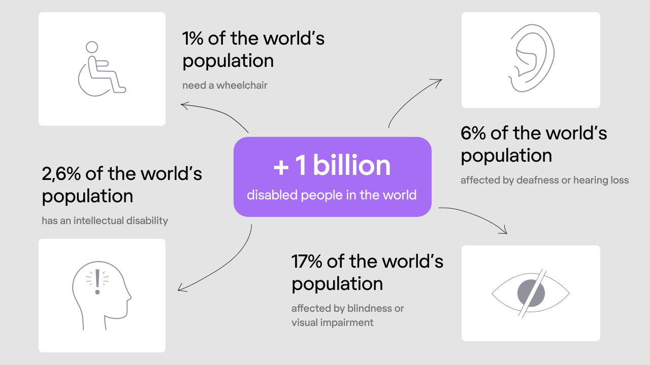
It’s so human to take for granted those things we got used to. Acute eyesight, good hearing, ability to read and understand, freely move and easily communicate. But what if to think for a moment that many people among us interact with the world differently? As of 2019, 37,5% of the world’s population (and that’s more than two billion people!) live with some kind of disability. A terrifying number, right? It can be permanent disabilities or temporary impairments; however, none of them makes life easier. 

how many disabled people are there in the world? statistics

Every day experiencing functional difficulties, using the web became a challenge for those who need assistance and a special approach. Every day businesses lose many potential customers just because the latter can’t properly use websites to achieve their goals. 

This article will talk about why user interface accessibility is vital for both people and businesses, how to make UX design accessible, and what UI design accessibility guidelines to follow. And to start with, let’s recap what we know about accessibility.

What is accessibility?

Accessibility evaluates a product from the perspective of whether people with different abilities can easily use it. Accessibility in user interface design expands the users’ coverage enabling as many people as possible to understand, navigate, and interact with the digital product. In a broad sense, accessibility serves not only those who have a certain kind of disabilities but also all users, making their user experience seamless and hassle-free. 

The universal design became the accessibility concept embodiment pursuing the goal to create a “one size fits all” design admissible for all users regardless of their physical or mental condition.

Different types of disabilities

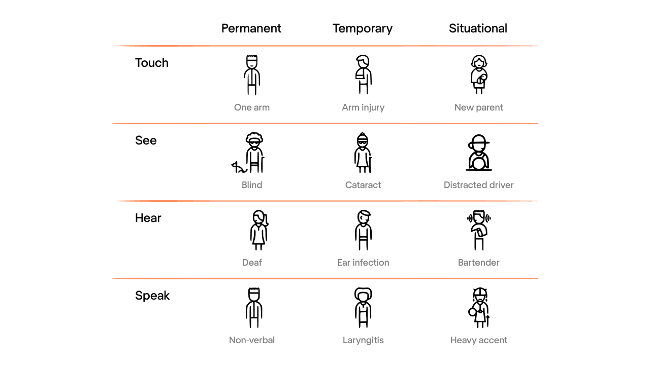
Working on accessibility in UI/UX design, it’s crucial to keep in mind that, besides permanent disabilities, people often experience temporary or situational deterioration of their condition.

For example, the sight issues can vary from total blindness to color blindness, low vision, or impossibility to distinguish website content on a mobile device under the bright sunlight. 

Disabilities can be permanent, temporary, and situational. For example, a person can be completely blind, has a catarct, or be a distracted driver


Usability vs. Accessibility

There is one distinct commonality between usability and accessibility. The poor user experience for the general audience creates much more difficulties for people with disabilities and impairments, making the interaction with a website or app inaccessible.

Inaccessibility lies in between frustrating and difficullt interaction with a website or app
Image credit: Uxmag

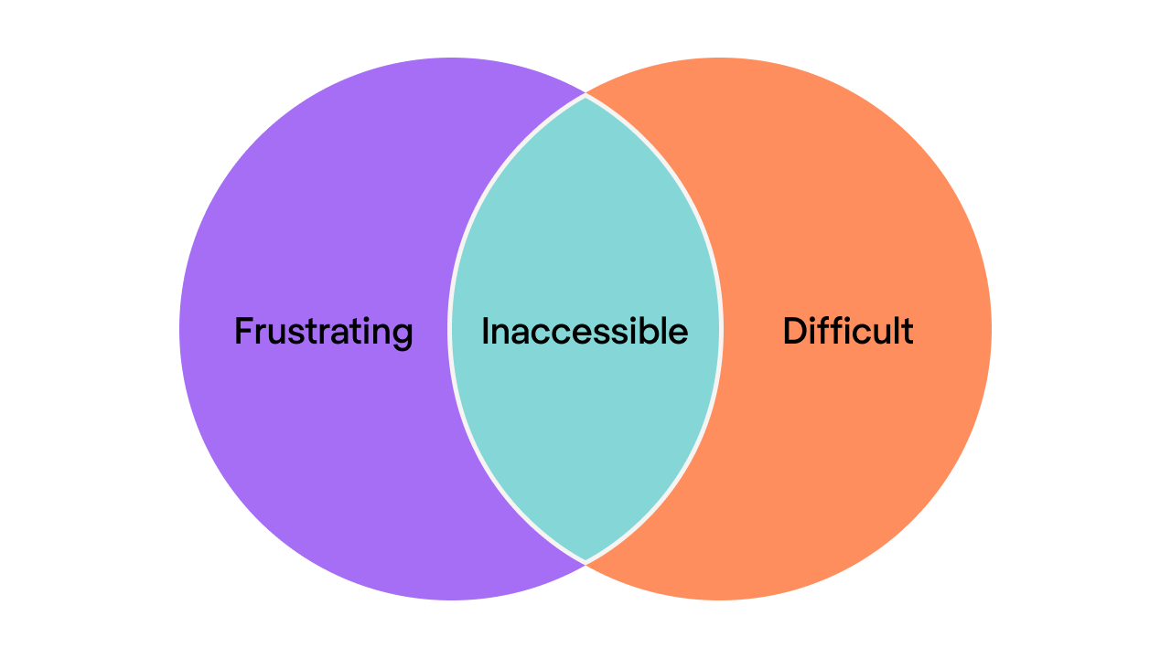
Inaccessibility shouldn’t necessarily be related to some kind of users’ disabilities. 

A product can become inaccessible for certain groups of people when:

  • It has a non-intuitive user flow and/or unclear instructions
  • The price is too high
  • Product usage requires a specific cultural context that not all users can understand
  • Some social groups (for example, aged people) lack the background knowledge to use the product

Why should we make design accessible?

As I mentioned above, the number of people having some kind of disability is impressive. Considering how many troubles they may have daily to lead a normal life, why not try making their interaction with the web less complicated but more productive? The UX designers can create a user experience beneficial for everyone who uses digital products regardless of whether they have permanent disabilities, temporary impairments, or situational difficulties. 

It’s impossible to create a customer-centered design without empathy. Working on accessibility in UI, designers should put themselves in a user’s shoes and walk through a customer journey, trying to understand the possible gaps in user experience.

And if we see UX accessibility from a business perspective, making your website or app accessible to as many people as possible will lead to:

  • Bigger audience coverage
  • Better search results
  • Faster loading time

Also, accessibility is a driver for innovations. For example, Google is working on a non-language processing tool that should process sounds and intonations, benefiting people with auditory impairments.

If you’re still not convinced whether you should make your website accessible, here is the information for your consideration.

In 2006 the National Federation of the Blind had a lawsuit against Target, an American retail corporation, regarding Target’s website inaccessibility. As a result, the corporation paid six million (!!!) fine and committed to ensuring the use of assistive technologies on their website to make it accessible not only for blind people but also for users with various disabilities.

And one more note. In 2017, US federal and state courts received 814 accessibility lawsuits under the non-discrimination laws. Things are getting serious, you see.

UX accessibility standards and guidelines

Assuming you’ve recognized all the importance of accessibility and now you’re wondering if there are any accessibility guidelines for UX designers to adhere to. Sure, they do exist and devote a separate paragraph. 

The two major sets of accessibility regulations in the United States are WCAG (Web Content Accessibility Guidelines) and Section 508. 

WCAG represents the world-accepted standards for the accessibility of websites and apps. 

It states that accessible design should be:

  • Perceivable: a user should be able to perceive the information presented on a digital resource. For example, people with low sight must be given a possibility to read written words by a screen reader
  • Operable: keyboard navigation must be an alternative solution to using a mouse or a touchpad
  • Understandable: a website’s information and user interface must be understandable and meet users’ expectations in terms of content and operability
  • Robust: the website must be advanced enough to be compatible with assistive technologies

Section 508 standards must be applied when working on governmental projects. It’s a set of requirements that need to be satisfied for the project to become legally compliant with accessibility guidelines (as they’re articulated in WCAG). So, if you’re designing a project for the private sector with no relation to state or federal programs, follow WCAG guidelines. In other cases, you should refer to Section 508 requirements.

How to make design accessible

While there are many things to implement for creating an accessible design (use this checklist for reference), you can primarily focus on some of them. 

  1. Check your current accessibility status

You can do this using the AXE Chrome extension. This tool performs web accessibility testing according to WCAG guidelines and gives you an “accessibility compliance” score. Based on the results, you decide how much effort you’ll need to make your product design accessible.

 AXE Chrome extension: accessibility status checker
  1. Ensure sufficient color contrast

The most widespread accessibility problem is the low contrast between text and background. According to WHO, around two billion people worldwide have more or less severe visual impairments caused by various conditions and diseases. Just imagine how many people you will help just by implementing slight text contrast adjustment to your design.

WCAG Visual contrast requires a 4.5 to 1 contrast ratio between text and background. To quickly check a color contrast level, you can use the Contrast app or WebAIM contrast checker. 

  1. Support color with other elements

When you outline essential information with color only, people with low visual acuity or colorblindness face difficulty figuring out what your content says. 

Use labels, bold text, underlines, italics, icons, font weight, and size to make your message understandable for people with visual impairments. 

The complex content as charts and graphs, should always be accompanied by text and labels. Using the color only to distinguish the data creates complications for your visually impaired audience and makes interaction with your website frustrating. You can use a Color Oracle app to check how people that can’t distinguish colors see your design.

  1. Use focus indicators

When you select a webpage item, it usually becomes highlighted with an outline. The name of this outline is a focus indicator. It shows what element a keyboard is focusing on and where you’re when navigating a website. Focus indicators can be used for links, form fields, buttons, and any other webpage elements that should differ from the surrounding items. These indicators help users with visual impairments who need screen readers or people whose mobility is limited due to injuries or specific illnesses.

Designing for accessibility, it’s crucial to make focus indicators visible to facilitate users’ interaction with your website.

Focus indicator is used to highlight the important element on the webpage
Image credit: Uxdesign


  1. Add alternative text to images

If a person has low sight or just doesn’t have time for reading the web content, they can use screen readers, which convert text into speech. As screen readers work only with written words, webpage images require textual description called alternative text that describes what the image is about and how it relates to the content. You can write alternative text within the <alt> attribute or just explain the image with the surrounding context. 

It’s a bad practice to write like “picture” in the <alt> text as it won’t help listeners understand the essence. Try describing as detailed as possible what’s happening on the image and how it’s connected to the overall text. However, if the image is just an illustration and serves for pure decoration, you can put an empty <alt> attribute “saying” the screen reader to skip it.

Google is now working on the AI technology that will describe pictures with 94% accuracy. But until they make it happen, the task of UX designers (and content writers as well) is to provide users with accurate and concise image descriptions.

Also, WCAG recommends keeping the text lines up to 80 characters and avoiding using justified text to enable zoom options.

  1. Establish content hierarchy

Headings and subheadings form the structure of the text and help readers understand better the logical order of the narration. Bigger font titles attract more attention and serve as content milestones based on which the main idea can be easily perceived. 

When developing a website, it’s important to use proper structural HTML elements such as <h1>, <h2> and similar. tags to form the content hierarchy. Browsers and screen readers “communicate” with HTML elements receiving the information they contain and process it properly. Thus, don’t use HTML tags just to outline some webpage item with no meaning and, on the contrary, don’t style headings with bigger font and bold text where the <h> tags must be applied.

  1. Enable keyboard navigation

Keyboard navigation is one of the most significant accessibility features. It’s helpful for people with motor impairments, poor muscle control, and visually impaired people that use screen readers. The navigation has to be logical and intuitive, correlating with a page’s visual flow. 

For example, the Tab key should be able to move through all interactive page elements like links and buttons. The Enter key should select an element and confirm information input. Try navigating through a website without using a mouse or a touchpad and check if you can take necessary actions only with the help of a keyboard.

  1. Test the design with real users

Once you’re done designing for accessibility, use accessibility-testing tools (like, for example, Color Oracle mentioned above) and ask users with different capabilities to check your design.

What else can you do for your product’s accessibility?

  1. Ask a third-party UX audit provider to conduct an accessibility audit and find out if your product corresponds to WCAG 2.0 guidelines and meets assistive technologies requirements 
  2.  Assign somebody from your internal team to go through your design and check if it meets principal accessibility standards (you can use the checklist from this article as a reference)
  3. Mind accessibility during the UX research stage, verify your design assumptions with people who are willing to help, and assess what you can improve in your design for better usability and accessibility.

A final word

Designing for accessibility will definitely require more effort following established standards and guidelines. However, by making your product accessible, you can help more people benefit from the web, increase your product’s audience, and avoid legal issues concerning inaccessibility. If you need any help with creating the accessible design, let’s talk. Also, check our article with inclusive design examples to see how brands adhere to accessibility standards.

Natalia Borysko

Author

Table of contents

Top Stories

Design process
/
0
min read

How, Where, and When to Find a Designer for Your SaaS App

Design and user experience (UX) is one of the most important aspects of SaaS. Good design will go a long way to not only convert customers but also help them engage with your product and return to it again and again. 

But how to find a person that can create a stunning UX for your SaaS customers? 

No worries! Here at Eleken, we specialize in designing for SaaS. To make your task a little easier, we will walk you through all the essential information on how to find a designer for your SaaS app. 

In this article, we will figure out what skills such a designer should have, discuss the places to look for a designer, give you tips to use during the interview, and help you define the right time to start your search.

First of all, to be able to correctly and fairly assess each designers’ portfolio, you need to understand how good SaaS design looks like.

What is special about SaaS design?

The ultimate goal of a designer is not to amaze users with an outstanding user interface of the SaaS product, but to make them say "wow" to how easily and efficiently the app helped them solve their problem.

For that reason, a good SaaS design should have the following characteristics:

Flexibility

As SaaS products tend to scale up quickly a professional designer should always take this fact into account. To be able to cope with the constant evolution and growth of a cloud app, instead of spending all time and effort on creating tailored components for the current need, a good designer makes things adaptable and scalable to future needs. That means a SaaS product designer should know how to work with design systems

After all, scalable design always pays out in the long run. For example, when we were working on TextMagic, the cloud-based company that provides a range of products for marketing, customer support, and sales, we used Wizard, a powerful design pattern to simplify the process of configuration of email marketing campaigns. In general, using the design system in this project made the whole design process faster and more productive (read more in our case study).  

The fast and simple sign-up process

The next thing that lets your customers quicker discover that your product is efficient and they need it is the frictionless sign-up process. 

Due to the specificity of the software-as-a-service model people access the product with their browser, that’s why they usually don’t feel comfortable filling in too much data straight away only for a trial period (especially billing data).

Designers that understand the essence of SaaS tend to make the sign-up process fast, clear, and brief. For that reason, they use short forms, remove all unnecessary information and create clear call-to-action buttons. 

Let’s take a look at Trello’s sign-up process. 

It is super fast and easy. The visitor sees a short fill-in form that asks only for an email address and a bright call-to-action button with a clear copy “Sign Up - It’s Free!”.

That’s how the visitor has to go through only one step to get the job done. 

Clear and noticeable call-to-action buttons 

When the customer uses the app, they should understand what they are supposed to do and what will happen after certain actions. CTAs help users quickly achieve their goals and easily complete tasks. 

The effective CTAs that convert visitors into customers are usually of appropriate size (big enough to notice), contrasting, and have a persuasive copy.   

Here is an example of a well-designed CTA created by our team for ClientJoy (former Gridle). 

The headline presents the value proposition of the Clientjoy and then logically the attention of the reader goes to the contrasting call-to-action button that says you can “sign up for free”. The size and the color of the CTA make it easy to notice. To learn more about this project, check our showcase

Intuitive and clear page architecture

The UI patterns like forms, button styles, pages, reports should hook the users. When patterns are consistent and intuitive, it makes products sticky and habit-forming. 

Minimalist and clean design is the first step to eliminate unnecessary features and clutter from your cloud app. It helps users focus on the core parts of the application and bring order to the overall layout.

The SaaS product that is known for its simplicity and clean minimalistic design is Dropbox

Even newbies for this app will easily understand how it works and what they are supposed to do. The minimalistic design and clear navigation leave no place for confusion. 

Human-centered design

Designing the SaaS products requires deep consideration of users and their behaviors as the first and foremost task of any cloud software is to bring value to the customer. SaaS UX design works like an instrument that helps to deliver value and create a user-friendly and practical product. 

Duolingo is a great example of a simple and highly intuitive application that has a main focus on its users. Duolingo’s design resembles a video game. It is full of interactive visuals but at the same time, there are no unnecessary elements that may confuse the user. 

This application for learning languages shows what human-centered design is all about. 

Optimized dashboard

SaaS products help users process big amounts of data. A good SaaS UX design essentially presents important information quickly for its users. The most frequently accessed data, updates, pending approvals, and a quick summary of key events encourage users to keep coming back. 

For that reason, a designer of cloud applications should know how to make easy-to-comprehend dashboards that provide users with all the necessary data.

Take a look at the dashboard Eleken designed for TextMagic. It allows managers to quickly understand how their team is progressing and if customers are satisfied.

Based on the above principles that contribute to effective SaaS design, we can formulate what skills a designer of cloud-based software should possess.

How to hire a SaaS designer

If you're new to the world of user experience design, it’s easy to get confused trying to find the best candidate. To understand which way to look, let’s figure out:

  • what are the responsibilities of a UI/UX designer; 
  • what skills, knowledge, and experience a designer should have to cope with those responsibilities; 
  • How to reveal the candidate’s skills, personality, strengths, and weaknesses.

Understand the responsibilities of a UI/UX designer

The position of a SaaS designer requires:

  • To understand the specifics of SaaS business
  • To own the end-to-end design process including user research, prototypes, test ideas and refine designs with data and customer feedback
  • To state clear problems based on research and data
  • To identify user needs, iterate solutions
  • To create/work with existing design system proficiently and consistently
  • To choose logical UI patterns. Deliver polished visual design and transitions
  • To know user-centered design principles
  • To be able to work using modern design and prototype tools (Figma, Sketch, Photoshop, Illustrator, and such)

Define the essential skills and background

No UX designer can be a jack of all trades, an expert in everything. But there are a number of applied skills that are essential for a candidate to tackle the responsibilities of a UI/UX designer:

  • UX research. To create a great SaaS application, designers need to understand who their users are, what are their needs, and how they are going to use the product. To figure things out, UI/UX professionals need to conduct user research before proceeding with the design itself.
  • Information architecture. UX design is not only about “making things pretty.” It also requires a designer to be able to structure the content and features of the app in a way that would work for the users.
  • Wireframing. The design process usually starts with black-and-white wireframes to concentrate on the logic behind elements. 
  • Visual design. The look and feel of the product have an enormous impact on how a user experiences an interface. That’s why a designer should be able to create pixel-perfect icons, buttons, and color schemes.
  • Prototyping and testing. To make sure your design solutions would be clear for users, a designer should be able to run user tests before the launch.

Evaluate your candidate’s background

Speaking about education, many UX designers do not have a degree in UX or a related field. It's quite possible to start a career in UX without a degree at all, replacing it with UX courses and self-education. 

Instead of requiring diplomas, ask candidates to share their portfolios. There is no better way to understand the designer’s skillset and ability to come up with solutions for varying design problems than by checking their portfolio. Moreover, the portfolio also shows the candidate’s attitude to work –– something all employers are looking at.

To give you a better understanding of what a good portfolio looks like, check out examples of popular product designers Simon Pan, Jonathan Patterson. As well, take a look at the way we organize our case studies at Eleken. 

Another chance for a candidate to demonstrate their expertise is a pre-hire test assignment. When we hire UI/UX designers at Eleken, we always ask them to do a quick test task. For example, to create a UI for a mobile AI messenger app (at least 3 screens).

Have a “live” conversation

An efficient work process and a successful final result are impossible without mutual understanding between you and the designer. That’s why it’s super-important to make sure you feel comfortable communicating with your potential hire. The best way to understand if you can communicate easily is to ask for a video interview. 

Tell the designer everything about the future application. Share your thoughts on the target audience, monetization strategy, and unique value proposition, show the moodboard with application designs you like, and so on. Share all this information and listen carefully to designer feedback to understand if you want to work with him/her.

Prepare a list of questions

We at Eleken UI/UX agency have been interviewing designers since 2015, and through all these years we made up a chart of interview questions that allow us to reveal candidates’ personalities, skills, and knowledge.

First of all, ask a candidate how great UX design differs from poor UX design. Mature professionals have their own definition of good design and can formulate a clear and specific answer to this question.

Knowing what makes good UX is one thing. Knowing how to design good UX is another. That leads us to the question about the candidate’s knowledge of UX best practices

Maksym, Eleken’s Design Director, says that simple questions are the best to reveal how a person reasons. He likes to ask candidates to explain to him what UI/UX design is, how UX differs from UI, and so on.

Technical questions are called to evaluate the level of the designer’s professionalism in the field. Here you want to know how a candidate builds their design process and what methods they use in their work. For instance, you may ask your candidate to walk you through the latest project in their CV.

If a candidate is serious about building their career as a SaaS designer, it’s always a good sign for any employer. So it’s a good idea to ask your interviewees about how they became designers and how they see their professional growth.

Here’s an example list of interview questions for SaaS designers:

  • Tell me about yourself.
  • What is the difference between UX and UI?
  • What differentiates good UX from bad UX?
  • Tell me about some of your favorite examples of good UX. 
  • Walk me through your design process for this particular project.
  • How do you see your future career in UX design?
  • Do you have any questions?

Don’t forget about onboarding once a designer is hired

After hiring a designer, take some time to onboard them and establish a proper work process. Otherwise, the whole affair is doomed to fail.

So here are some tips for how you can help your designers craft high-quality products.

Make designers familiar with your product

Any designer that is hired to develop a product needs to understand perfectly how the product works. Obviously, right? Yet, it’s not an easy task to deal with such a wealth of information in a short term. Help your designers by documenting all the guides, demos and customer interviews in one place.

Explain your work process

Walk your new employee through your working process, explain how things are working and why they are working this way. Detail what rules are flexible and what is set in stone. For the first days, it may be useful for a newcomer to shadow an experienced designer.

Devote some time for training

We at Eleken hire designers with UI/UX experience. They all have great portfolios and proven skills. But what makes them a part of a team is a monthly training that teaches them SaaS design approaches that are adopted in our agency. The pet project designers should complete during their training is a perfect onboarding tool — it teaches them to collaborate with one another, get their works reviewed by peers, and help each other to create better solutions.

Places to look for a designer

With the understanding of the specificity of SaaS design, it would be easier to look through CVs and portfolios. 

Let's check some places where you can find a designer for your application.

Upwork

Upwork is a global job search platform that offers help for employers who want to hire and manage remote professionals. Here you can find a freelancer or a freelance agency, interview them and begin to collaborate. 

Here you can find profiles of app designers with their experience, reviews, and links to portfolios.

Designhill

Designhill is a popular creative marketplace that helps companies and individuals find professional designers to perform designs of different complexity and scale. You just have to describe your needs, fill out a design brief and wait for a response from professionals to choose the one that you like the most.   

Behance

One more way to find a good specialist is to search on Behance. The site includes lists of portfolios from different designers. So you can find the samples you like, check who their creators are, and reach out to them.

We also have our works on Behance.

Dribble

Similar to Behance, Dribble provides a list of works of various designers and creatives. Filter the specialty you need ("SaaS app", "web design" "interactive design", “SaaS dashboard”, “b2b dashboard” etc.), find works you like, and contact their creators.

Check our works on Dribble.

Clutch

Clutch is a platform for B2B hiring decisions. There you can find design agencies sorted by objective client reviews, experience, client list, etc.

Eleken has a profile on Clutch as well.

Word of mouth

Asking your friends and acquaintances for advice may seem like a little outdated method, but don't neglect it. Talk with people you know, ask if they have contacts of designers that may be relevant for you. Who knows, maybe someone from your network has faced the same problem and can provide you with useful references.

Google

Don’t know where to find something? Just Google it! I guess you know how to use this tool perfectly well. Google gives access to a huge amount of information, but don't forget to carefully check the agencies or freelancers you find there.

Eleken UI/UX agency 

We at Eleken help SaaS companies overcome product design challenges every single day. We hire and nurture SaaS design professionals capable of managing those challenges. So if you want to resolve the matter with a UI/UX hire fast and securely, drop us a line.

Final thoughts

“If you give a good idea to a mediocre team, they will screw it up. If you give a mediocre idea to a brilliant team, they will either fix it or throw it away and come up with something better.” Ed Catmull

Choosing a designer for your application is a challenging and responsible task. The quotation above once again reminds us about the importance of finding a designer who not just blindly follows your instructions, but works as your thought partner, helping you overcome complex challenges.

In case you still have some doubts and questions about designing your SaaS app don’t hesitate to reach out to us for a free consultation

Design process
/
0
min read

Psychology in UX Design: The Science of Making People Happy

Many people who are new to UX design get confused when they find out that knowledge of human psychology is no less important here than graphic design skills. The accent shifts a bit if we say “User Experience” design instead of “UX”. Experience is something that lies in the field of human feelings, emotions, reactions, — all that belongs to psychology.

It may seem that the most basic UX commonplaces, like “make the main button big and bright” is something obvious. These things are not just an established way of designing similar websites: they are based on psychological principles, discovered by scientists and proven with experiments.

tip of the iceberg: good UX. Beneath the water: psychology and research

You may hear words like UI/UX psychology, interface psychology, or psychology of product design used to explain how psychology is used in UX.

In our design agency, we highly value design solutions that are built on the solid basis of interface design theory, UX design psychology, and user research. In the era of human-centered design, finding ways to make users happier is one of the most important tasks of a UX researcher.

You don’t need a UX psychology degree to understand the principles of UX design psychology: they are simple and often intuitive. Once you know them, your view of website design will be changed.

We will go through a few basic UX psychology principles that will help you understand why designers offer the solutions that they offer. Why do many websites look similar? Is it because designers don’t like to experiment? Let’s find out what UX laws tell us about it.

1. The Principle of Perpetual Habit. Don’t touch what works well

This is one of the basic UI/UX design principles. People get used to the same symbols, triggers, and behavioral patterns and feel frustrated when they can’t follow the beaten path. 

What does it mean for UX design? It means that following an established page structure is the best. Let’s say, a designer decides to replace the traditional hamburger menu button (three horizontal lines) with a fun symbol. Yes, it may look cool from the point of view of the original design. But most users won’t appreciate this.

The principle of perpetual habit is one of the reasons why websites often have this uniform look: because people got used to it and forcing them to break their habits would lead to dissatisfaction.

This rule is simple and obvious, but for digital industries where people value innovation over anything, the desire to experiment with design is very high. UX designers have to resist this temptation unless they have proof that their target users would appreciate that “break in the system”. Psychology tells us that an average human is more conservative than an average product team member.

2. Validation. Conformity. Follow the majority

Imagine you are participating in a group study that checks your eyesight. You are shown three lines and asked which one is the same length as the fourth one.

Asch experiment. 4 lines

You feel that the answer is simple until you hear that other people start answering “B”. You start doubting and trusting your eyes less and less. Afterwards you find out that the study was about psychology, not eyes. THe real objective of the experiment was to see how likely people are to conform with the majority. The study is known as the Asch experiment and proved that most people would change their opinion to conform to the majority.

This psychological effect is used a lot in politics, but there is a way to apply it to UX design, as well. Most companies put their former clients’ reviews on the landing pages, so that prospective clients feel that their choice is validated by other people who had a positive experience.

Some businesses put just a generic positive review along with a picture that looks pretty much photostock-y, but even this “evidence” works comforting on some basic level. Eleken steps forward from this approach: on our landing page, we put comments from Clutch, a review service, and videos from our clients telling their experience.

What our clients say about our work

3. Hick’s law. Can there be too much jam?

Have you ever found yourself stuck for five minutes in front of the shelves with jam in a supermarket, unable to choose out of 30 different jars? We should be happy to have that much choice, but instead, we feel quite drained after an hour in a supermarket having to make all those decisions.

The “too many jam” effect was discovered when psychologists put a degustation table with 24 tastes of jam in a grocery shop on one day and only 6 tastes on the second day. The study showed that people were 10 times more likely to buy jam when they had less choice, even though a table with 24 tastes initially attracted more people.

24 choices of jam = 3% of shoppers bought jam. 6 choices of jam = 30% of shoppers bought jam

This phenomenon is also called “choice paralysis” and is widely used in both marketing and UX design psychology.

Hick’s law states that increasing the number of choices will increase the decision time logarithmically. In the world of digital products, where people consider 3 seconds page load too long to wait, too many choices may ruin everything. Users get frustrated and are likely to abandon the page without making a decision.

That’s why the golden rule of UX design is to keep menus as short as possible. The less frequently used parts can be hidden behind the “other” section.

4. Errors. To delete or not to delete?

Doing things wrong sometimes is a part of human nature, as psychology (and life) tell us. The objective of the product team is to make the product error-free, but even the best product team can’t be protected from mistakes caused by the users. These mistakes result in unhappy users, and that causes a problem for the overall experience.

Are you sure you want to delete 2020?

What can UX designers do with people making mistakes? It’s impossible to avoid them completely, but knowing some psychology can help minimize the frustration and soften the negative effect. Here are some rules of error management in UX design:

  • Add the “are you sure?” pop-ups and “undo” buttons. Something that we take for granted, but saves us so many mistakes every day. I believe that the “Unsend” option introduced in Gmail is one of the best UX design ideas Google ever had.

Sending emails in an instant is great, but by sacrificing just a few seconds, users can prevent quite a few white hairs.

  • Inform users about errors as soon as possible. Have you ever filled a long registration form, to find out that the password can’t be longer than 8 symbols? And then having to fill it in again. The websites that highlight the text box in red as soon as the wrong password is inserted help detect mistakes at an early moment when fixing is the easiest.
  • Make error messages friendly and helpful. Instead of just putting “Error!”, suggest possible ways of solving the issue. “Contact our tech support and we will resolve the problem as soon as possible” sounds way more comforting and make people feel that they are not alone with the error. The modern trend of human-like friendly interfaces led many apps and websites to use this trick.
We lost this page. We searched high and low but couldn't find what you're looking for. Let's find a better place for you to go.

5. Emotions. Design for happiness

The human brain has two decision-making systems: fast, based on emotions, and slower, based on the results of rational thinking. Psychologist Daniel Kahneman wrote a lot about that, and much cognitive psychology in UX design is backed by his findings.

While many people would not realize that they rely on emotions in decision-making, the pattern remains. Sometimes, rational part of the brain would find reasonable arguments afterward to justify the fast emotional choices. Nowadays rational decisions are considered to be more reliable despite various biases of "rational" thinking. Logical thinking fits naturally into the product design process, but it’s important not to underestimate the emotional side of humans.

A large chunk of marketing and advertising tricks rely on emotions. How can we use them in UX design? The topic of applying cognitive psychology to user interface design is worth a separate article. Here are few elements that are used most commonly to evoke emotions:

  • Colors
  • Emotionally-charged elements: pictures or illustrations of characters showing emotions, emojis
  • Microcopy with an emotional tone

You can find some examples of emotional UX design in our article on user engagement strategies.

At Eleken, we believe that emotions in design are like pepper: it’s good in small amounts, but too much spice makes the dish a disaster. In Habitspace, a lifestyle app for personal use, one of our objectives was to make the app fun to use: we added emojis to habits and used encouraging copy to motivate people to stay on track of good habits.

Close to emotions stands the "beauty principle". It is quite intuitive: people tend to trust more websites and apps that look beautiful, for example have attractive and clean design. Of course, a pretty look won't make up for poor functionality and usability, but combined with good product development it definitely adds up to the overall user experience.

6. Serial position effect. Take sides

This rule might not be the most intuitive. It says that out of the row of objects, people pay more attention to the ones that are located on the sides, not the central one. That is why most apps try to place the most important buttons on the sides:

Instagram and google maps screenshots

7. Von Restorff effect. The science of attention attraction

Behind this fancy word hides a simple rule: among the range of objects people tend to remember the one that stands out better, let's say, by having a different color. That's how a classic pricing page is organized: designers try to drag users’ attention to the benefits of the premium version by highlighting it with colors and contrast.

Zoom pricing page. 4 options in columns

This is what most of psychology in UX design is about: attracting attention of the user. Here are some other principles that are commonly used.

8. Reading pattern. F-shape

People are used to reading pages following an F-shape, fading at the downside. This pattern influences location of the most important pieces of information and visual elements: the best places are the top part and left side.

Here is a picture of an eye tracker capturing the reading pattern. If you want to learn more on how eyetracking and other research methods are used in UX design, read our articles on UX research methods and tools.

9. Colors. The strategy of making accents

When we think of drawing attention, colors are the first thing that comes to mind. The most common color schemes used in UX design rely on psychological principles of perception.

The accent color has to be bright and contrasting to the rest of the page. What is important, it has to be used in small doses, no more than 10%. Look at the top of this page. Orange accent color is only used for buttons and links.

To sum up

These 9 principles are just the tip of the UX design psychology iceberg. And these rules should be treated only as assumptions: each decision has to be tested with users to prove right or wrong.

Want to learn more about how the assumptions are tested in UX research? Read our article about the UX research process!

Don't want to miss anything?

Get weekly updates on the newest design stories, case studies and tips right in your mailbox.

Success!

Your email has been submitted successfully. Check your email for first article we’ve sent you.

Oops! Something went wrong while submitting the form.
Don't want to miss anything?

Get weekly updates on the newest design stories, case studies and tips right in your mailbox.

Success!

Your email has been submitted successfully. Check your email for first article we’ve sent you.

Oops! Something went wrong while submitting the form.