
In the design world, it’s easy to get overwhelmed with UI elements. When designing a product interface, you might need to add a modal, place a tooltip in the right spot, insert a pop-up, build dropdown menus, or maybe use a popover.
With so many components that look somewhat similar, it’s easy to get confused about when to use each one. As a design agency with a decade of experience, we know what we’re talking about. And one thing we’ve learned is that choosing the right pattern within a design system can significantly impact usability.
In this article, we’ll focus specifically on the popover. You’ll learn what a popover is, when it should be used, and what it looks like in modern interfaces. We’ll also compare it with other elements so you can clearly understand the difference.
What is a popover in UX?
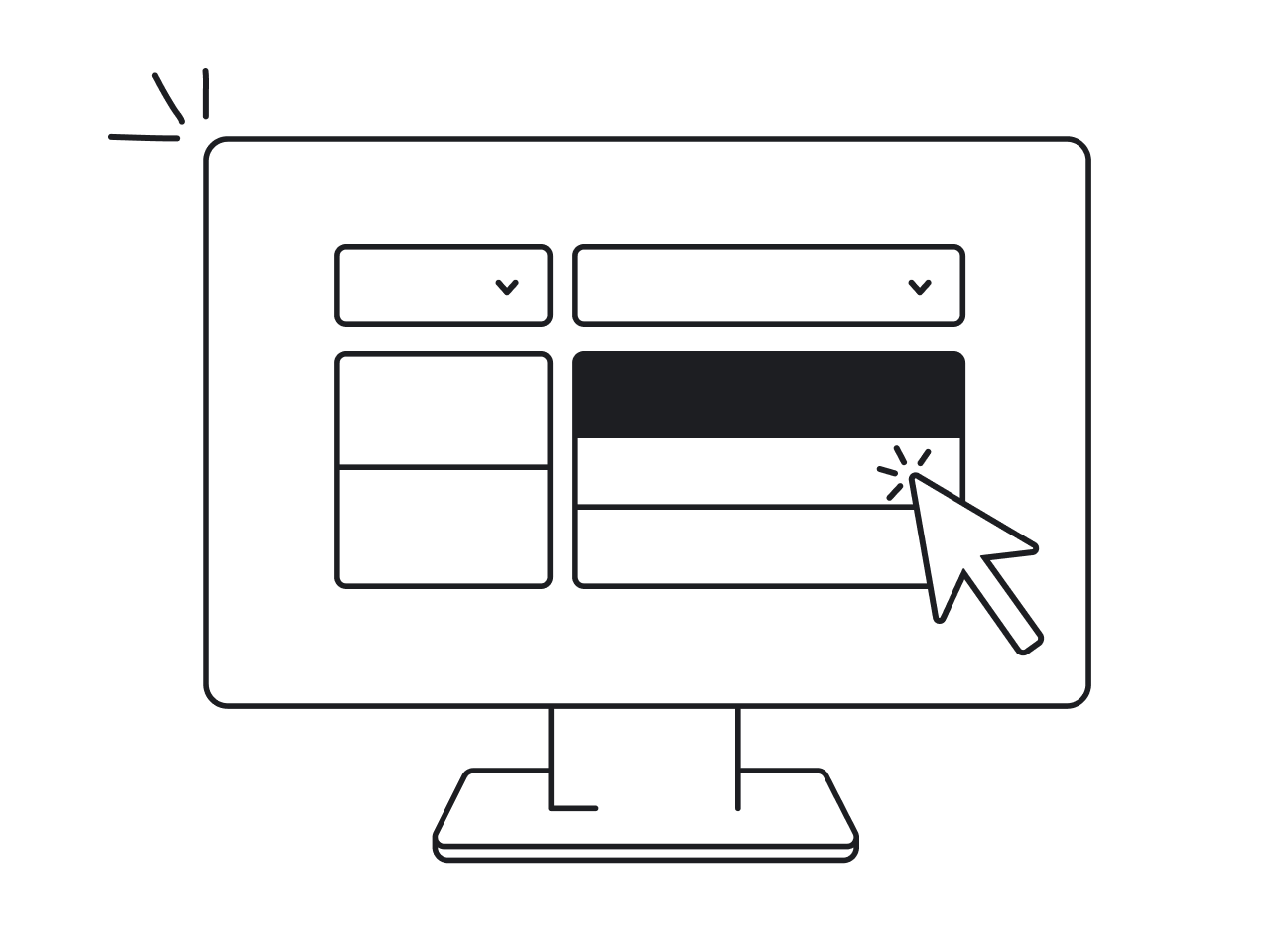
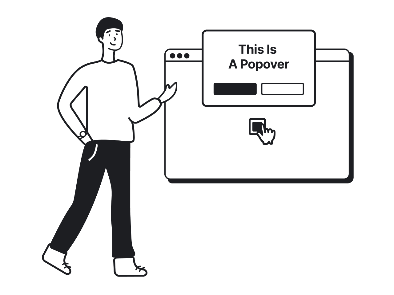
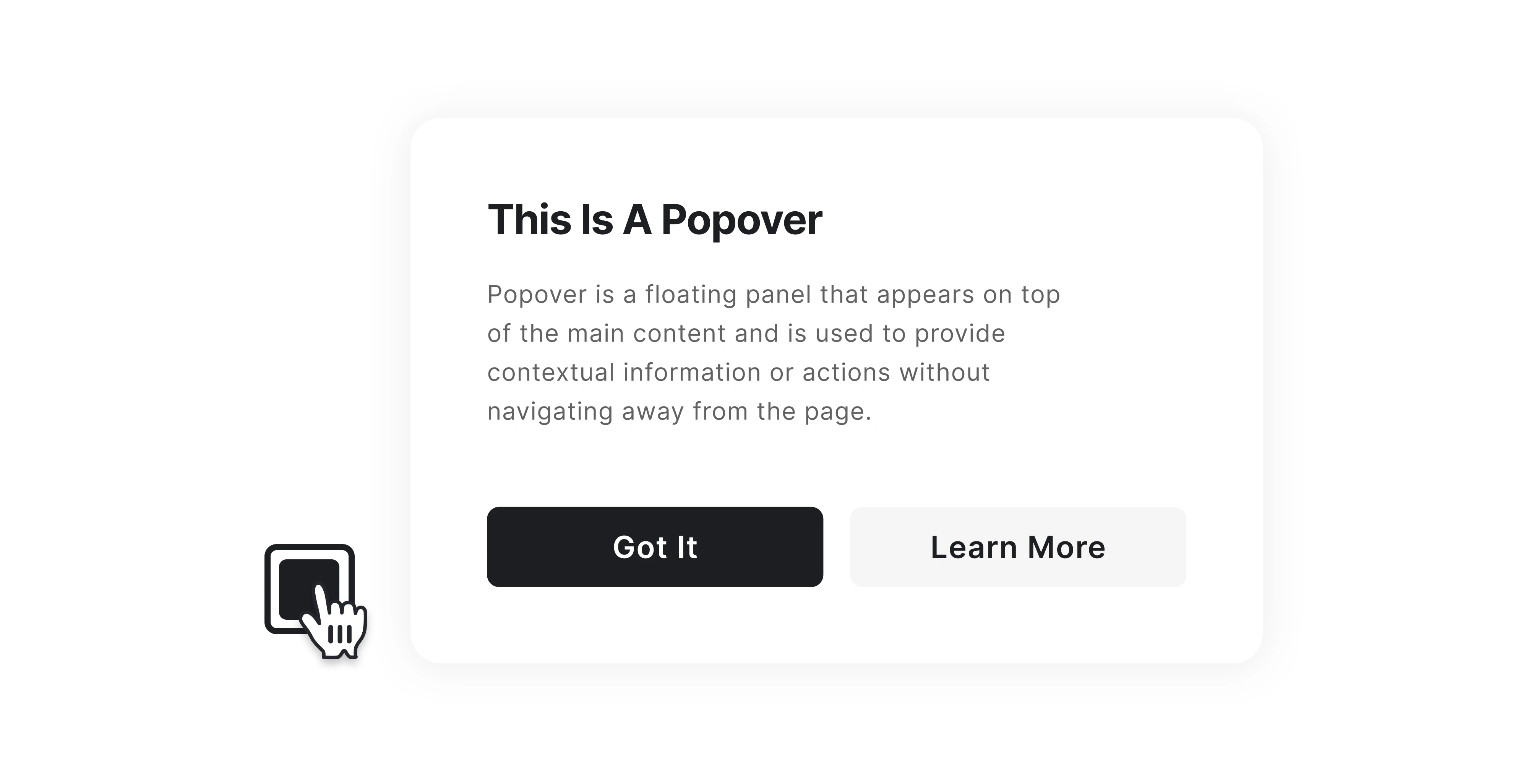
A popover in UX is a small overlay that appears on top of the interface to show additional information or actions related to a specific element. It usually shows up when a user interacts with a button, icon, or other UI element and disappears once the task is complete.
This allows users to access extra options or information without leaving the current page. For example, popovers are often used for elements like date and color pickers, emoji selectors, filter panels, inline editing tools, or quick settings menus.
With popovers, designers can hide secondary controls until users actually need them. This helps reduce visual clutter while still keeping functionality easy to access. In general, popovers share several common characteristics:
- Positioned near a trigger element.
- Contextual to the user’s current task.
- Temporary and dismissible.
- Lightweight and non-modal.
Popovers are also a standard component in many design frameworks, such as the Material Design system, where their behavior and positioning are clearly defined.
Popover vs tooltip vs popup vs modal
Working on a design, you’ve probably noticed how many interface elements look alike. Tooltips, popups, popovers, and modals appear on top of the interface, temporarily covering part of the screen to show critical information or actions.
Because of this, all components are often confused with one another. While they may look similar, they solve very different UX problems.
To make things clearer, let’s compare these elements in the table below.
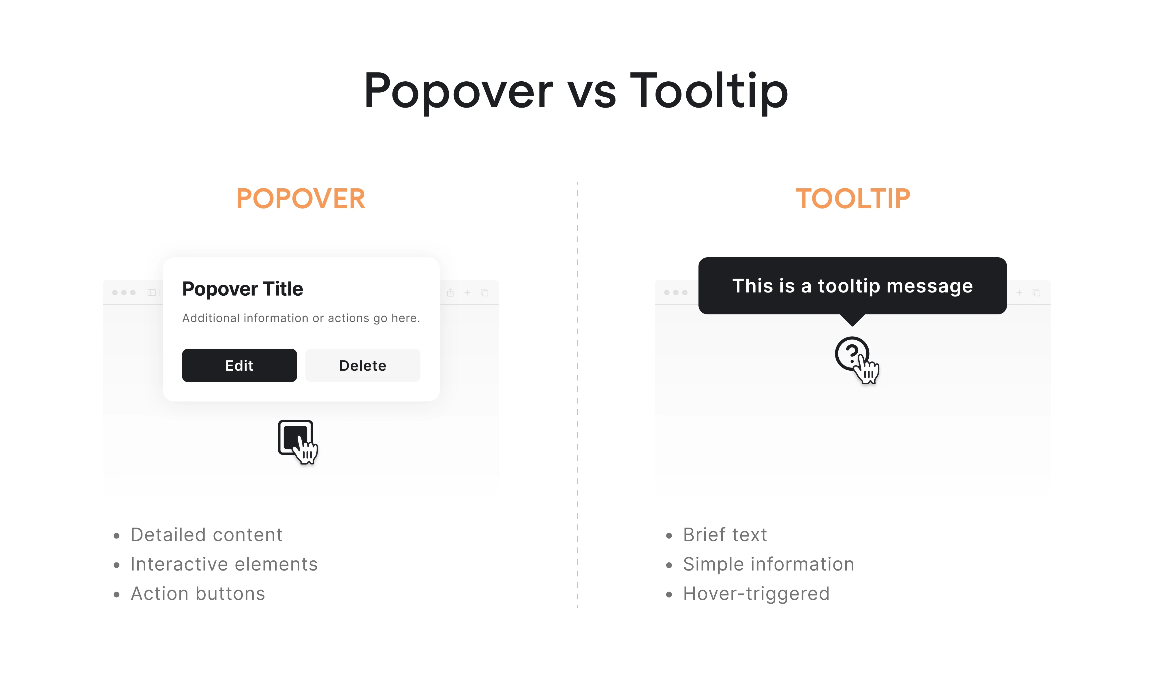
Popover vs tooltip
The main distinction between a popover and a tooltip is that the latter is mainly used to provide a short explanation of an element in the interface. A tooltip usually appears when a user hovers over an element and disappears when the cursor moves away, while a popover appears after a user clicks or taps on an element.
In short, tooltips inform, while popovers enable interaction.
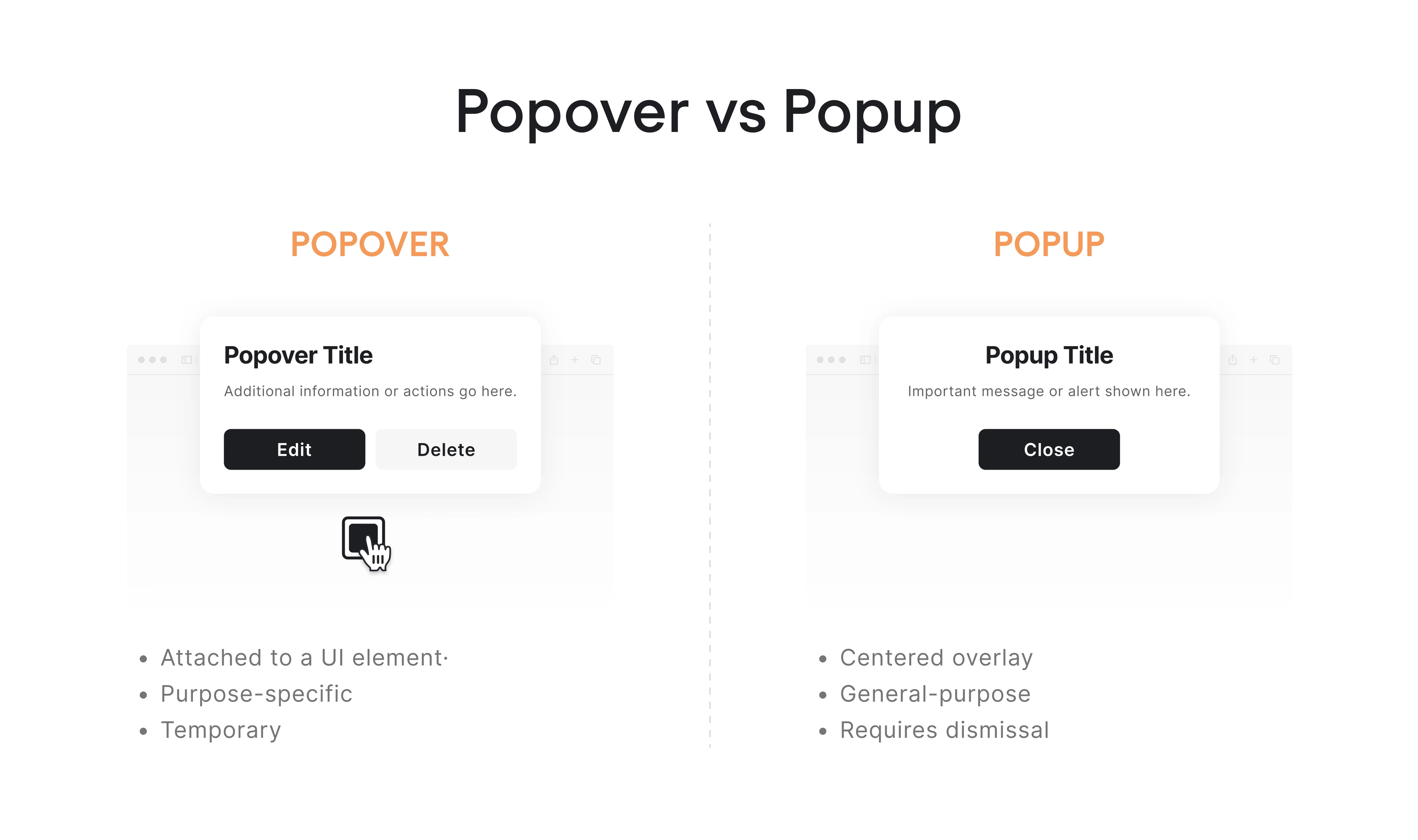
Popover vs popup
The popup vs popover debate is the most confusing one because both elements appear as overlays on top of the interface. However, a popup design captures the user’s attention, often showing a message, promotion, or notification. Popovers, in contrast, allow users to complete small actions related to the current task.
In short, popups capture attention, while popovers require users to act.
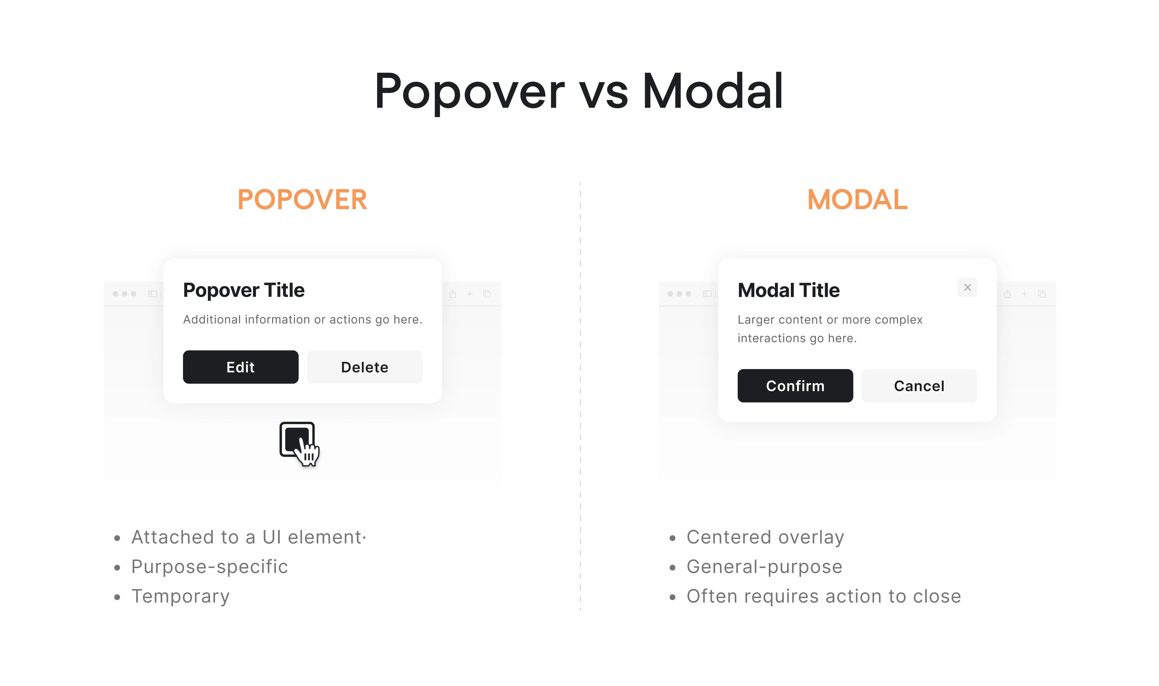
Popover vs modal
Popovers and modals are two more terms that may look and act similarly. But the main distinction is that a modal temporarily blocks interaction with the rest of the interface until the user completes an action. A popover is much lighter, allowing users to perform small actions or view options without interrupting their workflow.
In short, modals demand attention, while popovers are easy to dismiss.
When to use a popover?
Once you understand what a popover is, the next question that naturally comes up is: when should you use one? Although popovers work well for showing additional options or information, they aren’t suitable for every situation.
Let’s look at the cases where a popover is the right choice.
When users need contextual information
A popover works best when the action is related to a specific element. In these cases, users expect additional controls or information to appear close to the element they are interacting with, and a popover keeps the interaction tied to its context.
For designers, this means using a popover container when the action modifies, configures, or reveals details about a particular element. Typical examples include editing tags, adjusting formatting, opening filter options, or changing settings.
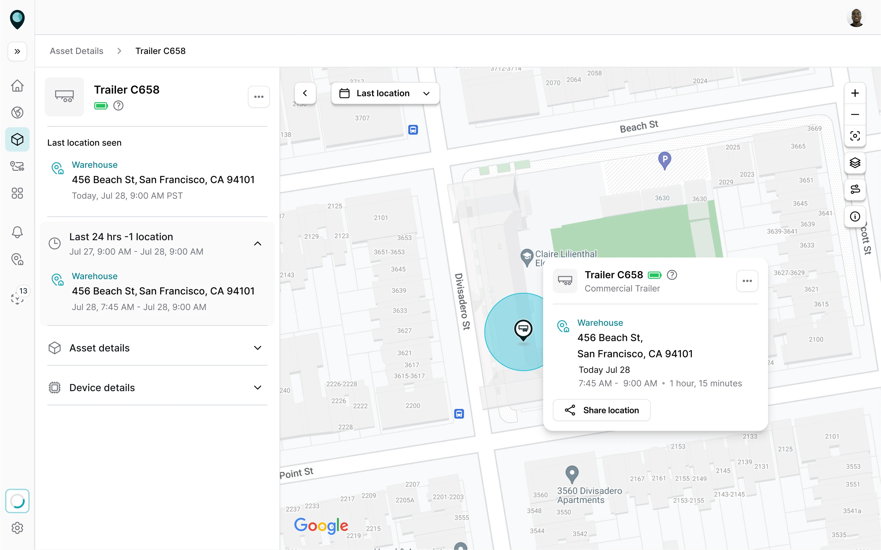
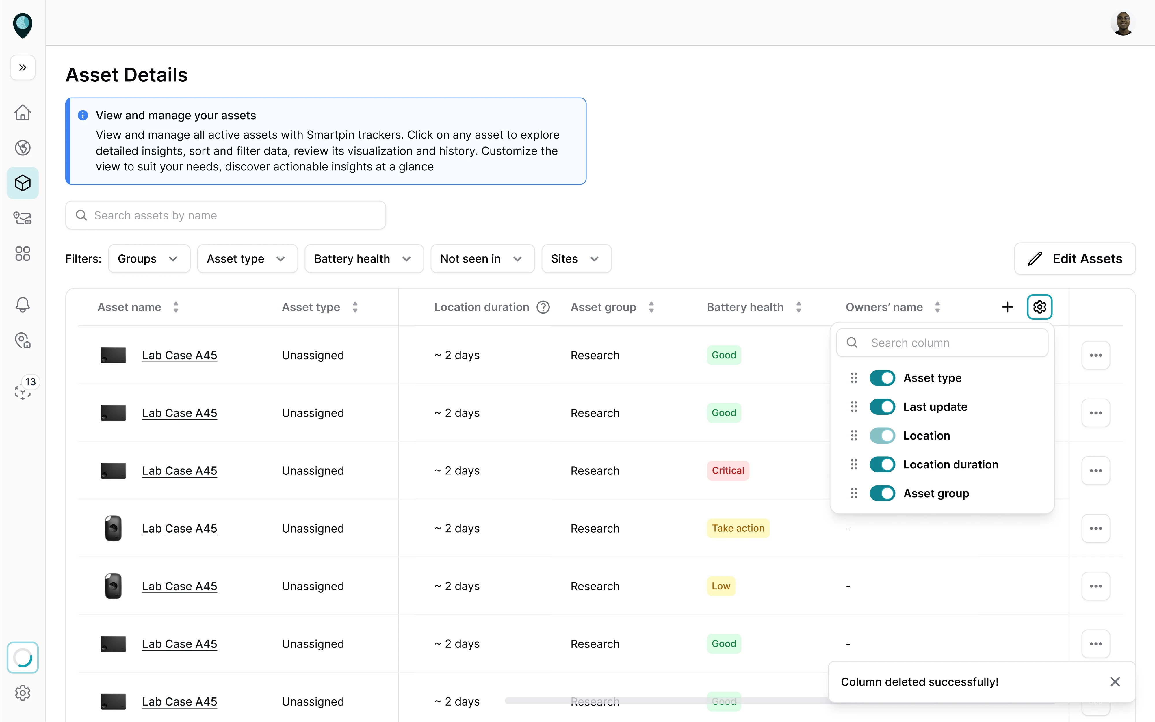
At Eleken, we applied this approach when designing a geospatial platform called Smartpin. Users needed to interact with specific assets on the map, so we displayed the relevant information in popovers anchored to each asset.
When the task is small
Popovers are designed for tasks that can be completed in seconds without interrupting the overall workflow. Designers might use popovers for actions like selecting a date, choosing a color, picking an emoji, or adjusting a few settings.
Keeping these small tasks inside a popover helps maintain interface efficiency. Users can make a quick adjustment and continue what they were doing. If the task becomes more complex, a modal or a dedicated page is a better solution.
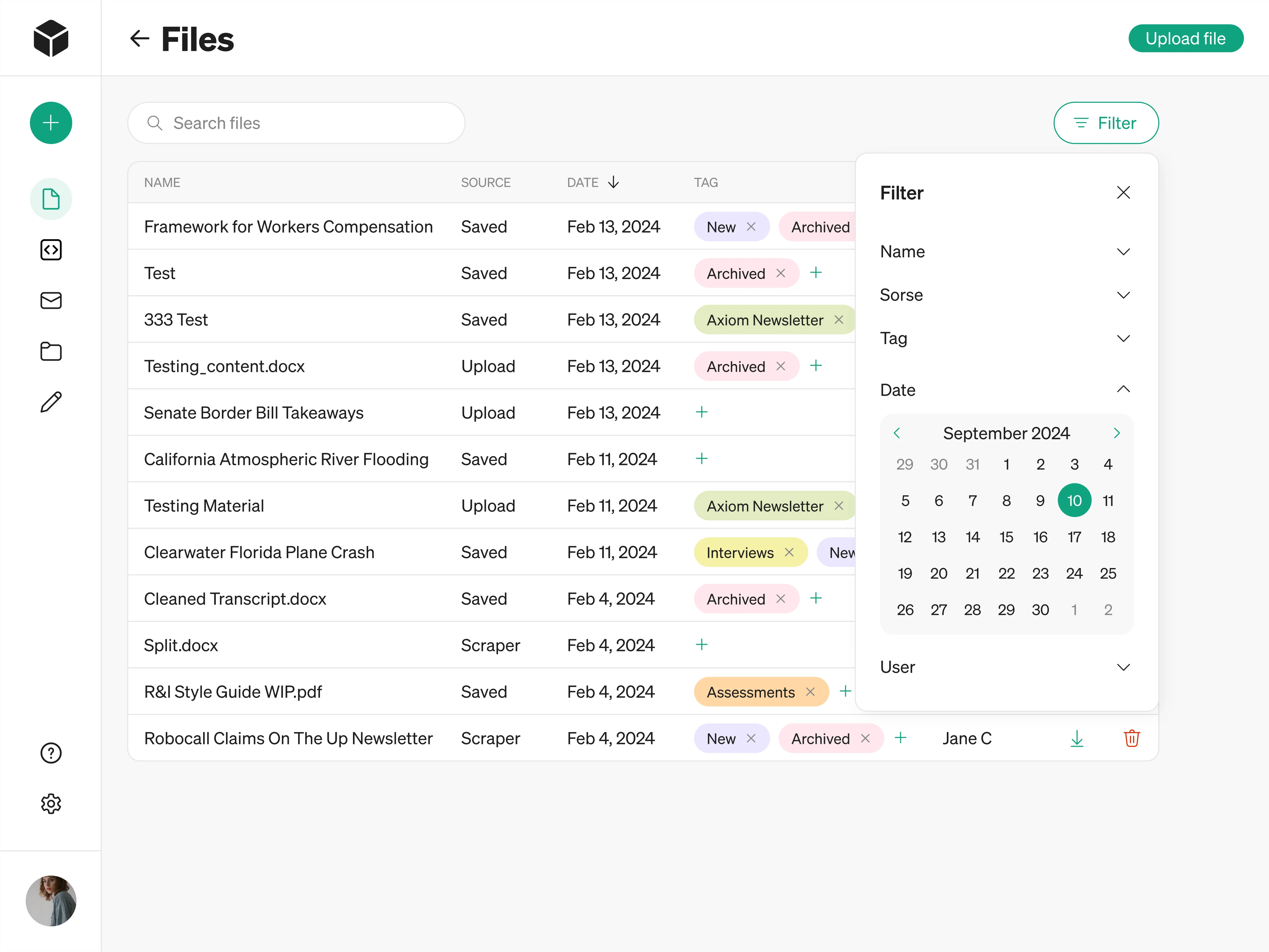
We used a similar mindset when working on Modia, an AI content creation tool. Users needed an easy way to manage large numbers of uploaded files, so our designer introduced a popover with adjustable filtering options.
When users should stay on the page
In many interfaces, especially SaaS dashboards or productivity tools, users work within a specific workflow. There are often situations where they need to perform an action on the current page, and a popover is a great solution here.
The key idea is to use popovers when the interaction should support the current workflow rather than replace it. If users need to quickly adjust something and continue working, a popover often provides the smoothest experience.
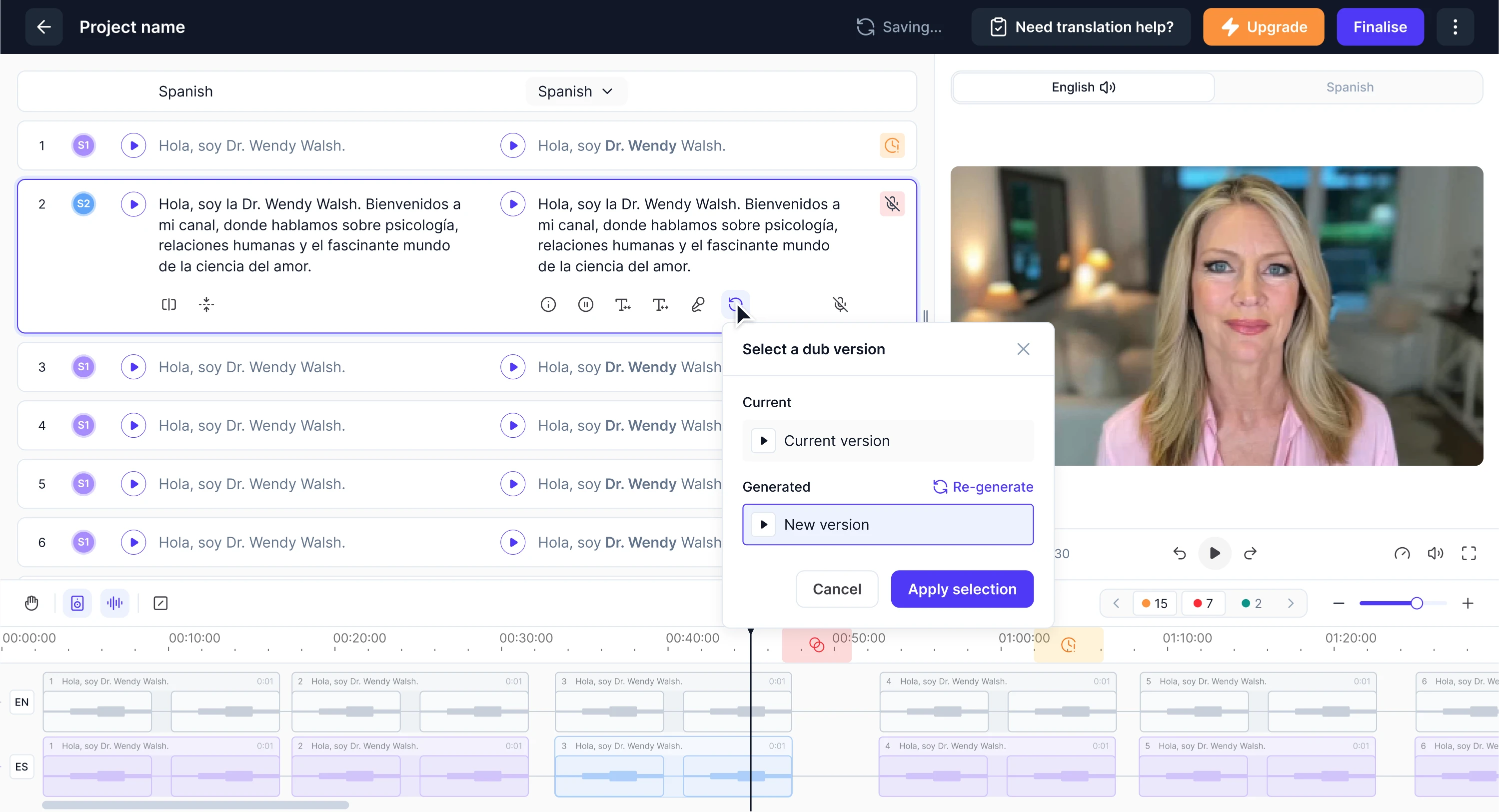
A popover proved useful when our designer was working on Panjaya, an AI-powered dubbing platform. The workflow was complex and required users to stay focused on their tasks. Using popovers for actions allowed users to make adjustments quickly.
When not to use a popover?
Popovers can be a powerful design pattern, but they’re not the right solution for every situation. When used incorrectly, they can clutter the interface, hide important information, or make interactions harder for users to complete.
Let’s take a look at situations when a popover isn’t the right choice.
When the content is critical
Popovers are not the best choice when the information or action is too important for users to skip. Because popovers are lightweight and easy to dismiss, users might accidentally close them or overlook the content entirely.
Critical actions usually require the user to pause and focus their full attention before proceeding. In these cases, designers should use UI patterns that clearly emphasize the importance of the interaction, such as modal dialogs or dedicated screens.
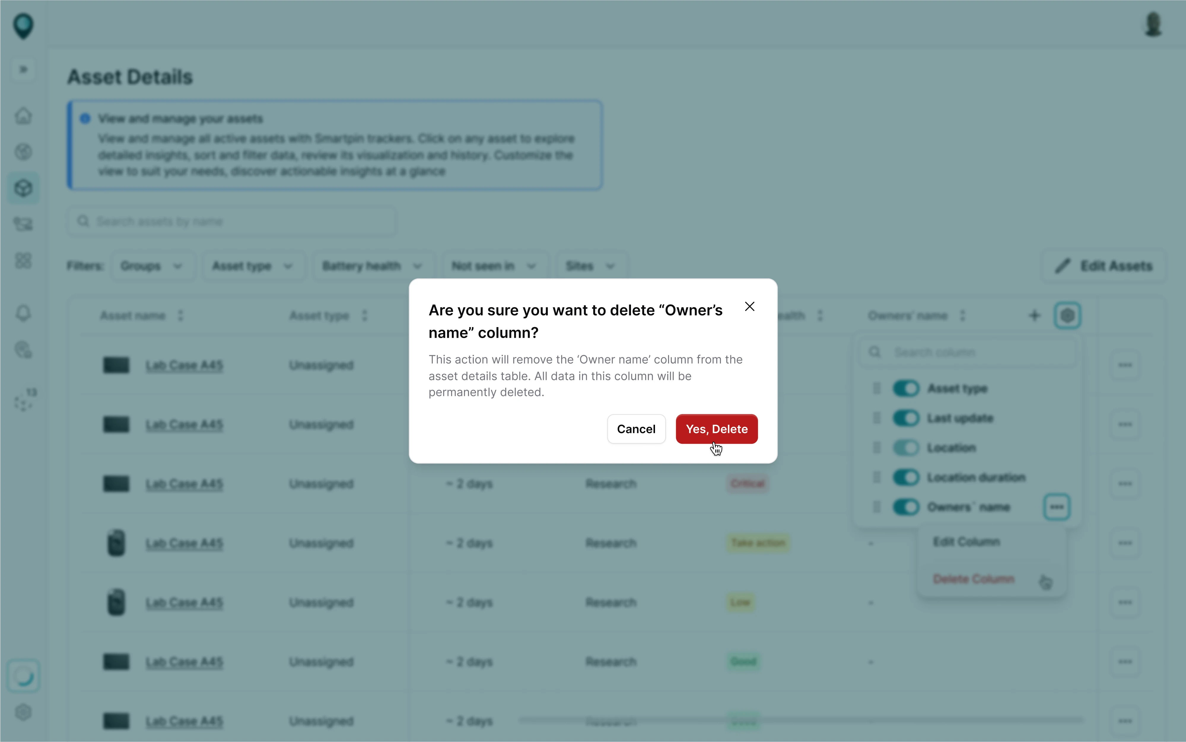
For example, when working on the Smartpin platform, deleting an asset was a moment that required the user’s full attention. To handle this, we used a modal window to ask for confirmation before proceeding.
When the interaction is complex
Complex interactions often require users to review information, make decisions, or provide detailed user input. In these cases, a popover may not provide enough space or structure for the task, which can lead to confusion and usability issues.
For designers, this means considering alternative patterns when the interaction grows beyond a few quick actions. Multi-step forms or workflows that require careful attention are usually better handled with modal dialogs or dedicated pages.
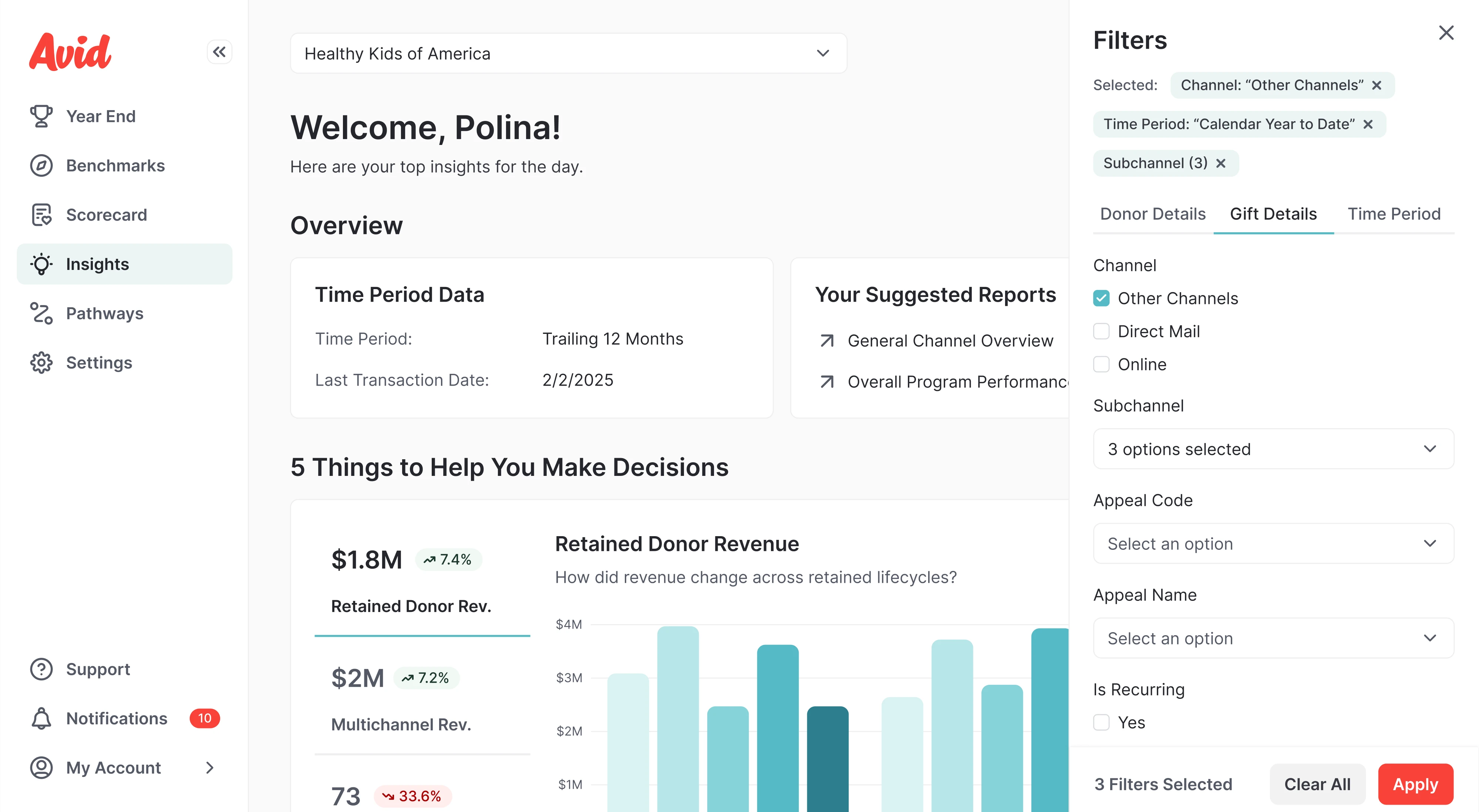
When working on Avid, an AI fundraising tool, users needed to filter large amounts of data using multiple parameters. Because the interaction was too complex for a popover, we designed a filter sidebar where users could adjust the options.
When the space is limited
Popovers rely on the available space around the element that triggers them. If the interface is already crowded or the trigger element is placed near the edge of the screen, the popover may not have enough room to display properly.
This is especially common in dense dashboards, mobile devices, or layouts with many compact elements. When space is limited, designers may need to consider alternative patterns such as pop-up dialogs, side panels, or full-screen dialogs.
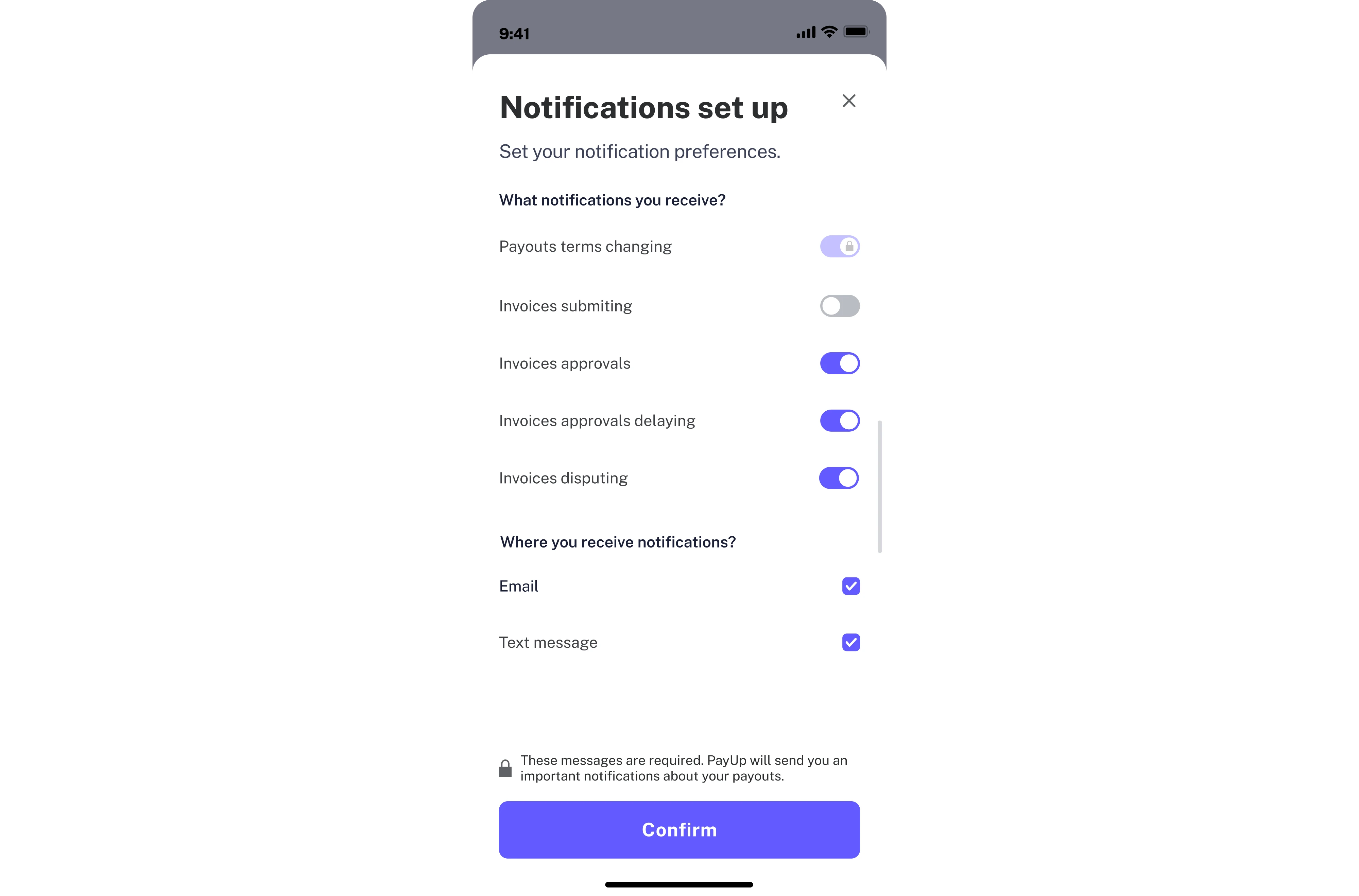
For example, when designing the PayUp financial platform, we worked on the mobile interface. Instead of a popover, our designer used a bottom sheet that made it easier for users to complete the notifications setup.
Popover UX best practices
Using a popover in the right moment is a good start, but the quality of the experience depends on how it's designed. To make sure your popovers actually support users instead of getting in their way, there are a few principles worth following.
Keep popovers small and focused
A popover works best when it stays focused on a single task or piece of information. Once it starts growing — more options, longer text, additional steps — it stops being a lightweight overlay and starts feeling like a modal that users didn't ask for.
A good rule of thumb is to limit popover content to one clear purpose: either show something or let users do something small. Aim for 1–3 sentences of copy. If your popover needs to exceed four columns in width, that's a signal to switch to a modal.
To keep popovers focused, prioritize clarity over completeness. It’s better to show fewer options than to try to fit everything into a small space. If users need more context or functionality, guide them to a modal or dedicated page.
A few practical signals that your popover has grown too large:
- It contains more than one distinct action or decision point.
- Users need to scroll to see all the content.
- The layout requires headers, sections, or multiple text blocks.
- You find yourself trying to fit form fields inside it.
Anchor popovers clearly
A popover that appears in an unexpected position breaks the connection between the action and its result. Users should always be able to tell at a glance what triggered the popover, and that clarity starts with how it's anchored.
The popover should appear as close to its trigger element as possible, with a caret or arrow tip pointing directly at it. This is especially important in cluttered interfaces where multiple elements compete for attention.
Positioning logic also needs to respond to context. A popover can appear on four sides — top, right, bottom, or left — and if it overlaps critical content or gets cut off by the edge of the screen, its position should adjust accordingly.
At the same time, hardcoding a single position and ignoring edge cases is a common implementation mistake. A popover should never be allowed to display off-screen. Its placement should always adjust dynamically as the viewport changes.
Use predictable dismissal
Users should never have to think about how to close a popover. Dismissal is one of those interactions that goes unnoticed when done right, and becomes a real source of frustration when it doesn't work the way people expect.
A popover can be dismissed by clicking the close button, clicking anywhere outside the popover, or completing an action inside it. On top of that, pressing Escape on the keyboard or tabbing focus outside the popover are equally valid ways to close it.
Supporting all of these gives users the freedom to dismiss the popover however feels natural to them in the moment.
One thing worth keeping in mind: a close button should always be present inside the popover and never removed. It serves as a visual safety net, especially for users who aren't sure whether clicking outside will work.
When designing dismissal behavior, keep this in mind:
- Avoid closing the popover automatically after a timeout.
- Don't require a specific action to dismiss.
- Make sure the popover doesn't close mid-interaction.
Avoid hover-only triggers
Hover seems like a natural trigger for a popover — the user moves their cursor over an element, and additional content appears. In practice, though, hover-only triggers create real problems for a significant portion of users.
Pop-up content that only appears on hover will simply not show up on touch screen devices like phones and tablets. Beyond that, many users navigate via a keyboard, touchscreen, or assistive devices that don't support hover interactions.
The right approach is to use a click as the primary trigger for popovers. A click-triggered popover opens predictably, can be dismissed with the Escape key or by navigating outside, and traps focus inside until dismissed.
When deciding on trigger behavior, consider the following:
- Click should always be the primary trigger.
- The trigger element should be clearly interactive.
- Hover can be used as an additional trigger, but never the only one.
Never nest popovers
A popover is a focused, single-purpose element by design. When designers start placing interactive triggers inside one that opens another popover, the interaction model quickly becomes difficult to follow and use.
Each layer adds cognitive load: users have to track where they are, what triggered what, and how to get back. Multiple popovers create confusing interactions and accessibility issues that are hard to resolve without rethinking the structure.
From a technical standpoint, nested popovers complicate focus management, dismissal behavior, and keyboard navigation. When a user presses Escape, which popover should close? When they tab through the content, where does focus go? These questions don't have clean answers in a nested structure.
If the interaction feels complex enough to warrant a second popover, that's a signal to step back and reconsider the pattern entirely. A multi-step interaction, meanwhile, requires comparing patterns like modal vs popup vs overlay, not a popover.
Keep the copy concise
As we touched on earlier when discussing size and focus, content length is one of the most common places where popovers go wrong. But beyond simply keeping things short, the quality of the copy matters just as much as its length.
A popover appears in the middle of a user's workflow when they're focused on a task. In that context, every word should add context, enable an action, or answer a question. Anything that doesn't serve one of those purposes is noise.
Aim for 1–3 sentences, written in full sentences with punctuation. If the topic genuinely requires more explanation, a "Learn more" link at the bottom of the popover is a cleaner solution than cramming everything into the overlay itself.
If the content starts to feel more like an alert or notification, it’s a good signal to consider other types of popups that are designed to capture attention.
A few practical guidelines for writing popover copy:
- Write in complete sentences.
- Lead with the most important information.
- Use plain language that matches the tone of the interface.
- Use a short button label if an action is available inside the popover.
Design for accessibility
Accessibility is one of those areas that often gets addressed late in the design process, or sometimes not at all. With popovers, this becomes a particularly common blind spot that requires careful implementation to work well for everyone.
The core issue is that a popover introduces a new layer of content into the interface. Users who navigate with a keyboard or rely on a screen reader need to know that a layer has appeared, be able to interact with it, and return to their original position.
When a popover containing focusable elements opens, focus should move to the first interactive element inside it. When the popover closes, focus should return to the trigger element to prevent users from losing their place.
On the technical side, the trigger element should include the appropriate ARIA attributes, allowing screen readers to announce the state change. These details make a difference for users who cannot rely on visual cues.
A practical accessibility checklist for popovers:
- The trigger must be a focusable, keyboard-operable element.
- The Escape key should always close the popover.
- The Tab key should allow navigation through interactive elements.
- ARIA attributes should reflect the current state of the popover.
- Ensure sufficient color contrast between the popover and its background.
Popover UX examples in SaaS products
Best practices are easier to follow when you can see them applied in real interfaces. To show how popovers work across different product contexts, we put together a few examples from our own work and popular SaaS platforms.
Lambda
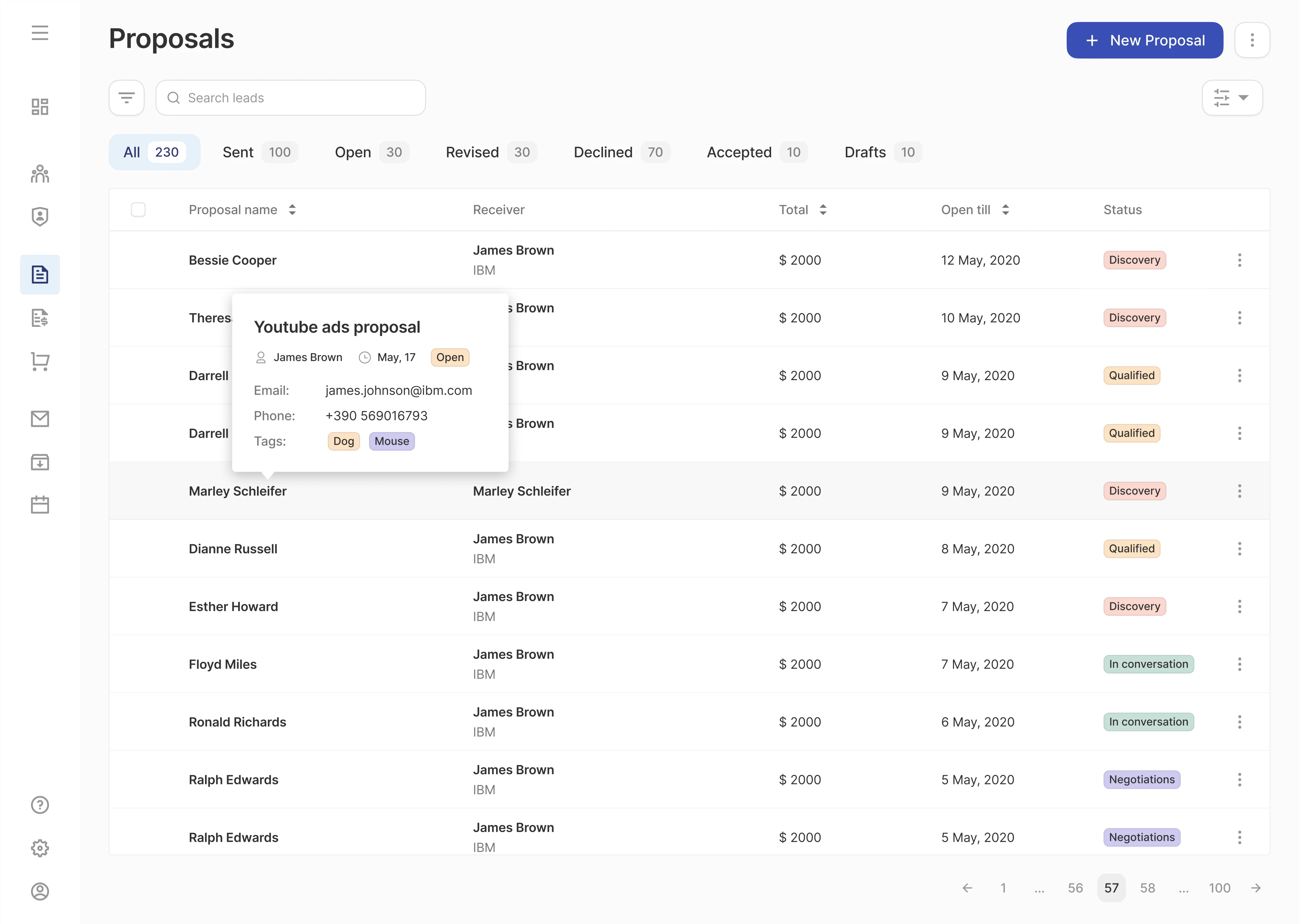
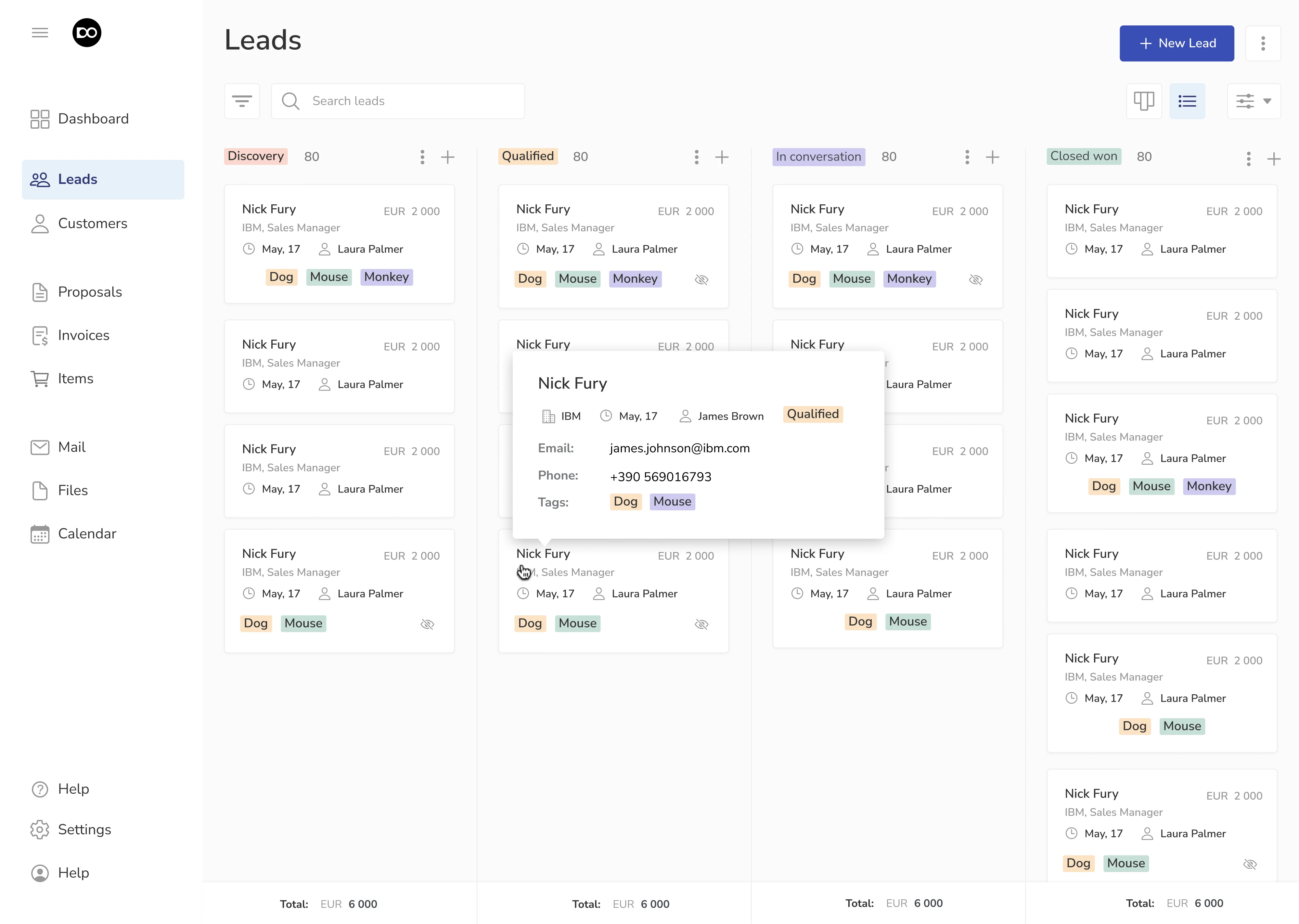
Lambda turned to Eleken to redesign Optiflow, their internal supply chain tool. As part of the interface, we designed a popover menu triggered by a three-dot icon. When users click on it, the popover appears with a relevant set of options.
Siena
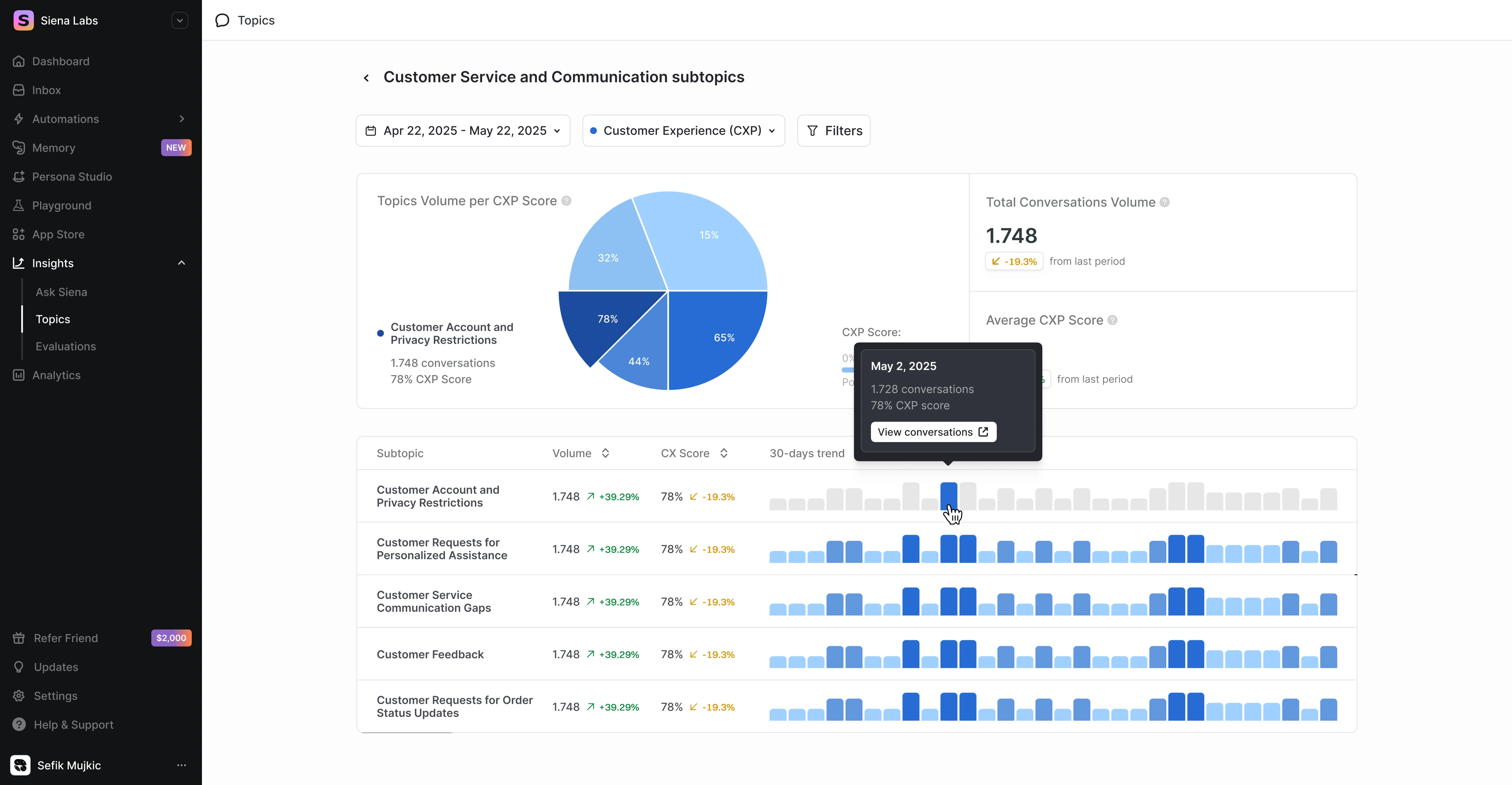
Working on Siena, a commerce agent for CX teams, we needed to visualize complex metrics. For this, we designed an interactive data table where users can hover over a data point and trigger a popover to explore more insights.
Gridle
Gridle, a client experience platform, required improving the interface from a usability standpoint. To achieve this, we introduced popovers that reveal key details about a contact when users hover over a card, simplifying access to relevant info.
Floret
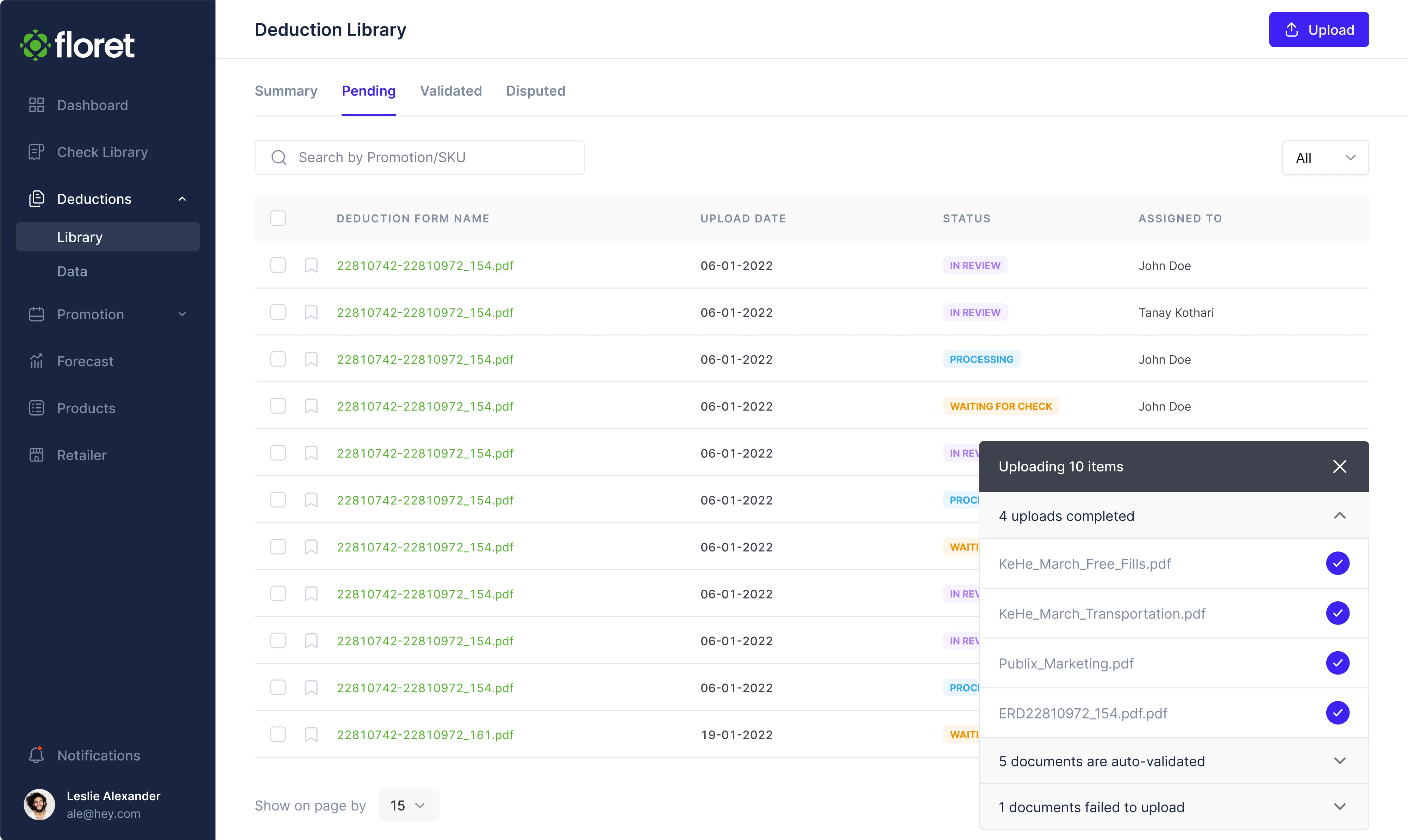
For Floret, a platform for foodtech companies, we designed a popover that appears in the bottom-right corner when a user uploads files, displaying upload status and progress. Our designer also added the option to dismiss the popover when needed.
Smartpin
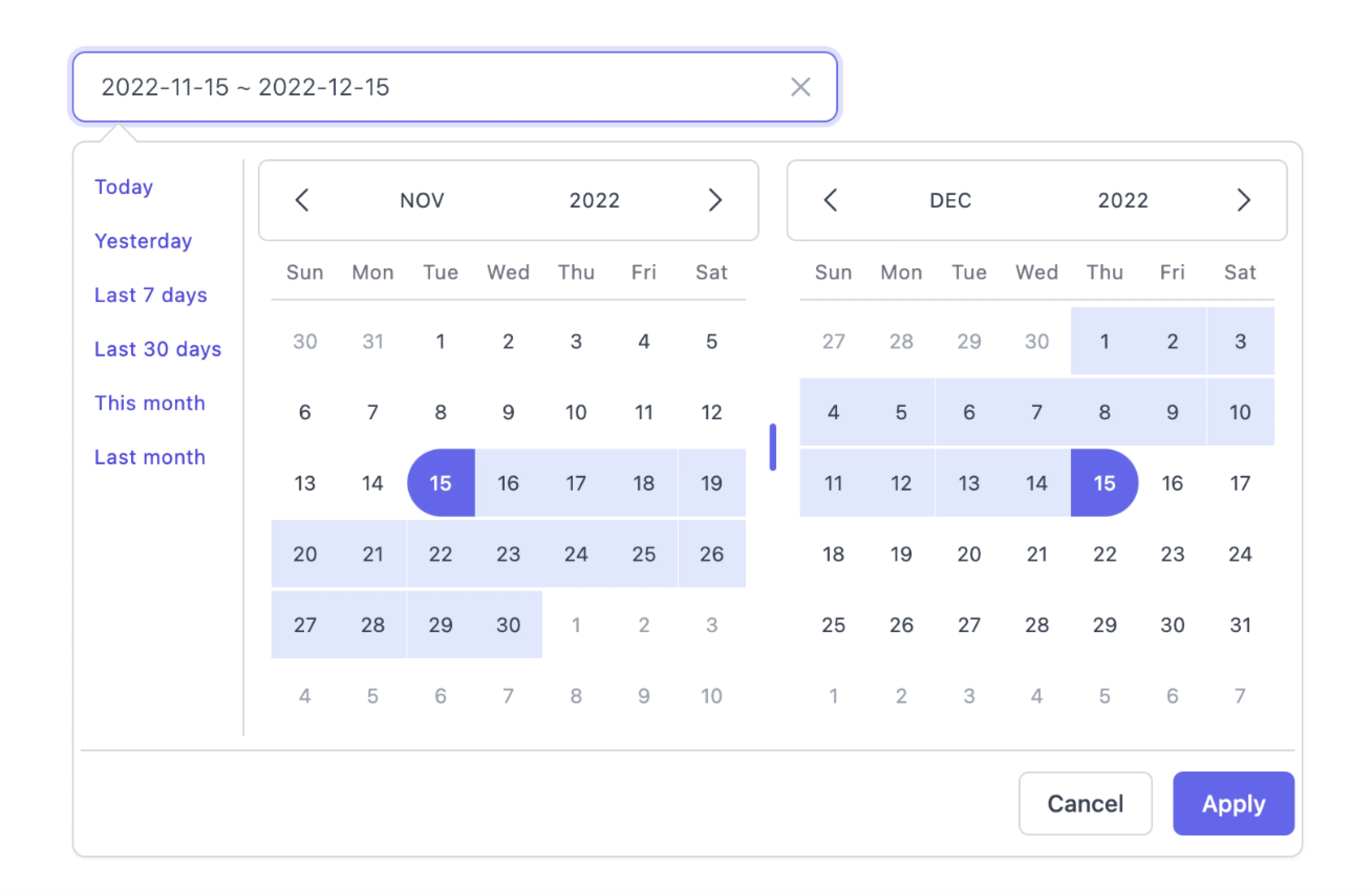
Designing Smartpin, a geospatial platform, we introduced a calendar popover that allows users to navigate through the calendar and select specific dates. This keeps the interaction lightweight and lets users quickly adjust time-based data.
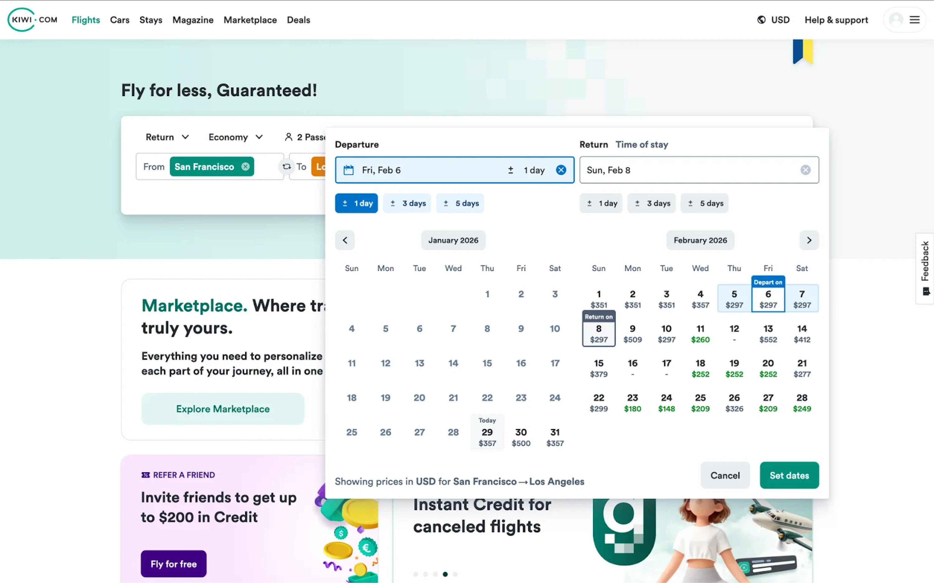
Kiwi
Another example of the calendar pattern can be seen in Kiwi.com. When users choose travel dates, a large popover appears with an interactive calendar that also displays ticket prices for each day, allowing users to compare options.
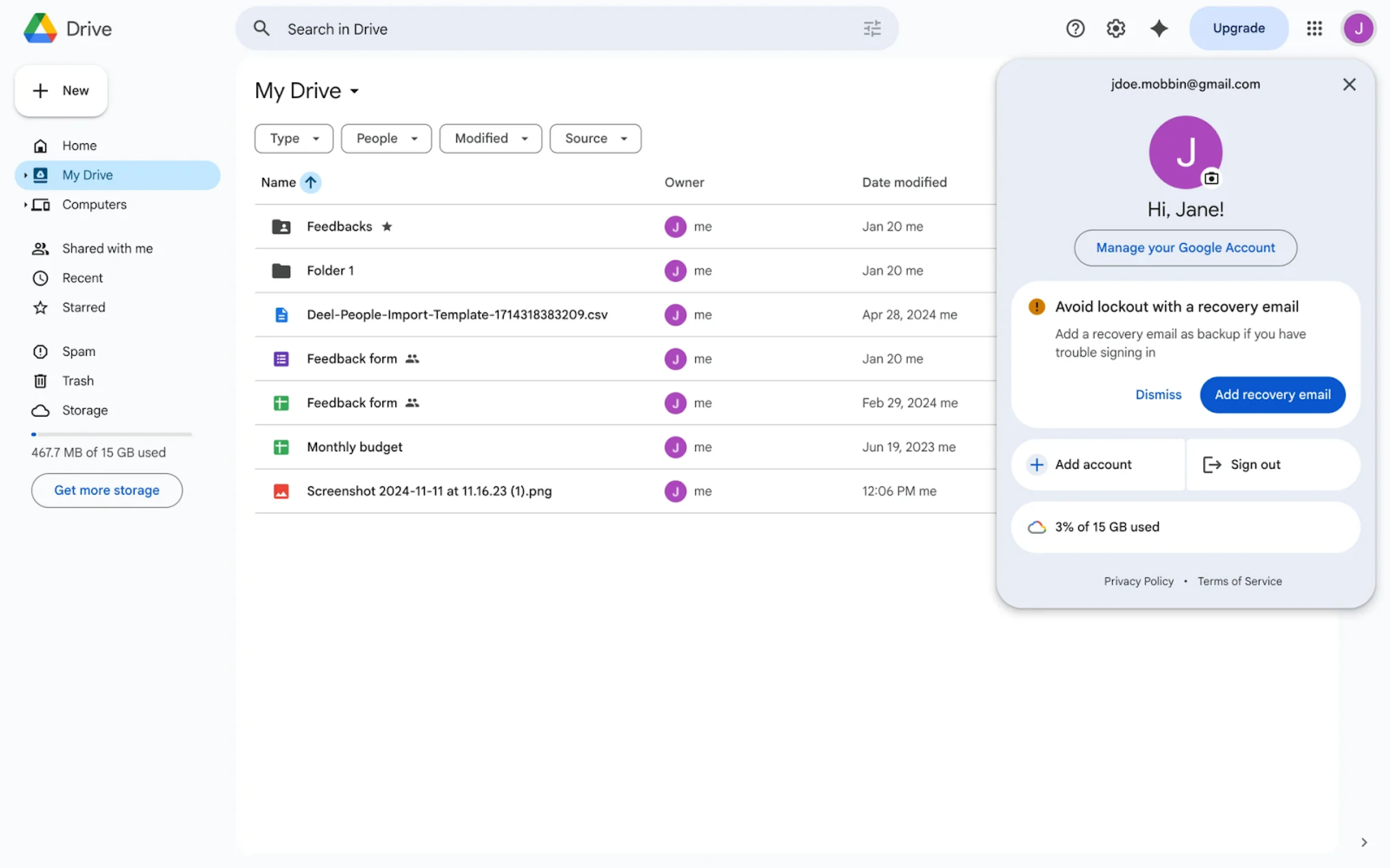
Google Drive
A common example of popovers can be seen in Google Drive, where clicking on the user avatar opens a profile popover. It displays important things, such as account details, settings, and quick actions like switching accounts or signing out.
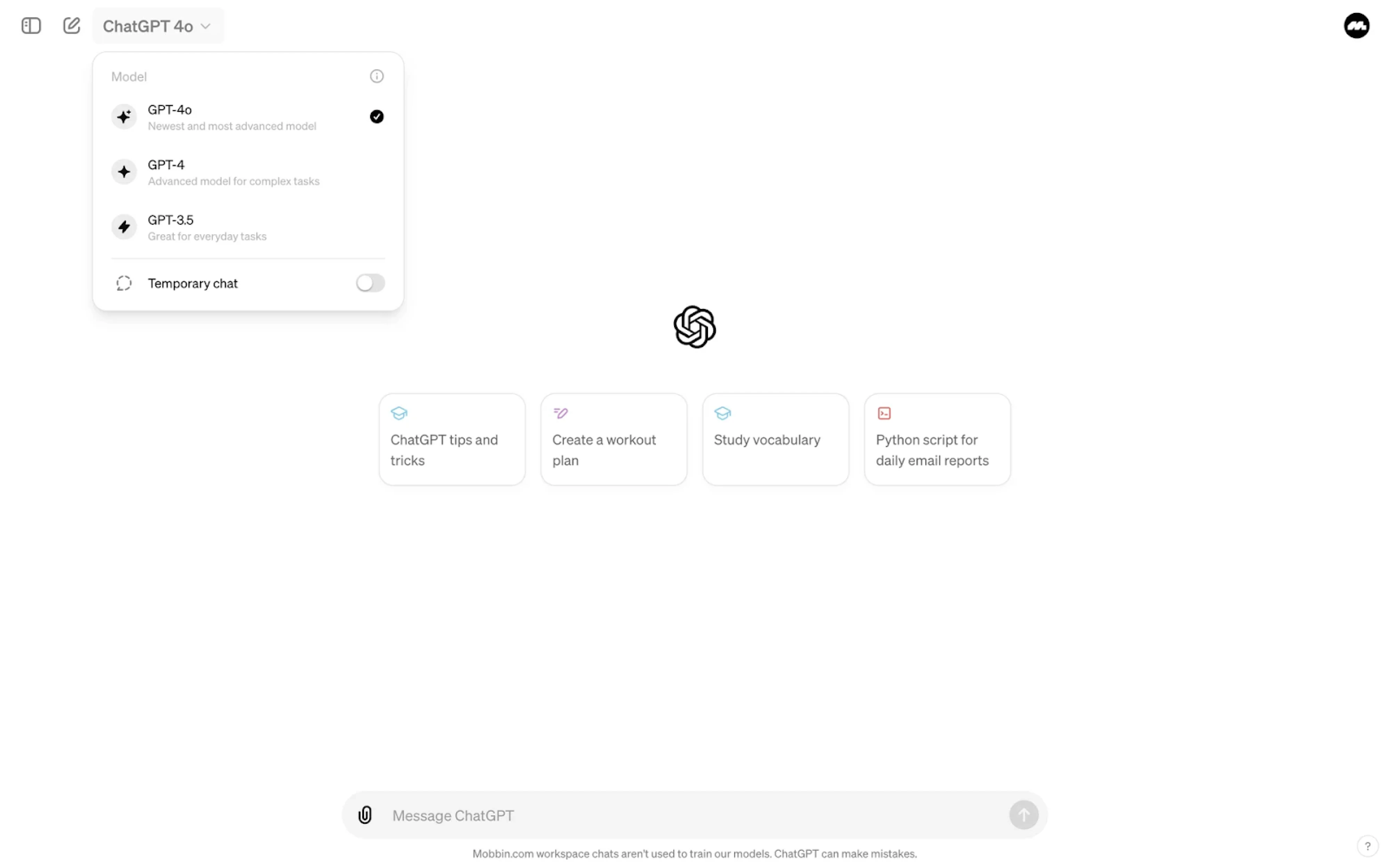
ChatGPT
In the ChatGPT interface, popovers are used to provide quick access to settings and options. For example, clicking on the model selector opens a popover with available models and controls, letting users switch between them instantly.
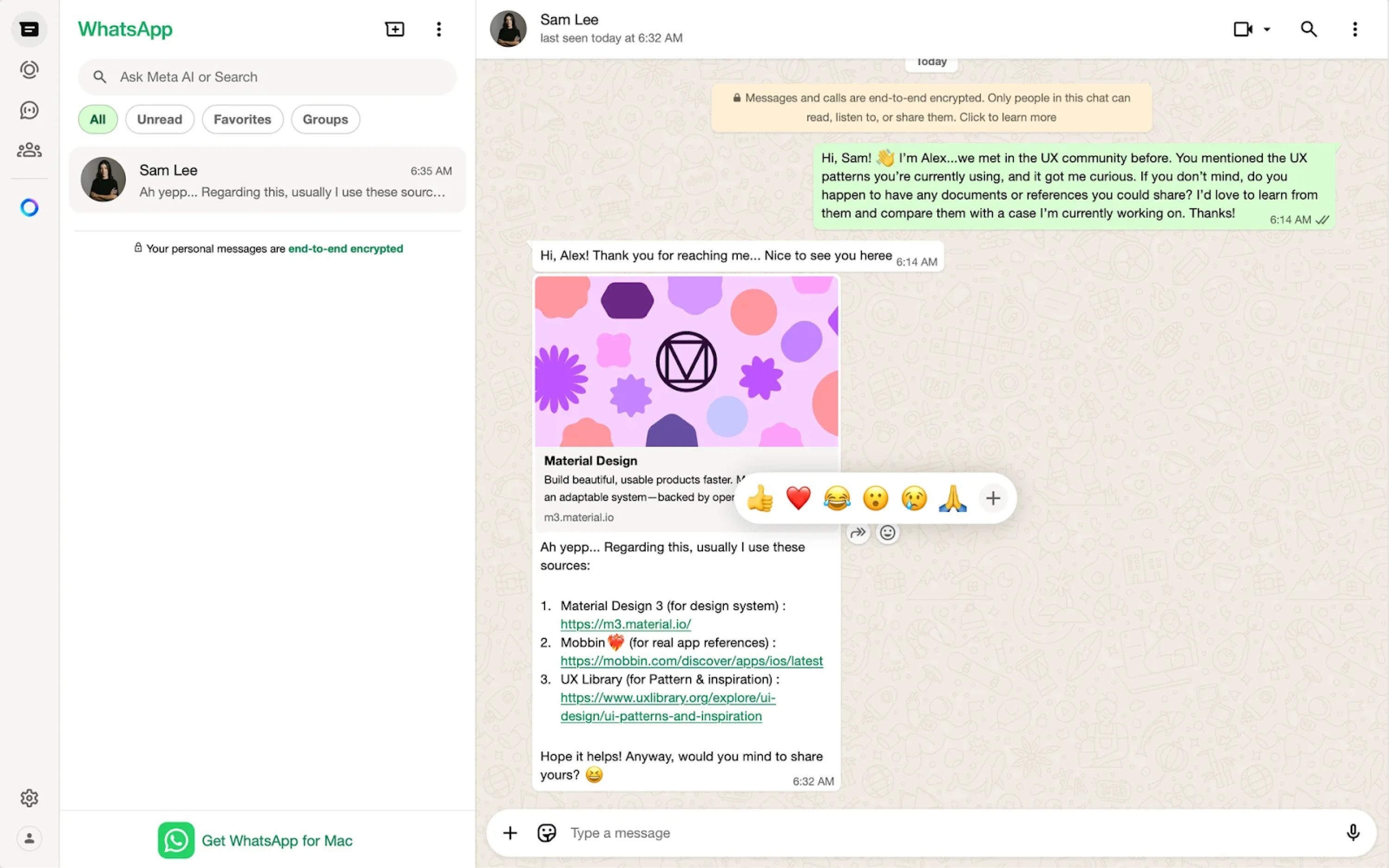
WhatsApp uses popovers to support contextual interactions like message reactions. When users hover over a message, an emoji popover appears, encouraging them to react instantly without interrupting the conversation.
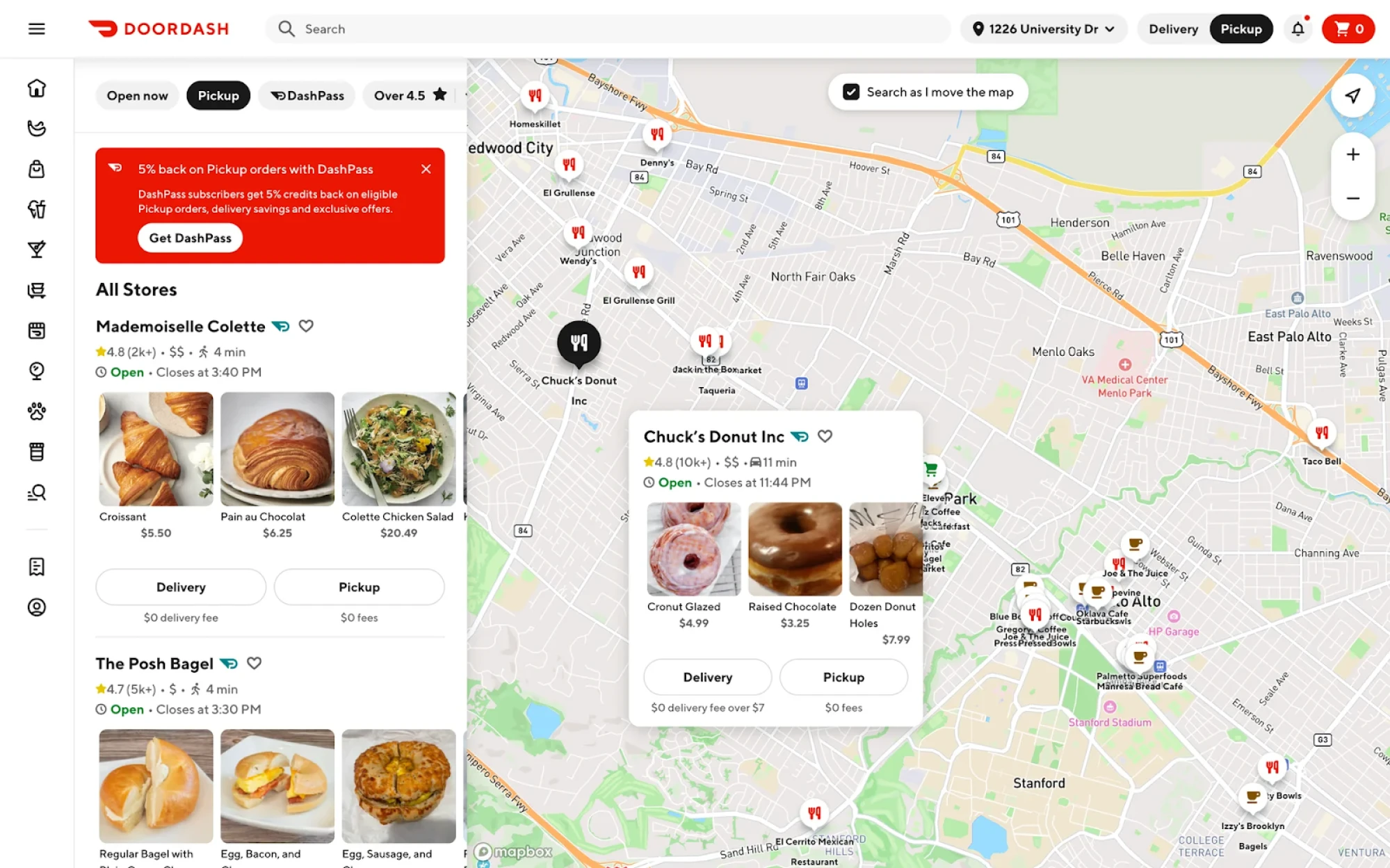
DoorDash
DoorDash demonstrates how popovers can be used in map-based interfaces. When users explore restaurants on the map, clicking on a location opens a popover with key details like ratings, delivery time, and menu items.
Wrap up
In product design, it’s often the smallest elements that shape the overall experience. A well-placed popover can make an interface feel intuitive and effortless, while a poorly designed one can just as easily create confusion.
With a clear understanding of when to use popovers and how to design them well, they can do a lot of quiet, effective work in your interface. So next time you reach for a popover, take a moment to apply what you’ve learned here.
And if you're working on a SaaS product and need a design partner to help get those details right, Eleken is happy to help.


.webp)

.webp)
.png)

.png)