Salesforce, Apple, Netflix, Pinterest, Twitter, Instagram, BBC. All these companies have one thing in common that you might have never noticed. They all use a card-based UI design.
Cards, cards, cards - cards are practically everywhere. Pay attention and you’ll start noticing that most of the apps and platforms these days use UI cards in one or another way.
But why are UI cards so popular, and what apps and platforms will benefit most from this solution?
We at Eleken, a SaaS product design agency with 100+ designers and deep expertise across data, AI, and geoservice products, in the no-code/low-code niche, apps for developers, have delivered numerous projects where UI cards became the core of the user experience. In this article, we’ll explore what makes cards so effective and where they work best.
What is a UI card?
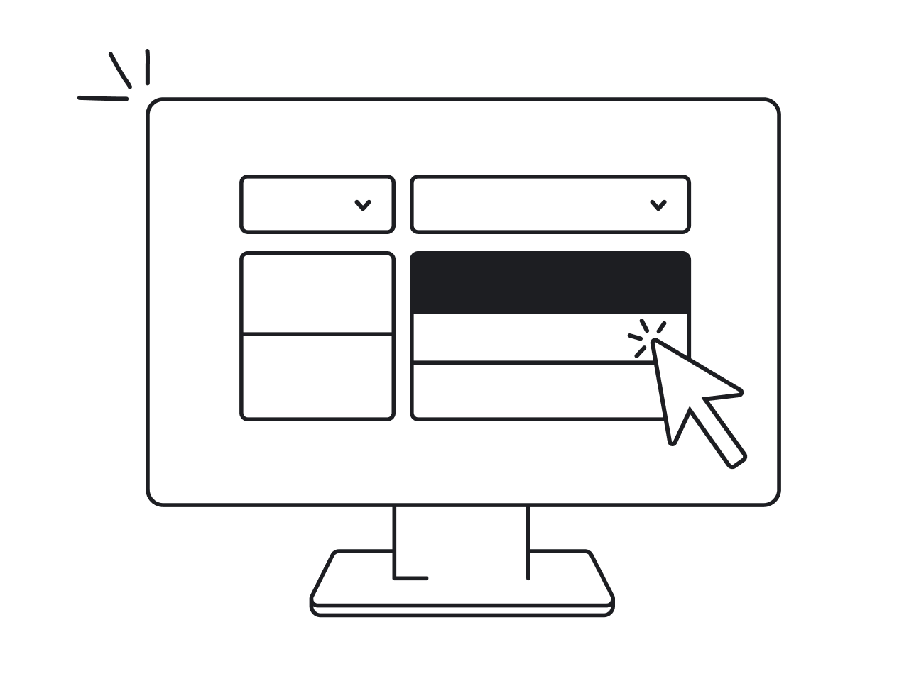
Cards are UI components, basically content containers. A card component is a versatile UI design pattern that groups related information into a visually distinct, clickable container. Usually, cards contain the image, title, description, call to action, and sometimes subheadings or icons, along with various text elements such as headers, subtitles, and supporting text. Cards are united by the same concept where each card represents one idea, item, or piece of content.
This UI component is suitable for different content types, making them adaptable for dashboards, social aggregation, or detailed comparisons. Nielsen Norman Group defines a card as a UI design pattern that groups related information in a flexible-size container visually resembling a playing card.

Card-based design is part of the modular design approach that relies on independent transformative elements, making cards effective for displaying information in discrete units. Cards in UI design refer to independent components that can be easily rearranged or customized. Cards present information in a clear and accessible way. Nowadays, it is one of the most common design layouts. And there are a few good reasons for that. Its versatility explains why cards dominate dashboard design examples, modern form design, and increasingly, chatbot UI.

Best card UI design examples
If you are considering using cards for your app or platform you could use some UI card design inspiration. We collected some examples of effectively implemented UI cards:
SaaS businesses
SaaS businesses can use UI cards as a good UI solution. Tendx, one of our recent projects, is a great example to prove this. It is a platform that connects global shippers and carriers. Eleken designers used a card-based layout for most components of this platform. UI cards represent tenders, the main element of the logistics platform.

For complex edtech platforms like Highpoint, users need to access a lot of information quickly. Cards helped us solve this by organizing key elements like exams, class schedules, and grades into separate sections on one dashboard. This way, users could see everything at a glance without having to switch between different screens, making the experience much more efficient and user-friendly. Cards can also support multiple actions, allowing users to manage tasks directly from the dashboard. To keep this volume of data manageable, patterns like filter UX, accordion UI, and list UI design play a key role, as seen in many effective screen design examples.

For PayUp, the challenge was simplifying the invoice creation process, which was previously slow and required users to navigate external services. To fix this, we designed a streamlined, in-app solution using cards. Each card represents a discrete block of information that users can easily fill in, minimizing unnecessary fields and keeping everything on one screen. We included ui controls such as buttons and input fields within each card to make the process interactive and straightforward. This card-based approach reduced complexity, allowed users to focus on one task at a time, and sped up the entire process, making invoice creation fast and intuitive.

For Datawisp, cards are the main part of the interface, making data analytics more visual and easier to use. By using cards to represent data sources, queries, and results, users can work with numbers without writing code. Each card can have a primary action that leads to more detailed information, serving as an entry point for users to access comprehensive details. This makes it simple to discover insights and manage data in a clear, organized way, with cards acting as entry points to detailed information.

Media
Cards work well for brief summaries of articles, posts, and such, often with photos to enhance visual appeal. This is proven by such companies as X (ex-Twitter), Instagram, BBC, and many others, which use UI cards for posts.
A card displays relevant information in a concise format, making it easy for users to quickly scan and find what matters most.
Media platforms typically present multiple cards organized into collections, allowing users to browse a variety of content efficiently. To deepen interaction, these collections are often paired with modal UX for focused actions, slider UI for quick exploration, radio button design for simple choices, and carousel UI for effortless content discovery.

Entertainment platforms
Users browse through and interact with UI cards with entertaining content, which often contain rich media such as video previews or trailers. The best example here that we all know is Netflix. Pay attention to their pop-up effects.
Users can also swipe through cards to discover new content. Selecting a card can lead to a new screen with more details.

E-commerce or delivery apps
In this case, UI cards make the process of browsing products or any similar items much easier and user-friendly.
Action buttons, such as "Add to Cart" or "Buy Now," are often arranged in a row at the bottom of each card for better alignment and accessibility. Product cards may also include supplemental actions like adding to a wishlist or sharing, typically placed at the bottom of the card. When there are multiple actions or limited space, an overflow menu can be used to organize additional options and supplemental actions efficiently. The same logic extends to layouts that mix input field design, tabs UX, stepper UI examples, or even map UI design when actions need to stay discoverable without clutter.

Task or activity managers
For this type of solution, you can display tasks or habits in the form of cards, where users can interact with a single card to manage a particular task. Each card represents a particular piece of information or activity, and may offer two actions, such as marking complete or editing. Other elements in the app, like special offers or articles, can also be represented as UI cards. These cards become even more flexible when paired with toggle UX and checkbox UX, while time picker UX and popup UI handle quick edits without pulling users out of the flow.

Ed-tech products
Courses or teachers' profiles can be reflected as cards. These cards are typically organized into a collection, allowing users to easily navigate through multiple options. For instance, when working on the design of PublishXi, an online system for publishing educational content and creating learning programs, Eleken designers used UI cards to make the platform more interactive and simple to operate with. Ed-tech platforms frequently use card layouts to present learning materials, as this approach enhances usability and supports content comparison. Additionally, collections of cards can often be filtered or sorted by users, making it easier to find relevant courses or profiles.

Dashboard apps and platforms
Card ui design patterns are a great solution for products that have a lot of dashboards. The space between cards helps the user focus and not feel overwhelmed by the complexity of dashboard data. The way cards are grouped and arranged directly affects how information is perceived by users, making it easier to scan and understand. Data within each card is presented clearly, allowing users to quickly grasp key insights. Dashboards often use cards to display different content types, such as charts, tables, or summaries, ensuring each type of information is shown in the most effective format. Table design UX fits naturally inside cards when data gets more detailed, while empty state UX and drag and drop UI give users clear guidance and control as dashboards evolve.

Real estate platforms
Cards can also be a great solution for real estate platforms. Every item for purchase or rent can be reflected as a card. Users can easily compare a card to other cards in the listing, making it simpler to evaluate different options side by side. As a result, it simplifies the process of browsing the website.

Apps with profiles
Dating, healthcare, consulting, pet, or any other types of apps where the main element would be the profiles are the perfect match for UI cards. Pay attention to the animated features our designers used to make the UI card design more engaging. You can also make the entire card interactive by applying specific classes, allowing users to select a profile by clicking anywhere on the card for a smoother experience. By connecting profile cards with contact form design and calendar UI, apps move from simple discovery to real interaction and intent.
Why use card UI design?
Thanks to the bright image element, small bits of information, easy-to-click CTAs and similar, UI cards grab users' attention. They have better scrolling rates and bring more impact than lists. A card displays information in a visually engaging way, making it easier for users to browse content. Cards often serve as entry points to a new page within the app or website, guiding users through the content journey.
- Highly responsive. Probably the main advantage of UI cards is that they are very adaptive. It’s the rectangular shape that makes them transformative. That is why UI cards look good on all screen sizes.
- Easy-to-understand. UI cards are rather minimalistic and understandable design elements. Small chunks of information they reveal are easy to consume.
- Intuitive and UX friendly. Most users are familiar with the card interface design and can easily navigate through it. Rectangular shape and simple clickable elements make the user experience very intuitive.
- Clickable. UI card is a perfect instrument to make clients interact with your product. Compact and well-designed cards with the right CTA make users want to click and share instantly. Clicking a card can lead to a separate page or detail screen with more information, allowing users to explore content in depth. Cards can also include multiple actions, such as UI controls or overflow menus, often implemented through drop down menu UI in profile page design, to enhance user interaction.
- Attractive and modern-looking. Despite the fact that card-based design has been around for a decade now it is still an up-to-date design solution. Their key visual element makes it easy to make any product attractive using this layout.
How to create a UI card?
1. Define the card's purpose and content
Before you start designing, it's crucial to understand what your card will do. Ask yourself:
- What information will the card display?
- What's the primary function of the card? (e.g., summarizing info, prompting action, or aiding navigation).
2. Set up the card container
The container is the foundation of your card. Consider these elements:
- Choose between a fixed or responsive width.
- Decide on the height (fixed or dynamic based on content).
- Add appropriate padding inside the card.
- Select a background color (typically white or light shades).
- Implement a subtle shadow or border for depth.
3. Structure the content
Good organization is key to an effective card design:
- Divide your content into clear sections (e.g., header, body, footer).
- Establish a clear visual hierarchy to guide the user's eye.
4. Add the header (if applicable)
The header is often the first thing users see:
- Include a title or the most important piece of information.
- Consider adding an icon or small image to enhance visual appeal.
5. Design the body
This is where the main content lives:
- Add your primary content (text, images, etc.).
- Use appropriate typography to ensure readability.
- Incorporate white space to prevent visual clutter.
6. Include a footer (if needed)
The footer can provide additional context or actions:
- Add action buttons or links.
- Consider including metadata or supplementary information.
7. Style interactive elements
Make sure interactive parts of your card are clear and accessible:
- Design hover and active states for buttons or clickable areas.
- Ensure sufficient contrast for accessibility.
8. Optimize for different states
Cards should look good in all scenarios:
- Consider how the card appears when empty or loading.
- Design error states if applicable.
9. Test responsiveness
Your card should look great on all devices:
- Ensure the layout adapts well to different screen sizes.
- Adjust padding, font sizes, and layout as needed.
10. Apply finishing touches
The details make the difference:
- Fine-tune spacing and alignment.
- Add subtle animations or transitions if appropriate.
- Ensure consistency with your overall design system.
11. Test and iterate
Perfect your design through feedback and refinement:
- Review the card in context with other UI elements.
- Gather feedback and make necessary adjustments.
If you encounter issues with card implementation, consider submitting a support file or ticket for further assistance.
Best UI card design practices
Now that you have seen some successful card-based apps and platforms, let’s find out how to make a card design that stands out:
- Images are extremely important for UI card design. They are the main grabbers of users’ attention. So keep a defined visual style, as otherwise your design will look off-putting. Remember to use transparent backgrounded images for your UI cards.
- Resolution is the key. We love cards for their responsiveness. So it’s very important not to mess it up with the wrong resolution of images. Use images for high DPI-screens to avoid pixelation.
- Round the edges. Our designers recommend this trick to create more visually appealing cards and make users feel relaxed.

- Spacing is another way to shape the general look. It is recommended to leave enough space around the cards for the user’s convenience. On the other hand, no spacing at all can also look great, just like more spacious images. When working with multiple cards, arrange them thoughtfully to maintain optimal usability and visual consistency.

- Play with the size. Adjustable size of UI cards is your opportunity to shape the general look of your digital product. You can align UI cards and let the user focus on the content, or, on the contrary, make some cards bigger than others to draw attention to them.

- Use animation. It is one of the ways to make your card UI design stand out. But be careful, too many animated elements will make your design look cluttered. Cards can support multiple actions, but avoid adding too many interactive elements to prevent clutter. One animated feature or a video instead of the main image will do.

- Use colors, shading, and effects. Without all that, cards might look boring. For example, flipping is a very natural move borrowed from playing cards. Use it wisely and remember that it looks better on smaller cards. Scrolling is a good idea for the set of cards. But avoid scrolling within one specific card, as the content might look very confusing.

- Use different card forms for different types of devices. Mobile UI card design is not the same as the web card user interface. Square cards look better on mobile devices, while rectangular cards work best for web apps or sites. Take this into account when grouping cards into columns,as mobile screens require fewer columns.

- Less is more. Avoid cluttering your UI cards with too many buttons and content. Display only the most useful information and reveal more by drop-down or flipping. A single card should not be overloaded with actions; keep interactions simple and focused.
Is card UI design always the best solution?
UI cards are great. Designers love them, developers love them, users love them. But is card UI design really a one-size-fits-all solution? Here’s where you need to decide. With skilled designers, cards really can make wonders for almost any web or mobile app. But there are also certain things to keep in mind:
- UI cards are less hierarchical than list layouts. They are better for browsing than for searching. So if you work with data or elements, where the order is important, it’s better to choose a more vertically structured list layout.
- Another important reason to reconsider building your website or application with UI cards is that they are used by many companies these days. Hence it’s not easy to stand out in the crowd. On the other hand, with the right visuals, card design never looks boring.
- Cards take more space, so for quick scanning of the titles the list is more effective. The same works for repetitive content. So if you need your user to go through a bigger amount of data or components where titles are more important than visuals then we recommend considering other layouts.
- Cards themselves are flexible components, but only to a certain extent. In the end, it’s always the number of rectangular elements. So if you need your user to go through a larger amount of data or components where titles are more important than visuals, then we recommend considering other layouts.
Conclusion
A card-based UI design has become a staple in the digital landscape. It's embraced by industry giants for its flexibility, responsiveness, and user-friendly nature. As we have seen, cards are highly adaptable, making them suitable for a wide range of applications, from SaaS businesses to media platforms, entertainment apps, and beyond. Their simplicity and intuitiveness enhance user experience, while their visual appeal adds a modern touch to any digital product.
However, while card UI design offers numerous advantages, it's not a one-size-fits-all solution. The decision to use card-based design should be based on specific project needs, considering factors like content hierarchy, uniqueness, and the extent of data presentation required. Cards work exceptionally well for browsing-driven interfaces but may not be ideal for data-heavy applications where a structured list layout could be more effective.
Ultimately, the success of a card UI design hinges on thoughtful implementation. Prioritizing clear images, appropriate spacing, subtle animations, and mindful use of colors and effects can elevate the design, making it not just functional but also engaging. Remember, the goal is to create a seamless, enjoyable user experience that blends aesthetic appeal with practical utility. As with any design approach, the key is balance: leveraging the strengths of card UI design while tailoring it to your product's unique demands and identity.
At Eleken, a subscription-based UI/UX design agency with a 4.9 Clutch rating and over 200+ successful projects, we use card UI patterns strategically across a wide range of SaaS verticals, especially complex B2B, data-heavy, and AI-driven products. In Datawisp, for example, cards were the core interaction model. By redesigning them to be more intuitive, scannable, and functional, we helped the startup significantly improve usability, contributing to the success of their $3.6M seed round.
If you’re unsure whether UI cards are right for your product, don’t hesitate to drop us a line. We’re always happy to share expertise and help you find the best solution for your app’s unique needs.


.webp)
.png)

.png)