

Being a UI/UX designer means navigating specific terminology, and “prototype” is one of those terms. Everyone uses it, but not everyone means the same thing. That uncertainty often leads to either overbuilding or underbuilding.
At Eleken, we’ve worked on 200+ SaaS projects across different industries. Based on that experience, we’ll walk you through real examples of prototypes and share practical tips to help you understand what to build, when, and why.
Let’s start by defining the term properly.
What is a prototype?
A prototype is a testable version of your idea. It represents how your product is supposed to work, but without the time and cost of full-scale development. Depending on your goals, it can be low-fidelity, mid-fidelity, or high-fidelity.
The main purpose of a prototype is validation. You put something tangible in front of users and observe how they interact with it. You can see where they hesitate, where they get confused, and whether the overall experience makes sense.
It’s also important not to confuse a prototype with similar terms:
- A mockup focuses mostly on visual design.
- An MVP is a functional product released to real users.
- A proof of concept tests technical feasibility.
A prototype sits in between. It focuses on experience and interaction. It helps designers, stakeholders, and developers visualize how the product should behave before moving to later stages of the development process.
If you’d like a more detailed explanation, explore our guide on UX prototype.
Prototype examples by type
With different fidelity levels available, you’ll eventually face a practical question: what kind of prototype should you actually build? The right choice depends on the project requirements and what exactly you’re trying to validate.
To make this clearer, let’s look at prototyping examples grouped by fidelity.
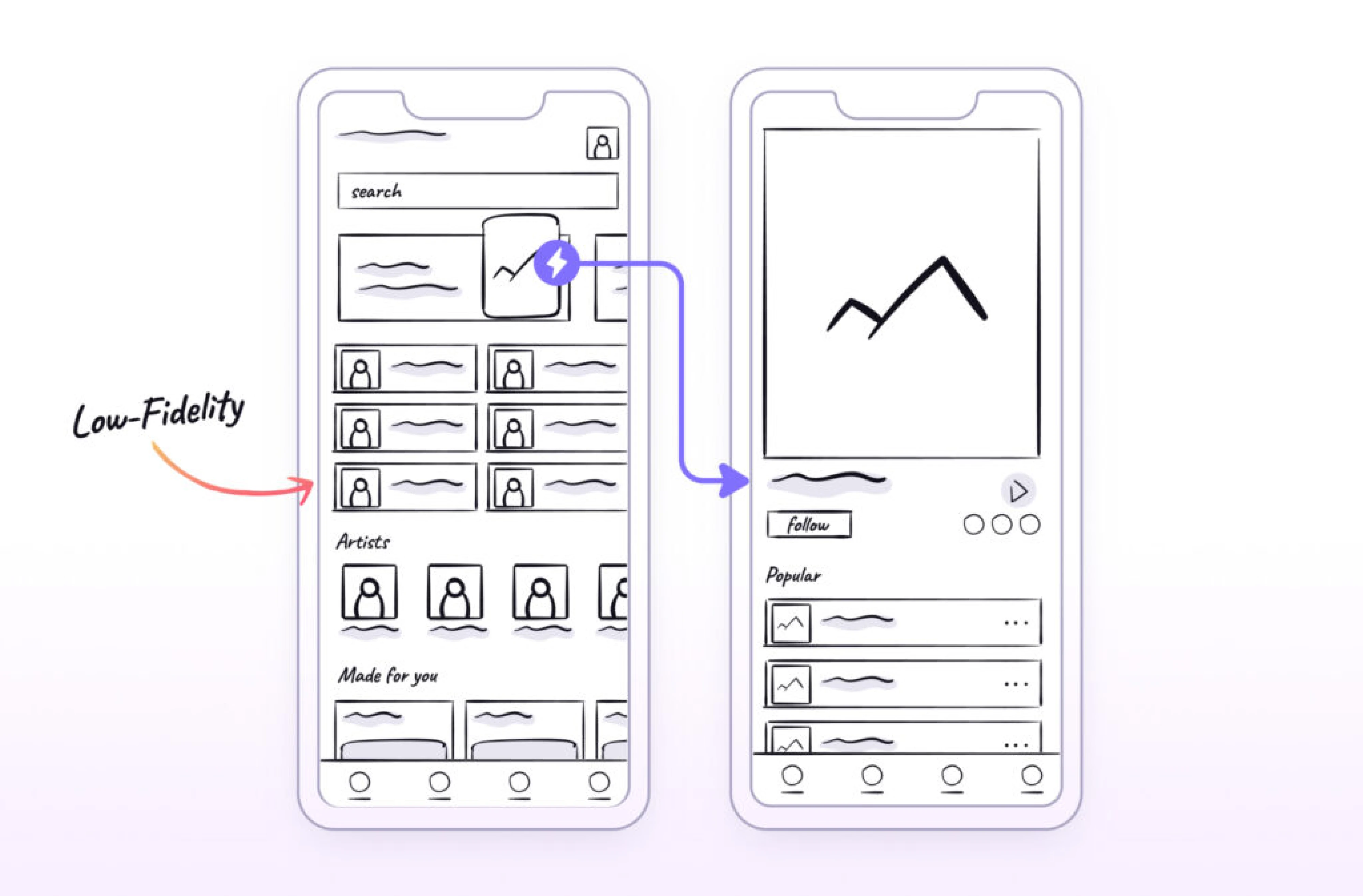
Low-fidelity prototype
A low-fidelity prototype is the fastest way to visualize a product idea. It focuses on structure, layout, and user flows rather than colors, typography, or detailed design elements. At this stage, clarity matters more than aesthetics.
Low-fidelity prototypes are often created as paper sketches, whiteboard drawings, or simple grayscale wireframes. They help teams align on how the product should work before moving into the design process or development.
Low-fidelity prototypes are especially useful when:
- You need to validate logic and navigation.
- You are exploring multiple structural directions.
- The core user flows are still undefined or unclear.
- You want user feedback before committing to visual design.
- The project is broad, complex, or involves multiple stakeholders.
At the same time, it’s worth noting that low-fidelity prototyping is not a mandatory step. In design communities, many professionals share that they sometimes skip this stage when the scope is small and the direction is already clear.
Mid-fidelity prototype
A mid-fidelity prototype sits between rough structural sketches and fully polished interactive designs. It keeps the focus on layout, hierarchy, and usability, but introduces clearer interface elements and basic interaction.
These prototypes include more realistic spacing, button styles, input fields, and content blocks, but still avoid detailed branding, final visuals, or complex animations. The goal is to test usability without being distracted by aesthetics.
Mid-fidelity prototypes are especially useful when:
- You want to evaluate task completion and navigation clarity.
- Stakeholders need something more concrete than wireframes.
- You are preparing for usability testing sessions.
- Developers require clearer interaction logic before implementation.
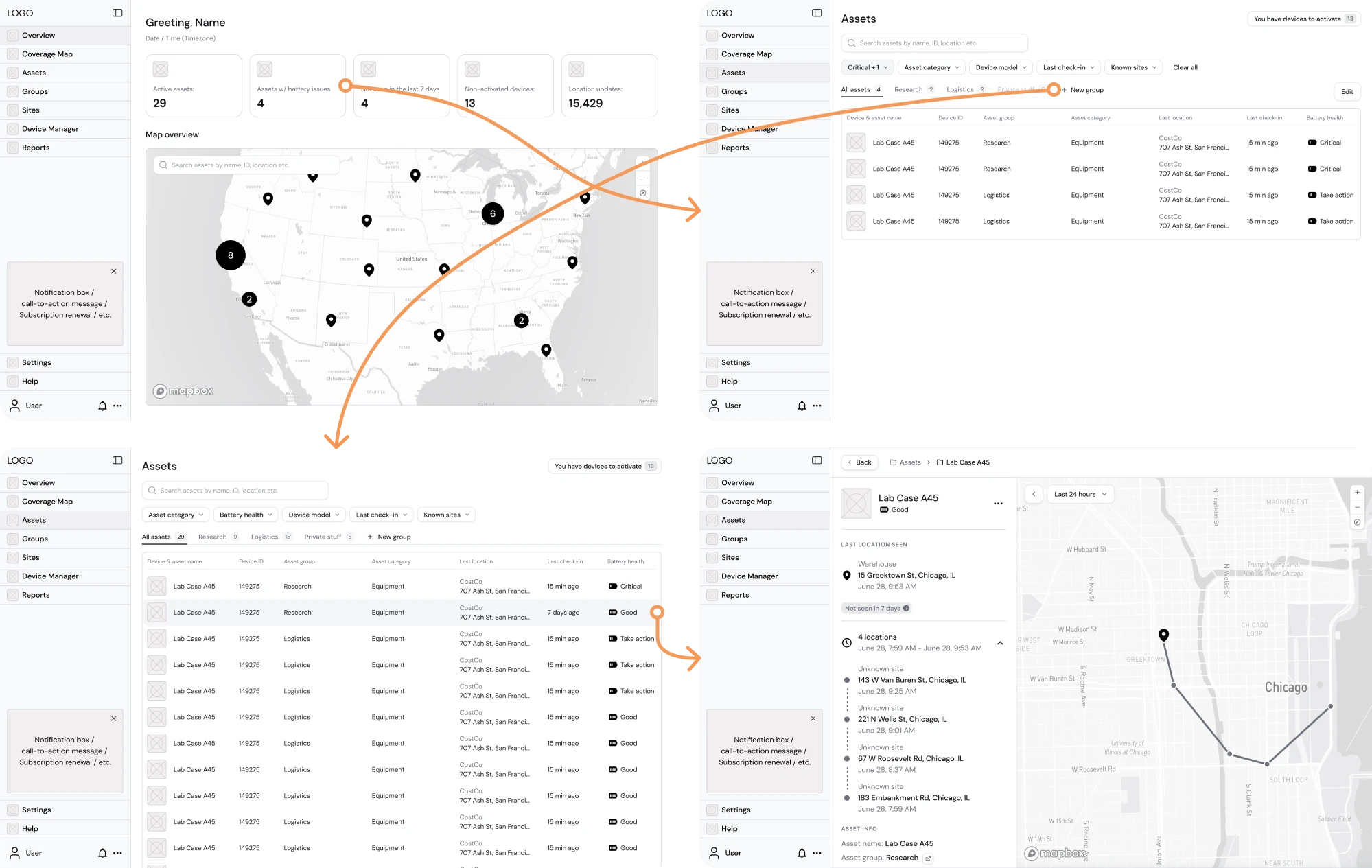
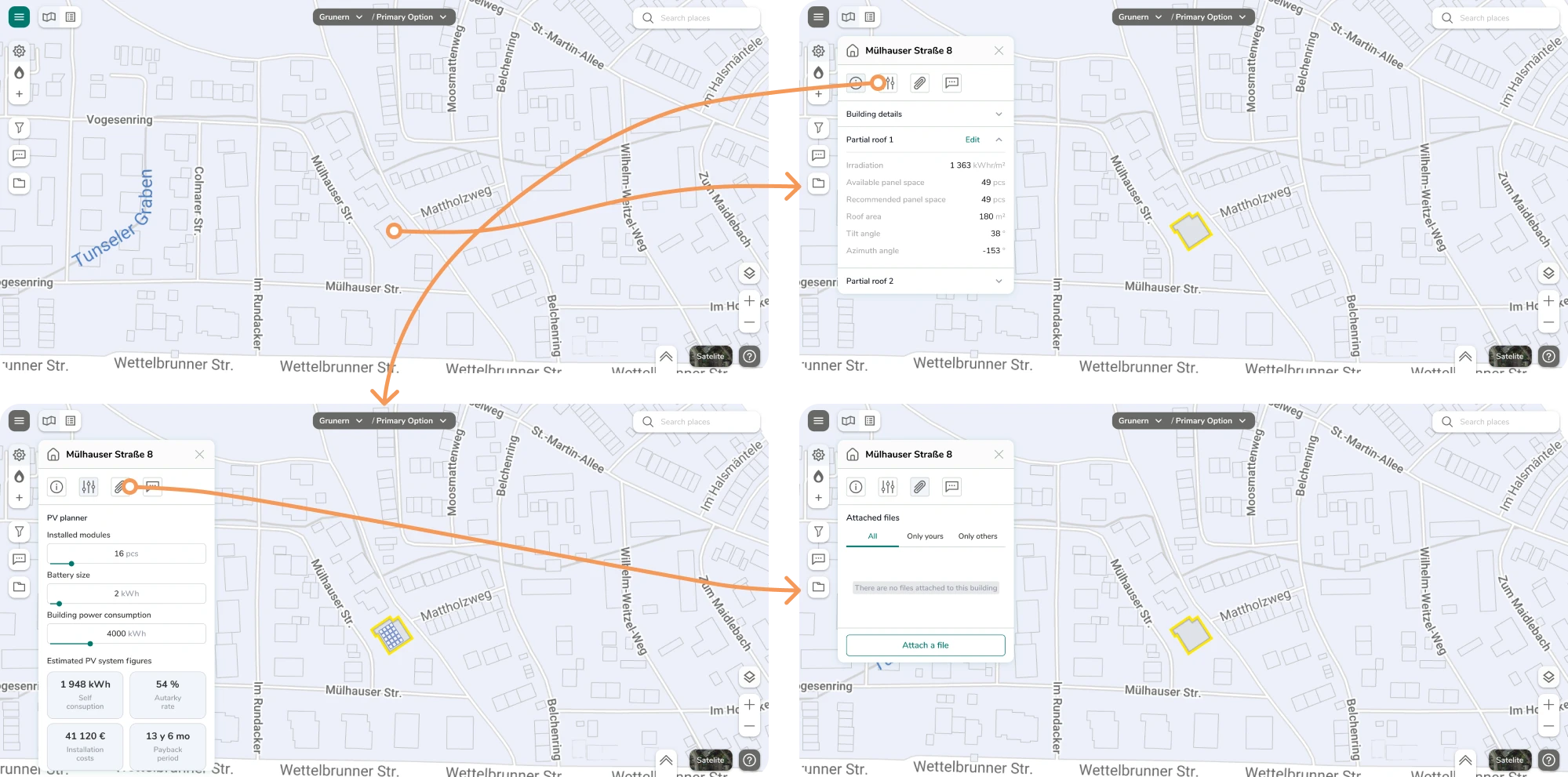
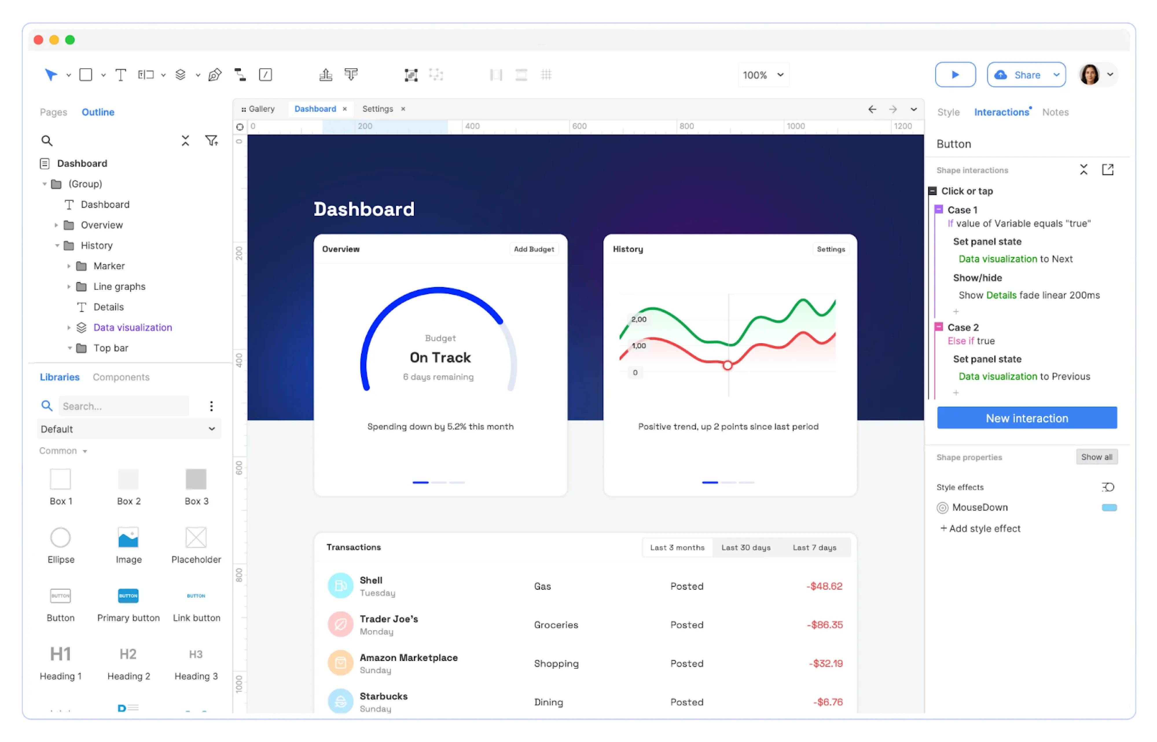
A great example of a prototype comes from our work with Hubble Network. The company had a powerful concept for Smartpin, a geospatial platform, and our team stepped in to visualize a detailed Product Requirements Document (PRD).
We carefully translated every requirement into structured interface screens and focused on building a functional layout. Once the core screens were ready, we created a mid-fidelity prototype and validated whether the user flow was logical.
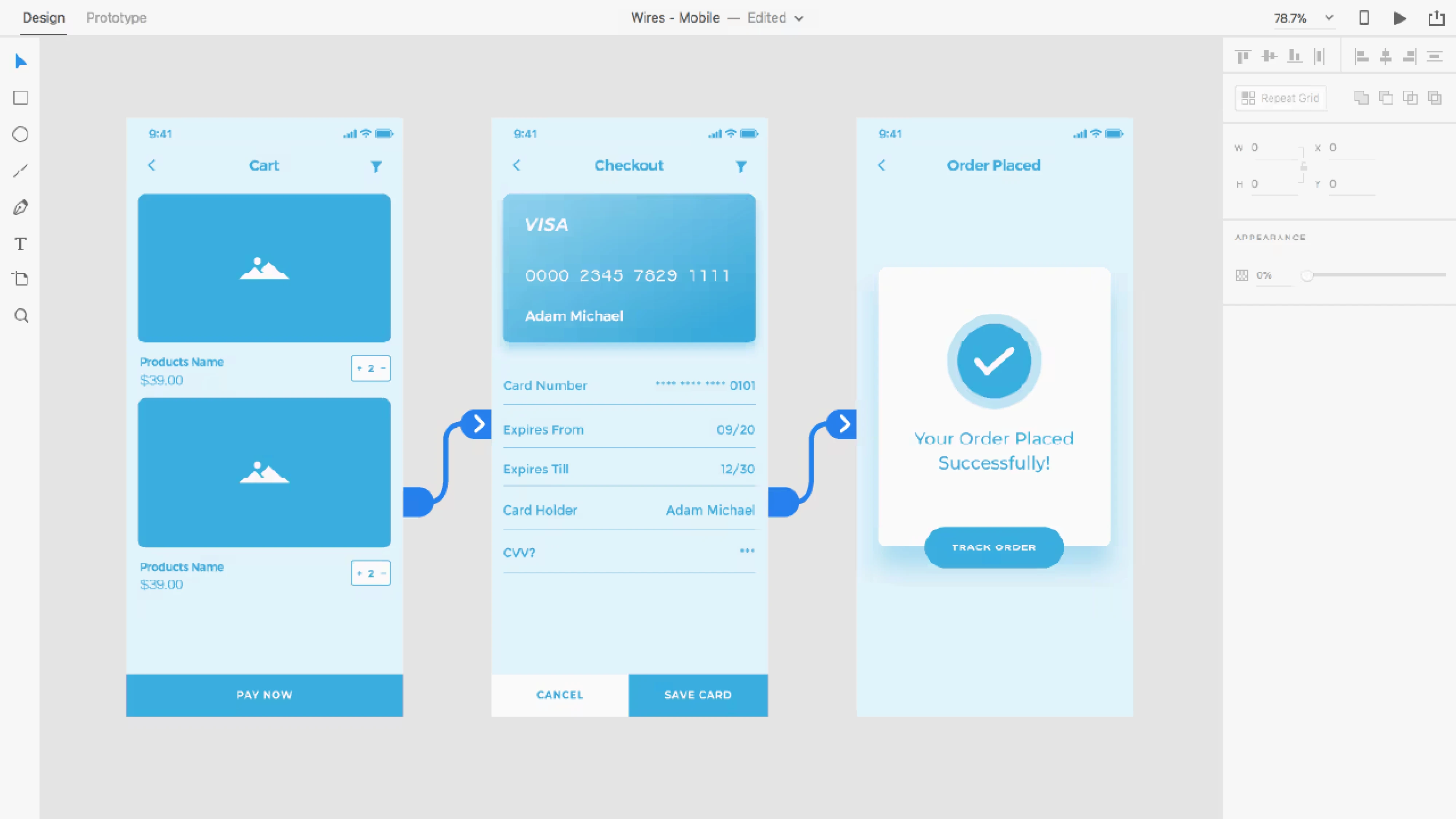
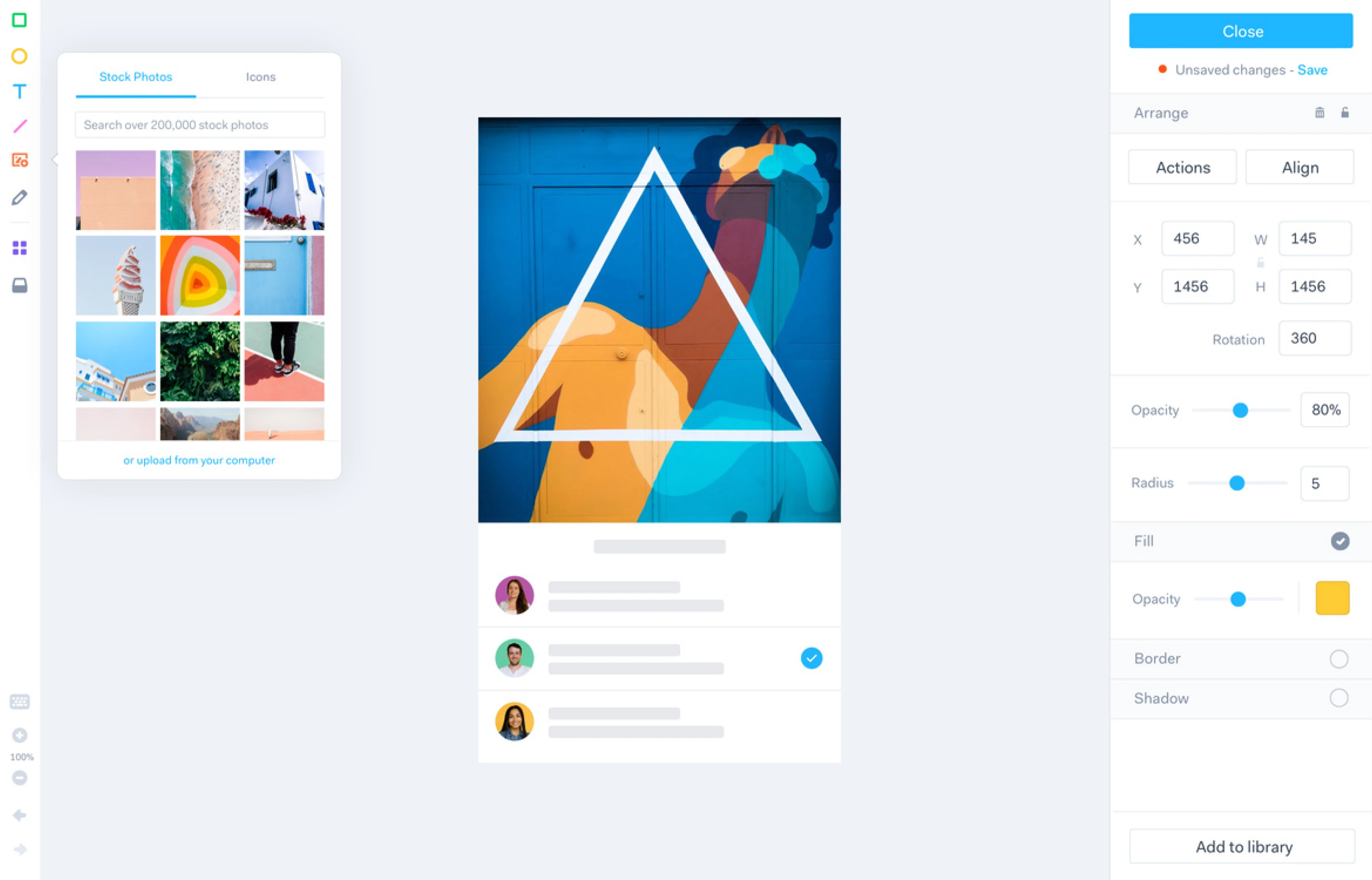
High-fidelity prototype
A high-fidelity prototype is the closest representation of the final product before development begins. It includes detailed visual design, realistic content, branded elements, and interactive behavior that closely resembles the live experience.
At this stage, the interface looks polished. Typography, colors, spacing, icons, and UI components reflect the final design system. Interactions may include hover states, transitions, dropdown behavior, form validation states, and more.
High-fidelity prototypes are especially useful when:
- You need to test detailed interactions and micro-behaviors.
- Visual hierarchy and branding play a critical role.
- You are preparing for investor or enterprise demos.
- Stakeholders require a near-realistic representation of the product.
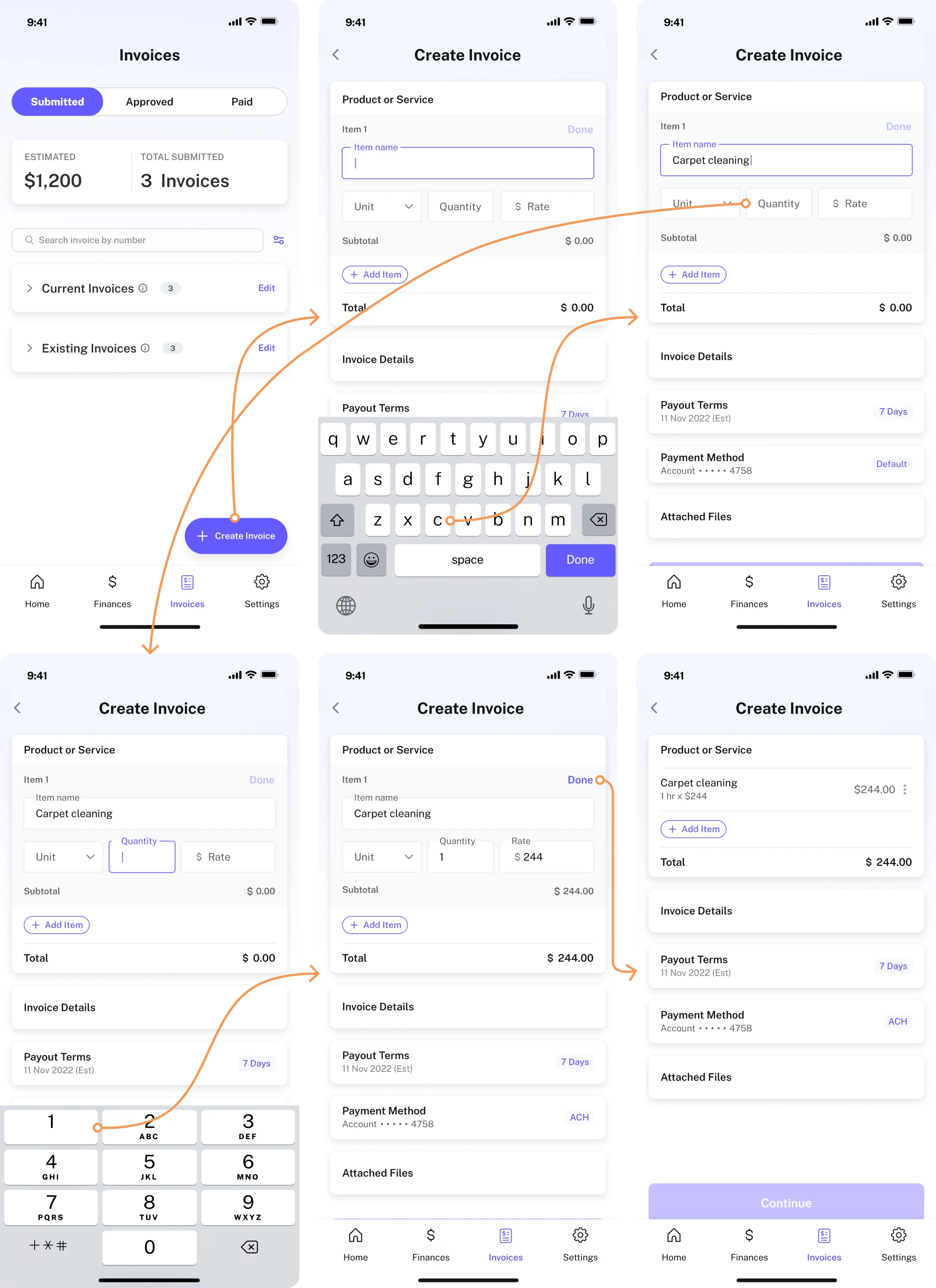
When working with PayUp, a financial startup, we needed to redesign existing screens and design new features from scratch. The client decided to introduce a new feature that allowed users to create invoices directly within the app.
To achieve this, we went through multiple iterations. We built a high-fidelity clickable prototype example to demonstrate how users would move through the invoicing flow.
This helped us evaluate whether the navigation was intuitive, whether the steps felt logical, and whether users could complete the task without friction.
Real-world examples of prototypes that became products
Many digital products started as simple prototypes built to validate a risky idea, test market demand, or demonstrate value to early users. What often begins as a rough experiment can later evolve into a fully developed product.
To show how prototypes create real value, we’ll explore examples we designed at Eleken for our clients.
1. Spoonfed
Spoonfed is a food logistics platform that approached Eleken to redesign its product. The system had been on the market since 2013, and over time, the interface became overloaded and difficult to navigate, causing multiple usability issues.
To address this, our designer simplified the navigation structure and improved filtering and file management logic. Because these changes directly affected how users moved through the system, we built a functional prototype to test the new flow.
Result: The redesigned experience received positive feedback from Spoonfed’s clients, confirming that the structural improvements worked in real use.
2. BookPeep
BookPeep is a customizable booking platform used by beauty salons, medical facilities, barbershops, pet care salons, and spas. Over time, as new features were added, the platform became increasingly difficult to navigate.
During our collaboration, we focused on the Inventory screen, where users managed products and suppliers. Because this section involved multiple actions and data points, we built a clickable prototype to simulate real interactions.
Result: Peep received an improved product design and was able to deliver a smoother experience to its existing clients.
3. Polaris
Polaris approached Eleken to create the first prototype of their code security app, Tromzo, and present it to potential investors. At that stage, the platform did not yet exist as a fully designed interface, so we had to build the prototype from scratch.
We worked closely with the founders to define the system’s structure and key features. Using elements of the backend logic as a foundation, we designed the core screens and built a digital prototype in Figma, focusing on a minimalist style.
Result: In just one month, we delivered a fully interactive product prototype example that visualized complex security processes in a simple way.
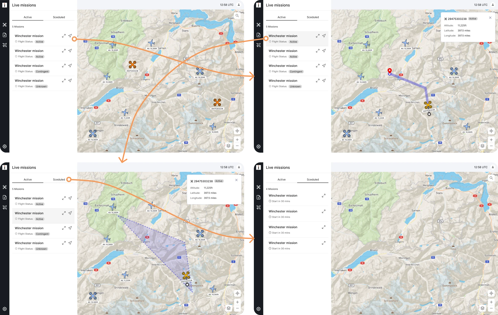
4. INVOLI
INVOLI is a drone management SaaS platform that, by 2022, had outgrown its original design. The interface had become outdated and increasingly difficult to navigate, which signaled the need for a complete redesign.
Our UI/UX designer used prototyping to capture the look and feel of the updated system before development began. These prototypes helped stakeholders see the bigger picture and evaluate how the redesigned features worked together.
Result: The team gained internal and external customer feedback and defined a clear direction for further product improvement.
5. Prift
Prift is a personal finance platform that came to Eleken with a clear initial concept. Their team had already conducted user research, and we expanded on those insights through competitor analysis, benchmark research, and feature prioritization.
After creating wireframes and running A/B tests, we translated the findings into a working prototype. The goal was to simplify the complex process of managing personal finances, and the interactive prototype made that possible.
Result: The updated design made financial management more intuitive, helping users achieve their financial goals with ease.
6. Greenventory
Greenventory is a German energy startup aiming to support the transition to zero-carbon energy. The founders had created a technical sketch of an energy planning platform and reached out to Eleken for design expertise.
To shape the functionality and validate interaction logic, we built a clickable prototype for user testing. This allowed us to identify interface issues, gather user input, and refine the system before software development began.
Result: Through multiple design iterations, we reduced cognitive load, improved workflow efficiency, and clarified complex technical data.
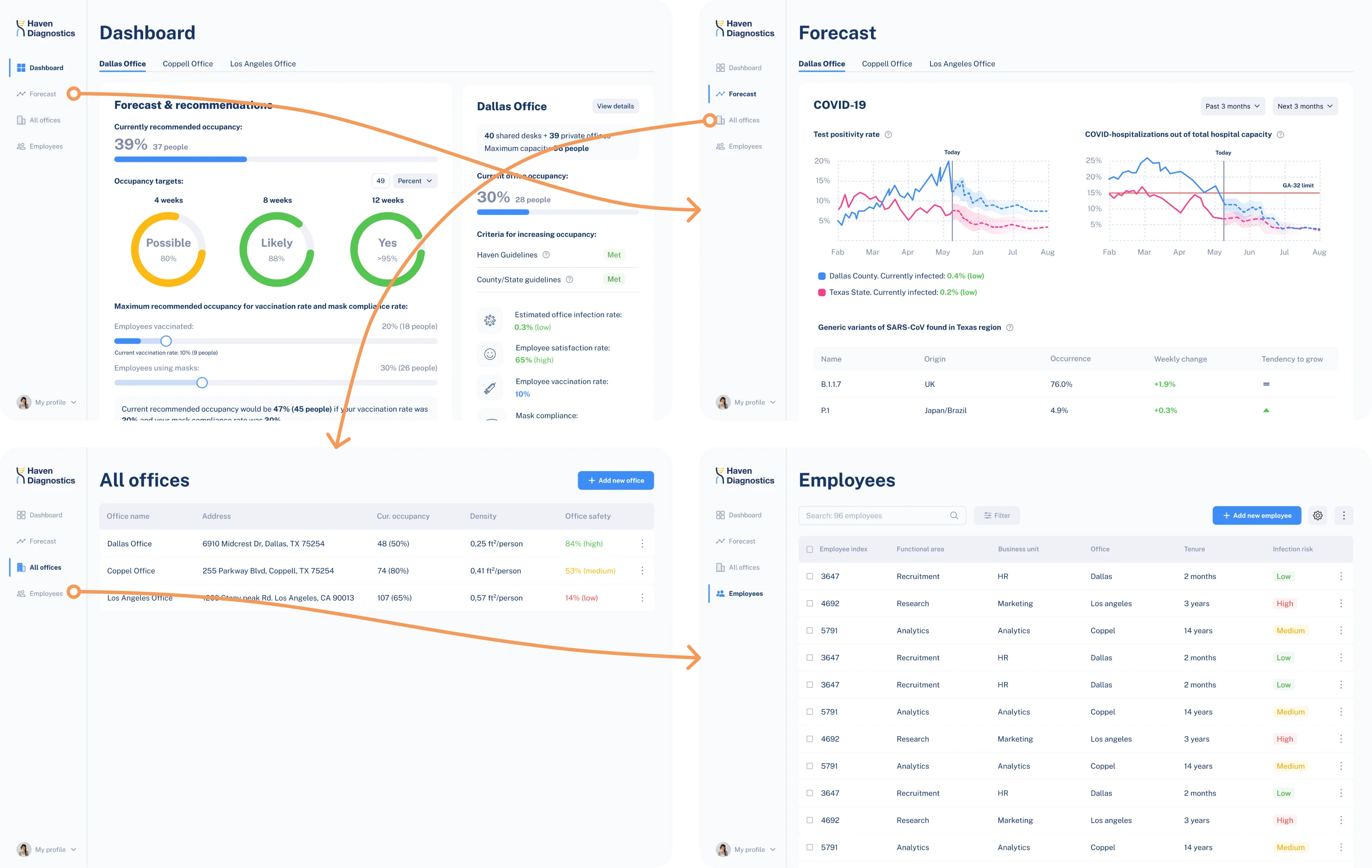
7. Haven Diagnostics
Haven Diagnostics applied healthcare infection-risk models to help companies safely return employees to the office. With this concept, they approached Eleken to design a scalable digital product and prepare it for an investor presentation.
From the start, we relied on thorough research and strategic discussions to define the core functionality. After designing screens, we combined them into a clickable prototype to refine the user flow and create a clear product story for stakeholders.
Result: The prototype laid the foundation for the product development process, marketing positioning, and investor communication.
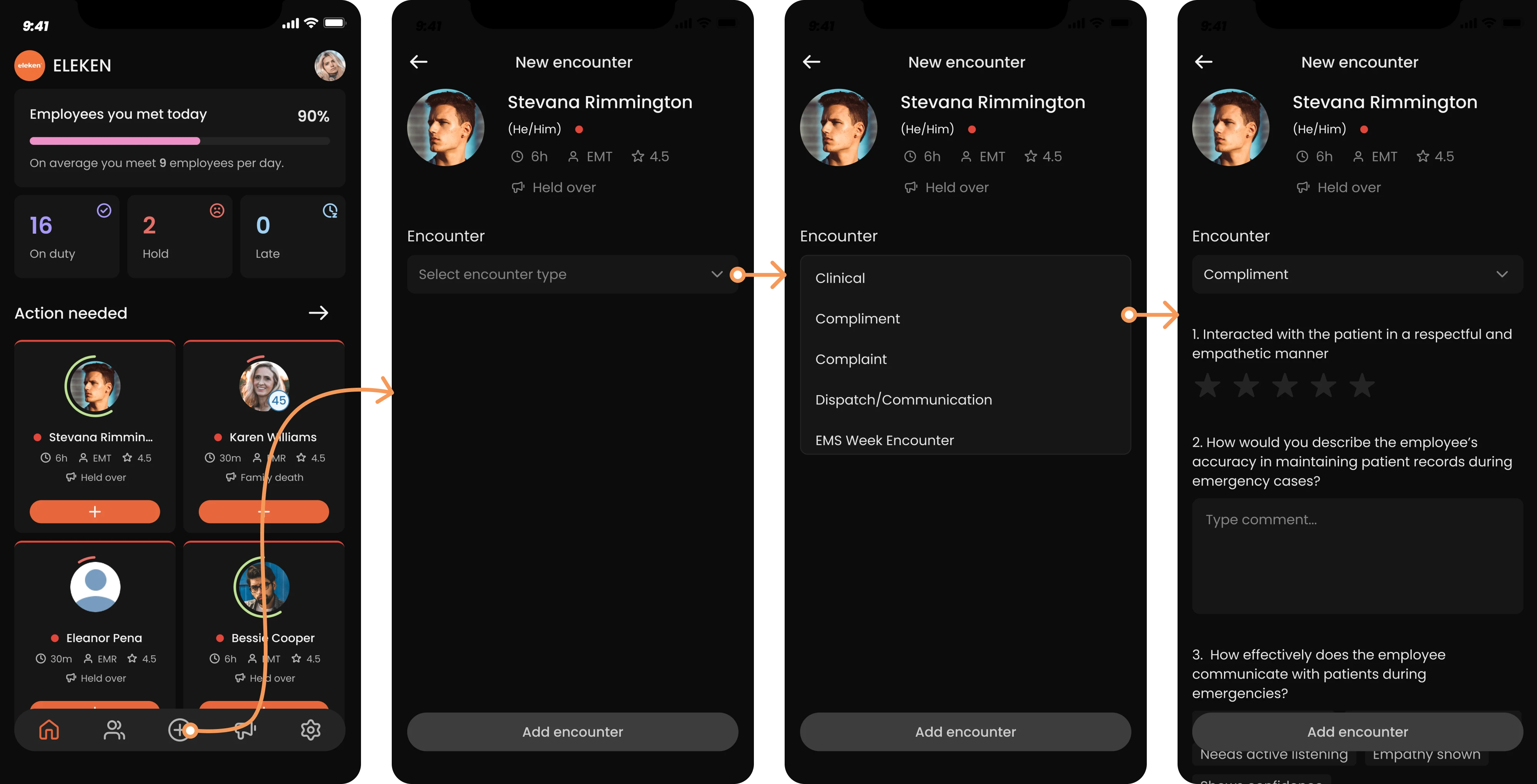
8. VLI Tech
VLI Tech delivers medical solutions, and Newton360, a workforce management app, was one of their new products. While the app offered strong functionality, it lacked an intuitive design, so the Eleken team stepped in to improve the UX.
Our designer worked on both mobile and desktop versions, including dark and light themes. Because the platform included complex workflows, we built clickable prototypes for each version to ensure that everything felt logical.
Result: The client provided positive feedback on the redesigned experience, and the handoff to development went smoothly thanks to a prototype.
9. HealthStream
HealthStream Insights is a reporting tool used in healthcare business administration. The existing reporting system had not been updated for nearly 15 years and was assumed to require a complete overhaul with highly customizable features.
After research, we discovered that users preferred standard reports with limited customization. We reimagined the user flow and built a prototype to validate it. Usability testing later confirmed that the updated flows were functional.
Result: Within seven months, our two designers delivered a fully interactive prototype, providing a solid foundation for future development.
10. Ricochet360
Ricochet360 is a cloud phone system and CRM platform, and is one example of prototyping in our case portfolio. As the company prepared to scale, it needed a more intuitive and structured design and turned to Eleken for support.
With only two months for the redesign, we focused on optimizing the existing UX through targeted improvements. Once the structure was refined, we built a clickable prototype to evaluate how the updated flows looked and behaved in practice.
Result: The final prototype shortened the learning curve for users and positioned Ricochet360 for scalable growth.
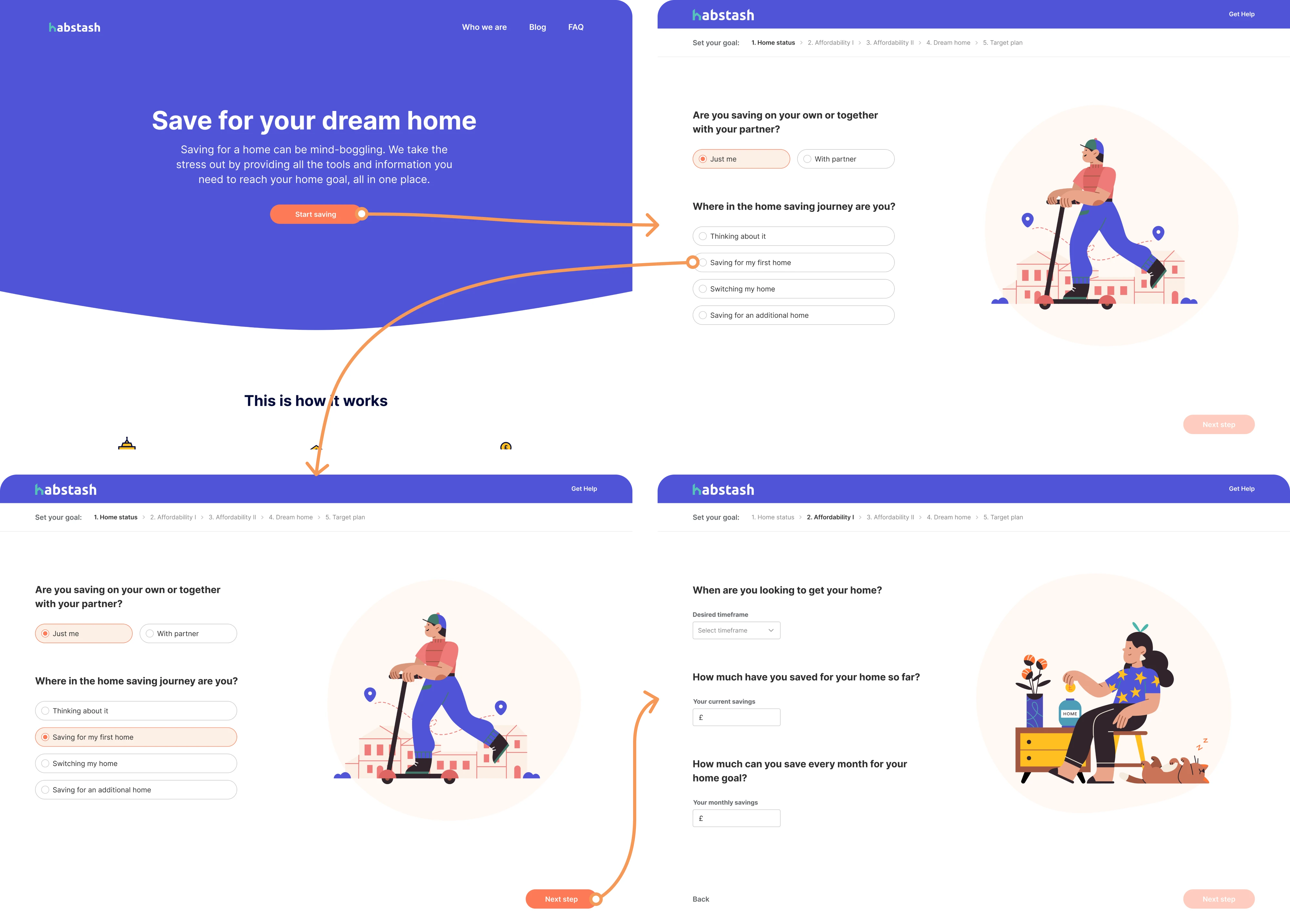
11. Habstash
Habstash is a startup that helps users plan and manage the savings needed to buy a home. The founders wanted to validate a SaaS idea by building a minimum viable product and testing how potential users would respond to different features.
We reviewed the existing flows and restructured the user journey. To test the new logic, we built a clickable prototype that showcased the complete user path from landing page to onboarding, reducing cognitive load along the way.
Result: The refined prototype laid the foundation for an intuitive MVP, bringing Habstash closer to delivering a seamless experience for future homeowners.
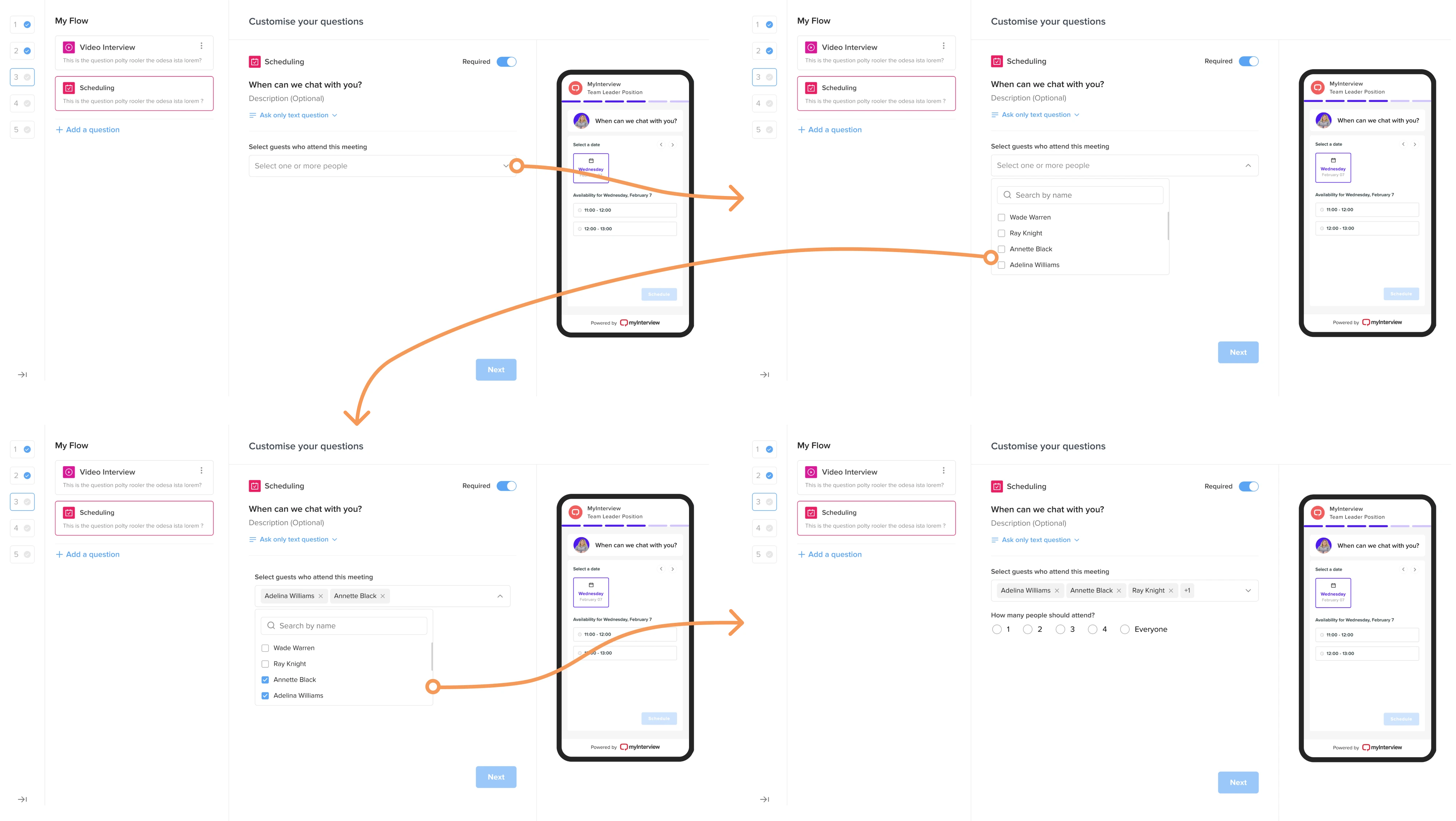
12. MyInterview
MyInterview is a video interviewing platform that approached Eleken while facing a 90% user churn rate. The product needed a major usability overhaul to improve retention and deliver a smoother experience for recruiters and candidates.
To connect both sides, we built a prototype that allowed recruiters to configure events and instantly see how they would appear to candidates. This helped us validate interaction logic and fix existing usability issues.
Result: The improved design reduced friction, increased consistency across the platform, and helped MyInterview win enterprise clients.
Which tools to use to build prototypes
Once you’ve gathered inspiration for your prototype, it’s time to build it. The next step is choosing the right tool for the task, and below we’ve prepared several strong options that can help you get started.
If you’re looking for a broader overview of design software, you can explore our guides on UX design tools and AI tools for designers.
Figma
Figma is one of the most widely used tools for UI design and prototyping today, and it’s the tool we rely on daily at Eleken. Because prototyping is built directly into the design environment, teams can turn static screens into interactive experiences.
Why choose it:
- Built-in prototyping capabilities.
- Real-time collaboration.
- Component-based system for scalable design.
- Easy browser sharing with built-in commenting.
Framer
Framer is a powerful visual builder for interactive experiences. It allows designers to create prototypes with real layout behavior, responsive logic, and advanced animations, and to publish them as live websites without involving developers.
Why choose it:
- Real layout behavior and responsive breakpoints.
- Advanced animations and interaction control.
- Built-in hosting and publishing.
- Great for marketing sites and interactive demos.
Sketch
Sketch was launched as a macOS-native app and became popular for its focused interface, strong vector editing tools, and early adoption of reusable components. While Figma has since become the industry leader, Sketch remains a reliable option.
Why choose it:
- Mature and stable macOS-native application.
- Strong vector editing and component system.
- Extensive plugin ecosystem.
- Well-suited for Apple-focused teams.
Marvel
Marvel is a beginner-friendly prototyping tool. It focuses on ease of use, making it a good option for designers who want to create clickable prototypes without dealing with complex setup or advanced interaction logic.
Why choose it:
- Easy to learn and use.
- Quick creation of clickable prototypes.
- Built-in prototype testing features.
- Suitable for low- and mid-fidelity projects.
Axure RP
Axure RP is a powerful prototyping tool built for logic-driven interfaces. Unlike lighter design tools, Axure allows designers to create advanced interactions, conditional logic, dynamic content, and data-driven prototypes without writing code.
Why choose it:
- Complex conditional logic and variables.
- Ideal for enterprise and data-heavy applications.
- Dynamic panels and advanced interaction control.
- Suitable for detailed functional specifications.
To sum up
A prototype is a decision-making tool. The difference between a good one and a wasted effort lies in knowing what to test and how much detail is actually needed. Overbuild it, and you lose time. Underbuild it, and you miss critical insights.
At Eleken, we design prototypes that do real work. If you need to validate prototype ideas, pitch to investors, improve usability, or hand off a clear vision to developers, contact us to turn concepts into experiences that move products forward.
Because the right prototype gives your idea a chance to prove itself.


.webp)

.webp)

.png)

.png)


