

Prototyping is a widely used technique for testing and evaluating design ideas at the earliest stage of product development. This is the best way to visualize the future product, demonstrate it to the client, and get valuable feedback.
Eleken is a team of product designers, and when developing a design solution we follow an iterative process which means we always test pieces and versions of the design solution and refine it along the way until, as the final result, our client gets an aesthetically pleasant and useful product that people love.
We decided to share our experience and shed some light on the question “What is a UX prototype?”. To succeed in this intention, in this article, we are going to tell you about the UX prototype definition, its importance for the design process, and your business in general. Besides, we will analyze the main types of prototypes, methods, and tools we use to create them.
Definition of the UX prototype
A prototype is a rough version of a product that helps you understand what concept, user flow, and layout the design solution has, and how the future product is going to work.
It can vary in complexity, ranging from simple sketches to highly interactive prototypes, clickable mockups that closely resemble the final product. Their main purpose is to test assumptions and gather user feedback before investing time and resources into full-scale development.
Depending on the stage of the design process, teams may choose to create either low-fidelity or high-fidelity prototypes. The level of fidelity refers to how closely the prototype mirrors the final product in terms of visuals, user interactions, and overall behavior. Let’s take a closer look at this.
Low fidelity prototype
Low-fidelity (lo-fi) prototypes are basic representations of a digital product. They focus on structure, layout, and core user flows rather than visual design or detailed interactions. These are wireframe prototypes, hand-drawn sketches, or grayscale mockups with placeholders for images and text.
Lo-fi prototypes are especially helpful in the early stages of the UX design process when teams want to test ideas quickly and cheaply. Their simplicity encourages feedback on the core functionality and structure without getting distracted by colors, fonts, or detailed visuals.
When to use low-fidelity prototypes:
- In early ideation or discovery phases.
- When validating initial design concepts or flows.
- During internal brainstorming and collaboration sessions.
High fidelity prototype
High-fidelity (hi-fi) prototypes are visually polished models that closely mimic the final product in appearance and functionality. These prototypes often include realistic content, brand colors, icons, and clickable elements that simulate user flows.
Hi-fi prototypes are typically created later in the design process, after the product idea is well-defined and the core user journey has been tested with low-fidelity alternatives. They serve as an excellent tool for stakeholder presentations, usability testing, and developer handoff.
When to use high-fidelity prototypes:
- When validating UI elements and visual design decisions.
- When testing user flows with interactive elements.
- Before moving into development to finalize interface behavior and transitions.
Benefits of the UX prototyping process
UX design prototyping as a process is supposed to take place after you create wireframes (basic structure of the product interface) and before you've got the final design.
Making prototype a part of the design process allows designers to:
- Save budget. Receiving customer feedback at early stages and making improvements to the prototype takes almost no cost as opposed to making changes to the already implemented product.
- Save time. A well-developed structure and arrangement of blocks in the future will help the UX designer not to make great changes to the finished layout since the main part of the project will be coordinated.
- Simplify the workflow. When directly creating a page design, the developer acts according to the plan. They don’t need to think about how to correctly arrange blocks and calculate the distance to individual elements.
- Facilitate interaction with the customer and other team members. When developing a design, a prototype is a kind of technical requirement, which has already been agreed upon with the customer and other project participants.
- Help the business owner increase conversion. UX prototyping means not only designing individual pages/screens of a product from a usability point of view but also drawing up a business strategy. The correct placement of the CTA and navigation elements, banners with promotions, and so on affects the conversion.
A Non-Boring Guide to How UX Research Is Supposed to Work
Learn how to approach UX research to grow your product
Get the free eBook
Types of prototypes in UX design
There are many ways you can create a prototype. At Eleken, for example, we usually divide prototypes according to their level of fidelity, and the designer chooses the most suitable prototype depending on the stage of the design process and the desired goal.
In case we need to roughly explain to the client how the user will move from one task to another when interacting with the product, a UX low-fidelity prototype will work well, but if we need to run usability testing with the focus group, a high-fidelity prototype will be the right choice.
In this section, we are not going to discuss every type of prototype but we will talk about the three most widely used methods of user experience prototyping:
- Paper prototyping
- Digital prototyping
- HTML prototyping
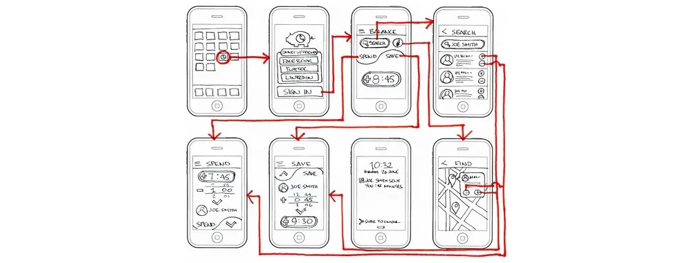
Paper prototyping
The easiest and fastest way to prototype is by hand drawing on paper or something else (whiteboard). This prototyping method is great to get a first impression of your product's initial concept.
Paper prototyping refers to the low-fidelity type, so don't worry about not being a designer, the implementation does not require any skills, just a pencil, paper, and your desire. But such prototypes, as a rule, have a low degree of elaboration, they contain only the most important information and have several restrictions (hard to interpret design, you can test paper prototypes only in person).
Still, the lack of details in a paper prototype allows you to focus more on the idea of your product rather than how the interface looks. After all, at the very beginning of development, it is unlikely that you will need some feedback about color or design.
Creating a low-fidelity paper prototype is a collaborative process, which is why it positively affects team communication and is a good starting point before interaction design prototyping.
Advantages:
- Fast
- Simple
- Affordable
- Facilitates team communication
Disadvantages:
- Difficult to make edits to an already finished drawing
- Users should have a good imagination to correctly understand how the product is going to work
- Can make complex issues look simple
- Not all elements are displayed on the prototype, a lot of details are missing
To sum up, paper prototyping is suitable for the early stages of product design, when the project vision is not that clear yet.
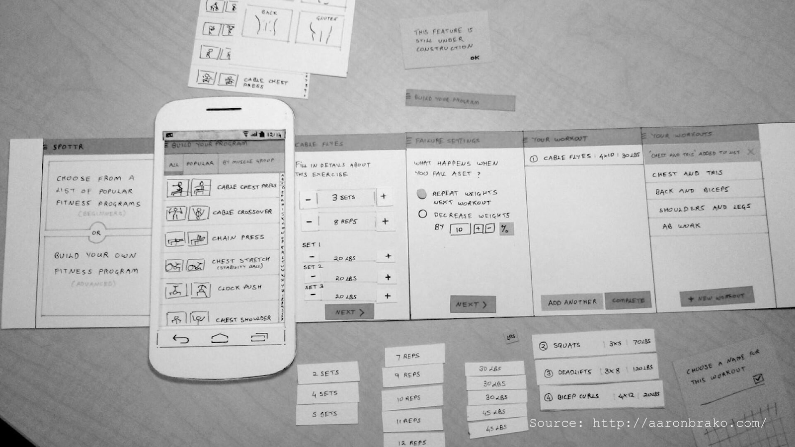
Digital prototyping
Digital prototypes refer to high-fidelity prototypes and are created with the help of special prototyping apps or software (we will talk about them a bit later).
This method is widely used, because digital prototypes look realistic, which allows you to properly test the majority of interface elements. Moreover, digital prototypes are easy to create in comparison to coding.
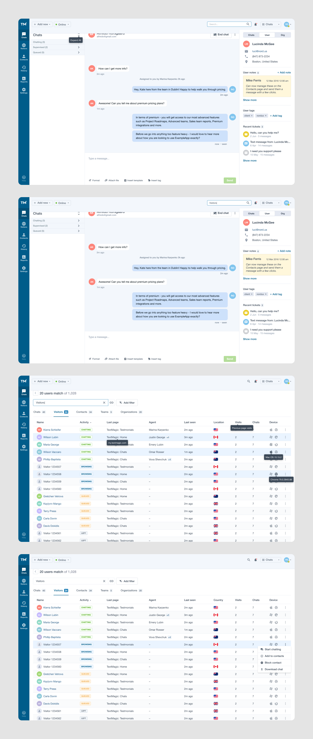
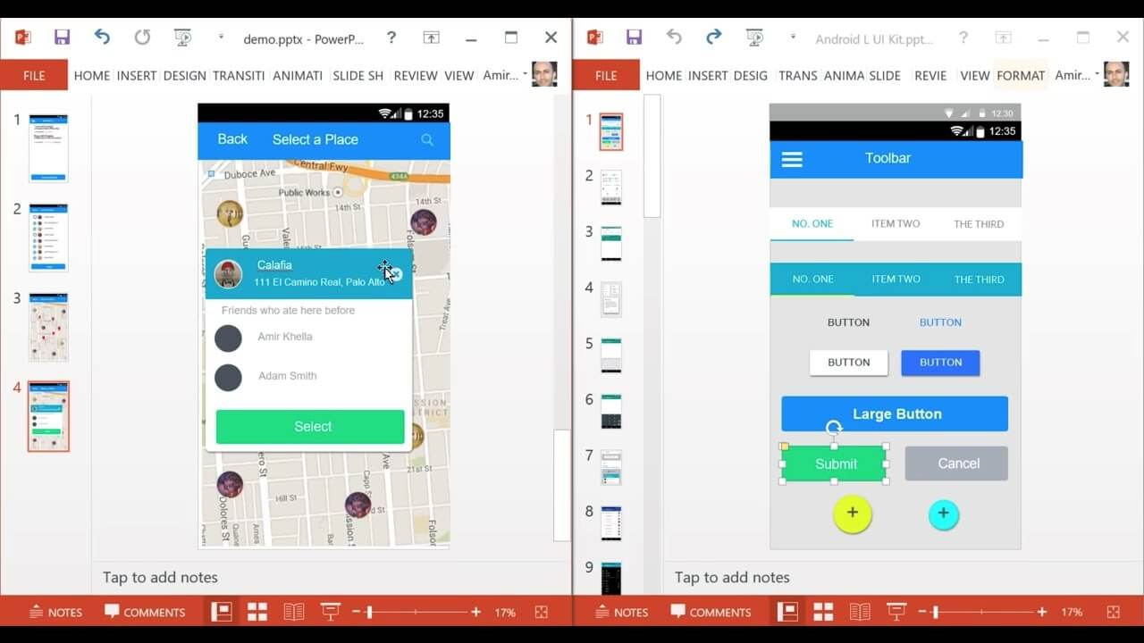
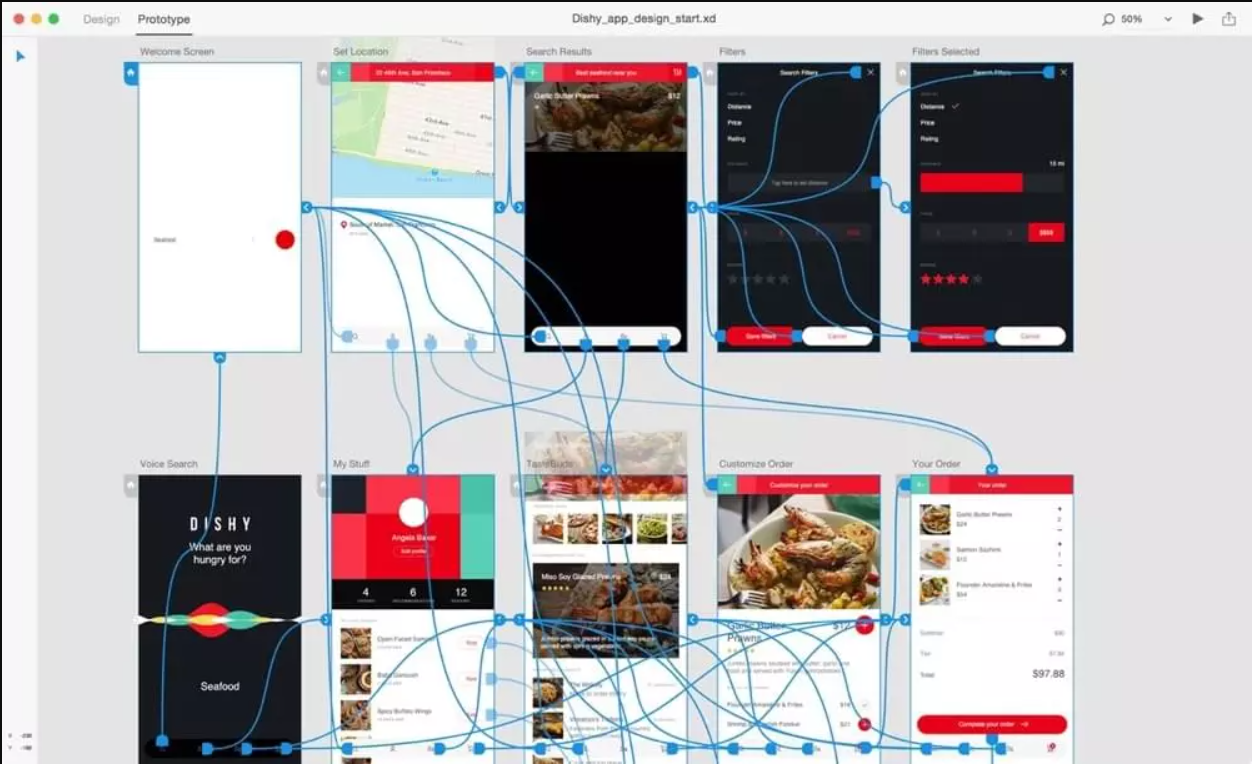
Our team uses this method of prototyping at the stage when we have a clear concept and a well-thought-out user flow of a product. For example, when we were working on Textmagic (customer experience platform) we designed our prototypes in Figma - a popular graphics editor and prototyping tool. Each piece of a prototype was then shown to users to get detailed feedback and then passed back to us to make further improvements or develop new ideas.
Below you can see a piece of a prototype that Eleken created for this project. It shows the Search function.
And of course, the same as with paper prototyping digital prototyping has its benefits and drawbacks.
Advantages:
- You can change and transform digital prototypes as many times as you need and it won't take long. Moreover, you can store multiple versions of a prototype in one place.
- Modern prototyping tools provide high accuracy, so you can visualize how the product will look and behave without actually building it.
- There are a lot of prototyping apps that let you share the project and work together with a team.
Disadvantages:
- It takes time to learn how to use a specific prototyping software
Digital prototypes look very similar to the final version of the product, they can be dynamic and animated. That's why it is better to use them not at the initial stages of the product design process, but at the stage when you are sure about the user flow the product will have.
However, a digital prototype doesn't behave like a final product. At this point, it is worth moving on to discuss the final prototyping method - coding.
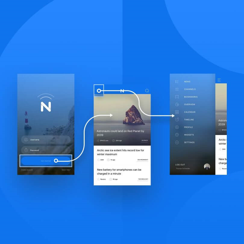
HTML prototyping
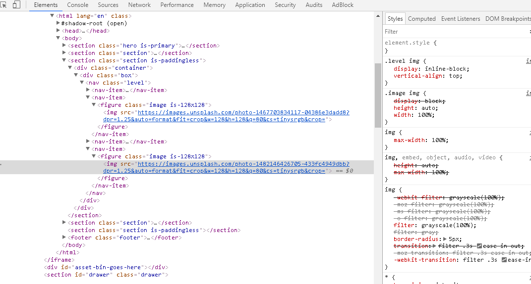
Image credit: medium.com
HTML prototyping is the most complex but the most precise method. This type of coded prototype looks the most similar to the final product (it also behaves like the final version) and that's why it allows you to collect the most objective customer feedback. But, of course, to create it, you (or your designer) have to possess the required technical skills.
Advantages:
- HTML prototype is very realistic, that’s why testing it allows you to collect the most precise user feedback.
- It serves as a base for further coding of the future product which simplifies the work for developers.
- It is possible to test such a prototype on various platforms and devices.
Disadvantages:
- Requires a high skill level. HTML prototype will be good only if your knowledge of HTML is sufficient enough.
- Takes more time to create than a digital prototype.
HTML prototyping is great for usability testing and is typically used later in the design process. But as it takes more time and resources to create such prototypes, they are not always profitable and worth creating.
When choosing what kind of prototype to create, always pay attention to the project specifics and preferences of your designers.
Prototyping tools for every design stage
Whether you’re sketching a quick idea or building a high-fidelity interactive demo, the right tool can make all the difference. With dozens of options available, it’s easy to get lost in the noise, so let us make it easier. Below, we’ve gathered a list of prototyping tools that we at Eleken (and many other design teams) use to turn concepts into testable products.
PowerPoint/Keynote
It's easy and simple to create a digital prototype using Microsoft Office PowerPoint or Keynote. If you are not a designer, we recommend starting with a program that you have already mastered and have on your desktop, without complicating your life with video tutorials for working with some professional apps.
Price:
- Keynote and Mac PowerPoint are free for Mac and iOS.
- Microsoft 365 subscription for Windows (that includes PowerPoint) has a 1-month free trial then the price is $12.50 per user/month (annual commitment).
Sneakpeekit
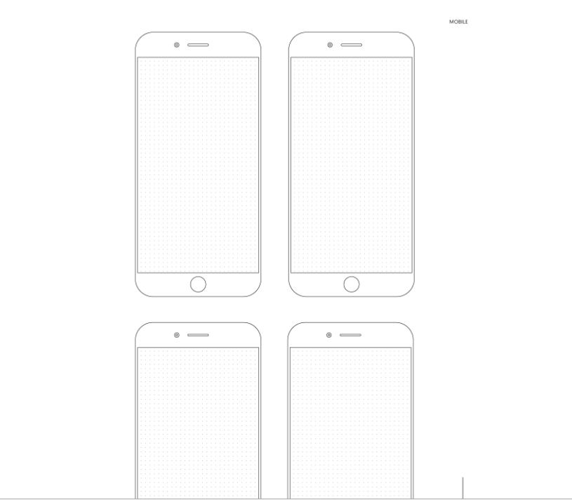
If you need to visualize the idea of an application or other digital service, then sketches of smartphones will help you to get started. Similar templates with or without a grid can be downloaded from Sneakpeekit. A great way to create screen designs is to test the future look of a product.
Price: Free
Download templates: https://sneakpeekit.com/
Invision
A simple and easy-to-use user interface makes Invision a perfect tool to get started. The intuitive software gives you the ability to download screenshots and link them to each other. As well, Invision has a function of shared prototyping, where you and your colleagues can work together to share comments and suggestions, full synchronization with other programs, and much more. In addition to its functionality, Invision has an excellent blog that provides tips for building your prototype.
Price: Freemium (free version with paid add-ons)
Sketch

Sketch was created solely to transform your sketches into sleek designs. The program offers one of the simplest user interfaces on the market that sets it apart from other similar software. Sketch also has a variety of templates to speed up prototyping.
Having a huge library of resources to use in your projects is just one of the many benefits of using Sketch. Not only is it extremely functional, but it also has a community of like-minded people who share their designs, helping each other speed up the design process. All available resources are located at www.sketchappsources.com. The only downside to Sketch is that it is only available on Mac computers
Price: 30 days free, then $ 99.00/year
Download: https://www.sketch.com
Figma
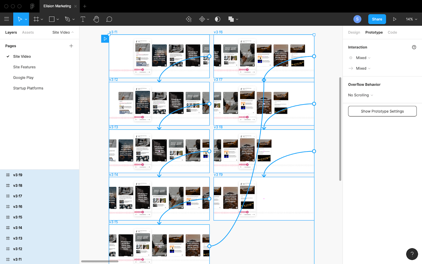
Figma allows the team to collaborate on a project online. With Figma, you can create both simple and complex prototypes. Figma has over 1 million registered users from all over the world, so the service can be considered a serious competitor to traditional prototyping programs.
Price: basic plan - free, pro - from $ 12/month
Download: www.figma.com
Adobe XD
Adobe Experience Design is an interface development program from Adobe Systems. Supports vector graphics and web layout, ideal for prototyping sites and applications. Wireframes, animations, storyboards, sitemaps, and flowcharts, team collaboration, UX prototype testing right on mobile - these are all Adobe XD features.
Price: Free trial available for 7 days then starting at $ 9.99/month
Download: www.adobe.com
Final tips for creating prototypes
The ease of use of the interface elements, the level of conversion, and the perception of the product as a whole depend on the quality of the created prototype. Here are some tips for those who are interested in developing a high-quality design solution.
1. When creating a prototype, consider the opinions of other specialists.
In the design process, not only one designer is involved, but specialists in different fields. Therefore, when prototyping, consider the involvement of other performers: a copywriter, a marketer, an SEO specialist, and other project participants.
2. Always have your target audience in mind
Despite the assumptions of even the most professional specialists, it often happens that some visual elements just don't work: there is no proper response from real users, sales do not increase, and customers do not notice functional elements. Therefore, after creating a prototype, test it on your target audience. This could be a focus group or some other people who would use the product for their purposes.
To sum up, each time we provide UI/UX design services to any kind of project we test and refine the design solution, so we know for sure that integrating prototyping into your design process is a smart and cost-effective decision as it allows you to understand the way customers perceive your product, therefore save your time and budget. So, drop us a line, in case you need some help in creating an effective UX prototype that will later become a usable product.


.png)
.png)


