When you start noticing that it has become harder to acquire new users, your app seems too complex and messy, and you receive more and more support requests from customers, it may be a sign that your product has some gaps in its user experience (UX).
At Eleken, a UI/UX design agency with 100+ product designers specializing in SaaS, we often help clients overcome these roadblocks through a UX design audit. This process uncovers usability gaps, reveals user pain points, and offers actionable improvements, all aligned with your business goals and aimed to enhance user satisfaction.
Every UX audit we run starts with deep product research, which may include accessibility checks, brand consistency analysis, structure review, and more. But at the core of our process is a proven checklist based on Jakob Nielsen’s ten usability heuristics, a reliable method that helps identify issues even before a single user testing is run.
Today, we want to offer you to examine your product with a UX design audit checklist that takes into account ten usability heuristics developed by Jakob Nielsen. Further on, we’ll explain why we consider this method to be effective and provide you with an explanation of each point in our list. As well, at the end of this article, you'll find a downloadable version of the ultimate UX audit checklist for your convenience.
Who is Mr. Nielsen, and what are his usability heuristics?
Meet Jakob Nielsen, a web usability expert, researcher in human-computer interaction, and co-founder of Nielsen Norman Group, also known as the “guru of Web page usability” (according to The New York Times) and the "king of usability" (according to Internet Magazine).

In 1990, together with Rolf Molich, they developed ten rules to help designers create better user interfaces. These heuristic principles were created using their years of professional experience, insights, and skills.
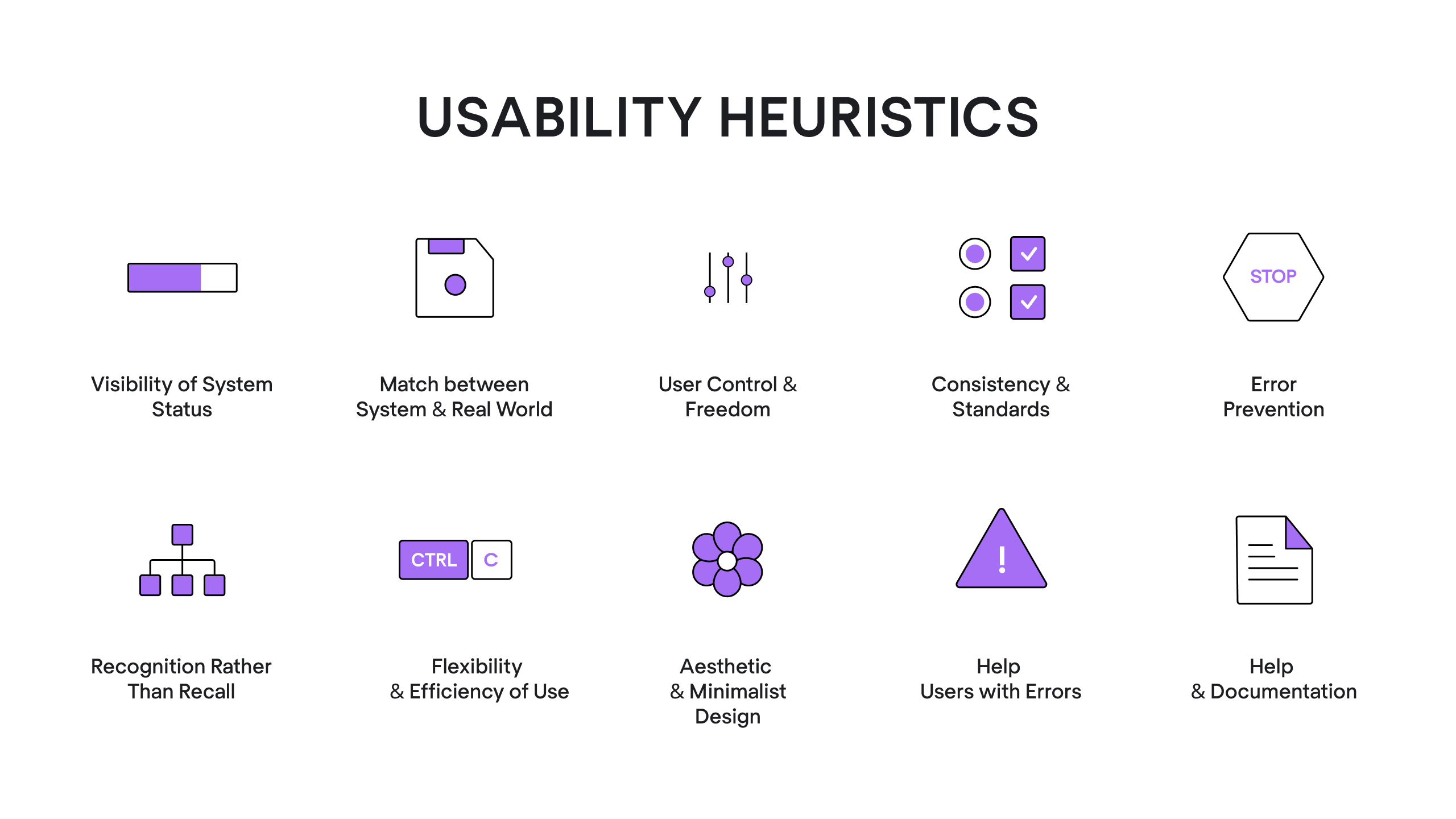
Nielsen's heuristics do not specify any particular usability requirements - they are basic guidelines you may adhere to in order to make digital products more accessible, user-friendly, and intuitive. These guidelines are the foundation for selecting relevant usability metrics that track how well a product performs. Heuristics have been relevant for over thirty years already, and it’s because they are broad and are formed based on basic human behavior. You can read more about each principle at the Nielsen Norman Group website.
In addition, heuristic evaluation allows us to receive quick feedback, doesn't require many resources, and can be combined with other usability testing techniques. This synergy helps teams get insights from usability tests by comparing expert observations with actual user behavior. So at Eleken, we find this evaluation very useful when conducting a UX audit.
Before we proceed with the UX heuristics checklist, it’s worth mentioning that a successful UX audit can go beyond the ten heuristics and take into account an app’s structure, accessibility, brand consistency, design continuity, consistency of a design system and visual style, and more. The points of a checklist we’ll provide below are the basis we recommend to start with.
A UX audit process checklist: explanations and examples
To begin with, here’s a short instruction on how to use a Nielsen heuristics checklist. Using this framework in a remote usability testing setup allows evaluators to analyze the interface across different devices and environments.
- Using a design audit checklist to assess the product involves having an evaluator (or several) who examines the interface and judges its compliance with usability tips and target user personas mentioned in a list. Many modern usability testing tools now include features to record these evaluations and map them directly to specific UI components.
- As you evaluate the app from the user's perspective, make notes and screenshots of every problematic area in key user flows you find. Don’t get frustrated if there are many: all usability issues your product has are opportunities for improvement.
- At the end of this procedure, organize all your findings in a UX audit report.
Now let’s move on to the checklist itself.
1. Inform users of the interaction status by providing timely feedback
Status mechanisms are essential for giving users the knowledge they need to react effectively to changing circumstances. Users should always be able to tell what the app is doing and what state it’s in. They don’t have to guess whether their request went through or not, the system itself should give quick feedback.
The feedback may be a color change after the user clicks a button, a progress bar when a procedure takes a bit longer to complete, a toast-notification, or a simple “thank you” message - anything that would let users know that the system is functioning and eliminate their doubts concerning the success of the initial action.
For example, the web app Tinypng that I commonly use to compress images for my articles, lets me easily understand if the image is processing, ready to download, or impossible to compress with its progress indicator.

2. Use the language your users will definitely understand
Avoid using internal jargon, professional terminology, abbreviations, and the like in your app, as it adds a cognitive load and increases the chances that your users will feel confused and forced to search for a definition. Using various types of usability testing can help identify where language becomes a barrier for the average user.
Use plain language if possible, or conduct user research to learn if your target audience understands the terminology you need to have in your app. When differentiating between user testing vs usability testing, remember that testing the language often falls into the qualitative side of user testing. In case you want to use a shortening or abbreviation, make sure to explain the whole phrase the first time the user sees it.
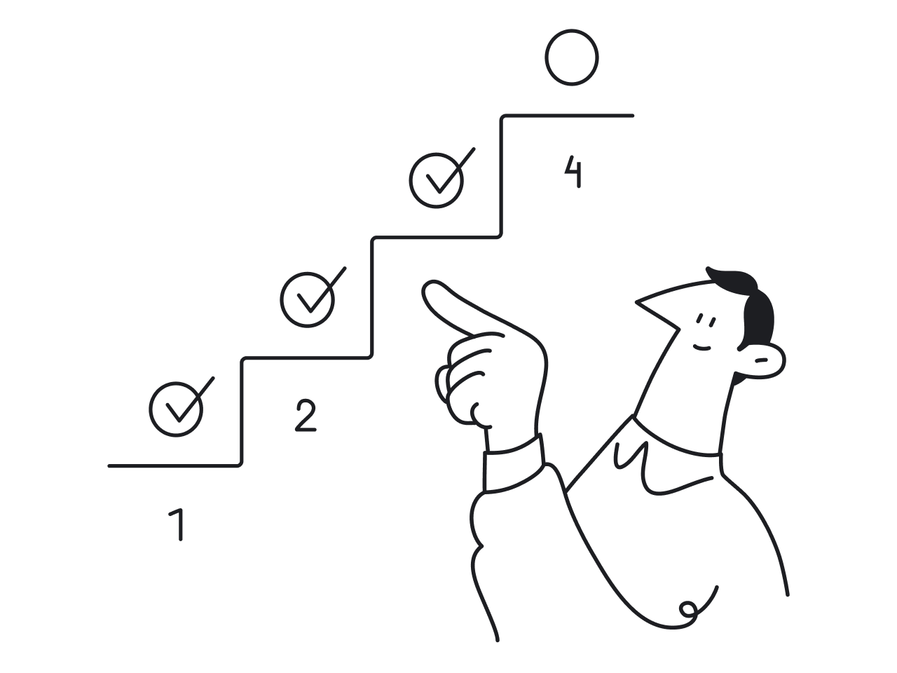
3. Always allow the “Return”, “Undo”, and “Cancel” options
When actual users explore your app they may sometimes go beyond the standard navigation menu. Some of them may want to know what would happen if they took a possibly risky action, while others may choose the wrong feature by chance. This is a common way to find UX issues related to user control and freedom. As well, the lack of a “return” or “undo” button makes people work much more slowly and carefully to prevent mistakes. As a result, there’s a significant decrease in productivity.
When you make each action reversible, users may both explore the app safely and make mistakes without being afraid of negative consequences. Even during unmoderated usability testing, where there is no researcher to guide the user back, providing clear exit points prevents the "trapped" feeling that ruins the user experience.

As for a “cancel” button, it’s especially relevant when using Wizards (a design pattern that makes complicated tasks that are carried out rarely or by new users simpler). Allow your users to go whenever they want, but be sure to let them know they can complete the task later. It’s also a good practice to remind them about their unfinished activity later.
For instance, to make a lengthy onboarding process less tiring for users, for one of our projects, our designer offered to add the “Save&Exit” button, which allows users to leave the registration process at some point and then come back to it later and continue from the same point where they left.

4. Use design patterns where possible
Jakob’s law states that “people spend most of their time on sites other than yours.” It means they have certain expectations about your product based on their previous experience of using similar apps. By breaking those conventions you force people to learn something new, adding them a cognitive load (so do it only if it’s absolutely necessary).
Design patterns are typical solutions to commonly occurring issues in UI/UX design. Users who are familiar with design patterns can explore a digital product without having to learn a new system from scratch.
Some examples of UX patterns are scrolling down to refresh the page, placing the menu in the header of the website, double-tapping the screen to like an image/video, and the like. All these design solutions are well-known to the majority of people, so they make the software more intuitive and user-friendly.
This way, if a user is searching for a share button, there’s no need to reinvent the wheel, choose sharing symbols, such as an arrow bending to the right or an open triangle with a three-dot share icon.

5. Ensure your design is consistent within your product or a group of products
When related elements have a consistent look and function similarly it improves your product's learnability and usability. Users get used to particular interface elements, including their location on screens. As a result, the experience becomes more comfortable and your product is easier to use.
To maintain consistency, businesses on scale build design systems.
With a design system, all visual design elements and UI components are available for use when designers need to build a new piece of an interface. Engineers may reuse the code by simply copying and pasting, and overall, the design system helps the product team increase productivity and product consistency.
6. Ensure error messages are helpful
When users make mistakes, it’s often the design's fault, not the users’. For example, "Error -1264" (or something like that) gives the user none of the information they may need to resolve the problem. So, to prevent your audience from making mistakes, carefully think out an error message and ensure they
- clearly explain the issue
- state what the user has to do about it
- have visual treatments that will help users notice and recognize the error message.
Any notification that doesn't meet the three requirements should be reported back to you by your QA team.
Take a look at the error notification from Slack:

7. Add clues to the context to make the user interface more intuitive through recognition
Which question is easier to answer: “Is the Antarctic blue whale the biggest animal on the planet?” or “What is the biggest animal on the planet?”
I bet you’ve chosen the first variant, and that’s because answering it involves recognition rather than recalling (you simply have to recognize if the information is correct or not).
So, instead of forcing users to recall information from memory, showing them things they can recognize (clues) increases usability, since the additional context makes it easier for users to get the meaning of the information they encounter.
The common illustration of a recognition-based user interface is a menu: the software displays the available commands, and you choose the one you want.
For instance, here’s a screen from the Zoom mobile app, a cloud video communication platform.
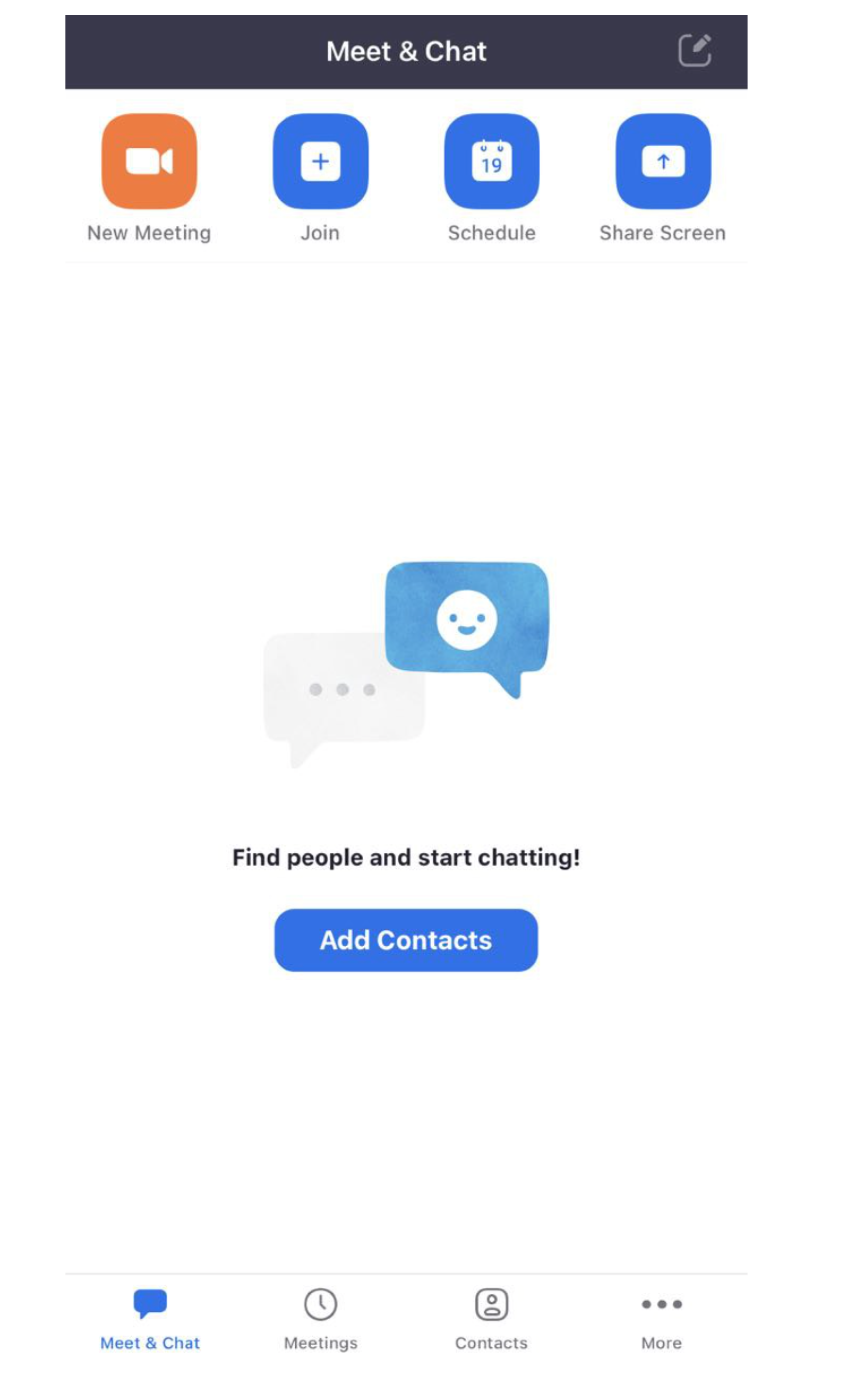
The icons at the top and bottom of the screen alone don't promote recognition: it’s difficult to understand what features they represent. However, Zoom places a label next to each of them, so that it becomes super easy for users to choose the feature they need. This is a common finding in web usability testing, where text labels significantly reduce the time spent deciphering abstract symbols.
8. Provide various methods of interaction for beginners and advanced users
The features of your app should be efficient for experts and friendly to newbies, as users with different skill levels have different user needs. While expert users can make use of secondary tools meant to speed up frequently performed processes, new users may need assistance in carrying out their tasks. Using specific user testing questions can help you identify where power users feel slowed down and where novices feel overwhelmed.
Going through this point of a checklist means that you allow user customization, avoid being prescriptive about the fundamental task steps, and include accelerators that help advanced users get their jobs done more effectively. This differentiation is a key part of the user testing impact in SaaS designs, as it ensures the product scales with the user's proficiency.
For example, in the WhatsApp app, if you swipe the chat to the left you can find an accelerator that allows you to quickly archive, or, if you tab for more, delete the chat. These operations may still be performed straight from each individual message, of course, but using the accelerator will speed up the audit process for more experienced users. To truly refine these shortcuts, many companies find beta testers among their most active users to validate that these "hidden" features are actually discoverable and helpful.

9. Eliminate any UI element of the application that is not helping
A minimalist design is one that contains all the necessary elements to allow users successfully complete their tasks. That is, a smart user interface should aim to improve usefulness and usability with exactly the right amount of items on the page.
Having too few elements would affect the app's usability (as users won’t be able to complete the necessary tasks), while too many elements would make it difficult for users to find those necessary features. So, include only those interface elements that are in your app for a purpose to make users’ interaction with the product more effective.
This rule is especially relevant when designing a dashboard, as it has to show only the essential data to be useful for a viewer.
10. Make sure your users can ask for additional help and it’s easy for them to find it
Of course, we should strive to make a product design so intuitive to its users that they won’t need to search for additional help or troubleshooting. However, you can’t predict every challenge your users may face, that’s why you need to have onboarding, tooltips, chatbots, documentation, videos, or tutorials. To ensure these support elements are integrated seamlessly, adding them to your design QA checklist is essential during the final stages of development.
The help should be concise, easy to find, take into account the user’s goal, and provide the user with clear steps on how to resolve the issue. Rigorous UI testing helps verify that help icons and documentation links are accessible and functional across all screen sizes.
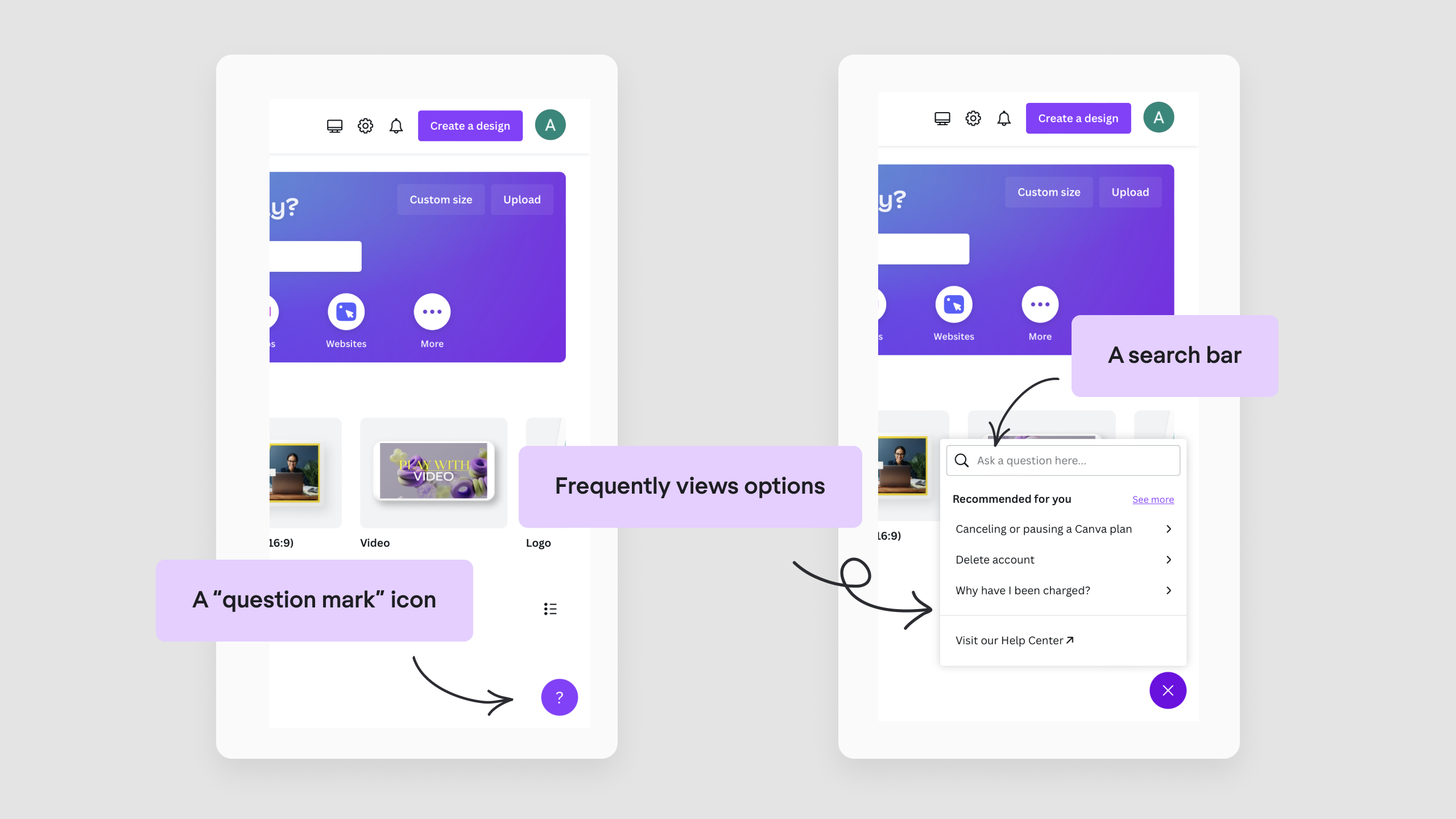
For example, an online graphic design tool Canva, has an easy-to-notice question-mark icon in its bottom right corner. Once you click on it, you’ll see the list of the most frequently viewed topics. You can also start typing your question in the search bar, or start a chat with the Help Center. When teams utilize A/B testing SaaS strategies, they often test different versions of these help widgets to see which placement or wording leads to lower support ticket volume.
And as we promised at the very beginning, here's a downloadable UX audit checklist based on 10 usability heuristics.
Why conducting UX audits with our checklist is key to achieving your business goals
Let’s take a look at one of Eleken’s design audit examples, a student engagement app. The company knew they had issues with visuals and usability, so we needed to analyze the app before starting the actual revamp to find the exact product’s weak spots. And of course, Jakob Nielsen’s ten usability heuristics came in handy here.
We put ourselves into users’ shoes and headed straight to the “filtering” feature. The first thing we noticed was the empty top navigation menu that makes users disoriented, not knowing what is going on (seems like it's the first point in our checklist). Additionally, it was completely unclear how to activate the filter. The solution was to put the proper markers and add a separate button to enable the filtering feature.
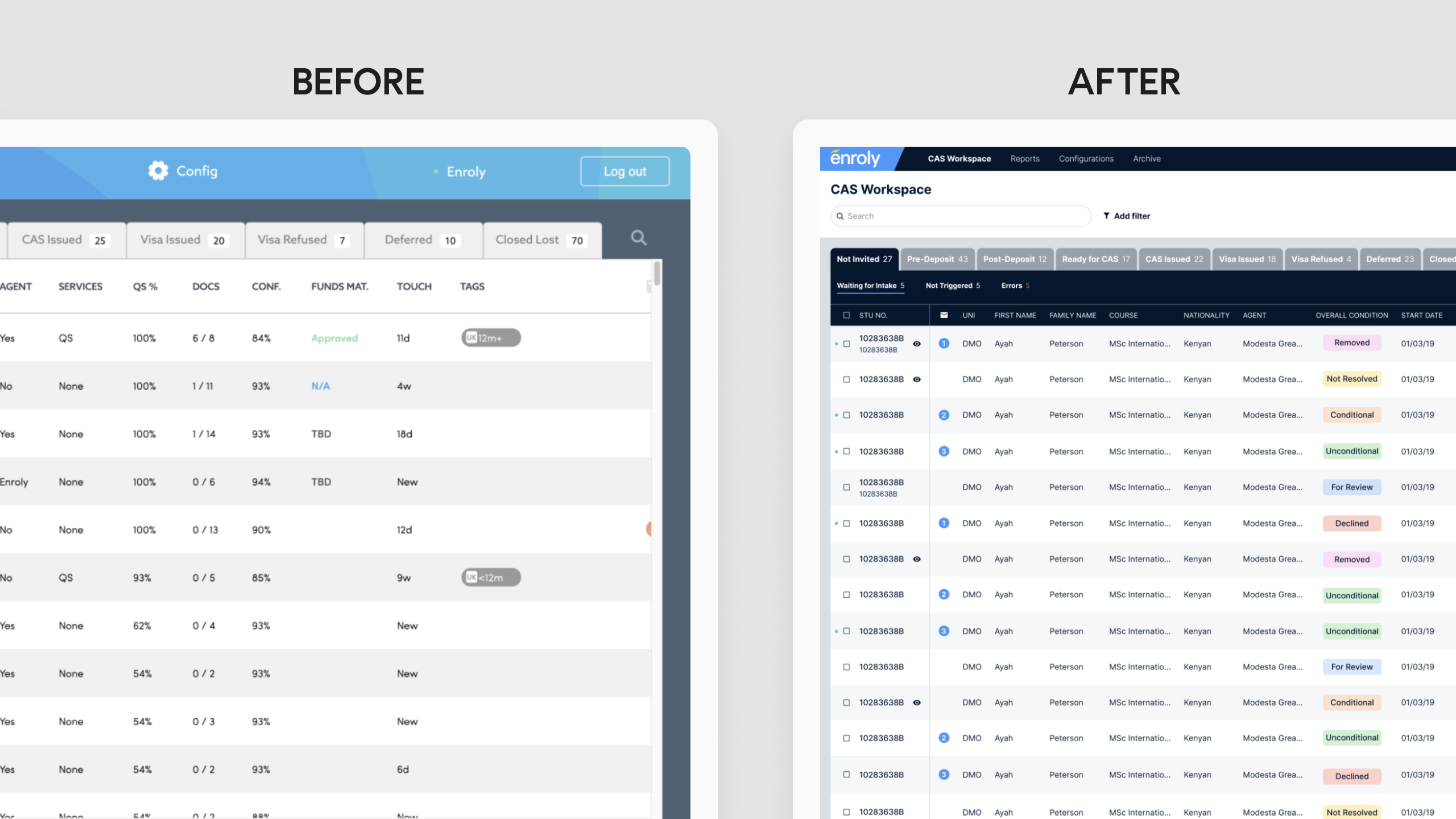
As we finally found the filter option, we understood that it becomes activated only after selecting some students in a list, while the rest of the time users just don’t need this feature. Remembering the ninth principle from our checklist (eliminate any element of the application that is not helping), we decided to remove this feature from the toolbar. Now it comes up in already active status only after you tick a box in the list.
We can go on with the case, but I guess it’s enough for you to understand the importance of running a user experience audit: it helps to make informed decisions rather than doing a redesign for the sake of redesign without a clear understanding of the goals and metrics you want to improve.
So, if you are not sure what exactly you want to improve, consider running a user experience audit first. You can learn to conduct it on your own, or let professionals do it for you.
At Eleken, we offer UX audit services that will help you identify areas of your product that need improvement, and we have years of experience in creating designs that help our clients pursue their business goals and improve customer satisfaction.


