Imagine signing up for a new app, excited to explore what it can do. The interface loads… and you’re greeted by a barren dashboard with no clues on what to do next. In that moment, you might wonder: Is this product broken, or did I do something wrong?
Chances are, everything’s fine, except one crucial thing — the app forgot to design a thoughtful empty state.
Too often, empty state UI elements are treated like an afterthought. Apps might show a generic “No data found” label or nothing at all, leaving users at a dead end. And that’s a huge missed opportunity.
In this guide, we’ll explore design practices for empty states that don’t just fill space, but earn it. And we’re not just here to talk about it. We’ll show you how it works in the real world, with examples from SaaS products, including a few from our own clients.
What is an empty state in UX design?
In UX terms, an empty state (sometimes called a “zero state” or blank state) is the screen design or UI state a user sees when there’s no content to display. It’s “empty” only in terms of user data, but from a design perspective, it shouldn’t be literally empty.
In SaaS products, empty states UX patterns crop up all over: the first time a user logs in, when a list design or table design has no entries, when a user clears out all items, or when something goes wrong (like an error or no results found).
Rather than being just a space, these moments are part of the user journey and can educate, guide, reassure, or even convert.
Types of empty states (with examples)
Not all empty states serve the same purpose. Some are meant to reassure. Others are there to push users toward action. Some exist purely to celebrate a job well done. That’s why it helps to break them into three main types.
1. Informational empty states.
These are the “it’s empty, but here’s why” moments.
Informational empty states UI explains what people see and provides context so they don’t assume something’s gone wrong. For example, a new user landing on a dashboard might spot a message like “You haven’t added any data yet” alongside a short explanation of what normally appears there.

This type is often used during first-time experiences, after content has been cleared, or when data is still being collected. It’s also the right moment to educate users.
A new project management app, for instance, could show a helpful note: “This is where your projects will appear — click ’New Project’ to get started.”
2. Action-oriented empty states
Now we’re in “let’s get going” territory. These empty states are designed to do something, like nudge users toward an action that will populate the screen. It can be an empty task manager that says “You have no tasks yet” and includes a bright, friendly “Add your first task” button.
In onboarding, these are essential. A new user shouldn’t have to guess what the first step is. They should see it, front and center. This is especially important in components like stepper UI or wizard UI, where users are expected to follow a defined path.
And even in cases like a no results UX pattern, a well-designed empty state avoids friction by offering search filters or other next steps.
3. Celebratory empty states
Sometimes, emptiness is the goal. You finished all your tasks. You cleared your inbox. You crushed your checklist. In those moments, an empty screen is a win. And it deserves to feel like one.
Celebratory empty states mark success with positive reinforcement. A cheerful message like “All caught up!” paired with a fun visual or a bit of humor turns a blank screen into a reward. These moments reinforce user progress and create emotional satisfaction (a technique also used in splash page designs).

💡 It’s worth noting that many empty states blend these types. An informational state might include an action. A celebratory one might gently guide users forward. The key is to understand what kind of moment your user is in and design accordingly.
Empty state design best practices
Psychologically, a blank or uninformative screen creates a micro-moment of uncertainty. And if the user starts second-guessing your interface, that’s where friction begins.
To avoid this from happening, here are four principles that make your empty state UX actually work.
Prioritize clarity and simplicity
At the heart of any good empty state design is an answer to a simple question: “What now?” Your job is to address that clearly, quickly, and in plain language.
- Say exactly why the screen is empty: “You haven’t added any items yet,” not “No data.”
- Anticipate the user’s state of mind: Are they new? Did they just clear something? Are they expecting results?
- Avoid jargon or fluff. If your message needs a glossary or a UX writer to interpret it, it’s not doing its job.

Keep a copy of one strong sentence and, if needed, a line of supporting text. Then offer a single, prominent CTA (like “Create Project” or “Upload File”). Visually, a clean layout with generous spacing and a simple icon or illustration is enough.
Match the message to the moment
A generic no results found UX message in a search empty state might technically be accurate, but it’s a conversion blocker. Think of how different the context is between a user performing a search, someone landing on a dashboard for the first time, and someone who has just cleared all their tasks.
The best empty states should be designed just for this moment.
If a user just ran a search with no results, the screen shouldn’t just shrug. A message like “No results found for ’kiwi’. Try adjusting your filters or checking spelling,” along with suggestions, turns the disappointment into action.
.png)
On the other hand, the dashboard empty state on a brand-new account home screen might say, “You have no projects yet. Create a project to get started.” — acknowledging that they’re new and guiding them forward.
Even visuals should be context-aware. An empty contact list might use a friendly outline of a user avatar. An empty file screen could show a folder icon. These subtle cues reinforce location and reassure users that they’re in the right place, even if it’s temporarily empty.
Maintain visual consistency and design hierarchy
Empty states should look like they belong to your product. That means:
- Apply your standard colors, typefaces, spacing, and button styles.
- Don’t treat empty states like ad-hoc screens. When building a component library, include empty state patterns in your design system.
- Use illustrations or icons to fit your brand tone. If an image doesn’t help explain the moment or guide the action, it’s just decoration.
- Put headline first (“No results found”), then secondary explanation (“Try searching for something else”), and CTA (“Browse categories”).
Many SaaS brands like Linear or Notion use simple, monochrome illustrations that blend into the interface while still offering warmth and clarity. The goal is always to enhance focus, not steal it.
This is often reflected in detail-focused components like radio button UI, checkbox UX, or toggle UX, where clarity and hierarchy are key.

Make it accessible and inclusive by design
Like any UX element, empty states must be accessible to all users. This includes both the visual design and the copy.
For starters, text should never rely on color alone to communicate meaning. That pale gray hint you’re using might look sleek on a retina display, but if it doesn’t meet WCAG contrast standards, it’s unreadable for low-vision users.
Similarly, icons can’t do all the work. A sad face or exclamation mark isn’t meaningful to a screen reader unless it’s backed by descriptive alt text or ARIA labels.

Functionality matters just as much. Your CTA button needs to be usable with a keyboard. If the empty state appears after an action, users relying on assistive tech should be notified that the content changed, something ARIA live regions can help with.
All in all, your empty states should never make someone feel excluded, lost, or at fault. When they’re accessible by default, they’re better for everyone.
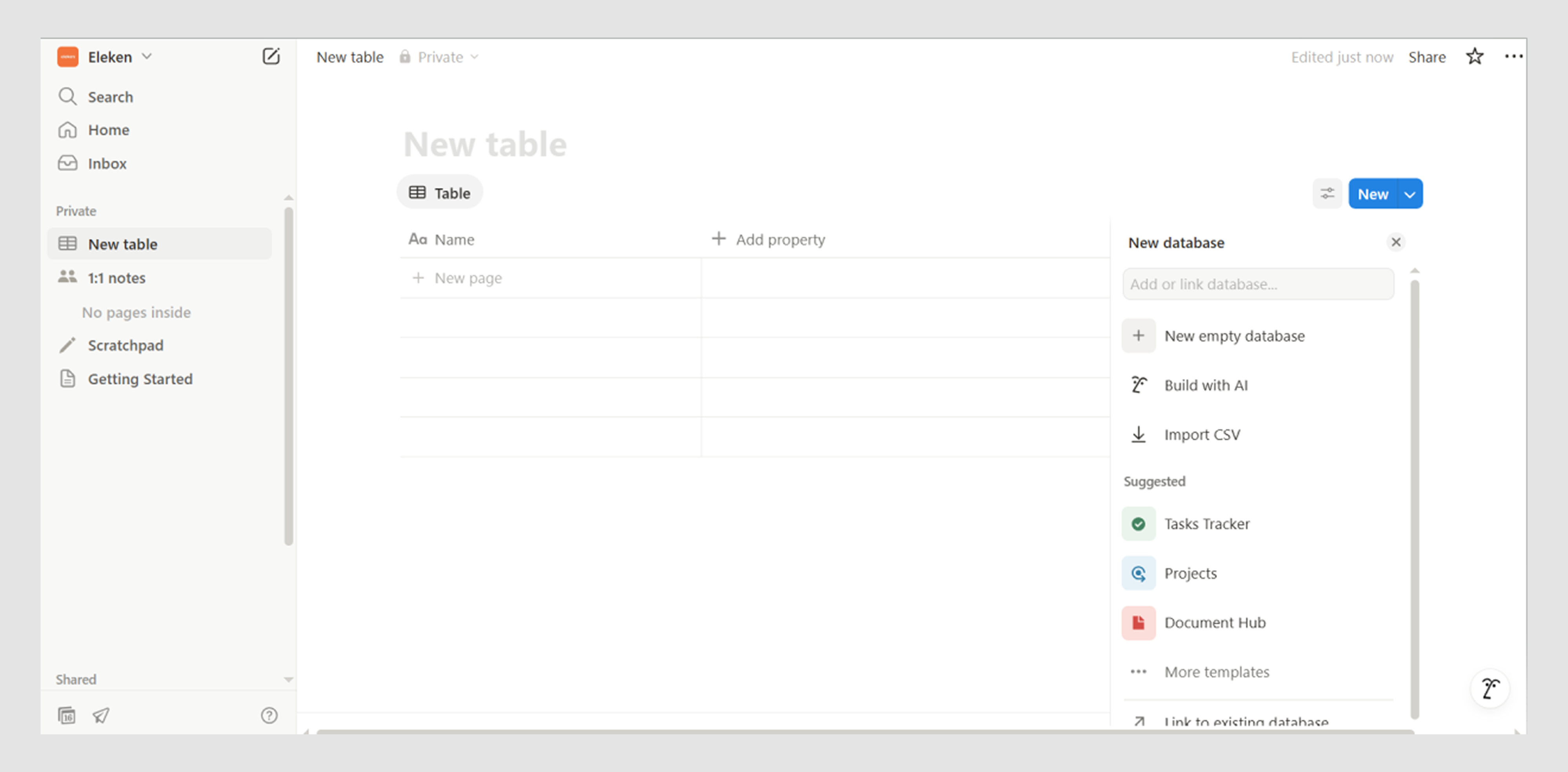
Case studies from the field (including Eleken)
Empty states appear in every industry, and each use case has its own nuances. To understand the impact of good design, let’s examine a few real-world empty state examples from SaaS products.
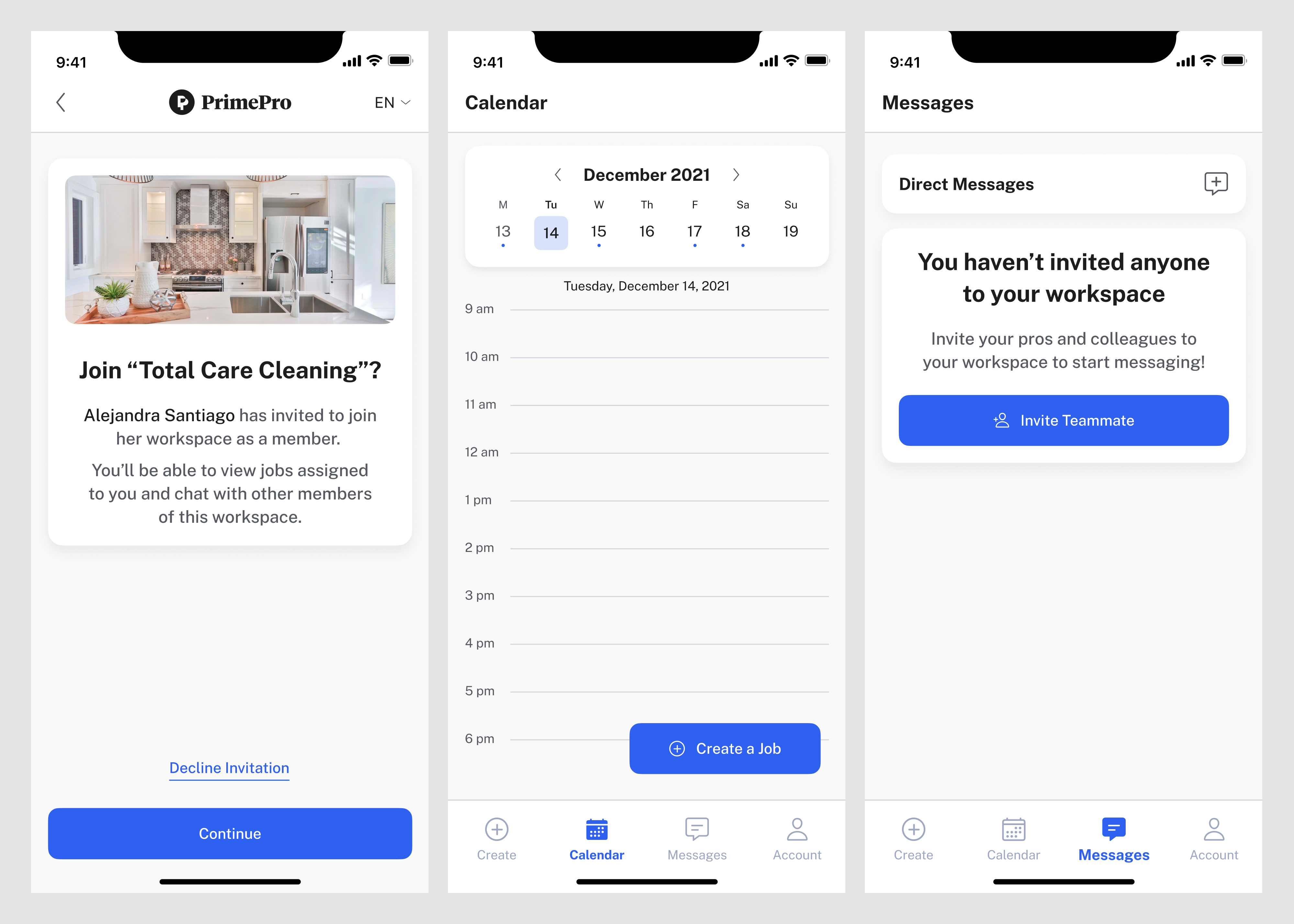
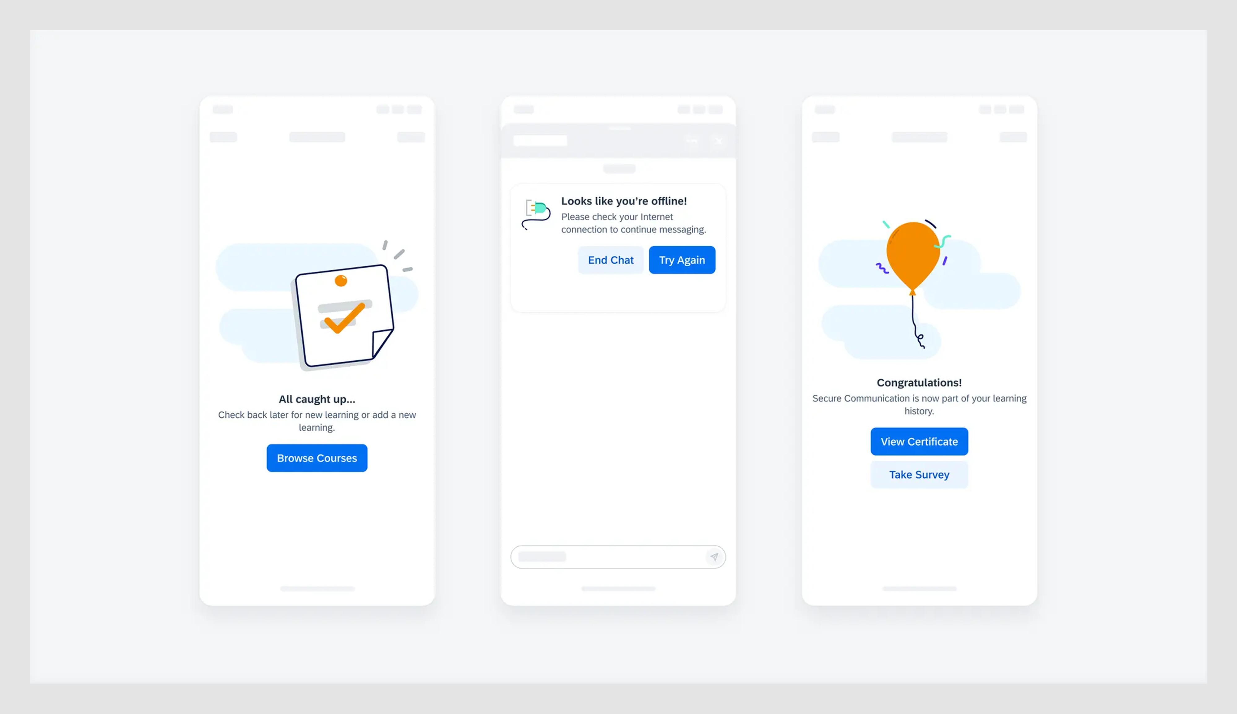
1. PrimePro
Another example comes from our work on PrimePro, a mobile app that connects contractors with on-demand workers.
One of the first moments a user encounters an empty state is during sign-in. We decided to replace a dry login prompt with a short message explaining how to join the platform, what users can expect in return, and offered two clear buttons — one to continue, one to decline.
Another case appears on the calendar screen. Here, we removed the empty state text entirely, but added a bright blue floating action button in the bottom-right corner. The idea was to rely on intuitive behavior, just like in any modern app.
(for practical tips on designing calendars and scheduling inputs, check out our article on time picker UX)
Lastly, on the messages tab, we used a much more minimalist approach. No icons, no animations, just a short, informative line of text followed by a single CTA.
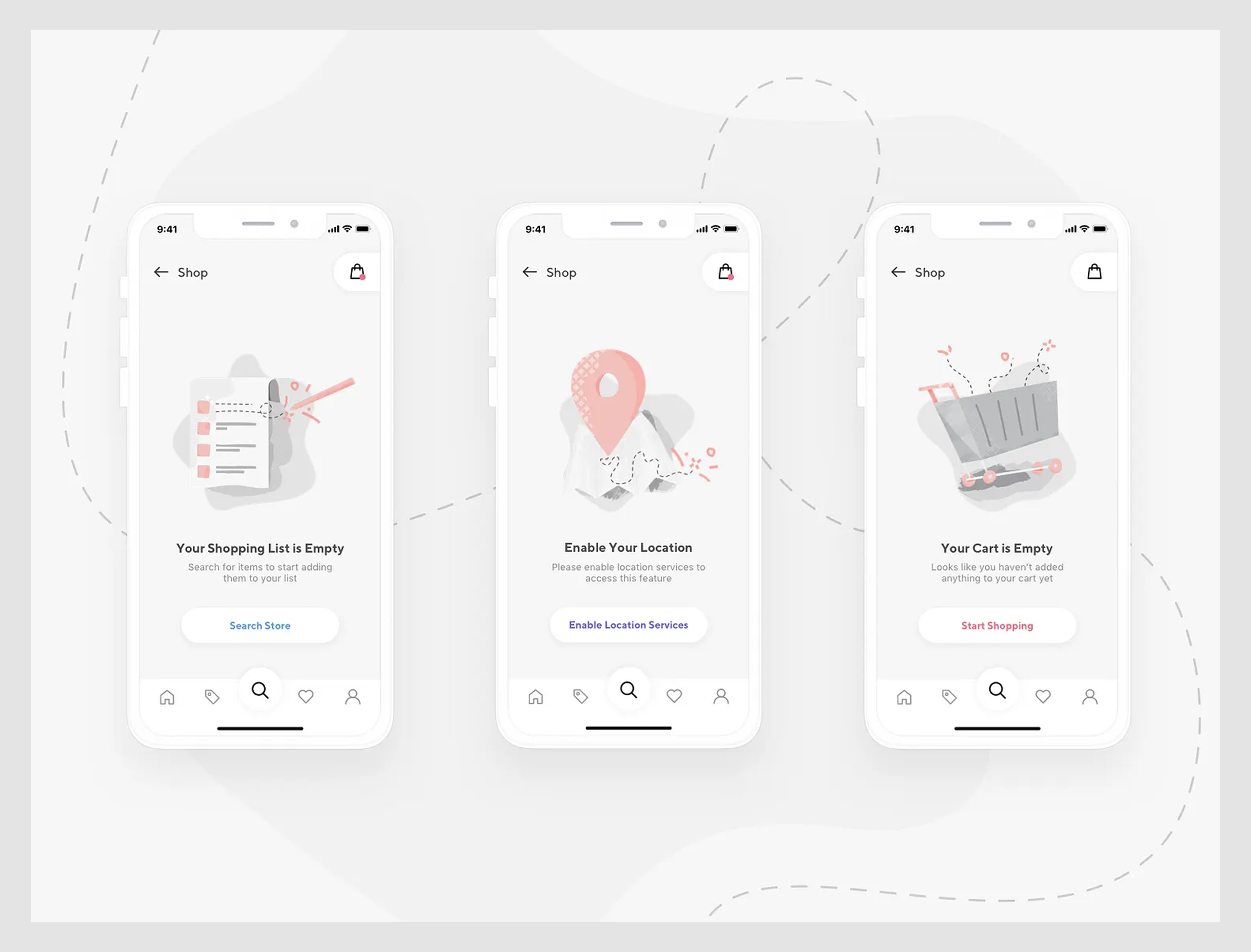
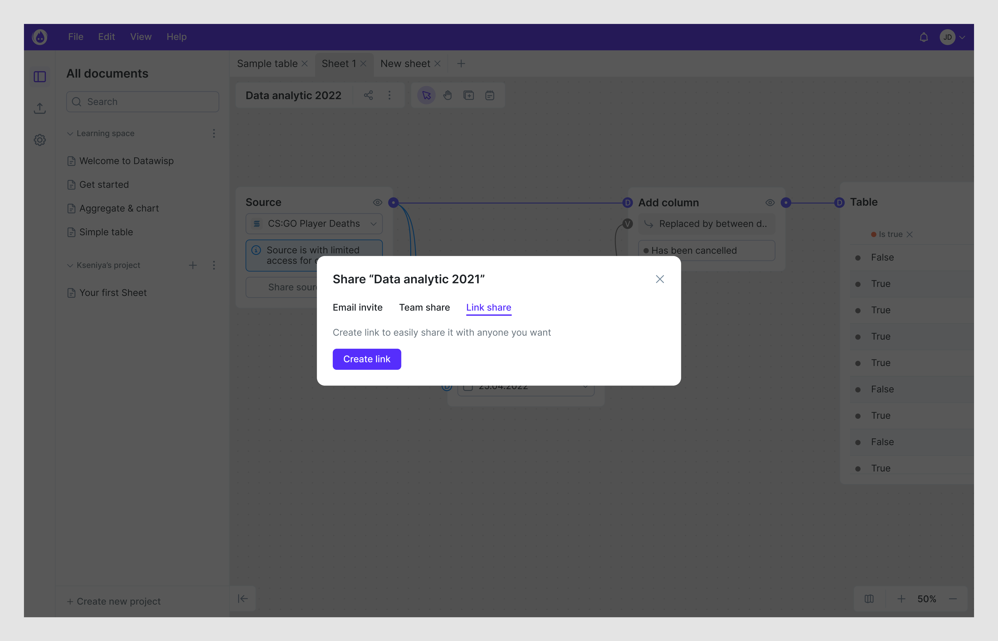
2. Datawisp
With Datawisp, a data analytics platform, we took a more restrained approach. There was no need for elaborate visuals or over-designed moments. We focused on following the user’s mental model and placed UX empty states exactly where they were expected.
Each one was straightforward by design: a relevant icon to provide visual context, a short message explaining the situation, and a clear button prompting the next step.

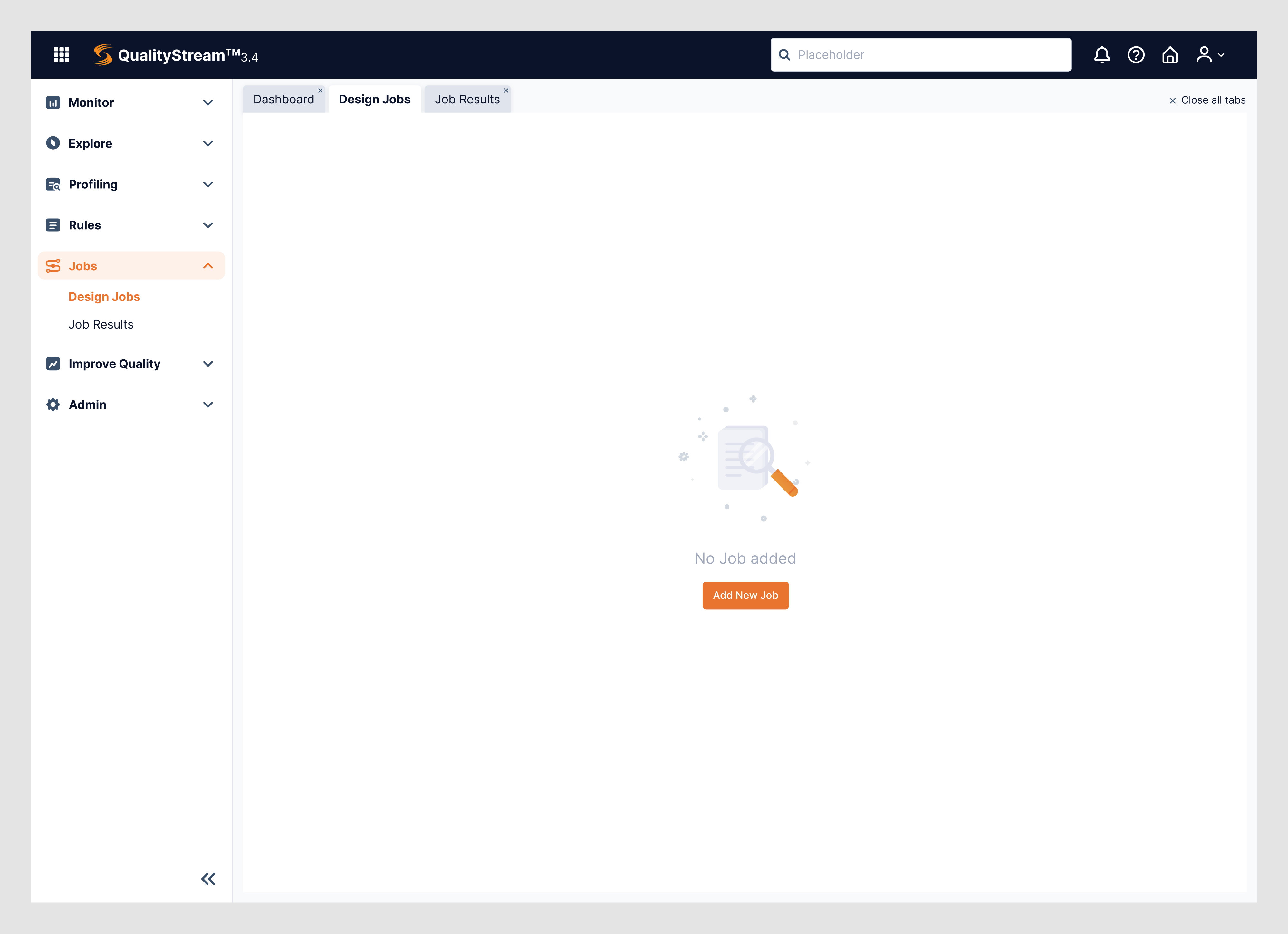
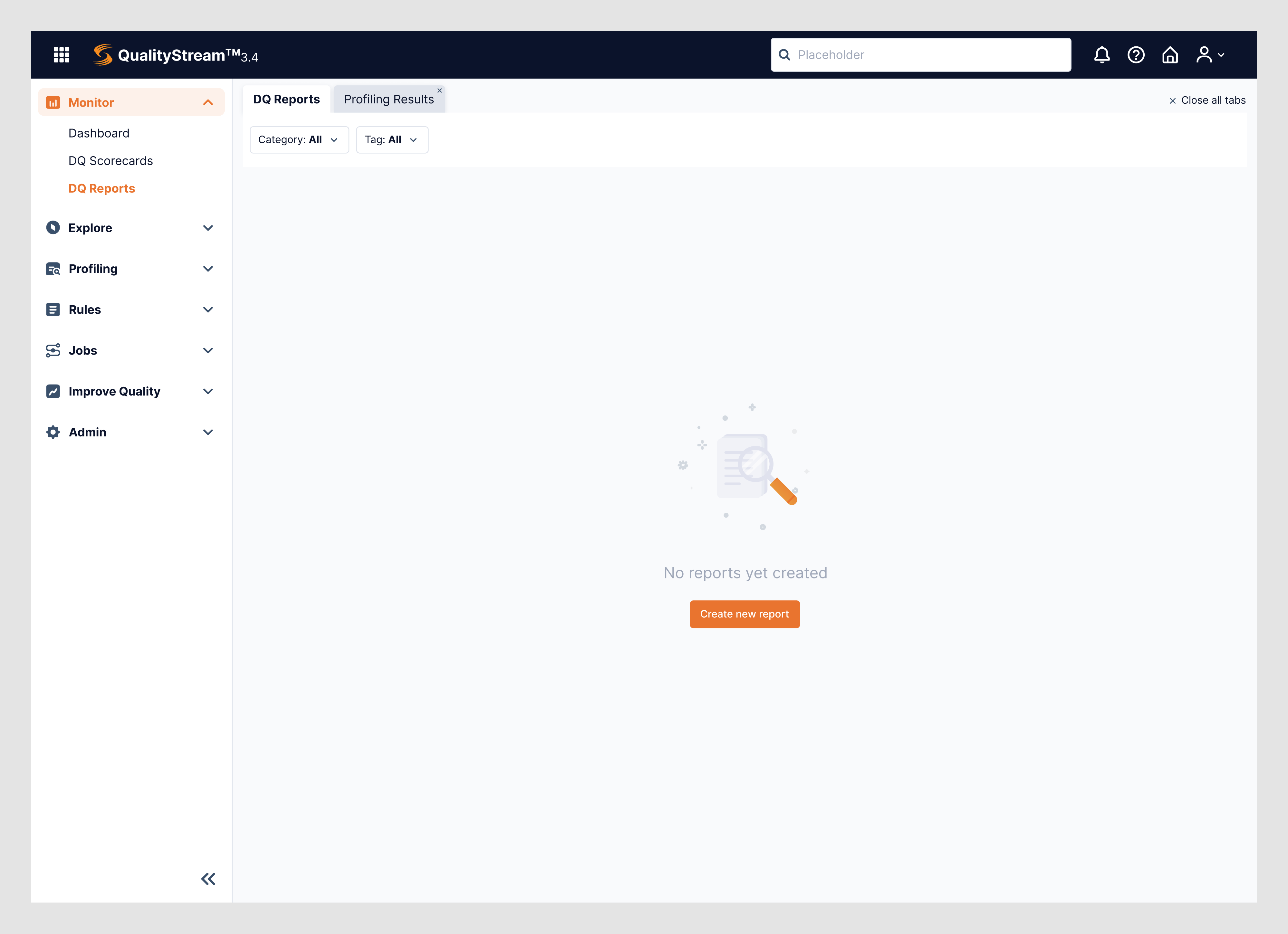
3. Data Streams
Data Streams is a feature-rich platform created to manage data in just about every way imaginable. When we began designing for this product, our main challenge was to help users navigate complexity without getting lost. And dashboard empty states became one of our most powerful tools.
We created tailored no results found UI sections, ensuring that users never landed on a dead end or felt abandoned. Each design followed a relevant icon, a short message, and a single CTA.
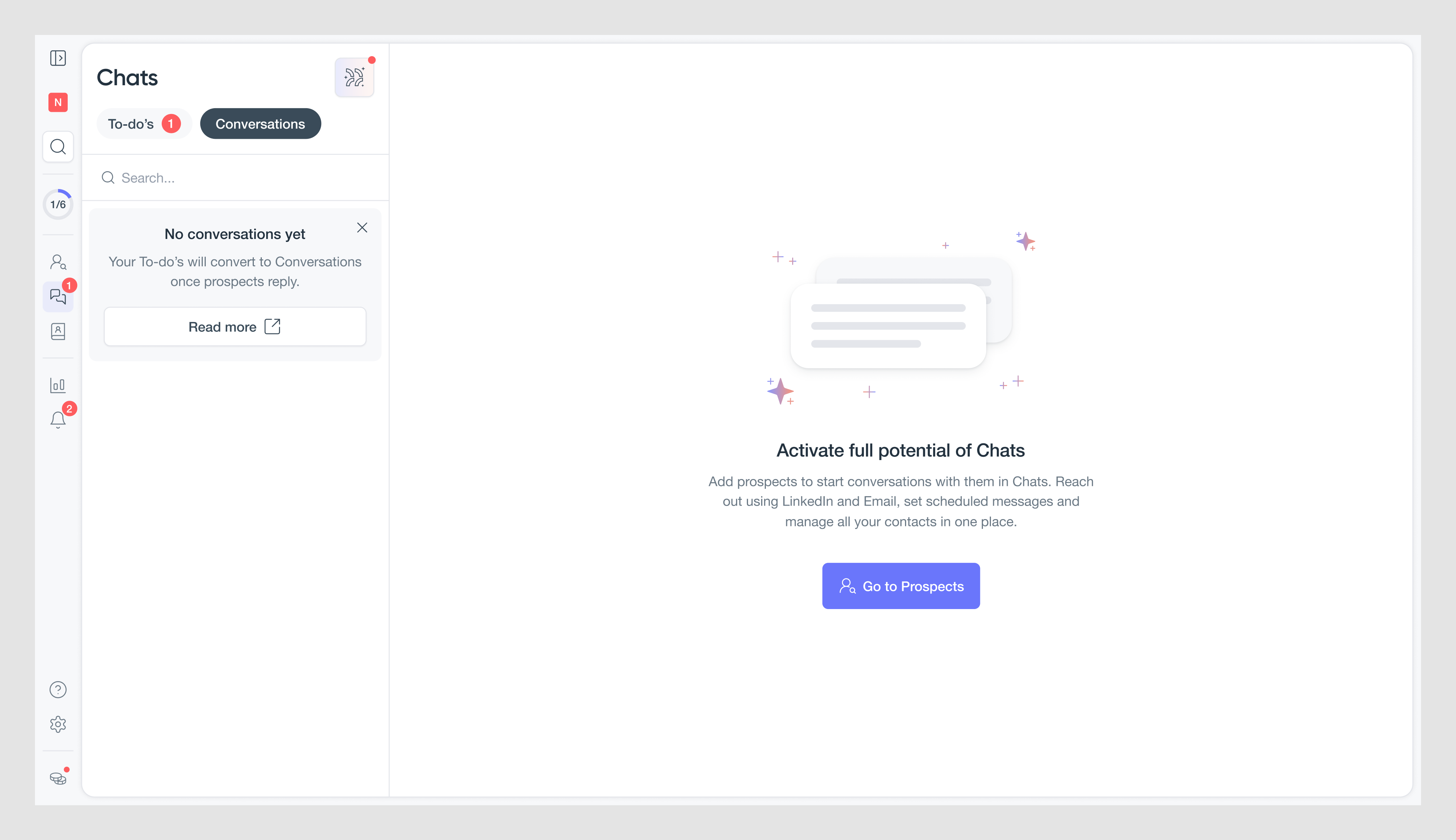
4. Zaplify
Like in previous projects, for the Zaplify sales automation service, our design team took a simple approach. We knew users would often land on feature pages that initially had no results UI pattern, so leaving them with a blank screen was out of the question.
In this regard, every empty state was crafted to serve a purpose. A short, focused message explained why the page was empty and what action the user could take. Clear CTA buttons made it easy to follow through.

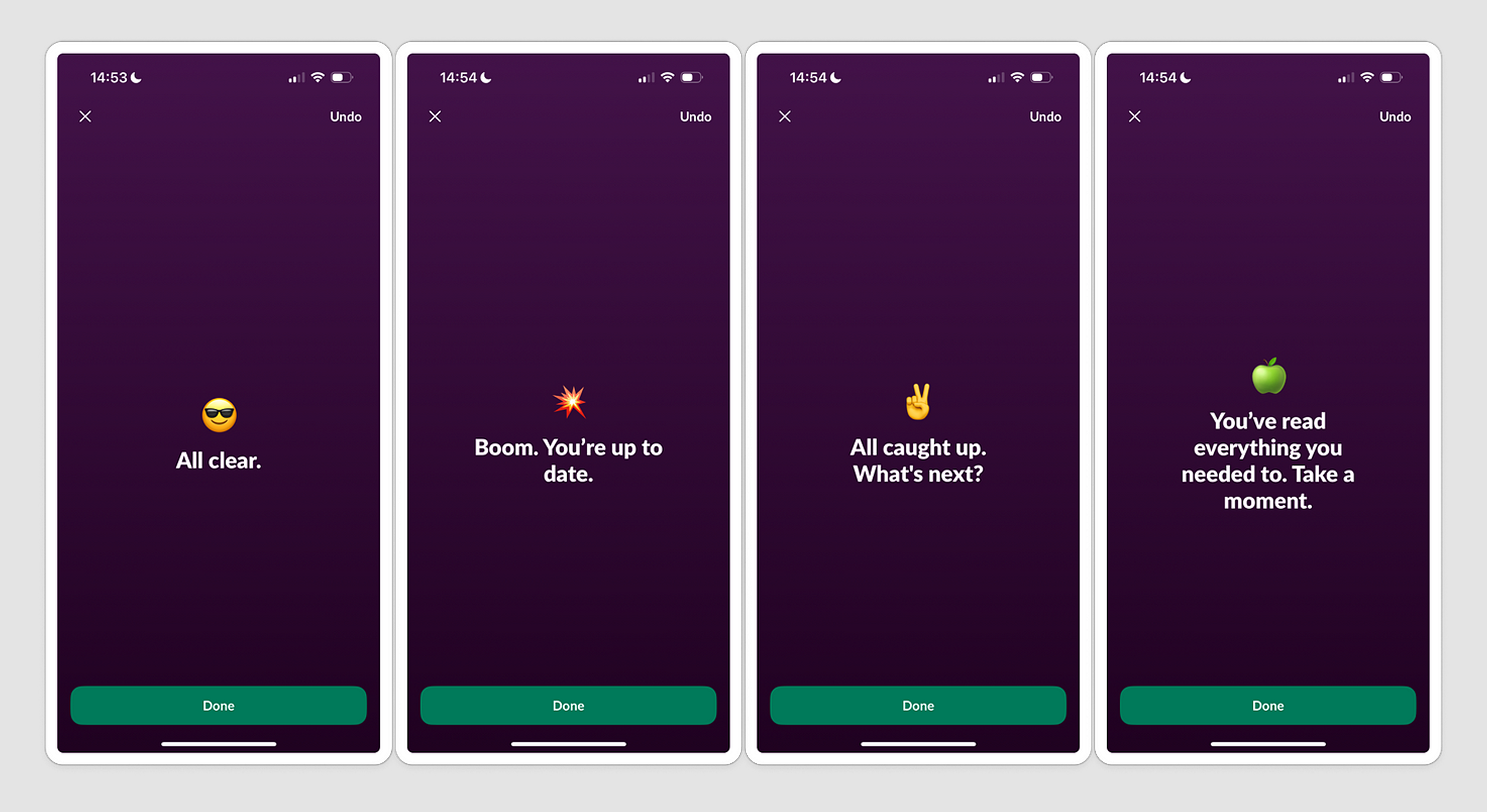
5. Slack
Slack offers a strong example of how empty states can guide users right from the very beginning. When someone signs up for the first time, they’re met with a blank message field paired with a sidebar that provides all the essential context.

The interface is clean and structured, using consistent layout patterns that reflect strong grid layout design. This setup subtly encourages exploration while making sure users never feel lost.
The same thoughtful approach is applied to congratulatory screens. When a user completes an action, Slack acknowledges it with a popup message and a celebratory emoji.
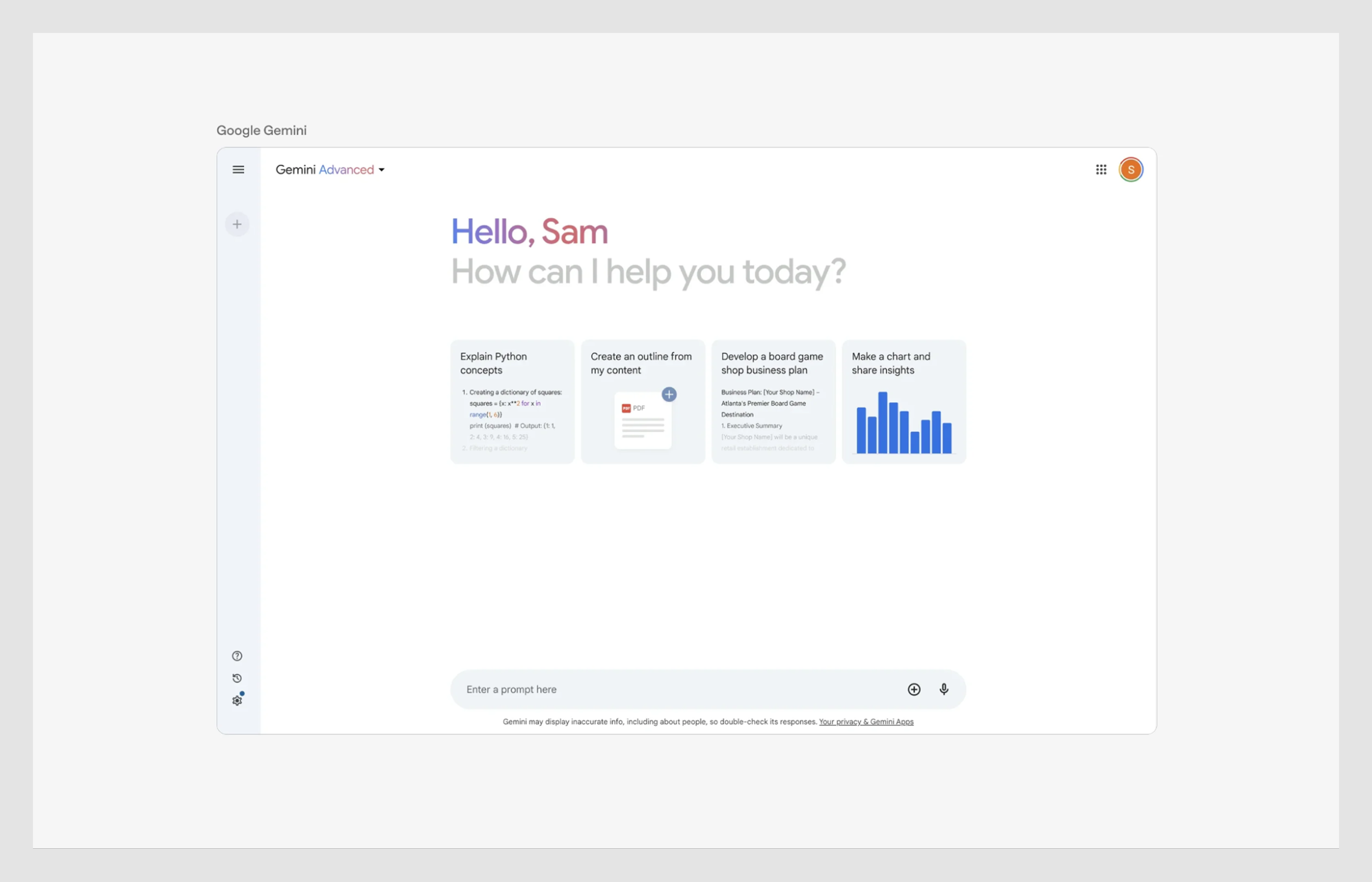
6. Google Gemini
When first-time users land in Gemini, they’re greeted by a clean and conversational UI. A personalized header — “Hello, Sam. How can I help you today?” — sets a friendly tone, making the AI assistant feel more human.
Below that, users see card design elements, each offering a different call to action. These prompts are thoughtfully curated to highlight a range of capabilities, helping users quickly grasp what the AI can do.
7. GitHub
GitHub delivers a delightful take on what’s known as a post-completion empty state.
After a user clears all their outstanding tasks, the screen features a lighthearted illustration of the GitHub mascot taking a stroll through the forest, paired with copy that encourages the user to take a well-earned break.
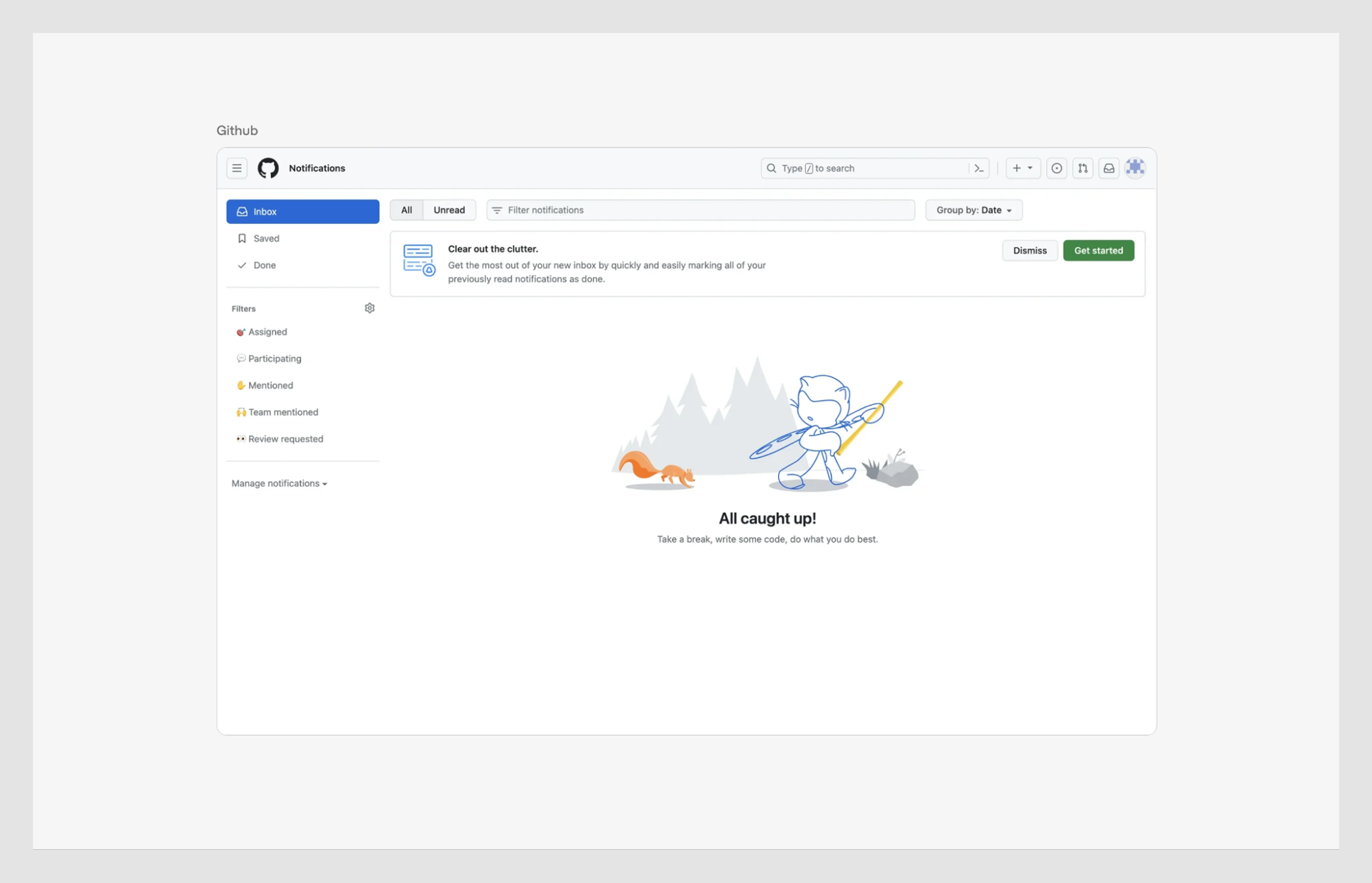
This kind of UX is especially common in productivity tools, where the work can be repetitive or draining.
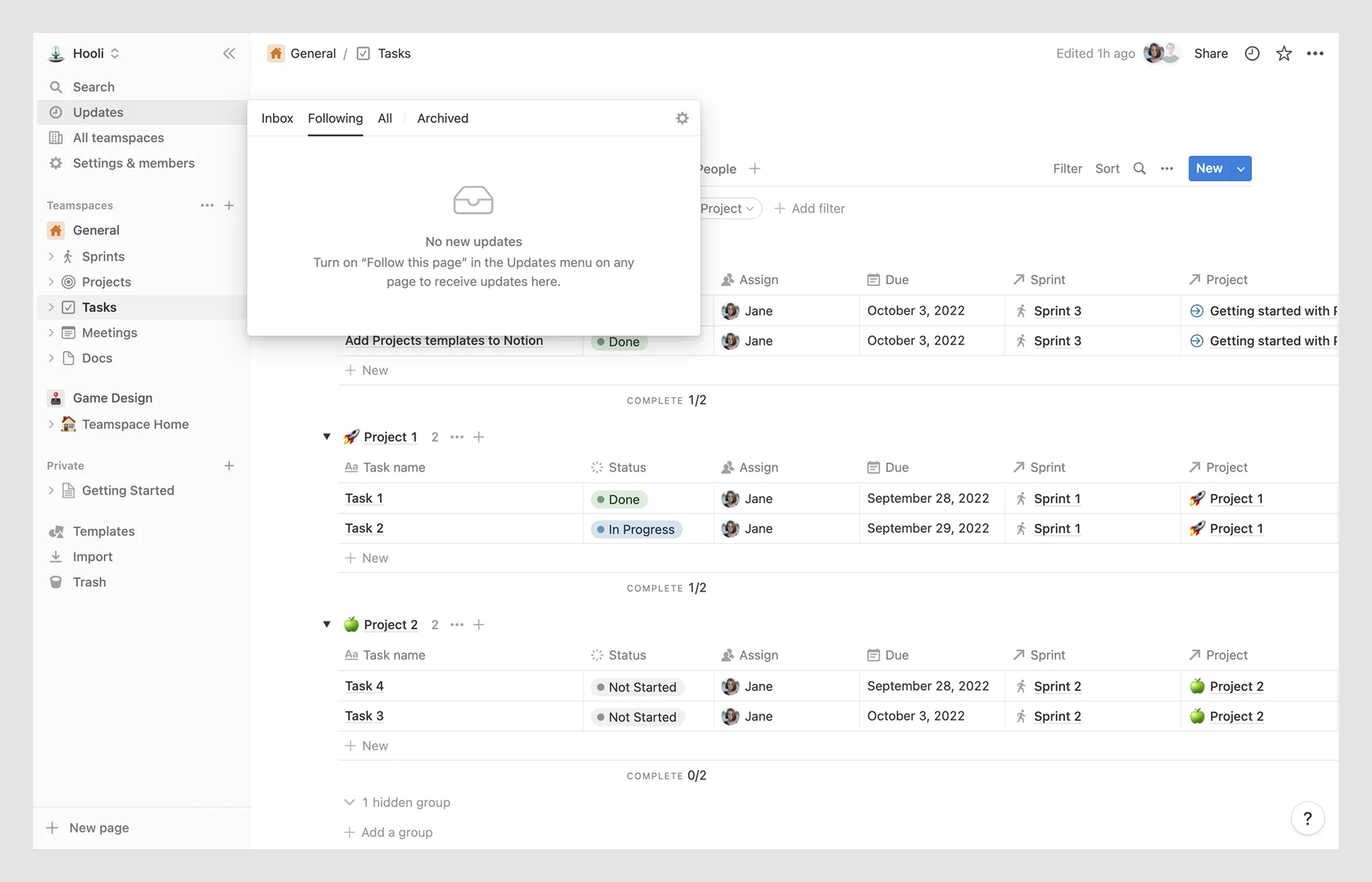
8. Notion
Notion sticks to its trademark simplicity when it comes to UI. The overall interface design is already intuitive, and its table empty state elements quietly support that experience.
Take the Updates tab, for example. When there are no new notifications, users see a short, unobtrusive message that confirms everything’s up to date.
The same minimalist clarity appears in search interactions. If a user enters a query that doesn’t return results, Notion lets them know and gently suggests an alternative.

9. Telegram
Telegram leans into minimalist design during a user’s registration. When opening the app for the first time, users are greeted with a screen that features lots of open space and just a simple message: “Folder is empty.”
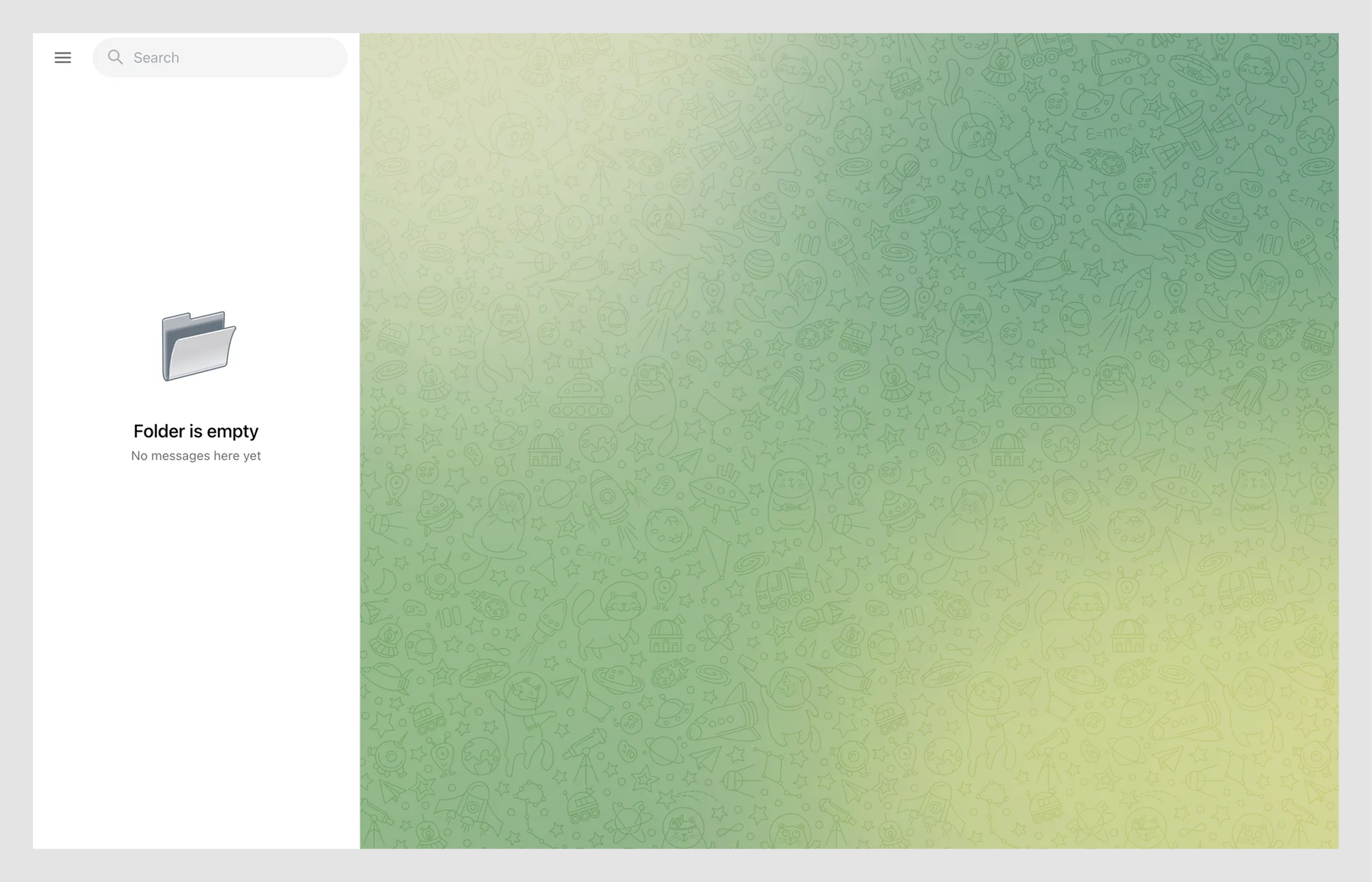
There’s nothing excessive, a clear sign-up flow with room to breathe, and a few key UI cues. A search bar at the top and a menu button on the upper left guide users intuitively toward their next actions.

Common empty state UX mistakes
Even the most experienced designers can stumble when it comes to crafting empty states. It’s easy to underestimate these quiet little screens, but that’s exactly where things can go wrong. Here are the most common mistakes we see in the wild, and how to steer clear of them.
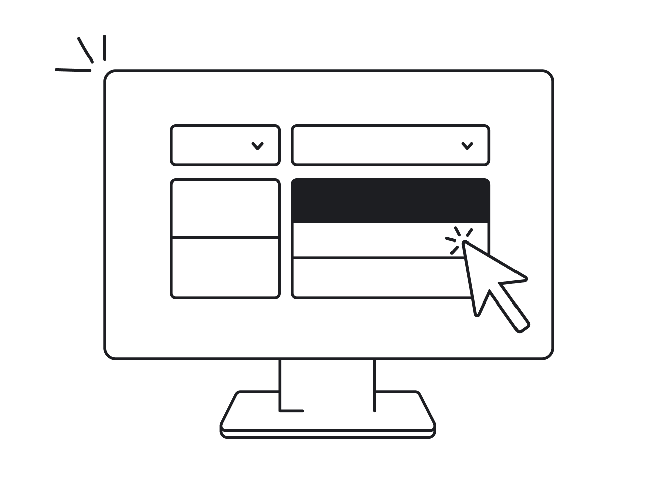
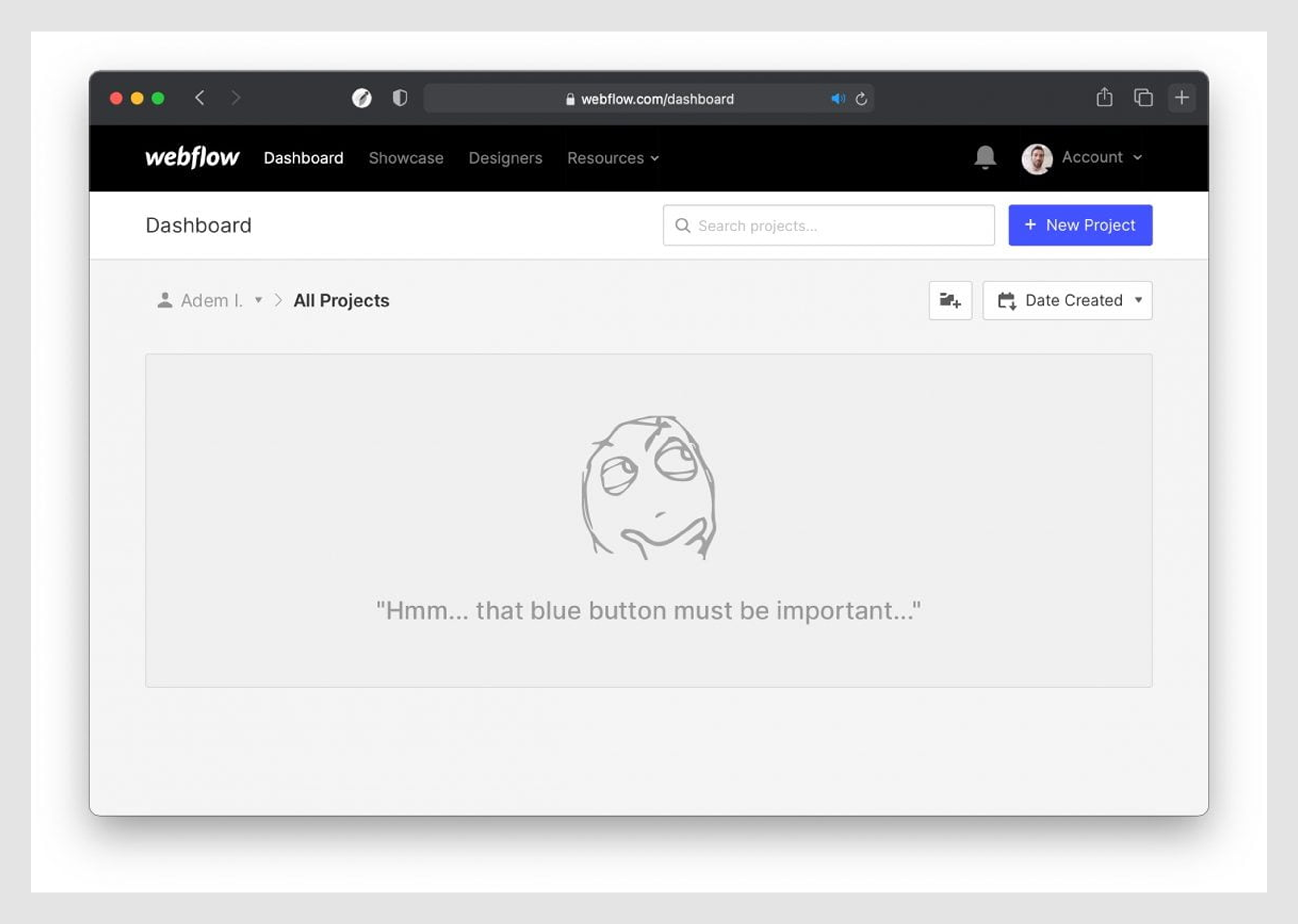
→ Leaving it blank, or worse, forgetting it exists.
The worst (and unfortunately very common) mistake is to treat an empty state as an afterthought and leave a screen essentially blank.
Examples include an empty dashboard that just shows an icon of a folder with no text, or an empty table UI that simply shows a “no data found” message in small print. It can cause panic, as users might assume something failed to load.
.png)
Avoid this by designing a purposeful empty state for every major view or component. If a section of your app can ever be empty, plan for it in your design process. Never allow an empty page that doesn’t at least confirm that nothing is wrong.
→ Copy-pasting content that doesn’t belong.
Sometimes designers copy-paste an empty state from one context to another without adjusting, leading to messages that feel out of place.
For example, an input field design urging the user to “Add your first project” shows up on a slider that isn’t about projects at all, due to a lazy reuse of a component. Or a text that suggests an action the user already did (“Upload your first file” when they actually have uploaded files elsewhere).
This irrelevance can confuse and annoy users.
The fix is to always craft empty states to fit the specific scenario. When your copy matches the brand voice and visuals feel on point, everything just clicks into place.
→ Being vague or cryptic.
Another pitfall is having an empty state UX message that is so unclear that the user doesn’t know what it means.
Phrases like “Nothing here yet” or “No data” without context fall into this category. Similarly, using overly technical language (“Error 241: Dataset empty”) or just a sad emoji with no text would leave people puzzled.
.png)
Vague empty states fail at the core job of communication. To fix this, make your copy direct and specific. State what is empty (e.g. “Your cart is empty” or “No search results for ’X’”) and preferably why (if relevant) or what the user can do about it.
Avoid the temptation to be poetic or mysterious. Clarity is far more important.
→ Getting too clever for your own good.
We all love a bit of personality in UX writing, and empty states can be a great place to have a friendly voice. However, a common mistake is leaning too far into humor or clever copy that obscures the meaning.
For example, an app might put a joke like “It’s as empty as your fridge on a Sunday night,” which is cute but doesn’t help the user. In this case, always balance personality with usefulness.
.png)
A good formula is a brief, witty headline plus a straightforward subtext. For instance: “No messages... yet” followed by “Invite some teammates to get the conversation going!” This way, you lighten the mood but still drive action.
Also, gauge the appropriateness of humor based on context: if the user might be frustrated (say, after an error or a failed search), a gentle empathetic tone might work better than a goofy joke.
→ Trying to do too much.
While emptiness can be scary, ironically, another pitfall is overcompensating by cramming the empty state full of stuff. If you present users with a wall of text, multiple buttons, links, tips, and an illustration all at once, you risk cognitive overload.
Remember, empty state UX is about easing users into the next step.
To avoid bombarding users, stick to the principle of one main idea per empty state screen. This applies across interaction-heavy elements like drag and drop UI, where simplicity ensures usability even in moments of emptiness.
You might have a secondary action or a small “Learn more” link, but don’t throw every possible detail at them. If you find your empty state text going beyond 2-3 short sentences, consider trimming it or breaking the info into a tooltip or separate help section.
Future trends in empty state design
As UX design matures and user expectations rise, empty states are evolving from static placeholders into dynamic moments of interaction. Looking ahead, here are some future trends and ideas shaping how screens might be designed in SaaS products.
Adaptive and contextual UI
Empty states are also starting to shift from passive messaging to interactive functionality. Instead of just saying, “You haven’t added anything yet,” modern examples might let you add something directly, right there on the same screen.
We’re already seeing interfaces that embed quick-start forms, integration buttons, or collaborative tips, especially within form design components that support immediate user input.
This kind of context-aware design will likely grow as products aim to reduce any friction in getting users to value. Designers will need to think of empty states more as responsive parts of the UI that can change with conditions.
Gamification and reward-driven UX
Another exciting direction is injecting joy and motivation through gamification. These are celebratory animations when a user hits inbox zero, or playful nudges like, “Create your first dashboard to earn a badge.”
Such micro-moments add a sense of progress and make the product feel more alive.
While subtlety is key, a bit of delight goes a long way in reducing friction, especially in user onboarding flows. Future SaaS products might even show milestone trackers within empty states, turning setup tasks into engaging journeys.
AI assistants built into the UI
The rise of conversational interfaces opens up new opportunities, too. This leads to dashboard empty states that say, “Need help getting started? Ask our AI assistant!” and let the user type a question or see an example.
With large language models (like the tech behind ChatGPT) becoming more common in apps, a chatbot UI could even converse with users: “I see your project list is empty. Would you like me to walk you through creating your first project?”
This approach could be especially useful in complex SaaS tools where users might be intimidated by a blank slate.
Avoiding empty states altogether
As we mentioned earlier, one of the most forward-thinking trends in empty state UX is… avoiding empty states entirely.
Some products now preload sample data, auto-generate starter content, or guide users through interactive onboarding so that by the time they reach the dashboard, something is already there.

However, there will always be cases (like searches yielding nothing, or user-cleared data) where emptiness can happen.
Wrap up
Empty states might start out as “nothing,” but as we’ve explored, they’re far from nothing. They are small design moments that carry big responsibility, like orienting new users, preventing frustration, and even celebrating successes.
Don’t waste that space. Embrace it, design it with care, and your users will surely notice (and thank you for it).
And hey, if you ever hit a wall and need help figuring out what to do with all that white space, drop us a line. Our team at Eleken has tackled this design challenge more times than we can count, and we’d be happy to help you make an impact.


.webp)
.png)

.png)