.png)

Great UX isn’t flashy. It’s intentional. The best UX design experiences are shaped by user research, real behavioral insights, and a deep understanding of what people need in the moment.
It solves real problems for the right people at the right time with clarity, speed, and care. The products users praise most don’t overwhelm or confuse. They make it easy to act, easy to understand, and easy to trust.
Here’s what consistently stands out in examples of good UX:
- Actions feel effortless.
- Cognitive load is low.
- The user experience design process anticipates user needs.
- Time and context are respected.
- Control is offered without complexity.
- Interfaces are accessible to all users, including those with disabilities.
And the best part? You often don’t notice great UX design at all, because it just works. A small touch like “pull to refresh” or “mark all as read” can reshape the entire app experience.
This isn’t a gallery of pretty interfaces. It's a curated set of good UX examples that actually work — from beloved apps, bold startups, and our own work at Eleken design agency. Each example highlights how thoughtful UI/UX and visual design choices can improve usability, clarity, and make both website and software feel worth using.
Design inspiration picks from Eleken’s Design Director
We asked Maksym Chervynskyi, Eleken’s Design director, to share user experience examples that feel intentional — not just polished, but purpose-built for the people who use them.
These UX design examples highlight how experienced UX designers apply practical design thinking to solve real problems for real users.
Here are four standout examples of UX design that evolve, listen, and design with purpose:
1. Airbnb designs filters around emotion, not features
The company was founded by a designer. That influence runs deep, from layout to language. They don’t just show listings — they shape expectations.
“You go to Booking, and it’s ‘2 beds, garage, washer.’ Airbnb says: ‘Want to live in a cave or a castle?😄” — Maksym Chervynskiy, Design Director at Eleken
Airbnb filters aren’t built around specs. They’re built around experiences: “cabins,” “caves,” “earth homes.” This changes how people search — not for what they need, but how they want to feel.
Airbnb’s UX design example shines because it aligns with how people dream, not just how they search. By reframing filters around emotions and designing a flow that feels intuitive and inviting, they guide users without making it feel like a decision tree.
.png)
What you can learn: Think beyond features — design filters and flows that speak to user desires, not just user needs and requirements. Lead and create with emotion, then support it with clarity and structure in the customer journey.
2. Figma treats user feedback as a product input, not an afterthought
When Figma released floating side panels, and users hated them, they rolled the change back. Fast. They explained why and improved the UI based on feedback. Simple as that. This is the power of UX in action — not as a design philosophy on a slide deck, but as a business decision that builds trust. Compare this to products that become bad UX examples precisely because they push through unpopular changes without listening: the result is often a textbook case of good UI bad UX, where the interface looks polished but the experience feels tone-deaf to the people actually using it.
“Figma listens, learns, and isn’t afraid to roll back a ‘cool’ idea if users hate it. That’s real UX leadership.” — Maksym Chervynskiy, Design Director at Eleken
It’s a product built with its users, not just for them.
.png)
What you can learn: Treat feedback like a feature. Don’t cling to decisions that don’t work. If users push back, respond with clarity and speed. The best teams design with their audience, not just for them — that’s the secret behind good user experience and strong UX/UI design practices.
3. Linear skips onboarding to double down on speed for pros
Linear isn’t trying to be for everyone — and that’s the point. It’s designed for fast-moving teams who already know the ropes. No hand-holding, no fluff — just speed, clarity, and precision. Every interaction is tuned for users who value flow over onboarding. The Linear app case study makes this philosophy concrete: by studying how their core users actually work, the team made deliberate decisions to remove features that would slow experts down, even if those same features might have helped beginners feel more comfortable.
That might feel confusing at first — but that’s not bad UX. It’s intentional.
“If something feels confusing, it might not be bad UX — you just might not be the target user.” — Maksym Chervynskiy, Design Director at Eleken
.png)
What you can learn: Don’t design for the masses if your product isn’t for the masses. Focus on your core users. Remove friction, not decisions. Let purpose, not instructions, drive clarity. That's how the best UX designs are born, especially when UX designers understand the context of the product’s app environment.
4. ChatGPT adds features without cluttering its core interaction
ChatGPT launched with a single input box — no menus, no distractions — so anyone could start using it instantly. As features like threads, history, and custom GPTs were introduced, the core experience stayed clean and intuitive.
“They scaled up without cluttering up. That’s rare.” — Max, Design Director at Eleken
It’s progressive UX done right.
.png)
What you can learn: Start small. Ship the simplest version that delivers value, then scale deliberately. Add features without breaking flow, and always protect the interaction users came for in the first place. It’s a model for good UX design examples done right, UX like this for your SaaS solution.
Good UX design that builds confidence
Products that make users feel smart, safe, and in control
These tools don't just simplify complexity — they build trust. Through calm visuals, clear flows, and reassuring language, they make serious tasks feel manageable and even empowering.
Clear descriptions and explanations in the user interface are essential for building trust and confidence. To top it off, good UX design includes a clear visual hierarchy that helps users navigate content in just a few clicks.
Essentially, reducing user friction and driving user confidence lies in the power of clear visual hierarchy patterns. And plus point, it also lets users get their voice heard by facilitating feedback or connecting with customer service. Based on any Cron app review, this is exactly what makes it stand out — users consistently praise how the app removes decision fatigue and puts the most important information front and center, making calendar management feel effortless rather than exhausting.
5. Wealthfront eases financial stress with calm language and flows
Finance apps can easily overwhelm. Wealthfront does the opposite.
It uses warm, non-technical language and smooth, non-urgent flows that reduce anxiety. The experience makes people feel like they can handle their finances — even if they’re not experts.
The UI removes friction and pressure, creating a space that feels less like a spreadsheet and more like a trusted guide. The Gmail redesign pursued a similar goal — by decluttering the inbox view and surfacing only what users need in the moment, Google made a product millions use daily feel noticeably less stressful, proving that even small structural changes can shift how confident users feel in a familiar environment.
The Google Meet redesign followed the same principle, simplifying the meeting controls and reducing visual clutter so that users could focus on the conversation rather than the interface around it.

What you can learn: Use language and tone to lower emotional friction. Don’t just simplify — create calm. Structure your flows so users feel safe, not rushed, when making big decisions. Even subtle visual design choices can have a huge impact on how confident and capable users feel.
6. Copilot Money turns complex personal finance into clear, daily insights
Copilot takes messy financial data and turns it into clear, bite-sized visuals. Instead of overwhelming users with budgets and spreadsheets, it highlights what matters most, using visually appealing charts, categories, and daily summaries, all framed in a clean, focused layout.
This approach helps users gain insights quickly without needing financial expertise.

What you can learn: Treat data like a story. Show progress over time. And remember: delight doesn’t have to be loud — it can be a moment of clarity in an otherwise stressful space.
7. Amplitude guides users to insights without overload
Amplitude is a powerful analytics tool, but it doesn’t force users to wade through complexity. Smart presets, clean dashboards, and guided flows help users uncover insights quickly — without needing to be a data scientist. Additionally, these dashboards include multiple layers of analysis while maintaining clarity for better decision making.
So it’s a real masterclass in giving users control without flooding them with options.
.png)
What you can learn: Offer smart defaults to reduce decision fatigue. Let your layout guide users to value, and only surface complexity when they’re ready for it.
8. Habstash makes home buying feel possible through guided flows
For first-time buyers, financial planning is stressful. Habstash turns that into clarity. Eleken helped design a wizard-style onboarding flow that collects complex financial data through bite-sized, friendly steps, guiding users through the customer journey from uncertainty to confident financial planning. A personalized dashboard shows how much you’ve saved, how far you’ve come, and what’s next. Features like saving with a partner and savings simulations build trust, not just in the app, but in the process.
.png)
What you can learn: Break big decisions into digestible steps. Reflect real-life scenarios in your UX. Build tools that empower users with clear, encouraging feedback — especially when the stakes are high.
9. Glow Labs makes Web3 dashboards less intimidating (and more fun)
Web3 interfaces are often chaotic. Eleken helped Glow Labs bring clarity through thoughtful UI design, color, iconography, and subtle playfulness. The dashboards use emojis and sparklines without sacrificing seriousness, making a complex tool feel lightweight and inviting.

What you can learn: Don’t be afraid to inject personality if it suits your audience. Use visual metaphors to lower the barrier to understanding, and always test layouts with real users.
10. Stripe builds trust with consistent, boring-in-a-good-way UX
Stripe is boring in the best way. Forms are quiet, flows are predictable, and interactions are rock-solid. When people are entering sensitive info like credit card numbers, they don’t want surprises — they want stability.
Any poor interaction at such stages could quickly turn into a bad UX design that damages trust.
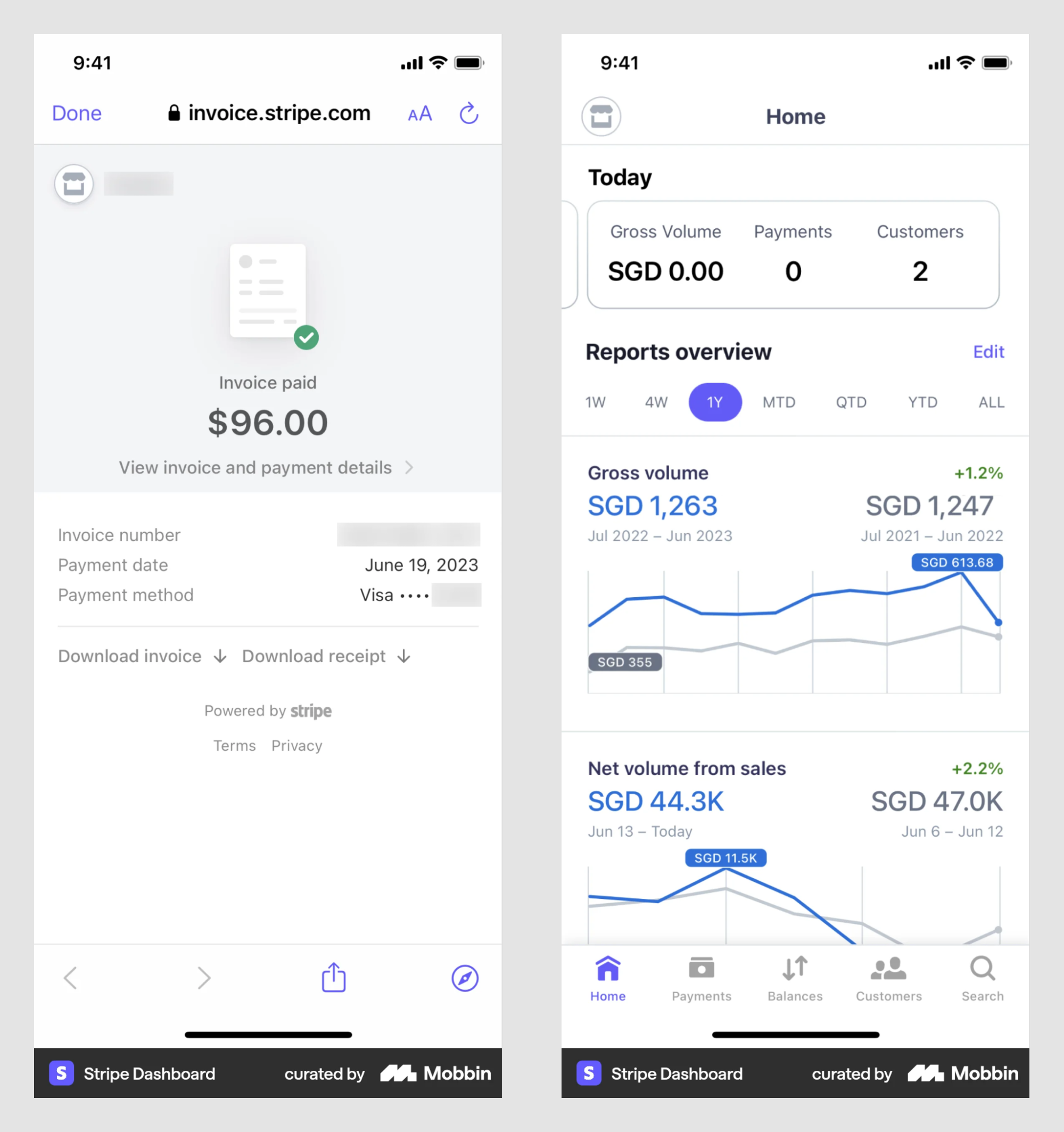
What you can learn: Consistency isn’t boring — it’s reassuring. Don’t get cute in mission-critical flows. Make trust your primary UX feature.
11. PrimePro simplifies job tracking by focusing on one task per screen
Field contractors don’t need complexity — they need clarity. PrimePro’s mobile UX focuses on one action per screen, replaces tabs with long scrolls, and presents a clean calendar view. The result? Zero confusion, even on the go.

What you can learn: Mobile UX should reduce decisions, not just screens. Keep each view task-specific, and prioritize focus over features.
12. Refera boosts healthcare trust with real visuals and intuitive inputs
Refera’s old interface used generic illustrations — not ideal for a product where trust is everything. Eleken redesigned it with real doctor photos, added intuitive components like a visual tooth selector, and built flows around actual healthcare needs.

What you can learn: Swap placeholder visuals for real people when trust matters. Make every visual element do emotional work, and align interactions with real-world behavior.
13. Gridle empowers small agencies with guided onboarding and smart dashboards
Gridle wanted to serve small teams, but its interface was overwhelming. Eleken redesigned the experience with product tours, simplified pipelines, and dashboards that show what matters most. The UI now supports confidence, not confusion.

What you can learn: Good UX reduces friction by anticipating user hesitation. Use onboarding to guide, not lecture. Keep flows familiar — just sharper, cleaner, and more helpful.
Tiny UX details with big impact
Small interactions that quietly improve the whole experience
Not all great UX shows up in bold UI. Some of the most impactful changes are the tiniest: a button moved, a flow clarified, a choice made obvious. These excellent examples show how small details UX designers add can prevent confusion, save time, or build trust — one thoughtful decision at a time. This is also one of the core reasons products fail — not a lack of features, but a lack of attention to the small moments that quietly erode user trust over time.
14. Netflix kills viewer fatigue with one magical “Skip Intro” button
Netflix spotted a universal annoyance — repetitive intros — and solved it with a single, well-timed button. The “Skip Intro” feature only appears when relevant, skips to the precise timestamp, and never clutters the UI. It gives viewers control without adding friction, making binge-watching smoother and more enjoyable. The Twitter redesign attempted something similar — simplifying navigation and reducing visual noise to make the core experience feel more focused. And while results were mixed, it's a useful product design trial to study: even when small UX changes don't land perfectly, they reveal exactly which details users care about most.
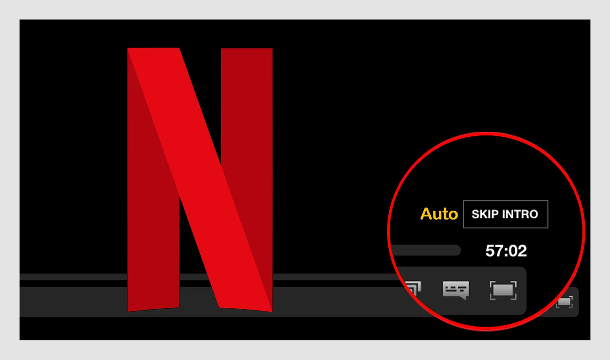
What you can learn: Look for repetitive moments that slow users down and automate them. Thoughtful utility doesn’t need fanfare — it just needs to appear when it’s needed. Solve small pains and your UX will feel magical.
15. YouTube auto-resumes videos across devices without users noticing
YouTube nails continuity. Whether you switch from laptop to phone or tablet to TV, your video resumes at the exact second you left off — no syncing required, no setup, no prompts. This kind of invisible UX removes friction in the entire experience without users even realizing it.

What you can learn: Persist state across platforms in a way that feels effortless. Eliminate redundant steps. When UX feels seamless, it fades into the background — which is exactly what good design should do.
16. iOS auto-fills codes to remove pain from two-factor logins
Apple turned one of the most annoying flows — 2FA verification — into a single-tap interaction. It detects SMS codes and suggests them right above the keyboard, so there’s no memorizing or switching apps. It's a masterclass in eliminating design and friction at exactly the right moment, when a user is already mid-task, every extra step feels twice as long, and removing even one can completely change how the experience feels.

What you can learn: Surface helpful automation at the exact moment it’s needed. Cut down steps, reduce context switching, and make convenience feel native.
17. Gmail’s ‘Undo Send’ protects users from email regret without clutter
“Undo Send” is a tiny buffer that solves a lot of anxiety. Gmail quietly delays sending by a few seconds, giving you a moment to catch a mistake — without changing how you send email at all.

What you can learn: Add safety nets around high-stakes actions. Use subtle delays or defaults to give users peace of mind without changing their behavior.
18. Apple turns Bluetooth setup into a one-step invisible gesture
With AirPods, Apple reduced Bluetooth pairing to a single action: open the lid. Proximity triggers connection, and a visual pops up — no settings, no tapping, no learning curve.
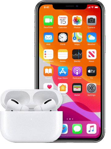
What you can learn: Design setup flows that feel like part of the product, not a separate task. Invisible UX is often the most powerful.
19. MyInterview slashes drop-off with clear inputs and preview feedback
MyInterview came to Eleken after seeing too many candidates abandon the process mid-interview. We discovered the UI was confusing and lacked feedback. By redesigning the flow with checkboxes instead of multi-selects, real-time previews, and clearer button affordances, Eleken helped reduce drop-off by 90%.
.png)
What you can learn: Don’t reinvent patterns that work. Use visual feedback to build confidence and make forward progress always feel visible.
20. Order Desk uses drag-and-drop to make automation feel approachable
Automation intimidated users, so Order Desk made it visual. Drag-and-drop logic blocks, clear rule labels, and visual templates replaced code and fear.

What you can learn: Replace syntax with structure. A well-organized UI reduces anxiety and helps users build with confidence, even in technical workflows.
Making complex products feel simple
Interfaces that guide, reveal, and support — without hand-holding
Not every user starts from the same place. Some want context. Some want control. Others just want to get things done. The best UX adapts — surfacing what's essential, hiding what isn’t, and helping users build confidence as they go. This is precisely why Skype failed: it accumulated complexity over the years without ever developing a clear principle for what to show, what to hide, and what to remove entirely, leaving users with an interface that felt increasingly exhausting to navigate.
21. Asana organizes complex project tools into clear, visual steps
Asana is loaded with power features—timelines, dependencies, reporting — but it never feels bloated. The interface leads with clarity, using focused task views and customizable dashboards that help teams act without overthinking.
Visual structure supports a clear visual hierarchy that minimizes cognitive load, letting users stay in flow instead of hunting through clutter.

What you can learn: Break complex systems into digestible views. Use visual hierarchy to guide attention and let users customize for focus. Make it feel like momentum, not micromanagement across a busy app environment.
22. FanDuel balances real-time data with fast, readable layouts
FanDuel could easily feel overwhelming with its constant flow of live stats and predictive analytics, but smart design keeps the experience feeling snappy. Cards, visual groupings, and speed-first design help users find and place bets fast, even under pressure.
Good structure in UX design examples like this shows how layout choices can support fast decision making.

What you can learn: Prioritize speed and structure when designing for real-time use. Group dense data visually. Strip away anything that gets in the way of action.
23. Tromzo visualizes DevSecOps risk with zoomable graphs and heatmaps
DevSecOps tools often drown users in spreadsheets and logs. Tromzo flips the script with visual risk mapping: zoomable graphs show ownership across teams, and heatmaps spotlight vulnerabilities. Clear VISUAL DESIGN decisions help transform complex security data into actionable insights.
Eleken designed workflows that integrate directly with tools like GitHub and Slack, meeting users and customers where they work.

What you can learn: In data-heavy UIs, lead with visuals that guide attention. Integrate with existing workflows, not around them. Enable users to gain insights quickly and let them explore complexity, not be buried by it.
24. EcoFlow explains smart energy systems with charts and plain language
Smart battery data could feel intimidating, but EcoFlow’s app makes it readable. Color-coded graphs show energy in and out, dashboards group live, and historical data, and plain-language labels tell users what’s happening ("Charging," not just voltage). The result: clarity without compromise.
This approach reflects a broader shift in how the industry thinks about complex interfaces — one that the Adobe Figma acquisition put into sharp focus, signaling that tools prioritizing accessibility and clarity over raw power are increasingly winning both users and market attention.

What you can learn: Translate complex data into visual design stories. Make the system status unmissable and use charts that teach, not just report.
25. Vector0 uses progressive disclosure to untangle cybersecurity chaos
Originally dense and overwhelming, Vector0’s UI now uses expandable sidebars and color-coded metrics to let users scan fast and dive deep only when needed. Eleken cleaned up duplicates and structured layers of info so users aren’t hit with everything at once.
Without a clear structure, systems like these can easily fall into bad UX design patterns where users feel overwhelmed.

What you can learn: Use progressive disclosure to manage complexity. Let users control when to go deeper. Remember that clean structure always builds clarity — even in chaotic data.
26. HabitSpace motivates users with one screen, one streak, one goal
Eleken redesigned HabitSpace around a single daily view — habits, streaks, next steps — no tabs, no fluff. Progress rings, color cues, and friendly microcopy keep users focused and consistent without cognitive drain.

What you can learn: Put repeat tasks in one place. Use visuals for motivation and feedback right after the action to keep momentum alive.
27. Pitch bakes design consistency into collaborative presentations
Pitch replaces blank slides with smart defaults, reusable layouts, and live multiplayer editing. It enforces consistency without effort, letting teams co-build polished decks without fussing over fonts or formats.

What you can learn: Use defaults to eliminate busywork. Bake best practices into the flow. Make collaboration seamless, not stressful.
28. Floret simplifies complex B2B workflows with role-based dashboards
Floret’s early UI overwhelmed users. Eleken rebuilt it with role-specific views, clearer flows, and tools like smart filters and dispute tracking. The result helped raise $2.3M by making the product feel tailored, not generic.

What you can learn: Customize flows by user role. Surface the right info at the right time. Personalization isn't fluff; it's a way to better respond to user needs.
Great UX design that teaches the user (quietly)
Interfaces that guide, reveal, and support without hand-holding
The best teaching moments in user experience design don't feel like lessons. They happen through smart defaults, thoughtful language, and interfaces that show rather than tell. These products guide users by design, helping them succeed without stopping to explain how.
29. Monday.com teaches by doing — onboarding happens as you build
Monday doesn’t onboard with a lecture. It gets you building right away. As users drag components, choose templates, and customize views, they’re learning the platform without realizing it. Onboarding is embedded into the product experience — no walls of text, just momentum.

What you can learn: Let potential customers learn through action. Guide setup with smart defaults and helpful context, not popups. Design your interface to be the tutorial.
30. Typeform turns forms into friendly, focused conversations
Typeform transforms boring web forms into something closer to a chat. Showing one question at a time keeps users focused and removes overwhelm. The conversational tone and rhythm make progress feel effortless, and completing a form less like work thereby significantly improving overall user experience.

What you can learn: Break complex tasks into small, paced steps. Use conversational copy to create flow. Keep the interface calm by showing only what matters in the moment.
31. Aampe renamed its features to reflect how users actually think
Aampe had powerful AI tools buried behind confusing labels. Eleken redesigned the experience by renaming “Snippets GPT3” to “GenAI Assistant,” grouping tools by workflow, and cleaning up navigation. Suddenly, the product made sense, and usage followed because the changes helped align the interface with real user needs.

What you can learn: Speak your users’ language. Structure your UI around how people work, not how systems are built. And audit your icons — they should clarify, not confuse.
32. Whoosh redesigns video calls to feel intuitive for all users
Whoosh reimagined the video call for simplicity. Eleken moved the self-view camera under the main feed to improve eye contact, previewed shared content, and made breakout rooms feel natural — all to make advanced features approachable for anyone, not just techies — which improved the overall app experience.

What you can learn: Layouts teach more than tooltips, as they have a huge impact on usability. Design smart defaults that reduce cognitive load. And always prioritize confidence for non-technical users.
33. Loom teaches recording with one glowing button and live feedback
Loom skips the tutorial and gives you a single glowing CTA: “Start recording.” Visual prompts guide you as you go. Real-time feedback and auto-transcripts turn first-time users into pros, which helps create confidence — without breaking the flow.

What you can learn: Reduce setup friction to nearly zero. Bake support into the experience, not separate help docs. Teach through action, not explanation.
UX that connects emotionally
Designs that resonate with who users are, not just what they need
These products go beyond usability and aesthetics. They tap into identity, confidence, and feeling. The goal isn’t just to help users do something — it’s to make them feel seen, empowered, or inspired.
Here's how thoughtful UX creates subtle connections and turns emotion into a feature, not a byproduct.
34. Spotify Wrapped turns listening history into a shareable story
Spotify Wrapped isn’t just a fun year-end feature — it taps into identity. By turning personal listening data into visual storytelling, it gives users something to celebrate and share. It’s a ritual now, one that users anticipate because it feels like a reflection of who they are.

What you can learn: Don’t just show data — turn it into a story. Design features that help users feel seen and proud. And if they want to screenshot it, you’re doing it right.
35. Headspace designs to soothe — from visuals to tone of voice
Headspace lowers anxiety before the first tap. Calming colors, slow animations, and human language replace clinical UI with care. Instead of just guiding users through meditation, the whole app is a lesson in mindfulness.

What you can learn: Use tone and motion to set the emotional baseline. UX isn’t just about function — it’s how people feel using your product that keeps them coming back. Because strong visual design decisions shape the emotional user experience.
36. BeReal builds emotional trust with timed, unfiltered prompts
BeReal flips the social script. By limiting when and how you post — and using both cameras at the same time — you create small, authentic moments that resist curation. The friction is the feature, reinforcing vulnerability over vanity.
Without thoughtful constraints, social platforms often fall into bad UX design patterns driven by engagement metrics alone.

What you can learn: Design emotional values into your constraints. Use friction to encourage sincerity, and build trust by removing pressure.
37. Strava helps users build identity with data-driven personal branding
Strava isn’t just tracking — it’s a transformation. The app helps athletes narrate their progress, set goals, and wear their stats with pride. Public profiles, personalized feeds, and achievement badges make workouts into identity-building experiences.

What you can learn: Let users define themselves through interaction. When data becomes a mirror, UX becomes motivation.
38. Canva boosts confidence by turning complex tasks into creative play
Canva makes people feel like designers, even if they’re not. With templates, drag-and-drop tools, and smart defaults, it empowers non-designers while still offering flexibility that web designers and graphic designers appreciate.

What you can learn: Turn complexity into flow. Reward users early and often. And remember — playful UI can be a powerful confidence booster.
39. Pinterest guides users through visual discovery with an intuitive structure
Pinterest feels like dreaming out loud. Its endless scroll, adaptable search, and visual-first experience invite exploration, not completion. Users build boards that become emotional maps — not just bookmarks.
This experience reflects some of the most recognizable examples of UX design patterns used in discovery platforms.
.png)
What you can learn: Don’t force linear paths. Let users wander, collect, and shape their own narrative. Great UX doesn’t just guide — it inspires.
40. Threads reduces friction by auto-connecting users and stripping features
Threads borrows from Instagram but feels simpler and more intimate. By auto-following friends and dropping likes and hashtags, a thoughtful design process turns social posting into low-pressure conversations. It's familiar, but quieter.

What you can learn: Don’t overload users to prove value. Strip away what creates pressure. Teach with patterns they already know, and comfort will follow.
These examples span industries, styles, and audiences, but the thread running through all of them is simple: clarity, empathy, and purpose. Whether it’s a finance tool or a social app, great UX meets people where they are and makes every interaction feel just right. The secrets of bad design are essentially the opposite of this list — products that prioritize internal logic over user mental models, or that confuse complexity with capability.
Conclusions: What all these good designs have in common
Genius UX doesn’t shout. It listens.
Across every example in this article, one thing stood out: the best UX design in SaaS experiences don’t just look good — they feel right. They’re built from a deep understanding of real users and real needs. For teams looking to reach that standard, Stripe design inspiration is one of the most cited benchmarks in the industry — not because Stripe is flashy, but because every detail serves the user's goal so precisely that the design itself becomes invisible.
Here’s what keeps showing up:
- Speak your users’ language. Name features the way users talk, not how your dev team thinks.
- Balance simplicity and power. Give experts depth without intimidating newcomers.
- Reveal complexity gradually. Show what matters right now. Let users ask for more.
- Avoid cleverness for its own sake. If it adds friction, it’s not clever — it’s noise.
- Let usage shape design. Watch what people do. Let that guide what you build next.
The best UX design is invisible. It feels obvious, because it was made for someone like you. Keep listening, keep iterating, and the clarity will come.


.webp)

.webp)
.png)