Search bar UI seems like one of those design elements you can’t mess up. Stick a magnifying glass icon in the header, add a couple of input states, ensure a solid backend — and you’re done, right?
The reality is, when users search, they often don’t know exactly what they’re looking for. That’s why a well-designed search bar doesn’t just capture queries — it supports the search process , guides discovery, handles vague inputs, and helps users refine their intent along the way.
At Eleken, we design search experiences for SaaS products all the time — minimalist, complex filter-driven, even AI-powered. And we’ve seen just how many micro-decisions go into building an effective search bar that aligns with both user needs and business goals.
In this post, we’re sharing some of our favorite search bar examples — from our own work and from the web — and breaking down why they succeed.
But first, what exactly is a search bar?
What is a search bar?
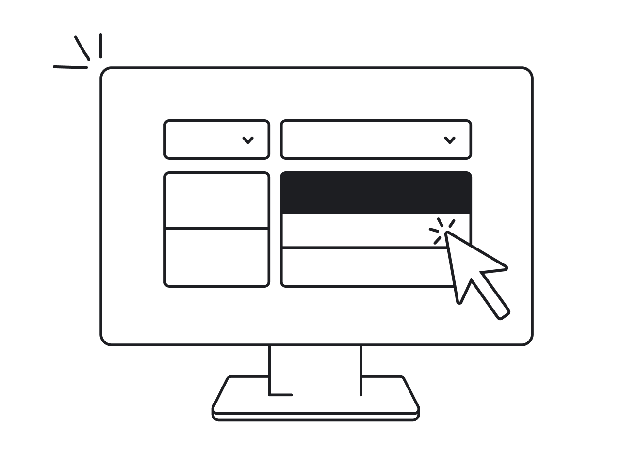
A search bar is a user interface element that allows users to input a query and return relevant results. It’s more than just an input field — it’s a decision-making shortcut, a navigation tool, and often, a product’s most-used feature.
.png)
We typically use search when we have a clear idea of what we’re looking for. Consequently, here are some common use cases for a search box:
- High-level search – used as a global navigation tool across the entire product
- Search within data tables – to quickly locate specific entries or records
- Search in form fields – for example, finding a specific geolocation, time zone, or attribute from a long list of options
- Search for filter options – to help narrow down content or results more efficiently
Now, let’s dive into some best search UX examples in action
30 best search bar examples
There are hundreds of well-designed UI search bars out there. But instead of listing them at random, we decided to go deeper.
This list is structured by UX complexity and functionality, because not all search bars are built for the same job. We’ve grouped the examples into five categories:
- Minimalist and simple search bars — lightweight, visually clean, and focused on straightforward search functionality.
- Context-aware and intelligent search bars — smart search interfaces offering personalized results, AI-powered suggestions, or contextual cues.
- Advanced and multi-filter search experiences — faceted search systems with dynamic filters, sorting options, and highly structured UIs.
- Experimental and creative search designs — unconventional layouts, playful animations, or immersive interactions that rethink how search can feel.
Each example comes with a quick breakdown of what works well and what UX patterns you can adapt for your next project. So here's how the search interaction supports the overall UI/UX design of the product:
Minimalist search bar design
Sometimes, the best search UI is one you barely notice. Minimalist search bars live quietly in the background, letting the content take center stage. But when done right, they’re still powerful tools — just… without shouting about it. They also reduce friction, helping users complete tasks quickly, lowering bounce rate, and improving overall usability.
1. b.well
b.well is a digital health platform where users need to navigate lab results and find medical providers. We redesigned its screens with a sharp focus on reducing user friction, centering around minimalist search bars.
.png)
Why it’s a success in minimalist search bar design
1. Purposeful placement: we placed the search bar where users needed guidance and speed. It helps to swiftly navigate through detailed and technical lab results.
2. Minimalist aesthetics: the search input is clean and visually lightweight. The search bar UI design is without visual clutter, results are displayed in a clean list with adequate spacing.
3. Functional depth without visual noise: By focusing only on relevant, high-priority actions (search, select), we avoided layering the interface with excessive buttons or form fields.
2. Cal.com

Cal.com’s App Store helps users explore different integrations like calendars, video tools, and analytics. The search bar sits quietly in the top-right corner — simple, light, and right where you’d expect it.
Why it’s a success in minimalist search bar design
- Clean and quiet design: The search bar blends into the UI without calling too much attention to itself. It’s there when you need it, out of the way when you don’t.
- Instant, relevant results: Start typing “calendar” and matching results show up right away, no extra clicks, no waiting, just smooth and immediate feedback.
- Helpful keyword highlighting: The matching word is bolded in each result card, making it super easy to spot what you’re looking for without reading the whole description.
- Simple cards, simple actions: Each result appears as a small card UI with a short description and two clear buttons – “Details” and “+ Install.” No clutter, just the essentials.
- Lightweight filters: Categories like “Automation” or “Calendar” sit right above the results. You can click one to filter, but it never feels like a heavy or complex filter system, more like a friendly nudge.
- Focused experience: The layout makes sure your attention stays on one thing, finding the right app. No distractions, no unnecessary UI elements competing for your focus.
3. Assembly
.png)
Assembly is a content calendar platform where teams plan campaigns, draft posts, and sync across projects. The calendar view is super clean, and the search bar blends right into that calm visual style.
Why it’s a success in minimalist search bar design
- Uncluttered layout: The search bar lives quietly at the top and doesn’t distract from the main interface. It’s easy to spot but doesn’t yell for attention.
- Simple input, instant results: You start typing, and relevant posts show up immediately with just enough context — date, title, and a tiny icon. No loading screens, no noise.
- Helpful keyboard guidance: The bar doesn’t just sit there blank. It lightly suggests shortcuts like ? for help or . for ideas. That little nudge helps users learn how to move faster without feeling like they need to read a manual.
- Soft focus shift: When you activate search, the rest of the screen blurs gently in the background. It feels lightweight and focused without being dramatic.
4. MoonPay
.png)
MoonPay is a crypto payment and asset exchange platform, and in this view, users are simply trying to select a token to work with — fast. The search experience here isn’t flashy or layered — it’s clean, fast, and gets out of the way.
Why it’s a success in minimalist search bar design
- No-fuss interface: The search bar sits right at the top of the “Select asset” drawer, clear and predictable. There’s no added chrome or styling distractions — it’s just there, ready to go.
- Flat, lightweight UI: No filter toggles, no previews, no loading states — just a flat list of tokens that narrows as you type. It’s incredibly quick and easy to scan.
- Visual hierarchy is simple and useful: Popular tokens like Bitcoin and Ethereum are grouped at the top, while everything else follows under “All tokens.” It’s a small but effective touch that speeds up decision-making.
- Immediate feedback: As soon as you type, the list adjusts in real-time. No search button, no enter key needed — it just works.
5. Google Meet
.png)
Google Meet is a video conferencing tool where people quickly jump into calls or create group links. Its search bar sits quietly at the top of the interface, helping users find contacts or dial numbers.
Why it’s a success in minimalist search bar design
- Clean and predictable UI: The search bar looks and feels exactly like you'd expect from a Google product, it blends into the top bar, doesn’t scream for attention, and just does the job when needed.
- Task-focused purpose: You’re not browsing or exploring, you’re either finding someone to call or entering a number. The search experience is laser-focused on one task: get into a conversation fast.
- Always available, never in the way: It’s persistent but unobtrusive. Even when you’re just browsing or setting things up, it’s there if you need it, but doesn’t distract from the primary action (starting a call).
- Instant recognition: Users instinctively know what it does thanks to clear placeholder text (“Search contacts or dial”). No learning curve, just start typing.
Context-aware and intelligent search UI examples
Context-aware search systems improve the experience by adapting to user intent. By predicting needs and surfacing relevant results early, they can significantly improve conversion rates and help users reach their goals faster.
6. Advan Research
Advan Research is a platform that helps people make sense of their data using saved reports and interactive maps. The search bar design we made for it makes a lot easier to find the info users need which is especially helpful taking into account that users of this platform work with loads of complex data.

Why it’s a strong example of intelligent, context-aware search
- Result previews: search results go beyond a basic dropdown list. Each result includes quick previews and contextual details, such as report dates, dataset sources, or summaries, so users can quickly assess relevance without needing to open every item.
- Integrated actions: in data-heavy SaaS environments, users often want more than just confirmation that a report exists, they want to interact with it directly. This search experience enables immediate access to actions like editing, sharing, or analyzing reports, reducing context-switching and boosting efficiency.
- Multimodal access: not just a search bar, it's a contextual access system that adapts to both visual and textual search habits.
- Dual input points: users can either use a search bar or interact with map elements to access reports. This allows flexibility, catering to those who prefer text-based inputs and those who are more visual.
- Contextual filters: the search bar integrates with metadata filters like location or dataset type, dynamically narrowing down results as the user types.
- Memory of user behavior: if users often access specific kinds of reports, the interface starts surfacing them quicker emulating a predictive model without being overwhelming.
- Keyboard navigation hints: the interface clearly communicates available hotkeys and shortcuts, guiding users to navigate and operate search more efficiently, especially helpful for power users and keyboard-centric workflows.
7. Sora by OpenAI

Sora is a visual-first platform for exploring AI-generated content like images and videos. With so much visual media, the search experience isn’t just about typing in keywords it’s about helping users find what they want with as little friction as possible, even if they don’t know exactly what they’re looking for.
Why it’s a strong example of intelligent, context-aware search
- Dual-layered search suggestions: As users type in a keyword (like “anime”), the search bar offers smart suggestions split into Explore and My media. This makes it easy to decide whether you’re searching across public content or just your own uploads, no need to toggle views manually.
- Predictive structure: The dropdown that appears during search helps guide users toward more focused results without making them type everything. It's like a gentle nudge in the right direction rather than just a blank box.
- Keyboard-first design: You can activate the search instantly with the ⌘K shortcut, and the input feels ready for power users who prefer speed and navigation without reaching for the mouse.
- Visually immersive but search-centric: Even with all the visuals on screen, the moment you open search, the background dims slightly and the search bar takes center stage, subtly shifting focus without interrupting the overall flow.
- Clever UI layering: The search experience sits on top of your current view rather than redirecting you somewhere else. That means less context switching and a more fluid interaction, especially important when you’re working with visually rich content.
8. Fey

Fey is a platform built for financial pros to track the markets, dive into data, and stay on top of company news. The search system doesn’t just help you find a ticker or a company, it helps you explore everything behind it, fast and without leaving your flow.
Why it’s a great example of multi-filter and advanced search
- Layered search results: When you type in something like “Amazon,” you don’t just get one result, you get categories like securities, company info, balance sheets, estimates, and even quick access to analysis tools. It’s all stacked in a neat and readable layout.
- Recent + popular suggestions: The search panel highlights both your recent searches and trending tickers, making it easy to jump back into familiar territory or discover something new.
- Dark theme that supports focus: The UI uses a bold dark color palette with soft contrasts that keeps things sharp and distraction-free, ideal for users scanning data-rich content for hours.
- Actionable results: Each result isn’t just a static label, you can instantly view reports, balance sheets, and estimates directly from search without switching tools or digging through menus.
- Category-based breakdown: Fey groups search results by type, like securities vs. financial docs, so users can quickly zero in on what they’re actually looking for. It’s structured without being overwhelming.
- Search that leads straight into workflows: Once you click a result, you're taken directly into a detailed view, like revenue charts or analyst projections, with another search input ready at the bottom. It feels like the whole app revolves around search as a core action.
- Designed for experts: This isn’t a beginner-friendly search bar, it’s meant for people who know what they’re doing and want speed, control, and clarity. And it totally delivers on that.
9. Twitch

Twitch is all about live content — streams, creators, trending moments, and its search bar reflects that energy. It’s about quickly getting to what’s live, who’s trending, or what’s worth watching right now.
Why it’s a strong example of intelligent, context-aware search
- Search that knows what you mean: As you start typing, Twitch surfaces creator handles, tags, and game titles in real time. It’s super fast and built around how people actually search on Twitch, usually by streamer name or game.
- Category-aware tabs: After searching, results are neatly sorted into tabs like Top, Channels, Categories, and Videos, so you can easily switch context without having to retype or start over.
- Predictive ranking: The platform shows trending searches and “people also watch” suggestions based on what you searched for, pulling in related creators and streams.
- Recent searches + smart follow-ups: Twitch keeps track of your recent searches, and when you re-search something, it’s faster and more tailored. And once you're on a streamer's page, Twitch nudges you to follow, watch related channels, or even get notifications.
- Live-first presentation: Results don’t just say “streamer found.” They show who’s live, what they’re streaming, and how many viewers are watching right now, which adds urgency and relevance to every search.
10. Evernote

Evernote has evolved its search bar from just a keyword matcher to a smart AI-powered assistant that helps users find insights, not just files. It's clearly designed for people who are juggling lots of notes, tasks, and docs and just want to get to what matters, fast.
Why this belongs in the “context-aware and intelligent” category
- Two search modes: There’s a toggle UI to switch between Standard and AI-Powered search with a simple toggle. This gives you flexibility either to go with the usual keyword lookup, or ask a natural language question like “when should I finish my reading?” and get a generated answer.
- Smart suggestions before you even type: The AI mode offers a few question ideas upfront like “What’s my workout today?” or “Notes I created in the last 3 months.” These prompts actively guide users toward more useful ways of searching.
- Search that understands your intent: Rather than returning just a list of matching notes, the AI actually synthesizes a response based on your content. In one example, it gives a specific time to finish your reading and explains where it pulled that data from. That’s huge.
- Still supports filters and structure: Even with AI, you’re not locked into one way of searching. Filters like attachments, tags, or specific notebooks are right there, so you can mix manual refinement with smart results.
11. Unity

Unity Discussions is the go-to space for developers to ask questions, find support, and connect with others in the Unity ecosystem. Its search experience helps users cut through noise and get straight to useful answers.
Why it’s a strong example of intelligent, context-aware search
- Smart suggestions while typing: As users enter a query, the search bar shows relevant suggestions in real time, including usernames, topics, and post titles. This helps users spot what they need faster without having to dig through long result pages.
- Previewing context-rich entries: Rather than just showing titles, the dropdown includes helpful context like category tags and icons that hint at content type (e.g., user vs. topic). These visual cues support quicker recognition and selection.
- Dynamic filters: Once users submit a search, they can immediately narrow down results with toggles like “Topics/posts” or “Advanced filters.” These controls adjust based on what’s being searched, giving users better ways to refine.
- Layered interaction: The experience supports both casual browsing and deep dive discovery. Whether someone’s entering a vague keyword or trying to pinpoint an exact API topic, the search adapts naturally.
12. Instagram

Instagram is a social media platform centered on sharing and discovering visual content. Its search interface supports exploration through a single entry point for users to find people, tags, places, and content.
Why it’s a success in intelligent, context-aware search bar design
- Semantic prediction and categorization: The search interface classifies results by categories (Accounts, Tags, Places, Audio, etc.) and shows relevant matches while typing. That helps tailor the interface to users’ mental models.
- AI-enhanced discovery suggestions: The presence of “Ask Meta AI” above the search field suggests integration of AI to guide discovery. This adds contextual intelligence and offers alternative exploration paths beyond direct search input.
- Search + Discovery hybridization: Unlike a pure search-only UI, Instagram combines traditional search with exploratory browsing. Users get both structured keyword search and unstructured recommendations like “Reels about insects” or “Night photography reels”.
- Instant result feedback: As users type, results populate instantly in categorized lists (like recent accounts, tags, and suggestions), reinforcing speed and responsiveness — especially useful for content-heavy platforms.
- Multi-entry navigation: While there’s a dedicated search tab, the interface also invites users to explore through tap-based categories and visual cues, bridging both textual and visual browsing behavior.
13. Urban Outfitters
Urban Outfitters is a commercial retail platform where even before typing, the search dropdown surfaces trending keywords and popular queries, helping guide users who are still exploring. Placed prominently on the home page, the search bar acts as both a navigation tool and a discovery shortcut, making it easier for users to quickly find relevant products without friction.

Why it’s a strong example of context-aware and intelligent search
- Trending and popular insights baked in: Even before typing, the search dropdown surfaces trending keywords (like “jeans” or “belts”) and most popular products.
- Instant preview results: As soon as you begin typing, relevant keyword variations and matching products appear immediately below the search bar. This means users can spot what they want before hitting enter.
- Visual suggestions with purpose: The search results aren’t just links, they include thumbnails, brand names, and pricing, helping users instantly recognize the right product visually.
- Seamless bridge between input and filtering: Once you hit search, you’re taken to a structured results page with classic filters like brand, color, size, and department already accessible. This two-phase flow (predictive input → detailed results refinement) keeps things fluid.
14. Snowflake

Snowflake is a robust data platform, and its search functionality reflects the needs of power users, helping them move quickly across large volumes of datasets, docs, and tools. The interface might look simple at first, but what it does behind the scenes is quite smart.
Why it’s a strong example of intelligent, context-aware search
- Helpful auto-suggestions: As users type, the search bar surfaces not only keyword matches but actual intent-based suggestions, like “python dateutil” or “python standard.” These are especially handy when working in technical environments where precision matters.
- Smart result types: The results aren’t just pages or files. They include data products, documentation, databases, and notebooks, all labeled with context like where they live (e.g., “SNOWFLAKE_SAMPLE_DATA”) and what type of object they are (like UDF handler examples or ML connectors).
- Tabless filtering by entity: On the dedicated search screen, users can refine results by content type, Tables, Views, Docs, etc. through the left panel.
- Clean, direct interface: Despite handling complex data types and nested categories, the search box UI feels light and intuitive. The consistent styling and whitespace help users make sense of results fast, even if they’re searching across multiple data sources.
15. Bing

Snowflake is a cloud-based data platform where users frequently search through complex assets like datasets, documentation, SQL worksheets, and marketplace modules. The search interface is designed for deep, high-volume queries, with smart structure and layered previews.
Why it’s a strong example of intelligent, context-aware search
- Cross-sectional access: It pulls from multiple domains (e.g., documentation, worksheets, data products, schemas) and presents them in a unified, clearly categorized view. This contextual organization lets users instantly understand what type of resource they’re selecting.
- Live metadata previews: Results aren’t just listed by title but with relevant context. For example, database results display associated schema and object type, while documentation previews show summaries. This helps users evaluate usefulness before clicking.
- Integrated with learning and tasks: Through the “Start with a project template” section and inline commands (e.g., "Load sample data from S3"), users can act on search results directly.
- Keyboard-friendly navigation: Though not overtly displayed in the screenshot, the layout and responsiveness suggest keyboard compatibility, which is essential for developer-heavy platforms like Snowflake.
- Minimal but powerful UI: The interface keeps the visual treatment clean while embedding deep layers of functionality under the hood, achieving depth without clutter.
16. Macrofactor

MacroFactor is a nutrition tracking app that helps users log foods and meals with minimal friction. The app blends straightforward search tools with a conversational input option that’s powered by AI.
Why it’s a strong example of intelligent, context-aware search
- Conversational input meets smart search: Instead of a traditional search bar alone, users can describe their meal naturally (e.g. “1 tuna sandwich and a cup of skimmed milk”). The system understands the context and returns structured food results instantly.
- Voice-friendly and flexible: Users aren’t forced into structured search terms. They can type or use voice, and the AI parses it smartly which perfect for on-the-go use.
- Immediate feedback loop: After submitting a natural-language input, users see results broken down into known food items with nutritional details. This shows that the search understands not just words, but intent and context too.
- Filters when needed, hidden when not: In the traditional recipe/food search screen, there’s a filter option (“Filter recipes”) that doesn’t take up extra visual space but is available when users want to refine results.
- Context-sensitive outputs: Whether you're in the "Library" browsing recipes or in the "AI Describe" mode logging meals, the app shows only the relevant tools and outputs for that context.
17. Elevenlabs

Eleven Labs is a voice AI platform where users can explore and manage voice models for projects like dubbing, storytelling, or voice-over work. In both the "My Voices" and "Library" views, the search experience plays a big role in helping users filter through large voice lists quickly.
Why it’s a strong example of intelligent, context-aware search
- Search with awareness of categories: Whether users are in their personal voice library or browsing community voices, the search system knows the context and adjusts results accordingly. That makes the experience feel smart and focused.
- Integrated filters for precision: Alongside the search bar, users can refine by voice type, recency, accent, and language. These options dynamically update results as the user interacts, removing the need for multiple separate steps.
- Segment toggles: Users can instantly switch between tabs like "All", "Narrative", or "Characters" right above the search results. This keeps navigation fluid without breaking focus.
- Smooth handling of large datasets: The search is built to deal with scale — hundreds of voices are handled through combined filtering and search, with clear visual feedback and result counts.
- Textual + behavioral flexibility: Whether someone wants to explore based on a mood, a language, or a specific name like "Benjamin", the system adapts. It supports casual exploration and laser-focused querying alike.
Advanced and multi-filter search box examples
As products grow more complex, a basic search bar is often not enough. Advanced interfaces enhance the search function by combining it with filters, sorting, and structured inputs, helping users refine results step by step. This approach gives users faster access to exactly what they need, especially when dealing with large datasets, multiple categories, or highly specific queries.
18. IDCore
IDCore is a platform for real estate professionals to find and manage vendors. As a part of the redesign, our designers implemented a search system and added search functionality to already existing filter UX.

Why it’s a great example of multi-filter and advanced search
- Multi-layered filters: users can apply multiple filters such as vendor type, status, compliance, and rating — all within one interface. These filters stack without overwhelming the user, allowing complex query building
- Integrated search + filter: a traditional search bar sits atop the page, enhanced with real-time filtering. As you type, the system adjusts results instantly based on both the text and any active filters.
- Dynamic feedback: the platform updates vendor lists live as users tweak filters or search inputs keeping the experience smooth and immediate, ideal for decision-making
- Tailored control: Gives professionals nuanced control over their search, critical in compliance-heavy workflows.
- Performance-friendly: Instant updates make the tool feel responsive, even when handling large datasets.
- Visual simplicity: Despite its complexity, the interface remains approachable through clean layout and collapsible filter sections.
19. Walmart

Walmart is a retail giant serving millions of customers online and in-store. This website search bar example is designed for efficiency, whether you’re looking for products or the nearest location.
Why it’s a great example of multi-filter and advanced search
- Search that adapts to the user’s task: While the main site-wide search bar helps users browse products or categories, the “Find a store” module transforms into a focused search experience tailored for location discovery.
- Contextual filtering by services: Users aren’t just finding a nearby store, they can instantly filter based on available services like pharmacy, bakery, photo center, or EV charging. This makes the search more specific and goal-oriented.
- Map-based visual feedback: As users filter and enter locations, matching stores appear on a map alongside service tags and distances. It creates a hybrid view – part search results, part navigation tool.
- Multiple input methods: Whether users type a zip code manually or use geolocation with “Use my current location,” the interface responds instantly with nearby matches. That flexibility enhances usability across scenarios.
- Clear structure with progressive depth: The experience starts simple (just a zip code input), then gradually reveals deeper filters, service tags, and store info only when needed keeping the interface clean but powerful.
20. Spoonfed
Spoonfed, a catering platform, previously used a category-based search system but over time users needed something more robust. The redesign we performed at Eleken introduced a more fluid and intuitive search experience by combining free-text search with smart filtering.

Why it’s a great example of advanced search
- Combined search entry: users can now type in a general search bar while also refining results through category filters, making it faster to pinpoint dishes, menus, or event packages.
- Filter enhancements: categories are now treated as dynamic filters rather than static groups. This lets users mix and match criteria to tailor their results.
- Improved user flow: before, users had to drill into rigid categories one at a time. Now, the updated flow allows them to enter a term (e.g., “vegan lunch”), then apply filters like dietary preference, delivery time, or event size.
- Instant feedback loop: filters and search dynamically narrow the item list in real time, so users never feel lost or forced to restart searches.
- Eliminates friction: the dual approach (search + filter) caters to both users who know exactly what they want and those browsing with constraints.
- Scalable for menus: works well even as the catalog of food items or partners grows, making it future-ready.
21. Process Enablement Platform
Process Enablement Platform supports internal teams by organizing processes and discussions across roles. During the redesign, our task was to simplify the search experience to help users locate key people and collaborative discussions more efficiently.

Why it’s a great example of advanced search
- Search input with smart hints: placeholder text guides users to search by author, tag, status improving discoverability and ease of use.
- Integrated filters: users can refine results by process, author, tag, or status; filters are clearly visible and easy to remove.
- Tabbed navigation: seamless switch between Discussions, Processes, Area Trainings, and People – all within one view.
- Consistent previews: discussions show relevant tags, timestamps, and user info at a glance for quick understanding.
- User-friendly + scalable: clean design balances simplicity for new users and advanced control for power users.
- Supports workflow navigation: helps users jump between people and processes without breaking flow.
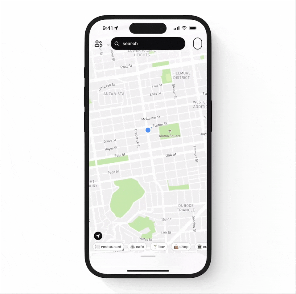
22. Habstash
Habstash helps users understand how long it would take to save for a home based on their income, savings habits, and market data. The search experience blends financial and geographic inputs to guide users toward actionable goals.

Why it’s a standout geo-search UX
- Context-aware search defaults: inputs like location (E6) and region (England) are pre-filled based on user context—helping users start faster and with more relevance.
- Interactive map integration: users can visually browse exact locations on the map, making it feel more like a housing app than a static calculator.
- Real-time input adaptability: users can tweak variables like move-in timeframe, savings, income, or bed/property type and see immediate, dynamic changes in affordability and listings.
- Advanced financial filters: the search isn’t just about home type or location—it includes nuanced sliders for monthly savings, income range, savings timeframe, and property size, transforming a standard real estate search into a financial planning tool.
- Dynamic affordability overlay: the map dynamically adjusts based on what the user can afford, using their filters. This helps users not just search but understand their buying power in real-time.
- Milestone feedback loop: search results are tied to clear savings milestones, for example, “You’ll be ready in 14 months”, which makes the experience both informative and motivational.
- Minimalist interface: despite the depth of filters, the interface stays clean. Filters are presented in compact sliders or dropdowns, and the map provides clear visual hierarchy without feeling crowded.
23. Revolut

Why it’s a great example of multi-filter and advanced search
- Layered filters across multiple dimensions: The search experience goes beyond just typing in a company name. Users can screen stocks using a combination of filters, like sector, market cap, P/E ratio, dividend yield, and more. It’s powerful but approachable.
- Live, stacked filtering without overwhelm: The design allows you to apply multiple filters at once (e.g., Technology + Healthcare + Small-cap + P/E under 20). But thanks to the chip-style filter UI and clean modal layout, it doesn’t feel heavy or complex.
- Dynamic sorting and real-time feedback: As filters are applied, the results screen updates accordingly. You’re not just choosing from a list, you’re actively shaping your dataset and immediately seeing what matches your criteria.
- Inline search across categories: Even within filter sections like “Sectors,” you can search to quickly find what you need. This keeps interaction smooth, especially for users with a goal in mind.
24. Upwork

Upwork is a freelance marketplace where speed and specificity matter. Their job search feature gives users serious control, helping them pinpoint the right opportunities from thousands of listings.
Why it’s a great example of multi-filter and advanced search
- Search logic built-in: Users can craft super-specific queries using advanced operators, like combining keywords with AND, OR, and NOT. This gives power users the flexibility to be precise with what they do or don’t want to see.
- Full advanced search form: Beyond the main search bar, users can access an advanced search panel that includes inputs like All of these words, None of these words, Exact phrase, Title, and Skills. It’s like Boolean logic for humans.
- Refined results in context: Search terms are visually highlighted in job listings, making it easy to see why a result showed up.
- Saved searches and filters in sync: Users can save their favorite searches or jobs and revisit them later, with filters remembered and clearly indicated (like the filter icon showing “4” applied). That’s a nod to real-life job seekers who return often and need persistence.
- Preview-rich results: The listings show everything at a glance, client spend, job type, tags, estimated workload, and more, so users don’t need to click into every post to qualify it. The search bar isn’t working alone here, it’s tightly paired with a helpful result layout.
25. VRBO

Vrbo is a vacation rental platform where users are looking for places to stay across the globe. The search experience is smart, layered, and deeply interactive.
Why it’s a great example of multi-filter and advanced search
- Stacked but streamlined filters: Vrbo balances flexibility and clarity with stacked filters: destination, dates, number of travelers, price, popularity, and room types. Each of these filters can be expanded and refined in its own view, yet they all sit neatly under the main search field.
- Flexible date picker: The calendar offers flexible options like "±1 day" or "Weekend only," plus multi-month selections. This is ideal for users who haven’t pinned down exact travel dates yet.
- Real-time feedback: As filters and parameters are adjusted, the listings update instantly. You see how many properties match your selections and can jump right into evaluating options, making the experience feel responsive and alive.
- Seamless flow between fields: Destination, dates, and travelers feel connected. Once a user types in "Bangkok," the interface gracefully transitions them into setting travel dates, choosing flexibility, and selecting party size, all without breaking the flow.
26. Postman

Postman is a tool for developers working with APIs, they’ve built a search that feels easy and useful when exploring complex workflows.
Why it fits under advanced and multi-filter search experiences
- Structured filters meet search: On the Flows Catalog page, the search bar lives right above categorized filters like “AI,” “Finance,” and “Marketing.” You can mix free text search with structured filters, making it easy to dig into exactly what you need.
- Real-time feedback: Start typing “Slack” and you instantly see relevant flows, integrations, and tools. It doesn’t wait for a full search — it just gives you what you need as you go.
- Integrated UI actions: Every search result comes with direct actions, you can “Use in Workspace” or “View” without opening a separate detail page. It keeps workflow friction low for busy users.
- Designed for scale: The layout can support dozens of filters and results without getting messy. With collapsible categories and scoped suggestions, the experience feels manageable even when you’re neck-deep in options.
27. TaleScale

Tailscale is a secure networking tool that allows teams to manage private networks across devices. Within its dashboard, users can search for machines using various attributes like name, owner, tag, or version. The search bar is a core element of the “Machines” screen.
Why it’s a great example of multi-filter and advanced search
- Multi-attribute search: The placeholder guides users to search across multiple data points, like name, owner, tag, version. This implies support for complex queries without needing a cluttered interface.
- Live filter controls nearby: The search bar is paired with a dedicated Filters button, which likely opens structured filtering options. This combo empowers users to drill down quickly when managing large device networks.
- Real-time feedback: As you filter or type, the list of devices updates instantly, no need to submit or reload. This makes the interaction feel fast and efficient, ideal for tech-savvy users dealing with a lot of machines.
- Focused layout: Despite having layered functionality, the search UI stays minimal and doesn’t overwhelm users visually. The layout is clear, with plenty of white space and intuitive labels, which helps keep things user-friendly.
Experimental and creative search UX examples
Not all search experiences are built for speed — some are designed for exploration. Experimental search interfaces go beyond traditional patterns, using visuals and unconventional interactions to make discovery more engaging. In these cases, the search bar becomes less of a tool and more of a creative entry point.
28. Universe

Universe is a mobile-first website builder that lets people design sites right from their phones, no code needed. Its search experience lives inside a super visual, scroll-heavy world and it plays right into that feel. You’re not just searching for data, you’re exploring creative work and the search UI reflects that vibe.
Why it’s a standout in experimental and creative search design
- Visually-led entry point: The Explore tab feels more like browsing a digital gallery than digging through a search tool. It encourages curiosity before it ever asks for input.
- Full-screen category icons: When you open the Search tab, you’re met with bold, touch-friendly icons for categories like “Art,” “Music,” “Funny,” and “Photo.” It feels more like a mood board than a list and it invites tapping and exploring, not just typing.
- Search-as-navigation: Typing into the search bar works as expected, but the whole experience feels more like filtering a creative feed than running a utility search. It’s relaxed, and fits the creative-first audience.
- Dark mode that feels like a stage: With its black background and minimal chrome, the search UI feels almost theatrical letting the colorful site previews take the spotlight.
- Mobile-native from the ground up: Everything is optimized for thumbs, taps, and casual use, no dropdowns, no multistep forms, just smooth category browsing and instant results.
- Organic discovery: Even if you don’t know what to search for, the layout encourages wandering and discovering cool sites based on visuals or simple themes. That’s something traditional search bars rarely do well.
29. PamPam

PamPam is a collaborative map app where users can plan trips, pin locations, and decorate maps with stickers and icons. Its search bar isn’t just about finding places — it’s about playfully curating your map.
Why it’s a creative, experimental take on search
- Playful visuals as search results: Instead of listing locations or plain text, the search experience is centered around visual emoji-style icons like donuts, coffee, and ramen. It invites users to think visually, not textually.
- Multi-modal layers: The search adapts depending on the interaction. Users can either search for a category (like “snack”) or filter with playful tags like “Outdoors” or “Activities.” It feels more like browsing a mood board than querying a database.
- Drag-and-drop interaction: Once a result is found, it isn’t just selected, it becomes a draggable, visual marker that users can creatively position on the map. This breaks traditional search-result behavior and leans into expressive, freeform mapping.
- Creative language blending: The interface blends map search language with emoji and visual tags. There’s no separation between “searching” and “decorating”, it’s the same playful act.
- Fun-first UX: The goal here isn’t efficiency, it’s engagement and expression. This search box design is just the doorway into a more tactile, almost game-like experience.
30. Corner
Corner blends maps, discovery, and social vibes into one fun, Gen-Z-friendly interface. And at the heart of it? A search experience that feels more like chatting with a friend than querying a database.
Why it belongs to experimental and creative search design
- Search understands how users think: Instead of asking users to search for “Italian restaurant” or “co-working spaces,” Corner shows prompts like “first date but not too fancy”, “spots to co-work from”.
- Results are tied to mood, not just metadata: The app doesn’t just return a list of venues — it gives curated cards with rich info like:
- Tags: authentic, korean, barbecue
- Source: saved from Instagram 4h ago
- Social context: who saved it, who wants to try it
It’s search, but it feels like discovery powered by culture and context. - Map + search feel connected: The map in the background isn’t just for show. It subtly adapts to the city or neighborhood the user is exploring, reinforcing that what you’re seeing is relevant to where you are (or want to go).
- No typing needed (but you can):The prompts and tags reduce the need for typing altogether. But if you do want to type something in the search bar, it still behaves like a traditional input — just with that Corner charm.
How to make a good search bar?
To wrap up all the search bar design examples we’ve explored, here are the key takeaways you can apply to your own projects.
- Autocomplete. Show up to 10 suggestions, but prioritize quality over quantity—make sure the first 3 are the most relevant.
- Last searches. Display the user’s last searches, especially for products or features they tend to look for repeatedly. This works great in task-based or routine-driven interfaces.
- Popular or context-aware defaults. Pre-fill search suggestions based on user context, like location, time zone, or language preferences. This helps personalize the experience and speed up selection.
- Search within categories. Let users narrow their search by sections or property types (e.g., “Search within articles” or “Filter by job role”) to make results more precise.
- Suggest search queries, not just results. Instead of only returning results, offer search query suggestions to guide users toward successful searches, especially helpful when they’re unsure what to type or their request is too broad.
- Show a dedicated search results page. For complex, data-heavy SaaS products, a simple dropdown isn’t always enough. Consider offering a full search results page that displays results with rich context — such as descriptions, metadata,edit options. This helps users explore and compare results more effectively.
At Eleken, we know that great UX is about more than clean visuals, it’s about creating intuitive flows that make even the most complex systems feel effortless.If you're building a SaaS product and want an effective search bar that improves navigation, boosts engagement, that looks sharp and actually helps users find what they need without getting lost in the noise, let’s talk. We design user interfaces that help people find what they need without getting lost in the noise.


.webp)
.png)
.png)