
Imagine your microwave oven is broken. You buy a new one, and it gets broken again. After throwing your fifth microwave in the garbage bin, you decide to invite an electrician, who discovers that the cause was the poor electric wiring. The good news is, you finally got your wiring fixed. The bad news, you wasted money on five ovens.
A similar thing happens in UX design. When product owners feel that something is not working right, they often decide to make a redesign. But a new look does not guarantee that the underlying problems disappear. Often, they stay and continue frustrating users.
A more efficient method, in this case, is to find UX issues in design and fix them topically, without a full revamp. We can say this for sure, as we’re a SaaS design agency, and fixing bad UX designs is our job.
Many clients come to us with a request for redesign, but in the process of communication, we discover that there might be faster and cheaper solutions to their problems. And in this article, we’ll give you an idea of how it works.
How to find UX issues?
Finding UX design issues is the first step on a way to UX design problem-solving. There is a number of tools that can be used to detect these issues, or frictions, as we call them. The word “friction” is quite self-descriptive: it’s that feeling that a user has when the product is not designed in the most comfortable way. Including these identified frictions into a UX audit checklist ensures they are systematically addressed.
Some of these UX research methods, such as user interviews and usability testing, can be run by product owners themselves. On the contrary, methods like UX audit need a person from outside with proper qualifications, a UX professional who is not familiar with the product and can look at your product with a “fresh pair of eyes”.
Usability testing
During usability testing, a researcher follows a group of users while they are performing tasks with the product. It also includes asking questions to understand the motives of the actions. By observing users, the researcher sees where they experience problems, make errors, or get lost. To get insights from usability tests, the researcher must analyze both what the user does and what they say. The research can be qualitative, as well as quantitative, and measure a range of usability metrics. When participants are in different locations, remote usability testing becomes a highly efficient way to gather this data.
User shadowing
This method may seem similar to usability testing, but there are some critical differences. Shadowing is done in the “natural habitat”, so that the usage situations are not “staged”. User shadowing requires more time and resources from a researcher, but the results can show a wider scope than usability testing. Selecting the right usability testing tools can help capture these natural interactions through mobile recordings or passive tracking.
User interviews
This research method is more subject to biases as the researcher has to rely on what users tell about their experience instead of direct observation. Still, it is a very common tool that brings valuable insights not only to UX professionals, but also to marketing, customer success, and sales departments.
Customer support insights
Sometimes it is hard for designers to get to talk directly to the users, especially when talking about an outsourced team. However, there are people whose full-time job is to talk to users about the problems they encounter while using the product. The customer success team must be the designers’ best friends. They can provide accurate data on what places in the product make users stuck. These insights often reveal technical glitches that should be prioritized during UI testing.
Analytics
The good thing about analytics is that this tool has little bias in itself, as we’re talking about pure data. Hotjar and Google Analytics don’t flatter designers to make them feel better.
The challenge with analytics is that its efficiency depends totally on the person who does the analysis. For instance, the analytics show clearly which pages cause users to abandon the task. But what is the reason? That’s the question for researchers to answer. Once a hypothesis is formed, the best way to validate a solution is to run A/B tests for SaaS to see which variation actually improves the conversion rate.
UX audit
This is Eleken’s ultimate tool when we start working with a new client who finds their existing design unsatisfying. Our designer scans through the product and evaluates every part of it according to the basic requirements of a good design following the heuristics of good design.
As a result, we prepare a UX audit report. In our work, it is typically a presentation of all UX design issues our designers found in the product, suggesting a fix to each of them.
The process of detecting and prioritizing UX issues
It’s always good to have more than one source to find UX issues. The process of working with UX design problems and solutions is not as simple as “find and fix”. Let me explain it using the example Acadeum, an eLearning app we redesigned for our client.
First of all, our designers went through user flows and highlighted the questionable areas. All the problems were listed on post-its in Figma and later discussed with the product team.
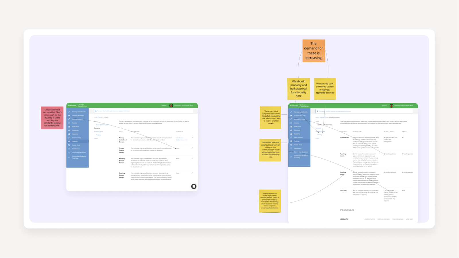
Apart from the UX audit, we also had access to recordings of several in-depth interviews with Acadeum users that we listened to. After that, our designers spoke to the customer support officer, the ultimate expert in users’ troubles. Together, they went through the app again and noted all the areas that were causing difficulties for users.
So, we ended up with a huge list of issues. To make sense of them, our designers sorted them by jobs-to-be-done. On the right side, we placed suggestions of solutions for each one.
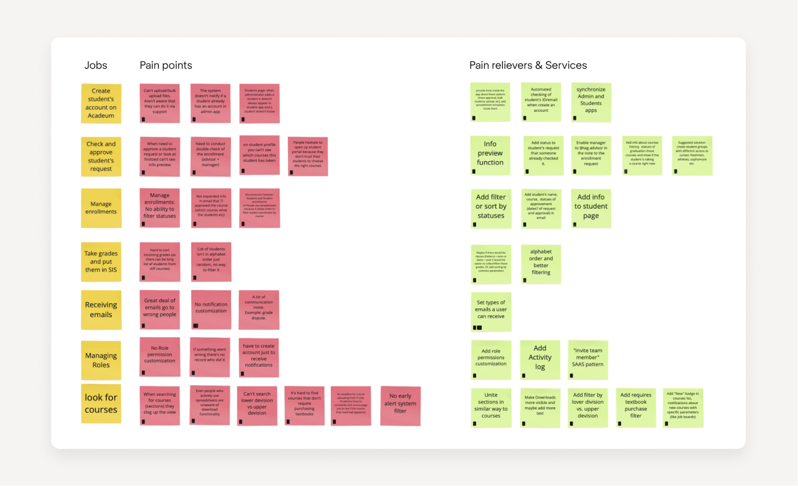
So, now that we had the problem/solution table, it all seemed perfect… But in the real world, it’s not as easy as taking all of them and changing them at once. There are timing issues, tech demands, and so on.
The solutions had to be prioritized. To do that, we held a workshop with the product team, where we placed all the cards on the Impact/Effort prioritization matrix. At this point, it became clear what must be done first and what could be postponed.

Sometimes, when you try to fix every little issue, you lose precious time while trying to reach the stealing perfection. Prioritization helped us to fit into the tight deadline and finish the Acadeum redesign in three months. If you want to learn more about UX problem-solving process, read our case studies.
The two most common questions about UX issues are: “how to identify UX problems” and “how to solve UX problems”. Now that we have answered the first one, let’s move to the next by exploring various usability testing methods.
In our work, we face all sorts of UX design problems. Examples range from complicated navigation to confusing fonts. The issues described below will give you an overview of the things we work with daily. Understanding the difference between user testing vs usability testing is key here: while one tells you if the concept works, the other reveals if the interface is actually functional.
Long and confusing fill-in forms
Let’s take as an example a case of one of our clients, Ricochet360, a CRM system. Here is what the “add a new lead” screen looked like: 30 fields and no hints on how to fill them in. This is a classic scenario for web usability testing, where observing a user struggle with data entry provides immediate evidence for redesign. To scale this research, unmoderated usability testing can be used to see where the majority of users drop off.
When analyzing these forms, specific user testing questions like "Which information here feels unnecessary to you?" or "Where did you feel most unsure about what to type?" can pinpoint exactly which fields to cut or clarify.
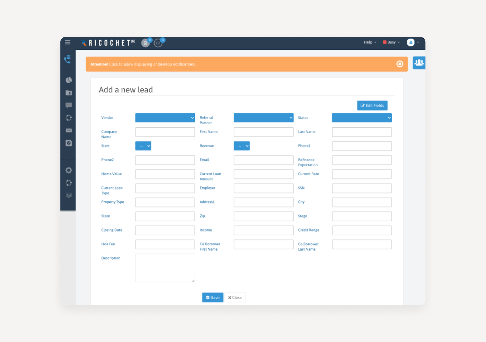
Issue: no indication of data format.
Some fields like “phone number” can be entered in many different ways: with spaces, hyphens, brackets, country codes… It causes confusion for the user and complications for the data storage system.
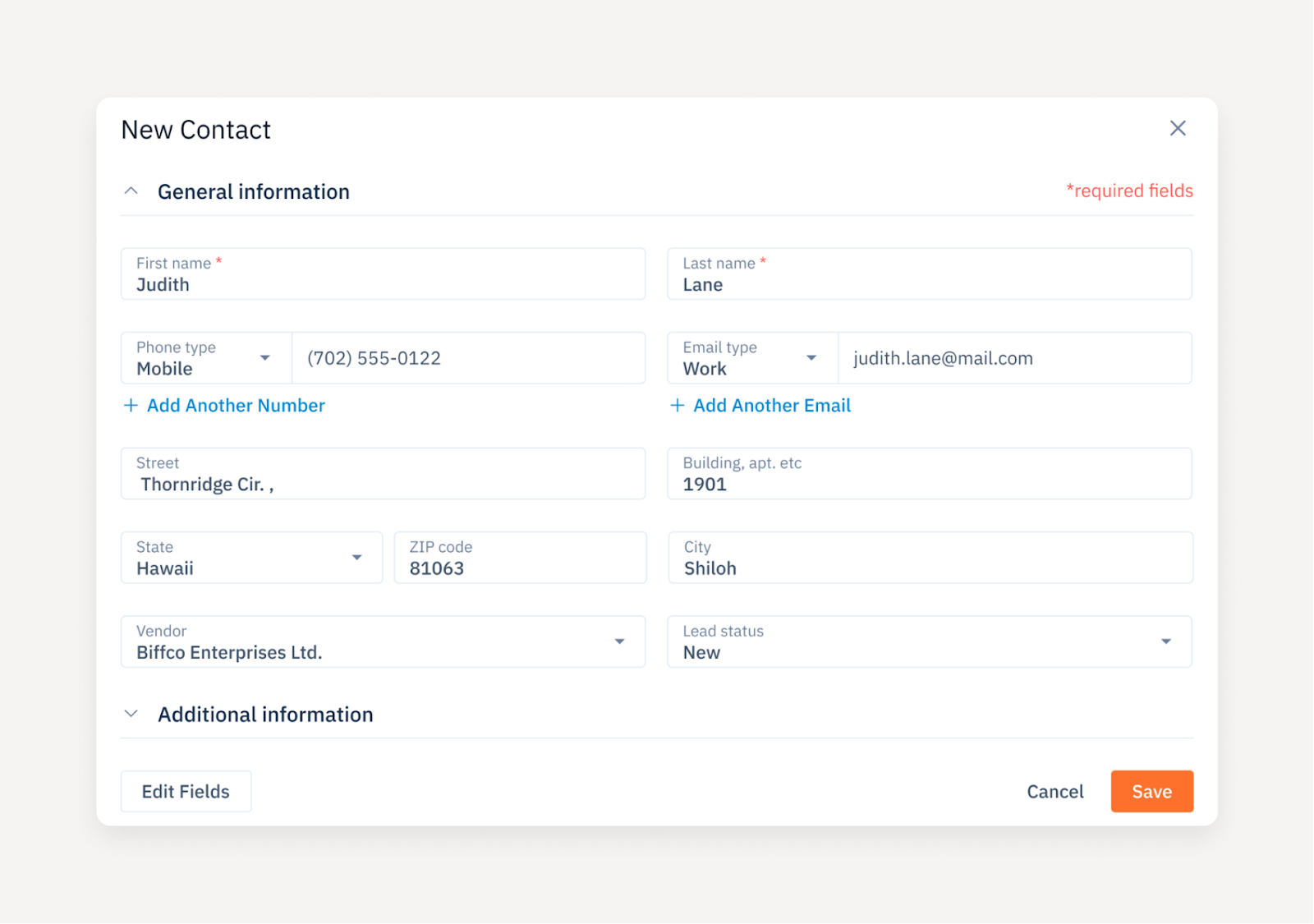
Solution: unify the data format and give hints right in the field.
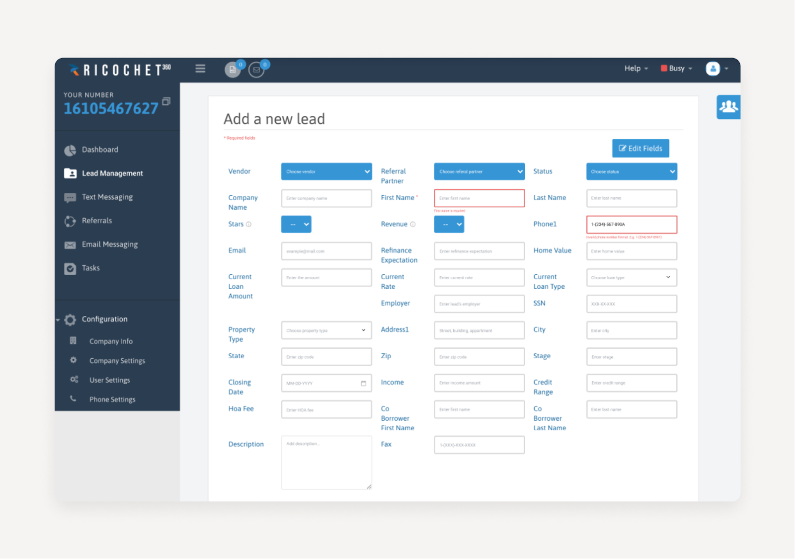
Issue: the form is too big to grasp.
Do users have to fill all 30 fields every time? Can they easily find the most essential ones?
Solutions: a red asterisk was added next to all the required fields. The most commonly used fields were shown on the screen, while the rest less frequently used were hidden behind the “Additional information” drop-down.
Flawed filtering systems
Filtering is an essential feature in apps dealing with large volumes of data. Oftentimes, a small improvement in filtering results in a huge improvement in user experience. That’s one of the most important thing we fixed in b.well a healthcare platform that hired us support their design plans.
Issue: Test results were grouped by date with no search or filter functionality, making it hard for users to locate specific information quickly.
Goal: Enhance the efficiency and usability of the Labs page for better health monitoring by making it easier to navigate and track test results.
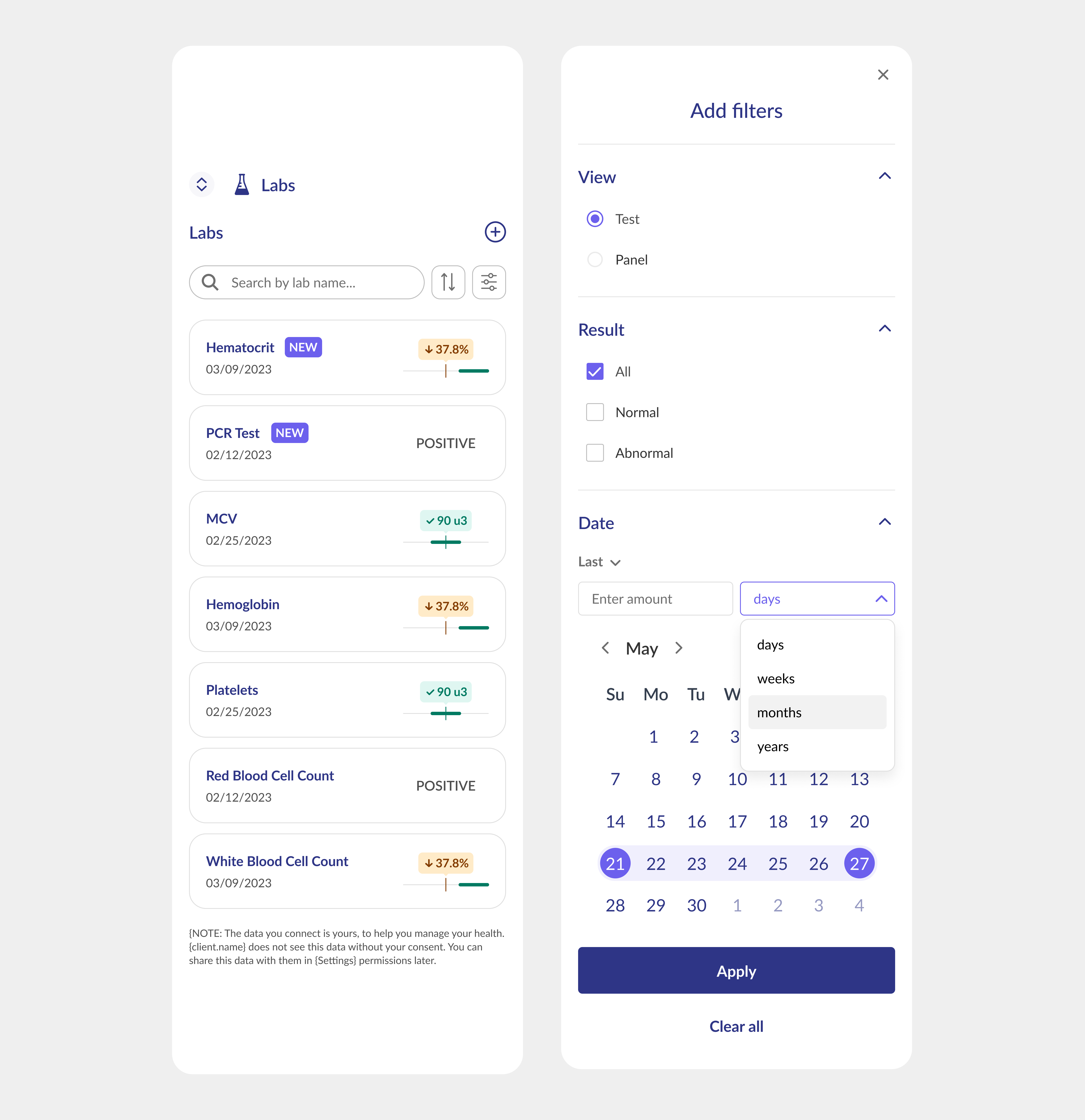
Solution: Introduced separate list items for each test result and implemented search and filter options.
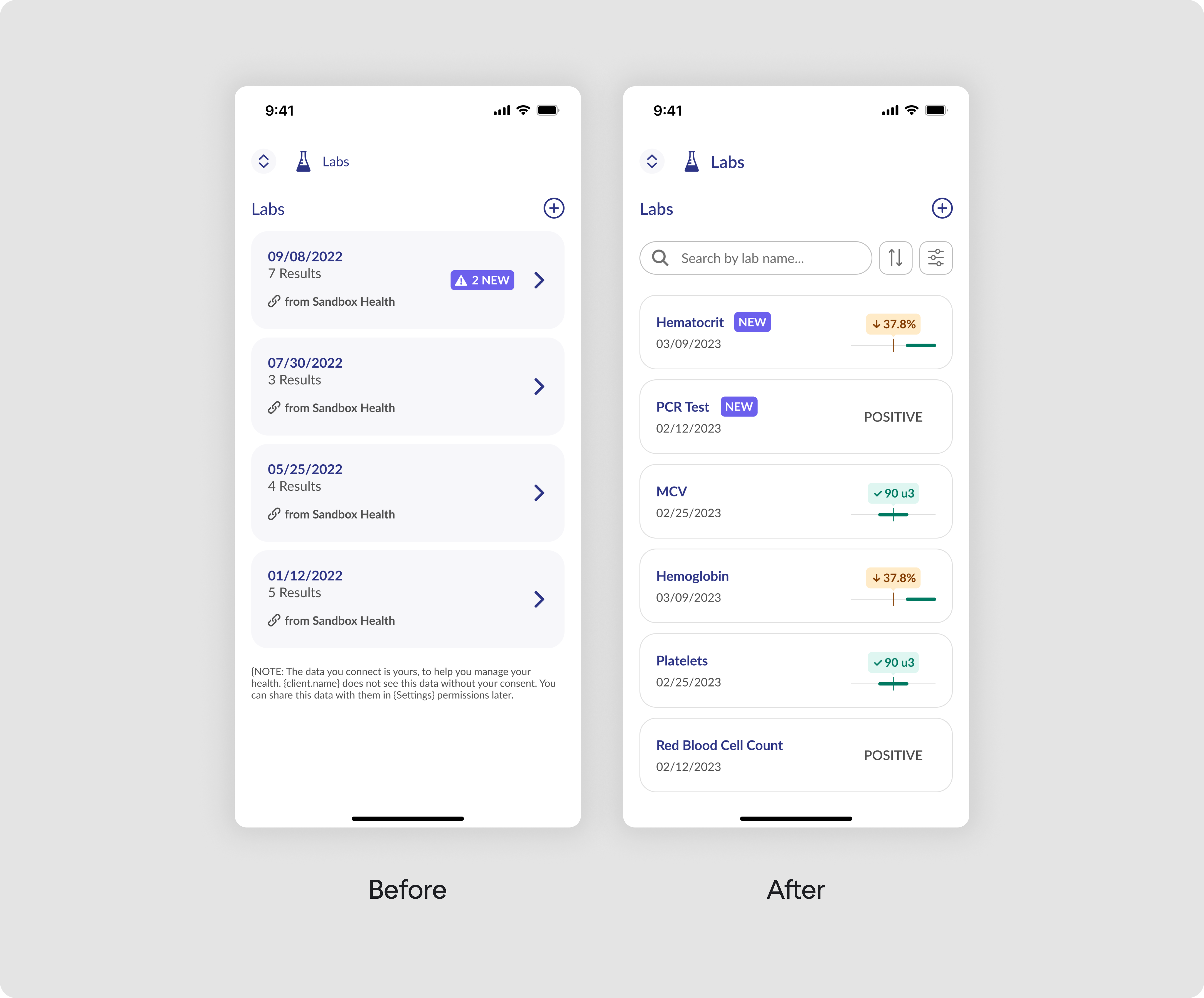
To enhance the effectiveness of filters, we introduced options to filter test results by view (test or panel), by results (all, normal, or abnormal), which is crucial for medical analysis, and by date with an intuitive date picker. The story of b.well shows us the exciting world of filtering design.
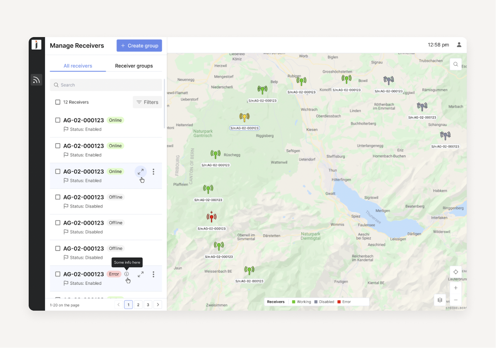
Cluttered screens
For mapping services, the amount of information that has to be fitted into one screen is one of the main challenges. We had worked with complex mapping products like Involi and Astraea which contain lots of data.
Issue: Side panels take too much space and the map becomes small
Solution: Add a “Hide side menu” button to close and open the side menu when needed.
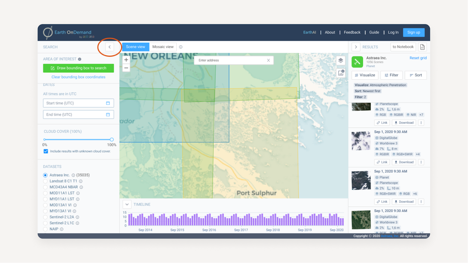
Issue: The numerous objects on the map look the same and affect readability.
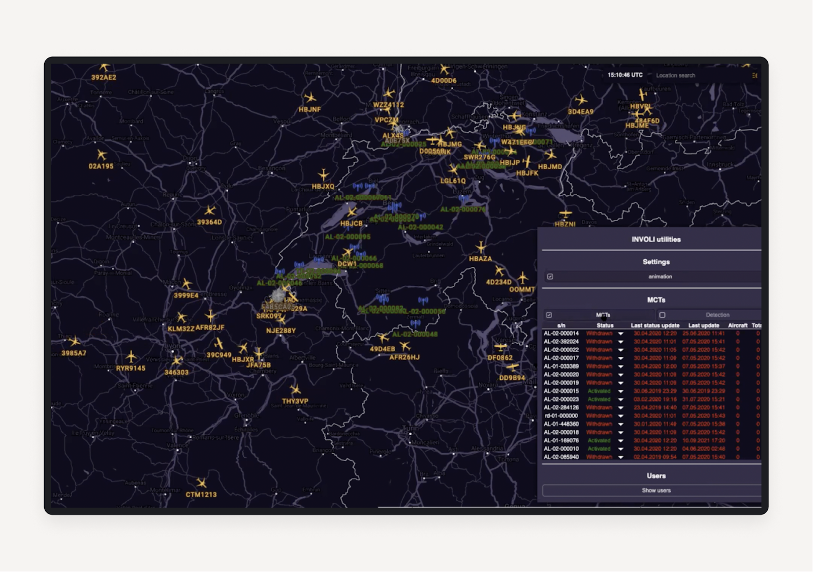
Solution: Differentiate the objects (receivers) by color: green for “working”, yellow for “selected”, red for “error”, and grey for “disabled”.
Bottom line, or how to fix UX issues fast and effectively
Sometimes UX issues are simple and easy to fix. And sometimes, it is the structure of a product that makes the product so complicated to use. In the former case, cosmetic changes are enough, in the latter case, fundamental work is needed to overhaul the structure. This is where measuring the user testing impact in SaaS redesigns becomes vital to justify large-scale structural changes to stakeholders.
Some issues are ruining the success of your product, while others barely impact anything and are only noticeable to perfectionist designers. To ensure nothing critical slips through the cracks during the build phase, a robust design QA checklist should be used to verify both minor visual tweaks and major structural updates.
Overall, there are numerous ways of dealing with UX issues, but there is one golden rule: the earlier you find them, the better.
It means that you don’t have to wait until your churn rate grows to an unsustainable level and the customer support officer burns out from an excessive amount of tickets. To catch these problems before launch, you should find beta testers who can provide honest feedback on your prototypes. Start with finding UX professionals who can have a fresh look at your product and ask them for an audit. At Eleken, we can analyze your product during our 3-day trial and present the issues and suggestions for you to later decide whether you want to us lend you a helping hand or not.
Sounds interesting? Schedule a call and we’ll tell you how to find the top UX issues of your app.


