

Visual design is where designers shine the most. Naturally, many try to skip parts of the process to get there faster, and wireframes are often the first to go.
If you’ve browsed Reddit threads on the topic, you’ve probably seen the divide. Some designers swear by wireframes and start with them 9 out of 10 times. Others say they’ve abandoned them completely because “no one cares.”
At Eleken, we’re firmly in the first camp. And chances are, you are too. Otherwise, you wouldn’t be searching for UX wireframe examples in the first place. So let’s look at practical templates, real examples, and how to use them effectively.
What is a wireframe in UX?
A wireframe is a simple visual layout that shows how a page or screen is structured. It outlines what elements go where, how content is organized, and how a user moves through a product, without the distraction of colors, typography, or final copy.
They also come in different levels of detail. Low-fidelity wireframes are rough, often hand-drawn sketches or simple digital outlines. Mid-fidelity wireframes add more structure and content detail, without any visual design. High-fidelity wireframes are the closest to the final layout, and typically include more realistic content.
Wireframes are often confused with mockups and prototypes, even though they serve different purposes in the design process. If you want a clear breakdown of how they differ, read our article on Wireframe, Mockup, and Prototype.
Do you always need to wireframe?
In most design processes, wireframing is a mandatory step, especially when the product involves complex flows, multiple user roles, or data-heavy interfaces.
At Eleken, we almost always start with wireframes because the SaaS products we work on require validating structure before any visual decisions are made. Skipping that step usually means revisiting the same decisions later, only at a higher cost.
And the design community largely agrees. As one designer put it on Reddit:
Another summed up the core value even more sharply:
That said, every project is different, and rigid rules rarely survive contact with real-world constraints.
A good example is our work with MegaStep, a quality control app. The client was a true domain expert with a clear product vision, but had never worked on digital product development before. He needed an autonomous designer who could take ownership, move fast, and make confident decisions without hand-holding.
Given the tight timeline and the client’s hands-on involvement, we made the call to skip low-fidelity wireframes and go straight to screen design. It was a deliberate decision based on what the project actually needed. And it worked.
So, do you always need to wireframe? In most cases, yes. But the right process depends on the product, the team, and the constraints you’re working within.
Free wireframe templates you can use right away
The fastest way to start wireframing is by using a good template. Resources like Figma, Miro, and Moqups offer a wide variety of options. To simplify the decision, we’ve gathered the ones we found most useful below.
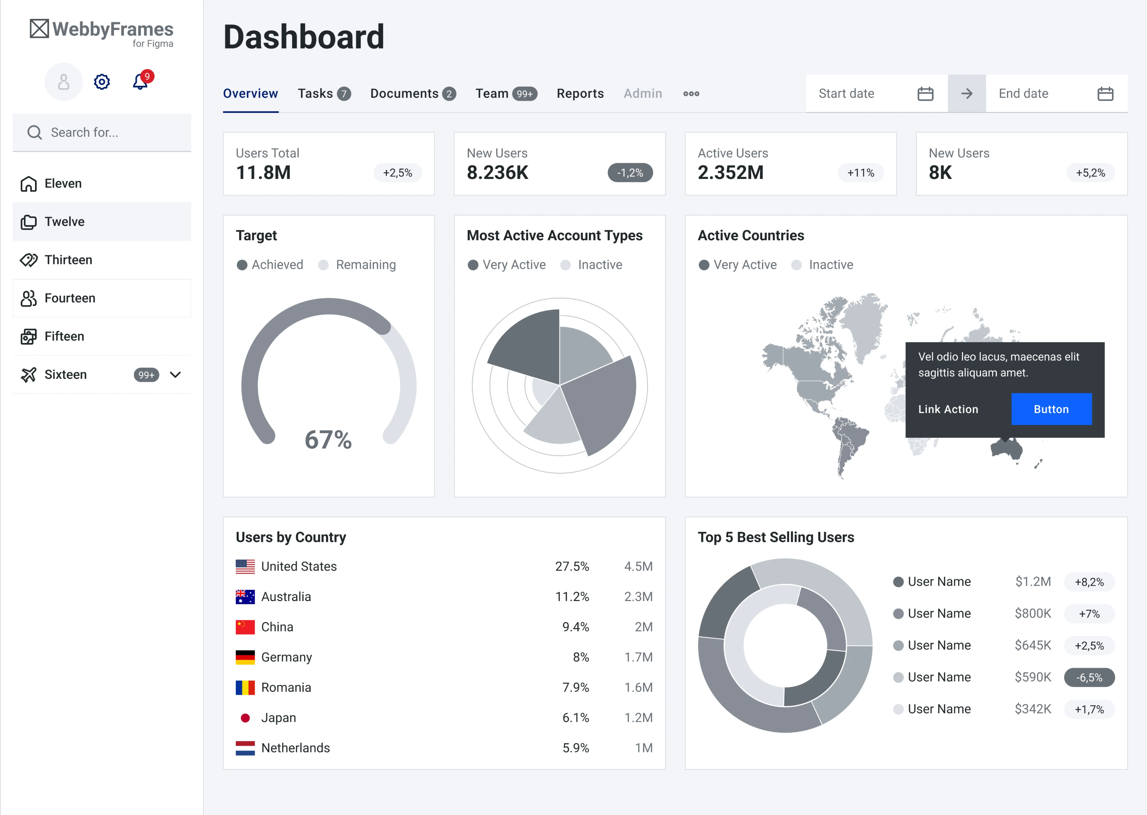
Admin dashboard wireframe template
This template from the WebbyFrames kit covers a sidebar navigation, a top bar with search and filters, key metric cards across the top, and a mix of charts and data tables below. It might be a solid starting point for any dashboard.
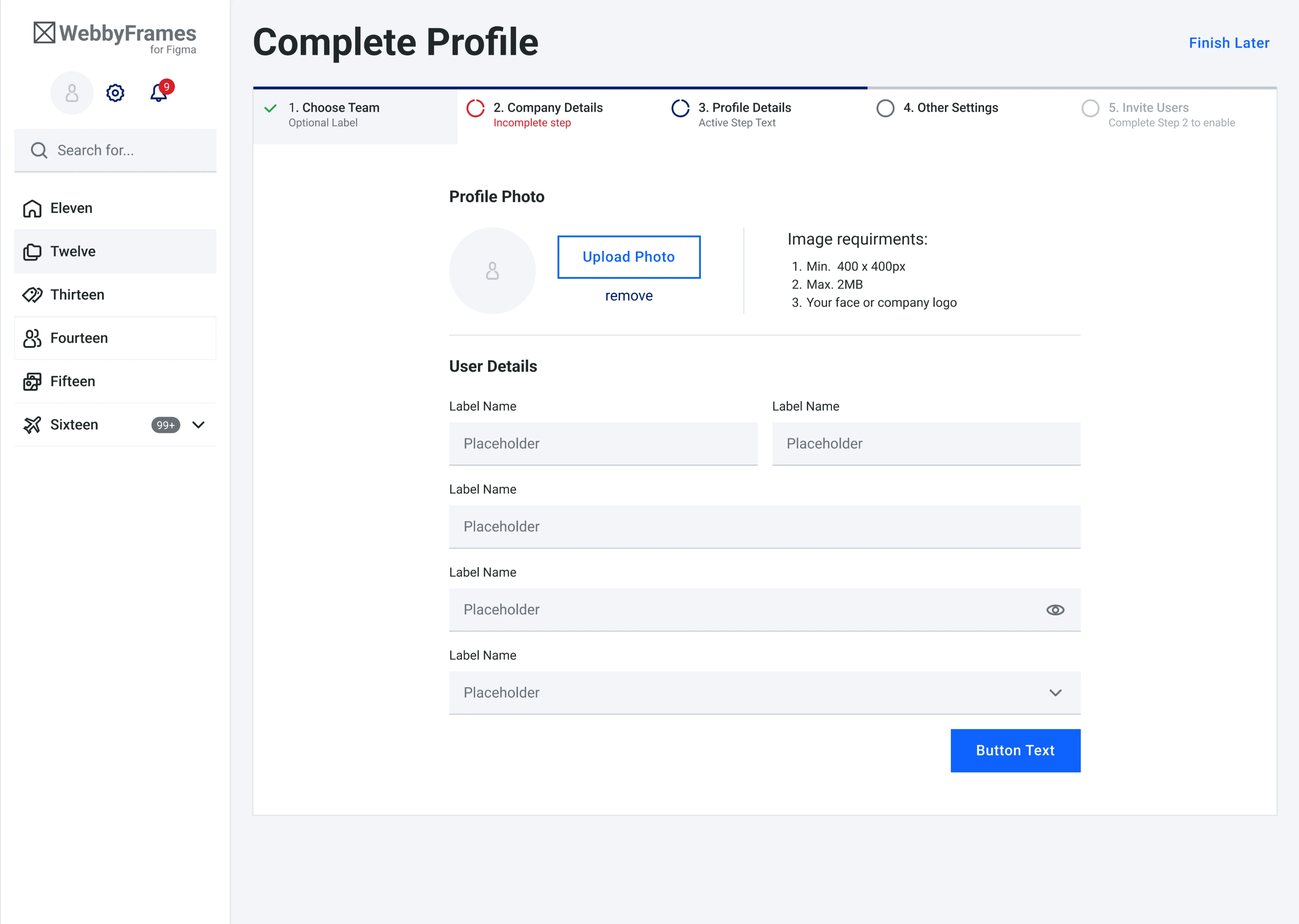
Profile page wireframe template
Also from the WebbyFrames kit, this template tackles the multi-step profile setup. The progress bar across the top makes the user’s position in the process immediately clear, and the overall content itself is well-structured.
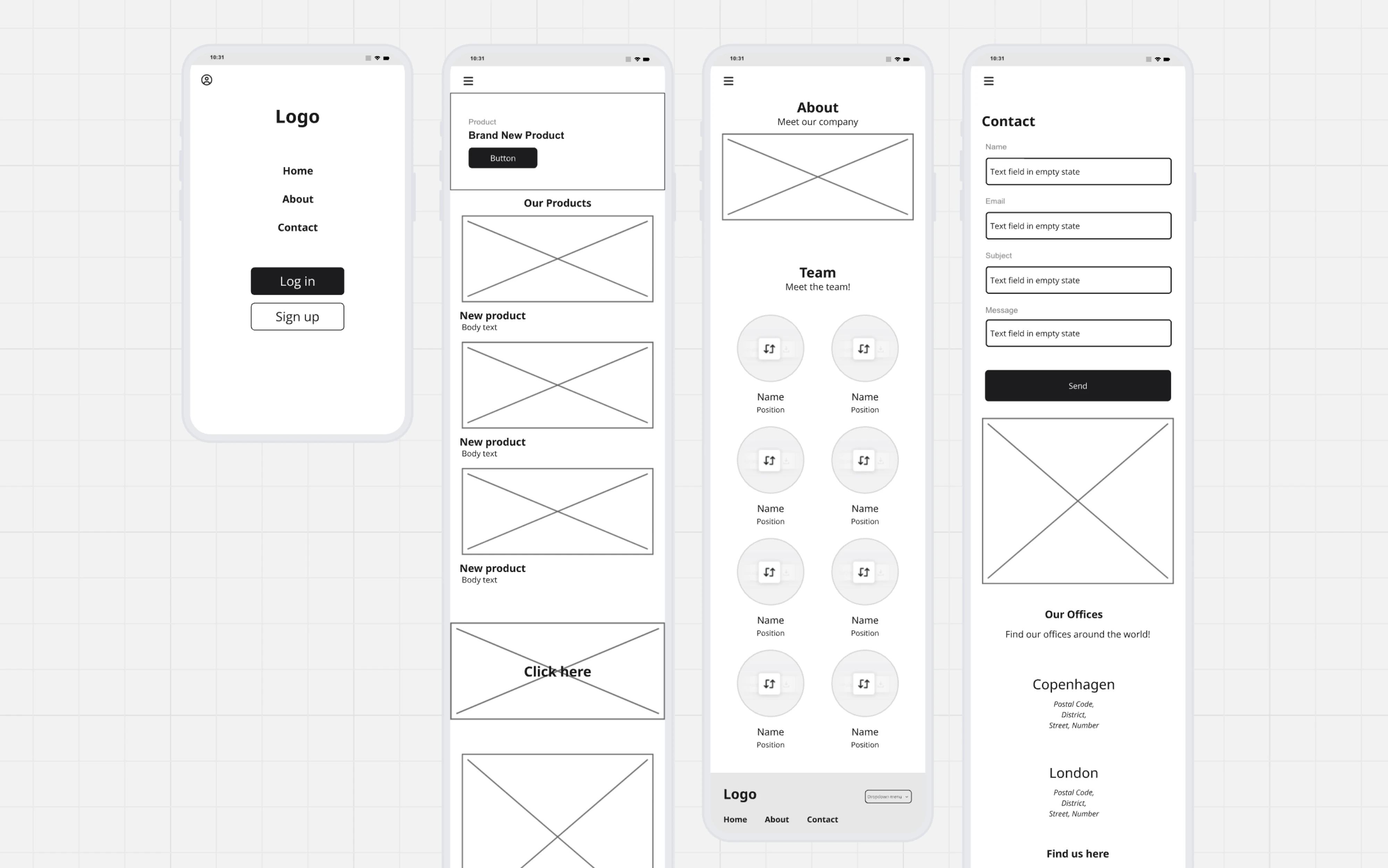
Mobile app wireframe template
This template from Miro covers the core screens most mobile apps need to get off the ground. They all follow a consistent low-fidelity style, using placeholder images and simple typography to keep the focus on layout.
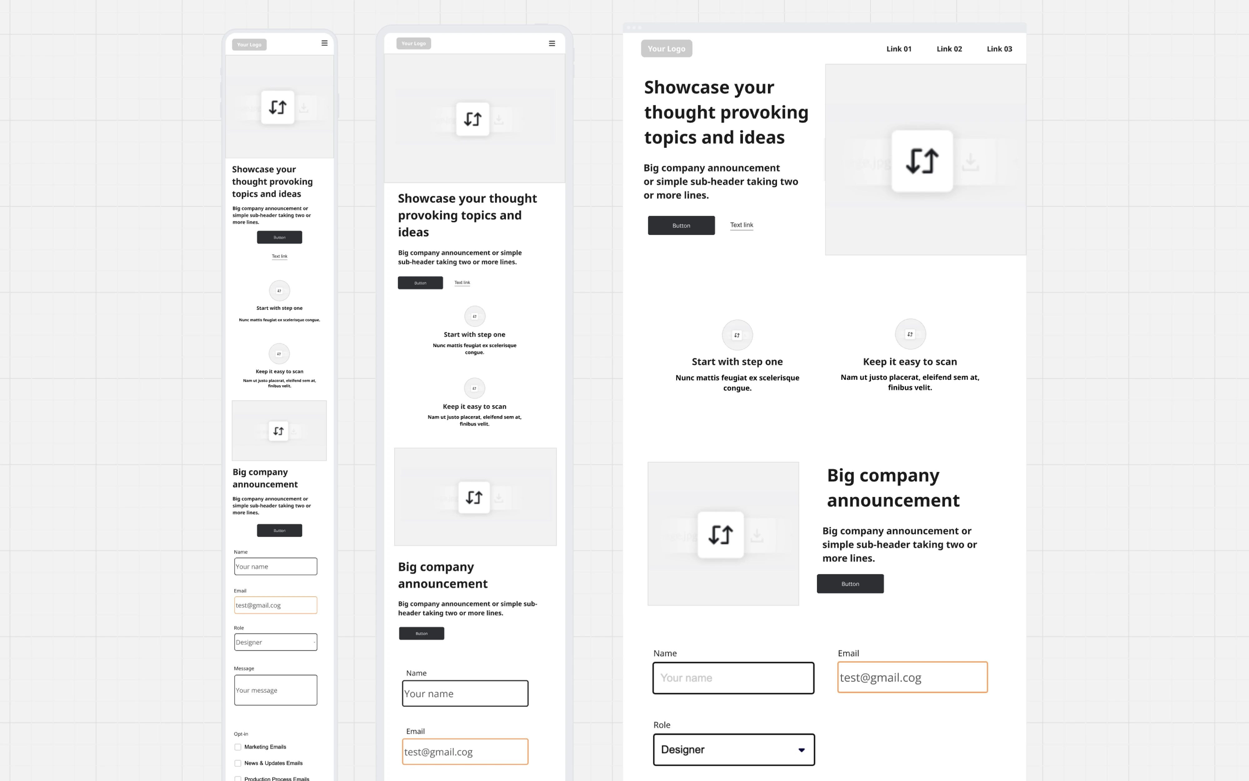
Website wireframe template
Another template from Miro covers the essential building blocks of a company website. Each screen includes common sections like a hero with a headline, a features block, a company announcement section, and a contact form.
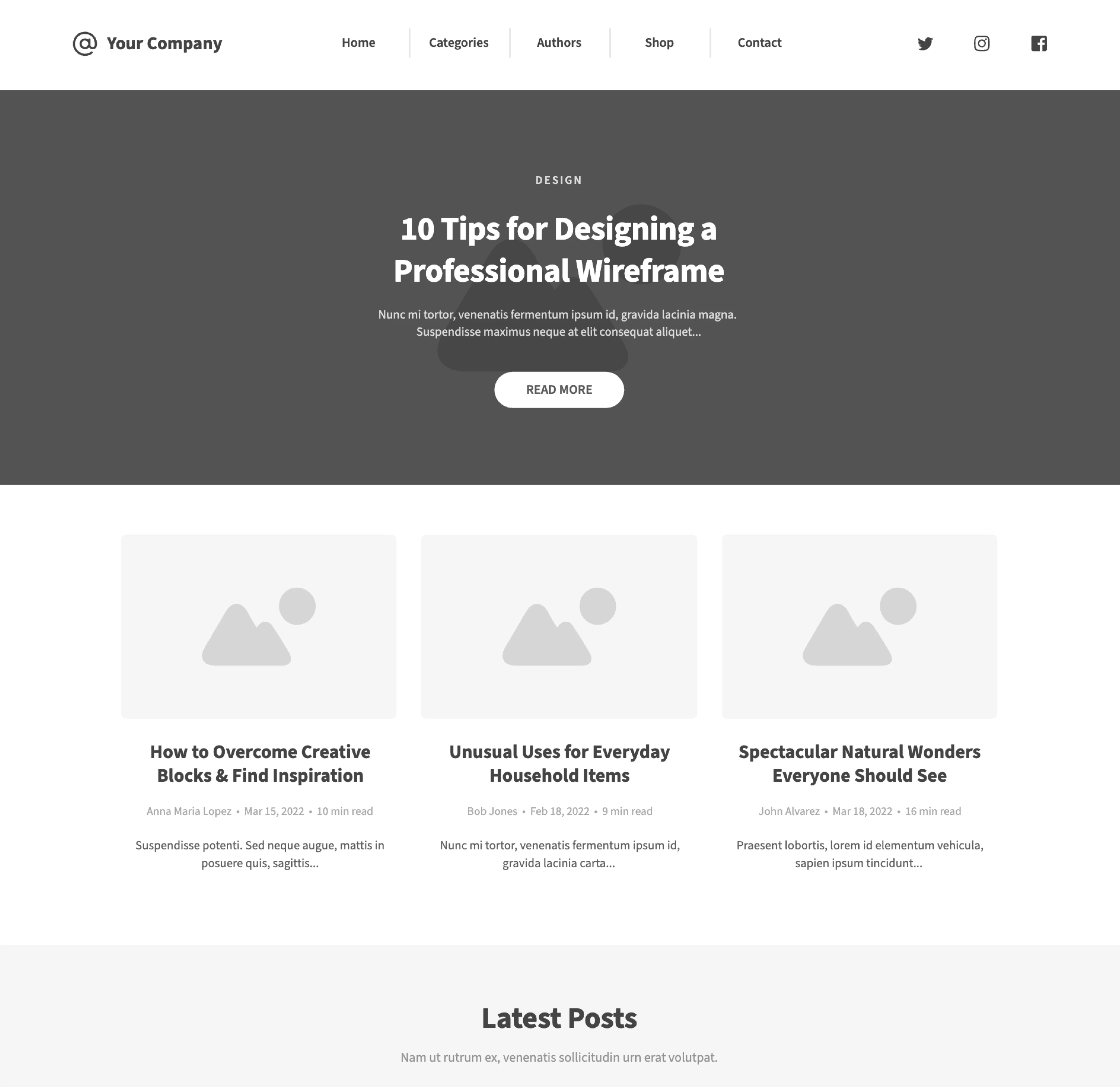
Blog page wireframe template
This template from Moqups lays out a clean and familiar blog structure. It’s a straightforward template that works well for content-heavy products, company blogs, or any platform where articles are a core part of the user experience.
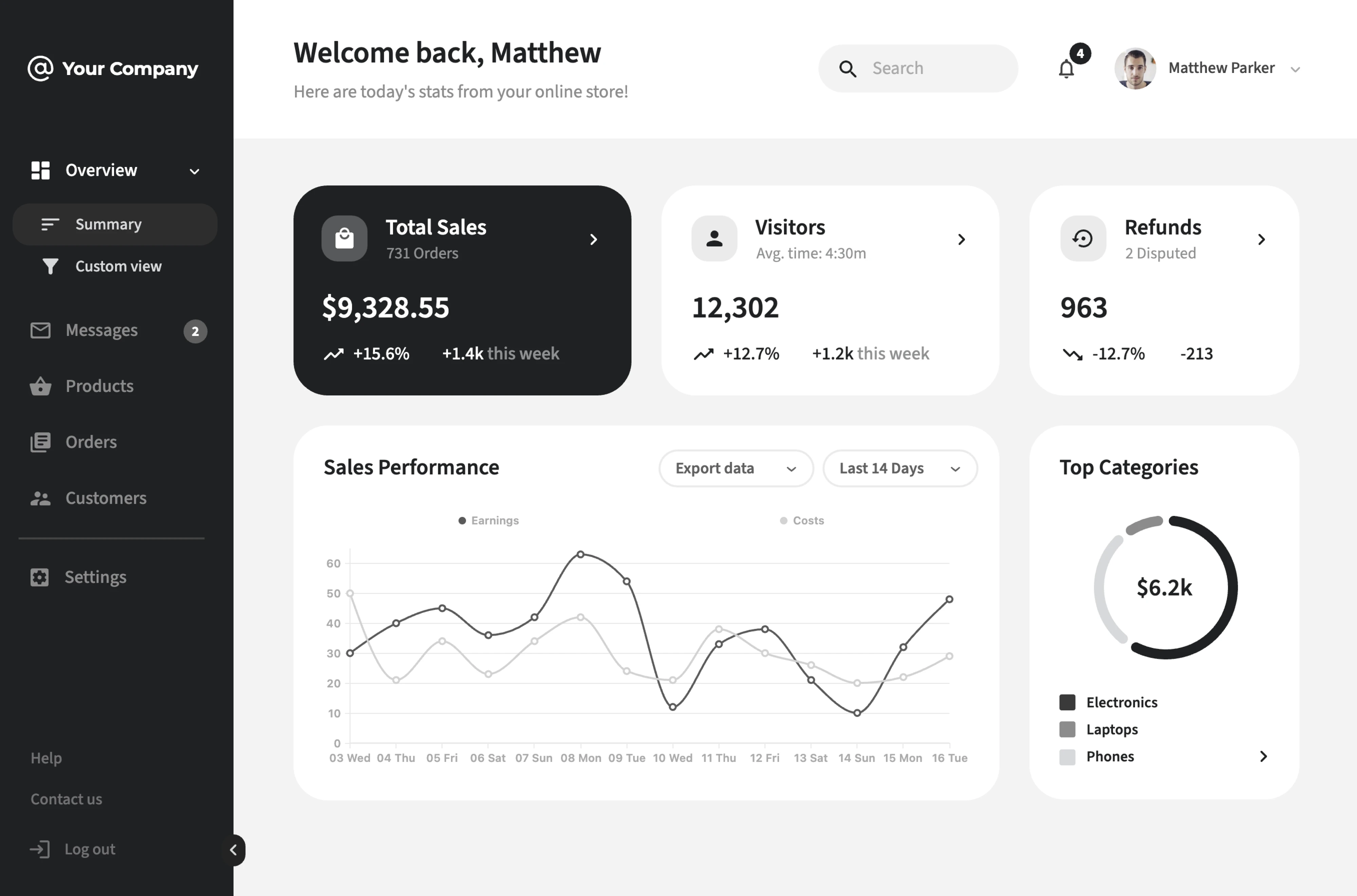
E-commerce dashboard wireframe template
This template from Moqups is built around the core needs of an e-commerce admin view. The layout leads with key metric cards and includes a sales performance chart. The dark sidebar navigation keeps the structure clean and easy to scan.
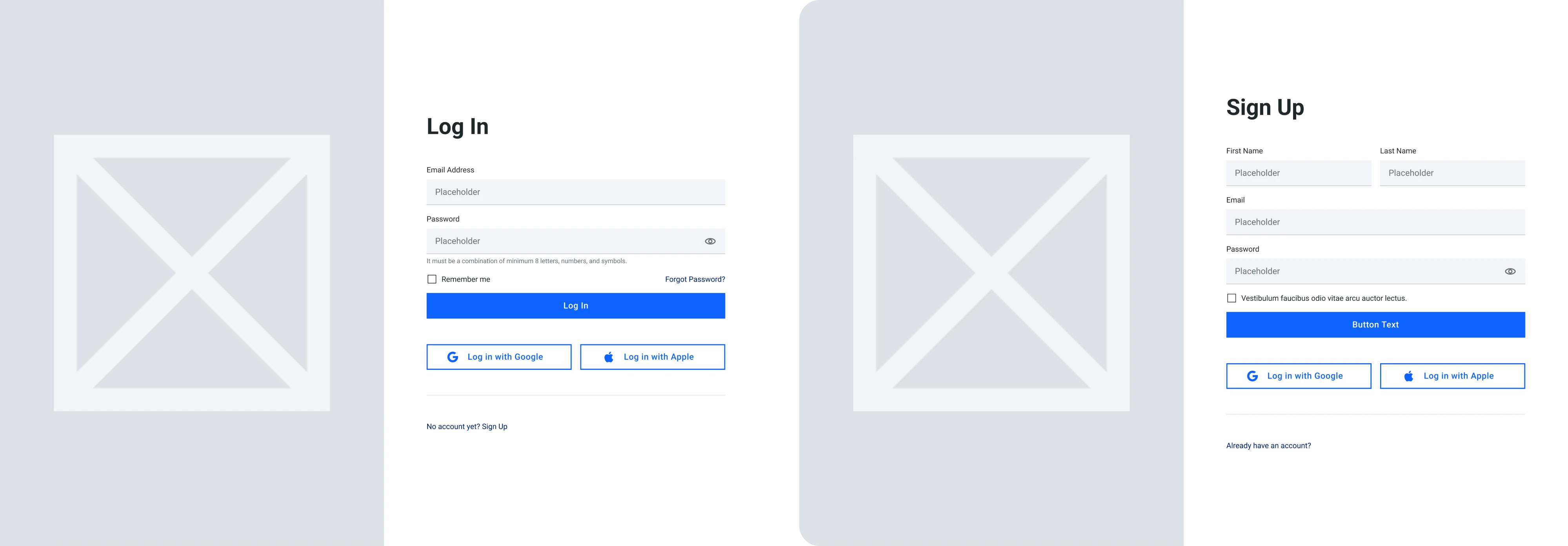
Sign-in/sign-up wireframe template
This template from the WebbyFrames kit covers the entry points of every product. What makes it useful is consistency. Same visual structure and same social login placement save a lot of back-and-forth in design reviews.
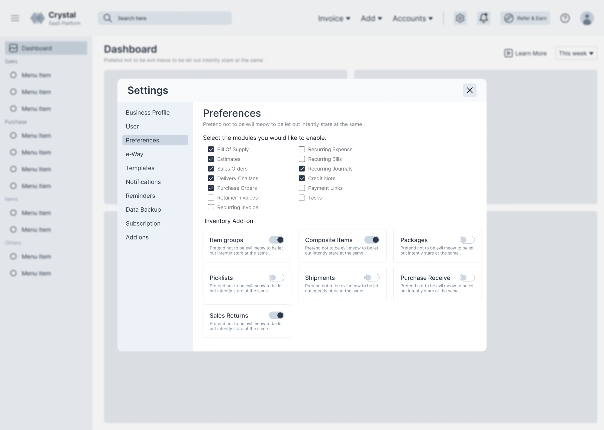
Settings page wireframe template
This free Figma template handles an information-dense screen — the settings page. The layout is presented as a modal overlay with a left-side menu. The main area is designed for quick and straightforward settings management.
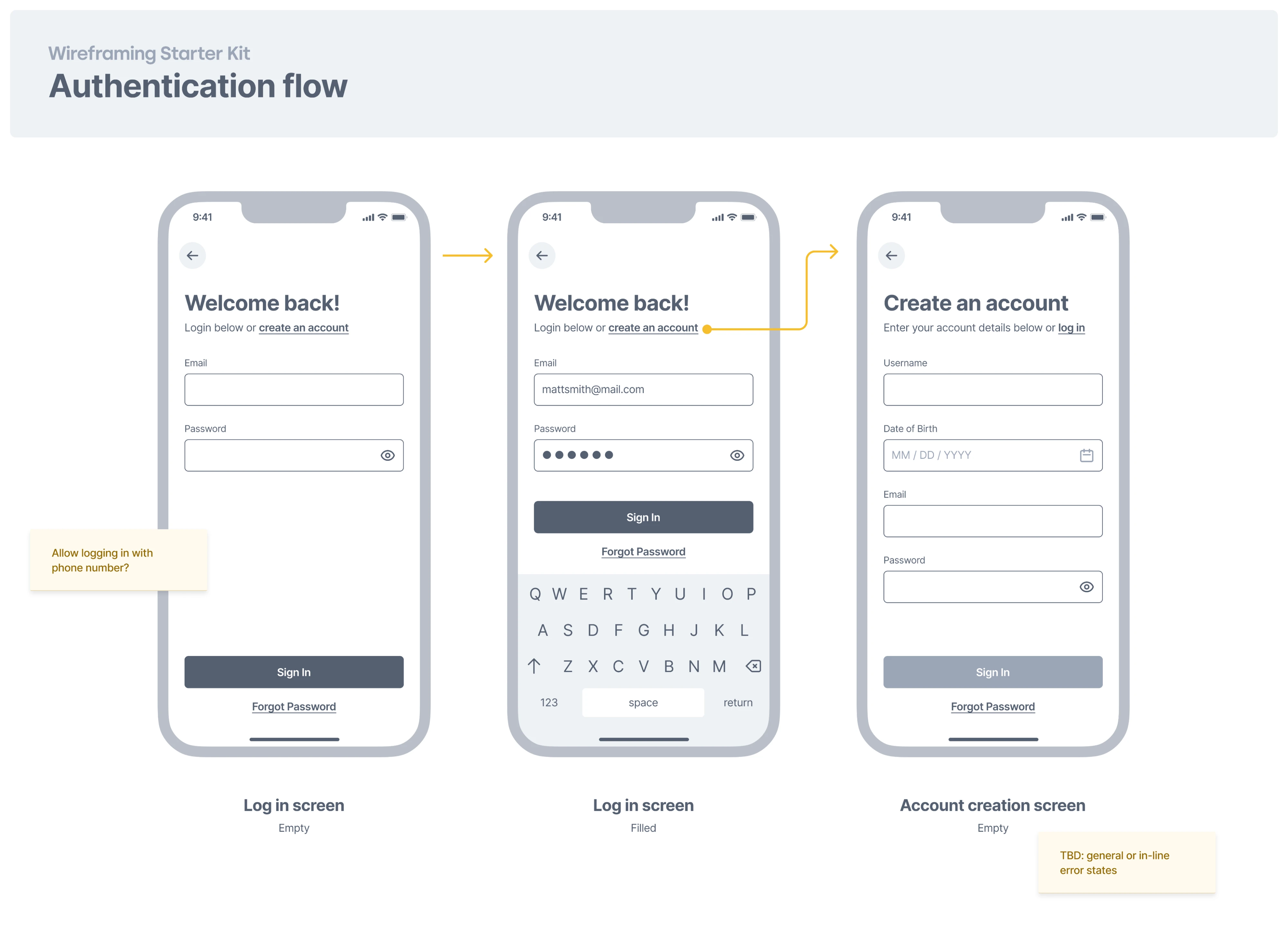
Authentication flow wireframe template
This Figma template maps out the full authentication flow across three screens — an empty login state, a filled login state, and an account creation screen. A solid starting point for any mobile app that needs to think through authentication.
12 UX wireframe examples for inspiration
Templates are a great starting point, but sometimes you need to see how real products solve structural problems before you can make the right call for your design. With that in mind, below we’ve gathered some good wireframe examples.
1. Smartpin
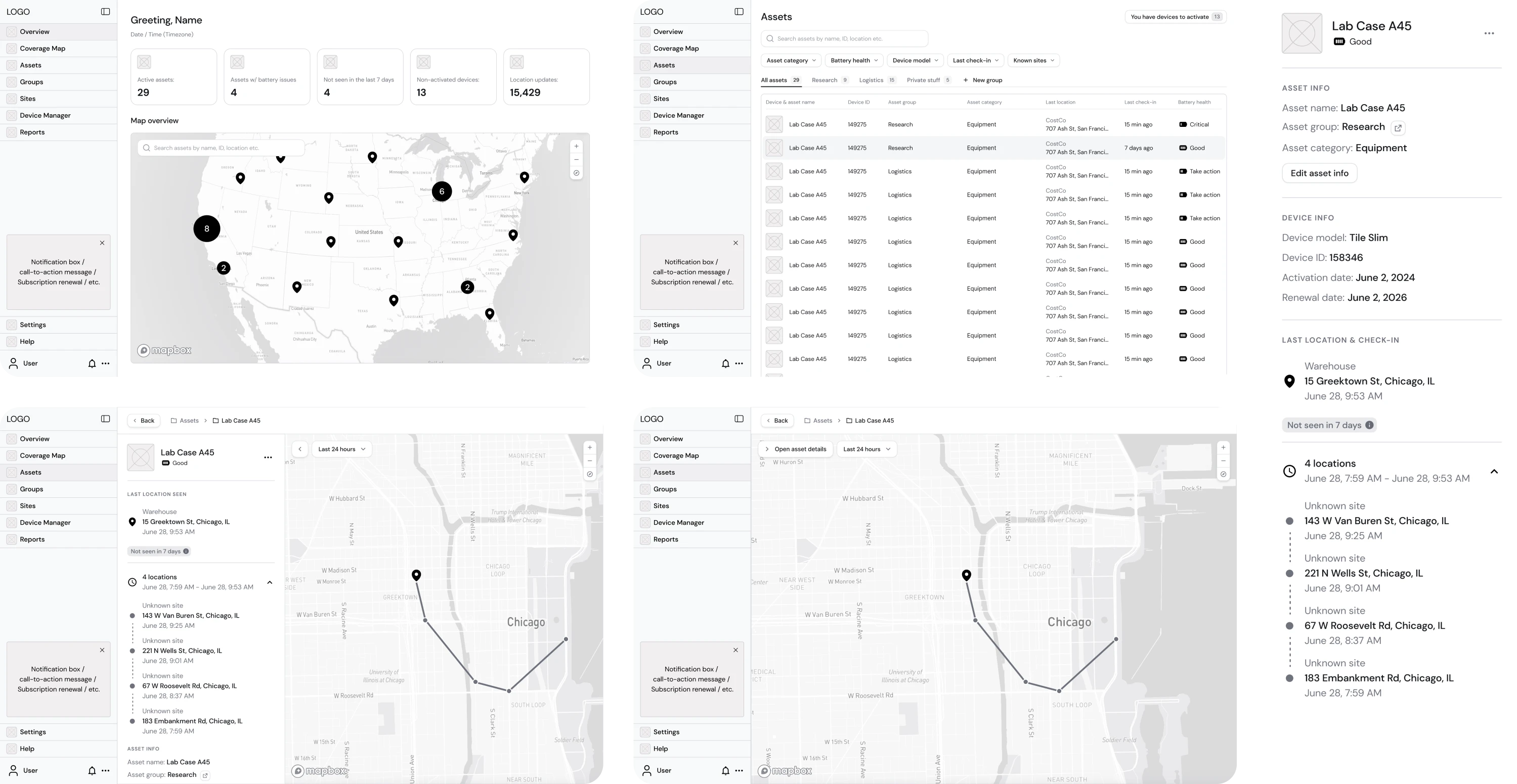
Hubble Network reached out to Eleken with a solid concept and a Product Requirements Document for Smartpin, a geospatial platform. Based on those materials, we built wireframes focused on stripping everything back to structure.
These early-stage UI/UX wireframe examples helped the team align on user flow, define hierarchy, navigation logic, and data visibility.
Why it worked: Early structural decisions led to an investor-ready product that helped Hubble secure $70M in Series B funding.
2. Datawisp
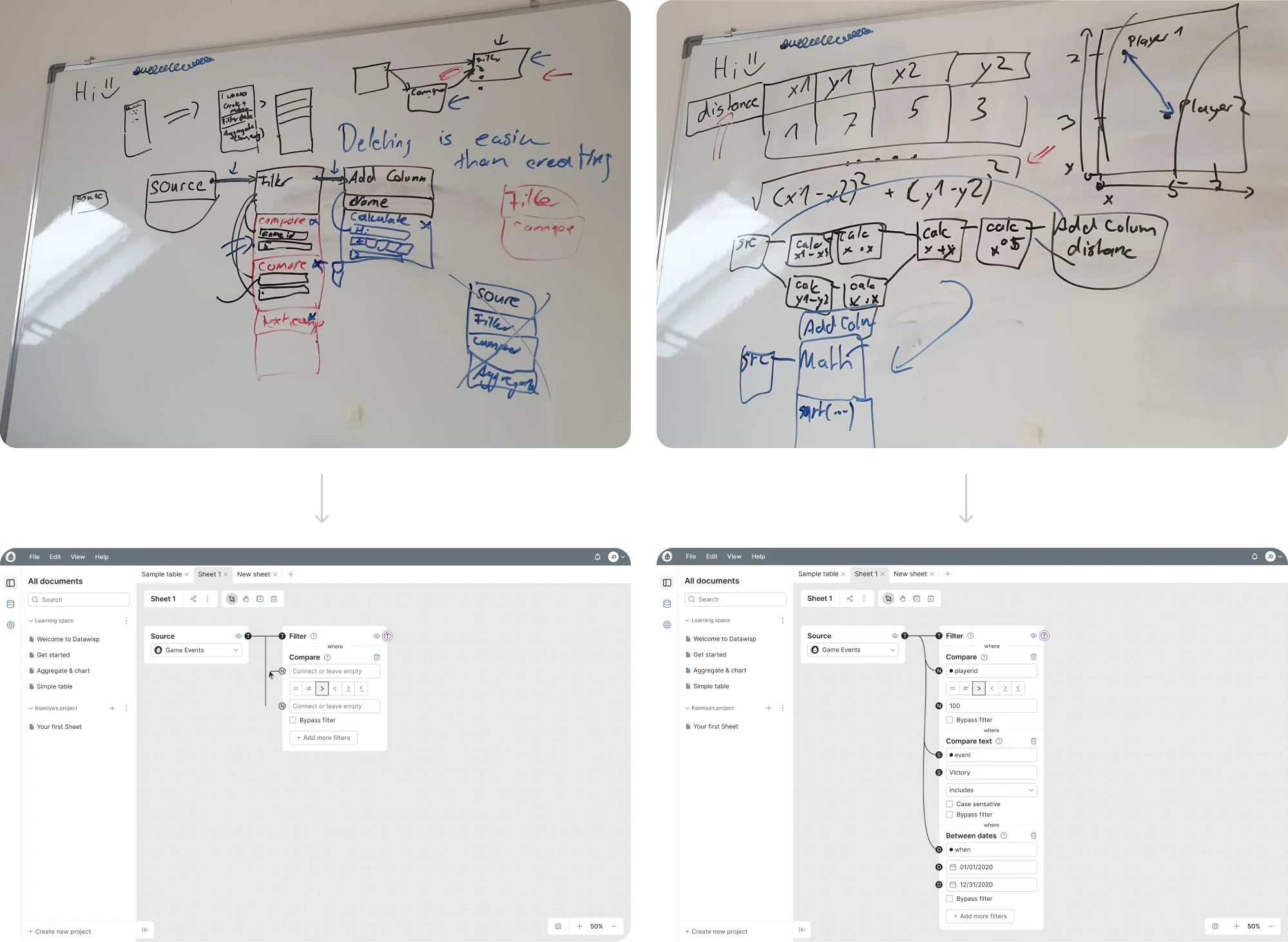
Datawisp, a no-code analysis platform, came to Eleken for a full redesign. Our designers started with raw sketches to outline the arrangement of elements, then moved to wireframes illustrating each element and the connections between them.
Such an approach helped our team better understand the product and design an interface that truly represented the user interaction logic.
Why it worked: Moving through wireframe stages gave the team a clear structure to build on, and helped the client close a $3.6M seed round.
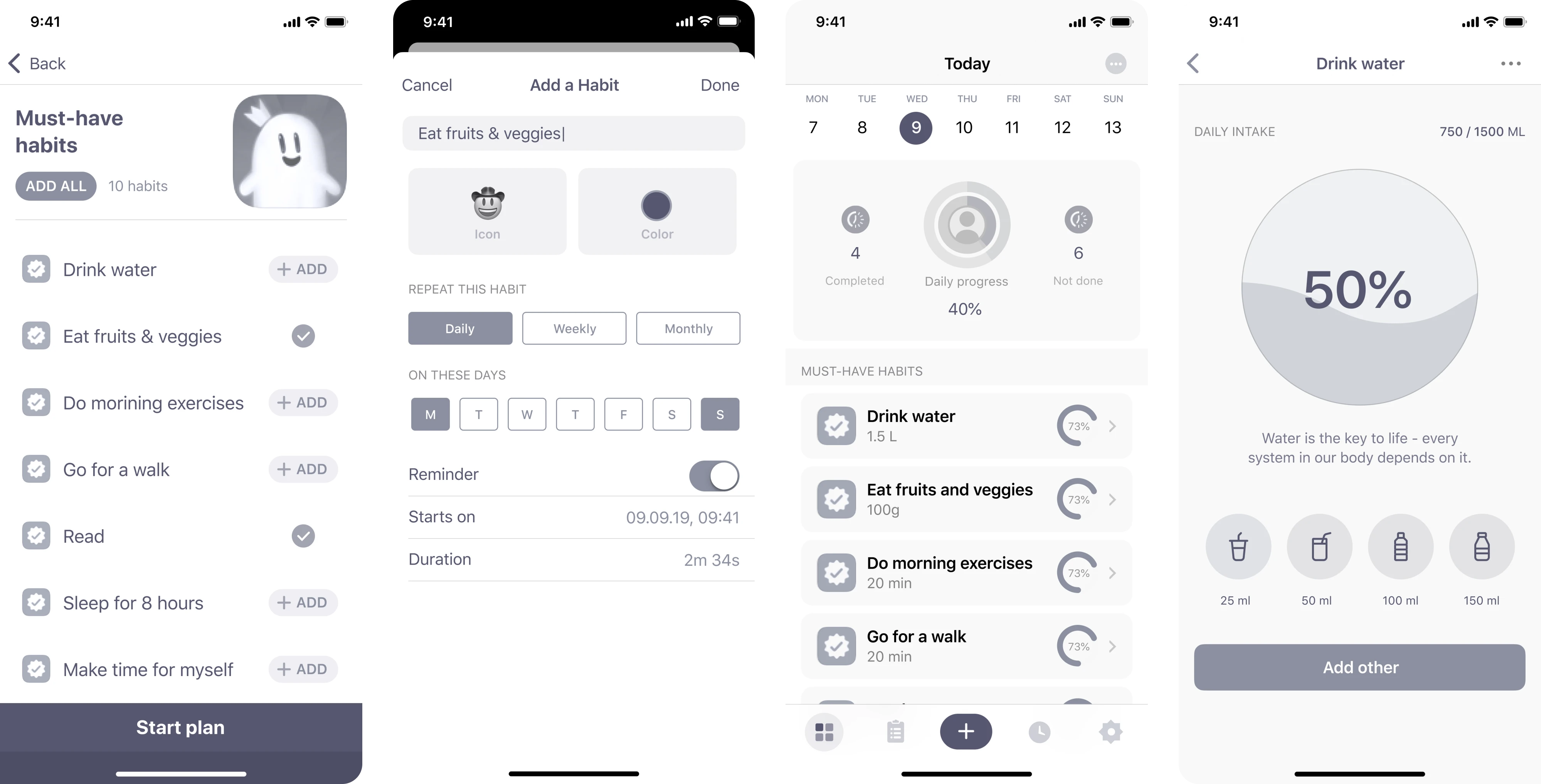
3. HabitSpace
When working with HabitSpace, our Eleken team needed to create a mobile experience that makes daily habit tracking engaging. After researching competitors and user needs, we designed wireframes to validate the product direction.
Given the mobile-first nature of the app, each wireframe focused on keeping navigation simple and the core actions immediately accessible.
Why it worked: Wireframing first allowed us to test the core user flow and design the final product that is now live on the App Store.
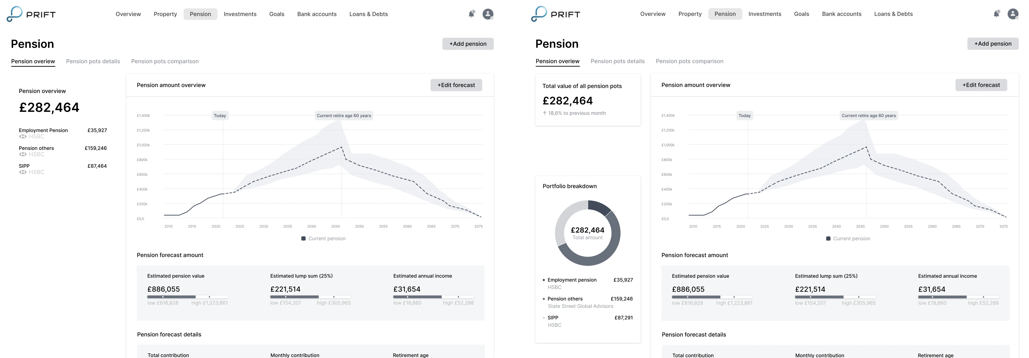
4. Prift
Prift contacted Eleken with a personal finance platform idea that needed professional UI/UX design. We created wireframes and conducted A/B testing across several screens to gather user feedback and validate the concept.
Having wireframe design examples side by side made it easier for stakeholders to compare options and make confident decisions early.
Why it worked: Testing at the wireframe stage, rather than after, meant user feedback directly shaped the MVP structure.
5. Avid
Avid was building an AI fundraising feature and came to Eleken for help. After running user interviews to understand the target audience, our designer created wireframes to validate the new flow and identify weak spots.
The goal was to map out a journey that felt direct and intuitive, and our designer made it possible for users to reach outcomes without getting lost.
Why it worked: Starting with wireframes before moving to prototypes kept the focus on getting the journey right.
6. DataStreams
During our collaboration with DataStreams, we were working on a product that needed to stand out from competitors. Together with the product manager, our designer conducted a discovery phase and, based on the insights, built wireframes.
Grounding these UX design wireframe examples in real research findings, we ensured the structure reflected actual user needs.
Why it worked: Keeping wireframes before final design helped us design a product that could successfully expand to global markets.
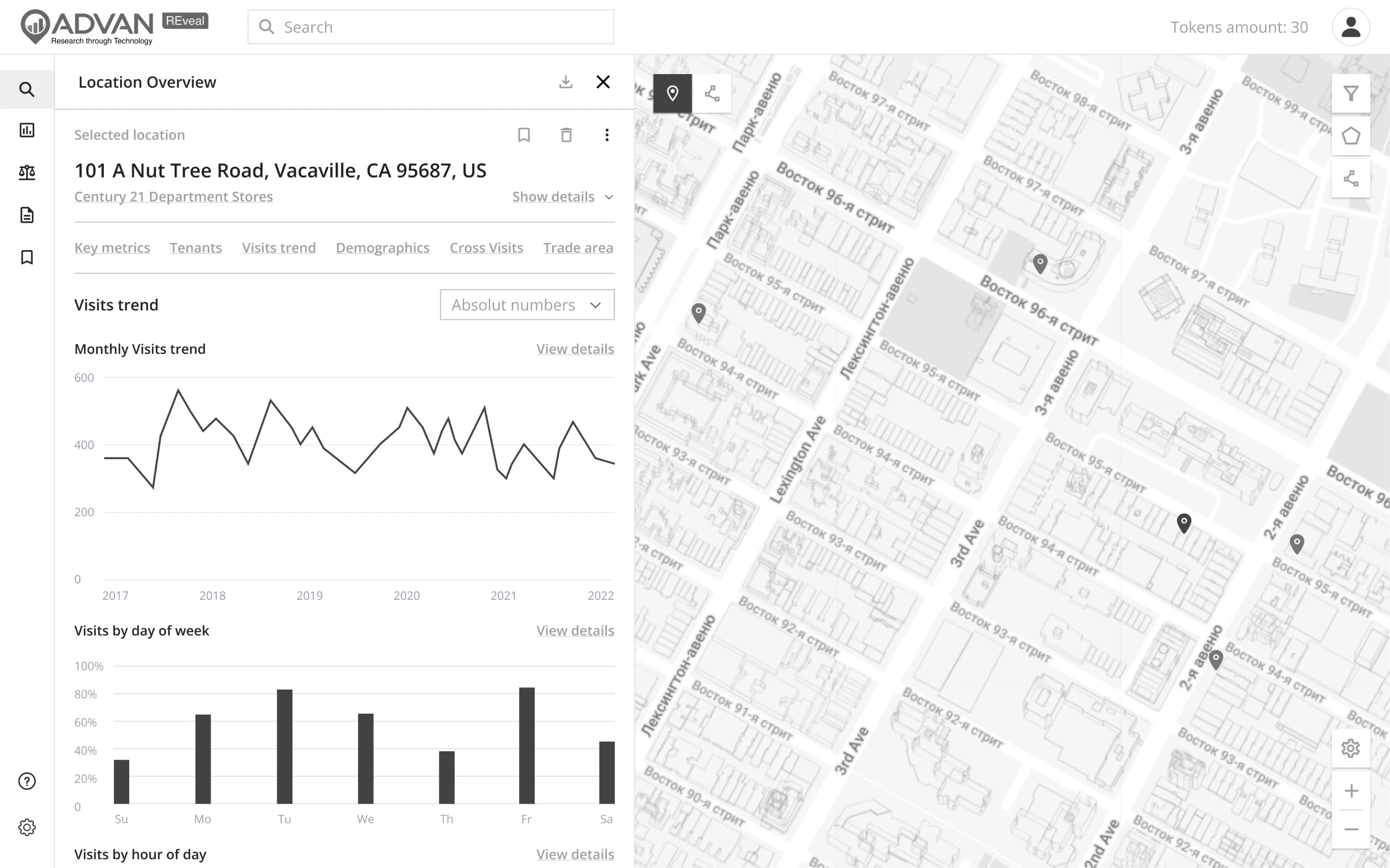
7. Advan Research
Advan Research needed a redesign of ReVeal, their GIS platform, to fix a cluttered experience caused by years of feature additions. Our Eleken team first defined the app structure and shaped wireframes around the new layout.
This step was critical for a product with complex data visualization needs, where the wrong hierarchy would have made the interface harder to use.
Why it worked: Wireframing kept the redesign focused on solving real usability problems rather than just refreshing the visuals.
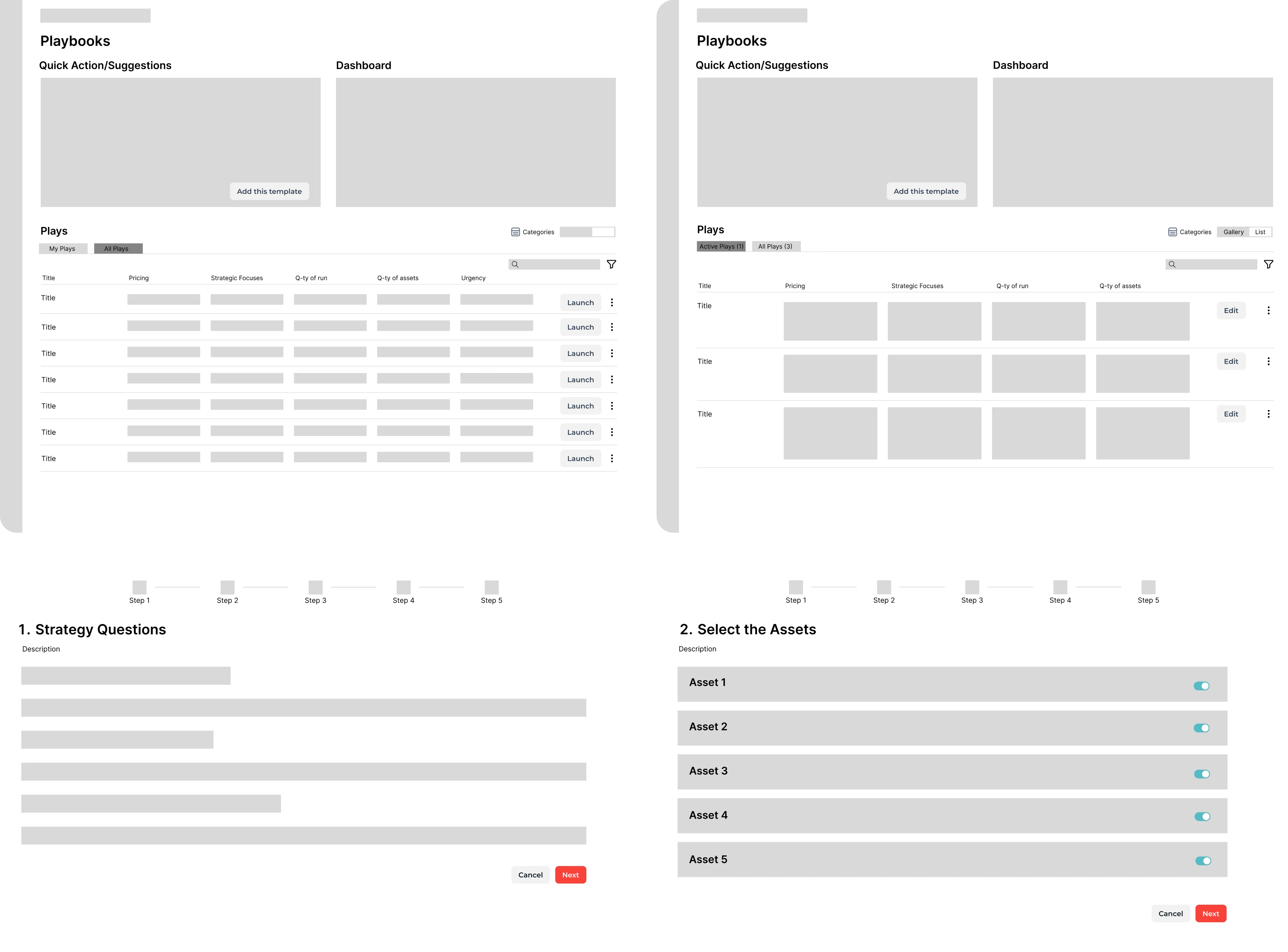
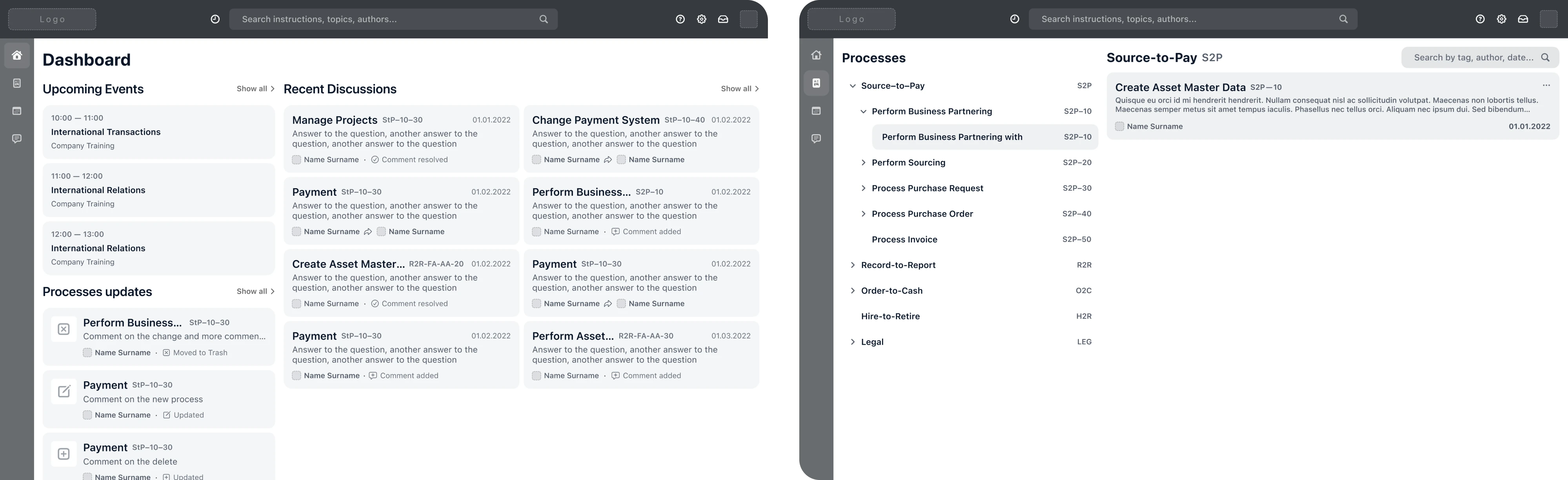
8. Process Enablement
Process Enablement was struggling to bring their product vision to life and contacted Eleken for professional help. Our designers created several wireframe variants covering key sections to prepare for investor and co-founder presentations.
Multiple wireframe UX examples at this stage gave stakeholders a tangible sense of the product direction without requiring a fully polished design.
Why it worked: Having professional wireframes ready early gave the client a credible, concrete vision to present to investors.
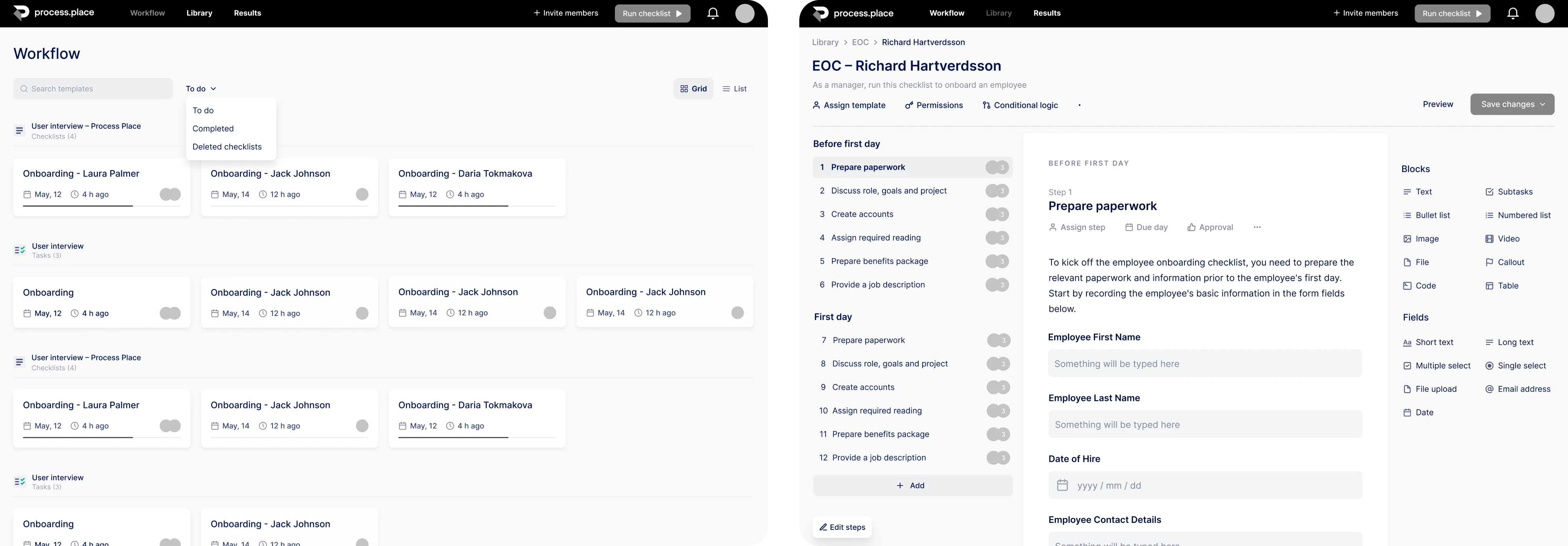
9. Process Place
Process Place, a process management tool, came to Eleken with research already done and ready to build. Our designers opened Figma and put together wireframes, deciding how elements would look on each page and connect with each other.
Since the product needed to handle multiple interconnected workflows, mapping these connections saved significant time during visual design.
Why it worked: Settling on structure first made it easier to clearly divide primary and secondary elements on each screen.
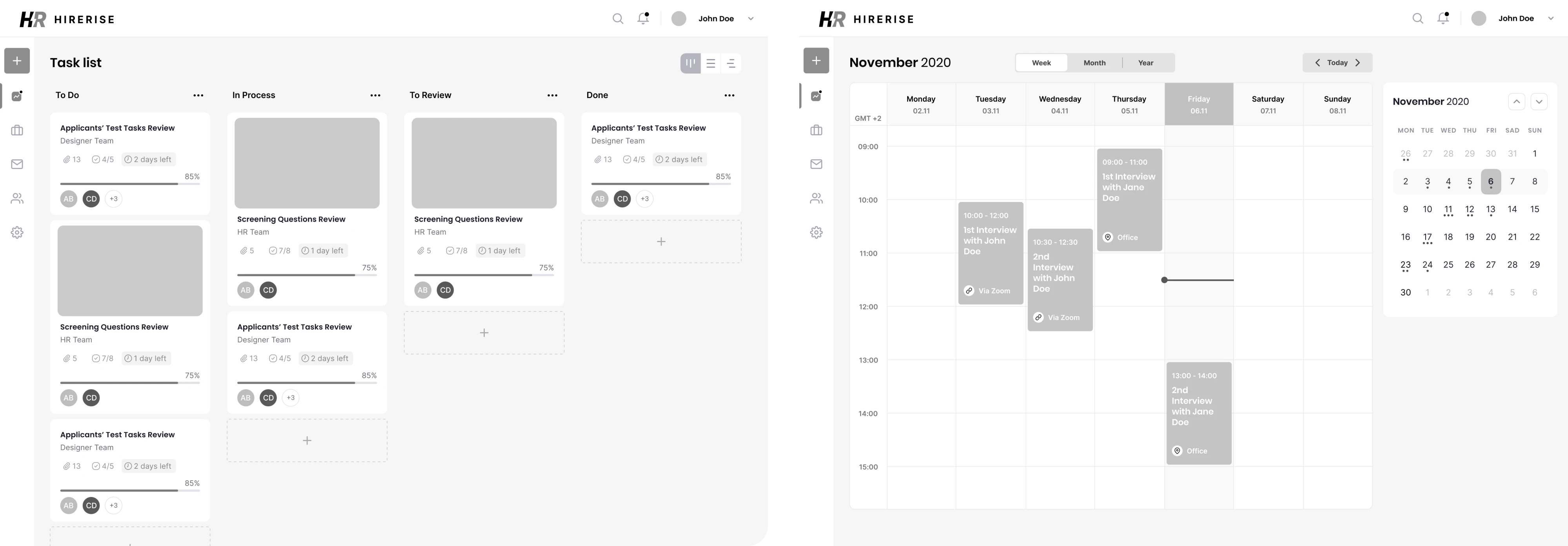
10. HireRise
HireRise needed an intuitive and minimalistic interface that would shorten users’ time-to-hire. Before any visual work began, our Eleken designer used wireframes to map out content layout and user journey at the earliest stage of development.
We stripped the UX wireframe design examples of any visual detail so the team could stay focused on flow and functionality.
Why it worked: Grounding design decisions in wireframes meant every element on the screen had a purpose.
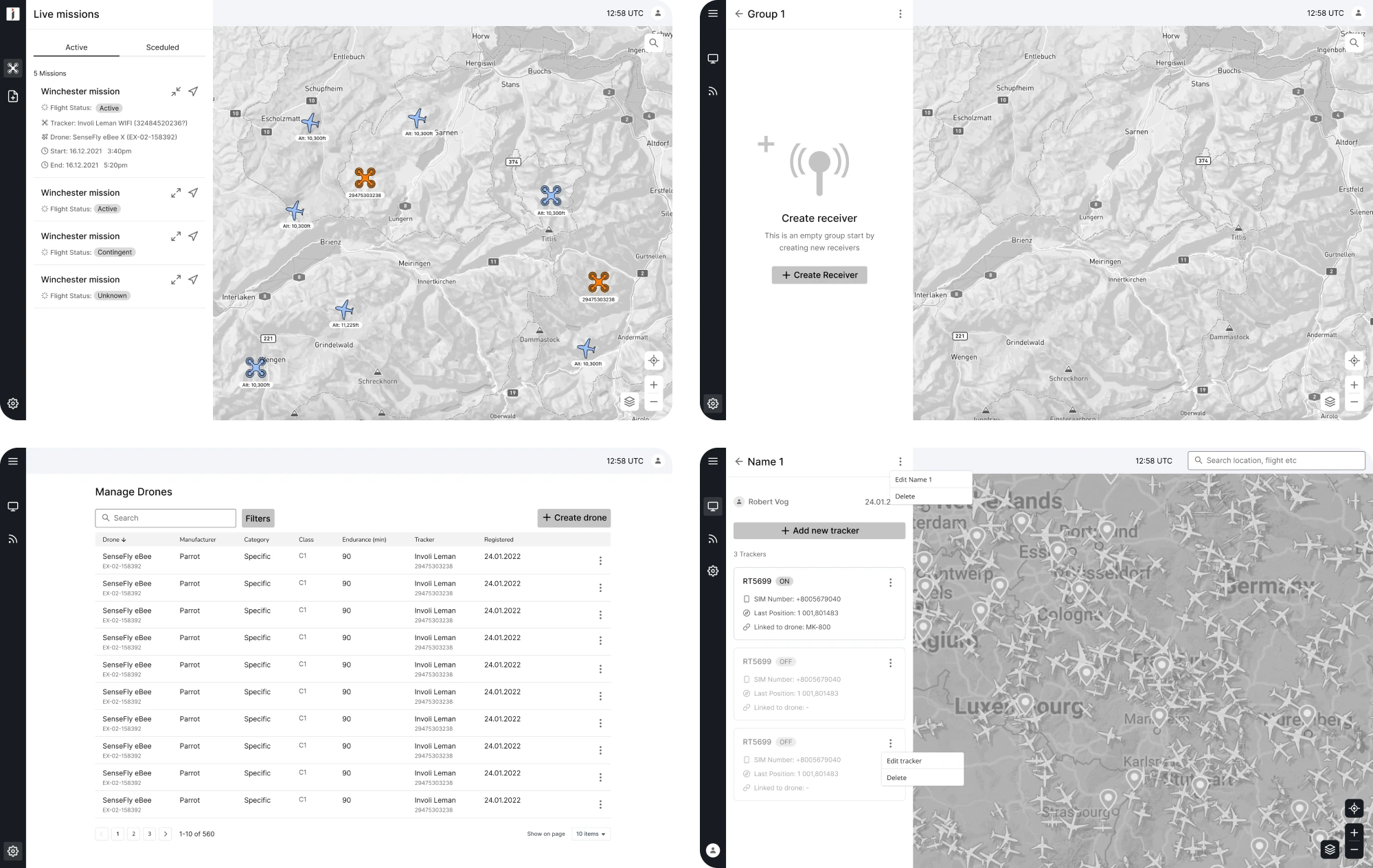
11. INVOLI
INVOLI, an air traffic surveillance platform, came to Eleken for a UI redesign. During product analysis, we identified a confusing drone flight booking form and used wireframing to restructure it into a simpler three-step flow.
Our designer resolved this at the wireframe stage, giving the development team a clear, validated structure to build from.
Why it worked: Breaking down a complex process at the wireframe stage made it easier to simplify the experience without losing functionality.
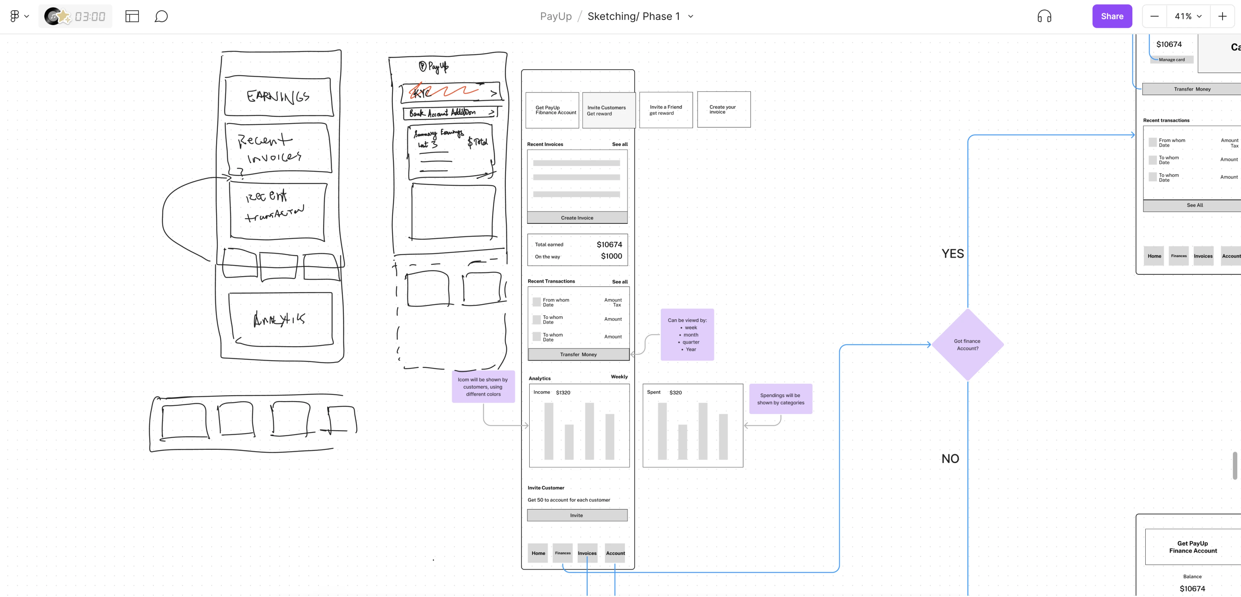
12. PayUp
PayUp, a financial platform for early invoice payments, approached Eleken for a full product redesign. We built low-fidelity wireframes presenting multiple versions of key features, giving the client options before committing to a direction.
For a product handling sensitive financial flows, having simple wireframe examples to review meant potential usability issues were caught early.
Why it worked: Exploring several wireframe variants early allowed the team to make informed design decisions, resulting in a product ready to scale.
Final thoughts
A blank screen is only intimidating until you have a structure to work with. Wireframes give you that structure, and as the examples above show, the teams that invest in it early build better products, move faster, and make fewer costly changes.
But even with the best templates and UI wireframe examples in front of you, knowing how to apply them to your specific product takes experience. That’s where having Eleken as a design partner can make the process easier and more structured.
If you’re ready to turn your product idea into a great design, we’d love to help.


.webp)

.webp)

.png)

.png)


