What is design if not a process of turning chaos into order? From this perspective, grids serve as the main tool for graphic and user interface designers. Grids help designers to place and align design elements on the page, in other words, create a certain order.
Eleken designers use grid systems to maintain consistency and structure across complex digital products and SaaS interfaces. By establishing a consistent pattern, grids help designers save time by reducing repetitive layout decisions. In this article, we would like to share a few tips and the best examples of grid layout design.
What is a grid in layout design?
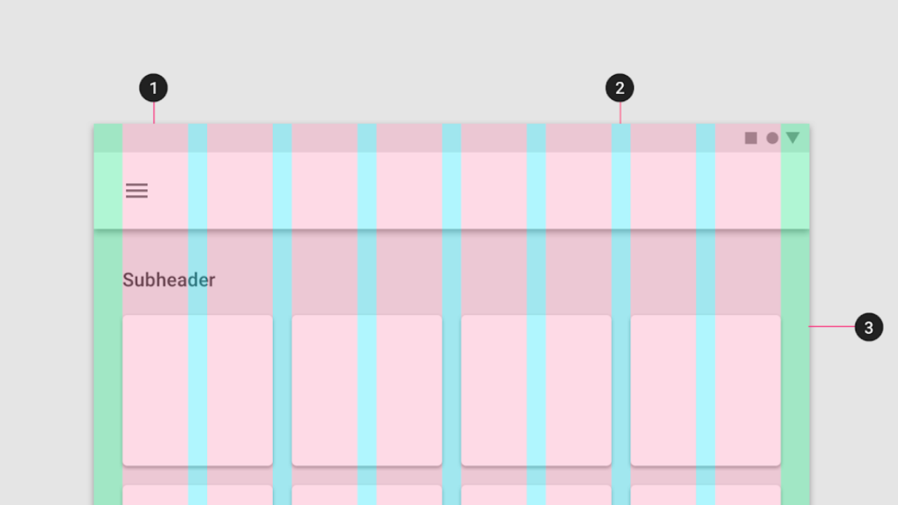
First off, let’s define the term “grids”. In layout design, grid is a structure of columns and lines that helps to structure a website, app, or print project. Grid determines where the block of text and other design components sit on the page. Every grid despite its size or type consists of three main elements: columns, gutters, and margins. Grid layout design is the design that relies on the grids.
Graphic and web-designers work in the dimension that can be broken down to the rectangle, be it a page or a screen. This determines the shape of the grid as well. The lines within the grid are customized. Creators can build the grid themselves or rely on ready grid systems, while designers can use the same grid system throughout the whole piece of design, or create a new grid for each page to express their ideas.
Grid layout consists of three main components:
- Columns: Vertical divisions that contain content and define the layout’s structure. Columns are created to structure the layout and organize modules vertically.
- Gutters: Spaces between columns that separate content and improve readability. Gutters contribute to spacing between columns, ensuring consistent gaps and visual rhythm.
- Margins: Empty areas on the outer edges of the layout that frame the entire design.
Grid is an essential element of UI and graphic design that allows dividing the web page into specific, predictable areas. Grids might be invisible but they are everywhere. Practically every user interface you see is built with the help of grids. Grids help align content and maintain consistent spacing, making layouts organized and visually balanced.
History of the grid design
We can trace the idea of the grid layout design down to the ancient times when the first books were handwritten. But with time grid importance evolved dramatically and went from unconscious aligning to carefully measured grid systems.
Grids became essential after the printing press was invented. Early prints repeated the handwritten books’ design, but the printing press made alignments even more clear-cut. A good example here is the Gutenberg Bible, one of the first printed artifacts where we can easily see a two-column grid. The use of grids in the Gutenberg Bible contributed significantly to the composition and visual harmony of early printed works.

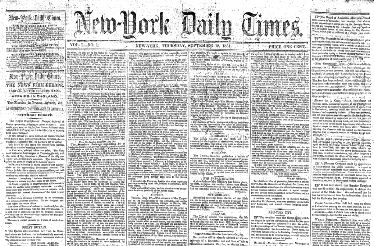
In the 19th century, the majority of newspapers adopted a grid-like format that would continue to be refined over the years. It has laid the groundwork for the more complex and efficient modular grids used today
By the end of the 19th century grids remained straightforward and simple. But in the 20th century grid layout was influenced by the big design movements of the time like Bauhaus and De Stijl. The principles of these movements are closely related to modern grid layout concepts. Grid designs became much more interesting involving round grids and brave braking of the grid.
As we can see, grids are not some sort of a trend coming by occasionally, but a powerful design tool that has been constantly developing as the time goes. The evolution of grid systems reflects the development of key layout design concepts over time. Now, let’s go back to our times and see how designers use grids nowadays to create digital products.
What are the five types of grids?
There are four main types of grids commonly used in design: manuscript, column, modular, and hierarchical grids. Some designers also consider the baseline grid a separate supporting grid system used to align typography and spacing.
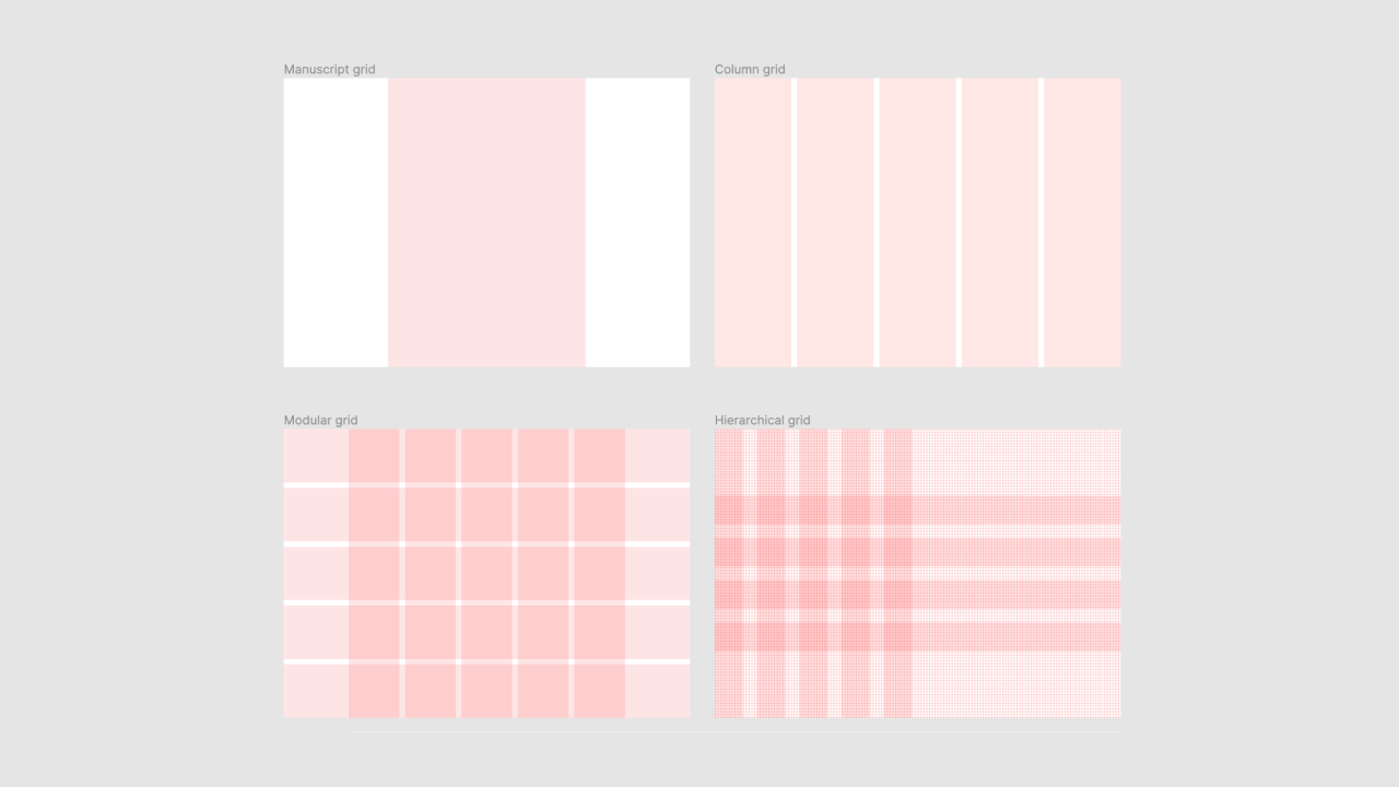
1. Manuscript grids. The simplest grid, where text is placed in one column, like on the book page.
- Used in: Books, long-form articles, academic papers, and some blogs.
- Most useful for: Presenting large amounts of continuous text, enhancing readability, and maintaining a clean, uncluttered look.
2. Column grids. The most common type of grid used by graphical and web designers. Basically, it’s a number of columns that help place and align text and other design elements. Columns are often set to the same width to maintain visual balance and coherence.
- Used in: Newspapers, magazines, websites, brochures, and multi-column documents.
- Most useful for: Organizing diverse content types (text, images, ads) in a structured layout, providing flexibility in content placement, and creating visually balanced designs. Columnar grids are useful for layouts with varied information. They allow creating zones for different content. For example, you can dedicate a specific column for illustrations. In blog designs, you might use two-thirds of the layout for main content, while the smaller third displays information about the blog or its author.
3. Modular grids consist of columns and rows creating “modules”.
- Used in: Complex layouts such as newspapers, calendars, charts, and some website designs.
- Most useful for: Organizing varied content types in a highly structured manner, creating consistency across multi-page layouts, and facilitating easy scanning of information. It’s used to create pixel-perfect designs or sites with many levels of hierarchy (where there are various font sizes, different headings, etc.).
4. Hierarchical grids are any irregular grids. This type of grid is the most flexible to content needs. It can be composed of two different kinds of grids brought together, or even be free-form.
- Used in: Unique web designs, infographics, posters, and some mobile app interfaces.
- Most useful for: Adapting to specific content requirements, creating visual interest through asymmetry, and emphasizing certain elements over others to guide user attention.
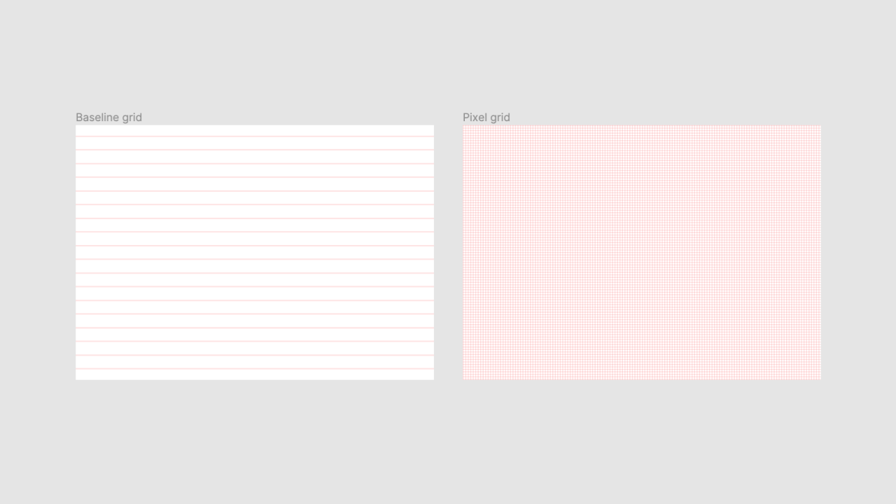
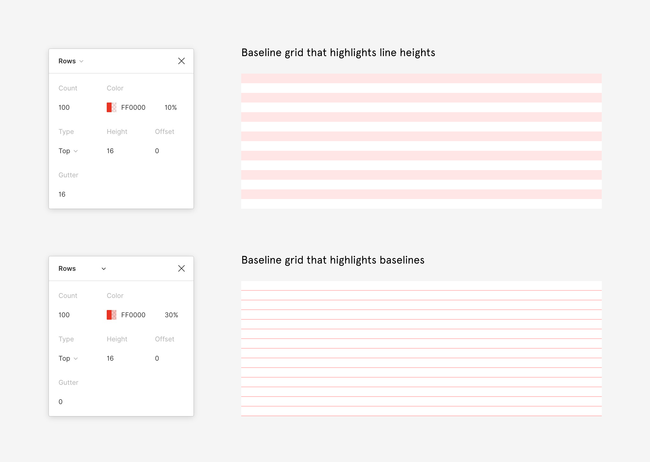
The baseline grid - a grid of horizontal lines like a school copybook. The baseline is a horizontal line on which text sits, helping to align text and create a consistent vertical rhythm. Baselines and line heights work together to ensure that text sits evenly across the layout, improving readability and visual harmony. Line heights are set to match the spacing between baselines, which helps maintain a structured and organized appearance. Or a pixel grid used mostly for digital screens - a grid of multiple rows and columns creating a pixel net. The baseline grid is important for print design, such as book layouts, but is also used in web design. It serves as the foundation for creating a modular grid.
These different kinds of grids are used in both print and web design.
Five inspiring grid layout design examples
For you to get some inspiring grid layout ideas and better understand how important it is to use a grid in UI design, we have collected some great examples to show you. Grid layouts can be used in different ways to display content across various devices, making them versatile for organizing forms, charts, and social media feeds.
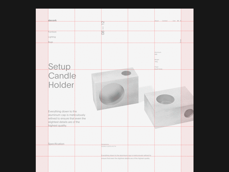
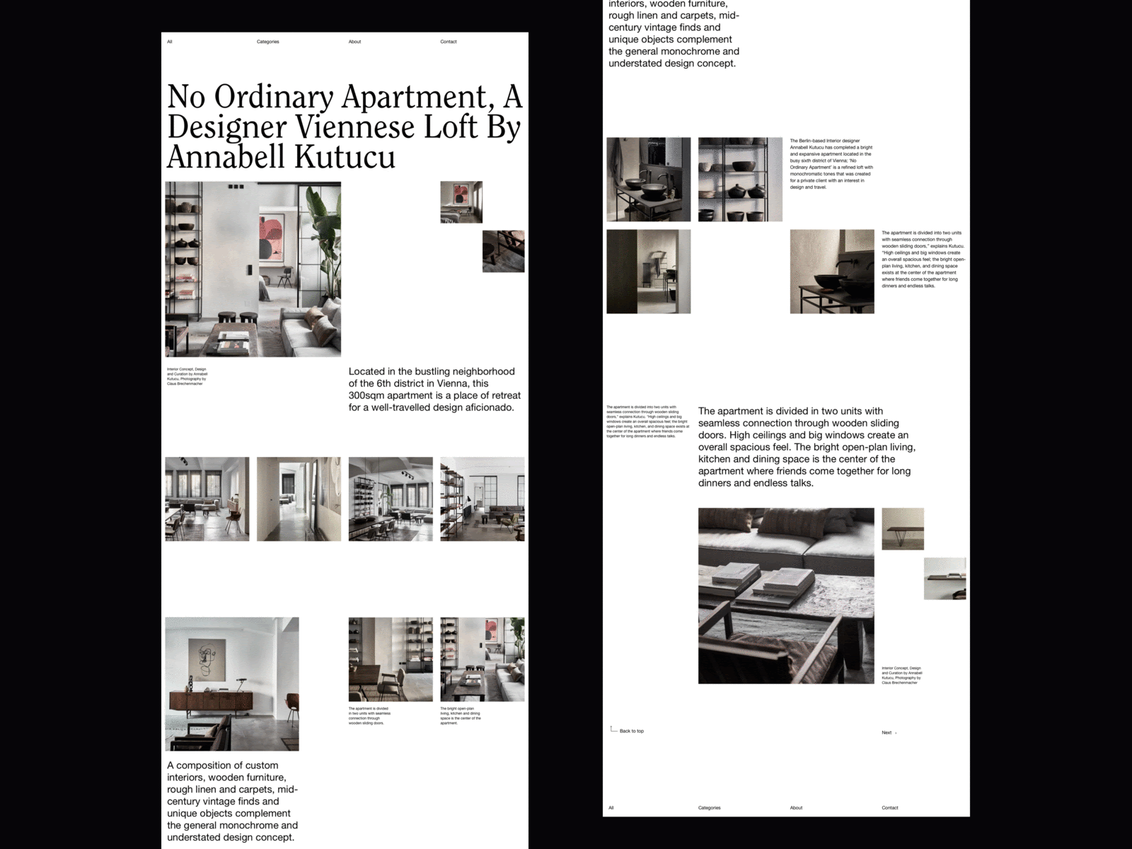
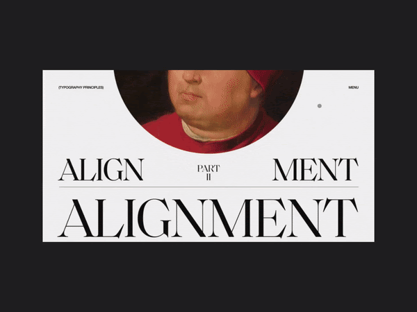
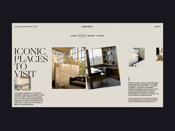
Perfect alignment. It’s the essential function of grids to align design elements. Its role in user interface designs can’t be underestimated. Pay attention to how the landing page grid below makes use of empty white space and keeps the other elements perfectly aligned, maintaining the same proportion between elements for visual harmony.
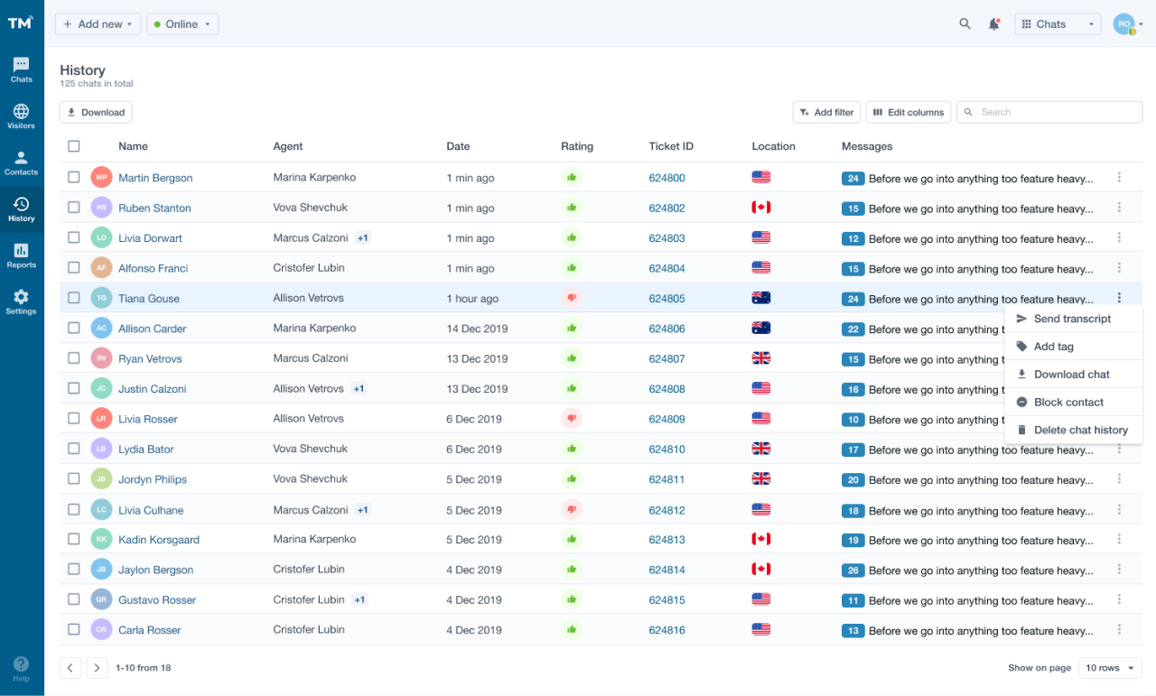
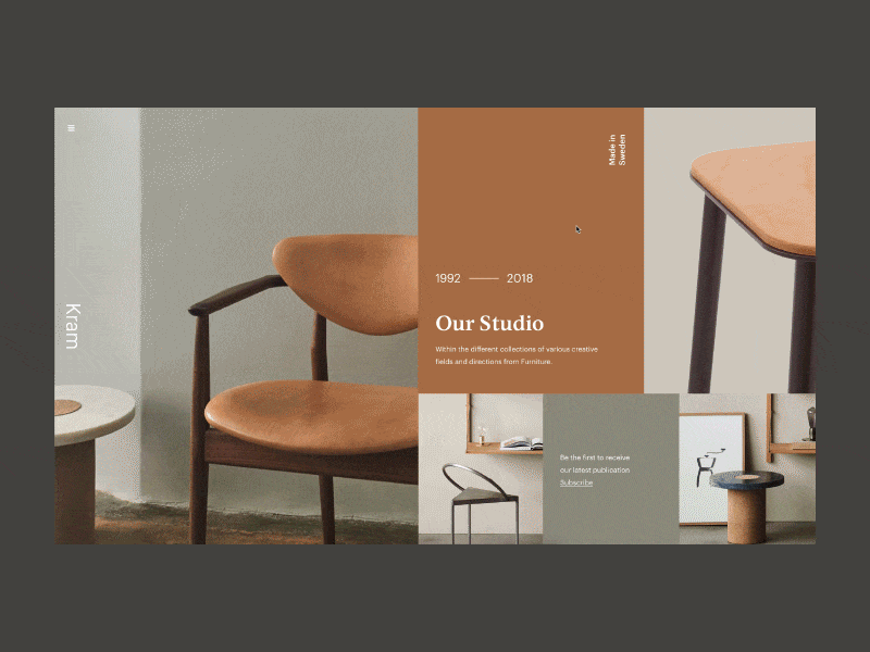
Complexity reduced. The grid can help to minimize the complexity of SaaS products. The neat structure of grid-based design helps to organize the data. For example, Eleken designers have created a neat grid-based design for TextMagic customer experience platform.
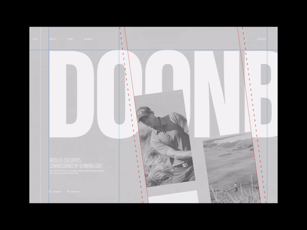
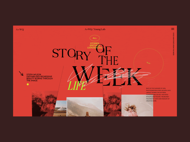
Go diagonal. We mostly imagine grids as coordinate systems. But they can be used to create diagonal designs that look fresh and interesting, just like the landing page below - looks more like a contemporary artwork, doesn’t it?
Grid breakers. You can use a grid to… break out of a grid. Grid is good not only for aligning design elements, but can also help designers create the effect of movement and make the design much more interesting. Take a look at the example below of how vertical scrolling can help to break out of the horizontal and vertical grids.
Animation. The symmetrical patterns of the grids match perfectly with animated effects. It is a great way to make the grid layout more vivid and eye-catching. Here’s an idea how grid approach can be combined with animation.
When you’d like to see more examples of grid-based design, check out our article about Angular Material design layout.
How do I create a layout grid?
Here are five simple steps to build grid design:
- Think out page elements and functionality you will design.
- Sketch a rough page layout, depicting all blocks and elements schematically. This helps determine module dimensions for the grid.
- Build the baseline grid.
- Overlay a column grid on the baseline.
- Set the dimensions of each module.
And here are five useful tips for working with grids design:
1. Keep in mind the screen size. In responsive design, it is important to be able to adjust your grids to different screen sizes. For example, the number of columns in the grid is different for mobile, tablet, and desktop screens. Usually, it is four columns for mobile, an eight-column grid for tablet, and twelve columns for desktop. A responsive layout ensures that the grid adapts dynamically to various devices by adjusting columns, margins, and other layout elements for optimal usability.
2. Gutters matter. The screen size also determines the size of the gutters. Smaller gutters look better on mobile screens and for web screens, you can use a little more space between columns. Adjusting gutter size is crucial for maintaining proper spacing between columns, which helps organize content and maintain visual rhythm. Avoid big gaps in modular grids.
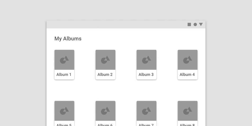
Image credit: Material.io
3. Go horizontal. You can use the grid to scroll horizontally. In the horizontal grid, layout columns are placed from left to right, and design elements scroll the opposite way.
4. Design the grid. You can design your own grid and work with it. Mix several grids at the same time, or, in other words, play with the hierarchical grid. Adjust the height and width of the columns, change margins and sizes of the gutters to create the grid that will meet your needs. Consistent spacing, including margins, padding, and gutters, is essential for a visually pleasing and organized layout.
5. Don’t let the grid limit you. Don’t think of the grid as of limits. Rather approach it as a certain logic that will help you bring design elements to order within the page. And don’t be afraid to break out of the grid.
Can I build a UI without grids?
Grids in UI design are more important than ever. Digital products require symmetry and perfect alignment. It’s part of a smooth user experience. However, it is not mandatory to use grids. You can work without a grid for sure, it will just take more time and effort to align the blocks of text and images within the web page.
If you feel like the grid is killing creativity and gets you on track with the same old patterns, you can surely try working without raws and columns. But we recommend customizing the grid and using it to enhance your ideas.
Conclusion
Grid is a system of columns and rows that helps to organize and align elements in the visual design. We at Eleken use grids to create page layouts, user interface designs, or graphic designs. Using a grid in UI design makes the process much more effortless and simple.
Grid layouts play an important role in responsive design because they help interfaces adapt consistently across different screen sizes, devices, and content structures. The reason for it is that grids facilitate multi-device support and reduce complexity. Designing on the grid allows you to bring the visual hierarchy to the page and gives your content a clear structure and makes it readable. As a result, your users will navigate better through well-structured pages of your digital product.
If you find this topic interesting and want to explore it more, you can also read our article on design systems. And when you want to know how the grid can help to design your product specifically, don’t hesitate to reach out to us.

