Modia
How we redesigned an internal AI content creation tool so it could scale into a full SaaS product
AI features are becoming a standard across modern products. But while companies rush to adopt them, many AI capabilities end up unnoticed or underused because the design makes them hard to understand.
Modia started as an internal tool built to help editorial teams create content faster with AI. Users could upload interviews, gather source materials, generate article drafts, and refine them with AI assistance. As the tool grew more powerful, the founders decided to spin it out into a standalone SaaS product.
That’s where blockers surfaced.
The team had no in-house UI/UX expertise and needed a design partner to help them move forward. That’s when they found Eleken design agency, and together, we set out to tackle their core challenges:
- A complex AI workflow that users didn’t understand.
- Unclear navigation and ambiguous interface elements.
- A raw MVP built without designers.
- A multi-role platform with growing needs.

We started with a UX flow restructure
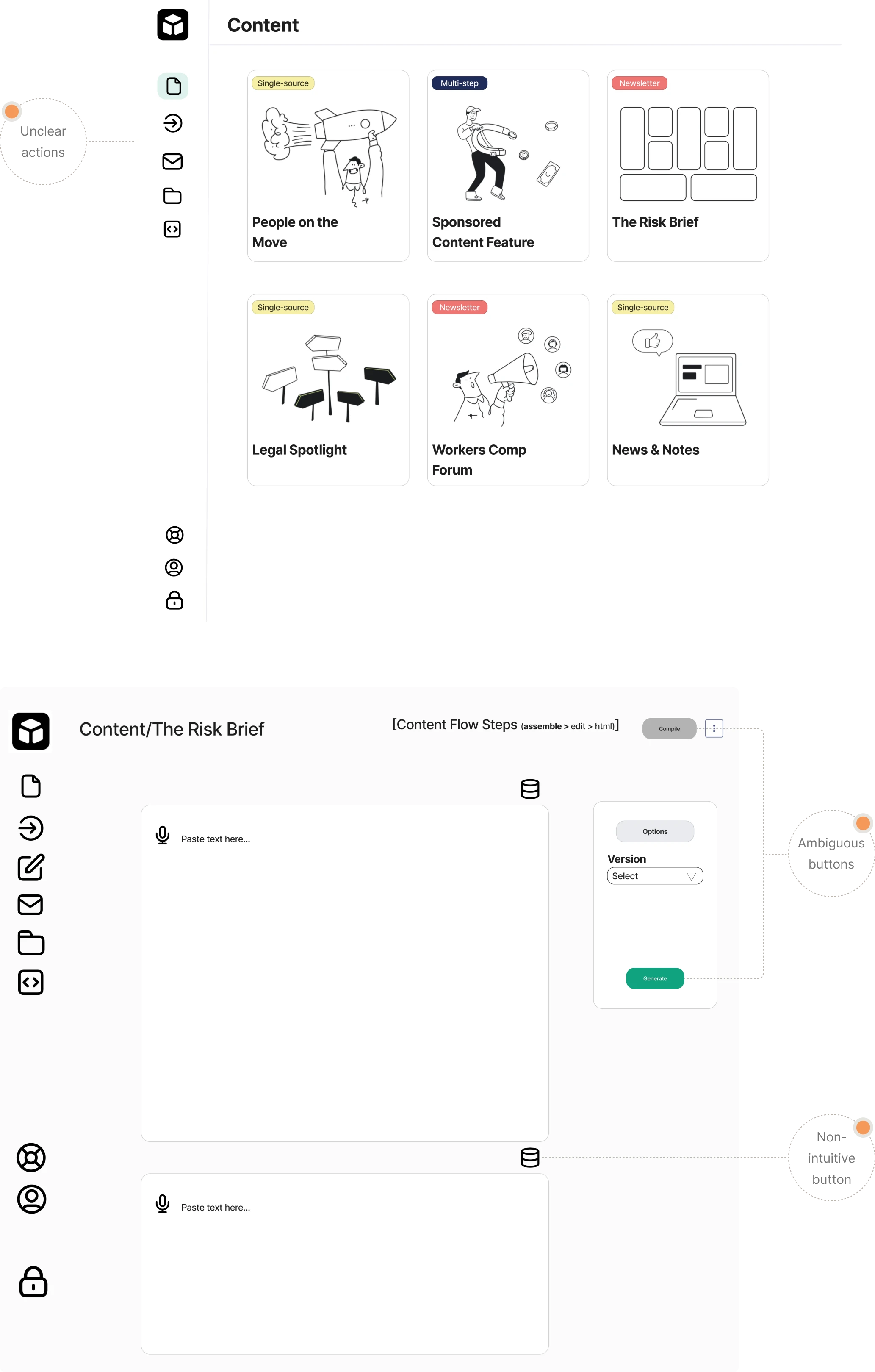
One of the biggest challenges in Modia was that its workflow was completely unfamiliar. The platform introduced a new way of creating content with AI, but the initial design didn’t guide users at all. Instead, teams faced:
→ Unclear icons;
→ Ambiguous buttons;
→ Too many actions on a single screen;
→ A non-linear flow with no obvious next step.
Because the MVP was prototyped quickly in FigJam and built directly in Bubble, the interface lacked structure and visual clarity. Users didn’t understand where to click, what each step meant, or how the workflow progressed.
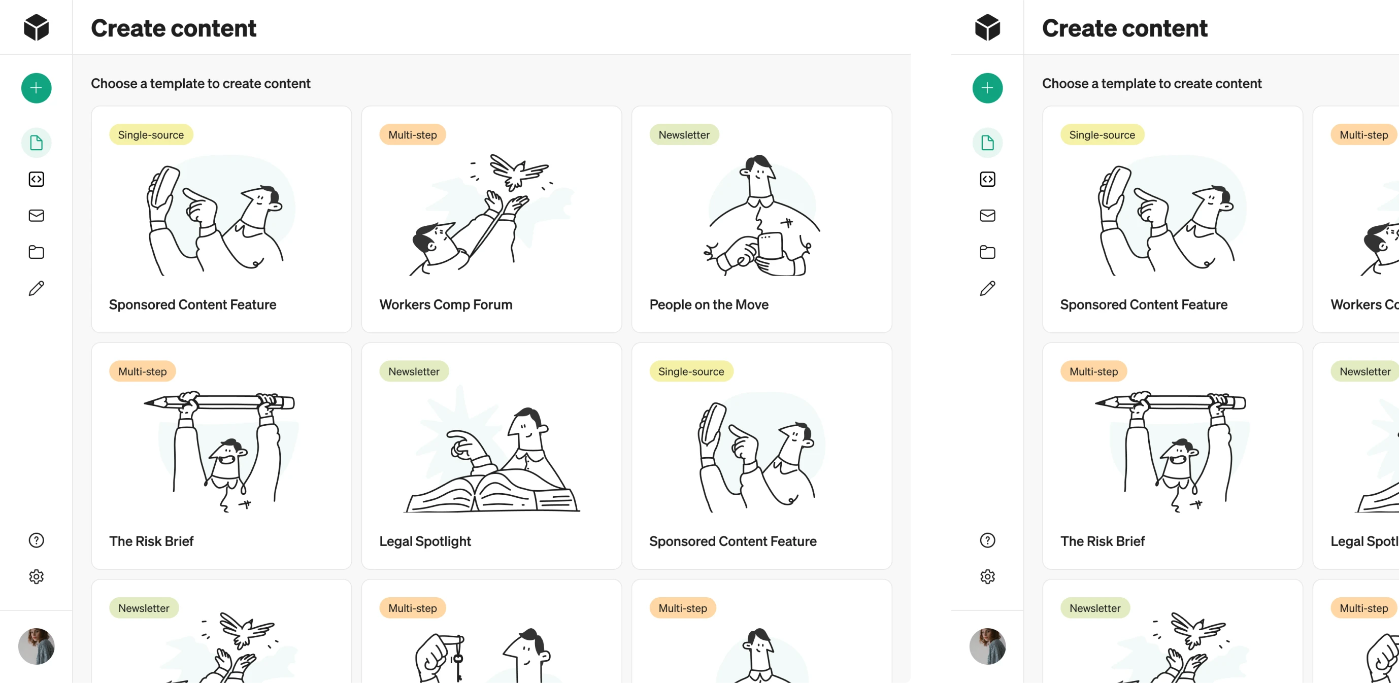
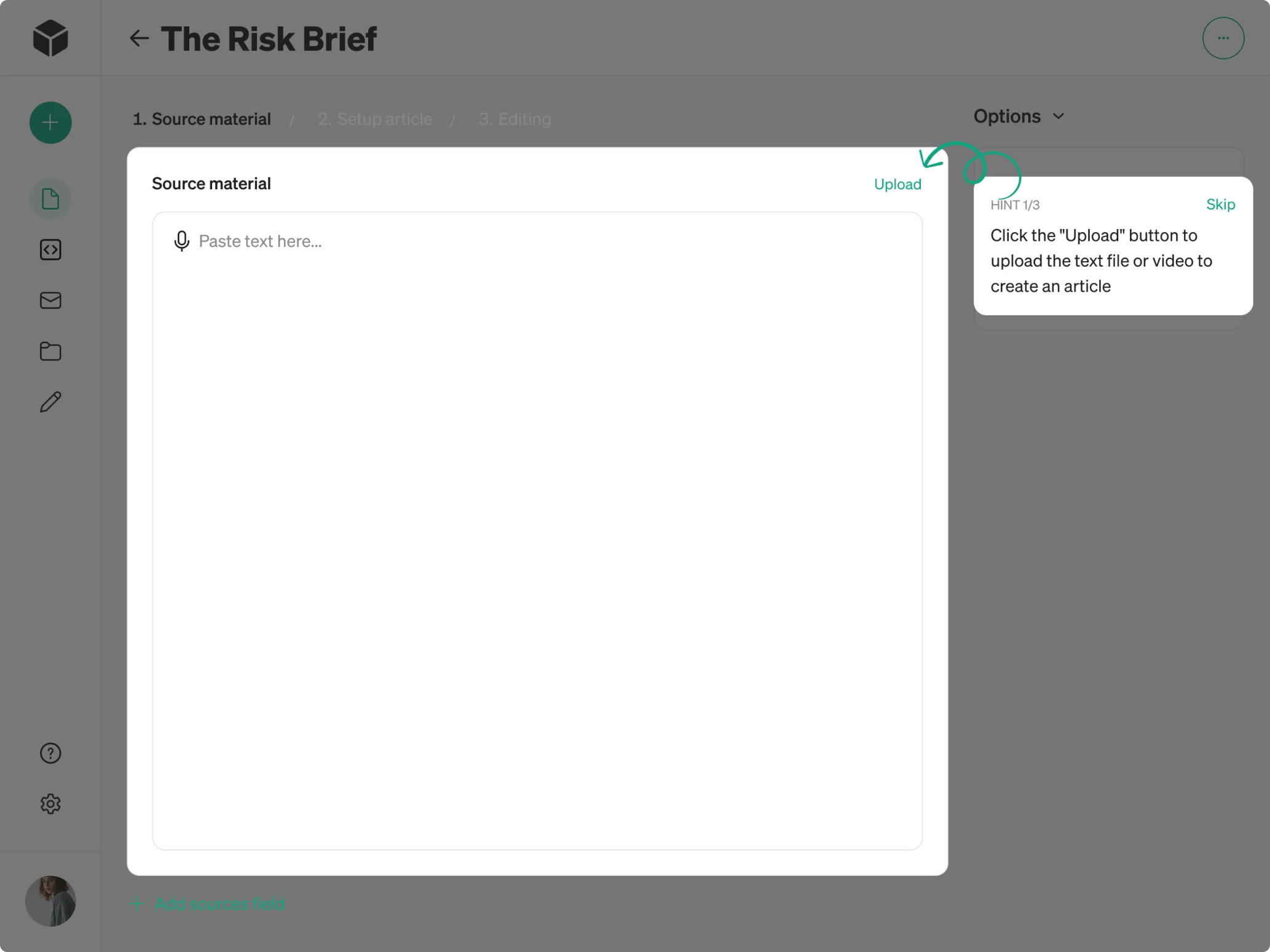
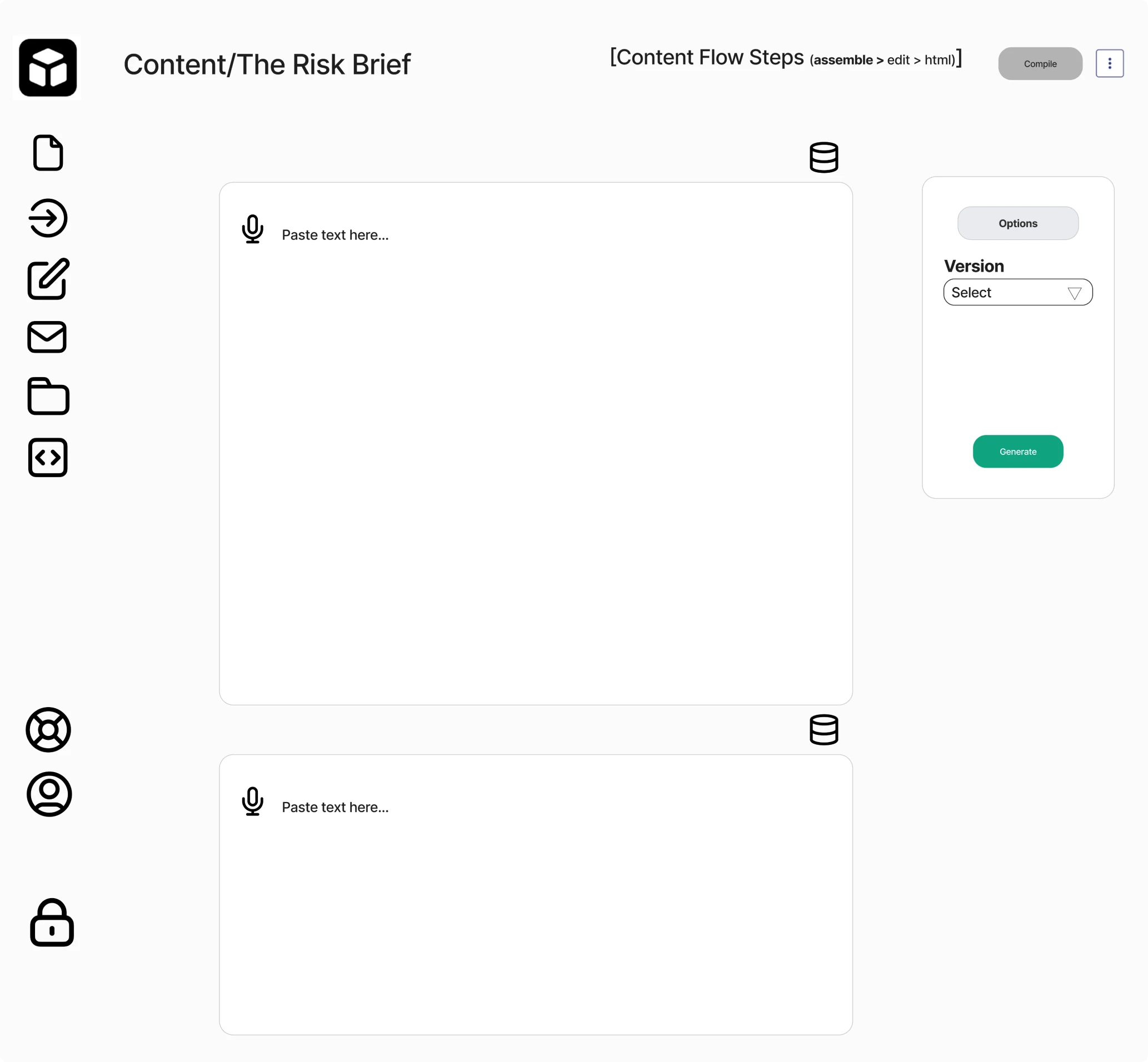
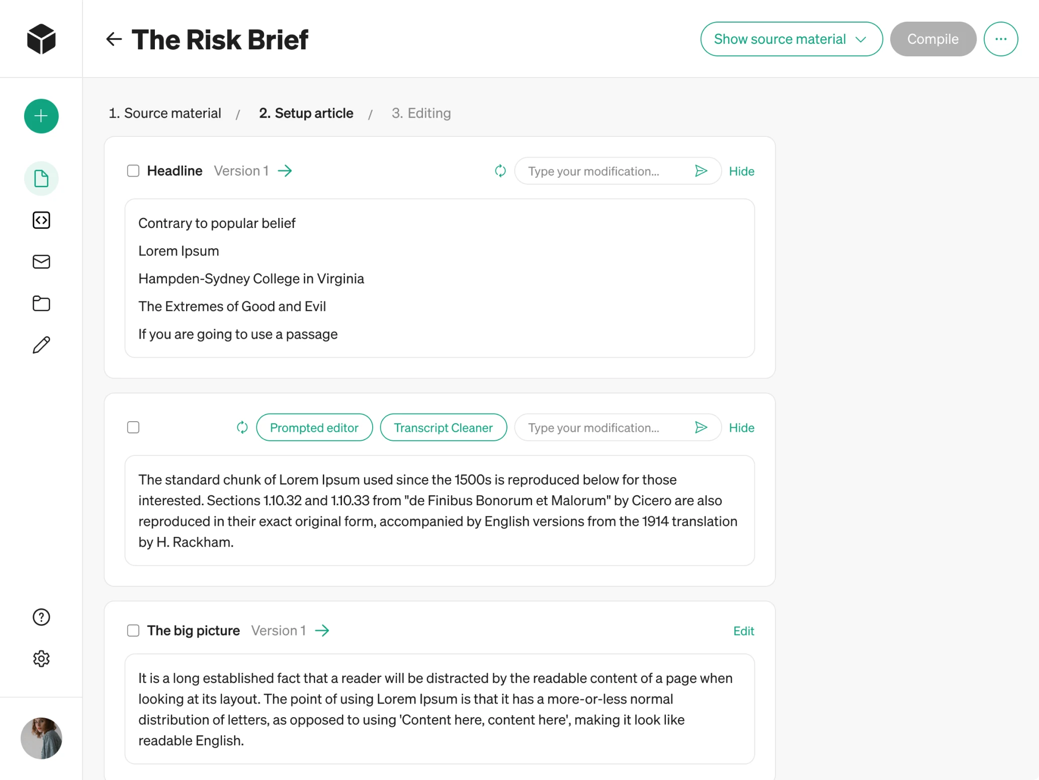
To demonstrate how we could solve these UX issues, we began with a 3-day trial focused on redesigning the Content page and reducing cognitive overload.
We simplified the layout, minimized the number of buttons, and left a single clear call-to-action so users always know what to do next. In the file upload section, we introduced drag-and-drop functionality to make the process easier.
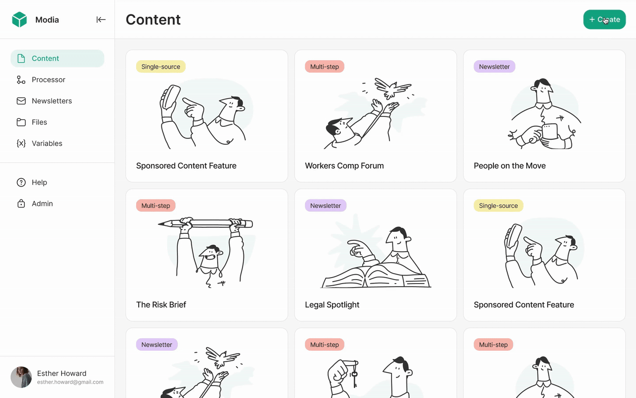
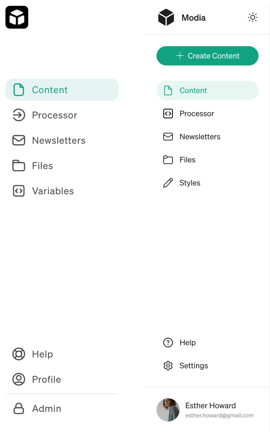
Another usability gap surfaced in navigation. When opening the app for the first time, users didn’t know where to start. To fix this, we updated the sidebar and introduced a “Create content” button, paired with a “+” icon in the collapsed format. For users, it serves as a clear visual cue for starting new content.
Eleken’s design team was tasked with building out our design assets from scratch and then building on those assets to create new pages and views. We worked through our entire application, updated all necessary design, and implemented new designs when necessary.
Guided tooltips helped us explain the unfamiliar AI flow
After restructuring the core screen, Modia’s workflow still required a learning curve. The product introduced a completely new way of creating content with AI, so our designer proposed adding guided tooltips.
These small design patterns walk people through the flow with short hints that explain how everything works. For more experienced users, there’s also a “Skip” button that lets them move ahead without onboarding.
This reduces friction in an AI-assisted workflow and helps teams reach value faster.
Designing intuitive role-based interfaces
Modia serves two very different types of users, each with their own responsibilities and workflows. To support both groups effectively, we needed to clarify permissions, simplify interactions, and restructure several information-heavy screens.
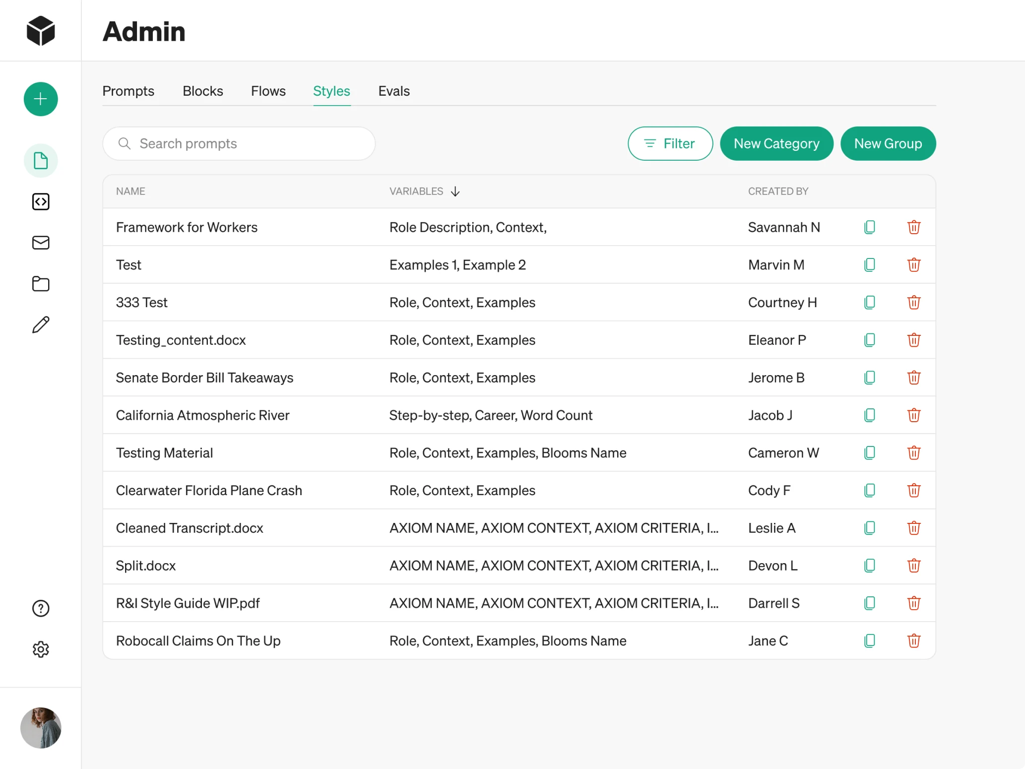
Admin
Admins represent the Modia core team. They manage access for external companies and are responsible for configuring the system. Their capabilities include:
→ Creating and managing company accounts.
→ Building custom content templates for each company.
→ Defining templates across content types.
→ Adjusting the structure of Newsletter templates.
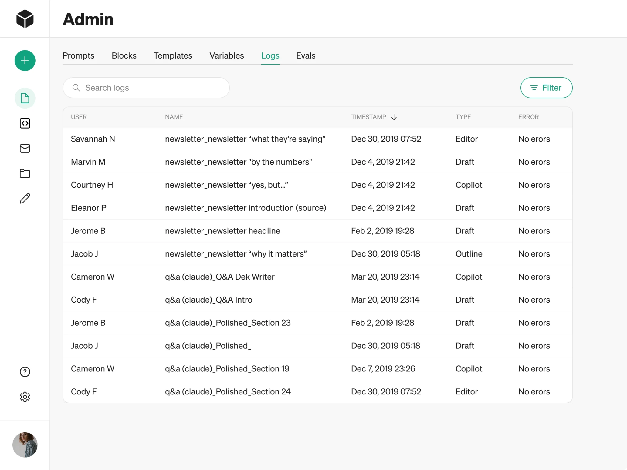
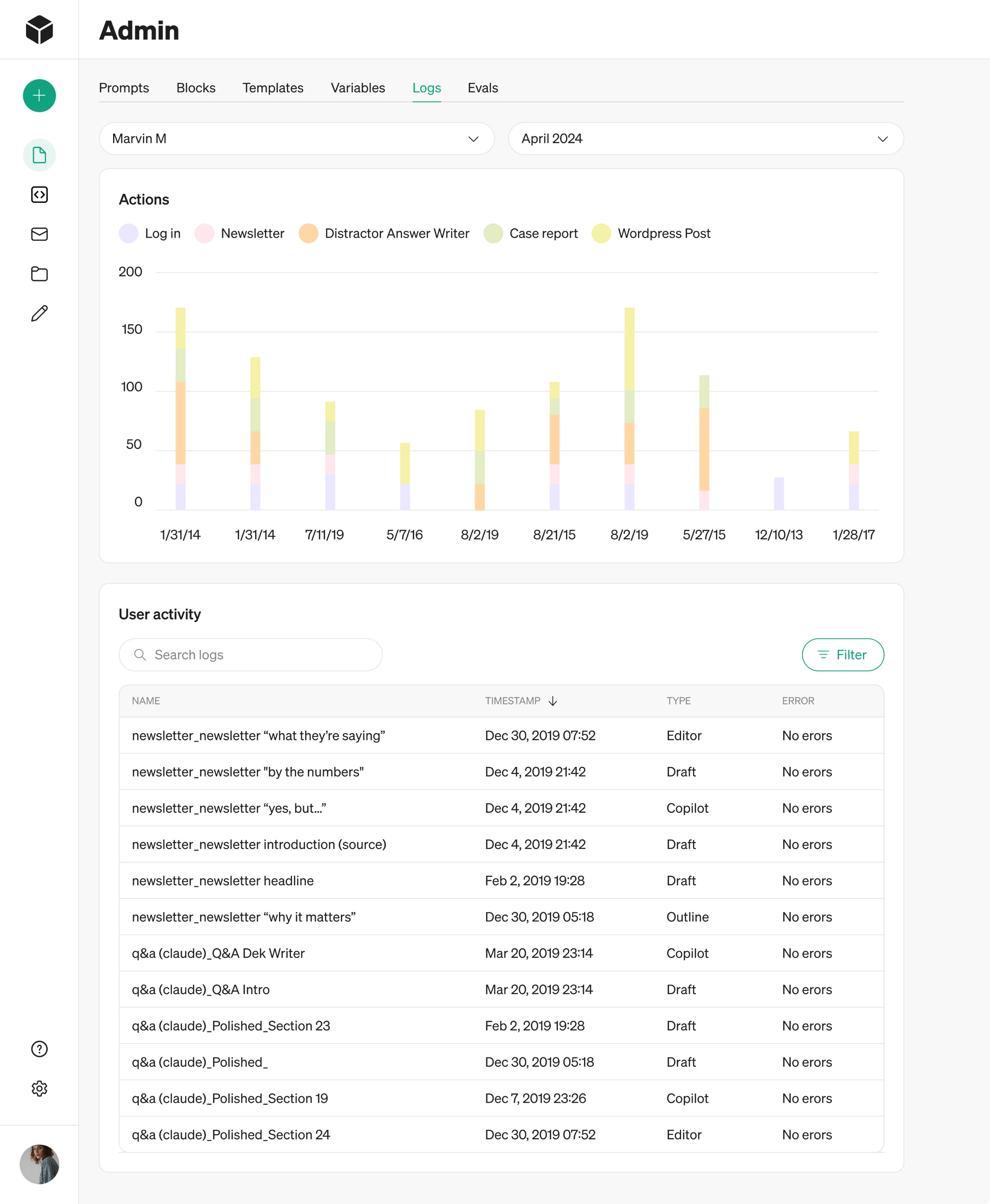
→ Viewing system logs to track user activity and login history.
Before our redesign, admin screens relied on overloaded tables. In some cases, an admin could open a table inside another table, which made the interface hard to navigate. The first thing we did was reorganize these tables by introducing a clearer hierarchy, better viewing options, and inline editing.
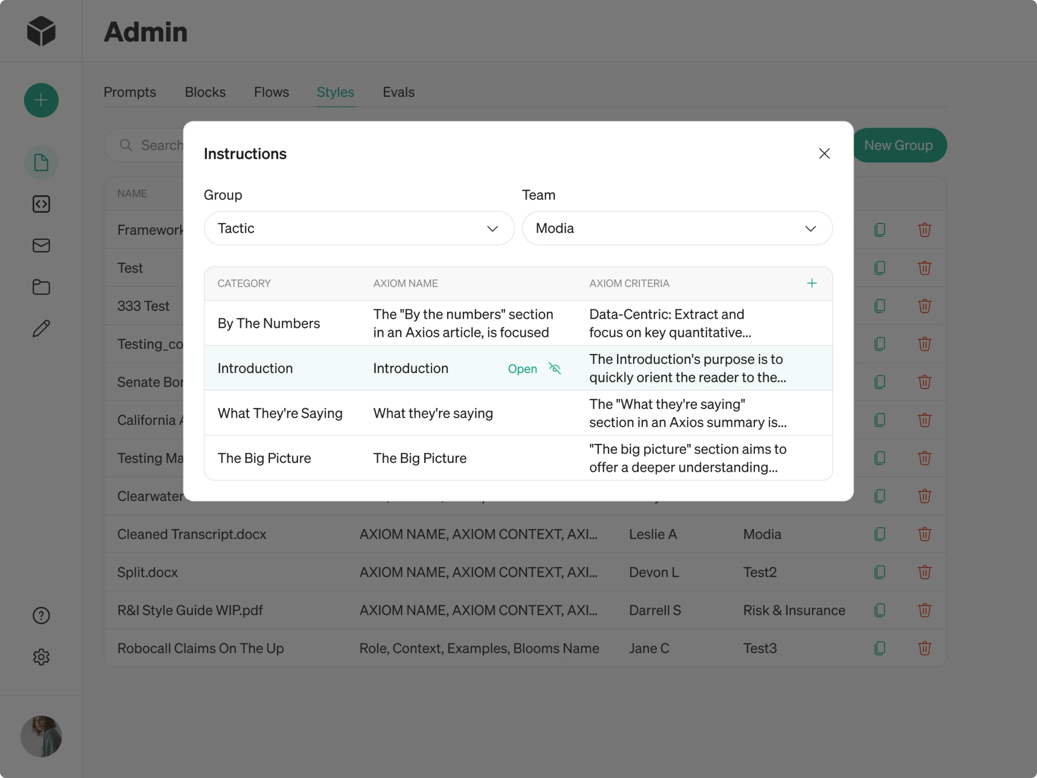
For the Logs section, we proposed multiple design directions, such as a traditional table view and an alternative with charts.
User
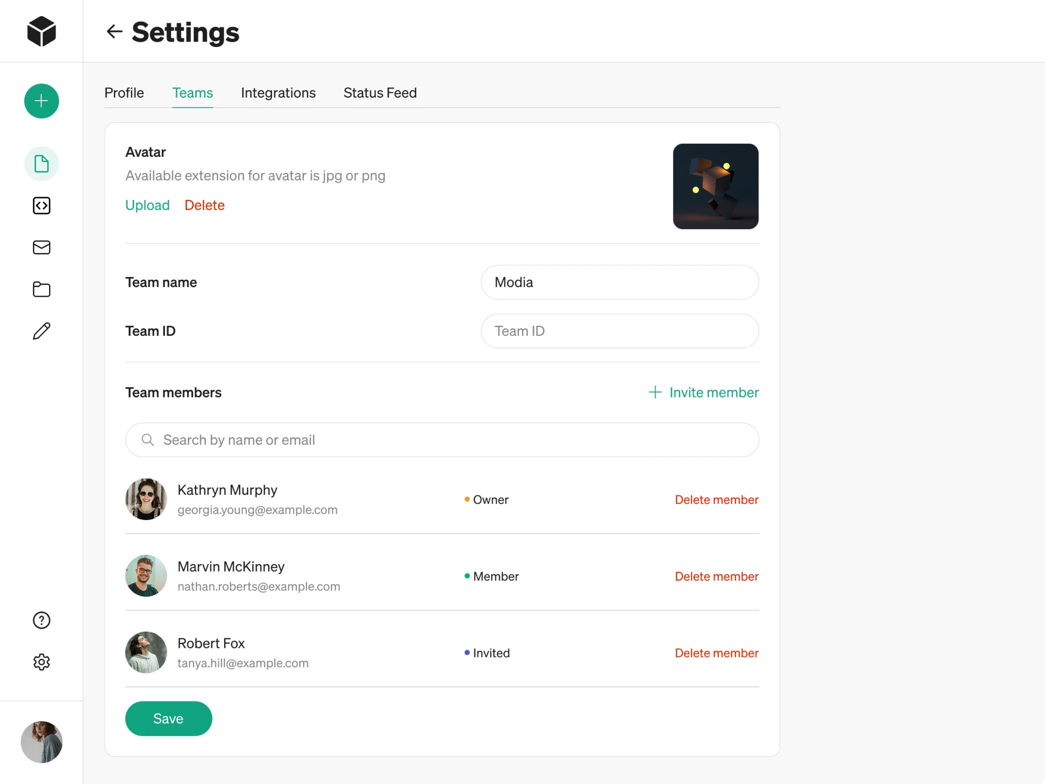
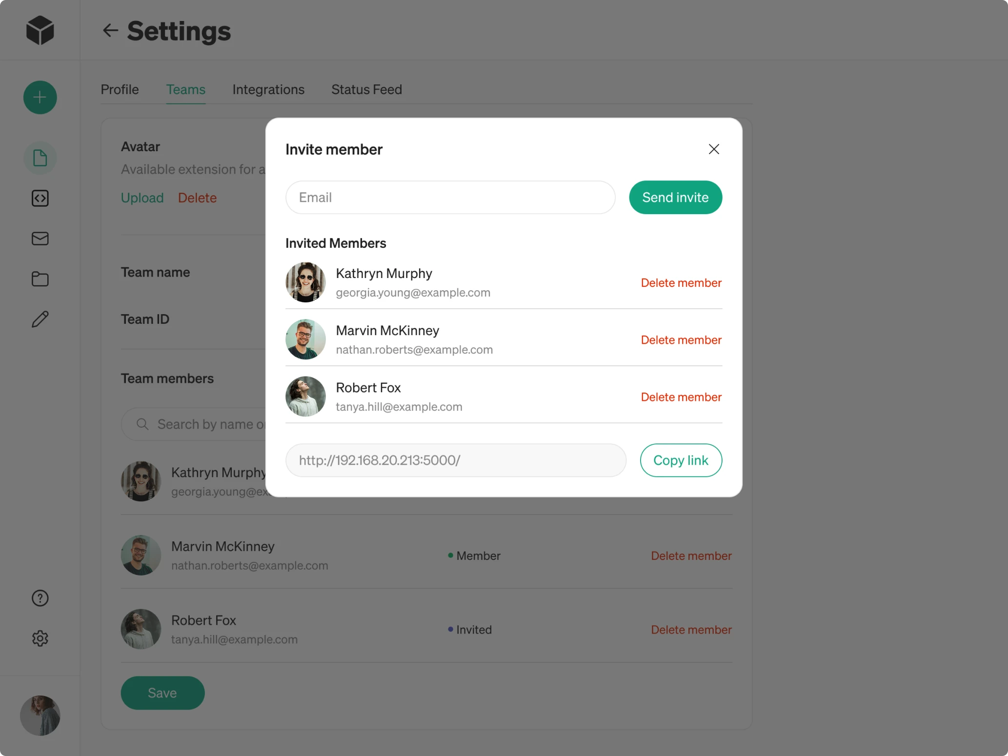
Users represent the companies that gain access to Modia through the admin. They can manage their own internal teams by:
→ Inviting teammates via email.
→ Assigning roles such as Owner or Member.
→ Collaborating on content creation within their workspace.
Because companies needed simple team management, we designed lightweight flows that help them scale their usage easily. Clear fields for inviting and removing users make the process straightforward and easy to adopt.
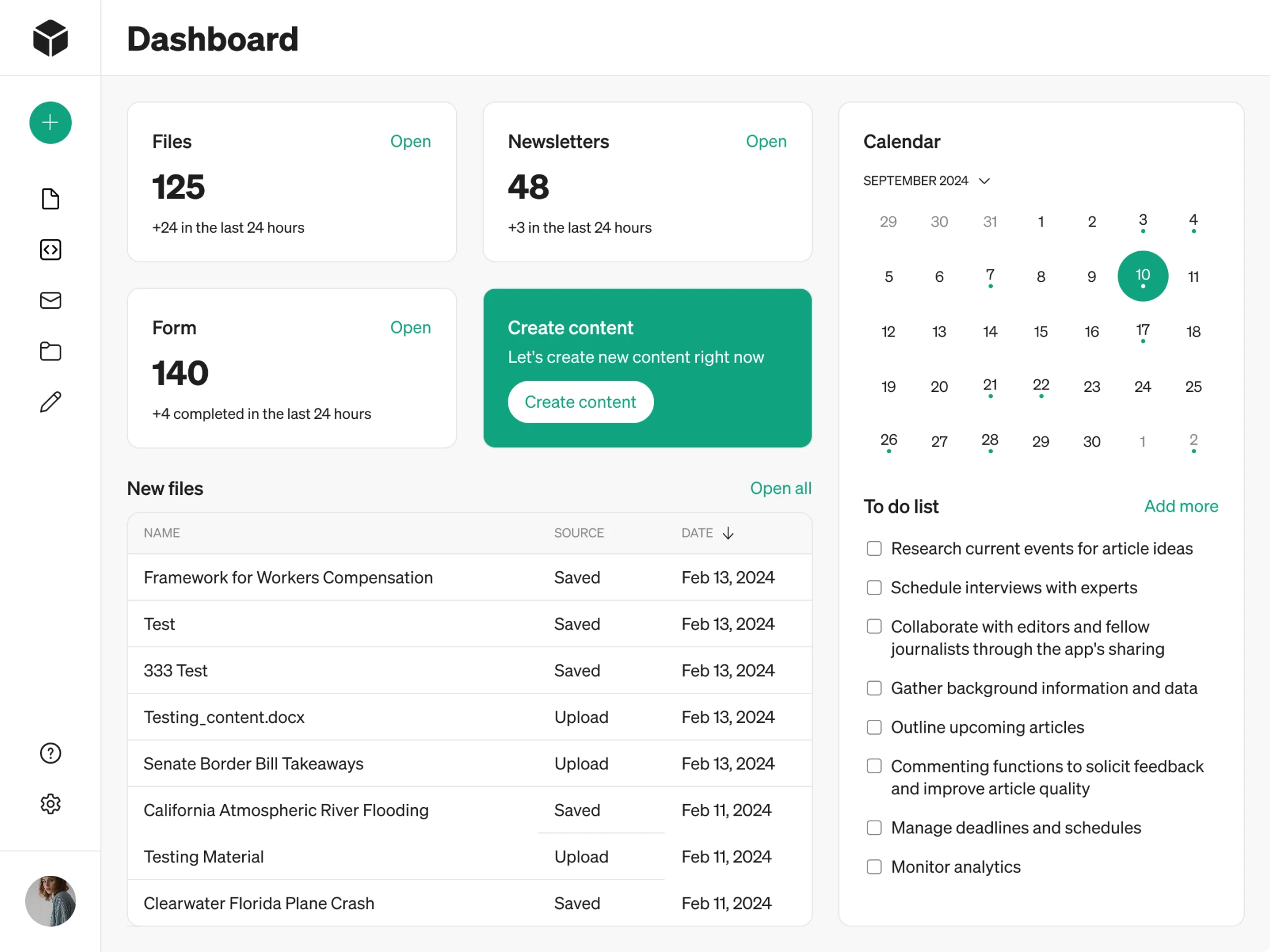
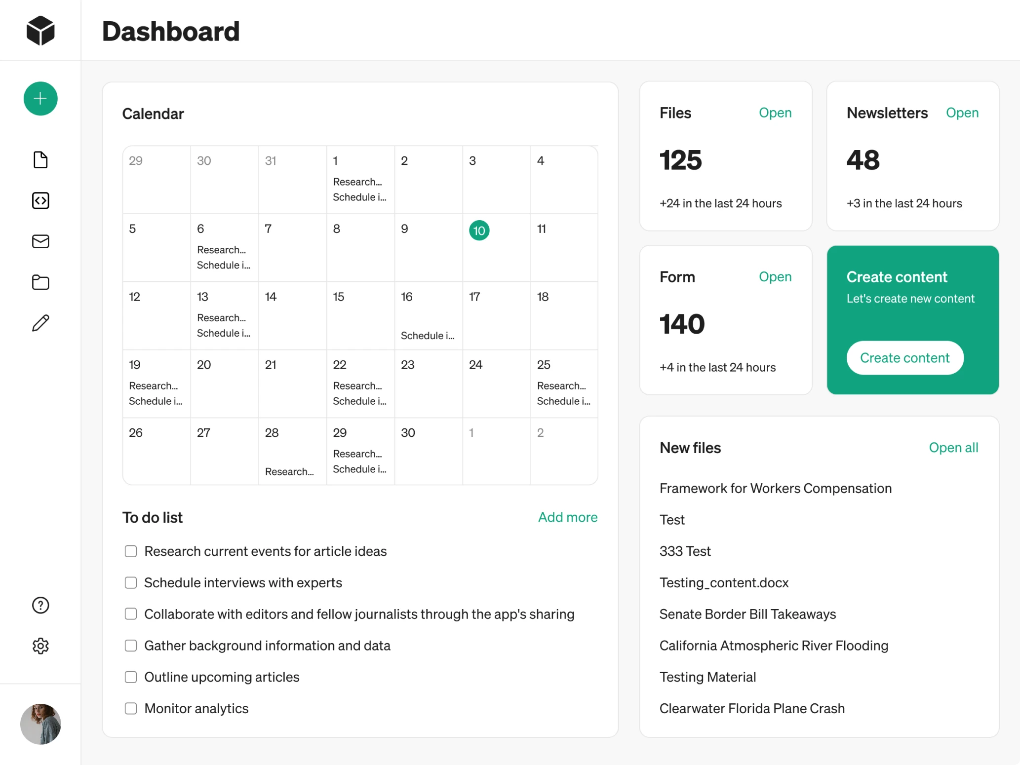
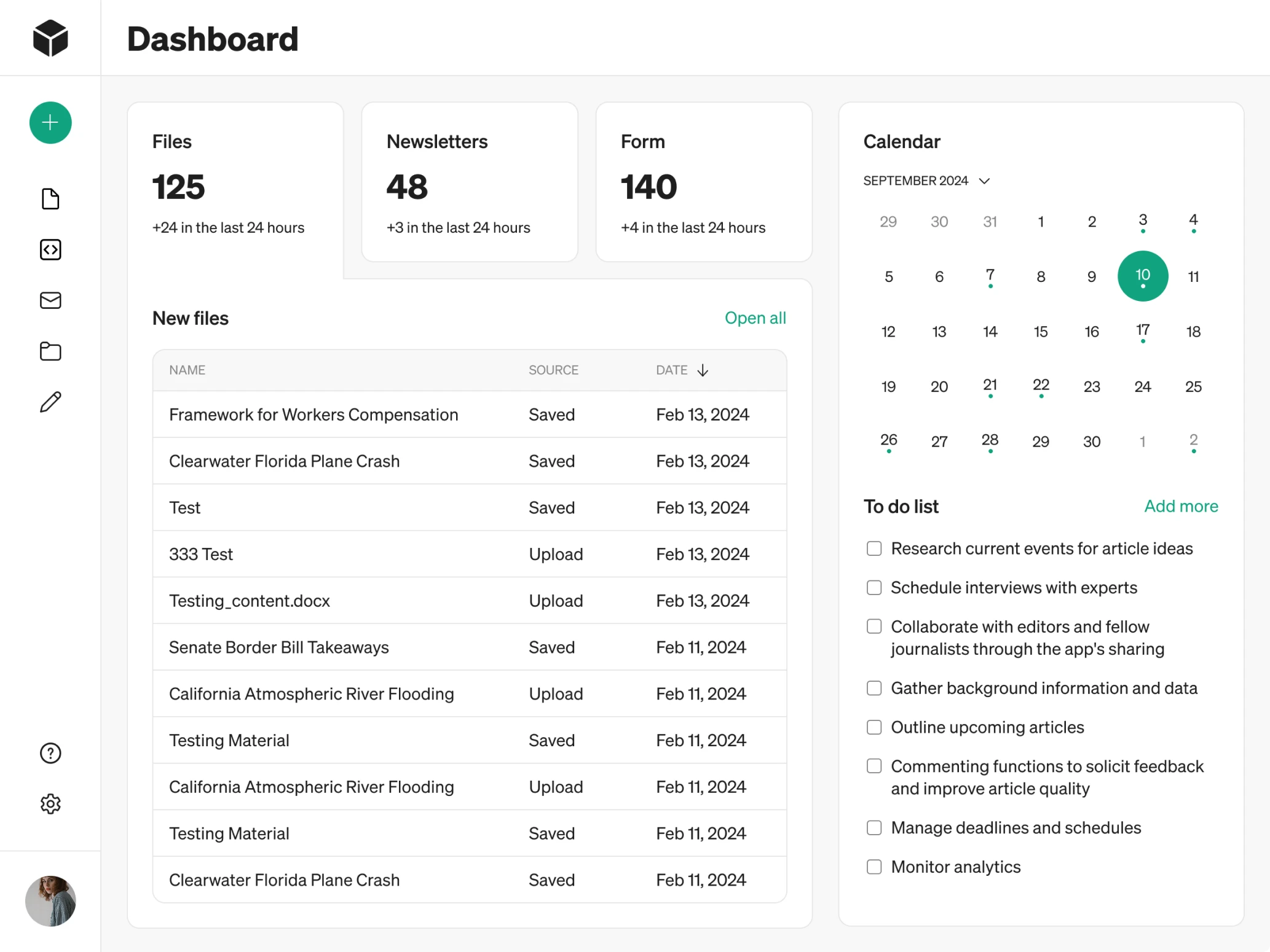
A dashboard that surfaces what matters most
After redesigning the role-based flows, we noticed another issue that affected every user — the lack of a central place to start.
Modia didn’t have a dashboard. Users landed directly on the Content tab without any overview of their work, recent activity, or next steps. From a UX perspective, this made the experience feel disorienting, especially for first-time visitors.
We analyzed what information would matter most to customers and structured the dashboard around those priorities. The screen now includes:
→ Key platform metrics to provide instant situational awareness.
→ Recently used files and forms with quick access points.
→ A clear primary call-to-action prompting users to create new content.
→ A calendar paired with a To-Do list.
We also presented several design variations, giving the client flexibility in choosing the approach that best fits their vision.
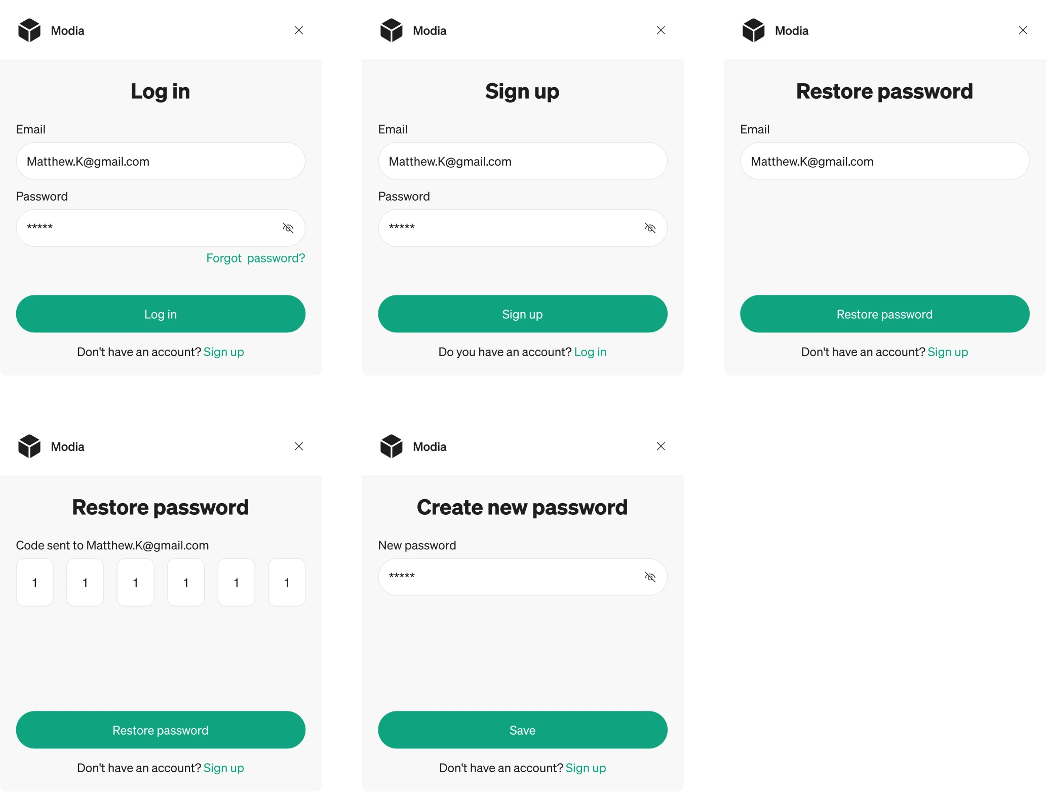
The way we made AI-powered content flows predictable
Modia’s core value lies in its AI-assisted content creation. However, the original flow was a bit confusing and lacked structure. Our UX goal was to make the entire experience predictable, transparent, and easy to control.
- AI-assisted template flow
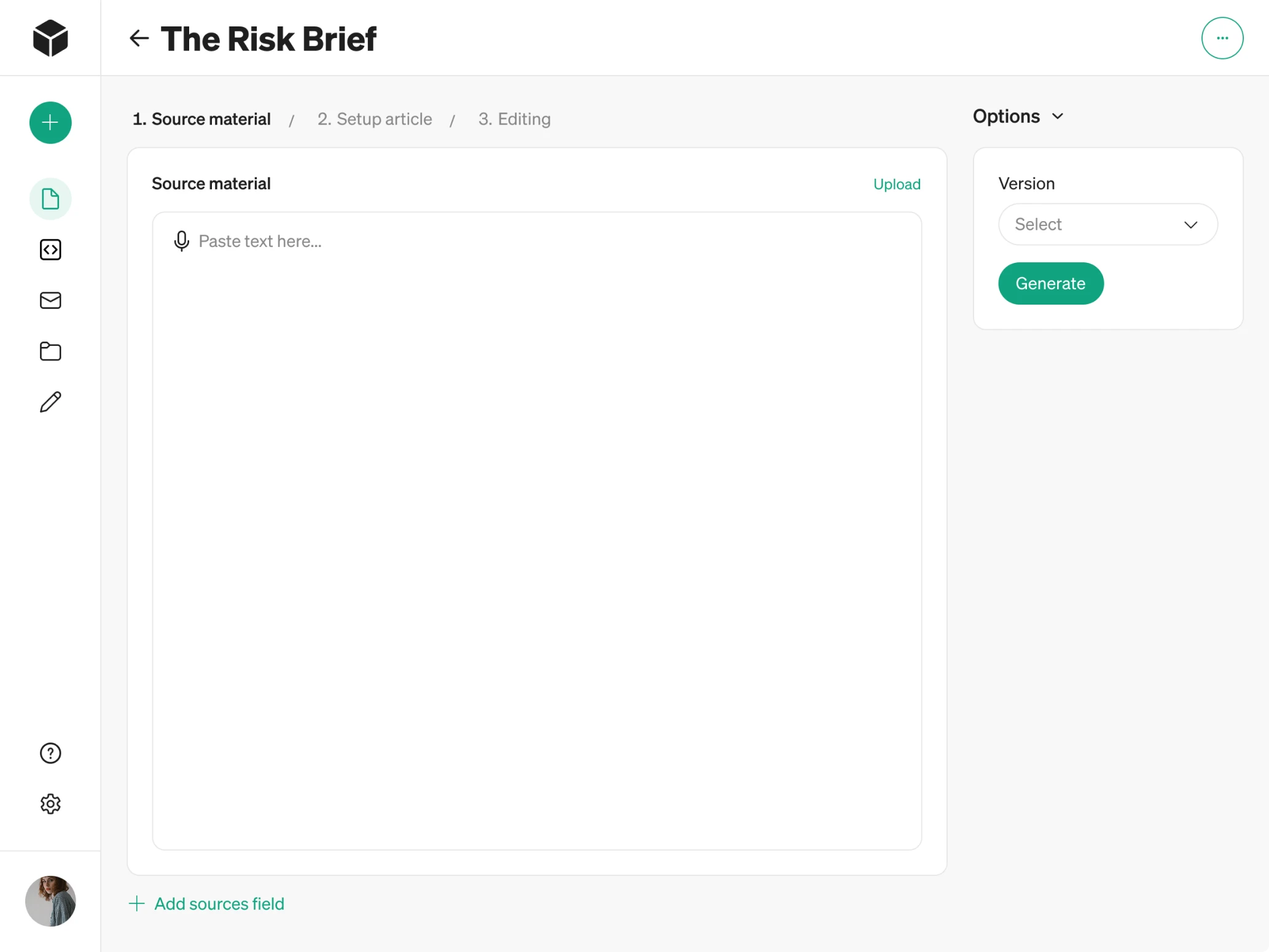
We began by clarifying the template selection. In the old version, templates looked like regular cards, so users had no sense of what they were choosing. We added subheadings and improved the visual hierarchy to make the entry point obvious.
To guide customers through the multi-step AI flow, we introduced steppers. They clearly indicate where the user is in the journey and what comes next.
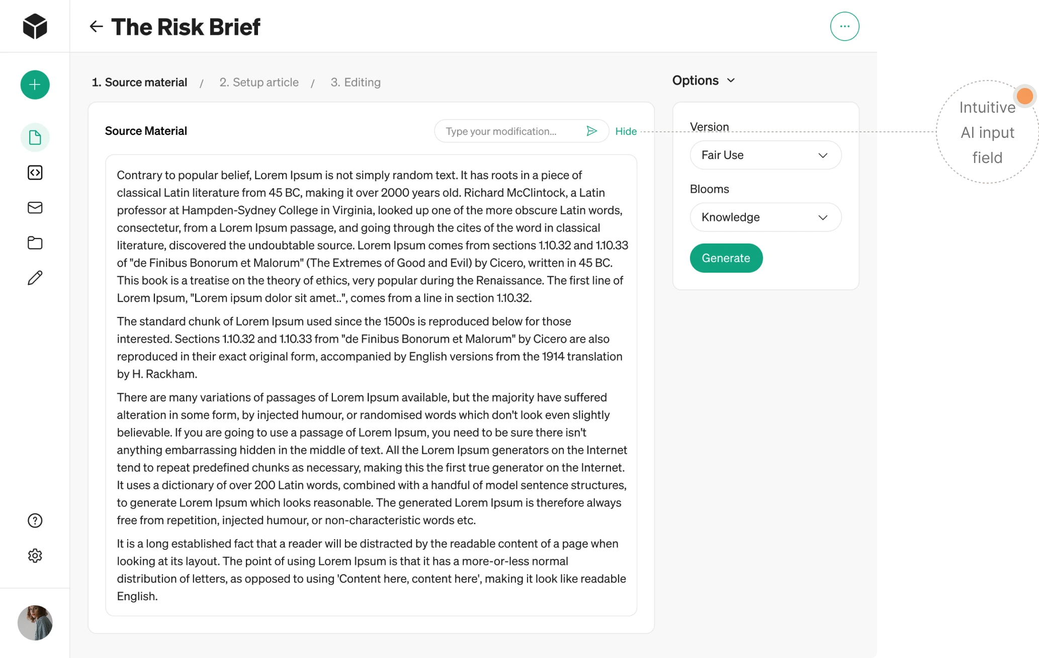
- Predictable prompt window
Once files are uploaded, the system opens a workspace where users can interact with AI to enhance their documents. For consistent navigation, we placed the input field for prompts in the same location across the interface.
And for those who prefer to write manually, there’s a simple “Hide” button that collapses the AI prompt area and gives teams full control.
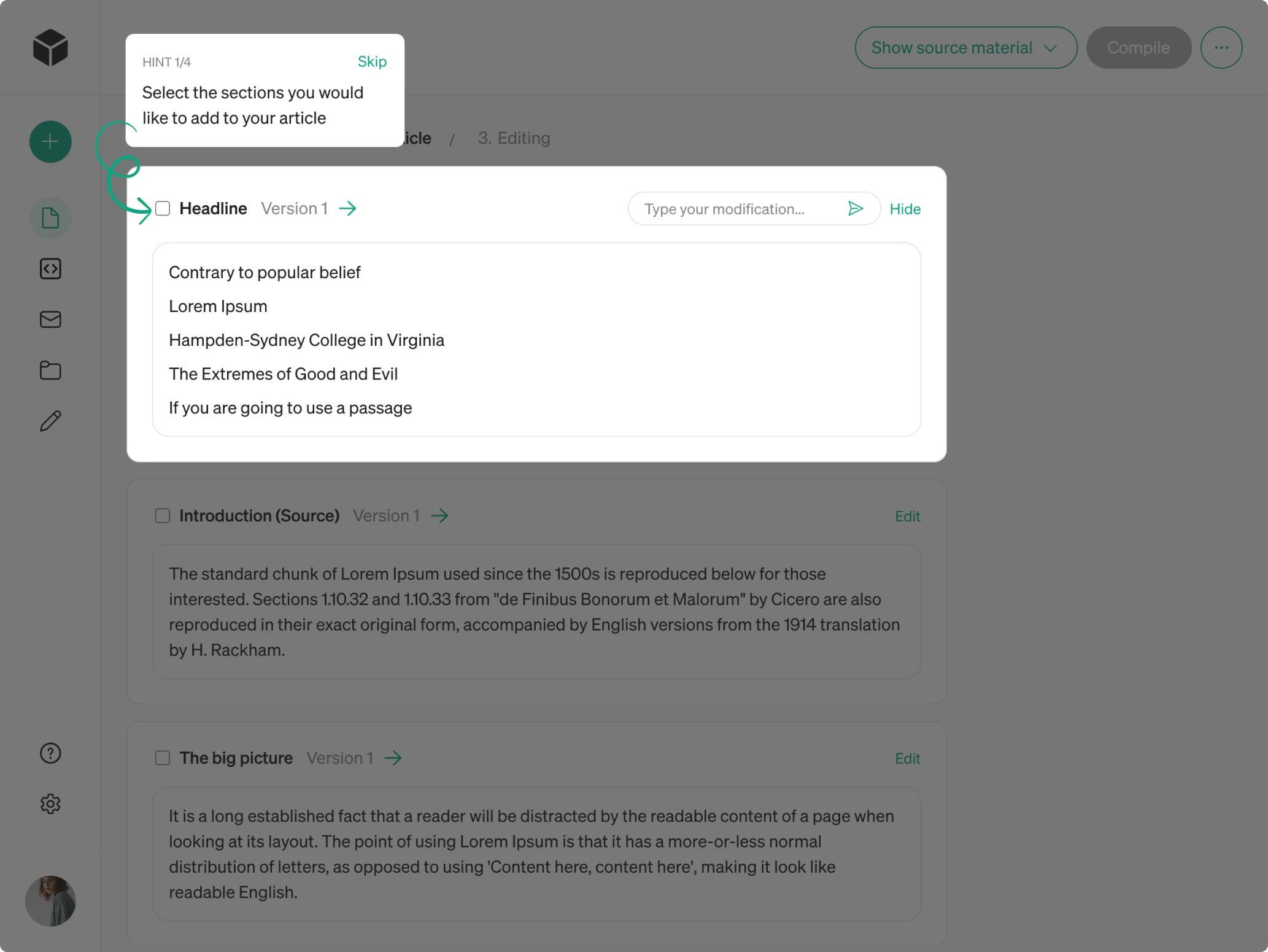
- Block-based content generation
Because users don’t always need to generate the entire article at once, we made content creation modular. With block-by-block interaction, people can select specific sections, apply targeted prompts, and regenerate content only where needed.
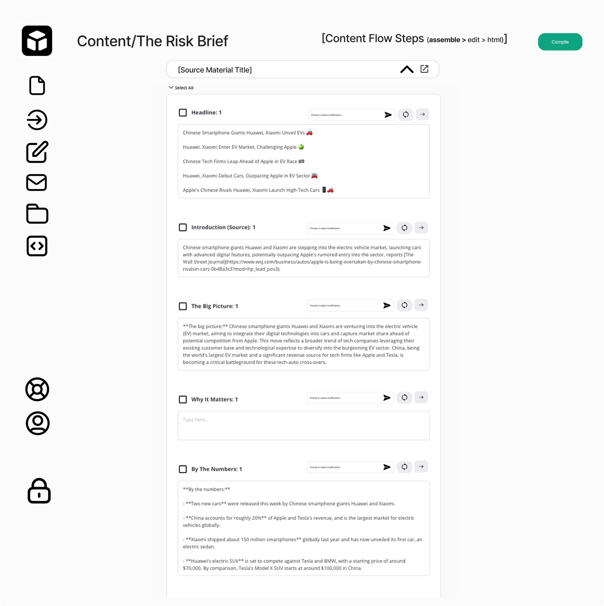
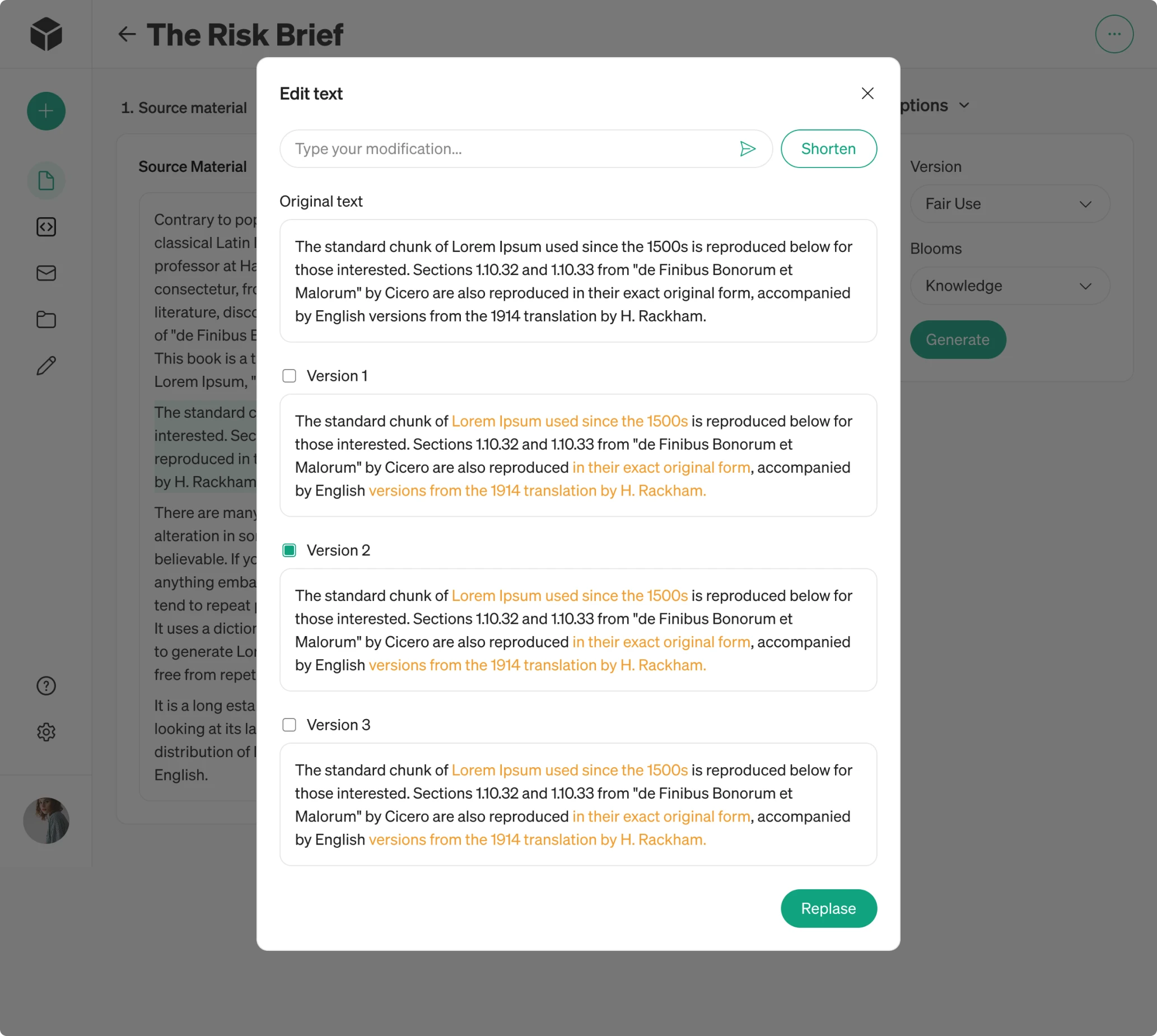
- Multiple AI-generated versions
To give users more flexibility, each block now generates three alternative versions. When a customer selects a specific block and enters a prompt, the AI responds with different options, with all changes highlighted in yellow for easier comparison.
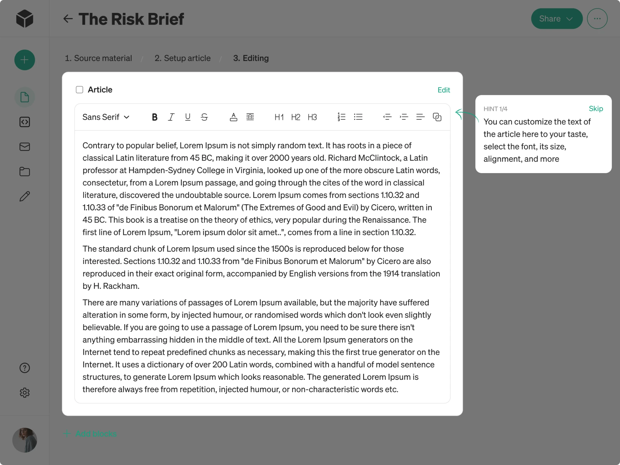
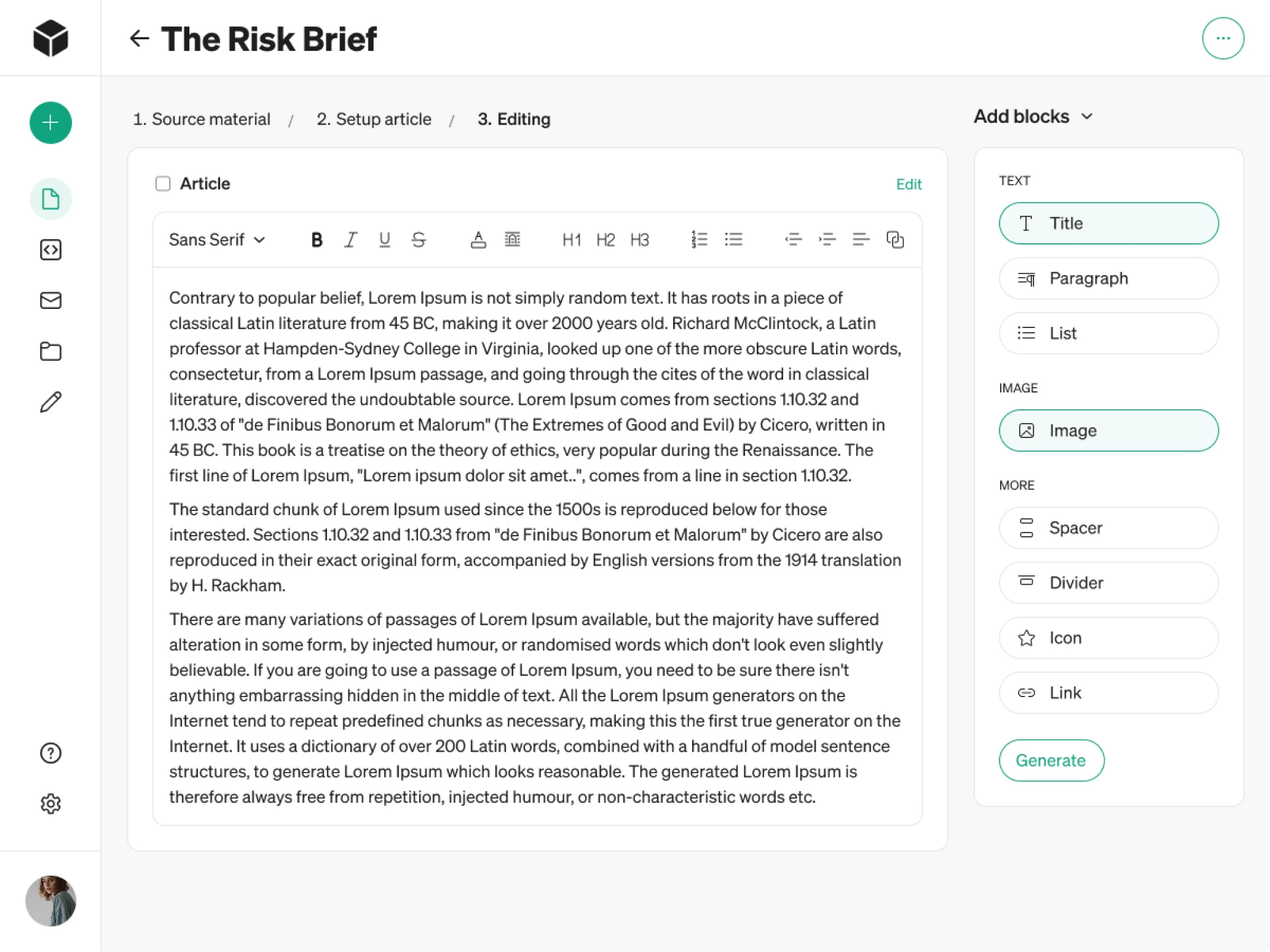
- Inline text editing and expanded editing tools
The previous design included limited editing capabilities, which wasn’t ideal for editorial teams. Recognizing this, we expanded the workspace with inline text editing similar to familiar tools like Google Docs or Word.
We also introduced a right-side panel where users can add common content elements such as paragraphs, spacers, dividers, and more.
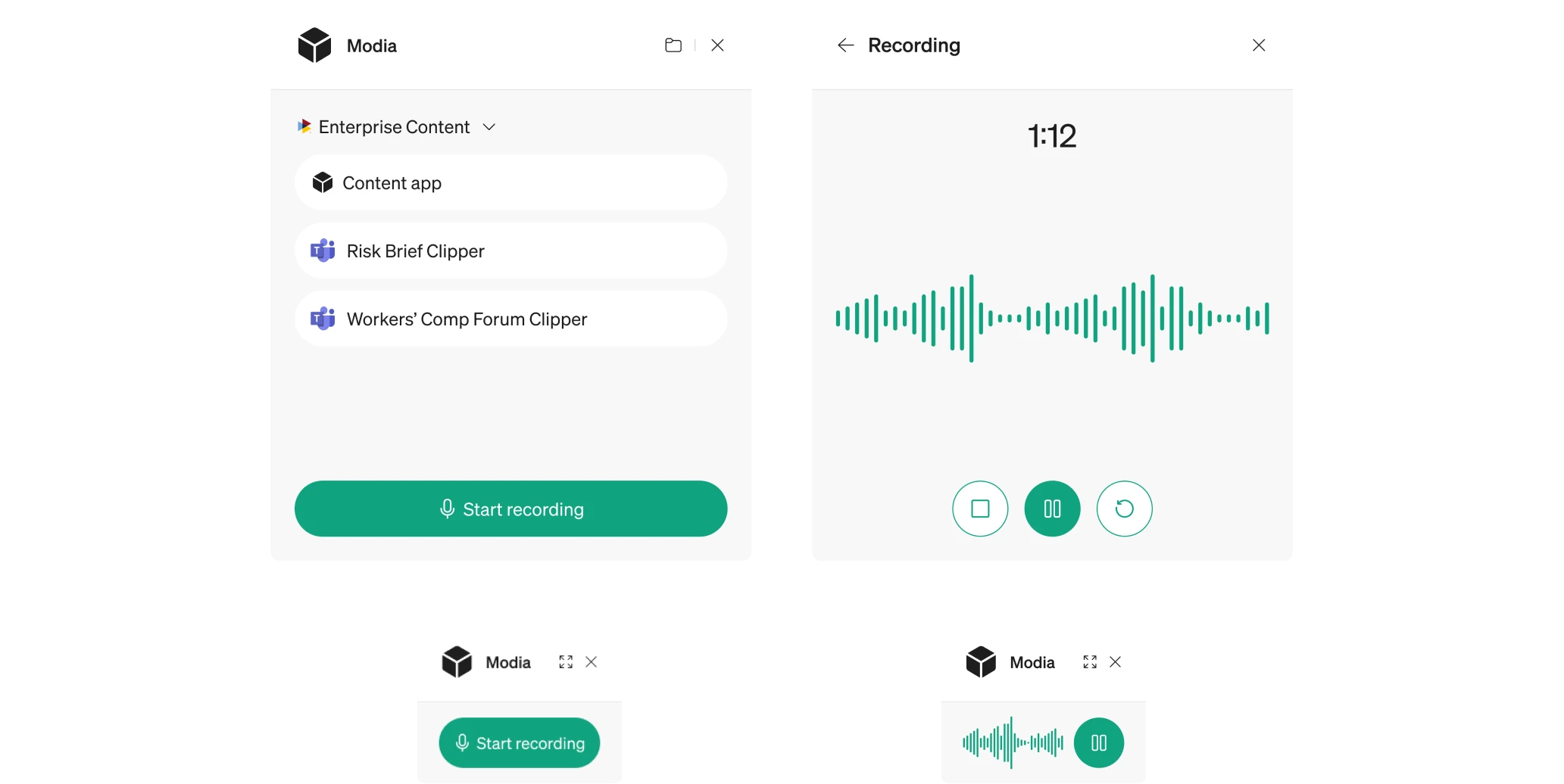
Chrome extension design for quick content capture
One of the interesting aspects of this project was designing Modia’s Chrome extension. Since the platform is used by editorial teams who often conduct interviews, they needed a fast way to access the tool.
We started by mapping a simple registration and login flow so users could connect directly to their profile. Once inside, the extension presents only the essential actions, keeping the interface focused and uncluttered.
Because Chrome extensions work within tight layout constraints, we created a compact structure. When an interview is in progress, the window becomes lighter to avoid pulling attention away from the ongoing conversation.
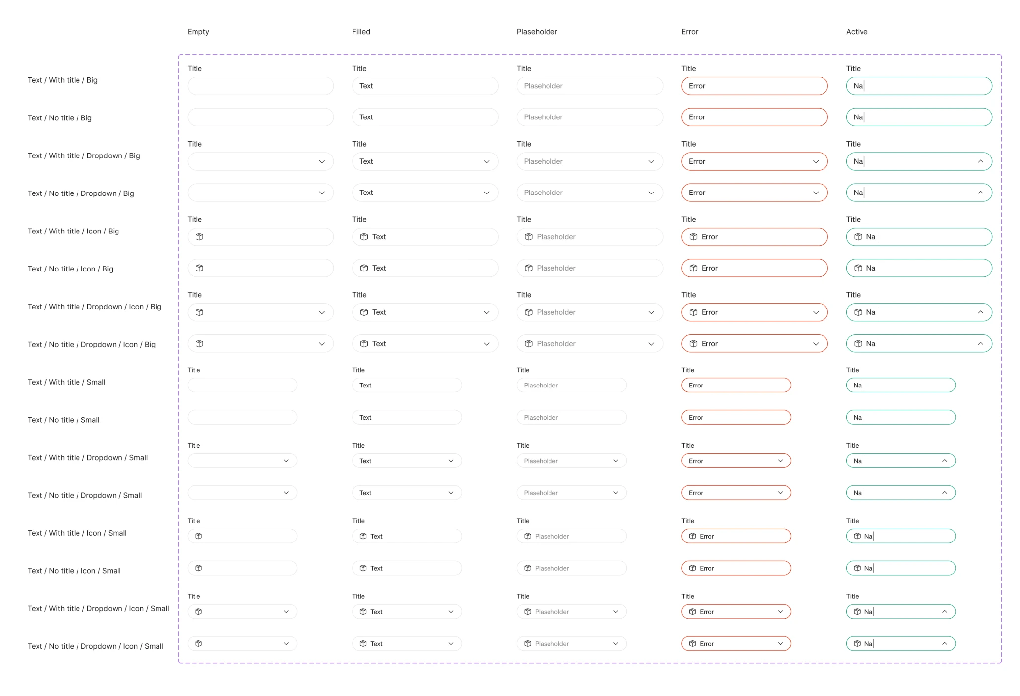
UI system decisions with user intention in mind
Alongside restructuring UX, we focused on building a visual language. Since the original MVP didn’t follow consistent design rules, we created a cohesive UI system.
We explored foundational elements such as button styles, field shapes, and component rounding, testing multiple variations to find the perfect match. To achieve the right balance, we iterated through several palette options.
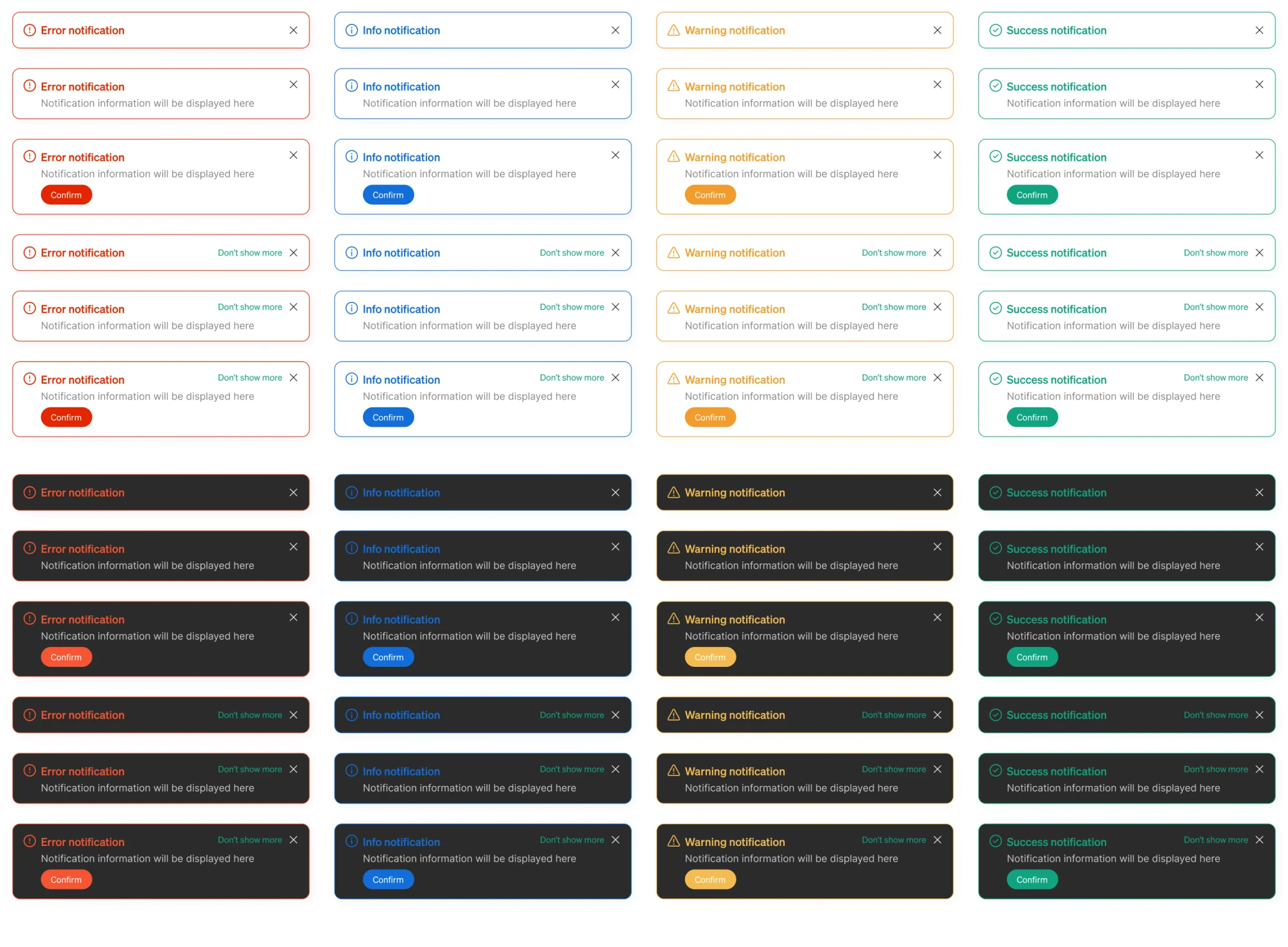
During this exploration, our designer proposed a dark mode variation. The client loved it so much that we expanded it into a full theme for the entire interface.
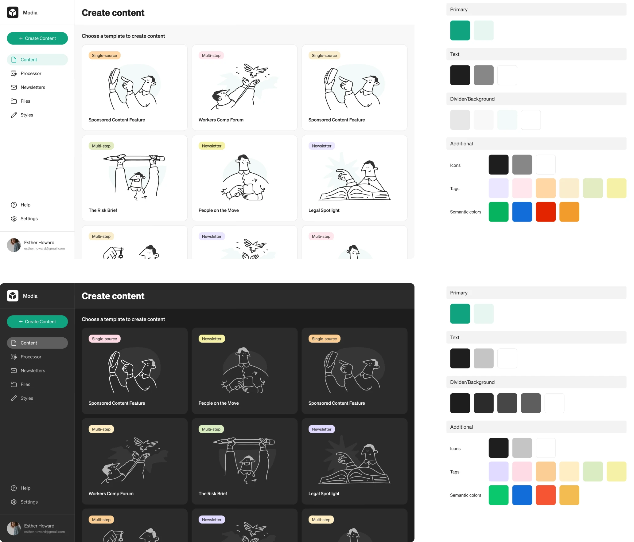
We also refined how notifications appear throughout the platform. Each type — error, warning, informational, and success — received its own color treatment that makes the tone and priority of each message easy to recognize at a glance.
We prepared Modia for external customers with a scalable UI/UX
The work we did on Modia made an immediate impact. The client was excited about how intuitive and modern the platform became. Features that previously felt confusing now looked and functioned like part of a unified experience.
With a clarified UX and a consistent UI system, Modia is ready to onboard external customers and grow as a polished SaaS product.
Collaboration was equally smooth. Despite a 7-hour time difference, our designer, the client, and the client’s developer worked in sync. Once a design was approved, it was implemented without any delays or major reworks.
"Eleken’s consistent communication and results were very impressive and set them apart from other agencies we have worked with. We were particularly impressed with the consistency given the large difference in time zones." — Partner from Modia