

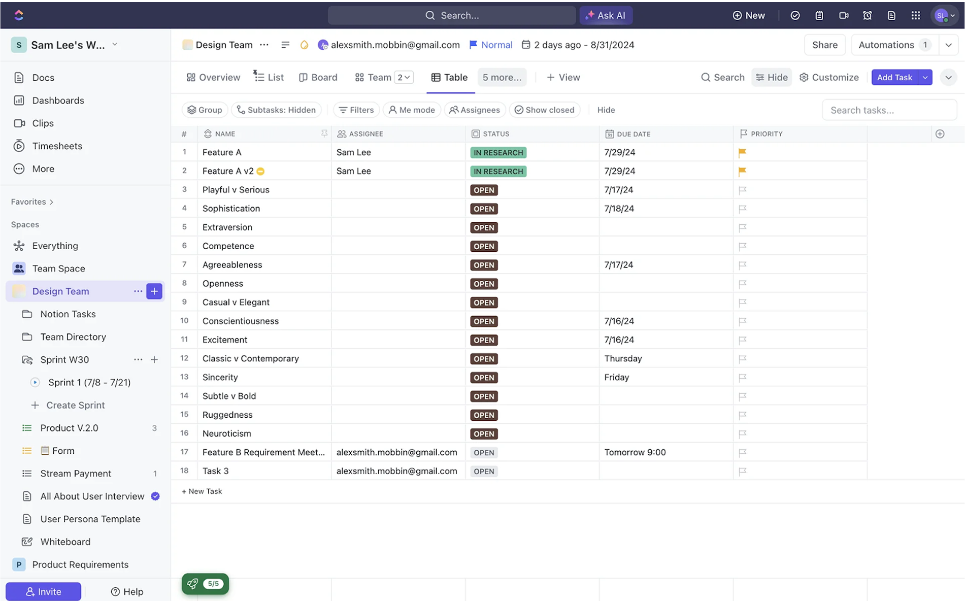
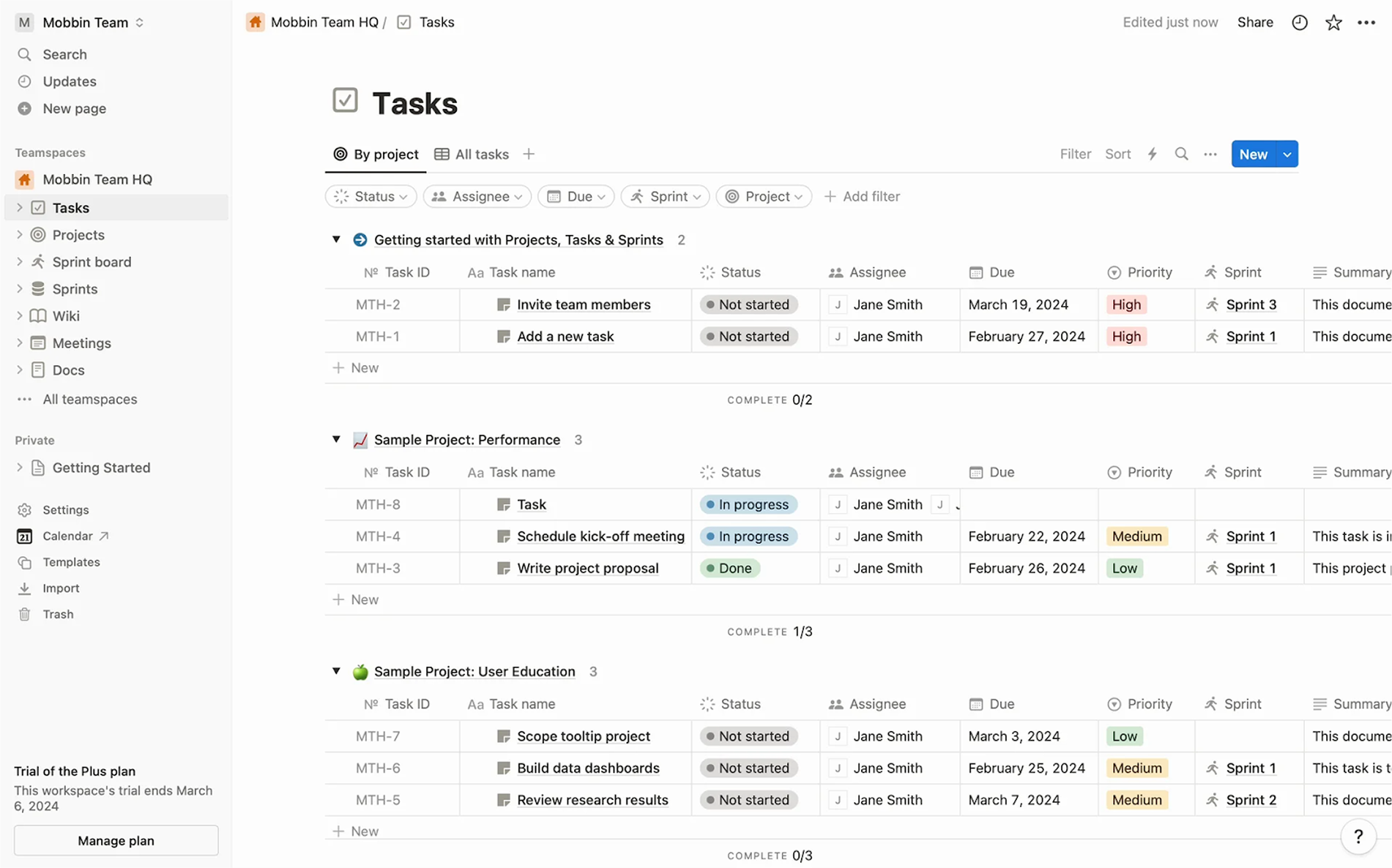
If you’ve ever worked on a B2B SaaS product, chances are you’ve come face-to-face with a massive dataset. In this space, data is everywhere, and at some point, all of it needs to be displayed, sorted, filtered, and acted upon.
At Eleken, we've been there. We've helped 200+ SaaS teams navigate data-heavy interfaces. And time after time, the most effective way to bring structure to that chaos is with thoughtful table design UX.
It might sound basic, even boring, until you start designing one.
But there’s no design challenge without a solution, and that’s exactly why we wrote this guide. Today, we’ll walk you through the practical side of table UX design and show you the ways to turn a wall of data into an intuitive piece of the interface.
Comparing data tables with other presentation formats
In the UI design toolbox, tables are just one way to present data after the user finishes the onboarding. This naturally raises the question: what does a data table look like, and when should you use a table instead of a card layout, a dashboard, or a data visualization?
The answer lies in your users’ goals.
.png)
Tables are at their best when the data is dense, structured, and meant to be used, not just seen. If your users need to scan across rows, compare values, find outliers, or act on multiple items at once, it is usually the smartest option. No amount of visual polish in alternative layouts can replicate the control a table UI provides.
Of course, other formats have their strengths too. Card layouts shine when you showcase rich, individual content, like a list of products, team members, or blog posts, and pair well with drag-and-drop functionality. Dashboards and visualizations work great for summarizing trends and making insights pop at a glance.
.png)
But when users are hunting for a specific record, making bulk edits, or trying to spot the lowest value in a column, they don’t want to scroll through cards or interpret bar charts. They want a grid. Rows. Columns. Filters. The kind of interface that doesn’t get in their way.
That said, sometimes the right approach is a combination. When redesigning the label performance feature for Aampe, we realized users needed a clear way to compare multiple label types at once. So we introduced a bubble chart to visualize performance across multiple variables.
Still, we didn’t throw out the table. It remained an essential part of the design, just a click away. Users could toggle between the visual overview and the granular details, depending on what they needed to do.
.png)
Best practices for data table design
It’s tempting to grab a template and be done with it. And sure, sometimes that’s enough. But more often, good table UI design starts with understanding the kind of information you’re working with, be it numbers, text, or even images.
Once you know what your table is going to communicate, you can start designing with intent. And to make that process a little easier, let’s take a look at some table UX best practices that will help your design actually work.
Align table data for readability
By convention, text is left-aligned, and numbers are right-aligned in tables. Left-aligned text mirrors how people read in most Western languages, keeping labels and content lined up neatly. Right-aligned numbers, meanwhile, let users compare digits by place value.
For example, if you have numbers 45, 7, and 1234, right-aligning them ensures the hundreds and thousands places stack neatly, avoiding confusion.
.png)
In contrast, centering content in data table UI cells is generally a no-go. This impedes quick scanning, as the starting position of each word varies, and the eye has to jump around more. The result is increased cognitive load and “visual wobble” as users try to read down a column.
Also, match the header alignment to the column data beneath it. If a column is numeric and right-aligned, its header should be right-aligned too. If another column contains left-aligned text, its header goes left. This way, the column headers sit directly above the values they label, creating a straight visual line.
Reduce icon clutter
Icons are great, until they aren’t.
A creative data table design overloaded with glyphs quickly becomes a mess. Edit, delete, info, share, status, tags... if every row is a billboard of tiny icons, users won’t know where to look. The best practice is to reduce icon clutter and group icons meaningfully.
For this, show only what’s essential. Group multiple row actions under a single dropdown or kebab menu at the end of the row, rather than displaying 5 different action icons in line. Users can click that one menu to access all actions, keeping the tables UI cleaner.
.png)
We also advise avoiding icon repetition. Instead of putting a “comment” or “attachment” icon in every row, you can display them only when relevant, or aggregate them visually in a way that doesn’t compete with core content.
Use white space and color
When designers face a dense table, the instinct might be to shrink everything to fit more on screen. But cramming data together usually backfires, as users quickly get lost in a wall of text and numbers.
Adding white space can make your UX table design far more legible. Adequate cell padding, taller row heights, and clear separation between columns and rows all help the eye isolate one piece of data from the next.
.png)
One useful technique is “zebra striping.” This means alternating the background color of each row (for example, white for odd rows, light grey for even rows). Done subtly, zebra rows provide a visual guide that helps users follow a line across the table without losing track (even a 5-10% grey tint is enough).
.png)
Color, too, plays a supporting role in data visualization table design. Use it to highlight what matters: a red balance for an error, a soft green for a success. Avoid the rainbow trap and stick to a neutral palette for the grid itself (whites, greys, light borders) and reserve brighter colors for truly important signals.
And then there are the lines and dividers. They’re important for separating information, but there’s no one-size-fits-all approach to using them. You might opt for lightweight grid lines or skip vertical lines entirely. It all comes down to what feels right for your design and what works best for your users.
.png)
Enable fast data discovery
Most users arrive at a table with a question in mind. “What’s the status of this invoice?” or “Which accounts are inactive?” A good table design UI makes these answers easy to find. That means prominent search fields, intuitive filters, and sortable columns.
Even small design choices, like using a funnel icon for filters or a magnifying glass for search, help users quickly understand how to navigate the dataset.
.png)
For the Polaris project, for example, we designed a data table with built-in sorting for each column, where users can quickly organize information in ascending or descending order. They can also find specific entries using a search bar or jump directly to a desired page by entering its number into the “Go to…” field.
.png)
The key is to think: how can we help users quickly isolate the row(s) they need? If your table is read-only, maybe search and filters are the primary actions. If it’s editable data, maybe an interactive highlight or scroll-to-row function is the solution.
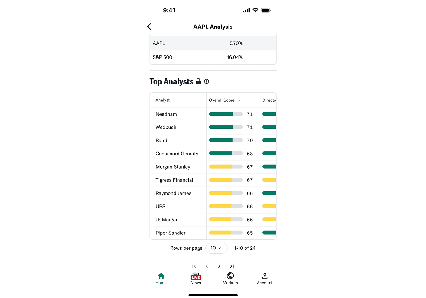
Support complex data comparison
One huge advantage of tables UX over other interface components is easy comparison. To support this, your design should ensure consistent alignment (as covered earlier) and possibly introduce features like frozen headers or columns.
In wide tables, freezing the first column (often an identifying name or ID) helps users keep track of which row they’re looking at while scrolling horizontally. This way, if I move over to column 20 in a giant table, I still see that I’m looking at “Acme Corp” or “John Doe” on that row, rather than just an anonymous set of cells.
Another design feature for comparison is row highlighting on hover or focus. If the user’s cursor is on a cell, consider highlighting the entire row (and/or column) subtly. This acts like a ruler guiding across, preventing the “lost in a grid” syndrome.
.png)
Additionally, when comparisons are a primary use case, you might provide a transpose or pivot view (in advanced scenarios) to flip the table or group data for side-by-side analysis.
But even without fancy features, the basics like alignment, smart ordering of columns, and keeping related data grouped will inherently support comparisons.
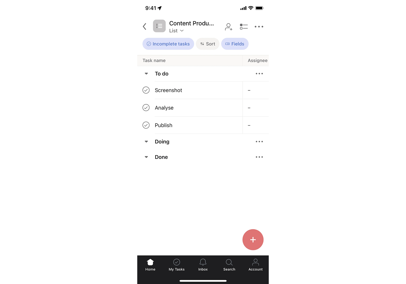
Design big tables with bulk actions
As we already said, in SaaS apps, data table design is meant to work with information. So the design should make all actions accessible without adding friction.
First, consider bulk actions. If users need to perform actions on many records at once, enable multi-select with checkboxes and a contextual action bar. This way, you let users select twenty rows and click “Archive” in seconds, rather than doing it manually one by one.
.png)
Next, think about inline controls for single-row actions. With editing as a primary task, the table should allow users to modify certain fields. Or if each row can be acted on (e.g. approve/reject, or send an invite), placing a button or dropdown makes it obvious how to perform that action.
It’s also important to give feedback. Once a user deletes some rows, perhaps the table shows a brief “undo” option or a confirmation message to reassure them. In our experience, enabling user actions in the data table UX itself (rather than forcing people to navigate elsewhere) dramatically increases productivity.
All in all, the goal is to minimize context-switching. Users shouldn’t have to leave the table, open a modal, and confirm on another screen just to update one field. The more you can let them act in context, the more productive the experience becomes.
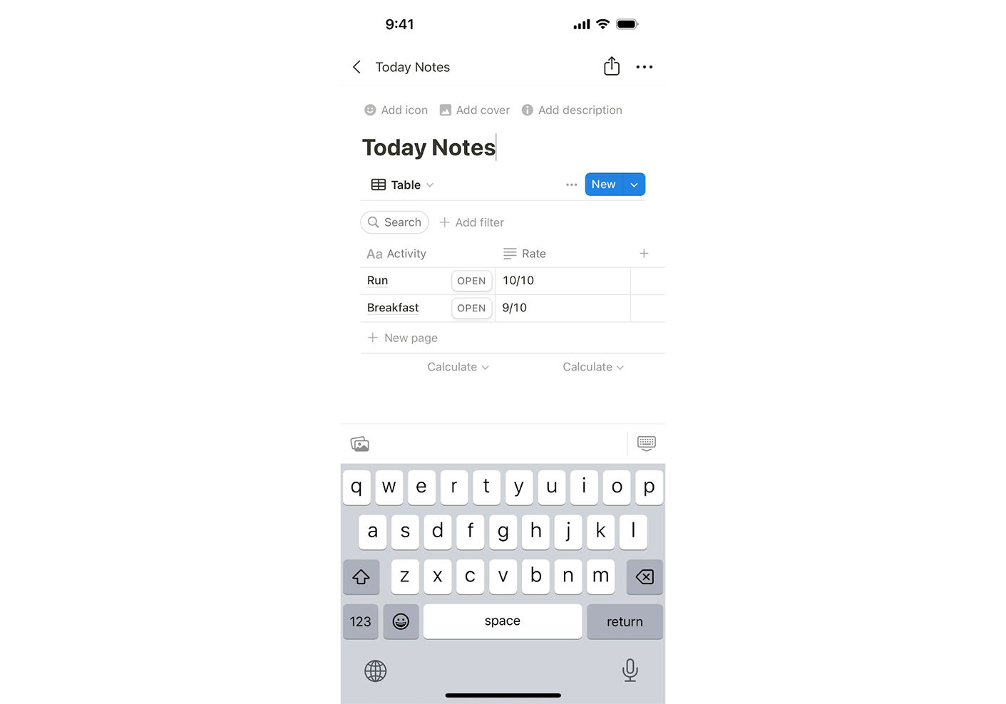
Allow inline editing
Inline editing allows users to modify values directly inside table cells, just like in a spreadsheet — whether it’s text, dropdowns, or radio buttons. It’s ideal for quick changes, like correcting a typo, toggling a status, updating a dropdown field, or even selecting a time via a time picker.
The benefit is clear — no context-switching, fewer clicks, and faster task completion.
However, not everything should be editable inline. If editing an item requires additional data or confirmation (like a complex multi-field form or an action with side effects), you might be better off opening a modal, popup, a separate detail view, or even using a wizard UI.
Design-wise, always make editable fields obvious. Use familiar input field design patterns, like a pencil icon on hover or a focus highlight, to cue interactivity. Also, confirm changes with visual feedback like a green checkmark, toast notification, or a cell highlight. And don’t forget error handling or “undo” options for peace of mind.
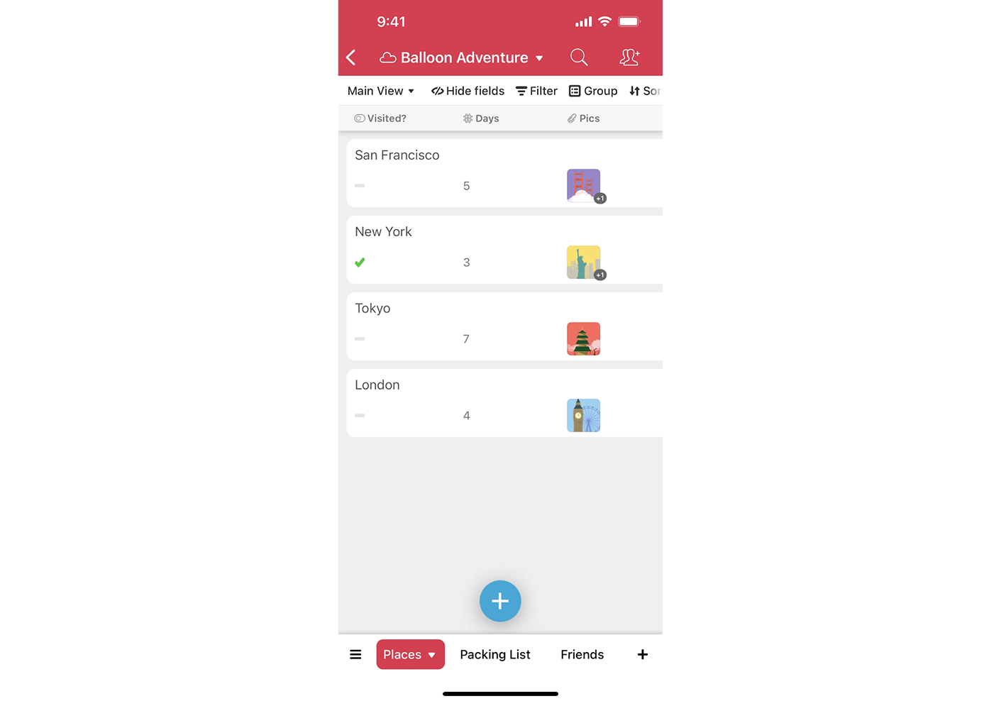
Add expandable rows
Expandable rows are one of many UX design patterns that let you tuck away extra details until they’re needed. Typically triggered by a small arrow or chevron icon at the start of the row, this pattern reveals a hidden section below the row when clicked.
The interaction should be intuitive. Use a familiar icon (like the triangle that rotates on expand), make it keyboard-accessible, and clearly style expanded rows so users can track what’s open. You can also allow multiple rows to be expanded at once, which supports comparison across items.
Just be mindful. If most users need that extra info regularly, don’t hide it behind an expand. And if performance drops with many rows opened, consider limiting how much data is shown at once or using paginated content within the revealed area.
At their best, expandable rows offer progressive detail without breaking context. Users don’t lose their scroll position or mental map of the table. They explore additional information only when necessary.
Real-world data table design examples
To better understand how table UX works in practice, it helps to look at real SaaS products. At Eleken, we’ve designed many data-heavy platforms, and below are a few examples that show how thoughtful table design can improve usability.
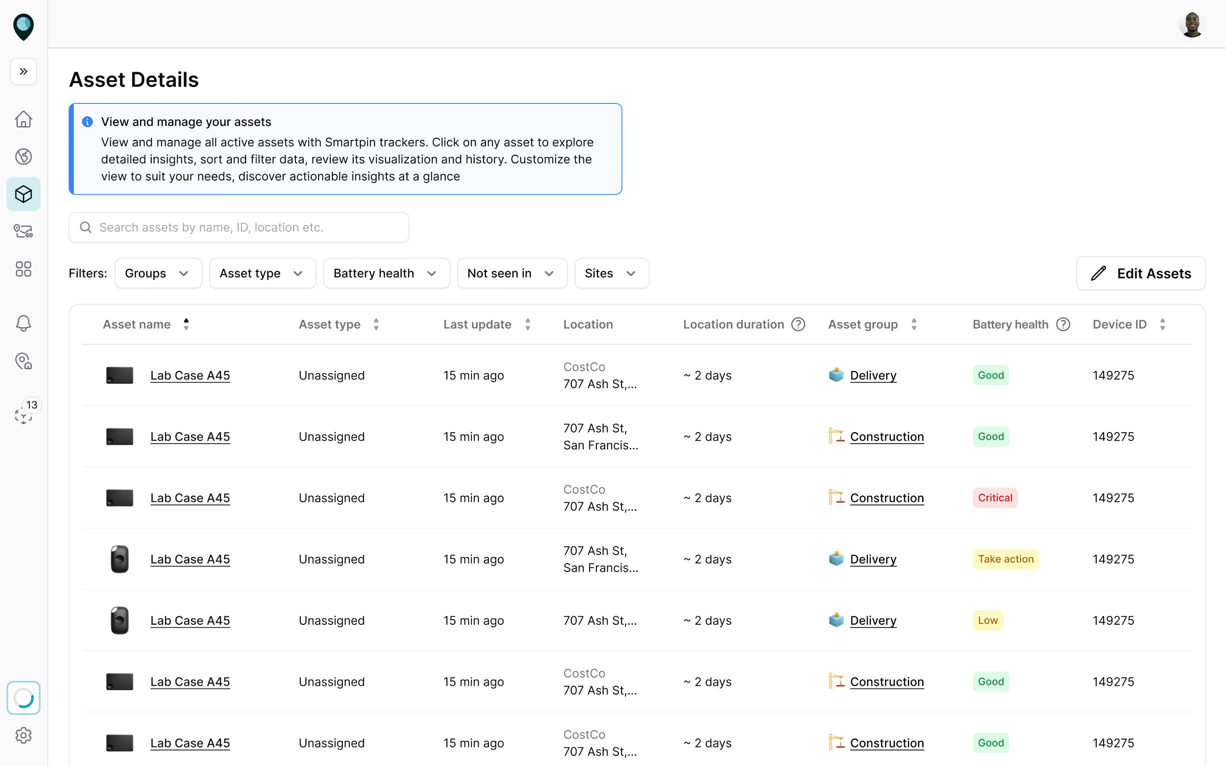
1. Smartpin
When designing Smartpin, a geospatial platform, we needed a clear way for users to browse and update large volumes of asset data. For this, we introduced a structured table layout. Filters placed directly above the table help users quickly narrow results, while inline editing lets them update asset details without leaving the page.
2. WireFilter
Wirefilter, a cybersecurity platform, came to Eleken with an interface overloaded with poorly visualized metrics. During the redesign process, we moved key insights into charts and graphs and used tables to organize structured data. This made complex security information easier to scan and interpret for administrators.
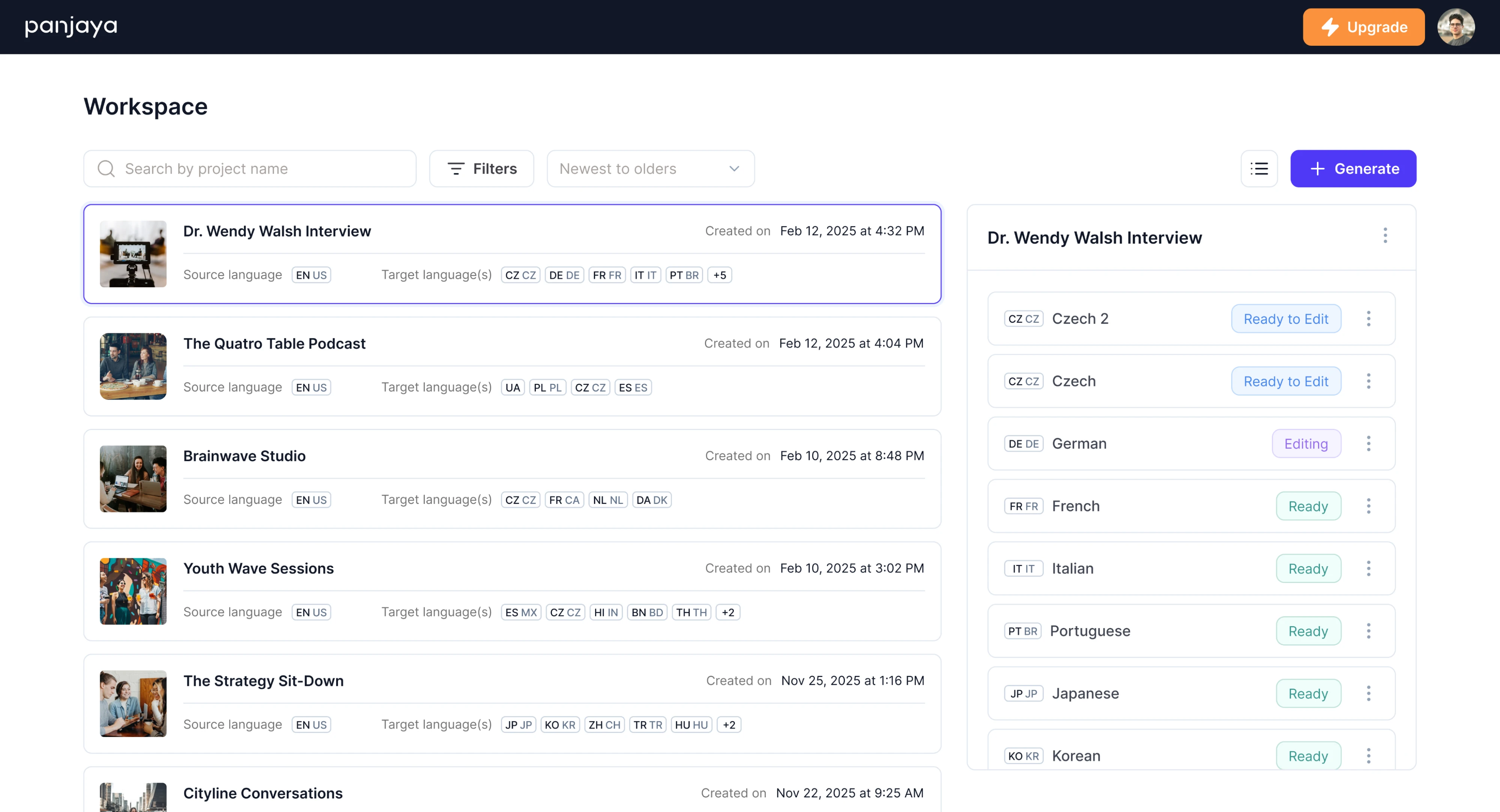
3. Panjaya
Panjaya, an AI-powered dubbing platform, needed a simple way for users to manage their video libraries. We introduced a table layout where each item includes key details like the title, preview image, and translation language. An expandable panel on the right reveals additional information when needed.
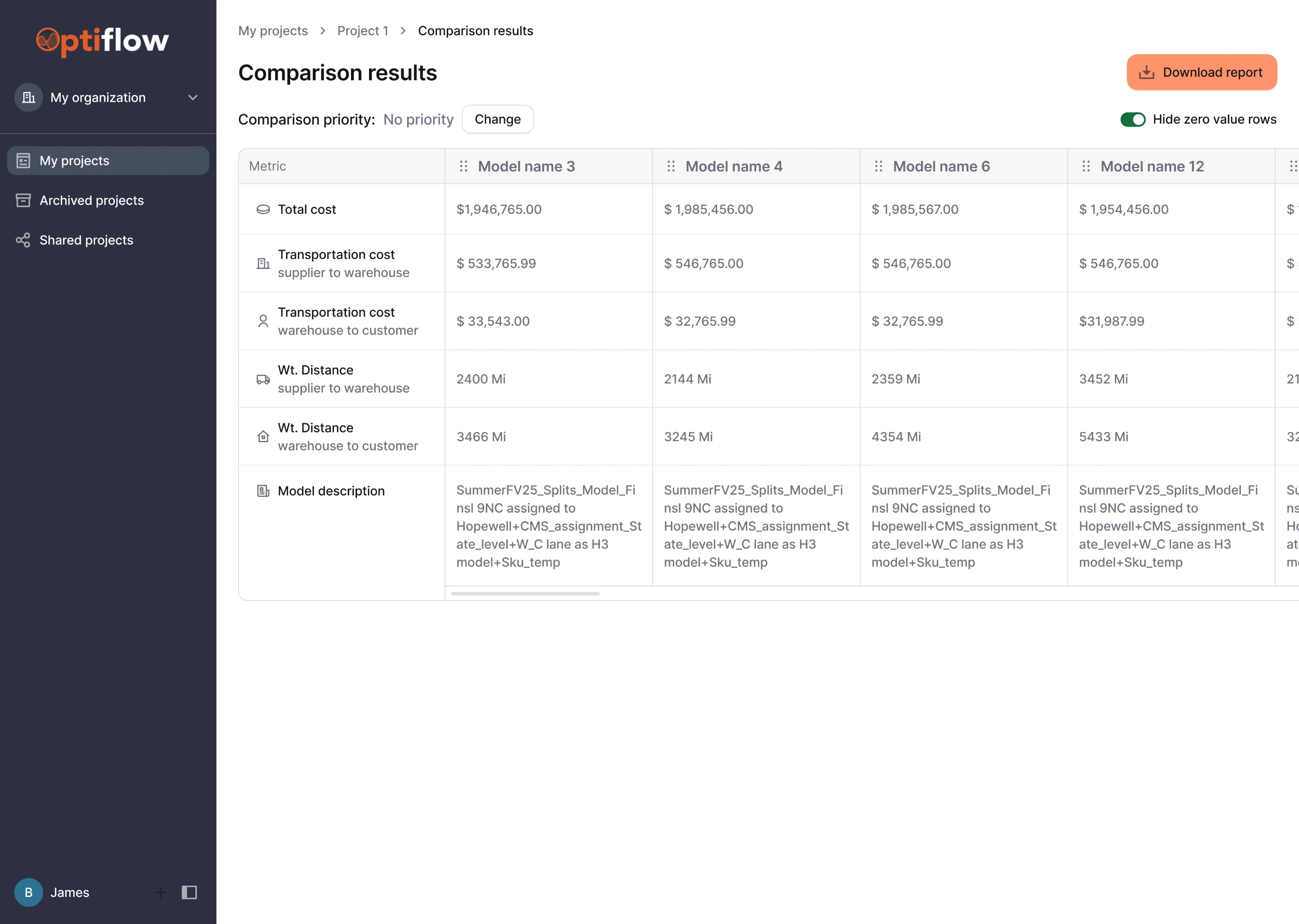
4. Optiflow
In Optiflow, a supply chain management platform, users needed to track and compare many logistics models. The original interface grouped too many actions together and made side-by-side evaluation difficult. We redesigned the table with a drag-and-drop interface to support comparison priorities like cost, transit time, or balance.
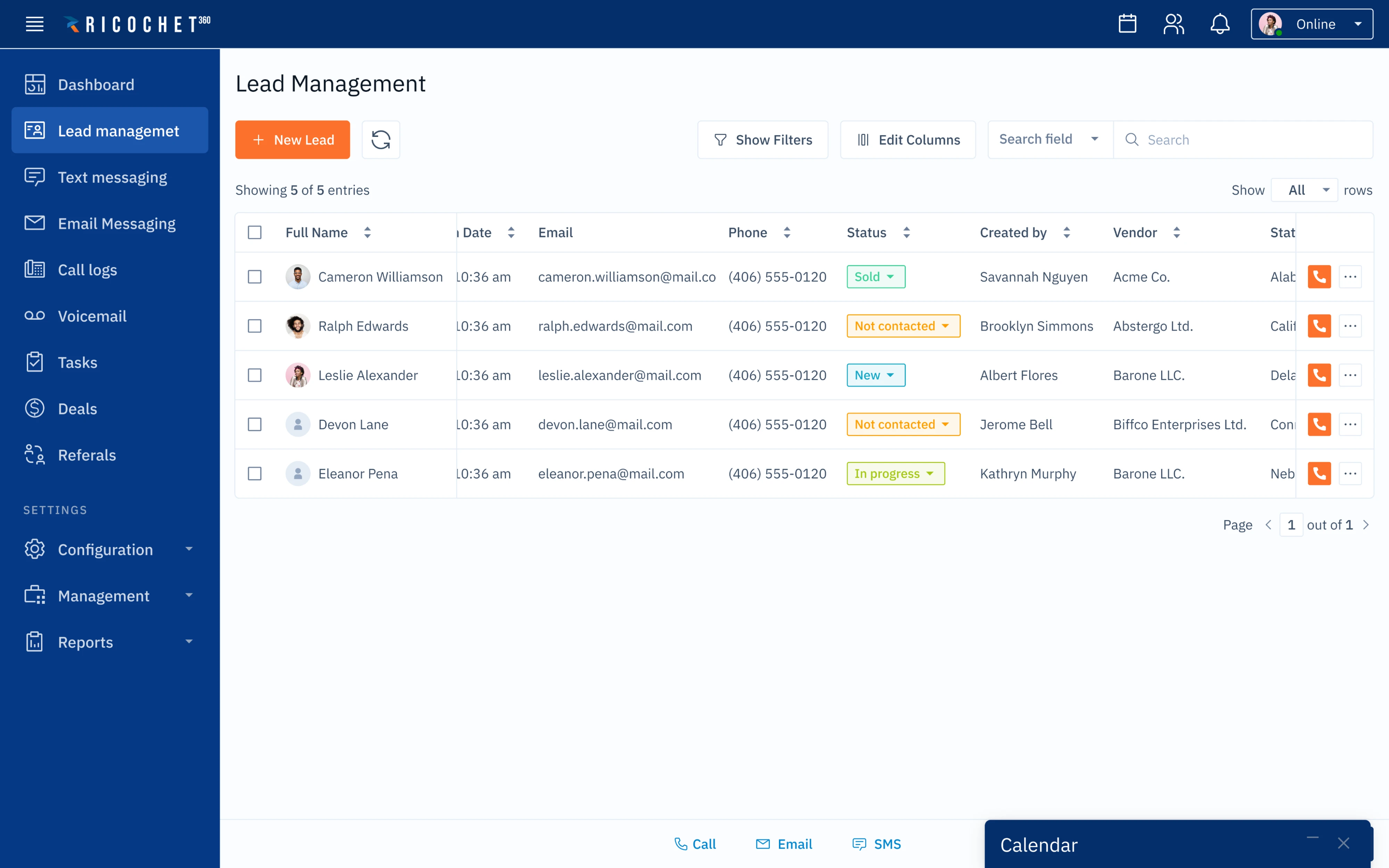
5. Ricochet360
Before Ricochet360, a CRM platform, contacted Eleken, they had a lead management table cluttered with rows of brightly colored action buttons. We simplified the interface by restructuring UX table actions, reducing visual noise, and prioritizing the “Add new lead” button. Less critical actions were moved or hidden.
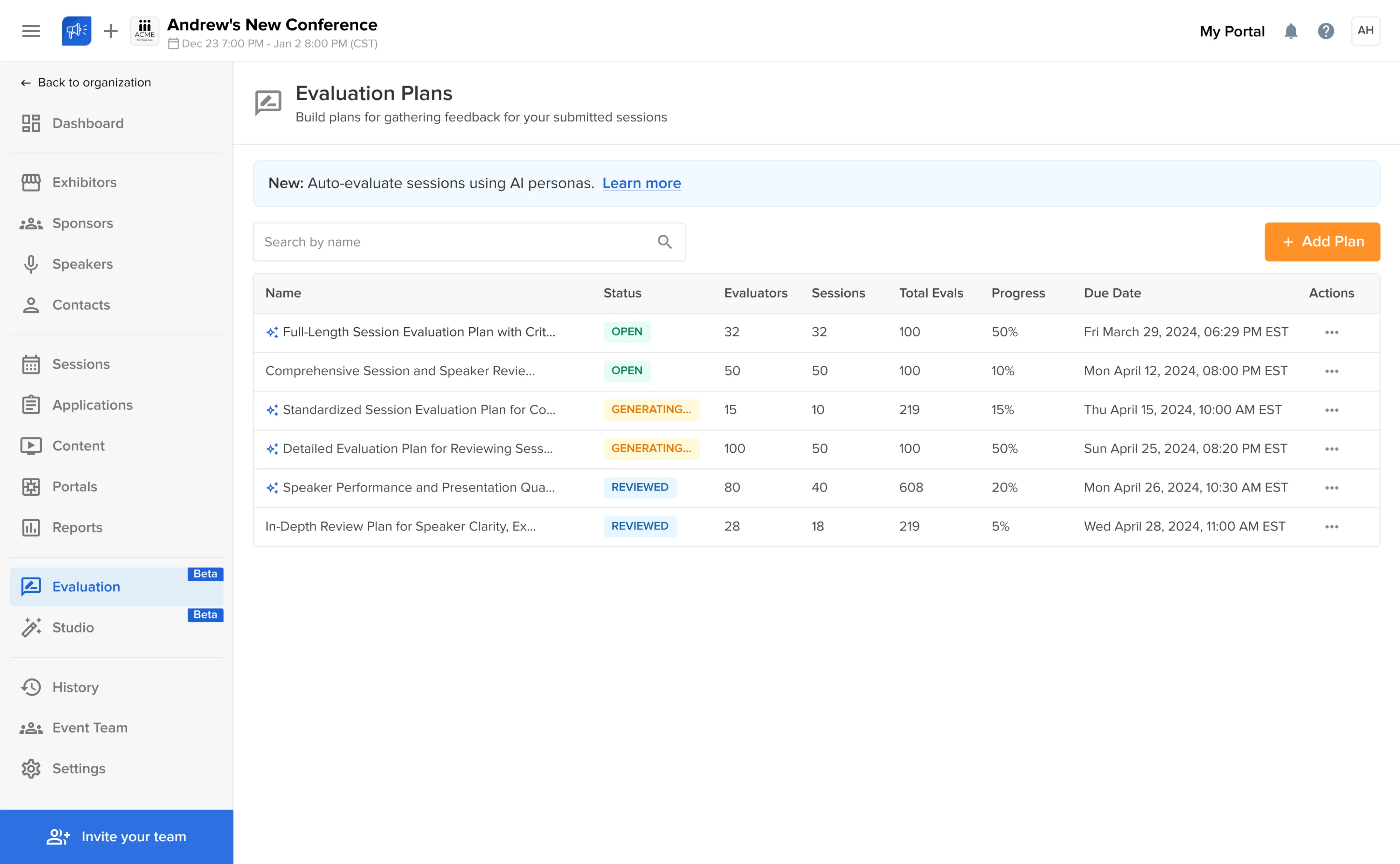
6. Sessionboard
Sessionboard, an event content management platform, handles large volumes of event data that users need to review and manage. Instead of redesigning the interface from scratch, we refined the existing table layout to make it clearer. We also introduced color-coded status indicators that help users instantly understand the state of each item.
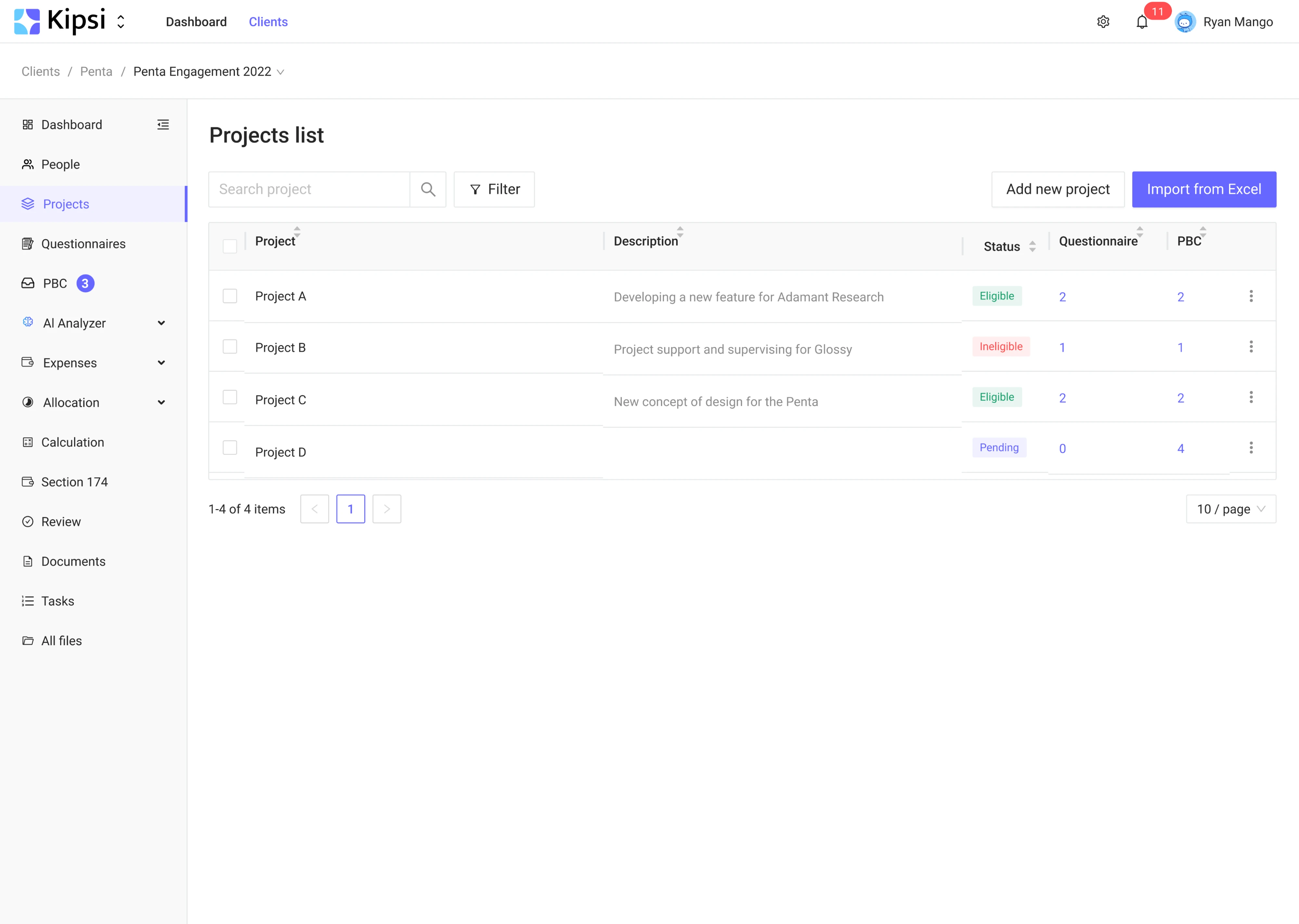
7. Kipsi
During our collaboration with Kipsi, a platform for accounting and tax consulting firms, we needed to present financial data without overwhelming users. To reduce cognitive load, we simplified the table structure to show only essential information. Unnecessary columns were removed, and pagination and filtering were introduced.
Challenges and solutions in table UX
By now, you’ve got a solid grip on the fundamentals of table UX. But even with best practices in hand, challenges tend to surface along the way. They may look like small, simple UI components, but the issues they bring often feel anything but small.
In real SaaS products, two pain points show up more than any others: making data table designs work on mobile, and handling massive datasets without overwhelming users or breaking performance. Let’s take a closer look at both.
Problems with mobile versions
Responsive design and data tables have historically been at odds. By nature, tables are wide (many columns) and dense (many rows), which don’t translate well to small mobile screens. If you simply scale down a full desktop table onto a phone, you’ll end up with unreadable text and a need for horizontal and vertical scrolling.
So, what can we do to provide a decent table UX on mobile? One solution is to limit what’s shown by default on small screens.
.png)
You might display only the most essential columns in the mobile view and omit the less critical ones. For example, a project tracking information table design that normally has columns for Name, Deadline, Owner, Status, Budget, and Notes could drop Budget and Notes on mobile to avoid overflow.
The user still gets a meaningful snapshot without immediately needing to scroll. Plus, you can offer access to the full dataset through a detailed view or an “expand” action if needed.
Another mobile-friendly approach is stacking, where each row becomes its own mini card. Rather than forcing horizontal scroll, you display data vertically, using label-value pairs. It’s not ideal for comparison across multiple rows, but it’s perfect when users are scanning one record at a time.
.png)
Sometimes comparison is critical, even on mobile. In that case, horizontal scrolling is unavoidable, but it needs to be handled with care. Use sticky headers and, if possible, freeze the first column so users don’t lose context. A horizontal scroll indicator, similar to those in a carousel UI, helps too.
Visual cues also matter here. A subtle gradient or an arrow on the right edge of the table can signal there’s more to see off-screen. Without it, users might not even realize the table scrolls.
Beyond scrolling and stacking, consider collapsible row details as a hybrid approach. Each row could have an expand/collapse arrow that, when tapped, reveals additional columns or information below. This way, the initial view is minimal, and if the user wants to see more data, they can always expand it.
Lastly, don’t be afraid to provide alternate views or dedicated mobile screens for critical table-based tasks. In some cases, the best mobile table may be a summary view, a chart, or even a conversational UI that delivers data step-by-step.
Handling large data tables
Another challenge comes when your table isn’t just large in layout, but large in volume of data. Designing for 10 rows is easy, but designing for 100,000 rows is another story. Huge data tables can introduce performance issues, overwhelm users, and generally bog down the UX.
One obvious strategy is pagination or virtual scrolling. Instead of dumping thousands of rows in one long table, break the data into 50 or 100 rows at a time, with controls to navigate to the next/previous set.
This improves load times and gives users manageable chunks to digest. An alternative is infinite scrolling, which can work well if users are likely to just keep scanning rather than jumping to a specific page.
Next, consider pinning (freezing) important rows or columns. We touched on sticky headers and columns earlier for comparison, and here it becomes even more critical. If a modern data table design has dozens of columns, this approach will let users scroll through other columns without losing track.
Many enterprise UIs allow users themselves to choose which columns to pin, adding to that sense of control.
Another technique is the segmentation or grouping of data. In place of an endless list, think about ways to chunk the information. For instance, group events by date or customers by region, with collapsible sections. Users can hide what they don’t need and focus on the subset that matters.
This structure turns a sea of data into something navigable (much like how a sitemap organizes complex content for clarity).
We also recommend summary rows or subtotals. A line showing the number of items, total amount, or average value before the raw data helps users glean insights quickly. In some cases, it’s worth offering pre-filtered views, like tabs for “Active Items,” “Archived,” or “Needs Review,” so users can start from a more relevant slice of the dataset.
On the technical side, virtualization is key. That means rendering only what’s visible on screen, in contrast to injecting all rows into the DOM. Users might not see this happening, but they’ll feel it, because the table stays responsive even under a massive load.
Lastly, educate and guide the user all the time. If loading takes a few seconds, show a spinner or progress message. Let users know how much data they’re seeing (“Displaying 1–100 of 8,231”) and what options they have. When there are known limitations, communicate that gracefully.
In many cases, showing every data point isn’t as useful as giving a way to find the needle in the haystack or visualize the haystack at a high level.
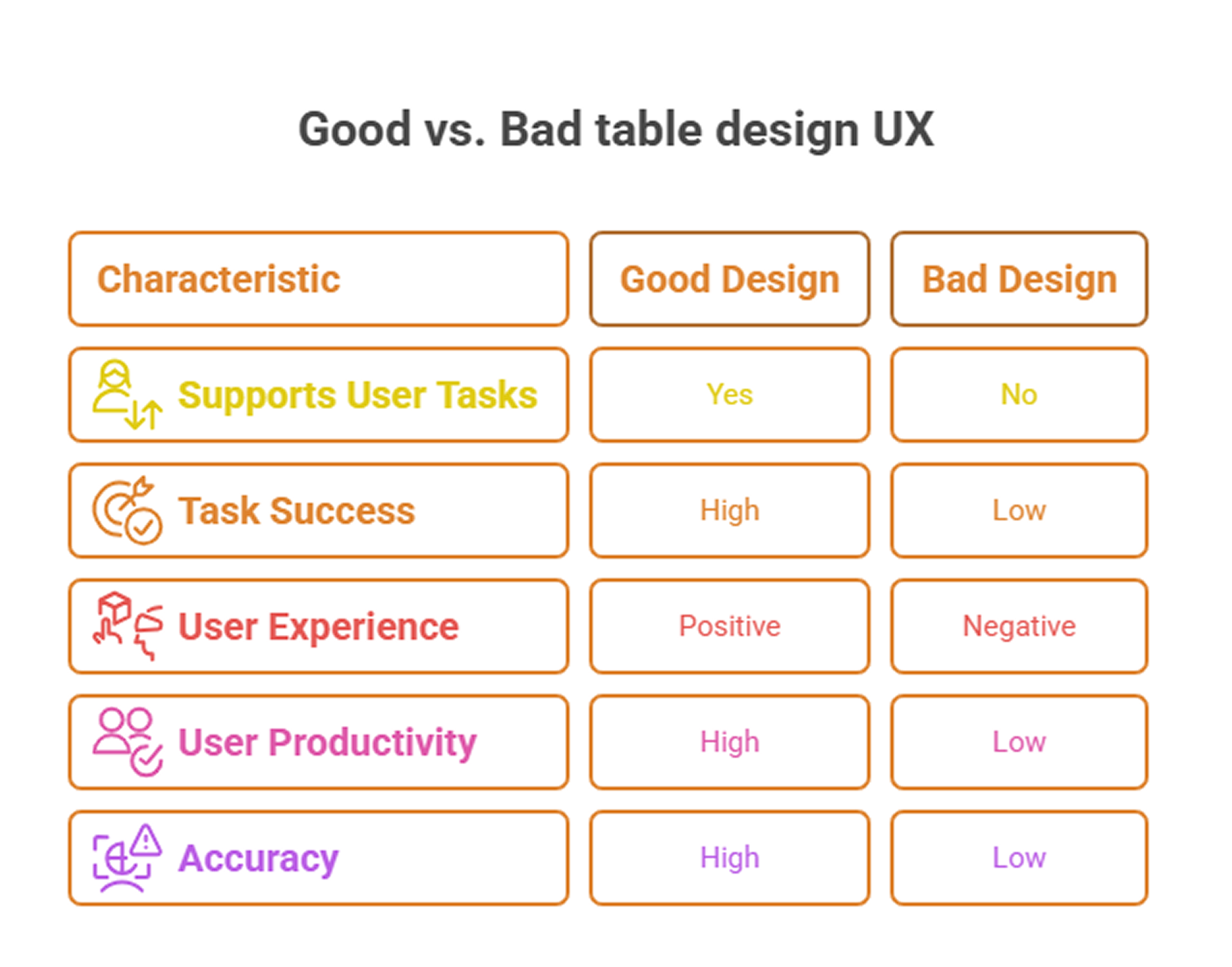
The impact of good table UX on usability
You don’t have to take our word that good table design improves UX — user testing and metrics can back it up. Whenever possible, it’s wise to test different table designs with real users and gather data on their performance and satisfaction.
Across the industry, Nielsen Norman Group research confirms that when data tables are designed to support core user tasks, people complete their objectives faster and with fewer errors. A modern data table UI design significantly reduces frustration and boosts task success rates by making the layout work with user goals.
On the flip side, poorly structured tables often become bottlenecks. When filters are buried, alignment is inconsistent, or actions are unclear, users start to feel lost, and productivity suffers. In environments where accuracy and speed are critical (finance, healthcare, enterprise ops), that’s risky enough.
Quantitative metrics help tell the story. According to Maze's Future of User Research Report, 58% of product professionals reported an increase in customer satisfaction after investing in user research, and table UX is no exception. Even something as small as improving alignment or making filters easier to reach can impact performance dramatically.
Metrics like time on task, error rates, and task success ratios often shift meaningfully after redesigns. If 7 out of 10 users struggled to locate a data point in the old UI, and now 9 out of 10 find it in under five seconds, that’s a win.
Feature engagement is another telling signal. After applying customization controls like column reordering or visibility toggles, many SaaS platforms see a rise in power user retention and in-app engagement. It’s no surprise, because when the interface adapts to users’ needs, they use it more.
But for those features to succeed, users need to discover them early, making user onboarding a critical part of the table experience.
Even subjective metrics matter. Satisfaction surveys and Net Promoter Scores (NPS) indirectly reflect table UX improvements. If support tickets that start with “Where do I find…” or “How do I…” suddenly drop off after a redesign, that’s a clue that your design choices are working.
Key takeaways
Although designing tables won’t wow anyone in a product demo like a splash page might, they’re where a lot of real work gets done. And that’s exactly why they deserve a thoughtful approach. For SaaS users, it can be the difference between confidently taking action and getting lost in rows of noise.
There’s no universal layout or perfect set of features.
Getting the design right takes iteration. It takes asking the right questions, testing ideas, and sometimes zooming out to rethink the whole interaction. That’s the kind of problem our Eleken team solves. So if your table’s starting to feel like a blocker, you know where to find us.

