

Every button asks the user to do something: submit a form, confirm a choice, or move forward. In that moment, the user makes a quick decision, often without thinking much. If the UI button is clear, they act instantly. If it’s not, they pause, hesitate, or choose the wrong path.
That split second is what button design is about.
And that’s harder than it sounds.
This guide is built to help you get them right. You’ll find real UI examples, a clear breakdown of button types, and best practices that go beyond the obvious. We’ve put it together based on our hands-on UX work, so you leave with a solid foundation.
25 button UI design examples
Most designers land here looking for button UI examples they can actually steal. So that’s exactly what we’ll give you — a look at how real SaaS products handle buttons, and what makes each decision worth borrowing.
Primary CTA buttons
1. Panjaya — “Start” button
To ease new users in, we designed a single full-width “Start” button for the Panjaya onboarding modal. It uses a high-contrast purple fill on a white background and sits at the most prominent position, making the next step impossible to miss.
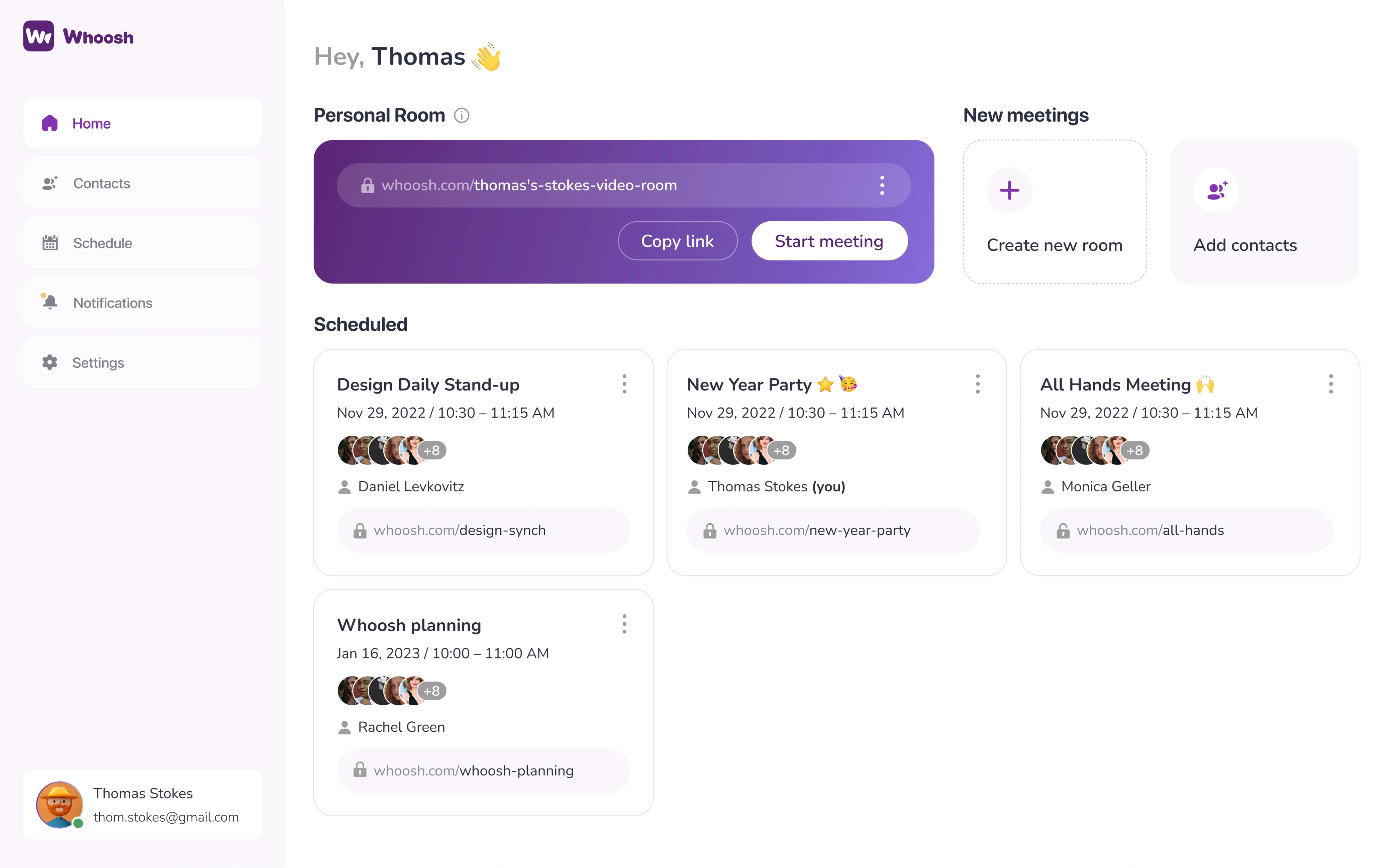
2. Whoosh — “Start meeting” button
For Whoosh, we placed the “Start meeting” button inside a card on the dashboard. The card itself is the loudest element on the page, so the button doesn’t need to be. It uses a white fill with dark text, standing out cleanly against the purple background.
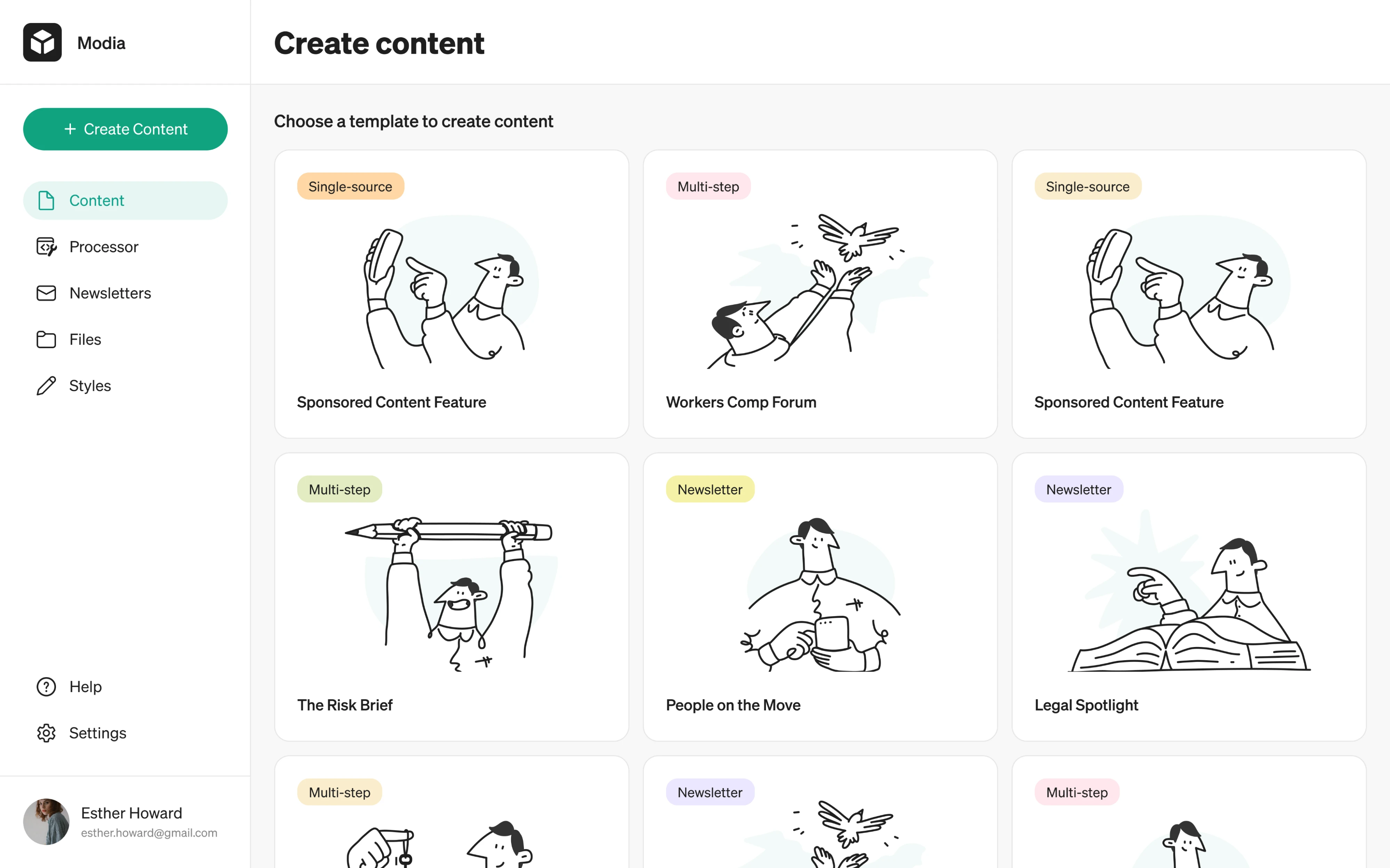
3. Modia — “Create Content” button
When we redesigned Modia, we stripped the layout back and introduced a single “Create Content” button anchored to the top of the sidebar. The green fill is the only real color, so the button draws the eye without competing on the screen.
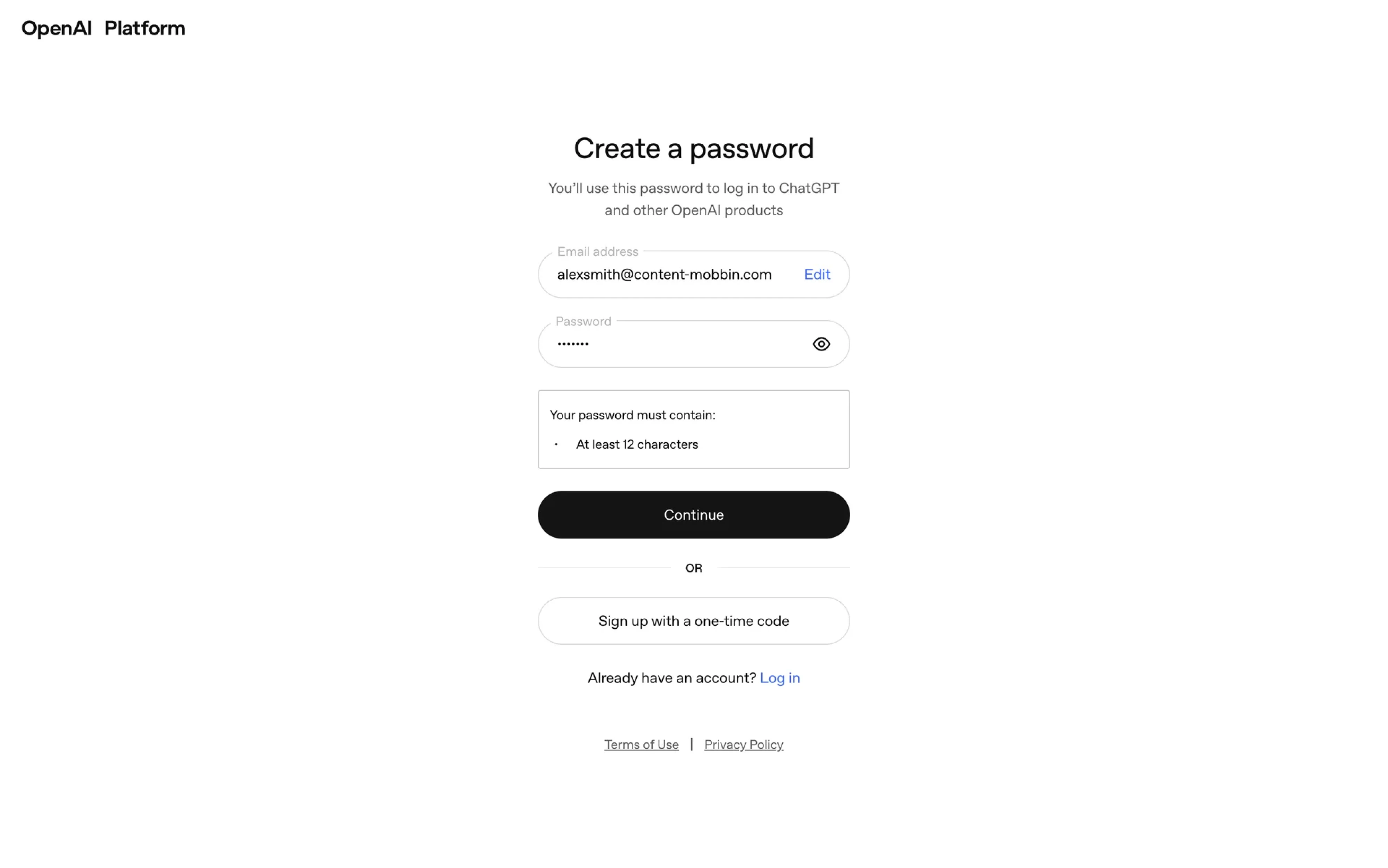
4. OpenAI — “Continue” button
Password creation during OpenAI’s signup flow spans three levels of hierarchy on a screen. The primary “Continue” button sits at the top as a solid black fill, supported by an outlined “Sign up with a one-time code”, and a plain “Log in” text link.
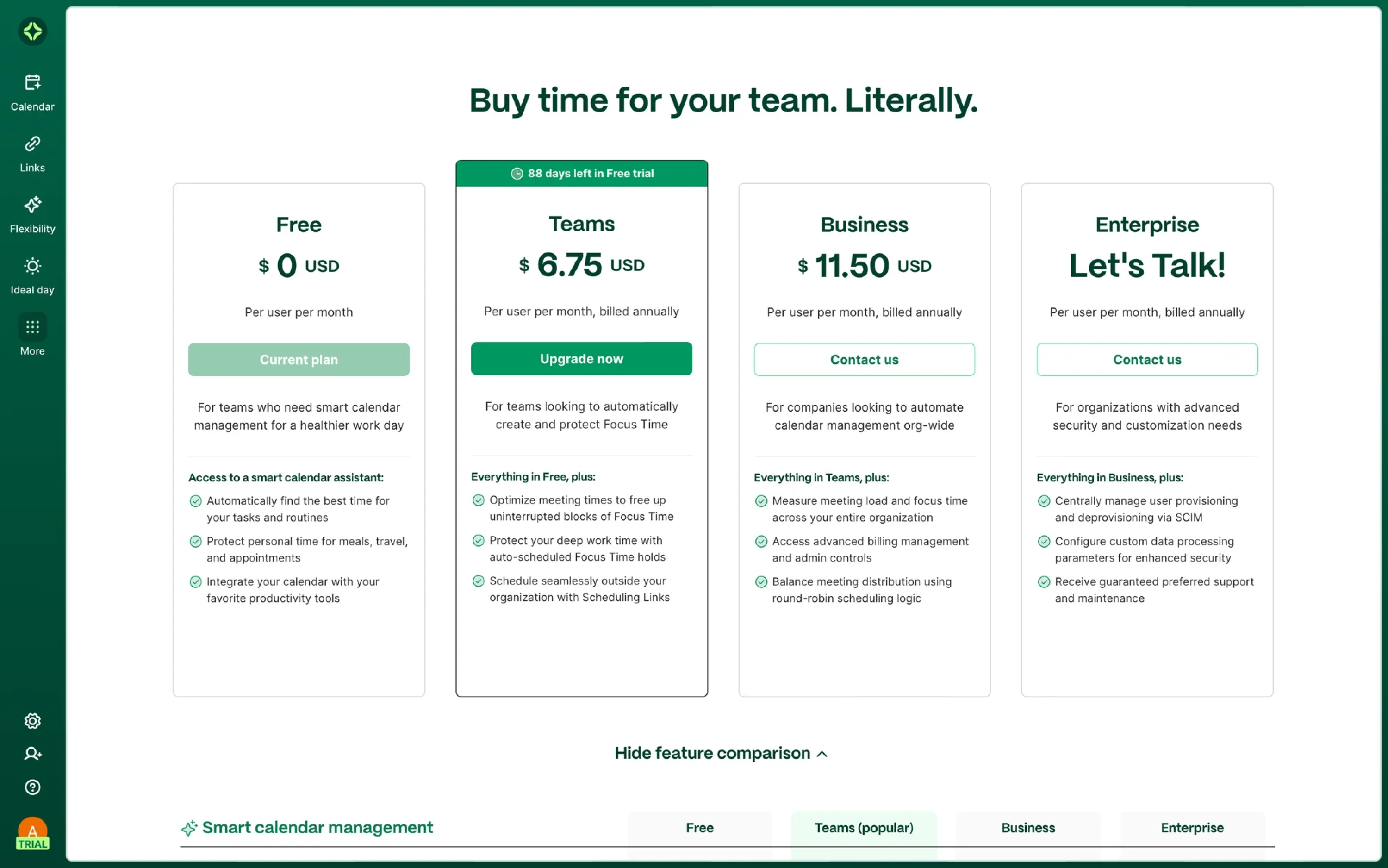
5. Clockwise — “Upgrade now” button
Clockwise handles the pricing page design across four plans. “Upgrade now” is the most visually dominant button on the page and the most profitable action for the business. Other buttons use a disabled-style fill to communicate status.
Secondary & ghost buttons
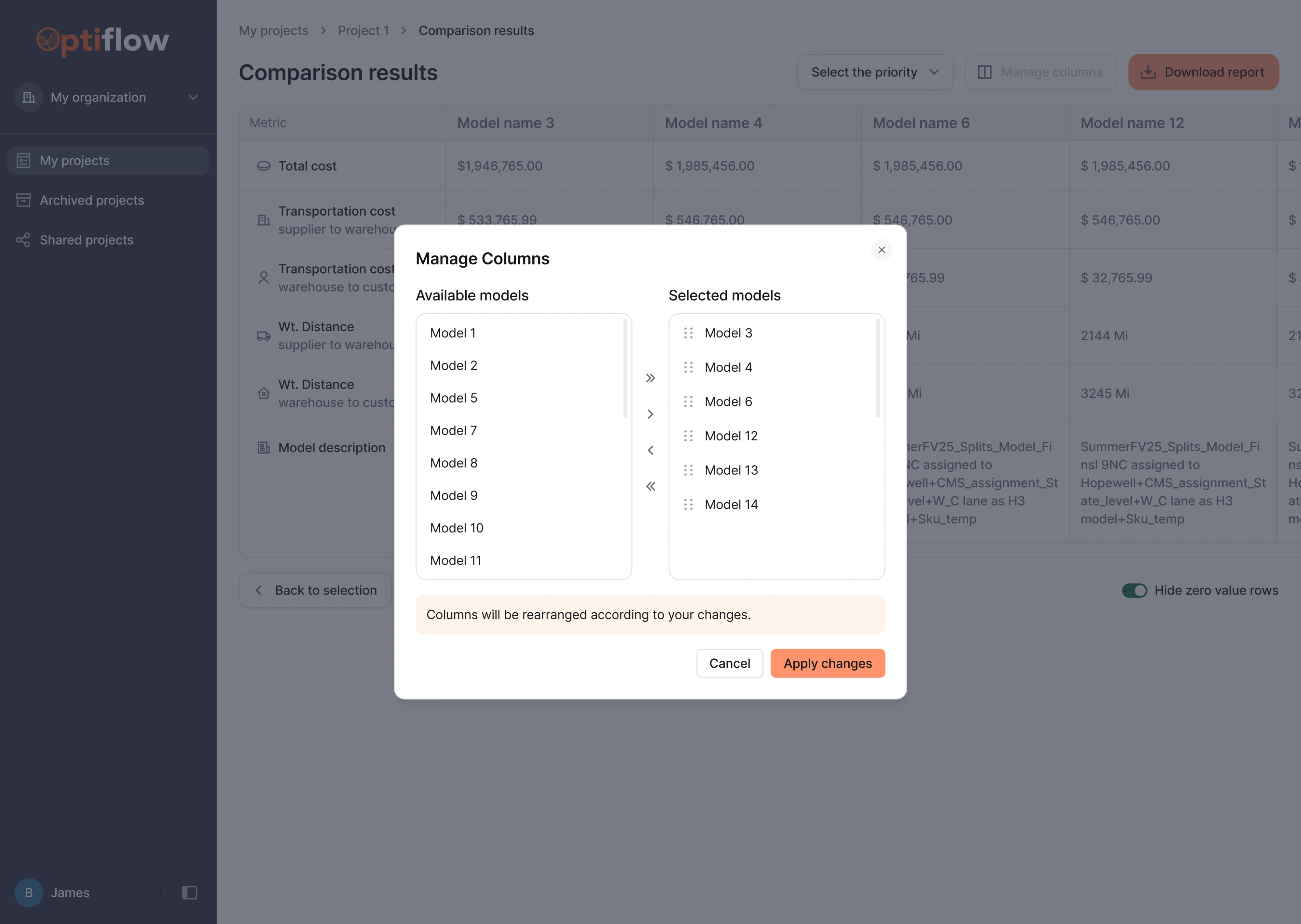
6. Optiflow — “Cancel” button
Redesigning OptiFlow, we established a clear hierarchy across the interface. In the confirmation modal, “Apply changes” uses the orange fill as the dominant action, while “Cancel” appears as a plain text button that sits quietly in the background.
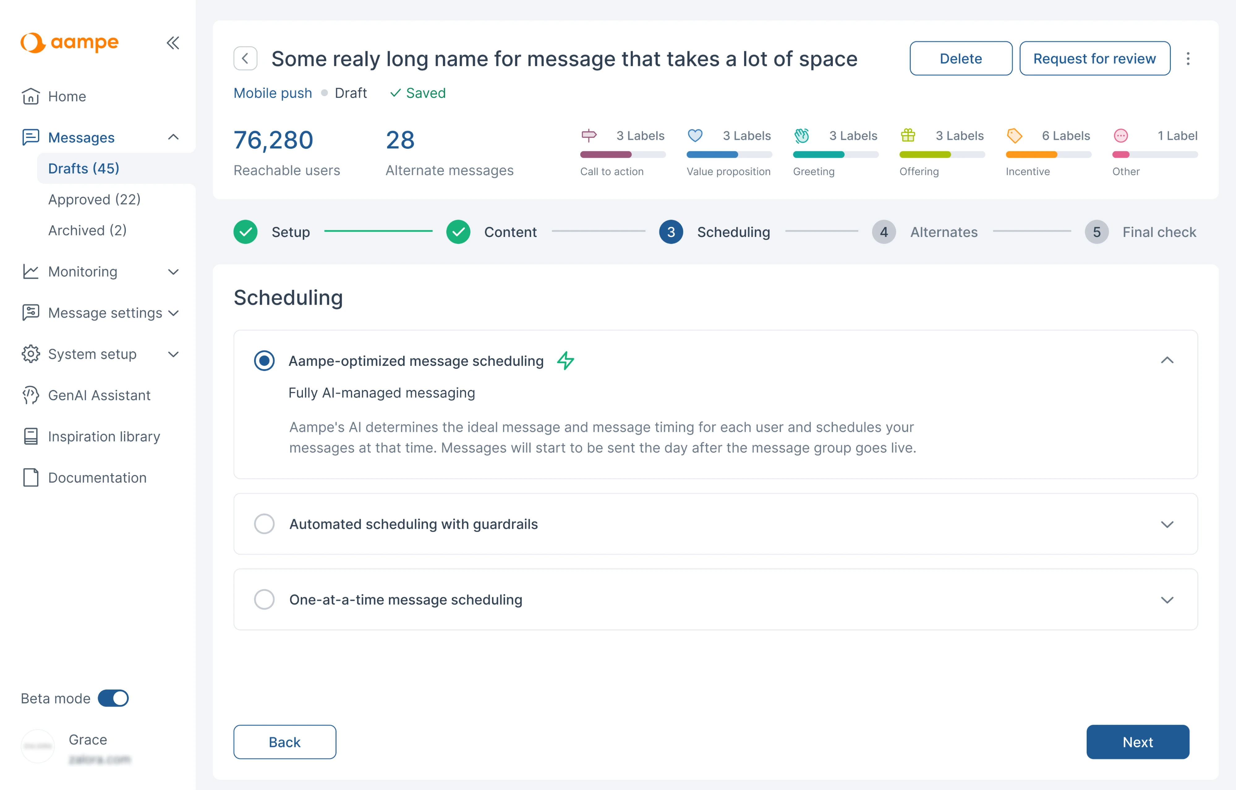
7. Aampe — “Back” button
For Aampe, we applied a button pairing where “Next” sits as a dark primary in the bottom-right, while “Back” uses an outlined style on the opposite side. Both elements are the same size to make users feel confident moving through the flow.
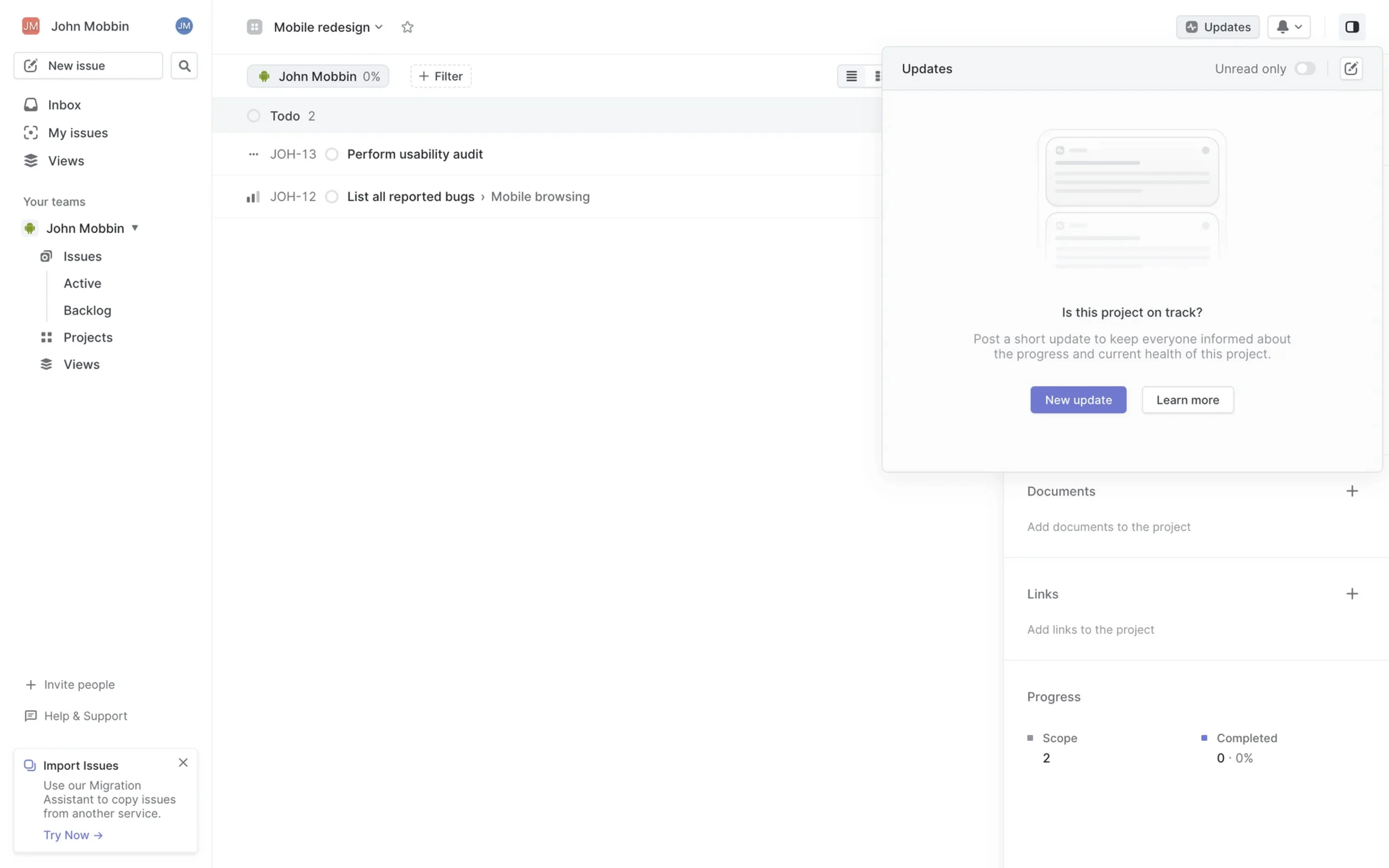
8. Linear — “Learn more” button
In Linear’s Updates panel, secondary buttons behave well in an empty state context. “New update” acts as the primary action, while “Learn more” sits next to it as a secondary option, respecting users who need more context.
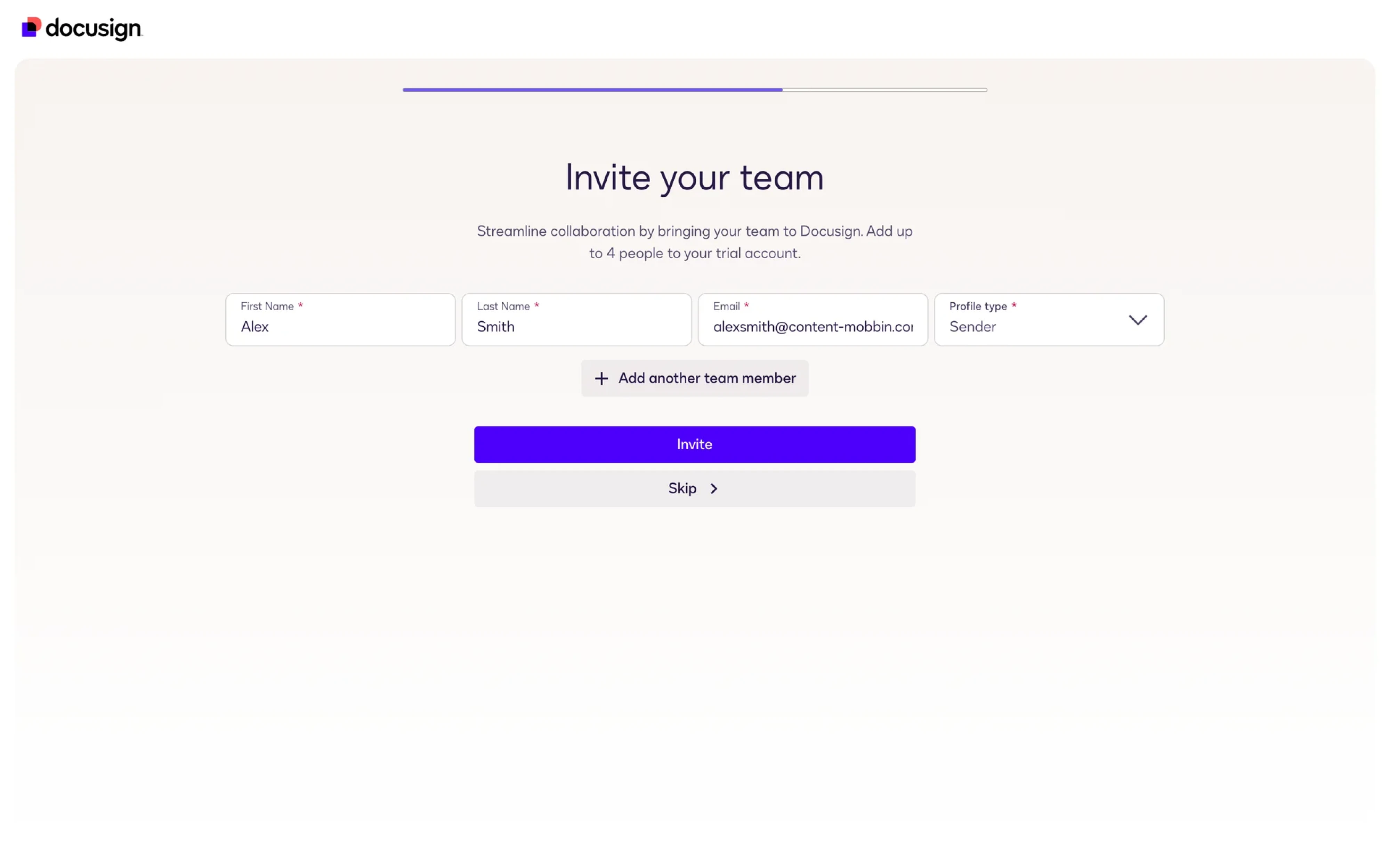
9. DocuSign — “Skip” button
Looking at DocuSign, you’ll see three levels of button hierarchy where “Invite” is a solid primary, supported by “Add another team member” and “Skip” buttons. Both are visible enough to find but carry no visual urgency.
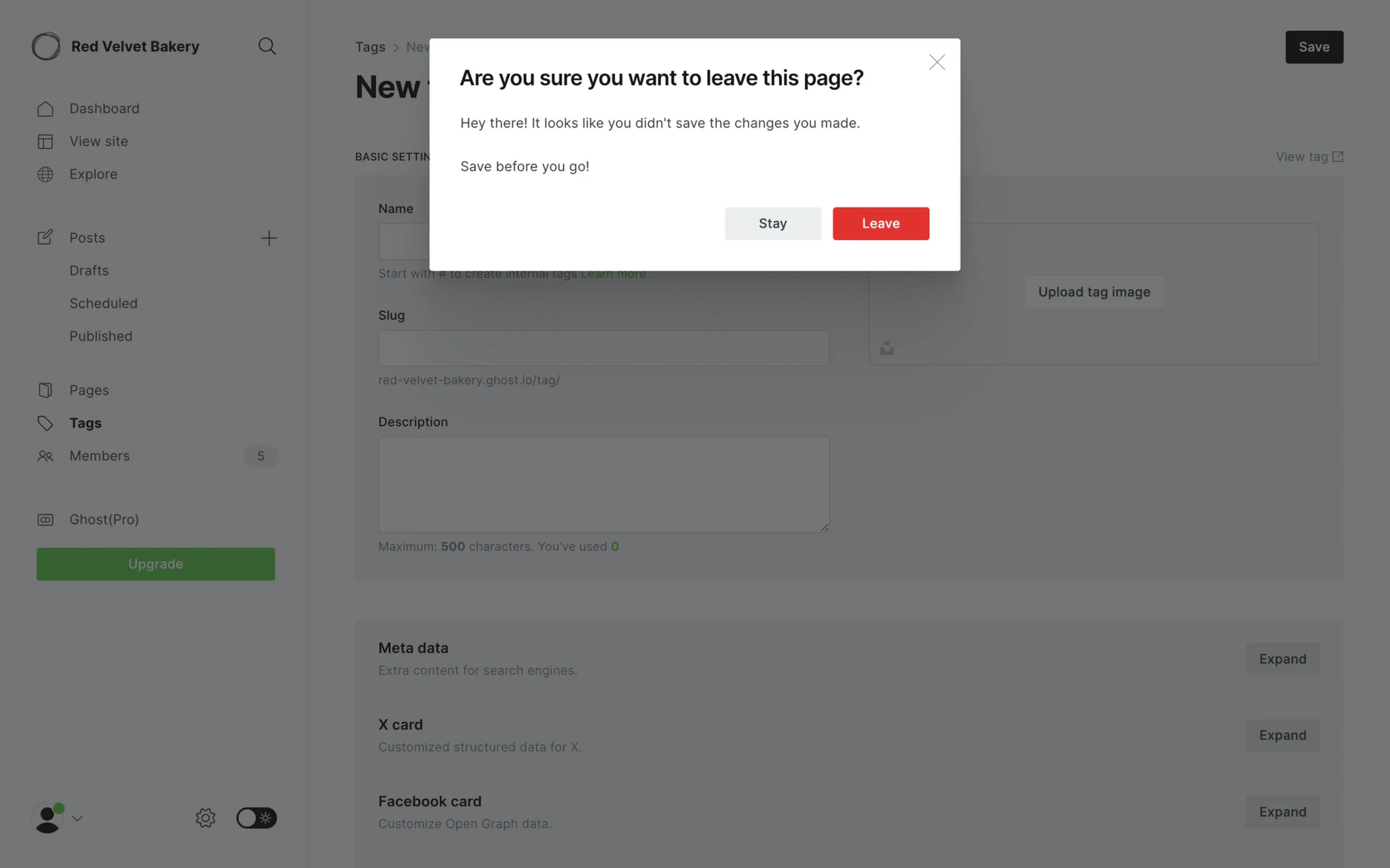
10. Ghost — “Stay” button
Ghost’s confirmation modal is a good example of how destructive action buttons should be handled. “Leave” uses a solid red fill, communicating danger and irreversibility. "Stay" uses a light grey outlined button, clearly secondary.
Icon buttons
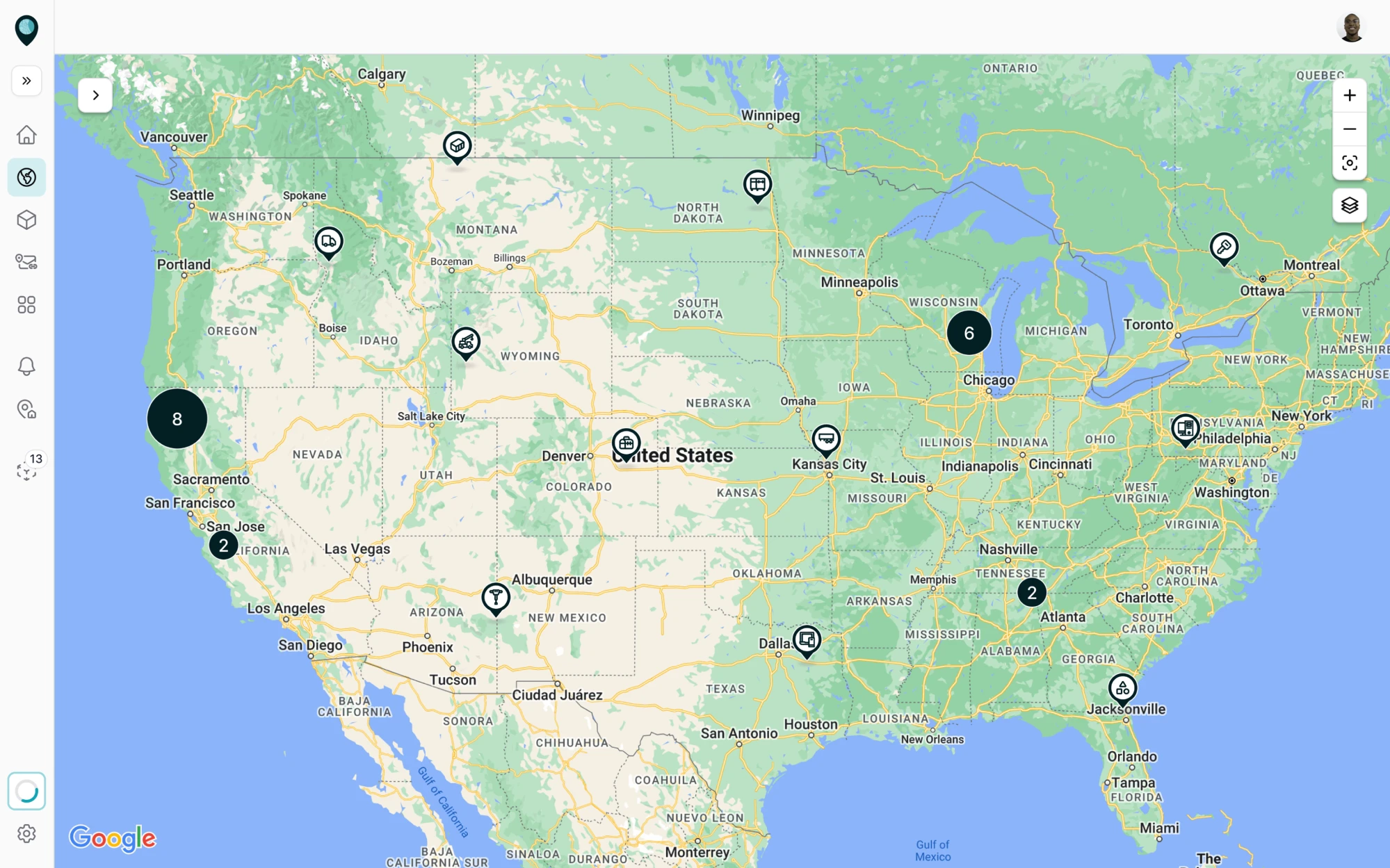
11. Smartpin — icon-only buttons
Smartpin is a geospatial platform where the map is the main focus. To keep the UX design clean, we went with an icon-only button interface. The left sidebar uses a set of navigation icons, while the map controls on the right follow the same logic.
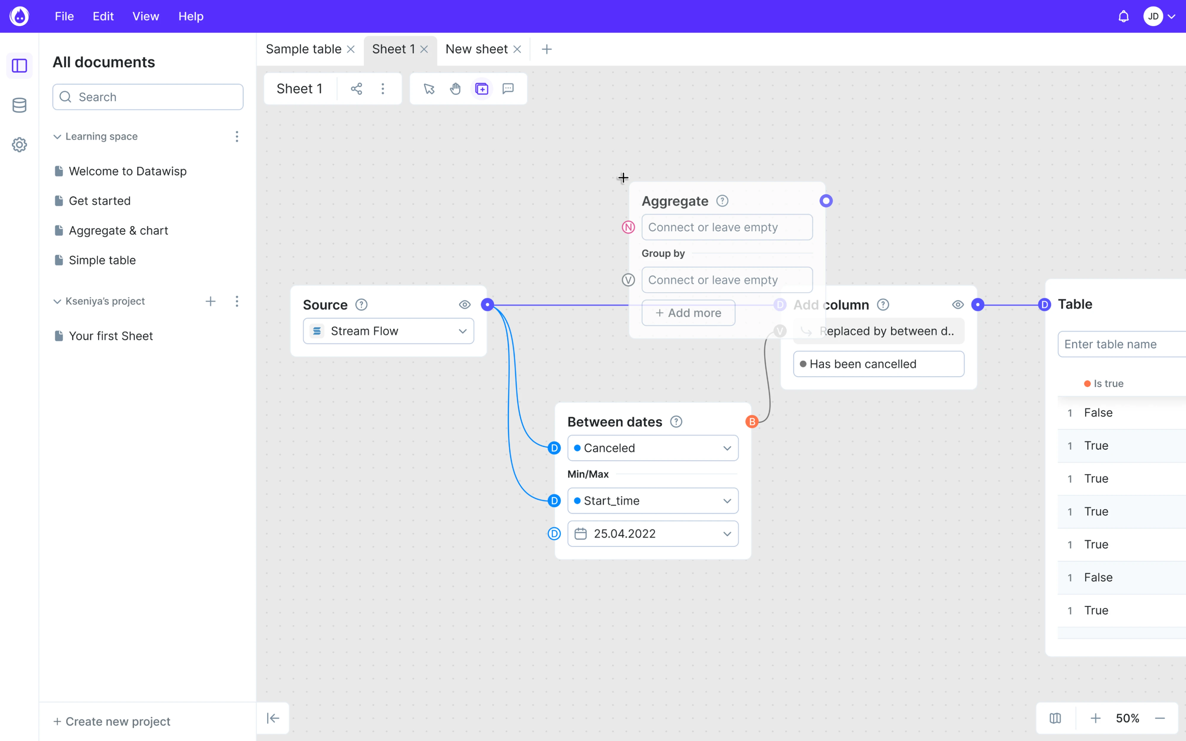
12. Datawisp — icon-only buttons
In Datawisp, canvas is the main workspace, and keeping it clean was our core design priority. Because the cursor, hand, frame, and comment tools are repeated actions that users learn quickly, we framed them as icon-only buttons with no labels.
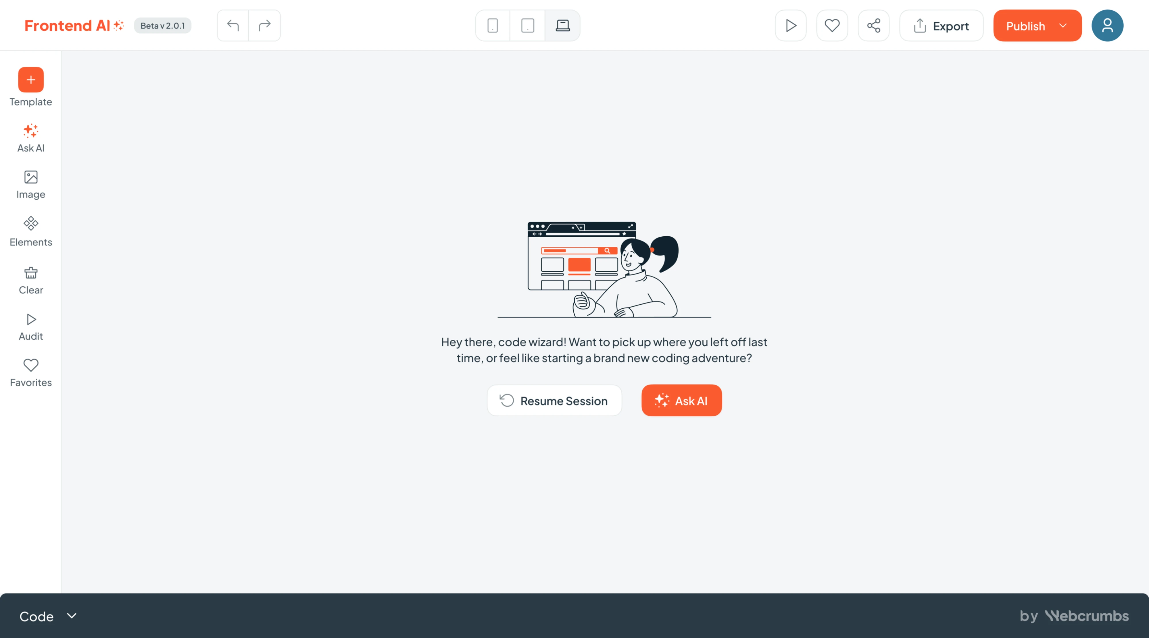
13. Frontend AI — icon with label buttons
When designing Frontend AI, we used two different icon button strategies. The left sidebar applies icon + label pairs for tools that need to stay approachable for new users, while the top toolbar goes all icon-only with universally recognized controls.
14. Sora — icon with label buttons
Sora’s video editor uses a bottom navigation with icon + label pairs for controls, keeping each option clear without requiring users to memorize icons. The buttons on each video card appear as icon-only controls directly on the relevant element.
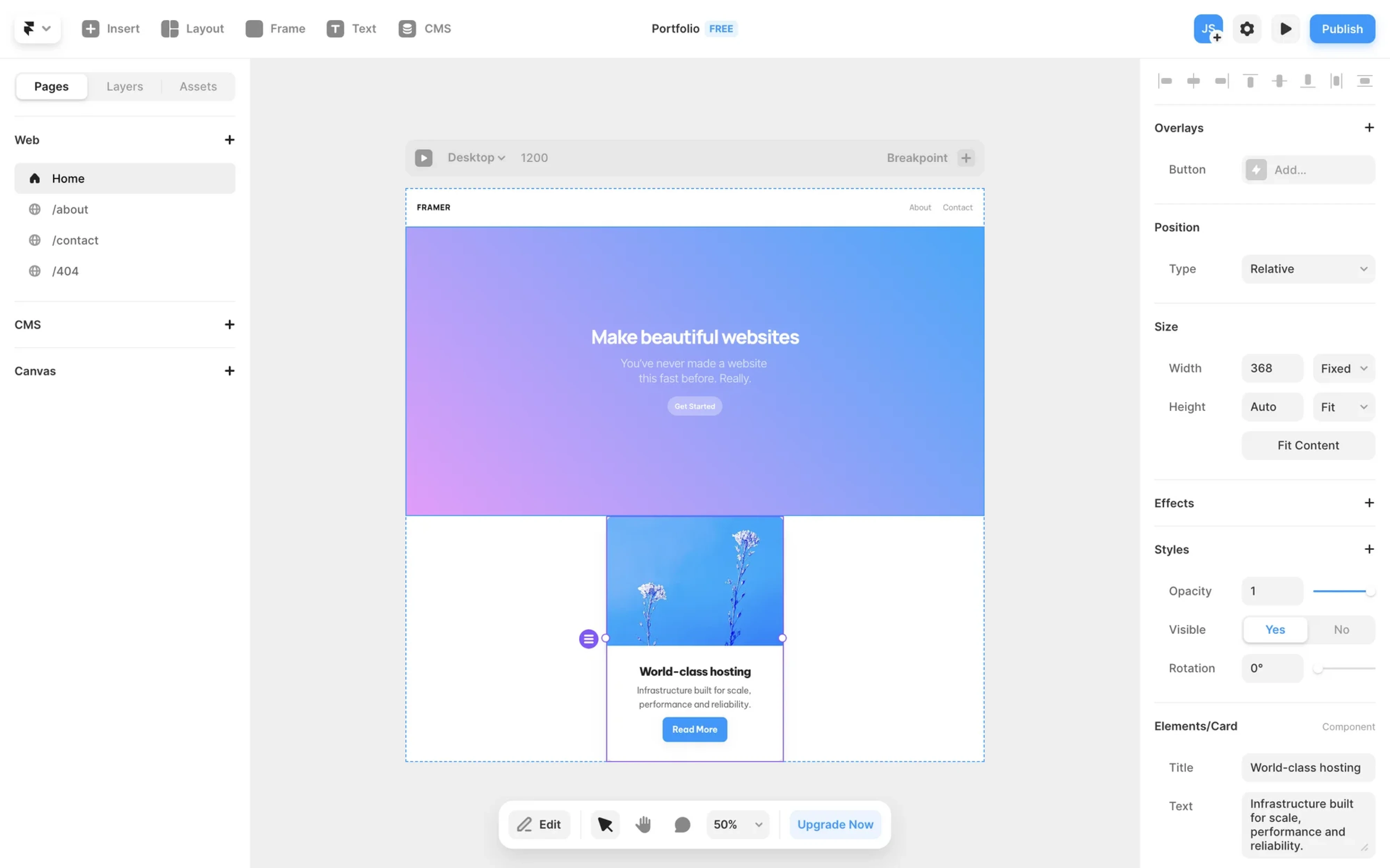
15. Framer — icon with label buttons
Framer is a busy interface with a lot competing for attention, so button decisions matter more here than in most products. Like other examples in this list, the product uses a hybrid approach, combining icon + label buttons with icon-only ones.
Mobile buttons
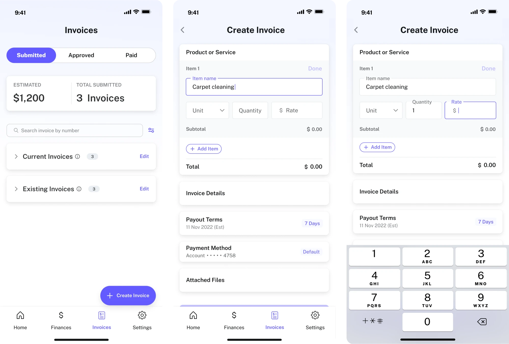
16. PayUp — primary and secondary buttons
Working on PayUp, we made UX button decisions around the idea of helping people manage invoices on the go. Primary actions like “Create Invoice” are highlighted in color, while secondary ones like “Add Item” stay greyed out.
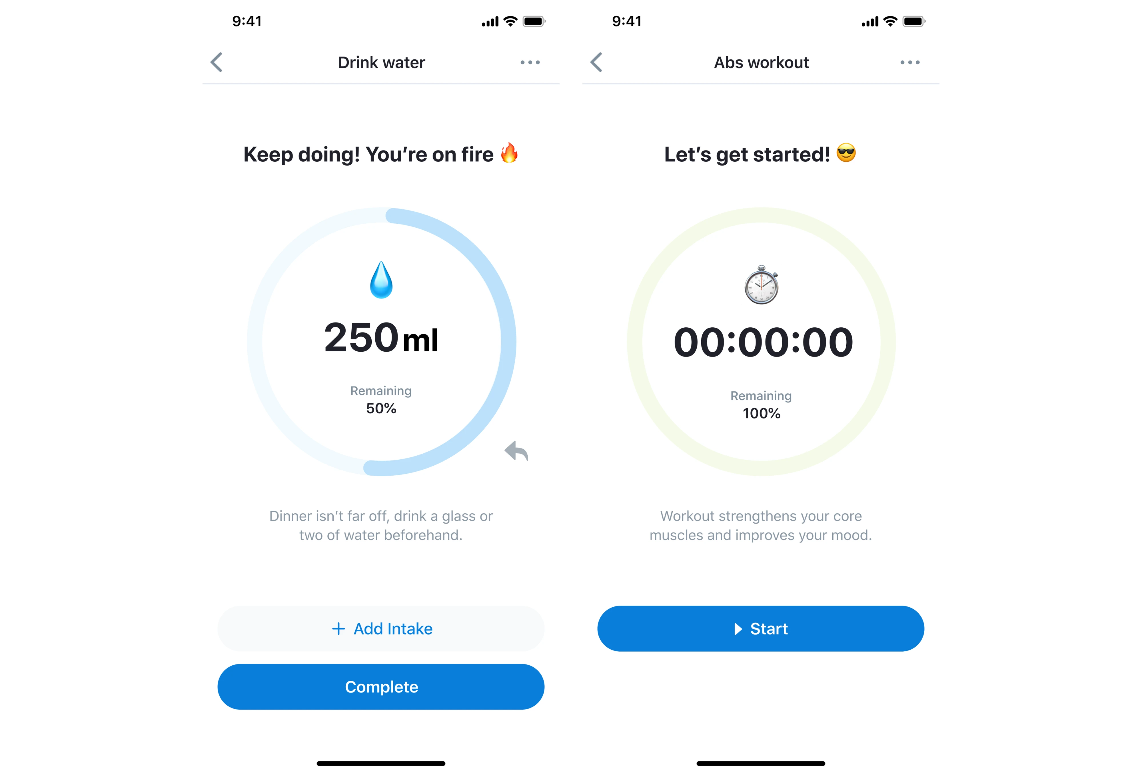
17. HabitSpace — primary and secondary buttons
In HabitSpace, we made every button decision to be fast and focused. Primary actions like “Complete” and “Start” sit as solid blue full-width buttons, always within thumb reach. Secondary options like “Add Intake” stay outlined and low-emphasis.
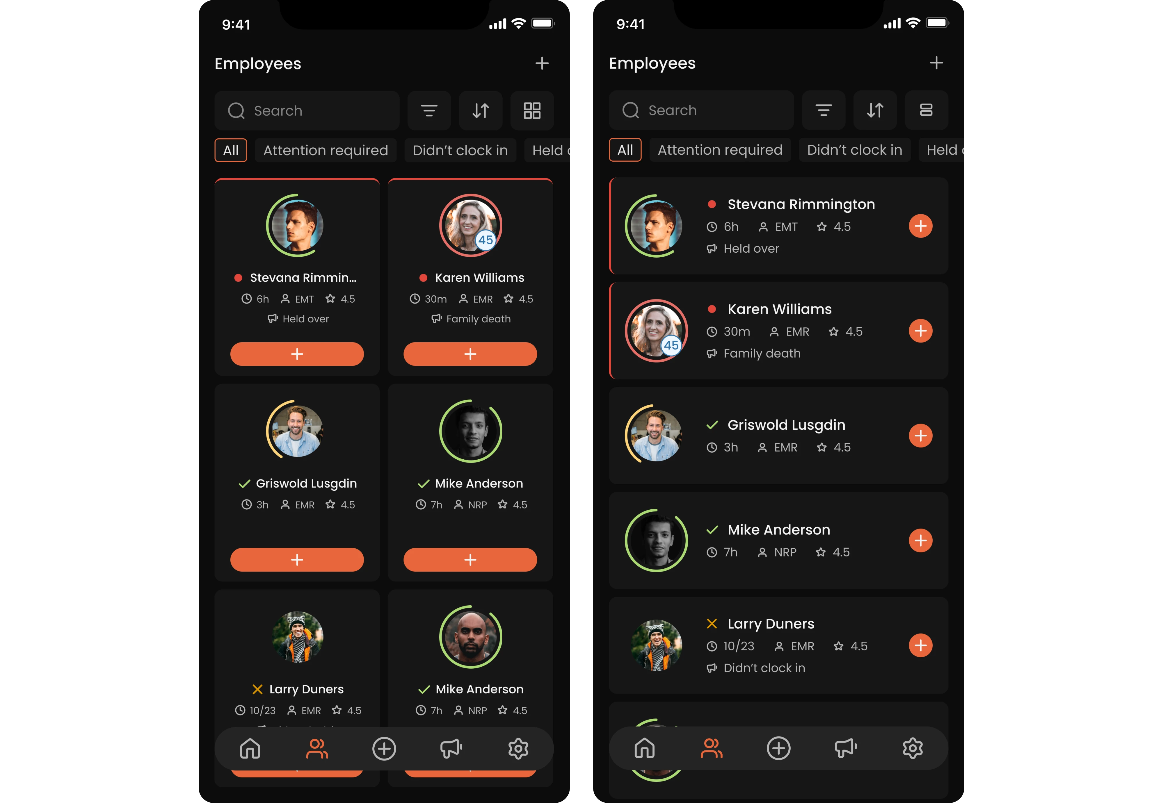
18. Newton360 — icon-only buttons
Looking at the Newton360 app, you’ll see the “+” button on each employee card, which reflects the main action: a supervisor can start a new encounter. The button stays consistent throughout the interface and appears as a small orange circle.
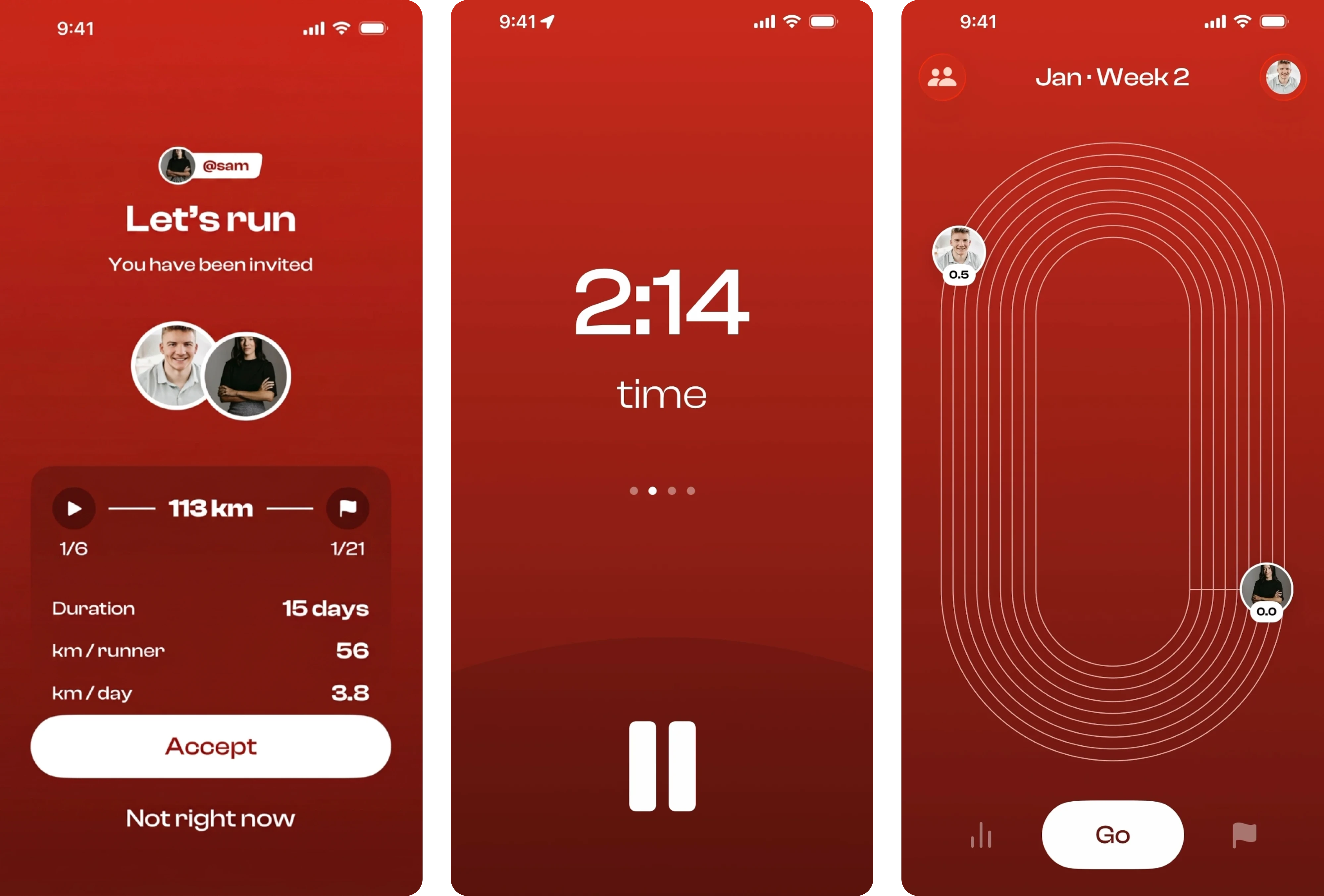
19. Runbuds — oversized buttons
Runbuds keeps its button decisions minimal and instinctive throughout. On the invitation screen, there are primary and secondary buttons that show the direction forward. The active run screen strips everything back to a pause icon at the bottom.
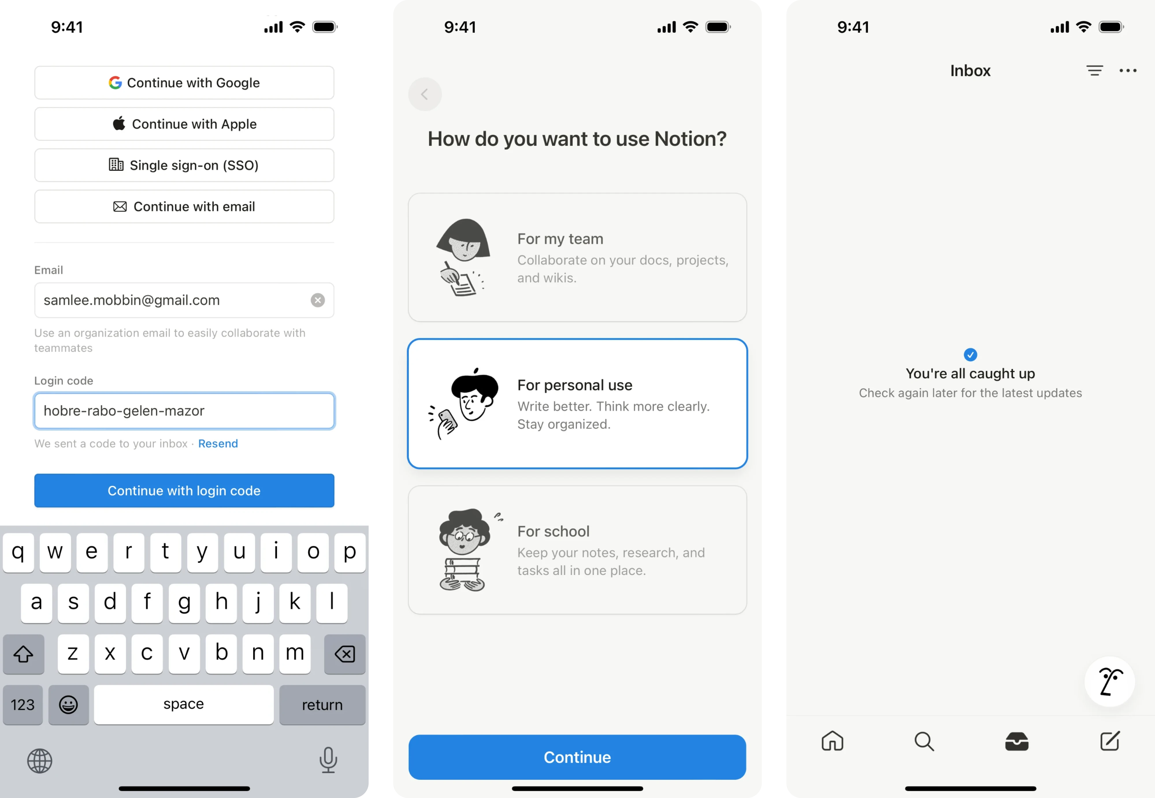
20. Notion — thumb-natural buttons
Across mobile, Notion keeps UI buttons clean. Primary actions are pinned to the bottom where the thumb naturally lands. For navigation, the app relies entirely on icon-only buttons, keeping the bottom bar minimal and the focus on content.
Creative & modern buttons
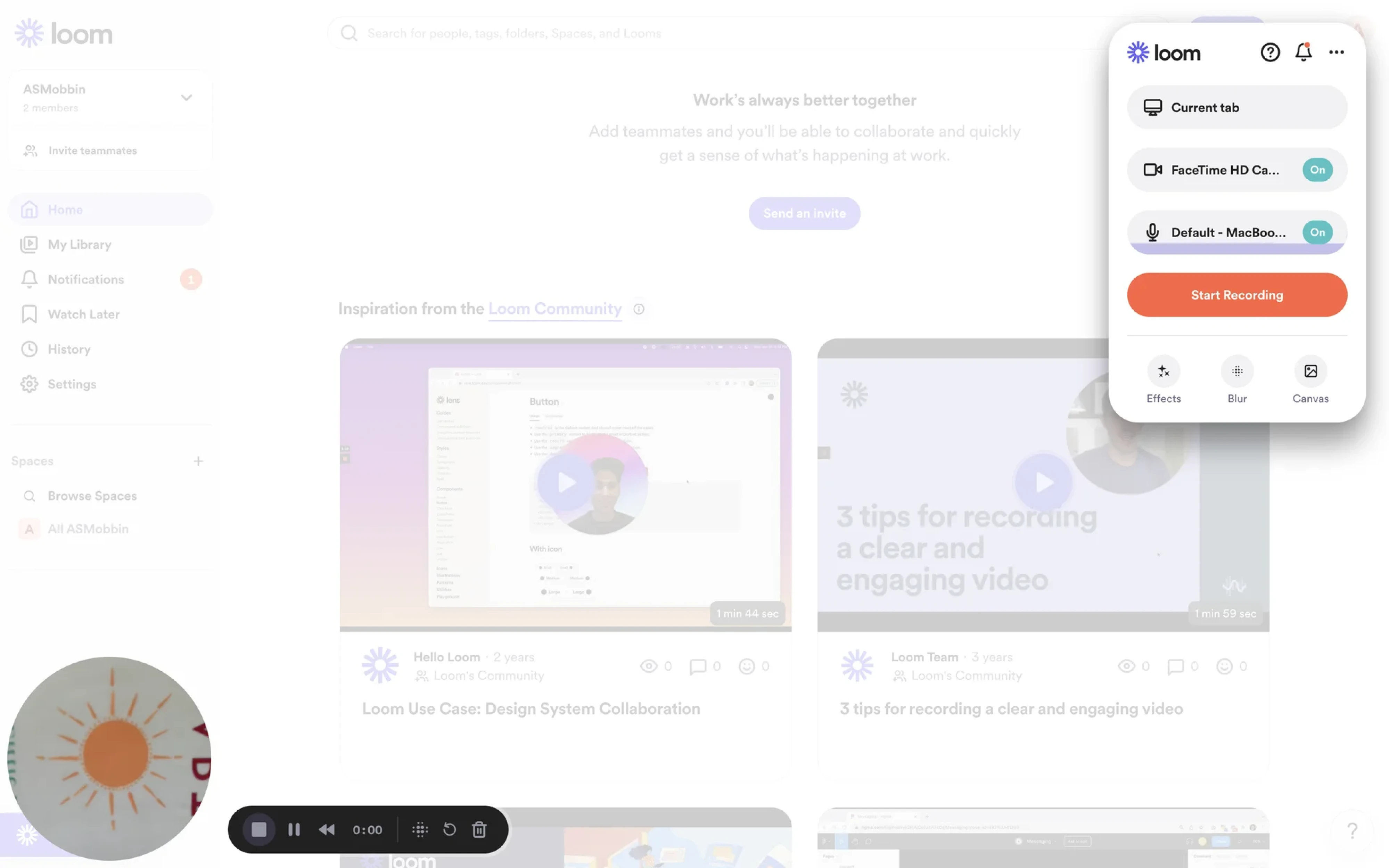
21. Loom — record button
Loom’s record is one of the best button design ideas that changes its own affordance during use. It transitions through three visible states: idle, countdown, and active recording, communicating something different to the user.
22. Notion — slash command button
Notion allows users to type “/” anywhere on the page, triggering a popover inline. What makes it creative is that a keyboard character doubles as a button, a UX pattern now copied across dozens of products.
23. Superhuman — gradient buttons
Superhuman’s modal itself has a gradient border that immediately signals something premium before users read a single word. Inside, two buttons use a matching purple gradient fill, tying them to the overall visual system.
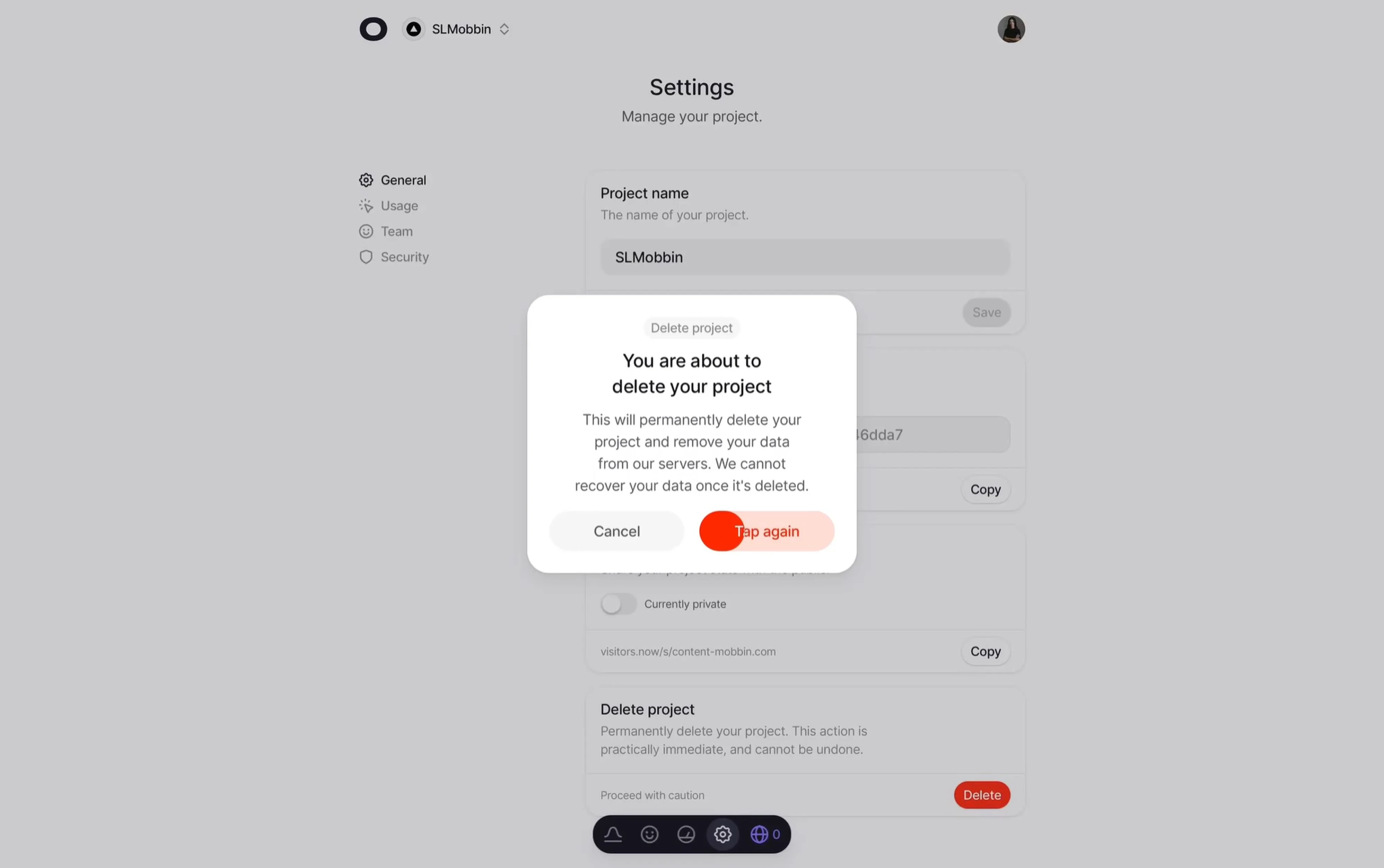
24. Visitors — delete button
Most products handle destructive actions with a separate confirmation modal, but Visitors takes a different approach. The delete button requires three taps to execute, with the first tap changing a state and animating the button in red.
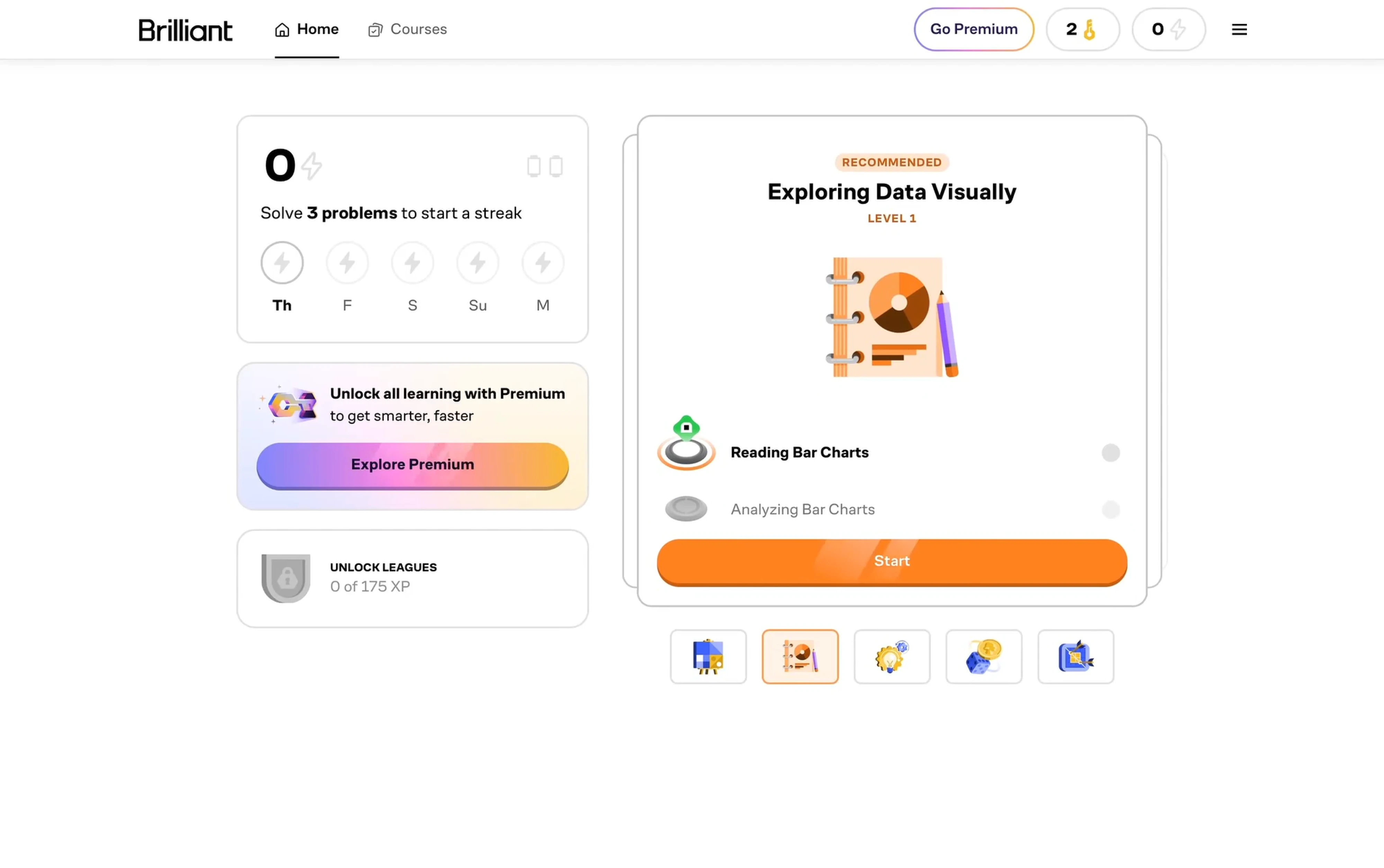
25. Brilliant — shimmering button
Brilliant buttons use an animated gradient that creates a shimmering effect that makes the button feel alive. It’s placed inside a soft pastel card that frames it without competing, so the animation draws the eye naturally.
Types of buttons in UI design
We’ve already outlined that there are primary and secondary buttons, which can also be represented as text, icons, or on mobile. To give you a better understanding of when to use each UI button style, let’s break them down in detail.
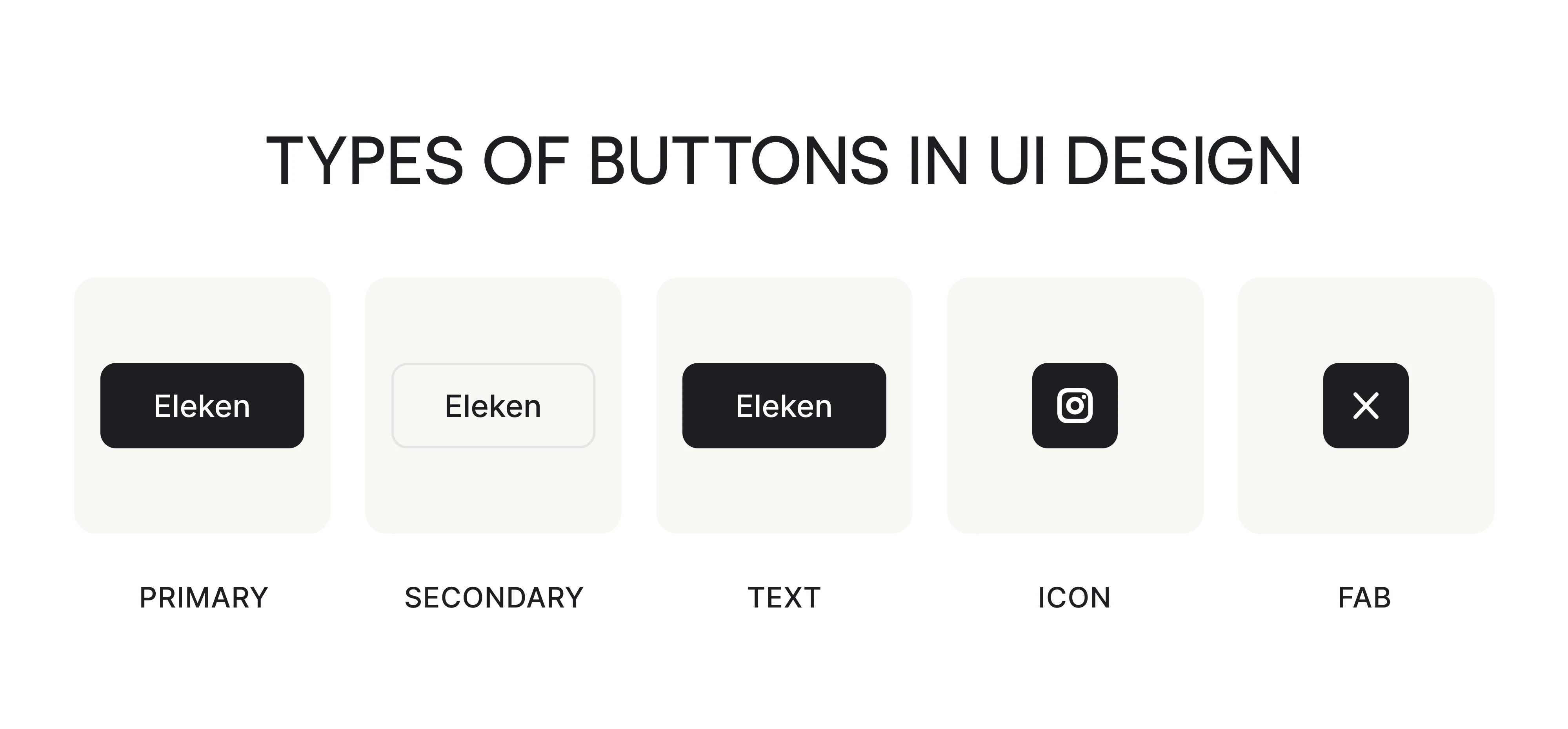
Primary buttons
A primary button is the most important action on a screen that you want users to take. What sets it apart visually is emphasis. This component uses a solid-filled background with enough contrast to stand out from everything else.
The rule most design systems agree on is simple: one primary button per screen, or per decision zone. When every button looks equally important, none of them are.
Primary buttons work best for:
- Form submissions and onboarding next steps.
- Upgrade, purchase, or checkout flows,
- Any moment where the user needs a clear path forward.
Secondary and ghost buttons
Secondary and ghost buttons are the actions you want to make available for the user without promoting. They support the primary without competing with it, and that distinction is what makes them worth understanding separately.
A secondary button is typically a lower-contrast filled button sitting next to a primary. A ghost button has no fill and often no border. It’s the quietest button in the hierarchy, used for actions that should exist but not be tempting.
Secondary and ghost buttons work best for:
- Alternative actions that are genuinely important.
- Confirmation dialogs where both options need to be visible.
- Any pairing where users may legitimately choose either action.
Text buttons
Text buttons are the lowest emphasis button type that rely entirely on their label and placement to communicate interactivity. They sit at the bottom of the visual hierarchy, used for actions that should be available but not noticed at first glance.
What makes these components tricky is that they look a lot like plain text or links. The difference is that text buttons trigger an action within the current screen.
Text buttons work best for:
- Low-priority supplementary actions like “Learn more” or “See all.”
- Tertiary actions sit below a primary and secondary button.
- Dense interfaces where adding more buttons would create visual clutter.
Icon buttons
Icon buttons are built for interfaces where space is limited, and the action is clear. When the symbol is universally recognizable, the button needs nothing else.
The tradeoff is discoverability. Icon-only button UX design works well for experienced users who’ve learned the interface, but can confuse new ones who haven’t. This is why many products use icon + label for navigation and core tools.
Icon buttons work best for:
- Toolbars with repeated familiar controls like undo, redo, or zoom.
- Contextual actions that appear directly on an element.
- Navigation items in compact interfaces where space is at a premium.
Floating Action Button (FAB)
A Floating Action Button is a circular button that floats above the user interface, anchored typically to the bottom-right corner of the screen. It represents the single most important action that defines what the screen is for.
The button stays visible as users scroll through content, hovers above everything else on the screen, and is sized and positioned for easy thumb reach on mobile.
FABs work best for:
- Single, frequently used actions that define the screen’s purpose.
- Mobile interfaces where thumb accessibility matters.
- Content-heavy screens where a persistent action button is needed.
Button design best practices
Good button design rarely gets noticed. As a designer, your goal is to make users click and move on. The seven UX button best practices below cover what it takes to get there, from making buttons recognizable to writing copy that removes hesitation.
Make buttons instantly recognizable
Before users read the copy or consider the action, they need to recognize the element as interactive. Signals like shape, color, contrast, and consistency help with this. A contained, filled element with clear boundaries reads as a button, and consistent styling means users learn the pattern once and apply it everywhere.
As stated in Material Design’s guidelines, visual feedback — including labels, colors, and icons — shows users what’s available in the UI. When those cues are consistent, users stop thinking about how to interact and just act.
The biggest risk is visual ambiguity.
Ghost buttons that blend into their background, text links styled like buttons, or buttons that look identical to inactive states all create hesitation. Explicit affordances work best for any action where clarity is critical. Hidden affordances, which only reveal themselves on hover, should be reserved for secondary actions.
Buttons should always look like buttons before users hover, tap, or focus them.
Place buttons where users expect to act
In our work, we’ve repeatedly seen that when buttons appear in unexpected places, even well-designed ones get missed. Good button placement means meeting users where their attention already is.
A few patterns hold consistently across interfaces. In multi-step flows and wizards, the primary action belongs at the bottom-right. In full-page layouts, the primary button typically sits on the left, following the natural reading direction. In modals and dialogs, buttons are right-aligned, close to where the user’s eye finishes scanning.
As a general rule, left alignment works for buttons that follow content blocks, center alignment for empty states, and right alignment for dialogs and cards.
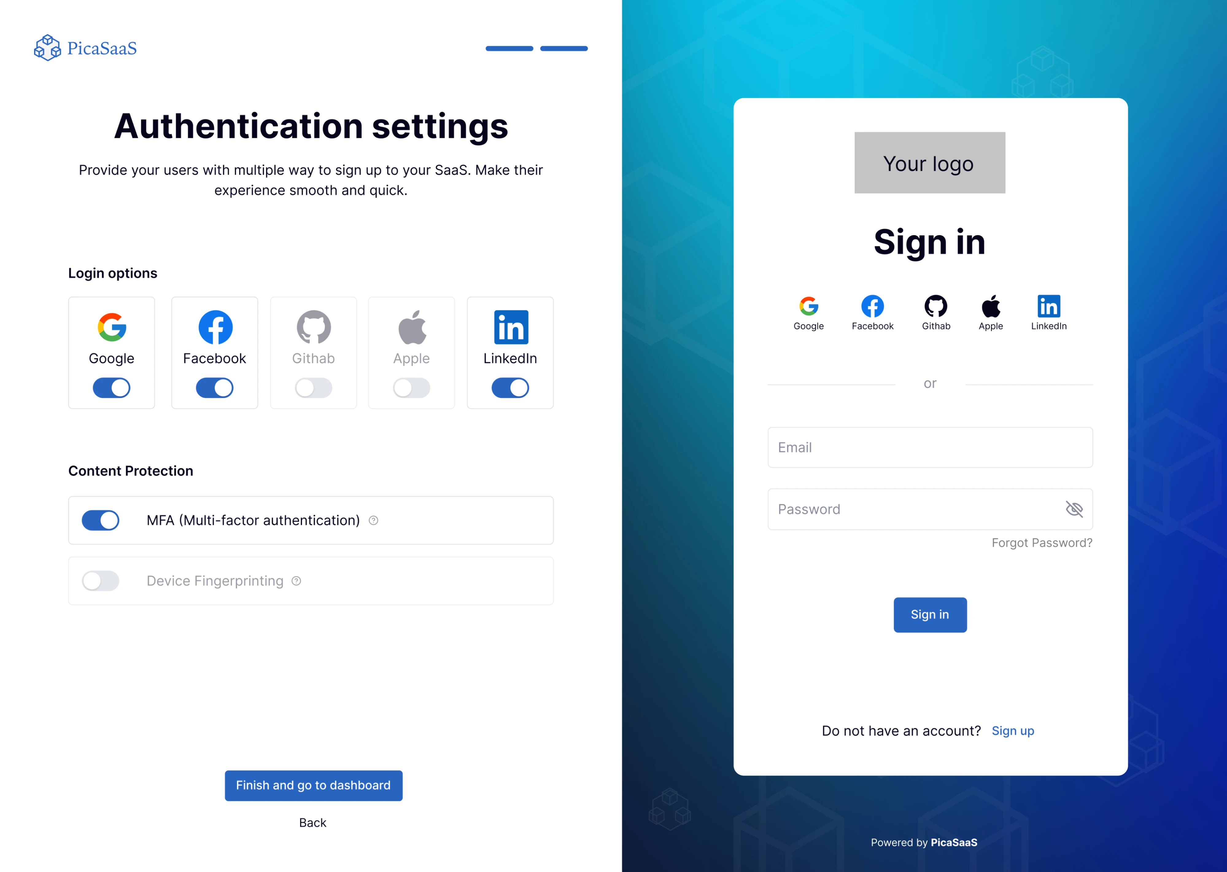
However, context shifts these rules. When working with PicaSaaS, we positioned a blue button at the bottom of the setup flow to give users a clear, unmissable signal that the configuration was complete and they could move forward.
The principle stays the same regardless of context: put the button where the user’s attention lands naturally, not where it’s convenient for the layout.
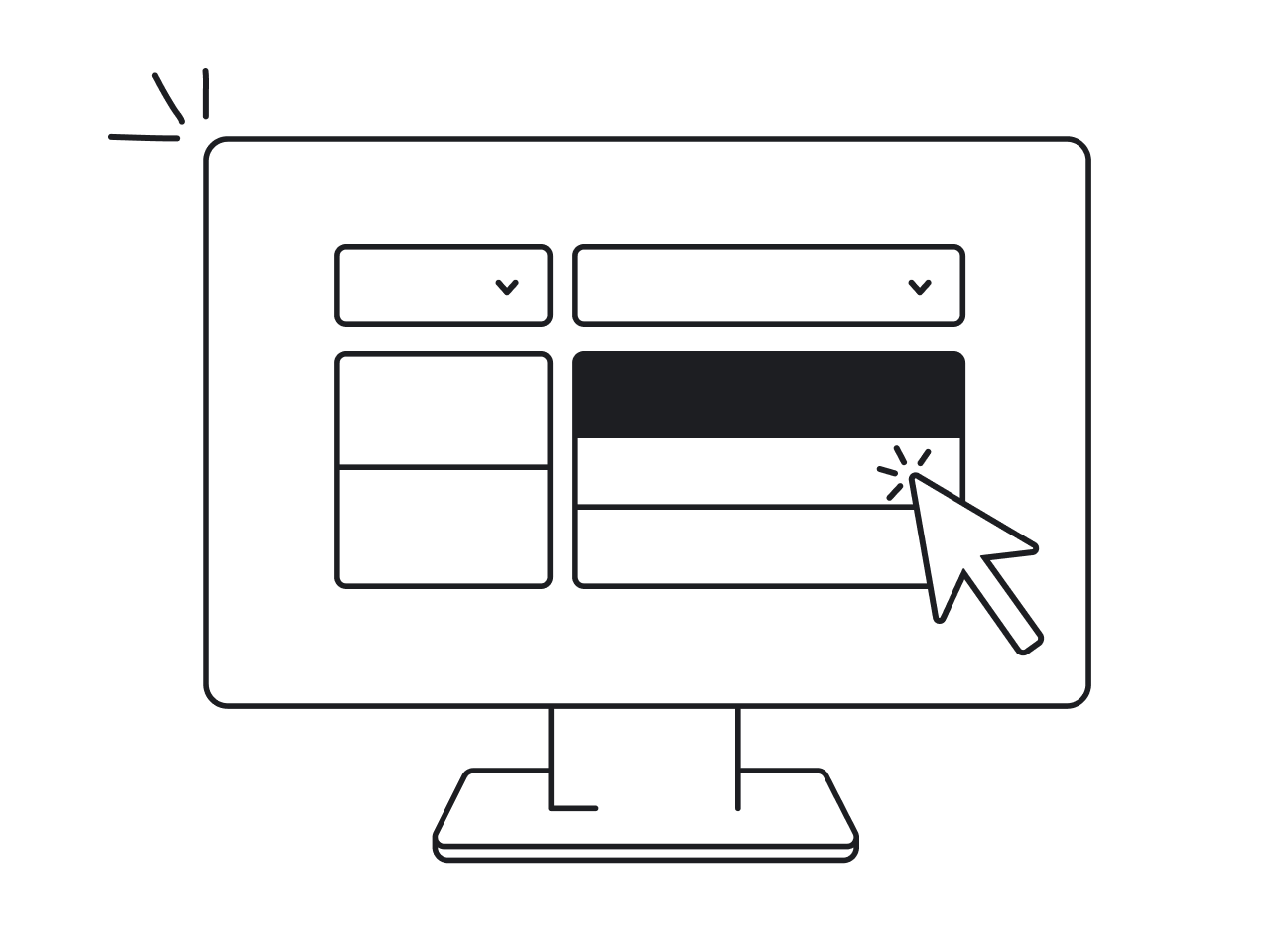
Use visual hierarchy to guide user decisions
When every button on a screen looks equally important, none of them are. Users slow down and click the wrong thing because the interface isn’t telling them what to do next. In these situations, designers apply visual hierarchy to solve this.
All you need to apply it well is size, color, contrast, and weight. For example, a filled primary button draws the eye before an outlined secondary. From a psychology standpoint, users instinctively treat larger buttons as the most important actions, medium-sized ones as less critical, and small ones as the least important.
A well-structured button hierarchy typically follows three levels:
- Primary — the single most important action, highest visual weight.
- Secondary — an alternative or supporting action, clearly subordinate.
- Tertiary or text — low-priority options that should be available but not tempting.
Separate buttons from links
When designing the interface, use buttons for doing and links for going.
A button submits a form, opens a modal, triggers a process, or confirms an action — anything that changes the state of the current screen. A link takes users to a different page, a different section, or an external resource. When you click a link, the URL changes. When you click a button, something happens.
The problem arises when one is styled to look like the other. A link dressed up as a button misleads users about what will happen when they click. A button styled as plain text gets confused with a link. That moment of doubt is invisible friction, and it compounds across an entire interface.
Beyond visual confusion, the distinction also matters for accessibility. Screen readers announce buttons and links differently, and users who rely on keyboard navigation expect them to behave differently, too.
The practical guidelines are straightforward:
- Use a button for any action that triggers a change on the current screen.
- Use a link for navigation to another page or section.
- Never style a link to look like a primary button, or a button to look like underlined text.
Write clear button copy
Button copy is the one part users will actually read before clicking, and most teams spend the least time on it. The label tells users what will happen, sets expectations, and builds enough trust to act. Get it wrong, and a button creates hesitation.
Our main advice is to be specific and use action verbs. “Download Report” is better than “Next.” “Delete account” is better than “Confirm.” The more closely the label matches what actually happens, the less friction users feel before clicking.
We applied this directly when working on the Hubble Network.
The product interface needed clear error navigation, and to make that happen, we added “Previous error” and “Next error” buttons. Users immediately understood where they were in the flow and what each button would do.
If you’re writing button copy, follow these guidelines:
- Use 1 to 3 words maximum
- Start with an action verb
- Match the label to the outcome
- Avoid clever or brand-voice labels
- For destructive actions, make the consequence explicit
Use color and contrast to communicate
In UI button design, color communicates the element’s purpose and importance. The primary button stands out because it’s the most visually dominant. A destructive button turns red to signal risk. A disabled button fades to signal unavailability.
According to WCAG 1.4.1, color must not be the only visual means of conveying information or indicating an action. Users with color blindness or low vision rely on shape, size, contrast, and labels to understand what’s interactive and what’s not.
On contrast, specifically, WCAG 2.1 guidelines set clear minimums: button text needs a 4.5:1 contrast ratio against its background, and the button’s boundary itself needs at least 3:1 against adjacent colors.
A few things to keep in mind:
- Test contrast ratios for every button state.
- Never use color as the only indicator of a button’s state or importance.
- Disabled buttons are exempt from contrast requirements under WCAG, but making them completely illegible is still a usability problem.
- If a brand color fails contrast requirements for interactive elements, use an accessible alternative.
Mind button size and spacing
Size and spacing determine whether users can hit the button. On desktop, this is mostly a visual concern, but on mobile, it becomes a direct usability issue. A button that’s too small or placed too close to another element leads to mistaps.
Apple’s Human Interface Guidelines recommend a minimum touch target of 44x44 points, and Google’s Material Design sets the bar at 48x48dp.
Spacing matters just as much as size. Buttons placed too close together cause the user to tap the wrong element, even when individual targets are large enough. The optimal range between buttons is 12 to 48 pixels — smaller buttons need more spacing to compensate for less precision, while larger buttons can tolerate tighter spacing.
During the redesign of JobCall’s mobile interface, we ran into this directly. The original app packed a lot of content into a small screen, and users were mistapping buttons regularly. We increased button sizes, highlighted important CTAs, and gave each interactive element enough breathing room.
These small changes made the interface noticeably easier to use for the product’s audience, which included a significant number of senior users
Design systems and UI kits for better button design
Throughout this guide, we’ve referenced several official design systems when discussing hierarchy, contrast, placement, and accessibility. If you want to go deeper on any of those principles, these are the primary sources worth bookmarking:
- Material Design 3 — Google’s design system, the most comprehensive public documentation on button types, states, color roles, and accessibility.
- Apple Human Interface Guidelines — Apple’s official guidelines covering touch target sizes, button behavior, and native iOS patterns.
- Carbon Design System — IBM’s enterprise-grade system with detailed button hierarchy rules, placement guidance, and accessibility documentation.
- WCAG 2.2 Guidelines — The accessibility standard, covering contrast ratios, touch target sizes, and color usage requirements.
For ready-made UI design buttons to use in your own designs, the Figma Community is the most practical starting point. It hosts over 4,700 free UI kits covering everything from native iOS and Android components to SaaS dashboards and enterprise interfaces. A few worth checking out specifically for buttons:
- 170+ Perfect Buttons Free UI Kit — 170+ button variants covering all types, states, and styles, free to use
- Button UI Kit — A focused button-only kit with interactive properties and semantic color support
- Material 3 Design Kit — Google’s official Figma kit, including all button variants from the Material Design 3 system
Wrapping up
Buttons are small. The decisions behind them are not. Every choice covered in this guide adds up to something users feel without being able to name. When it works, they move through your product with confidence. When it doesn’t, they pause, hesitate, or leave.
Once you’re building a SaaS product and want to make sure every detail is working in your favor, that’s exactly the kind of work we do at Eleken. We’ve designed full product interfaces for dozens of SaaS teams, and the examples throughout this guide are just a small part of that.


.png)

.png)