
Every product generates events over time—tasks move forward, orders are delivered, bugs are fixed, and customers interact with your business. Timeline UI design organizes these events into a clear chronological view, helping users understand progress, history, milestones, workflows, and dependencies.
Timeline interfaces are everywhere, from project management tools and onboarding flows to CRM activity feeds, audit logs, delivery tracking, healthcare records, mobile app activity feeds, product roadmaps, incident management platforms, and social feeds. By presenting information in sequence, they reduce cognitive load, improve scanability, and set users up for long-term success even when timelines become more complex.
But great timeline UI isn't about displaying every event. It's about helping users stay oriented inside complex, time-based information. At Eleken, we've seen how quickly SaaS timelines become cluttered as products evolve. In this guide, we'll explore timeline UI patterns, inspiring timeline examples, and UX best practices for designing timelines that stay clear as they grow.
Timeline design inspiration: patterns worth studying
Timeline UIs come in many forms because they're designed to solve different problems. A product roadmap, an activity feed, and a project schedule all organize information over time, but they prioritize different user needs. Studying successful products can give you practical ideas for timeline design patterns and decide which one works best for your use case—and why.
Product roadmap timelines
Product roadmaps help teams communicate what's planned, what's in progress, and what's already shipped. Unlike project plans, they're meant to provide a high-level view rather than track every task, so clarity matters more than detail.
Some of the best roadmap timeline come from Notion, Linear, and the GitHub Roadmap. Although each product has its own visual style, they share a few design principles:
- Clear status indicators make it easy to distinguish planned, active, and completed work.
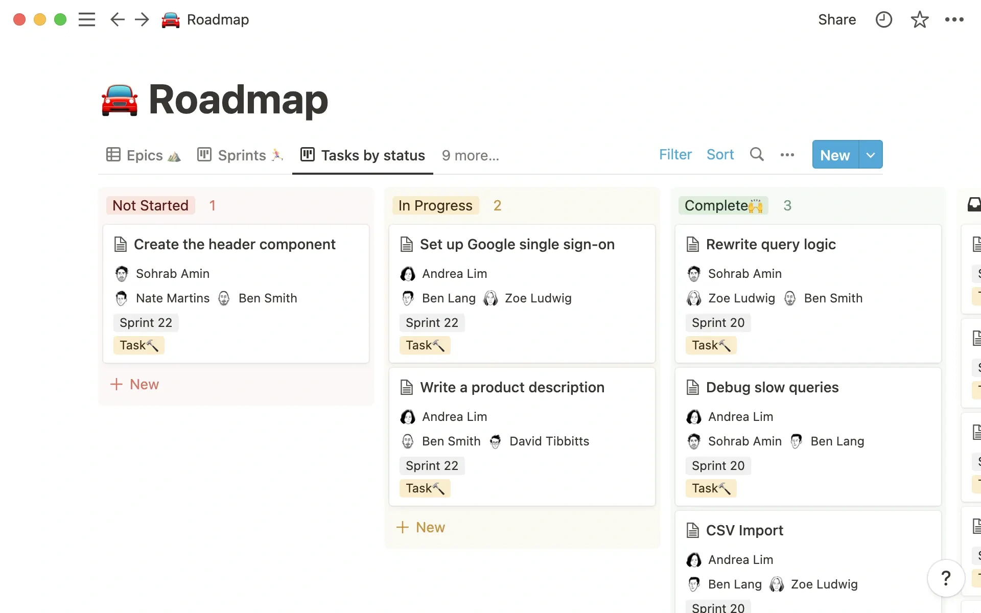
- Thoughtful visual hierarchy draws attention to priorities without overwhelming users.
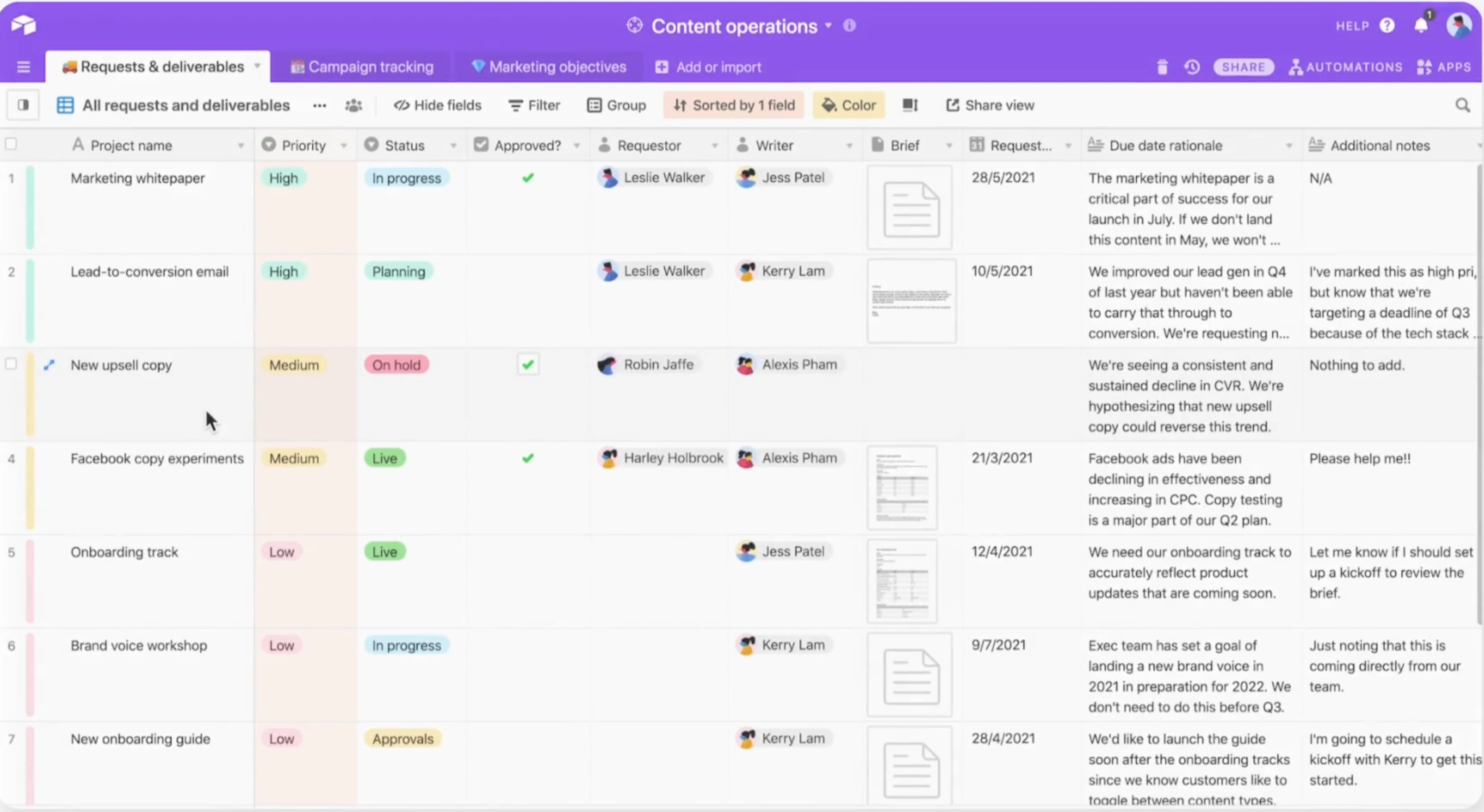
- Flexible time scales let users understand both short-term progress and long-term plans.

- Minimal visual clutter keeps the focus on milestones instead of decorative timeline elements.
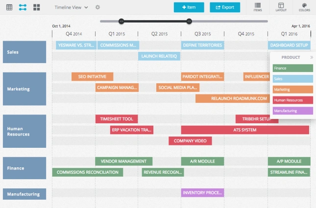
The biggest takeaway from these products is that a roadmap isn't just a schedule—it's a communication tool. Users should be able to understand where a project stands within seconds, without reading every card or milestone.
Activity-feed timelines
Unlike roadmaps, activity-feed UI design timelines focus on what has already happened. They record actions as they occur, giving users a chronological history of updates, interactions, and system events. The challenge isn't showing every event—it's making important ones easy to spot.
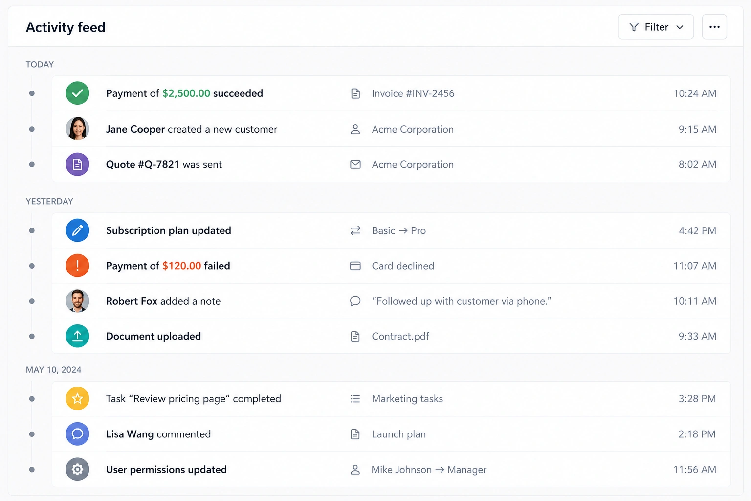
Products like Stripe, GitHub, and many CRM platforms handle this well by prioritizing scanability over visual complexity. Their activity feeds typically share a few key characteristics:
- Clear timestamps provide immediate context for every action.
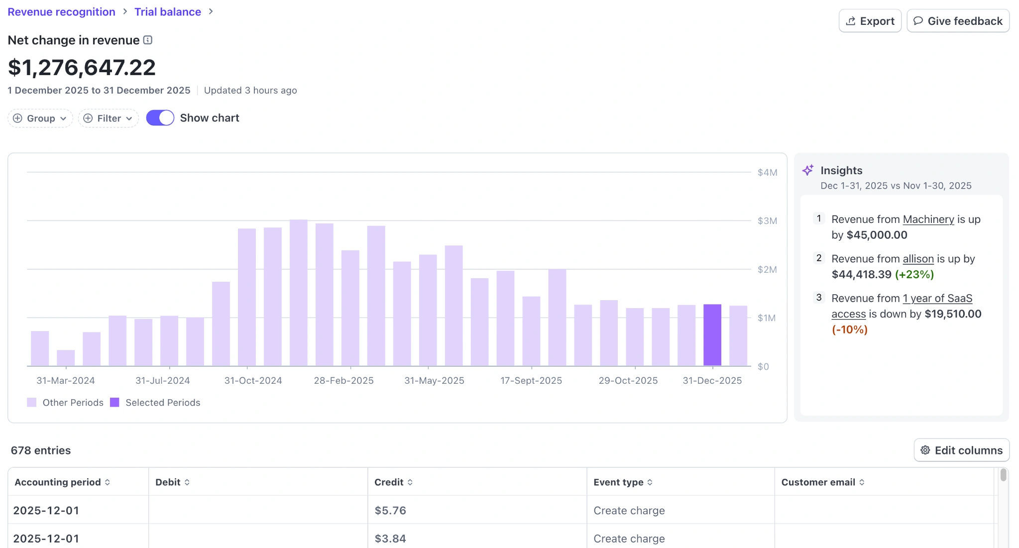
- Visual cues, such as icons, avatars, or status badges, help users identify event types without reading every entry.
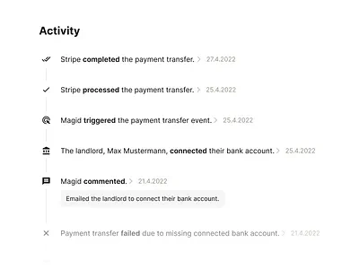
- Consistent layouts make long histories easy to scan.
- Progressive disclosure keeps the feed compact while allowing users to expand entries for more details when needed.
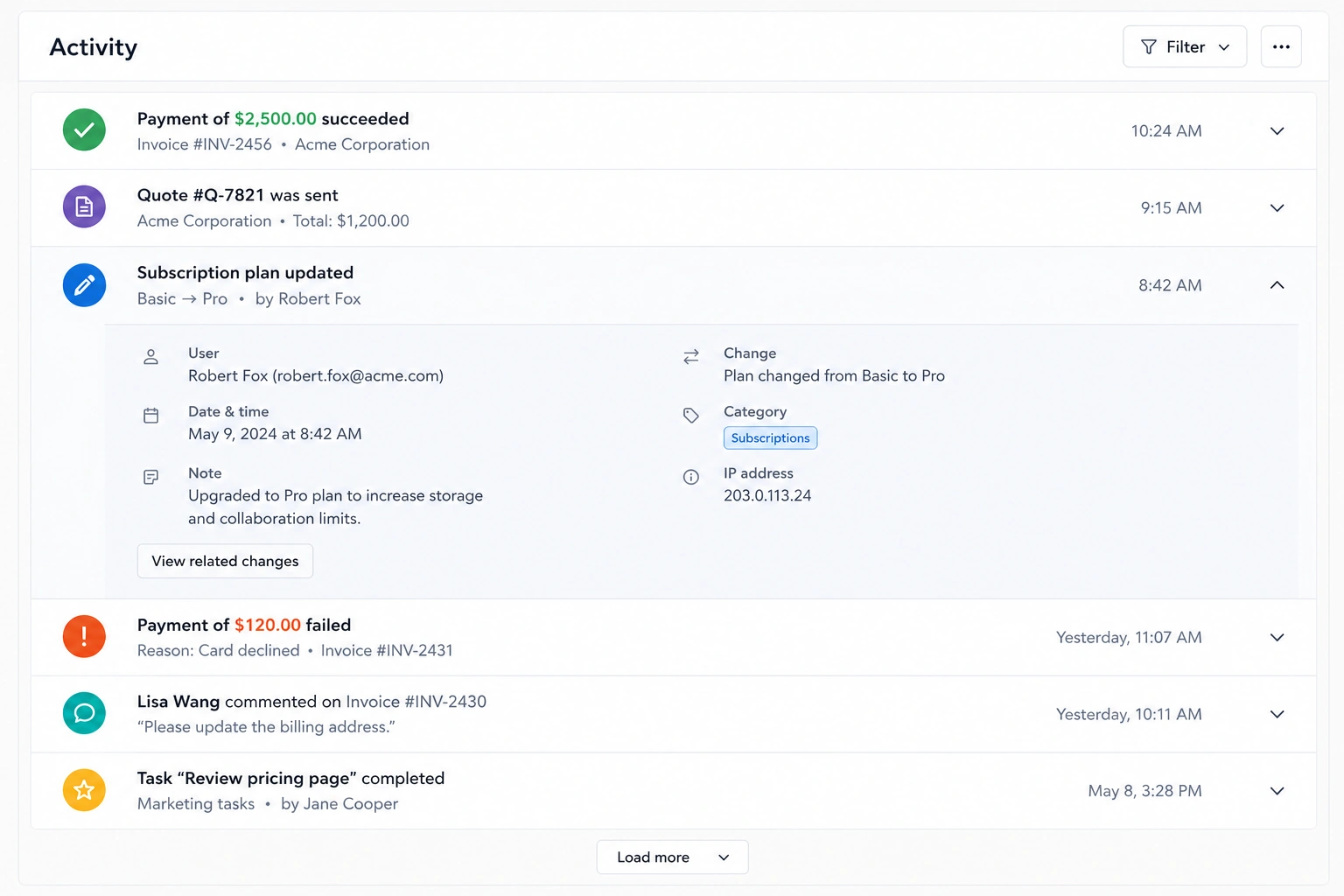
The biggest lesson from these examples is that users rarely read activity feeds from top to bottom. They scan for a specific event, person, or status change. Good timeline UI supports that behavior by making the most relevant information stand out first.
Scheduling timelines
Scheduling timelines help users plan, organize, and track work over time. Unlike activity feeds, which focus on the past, scheduling timelines emphasize what's happening now and what's coming next. They're a core component of project management tools like Jira, Asana, and monday.com, where users need to coordinate tasks, deadlines, and dependencies.
The most effective scheduling timelines share several design principles:
- A clear time scale lets users understand schedules at a glance, whether they're viewing days, weeks, or months.
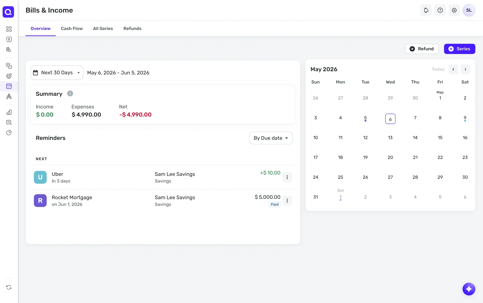
- Color-coded tasks and statuses make priorities and progress easy to distinguish.

- Dependency visualization shows how one task affects another, helping teams anticipate delays and providing immediate feedback when plans change.
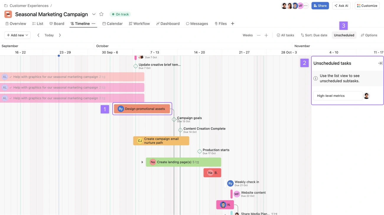
- Interactive controls and reusable UI components, such as drag-and-drop editing or zoom levels, make timelines easier to manage as plans evolve.
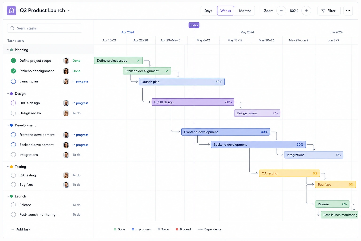
The biggest lesson from these products is that scheduling timelines should support decision-making, not just display dates. Users need to quickly identify conflicts, understand priorities, and adjust plans without getting lost in a sea of tasks.
Dense-data timelines
Some timeline interfaces need to display hundreds—or even thousands—of events without becoming overwhelming. These dense-data timelines are common in products like Google Maps Timeline, analytics platforms, and history logs, where users need to explore large amounts of chronological data while still finding specific moments quickly.
Well-designed dense timelines balance information density with readability by using techniques such as:
- Zoomable time scales that let users switch between broad overviews and detailed views.
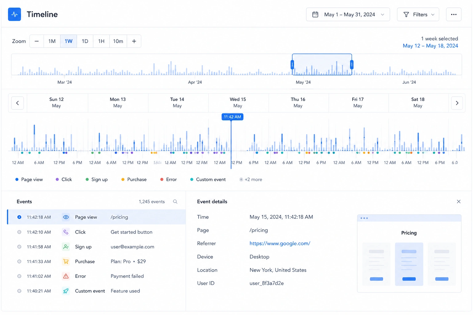
- Grouping and clustering to combine similar events and reduce visual clutter.
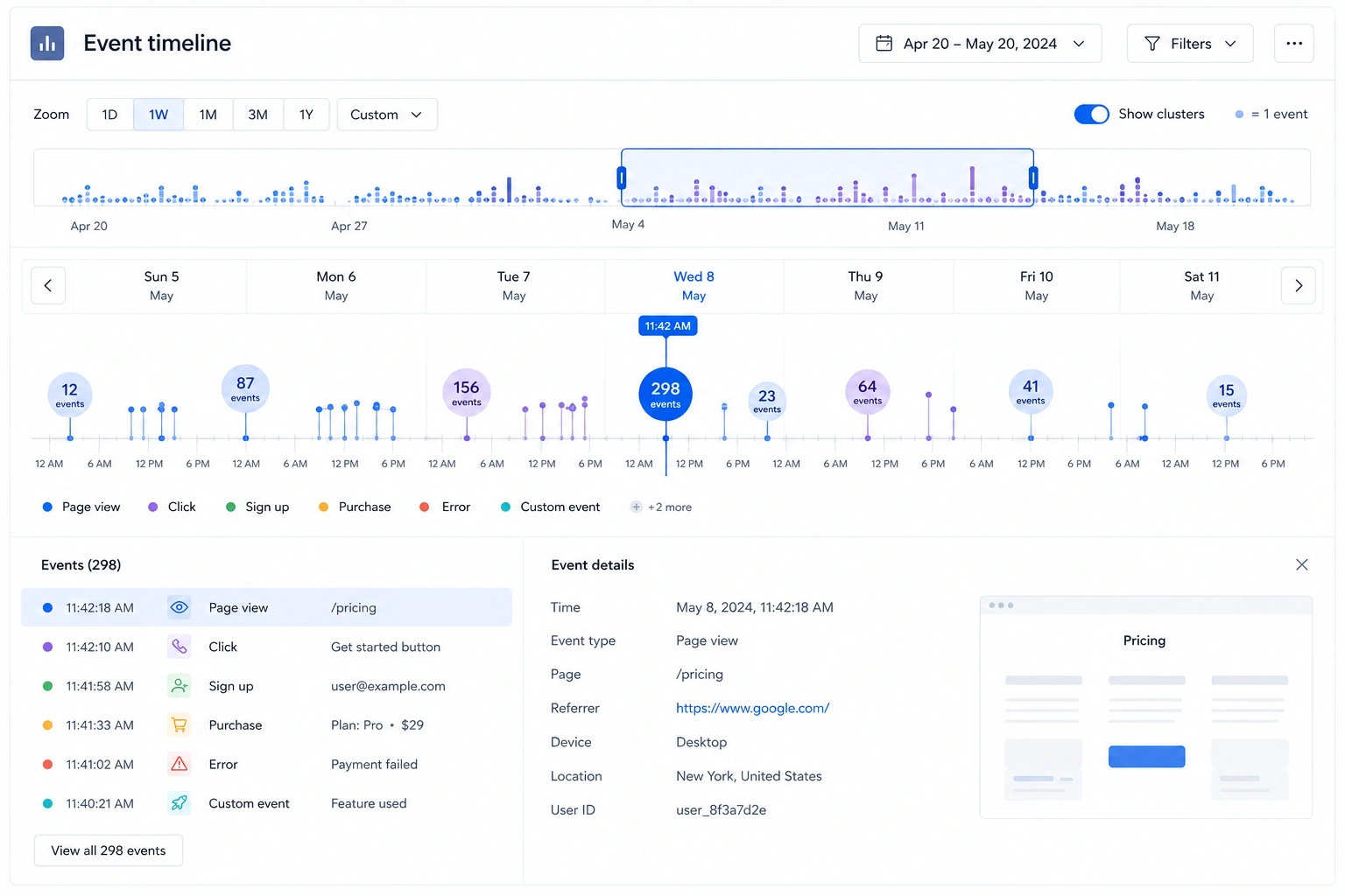
- Filtering and search give users quick access to the events they're looking for without scanning the entire timeline.
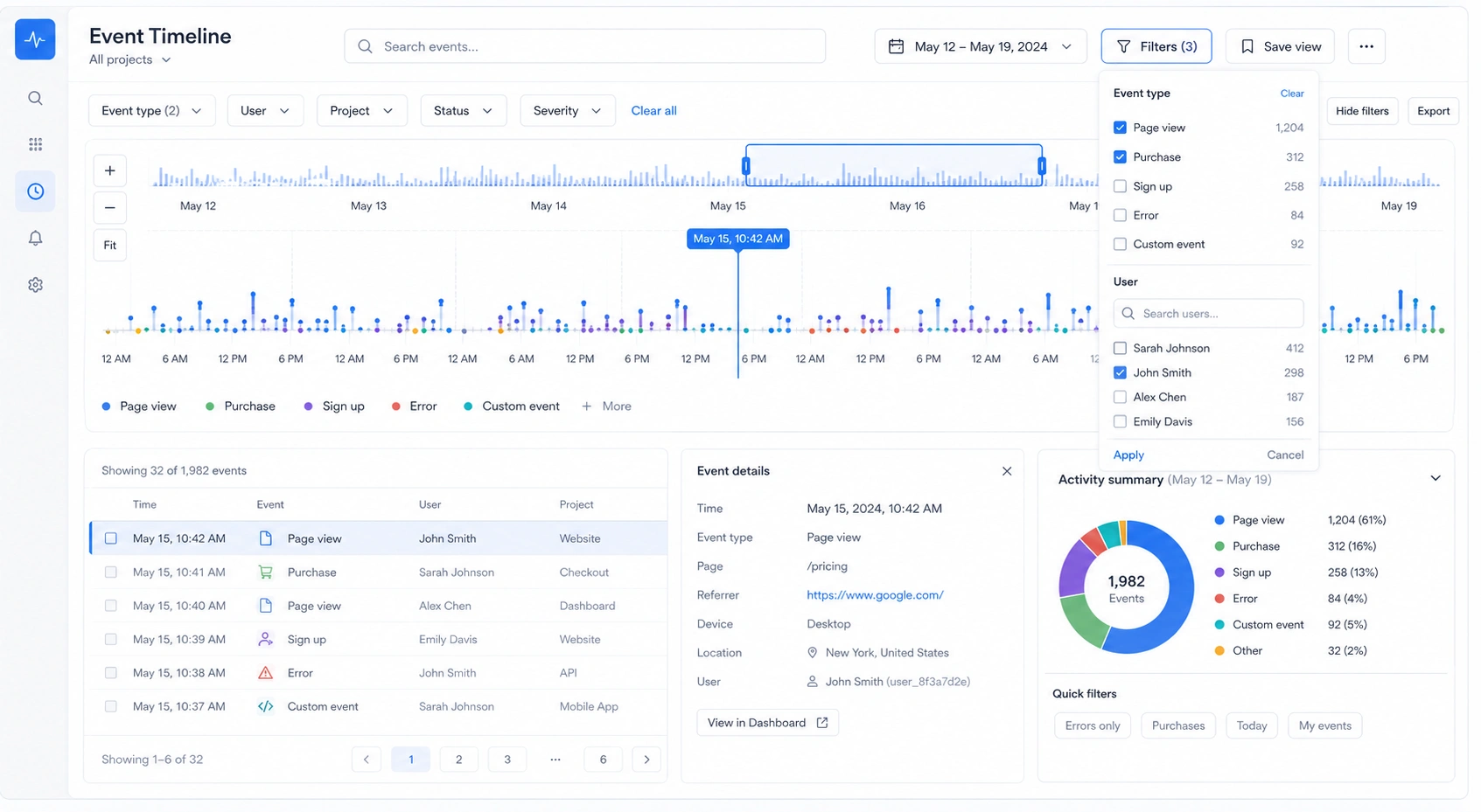
- Progressive disclosure that reveals additional details only when users need them.

The biggest takeaway is that dense timelines shouldn't try to show everything at once. Instead, they should help users move from a high-level overview to the exact event they're looking for with as little effort as possible.
Timeline UX best practices
A timeline can have the right structure and still feel difficult to use if the visual design doesn't support it. Since timelines often contain large amounts of information, visual hierarchy and consistency are essential for helping users scan content, identify priorities, and stay oriented.
Build a clear visual hierarchy
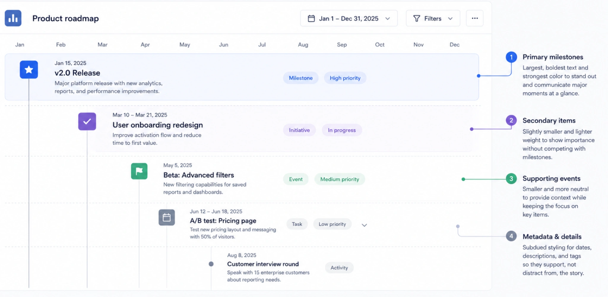
Not every event deserves the same amount of attention. Use size, color, weight, and spacing to create no more than two or three levels of hierarchy—for example, primary milestones, secondary events, and supporting metadata. Adding more levels makes timelines harder to scan and forces users to work harder to find what matters.
Keep spacing consistent
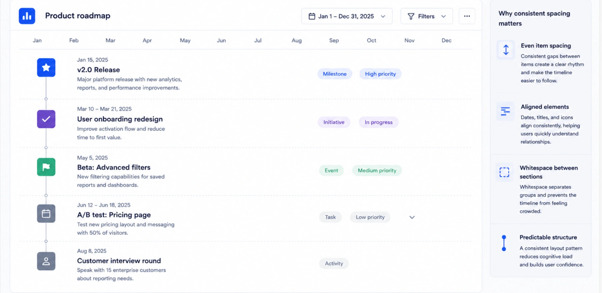
Consistent spacing creates rhythm and makes long timelines easier to follow. Align events, maintain even gaps between items, and use whitespace to separate sections or groups. Irregular spacing can make users question whether items are related or simply misaligned.
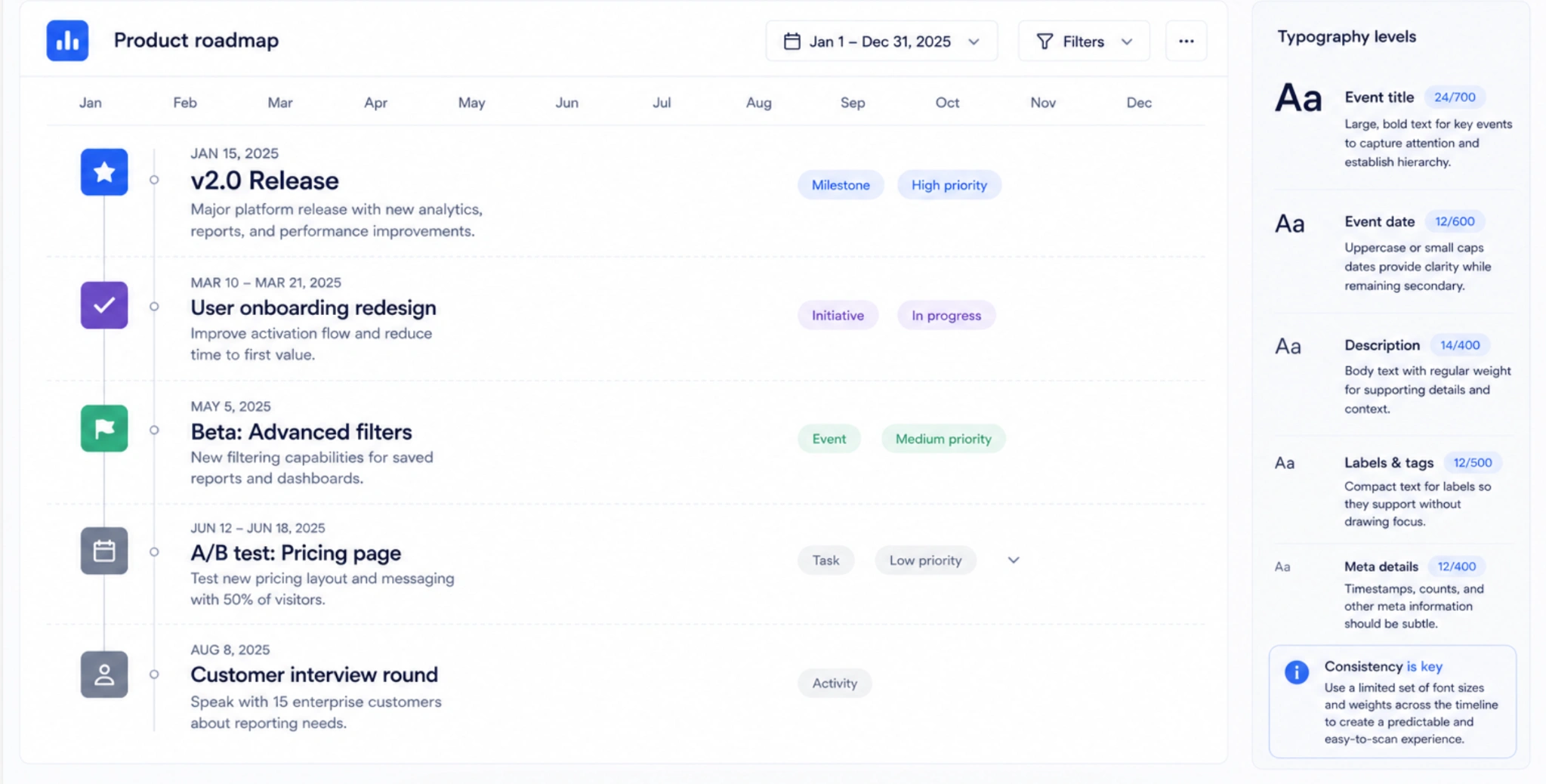
Create a typography rhythm
Typography should reinforce the information hierarchy. Use larger, bolder text for titles or key events, while timestamps, labels, and supporting details should remain visually secondary. Keeping font styles and sizes consistent across the timeline improves readability, especially in data-heavy interfaces.
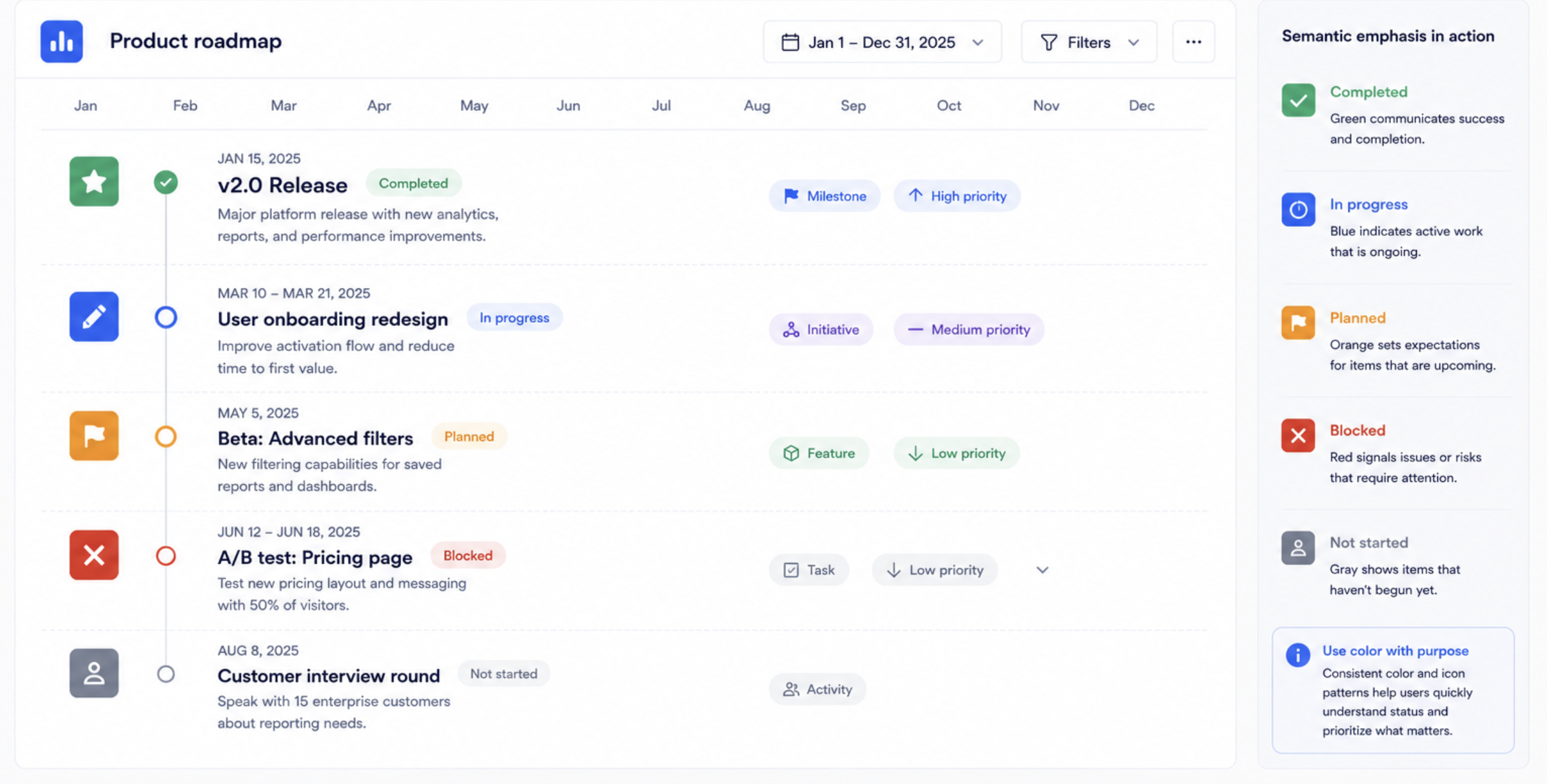
Use semantic emphasis
Color, icons, and badges should communicate meaning—not just decorate the interface. For example, use consistent colors to indicate statuses like completed, in progress, or blocked, and reserve accent colors for events that require attention. When every element is emphasized, nothing stands out.
Build an accessible color system
Color is a powerful way to communicate status, priority, and progress—but it should reinforce information, not be the only way users interpret it. Relying on color alone makes timelines harder to use for people with color vision deficiencies and can reduce clarity for everyone.
Instead, combine color with other visual cues:
- Icons help users recognize event types or statuses at a glance.
- Labels make categories and states explicit instead of relying on color interpretation.
- Patterns or shapes provide an additional visual distinction when colors are similar.
- Status text, such as Completed, In progress, or Failed, removes ambiguity and improves accessibility.
The strongest timeline UIs use color to support meaning—not replace it. When multiple cues work together, users can understand events quickly regardless of their device, lighting conditions, or visual abilities.
Maintain strong contrast and readability
Timeline UIs often contain a lot of supporting information—timestamps, status badges, usernames, tags, and event descriptions. If these elements lack sufficient contrast or are too small, users have to work harder to scan the interface, especially on mobile devices or in challenging viewing conditions.
Good readability becomes even more important for:
- Dense metadata, where users need to distinguish between multiple pieces of information at a glance.
- Outdoor or mobile use, where screen glare and small displays reduce legibility.
- Low-vision accessibility, where adequate contrast and readable text sizes are essential.
A few design choices can make a significant difference:
- Use high-contrast badges so status indicators remain easy to distinguish in both light and dark interfaces.
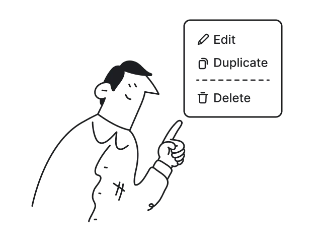
- Prioritize touch readability by using text sizes and tap targets that are comfortable on mobile devices, avoiding cramped layouts.
- Design for both light and dark modes, checking that colors, dividers, and timeline connectors remain visible and maintain sufficient contrast in each theme.
Readable timelines reduce cognitive effort. When users can quickly identify statuses, scan metadata, and interact comfortably across different environments, they can focus on the information instead of deciphering the interface.
Add personality without creating clutter
Timelines often prioritize function over aesthetics, but that doesn't mean they have to feel sterile. A bit of visual personality can make the interface more engaging, strengthen brand identity, and help users enjoy spending time in the product—as long as decorative elements never compete with the timeline itself.
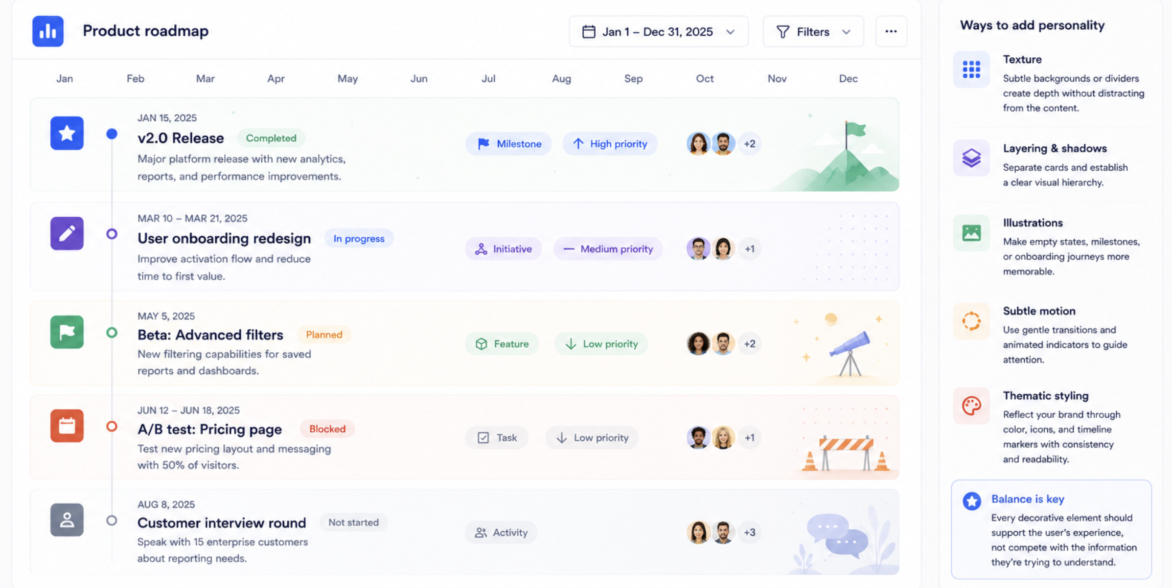
Some effective ways to add personality include:
- Texture, such as subtle backgrounds or dividers, to create depth without distracting from the content.
- Layering and shadows that separate cards and establish a clear visual hierarchy.
- Illustrations for empty states, milestones, or onboarding journeys to make key moments feel more memorable.
- Subtle motion, like gentle transitions or animated progress indicators, to reinforce changes and guide attention without slowing users down.
- Thematic styling that reflects your brand through color palettes, iconography, or timeline markers while maintaining consistency and readability.
The best timeline designs strike a balance between clarity and character. Every decorative element should support the user's experience, not compete with the information they're trying to understand.
The best timeline UI feels effortless
The best timeline interfaces aren't the ones that display the most information—they're the ones that help users understand and navigate time-based information with the least amount of effort. Whether someone is tracking a delivery, managing a project, reviewing an audit log, or exploring product history, a well-designed timeline makes it easy to answer three essential questions: What happened? What's happening now? What comes next?
For every designer, creating an effective timeline starts with choosing the right pattern for the job. From there, every design decision should improve scanability, reduce orientation anxiety, and make it easier for users to find the information they need without feeling overwhelmed. As timelines grow, clarity becomes far more valuable than adding more features or visual complexity. And because so many users interact with timelines on smaller screens, mobile usability should be considered from the beginning—not treated as an afterthought.
Ultimately, the best timeline UIs help users move through history, workflows, and progress with confidence and clarity. They fade into the background, allowing the information—not the interface—to take center stage.
If you're designing a SaaS product with complex workflows, the right timeline can dramatically improve usability. At Eleken, we help product teams simplify complex interfaces, improve scanability, and validate better timeline patterns quickly. Start your 3-day free trial and see how thoughtful UX design can make even the most information-rich timeline feel effortless.


.webp)
.webp)

.png)

.webp)

.webp)