.webp)


Split button UI shows up in Material Design, Atlassian, and ServiceNow, and chances are your users have clicked one today without thinking twice. But when someone on the team suggests adding one to a toolbar packed with related actions, knowing whether it actually belongs there is harder than it looks.
That decision comes up more often than you'd expect. At Eleken, we work on complex SaaS interfaces where it lands on the table regularly. Split buttons are genuinely useful in the right context, and quietly frustrating in the wrong one.
This article gives you a practical framework for getting it right. You'll walk away knowing what a split button is, how it behaves, the specific conditions where it earns its place, and how it compares to similar patterns you might consider.
What is a split button?
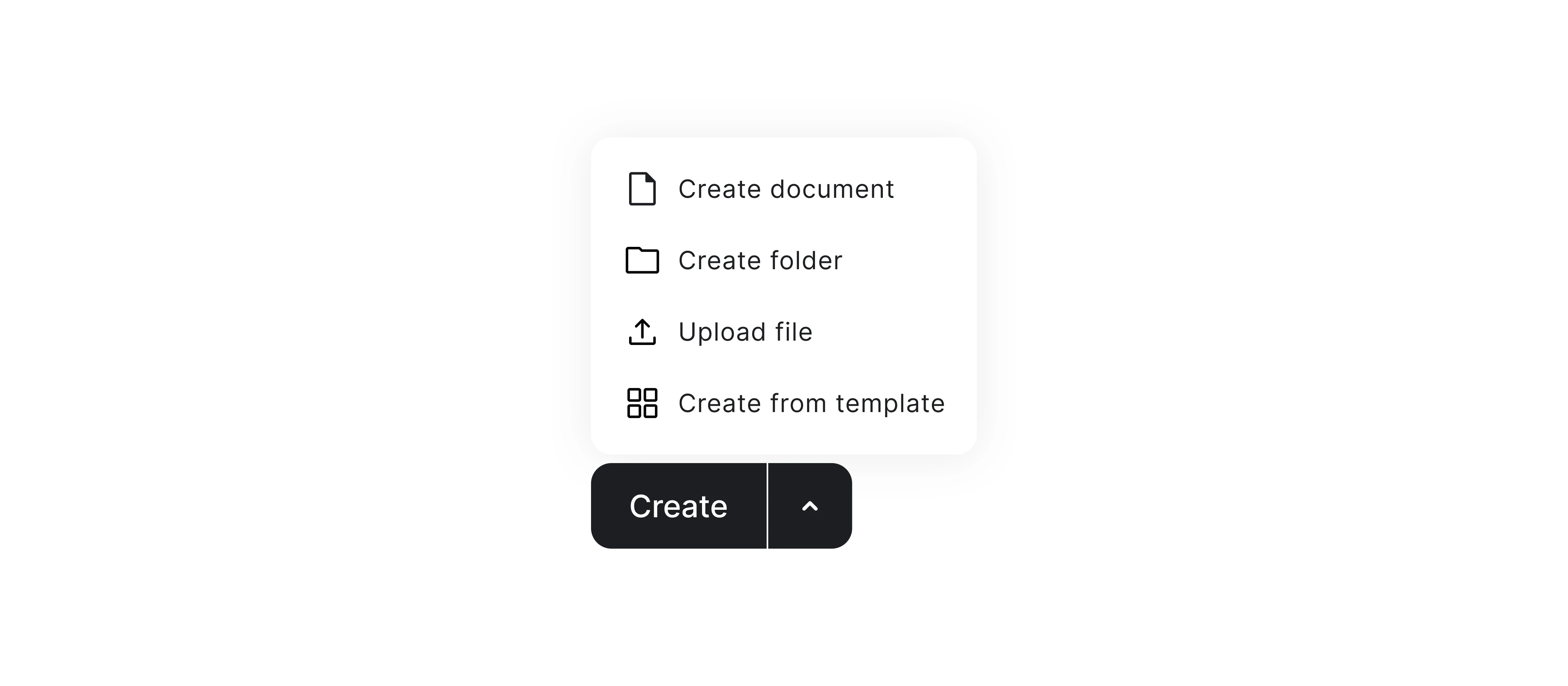
A split button is a single UI element with two distinct, clickable zones. The left side is a primary action, where you click it, and something happens immediately. The right side is a small arrow or chevron that opens a menu of related secondary options.
The two zones are separated by a visible divider, which is the only thing telling users that two different behaviors live inside what looks like one button.
That's the concept in one sentence, but the mental model behind it is worth sitting with — one element, two behaviors. This pattern groups related commands into a dropdown, but also offers access to a default action one click away.
To understand how it works, it helps to see each part clearly:
- Primary action zone — carries the label;
- Divider — the boundary between the two zones;
- Dropdown trigger — the arrow or chevron that opens the secondary menu;
- Dropdown menu — a short list of related actions.
How a split button works
Every interaction with a split button component follows one of two paths:
- Click the label —the primary action fires immediately, and nothing else happens. This is the path the button is optimized for, and in a well-designed split button, it should cover the vast majority of use cases.
- Click the arrow — the arrow opens a short list of related secondary actions, the user makes a choice, and the menu closes. It takes more steps and requires the user to know the dropdown exists in the first place.
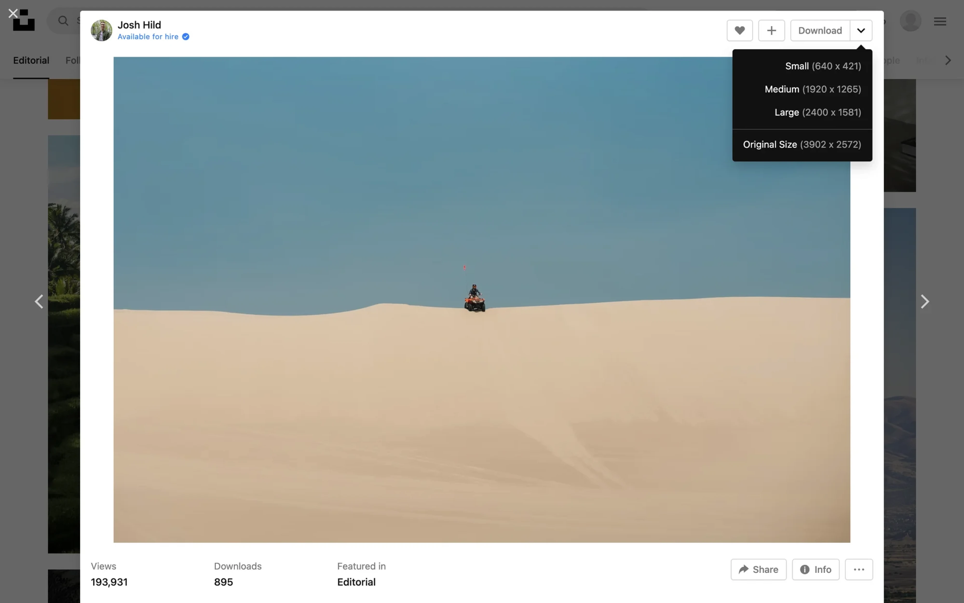
There's also a variation worth knowing about called a persistent split button. In this type of button, the default action changes to the last action selected by the user from the dropdown menu, so the choice persists as the new default going forward.
Think of the Windows Snipping Tool: if you select “Window Snip” from the menu, the next time you click the button directly, it runs a window snip rather than the original default. This works well for repetitive or batch work, where a user might rely on one option for a while, then switch to another.
The tradeoff is that the button label changes with each selection, which can quietly disorient users who aren't expecting it. For interfaces with a mix of experienced and occasional users, a static default is usually the safer choice.
When to use a split button component
The tricky thing about split buttons is that they look like a reasonable solution to almost any “too many actions, not enough space” problem. But the pattern only works when a very specific set of conditions is met.
Use it when…
A split button earns its place when all of the following are true at once. If even one condition is missing, a simpler pattern will likely serve users better.
- One action is used significantly more often than the others. The primary action needs to be an obvious choice. If users have to think about which action is the default, the pattern loses its core advantage.
- The secondary actions are closely related to the primary one. The dropdown should support the same workflow. If the actions feel unrelated, the pattern quickly becomes confusing.
- The context is a repeat-use desktop or web application. Users need repeated exposure to learn and remember the dropdown behavior. In one-time flows, the pattern often goes unnoticed.
- The user base is at least somewhat familiar with the interface. Users who are still learning an application often don't recognize the split button UX pattern and may not notice the secondary menu at all.
- Both zones can meet accessibility target size minimums. Split buttons are not recommended for touchscreen applications because of the fat-finger problem, and even on a desktop, there’s a minimum target size.
Don't use it when…
All actions have roughly equal frequency. Without a clear dominant action, there's no default worth protecting. A dropdown button or a button group will serve users better.
- The actions are unrelated. If you're grouping them together out of convenience and not because they support the same task, a standard dropdown is usually the better choice.
- You're designing for mobile or touch-first contexts. Two small, adjacent tap targets inside one component are a recipe for mis-taps and frustration. The pattern simply doesn't translate well to touch.
- Users are new or occasional. Discoverability of the dropdown is low for anyone who hasn't spent time with the interface. If your audience is first-time users, the secondary actions will largely go unnoticed.
- The button is for navigation. Split buttons belong in toolbars and action bars. Using them for navigation creates unpredictable interfaces because users don’t expect a label and an arrow to behave differently.
- You're using it to avoid a product decision. If the team can’t agree on which action should lead, hiding multiple contenders inside a split button design only postpones the conversation.
Before committing to a split button, we always ask one question internally: if most of your users never discover the dropdown arrow, does the primary action alone still serve them well? It sounds simple, but it cuts through a lot of debate quickly.
When the answer is yes, the pattern can work. When the answer is no, it means the design is leaning on the dropdown to carry weight it was never meant to carry.
Split button vs. Similar UI patterns
There are several UI patterns that look similar at a glance but behave very differently, and picking the wrong one is easy when you're working fast. Before getting into design, it helps to see exactly how it differs from each of its closest lookalikes.
Split button vs. Dropdown button
These two patterns look nearly identical at a glance. Both have a label and an arrow. Both reveal a menu. The difference is in what happens before the menu opens.
A dropdown is a single interactive zone. Clicking anywhere on it opens a menu. Nothing executes until the user makes a selection from that list. It's designed to save space when multiple actions need to be offered as a button with a dropdown UI. A split button, as we've established, acts immediately when you click its label.
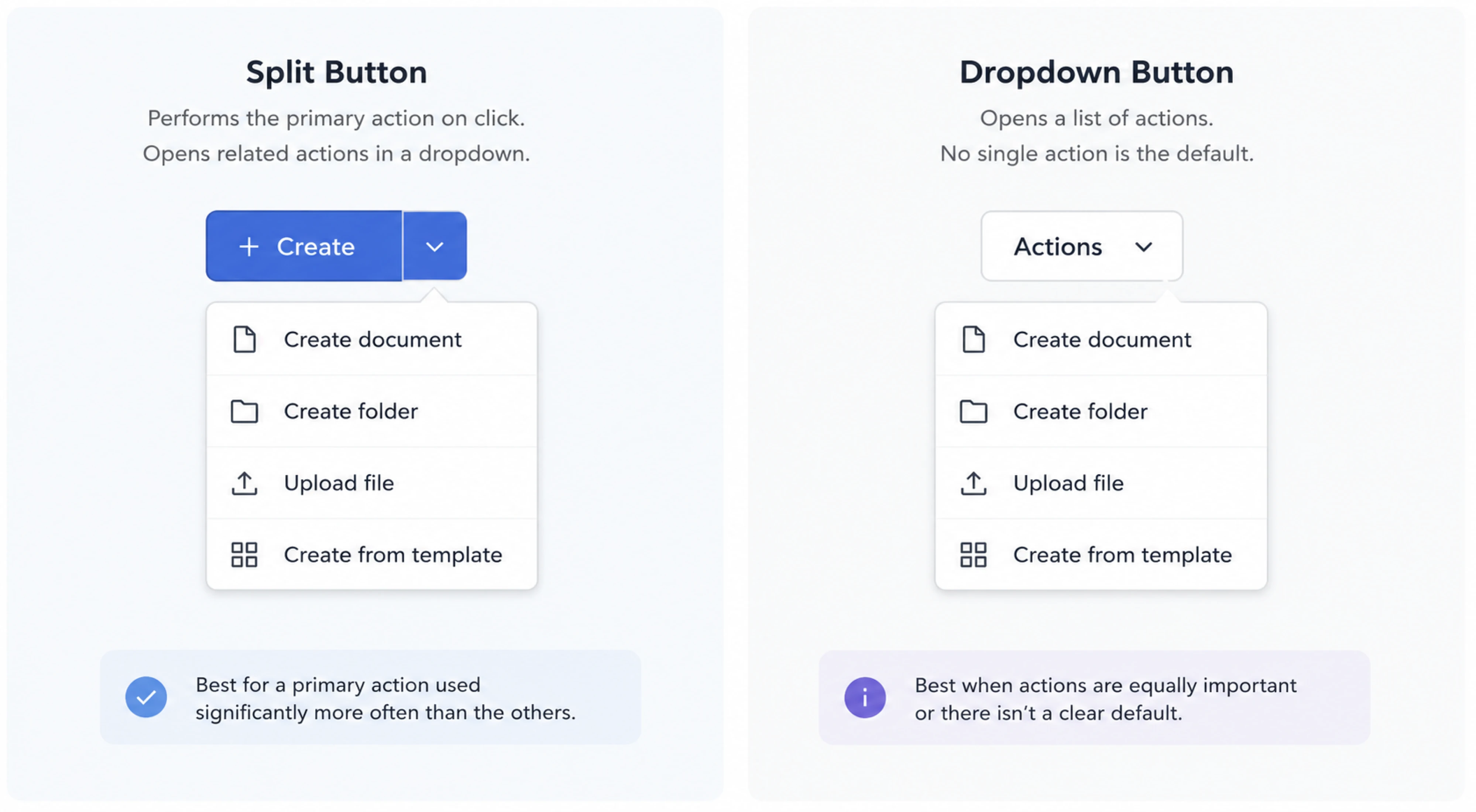
To choose between them, ask whether one action dominates. A dropdown button works well when there are many actions and none of them is more important than the others. The moment one action pulls ahead, a split button starts to make sense.
Split button vs. Button group
Instead of hiding secondary actions behind an arrow, the button group pattern puts everything on the table. Two, three, or four separate buttons sit side by side, each with its own label and click target. Nothing is hidden, nothing requires discovery, and every action has equal visual presence.
A button group is the right call when two to four actions are all frequent enough to deserve permanent visibility, and you have the space to show them. A split button makes more sense when one action dominates, and screen real estate is tight.
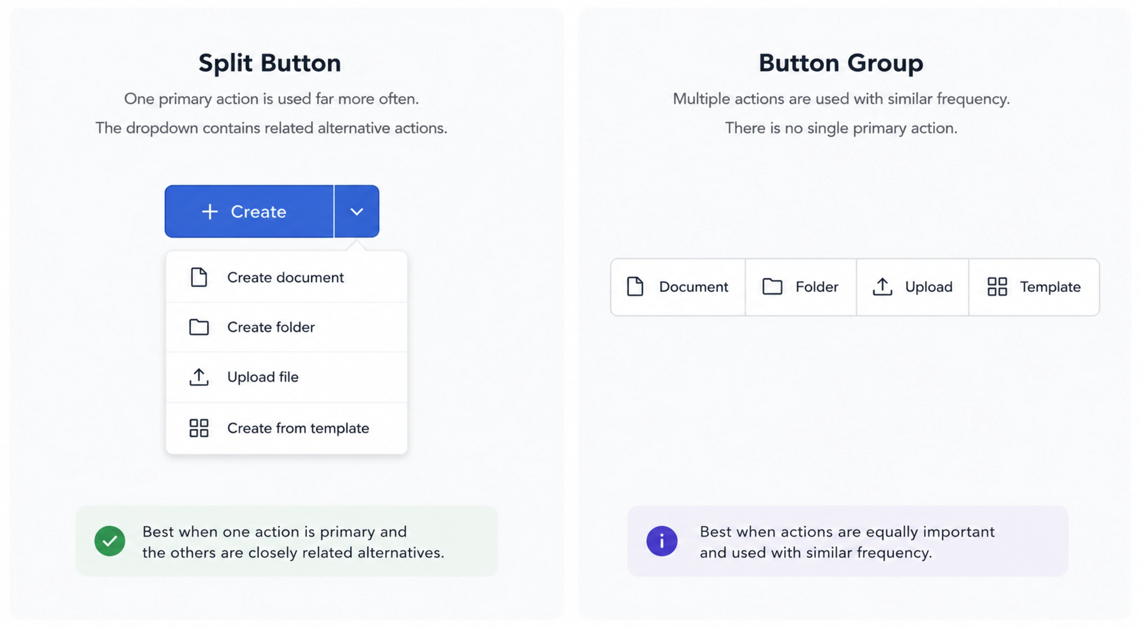
If you find yourself designing a button group where one button gets clicked far more than the rest, that's a signal that a split action button would serve your users better.
Split button vs. Icon button + separate menu
An icon button with a separate menu pairing is the safer choice. Instead of combining a primary action and a menu trigger, you split them into two controls with a clearly labeled action button on one side, and a separate menu button next to it.
The functional result is nearly identical to a split button, but the interaction model is far less ambiguous. Each button does exactly one thing, and users don't have to discover that a single component has two behaviors.
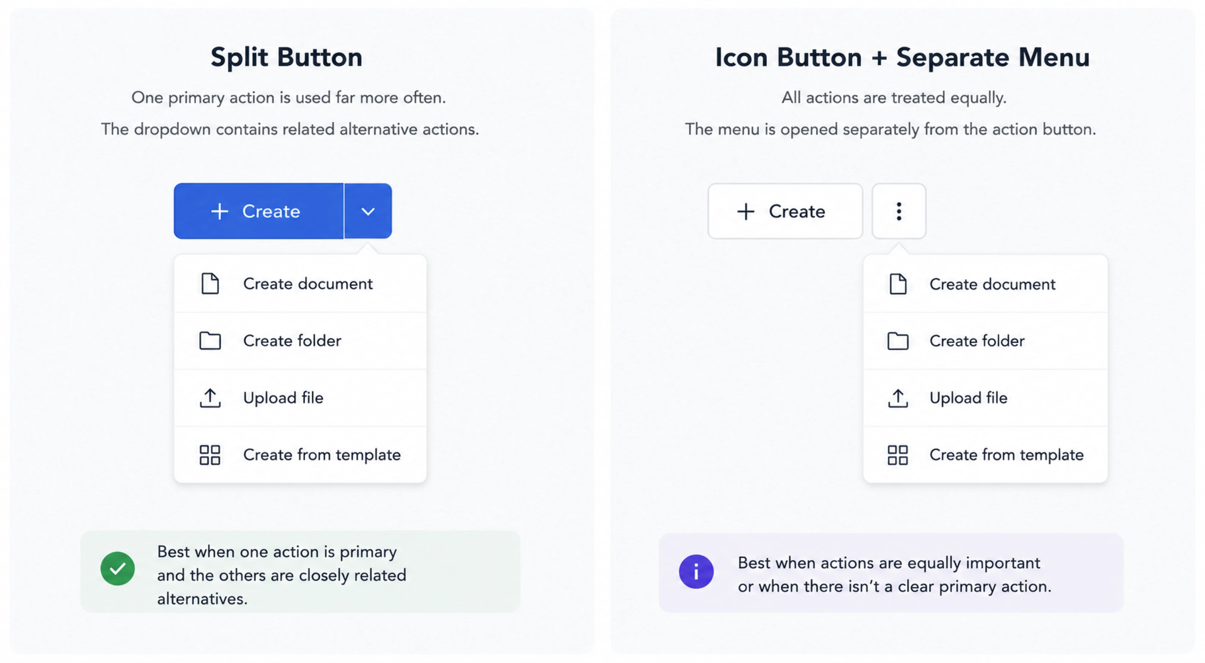
At Eleken, when we're unsure whether a split button will read clearly in context, an icon button paired with a separate menu is usually where we land. It adds a small amount of visual space to the interface, but it removes the cognitive guesswork.
Split button vs. FAB
Of all the patterns in this comparison, a FAB with speed dial is the one that looks most different from a split button. Yet teams occasionally debate the two in the same breath when trying to surface a primary action alongside a set of related ones.
A FAB is designed to provide quick access to the single most important action in an app. When tapped, it can expand into a speed dial, remaining visible while emitting a stack of related actions for the user to choose from. It lives in a fixed position on screen, floats above all other content, and is built entirely around touch interaction.
A split button lives inline within a toolbar or interface layout, is designed for desktop and mouse-driven contexts, and fires its primary action immediately.
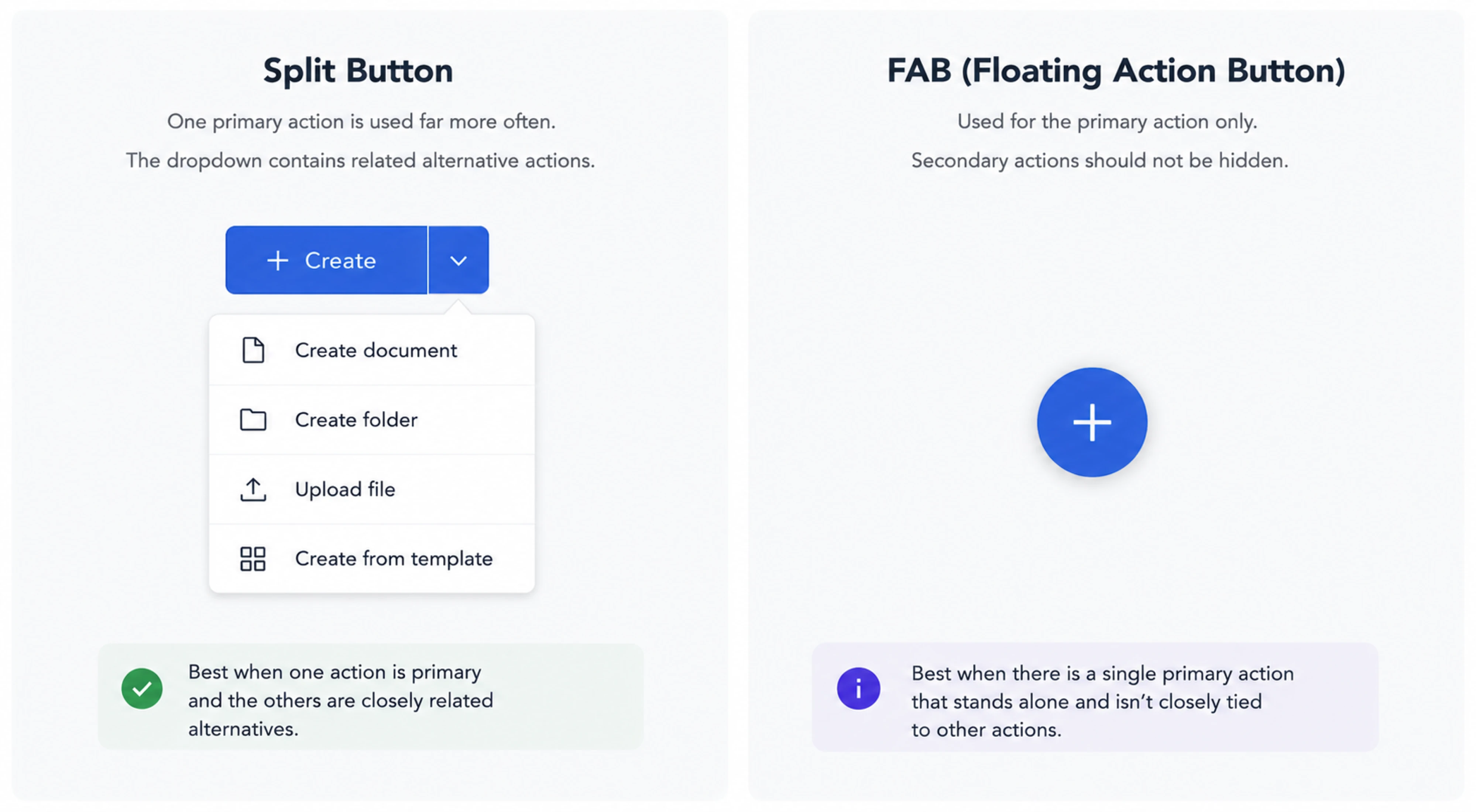
The two patterns offer one dominant action plus a set of related secondary ones, but they belong in different environments. If you're designing a mobile-first product, a FAB with speed dial is the right tool. If you're working on a dense desktop SaaS interface, a split button is the conversation worth having.
Quick decision table
Each of these patterns addresses the same core challenge of too many actions and not enough space. The table below maps out the key differences so you can make the call quickly.
Split button UI inspiration examples
The best way to understand when a UI/UX design pattern works is to look at products that have already made the call. To make that easier, we gathered split button examples from tools across different categories and user bases.
Whoosh — screen sharing button in a video conferencing app
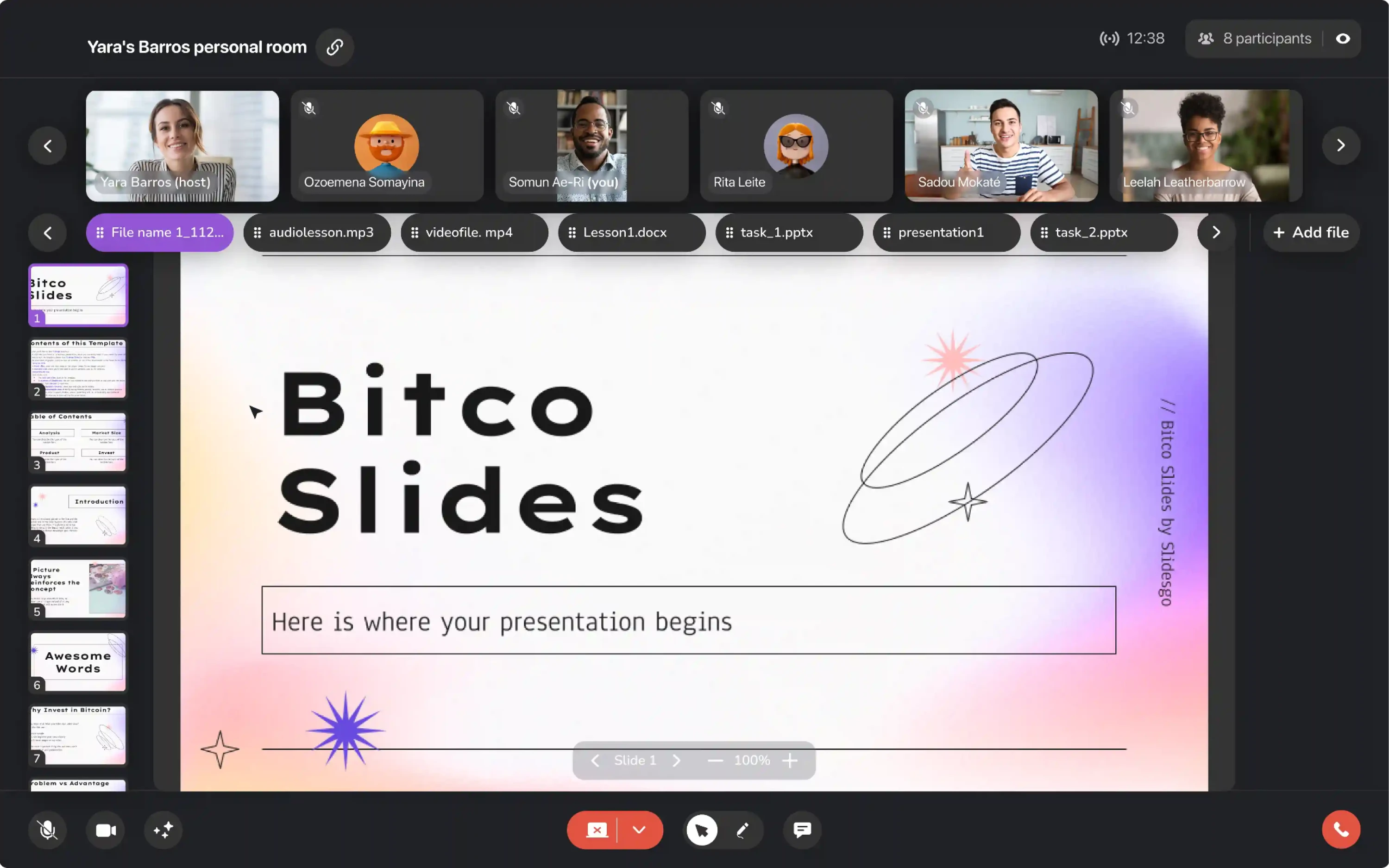
When we were designing Whoosh, screen sharing was one of the features that needed the most thought. It's a frequent action in any video session, but the way users want to share varies enough that a single button wouldn't cover all the cases.
A split button let us give users immediate access to the default sharing mode while keeping alternate options one step away.
The result is a button sitting in the bottom toolbar. Clicking the left side stops screen sharing immediately. Clicking the chevron opens a small menu for users who want to pause the current share or adjust sharing settings.
Siena — “Create new automation” button in an AI support platform
During our collaboration with Siena, we needed to find ways to surface new AI-powered capabilities without overcomplicating the interface. The automations section was a good example of that tension. There were multiple ways to create a new automation, and each one served a different user need.
A split button gave us a clean way through that. The purple “Create new automation” button in the top right fires the default creation flow for users who already know what they want. Clicking the chevron opens a short dropdown with three distinct paths.
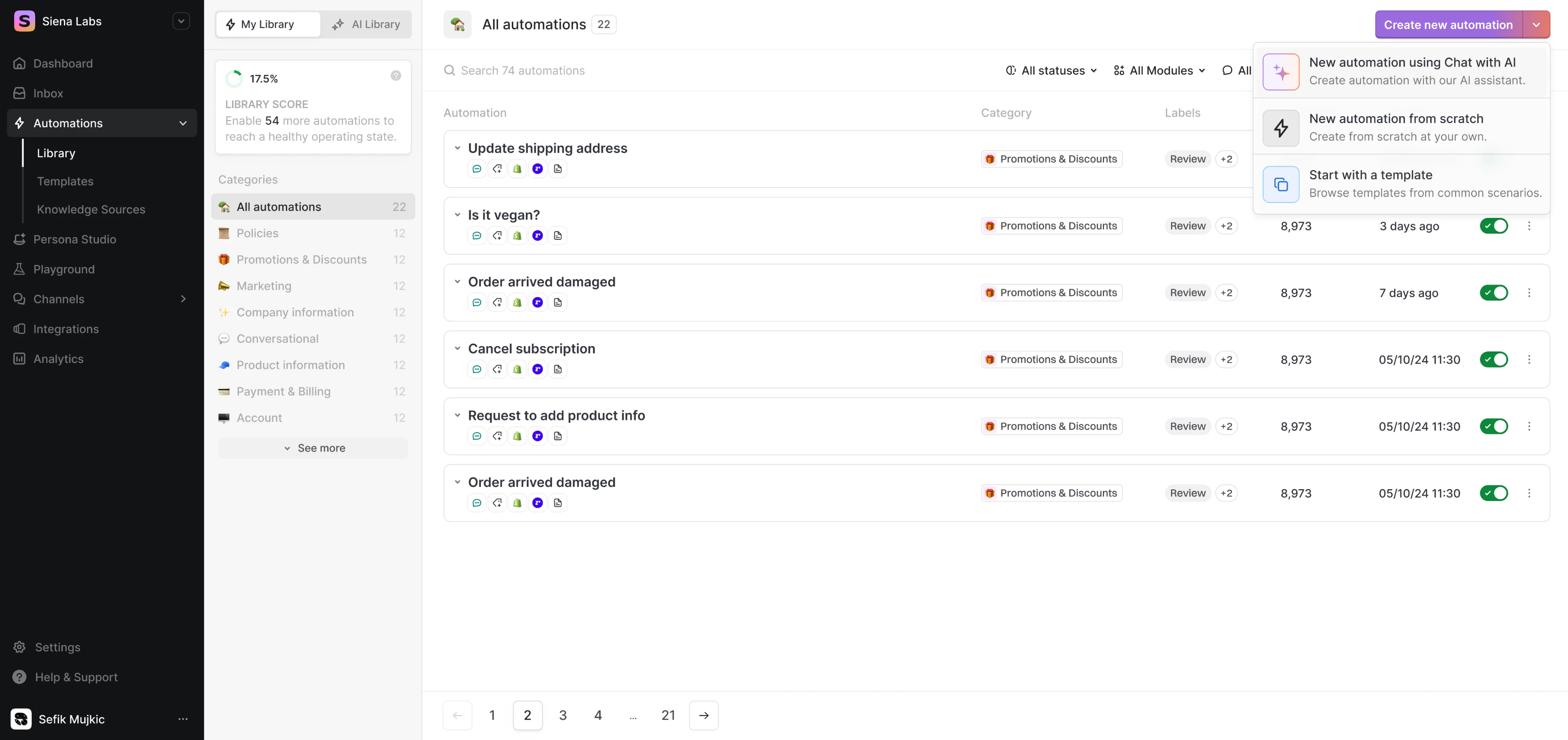
What makes this placement work is the audience. Siena is used daily by CX teams who are familiar with the platform. The split button respects that by keeping the fastest path one click away, while making other options available within reach.
Modia — “Share” button in an AI content creation platform
Working with Modia, our design team was tasked with making a complex editorial workflow feel intuitive. The platform supports multiple ways to share and export content, and to make them easy to reach, we went with a split button.
Clicking “Share” opens the default sharing flow immediately for users who are ready to publish. Clicking the chevron expands a dropdown with more specific options, including export and newsletter publishing.
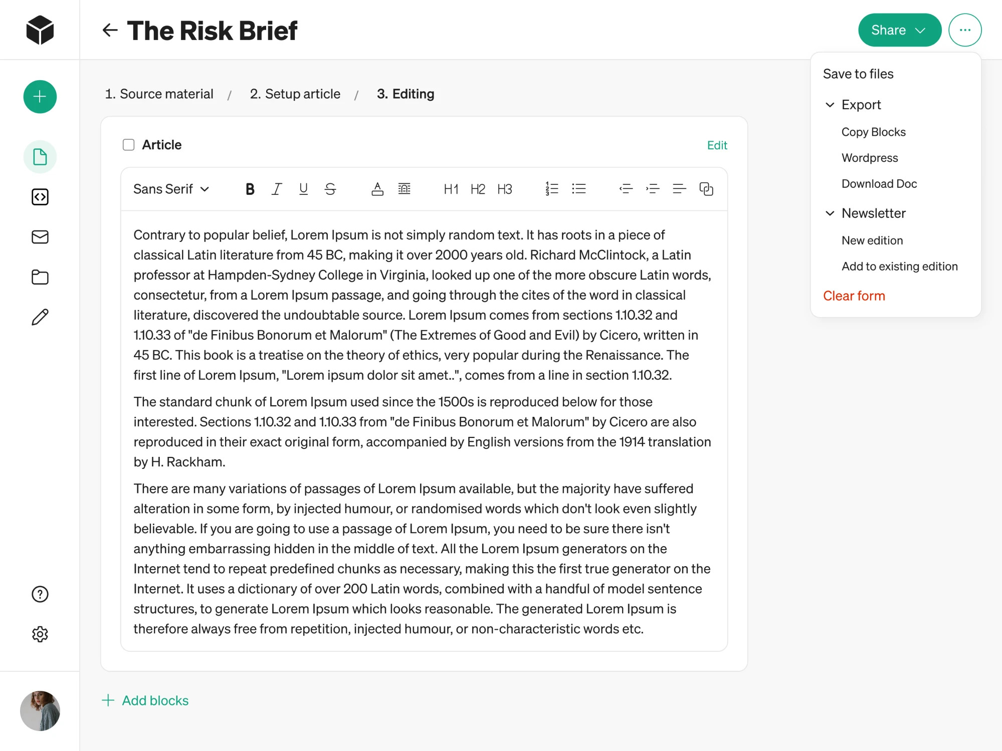
For an editorial tool, this kind of efficiency compounds. Users who publish daily don't want to open a menu every time. The split button gives them a shortcut without hiding anything from those who need the full range of options.
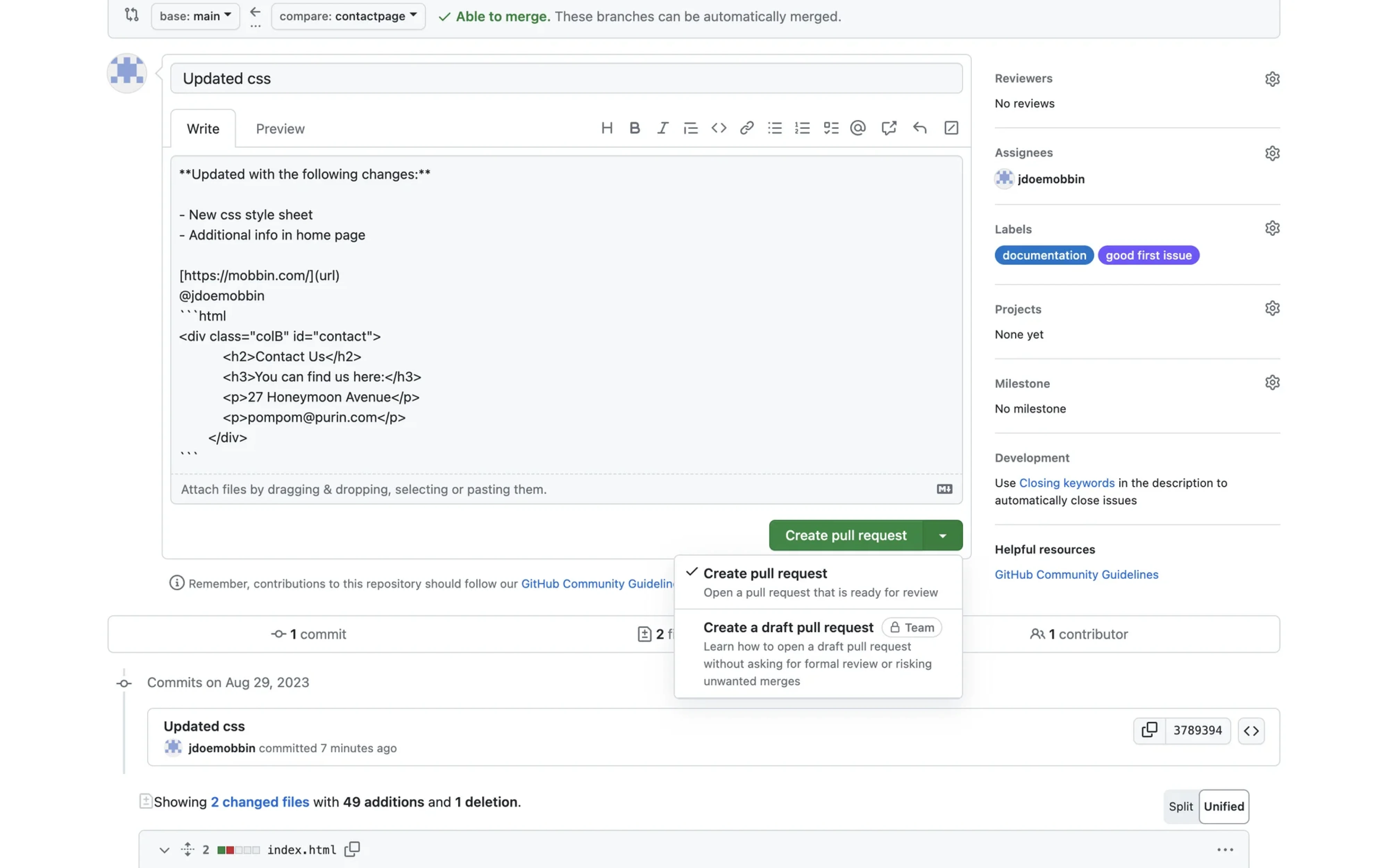
GitHub — “Create pull request” button in a developer platform
GitHub's “Create pull request” button is one of the most widely recognised split button implementations in any developer tool.
Clicking the label submits a pull request immediately and opens it for review. Clicking the chevron reveals a second option — creating a draft pull request — for teams who aren't ready for a formal review yet but want to get their changes into the pipeline.
It's also worth noting that GitHub makes the dropdown content descriptive. Each item includes a short explanation of what it does and when to use it, which helps less experienced users understand the difference without leaving the page.
Manus — “Add” button in an AI agent platform
Manus is an AI agent platform where users can extend their workspace by adding skills. The pane itself offers four distinct ways to do that, where each path serves a different type of user, but they all lead to the same outcome.
The split button handles this well. Clicking “Add” opens the default flow for users who already know what they want. Clicking the chevron reveals the full list of options for those who need to choose a specific path first.
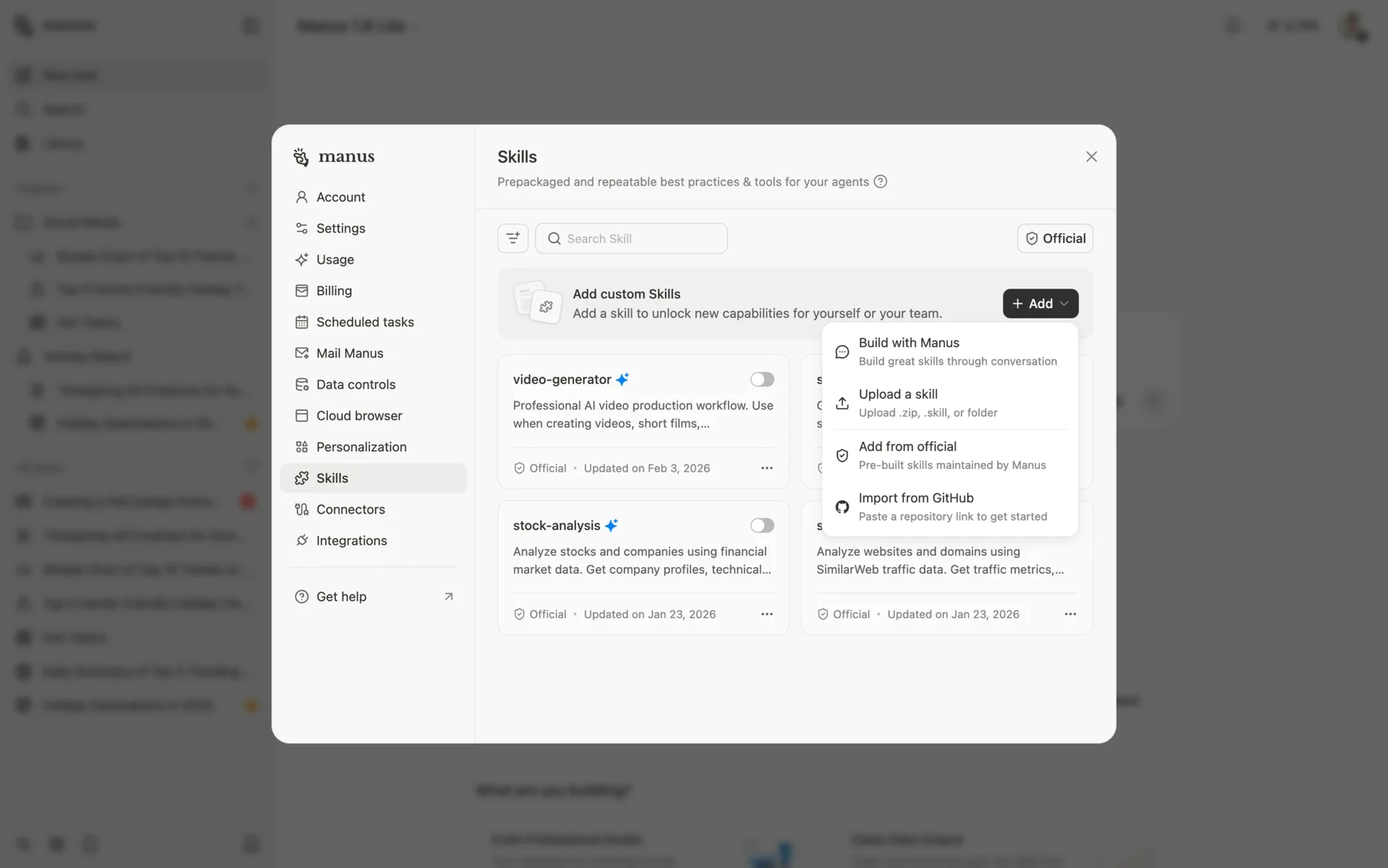
One thing worth pointing out is the label. “Add” is functional, but it doesn't tell the user what the default action does. In a platform used by a technically sophisticated audience, this works because users are likely to explore the dropdown. But in a more mainstream product, a more specific label would make the primary button clearer.
The bottom line
As a design agency working on SaaS products, we don't reach for a split button every time. There are cases where it fits perfectly, like in our work with Siena, but most platforms we design for have a mix of experienced and new users, and guiding them through the interface often matters more than saving a click.
In those cases, an icon button paired with a separate menu tends to be the safer choice.
When you start designing your product interface, think carefully about where a split button earns its place. And if you ever need help defining the right UI patterns for your specific audience, the Eleken team is just a few lines away.




.webp)
.webp)