.webp)


Every product team puts real time and effort into designing notifications UX. But by the time those notifications actually start reaching users, a large percentage have already decided to ignore them. For most products, this is not something you can fix by writing a better copy or picking a nicer toast component.
What you can do is design the notification system right from the start, and this guide walks you through how.
The real question is which events deserve a notification at all, and how that changes depending on what your product is for. As a UX design agency that has shipped over 200 projects, we have seen this go wrong enough times to know what works.
What a notification actually is
A notification is a UI element that delivers timely information about something happening in the product, usually while the user is focused on something else. The system sends notifications automatically based on product events. That is the core of what separates a notification from other types of in-product messaging.
The difference between alerts and notifications is where teams most often get confused, but validation messages and status indicators also serve different roles. Each one does something different, and the table below lays out the distinctions.
Once you separate these four, the UX design decisions get easier. The pattern you reach for depends on what kind of message you are sending.
Types of notifications
Within notifications themselves, there are three functional types worth knowing. They cover almost every case a UX designer will run into, so being able to spot which one you are working with is the first decision in any notification flow.
- Informational notifications
These are FYI messages. The user might want to know about the event, but they do not have to do anything about it. Calendar notifications, delivery updates, and battery warnings sit in this category. Because nothing is at stake, these low attention informational messages should stay quiet and never force the user to stop.
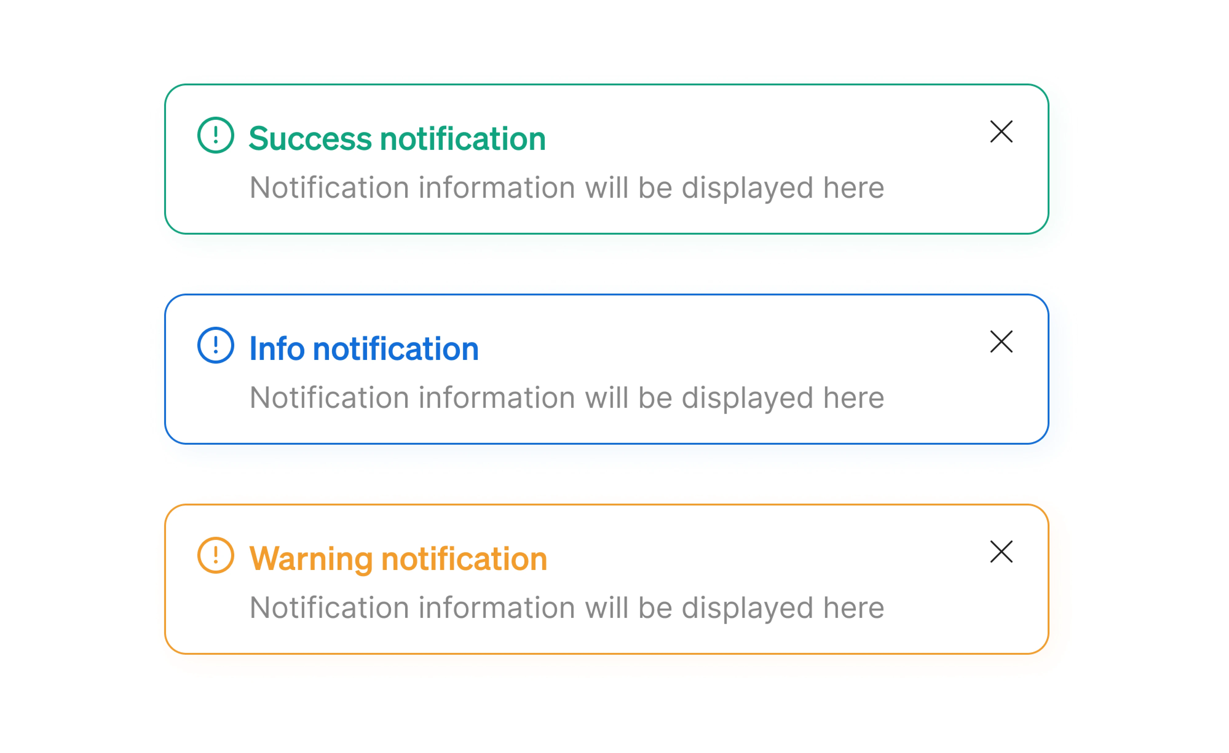
- Action-required notifications
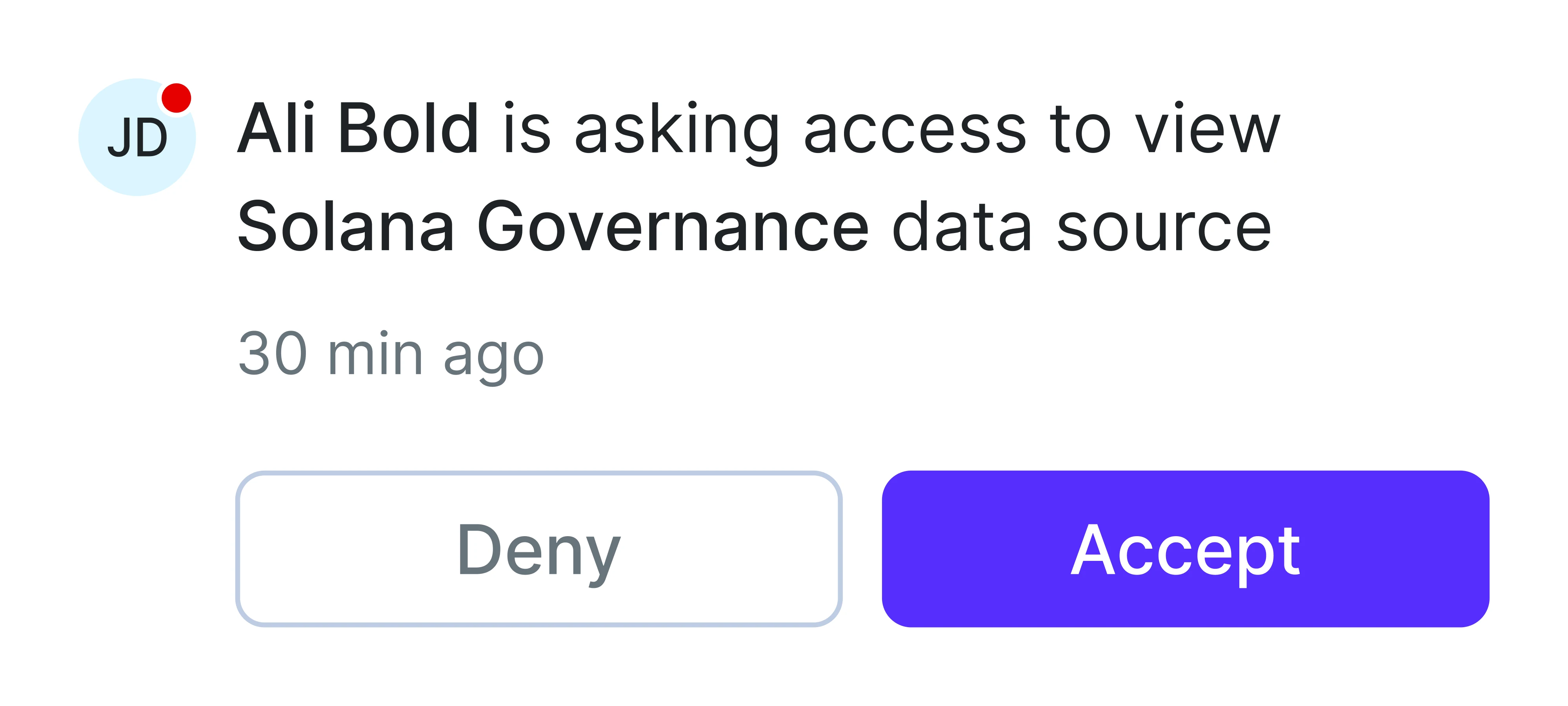
These ask the user to make a decision or respond before the system can move forward. Approving a payment, confirming an action, accepting an invite, or installing a critical update are common examples. Because they tie directly to outcomes, they deserve more visual weight, often a modal or a persistent banner.
- System feedback notifications
These communicate the system status of the product. Scheduled maintenance windows, sync status, deployment progress, and degraded service warnings all fit here. Most of the time, they sit quietly in the background, but they can escalate into the action-required category when something goes wrong.
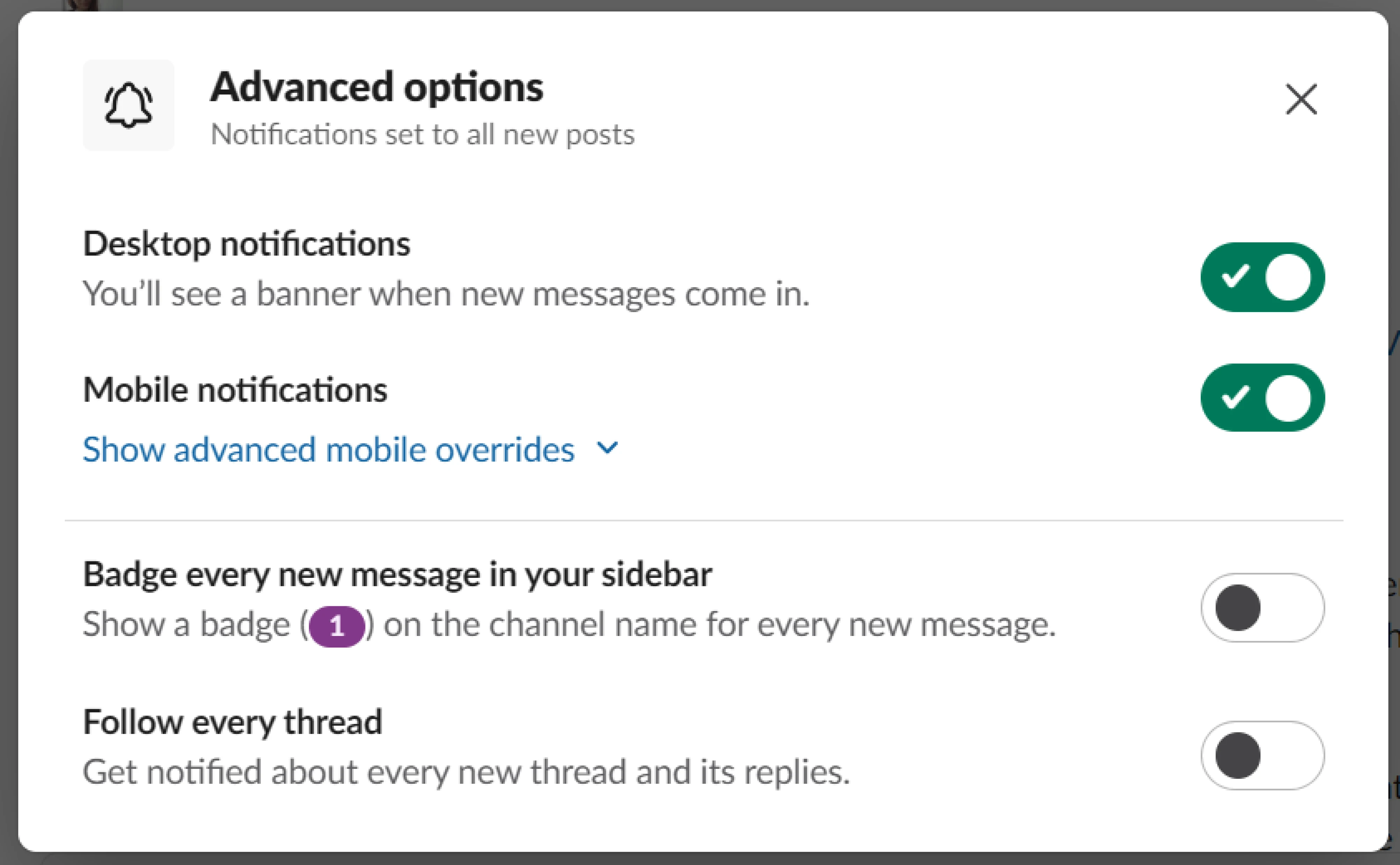
The 8 guidelines for designing notifications that work
The hardest part of notification design is the editorial judgment behind it, deciding which events deserve a place in the user's day and which ones do not. The eight guidelines below are how we make that call across client work.
1. Be extremely selective
Most product teams treat notifications as a growth lever. More pings, more pulls back to the app, more sessions. The data does not support this. Reuters Institute research has documented widespread alert fatigue across industries, where many users disable in-app notifications due to overload or low perceived usefulness.
The fix is a higher bar for what gets sent. The default for any new event in your product should be silence, and the burden of proof sits with the team proposing to add one. We use four tests when deciding whether an event earns a notification.
- The user explicitly asked to be notified about it.
- It is time-sensitive in a way that makes missing it costly.
- It requires a decision only the user can make.
- It contains personal context that the user could not get elsewhere.
If a proposed notification fails all four, it does not belong in the notification system. It probably belongs in an in-product activity feed, an email digest, or nowhere at all.
2. Match urgency to the right pattern and channel
How a notification arrives is part of the message. Users have learned to read both the channel and the UI pattern as urgency cues, and choosing the wrong delivery for an event miscommunicates how important it is.
The mapping below is the one we keep coming back to.
The most common mistake is dressing up low-urgency events in high-urgency clothing. A push notification that says “check out our new dashboard features” teaches users that your pushes are noise, and the next push that matters (their trial expires tomorrow) gets muted along with the rest.
Similar UX tradeoffs appear in onboarding flows, where products constantly balance guidance with interruption. We explored several of those patterns in this onboarding case study.
One more thing worth flagging is the redundancy tax. Stacking channels with a push, an in-app banner, and an email for the same event feels safe but trains users to ignore at least two of the three. Pick the one channel that fits the urgency, and reserve stacking for events that justify the noise.
3. Give enough context to decide in 2 seconds
A notification interrupts someone who was not thinking about it. That is the part most teams forget when they write notification copy. Validation messages can be terse because the user just triggered them and already has the context loaded.
Notifications get none of that. The user has to reconstruct the situation from whatever you give them, and if the copy fails, the only option left is to open the product and dig around for the answer.
Good notification UX design keeps users informed by answering three questions within the message. What happened, what it concerns, and what the user should do (if anything). A useful test is whether someone can make a decision without leaving the lock screen or the notification card. If they cannot, the copy is not done yet.
Compare these two ways of telling a user that a teammate commented on their work.
- “New activity on your document”
- “Anna commented on Q1 Strategy. ‘Should we cap this at 15%?’”
The first makes the user open the app to find out what changed and whether it matters. The second is decidable on its own. The user can swipe it away if Anna's question can wait, or tap through if it cannot.
A few practical limits help. Push notification headlines work best around 25 characters. In-app cards usually do their job in 10 words or fewer. Put the decision-relevant detail first because users scan rather than read.
4. Make notifications actionable
Teams hear “make notifications actionable” and start stuffing buttons everywhere. That is not what actionability means. A notification is actionable when the user can resolve it without leaving the message, in whatever form resolution takes for that event.
The resolution shows up in three forms:
- Tap to open the right view. Every notification should deep-link to the exact screen the user needs. A comment notification should open that comment. A failed payment should open the payment screen. This is the baseline.
- Inline action. When the next step is small and well-defined, put it inside the notification itself. Reply, snooze, archive, undo, accept, or decline an invite.
- Full resolution. Some notifications need no tap because the message already delivers the value. A report-ready toast with the key number, or a delivery update with the ETA in the text. The user reads, gets it, and moves on.
The trap is adding actions for the sake of looking actionable. IBM's Carbon Design System limits inline notifications to a single action button, and the constraint is worth borrowing. Two or three buttons turn the user from someone making a quick decision into someone evaluating options.
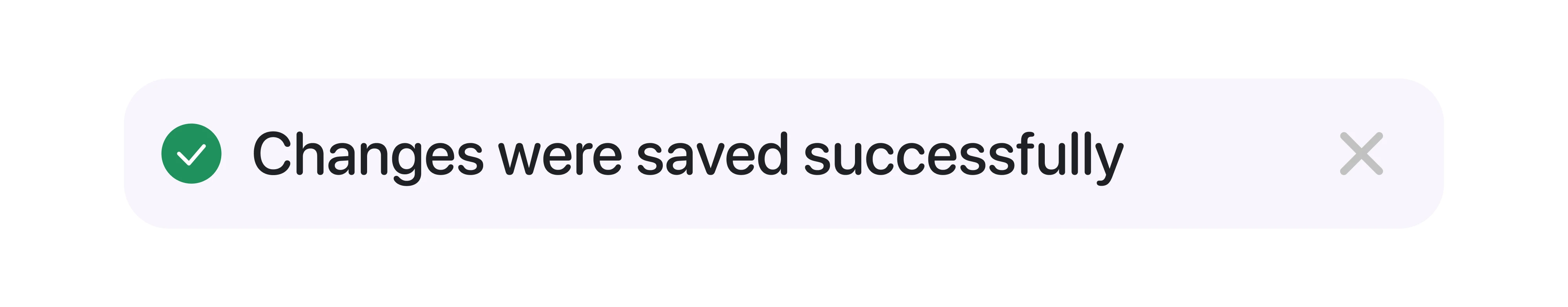
Not every notification needs an action attached, either. A toast confirming “changes saved” is the right kind of action-free notification because the user has already completed the action and only needs user confirmation from the system.
5. Group and batch notifications
Ten teammates collaborating on a document produce one notification at first and forty by the end of the week, while the user's tolerance moves in the opposite direction. Grouping is what keeps a notification system functional at a real-world scale.
There are three mechanisms worth knowing, and most products use a mix.
- Real-time grouping collapses similar events. “Anna commented on Q1 Strategy” becomes “Anna and 3 others commented on Q1 Strategy.” The user sees one card instead of four, and the information value is identical.
- Time-window batching holds similar notifications in a short buffer (15 minutes, an hour) and ships one combined message at the end. Useful for events that arrive in bursts but do not need instant attention.
- Scheduled digests roll a longer window of low-priority events into a daily or weekly summary. This approach works best for email and for an activity the user wants to track without being interrupted by.
Slack handles this well by adapting grouping to actual usage. When a channel is quiet, every message generates a notification because that matches the user's expectation. As the channel gets busier, Slack shifts the user toward mention-only and thread-only notifications and lets the rest live in the unread count.
However, security alerts, payment failures, direct messages, and anything time-sensitive belong outside the batching system. Critical notifications still need to arrive instantly because the cost of delay there is measured in real outcomes.
6. Respect timing and attention
Most articles about notification timing focus on when to send. The more important question is whether the user can receive. Even a perfectly written notification becomes a distraction if it appears in the middle of focused work.
This reframes timing as three operational decisions.
First, trigger notifications based on behavior, not schedules. Behavior-based triggers, like a stalled checkout, a returning user, or a teammate’s comment, work better because the message is already relevant. Scheduled notifications assume the user is ready. Behavior-based ones wait until they are.
The next layer is attention mode. Time zones, Do Not Disturb settings, focus sessions, and sleep windows are all clear signals about when users do not want interruptions. Respecting them is the minimum.
The better approach is understanding the user's context and knowing when to pause notifications during focused work sessions. If someone has been deeply focused on the product for thirty minutes, that is probably not the right moment for promotional and automated messages, even if the timing looks correct on paper.
This becomes important during onboarding. New users are still learning the product’s logic, so excessive prompts, tips, and notification banners can quickly make the interface overwhelming. The best onboarding flows introduce guidance gradually and reserve interruptions for moments where the user is most likely to need help.
7. Hand control back to the user
Every notification system runs on assumptions. The team assumes the user wants to know about this event, at this frequency, in this channel, at this time of day. Those assumptions are right often enough to keep the system worth using, but they are wrong often enough that the user needs a way to correct them without leaving the product.
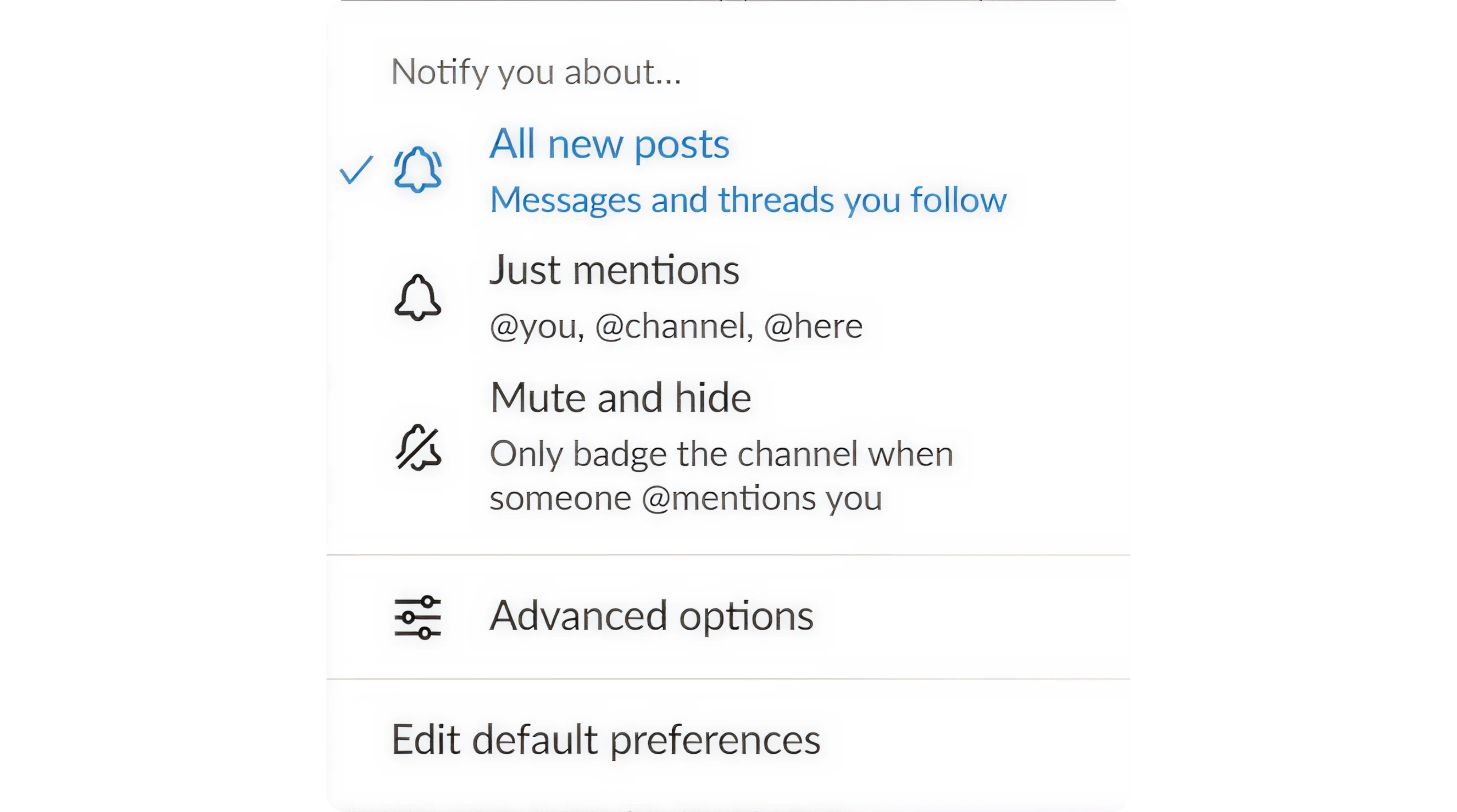
The instinct most teams have is to add more controls. Per-notification toggles, quiet hours, channel settings, and time-based rules. Some level of granularity matters, but most users do not want to manage a dashboard full of checkboxes.
The better approach is to give users simple control first. Modes like “calm,” “regular,” or “power user” let people adjust notification volume without thinking through every edge case, while a slow default notification frequency helps reduce fatigue for new users. More advanced settings can exist underneath for users who want them.
Control also needs to be accessible at the moment of frustration. If users have to dig through notification settings to stop a certain notification type, many will mute the entire channel instead. A simple “fewer notifications like this” or “turn this off” option works far better.
There is one boundary worth being explicit about. Not every notification should be user-controllable. Security alerts, billing failures, account verification, and other notifications tied to real consequences belong outside the preference system.
8. Design for the muted state
Push is the loudest notification channel, and it is also the easiest to turn off. Once a user mutes your push permission (and a meaningful percentage will), everything you ship into that channel from then on does not exist.
What remains is the in-app inbox, the badge on the bell icon, the unread count, the activity feed, the email digest, and whatever surfaces sit inside the product itself. For most of your users, those quieter surfaces are the entire notification system, and most teams pour effort into push and treat the rest as plumbing.
Designing for the muted state means treating the in-product surfaces as a first-class channel. That changes a few things in practice.
- The notification center UX needs to stand on its own. Users who come to it on their own schedule need to be able to scan, prioritize, and clear.
- Badges should be earned. An unread count is a small but persistent attention tax. Use it for events the user actually cares about resolving.
- The “what you missed” surface matters. Users opening your product after a few days away need a clear summary of what happened.
- Cross-device state needs to be honest. If a user reads a notification on the web, the mobile badge should clear.
The deeper point is that notifications are not a delivery mechanism, they are a state. Your product is in a state of having things to tell the user, and the user is in a state of having things to attend to or ignore.
Push is one expression of that state. The in-product surfaces are another, and for muted users, they are the only ones. Design them with the same care as the push copy you spent two weeks on.
Real-world notification UX examples in SaaS products
With guidelines on paper, it is tempting to start designing by checking off all the notification UX best practices. The harder question is whether they hold up inside a specific product, across thousands of users, in a particular industry. The six examples below show how design teams answered that.
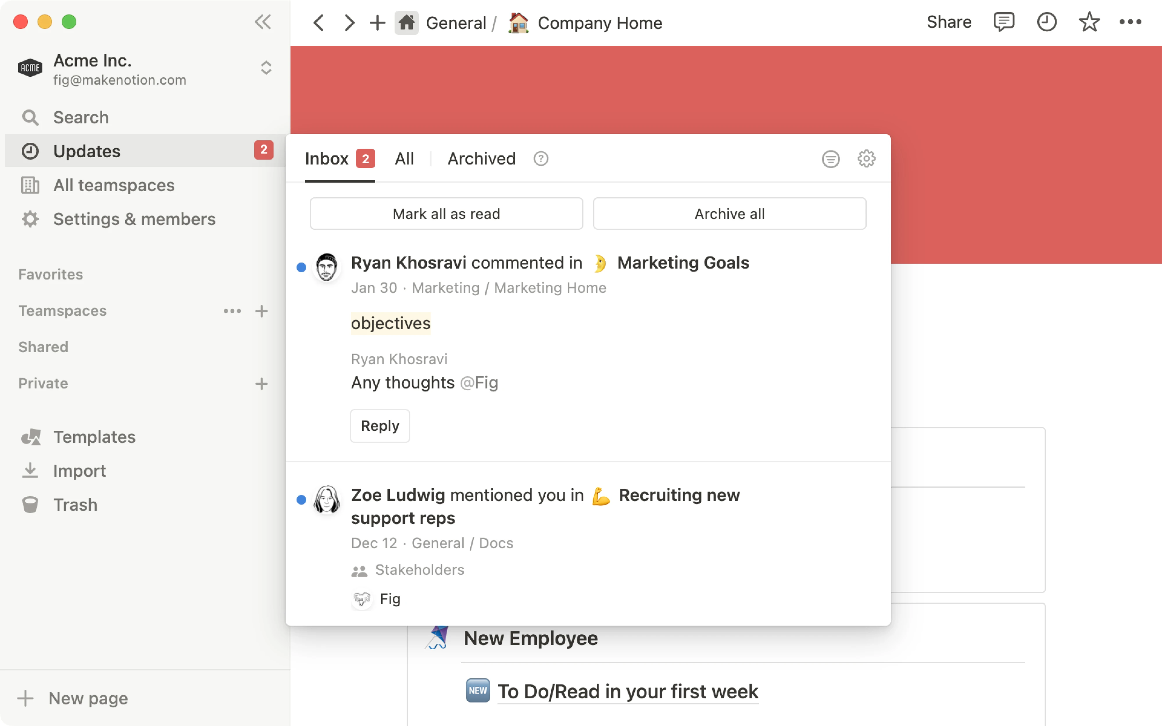
Notion
Notion's notification system is built around the idea that you should only hear about the things you are actually involved in. Mentions, comments on your pages, and replies to your threads come through the inbox, while everything else stays quiet.
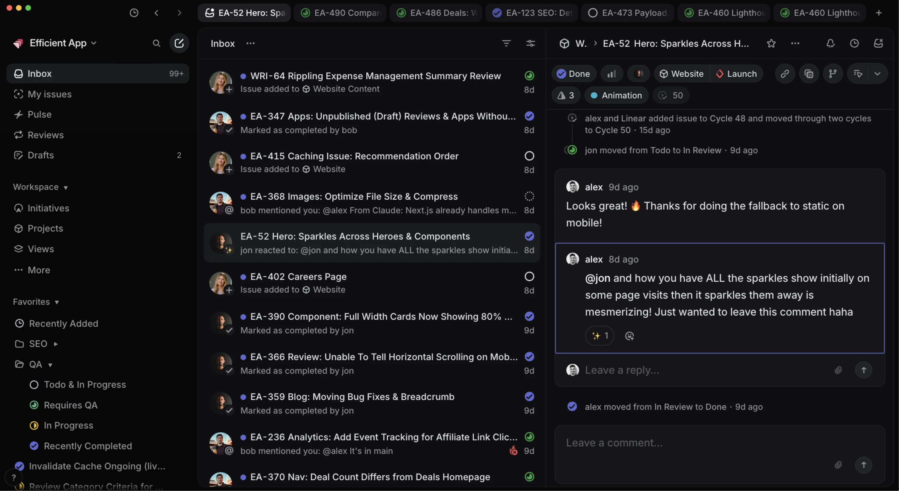
Linear
Linear's notification system treats the inbox as the primary surface. Every notification arrives in a filterable list with mark as done, snooze, and open built into each card, so users can clear an entire morning's worth of activity without leaving the page.
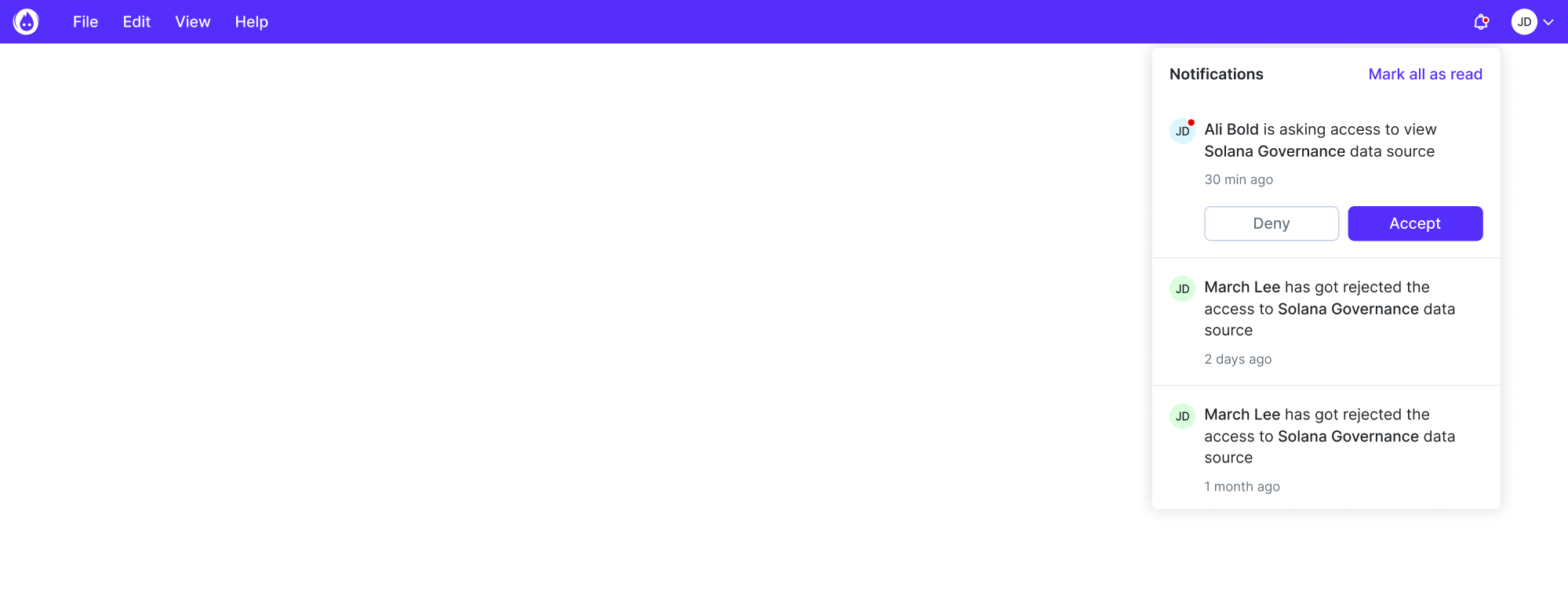
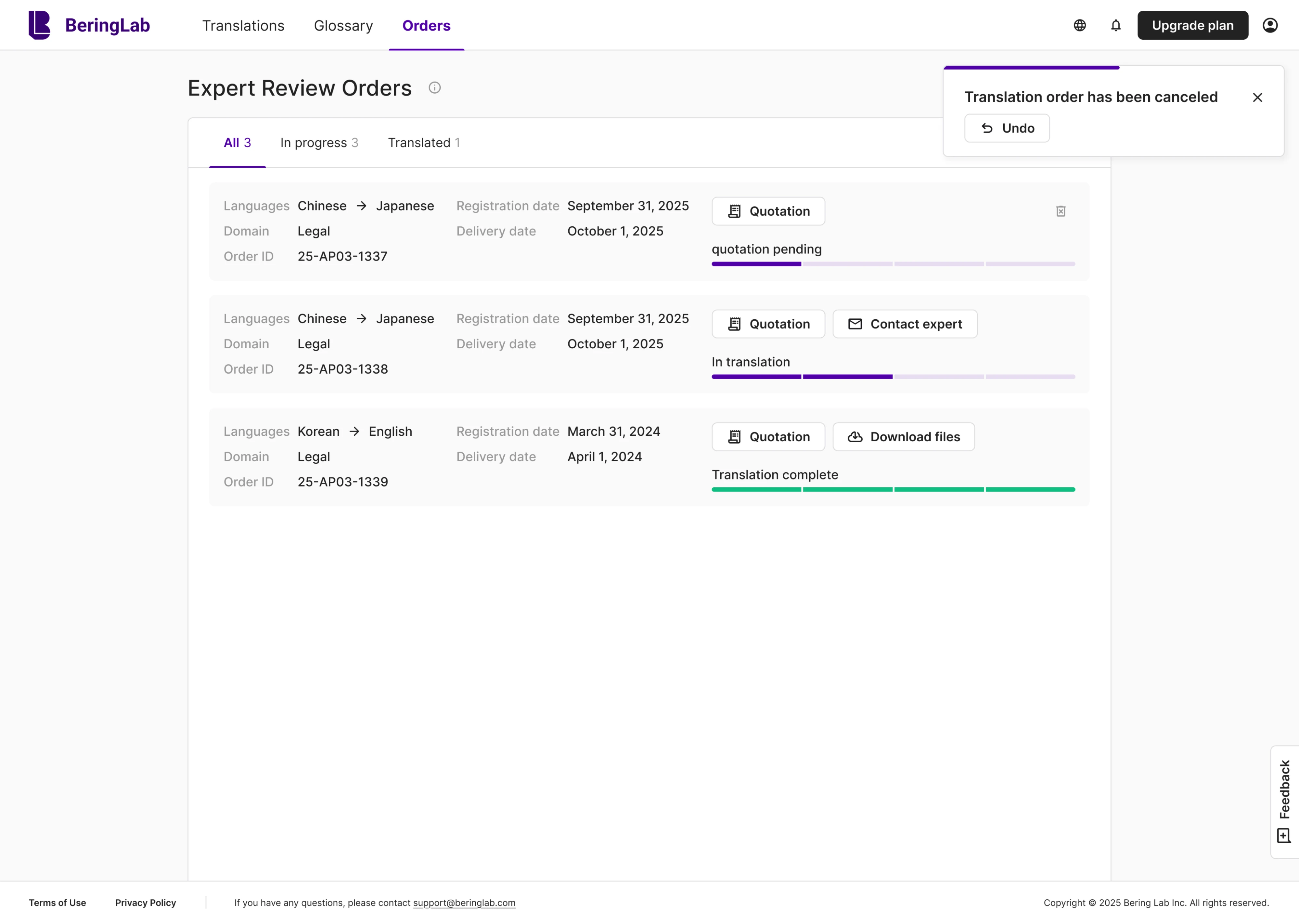
Bering Lab
Working with Bering Lab, we designed a cancellation UI notification as a small toast that appears in the corner with an Undo button. A thin progress bar shows how long the toast will stay, so the user knows how much time is left to react.
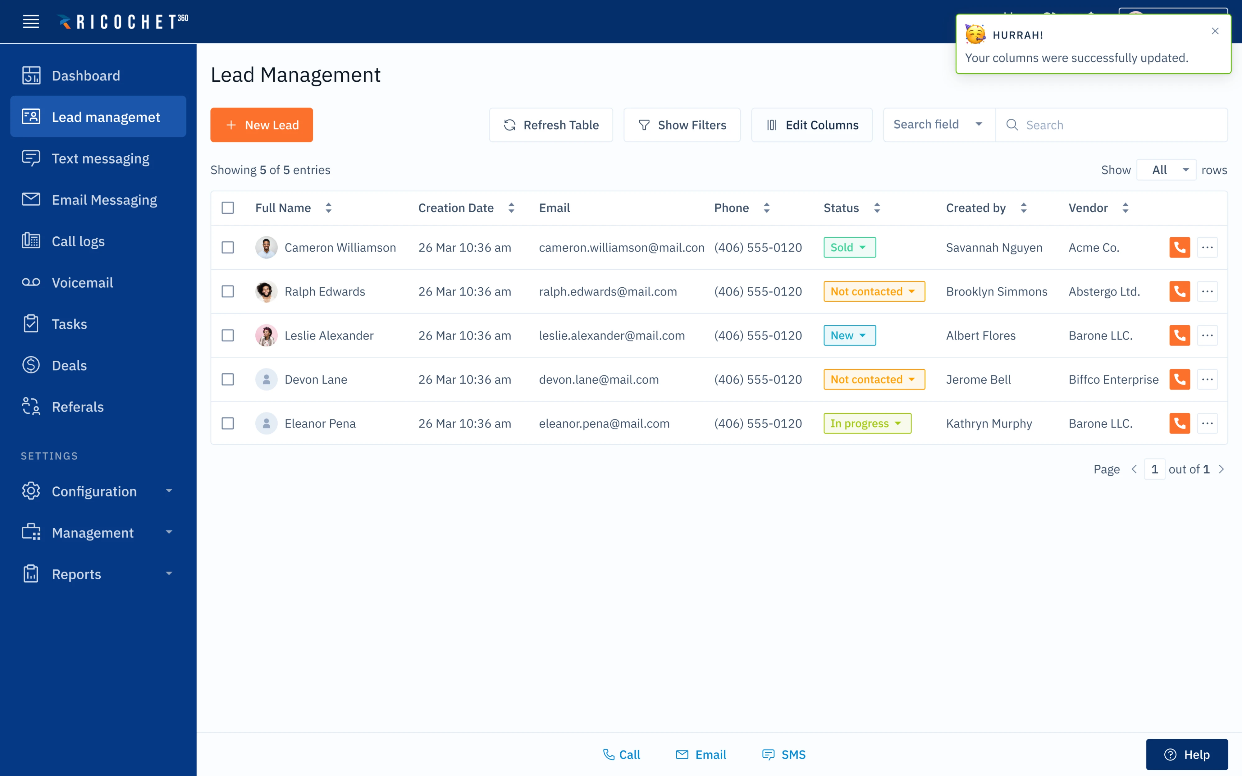
Ricochet
For Ricochet, we build a notification system around small toasts that confirm changes. The same pattern carries across the product for low-stakes confirmations, so users learn to scan the same corner of the screen for appropriate feedback.
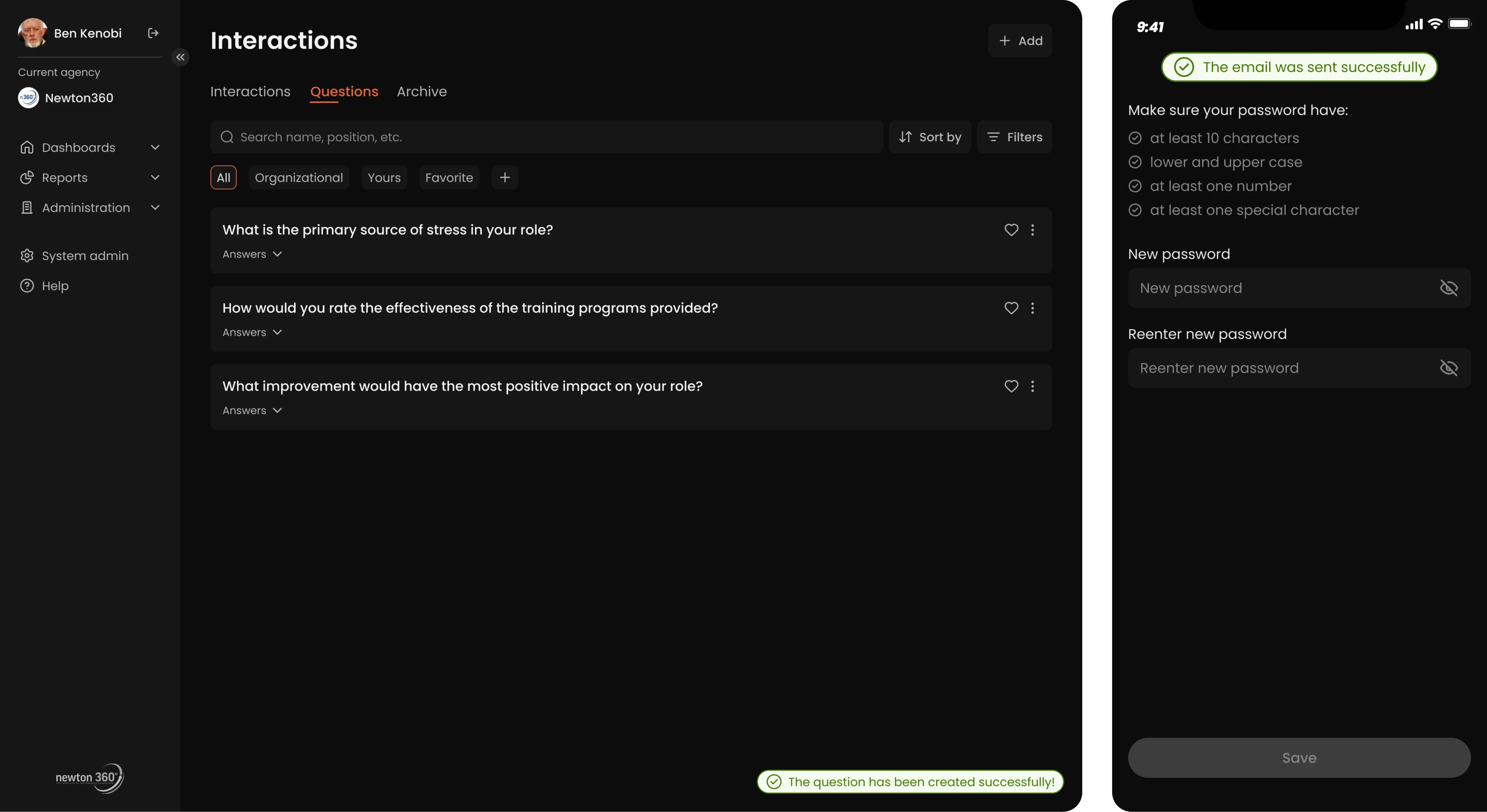
Newton360
As in the previous projects, we kept the Newton360 notification system quiet. Confirmations appear as a small toast in the bottom right on desktop and at the top center on the mobile app, with a soft green accent showing the action was successful.
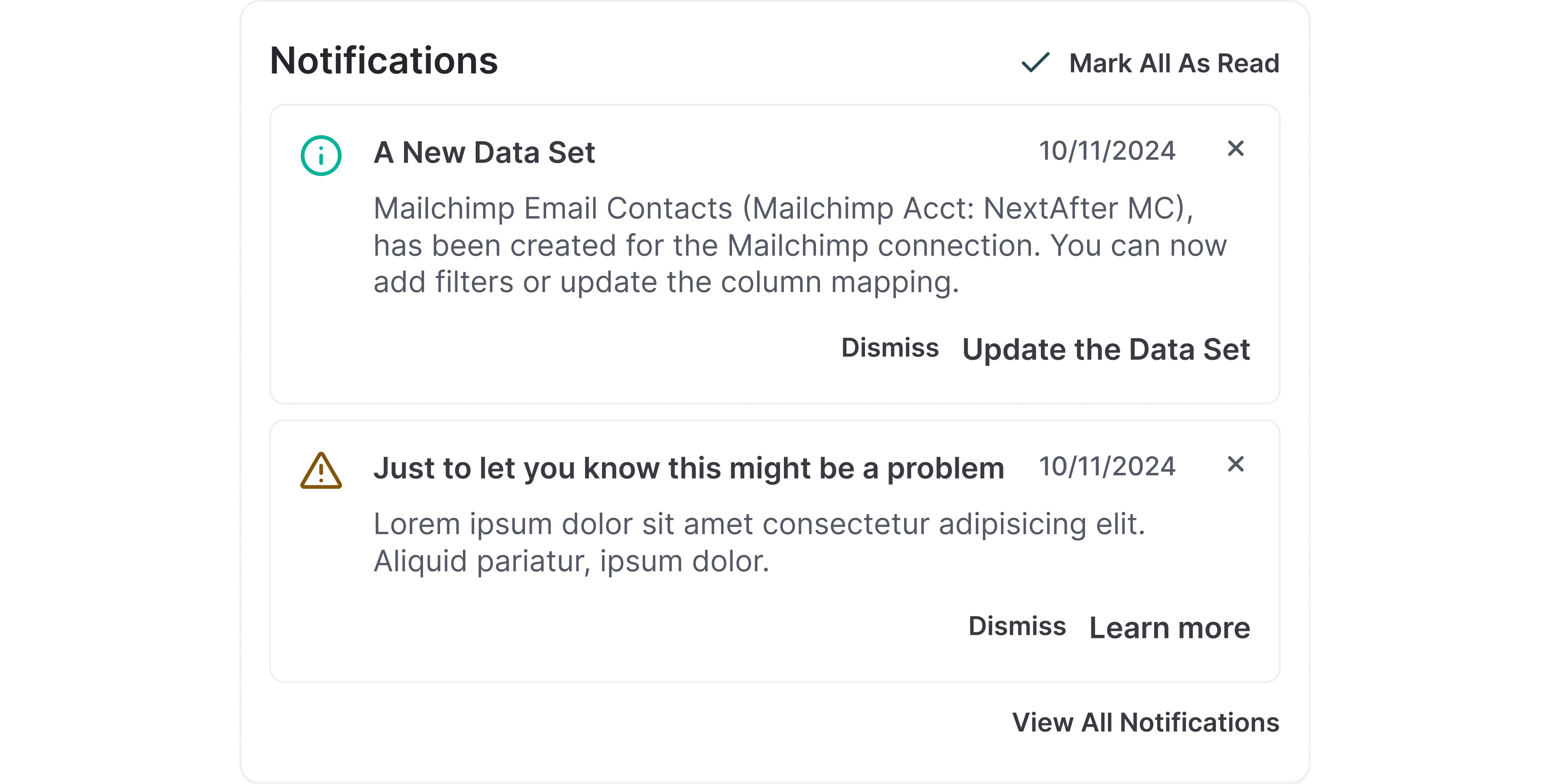
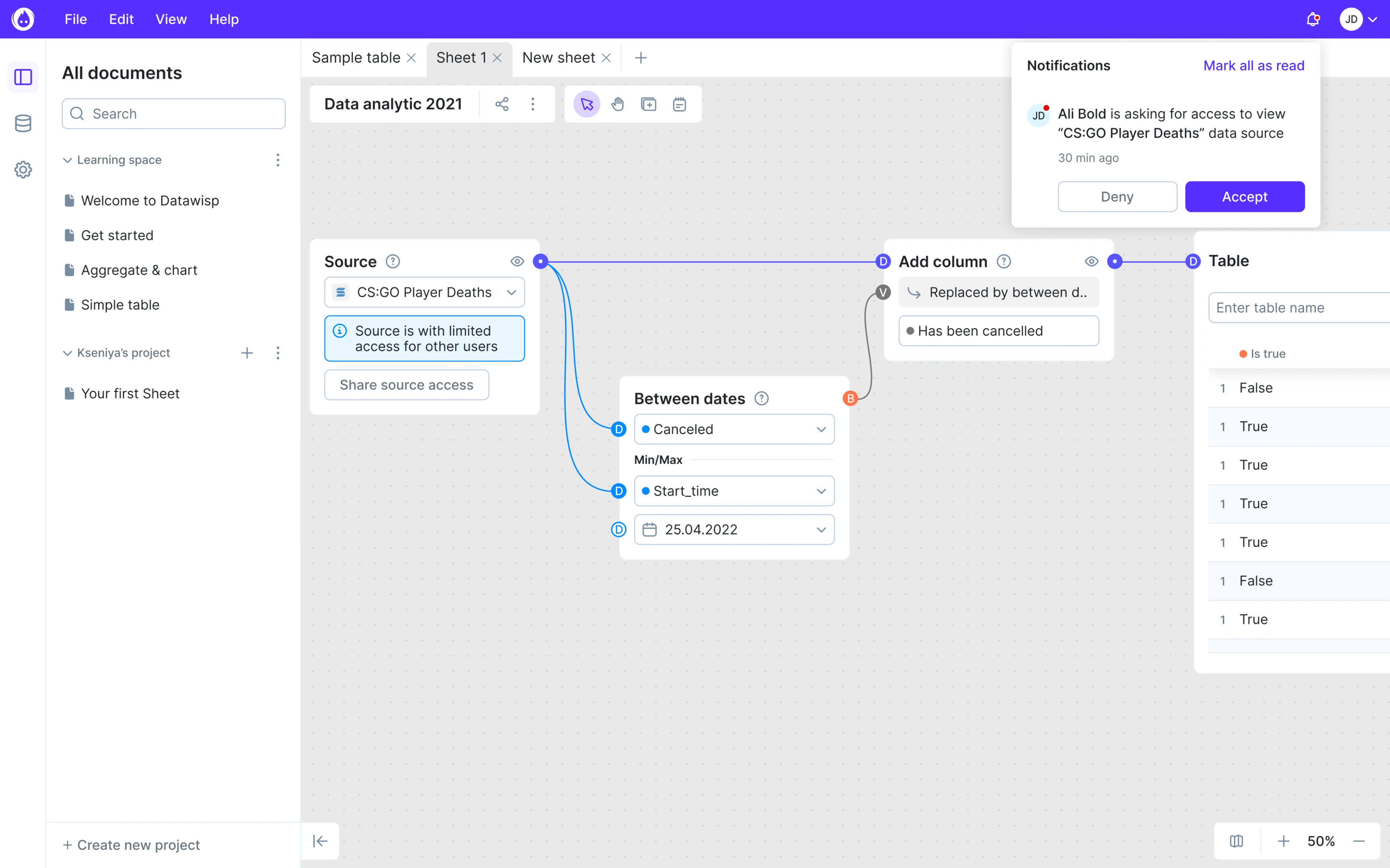
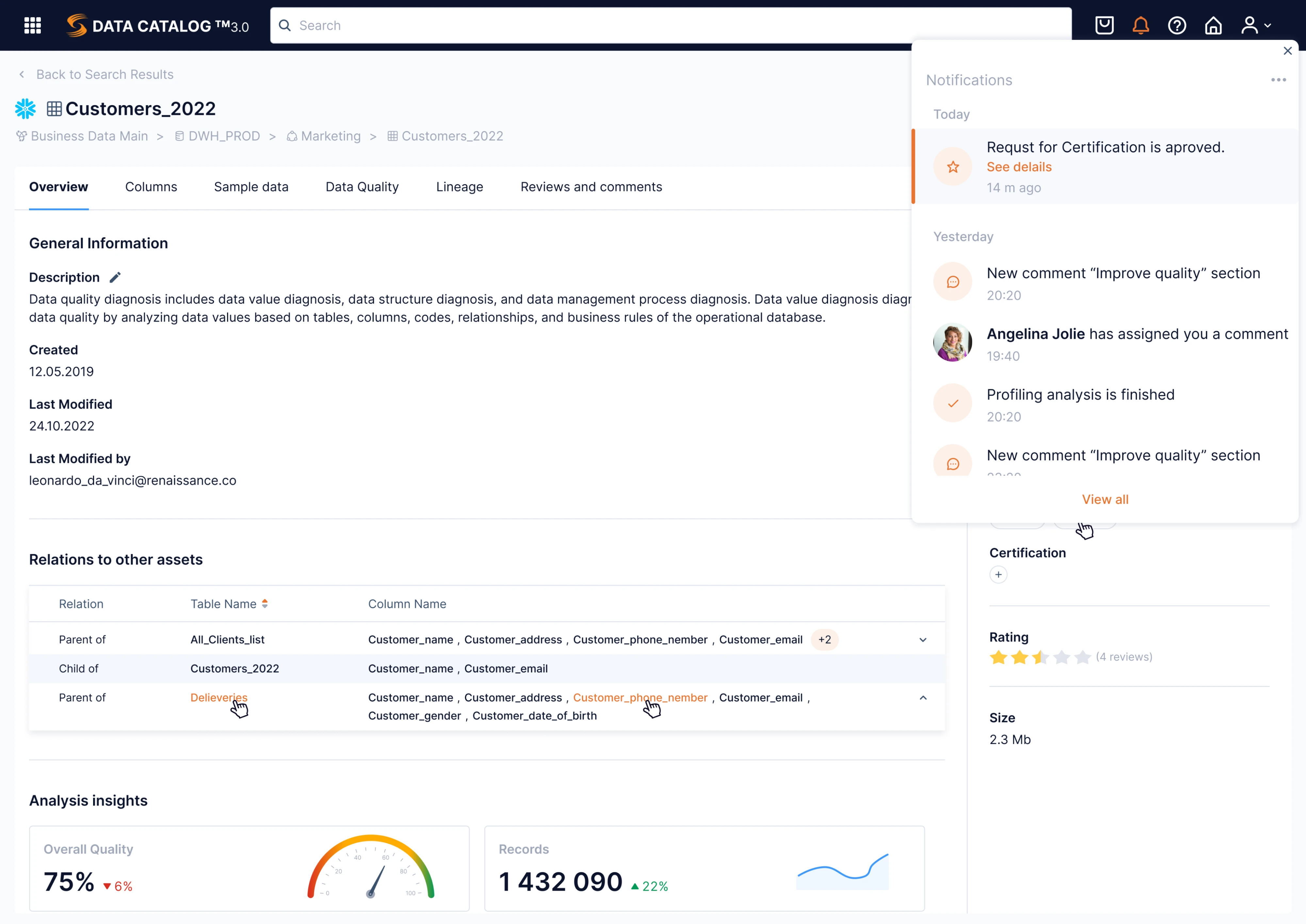
Data Streams
Data Streams runs a two-layer notification system. Quiet success and error messages handle in-the-moment feedback, while an inbox holds the full history. We grouped items by day, showing what happened, who triggered it, and how long ago.
Closing note
The guidelines and examples in this article are the UX patterns that hold up well across products we have shipped and products we have studied. They are starting points for the harder editorial work of deciding what your product should ever say to a user in the first place.
If you are thinking through that decision now and want a second set of eyes, that is the kind of work we do at Eleken. We have helped SaaS teams design notification systems (and the rest of their product) so the channel stays alive long enough to matter, and we can help you do the same.


.png)

.png)