Imagine you are a host of a party meeting awaited guests. You want to make the best impression possible and get many useful connections, so you thought out all the details and did your best to ensure everybody enjoyed the party. Apply the same situation to your website. Is your “home” ready to provide people a smooth and delightful experience? Have you taken care of your visitors the way they want to keep on collaborating with your business? Are you sure you did everything possible to help users take an expected action?
If you are wondering what is the relation between all said and the UX design, I would say - direct. The same as you decorate your house and make necessary arrangements to host a party, prepare your website or app to meet the customers through a well-thought and friendly user interface. Our skilled designers would prove that, besides creativity, a user-centered design should adhere to the fundamental UI/UX design rules to help a company achieve business goals.
This article gathered nine user interface design principles that will nudge your website guests to leave you their visit (read - credit) card details and push “purchase”.
So, let’s figure out what makes UI design good.
Principle 1: Meet users needs
In other words, the main principle you should build your design around sounds like “put the user first.” UI/UX design is customer-centered, meaning you need to consider whether your design satisfies customers’ needs and helps users achieve their goals. It’s crucial to walk in customers’ shoes and understand what they’re looking for when interacting with your website or app.
A UX designer and a design director of Mailprotector Jeremy Nigh said that the “U” in UX doesn’t mean “You” but “User”. Whatever excellent you think your design is, the actual customers may feel the opposite. Try looking impartially and reveal through UX research and UX audit what your customers really need.

As UX design’s primary purpose is to help users solve their problems, usability is one of the paramount user experience principles. Each design element, be it an icon, button, or image, should have a meaning and lead to a specific action you want users to take. Then it will be a good decision to run usability tests during the prototyping phase, long before your product goes live.
When designing, it’s also important to take into consideration the user’s context. It’s the location where a customer interacts with the design, the device, time, emotional state, and other people influencing the customer’s behavior. Understanding these environmental factors is a core part of applying psychology in UX, as it helps anticipate how external triggers affect a user's focus.
Principle 2: Speak customers language
The statement above refers to both words and visuals we use in a product’s interface. Take for granted that nobody will spend extra time on guessing what an author (you) wanted to say with niche jargon or technical terms only your developers can get the point. This approach is rooted in various UX psychology laws that prioritize familiarity and mental models, ensuring that users feel confident and in control while navigating the interface.

You should avoid (or at least reduce) ambiguity in UX-copywriting and graphic elements.
Here are some tips on how to make your design language readable and understandable:
- Define who your audience is - what they need, what they’re searching for, and what goals they want to achieve by interacting with your product
- Build your design template focusing on the typography, page layout, and infographics
- Choose communication style and tone of voice your audience would better accept
The system should speak a real-life language. Just imagine how often you answer “OK” when somebody asks you “Are you sure?” Not often, right? The most common reply would be “Yes”. Then, use it in your system messages’ copy.

Visual metaphors should also correspond to real-world experience. The concept of a recycle bin icon on Mac, for example, would be easily caught even by those who had never seen any PC before.

Principle 3: Organize content clearly
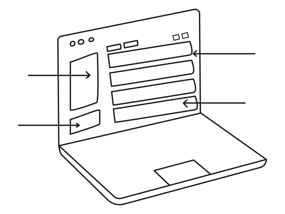
This principle is talking about information hierarchy that helps users easily navigate through the website or app design. When you come to a random website, more likely, you will see the navigation bar showing the main sections like About, Products, Prices, Contact Us, etc. These sections make up the primary hierarchy. If you hover over one of them, the sub-sections appear, announcing what you will find when diving deeper into the website.

The more logical you arrange your site map, the easier it will be for customers to navigate, and the smoother user experience they will eventually have.
What is also worth mentioning is the size of target buttons and typography. The bigger-sized buttons ensure efficient interaction reducing the risk of performing the wrong action. And well-thought typographic choices can significantly improve a website’s accessibility facilitating perception of written information.

Principle 4: Don’t overwhelm, be simple
To put it another way, every design element that doesn’t assist in users’ goal achievement should be a subject to elimination. The unnecessary information distracts customers from their primary purpose wasting cognitive and operational resources. The pioneer who adopted a less-is-more design approach was Apple. From 2007 when the iPhone was introduced till nowadays, Apple follows the principle of simplicity in their products and website’s design. By stripping away the non-essential, they create a powerful visual hierarchy that naturally directs the eye to the most important actions and information without any friction.

Another example of less-is-more philosophy in design is iA Writer, an app looking like a plain sheet without any distractive content or information. The simple UI allows writers to concentrate on the creative process, making it easier to get into the flow yet providing users with helpful tools to improve their writing.


Principle 5: Keep design consistent
When people start using a new product, they expect it to be similar to what they have already experienced before. This way, users may reduce the cognitive load they encounter trying to learn something new. Design consistency follows the idea of so-called transferable knowledge. Microsoft adheres to this concept making design consistent throughout all products. For example, using Microsoft Word will help quickly adopt Excel or PowerPoint, which have similar UI concepts.

Being comfortable for users, design consistency makes the design process easier for UX and UI designers as well. There is no need to continuously create new solutions when starting to work on a new product.
Consistency in UI embraces:
- Visual consistency - all elements should look the same within one product
- Functional consistency - all objects should work in the same way, preventing users from becoming confused with unexpected changes in item functionality.
- Expectations consistency - using hundreds of different websites, users form certain expectations as of how interface components should work or look. If you destroy their expectations with a super creative design solution, users will “thank” you with frustration and a high bounce rate.
Also, don’t try using new UI/UX terminology - stick to wordings most people are familiar with. This reliability is closely linked to gestalt principles, specifically the law of similarity, which helps users categorize and understand interface elements based on their shared visual characteristics.
Principle 6: Give feedback to users’ actions
Is there anything on Earth more frustrating than pushing a button on a website and having no idea what is happening? The great UX design should always inform customers of their system status and action progress.
Say, you started downloading a file and naturally expect the website to show you some sort of progress bar or a countdown to understand how much time is left. In its essence, the design feedback is a dialogue between humans and machines. The design may respond by altering the target button’s color, shape, or any other visible changes. Or, for example, you can show how many minutes are left to complete the task. To illustrate what I’m talking about, look at the GIF below. Do you see the button’s color is changing? That’s how the system is interacting with users. Integrating these responses is a core part of the principles of design, as it reduces uncertainty and ensures the user remains in control of the interaction.

Relevant error messages are as important as feedback. Users will have a better experience if, together with explicit communication of an error, you will give them hints on how the problem can be solved. Stay polite, helpful, and upbeat.

You can also create preventive messages warning users about possible issues. For instance, Gmail uses pop-ups to notify customers about missing attachments.

A good design is sending comprehensive error messages, whereas a great design is trying to prevent errors. Anticipating user mistakes before they happen is a core strategy often discussed in the simplicity in UX debate, as it reduces the need for complex recovery flows.
Principle 7: Allow users to control the process
People like feeling confident that everything is under control. When we know that our mistakes can be easily fixed, this gives us more freedom to explore new options and inspire us to be courageous and creative. The top-of-mind option that gives control in our hands is Undo. This function is critically important for text and graphic editors, where the creative process implies multiple changes to achieve perfection.
Also, Undo is helpful when users perform an action by mistake and want to backpedal it. For instance, Gmail sends a notification message offering to undo just deleted email.

I’m sure the possibility to rewind the wrong action saved millions of lives (definitely, mine is on the list). Thanks to Apple’s notification asking if I was sure to permanently delete the items in the Trash, I rescued the files that cost me tons of time and nerves.

Principle 8: Make interaction a no-brainer
Whether your user is an advanced expert or a no-clue newbie, the interactions with your website or app should be comfortable for both. For those who start using your product, tutorials and explanations would be helpful. For customers who are already familiar with the functionality, you should offer shortcuts to shorten the path to the mostly-used actions.

Principle 9: Mind accessibility
In the modern world, where we celebrate our differences, accessibility has become a must for digital products. It’s a designer’s responsibility to ensure that people with various impairments, temporary or permanent, will have a hassle-free experience interacting with a website or application.
When designing a product, it’s crucial to build it for users with poor vision (who are blind or can’t distinguish the colors), who have motor, hearing, and cognitive impairments (like, for example, dyslexia).
We have a separate article on our blog dedicated to inclusive design examples, so if you find this topic interesting, take a look. Focusing on simplicity in UI UX in this context means removing barriers so that the interface remains functional for everyone, regardless of their physical or cognitive abilities.
To complete the above principles list, I’m adding here some more UX design rules and UI principles our experienced designers follow in their projects.
Top UI/UX principles from Eleken designers
- It’s critical to build the right navigation in the interface and outline the navigation hierarchy
- If you can leverage visual objects like style and patterns - do it. It will keep the consistency and will relieve a headache of your developers
- Don’t put a dozen buttons on one screen. Limit yourself to one primary button, a couple of secondary ones, and hide the others. This is one of the most practical simplicity design tips, as it prevents decision paralysis and keeps the user's path clear
- UI design is all about managing customers’ attention. The good design doesn’t need onboarding - it will lead customers to an action we want them to take
- Be simple and follow the less-is-more approach. At the same time, don’t oversimplify and remember that there are things that should be complicated
- Mind accessibility (especially colors and fonts). We make design for everyone, not only for youngsters with the perfect sight.
By the way, you can learn more about accessibility in UX in our next article.
We hope the information in this article will help you create a great UI design for your digital products. And if you ever need a helping hand - let us know; we are here for you.


