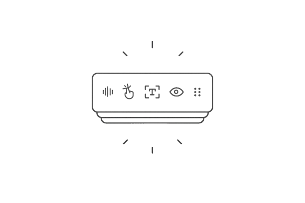


Interfaces no longer live only on screens.
Today, people interact with digital products while walking, driving, cooking, multitasking, and moving between devices. They might speak to a voice assistant, tap a smartwatch, upload a photo, or continue a task on another screen — often within the same experience.
Modern systems increasingly combine multiple signals at once: voice, touch, text, location, context, and behavior. Users, however, don't think in terms of "modalities." They're simply trying to accomplish something with as little friction as possible.
This shift is driving the rise of multimodal product design — an approach that combines different interaction methods into one coherent experience. The goal isn't to add more ways to interact with a product. It's to reduce the gap between human intent and system understanding.
In this guide, we'll explore what multimodal UX design is, how multimodal systems work, where they often fail, and what designers can do to make interactions feel more natural and intuitive.
What is multimodal UX?
Multimodal UX is an approach to designing products that combine multiple ways of interacting with a system — such as voice, touch, text, gestures, vision, haptics, or contextual signals — into a single user experience.
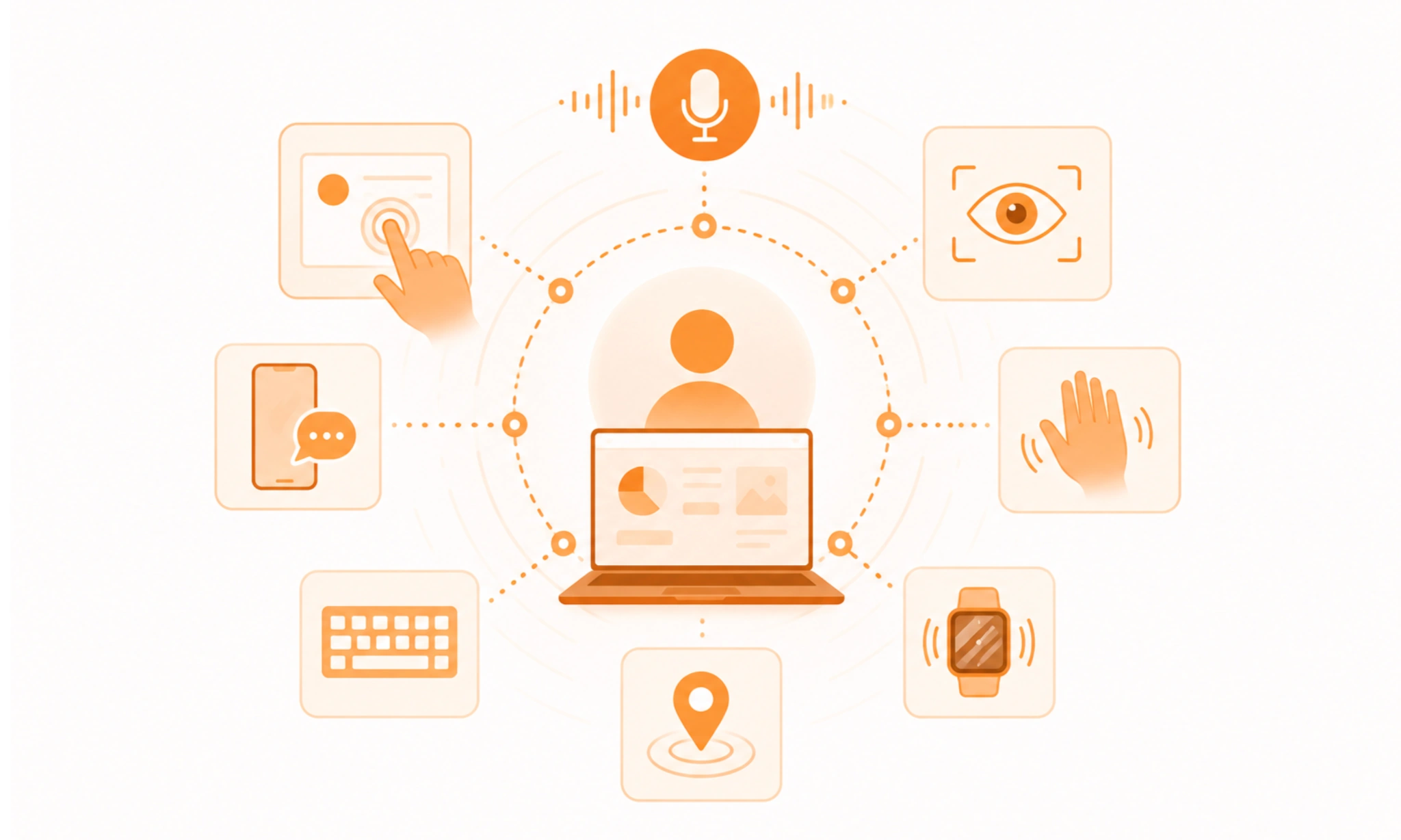
The key idea isn't that multiple modalities exist. Most digital products already support more than one input or output method. What makes an experience truly multimodal is how those modalities work together.
For example, a user might:
- ask a question using voice,
- refine the result with touch,
- receive visual feedback on a screen,
- get a haptic confirmation when an action is complete.
Rather than functioning as separate interaction channels, these inputs and outputs support the same task.
This is what distinguishes multimodal design from simply adding more features. The goal is to create a system that understands intent regardless of how users choose to express it.
Multimodal vs. unimodal interfaces
Traditional interfaces are often unimodal — they rely primarily on a single interaction method.
A calculator app, for example, expects touch input. A voice assistant expects spoken commands. The interaction model is relatively fixed.
Multimodal systems are more flexible. They allow people to switch between multiple modes depending on context, user preferences, or circumstances.
The tradeoff is important. Multimodal systems can reduce friction for users, but they also introduce more design complexity behind the scenes.
How does multimodal UX work
From a user's perspective, multimodal interaction design feels simple. You speak, tap, point, or upload something — and the system responds.
Behind the scenes, however, a lot is happening.
Most multimodal systems follow a similar process:
Input → Interpretation → Orchestration → Response

The challenge isn't collecting signals. It's turning them into a coherent understanding of what the user is trying to do.
Step 1. Signal capture
Everything starts with input.
Depending on the product, that could include:
- voice commands,
- touch interactions,
- typed text,
- images,
- gestures,
- location data,
- eye tracking,
- or device sensors.
A single interaction may generate several signals simultaneously. For example, a user might upload an image, type a question about it, and highlight a specific area on the screen.
Step 2. Intent recognition
Raw input doesn't mean much on its own.
The system needs to interpret what the user is trying to achieve.
If someone says: "Find restaurants like this" while uploading a photo of a meal, the goal isn't processing speech or image data separately. It's understanding the underlying intent.
This is where AI and natural language processing increasingly come into play, helping systems move beyond individual inputs and focus on user goals.
3. Modality fusion
This is where multimodal UX becomes truly multimodal.
Instead of treating inputs independently, the system combines them into a shared understanding.
A good example is ChatGPT's multimodal experience. Users can:
- type,
- speak,
- upload images,
- and continue the same conversation.
The interaction feels unified because the system merges different signals into one context instead of creating separate workflows for each mode.
4. Prioritization
Not every signal deserves equal weight. Sometimes modalities reinforce each other. Sometimes they conflict.
Imagine a user saying: "Open this" while pointing somewhere else on the screen.
Which signal should the system trust?
Resolving these situations requires clear rules, confidence scoring, and context awareness. Without them, multimodal interactions quickly become confusing.
5. Feedback loops
Finally, the system needs to communicate what it understood.
This is where many multimodal experiences succeed or fail.
Good systems provide feedback through multiple channels:
- visual cues and confirmations,
- audio cues,
- haptic responses,
- or conversational clarification.
Users shouldn't have to guess whether the system understood them correctly.
The best multimodal experiences make interpretation visible, reducing uncertainty and building trust along the way.
The hidden challenge: modality orchestration
Most articles talk about modalities themselves. The harder problem is making them work together.
Different input modalities—voice, touch, text, and visual inputs—can either complement each other or compete for attention. As more interaction methods are added, the challenge shifts from recognition to orchestration.
Designers need to answer questions like:
- What happens when inputs conflict?
- Which modality takes precedence?
- How does the system recover from ambiguity?
- When should users be asked for clarification?
Ultimately, multimodal UX isn't about supporting more inputs. It's about making multiple inputs feel like one coherent conversation with the system.
Common multimodal design patterns
Not every multimodal experience needs voice, gestures, eye tracking, and AI working simultaneously.
In practice, most successful products rely on a handful of repeatable patterns that help users move between modalities naturally. The goal isn't to maximize the number of inputs — it's to make interaction feel effortless.
Redundant input
This is the simplest and most common multimodal pattern.
Users can accomplish the same task through multiple options depending on their preferences or situation.

For example:
- typing or voice input,
- clicking a button or using a keyboard shortcut,
- scanning a document or uploading a file manually.
Google Search is a great example. Users can type a query, speak it, upload an image, or combine several methods at once.
The benefit is flexibility. The challenge is ensuring every option delivers a comparable experience.
Sequential multimodality
In this pattern, one modality starts the interaction and another completes it.
For example:
- voice initiates a task,
- touch refines the result.
Imagine asking: "Find flights to New York" and then using filters on the screen to adjust dates, price ranges, or airlines.
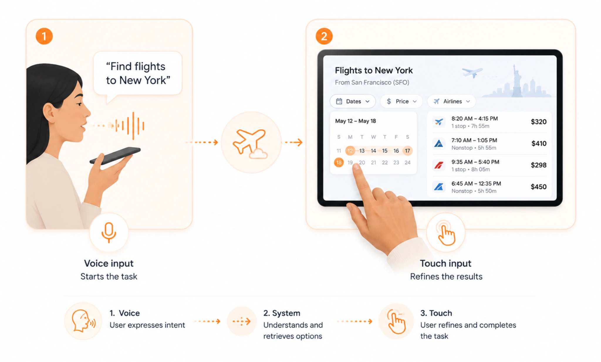
Many AI assistants increasingly follow this model because voice is great for intent, while visual interfaces are better for precision.
Simultaneous multimodality
Some interactions rely on multiple inputs at the same time. A common example is pointing while speaking.
Imagine using a spatial interface and saying: "Move this over there" while looking at or pointing to specific objects.

Neither signal is sufficient on its own. Together, they create a complete instruction.
This pattern is becoming increasingly important in AR, VR, and spatial computing environments.
Context-aware prioritization
Different modalities work better in different situations.
When driving, voice often becomes the primary interaction method. On a smartwatch, glanceable information and haptic feedback may matter more than detailed visuals.

Good multimodal systems adapt to context instead of forcing users into a single interaction style.
The goal isn't offering every possible input. It's prioritizing the one that creates the least friction in a given environment.
At Eleken, we explored this challenge while designing Hubble Network, a geospatial SaaS monitoring platform. Users constantly switch between interactive maps, live device alerts, and dense data tables depending on what requires their attention.
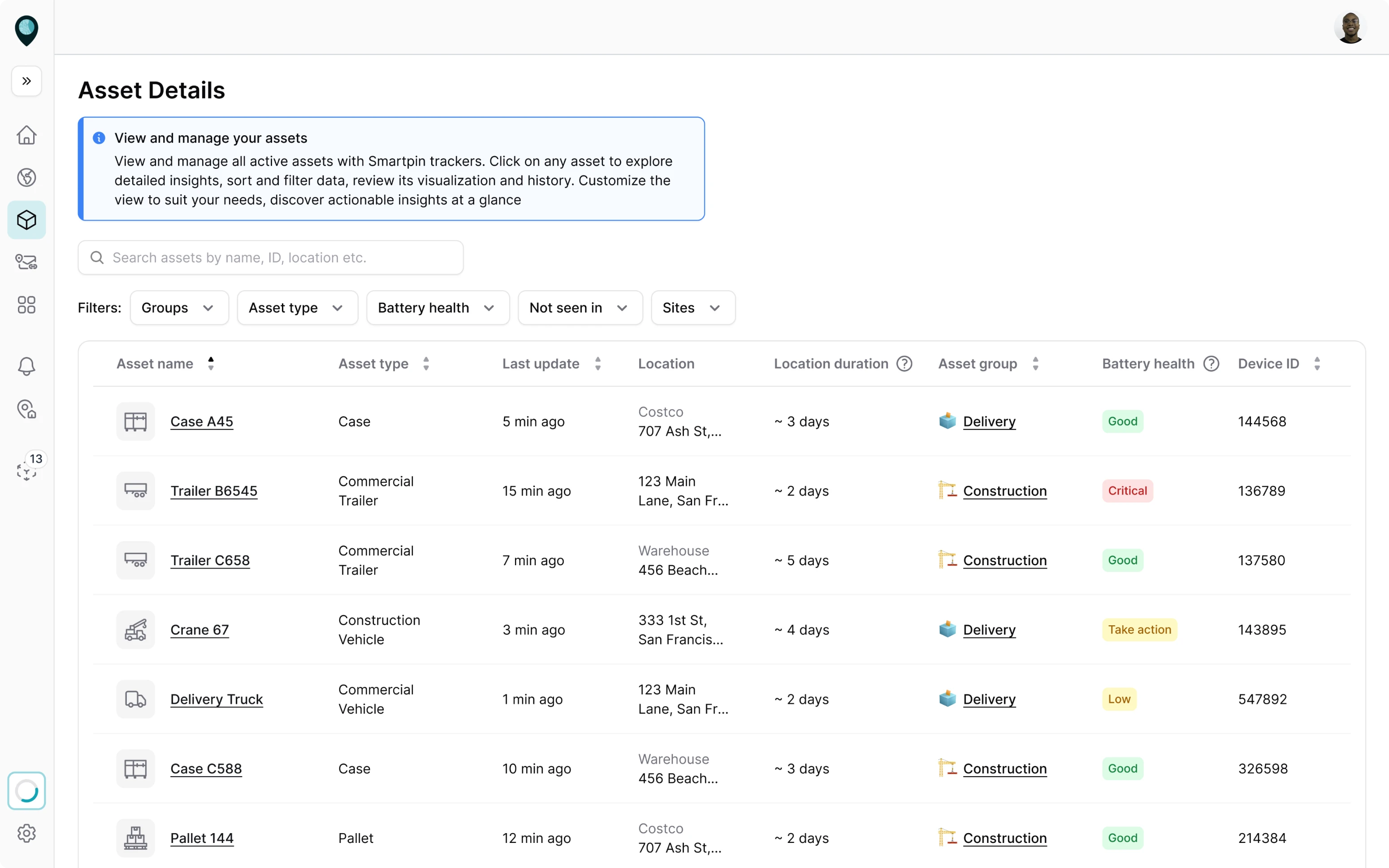

Rather than treating each view as a separate experience, we designed the interface to help users move naturally between spatial context, system events, and detailed analysis without losing situational awareness.
Ambient multimodal interaction
This is where multimodal UX starts to overlap with AI and proactive systems.
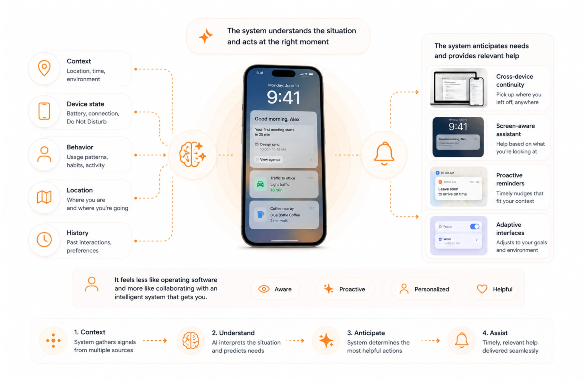
Instead of waiting for commands, the system continuously combines:
- context,
- device state,
- location,
- behavior,
- and previous interactions.
Examples include:
- cross-device continuity,
- screen-aware assistants,
- proactive reminders,
- and adaptive interfaces.
The interaction feels less like operating software and more like collaborating with an intelligent system that already understands the situation.
As these patterns evolve, the strongest multimodal experiences tend to follow the same rule: users should focus on their goal, not on choosing the "correct" way to interact.
Real-world multimodal UX examples
Multimodal UX often sounds futuristic, but most people already use multimodal systems every day. The difference is that the best examples don't draw attention to the modalities themselves — they make interaction feel natural.
ChatGPT
Pattern: Voice + text + vision in a shared context
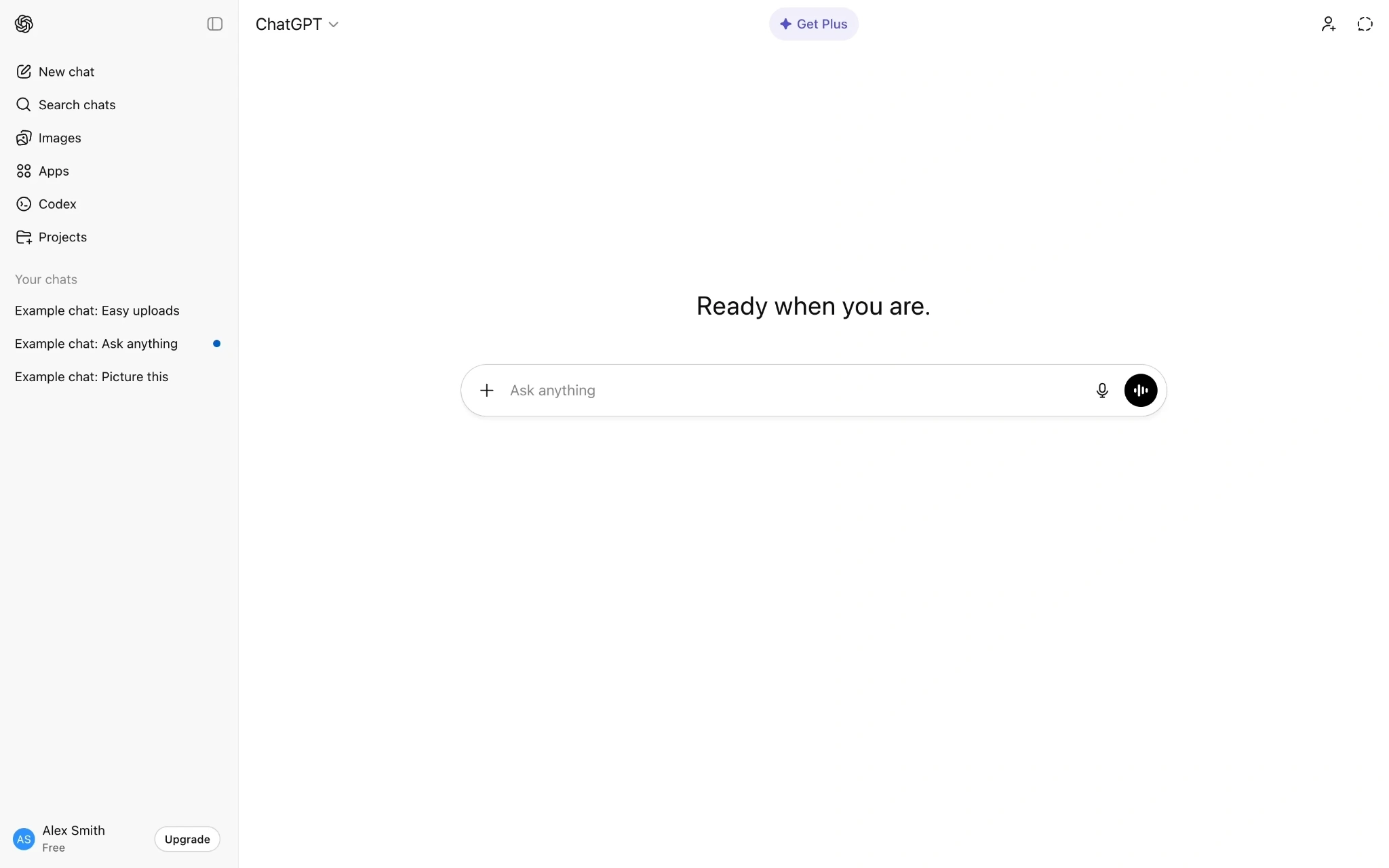
ChatGPT has become one of the clearest examples of multimodal interaction in practice. Users can:
- type questions,
- speak naturally,
- upload images,
- share documents,
- and continue the same conversation across all of them.
What it does well: Different inputs feel like part of one interaction rather than separate features.
Tradeoff: Users don't always know what the system can perceive or how it prioritizes different inputs.
Google Maps
Pattern: Context-aware multimodality

Google Maps combines:
- voice guidance,
- visual navigation,
- location awareness,
- and touch interaction.
Drivers can keep their attention on the road while receiving spoken directions, then switch to visual exploration when planning a route.
What it does well: Adapts interaction to context.
Tradeoff: Too much information at the wrong moment can still create distraction.
Apple Vision Pro
Pattern: Spatial multimodal interaction
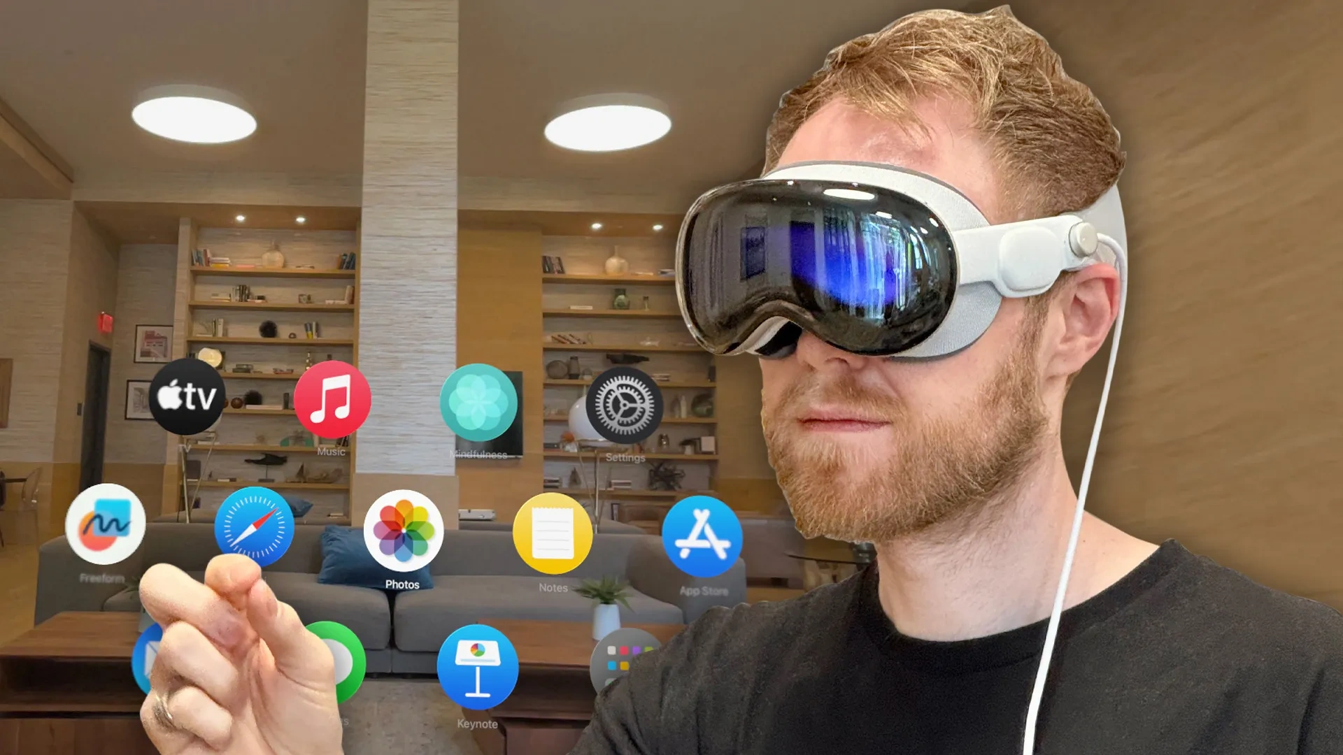
Vision Pro combines:
- gaze,
- hand gestures,
- voice,
- and visual interfaces.
Users rarely need to think about which modality they're using. Looking at an element, pinching fingers, or speaking can all contribute to the same interaction.
What it does well: Makes digital interaction feel more physical and intuitive.
Tradeoff: New interaction models come with a learning curve and discoverability challenges.
Tesla
Pattern: Hybrid physical and digital controls
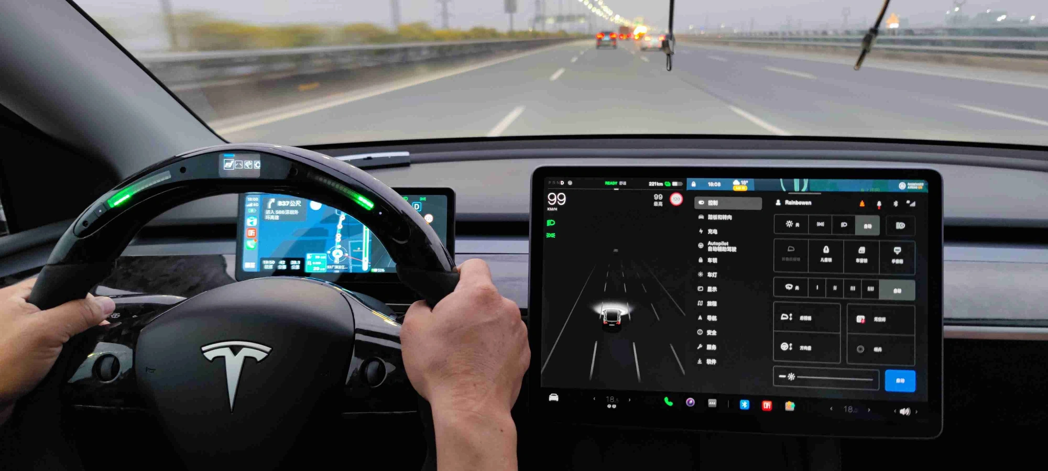
Tesla relies heavily on touchscreens while supporting voice commands and contextual automation.
Users can:
- adjust settings manually,
- issue spoken commands,
- or let the system automate certain behaviors.
What it does well: Provides multiple ways to accomplish the same task.
Tradeoff: The balance between automation and direct control remains controversial.
Duolingo
Pattern: Multimodal learning experience
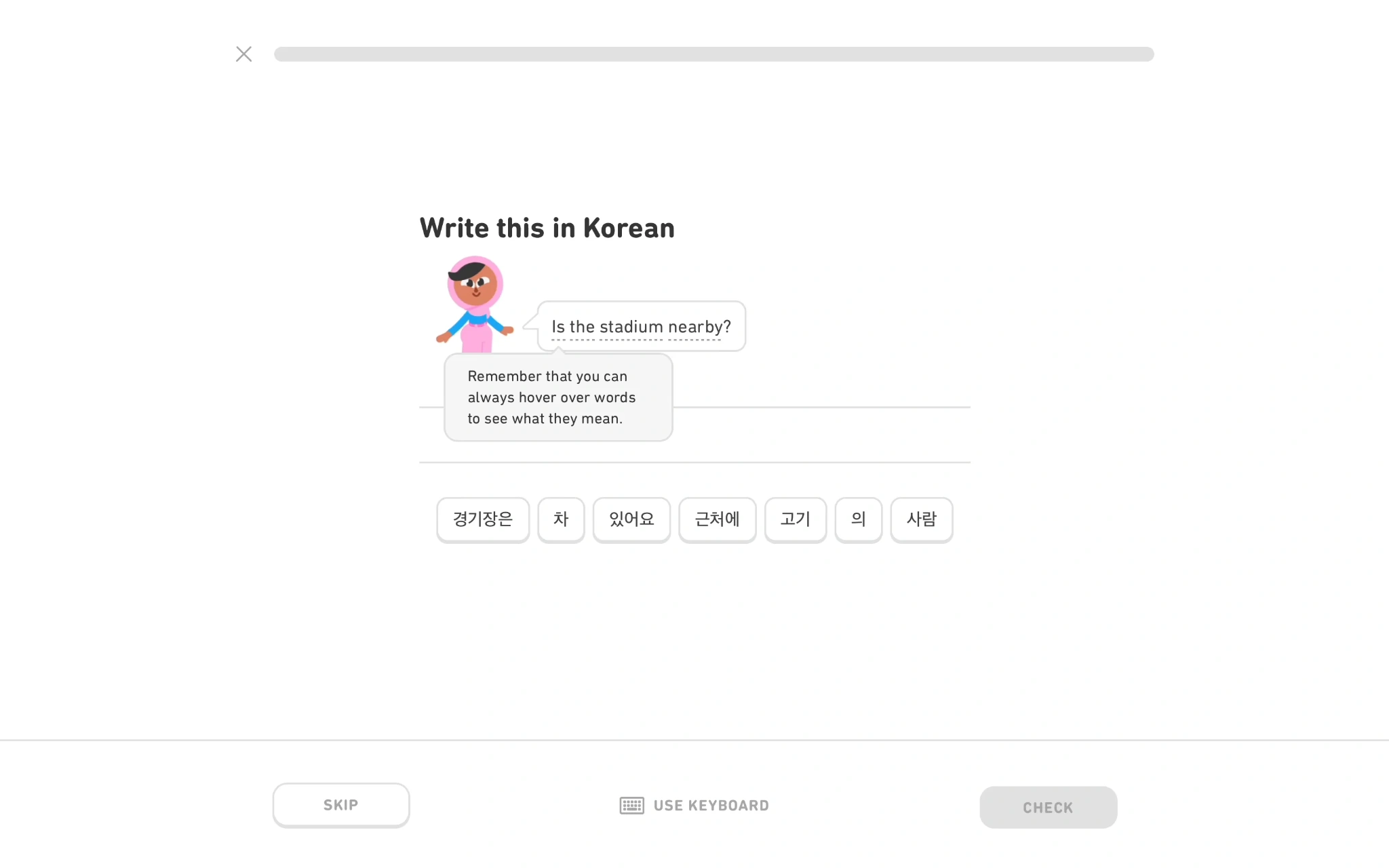
Duolingo combines:
- reading,
- listening,
- speaking,
- tapping,
- and visual feedback.
Instead of relying on a single input method, lessons engage multiple senses to reinforce learning.
What it does well: Creates varied and engaging interactions.
Tradeoff: More interaction types can increase cognitive load if introduced too quickly.
AI copilots and enterprise tools
Some of the most interesting multimodal UX examples are emerging in SaaS products.

Modern copilots increasingly combine:
- chat,
- file uploads,
- dashboards,
- visual data,
- and contextual actions.
These conversational interfaces allow users to move naturally between chat, structured controls, and visual information without breaking their workflow.
Instead of forcing users to choose between forms, menus, and conversations, the interface allows them to move fluidly between different interaction styles.
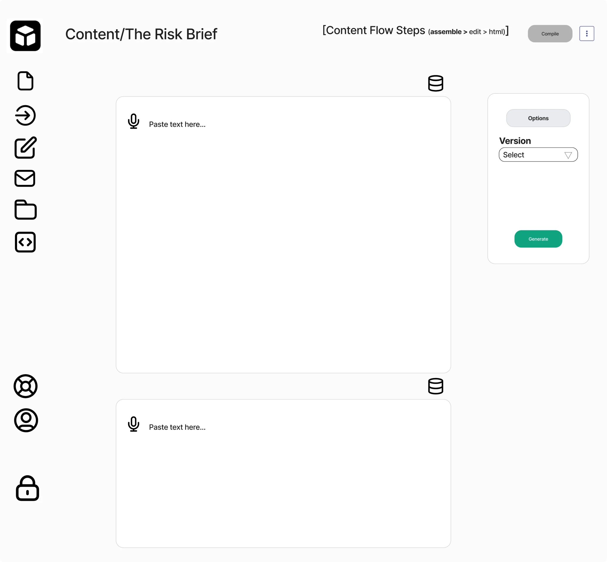
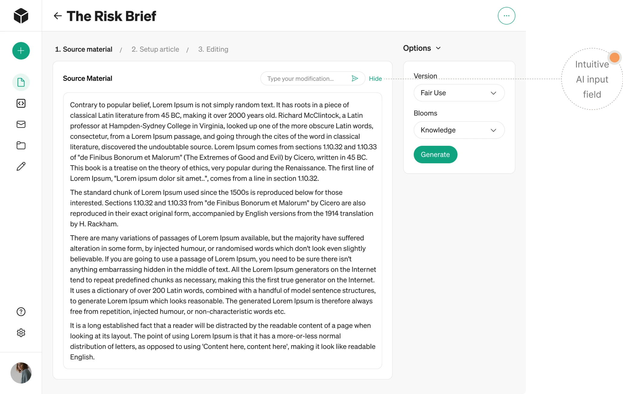
We've encountered similar challenges while designing enterprise SaaS products at Eleken. For Modia, an AI-powered content platform, users move seamlessly between conversational AI, drag-and-drop file uploads, and structured editing tools within a single workflow.
In Panjaya, a video dubbing platform, editors work with video, audio, transcripts, and AI-generated translations simultaneously.

In both cases, the design challenge wasn't introducing more interaction methods—it was making multiple information sources feel like one coherent workspace rather than disconnected tools.
The strongest multimodal products don't make users think about modalities at all. They make different interaction methods feel like parts of the same conversation.
Multimodal UX best practices
Designing a multimodal experience isn't about adding voice, gestures, vision, and AI to every workflow. It's about deciding when multiple interaction methods genuinely make things easier.
Here are the principles that separate useful multimodal systems from confusing ones.
Start with user intent, not technology
Many multimodal projects begin with a technology question: "Where can we add voice?"
or "Should we support image input?"
The better question is: "What is the user trying to accomplish?"
Once the goal is clear, the appropriate interaction method often becomes obvious.

If users need speed, voice may help. If they need precision, visual controls may be better. If they need context, combining multiple modalities may make sense.
The modality should support the task, not justify the technology.
Add modalities only when they reduce friction
Every new interaction method increases design complexity. That's why a useful rule of thumb is: Choose the input that fits the task, then define the fallback if it fails.
For example:
- voice interaction for hands-free navigation,
- touch for precise adjustments,
- image upload for visual search,
- text for complex instructions.
If a new modality doesn't make the task easier, it probably doesn't belong there.
Design graceful fallback paths
No modality works perfectly all the time.
Voice recognition fails. Sensors lose context. Images are unclear. Network connections drop.
The question isn't whether failure happens. Every multimodal experience should provide an alternative path when a mode fails. It's how the system responds.

Users should always have an alternative path forward without restarting the entire interaction. Multiple interaction methods also make products more accessible to people with different abilities and changing circumstances.
The best multimodal experiences recover gracefully rather than exposing the underlying complexity.
Prioritize consistency across modes
Users shouldn't have to learn a different product every time they switch interaction methods.
Whether someone:
- speaks,
- types,
- taps,
- or uploads a file,
the system should behave consistently. Such a consistent behavior helps the product meet user expectations, regardless of how people choose to interact.
The same actions should produce similar outcomes regardless of how the request is made.
Consistency reduces cognitive load and helps users build trust more quickly.
One reason multimodal systems feel unpredictable is that users can't always tell what the system understood.
Good multimodal UX makes interpretation visible.
That can mean:
- visual confirmations,
- progress indicators,
- contextual hints and other subtle cues,
- previews,
- or conversational responses.
Users should never be left wondering: "Did it hear me correctly?" or "What happens next?"
The more intelligence a system introduces, the more important feedback becomes.
Test in real environments
Many multimodal experiences work beautifully in controlled demos and poorly in real life.
People interact with products:
- in noisy environments,
- while multitasking,
- under stress,
- while moving,
- and across multiple devices.
Testing only in ideal conditions hides many of the problems users eventually encounter.
At Eleken, this is often where UX research uncovers issues teams didn't anticipate. What seems obvious in a prototype can become confusing once real-world distractions, interruptions, and edge cases enter the picture.
Design for trust and predictability
As AI becomes more deeply integrated into multimodal experiences, trust becomes a design challenge rather than a technical one.
Users need to understand:
- what the system knows,
- what it inferred,
- what it can do,
- and how to correct it when it's wrong.
The most successful multimodal products aren't necessarily the smartest.
They're the ones that behave predictably enough for users to feel comfortable relying on them.
The future of multimodal UX
It's tempting to think the future of multimodal UX is simply more modalities.
More voice, more gestures, more sensors, more AI.
But that's probably the wrong direction.
The biggest shift isn't the number of interaction methods available. It's the growing ability of systems to understand intent across different contexts and combine signals intelligently.
Interfaces are becoming more context-aware
Today's products largely react to user input.
Future systems will increasingly anticipate needs based on:
- location,
- device state,
- previous behavior,
- environmental conditions,
- and ongoing tasks.
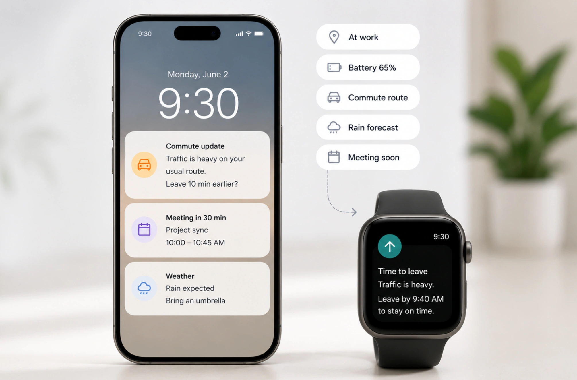
Instead of waiting for instructions, interfaces will become better at understanding what's happening around them and adapting accordingly.
The challenge for designers will be deciding when proactive behavior feels helpful and when it feels intrusive.
AI will become an orchestration layer
As these complex systems grow more capable, users shouldn't have to decide which interaction method to use.
AI will increasingly act as the layer that coordinates:
- voice,
- touch,
- text,
- images,
- gestures,
- and contextual signals.
The goal is not to replace interfaces, but to make transitions between modes feel seamless.
Users will focus on outcomes rather than interaction methods.
Spatial computing expands the design space
Products like Apple Vision Pro point toward a future where interfaces exist beyond traditional screens.
In these environments, users can:
- look,
- speak,
- gesture,
- move,
- and interact with digital objects in physical space.
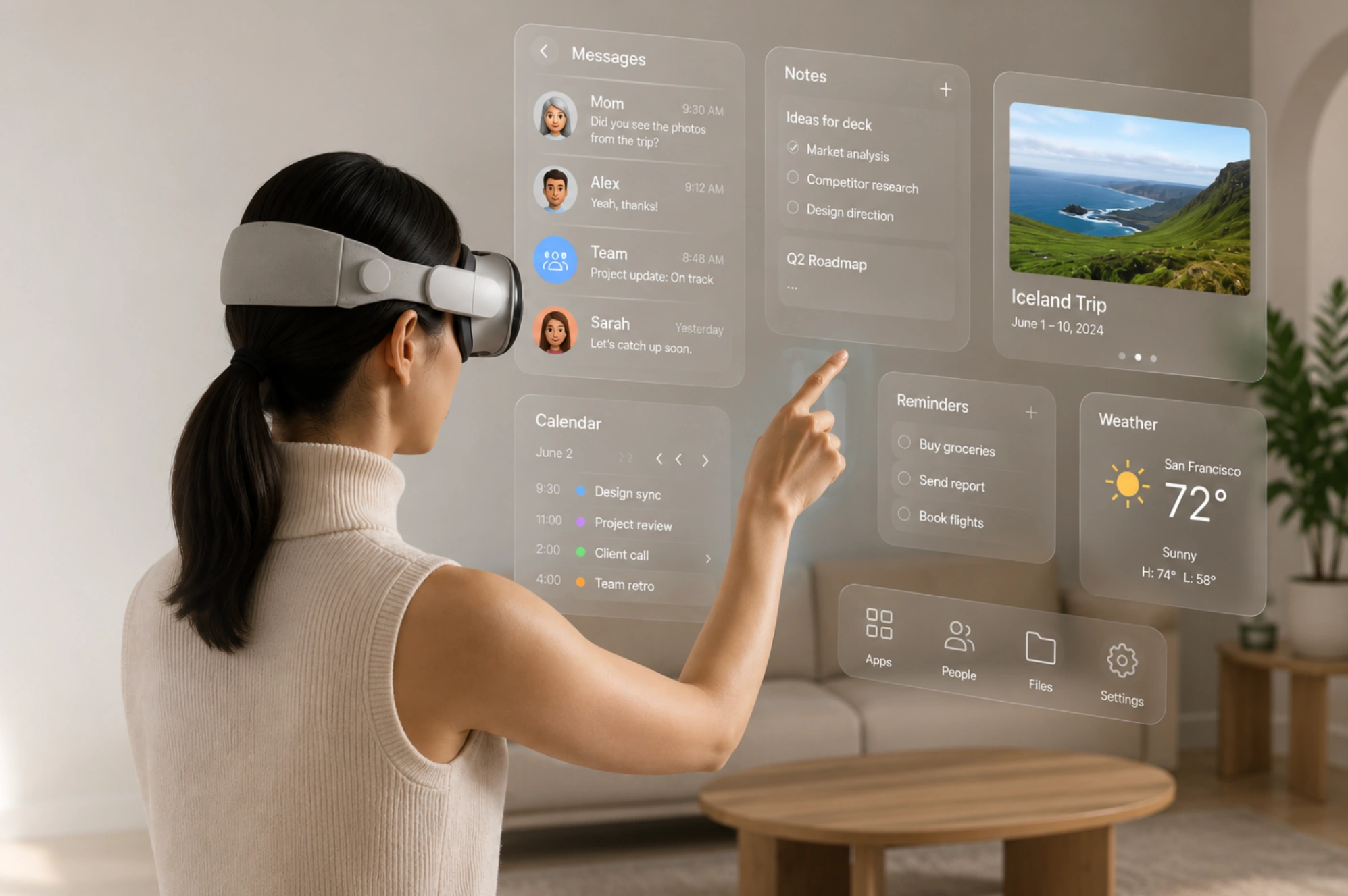
This creates entirely new opportunities for multimodal interaction—but also new design challenges around discoverability, feedback, and cognitive load.
Many of the UX principles we rely on today will need to evolve.
Wearables and ambient systems will become more important
As devices become smaller and more connected, interactions will spread across ecosystems rather than individual products.
A task might start:
- on a smartwatch,
- continue on a phone,
- move to a laptop,
- and finish through a voice assistant.
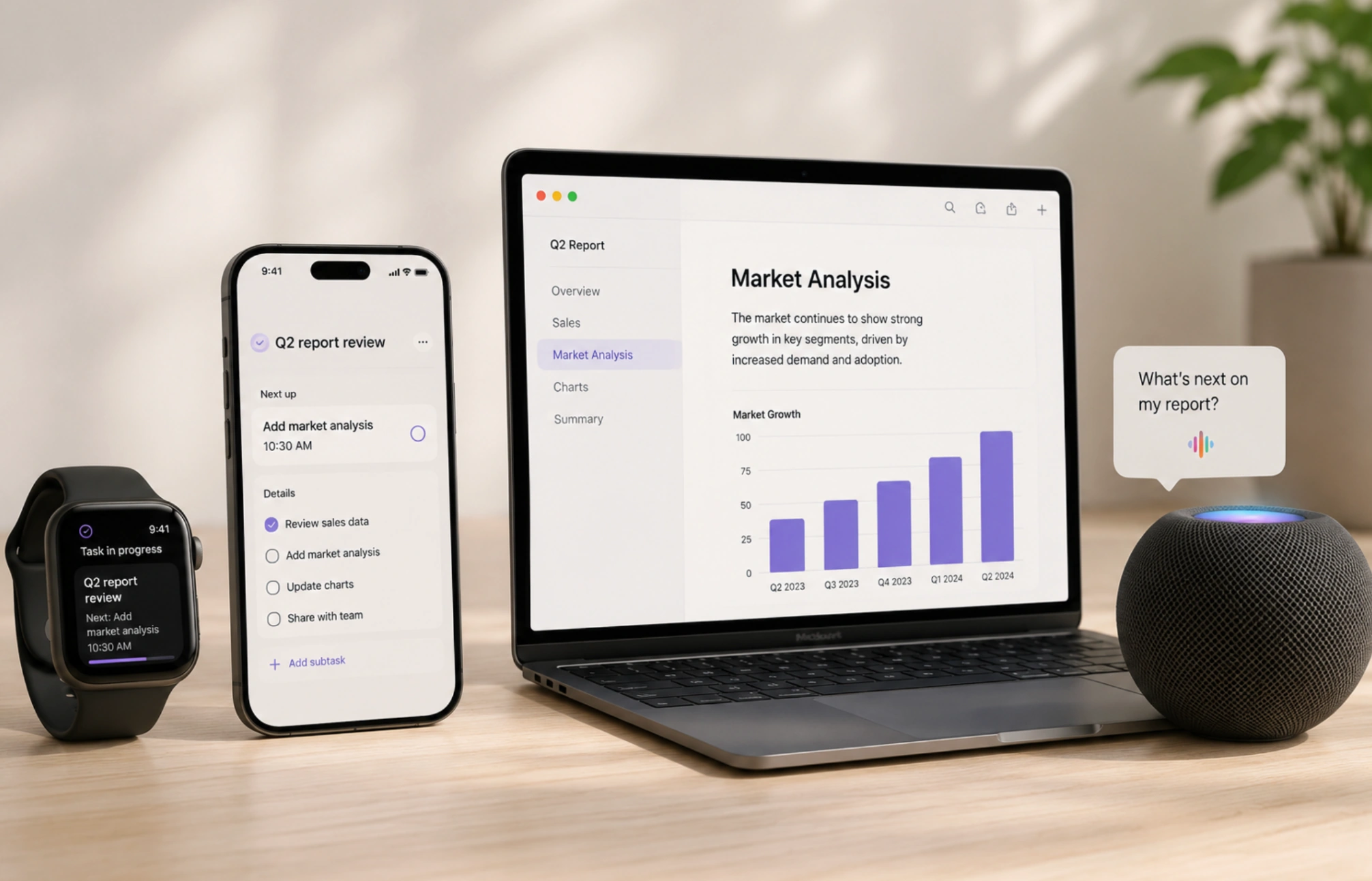
Users won't think about devices. They'll think about goals.
The responsibility of the system will be maintaining continuity across every interaction point.
The future is not more modalities
The future of multimodal UX isn't about adding as many interaction methods as possible.
It's about making technology feel less like a collection of interfaces and more like a system that understands what people are trying to accomplish.
The products that succeed won't be the ones with the most advanced inputs. They'll be the ones that make complexity disappear.
Conclusion
Multimodal UX is ultimately about making interaction feel more human.
The challenge is no longer creating interfaces users can operate. It's creating systems that can understand intent across different contexts, behaviors, devices, and environments.
That doesn't mean every product needs voice, gestures, AI, and spatial computing. In many cases, adding more modalities creates more friction, not less. What matters is choosing the right interaction method for the task and ensuring users always have a clear fallback when things go wrong.
The best multimodal experiences feel coherent, predictable, and easy to trust. Users shouldn't have to think about which modality they're using or how the system works behind the scenes.
They should simply feel understood.
At Eleken, we help SaaS teams design human-centered experiences that stay intuitive as products become more intelligent, adaptive, and AI-driven. Because as interaction models evolve, clarity, consistency, and simplicity still matter more than ever.
The best multimodal interfaces won't feel multimodal at all — they'll simply feel intuitive.




.webp)
.webp)