

Dropdowns look simple. Just a box with a few options, right?
Then you try to design one and suddenly you’re three hours deep into Reddit threads, debating whether a multiselect dropdown UI should use checkboxes, tags, or just not exist at all.
At Eleken, we’ve designed dropdowns for SaaS products across various industries, from clinical software, where a single wrong click can compromise a diagnosis, to marketing tools, where clarity is the only thing standing between a conversion and a bounce. We’ve seen how the smallest decision in a dropdown can make or break an entire flow.
So, in this guide, we’ll cover how dropdowns work and fail, when to use them or avoid them, and what makes them accessible, intuitive, and fast.
Let’s start with the basics: what is a dropdown, and what parts of it can go wrong?
What is a dropdown menu UI? (And its core anatomy)
A dropdown menu is a UI component that reveals a list of options when triggered. It hides complexity by default and shows choices only when needed. That’s the good part. The bad part? It’s also where a lot of usability problems love to hide.
Let’s break down what makes up a standard dropdown because understanding the parts is the first step to diagnosing what’s broken.
The key elements of a dropdown UI are as follows:
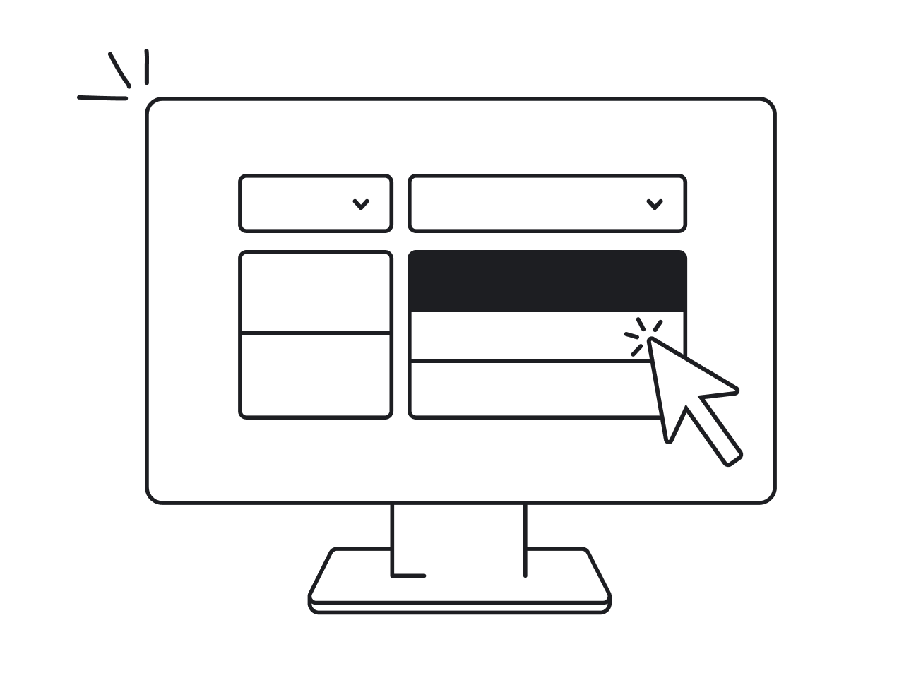
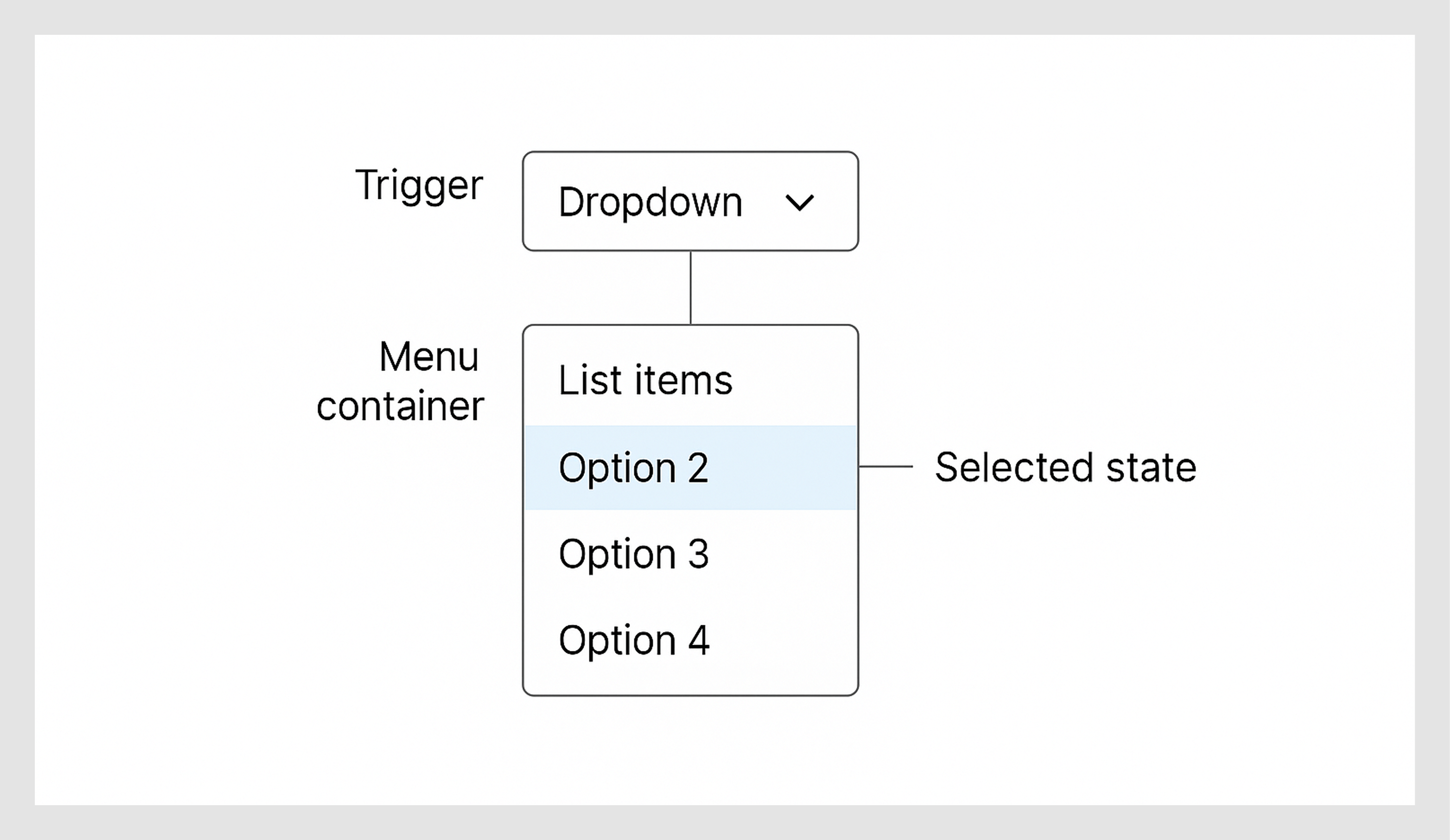
- Trigger is what the user clicks or taps to open the menu. Usually, a button or input field design with a label, a dropdown icon (like a caret ▼), or both.
- Menu container is the floating box that appears. It holds the list of options. Should feel connected to the trigger and appear instantly (with zero jank).
- List items are your options. They might be plain text, include icons, or be grouped with dividers. Each item must be tappable or clickable, even for people with giant thumbs.
- Selected state shows the user what’s currently selected. Please don’t hide it in some soft-gray-italic-ghost styling. Highlight it like you mean it.
- Active/hover/focus state guides the user as they move through the list, especially with a keyboard. These states make the UI feel alive and responsive.
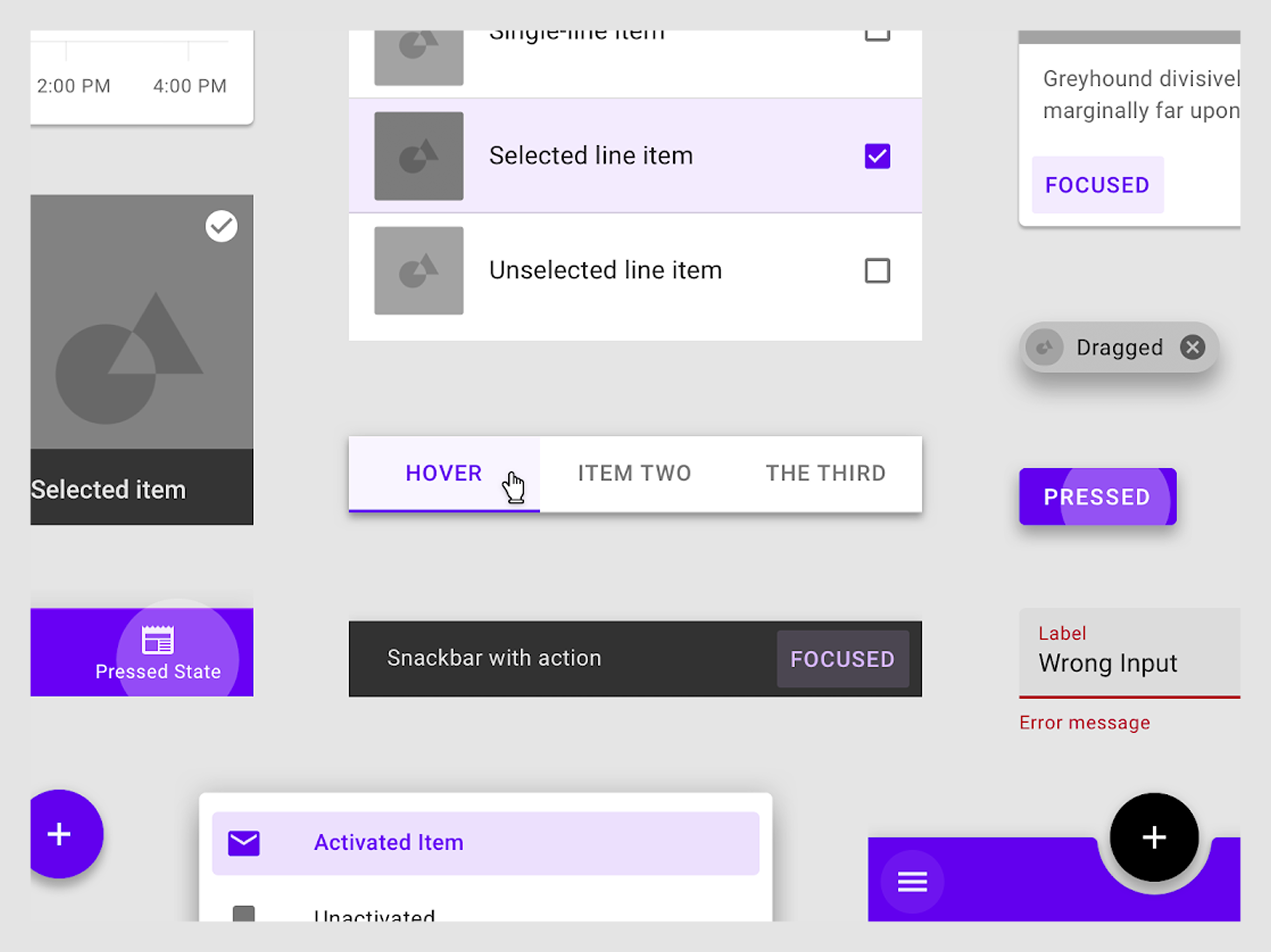
- Optional extras may include:
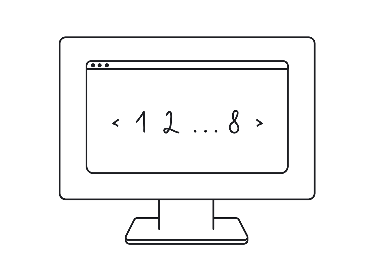
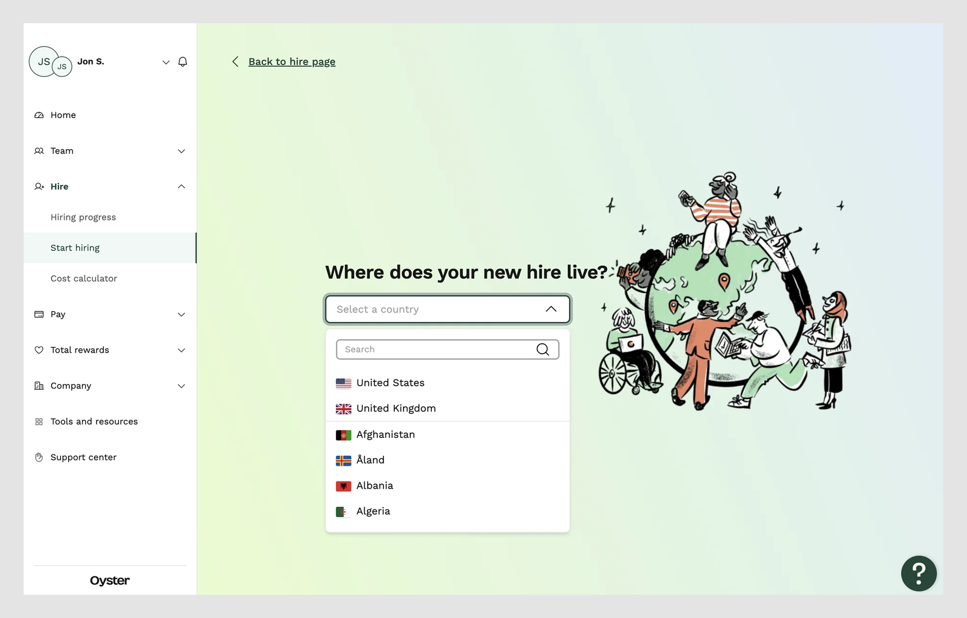
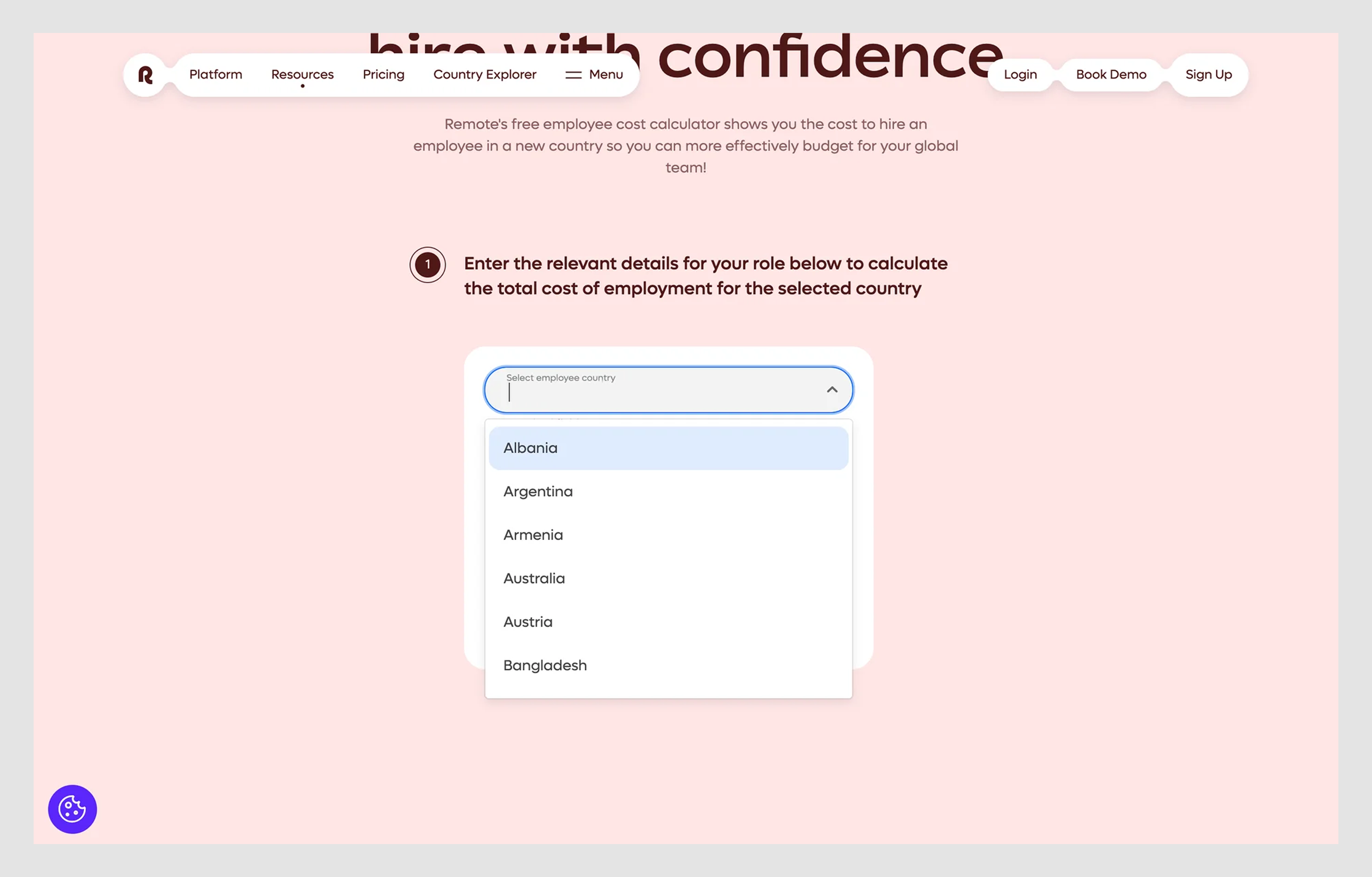
- Searchable input: Great for long lists (countries, job roles, etc.), like in the example below.
- Dividers or group headers: Helpful when organizing related options.
- Disabled items: To indicate what’s not available yet (but avoid overusing this, as it can be frustrating).
Additionally, don’t forget about keyboard navigation. A dropdown isn’t complete unless it works with a keyboard:
If you're struggling to create a clean, user-friendly dropdown, and the user interface feels messy or confusing, this video can help you get back on track:
Now that we’ve looked under the hood, let’s map out the major types and why they matter.
Dropdown types and menu items
Not every dropdown is a dropdown. At least not in the same way.
Designers often treat dropdowns as one-size-fits-all widgets. But in reality, there are several flavors, each serving a different purpose.
Let’s match the type to the situation:
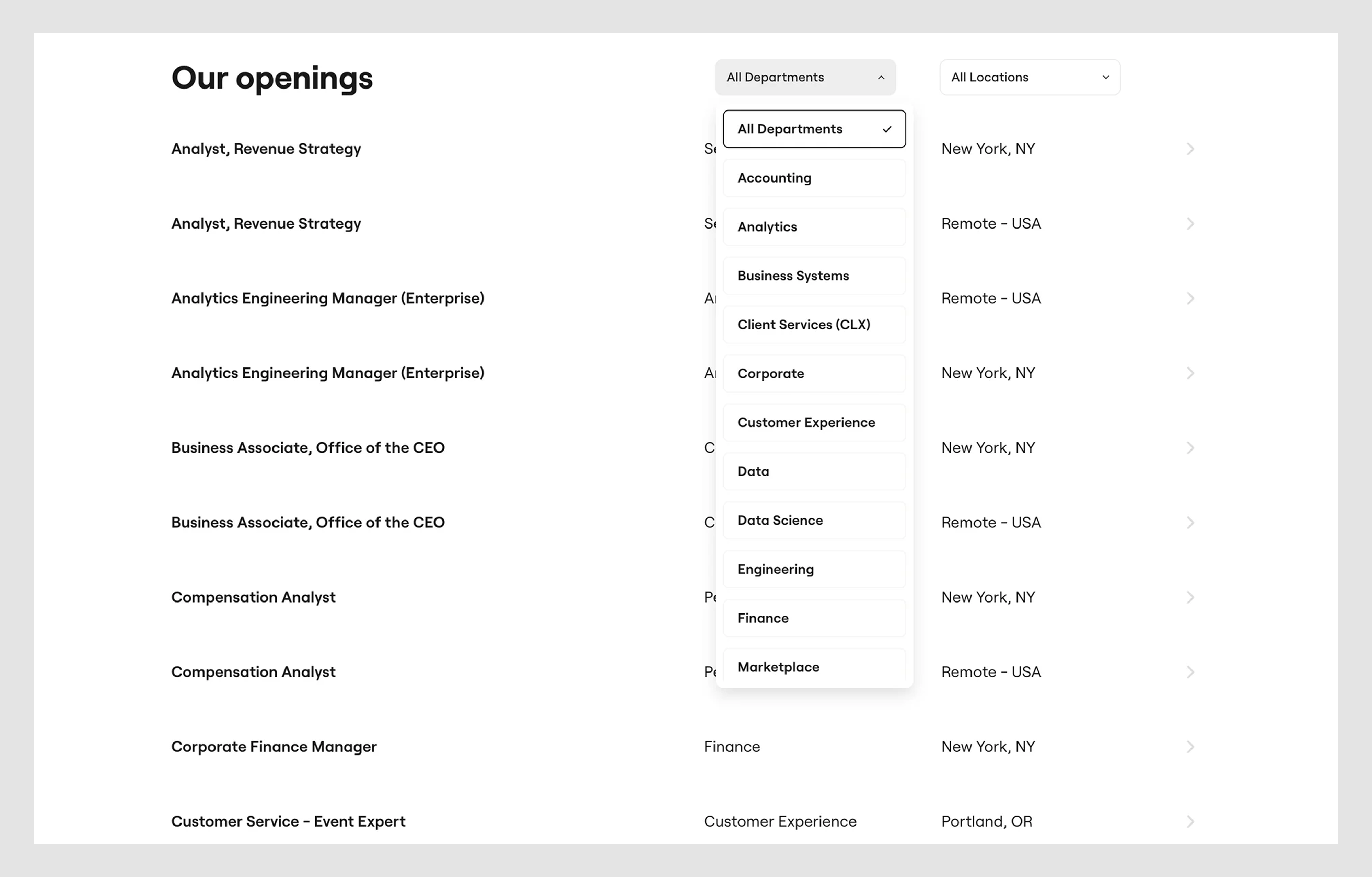
- Navigation dropdowns
These elements are typically located in headers, sidebars, search bar examples, or mega menus. Good examples let users scan groups fast, while bad ones collapse unpredictably or get cut off on mobile.
2. Select dropdowns
Standard select menus are ideal for form design and items such as job titles, countries, and categories. But watch out. Too many dropdown menu items without search = scroll fatigue.
Tip: Add a searchable input when your list reaches ~15 items or more.
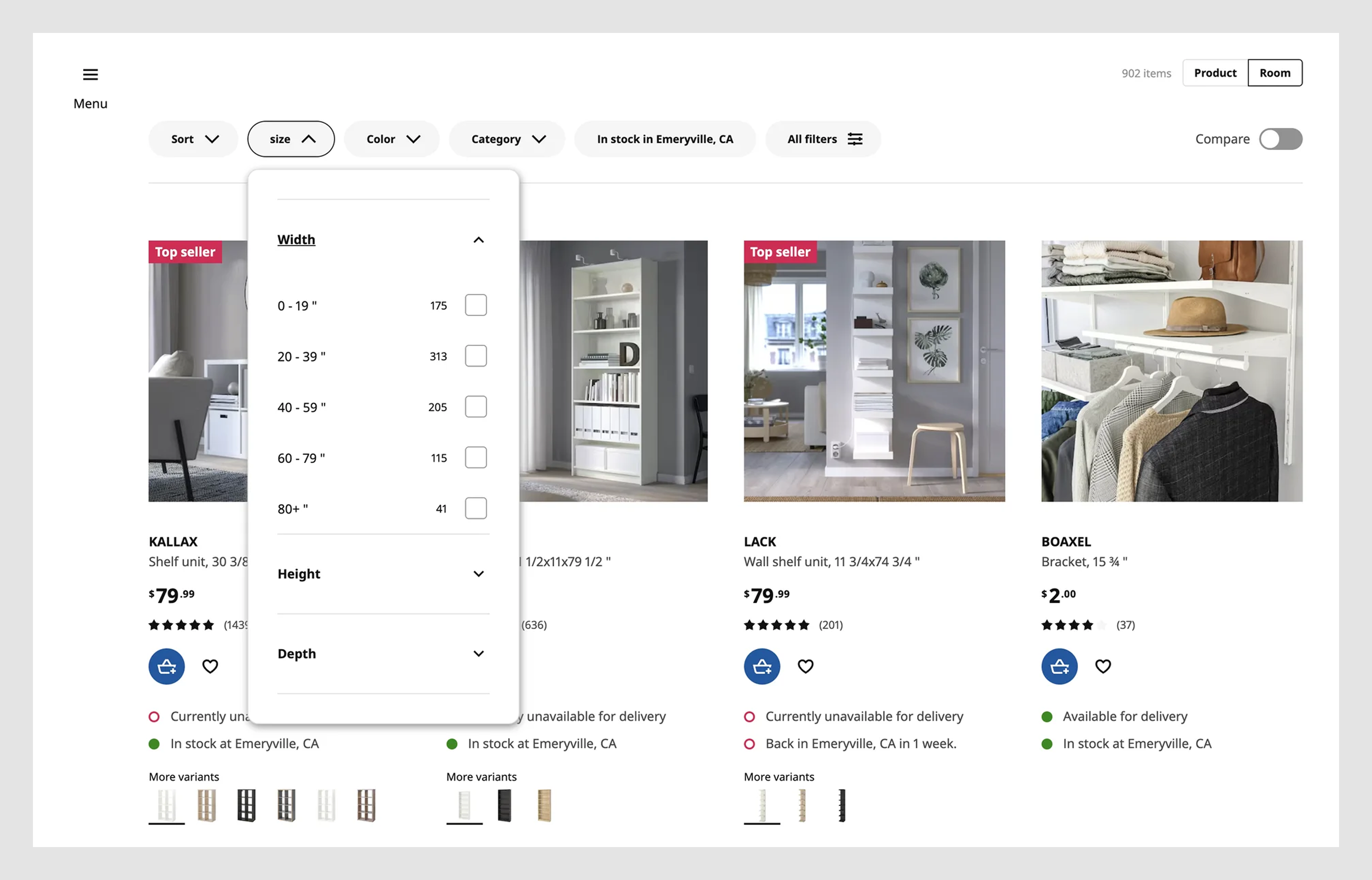
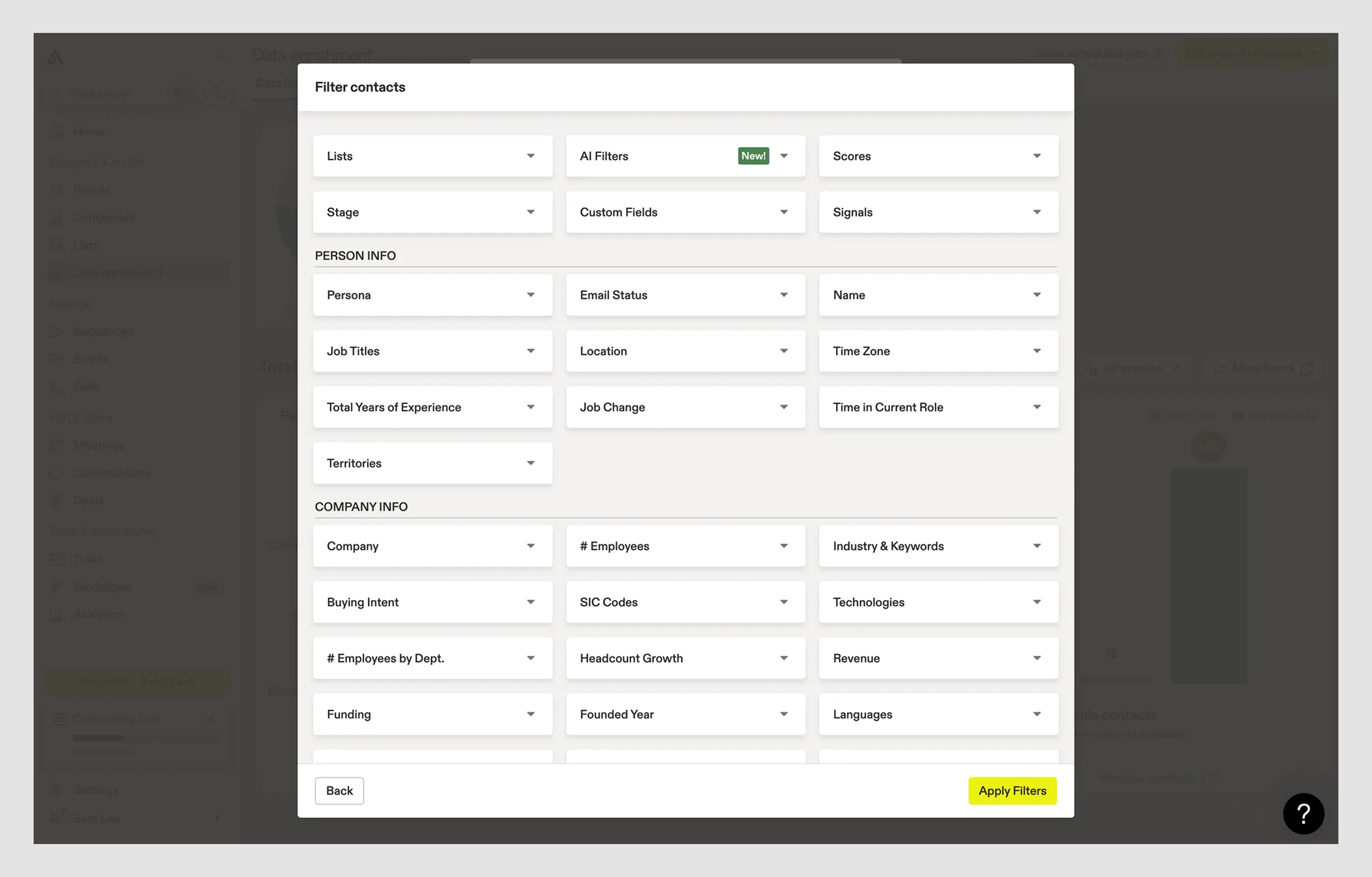
- Combobox with filters and sorting menus
Consider: e-commerce filters and dashboard views with multi-select dropdowns or checkboxes inside the menu. However, note that it is undesirable when filters close every time you click an item. A good option is to use filters that let you select a few, then click "Apply."
- Action/contextual menu
You’ve seen these as three dots (⋮) or tiny dropdown arrows next to buttons. They're small but powerful and easy to overload. But there is a rule of thumb: If it takes more than a second to figure out what’ll happen, it's too cryptic.
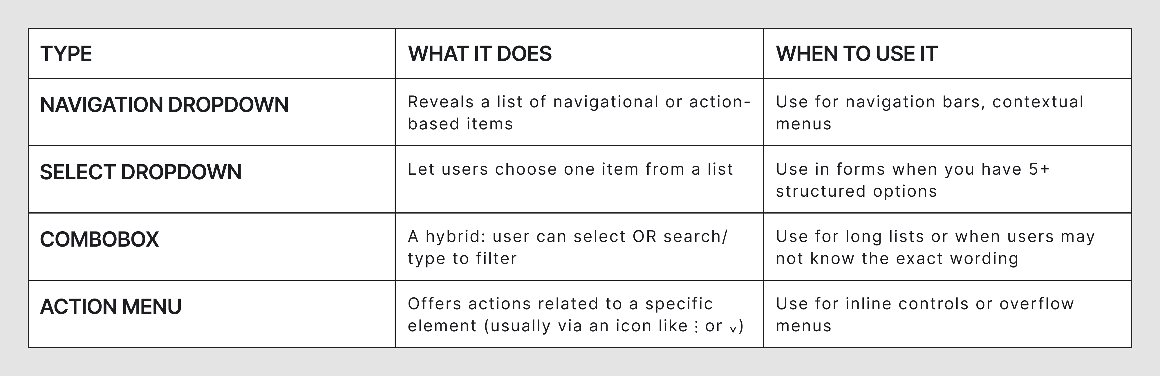
The four core types comparison
Here’s a breakdown of the most common dropdown UX variants:
Now that we’ve covered the anatomy and types, let’s look at the fun part: real-world dropdowns that nailed it and what you can learn from them.
Dropdown menu design inspiration (web + mobile)
Sometimes, the best way to understand great design is to see it. So before we hit you with rules and frameworks, here’s a gallery of real-world dropdown menu examples that do something right.
And yes, we’ll show a few of our own.
Navigation dropdowns
Navigation menus are often the first interaction users have with your product. These examples show how smart dropdown menu design can make navigation feel effortless.
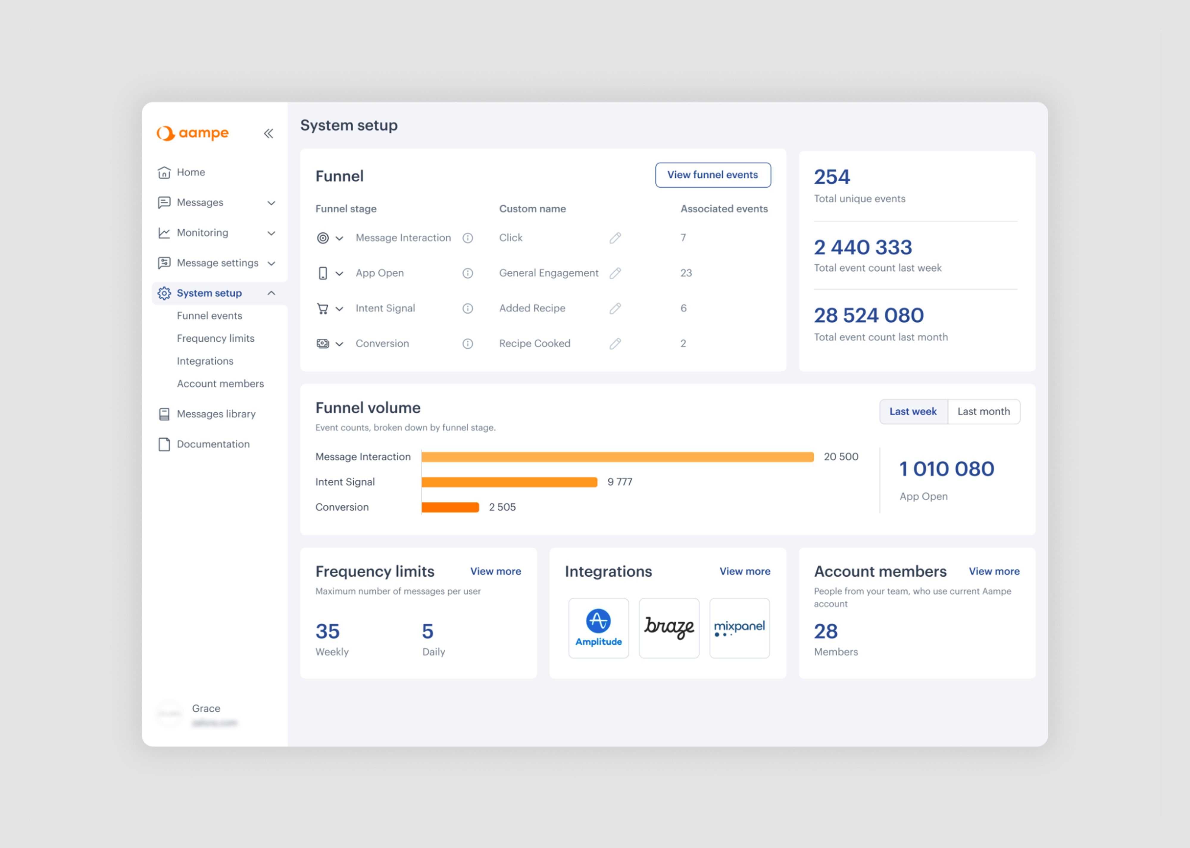
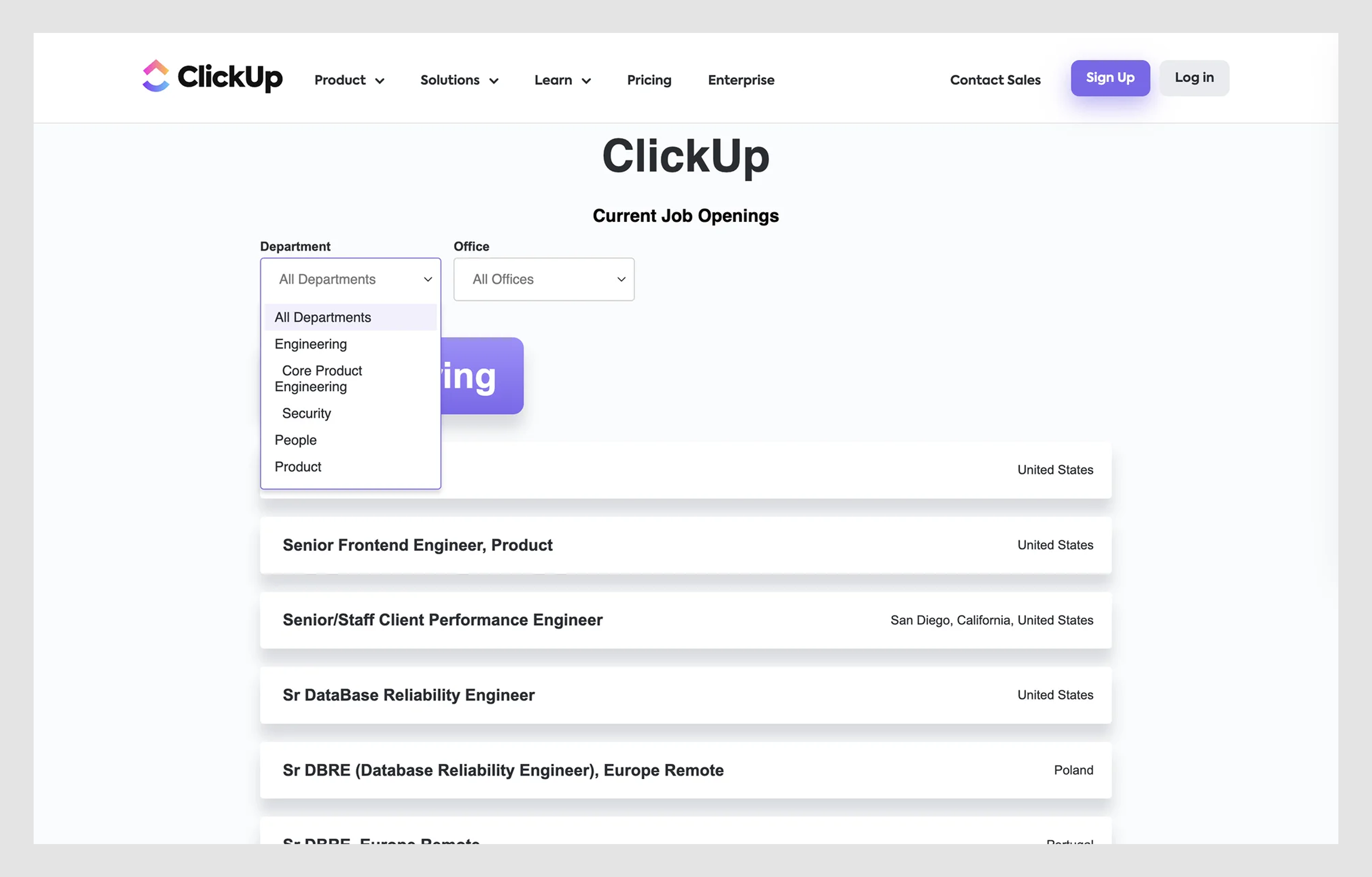
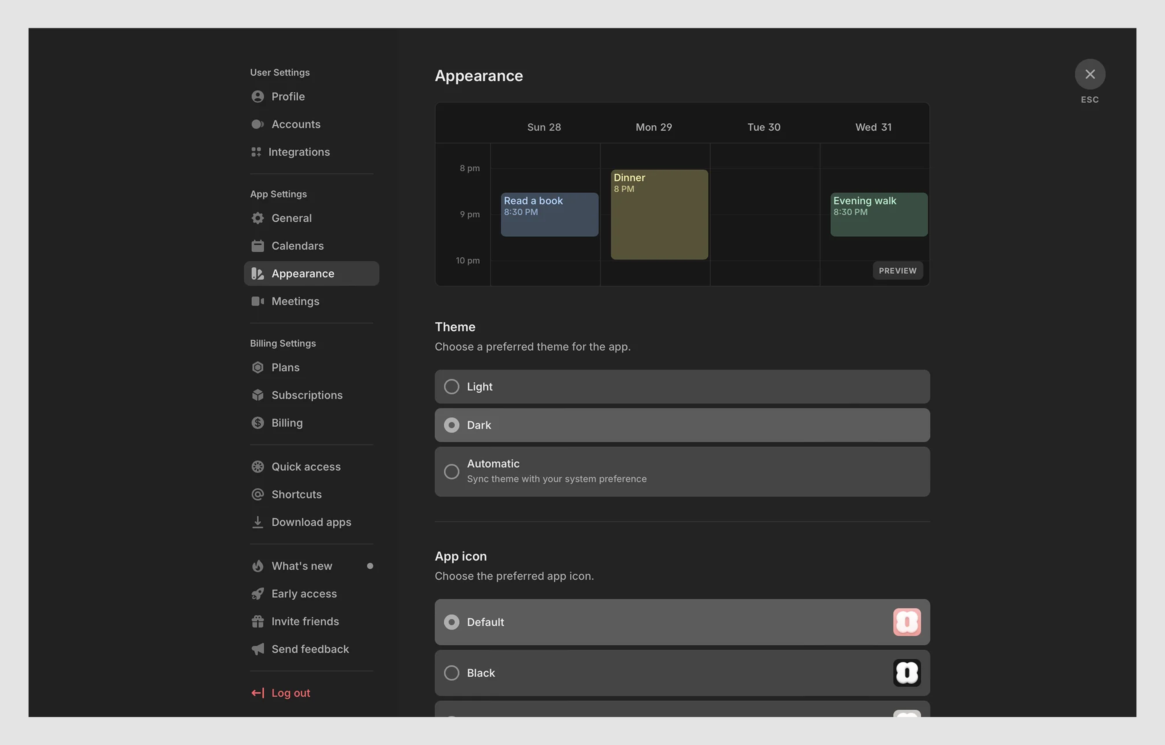
1. Eleken for Aampe project
Aampe’s original navigation relied heavily on dropdowns, with multiple sections buried deep in long, nested menus. It felt clunky on desktop and was nearly unusable on mobile.
Eleken redesigned the system by introducing a collapsible sidebar. Some sections were merged, others split, and dropdowns were used more selectively to simplify navigation across desktop and mobile devices. The updated UX created a clearer information hierarchy and supported Aampe’s product growth as the company later raised $18M in funding.
Why it worked: A clean sidebar outperforms deep dropdowns when navigation needs to be quick, flexible, and mobile-friendly.
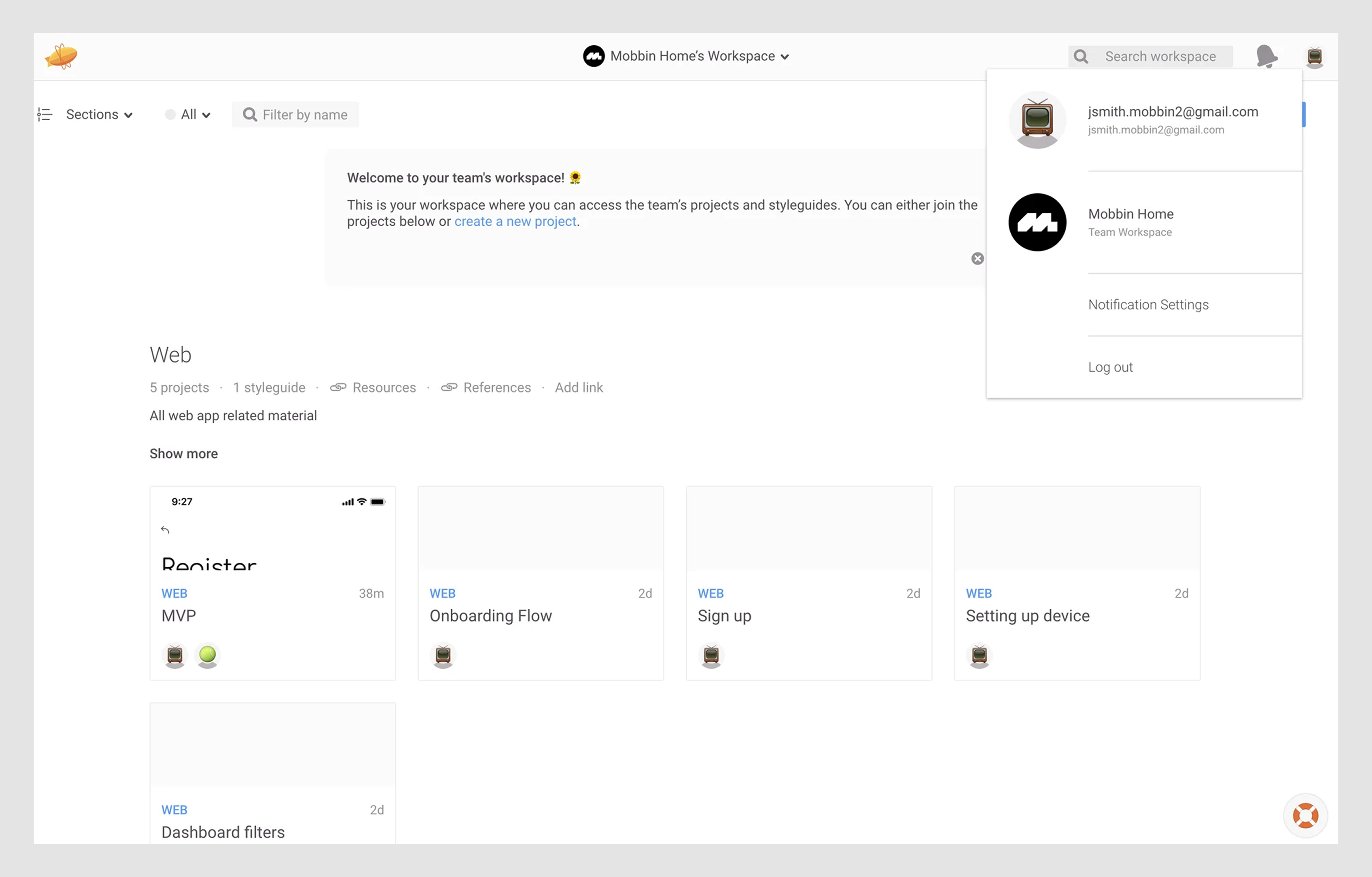
2. Selfridges
The account dropdown UI on Selfridges appears on hover and lists user-specific actions like viewing orders, managing payment cards, and signing out. Each item is clearly labeled and stacked vertically for easy scanning.
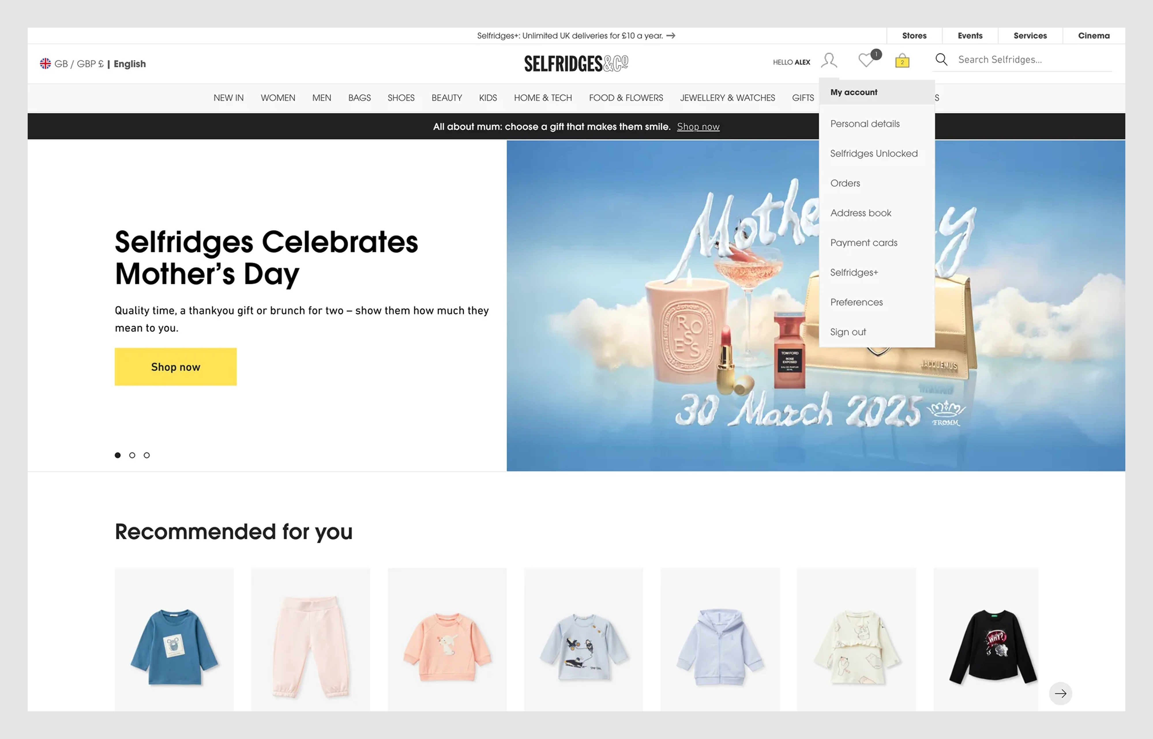
Why it works:
The dropdown is simple, fast, and intuitive. It separates personal info, preferences, and sign-out actions into clear sections, with zero clutter or guesswork.
Select/form dropdowns
Form dropdowns are one of the most common UI elements and one of the easiest to misuse. But all too often, they slow users down with endless lists, unclear default text, default value, or missing search. Here are a few examples that get it right.
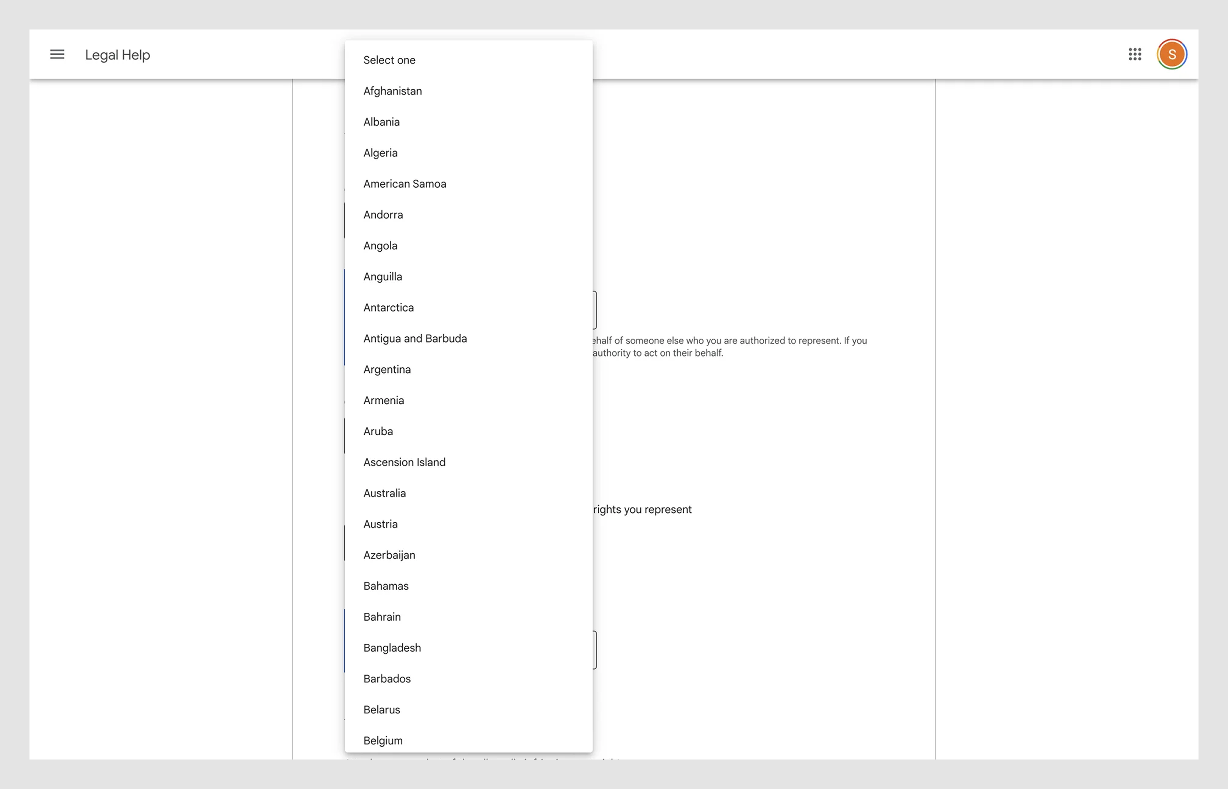
3. Google Forms
Default dropdowns are simple and fast. For long lists, they can auto-expand to fill the screen vertically. This dropdown UI appears when setting validation rules for checkbox questions. It allows the form creator to define how many options a user must select — "at least," "at most," or "exactly."
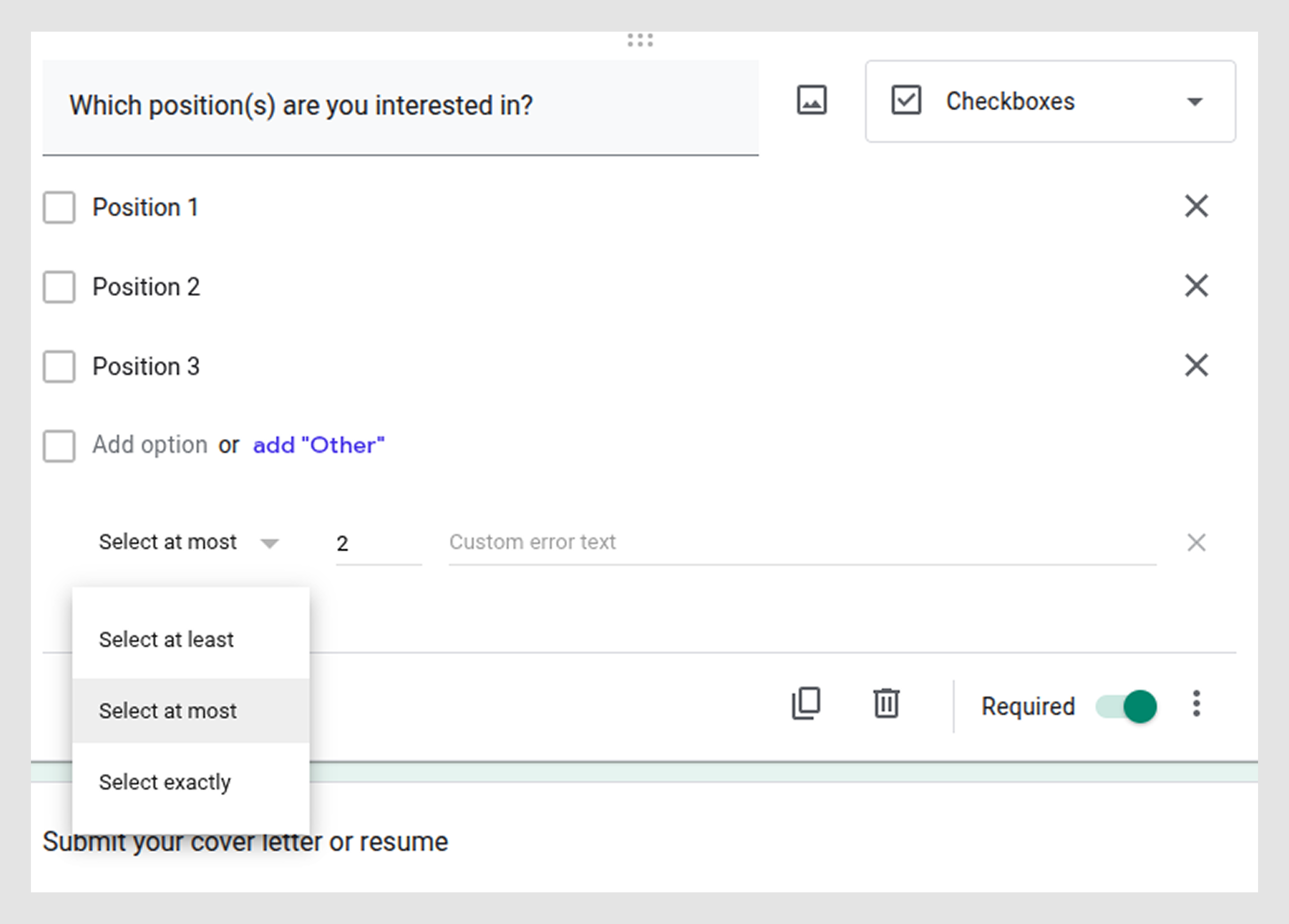
Why it works: The dropdown appears inline, with straightforward labels that clearly describe what each rule does.
4. Populate by Eleken
Doctors use dropdowns to select visit notes quickly. We built visually heavy menus that were easy to scan and helped reduce typing.
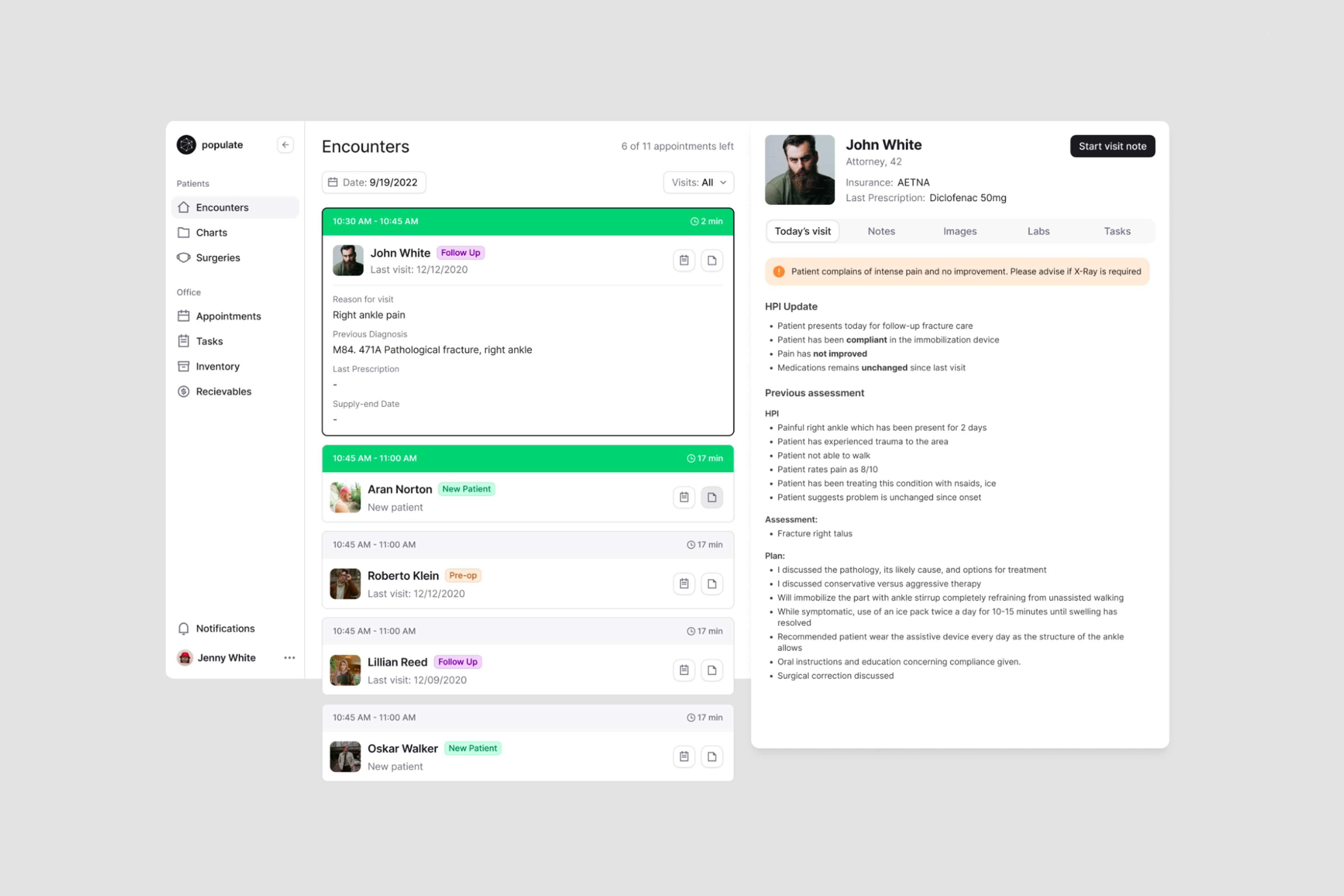

Why it worked: The dropdowns used strong visual hierarchy and context-aware suggestions to make options easier to scan and reduce unnecessary typing for doctors during patient visits.
5. Employment Hero
This dropdown controls each stage of a customizable hiring pipeline, letting users set rules or actions per step. Each step (like “Interview” or “Assessment”) has its own dropdown for additional configuration.
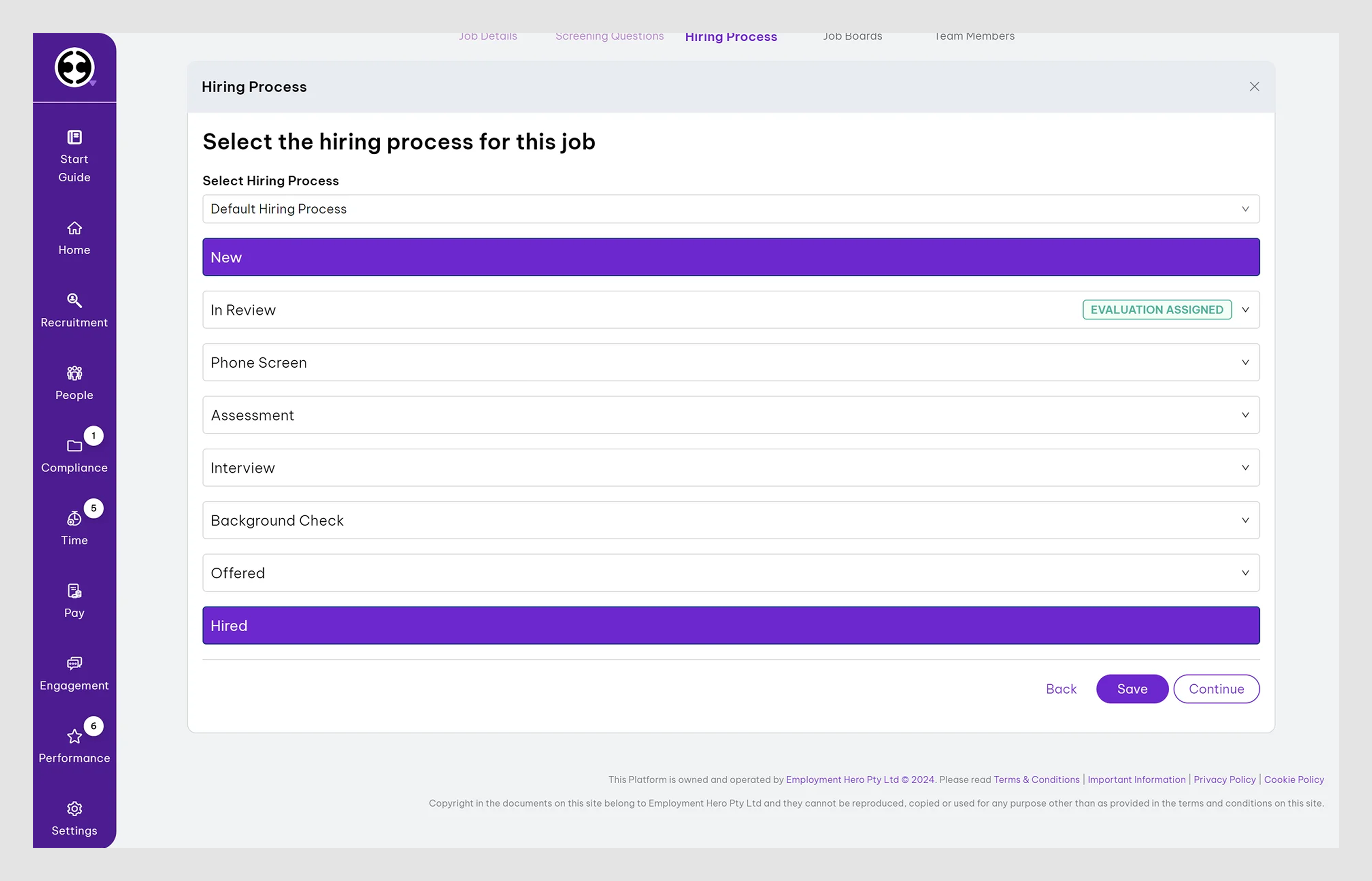
Why it works:
It breaks complex workflows into manageable, scannable chunks. The consistent layout and dropdown alignment keep the UI clean, even as users handle multi-step processes.
Combobox
Comboboxes are perfect for long or dynamic datasets. These examples demonstrate how to strike a balance between flexibility and clarity, without overwhelming the UI.
6. Linear
A clean, minimal dropdown used for filtering issues by priority. The menu appears directly under the filter bar, with generous spacing and clear option grouping.
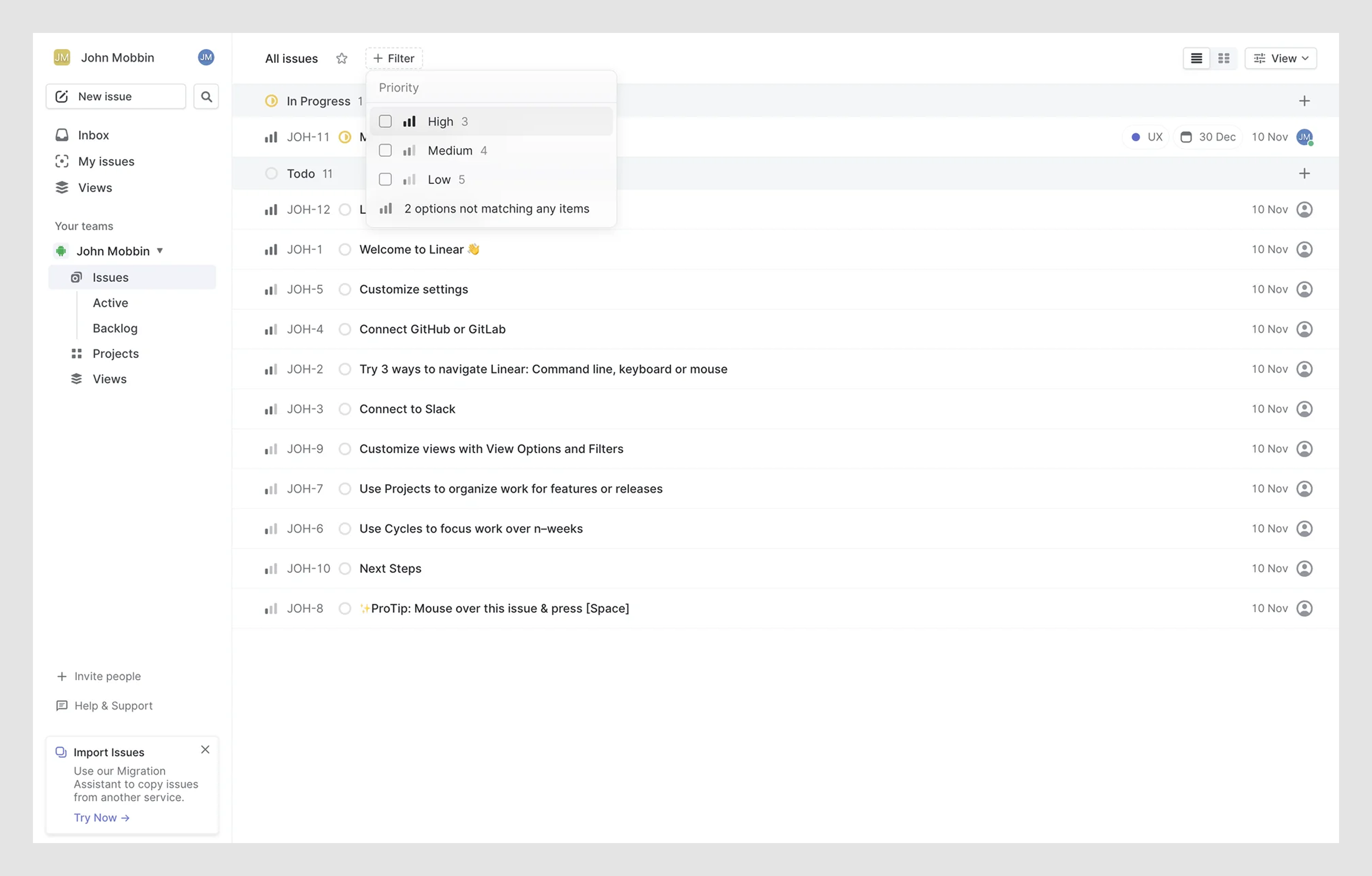
Why it works:
Only one level is shown at a time, preventing overwhelm. Options are easy to scan and select, and the dropdown feels tightly integrated with the content view.
7. Asana
This multiselect dropdown lets users choose one or more functions that describe their work. Each selected item appears as a tag, and checkboxes allow for quick scanning and toggling.
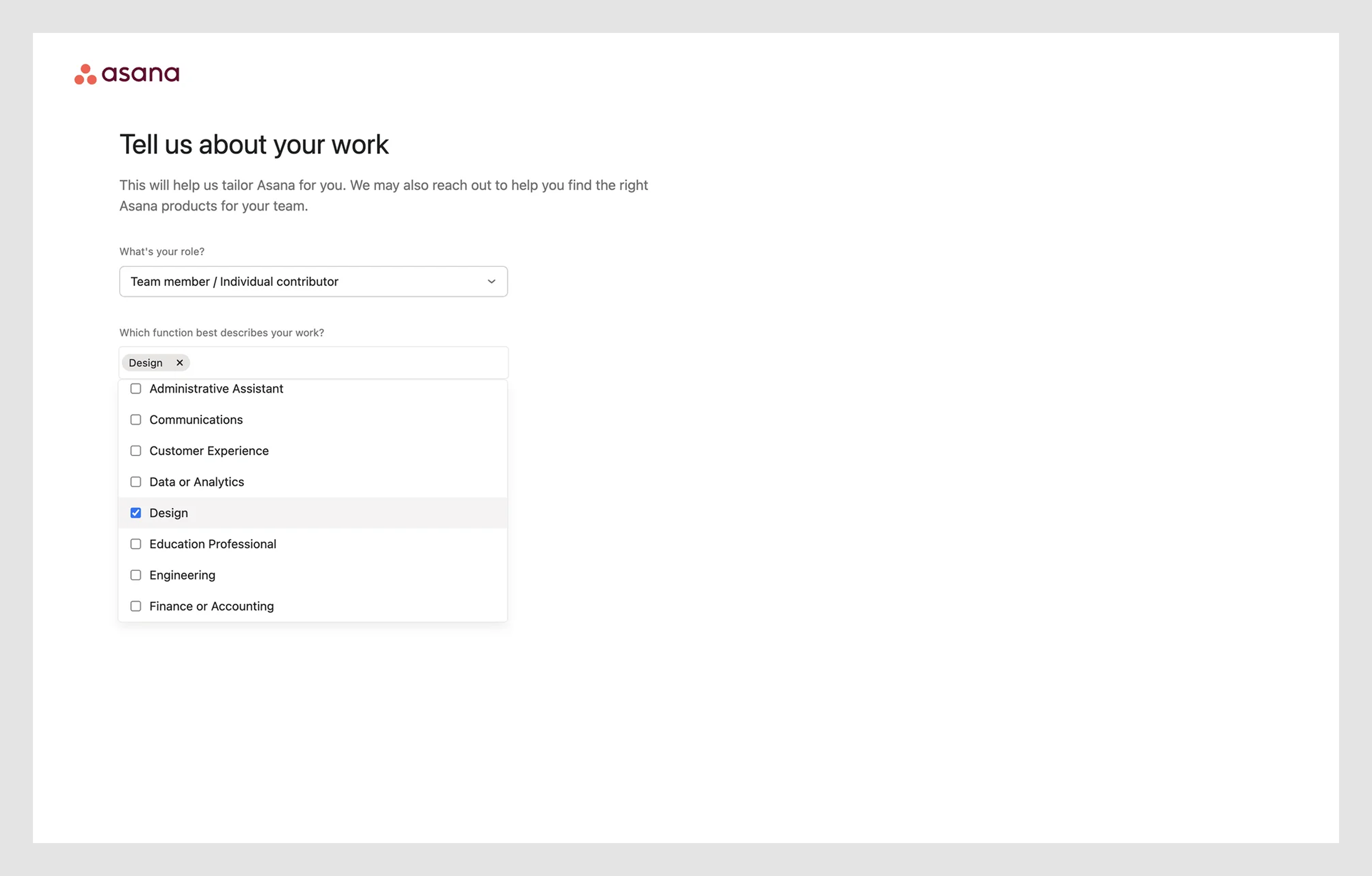
Why it works:
It's a simple dropdown, intuitive, and scalable for long lists. Tags provide clear feedback, and the search-friendly layout helps users find their function without scrolling endlessly.
Action/contextual menus
These dropdown menus often carry critical actions, such as edit, duplicate, and remove, all from one small UI element. Let’s look at how smart design keeps them intuitive and unambiguous.
8. Notion
Notion uses a contextual action dropdown triggered by the three-dot (⋮) icon. It lets users choose where to save content by selecting a specific page or database.

Why it works:
It keeps the interface clean while giving users control over where content goes. The dropdown includes icons and a nested structure to make destinations easy to recognize and select.
9. Slack
This three-dot (⋮) dropdown provides quick access to canvas-level actions like starring, locking edits, changing the cover image, or setting visibility preferences.
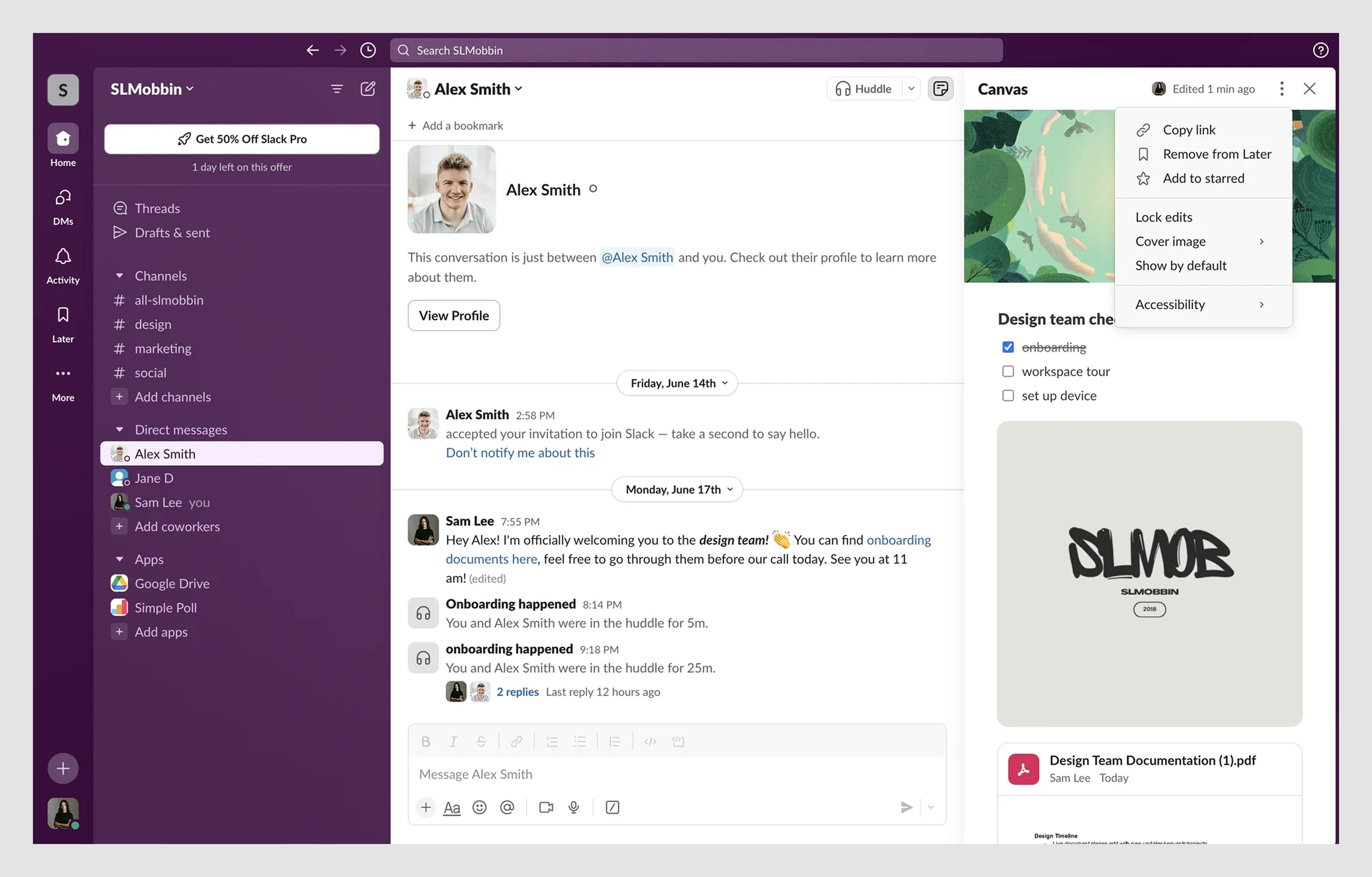
Why it works:
It keeps advanced actions hidden until needed, reducing clutter. Grouped logically with subtle icons, each item is scannable and task-specific.
10. Canva
Canva’s contextual dropdown appears inside a spreadsheet-like interface, triggered by right-clicking a cell. It offers quick access to relevant actions like copying, deleting rows, or adding columns, all organized in a single, scrollable list.
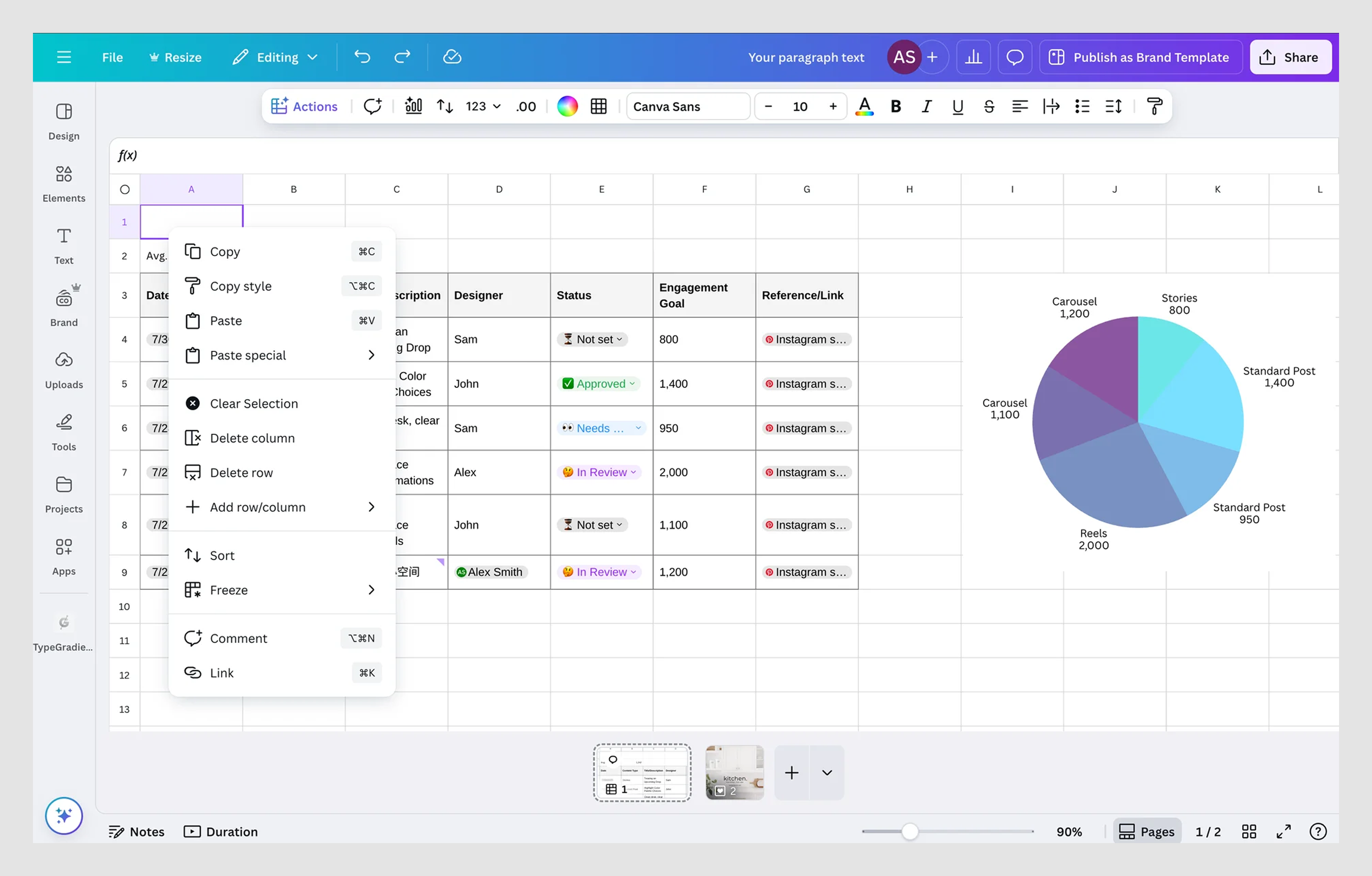
Why it works:
It feels native to the environment. Options are grouped logically, icons support scannability, and the menu adapts to the user’s context without cluttering the screen.
Mobile-first dropdowns
Dropdowns that work great on desktop can completely fall apart on mobile. Tiny tap zones, dropdowns cut off-screen, awkward gestures… We’ve seen it all. These examples show how to do mobile the right way.
11. Stripe Dashboard (mobile view)
This mobile dropdown menu allows users to select their nationality from a long list during account setup. The component is optimized for touch, with large tap targets and native-feeling interaction.
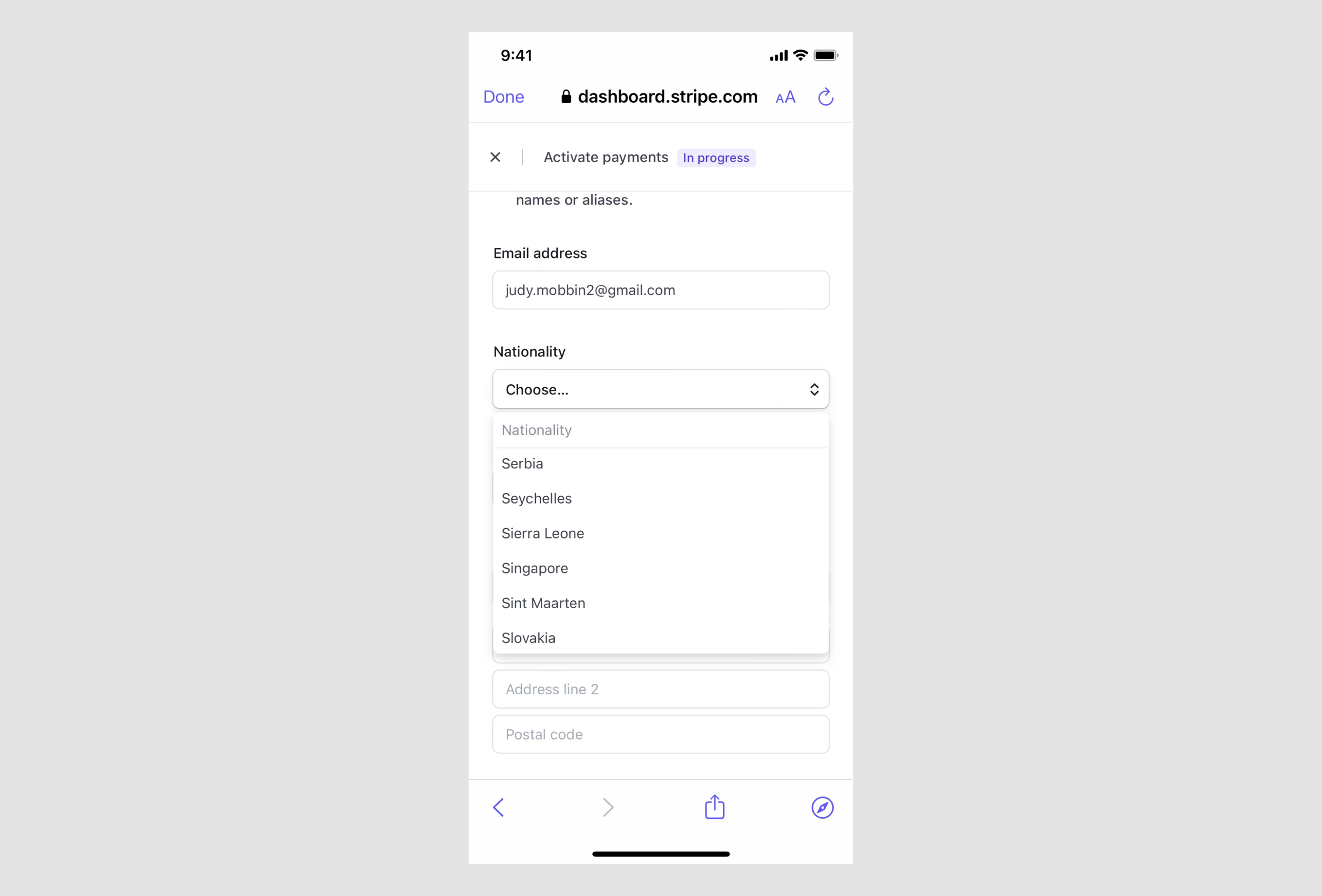
Why it works:
It’s mobile-first in execution: responsive, easy to scroll, and keyboard-friendly if needed. The placeholder text sets clear expectations, and the UI adapts well to smaller screens.
12. BookPeep by Eleken
BookPeep’s mobile settings dropdowns were causing trouble, pointing off-screen, overlapping text, and breaking away from Material Design norms. The result? A confusing and clunky experience, especially on smaller devices.
Eleken stepped in to clean it up. We applied Material-aligned styling, used arrow indicators, proper elevation, and conditional rendering to ensure dropdowns opened where they should, without breaking the layout.
Why it worked:
It brought predictability to the interaction. The dropdowns felt native to mobile — not just shrunken desktop components, making the UI feel more polished and intentional.
Notable patterns
Not every dropdown menu UI requires advanced features, but when the situation calls for it, these design patterns can save users a significant amount of time. Here are a few we keep reaching for in SaaS UI design:
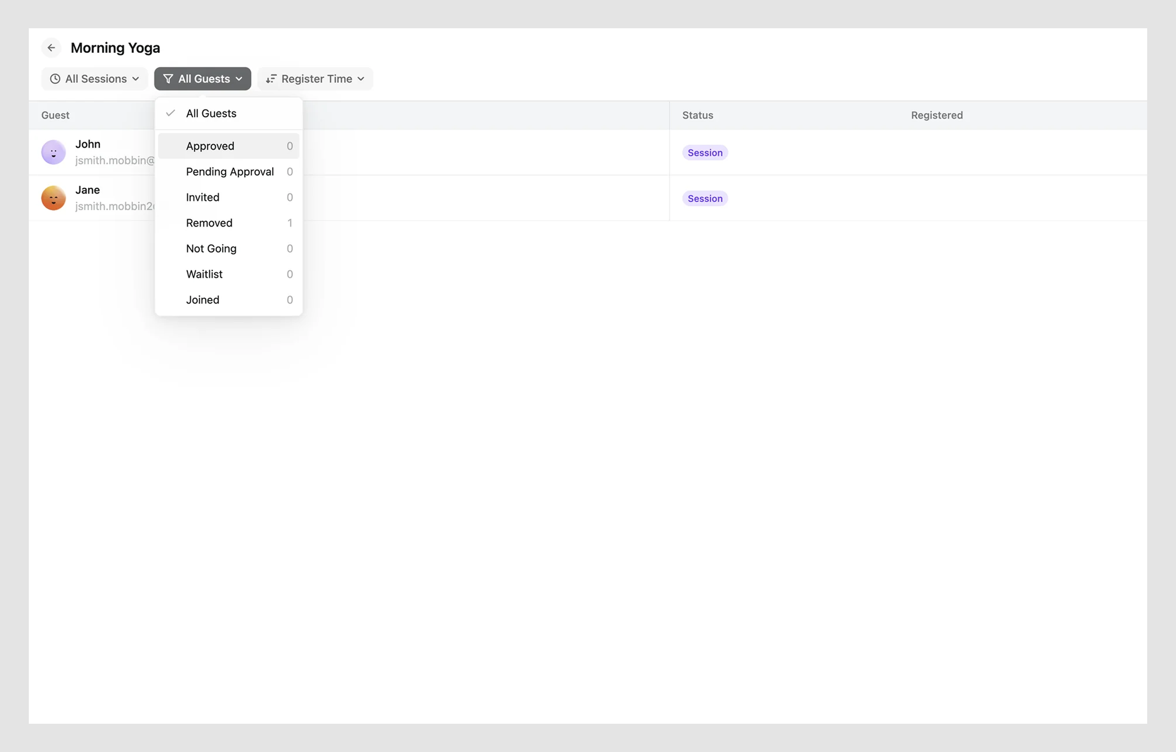
- Searchable dropdowns
These tools allow you to type to filter multiple options, making them ideal for power users. But watch out: don’t bury the most common choices behind search. Use type-to-filter as an enhancement, not a replacement, for a well-structured list.
13. Tripadvisor
This combobox lets users search across categories like hotels, restaurants, and experiences by typing a location. Results appear dynamically with icons and helpful context.

Why it works:
Fast, flexible, and power-user friendly. Icons and sub-labels help users skim results quickly without needing to type full queries.
- Dropdowns with icons
Icons can help if they clarify, not decorate. See GitHub’s issue label dropdown for a good dropdown menu example.
14. GitHub
This action menu (▼) appears next to each commit in the activity feed. It uses an icon and menu label to offer quick actions like "Compare changes."
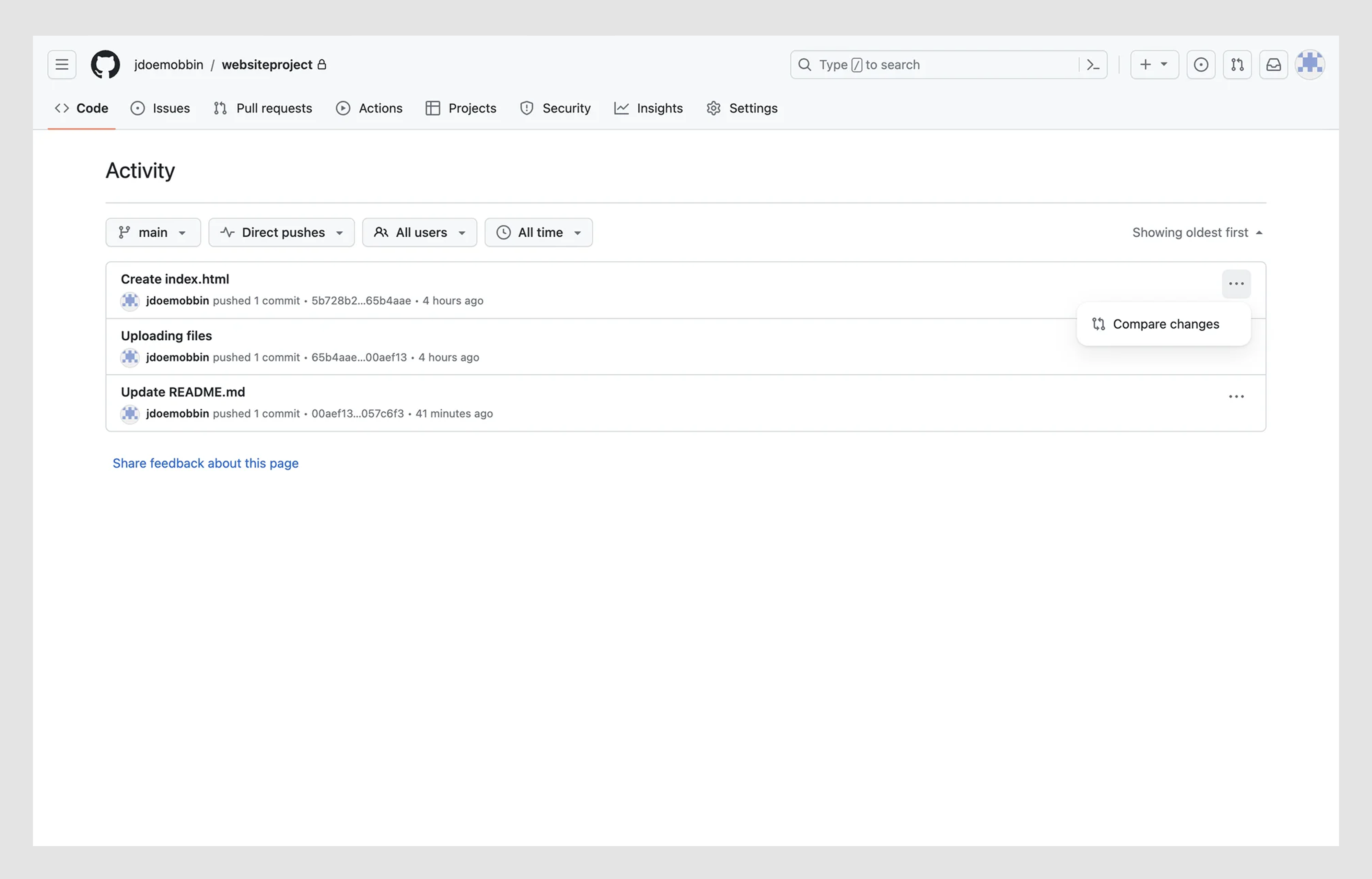
Why it works:
The icon adds clarity, not noise. The dropdown is minimal but informative — no mystery meat here.
Okay, now that you’ve seen what’s possible, let’s break down the why behind good dropdowns. Up next: the UX and UI best practices that separate clean design from total chaos.
Dropdown UX and UI design best practices and design tips
To design a dropdown that users enjoy interacting with, you need clarity, feedback, and behavior grounded in UX readability, simplicity in UI/UX, and fundamental psychology laws, like users scanning before reading, or defaulting to the easiest path forward.
Here’s a set of opinionated, field-tested best practices to help you make your dropdowns more usable, more accessible, and less... annoying. Each tip includes what to do, what to avoid, and why it matters.
- Apply Eleken’s dropdown and field principles
From dozens of SaaS projects, we’ve developed a few internal rules we apply to nearly every dropdown we design because they consistently improve clarity and usability:
- Always show a clear, persistent label. Users should understand what the dropdown is for, even when it’s closed. This aligns with UX readability and Gestalt’s principle of proximity: when a label is visibly close to a field, users naturally associate it with the field.
- Apply the same clarity to input fields. Labels shouldn’t disappear or rely on placeholder text alone. They need to persist.
- Use prefilled examples or hints. A subtle default, such as “e.g., Designer,” helps guide the user and reduces form errors.
- Make states visually obvious. Whether the dropdown is open, closed, active, or filled, the user should always be able to tell. Use caret direction, colors, or border styling to indicate the current state.
These small design cues add up to a smoother, more intuitive experience, especially in forms, filters, or onboarding flows.
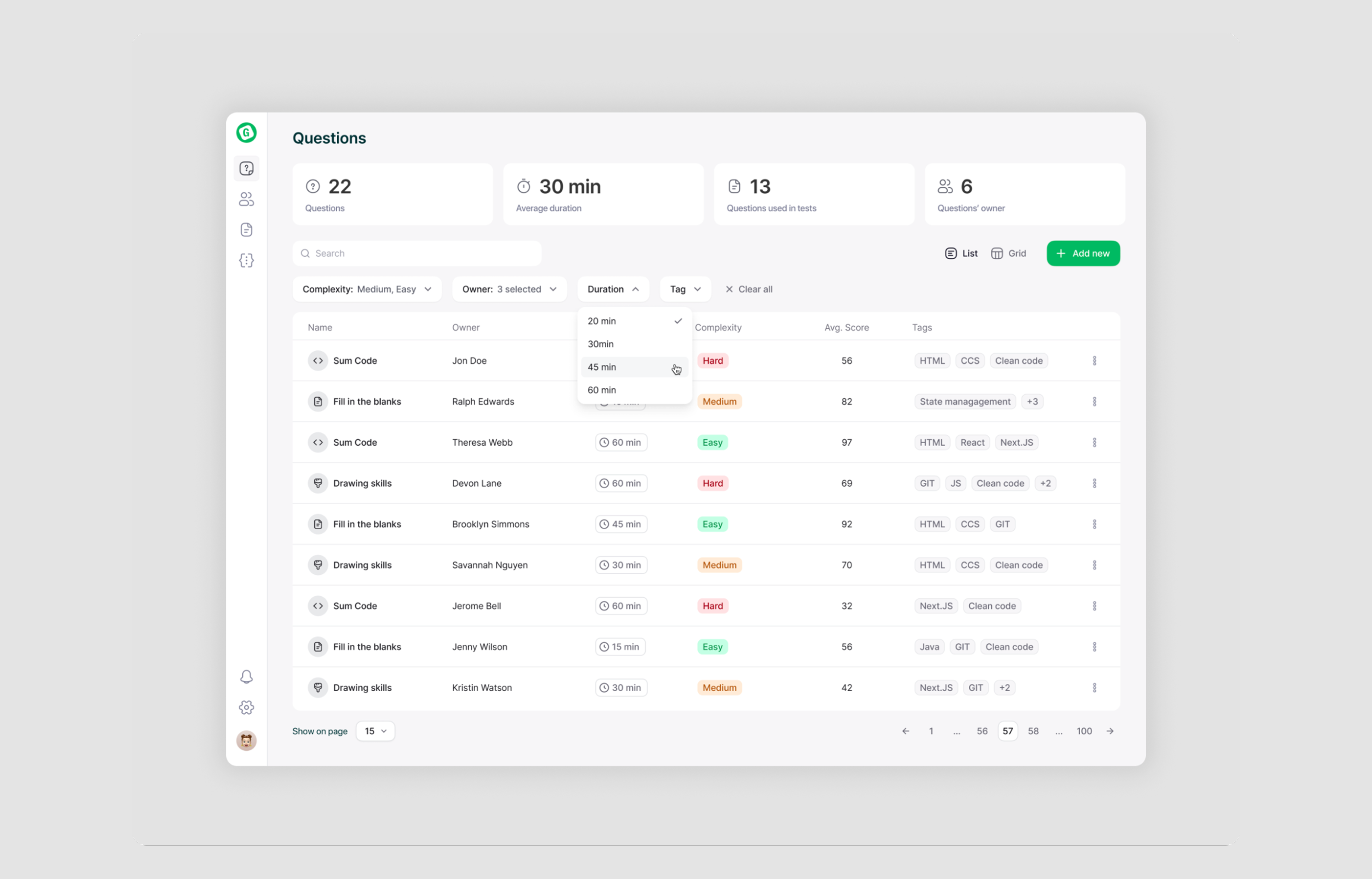
Take our client Gotechiez, for example. To simplify their Questions list, we introduced smart dropdown filtering options by complexity, owner, duration, and tags. This helped users narrow results quickly without confusion, and made the overall search experience far more efficient.
- Show all options without scrolling (when possible)
If your dropdown contains a small set of options, say, fewer than 10, display them all at once. There's no benefit in forcing users to scroll through a short list inside a tiny container.
As the list grows longer, ensure the scroll area feels natural, with smooth height transitions and clear visual boundaries. This minor tweak makes scanning faster and reduces friction.
- Use a placeholder, not a preselected value
A dropdown should guide the user, not make assumptions on their behalf. If a value is preselected, users may skip over the field entirely, thinking a choice has already been made.
Instead, use a neutral placeholder, like “Select a country,” to prompt intentional input. This keeps the interaction clear and prevents accidental form errors.
- Make dynamic updates obvious
If your dropdown content changes based on a previous dropdown selection, ensure that users are aware of the change.
Sudden, silent updates can feel like glitches. Use subtle animation, a transition effect, or a label like “Updated based on your selection” to show that something has changed. A little context helps users feel in control, not confused.
- Use clear visual cues
A dropdown should look like a dropdown. Use familiar indicators, like a caret icon (▼), a visible border, or a hover/focus state, to signal interactivity.
Subtlety is fine, but ambiguity isn’t. And don’t rely on color alone: pair it with iconography or movement so the cue works for all users, including those with visual impairments.
- Highlight the selected item
When a user opens a dropdown, their current selection should be immediately visible. Use visual styling like bold text, checkmarks, or background highlights to differentiate the selected option. This provides quick feedback, prevents second-guessing, and makes the interaction feel more responsive.
- Use tags or pills for multiselects
In multiselect dropdowns, showing selected options clearly is essential. Checkboxes inside the menu are helpful, but once the dropdown closes, users need visible feedback.
Display selected items as tags or pills outside the dropdown, either above, below, or inside the field, so users can easily review and remove choices without reopening the menu.
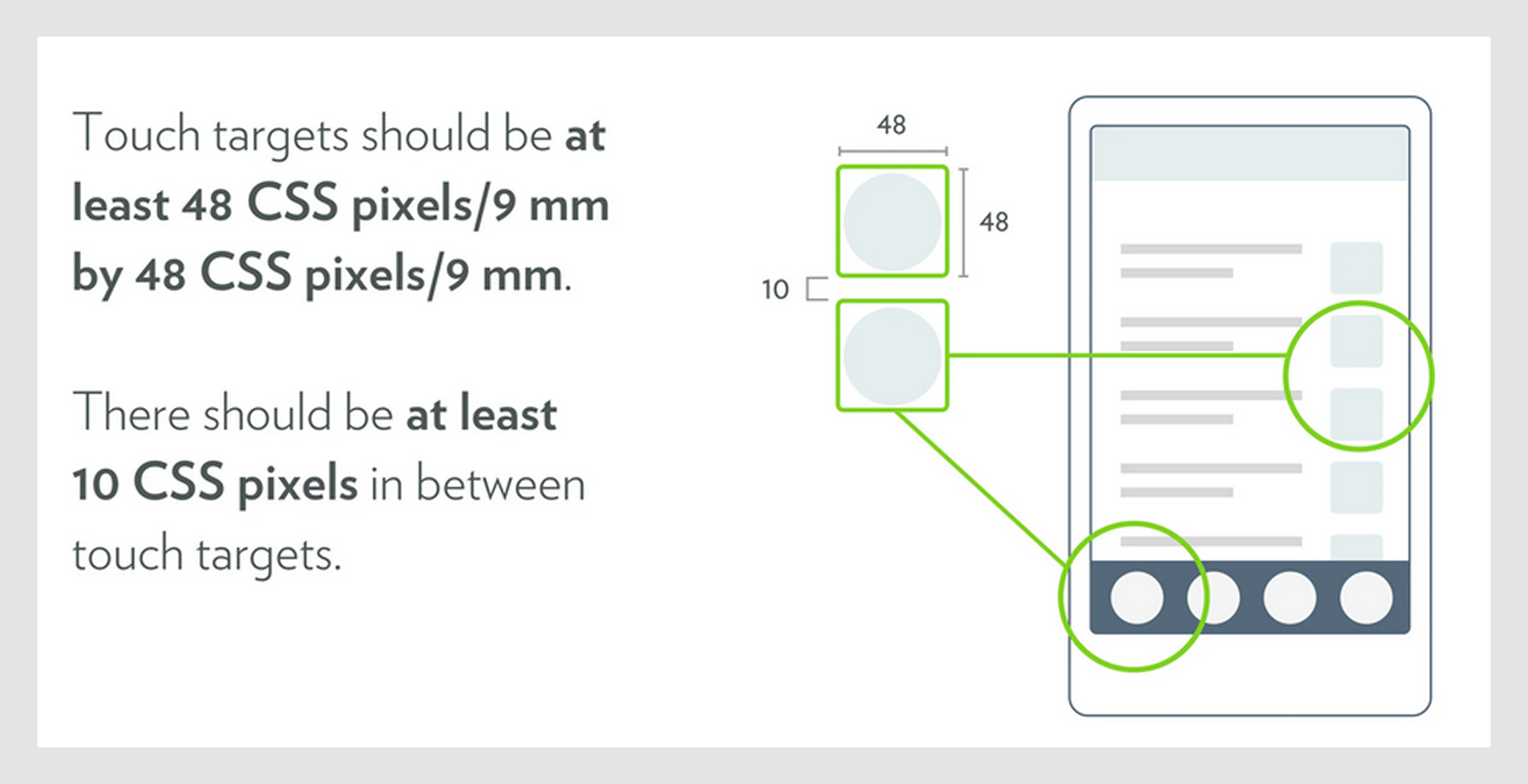
- Respect mobile tap targets
On mobile, precision is limited, so your dropdown items need to be finger-friendly. Follow the recommended minimum tap target size of 48×48px to ensure ease of use. Use generous padding, clear spacing, and make the entire row clickable, not just the text. This small detail dramatically improves usability, especially for users on the go or with larger fingers.
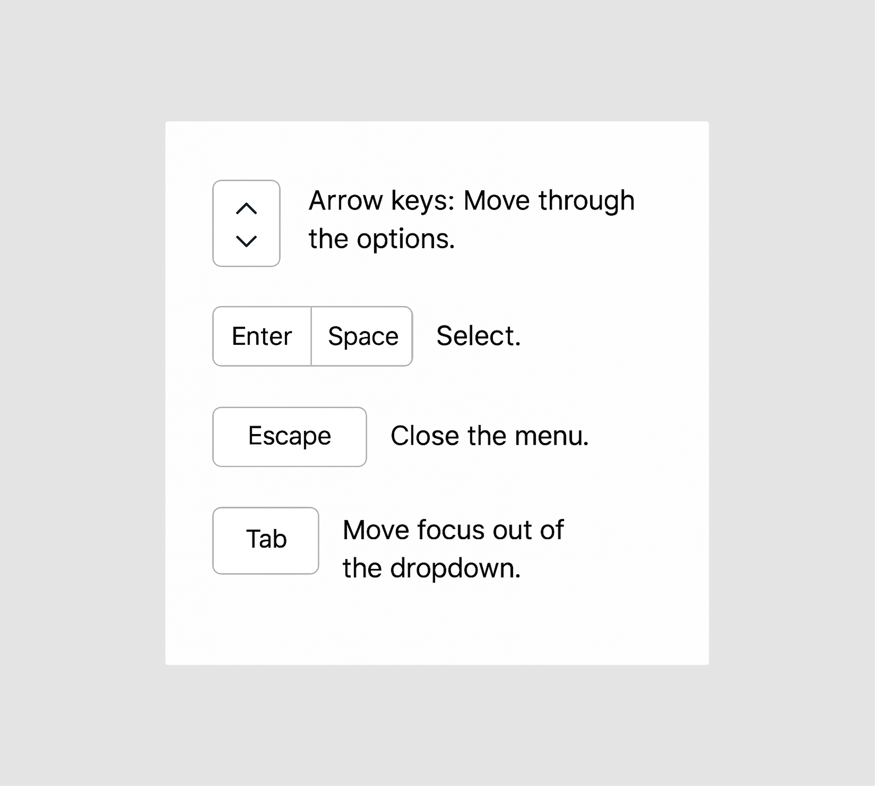
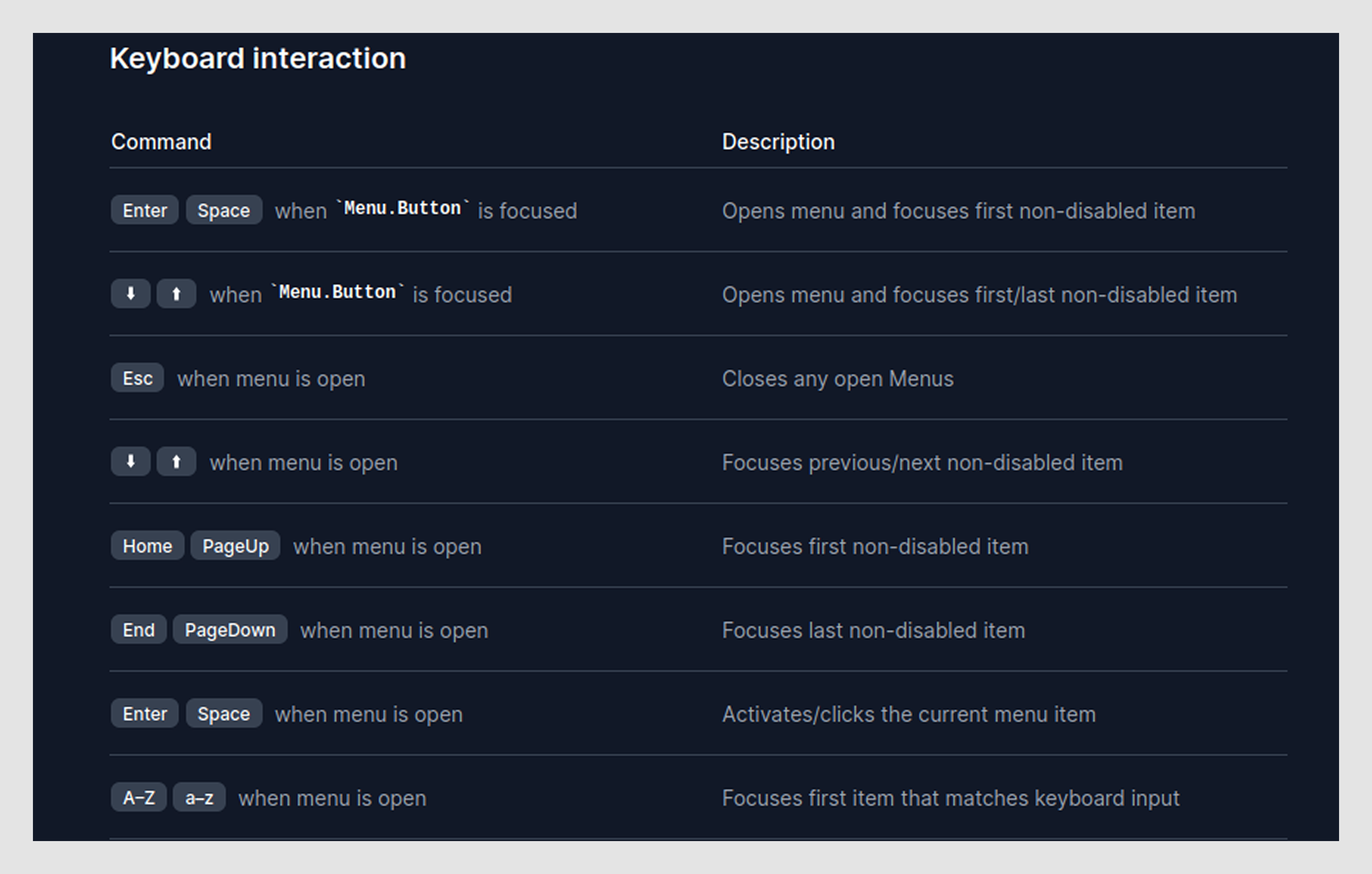
- Support keyboard navigation
Keyboard interaction is essential for accessibility in UX and speed. Your dropdown should support the full range of expected behavior:
- Arrow keys to move between options.
- Enter (or Space) to select.
- Escape to close.
- Tabs UX to move focus away.
If your dropdown component doesn’t handle these, it’s not accessible, and many users simply won’t be able to use it.
Pro tip: Use a native <select> when possible, or rely on accessible libraries like Headless UI or Reach UI that handle this out of the box.
- Avoid accessibility and UX pitfalls
Dropdowns might seem lightweight, but they can easily break for users relying on keyboards or screen readers. If you’re building a custom dropdown (not a native <select>), make sure to use the correct ARIA roles:
- combobox for searchable inputs,
- listbox for standard option lists,
- menu for action-based dropdowns.
Avoid using a menu in forms; it’s meant for actions, not selections.
For screen reader support, ensure your dropdown announces when it’s open or closed, clearly labels each option, focuses the first item when opened, and announces any changes when a selection is made. Tools like VoiceOver or ChromeVox can help you test this quickly.
And don’t let animations slow things down. Smooth transitions are great, but if they delay interaction by more than 200ms, they’re likely doing more harm than good. A responsive dropdown is always better than a flashy one.
Next up, when not to use a dropdown at all.
When and when not to use a dropdown
Sometimes, teams default to a dropdown simply because “that’s how everyone does it.” Visually, it might look clean, but that can be a case of good UI, bad UX. Not every choice needs to be hidden behind a click or tap. In many cases, there’s a faster, clearer, or more user-friendly alternative.
Not sure when a dropdown makes sense? Here’s how to spot the right use case:
- You’re dealing with 5+ mutually exclusive options.
Example: Selecting a country, industry, or department.
- You want to conserve space in a dense UI.
Example: Compact filter tools in analytics dashboards.
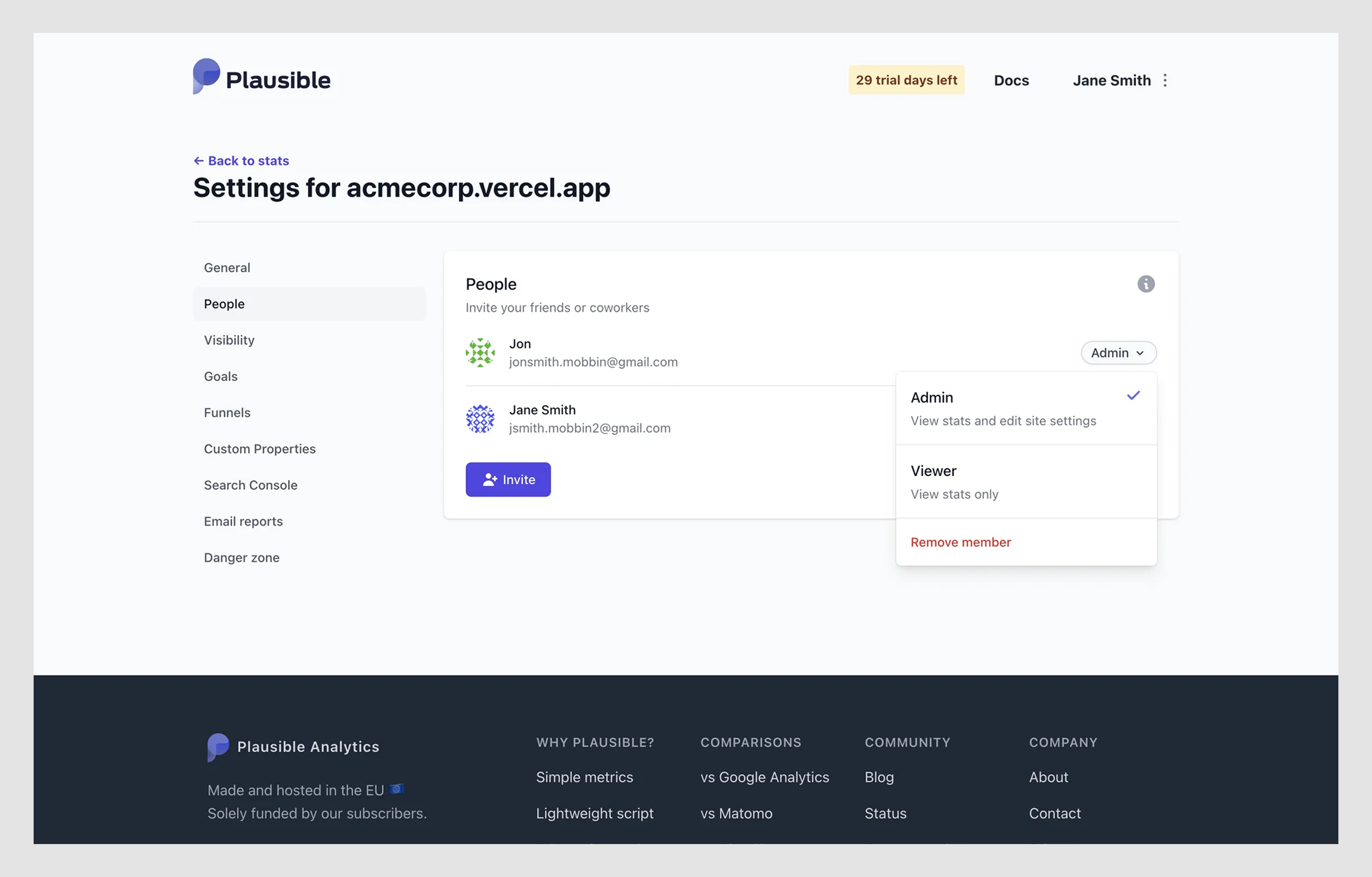
- The values are structured and stable.
Example: User roles like “Admin”, “Viewer”, “Editor”, “Remove member”.
- You want to avoid cognitive overload.
Dropdowns let users scan instead of guessing.
However, dropdowns aren’t always the right choice. Here’s when it’s better to avoid them:
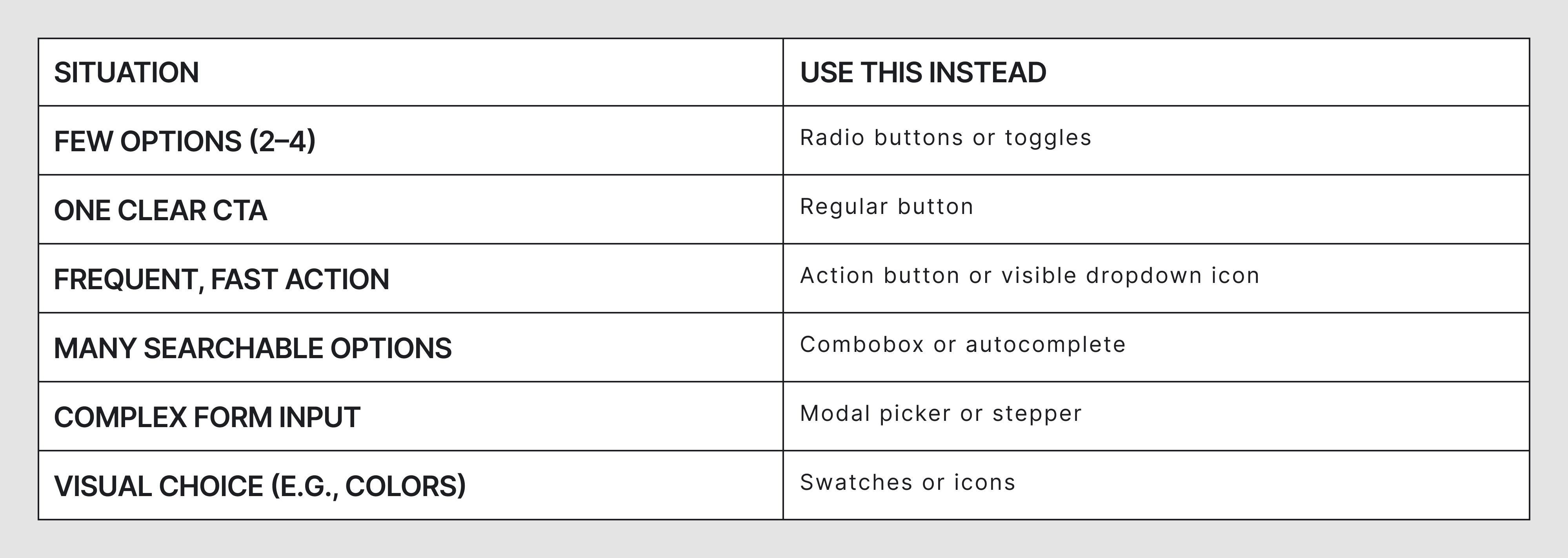
- There are only 2–4 options.
Use buttons, toggles, or radio button UI instead. They’re faster and more discoverable.
Example: Choosing between “Light” and “Dark” mode? Don’t use a dropdown.
- The user needs to perform a frequent action.
Extra clicks slow people down. Example: Don’t bury “Log out” under three layers of nested menus.
- The input is known or easy to type.
Use autocomplete, text input, stepper UI, or masked fields. Example: Age selection: a text input is often faster than scrolling through 99 dropdown options.
- You have dependent dropdowns that change based on previous selections.
This creates hidden logic. Unless it’s explained, users will be confused.
Here are some more situations to consider:
Nail these basics, and your UI will work better not just for some users, but for everyone.
All right, let’s bring it all together.
Conclusion
Dropdowns are tiny, but they quietly support your product: organizing actions, streamlining inputs, adapting to different screens and users.
However, they can become traps. Slow, unclear, hard to tap, impossible to keyboard through, and surprisingly easy to get wrong.
We’ve seen dropdowns that slowed down onboarding, broke on mobile devices, confused doctors, and buried key actions behind mystery meat menus. And we’ve redesigned every one of them to be faster, simpler, more accessible, and, honestly, invisible in the best way.
Here’s what to take away:
- Design with purpose, don’t just drop in a dropdown because “it fits”.
- Keep interactions clear, fast, and consistent.
- Avoid dropdowns when simpler UI components will do.
- Test with keyboard and screen reader before calling it done.
- Think mobile-first, especially for tap targets and spacing.
No dropdown exists in isolation. It’s part of your product’s UX system, and that system either helps users or makes them work harder.
If you’re building a SaaS product and need help making your UI work better, including your dropdowns, Eleken can help. After working on 200+ SaaS products, we’ve learned what makes navigation patterns intuitive, scalable, and easier to use across complex workflows.


.png)


.png)
.webp)