Hubble Network
How our design helped a geospatial SaaS platform raise $70M in Series B funding

Hubble Network is aimed at building the future of global connectivity, and one day, they came up with the idea of Smartpin. This is a geospatial platform powered by a commercial-grade network of 80+ million Bluetooth access points from their partners.
At that point, Hubble had a powerful concept and a detailed Product Requirements Document (PRD) for this B2B SaaS product. They needed a dedicated designer partner to deliver UX-centered designs without slowing down the development.
So we stepped in to design Smartpin, a platform that would let users:
→ Monitor and manage assets through real-time satellite data.
→ Visualize geolocation insights in an interactive way.
→ Get started quickly without technical training.

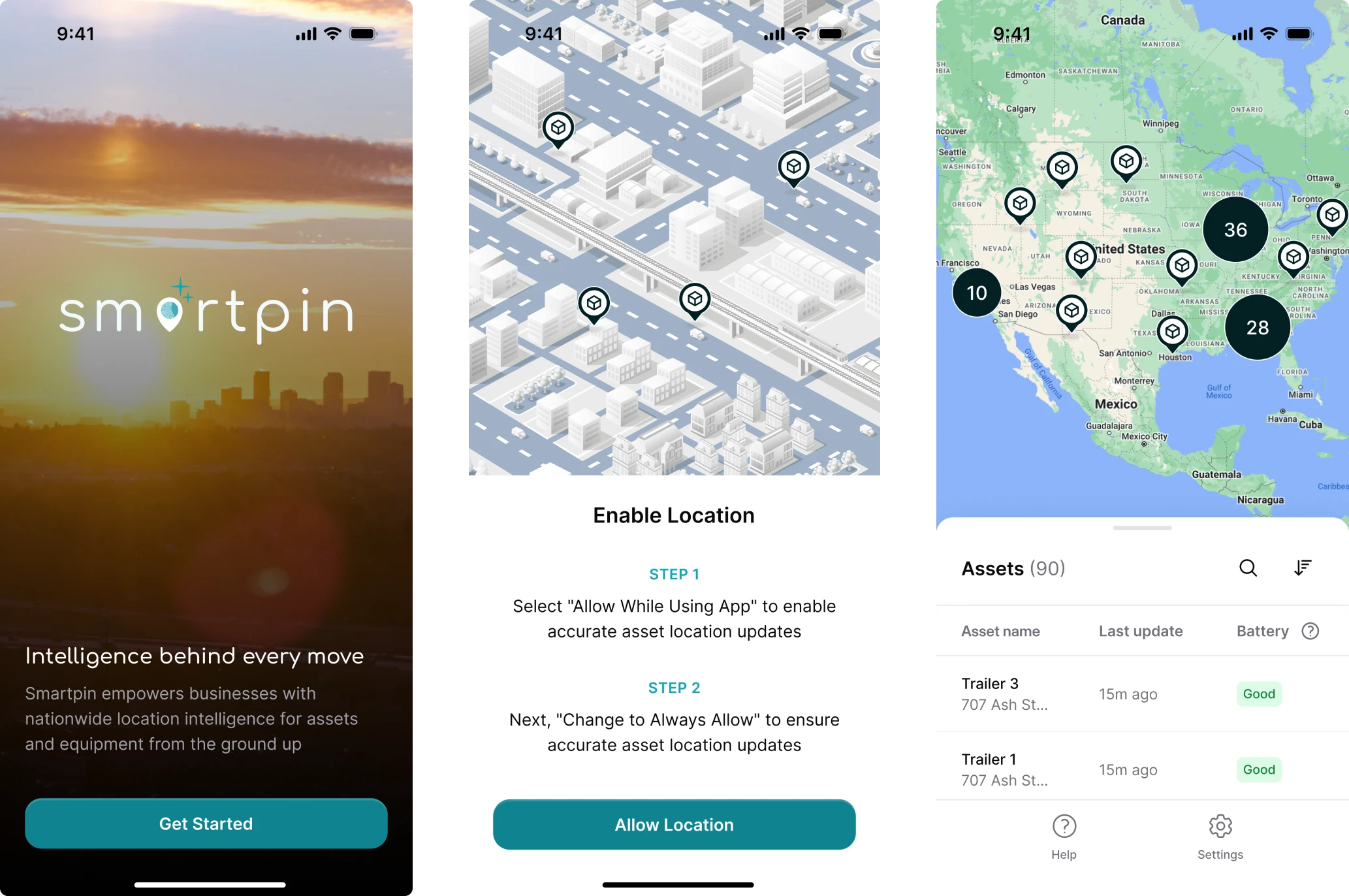
Three days later, we delivered a dashboard that spoke for itself
After our first call with Hubble, we agreed to start with a three-day trial and show how our designer could turn their product vision into design. There was only a PRD and a complex satellite technology behind it, so we literally began from scratch.

What we planned to design was the main dashboard, the first point of interaction with users, and the foundation of their experience. To make it self-explanatory, we focused on showing what matters most at a glance:
- Map overview;
- Active trackers;
- Devices with issues;
- Trackers running low on battery.


The client was thrilled with the result but slightly concerned about the 10-hour time zone gap between our teams. Still, as an experienced remote design agency, we quickly kicked off full-time and made collaboration seamless.
Despite working remotely, they feel like an embedded part of our team, matching our pace, anticipating needs, and consistently delivering work that’s ready for production.
User flows and wireframes helped us make sense of a complex system
Our next step was to map how users would move through the product. For this, we created a user flow outlining the key actions and decisions within the platform.

Once the flow was approved, we moved on to wireframes and stripped the interface down to the essentials, defining hierarchy, navigation logic, and data visibility.

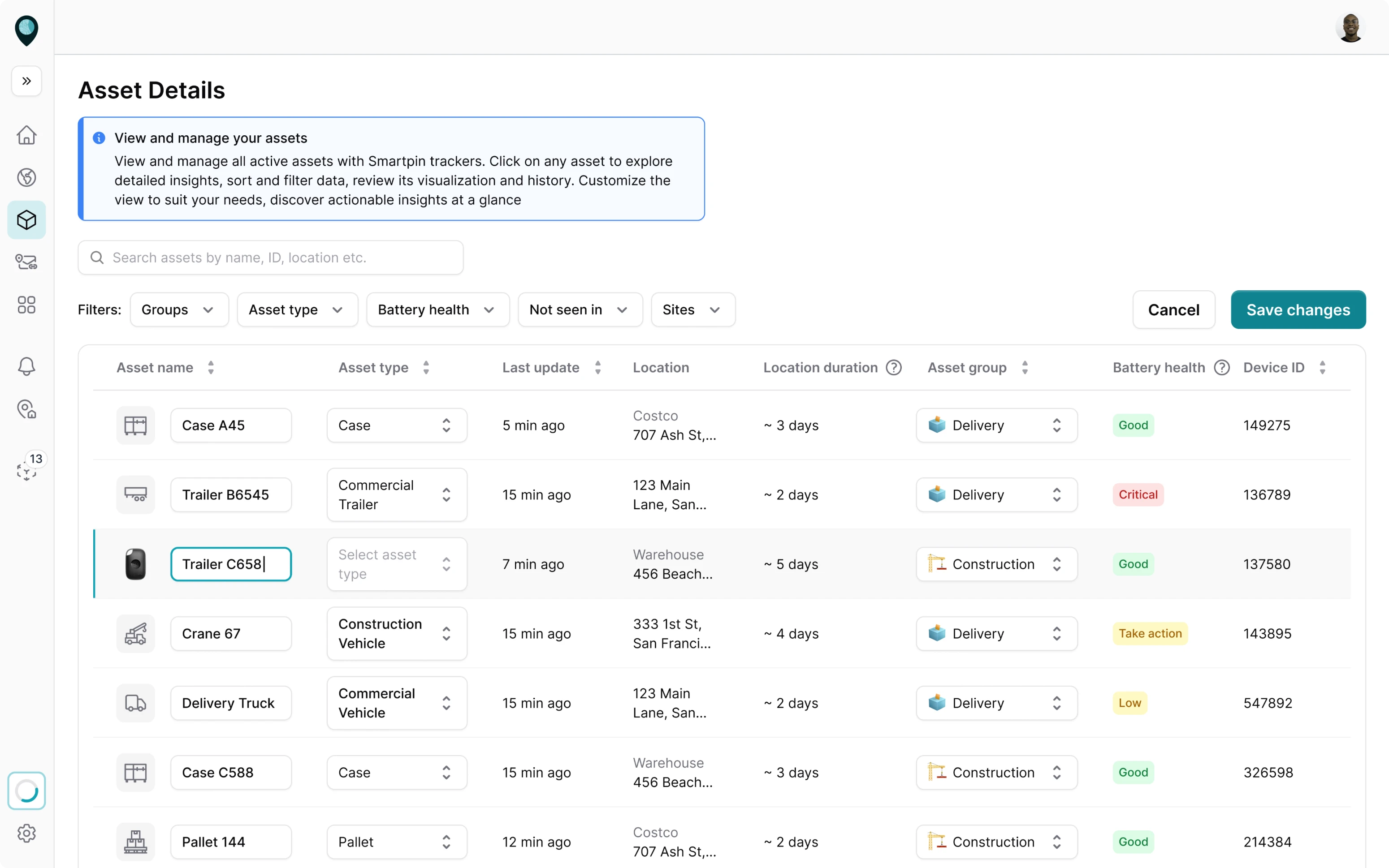
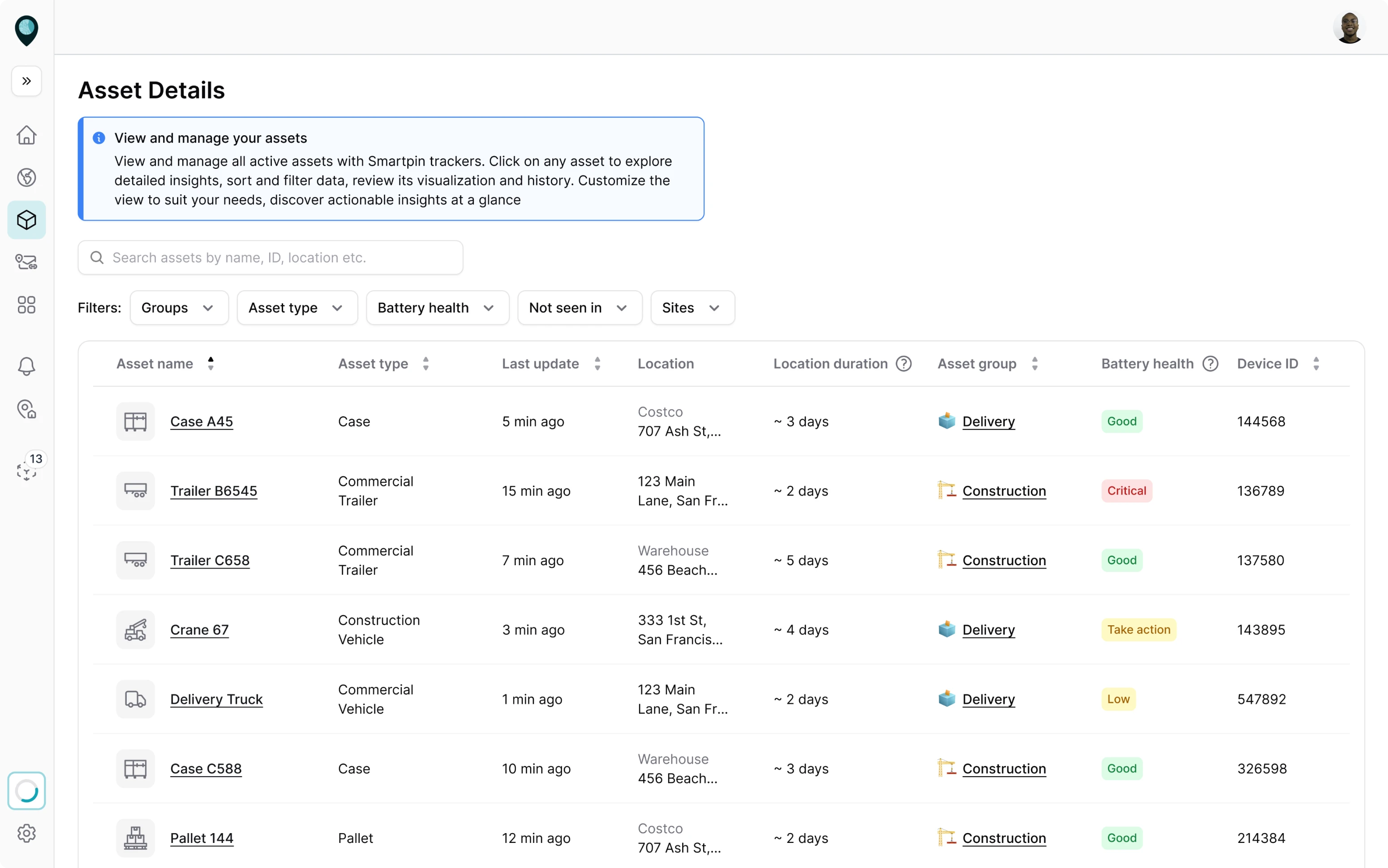
With table-based layouts, we structured a dense set of geospatial data
Smartpin aimed to handle large data volumes, which meant one thing — we needed to structure information so that users could easily view, edit, and manage it.
From the start, we held several brainstorming sessions with the client, exploring different layout options. After evaluating usability and scalability, we insisted on a table-based layout, as it provided data density, clarity, and quick interaction.
Eleken knows when to push back with data-driven reasoning and when to give us multiple polished options to spark healthy debate.
To support future growth, we also began building reusable data components: consistent table cells, filters, and inline-editing patterns, all aligned with Tailwind’s design system. This ensured a scalable structure, easy for developers to maintain and for users to learn through pattern familiarity.
We designed role-based UX to match how teams actually work
Considering that Smartpin is a complex geospatial SaaS platform, we needed to carefully design how users would interact with it. The challenge was to maintain consistent logic across devices while adapting to different contexts.
We defined three main user types: Admin, User, and Field Worker.
Admin and User operate on a desktop, where asset creation, grouping, and management take place. These roles required detailed views and permission logic, showing each user only what’s relevant to their authority level.

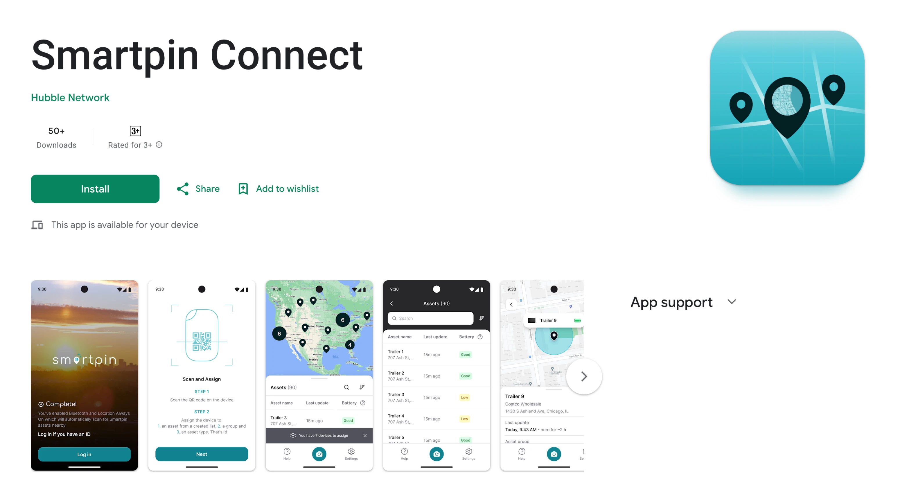
Things became more interesting with the Field Worker role. These users often operate outside and don’t have access to a laptop. Their key task is identifying and assigning trackers to physical assets as quickly as possible.
To support this, we designed a mobile app interface focused on scanning and assigning assets. Here’s how this flow looked in practice:
- Workers scan QR codes on physical trackers with their phone camera.
- The app pulls existing asset names from the database.
- Workers instantly assign a tracker to an asset, syncing updates to the central system.

This mobile-first workflow reduced coordination friction between office and field teams. It allowed the platform to function as a truly connected system.
The Smartpin mobile app successfully passed App Store and Google Play review and remains in active use as part of the live platform.
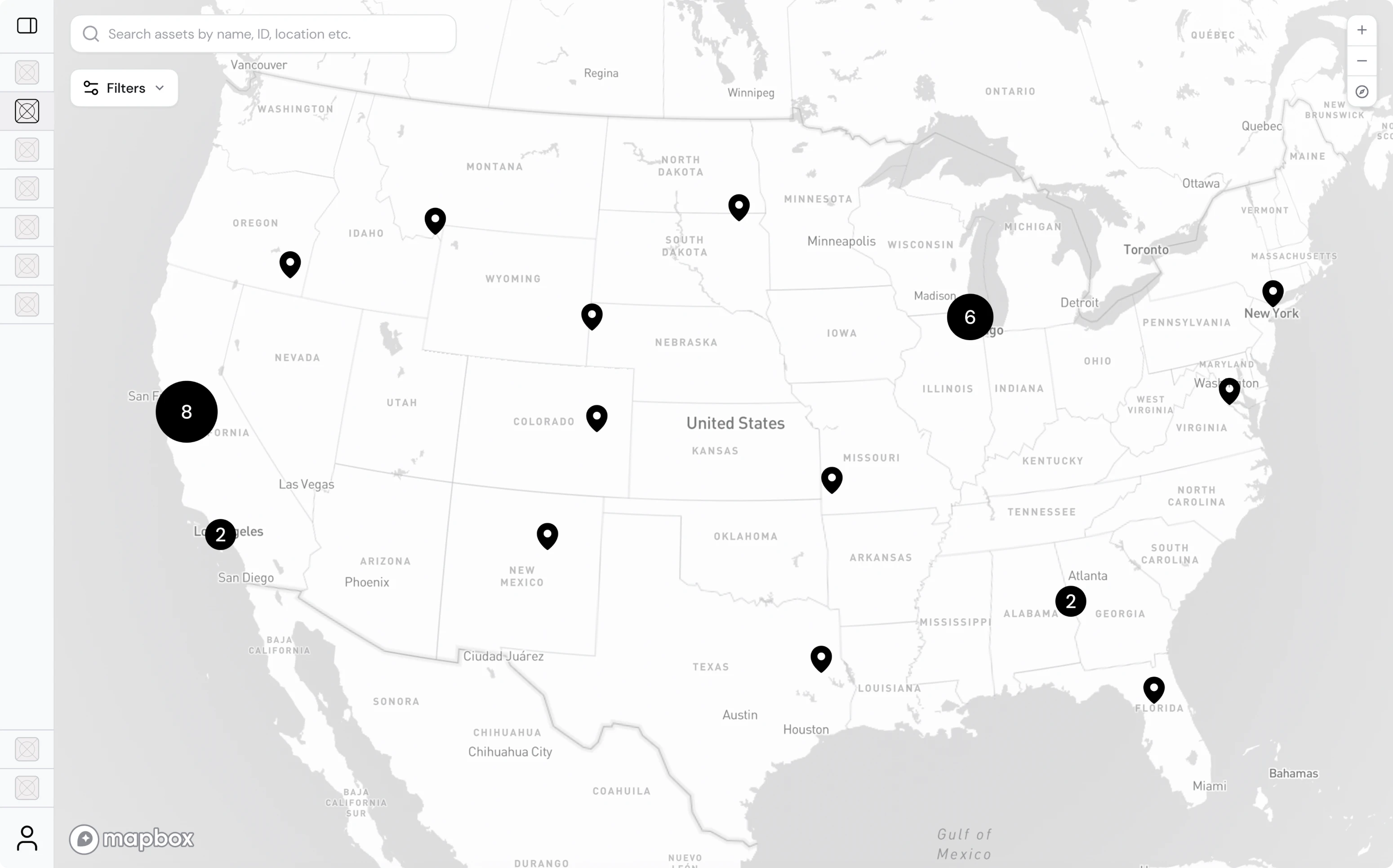
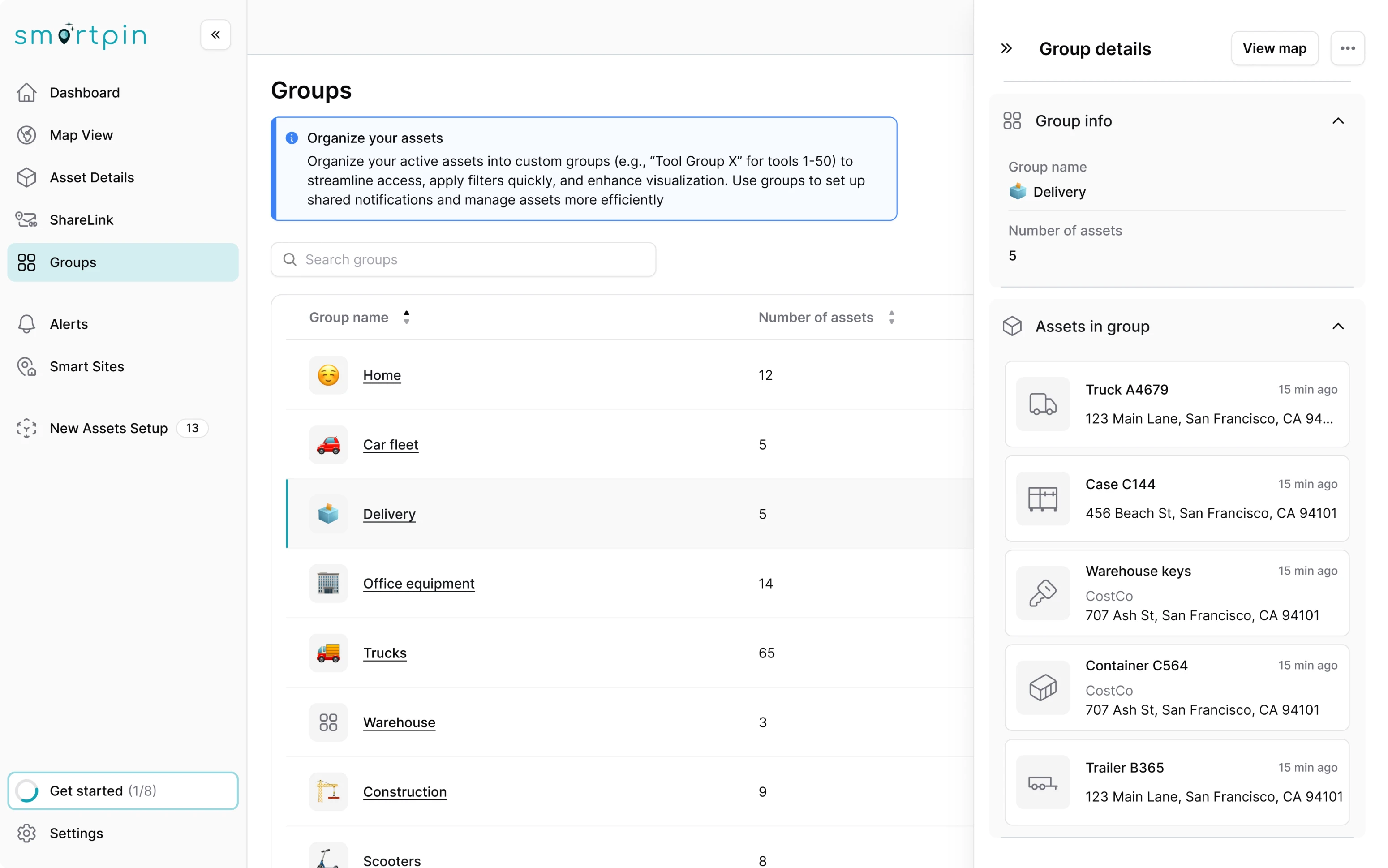
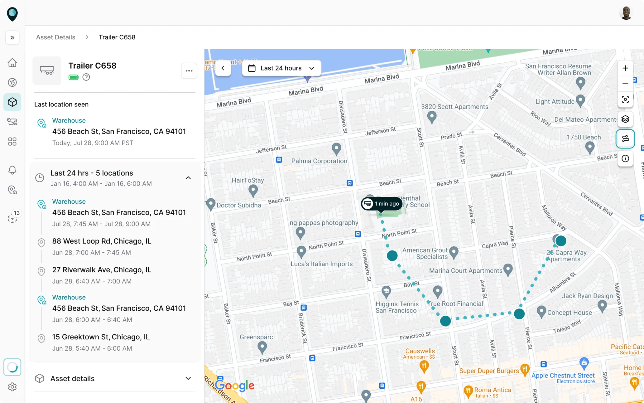
For thousands of moving trackers, we aimed to give users better control
As soon as real data started coming into Smartpin, it became clear that the map was overwhelming. It was filled with scattered dots and tangled lines showing every tracker update in real time. While accurate, it made the interface difficult to read and almost impossible to analyze.
Our aim was to give users control.
The thing that’s probably just highest worth mentioning is we expect customers to have hundreds, at some point, thousands, of device assets.
We started by introducing tracker grouping, which allows users to organize devices by category, for example, personal items, lab equipment, or logistics units. Each group opened on a dedicated map view, displaying only its relevant trackers.


Next, we turned to the map visualization itself. To make it readable, we implemented:
- Clustering of pins and location points, so areas with heavy tracker activity looked clean instead of chaotic.
- A switcher for route lines, letting users toggle visual elements on and off depending on what they needed to analyze.
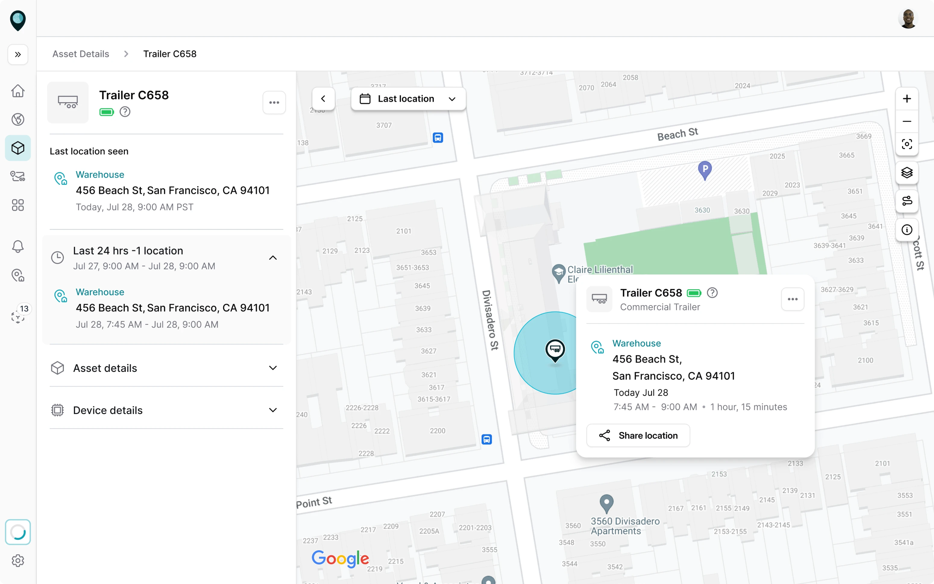
- Smarter pins, redesigned to show what kind of asset they represented and when it was last updated.

Still, users wanted to understand how assets got to a certain point. To make this happen, we made the asset history panel interactive and let users click through the timeline to see where the asset started, moved, and stopped.
We simplified the alerts flow to provide instant awareness
For companies managing thousands of moving assets, staying aware of what’s happening in real time is crucial. Recognizing this, we worked on the Alerts page.
Even though users can’t see their equipment in real life, the interface had to give them that same sense of awareness and control.
To accommodate different roles, we designed two parallel user flows. Admins could create, enable, or disable alerts directly from their dashboard, while regular employees could simply subscribe to the alerts relevant to their work.

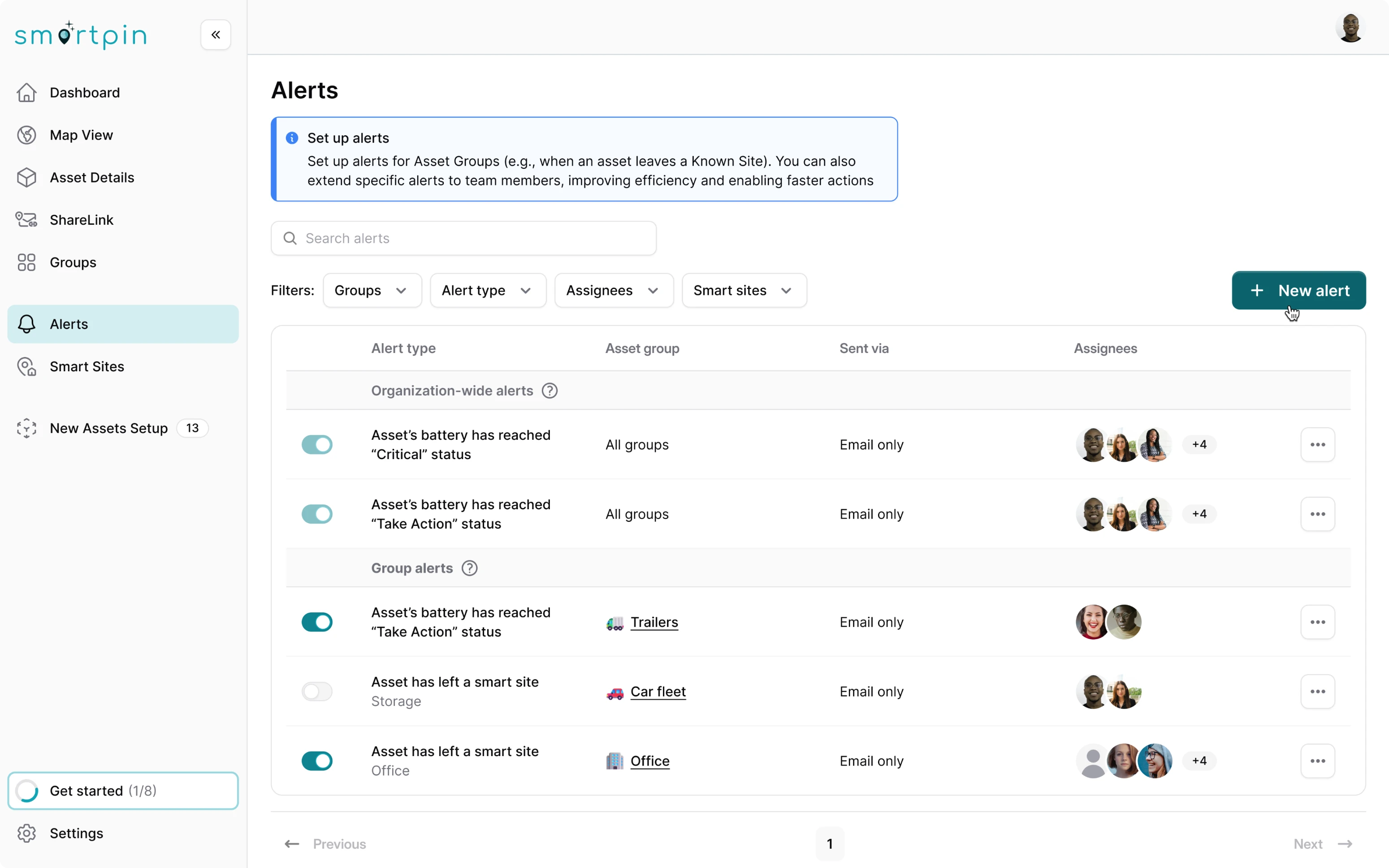
From the UX side, we simplified the alert management process and allowed users to:
- Easily manage alert settings from one place.
- Switch alerts on or off with an intuitive toggle.
- Filter notifications by specific parameters.
- Quickly search through dense information using a search bar.
After user testing, we discovered some pains in the import flow and knew exactly what to do
During user testing conducted by the client, we identified usability hurdles with data import logic. Only asset names were unique, while other attributes had to match predefined system entities. This created a high risk of mismatched or duplicate data.
We redesigned the import flow to include a Review & Fix step with a guided error experience. Instead of splitting issues across tabs, users now see a linear flow:
- The interface highlights “Error 1 of N” and the exact problem (e.g., duplicated asset name).
- After each correction, users advance to the next issue with a clear “Error fixed” confirmation.
- We added error navigation buttons — “Previous” and “Next error” — so users can move through issues in a logical order.

Eleken and Hubble Network’s partnership led to an investor-ready product, and it’s still growing
The client came to us as a Series A startup with a mission to build a data-heavy geospatial tool that any business could use with ease. Together, we turned that vision into reality. The result helped Hubble secure $70M in Series B funding, bringing their total to $100M.
Our collaboration didn’t end there. We continue to work on the platform, expanding it with new features, enhanced functionality, and an even more seamless UX.