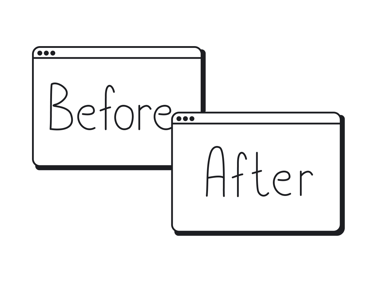

Before-and-after redesigns are the fastest way to see what UX really does. At one glance, you can spot the huge difference between a screen that gives users a headache… and one that makes them click around and explore with ease.
At Eleken, we live and breathe this stuff. As a UI/UX design agency for SaaS, we’ve seen firsthand how a smart redesign can completely boost a product.
Since this topic is a great source of design inspiration, we put together a showcase of 7 redesigns from our own client projects. Each one comes with UX before and after comparisons, so you can instantly see what changed and what worked.
1. Datawisp
Datawisp is a no-code data analytics platform built to help people work with numbers in a visual way. The platform’s concept was solid, but the user interface looked more like Windows 98 rather than an innovative, user-friendly SaaS app.
Here were the main struggles the team faced:
- After raising $435K, they couldn’t move to the next round.
- A limited investment and a tight burn rate put them on the clock.
- The original interface made users work too hard.
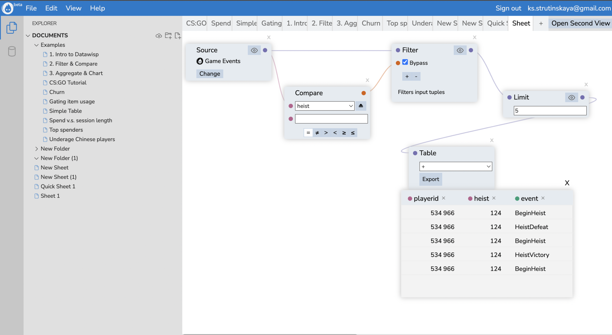
When the team came to Eleken, we kicked things off with a 3-day trial and did a complete redesign of the product’s main screen. The client was pleased with the results, so we moved forward with the full-scale redesign.
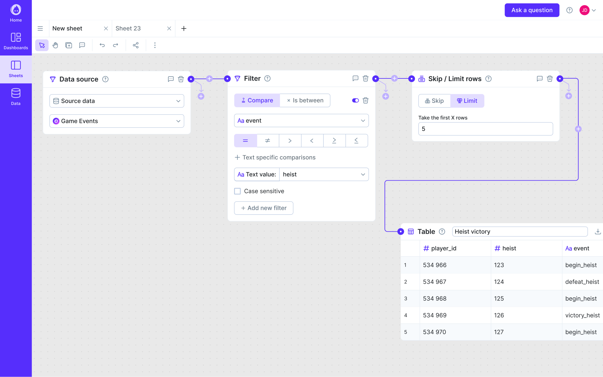
Our designer ran a full UX audit to uncover what was holding users back. From there, we centered the new design around readability and simplicity. Key elements like cards got a complete makeover, while charts were redesigned to be informative.
Here are the key UX decisions we made:
- Simplified the app’s complexity with clear flows.
- Reduced cognitive load by addressing core UX issues.
- Gave each element a clear role in the experience.
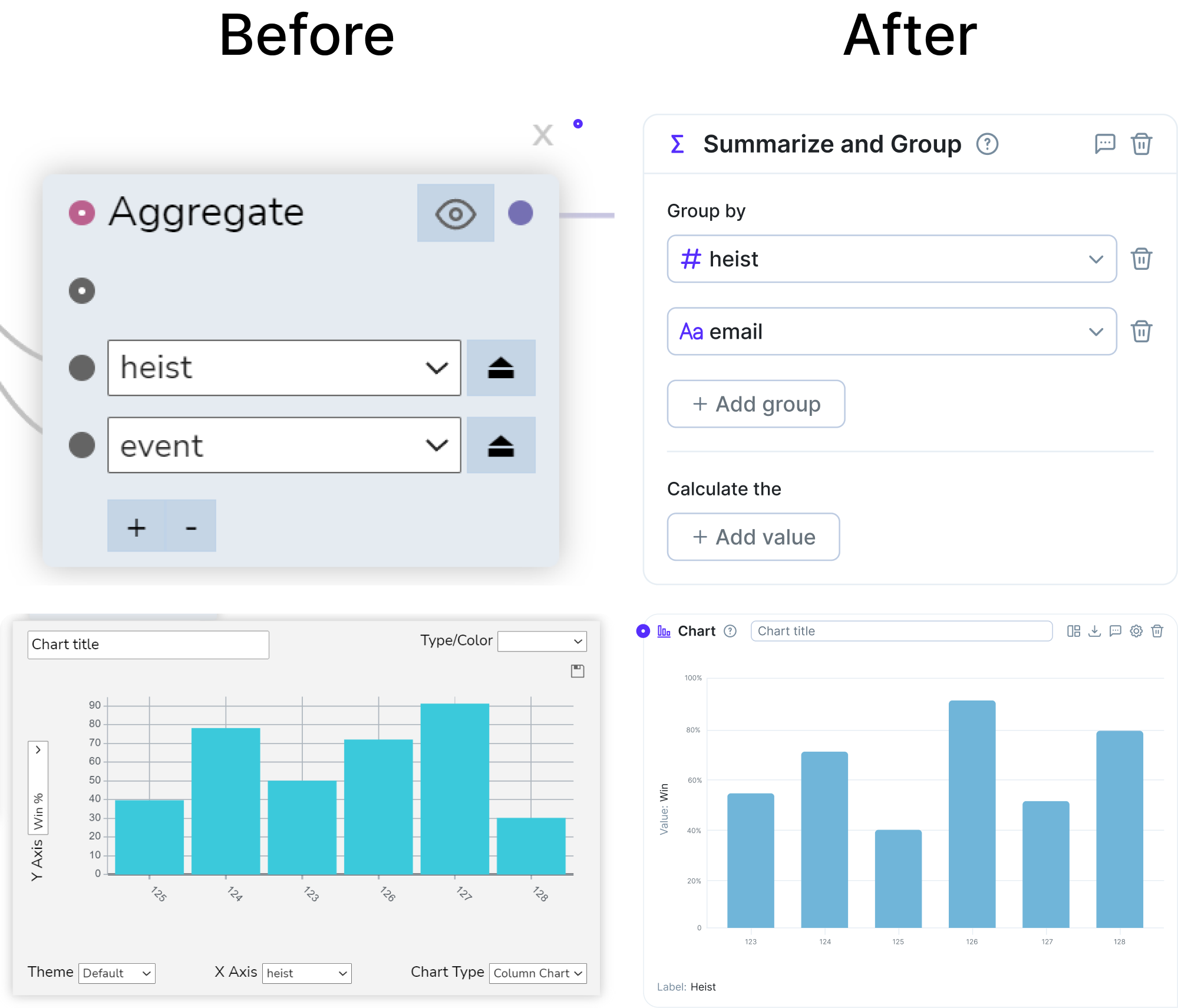
And the redesign worked. The improved UX helped Datawisp raise a $3.6M seed round and earned positive feedback from both users and investors.
2. Floret
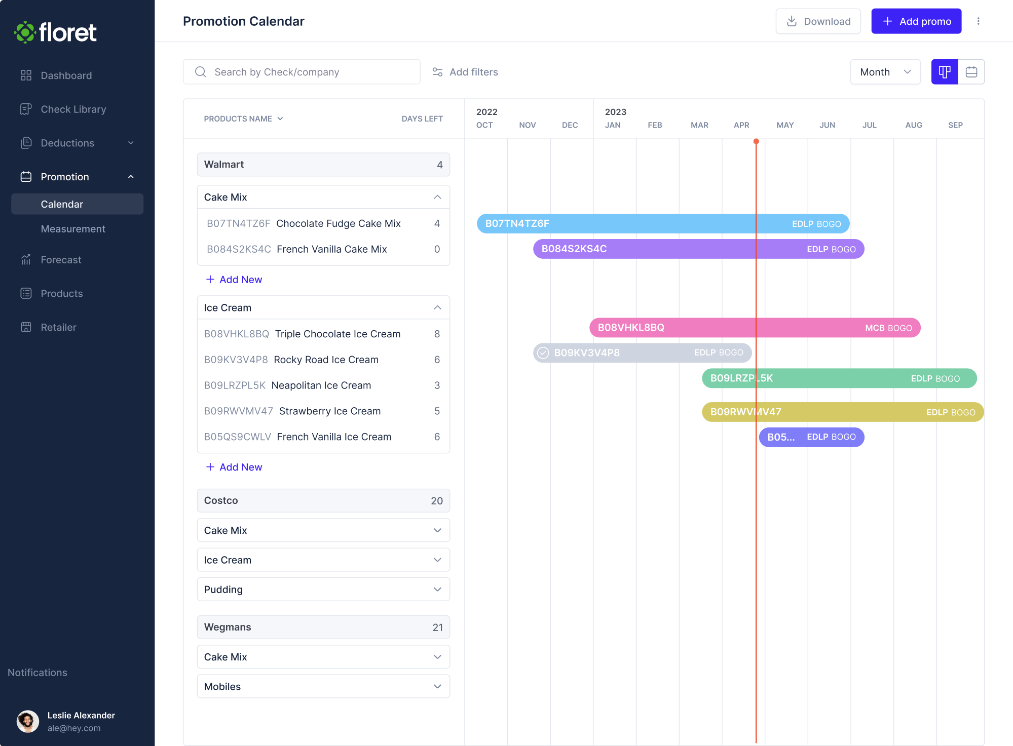
Floret was created to help foodtech companies manage their transactions without drowning in spreadsheets. At that stage, they needed an MVP that worked smoothly and could impress investors. And they needed it in under two months.
Here were the main struggles the team faced:
- A lot of detailed data was overwhelming to users.
- The need for new features had to align with existing ones.
- The functionality was raw and not ready for investor demos.
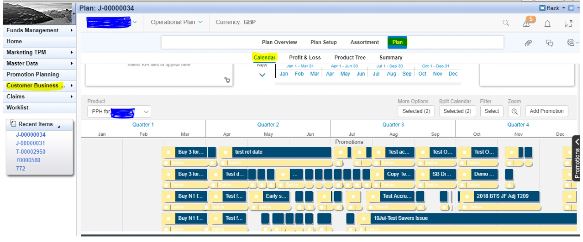
To solve the problem with layered data, we approached every part of the app with clarity in mind. For the promotional calendar, for instance, we trimmed unnecessary details, reorganized the layout, and made the important things stand out.
User roles were another layer we simplified. The app had three user types — Admins, Editors, and Viewers — and we defined permissions visually and structurally to ensure only the right users could access sensitive settings.
Here are the key UX decisions we made:
- Organized complex data into visual patterns.
- Created clear flows and views for different user roles and permissions.
- Simplified key features to provide a seamless experience.
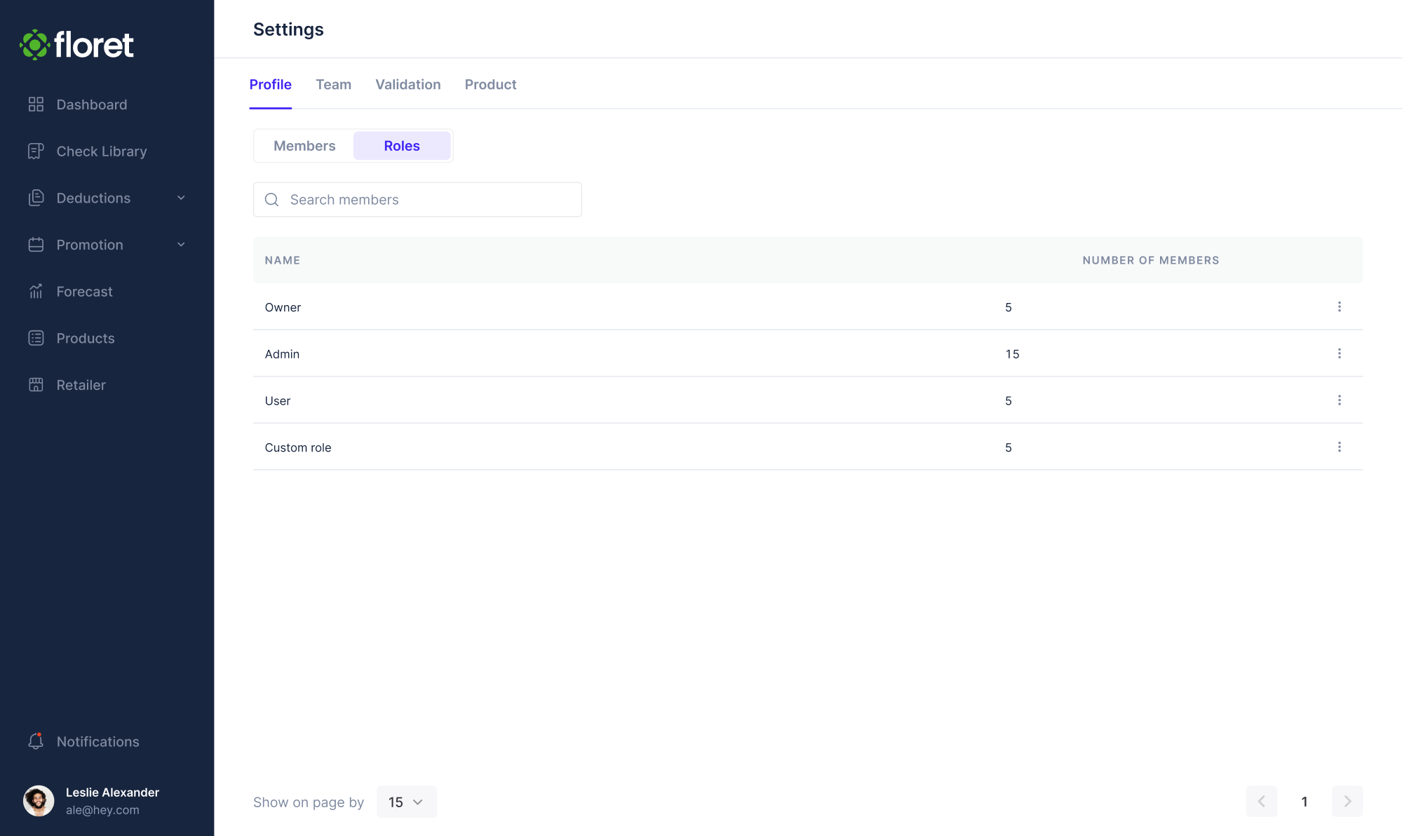
With everything in place, the product redesign before and after led to a successful $2.3 million funding round in just one venture stage.
3. Aampe
Aampe is an AI-powered platform that helps marketing teams send thousands of personalized messages. After encountering challenges with their in-house designer, the team sought a new full-time member and reached out to Eleken.
Here were the main struggles the team faced:
- The navigation experience was confusing and inconsistent.
- Accessibility issues made the product hard to use.
- Data presentation lacked structure and clarity for decision-making.
One of our first tasks was redesigning the menu. We introduced a clearer hierarchy, renamed confusing sections, and applied a consistent icon set. At the same time, we improved accessibility by adding tooltips, labels, and visual cues to the interface.
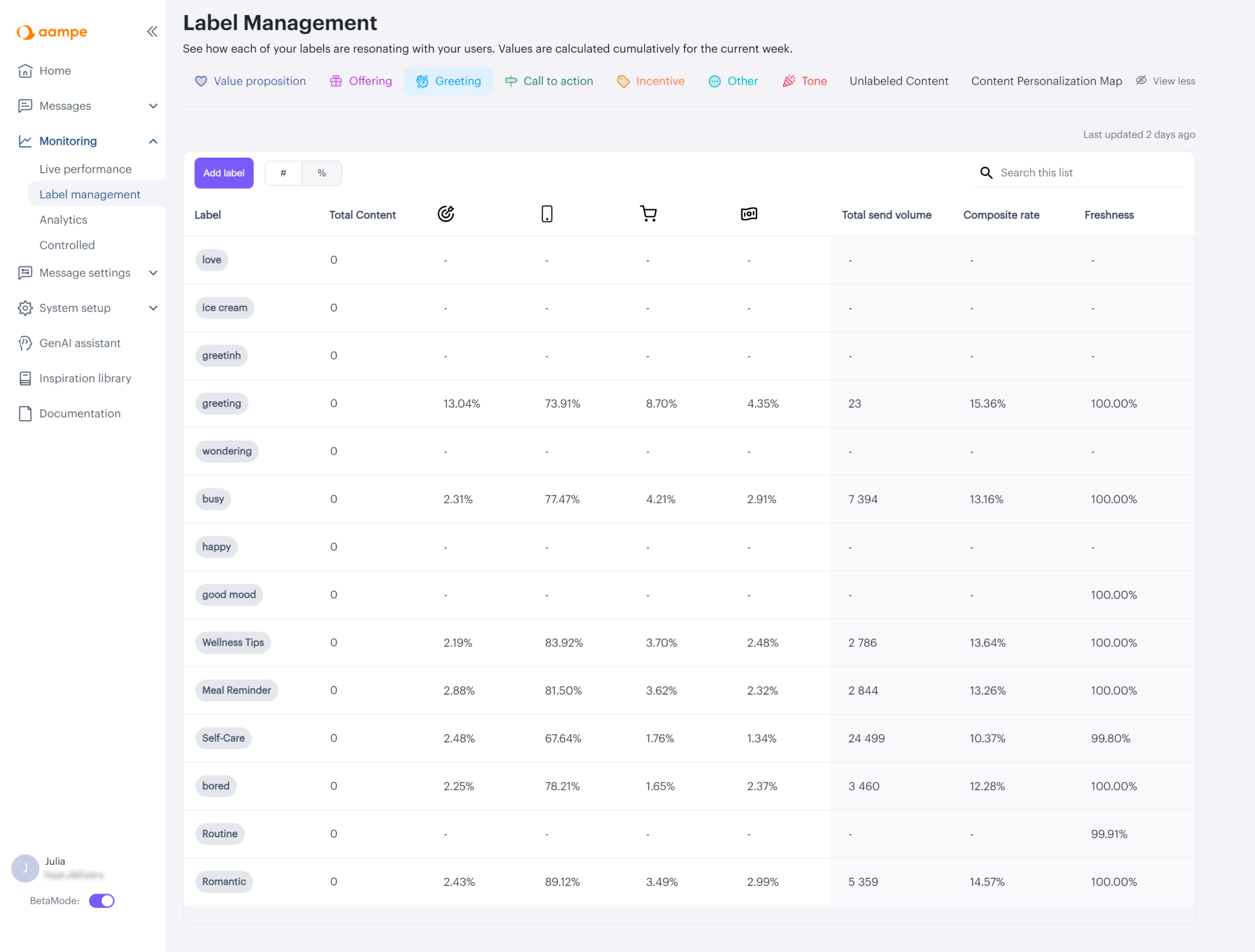
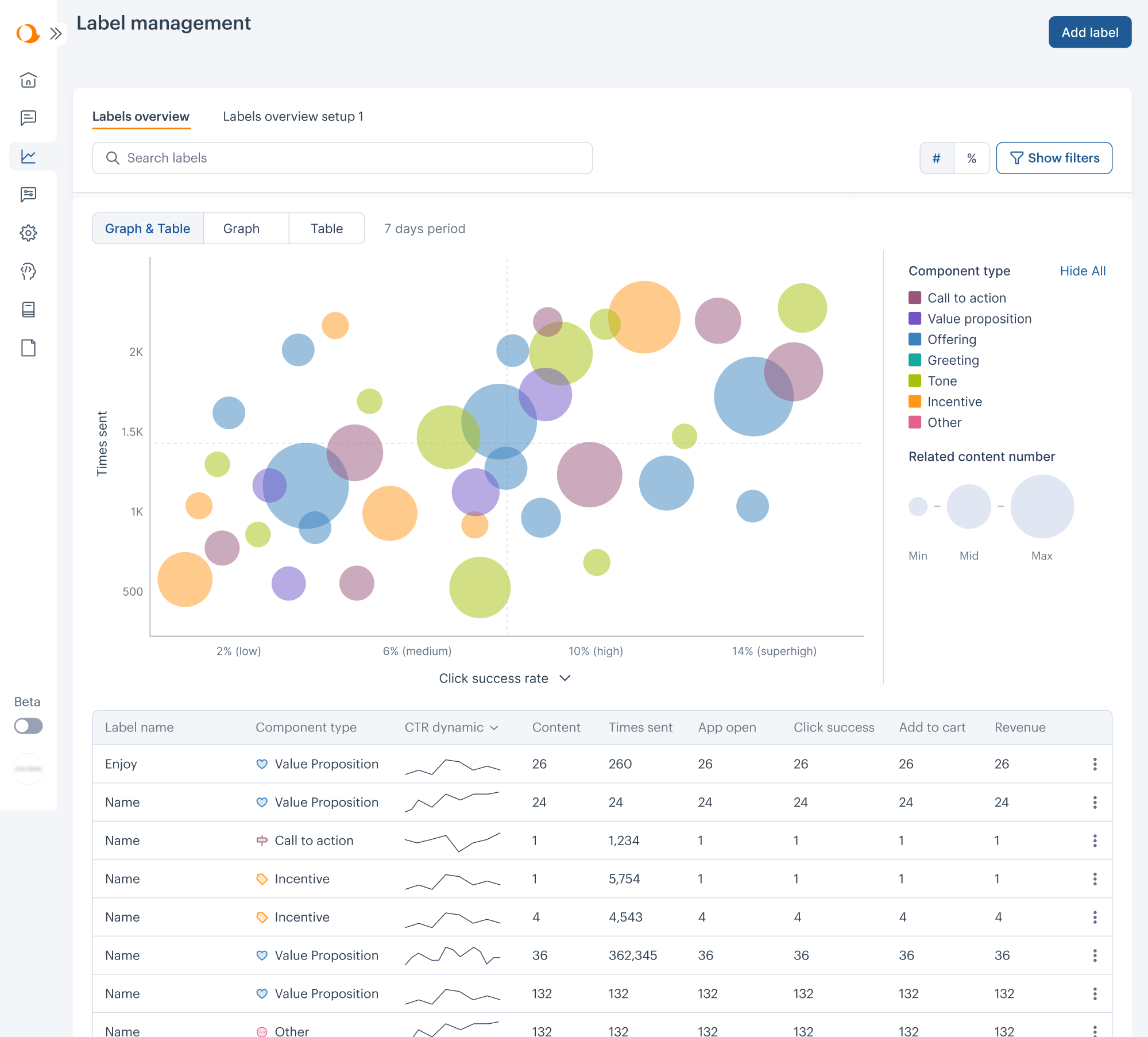
When it came to label performance, the table layout wasn’t meeting user needs. Through close collaboration between the design, data science, and customer success teams, we developed a bubble chart as a solution.
Here are the key UX decisions we made:
- Simplified navigation with clear hierarchy and consistent visuals.
- Improved accessibility through better contrast and visual cues.
- Visualized complex data using a bubble chart.
With each sprint, the product became more focused, accessible, and user-friendly. That momentum paid off, as Aampe closed an $18M funding round.
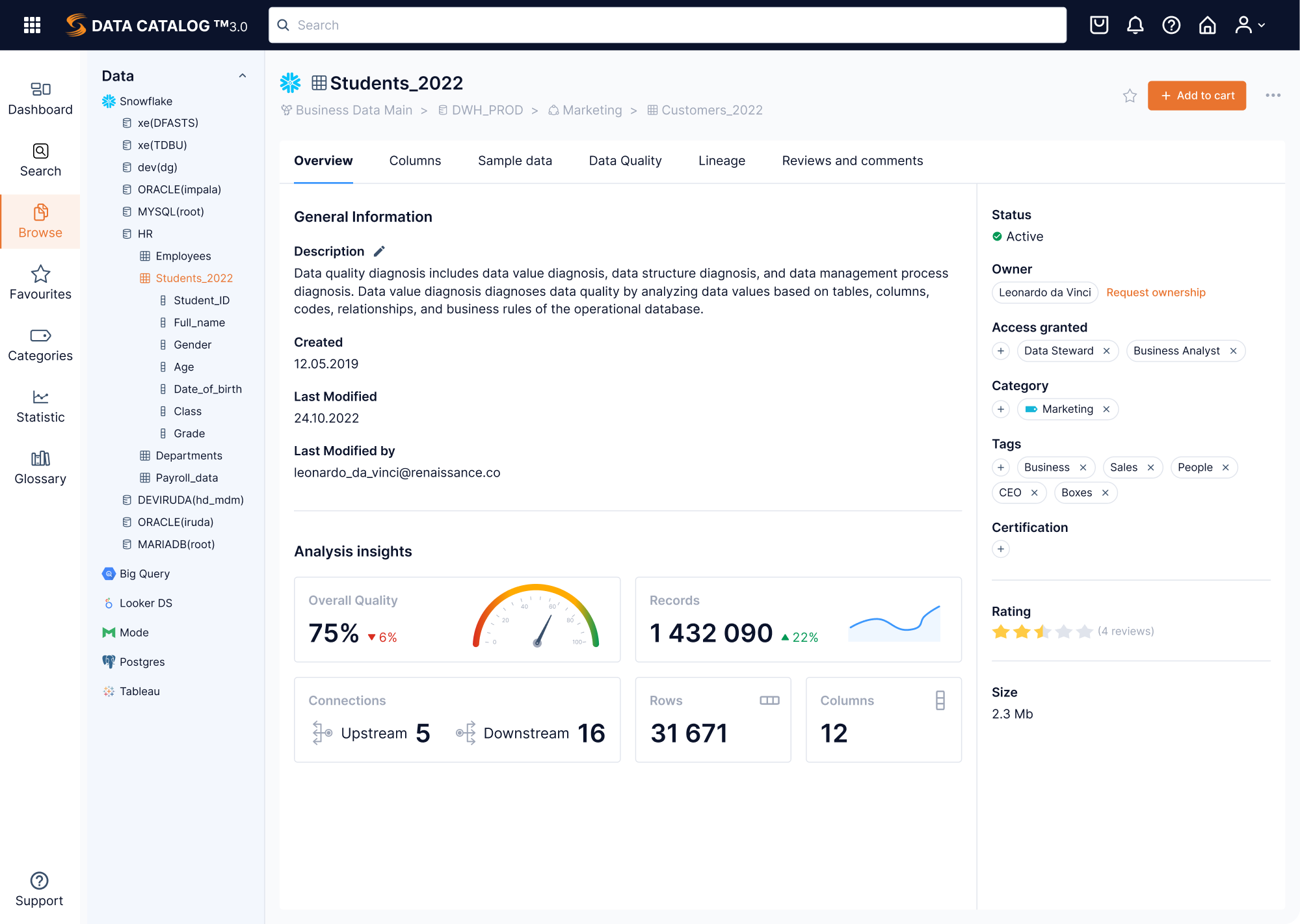
4. Data Streams
Data Streams is a powerful data management platform that set out to go global. To win over new users and stand out from competitors, the product needed a visual design overhaul with strong UX at its core, and an Eleken designer on the team.
Here were the main struggles the team faced:
- A legacy interface that wasn’t ready for global competition.
- Unstructured features and scattered information architecture.
- A need to modernize fast without losing momentum.
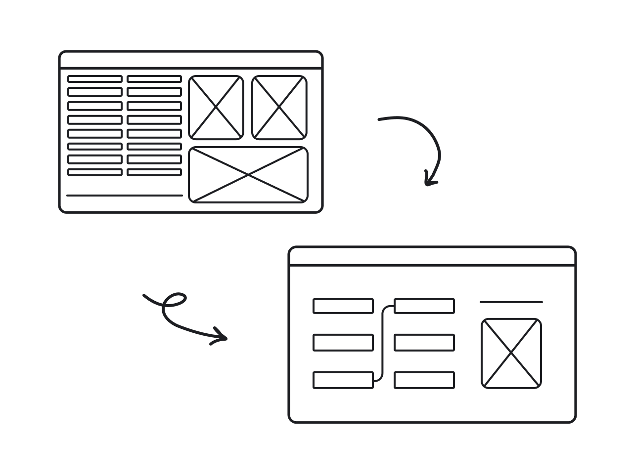
One challenge we tackled was rebuilding the interface for users handling large datasets. Initially, they could select the data but couldn’t customize how it looked. We added a drag-and-drop grid, giving users more control over their workflows.
Another key screen — the Browse page — needed to fit a huge amount of information. For this, we organized the layout with a fixed sidebar for navigation, vertical filters, and collapsible tabs to structure the content.
Here are the key UX decisions we made:
- Rebuilt the information architecture based on real user flows.
- Restructured the dashboard layout for better user control.
- Organized dense information in a more efficient way.
By delivering both short-term impact and long-term structure, we helped Data Streams modernize their platform and move closer to their global ambitions.
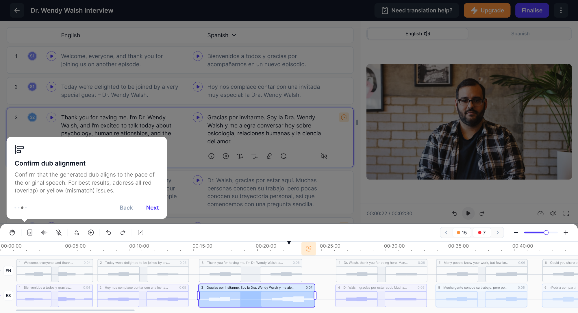
5. Panjaya
Panjaya is an AI-driven video localization software that helps creators dub, translate, and lip-sync content into over 30 languages. The product was already backed by $9.5M in funding, but what it needed next was an intuitive UX to support growth.
Here were the main struggles the team faced:
- A high learning curve due to the novelty of the platform.
- Lack of onboarding and in-product guidance.
- Poor visibility and understanding of AI-generated errors.
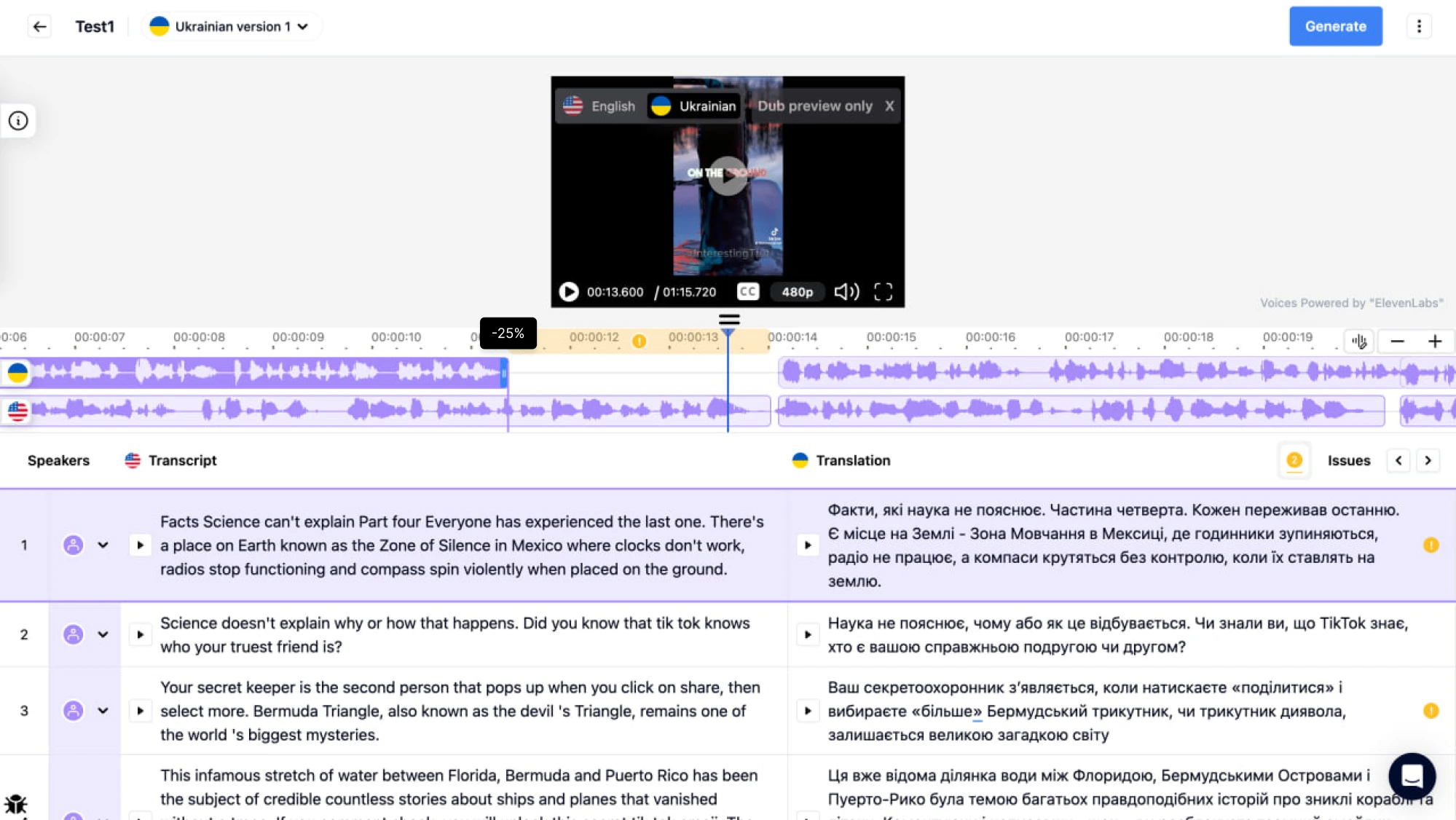
During our 3-day trial, we focused on the layout. To free up space, we proposed placing the video player and transcript side-by-side instead of stacking them. To help users manage AI mistakes more easily, we added error markers on the timeline.
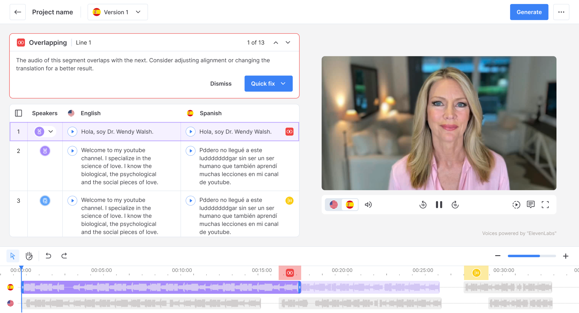
Since this workflow could feel unfamiliar to some users, we supported them with a simple highlight tour that introduced the core areas of the workspace. For the rest of the features, we designed clean user flows that didn’t require a steep learning curve.
Here are the key UX decisions we made:
- Reorganized the layout to reduce cognitive load.
- Designed a clear error panel to help users manage AI mistakes.
- Introduced guided onboarding to make the experience approachable.
Powered by intuitive UX, Panjaya strengthened its market position and now serves major clients, including TED, who reported a 115% increase in views.
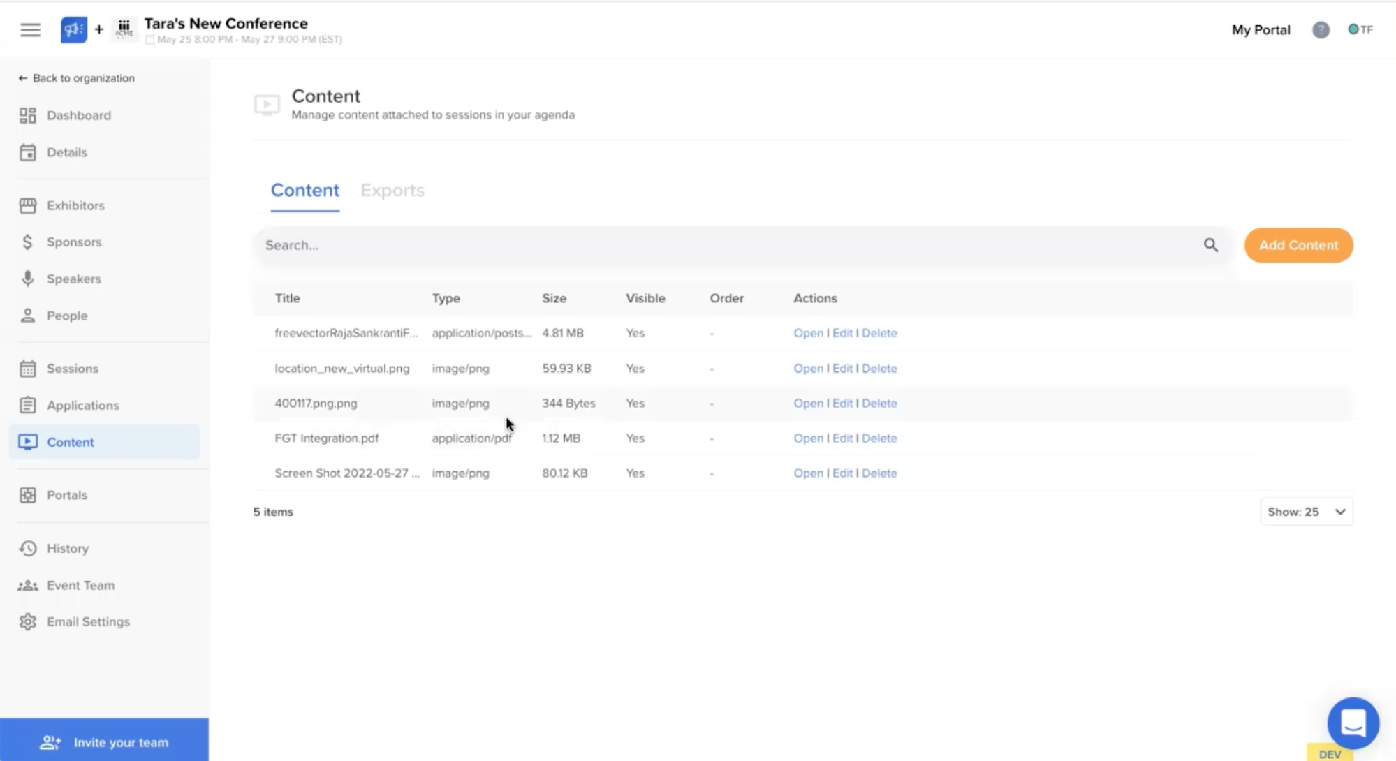
6. myInterview
myInterview is a video interviewing platform that faced a serious problem: 90% of candidates were dropping out mid-interview. That kind of churn was a threat to the product’s core value, and the team came to Eleken with a mission to fix this.
Here were the main struggles the team faced:
- A critical drop-off rate during the candidate application flow.
- An outdated interface that confused users and slowed task completion.
- A growing product with no consistent design system to support scale.
We started by redesigning the input screen for the candidate flow. Clear checkboxes replaced ambiguous icons. The entire area became clickable, and helpful copy made the multi-select logic intuitive. The result was a flow that felt familiar.
On the recruiter side, we revamped the job creation process. We introduced a step-by-step flow with previews, so hiring teams could see how their postings would appear before publishing. Custom branding was integrated directly into the setup.
Here are the key UX decisions we made:
- Redesigned the candidate flow to reduce churn.
- Simplified the recruiter flow with templates, branding, and previews.
- Created a design system to unify the growing product experience.
This UX redesign case study led to a more confident platform that converts better, scales faster, and now closes enterprise clients with solid demos.
7. Sessionboard
Sessionboard is a CRM that tracks speaker history, engagement, and expertise across events. The team was struggling to move forward, as previous design vendors had missed the mark. From that point, Sessionboard turned to Eleken.
Here were the main struggles the team faced:
- Fragmented data and no centralized way to manage speaker content.
- Inconsistent design inherited from a legacy system.
- A lack of scalable systems to support growth and new features.
To start, we fixed the content sprawl by creating a centralized Contacts page with a clean grid layout and smart filters. Here, users could access full speaker profiles where everything — bios, files, session links — was grouped into tabbed sections.
As we tackled data issues, we also laid the groundwork for AI-powered features. Reviewing hundreds of bios, abstracts, and attachments was a pain point for content managers, so we helped bring in AI tools by applying familiar UX patterns.
Here are the key UX decisions we made:
- Centralized speaker data with clean layouts, tabs, and bulk filters.
- Designed a deduplication flow to clean up and connect speaker records.
- Used proven UX patterns to make AI features feel simple and usable.
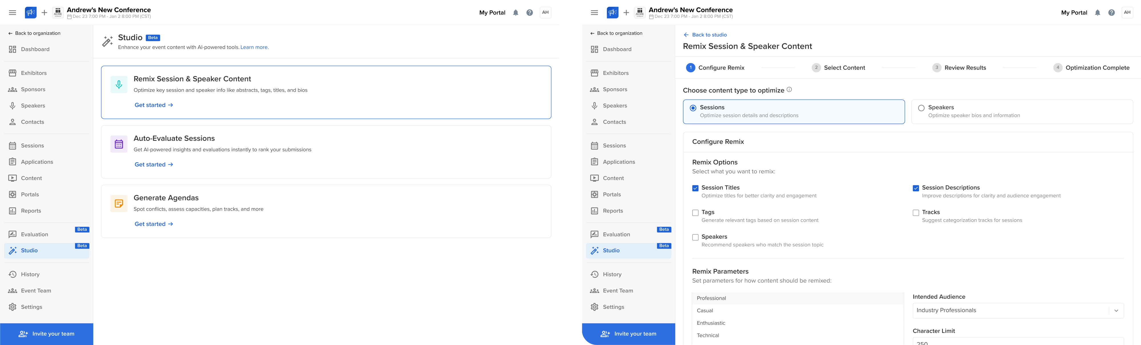
By fixing the foundation and introducing scalable systems, we helped Sessionboard turn its platform into a focused, structured product ready for growth.
To sum it up
All UX transformation examples we’ve covered are stories of their own. Some of our clients needed to attract investment. Others wanted to go global or bring clarity to a product that had grown. And in some cases, the interface just didn’t work.
Whatever the goal, UX redesigns are powerful tools for unlocking growth, reducing friction, and making your platform something people enjoy using.
If you’ve got a goal in mind, or even if you just feel like part of your product isn’t working, we’re here to help. At Eleken, we’ve spent over 10 years designing SaaS products, and we’d love to craft one you’ll be proud to share.