

The word 'wireframes' may sound complex, boring, or even intimidating for those outside the industry. But if you are in the design or product field, you know that wireframes are actually a great way to present how the digital product will work and look.
We are a design agency for product companies, so we know a great deal about wireframes and their importance in the design process. We also know that what seems obvious to designers can still be a mystery for specialists in other fields. In this article, we will address all of your concerns related to high-fidelity wireframes and share some examples from our talented UX designers.
But first, it is important to understand the basics.
What is a wireframe?
A wireframe is a schematic layout of a future product, whether a website, an app, or a platform. Wireframe is always a simple text-and-line representation — a skeleton of the future product design built from basic shapes and structure.
Wireframes are low-fidelity prototypes. This causes some confusion: what is considered a wireframe, as wireframes are prototypes, but not the other way around? This topic requires an in-depth explanation, so when you're curious to learn the difference between wireframes, mockups, and prototypes, go read our article dedicated to the topic.

Usually, wireframes look like schematic blocks with essential elements that visually illustrate how various components of the website will be organized. They are monochrome, often black and white, but not always.

An understanding of how and why we use wireframes in the design process can help us with high-fidelity wireframe definition.
Designing a product is a complex journey, so we must break it down into smaller steps.
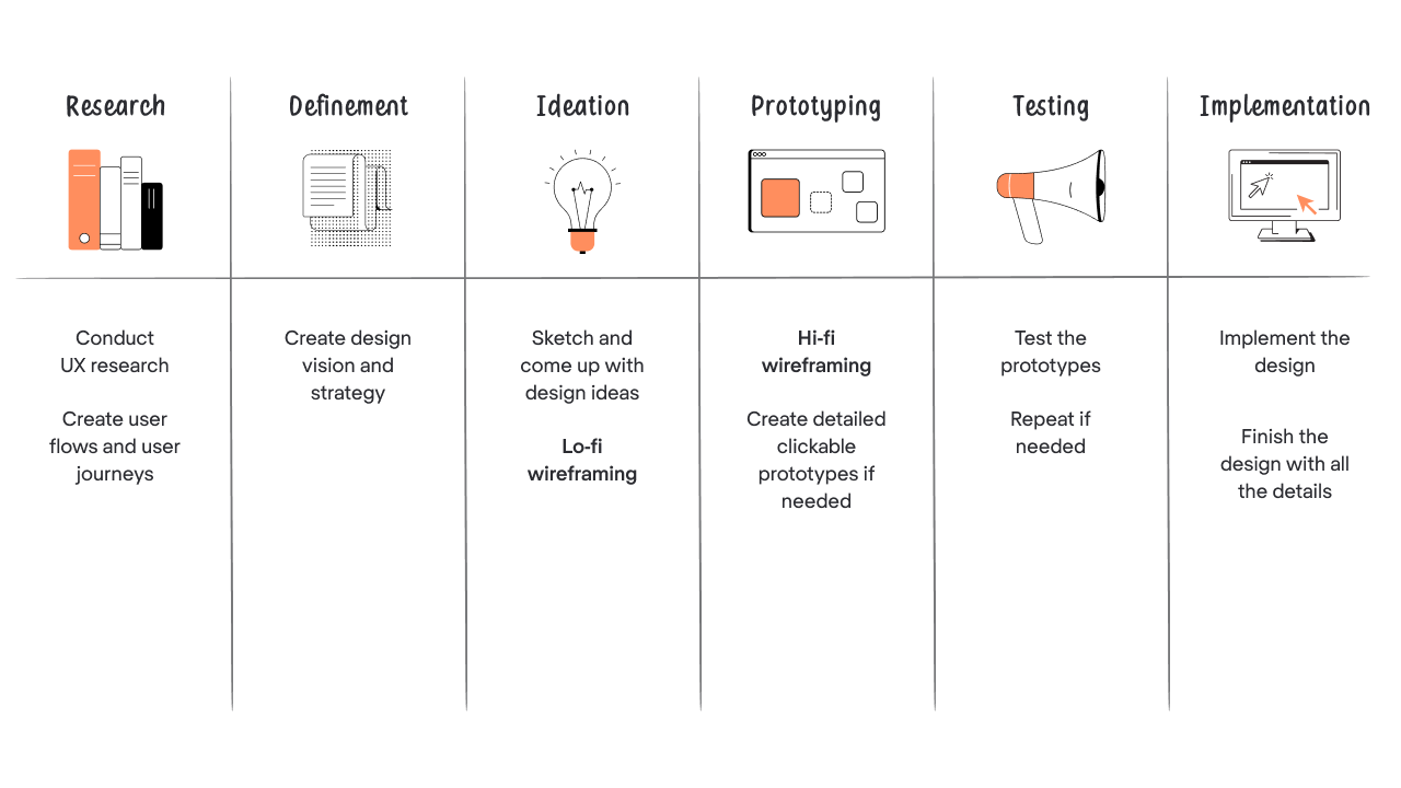
Wireframing is part of the ideation and prototyping stages of the product design. Depending on the stage of product development, designers use different fidelity wireframes ranging from low to high. From the design point of view, fidelity is how detailed the wireframe will be and how accurately it reflects the overall structure of the product.
What is a low-fidelity wireframe?
A low-fidelity (lo-fi) wireframe may vary from a black-and-white paper sketch to a simple digital one. It focuses on the basic layout and core ideas, using boxes and lines to depict the main structure of the website or app, without much attention to UI elements or interaction.

Lo-fi wireframes can reflect a product's basic structure and features, showing where the content and visual blocks will be placed. With them, designers can quickly create wireframes in short terms to explore concepts and possibilities during the early stages of product development phase.
Low-fidelity wireframes are part of the ideation process and are perfect for rapid iteration. As many of the details are missing at this stage, designers usually present them to the client with some additional comments. Lo-fi wireframes are time-saving for both product owners and the design team. Simplicity, effectiveness, and time-saving characteristics make it easier to quickly iterate and align with stakeholders.
By this point, we hope you have an idea of how wireframes work. However, there is still a bigger question to answer.
What is a high-fidelity wireframe?

Following the logic, a high-fidelity (hi-fi) wireframe is an advanced version of a low-fidelity wireframe. However, it is more than just a detailed sketch — it is a series of well-thought-out screens that illustrate each element and the connections between them with a detailed representation of the product.
Unlike prototypes, wireframes are usually static, but hi-fi versions can include interactive elements or even clickable elements to simulate flows. Compared to high-fidelity prototypes, they are slightly less polished but still offer a realistic view of the final product.

The key difference between low-fidelity and high-fidelity wireframes is that lo-fi represents design direction and general layout, while hi-fi is well-researched, highly detailed, and presents a more precise look and functionality of the future product.
Lo-fi sketches can result in human error and confusion. High-fidelity wireframes, on the other hand, help teams design accurately and reduce misunderstandings. They provide a clearer sense of visual hierarchy, basic navigation, and how users move through the interface.
Because they are closer to the final product, hi-fi wireframes make it easier to gather feedback from stakeholders and align design and development teams. They often include elements like specific fonts, branding elements, and structured ui components.
Hi-fi wireframes take more time to develop and can be time consuming, especially when adding intricate details or simulating hover states and behaviors. However, they provide a much clearer foundation for the design system and final UI.

More detailed wireframes naturally require more effort, but they ensure clarity and reduce rework later in the later stages of development.
Now that we have figured out what high-fidelity wireframes are and why they are good, it's about time we addressed the last question.
When to use hi-fi wireframes?
High-fidelity wireframes are one of the most effective UX deliverables. They serve as a strong base for mockups and help teams test user flows before development begins.Wireframes can be used to represent the screens and how they appear after one another when the product is in use.
Hi-fi wireframes can also be used to create a strong framework for your design. High-fidelity wireframes give designers a ground to make better decisions related to the final product's design.
And they are especially useful when working within a defined project scope and when the product team needs to align on functionality and visuals.
Here's a hi-fi wireframe and finalized design of our project. You can see that wireframe is a pretty accurate representation of what it will become.

They are also essential for validating ideas through usability testing, ensuring that the structure supports real user needs before investing in full development.
One more indicator that the product needs high-fidelity wireframes is when the designer needs to visualize the specific design ideas to stakeholders. It is sometimes difficult for the client to visualize the outcome of the particular software or app based on very simple lo-fi wireframes, while high-fidelity design delivers most of the details, making it easier for the client to approve or suggest changes.
Hi-fi wireframes can also save you when you are building a startup and are aiming to find investors. Instead of jumping straight into development, teams turn to creating high fidelity wireframes as part of the validation process to showcase your MVP to investors.
At Eleken, we use high-fidelity wireframes to get feedback on things like:
- The overall the look-and-feel of the future design;
- How readable text is and what size it should be;
- What images to use for buttons and other graphics;
- How big margins should be between different elements
- Whether your logo fits with the overall design.
- And the overall UI layout enhances the aesthetic and content of the future product.
These wireframes highlight the focal point of each screen, show realistic view of the product and ensure all design elements work together cohesively.
Our Head of Design recommends building hi-fi wireframes when you are creating a product design from scratch. If you are redesigning the existing product, wireframes can be skipped. And let’s not forget about mockups. We build them for almost every project, and the base for mockups are good old hi-fi wireframes.
However, for redesigns, teams might rely more on mid-fidelity wireframes depending on the complexity.
Conclusion
High-fidelity wireframes are an indispensable tool in the design process, especially when precision and detailed visualization are key. They bridge the gap between basic conceptualization and the final design, providing a clear, detailed preview of the product. Hi-fi wireframes are particularly valuable in stages where stakeholder feedback is crucial, or when presenting a sophisticated design vision that requires more than just basic sketches.
At Eleken, we've already delivered 200+ projects and understand the importance of accurately conveying the design intent to our clients and stakeholders. That's why we leverage high-fidelity wireframes to ensure our designs are not only aesthetically pleasing but also functional and user-friendly. Whether you're starting from scratch or refining an existing product, integrating hi-fi wireframes into your design process can significantly enhance the outcome, leading to a product that not only meets but exceeds expectations.
Book a free 3-day trial with our designers and see for yourself that wireframes are a great start to future powerful user experiences.


.png)
.png)


