Two decades ago, in the year 2000, Jakob Nielsen declared that Flash design is 99% bad because it kills usability. What's being said between the lines is that everything that kills usability was bad.
Mr. Nielsen was the voice of a new trend that revolved as a reaction to the websites from the 90s — the ones with acidic colors, prominent blue hyperlinks, wild graphics, and all those amazing GIFs.

Web design took its very first steps back then. It wasn’t limited by user-centered principles, Nielsen Norman Group guides, or Apple’s flat aesthetic. First websites weren’t made for users, they were made for “pure art”.
No wonder that new UI/UX trends turned to simpler, cleaner, and clearer interfaces. In one word, minimalistic. Over decades of user research, designers figured out minimalism is what people want from interfaces. Jakob Nielsen’s voice was heard.

In the same year, in response to Nielsen’s minimalistic manifesto, Joel Spolsky wrote a little note stated the following:
“You get the feeling that if Mr. Nielsen designed a singles bar, it would be well lit, clean, with giant menus printed in Arial 14 point, and you’d never have to wait to get a drink. But nobody would go there, they would all be at Coyote Ugly Saloon pouring beer on each other.”
It was a voice of brutalism in web design, manifested 15 years ahead of its time.

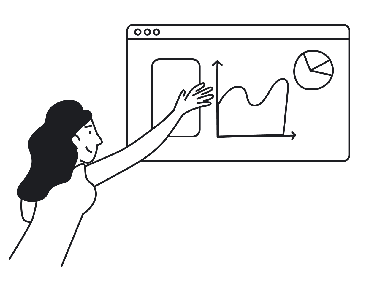
Minimalist UI/UX design
A minimalistic movement encourages designers to simplify interfaces by removing unnecessary elements or content that doesn’t support user tasks. Google, Microsoft and Apple pioneered such simplification two decades ago, and since then, the user interfaces and UX design world has gradually come to be dominated by minimalistic aesthetics.

Minimalism is very commendable. It helps users understand the content and complete their tasks, it looks polished and professional, it is a really good trend on so many levels that it’s no surprise this trend has become so… hmm… popular.
When we all have one recipe that works better than anything else, we naturally end up in an almost homogenized web. It was clearly felt, but not so clearly seen (for me, at least) until this tweet from 2018 by Jimmy Daly.

Jimmy is speaking about almost identical anthropomorphic illustrations top SaaS brands have, but you still can’t tell the difference between which landing page is which even if you forget for a moment about pictures. Look at those rounded sans serif fonts, black & white interfaces, rounded rectangle buttons.
App design blurs even more and becomes literally invisible: link is link, text is text, navigation is all the same and suddenly everything in your phone feels like one big white application.

Is it bad that our designs look like clones?
Not really. The product’s visual identity and junior designers’ ego may suffer. But for users, uniformity in product design is a good thing, because...

When people use their GPS navigators and banking apps or scroll through a long article like the one you’re reading, they don’t want to focus their energy on an interface. They want to focus on the job. And since they have dozens of mobile apps on their phones, uniformity across everyday digital products helps to switch between them smoothly.
If you want to set yourself apart from the rest of the apps by unique digital design, consider the case of Snapchat’s redesign disaster.

In 2018, the company shocked its fans with innovative user interface design and unfamiliar navigation patterns. The reaction was not long in coming — you see the dramatic drop in consumer sentiment.
Close to a quarter of all downloaded apps are deleted after just one use. And annoying people with overloaded interfaces is not the best strategy to stay afloat, even for the brightest brands.

What is the best strategy is to spend designers’ time working on little touches that matter for user experience — like Figma’s animated onboarding or Asana's celebratory unicorns.
When minimalism is not enough
For a few months already, I’m struggling through Ulysses by James Joyce, probably the most challenging text I have ever read. The plot of the story is pretty elusive, buried under the layers of Greek myths, Irish history, Aristotle, Shakespeare, Dante, and 19th-century memes. Most of the time I hate this book. But in the moments when tiny dots come together in my mind, I’m the king of the world.
Sure, I don’t want all my life, or, God forbid, my apps, to feel like Ulysses. But there are situations when people want to be annoyed with some level of mystery and complexity. When they want to solve some puzzle.
That’s partly why designers are experimenting beyond pure minimalism. Referential design, for example, blends nostalgia with modern UI design, borrowing cues from the physical world or retro digital aesthetics to create interfaces that feel both familiar and fresh. These touches add emotional depth without completely sacrificing usability. To understand why this matters, it helps to ask what is UX beyond aesthetics — it's the full emotional and cognitive experience a product creates, which means even deliberate complexity can be good UX when it's intentional.
Because minimalism, for all its clarity, can become monotonous. After years in perfectly lit, spotless bars with giant white menus, it’s only natural that some of us start looking for a little Coyote Ugly energy instead. This is also where UI vs UX becomes a useful lens: the UI might look deliberately rough or chaotic, but the underlying UX still needs to make sense — emotion and usability aren't mutually exclusive.
Brutalist web design
Remember Morgan Freeman’s office in Bruce Almighty? That pure white sterile space recalls me of some bare-bones minimalist white websites. Brutalist web design came as a reaction to standardized visual design and spray-painted some punk stuff onto walls of minimalism. Recently, neobrutalism has emerged as a design trend, characterized by its raw, high-contrast, and quirky aesthetic, helping brands stand out even more in the digital landscape. And the numbers support the shift — UX statistics show that emotionally distinctive interfaces generate stronger brand recall and higher engagement than their neutral counterparts, suggesting that a little visual provocation goes a long way.

Since 2014, the Brutalist Websites page has been collecting the brightest brutalist web design examples. Back then, these were personal portfolios of designers and coders who were tired of the mainstream.

In 2016, the Washington Post said that “the hottest trend in Web design is making intentionally ugly, difficult sites”. And that was the point when businesses started careful experiments with their interfaces. Digital agencies, creative media and fashion labels, all the cool kids turned their attention to provocative brutalist tricks — broken grids, random colors, ugly fonts. Some experiments turned out to be more successful than others.
In October 2017, Dropbox’s rebranding blew the collective mind of the worldwide designer community. The company was known for its design system that helps users handle files with minimal distraction. And suddenly, it went wild with a plethora of colors and 259 (!!!) fonts. Sounds like lots of destruction. Expressive typography is becoming a focal point in UI design, with designers using bold and emotive typefaces to enhance visual storytelling and create a memorable brand personality.

The idea of rebranding was to change Dropbox’s positioning from being just a place to store files to being a workspace for creative teams. So the new design was speaking to creative teams. But it looks like the target demographic turned out to be more moderate than Dropbox expected because most of the feedback I’ve seen on the Web was negative. This is a classic CX vs UX tension — the UX of the new interface may have been perfectly functional, but the broader customer experience, including brand perception and emotional expectations, didn't land the way Dropbox intended.
You’d say that we can’t judge the effectiveness of a redesign by comments from the web, and you’d be right. But we have something much more valuable to consider — how the users behave in the redesigned pages. For anyone who wants to understand the theory behind these decisions, UI UX books like Hooked by Nir Eyal or Designing Brand Identity by Alina Wheeler explore exactly how visual rebrands shape user behavior — and why getting that balance wrong can cost more than just good reviews.
Here’s how Arlen McCluskey from Dropbox comments on pricing page redesign:

The bold rebrand color palette negatively affected trust and clarity. As a result — a drop in several key metrics. So shortly after the makeover, Dropbox returned its pricing page to a more discreet design.
You may want a creative web page, and your brand may need a brighter identity, but any moves towards design diversity may decrease usability. And if you're in business for money, you can’t ignore users voting with their dollars against bad usability.
So current UI/UX trends are all about balancing on the dizzying path in between great usability and a brave outstanding brand.
Some of the 2026 UX design and UI trends
After years of polished minimalism, 2026 UI/UX trends are pushing brands to be braver, louder, and more expressive, without abandoning usability. Designers are experimenting with stronger visual identities, bold typography, and richer color palettes to break out of the “all apps look the same” era. Here are some of the key UX UI trends shaping interfaces right now.
#1 Edgy typography
Making fonts bigger and bolder is a very noticeable trend shifts in modern UI design examples. Complex typography looks fresh and entertaining, it adds some spice to your design but doesn't usually impact its functionality and navigation performance. Carefully chosen font combinations within minimalist UI design also contribute to an elegant, simple, and functional aesthetic, enhancing visual harmony and user experience. This is where customer experience design comes into play — typography isn't just a visual decision, it sets the emotional tone of an entire brand interaction before a user reads a single line of copy.
Quirky, variable fonts often act as design accents on SaaS landing pages. Take Dropbox’s squashed-up Sharp Grotesk typeface or Whyte Inctrap font that earned Figma a place in Eleken’s landing pages ranking. But bold typography only works when it sits within a clear information architecture — without a solid content hierarchy beneath it, expressive fonts create noise instead of personality.

#2 Consistent visual language
UX is not an excuse for lack of visual identity. If you don’t want to dissolve your brand’s personality in standardized interface elements, you may come up with your own visual language, just like Miro did.
It all started with shapes that reflected the company's key values — spatiality, fluidity, agility, and distribution. Later, Miro incorporated brand shapes into all the UI elements. They use them as photo frames, backgrounds and illustration patterns, creating a recognizable look. Adding a human touch to design helps brands connect with users on a more personal level, making digital products feel relatable rather than mechanical. When a digital platform maintains a consistent visual language, it not only strengthens brand identity but also creates a cohesive, emotionally resonant experience that users can recognize and trust.
Today, UI designers are moving beyond generic interfaces and adapting to individual user needs, aiming to communicate in ways that feel respectful and thoughtful. The real goal of personalization in UI/UX is not just to boost satisfaction metrics, but to curate meaningful experiences that genuinely reflect how people think, feel, and interact.

#3 Going loud with colors
Moving away from white is a drastic change from minimalistic designs that makes your landing page stand out for users who go through hundreds of light-colored websites in a day.
Look at Zendesk's website. This one, in its 2018 edition, appeared in Jimmy Daly’s tweet as one of four identical websites with creepy illustrations. Since then, Zendesk differentiated itself with colors, and today you can barely mix up their page with any others.

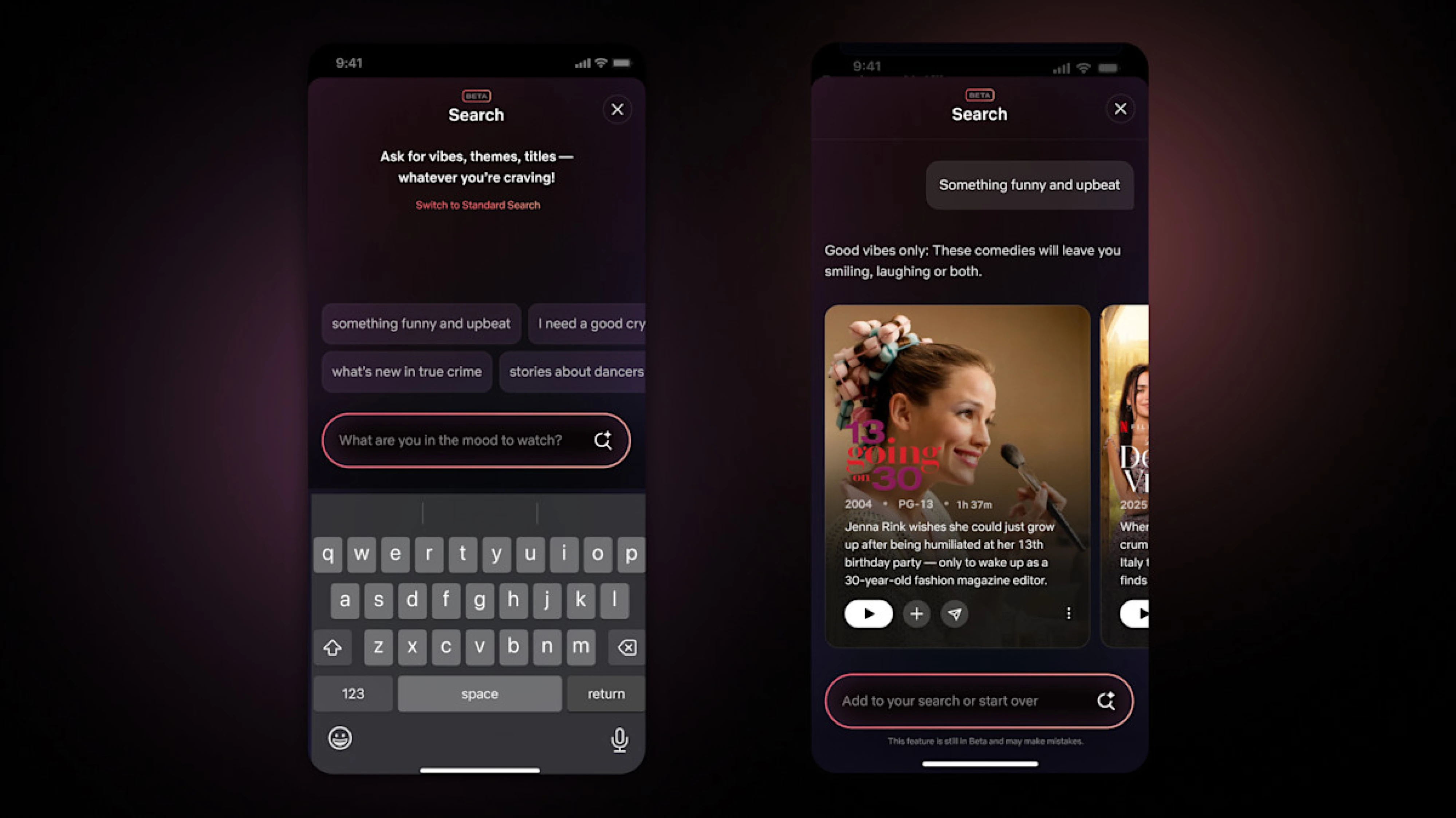
#4 AI-powered design
AI is no longer just a productivity booster for designers; it’s becoming part of the interface itself. Instead of static screens, we’re moving toward adaptive systems that respond to user behavior in real time. Think layouts that reorganize based on usage patterns, content that prioritizes what matters most to a specific user, or onboarding flows that adjust based on skill level. In this context, sitemap UX is evolving too — static page hierarchies are giving way to dynamic structures that shift based on who the user is and what they've done before.
As artificial intelligence evolves, it’s increasingly intersecting with augmented and virtual reality environments. In immersive digital interfaces, AI tools can help can personalize spatial layouts, adjust information density based on user's attention patterns, or dynamically guide users through complex 3D experiences. Whether in augmented reality product demos or fully virtual reality workspaces, AI systems create environments that feel responsive and intuitive rather than overwhelming.
For UX designers, this means shifting from designing fixed screens to designing adaptive systems and behaviors, sometimes across both 2D and immersive 3D contexts. AI can generate design systems, automate variations, personalize dashboards, and enhance augmented and virtual reality experiences at scale. The real value, however, lies in using it strategically: not to make products feel futuristic, but to reduce friction, increase relevance, and create genuinely user-centric digital experiences.
One standout example of AI in UI/UX personalization is Netflix’s recommendation UI, where AI tailors the interface for each user based on their watch history, search behavior, and preferences.
#5 Motion design and interactions
Motion is evolving from decorative animation to functional guidance. Well-designed transitions clarify relationships between elements, signal cause and effect, and make complex systems easier to understand. In data-heavy products especially, motion can help users track changes, notice updates, or understand hierarchy.
The key is restraint and purpose. Animations should explain, not distract. A subtle hover state, a smooth state change, or a contextual reveal can significantly improve usability when aligned with user intent. The best motion design feels invisible. It supports cognition without demanding attention. This is also a matter of typography design, when type shifts, scales, or animates as part of a transition, it either reinforces the visual hierarchy or disrupts it, making the choice of typeface and weight just as important in motion as in static layouts.
A standout motion-driven interface example is Asana’s animated celebratory illustrations, where completing tasks triggers playful, branded animations, from unicorns to narwhals, that reward users and make routine actions feel delightful and satisfying. These motion cues not only add personality but also provide clear feedback that the user’s action was registered, reinforcing task completion in a way static interfaces rarely do.

#6 Micro interactions and meaningful details
Micro interactions are where personality meets usability. A loading indicator that reassures instead of frustrates, inline validation that prevents errors before submission, or a small celebratory moment after completing a task; these details shape how a product feels. Understanding them starts with solid UI UX terminology — terms like feedback loop, affordance, and progressive disclosure give designers a precise vocabulary for discussing why one micro interaction works and another creates friction.
But effective micro interactions aren’t random delights. They should reinforce feedback loops, confirm actions, prevent mistakes, and guide behavior. In competitive SaaS markets where features quickly become similar, these small refinements often define the overall experience.
One great examples of effective micro-interactions is Notion's mode when the search result is empty.

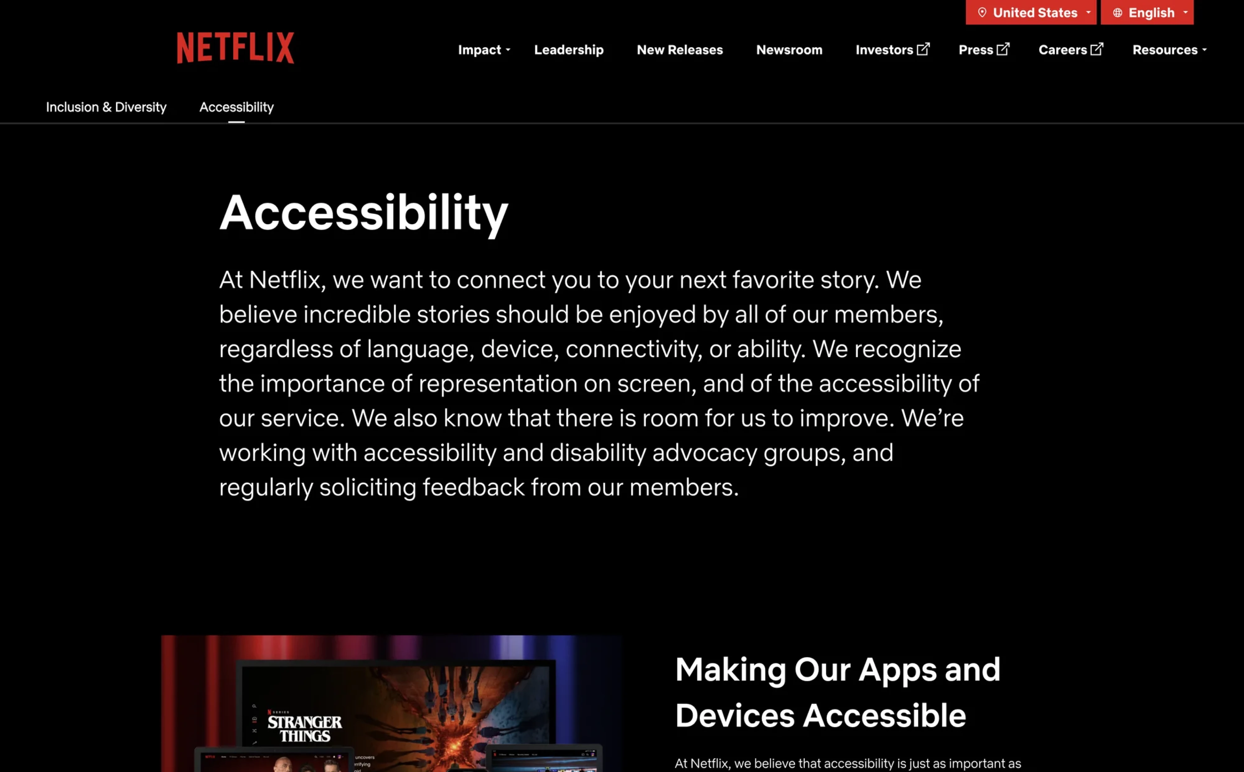
#7 Dark mode and accessibility
Dark mode has matured from a trendy feature into a user expectation. However, implementing it properly requires more than inverting colors. Contrast ratios, readability, visual hierarchy, and brand consistency all need reconsideration.
More broadly, accessibility is no longer optional. Designing for inclusivity means ensuring sufficient contrast, scalable typography, keyboard navigation, and clear interaction states. Products that prioritize accessibility improve usability for everyone. In 2026, inclusive design is simply good design.
Psst… If you want more trends, we have more trends.
Spice it up, but keep it functional
Latest UI/UX design trends are definitely moving from perfection to uniqueness, but it’s all about context.
If we’re speaking about a SaaS product, your first concern is making the app extremely functional and pleasant for the user to navigate. User-friendly tools can significantly streamline the design process and improve usability, making advanced capabilities accessible even to teams without deep technical expertise. Experimenting with a bold, expressive landing page can be a smart move. It acts as a colorful wrapper for your product. But every visual decision should be validated against real metrics. If you’re running a SaaS business, track how changes affect conversions and retention. More radical design experiments often make greater sense for personal portfolios or creative agency websites, where differentiation is part of the value proposition.
Personalization in UI/UX design goes beyond inserting a user’s name into a dashboard. It’s about shaping experiences that adapt to individual behaviors, goals, and contexts, creating a seamless journey that feels intentional rather than generic. For businesses, this means using data responsibly to surface relevant content, simplify decision-making, and remove friction. With AI-driven insights, products can increasingly anticipate needs, recommend next steps, and continuously refine the experience based on real usage patterns.
The core principle, however, remains unchanged: design must be usable. No matter how visually striking or innovative an interface is, if it confuses users or slows them down, it fails.
At Eleken, we help SaaS companies strike that balance, creating product designs that are distinctive, strategically aligned, and, above all, intuitive to use.
Interested? Let’s talk.


.webp)