A SaaS UX audit is a powerful tool to identify a product's strengths, weaknesses, and opportunities. But what exactly is it and when do you need to invest in one?
At Eleken, we know a thing or two about UI/UX audits and often conduct them during product redesign. In this post, we are going to walk you through a typical process of UX audit step-by-step, show you specific examples of how we conduct them and tell you how your SaaS product can benefit from a UX audit.
Why and when do you need a UX audit?
When it comes to SaaS products, a UX audit is crucial for improving user satisfaction and product effectiveness. We recommend conducting one during the initial design and development phase to detect problems early, and one after launch to fix issues, enhance onboarding, and adapt to users' changing needs. This is especially important if you added some new features that weren't planned initially. The longer your product is live, the more likely it is to collect issues only a thorough analysis will be able to detect.
For conducting a UX audit, we also recommend working with an expert in this field. Experienced UI/UX designers, especially those specializing in SaaS, possess the specialized knowledge and skills to tackle the unique challenges of auditing SaaS products. Plus, with their expertise, you can better identify crucial areas for improvement, gain valuable insights on how to enhance user satisfaction, and eventually come up with the design that will let you boost retention rates.
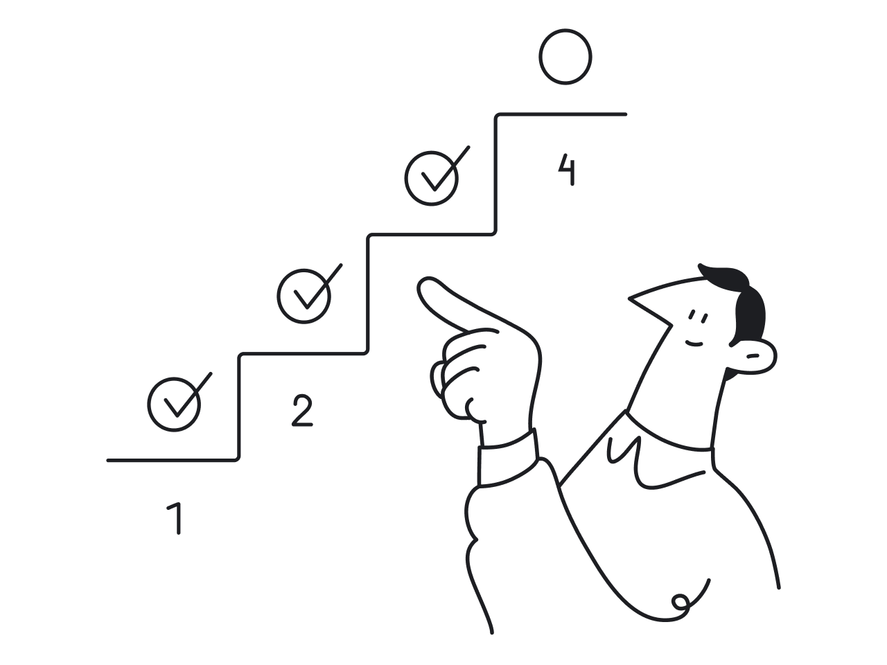
How does a UX audit go?
Depending on the product, specific steps to how to conduct UX audit might vary. But we at Eleken generally following these steps:
- Getting familiar with the product. Our designers learn what are the business goals, who is the target audience and what pain points the product solves.
- Gathering user data. At Eleken, we often receive tons of valuable data from our clients thanks to usage analytics and support ticket trends. We also conduct additional research using various UX audit tools to help us gain insights into analytics.

- Usability evaluation. Here, we're diving deep into the product's interface, navigation, and overall usability. By identifying the areas of friction, we can learn how to streamline the user experience.
- Performance assessment. We analyze the solution’s performance in different scenarios, identify potential bottlenecks, and optimize the loading times when possible.
- Accessibility checkup. It's essential to verify that the product is inclusive and works seamlessly with any other tools or services it integrates with (for example, screen readers), ensuring that end-users have a cohesive and seamless experience.
- Putting together the UX audit report. In our case, we prefer using Figma as this way we can immediately offer the solutions to the issues we’ve identified. But there are different ways to approach it, and you can check our post on UX audit report examples to learn more.
Sometimes the design audit redesign that comes after the UX audit will entail a complete overhaul of some product parts. And in some cases, you just need a quick fix to a couple of minor issues. In any case, it will be worth it.
Now, let's take a closer look at a couple of our cases to see the power of UX audit in real-life scenarios.
Our examples of conducting UX audits
Here are some cases that show how UX audit can be conducted depending on your project.
How Eleken improved TextMagic's usability to support their product expansion
TextMagic is the UK-based all-in-one text messaging service for mobile marketing with almost two decades of history under its belt. The company came to us in 2019, looking to design their CX platform to further expand their product line.
When trying to add new features without proper UX audit it's a straight way to a bad user experience. TextMagic wanted to avoid this pitfall from the get-go, so they decided to opt for professional help from Eleken designers.
Here’s how our UX audit process looked like:
1. We began by analyzing the competitors, including Intercom and JivoChat for live chats, Mailchimp, Autopilot, Sendgrid, and Sendinblue for email marketing, and Zendesk as our main reference point. We learned about their strengths and weaknesses by studying their patterns and user flows.
2. Next, we defined the clear value proposition of the product, ensuring it meets the needs of our target audience, which includes marketers and sales teams.
3. To understand our users better, we created user stories and mapped out their journeys. It helped us identify the tasks users wanted to accomplish and the necessary functionality we needed to improve or implement.
4. Our designers conducted a thorough UX analysis of the TextMagic’s existing functionality. Using heuristic evaluation, we looked for usability inconsistencies and logical gaps, which allowed us to compare our product against common usability principles.
5. Finally, we compiled a detailed report that explained the improvements we identified throughout the audit. Additionally, we created a new UI Kit to enhance the overall user experience.
Based on the insights from our UX audit, we managed to create intuitive flows and minimalistic interfaces. Even with complex product functionality TextMagic has, they do not overwhelm the user and help them to get the job done quickly. You can check out the UX audit results in our Figma file.
Here's, for example, a contrast checkup. The grays used in the initial design blend together, so our designers offered to change the palette to avoid the issue:

In the initial design, the "add new button" was blending too much into the background. We fixed it by adding a distinctive blue field:

The most obvious solution was to rely on existing patterns the users are familiar with (for example, how tabs look in Google Chrome):

We added circle indicators in orange to immediately attract the user's attention to the tasks at hand:

How we streamlined the UX of Ricochet360 and reduced the learning curve
Ricochet360 is a cloud phone system and CRM platform that allows sales teams to manage all their prospects in one place. When we joined the project, Ricochet was planning to improve user experience and renew the design to scale successfully. The main challenge we had to address was the learning curve. The problem was that it took more than a month for users to get how to use the product.
The UX audit done by our designers allowed to find small UX frictions that piled up and resulted in bad user experience. Let's take a closer look at one of the main pages, which is “Add a new lead”.

Our UX audit allowed us to identify the following problems:
- No established data formats (for example, for phone numbers) and no clues in which format to enter it.
- Lack of clear hierarchy. People grasp info better when it's grouped. Here, we had 30 fields that seemed to be equally relevant.
- 30 fields are just too much, full stop. Especially considering some of them were rarely used.
- Adding a new lead is often a subtask, so opening a new window to do it breaks the workflow. Making the page a pop-up window would've streamlined the process.
The interim solution, which included a UX content audit and immediately improved business performance without waiting for a lengthy redesign, looked like this.

The main difference in comparison to the initial design are the visual cues:
1) the user sees in which format they should enter the data from the get go (light gray text on the forms' background helps with that)
2) red framing immediately alerts the user when they've entered the incorrect data.
After the complete redesign, the page was simplified to this:

We've hidden most of the fields under the "Additional information", leaving only the essential ones, and adding the option of editing the fields that the user actually needs for their work.
How the UX audit helped AdvanResearch (ReVeal) get ready for market expansion
ReVeal were looking to expand their user base, but their initial design would inevitably lead to confusion by non-technical users. The problem was that the company has been adding new features without any design system in place, which resulted in the solution becoming too complicated to operate.
After conducting a UX audit and applying UX audit report best practices, our designer detected over 30 flaws in the design that could be fixed to improve user experience. As an analytics app, ReVeal provides its users with the information on the real estate trends. Below, for example, is a suggestion on how to redesign the sliders to give the users a more clear understanding of what exact information they are working with.

In some cases it was easier to straight-up redesign a feature, like here:

For some cases, it's enough to tweak the already existing solutions a bit. For example, in the Reveal’s initial design, the data points overlapped. The common solution to this issue was to group them when the user zooms out of a map.

Or you can even unsheath that good old Occam's razor and simply eliminate the superfluous and confusing options. Different buttons for one function are always confusing, so in our case, we recommended to stick to just one design:

Last but not least, we also researched two direct and three indirect competitors. Our designer studied the use cases of other products to build hypotheses about ReVeal. Later, these hypotheses became the basis for the redesign. As ReVeal wanted to expand its user base, we provided UX audit services to create a structure which catered to the needs of two different audiences. Redesigning to simplify the user interface allowed the app to reach the users without previous experience of working with such products, which was exactly the goal.
Final thoughts
UX issues, especially if the product exists for a long time and develops without a strict plan, tend to pile up. A button here and a label there might not seem like a huge problem. But at a certain point, they might make a user experience terrible and churn rates too high. So, if you feel like your onboarding is way too lengthy, user retention is not great, or you're planning to roll out new functionality tailored to a new audience, it's a good idea to conduct a UX audit before the small issues hurt your product.
If you are looking for UI/UX audit and redesign services, contact us today and let us know how we can help.