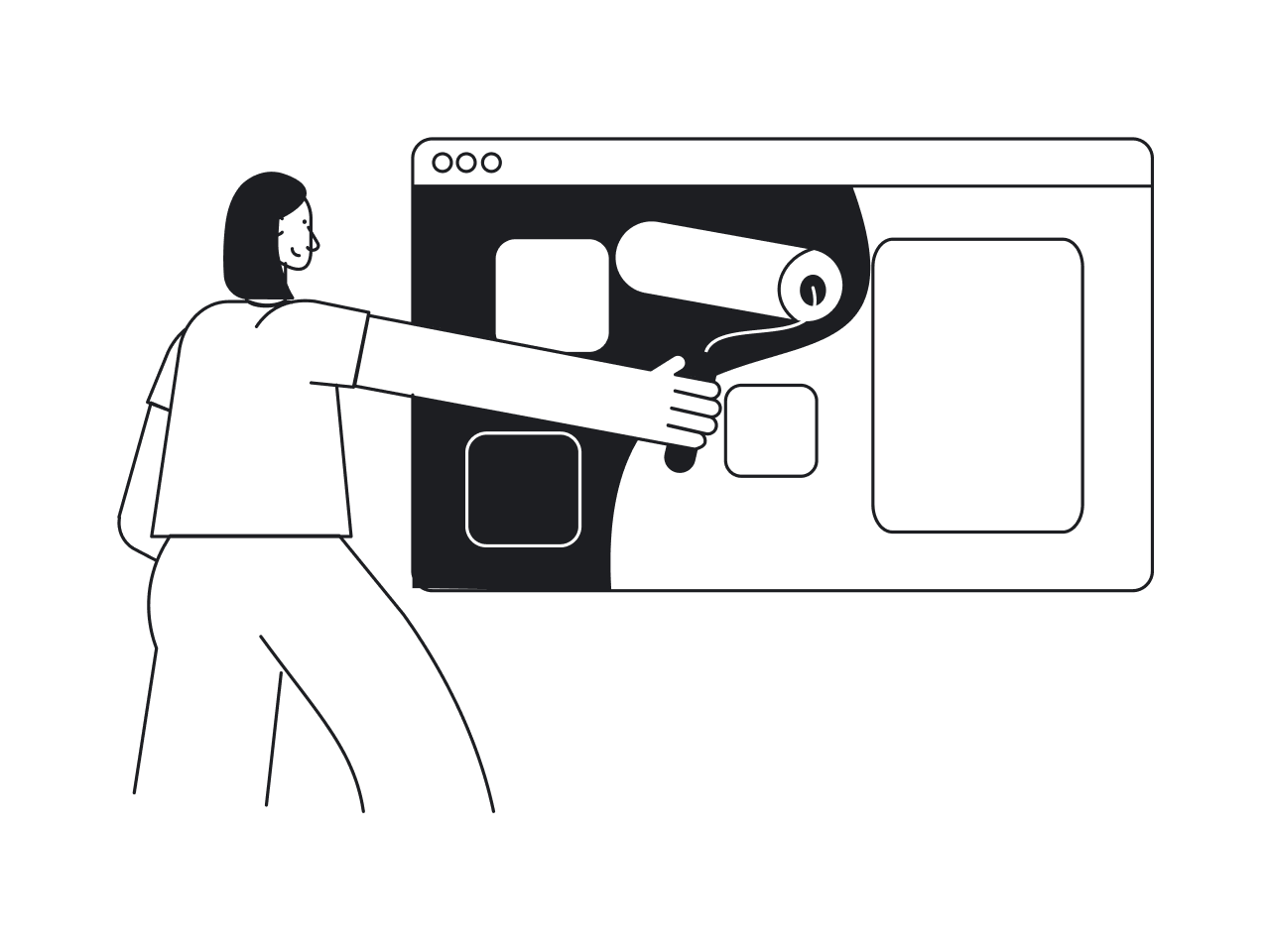

Product managers know that successful products never stand still. User needs evolve, competitors innovate, and technology advances. To lead the market, SaaS teams must understand how to redesign a digital product.
After more than 10 years of designing SaaS products, we realized almost every project that comes through our door needs a redesign in some shape or form. And almost always, we found the root problem deeper than the visuals.
That’s why we decided to put everything we’ve learned into one product redesign guide. We’ll explain what redesign actually means, how you can benefit from it, and share a step-by-step process for SaaS teams that want to do it well.
What is product redesign?
When people talk about “redesigning” a digital product, be it an app, a SaaS tool, or a website, they often think about a prettier UI, maybe a new logo, and some updated colors. But product redesign usually covers much more than that.
In practice, product redesign touches how things work and whether the product still solves user problems. It can mean rethinking user flows, reorganizing architecture, refactoring underlying tech or logic, and even realigning the product’s vision.
The benefits a product redesign can bring
Redesigning a product takes time, effort, and no small amount of coordination. But it’s also something that pays off in the long run. So before you jump in, it’s worth understanding what you stand to gain.
Improve usability to boost satisfaction and retention
When users struggle with your product (even a little), it adds up. A clunky form, unclear navigation, a button that doesn’t behave as expected... these irritations often go unnoticed in metrics until they quietly chip away at satisfaction and retention.
That’s where a thoughtful redesign can change everything.
By removing friction and improving product usability through redesign, you change how people feel about your product. And that feeling directly impacts retention.
Once usability improves, users are more likely to stick around, complete key actions, and recommend your product to others. For businesses, this means fewer complaints and a healthier foundation for better conversion, expansion, and growth.
So yes, redesigning for usability takes time. But if you do it well, the ROI shows up in all the right places.
Streamline onboarding for different user personas
Onboarding is often the make‑or‑break moment. If that first flow feels confusing, overwhelming, or just plain awkward, most people bounce. For many SaaS products, the bulk of churn happens before users even get a chance to see real value.
A thoughtful SaaS redesign can transform those early moments into a welcoming introduction, especially when your customer base is diverse and includes different personas like power users, occasional users, or complete newcomers.
A great example of this in action is our work with myInterview, a video interviewing platform. When the team reached out to Eleken, their candidate onboarding funnel was leaking badly: roughly 90% of users were dropping out mid‑interview.
On closer inspection, we found some serious UI and UX issues. The screens didn’t clearly show what to click, the multi‑select fields looked more like a quiz, and the “3 options max” limit only appeared after people started interacting.
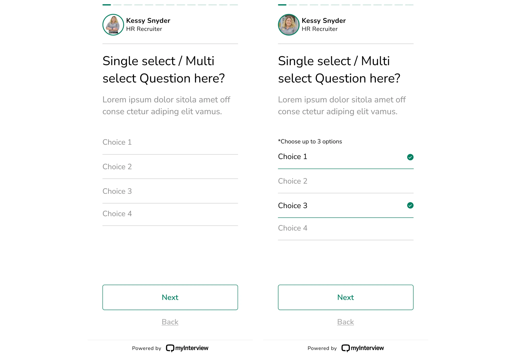
We gave the onboarding flow a full redesign.
The new version used clear checkboxes to indicate multi‑select fields, expanded clickable areas to suggest where to click, and used clear copy to manage expectations from the get-go. With that design, the path to completion felt obvious.
Reflect your evolving brand and business
As your product, vision, and business grow, what felt like the right brand identity a few years ago can slowly start to feel… off. Maybe the positioning shifts. Maybe your users change. Maybe your market has moved on.
When your brand’s identity no longer matches what your product offers or who your customers are, that’s a signal it’s time to rethink how you present yourself.

A brand refresh helps “modernise and energise” an existing brand without throwing out everything that worked. It’s a chance to ensure everything reflects the product you are today and the product you’ll become tomorrow.
Doing this right can pay off. A refreshed brand helps you stand out, communicates professionalism and maturity, and helps build trust with users who may expect modern interfaces, clear messaging, or a feel that matches their own growth.
Scale your product without breaking it
Growth is great until your product starts creaking under its own weight. More users, more data, and more features can put pressure on your product. If your foundation isn’t ready, growth can go from exciting to painful.
A redesign helps you re‑architect the product with scalability in mind, refactor tangled flows, and prepare the soil for all the features you plan to add tomorrow. It’s how you avoid crashes, confusing UX, and a pile of technical debt.
When Siena, a platform for CX teams, started scaling, growth exposed several structural problems. The existing design was lagging behind ambitions, and the team wasn’t sure how to add new features without making the platform confusing.
From that point, Siena turned to Eleken. Together, we rethought the platform’s structure, redesigned flows to support future expansion, and laid the groundwork for new AI‑driven tools to slot in smoothly.
Because of that redesign, the team can now roll out new features with confidence, knowing they won’t break the overall user experience.
Stay ahead of the competition
Competitors constantly innovate, release new features, sharpen their UX, and realign their offering to shifting market needs. If your product doesn’t evolve, it risks being perceived as outdated or simply irrelevant.
A strategic redesign becomes your competitive edge. By aligning with market trends, user expectations, and product differentiation, you give yourself the chance to lead.
Many SaaS teams include competitor analysis and user testing in their strategy. This helps spot which features, flows, or messaging rivals are using and what people actually expect, so they can decide whether to match, exceed, or differentiate.
Beyond survival, redesign can help your product stand out. When your UI, flows, and deliverables feel modern, reliable, and in sync with what users want, they’re far more likely to choose you over the alternatives.
Enter new markets with confidence
When you expand into a new market, your product needs to look, feel, and behave in a way that resonates with a new group of people. A redesign can serve as the bridge between “old product for old audience” and a fresh offering ready for new users.
When expanding globally, localization and user‑experience adaptation become critical. Adapting the product to local conventions, language norms, and cultural expectations reduces friction, builds trust, and makes your product native.
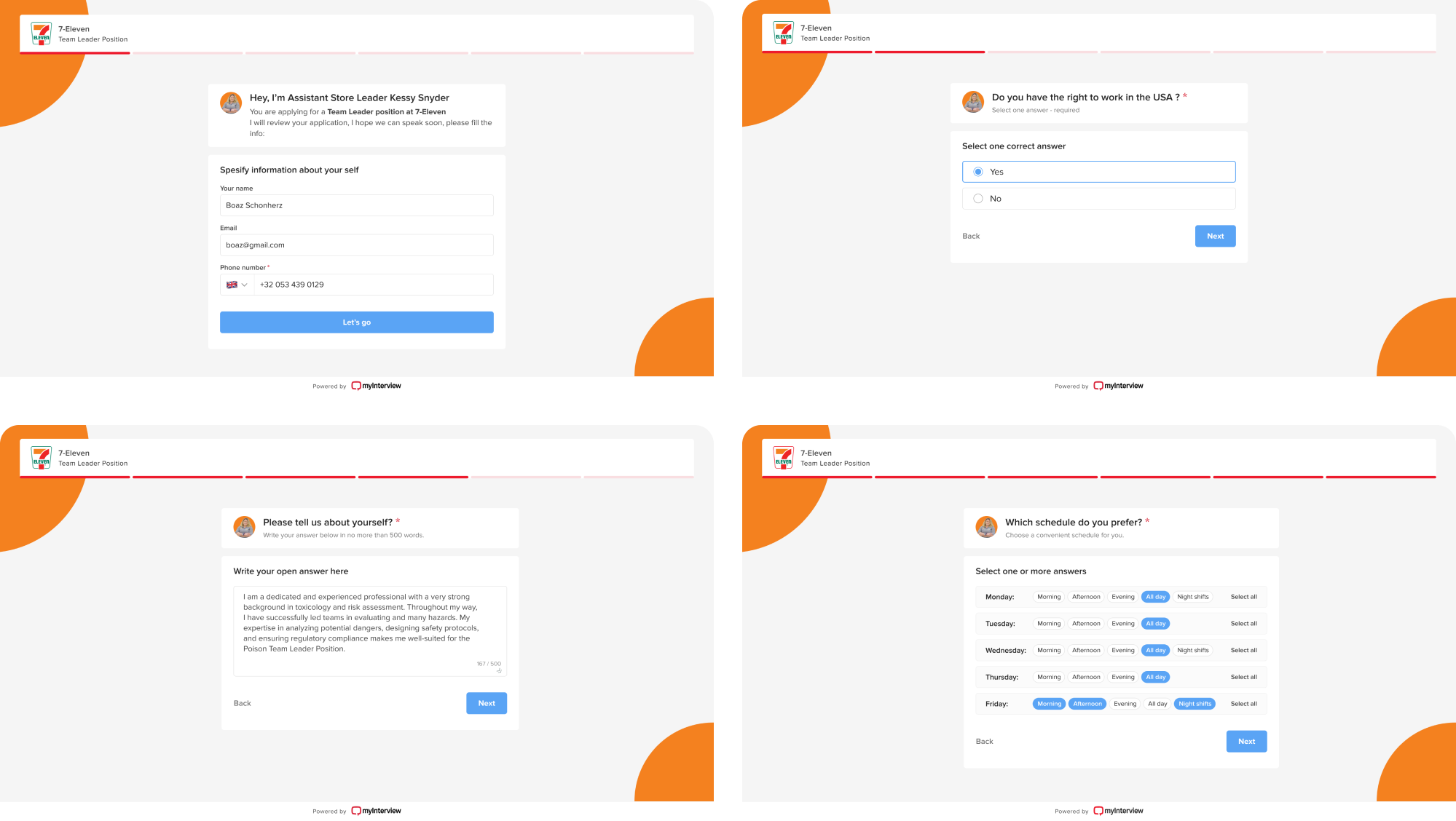
That was exactly the challenge with Alture Funds. The client had previously launched Elevate Money, a finance app designed for Gen Z, with a bold, youthful interface and styling that fit crypto‑wallets or modern trading tools.
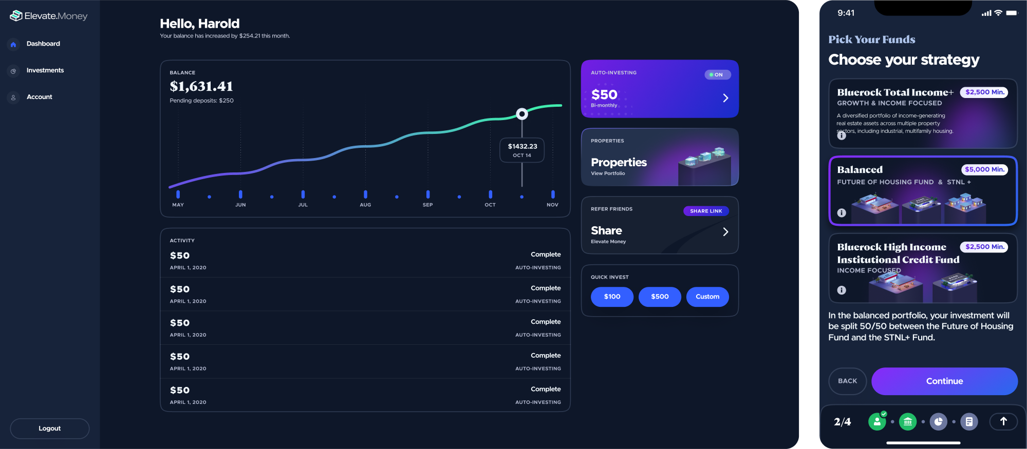
But when the decision was made to launch Alture Funds, a platform aimed at financially stable investors aged 35–40+, the old design simply didn’t fit.
The Eleken team helped reimagine the product. We redesigned the UI/UX across web and mobile, reshaped brand identity to reflect a more professional tone, and streamlined complex onboarding flows into something calm and clear.
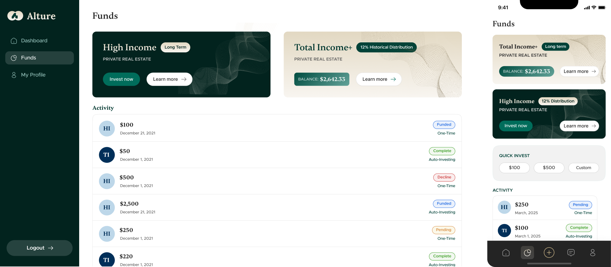
In doing so, even under tight deadlines and constraints, we helped the platform enter a new market confidently.
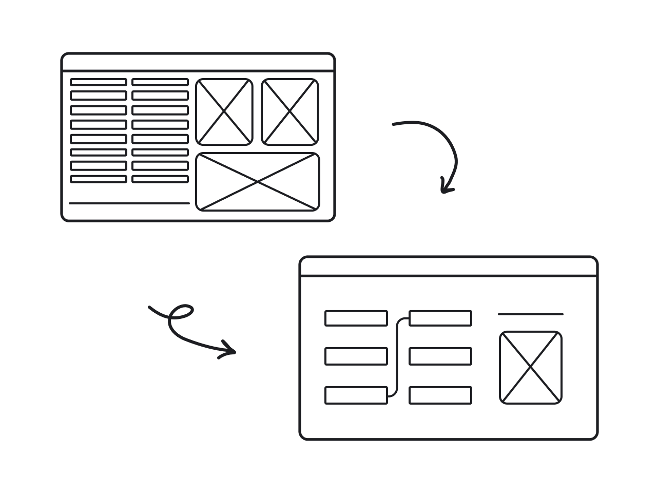
What kind of product redesign do you need?
If you’ve decided that your product needs a redesign, keep in mind that not all redesigns are created equal. Different types of work hide behind that one word, and understanding the nuances can save you from misaligned expectations.
Evolutionary redesign
Evolutionary redesign is a process of small-scale improvements, where you iterate on product design bit by bit. That often includes refining flows, modernizing outdated UI, or reshaping specific features without disrupting the entire product.
This approach works best when the foundation is solid, but certain parts of the product feel out of sync with customer expectations. Rather than risk a big change, you improve things gradually and reduce the chance of unexpected issues.
You might choose an evolutionary redesign when:
- Your product works, but some areas feel outdated or awkward.
- You want to improve UX without disrupting active users.
- Your design team is collecting feedback and ready to act on it incrementally.
Revolutionary redesign
A revolutionary redesign means rethinking everything, including UX flows, UI, architecture, and sometimes underlying assumptions about how the product should work. It’s the kind of redesign that sets an entirely new direction for your product.
This kind of overhaul makes sense when you hit structural or foundational limits. Maybe your architecture can’t support new features, usability issues are too deep, or your product no longer aligns with business goals or user expectations.
You’d consider a revolutionary redesign when:
- The UI and UX feel outdated or inconsistent across the product.
- The codebase is outdated or weighed down by technical debt.
- Core flows and navigation no longer match user behavior.
A step-by-step product redesign framework
By now, you’ve seen how a redesign can improve usability, sharpen your brand, and attract investors. But when it’s your turn to lead one, it helps to know where to start. To make things easier, here’s the product redesign process explained in six steps.
Phase 1: Analyze
Before you touch a single pixel, you need to map the full shape of your product: what works, what’s broken, what’s hidden, and why. At this initial stage, you’re analyzing.
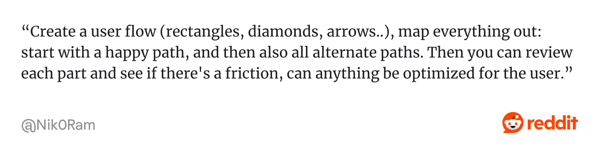
To start with, you can build a map of the existing product. That involves tracing user flows, decision trees, or journey maps. You screenshot every UI variation, annotate what works and what doesn’t, and try to document all the little design quirks.
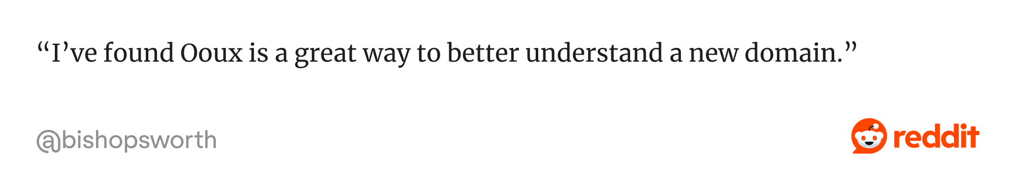
For complex products, you may also use methodologies such as Object‑Oriented UX (OOUX), which helps you model domain “objects” and their relationships.
Next comes getting to know your customers. That means talking to real users, observing them on calls or via session recordings, and identifying how different personas navigate, where they get stuck, and which workflows they rely on.
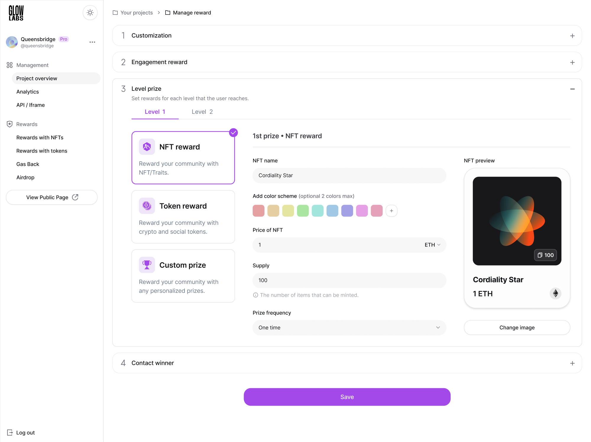
That was exactly the approach we followed while working with GlowLabs, a web3 loyalty rewards program. Their product manager was in close contact with clients, which meant our designer had access to direct usability testing feedback.
Such insights even led to new feature additions and product redesign ideas for key UI elements to make the platform easier to use.
Reviewing analytics and user behavior patterns is another key part of this phase. Funnels, paths, heatmaps, drop‑off points, and user movement all tell a story. A careful look might reveal dead features or spots where users abandon a task.
During this stage, try to spot:
- Pain points or repetitive frustrations.
- Workarounds or hacks users invent to get things done.
- Areas where user expectations don’t match the interface.
- Missing features users assume should be there.
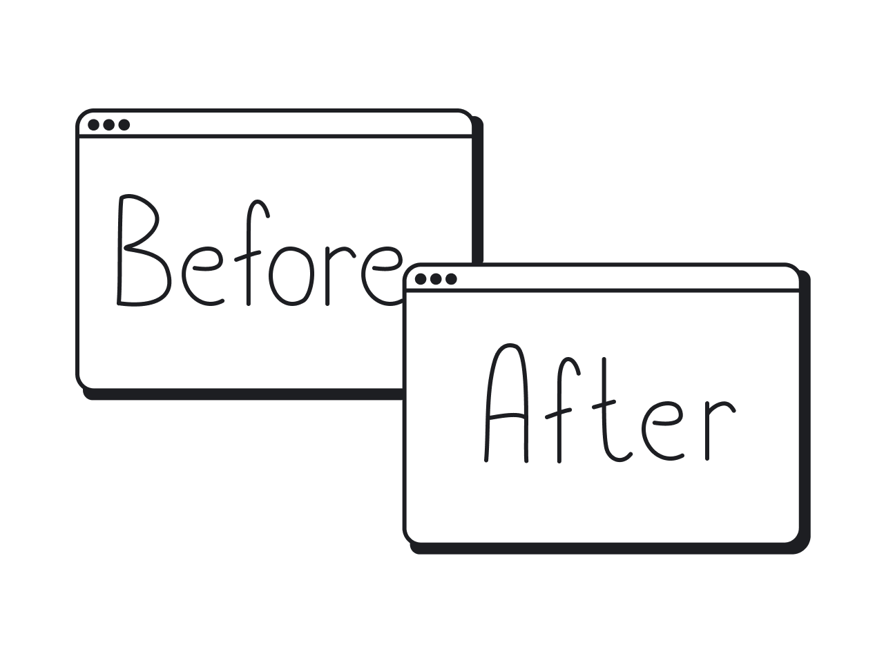
One smart move is to collect and benchmark your analytics data before the redesign and then compare it with post-launch metrics. That way, you’ll have a clear picture of what actually changed, and where your redesign made a measurable impact.
Phase 2: Decide
Among the steps to redesign a product, the next one is to decide what to change, why, and in what order. You can start by defining your goals with the SMART framework — Specific, Measurable, Achievable, Relevant, and Time‑bound.
SMART goals help you avoid fuzzy objectives like “make the product nicer.” With its help, you get clear targets, such as improving user retention by X or reducing onboarding time by Y, giving direction to design and development teams.
Goals you might set could be tied to retention, conversion, onboarding speed, task completion, performance, or support load. Since you likely won’t have the time or resources to overhaul everything at once, prioritization becomes essential.
Here are common feature prioritization frameworks you might turn to:
- Impact‑Effort Matrix;
- MoSCoW;
- RICE;
- Kano Model;
- Value vs. Complexity Matrix.
When our Eleken team was working on Prift, a personal finance platform, we relied on the MoSCoW method.
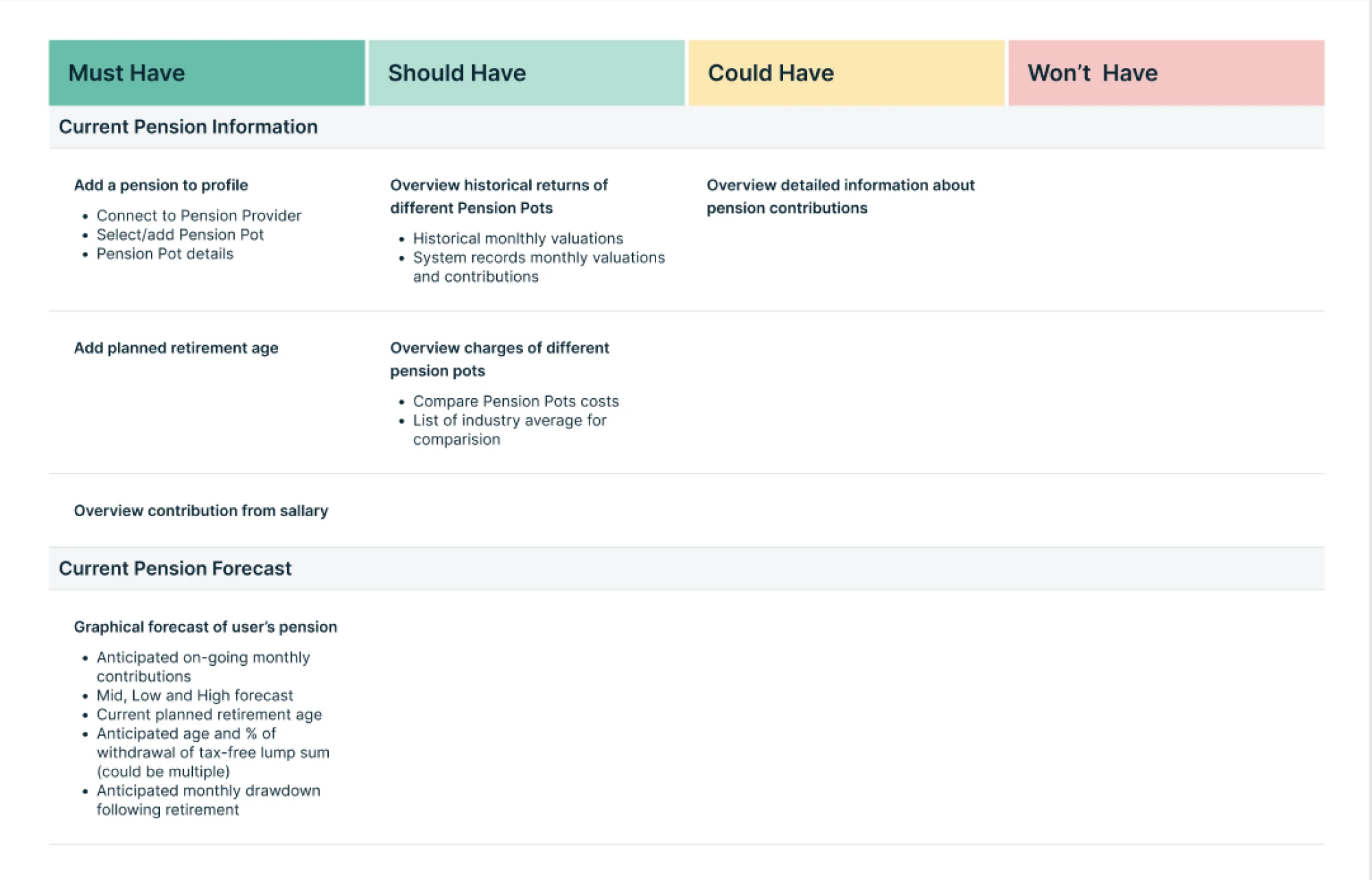
We listed every potential function, grouped them into must‑have, should‑have, could‑have, and won’t‑have. For the MVP phase, we focused on must‑haves and should‑haves, in Prift’s case, features that enable long‑term financial forecasting.
Everything else was deferred. That way, every feature shipped contributed directly to value, without bloating the MVP or wasting resources.
Phase 3: Design
Before you deliver a final design, it’s smart to start by sketching out ideas, testing them quickly, and validating assumptions early. In this phase, you build confidence in the direction before committing to code or visual polish.
One of the most effective things you can do is run early validation.
Lo‑fi prototypes and wireframes let you test flows, catch usability issues, and avoid expensive rewrites later. Skipping this step often means polishing something that ultimately doesn’t solve the real user problems.
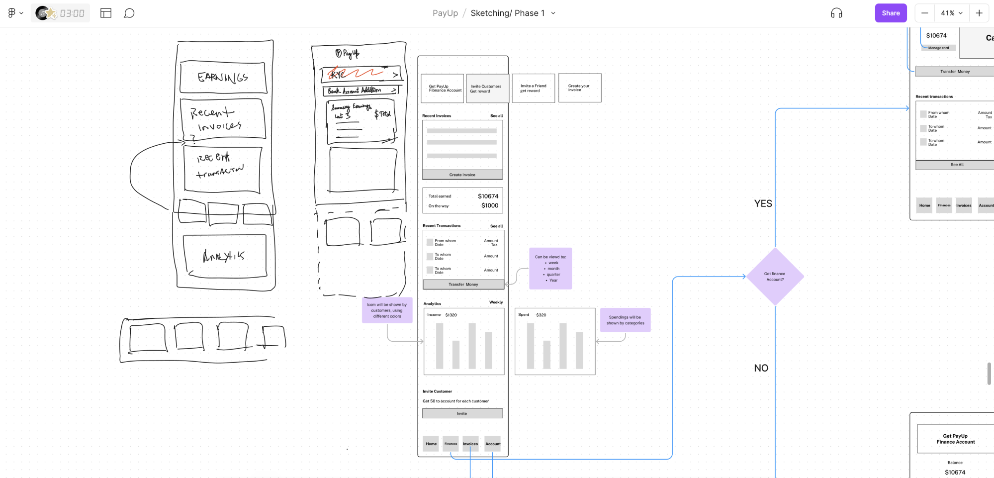
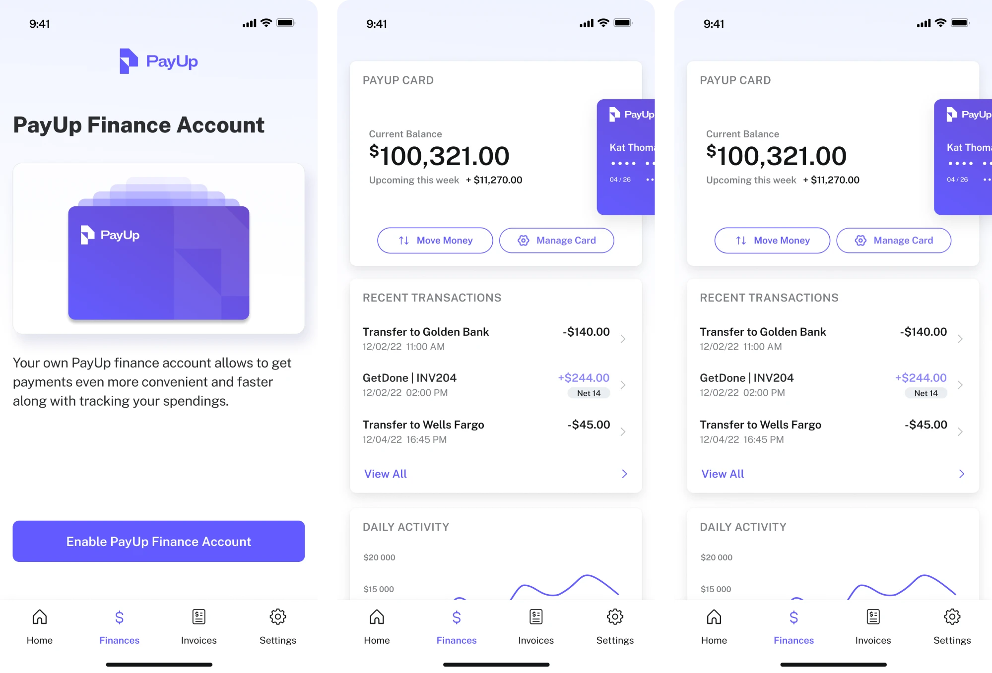
At Eleken, we’ve applied this approach multiple times. For example, when we partnered with PayUp, a financial platform, we began with wireframes. Exploring different options helped us identify the best direction before moving on to the final design.
With wireframes in place, you can go further and conduct different types of testing. This helps you restructure the information architecture and refine core task flows to better reflect real user expectations.
You can validate designs using tools such as:
- Usability tests;
- Interactive prototypes;
- A/B tests with small cohorts;
- Heuristic evaluations.
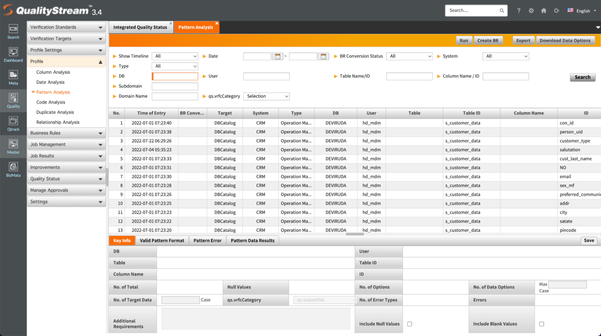
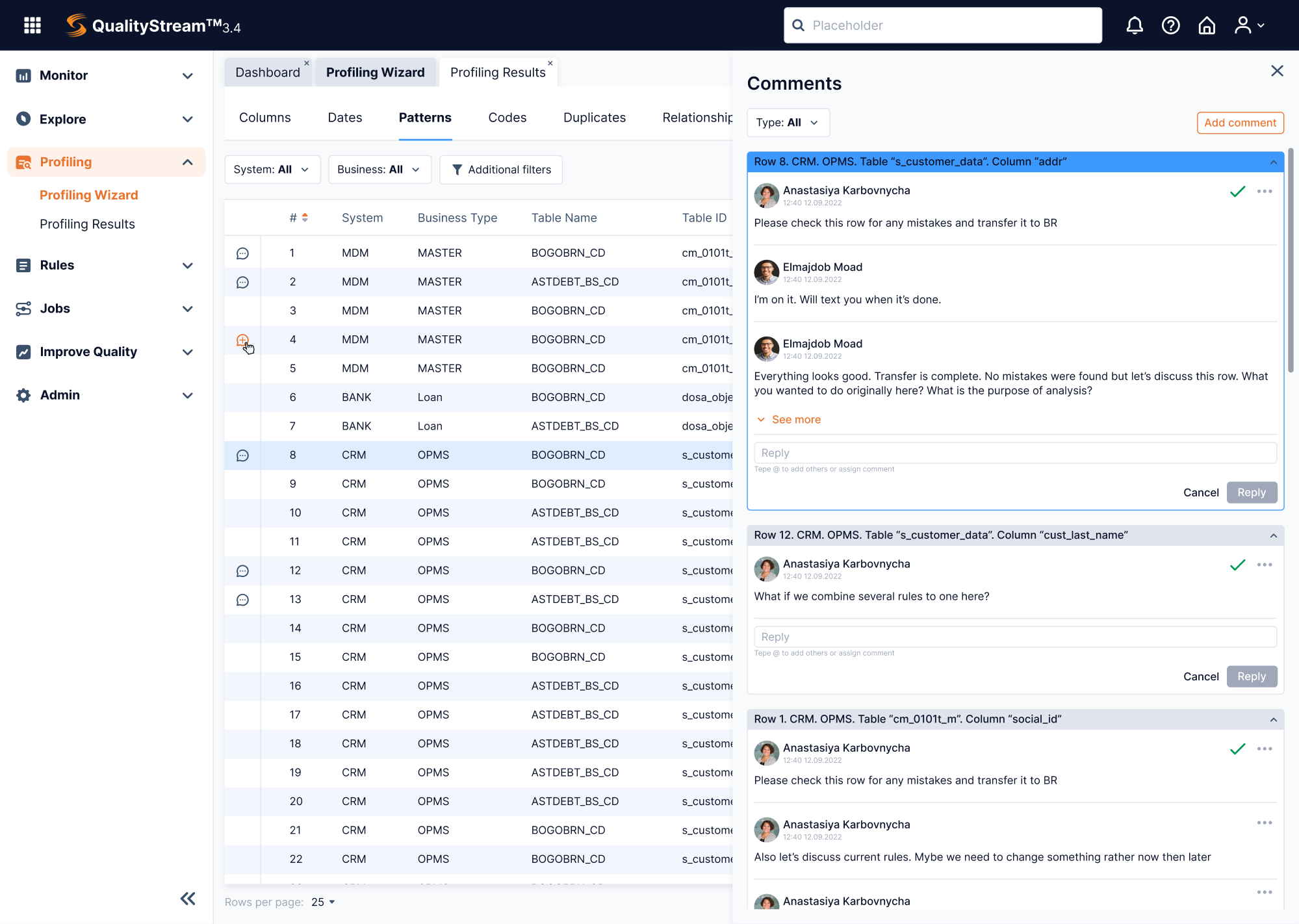
That’s exactly what we did when working with Data Streams, a data-management platform. After user research, feature analysis, and heuristic evaluation, we were able to bring the product to life through thoughtful, user-centered design.
Phase 4: Build
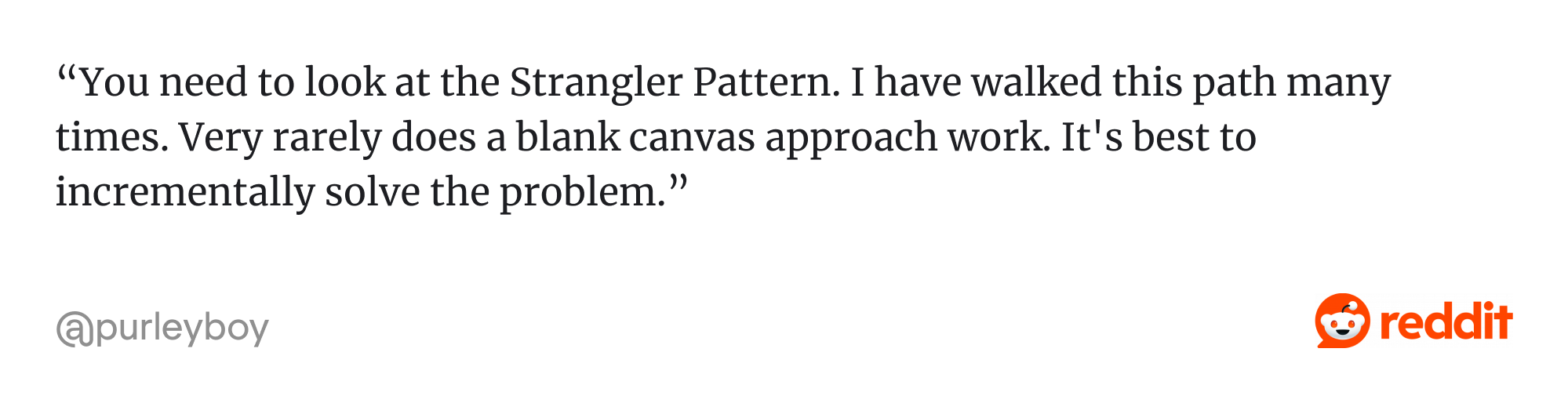
When it’s time to build, a full “big bang” rewrite often carries too much risk. That’s why many teams nowadays prefer an incremental migration strategy. They start rolling out changes feature by feature, so the product keeps working while it evolves.
A popular pattern is the Strangler Fig pattern. With this approach, the old system and the new version coexist side‑by‑side. New features or updated modules are built and released gradually, allowing teams to gather continuous customer feedback.
While migration happens, a unified design system becomes a must-have. Once you have a living library of components, patterns, and design tokens, every new feature looks, feels, and behaves consistently across the product.
At Eleken, our designers always prepare a UI Kit before handing it off further. That way, developers don’t have to guess. They work with a solid base of reusable buttons, input fields, spacing rules, typography scales, color palettes, and more.
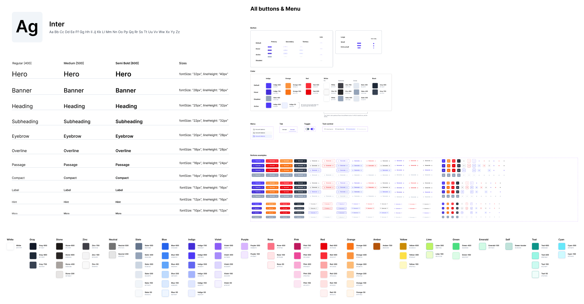
Typically, a UI kit includes:
- Reusable components (buttons, input fields, dropdowns, etc.);
- Typography scales (font sizes, weights, and usage rules);
- Spacing and layout rules (grids, margins, paddings);
- Color tokens (primary, secondary, semantic colors, and states);
- Icons and imagery guidelines;
- Interaction states (hover, active, disabled, loading).
Phase 5: Launch
If you’ve done the hard work of diagnosing, designing, and building, the launch is when you guide users through changes and make sure everything lands smoothly.
Start by planning your communication and onboarding.
Send a well-timed announcement and let potential users know what’s coming, why it matters, and how it helps them. And don’t forget to highlight the benefits clearly because people respond better when they understand what’s in it for them.
When the update goes live, make those first moments as frictionless as possible. A personalized onboarding experience will ease the transition and reduce user frustration. Here are a few helpful tactics to do that:
- Checklists.
- Product tours.
- Contextual tooltips.
- Persona-based onboarding.
- Optional toggle to old UI.
As well, be ready for resistance. Change can feel jarring, especially for power users with long-standing habits. That’s normal. Don’t take it as a failure. Instead, anticipate questions and support your users with help articles, guides, FAQ, and more.
Phase 6: Measure and iterate
Once your redesign project is live, it’s time to measure its impact, learn what worked (and what didn’t), and iterate. Because real users, real data, and real environments always reveal surprises only once people actually use the new version.
If you collected analytics before redesign (as we recommended earlier), you’ve got a baseline. You can compare before and after to see whether your changes moved the needle. Some of the most meaningful metrics to monitor post‑redesign include:
- Task success and completion time;
- Drop‑off rates per workflow or flow steps;
- Activation or retention cohorts;
- User satisfaction/feedback metrics (for example, NPS or CSAT);
- Performance and technical health;
- Support tickets/bug reports.
When we worked with SEOcrawl, a set of SEO tools, we conducted a full UI/UX overhaul. After launch, the client tracked key metrics and saw that their customer base grew 2x. That kind of result highlights the power of thoughtful redesign.
"We have seen a huge growth in users (from 0 to 2k) nd new paid customers thanks to the new design." — David Kaufmann, CEO at SEOcrawl
Once live, your product should stay in motion. Real users will always uncover edge cases, unexpected behaviors, or new needs, and following a continuous loop helps you keep learning and improving.
Let’s make it better
If your product is growing, so should its UI/UX. You might have the best feature set, but if no one can find it and use it, it’s a problem. Situations like that signal when to redesign a product, and they’re more common than you think.
If you don’t want to tackle it alone, the Eleken team is just a few lines away.
SaaS companies come to us when their product has outgrown its original design and needs a new one that fits just right. So if you’ve ever stared at your user interface thinking “this could be so much better,” you’re probably right. And we’re here to help.