
Picture this: your SaaS product has onboarding drop-offs, feature requests piling up, and users complaining about confusing workflows. The roadmap is full of ideas, yet every team argues for a different priority. Engineering wants to reduce technical debt, marketing pushes for better activation, customer success asks for usability fixes, all while product managers want to ship new features.
When everything feels urgent, the real question becomes simple: if everything in your product is on fire, what fire do you put out first?

This is where user experience strategy comes in.
UX strategy isn’t a slide deck or a trendy rebranding of UX design. It’s the long-term direction that connects user experience decisions with business outcomes. Such a strategic plan helps teams understand how a product’s experience should evolve and which improvements deserve attention first.
That’s exactly the type of crossroads we help SaaS teams navigate at Eleken UI/UX agency — turning scattered UX fixes into a coherent experience direction the whole team can execute. Because without direction, design often becomes reactive: teams fix individual screens or optimize isolated flows, but the overall experience slowly fragments.
In this guide, we’ll break down what UX strategy actually means, how it differs from product strategy and UX design, and how to build it step by step with the UX strategy framework, and much more included.
So, what is UX strategy? (a deeper overview)
At its simplest, a UX strategy is a long-term plan for how a product’s experience will create value for both users and the business — and how teams will prioritize decisions to get there.
At first, UX strategy definition may sound abstract, but the key idea is straightforward: strategy is about direction and choices.
Every product team faces tradeoffs: Should you simplify onboarding or ship a new feature?
Should you invest in automation or improve collaboration workflows?
Should you optimize the current experience or expand into new capabilities?
UX strategy exists to answer questions like these. It helps teams decide how the experience should evolve over time, rather than reacting to isolated design problems as they appear.
To understand this better, it helps to distinguish strategy from other planning concepts that often get confused with it.
For example, a UX design strategy might define a goal such as “reducing friction in onboarding so new users reach activation within minutes.”
The plan would outline research, experiments, and design improvements needed to achieve that goal, while the roadmap would schedule the specific initiatives across upcoming releases. At that level, strategy functions as a high level plan rather than a list of tasks.
Another important aspect of UX strategy is its scope. Strategy can exist at several levels of a product:
- Feature-level — improving a specific workflow or capability
- Product-level — shaping the overall experience of a product
- Platform or portfolio level — aligning experiences across multiple products
The time horizon also tends to be longer than everyday design work. While UX design focuses on solving immediate interface problems, UX strategy typically looks months or even years ahead, defining the desired destination of the product experience.
Ultimately, a well-defined UX strategy answers a simple but powerful question:
What kind of experience are we trying to create — and what choices will get us there?
UX strategy vs product strategy vs UX design
UX strategy often feels confusing because it overlaps with product strategy and UX design. While these disciplines work closely together, they focus on different aspects of building a successful product.
To illustrate the difference, imagine a SaaS company building a project management platform.
Product strategy defines the market opportunity. It answers questions such as which customer segment to target, what problems to solve better than competitors, and how the product will drive growth.
UX strategy focuses on how the experience supports that vision. It identifies the most important workflows, determines where the experience needs the most improvement, and guides how the product should evolve as it grows.
UX design then turns these strategic decisions into concrete solutions. Designers create the flows, interactions, and interfaces that users interact with every day. That means the design process becomes much more effective when strategic direction is already clear.
In practice, these responsibilities often overlap. In small startups, one person may handle product thinking, UX strategy, and design. In larger organizations, the roles are usually split between product managers, UX designers, researchers, and design leaders.
The key point is that UX strategy connects business goals with the product experience, ensuring that what teams build ultimately works for users.
Why UX strategy exists (if design is already “strategic”)
At this point, some designers might wonder: isn’t good UX design already strategic?
In many ways, it is. Experienced designers rarely think only about individual screens. They consider user goals, product direction, and how design decisions affect the overall experience.
So why introduce a separate concept called UX strategy? The answer lies in scale.

As products grow, experience decisions become more complex. Multiple teams work on different parts of the product, each shipping new features and improvements. Without a shared direction, these efforts can drift apart, creating an experience that feels fragmented or inconsistent.
UX strategy helps prevent that fragmentation. It aligns teams around a common vision of how the product experience should evolve and ensures that design decisions support broader business objectives.
In practice, UX strategy performs three essential functions:
- Alignment — helping product, design, and engineering teams move toward the same experience goals
- Prioritization — identifying which improvements create the most value for users
- Risk management — testing assumptions before investing heavily in new features
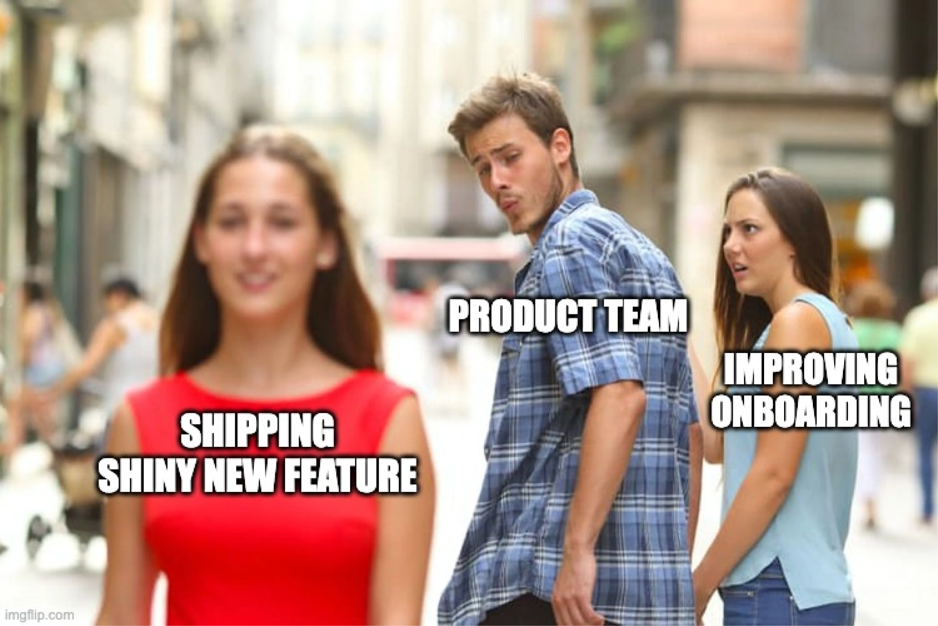
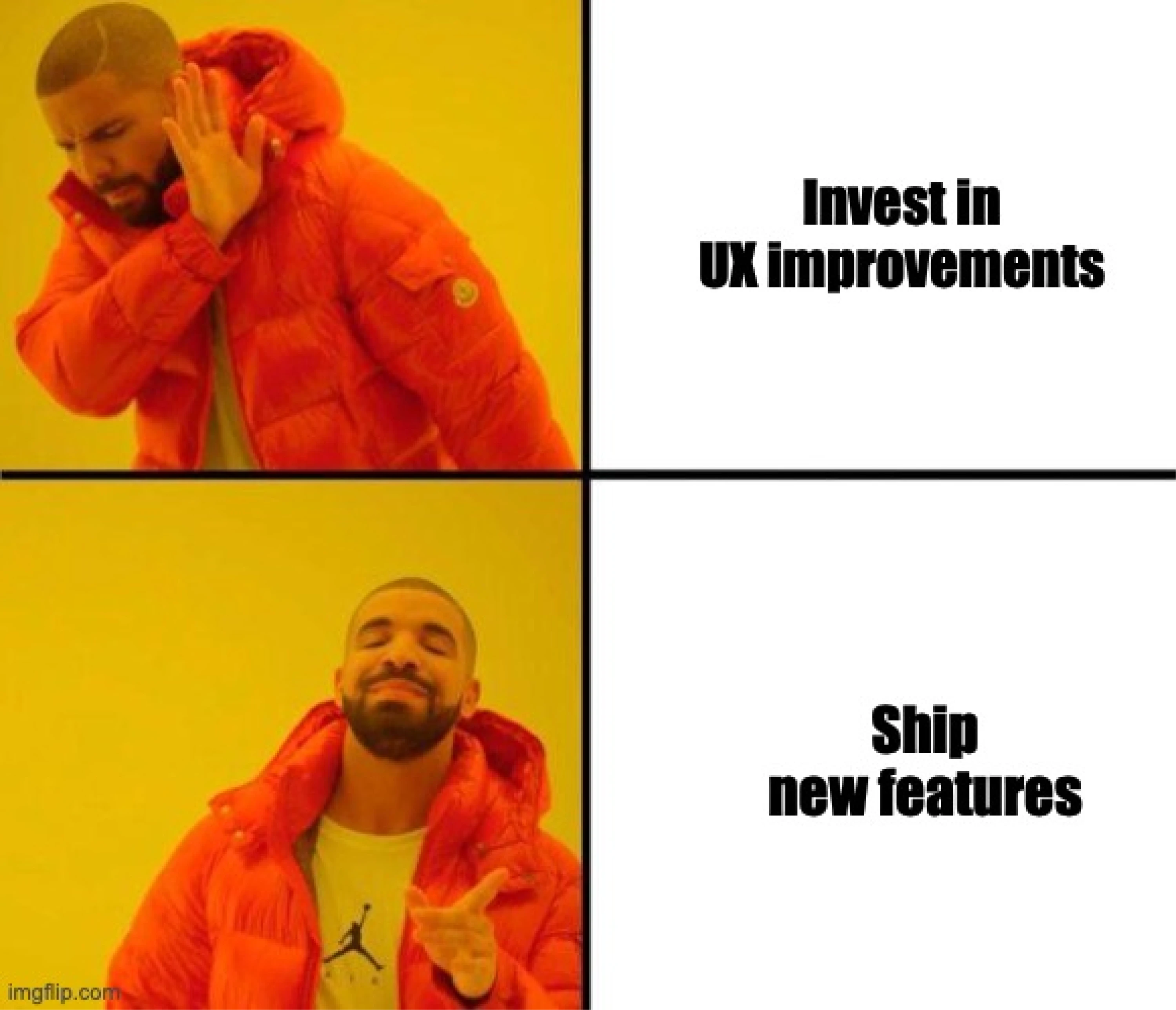
Without UX strategy, teams often fall into feature factory mode, shipping functionality without considering how it affects the overall experience.
A clear UX strategy helps teams make deliberate decisions and build products that evolve in a cohesive, user-centered way.
The core components of UX strategy
A strong UX strategy is not a single document or workshop outcome. Instead, it consists of several interconnected elements that guide how a product experience evolves over time.
While different companies may structure their strategies differently, most effective UX strategies include five core components: a UX vision, strategic focus areas, experience principles, roadmap themes, and success metrics.
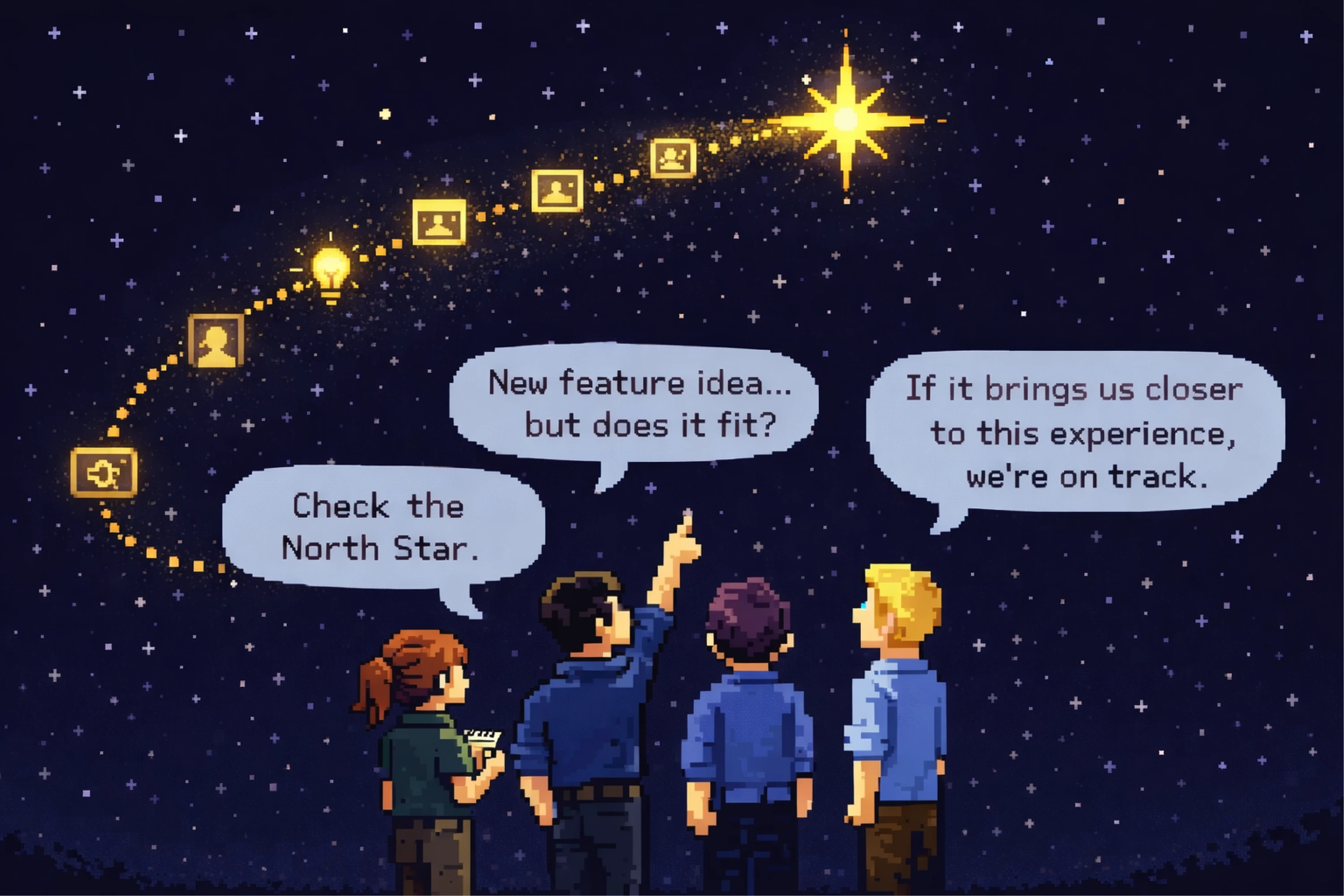
1. UX vision (the North star experience)
The UX vision describes the future experience the product aims to deliver. It serves as a long-term reference point that helps teams understand what success should look like for users.
Unlike product roadmaps, which focus on upcoming releases, a UX vision focuses on the desired experience outcome.

For example, a B2B SaaS company might define its UX vision like this:
“New users can set up their first workflow and see value from the product within ten minutes, without needing training or documentation.”
This kind of statement clarifies what the team is ultimately trying to achieve and helps guide design decisions across the product. It also sharpens the product’s value proposition by making the promised experience concrete.
2. Strategic focus areas
Once the vision is clear, teams identify where to invest their efforts. These priorities are called strategic focus areas.
Focus areas highlight the parts of the experience that require the most improvement or offer the greatest opportunity for impact.
Examples might include:
- improving onboarding and activation
- simplifying complex workflows
- increasing product discoverability
- supporting collaboration between users
By defining focus areas, teams avoid spreading their efforts across too many initiatives and instead concentrate on the experience improvements that matter most.
3. Experience principles
Experience principles act as decision-making guidelines for product teams. They help designers, product managers, and engineers make consistent decisions even when working on different parts of the product.
For example, a product might adopt principles such as:
- clarity over feature density
- progressive disclosure for complex data
- automation before manual work
These principles ensure that individual design decisions contribute to a consistent overall experience. In many teams, they become part of the company's guiding principles for how product decisions get made.
4. UX roadmap themes
UX strategy does not typically define individual features. Instead, it shapes broader roadmap themes that guide product development.
A roadmap theme represents a strategic bet on improving a particular part of the experience. Examples include:
- onboarding simplification
- cross-platform consistency
- workflow automation
- improved search and discoverability
These themes then translate into concrete product initiatives across multiple releases.
5. Metrics that connect UX to business outcomes
Finally, UX strategy must define how success will be measured. Without clear metrics, strategy can easily become abstract.
The most useful metrics connect UX improvements to product and business results.
For example:
When teams connect UX improvements to measurable outcomes, strategy becomes actionable rather than theoretical. The point isn’t just to track activity, but to measure success in ways that reflect both product and business impact.
A step-by-step framework to build a UX strategy
Understanding UX strategy conceptually is useful, but the real challenge is building one in practice. Product teams often know their experience could improve, yet struggle with where to start, what inputs they need, and how to turn insights into clear strategic decisions.
UX strategy helps teams move from scattered improvements to intentional experience evolution. Instead of fixing isolated UX issues as they appear, teams define a direction for the product and focus their efforts on the changes that will have the greatest impact.
Here we offer an easy to apply framework outlining a practical six-step process for developing a UX strategy. While every organization adapts the process to its own context, these steps provide a reliable structure for aligning teams and guiding experience decisions. Think of it as a compact UX strategy toolkit that teams can return to as the product evolves.
Step 1: Diagnose the current experience
Among the first steps for UX strategy lies a multifaceted evaluation of the current state of your product experience.
At this stage, the goal is to identify where the experience works well and where it creates user friction. This diagnostic phase helps teams move beyond internal opinions and focus on evidence – a great way to do this to is conduct a UX audit.
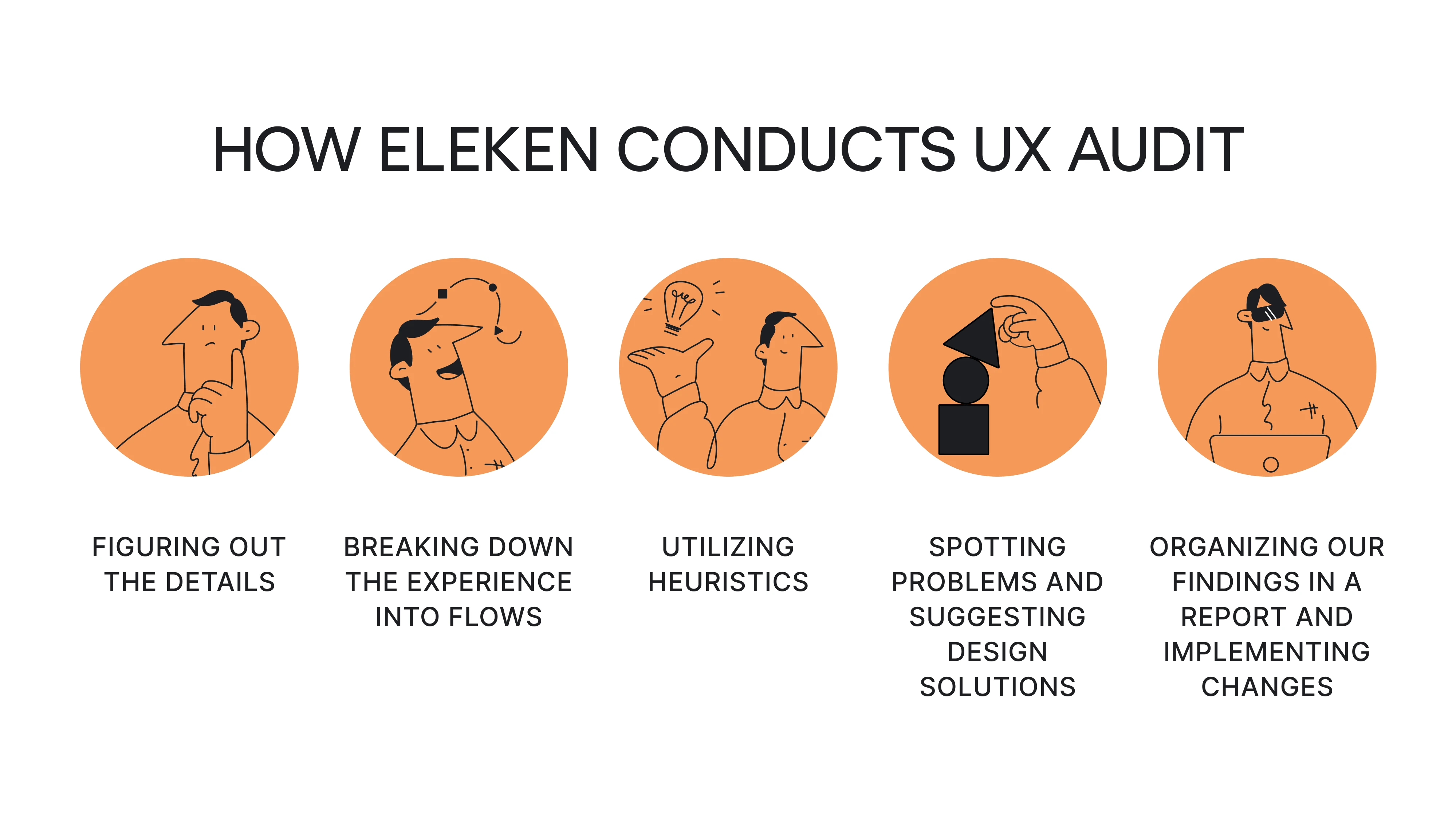
Also, another crucial part should be dedicated to considering the needs of the business. So a designer should have a clear understanding of
- the main idea of the product, its goals, and objectives
- the business model behind the project
- the core functionality of the product
Teams usually combine several sources of insight, including:
- Journey mapping, which visualizes the user experience across key workflows
- Product analytics, revealing where users drop off or struggle
- Customer support tickets, highlighting recurring usability issues
- Stakeholder interviews, surfacing internal assumptions and constraints

- User research, such as interviews or usability testing
Some product teams refer to these problems as experience fires — the issues that repeatedly surface across user feedback, analytics, and internal discussions.
Diagnosing the current experience helps teams answer a crucial question: Where is the product experience failing users today?
Step 2: Identify high-risk assumptions
Many product decisions are based on assumptions about users. Teams may assume that users understand onboarding steps, trust automation features, or know how to navigate complex workflows.
UX strategy helps make these assumptions visible.
Instead of treating them as facts, teams examine them critically and ask whether they have been validated. At this stage, the focus shifts from identifying problems to identifying uncertainty: capture your key assumptions (a doc, board, or notes) and review them as a team.
Here are key questions to guide you:
- What do we believe about our users that hasn’t been validated yet?
- Which assumptions, if wrong, would significantly affect the product experience?
- Where is uncertainty highest in our product decisions?
For example, a team might assume that new users understand how to set up integrations during onboarding. If analytics shows that many users abandon the setup flow, that assumption becomes a high-risk area worth investigating.
Surfacing assumptions early helps teams avoid investing time and resources into features that may not actually solve the right problems. Reaching that clarity usually requires a deep understanding of both current user behavior and team assumptions.
Step 3: Define the UX vision
Once the team understands the current experience and its biggest uncertainties, the next step is defining the UX vision.
The UX vision describes the experience the product ultimately aims to deliver. It acts as a North star, helping teams evaluate whether future decisions move the product closer to that goal.
A strong UX vision focuses on user outcomes, not interface details. It describes what users should be able to achieve and how the experience should feel.
For example, a SaaS product might define its vision like this: “New users can create their first automated workflow within ten minutes and immediately see how the product saves them time.”
This type of statement clarifies the value the product aims to deliver and helps teams align their design and product decisions around that outcome.
Without a clear UX vision, teams often optimize isolated parts of the interface without understanding how those changes contribute to the overall experience. A vision like this gives the entire UX team a shared reference point for everyday decisions.
Step 4: Prioritize strategic focus areas
Once the desired experience is defined, teams must decide where to focus their efforts.
Most products have dozens of potential improvements, but attempting to tackle everything at once usually leads to diluted impact. UX strategy therefore, focuses on identifying the areas where improvements will create the greatest value.
These priorities are often called strategic focus areas.
Examples might include:
- improving onboarding and activation
A good example of prioritizing onboarding and activation comes from Eleken’s work with the sales automation platform Zaplify. The team conducted a broader UX overhaul, but a key focus area was improving the early product experience for new users. By simplifying onboarding steps, clarifying the interface, and making core actions easier to understand, Eleken helped reduce friction during the first interactions with the product.
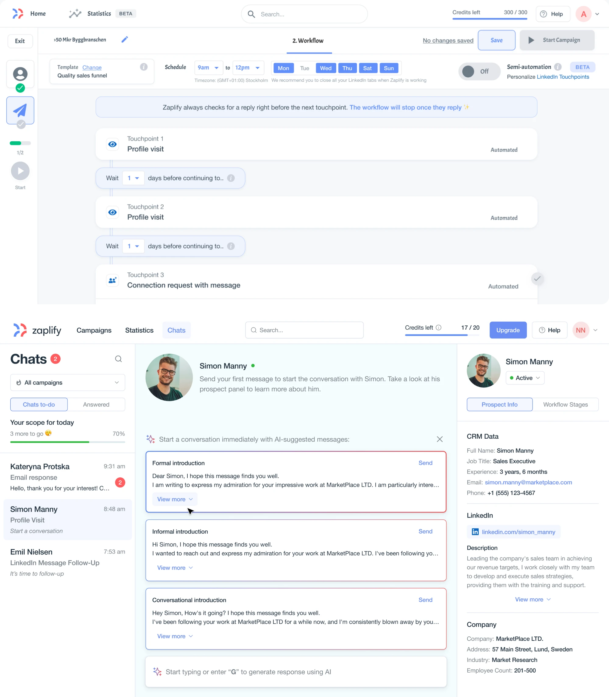
As a result, Zaplify’s activation rate doubled, up to 40% overall, showing how targeted improvements in early user journeys can significantly impact product adoption.
- simplifying complex workflows
Strategic UX priorities often focus on making complex products easier to use. A good example is Eleken’s work on Polaris, a code security platform designed to help teams detect vulnerabilities in their software. Because the product processes large amounts of technical data, the interface could easily become overwhelming.
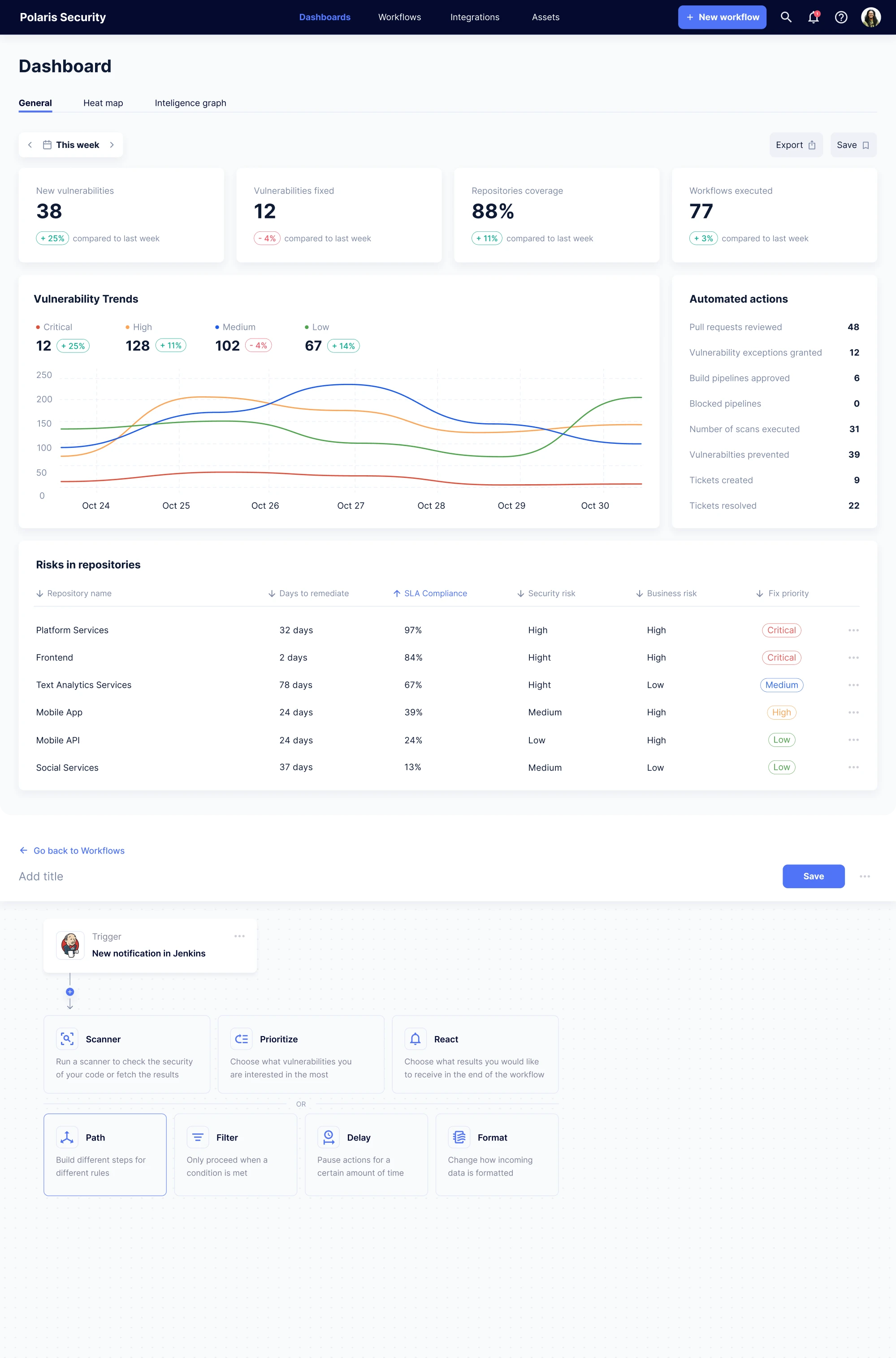
Eleken focused on presenting complex information in a more accessible way by structuring dashboards clearly, introducing filtering options, and improving data visualization. These changes helped users navigate large sets of security data and focus on the most critical issues.
- increasing feature discoverability
A good example of prioritizing strategic UX improvements comes from Eleken’s work on Modia, a platform that helps creators produce and manage visual content. Because the product offered many powerful features, the interface had become complex and difficult for users to navigate.
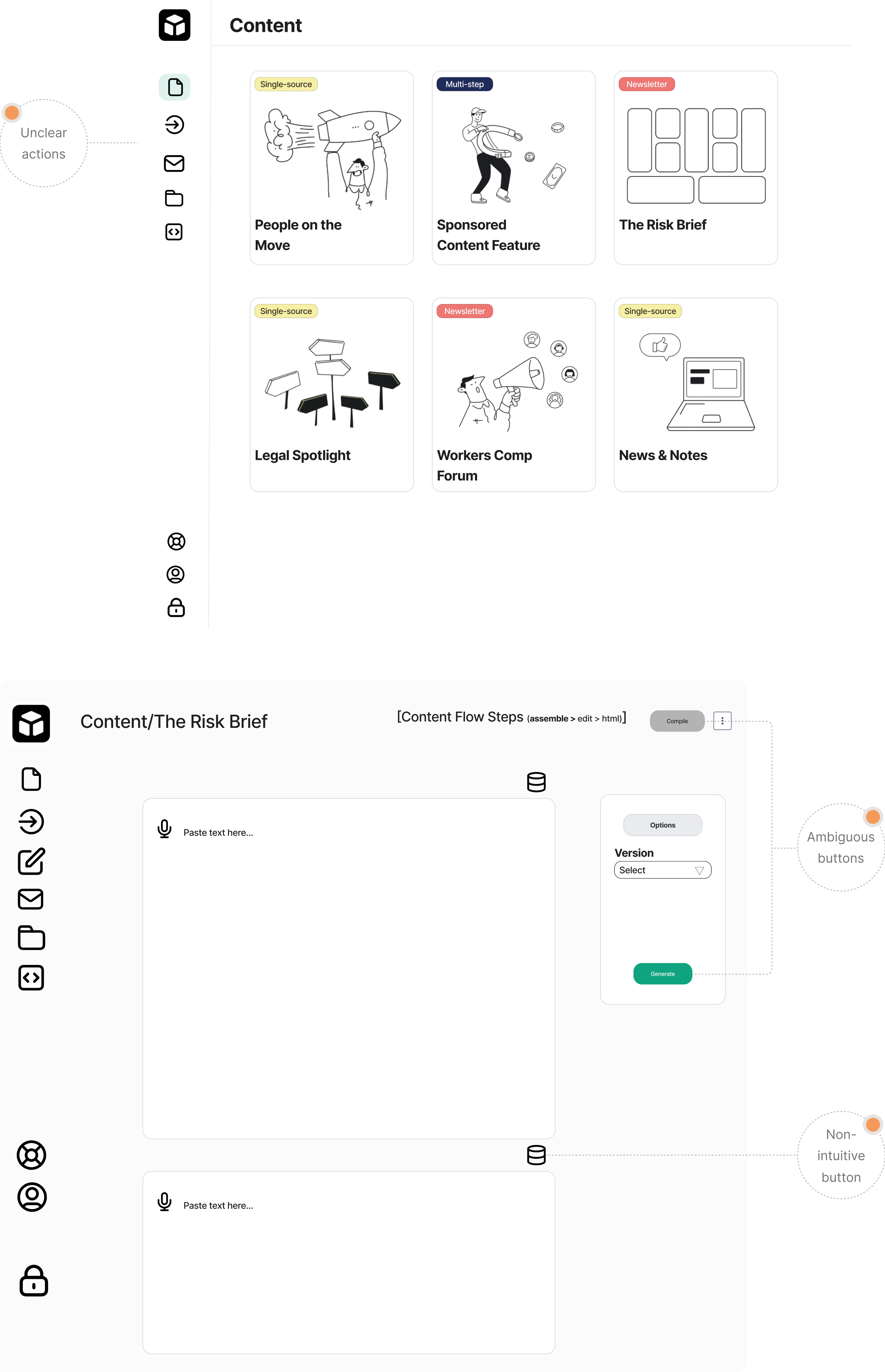
Rather than attempting to redesign every part of the system at once, the team focused on improving the areas that had the biggest impact on everyday workflows.
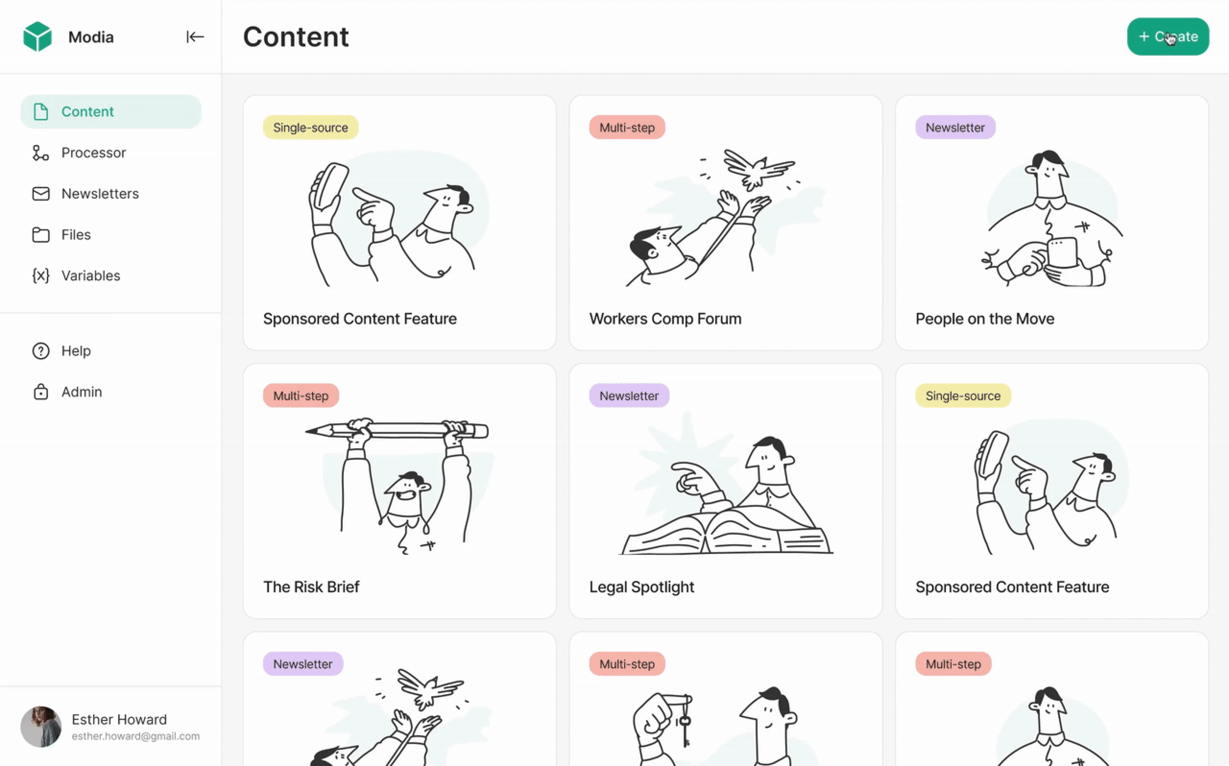
By reorganizing the interface, clarifying navigation, and strengthening visual hierarchy, Eleken helped make the platform easier to understand and use.
- strengthening collaboration between users
Strategic UX priorities may also involve improving collaboration between different users of a system. For example, when Eleken worked on LogitudeWorld, a logistics platform used by freight forwarders to communicate with customers, agents, and partners, the team focused on making shared shipment information easier to understand.
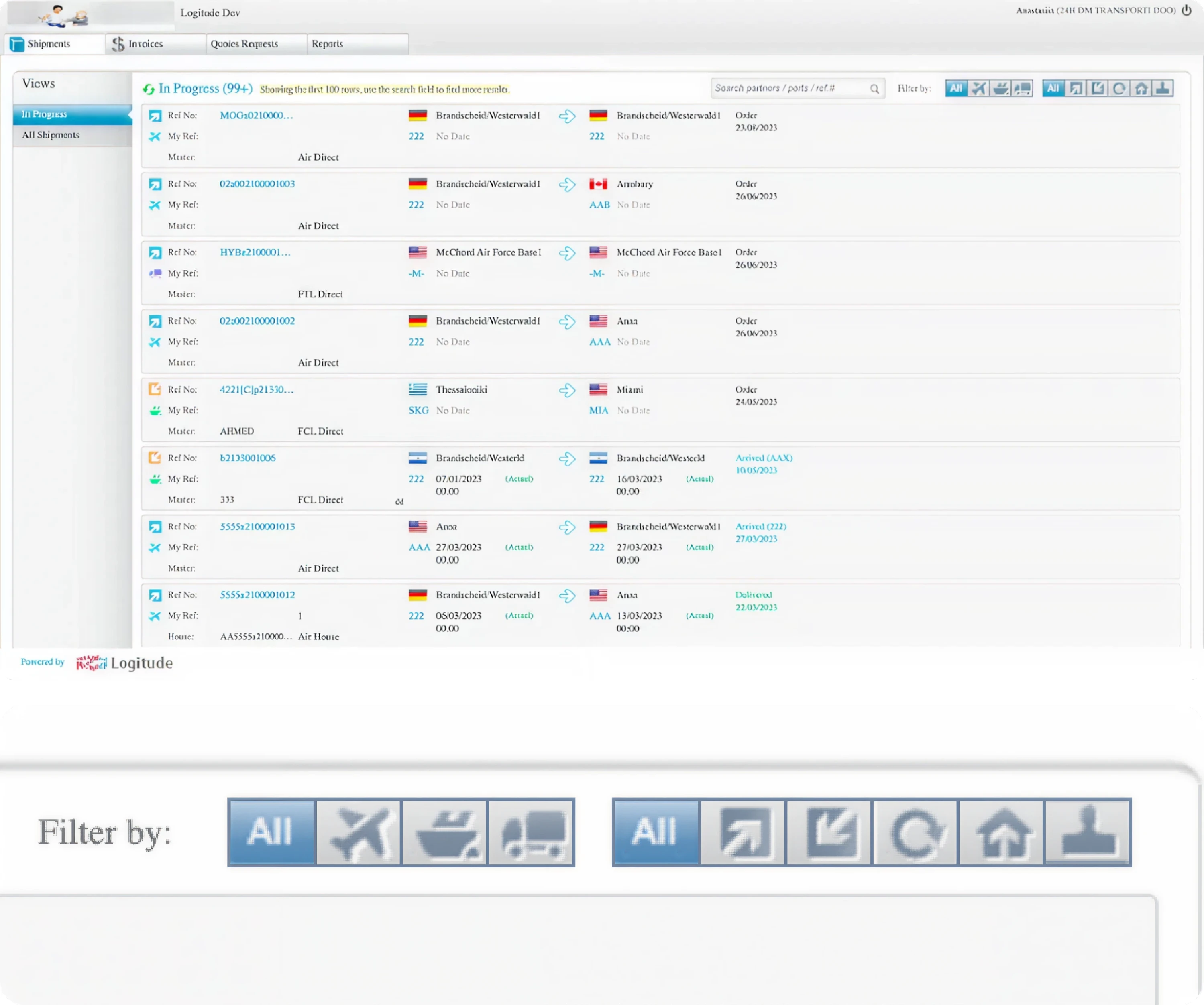
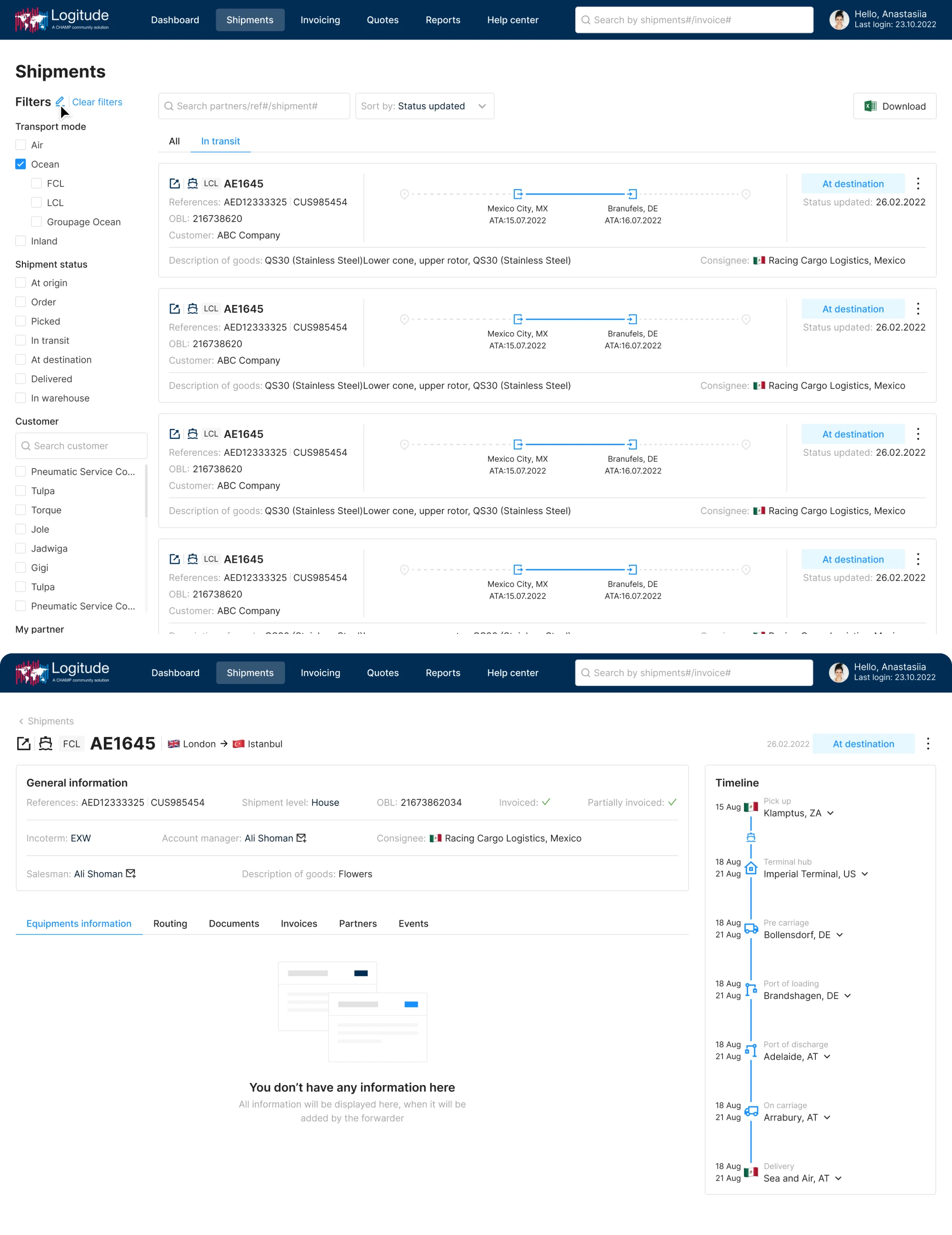
By redesigning the dashboard and organizing shipment data more clearly, Eleken helped different stakeholders track shipments and coordinate their work more efficiently.
Additionally, several prioritization tools can support this process, including:
- Opportunity solution trees, which connect user problems to possible solutions
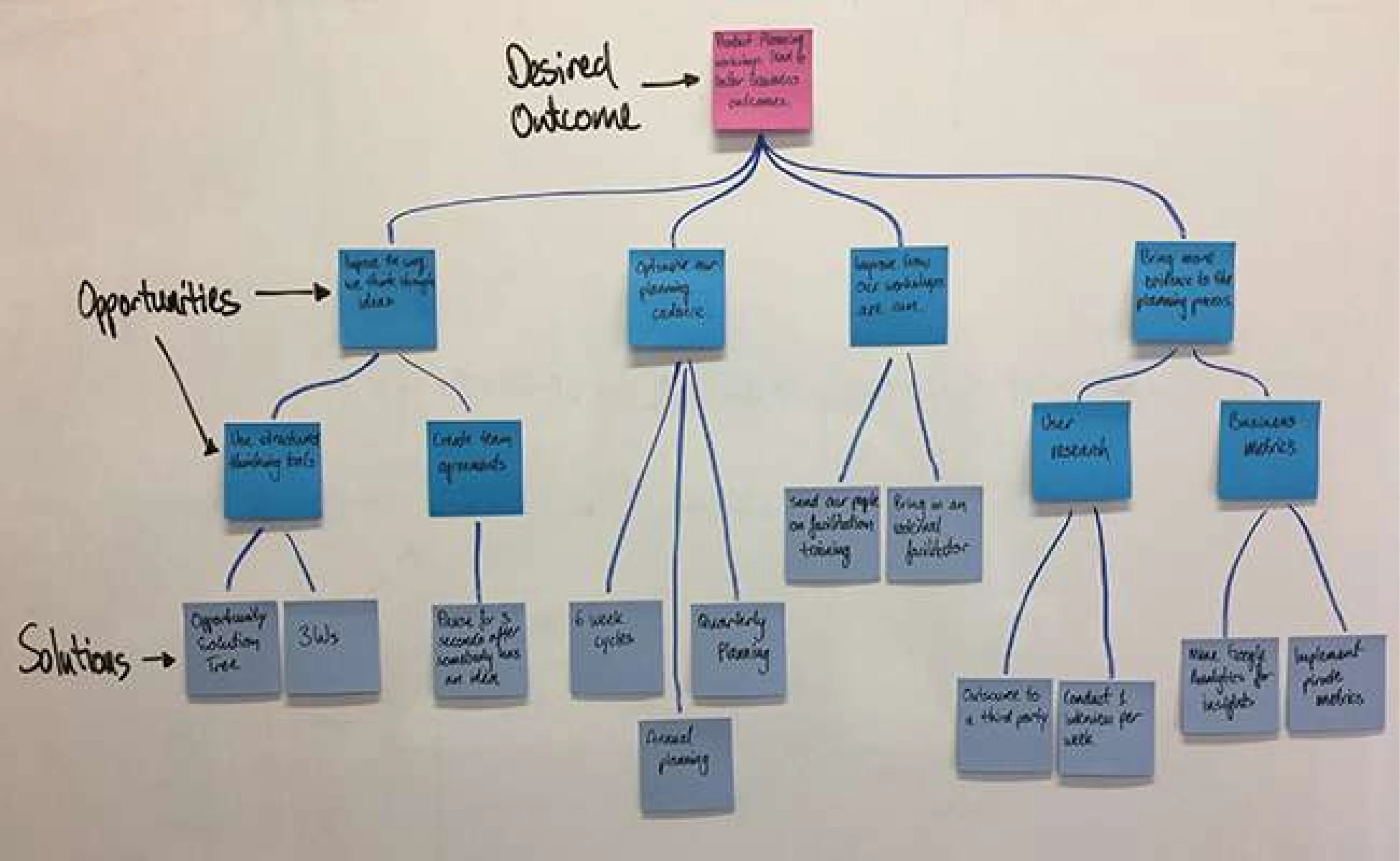
- RICE scoring, which evaluates reach, impact, confidence, and effort
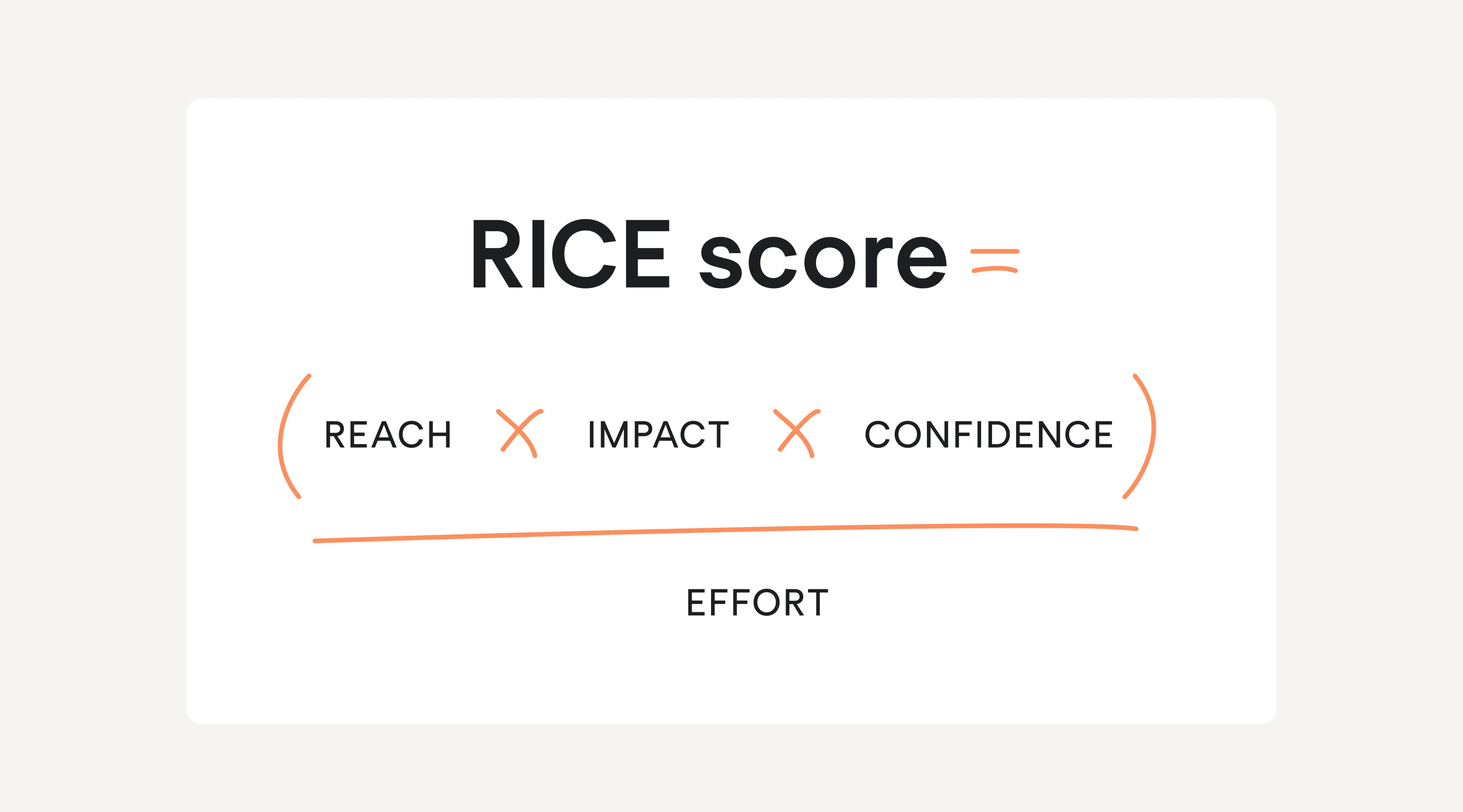
- Journey impact mapping, which highlights the most critical points in user workflows
The goal is not to produce a long list of initiatives, but to define a few strategic bets that will meaningfully improve the experience. In practice, this is one of the tenets of ux strategy – deliberate focus beats scattered improvement.
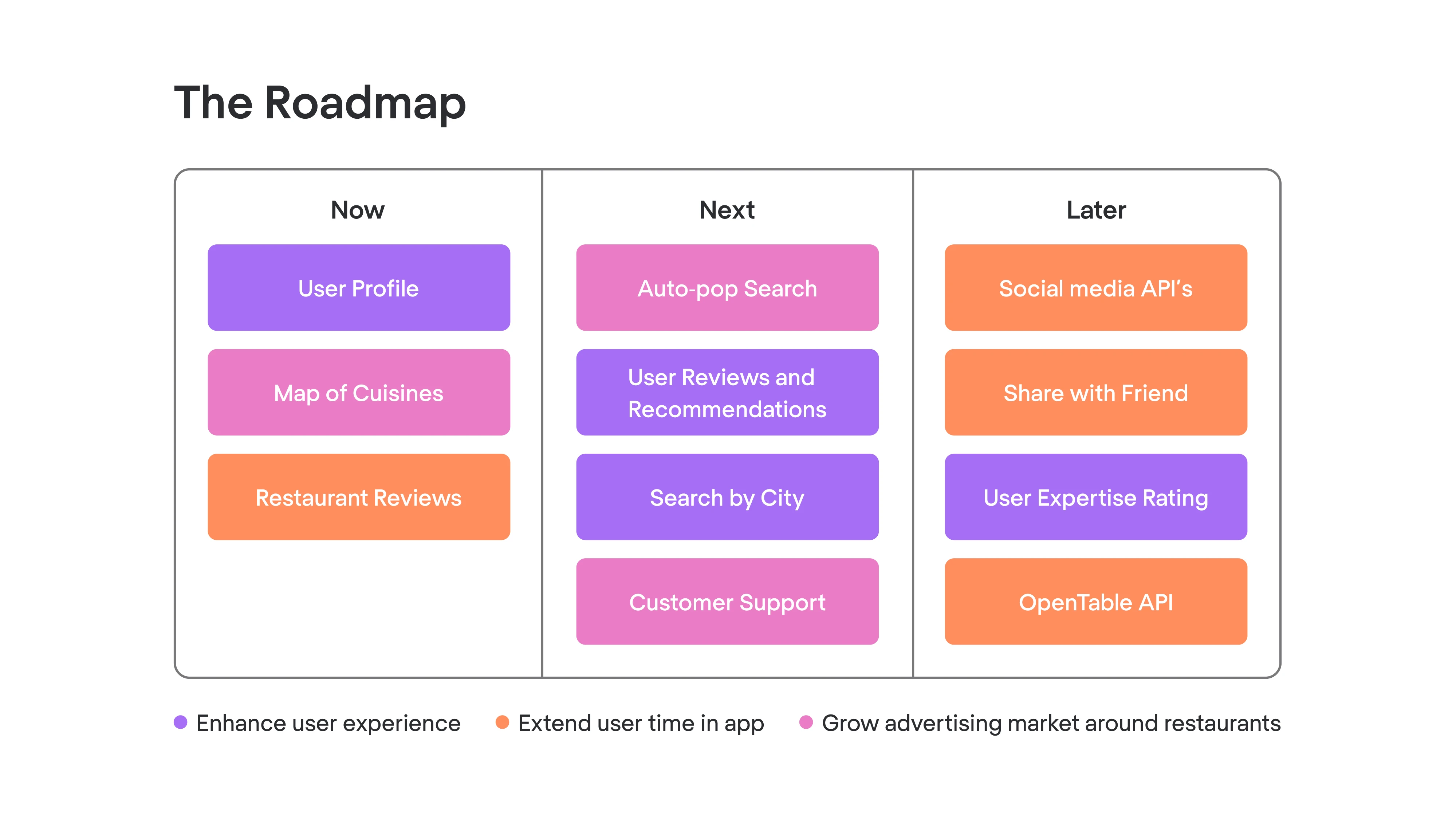
Step 5: Develop UX roadmap ‘themes’
The final step is translating the strategy into roadmap themes that guide product development.
Instead of listing individual features, roadmap themes focus on broader experience improvements. These themes help teams maintain strategic direction while still allowing flexibility in how solutions are implemented.
Examples of UX roadmap themes include:
- onboarding transformation
- workflow automation
- cross-platform consistency
- improved collaboration features
These themes then translate into concrete initiatives across multiple product releases. That makes strategy easier for team leads and cross-functional partners to use during planning.
Step 6: Define success metrics
UX strategy becomes effective only when teams can measure whether their decisions are working. At this stage, define metrics that connect UX improvements to product and business outcomes — we’ve already covered these connections earlier in the article.
Focus on a small set of indicators that show whether the experience is actually improving, such as activation, task completion, retention, or feature adoption.
When these connections are clear, UX improvements become easier to prioritize and justify within the broader product strategy.
Over time, teams review progress, measure outcomes, and refine the strategy as they learn more about their users and product. Oftentimes, that means using both quantitative data and qualitative insight instead of relying on a single signal.
In practice, UX strategy is not a one-time activity but an ongoing process of learning, prioritizing, and improving the product experience – and fair enough, it’s not fixed and can be adjusted.
From theory to practice: UX strategy real-world examples in SaaS
Frameworks help explain how UX strategy works, but the real value becomes clearer when we look at how these ideas apply to actual products. In SaaS companies, especially, UX strategy often emerges from solving complex usability problems, aligning teams, and preparing products for growth.
Below are several examples that illustrate how UX strategy decisions shape real product experiences.
Example 1: UX strategy for platform experience unification
Some SaaS products grow quickly and accumulate features faster than their experience can evolve. Over time, navigation becomes cluttered, workflows become inconsistent, and users struggle to understand how different parts of the platform connect.
In situations like this, the UX strategy often focuses on experience unification.
Instead of redesigning individual screens, teams step back and rethink the structure of the entire product. Strategic decisions might include:
- rebuilding the information architecture
- simplifying navigation patterns
- standardizing workflows across features
- introducing a consistent design system
The goal is not simply aesthetic improvement but reducing cognitive load for users so they can understand the product faster and move through it more confidently. That clarity can become a real competitive advantage in crowded SaaS niches.
A similar challenge appeared in Eleken’s work with Data Streams, a platform that needed to compete in a complex data-management market. The UX strategy involved analyzing competitors, restructuring the information architecture around user scenarios, and defining clearer user flows before visual design began.
This strategic foundation allowed the product to evolve more confidently as the company expanded to new markets.
Example 2: UX strategy for faster user activation in SaaS
Onboarding is one of the most common areas where UX strategy plays a critical role. Many SaaS products lose users early because the initial experience is confusing or overwhelming.
In these cases, the strategic focus often shifts toward activation — helping new users reach their first meaningful success with the product as quickly as possible.
UX strategy for onboarding may involve decisions such as:
- simplifying the first-time setup flow
- introducing progressive disclosure for advanced features
- guiding users toward their first successful action
- redesigning navigation to highlight the product’s core workflow
This kind of work helps teams align onboarding with user expectations instead of internal assumptions about how the product should be learned.
So for another real-world UX strategy example, consider our work with MyInterview, a hiring platform that struggled with high candidate drop-off during the application process.
Rather than simply redesigning individual screens, the UX strategy focused on optimizing candidate onboarding flows, fixing broken input patterns and flows, and gradually introducing AI features that improved the experience without overwhelming users.
This strategic approach reduced candidate churn significantly and strengthened the platform’s ability to attract enterprise clients.
Example 3: UX strategy for simplifying complex technical platforms
Some products face a different challenge: the underlying technology is highly complex, making it difficult for users to understand or interact with the system.
Cybersecurity platforms, developer tools, and data analytics software often fall into this category. In these cases, UX strategy focuses on making complex systems understandable.
Key strategic decisions might include:
- simplifying technical concepts through progressive disclosure
- organizing data through filtering and grouping systems
- visualizing complex relationships between entities
- guiding users through advanced workflows step by step
Eleken’s work with Vector0, a cybersecurity platform, illustrates this type of challenge. The product needed to present vulnerability data that could easily overwhelm users unfamiliar with the domain.
In products like these, teams often need thorough user research before deciding how much complexity to expose and when.
So as you can guess, the UX strategy centered on simplifying this kind of complexity. The design introduced progressive disclosure through contextual sidebars, advanced filtering systems, and structured workflows that allowed users to explore vulnerability data without feeling lost.
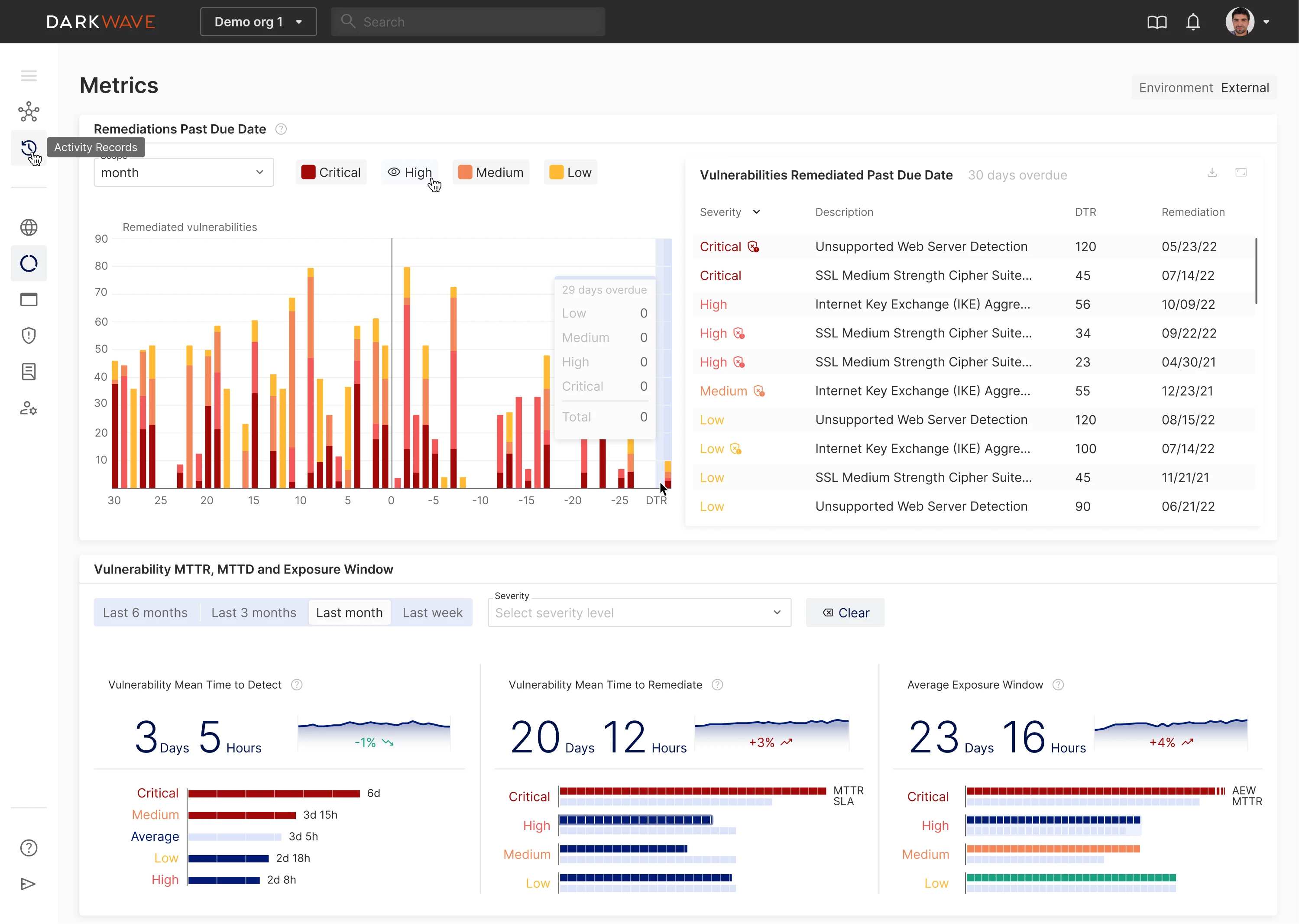
This strategic direction helped transform a technically dense platform into an experience that investors and users could understand.
Example 4: UX strategy for improving user adoption
Another situation where UX strategy becomes critical is when a product begins to receive consistent negative feedback from end users, even though its core functionality technically works.
This often happens in complex B2B platforms. The product may have been designed around internal logic or technical requirements, but over time, the workflows become difficult for everyday users to navigate.
This was the case with Nworx, a B2B performance enablement and learning platform that helps organizations manage employee development and learning programs. Before partnering with Eleken, the team was struggling with low end-user adoption and had begun receiving negative feedback from users. That feedback revealed a clear problem: several learning management flows were difficult to navigate and didn’t match how people actually interacted with the platform.
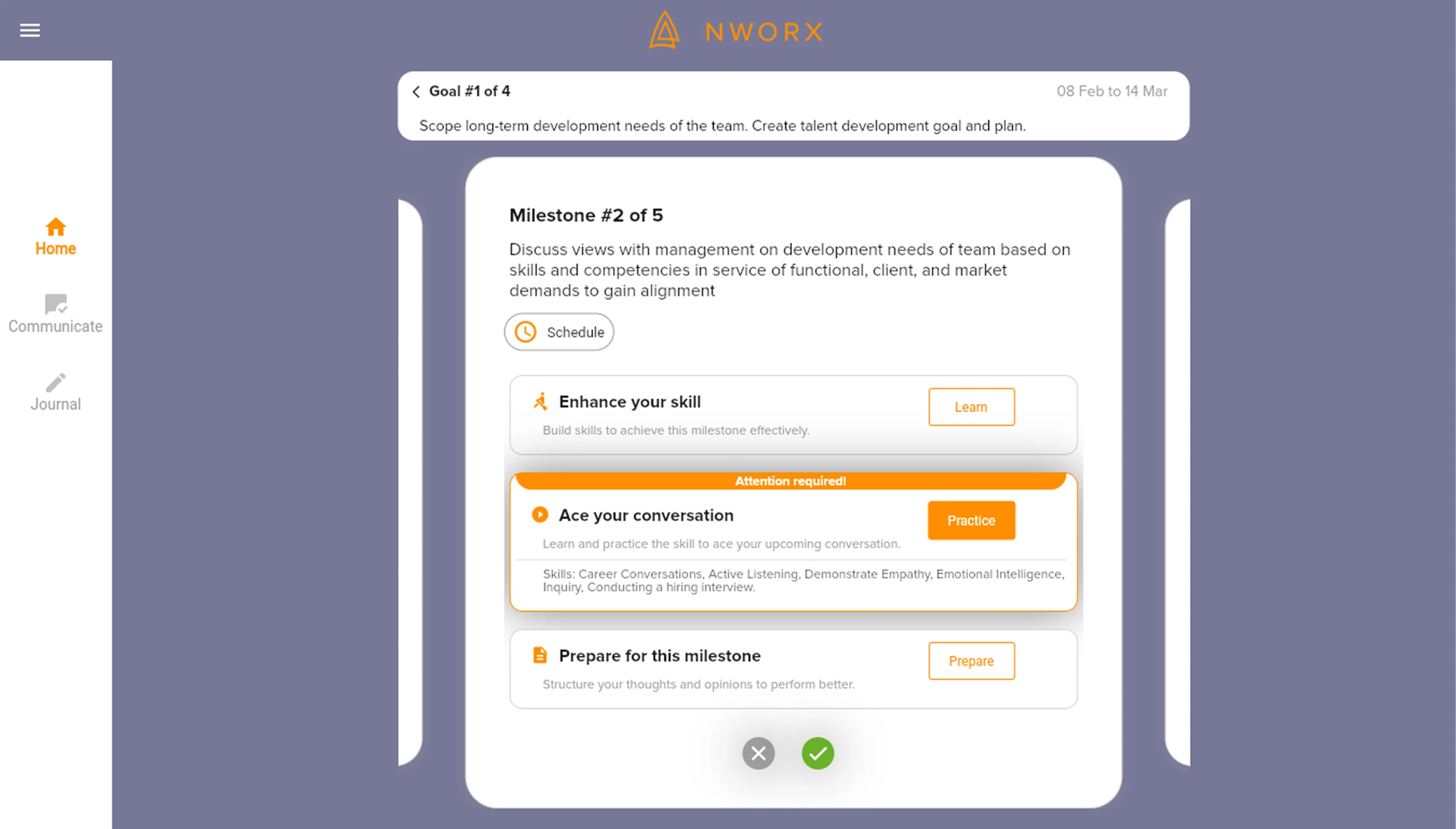
To address these issues, Nworx turned to Eleken.
Instead of redesigning the platform from scratch, the UX strategy focused on improving usability while preserving the product’s underlying logic. That kind of work is especially effective when teams conduct user research close to the places where friction appears most often. The team refined the learning management flows, clarified task sequences, and simplified interaction patterns so users could move through the platform more naturally.
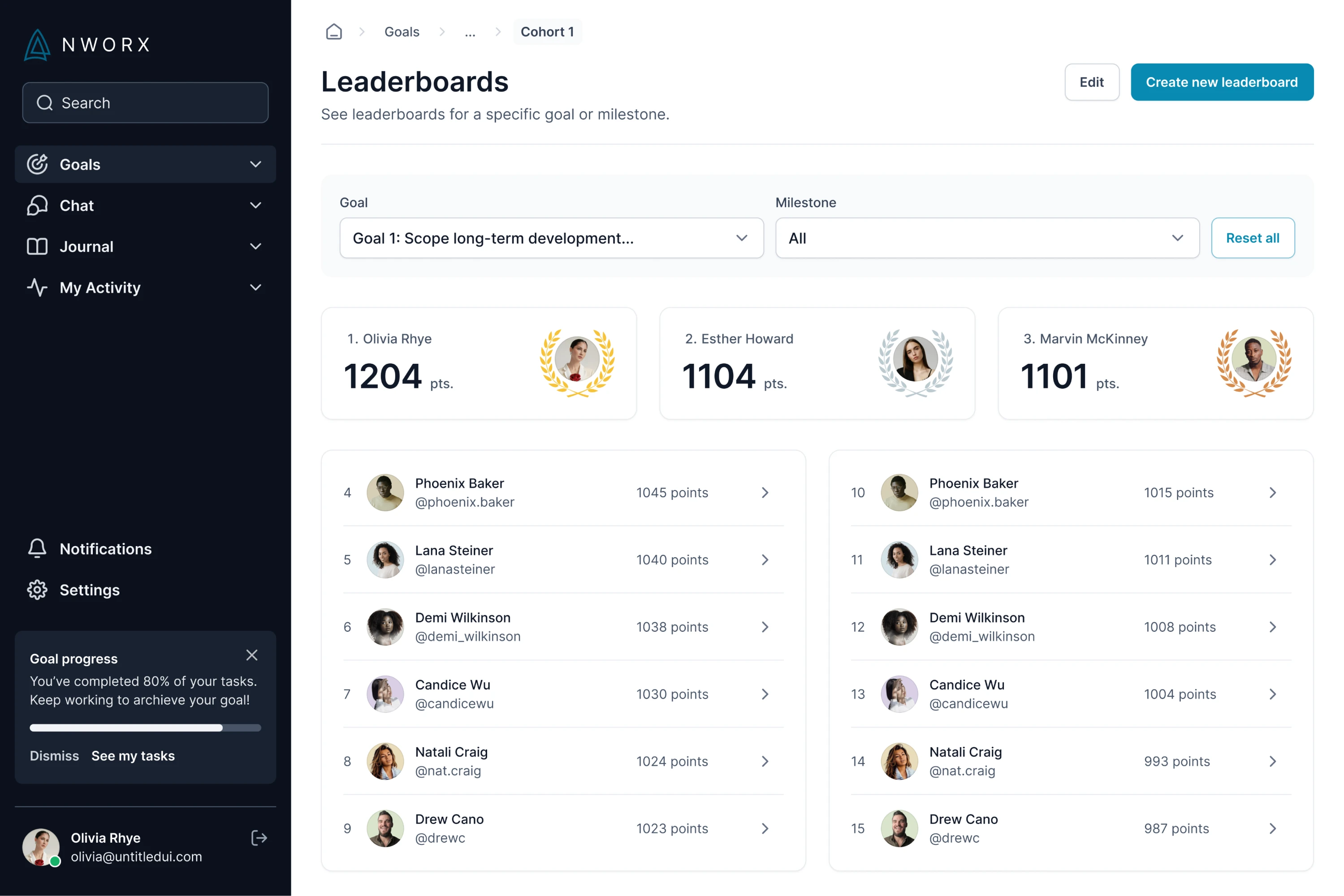
The aforementioned improvements helped increase end-user adoption and strengthened the overall experience of the B2B platform without disrupting its existing functionality.
All in all, these examples show that UX strategy rarely exists as a theoretical framework. Instead, it emerges from real product challenges — improving onboarding, simplifying complexity, aligning teams, or preparing a platform for growth.
By stepping back and defining the experience direction before jumping into interface design, teams can solve these challenges more effectively and build products that remain coherent as they evolve.
Lean UX strategy (when you don’t have time or budget)
In theory, UX strategy involves research, structured frameworks, and long-term planning. In reality, many product teams don’t have the time, resources, or dedicated roles required for a full strategy process.
Startups, small SaaS teams, and early-stage products often work under tight deadlines. Designers may be responsible for research, interface design, and product thinking at the same time. In these environments, UX strategy must be lean and practical.
Fortunately, a strong UX strategy doesn’t require months of workshops or extensive documentation. What matters most is focusing effort where it has the greatest impact. That’s why teams often rely on lightweight strategy tools rather than heavyweight planning artifacts.
Research where the risk is highest
Not every product decision requires deep research. Instead of studying everything, lean UX strategy focuses on the areas where uncertainty creates the biggest risk.
For example, teams may already understand their core users well but remain unsure about how new users approach onboarding. In this case, research should focus specifically on onboarding behavior.
By prioritizing the most uncertain parts of the experience, teams can gather meaningful insights without slowing down development.
Use internal expertise when risk is low
In some situations, teams already have enough knowledge to make informed decisions. Product managers, support teams, and domain experts often understand common user challenges based on daily interactions with customers.
Lean UX strategy encourages teams to use existing knowledge where appropriate instead of running research for every decision. This approach saves time while still allowing teams to move quickly. For many UX professionals, this balance is what makes strategy sustainable in real product teams.
Validate ideas after launch
Traditional UX processes emphasize validating ideas before building them. While this approach is valuable, early-stage teams often need to release features quickly to learn from real usage.
Lean UX strategy therefore, relies heavily on post-launch validation.
Teams can monitor:
- product analytics
- user behavior patterns
- support requests
- qualitative user feedback
This data helps teams understand whether a change improves the experience or introduces new friction. Sometimes that also means running structured experiments instead of making assumptions based on opinions alone.
Build a shared knowledge repository
One challenge many teams face is that research insights get lost over time. Interviews, usability tests, and analytics findings often remain scattered across documents or presentation slides.
Lean UX strategy benefits from maintaining a simple insight repository where teams can store and revisit research findings.
A basic repository might include:
Over time, this repository becomes a valuable resource for future product decisions and helps teams keep both user and business needs visible in one place.
Lean UX strategy focuses on learning quickly, prioritizing uncertainty, and continuously improving the product experience. Instead of trying to create a perfect strategy upfront, teams evolve their strategy as they gather new insights from users and real product usage.
Why most UX strategies fail
Even when teams understand the value of UX strategy, implementing it successfully can be challenging. Many strategies fail not because the ideas are wrong, but because the organization struggles to translate them into everyday product decisions.
Understanding the most common pitfalls can help teams avoid turning their UX strategy into a document that is quickly forgotten.
Lack of leadership support
A UX strategy requires alignment across product, design, and engineering teams. Without support from leadership, strategic decisions often lose priority when short-term pressures appear.
For example, teams may recognize the need to improve onboarding or simplify workflows, but leadership might push for rapid feature releases instead. Over time, the strategy becomes secondary to the immediate roadmap.
To prevent this, UX strategy should connect clearly to business goals such as activation, retention, or revenue growth. When leaders see how experience improvements support measurable outcomes, strategy gains stronger support. In other words, that connection is easiest to defend when UX is clearly tied to the core business strategy, not treated as a side concern.
Strategy disconnected from the roadmap
Another common problem occurs when strategy and execution become separated.
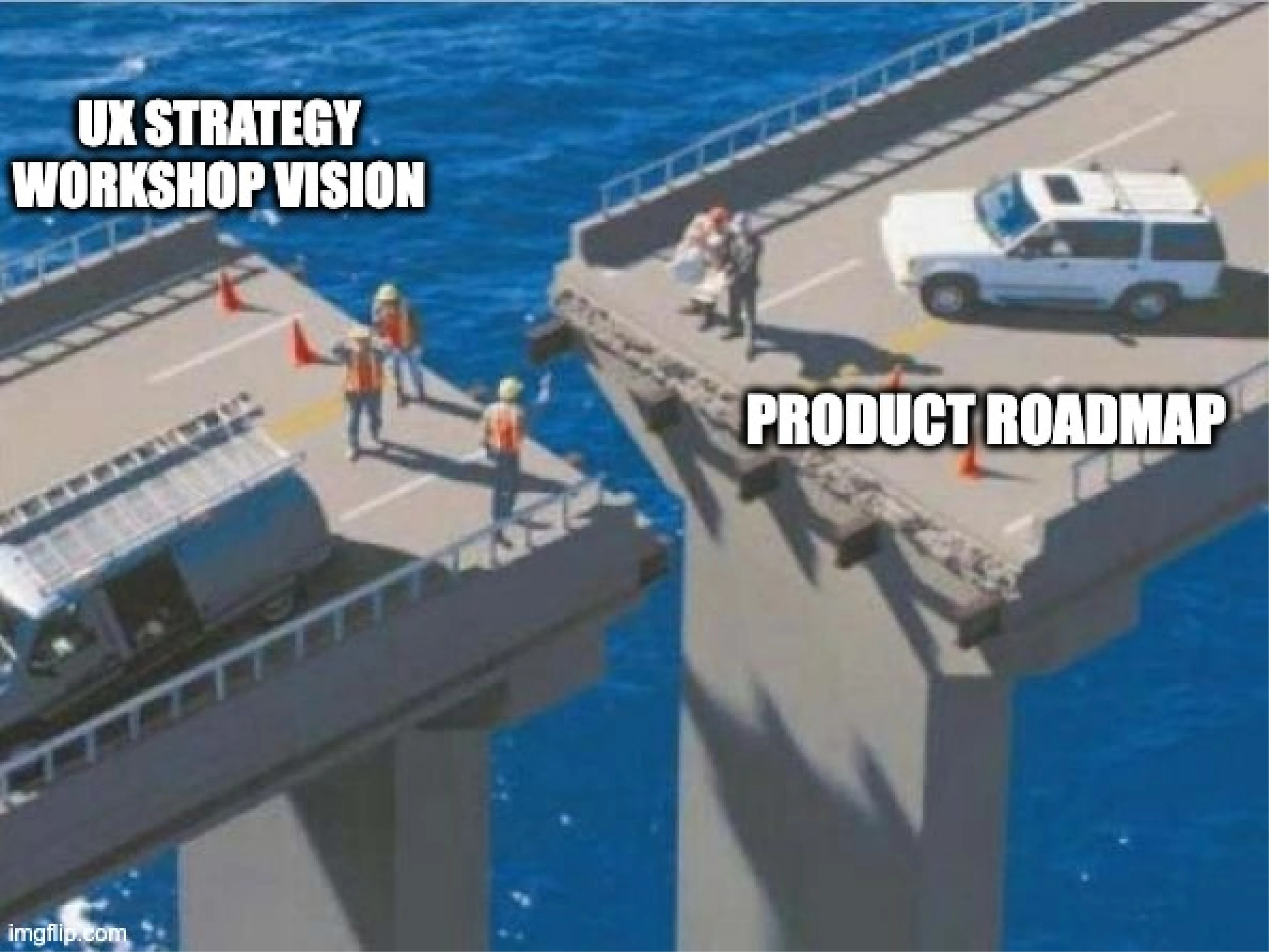
Teams may define a compelling UX vision during workshops or strategy sessions, but the product roadmap continues to prioritize unrelated initiatives. When strategy does not influence planning decisions, it gradually loses relevance.
One effective solution is translating UX strategy into the roadmap themes rather than abstract goals. These themes help ensure that product initiatives consistently support the long-term experience direction.
No measurable outcomes
Strategies that lack clear metrics are difficult to evaluate. If teams cannot measure progress, it becomes impossible to determine whether strategic initiatives are actually improving the product experience.

Connecting UX goals to product metrics — such as activation rate, task completion, or user retention — allows teams to track the real impact of their efforts.
Falling back into “feature factory” mode
Perhaps the most common failure occurs when teams revert to feature factory behavior. Under pressure to deliver new capabilities quickly, organizations sometimes prioritize feature output over experience quality.
When this happens, UX strategy loses influence, and the product gradually becomes more complex and harder to use.
Preventing this requires regular strategy reviews and continued alignment between teams. Revisiting UX goals during planning cycles helps ensure that new initiatives support the broader experience vision rather than undermine it.
How to prevent these UX strategy failures
Preventing these issues usually doesn’t require complex frameworks. What matters most is ensuring that the UX strategy stays connected to everyday product decisions.
A few practical habits can help teams keep their strategy alive:
Tie the UX strategy to OKRs
If strategic UX initiatives are linked to product or company OKRs, they are far less likely to be ignored when roadmap priorities shift.
Review the strategy regularly
Revisiting UX strategy during quarterly planning helps teams evaluate progress, adjust priorities, and ensure that new initiatives still support the long-term experience direction.
Embed experience principles into the design system
When UX principles are reflected in design patterns and guidelines, teams naturally apply them during everyday design and development work.
Use the strategy to say “no”
A strong UX strategy helps teams evaluate new feature requests against the product’s experience goals. If a proposal doesn’t support the strategic direction, teams have a clear reason to deprioritize it.
In practice, UI/UX strategy succeeds when it becomes part of how teams plan, prioritize, and make decisions — not just something documented in a presentation.
That kind of discipline is often what separates a successful UX strategy from one that stays stuck in presentation slides.
UX strategy is where product experience starts
UX strategy is often treated as something abstract — a concept discussed in workshops or strategy decks.
In reality, it’s far more practical – UX strategy is the process of deciding how a product experience should evolve and what choices will help it create value for both users and the business. When teams approach UX strategically, design stops being reactive work focused on isolated screens and becomes a way to shape the direction of the product itself.
If there’s one core message from this guide worth carrying forward, it’s that UX strategy helps teams make experience decisions deliberately rather than accidentally. Here are a few principles that capture the essence of it:
- UX strategy is about direction and decisions – it helps teams prioritize which experience improvements matter most.
- It connects user experience to business value — UX improvements support outcomes such as activation, engagement, and retention.
- It scales design thinking beyond individual screens – strategy keeps the experience coherent as products grow.
- Without the UX strategy, UX becomes mere execution – designers fix isolated problems instead of influencing product direction.
- But with UX strategy, UX influences what gets built – helping guide priorities and product decisions.
Ultimately, UX strategy is what allows design to move from polishing interfaces to shaping products.
At Eleken, we’ve spent 10+ years helping SaaS teams connect business goals with real user needs and translate strategy into interfaces that convert, retain, and scale. Over that time, we’ve worked on 200+ SaaS product design projects, turning complex ideas into practical product experiences that drive user engagement and emerge as a solid competitive advantage. If that’s the kind of support you’re looking for, feel free to drop us a line.


.png)