Lists are a fundamental element of UI design. They help users navigate information efficiently, whether it’s browsing a catalog, organizing tasks, or finding friends on social media. Yet, the effectiveness of a list design depends on how well it balances functionality and aesthetics.
When done right, lists not only provide clarity but also enhance user engagement by making complex data approachable. On the flip side, poorly designed lists can overwhelm or frustrate users, leading to a poor experience and potential churn.
This article is here to ensure your lists belong in the first category. We’ve compiled 30+ examples of exceptional list UI designs from apps, websites, and digital tools across various industries. Along the way, you’ll learn practical design principles and expert tips to craft lists that are both intuitive and visually engaging.
So whether you’re designing a to-do app, a shopping site, or a content platform, this guide will provide actionable insights to inspire your next project. Let’s dive in!
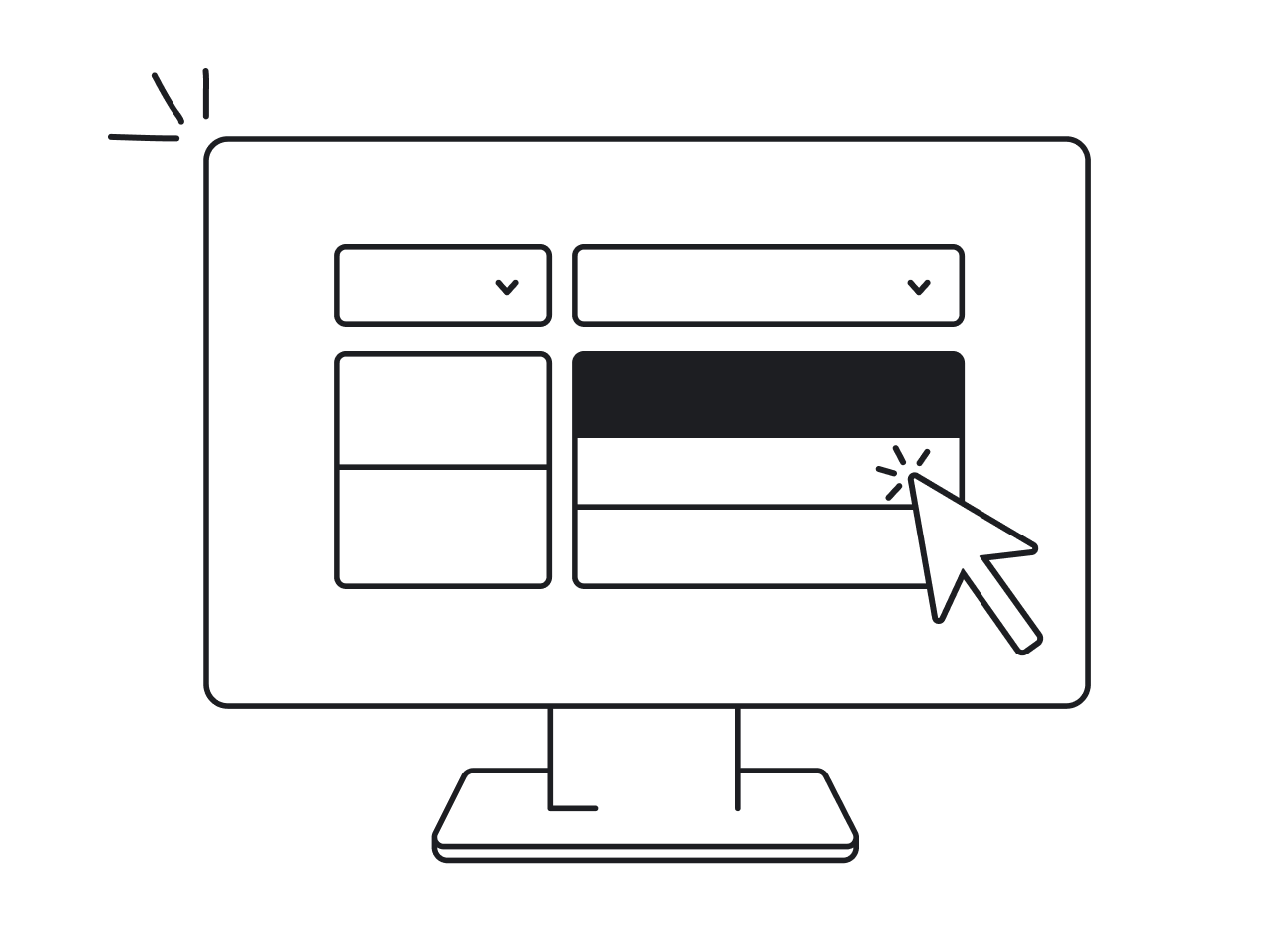
What is a list design UI?

In user interface (UI) design, a list is more than just an arrangement of items—it's a critical structure that organizes information to guide users toward their goals. This element is widely used across digital interfaces to display list items, categorize primary content, or perform actions like browsing or selecting.
Understanding the basics of a list
A list typically consists of:
- Items: The core elements displayed in a sequence (e.g., product names, tasks, or user profiles).
- Container: A framework that groups items for clarity and order.
- Actions: Additional features like checkboxes, icons, or swipes that enable user interaction.
For instance, the inbox in your email app is an entire list that displays subject lines, sender names, and timestamps, allowing you to quickly prioritize and act.
The significance of a list component in digital interfaces

Lists simplify complex datasets, presenting information in digestible chunks. Their structured design supports scanning and decision-making, which is why lists are essential in:
- E-commerce: Product lists that help users browse and purchase items.
- Task Management: Organizing activities with due dates, priorities, and status updates.
- Social Media: Friend or follower lists that facilitate connections and engagement.
Visualizing a list in action
Imagine a movie streaming app that recommends titles:
- The list design allows users to scroll horizontally or vertically through genres, ratings, or trending films.
- Interactive elements like star ratings or “Add to Watchlist” buttons enhance usability.
This example highlights how well-structured lists enhance user experience by blending functionality with an intuitive design.
Types of list design
Lists are foundational in UI design, but their structure and purpose can vary significantly. Here’s a refined breakdown that incorporates both textual and visual elements, along with interactive and dynamic functionalities.
1. Text lists
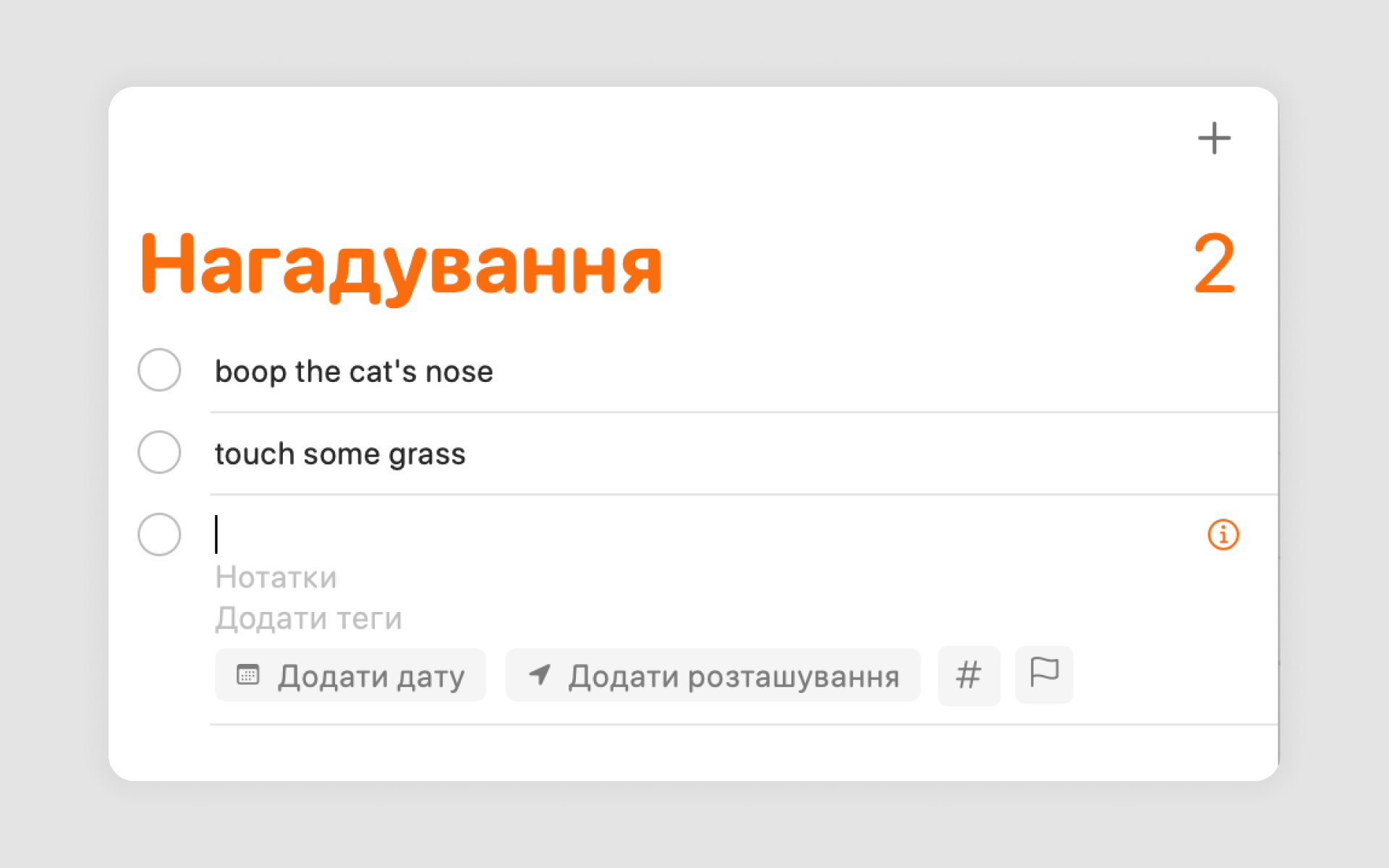
Text-based lists focus purely on information displayed in textual form, often enhanced by subtle interactive elements.
Subtypes:
Simple lists: Minimalist, easy-to-read structures for quick information access.
Example: Apple Notes displays a plain, scrollable one-line list of text-based notes for seamless navigation.
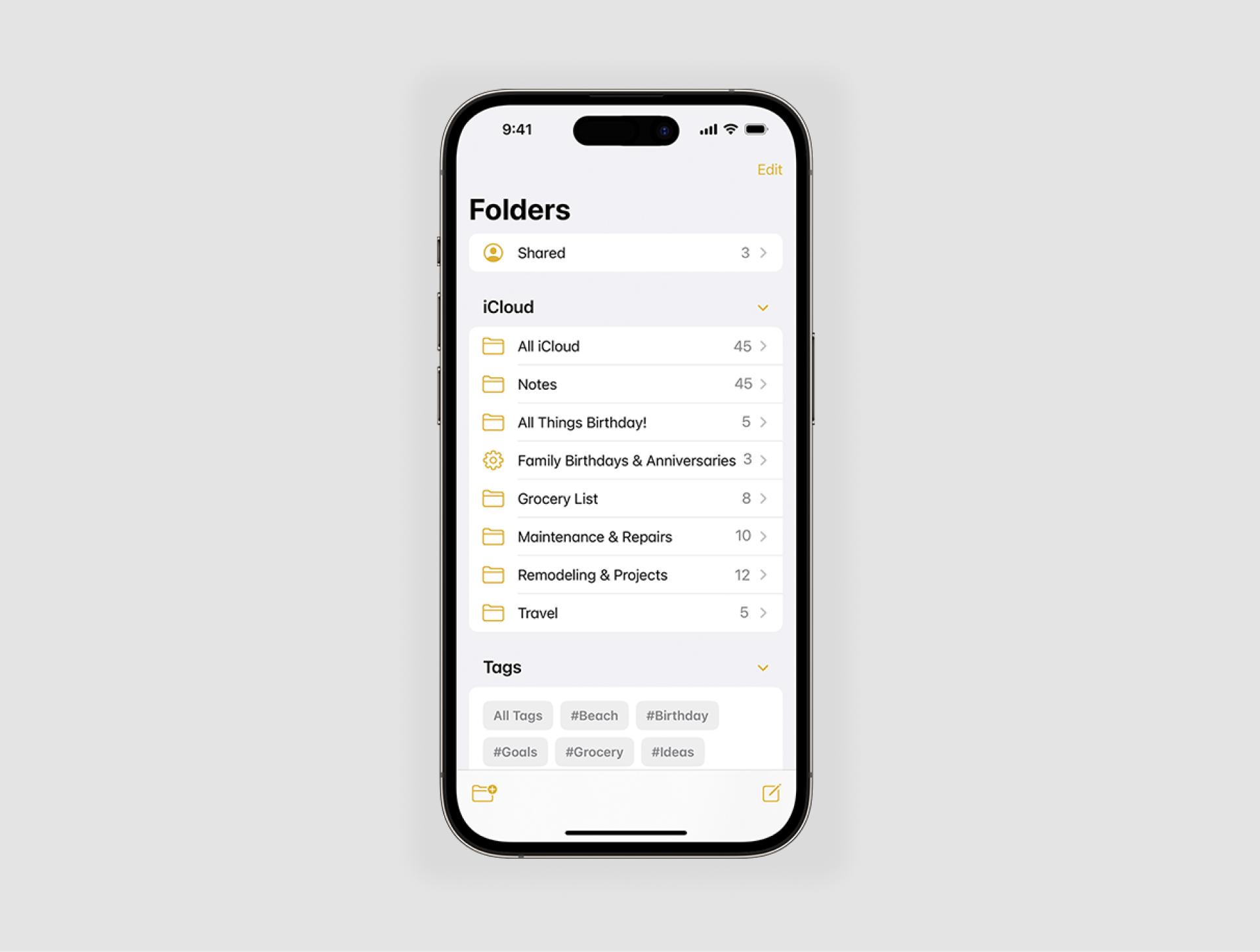
Nested lists: Hierarchical structures that organize content into categories and subcategories.
Example: Google Drive organizes files within folders, allowing users to drill down into multiple levels.

Best use case: Ideal for task management, navigation menus, and content-heavy applications requiring clarity and simplicity.
2. Image lists
Image-based lists combine visuals with text to deliver richer, more engaging content. They often include thumbnail previews or inline imagery.
Example: Spotify playlists display album covers alongside song titles to create an intuitive music browsing experience.
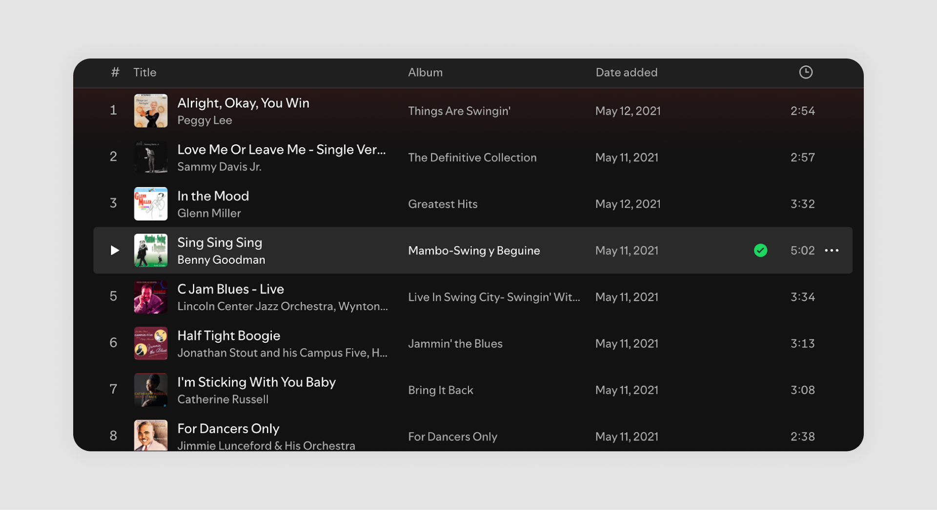
Best use case: Media platforms, e-commerce galleries, or any application where visuals enhance information retrieval.
3. Card lists
Card lists present content in visually distinct containers, often featuring both images and text, making them ideal for highlighting individual items.
Subtypes:
- Static card lists: Fixed layouts for structured browsing.
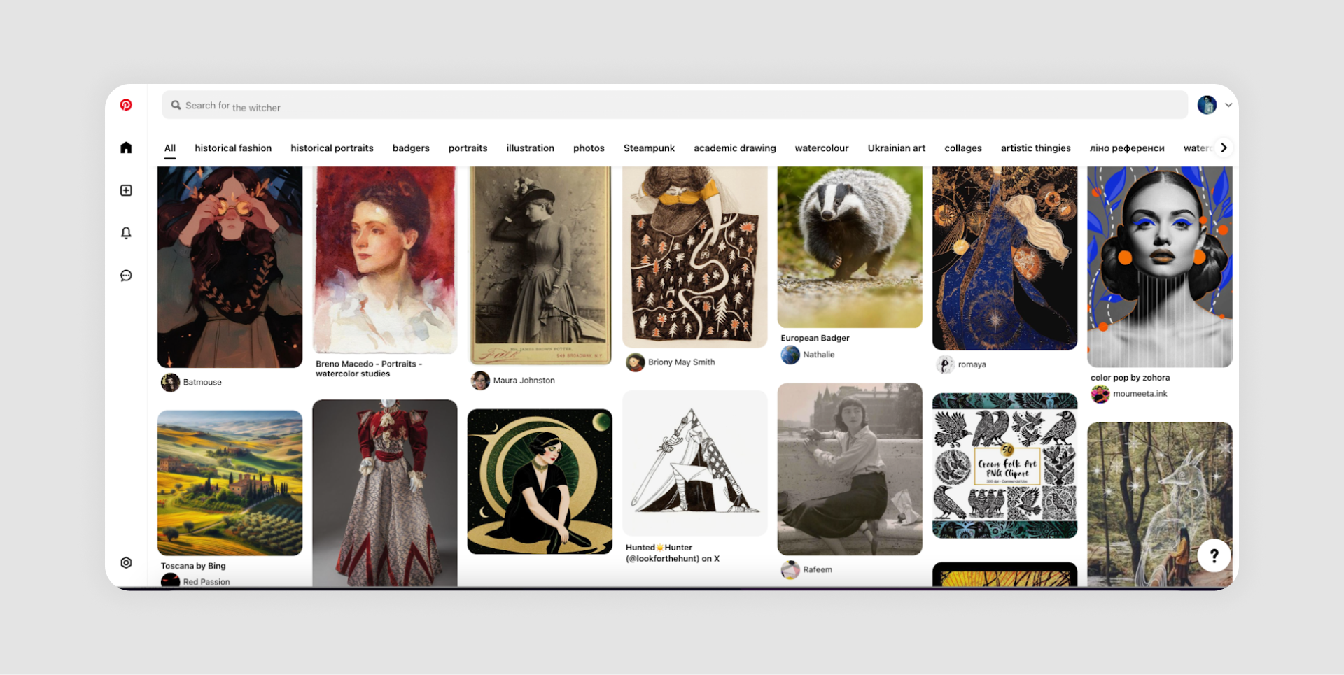
Example: Pinterest showcases images in grid-style cards with titles and descriptions for immersive exploration.
- Dynamic card lists: Adaptive layouts that respond to filters or user inputs.
Example: Airbnb search results dynamically adjust based on filters like location or price, displaying property images and key details.

Best use case: E-commerce, travel platforms, or apps that require a balance of aesthetics and functionality.
4. Interactive and dynamic enhancements
Regardless of type, lists UI often incorporates interactive or dynamic features to elevate usability:
- Interactive lists: Allow user engagement through actions like swiping, tapping, or dragging.
Example: Gmail inbox supports swipe gestures for actions like deleting or archiving emails.
- Dynamic lists: Update in real time, offering sorting, filtering, or infinite scrolling capabilities.
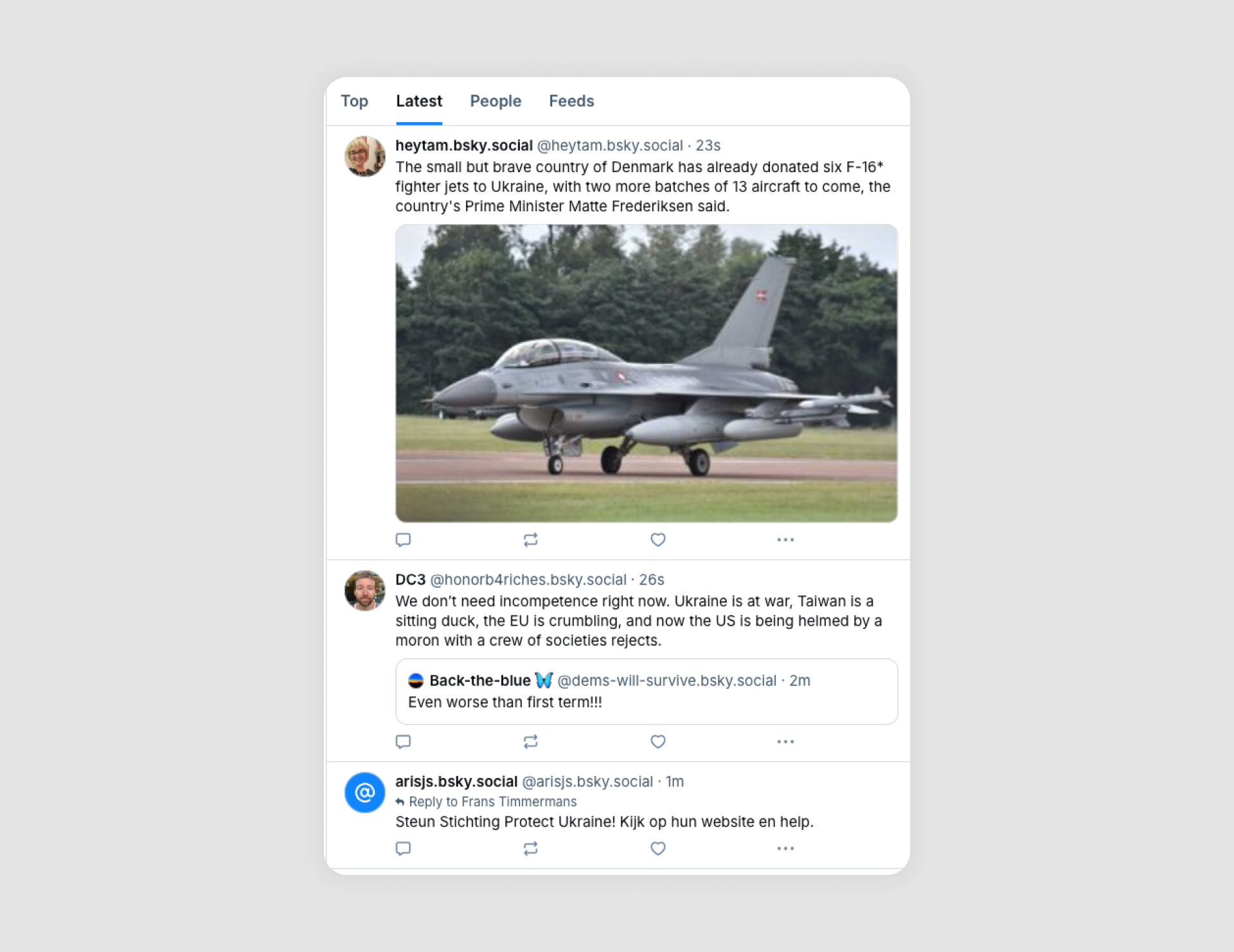
Example: X, BluSky’s feeds refresh dynamically to display the latest posts.
Best practices for designing list UIs
Creating an effective list design requires careful consideration of usability, aesthetics, and functionality. These best practices will help you craft a list UX that is both intuitive and engaging for users.
1. Maintain readability and hierarchy
Users rely on lists for quick access to information. Organize content with clear visual hierarchy:
- Use bold titles or headings to separate sections.
- Incorporate subtext for additional details when necessary (e.g., timestamps in email apps).
2. Use white space effectively
White space helps avoid visual clutter, making lists easier to scan and interact with.
- Space between list items improves readability.
- Avoid overpacking lists, especially on mobile screens.
3. Leverage consistent iconography and typography
Visual consistency aids comprehension and reduces cognitive load.
- Use uniform icons for actions like editing, deleting, or checking items.
- Stick to a consistent font size for headers and descriptions.
4. Prioritize primary actions
Highlight the most common user actions within your list.
- Use buttons, swipes, or hover states to make actions accessible.
- Ensure that secondary actions don’t distract from the primary workflow.
5. Design for accessibility
Ensure that your lists are usable for all audiences, including those with disabilities.
- Provide sufficient color contrast for text and backgrounds.
- Use ARIA labels for screen readers.
- Enable keyboard navigation for interactive lists.
6. Adapt lists for mobile and desktop
Responsive design ensures that lists look and function well on different devices.
- Use compact views for mobile UI and expand details for desktop.
- Prioritize touch-friendly elements like larger buttons for mobile.
7. Decide between infinite scrolling or pagination
Choose the right method for displaying long lists based on user context:
- Infinite scrolling: Best for continuous exploration, as in social media feeds.
- Pagination: Ideal for structured browsing, like search results.
8. Incorporate filtering and sorting options
Allow users to refine large datasets with intuitive controls.
- Filters should be easy to locate and apply without disrupting the list view.
- Sorting should present options like date, popularity, or relevance.
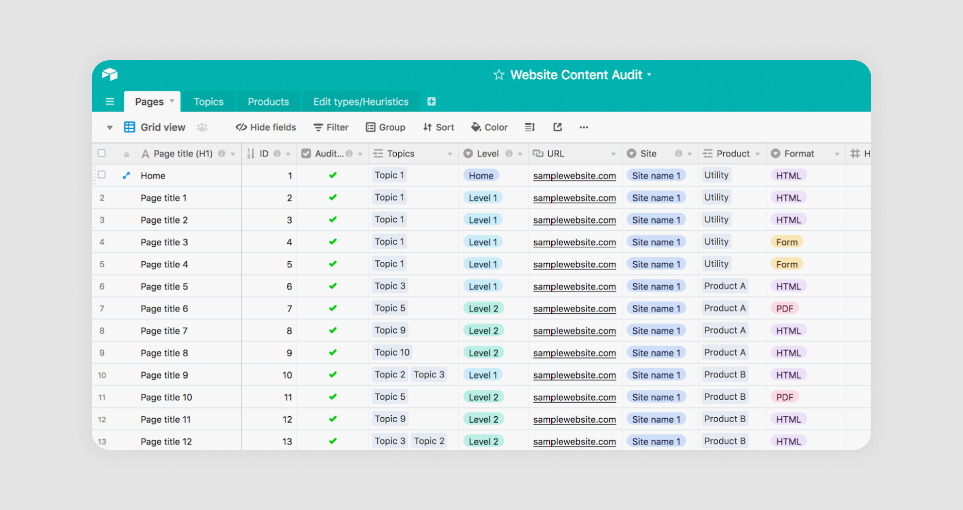
30 inspiring list UI design examples
Exceptional list designs demonstrate how structure, aesthetics, and functionality combine to create seamless user experiences. Below, we've compiled 30 list design ideas grouped by categories, showcasing diverse use cases and inspiring your projects.
1. Aliexpress
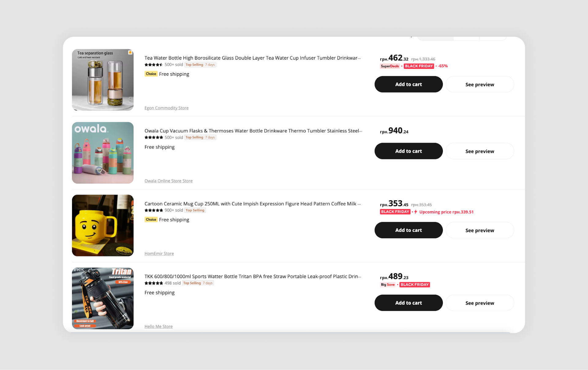
AliExpress relies on a classic vertical list format that combines product titles, thumbnails, ratings, and pricing details. The hierarchy is carefully structured so that the most important information is immediately visible.
What works: Prioritized information hierarchy ensures essential details are visible at a glance.
2. Etsy
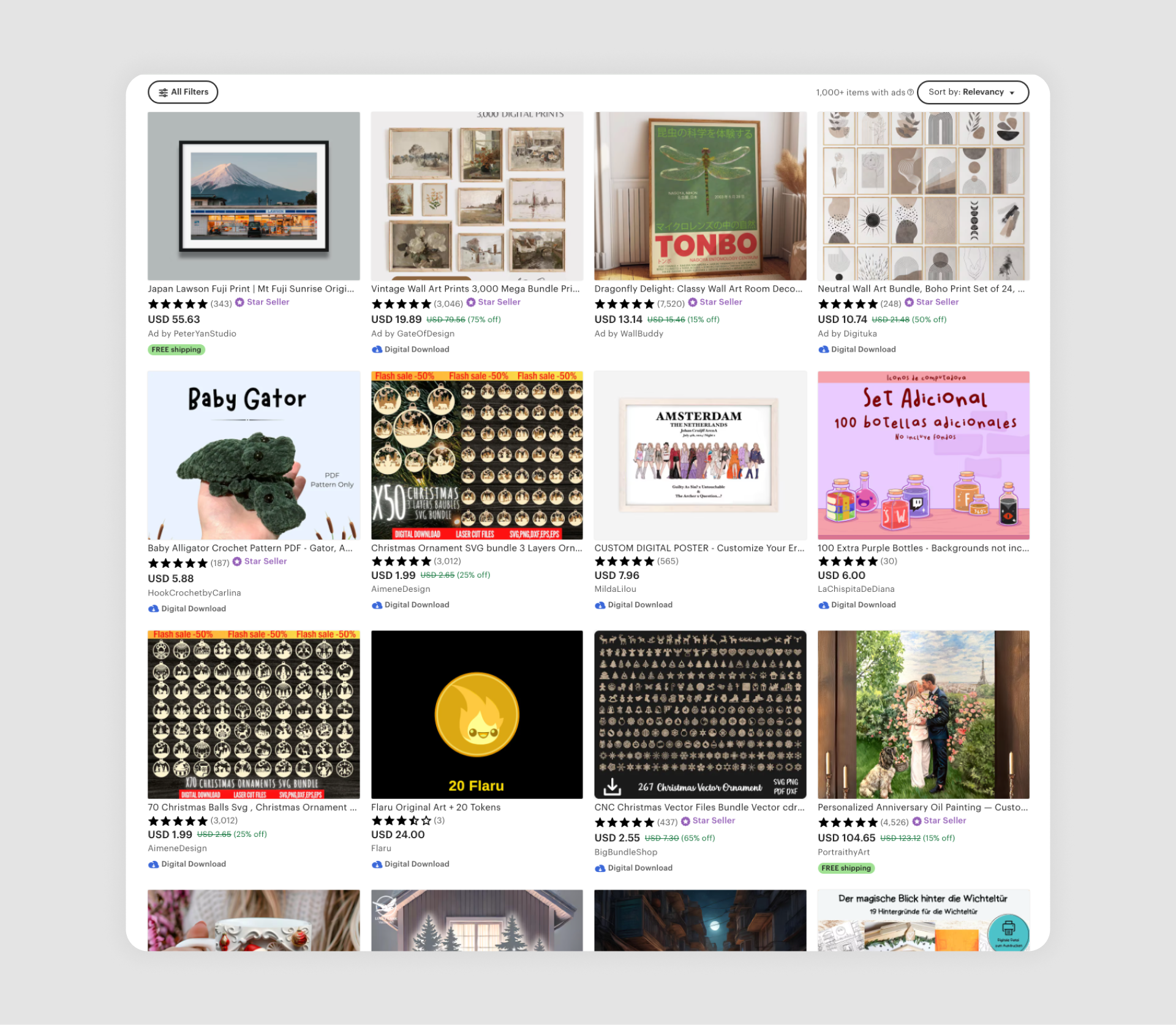
Etsy organizes its vast catalog with a grid-style list that highlights product photos, prices, and seller ratings. The strong emphasis on visuals makes it easy for users to browse and discover unique, handmade, or artistic items without feeling lost in text-heavy layouts.
What works: Beautiful visuals drive engagement, making it ideal for artistic items.
3. Todoist
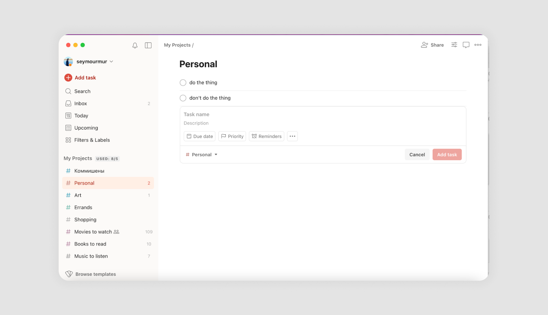
Todoist uses clean, text-based lists with a natural hierarchy that makes tasks and subtasks easy to follow. Color-coded labels and priority markers add subtle visual cues, highlighting the primary text and helping users stay organized without overwhelming them.
What works: Natural hierarchy and color-coded labels simplify organization.
4. Notion
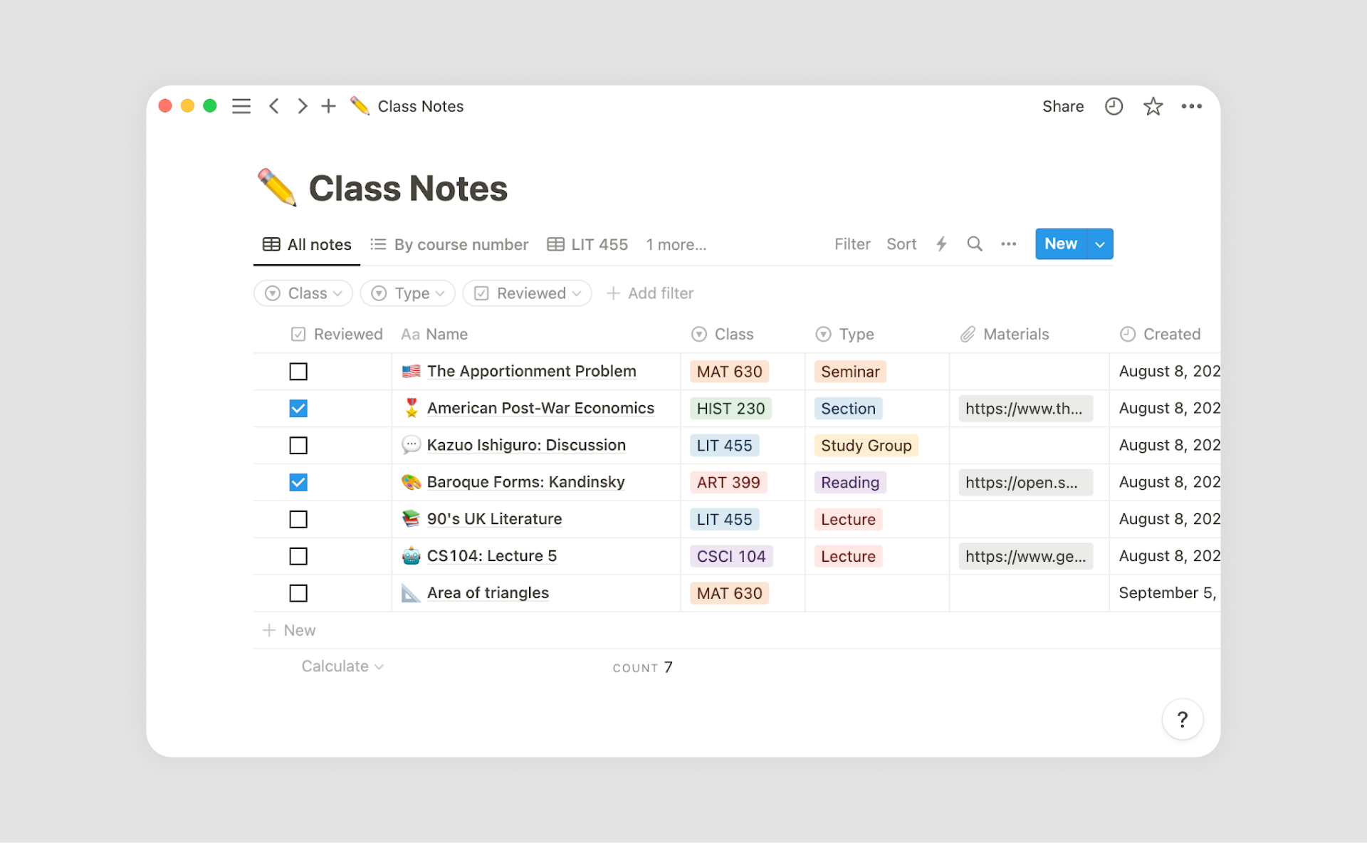
Notion takes list design to a new level by making it fully customizable. Users can combine text, images, checkboxes, databases, and links, turning simple lists into two or even three-line lists with powerful workflows. This flexibility allows teams and individuals to adapt lists to their exact needs.
What works: Flexibility for creating personal workflows.
5. Asana
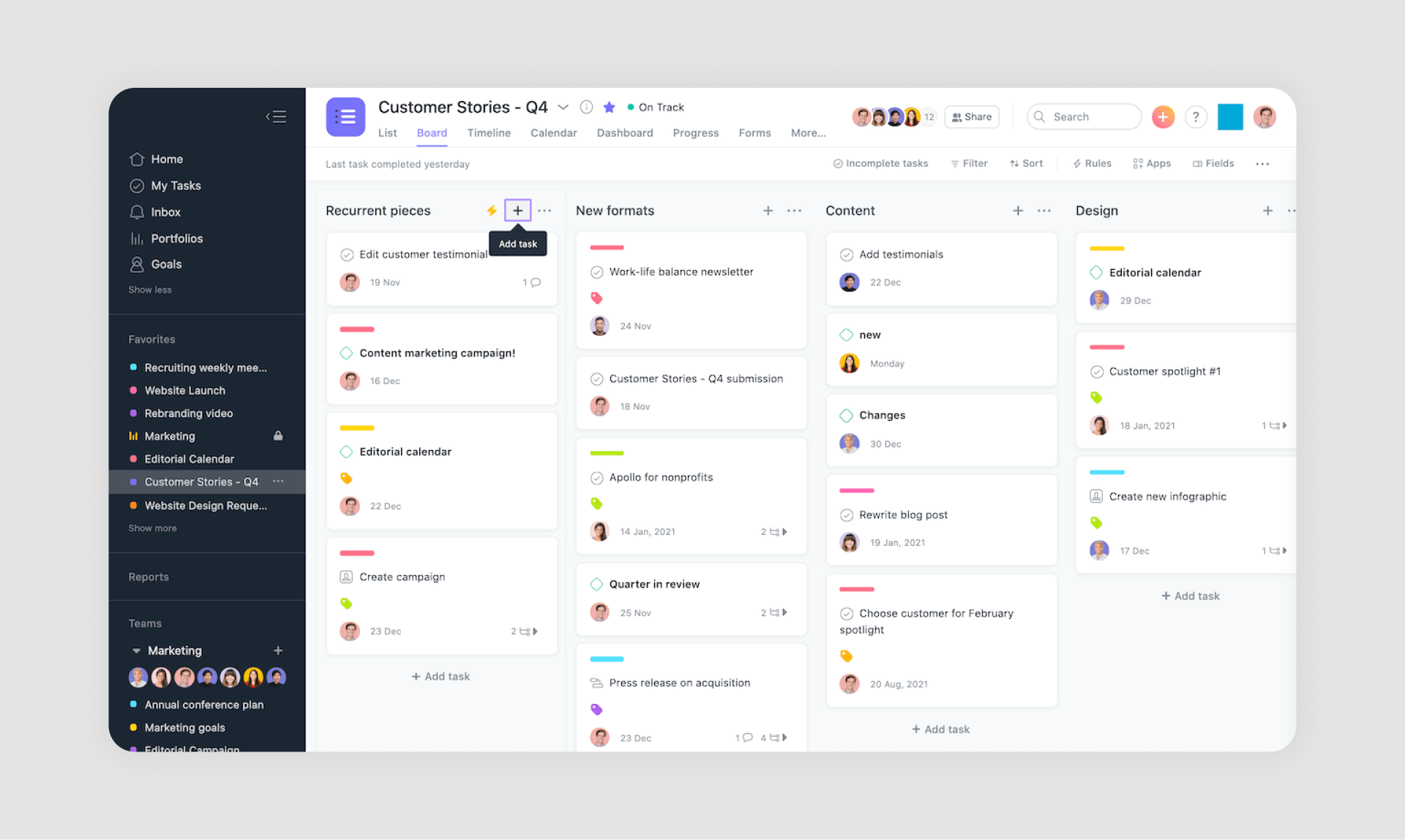
Asana blends traditional task lists with visual progress indicators, giving teams a clear sense of how projects are moving forward. Each list is enriched with tags, due dates, and status updates, which make collaboration more transparent and organized.
What works: Collaborative elements like tags and status updates streamline teamwork.
6. Netflix
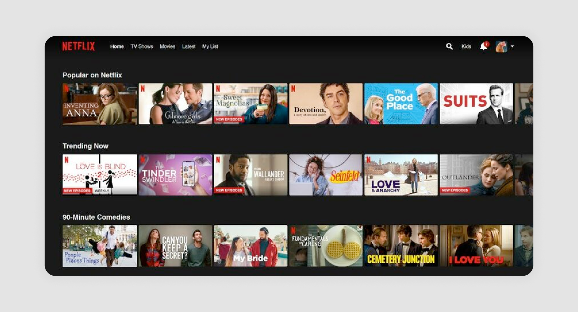
Netflix uses horizontal scrolling lists with bold thumbnails and genre labels to make content discovery feel natural and entertaining. Sections like “Popular on Netflix” or “Trending Now” ensure that users always see something relevant to their tastes.
What works: Strong emphasis on personalization with “Continue Watching” and “Top Picks.”
7. Medium
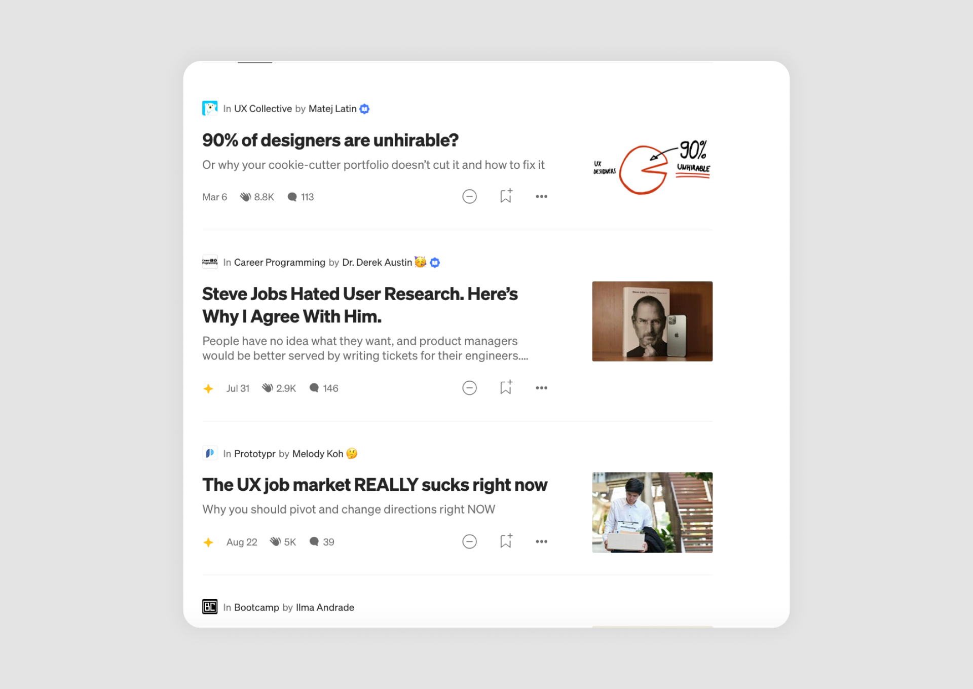
Medium presents its articles in vertical text lists that balance titles, summaries, and author details. The clean typography and generous whitespace make the content easy to scan, encouraging readers to explore more stories without feeling overwhelmed.
What works: Balanced typography and whitespace enhance readability.
8. Trello
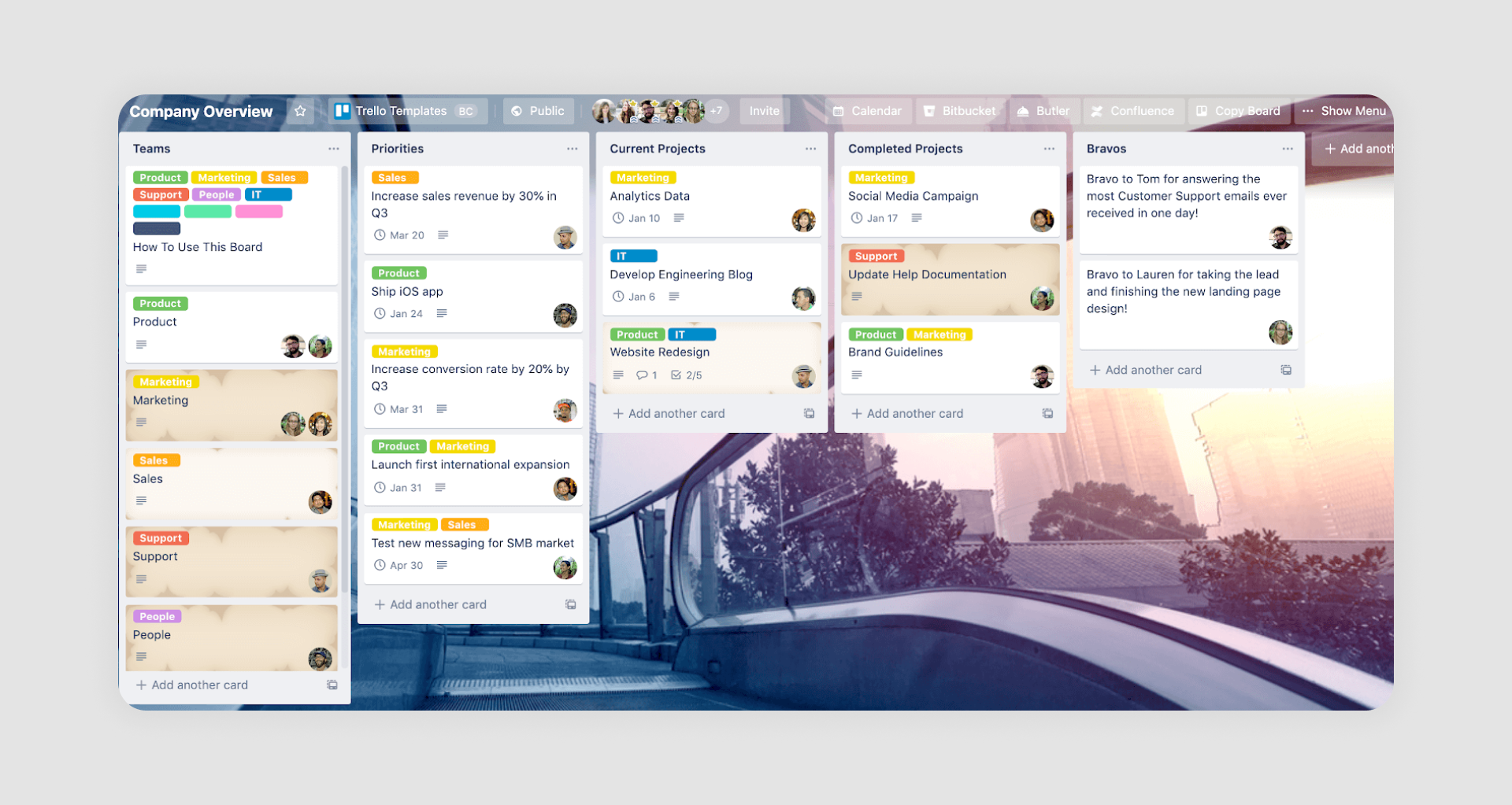
Trello is built around card-based lists that users can drag and drop to organize tasks and projects visually. Each list acts as a column within a board, giving teams a clear overview of progress at a glance.
What works: Intuitive design makes it easy to create, edit, and move items within projects.
9. Slack

Slack organizes conversations into compact message lists where each thread is clearly indicated, keeping discussions structured even in busy channels. The use of subtle color accents and labels helps users quickly spot mentions, reactions, or unread updates.
What works: Organized structure and color-coded labels simplify communication.
10. HubSpot
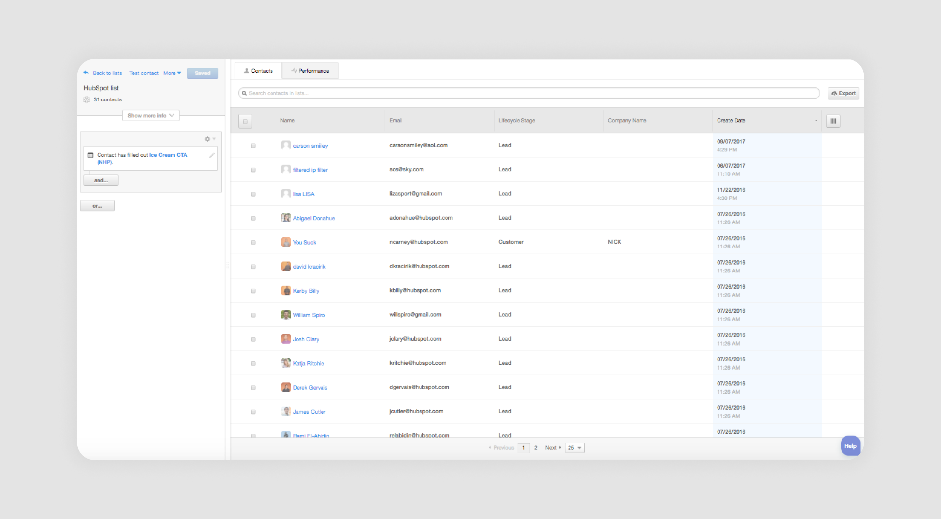
HubSpot relies on structured lead and contact lists with sortable columns and customizable tags. This design allows sales and marketing teams to tailor their views, focusing on the metrics or client details that matter most.
What works: Customization options enable users to tailor views to their workflow.
11. Jira
Jira organizes complex project data into nested issue lists, sorted by status, priority, or sprint. With powerful filters and labeling, Jira’s list design makes it easier for teams to manage large backlogs and maintain transparency across fast-moving projects.
What works: Clear labeling and filters streamline task management for teams.
12. Zendesk

Zendesk presents customer requests in organized lists that update in real time, helping support teams stay on top of incoming issues. Each query is paired with status indicators and sorting options, so agents can prioritize urgent cases and respond quickly.
What works: Live updates and sorting features aid fast response management.
13. Salesforce
Salesforce structures its client and deal data into highly customizable lists that adapt to different sales processes, with drop down menu UI allowing teams to configure views without friction. Users can add fields, apply filters, and use tags to organize large volumes of customer information in a way that matches their workflow.
What works: Robust filtering and tagging options for high-volume data handling, often complemented by calendar UI for time-based planning and profile page design for quick access to client details.
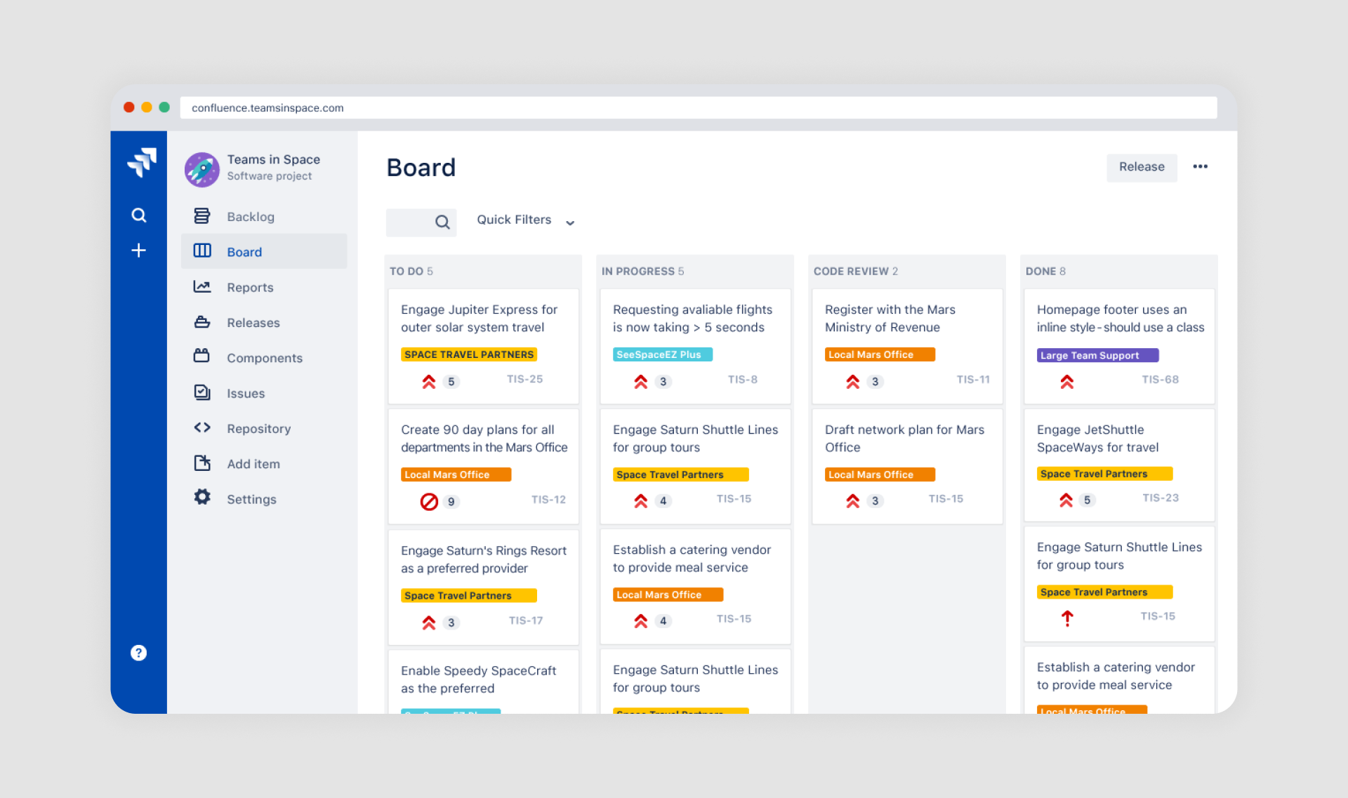
14. ClickUp
ClickUp offers highly customizable list views that allow teams to organize projects and tasks of any size. Each list can include priority tags, due dates, and collapsible subtasks, making it easier to manage complex workflows without losing clarity.
What works: Features include priority tags, due dates, and collapsible subtasks, making it easy to manage projects of any size.
15. QuickBooks

QuickBooks uses structured financial lists to help users manage transactions, invoices, and expenses with clarity. The clean table layout, paired with filters for date, status, and client, makes it simple to track income and spending at a glance.
What works: Clean financial tables with filters for date, status, and client, enabling users to track income and expenses efficiently.
16. Tableau

Tableau organizes reports and dashboards in a clear, searchable list format that simplifies access to complex data. Users can quickly locate the right visualization using categories and interactive filters, which keep large datasets manageable.
What works: Interactive filters and categories let users quickly find and analyze visual data reports.
17. Zapier
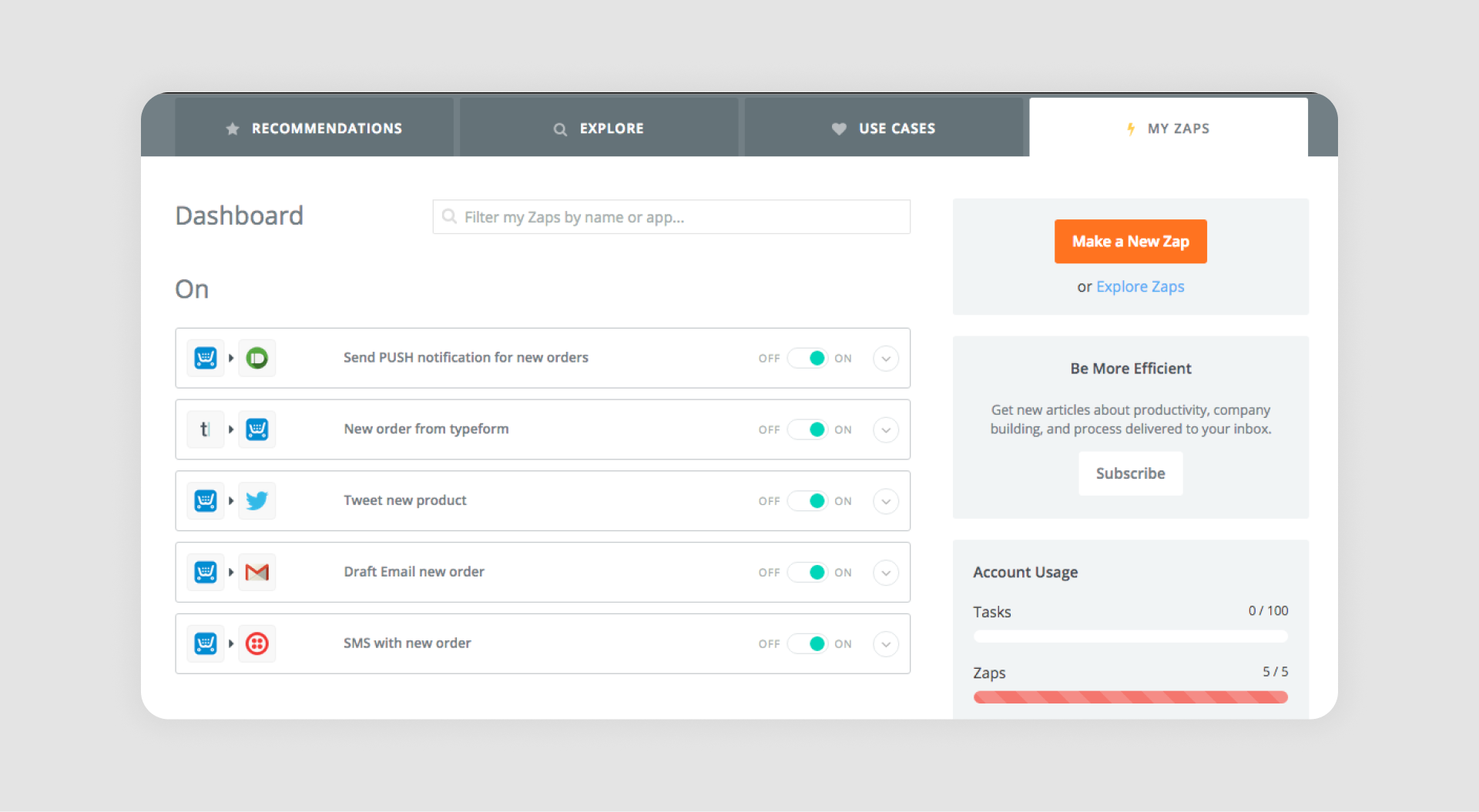
Zapier presents its workflows, called “Zaps,” in a grid-like list that gives users an overview of the connected apps, triggers, and actions. With just one click, users can move to details or edit their automations, keeping the experience both simple and powerful.
What works: In many screen design examples, this approach succeeds because accordion UI lets users expand complexity only when needed, while the grid-based list design maintains a clear overview of triggers and actions.
18. Basecamp

Basecamp structures its projects around organized task lists that combine to-dos, discussions, and schedules in one place. Each list is grouped by project and a separator line, giving teams a clear view of responsibilities and deadlines.
What works: Organized task lists grouped by project, with built-in notifications to track deadlines and updates.
19. Pipedrive

Pipedrive uses customizable pipelines and deal lists to give sales teams a clear view of their opportunities. The drag-and-drop interface makes it easy to move deals through different stages, while integrated activity tracking ensures no follow-up is missed.
What works: List views with drag-and-drop functionality and integrated activity tracking streamline sales workflows.
20. Airtable
Airtable blends the simplicity of a spreadsheet with the flexibility of a database, offering list and grid views that adapt to many use cases. Users can easily switch between lists, Kanban boards, or calendar views, making it ideal for both simple task tracking and complex project management.
What works: Users can switch between list, Kanban, and calendar views, making it adaptable for various use cases.
21. Calendly
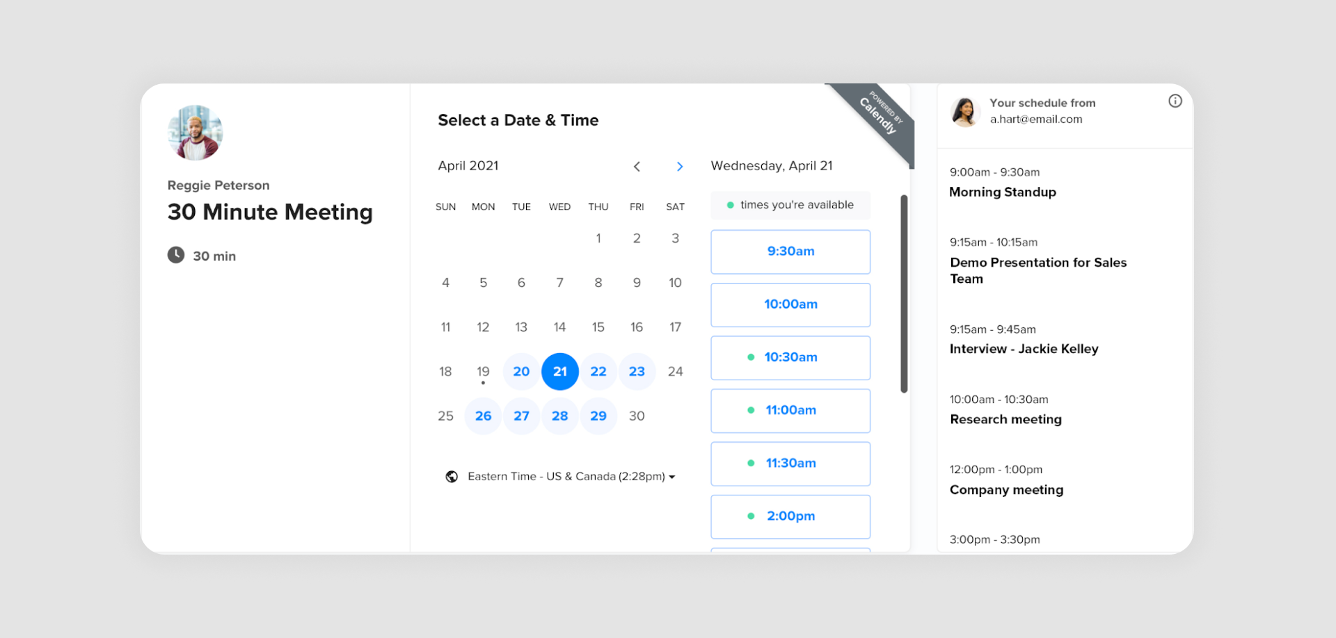
Calendly simplifies scheduling by presenting available time slots in a clean, scrollable list. The modern design removes distractions, so users can quickly pick a time that works without confusion or back-and-forth emails.
What works: The simple and minimal list layout design provides clarity and eliminates scheduling conflicts for users.
22. Notability
Notability displays notes in a scrollable list that supports both text and multimedia content. Thumbnails and highlights make it easy for users to quickly identify the right note, whether it’s a sketch, an audio snippet, or a written entry.
What works: Highlights and thumbnails in the list allow users to easily find and organize their content.
23. GitHub Issues
GitHub Issues organizes software tasks, bug reports, and feature requests in a straightforward list format that developers can easily filter and label. Milestones and tags provide extra context, helping teams prioritize what to tackle next.
What works: Filters, labels, and milestones are combined in a list format, while modal UX and radio button design support quick updates and status changes without leaving the main view, giving teams clarity on development priorities. Slider UI can further assist when adjusting ranges such as priority or effort.
24. Canva Teams
Canva Teams presents shared templates and designs in a grid-style list that combines visuals with contributor names and timestamps. Tabs UX help teams switch between projects, folders, or shared spaces without losing context. This structure makes it easy for team members to find the latest version of a file and see who worked on it last.
What works: The grid-style list combines visuals with team member names and timestamps, promoting efficient collaboration and version tracking. Carousel UI supports scanning through recent or featured designs, while input field design enables fast edits and searches, and map UI design can assist in navigating complex content ecosystems.
SaaS List UI Design by Eleken
25. Process Enablement Platform
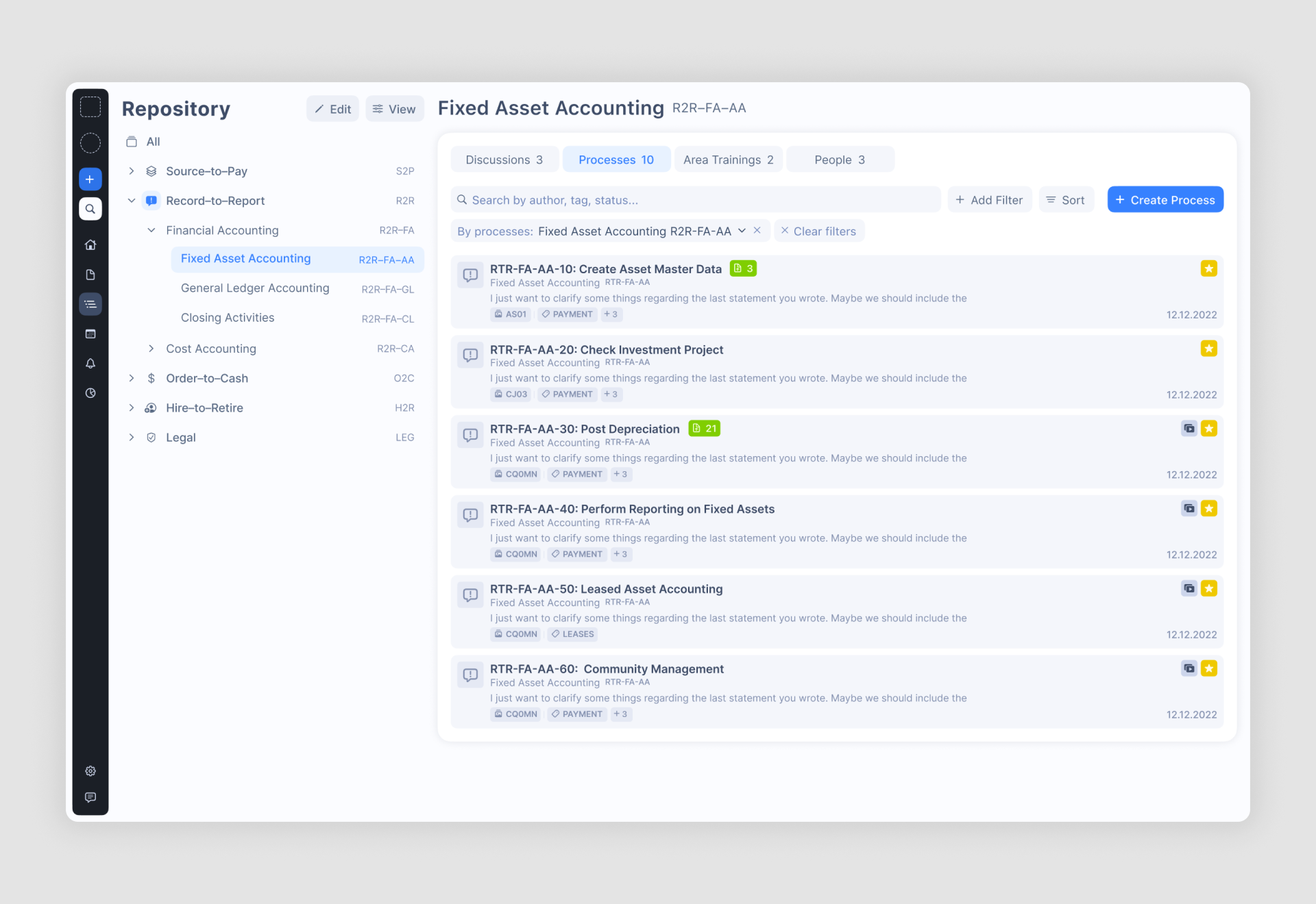
A B2B SaaS app designed to help companies manage and document their operational workflows, with dashboard design examples that emphasize clarity and structure. It categorizes processes into clear hierarchies, aiding teams in collaboration and compliance.
What works: Intuitive filters, well-executed filter UX, progress indicators, and a clean sidebar layout simplify navigation. Card UI examples help teams scan multiple processes at a glance, making it easy to track and manage them efficiently. Chatbot UI can further support users when clarification or guidance is needed.
26. Ricochet360
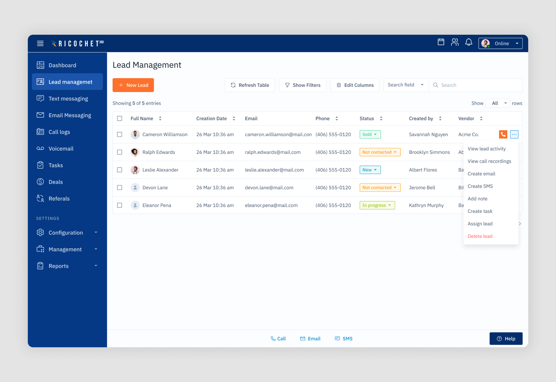
A cloud phone system and CRM platform designed to help sales teams manage leads, telemarketing, text, and email marketing in one place. Eleken redesigned the interface to shorten the learning curve for sales managers, enabling smoother onboarding and efficient scaling.
What works: Clean lead management lists with sortable columns, color-coded statuses, and improved button visibility enhance usability and help users quickly access key functions like creating or assigning leads.
27. HealthStream

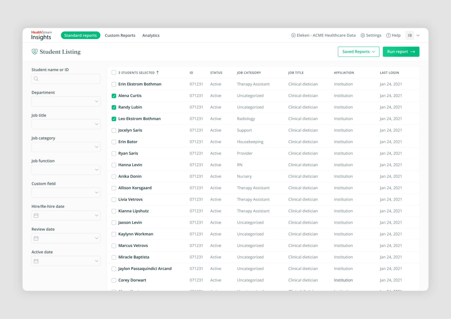
A reporting tool for healthcare organizations, designed to streamline report generation on employee training, certifications, and performance. Eleken’s redesign grouped reports into categories for clarity and introduced features like templates, filters, and scheduling to enhance usability.
What works: The first screen provides a clear overview of report categories with concise descriptions, acting as a starting point similar to stepper UI examples, while the second screen offers detailed lists with customizable filters and sortable columns. Toggle UX and checkbox UX allow users to fine-tune report parameters, ensuring they can efficiently locate and organize data.
28. Floret

A platform designed to help foodtech companies streamline the management of promotions, transactions, and payments in the food and beverage industry. Eleken created an MVP that organizes complex data into intuitive views, making it easier for small and medium-sized companies to operate efficiently.
What works: The promotional calendar screen uses Kanban and standard views, displaying key details such as promotion budgets, dates, and progress stages. Clear categorization and filters reduce cognitive load and enable users to manage promotions effortlessly.
29. Highpoint
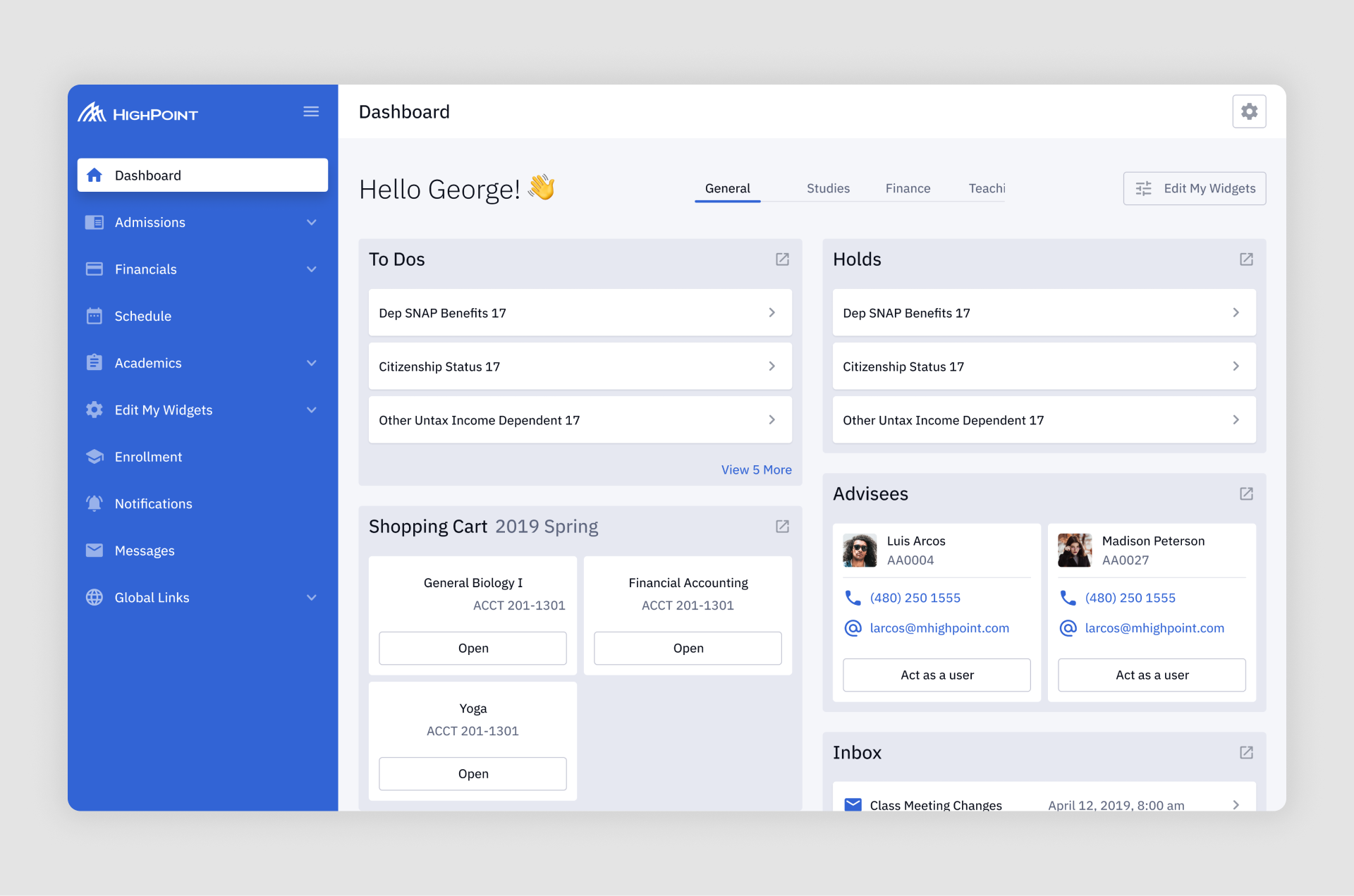
A white-label campus management solution for universities, designed to streamline student and staff workflows while allowing customization to fit individual institution branding. Highpoint incorporates tools for enrollment, scheduling, financial aid, and more into a modular system.
What works: The dashboard combines multiple types of lists, including to-do lists for student tasks, adviser lists with quick contact options, and "shopping cart" lists for course selection. Clear categorization and card-based design make navigation intuitive and visually cohesive, reducing cognitive overload.
Here you can learn more about dashboard anatomy.
30. Nworx
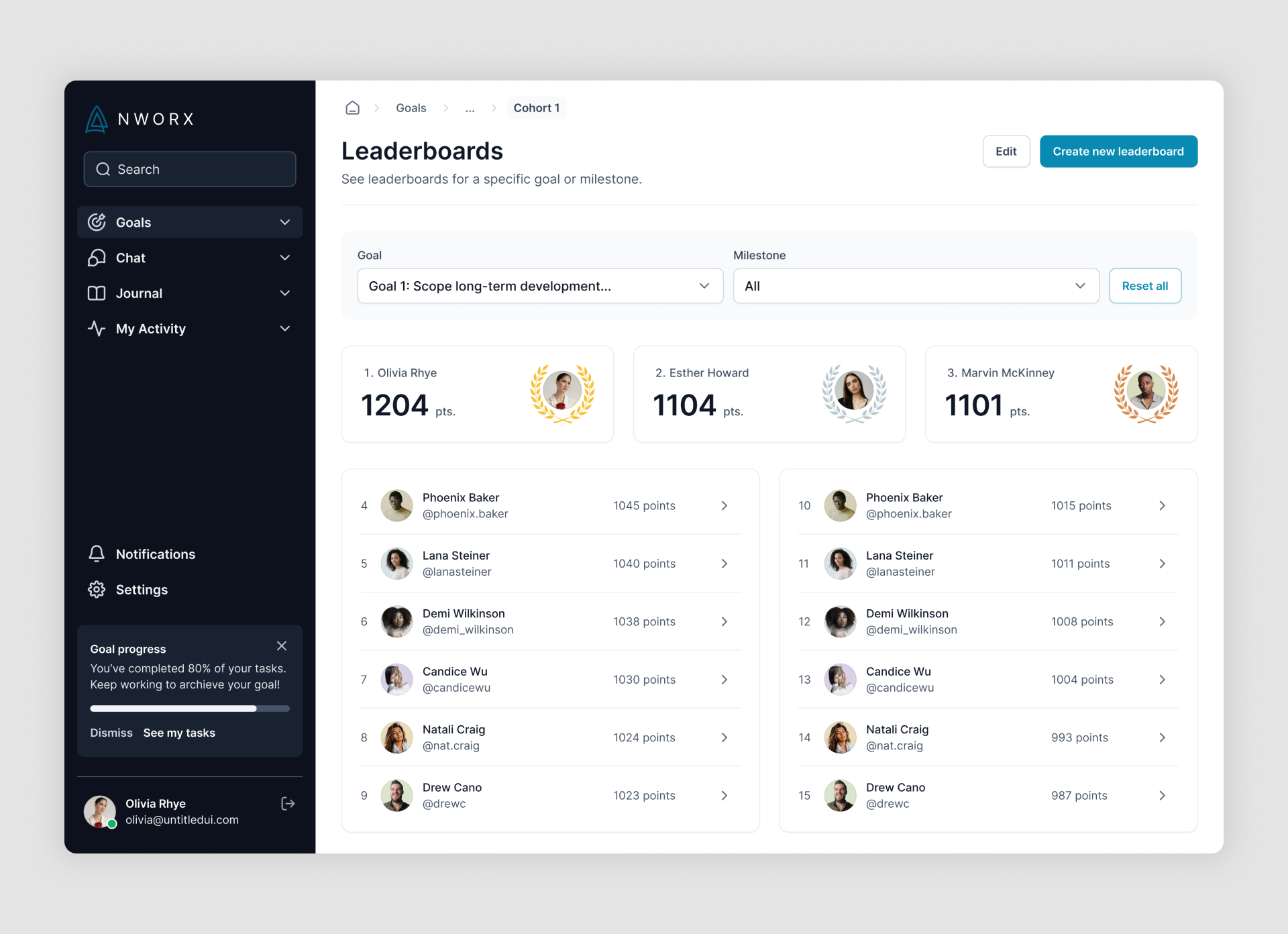
A B2B corporate learning management platform designed to integrate professional development into employees' daily workflows. The platform allows managers to create custom learning programs, assign goals, and track team progress seamlessly.
What works: The leaderboard screen uses a card-based layout for the top performers and a scrollable list for others, providing clear rankings and point-based performance insights. Filters for goals and milestones make navigation and customization intuitive, catering to managers and team members alike.
31. Order Desk

A robust e-commerce order management system with over 300 integrations, designed to streamline vendor workflows. Eleken’s redesign focused on simplifying complex processes, introducing better organization for folders, and enhancing filters and labeling systems.
What works: The "All Orders" screen features a structured table layout, making table design UX central to scanning large datasets, with sortable columns, color-coded tags for quick identification. Popup UI supports quick actions and edits, while time picker UX allows precise filtering by date and time, providing users with a clear and intuitive way to manage high volumes of data effectively.
32. IDCore
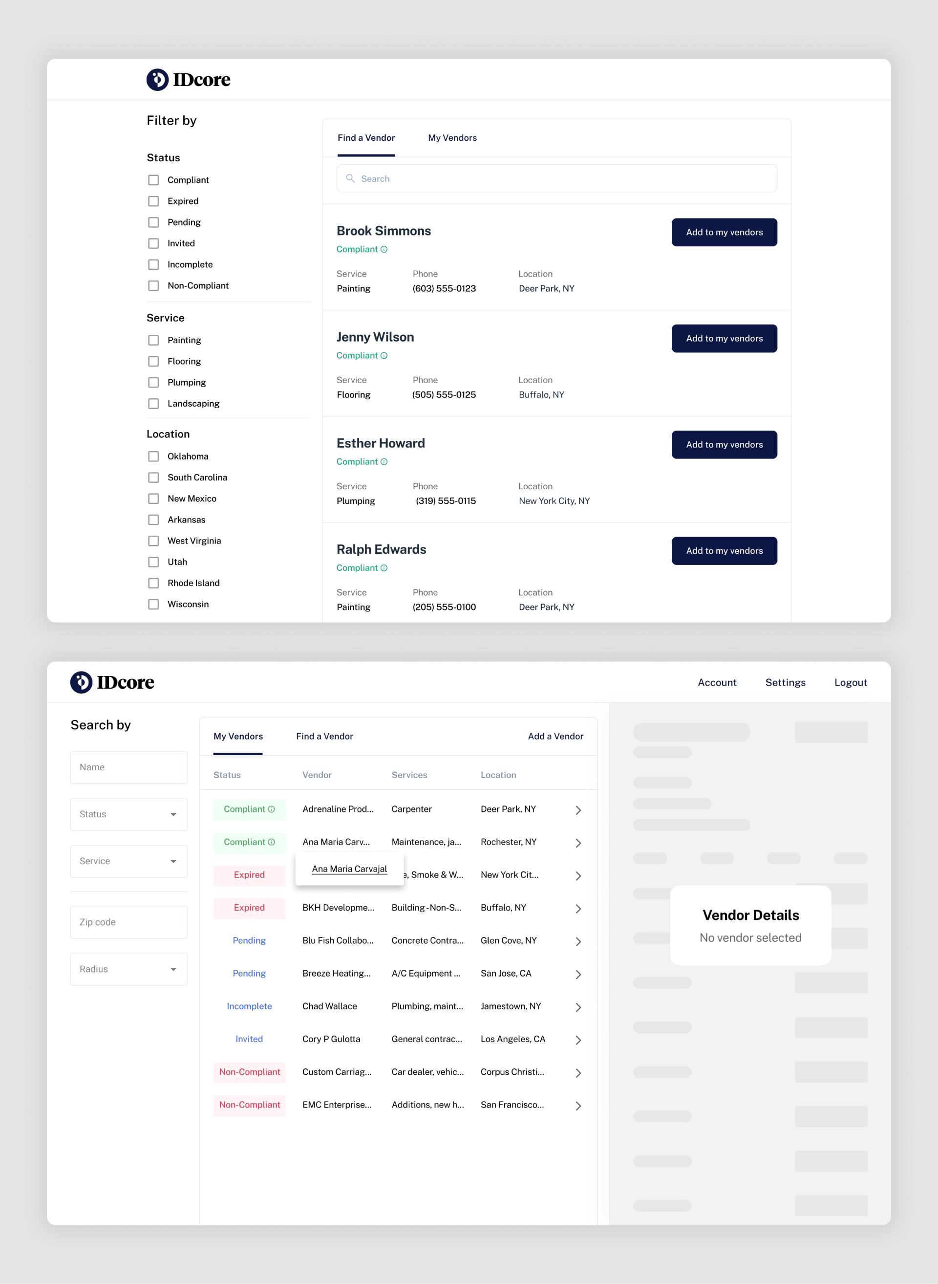
A compliance verification platform designed to simplify the management of real estate contractor requirements. It serves vendors by allowing them to submit necessary compliance documents and helps property managers find and track compliant contractors efficiently.
What works: The first screen organizes vendor data in a table format with color-coded status labels like "Compliant," "Expired," and "Pending," allowing managers to quickly assess compliance at a glance. Empty state UX clearly explains next steps when no vendors or documents are available. The second screen simplifies finding and adding vendors with intuitive filters and a card-based list displaying contact details, services, and locations. Drag and drop UI streamlines document submission, while contact form design supports quick vendor outreach, improving usability for both vendors and managers.
Build smarter list experiences
Great list design is the backbone of intuitive and efficient user experiences, whether you're managing workflows, tracking orders, or browsing content. The examples above demonstrate how thoughtful design transforms lists into powerful tools that engage users and simplify complex tasks.
Looking to create a clean and effective list design for your product? At Eleken, we specialize in designing functional, user-friendly interfaces that deliver results. Let's bring your vision to life – get in touch with us today!


.png)

.png)