We use dashboards to monitor key indicators important for our business growth. The best dashboard designs make interaction with complex data smooth and its comprehension easy. But creating such a dashboard requires the ability to combine a smooth user experience with an appealing UI to make boring analytical data easy to read and perceive.
To help you out with dashboard design, in this article, we analyze 16 real SaaS dashboard designs — including work from Eleken's portfolio and standout examples from other products — and explain why each design decision was made. This will give you some insights into what works for the dashboard design and what doesn't, and who knows, maybe you will use some of our dashboard design ideas later in your project, especially when polishing form design inside your dashboard.
But before we go any further, a quick definition.
What is a dashboard in design?
Dashboards are used in SaaS apps to provide customers with a quick overview of key data and metrics. Since the piles of numbers are not something people can easily grasp, dashboards tend to showcase the data visually, using graphs, pie charts, tables, maps, and so on.
Depending on the data, we can divide SaaS dashboards into three types: operational, analytical, and strategic.
- Operational dashboards are the most common. Much like the dashboard on a car, they provide real-time information for operational decisions.
- Strategic dashboards show the data that is essential for long-term decision making: a bird's-eye view of key performance indicators (KPIs), integrated data from different departments, and performance indicators in a retrospective view.
- Analytical dashboards are the most complex ones. They not only display the data, but also allow users to slice and dice data points across multiple variables.
Now that we're done with the theory, it is time to provide you with the promised dashboard design inspiration. At Eleken, we have extensive experience working with complex SaaS products and designing dashboards — and we've also studied what makes other great dashboards tick. So let's dive in!
1. TextMagic. A CRM dashboard design example
TextMagic is a customer experience platform that hired Eleken to design some of its new features. Our scope of work also included dashboards for managers to understand chat performance and customer satisfaction.
The dashboard we designed for TextMagic belongs to operational dashboards, and it had to fit quite a lot of data of different types. So, the most important part of our job was to split the data into separate groups visually, so that users could differentiate them easily at a first glance. But instead of trying to squeeze all the data into a single screen, we created different tabs which you can open when needed, and this way, leaving the screen clean and minimalistic.

Takeaways:
- use different graphs and charts for different types of data;
- create multiple tabs to clean up the screen and not overwhelm users;
- clear visual hierarchy is a must;
- bar charts are well-suited for comparing data across different categories;
- color-coding is one of the most important aspects of directing the users' attention.
2. MyInterview. A dashboard for a video interviewing platform
The MyInterview dashboard features a clean and organized layout, ensuring that users can quickly access and interpret the information they need. The use of tabs across the top—such as List View, Kanban View, Scorecard, Conversations, and Analytics—enables users to switch between different data perspectives easily, maintaining a streamlined and clutter-free interface.

Takeaways:
- provide clear visual cues, like color-coded status indicators, to help users quickly understand important information, following the clarity seen in chatbot UI and card UI examples;
- use tabs to separate different data perspectives, keeping the layout clean and uncluttered;
- display trends with simple, clear graphs to help users make informed decisions efficiently.
3. Gridle. A dashboard for a client management platform
Gridle is a client experience platform that made an operational dashboard the first screen a user sees after opening an app. The dashboard displays the number of leads in the funnel, the number of closed deals, and other important information that helps users understand their current progress.
We needed to visualize different types of data here, so we decided to use different graphs for them to be easily recognizable. For example, the pie chart breaks up the proportion of the lead sources. We could have visualized the funnel count in the same way, but we needed to make the information distinctive, so we chose the next best option – a segmented bar chart. And line graphs work perfectly for leads tracking. This focus on choosing the right visual metaphor for each data type is a core element of human-centered design for data products, ensuring the interface speaks the user's language.
Normally, designers use different colors to help the user differentiate between different types of data, but as we used multiple charts instead, we were able to keep one color palette so that the dashboard’s look and feel won’t become overwhelming.For users to see all the trends clearly, we opted for contrasting colors, such as red, blue and green. While this specific project focused on operational metrics, the same principle of visual distinction applies to geospatial product design, where overlapping data sets must remain legible through shape and form rather than just colour alone.

Takeaways:
- line charts are useful for displaying trends over time, especially when combined with filter UX patterns and layout ideas borrowed from accordion UI and screen design examples;
- pie charts are great for visualizing proportions (in this case, the source of lead);
- green or blue and red are the go-to colors when you need to visualize some kind of a yes or no situation (here, closed won and lost leads).
4. QUEST. Analytics dashboard design for a gaming platform
QU3ST, a gaming analytics platform, needed a design that would stand out from the competition. Initially relying on generic Material design templates, the team turned to Eleken to craft a unique, brand-aligned dashboard that could handle large datasets while still looking sharp.
We created a clean dashboard that balances aesthetics with functionality. It features intuitive data visualization tools that allow users to analyze trends and performance metrics with ease. The flexible design lets users customize reports, add data, and save different dashboard views, making it adaptable to both high-level overviews and deep dives, while aligning with best practices in list UI design and modal UX.

Takeaways:
- use color-coded line graphs to clearly distinguish between different datasets, making complex data easy to interpret;
- offer customization options that allow users to tailor the dashboard to their specific needs, enhancing usability, with interface elements such as slider UI controls, radio button design, and carousel UI components supporting flexible interaction;
5. Ricochet360. Dashboard for a cloud phone system
Ricochet360 is a cloud phone system that came to Eleken for a redesign to make the app more intuitive. Ricochet was a complex software, and its old product design didn't make things any easier. It took more than a month to onboard new users, so making things easier on them was the number one priority.
To solve the issue of the cluttered dashboard, we first of all again made use of creating different tabs that the user can engage with when necessary. This allowed us to remove the unnecessary data from the primary screen.
Designing a layout with a clear visual hierarchy and different types of charts allowed us to create a composition which is easy to understand at a first glance. We also used colors to guide the users' attention and designed simple and intuitive icons, complemented by consistent input field design, map UI design elements, and clean tabs UX.

Takeaways:
- when the product is overly complex, leave only the necessary data;
- divide the data into various types of charts and position respective modules with a clear visual hierarchy, using familiar patterns like stepper UI examples, toggle UX, checkbox UX, and time picker UX to maintain consistency;
- use colors and icons to provide visual cues.
6. Hirerise. A dashboard for an applicant tracking system
Hirerise is an applicant tracking system. Its dashboard is the first screen users see when they open the application — it provides a detailed view of the most important information. The goal was to not only visualize the information but also to help the user start their day right. Here, except for the data, they see their daily tasks and agenda, which are connected to said data. So, key numbers and the calendar all work together.
Trying to fit them into one screen, however, would've led to one horrendous interface. So, we used different tabs to separate the data. In the "overview" section, the user gets the general idea of what's happening, while clicking on one of the following tabs will allow them to dive into the nitty-gritty details of their daily tasks.
Simple numerical information can be separated as cards or, in this case, just plain cells. Still, we had to ensure that, first of all, there was a lot of space between them to be easily recognizable, and that there was a clearly readable font hierarchy (small, light gray vs bold and black) so the user's eye immediately lands on the data that matters. This ensures that data-intensive apps remain navigable while keeping consistency with popup UI, table design UX, and empty state UX patterns.
Linear graph, as always, was a go-to option to visualize the progression over time. This classic element of data visualization design provides the most intuitive way for users to track hiring trends without cognitive overload.

Takeaways:
- when presenting data, try to divide the dashboard into tabs (here: overview, calendar, tasks, and activity);
- mind the fonts and the spacing when presenting plain numbers, applying the same clarity used in drag and drop UI, contact form design, and calendar UI.
7. Tymewise. Time-tracking web app dashboard
Tymewise is a time-tracking web application. When designing a dashboard for this product, we aimed to build a simple yet informative tool that would help users spend their time more efficiently. Time is the key metric here, and the app allows comparing the data from this week to the last one, for which bar charts are a perfect design choice.
When we needed to demonstrate time spent on work and money gained, we went with simple numbers. Bold black font and enough spacing allow the user to read them with ease. We used different lines for time and money, as well as different formatting, so the user doesn't get confused. The design remains minimalist and helps to differentiate between points of data without making the screen too stuffed, echoing the same clean logic that powers well-structured drop down menu UI and thoughtfully crafted profile page design.

Takeaways:
- don't complicate things unnecessarily. Some data – like time – works best if left simply as numbers;
- use different formats so that numbers for time, money or anything else don't look all the same;
- distinctive fonts and a lot of white space are your best friends.
8. ProsperWorks. Google-compatible CRM dashboard
When designing this dashboard, the ProsperWorks team focused on making it feel familiar. If you've used Google's apps before, you'll feel right at home here. This strategic choice helps new users feel comfortable right from the start. This type of familiarity is a powerful tool in data product UX, as it leverages existing mental models to reduce the learning curve for complex systems.
Now, we all know CRMs can be a pain to learn. So designers fill the dashboard with sample data, so that new users can explore and see what the system can do without having to input their own info right away. This approach serves two purposes: it demonstrates the platform's value proposition and eases the onboarding process.

Takeaways:
- show, don't just tell. Let users play with sample data to get a feel for your product;
- incorporate familiar design elements to reduce the learning curve for new users.
9. PublishXI. A dashboard for a corporate LMS
PublishXI is a web and mobile app design for a corporate learning management system.
Its dashboard offers three types of data classified by levels: Organizational, Content, and User. In the screenshot below, you can see the Organizational layout. It helps learning managers to understand how many publications the learners have viewed and how many tests they have taken.
Creating three different types of permissions and roles for the dashboard is a typical practice for LMS as it works best to create a superb user experience for management, content makers, and learners alike.
Compared to the previous cases, here we had to work with plain numbers much more. But instead of a simple spreadsheet format, we went for the cards. Spacing between them and background distinction made it possible to show a lot of numbers without them being mixed up together.

Takeaways:
- Don't try to throw everything into one place. Find a way to organize and divide your information by its type or the intended users;
- using card design is a great way to organize data dashboards that can't actually be visualized in graphs;
- make sure your numbers are large and immediately clear;
10. Haven Diagnostics. Dashboard UI design for a healthcare app
Haven Diagnostics was the first company to apply the mathematical models for projecting the infection risk used in the health industry to corporate offices. Therefore, their dashboards are very specific and designed with a unique focus on healthcare UX, significantly differing from the screens we’ve already seen.
One of Haven Diagnostics' dashboards is dedicated to the forecast. It shows contagion graphs with future projections and represents an example of an analytical dashboard. Two contrast-colored lines of a line chart type are perfect for showcasing competitive trends over time.

Another dashboard we made for Haven Diagnostics is more typical. Green/blue, red, and yellow colors are used to communicate the relevant information. The layout with two distinctive columns also helps to differentiate the data.

Takeaways:
- don't be afraid to create an unusual look if it serves a specific purpose;
- line charts are perfect for visualizing time-dependent dynamics of pretty much anything.
11. HabitSpace. Dashboard design idea for a habit-tracking app
HabitSpace is an engaging mobile app that helps people with detailed tracking of their habits and improve their quality of life. The analytics tab of the app shows users the summary of their overall progress and the completion rate for every habit. This is one of the most cheerful UI dashboard examples because it has to be appealing for a regular user.
For B2C apps, simplicity, engagement and even gamification work the best, so we leaned into them all heavily. We used cheerful colors and quite a lot of emojis. Both of them allow the user to navigate between the tasks easily. And emojis (as well as illustrations) work great as a gamification element.

Takeaways:
- when you're designing a B2C dashboard, try to make it as simple and intuitive as possible;
- for apps, keep yourself grounded in mobile design patterns.
12. Pixlee. Marketing platform dashboard design example
Pixlee presents a masterclass in dashboard design with its simplified metrics display. This dashboard effectively balances the need for comprehensive data with an easily digestible format. The design team created a layout that puts the most important info front and center. They carefully chose which metrics to show and how to present them, ensuring they provided actionable insights. As a result, they've created a dashboard that quickly communicates value to users.

Takeaways:
- prioritize clarity and simplicity in dashboard design to avoid information overload;
- use a logical information hierarchy, placing the most crucial data at the top, and more details as you scroll down;
- employ graphs selectively to highlight important trends without overwhelming the user.
13. Brand24. A dashboard for a social media monitoring app
Brand24 tackles a tough challenge: making sense of the chaotic world of social media. Their dashboard design focuses on turning that chaos into manageable information for businesses.
The secret sauce in Brand24's dashboard is how they introduce it to new users. Right after you sign up, they guide you through the dashboard's features. This way, you can quickly see the value and start using the platform effectively.

Takeaways:
- show value right away by populating the dashboard with some initial data
- don't overwhelm new users - introduce features step by step;
- use contrast to draw attention to important parts of your dashboard;
- explain each feature clearly and briefly - tell users why it matters and how to use it.
14. Refera. Dashboard for a dental referral solution
Refera has an operational dashboard that helps to see all referrals at a glance and understand which doctors and practices perform the best. Here, there are no bright visuals. Everything holds due to the clear-cut informational blocks, so this is one of the noteworthy dashboard layout examples.
As we needed to combine the metrics with the lists of specific doctors – which appeared depending on the metrics – we combined the cards with the spreadsheets. As we've mentioned previously, spreadsheets work best when you need to visualize the list of people with specific characteristics (here, even with actionable buttons). And cards allow to distinguish between plain numerical data without the numbers turning into a mess. Green colors work for the medical field, and as there's no need to dramatically emphasize specific bits of data, the color palette remained quite muted.
While this medical dashboard focuses on practice management, the logic of combining high-level cards with detailed lists is often mirrored in geospatial UX, where a map view provides the spatial context while a side-panel spreadsheet handles the detailed attributes of specific locations.

Takeaways:
- Once again, card design helps to organize the key information, which cannot be easily visualized;
- when you don't have lots of charts and graphs, you can stick to a relatively monochrome color scheme.
15. Koemei. A SaaS dashboard for a video discovery app
Koemei is a SaaS platform that makes videos searchable. For them, we designed one of our best simple dashboard design examples. It shows users two crucial metrics: the number of total searches through video content and the number of searches with results.
As the main goal of the dashboard was comparing the dynamics of these two metrics, we went for the line chart, which is best for the purpose. When possible, it's best to keep design as simple as possible, and here we managed to do that.

Takeaways:
- when possible, always aim for simplicity and minimalism.
16. Prift. Dashboard UI design example for a finance app
Prift aims at helping manage one's finances. This is one of the best dashboard UI examples when it comes to visualizing various data points in a way that is legible to the customer.
Moreover, this dashboard is aimed to help the user make decisions. So, it should be clear in any given tab what to pay attention to first. We needed to visualize clearly what loan the person should take care of first. This was managed through the use of contrasting colors, as well as different types of graphs. The pie chart allowed us to break down the proportions.
We broke down different types of finances into different tabs. For example, with pension, users need to see their own dynamics and progress, but also compare the different pension pots so they are able to make informed decisions. A linear graph helps with that.
We clearly differentiated zones with different data types, as well as emphasized the necessary charts.


Takeaways:
- mix various charts when you have a lot of numerical data;
- if you're dividing the dashboard according to data categories (for example, here we see separate screens for pension and for loans and debts), make sure key elements are designed similarly to ease the navigation.
Dashboard templates for inspiration
If you want to skip the blank-canvas anxiety, start by exploring ready-made dashboard templates. Even if you plan to design your own from scratch, browsing existing designs will help you see how different industries visualize data, structure layouts, and apply color hierarchies.
Here are some of the best places to find quality dashboard templates:
Dribbble
Dribbble is a playground for UI designers to showcase their work, and dashboards are one of the popular categories. You’ll find everything from clean, minimal analytics layouts to bold, experimental concepts. While many designs are conceptual, they’re a great way to spot emerging trends, color palettes, and layout ideas you can adapt for your own product.
Behance
Behance is ideal for in-depth case studies, where designers present full dashboard projects with context, wireframes, and design systems. Browsing here can help you understand not just how a dashboard looks, but why it’s structured in a certain way. It’s a valuable source for seeing complete workflows from concept to final UI.
Figma Community
The Figma Community hosts thousands of free and premium dashboard UI kits shared by designers worldwide. Most templates are fully editable, allowing you to swap colors, adjust typography, or restructure components to match your unique brand identity. It’s one of the fastest and easiest ways to move from inspiration to a working prototype quickly.
ThemeForest
ThemeForest offers a massive library of HTML, admin, and SaaS dashboard templates that are ready to implement instantly. Many come bundled with responsive design and built-in interactivity, making them suitable for quick prototyping or full-scale production use. If speed to market is your top priority, this marketplace is definitely worth exploring.
Designspiration
Designspiration is a curated search engine for creative work across design disciplines, including UI. While it’s not dashboard-specific, you can find striking interface layouts, typography treatments, and color combinations to inspire your project. It’s especially useful when you want to think outside the “standard” dashboard look.
Dashboard design best practices
As we at Eleken provide UI/UX design services for SaaS products, making complex things look simple with the help of minimalist and intuitive design is literally in our blood. To create a clear and easy-to-navigate dashboard, we always take the target audience into account and follow innovative concepts in dashboard design. This way we ensure your dashboard communicates the most significant data for the customer in the easiest-to-get way.
Each dashboard has its own purpose and conveys different kinds of information. Still, there are some common dashboard design best practices suitable for all types of progress reports.
.png)
- Stick to the five-second rule. It should take no more than five seconds for the user to find the most important information on the dashboard. In case you look through the data in search of a needed index for a longer period, it means the visual layout requires some improvements. The user wants to have all their questions answered as quickly as possible.
- Take care of creating a clear and logical layout. Divide all the information into three parts in descending order of importance. Put the most significant indicators on the top, continue with trends that explain the above insights, and put details that allow learning the issue deeper at the end. This will make the dashboard clear and easy to read.
- Display only key metrics. Avoid overwhelming users with excessive details that dilute the value of your dashboard. Since human memory can comfortably process around seven visuals at a time, aim to present only five to nine key metrics or charts. This focused approach keeps users oriented, reduces cognitive load, and ensures their attention stays on what matters most.
- Visualize data in the most effective way. Organize information so it’s instantly clear and easy to interpret. For instance, use pie charts to compare proportions between categories and line graphs to show changes or trends over time. Choosing the right visual format helps users grasp detailed insights faster and with greater accuracy.
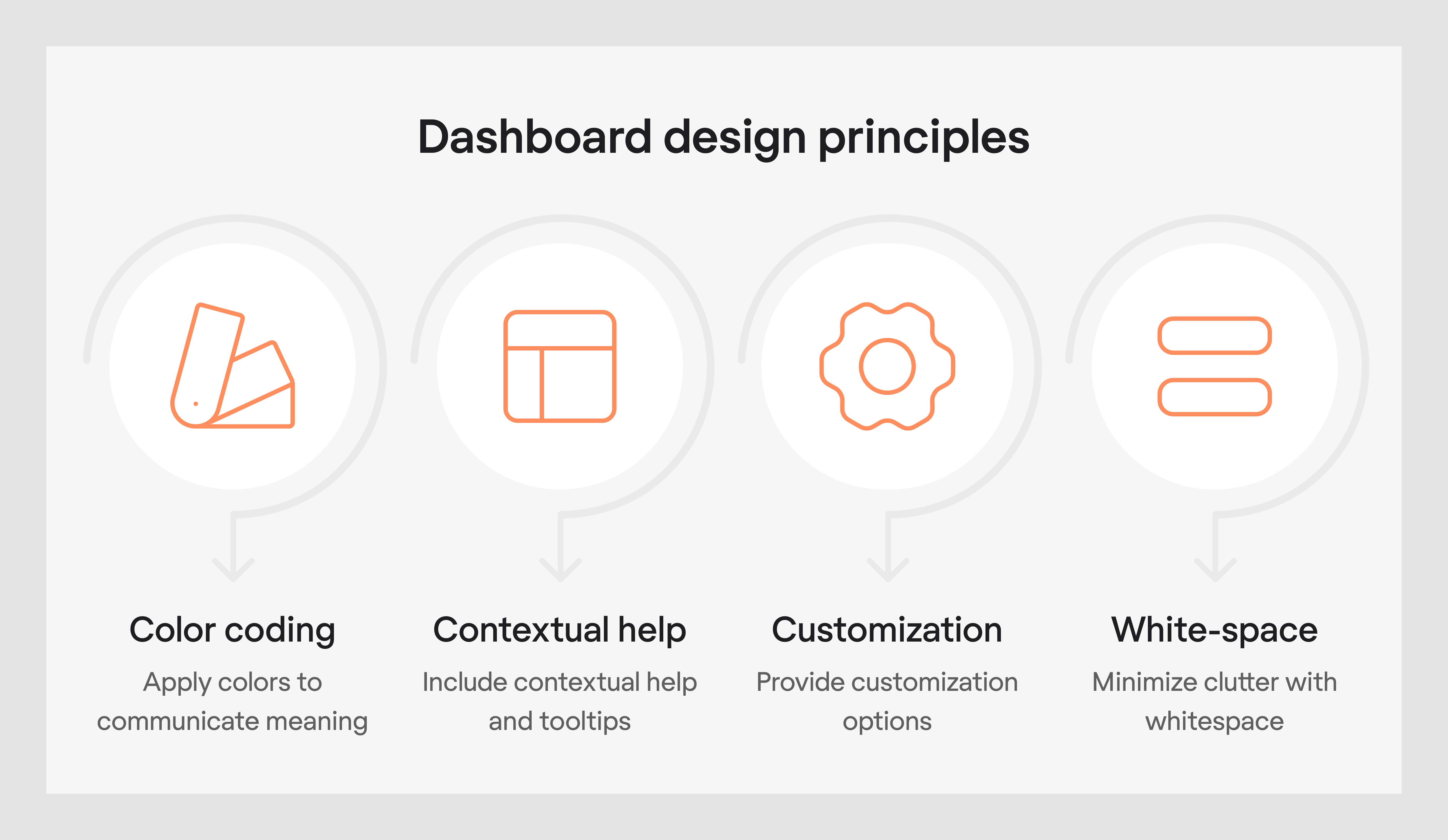
- Apply effective color coding. Use colors purposefully to communicate meaning rather than for decoration. For example, green can indicate positive performance, red can signal problems, and yellow can mark items that need attention. Keep your palette consistent across the dashboard so users can interpret the right data at a glance without relearning color meanings each time.
- Include contextual help or tooltips. Not all users will immediately understand every metric or term, so providing quick explanations helps them stay on track. Tooltips, info icons, or short inline descriptions can guide users without taking them away from the dashboard. This approach reduces confusion and ensures users can interpret data accurately.
- Provide customization options. Different users often have different priorities, so letting them choose which metrics to display or how to arrange widgets increases dashboard relevance. Options like resizing modules, changing chart types, or saving personalized views help ensure the interface adapts to individual workflows.
- Minimize clutter with whitespace. A crowded layout makes it harder for users to focus on the information that matters most. Strategic use of whitespace between interactive elements improves readability, reduces visual noise, and creates a cleaner, more professional appearance. A well-spaced design also makes it easier for the eye to scan and find key insights quickly.
Final thoughts
Dashboards are an essential part of SaaS applications that help users gain valuable insights and make data-driven decisions.
How do you make a good dashboard design? You consider carefully the audience, the type of data being displayed, and the business goals the dashboard is intended to support. Good dashboard design examples might come in various forms. The things they have in common are clarity, simplicity, and clear hierarchies. Every dashboard is unique and requires a careful personal touch.
At Eleken, we can provide personalized solutions regardless of your industry and complexity. If you're looking for ways to make complicated data look simple, look no further, just drop us a line!


.png)


.png)
.webp)