Some designers believe anything that hides content is bad UX. If users can't see everything at once, won't they get lost? Still, tabs are everywhere — navigation, mobile apps, dashboards. If they were truly a UX crime, wouldn't they have disappeared by now?
The truth is, tabs UX isn’t inherently bad. When used correctly, it organizes content, reduces cognitive load, and creates a cleaner interface. When used poorly, tabbed UI frustrates users, buries key information, and turns navigation into a guessing game.
So how do you make tabs work for your design instead of against it? In this guide, we’ll break down the best practices we’ve learned while designing SaaS applications since 2015, showcase real-world examples, and highlight common mistakes. We’ll also explore when tabs are the wrong choice and what UX patterns work better instead.
What are tabs in UX design?
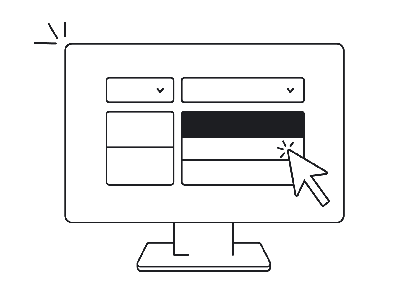
Tabs are a UX pattern used to organize content within a limited space. They allow users to switch between different sections without leaving the current page, keeping interfaces cleaner and more structured.

But not all tabs serve the same purpose.
In-page tabs vs. navigation tabs
Not all tabs work the same way. There are two main types:
- In-page tabs: These divide content within a single page. Think of product pages on e-commerce websites — specs, reviews, and Q&A sections are neatly separated but still accessible without a page reload.
- Navigation tabs: These help users switch between entirely different pages or views. Google Drive, for example, uses tabs like “My Drive” and “Shared with me” to categorize content at a higher level.

Understanding this difference is key because mixing up in-page and navigation tabs can lead to usability issues. Users expect in-page tabs to be fast and seamless, while navigation tabs often come with page loads and structural shifts.
Why is tabs design good for your product?
Tabs work because they align with how we process information. Instead of overwhelming users with too much at once, tabs break content into digestible chunks. This technique, known as content chunking, reduces cognitive load and helps users focus.
There’s also a mental model at play. Users instinctively understand tabs because they mimic real-world objects — think of file folders or dividers in a notebook. When a design follows this expectation, tabbed navigation feels natural. When it doesn’t, users get confused.

Tabs may be simple, but their impact on usability is significant. The key is designing them in a way that meets user expectations rather than disrupting them.
That raises an important question: What makes effective tab UI design? Let’s look at some key best practices.
Tab UX design best practices
Most likely, no matter what product you design, you'll have the need for a tabbed user interface at least once. Getting it right is crucial because even a small misstep can lead to frustration. While each case is unique, there are some solid rules and practical tips that you can apply to most scenarios. In this section, we'll explore when tab UI are worth using and when you might want to consider a different approach.
When to use tabs
Tabs work best when they:
- Group related content – Users should immediately understand why the tabs exist and what content they separate.

- Don’t require comparison – Tabs work when users don’t need to see multiple sections at the same time. If they do, consider an alternative like split views or accordions.

- Stay within a reasonable limit – More than three to five tabs? You might be overwhelming users. Instead of putting everything into tabs, consider breaking up content into steps or sections.
If you’re unsure whether tabs will improve usability, try testing two versions — a tabbed interface and an alternative (like a single-page layout with jump links). Gather feedback from real users before making a final decision.
When NOT to use tabs
Tabs are not the best choice when:
- Users need to see all content at once – For example, analytics dashboards often work better with expandable panels rather than hiding data behind tabs.

- The content is critical – If hiding information behind tabs leads to missed details (such as legal terms or key product specifications), it’s better to display them upfront.
- Too many tabs clutter the screen – This is a common issue in CMS-based websites where designers don’t control the content, and editors keep adding more tabs. If your tabbed interface starts resembling a tab graveyard, it’s time to rethink the design.
To sum up, a good rule of thumb: If hiding content behind tabs causes usability problems, it’s a sign the design needs rethinking — not that tabs are inherently bad.
Anyways, we'll explore alternatives to using tabs later in the text. For now, let's focus on how to design an effective tabs UI when it's truly needed.
Key design principles for an effective tabs UX design
Even when tabs are the right choice, they can still cause usability issues if designed poorly. Below are common tab-related problems and practical solutions that will help you keep your UI intuitive and users satisfied.
Scenario 1: Users struggle to understand what’s inside each tab
- Problem: Vague or generic tab labels (like Info, More, or Details) make users unsure where to click.
- Solution: Use clear, descriptive labels that reflect the content inside. If space is tight, consider icons with text labels rather than abbreviations that may confuse users.
Scenario 2: Users don’t realize there are more tabs available
- Problem: On mobile or small screens, excessive UX tabs may get hidden, making users unaware that more content exists.
- Solution: Use horizontal scrolling, but make sure to include visual indicators, such as a partially visible tab at the edge of the screen or small arrows, to signal that more options are available. Without these cues, users may assume there are no additional tabs.

Scenario 3: Users forget which tab they are on
- Problem: Poor visual hierarchy makes it unclear which tab is currently active.
- Solution: Always highlight the active tab with strong visual cues like a bold font, a contrasting background color, or an underline. Make sure inactive UI tabs look clickable but distinct from the selected one.

Scenario 4: Users expect tabs to behave consistently across devices, but they don’t
- Problem: The desktop version has horizontal tabs UI design, but on mobile, they disappear or turn into an unfamiliar layout.
- Solution: Ensure consistent behavior across screen sizes. If horizontal tabs don't fit on mobile, convert them into a scrollable tab bar or a dropdown selector instead of drastically changing the main navigation style.

Scenario 5: Users with disabilities can’t navigate tabs easily
- Problem: Many tabbed interfaces are difficult to use with a keyboard or screen reader.
- Solution: Make sure tabs are fully keyboard-accessible (users should be able to navigate using the Tab key). Use ARIA roles (role="tablist", role="tab") to help screen readers interpret tab functionality correctly.
Scenario 6: CMS users overload tabs with too many options
- Problem: In large organizations, content managers or clients may keep adding tabs until the UI becomes cluttered.
- Solution:
- Set a hard limit (e.g., max five tabs) and automatically collapse extras into an accordion or "More" dropdown.
- Provide guidelines for content managers on when to use tabs vs. other UI patterns.
- If tabs keep getting misused, introduce alternative layouts like side navigation for complex content structures.

Beyond general best practices, design frameworks like Material Design and Apple’s Human Interface Guidelines offer deeper insights into tab usability. Let’s explore what they recommend.
Guidelines for tabs in popular design systems
Industry leaders like Google and Apple have developed clear guidelines for effective tab usage. Here’s what you need to know.
Material Design’s approach to tabs
Google’s Material Design framework provides one of the most structured approaches to tab UI. Here are its main principles:
1. Use tabs to organize related content, not sequential content
Do: Use tabs to separate categories that belong at the same level (e.g., Products, Reviews, FAQs).
Don’t: Use tabs for content that needs to be read in a specific order (e.g., Chapter 1, Chapter 2, Chapter 3). Instead, structure sequential content using headings, typography, or step-based navigation.

2. Prioritize text labels over icons
Icons alone often fail to communicate meaning clearly, especially when representing complex content. Use text labels whenever possible. If you must use icons alone, make sure they are universally recognized (such as a home or search icon).
Best practice: If using icons, maintain visual consistency — avoid mixing text labels on some tabs with icons on others.

3. Keep tab labels short and readable
Tab labels should be concise and fit within only one row. If necessary, labels can wrap to a second line, but should not be unnecessarily long.
- If the tab set doesn’t fit on the screen, use scrollable tabs rather than shrinking the text.
- Avoid truncating tab labels, as it makes content harder to understand.

Best practice: On mobile, the first visible tab in a scrollable tab set should be offset slightly (52dp from the left) to indicate that users can scroll.

4. Use badges to indicate updates
Badges can help users notice new activity or important updates within a specific tab. They should be used sparingly and disappear once the user views the related content.
Best practice: Keep badge content short, four characters max (e.g., "99+" for notifications).
5. Design for different screen sizes: fixed vs. scrollable tabs
Material Design supports two types of tabs:
- Fixed tabs: Display all tabs at once and work best for simple navigation with a small number of options (ideally four or fewer). Set each tab’s width based on the widest one. If using fixed tabs, align them to the center or leading edge of the container and keep all tab widths equal.

- Scrollable tabs: Used when there are too many options to fit within the available horizontal space. Instead of shrinking the text, users can scroll horizontally, which works especially well on touch interfaces.
6. Ensure a smooth state transition
Tabs should respond clearly to user interactions. Use standard states, like hover, focus, and pressed states (for better usability).

Tabs can stay fixed at the top or scroll offscreen with content, reappearing when the user scrolls up. Avoid hiding tabs behind a top app bar — they should move together as one unit with their attached component.

Best practice: Clearly distinguish between active and inactive tabs using color, contrast, or an underline indicator.
7. Avoid conflicting gestures
If tabs are swipeable (for example, switching between sections by swiping left or right), avoid placing other swipeable elements inside the tab content area. Otherwise, users might accidentally trigger the wrong action.
Best practice: Ensure swipe gestures are intuitive and don’t interfere with scrolling inside the content itself.
Apple’s HIG: How Apple approaches tab UI
Apple’s Human Interface Guidelines (HIG) take a slightly different approach, focusing on mobile usability, bottom navigation, and minimalism. Here’s what they emphasize:
1. Use tabs for closely related content
Tabs should only be used when the sections are strongly related and feel like part of the same experience. The visual enclosure of a tab bar signals that the content belongs together.
Best practice: If the content in each tab is too different, consider using a sidebar or a different navigation bar instead.
2. Each tab should be self-contained
When switching tabs, users expect that all actions within a tab stay within that tab. If controls inside one tab affect content in another, it creates confusion.
Best practice: Make sure interactions (like form inputs or toggle UI) only modify content within the same tab.
3. Provide clear, concise tab labels
Users should immediately understand what’s inside each tab before tapping. Apple recommends using nouns or short noun phrases for labels (e.g., Home, Profile, Settings). In some cases, a verb or short phrase may work (e.g., Explore, Discover).
Best practice: Keep tab labels short and follow title-style capitalization (e.g., Favorites instead of favorites).
4. Avoid dropdowns for tab navigation
Tabs work best when all choices are visible at once. Using a pop-up button or a dropdown menu to switch between tabs adds unnecessary user clicks and makes navigation less efficient.
Best practice: Only use a pop-up menu if you have too many tabs to fit on screen. If you need more than six tabs, consider an alternative layout.
5. Limit tab count to six or fewer
Apple recommends a maximum of six tabs to prevent visual clutter and usability issues. More than six tabs can overwhelm users and make the tab bar feel cramped.
Best practice: If you need more than six sections, consider using a sidebar (for desktop or tablet interfaces) or group related sections into a "More" menu to keep the tab bar clean.
Accessibility considerations
Both Material Design and Apple’s HIG emphasize accessibility. Here’s how to ensure your tabs are usable for all:
1. Keyboard navigation: make tabs easy to navigate
Users who rely on a keyboard or switch devices should be able to move between tabs effortlessly.
- Tab – Moves focus into the tab list and places it on the active tab. Pressing Tab again moves focus to the tab content.
- Right Arrow – Moves focus to the next tab. If at the last tab, focus moves to the first tab. The newly focused tab is activated.
- Left Arrow – Moves focus to the previous tab. If at the first tab, focus moves to the last tab. The newly focused tab is activated.
- Home – Moves focus to the first tab and activates it.
- End – Moves focus to the last tab and activates it.
- Space/Enter – Activates the focused tab if it hasn’t been activated yet.
Ensure that users can navigate all interactive elements within a tab using only the keyboard.
2. Screen reader support: Use proper ARIA roles
Screen readers need additional cues to interpret tabbed navigation correctly. Use ARIA (Accessible Rich Internet Applications) roles to define how tabs should be read and interacted with:
- The tab list should have role="tablist".
- Each tab should have role="tab", and the active tab should have aria-selected="true".
- The tab panel should have role="tabpanel" and be linked to the active tab using aria-labelledby.
Ensure that when users switch tabs, focus moves to the start of the new content, preventing them from getting lost.
3. High contrast and visual accessibility: Improve visibility
Users with low vision or who rely on high contrast mode should be able to clearly distinguish tabs.
- Make active tabs stand out – The active tab should have thicker borders (2-4 pixels) and a slight elevation to differentiate it.
- Avoid using only color – Pair color changes with underline indicators, bold text, or icon adjustments to indicate active state.
- Use focus indicators – A clearly visible focus ring should appear when a tab is selected using a keyboard.

4. Touch interactions: Ensure usability on mobile
On touchscreens, users need clear feedback when interacting with tabs.
- Touch ripple effect – When a user taps a tab, a subtle ripple animation should appear, providing instant feedback.

- Scrollable tabs for small screens – If all tabs don’t fit, allow horizontal scrolling with clear visual indicators (e.g., partially visible tabs or small arrows).
- Avoid infinite scrolling – Tabs should have a clear start and end, preventing users from getting stuck in an endless loop.
5. Avoid tab density issues: Keep targets large enough
Tabs should be easy to tap or click, even for users with motor impairments.
- Default tab sizes should be at least 48x48 pixels for touch accuracy.
- If offering denser layouts, always provide an option to revert to a more spacious version.
Now that we’ve covered accessibility best practices, let’s look at real-world examples of great tab design across different platforms.
Real-world examples of tabs in action
The best way to understand great tab design is to see it in action. Below are examples of real-world products that use tabs effectively, along with key takeaways for each.
1. Tab design via sidebar navigation: Aampe
Aampe, an AI-driven marketing platform and one of our clients, faced navigation challenges in its platform due to:
- Overloaded dropdown menus
- Confusing section names
- Inconsistent iconography
Redesign approach: Eleken didn't introduce “tabs” in the traditional top-nav sense but achieved the same functional clarity using a collapsible sidebar, section splitting, and hierarchical restructuring, effectively creating a seamless experience for users.


Key actions taken:
- Split large dropdowns into distinct sections (e.g., “Configure” became “Message Settings” and “System Setup”).
- Introduced collapsible sidebar to allow easy toggling and screen space optimization.
- Renamed tabs for clarity (e.g., “Snippets GPT3” became “GenAI Assistant”).
- Applied a consistent icon set to improve recognition and visual rhythm.
Why this tab UX design works
- Only relevant options are shown when needed, minimizing cognitive load and letting users focus.
- Splitting complex sections into meaningful parts helped users quickly locate what they need.
- A collapsible sidebar allows for a clean layout while keeping quick access within reach, ideal for data-heavy workflows.
- Renaming menu items to match user expectations reduced confusion and made navigation more intuitive.
Lessons to learn
- Tab design isn't always horizontal. Think in terms of task clarity and structure, not visual form. Sidebars, modals, even accordions can replicate "tab" logic when appropriate.
- Audit your IA (Information Architecture) regularly. Complex products evolve fast — what made sense last year might now be bloated or misaligned with user workflows.
- Combine UX writing with UI structure. Naming clarity (like “GenAI Assistant” vs. “Snippets GPT3”) is just as important as layout.
- Design for scalability. The tab-like sidebar now supports expansion, allowing Aampe to grow without rethinking navigation each time.
2. Tabbed UX for a dashboard: Hirerise
Hirerise is a new recruiting platform aiming to streamline candidate management, interviews, and internal coordination. Since there was no previous product interface, the challenge was to design a clean, efficient, and scalable UI from scratch tailored to the fast-paced needs of hiring teams.
The platform needed to support:
- Real-time team collaboration
- Task-oriented recruiting workflows
- Easy access to candidate pipelines, schedules, and performance tracking
Design approach: Eleken built the interface using a tabbed layout that organizes features by recruiter workflows, enabling seamless navigation across core tasks. Each tab creates a clear boundary around a specific aspect of the hiring process.

Why this tab design works
- Built around recruiter workflows: tabs mirror the real-world processes of hiring teams, reducing context switching and cognitive load.
- Efficient navigation: tabs allow users to switch between views instantly, without reloading pages or digging through menus.
Lessons to learn
- Tabs are a powerful foundation for early-stage platforms, use them to give structure and clarity from day one.
- Design from user tasks, not features — each tab should reflect a core user goal, not just a tool.
- Avoid over-engineering early products: tabs help teams launch with clarity while keeping room for evolution.
- Start modular – a tabbed layout naturally supports product scaling without rework.
3. Mobile-friendly tab UX: b.well
b.well is a health platform that helps users manage clinical data, wellness information, and device-based health inputs. One of tasks that Eleken worked with was improving the UX and UI of the section that enables users to track health metrics like blood pressure, heart rate, and oxygen levels. Originally it was presented as a vertical scroll listing individual metrics — each one detailed, but difficult to scan quickly, especially on mobile.:
- Users had to scroll extensively to find key information.
- There was no high-level summary or prioritization.
- Mobile experience felt static and content-heavy.
Redesign approach: To enhance usability on mobile, the Eleken team redesigned the Vitals section using top-level tabs, color-coded indicators, and a modular card UI, allowing users to easily access, scan, and manage their health data.

Key UX improvements:
- Tab navigation: users can switch between All, Clinical, and Devices — each tab filters relevant vitals to declutter the screen and support focused navigation.
- Health metric cards offer easy-to-scan summaries with: vitals are now presented in elevated white cards with clear labels, readable metrics, and immediate pinning options.
Why this tab design works
- Mobile-optimized scanning: tabs separate data sources, which helps users find what they need without overload.
- Clear visual hierarchy: card layout emphasizes key vitals while minimizing noise, improving usability on small screens.
- Personalization and priority: the ability to pin metrics gives users control over what they care about most.
- Fast visual interpretation: color-coded indicators with icons allow users to instantly understand health status, crucial for mobile contexts.
Lessons to learn
- Combine tabs with modular content (cards) to create a mobile-first experience that’s flexible and readable.
- Segment data by source or context, not just type — this mirrors real-world user mental models (e.g., "clinical info" vs. "wearables").
- Prioritize visual clarity over density, especially in health-related mobile UIs.
- Use tabs to create structured mental models, reducing the need for vertical scrolling and decision fatigue.
4. Data-heavy interfaces: Cylynx
Cylynx is a platform for visual graph analytics, often used in fraud detection and financial compliance. It provides tools to upload datasets, filter and style graphs, explore data in various visual modes.
Originally, all features were accessible from a single screen, leading to:
- Interface clutter
- Overlapping tool panels and hidden state logic
- User confusion about which settings were active
- No centralized context of what changes were applied or why
Redesign approach: To resolve these issues, Eleken collaborated with Cylynx developers to restructure the graph editor into three clearly defined tabs, each serving a specific purpose:
- Data: upload datasets and select which data to display in the graph.
- Styles & Filters: modify graph appearance (size, color, linking datasets) and apply data filters for refined views.
- View: access a read-only mode for reviewing the graph and leaving comments—without editing disruptions.
We put three tabs at the top of the user interface and designed them to be clearly visible.


Why This Tab Design Works
- Mode isolation: tabs provided clear separation of tasks — no accidental edits while trying to view or filter data.
- Task-focused design: each tab only shows tools relevant to a specific workflow (editing vs. filtering vs. viewing).
- State preservation: users could switch tabs without losing context or changes, making back-and-forth interaction seamless.
- Interface clarity: clean UI with only one active control group per task, avoiding clutter from overlapping panels.
Lessons to learn
- Use tabs to separate interaction modes (e.g., edit vs. view), not just categories.
- Don’t overload single screens in feature-rich interfaces. Use tabs to pace user focus.
- Support complex workflows with minimal visual noise: show only what’s needed per action phase.
- Tabs help enforce UX discipline in data-heavy tools, where flexibility often leads to chaos if unstructured.
While tabs are a powerful UI tool, they aren’t always the best choice. In the next section, we’ll explore alternatives to tabs and when they might work better.
What is the alternative to tabs in UX?
Tabs are great for content organization, but they aren't always the best solution. In some cases, they can make navigation harder, especially when dealing with large datasets, mobile constraints, or users who need to compare multiple sections at once. Some practical alternatives are
- Accordions or list UI design
- Progressive disclosure
- Sliders or carousels
- Segmented controls
- Horizontal scroll
Let’s explore when to use them.
1. Accordions: best for FAQs and mobile interfaces
Accordion UI is a vertically stacked list of headers that can be expanded or collapsed to show or hide content.

When to use:
- When content is hierarchical rather than parallel.
- When users don’t need to switch back and forth between sections frequently.
- When screen space is limited, such as on mobile devices.
Why it works:
- Keeps the interface clean by hiding non-essential content until needed.
- Works well on mobile because it reduces the need for horizontal scrolling.
- Allows users to focus on one section at a time.
2. Progressive disclosure: best for step-by-step workflows
This is a visual design approach that reveals information or actions gradually, only as needed.

When to use:
- When users need to complete tasks in a specific order (e.g., multi-step forms).
- When you want to gradually introduce complexity rather than overwhelm users upfront.
The Wizard UI pattern is a classic example of Progressive Disclosure in UI/UX design.
Why it works:
- Reduces cognitive load by showing only relevant information at each step.
- Encourages completion by guiding users through a structured process.
3. Sidebars or carousels: best for content-heavy applications
When tabs can’t accommodate numerous sections, sidebars and carousels offer more scalable navigation options, with sidebars displaying all content at once and carousels guiding users through sections sequentially.
When to use:
- When there are too many sections to fit in a tabbed layout.
- When users need to see all available options at once without clicking.
Why it works:
- Tabs can become cluttered or require horizontal scrolling if there are too many sections. Sidebars can list all sections vertically, maintaining visibility and easy access. Carousels can break down content into digestible chunks without overwhelming the interface.
- Tabs can disrupt linear flows by forcing users to jump between sections. Carousels maintain a guided, step-by-step flow, ideal for user onboarding or product tours.
- Works well for dashboard-style layouts, where users often compare multiple sections.

4. Segmented controls: Best for minimalistic designs
Segmented controls allows to toggle between closely related content states or data views within the same context, often without changing the overall layout.

Deezer uses segmented controls to show the difference between monthly and annual pricing
When to use:
- When content doesn’t need to be visible at all times.
- For lightweight content, displaying different views of similar data (e.g., list vs. grid view).
- Data filtering, view switching, or toggling small data sets (e.g., "Today," "Week," "Month" in an analytics dashboard).
- When you want a compact UI without taking up much available space.
Why it works:
- Prevents clutter by only showing options when needed.
- Works well for mobile by reducing persistent navigation elements.
5. Horizontal scroll: Best for content exploration
When users need to explore multiple content sections without leaving the main view, horizontal scrolling provides a fluid alternative to tabs, allowing for seamless navigation through diverse content without disrupting the overall layout.
When to use:
- When the user is browsing rather than searching for something specific.
- When showing media-heavy content, such as image galleries or product listings.

Uber Eats uses horizontal scrolling to streamline the browsing experience, allowing users to easily explore different meal categories without leaving the main view
Why it works:
- Allows for a flexible number of options without cluttering the UI.
- Feels natural on touch devices, where swiping is an expected interaction.
What makes tabs great UX
Tabs are a powerful tool in the UX designer's arsenal but like any tool, they need to be used with care. When applied correctly, they can simplify navigation, reduce cognitive load, and make interfaces feel intuitive. When misused, they confuse users, bury important content, and create unnecessary friction.
The key takeaways?
- Use tabs UI design to group related content when users don’t need to compare sections side by side.
- Keep labels short, clear, and consistent.
- Limit the number of tabs, especially on mobile, and provide visual cues if some tabs are hidden.
- Make accessibility a priority from the start: keyboard support, ARIA roles, focus states, and high contrast compatibility all matter.
- Don't force tabs into a layout when another design pattern (like an accordion, slider UI, sidebar, or progressive disclosure) would work better.
Tabs are not inherently good or bad, they’re only as effective as the context you place them in.
At Eleken, our designers work with the tab pattern all the time — but more importantly, we know when not to use it. Whether it's a mobile app, a complex dashboard, or a CMS-heavy enterprise platform, we make sure the navigation structure fits your product and your users.
Looking for a UX/UI team that knows how to make the right design choices? Let’s build something smart together.


.png)

.png)