

Pagination is one of those things users only notice when it’s bad. But for the designers and developers behind it, it’s a tricky balance of UX, logic, accessibility, responsiveness, and more nuance than most teams expect.
At first glance, it might look like a simple pattern. Just a few buttons, right? But as you’ll see in this article, there’s a lot more going on under the hood.
Today, we’ll break down the modern state of pagination UI, explain when to use it, how to design it for real people, and how to implement it using frameworks like React and Tailwind. Let’s uncover how to make this part of your interface hurt a little less.
What is pagination, and why does it matter?
Pagination is a navigation mechanism that separates content into discrete pages. Instead of forcing users to scroll through one long list or article, it provides structure and gives users control over their browsing experience.
Search engines, for example, almost always use pagination to show results page by page. News websites may split long articles or archives in a similar way.

Without this pattern, users might feel overwhelmed by too much information at once. By offering a sense of progress and orientation, pagination helps people understand where they are and makes it easier to navigate large sets of content.
Common use cases for pagination
Pagination component is useful in any interface where there’s more content than can fit on a screen. By breaking content into manageable pieces, this pattern avoids overwhelming users with an endless list. Let’s look at the most common scenarios.
- Search and discovery interfaces
Search engines like Google or Bing typically show 10–20 results, with numbered links at the bottom for easy page navigation. This lets users move through results gradually, rather than loading hundreds at once.
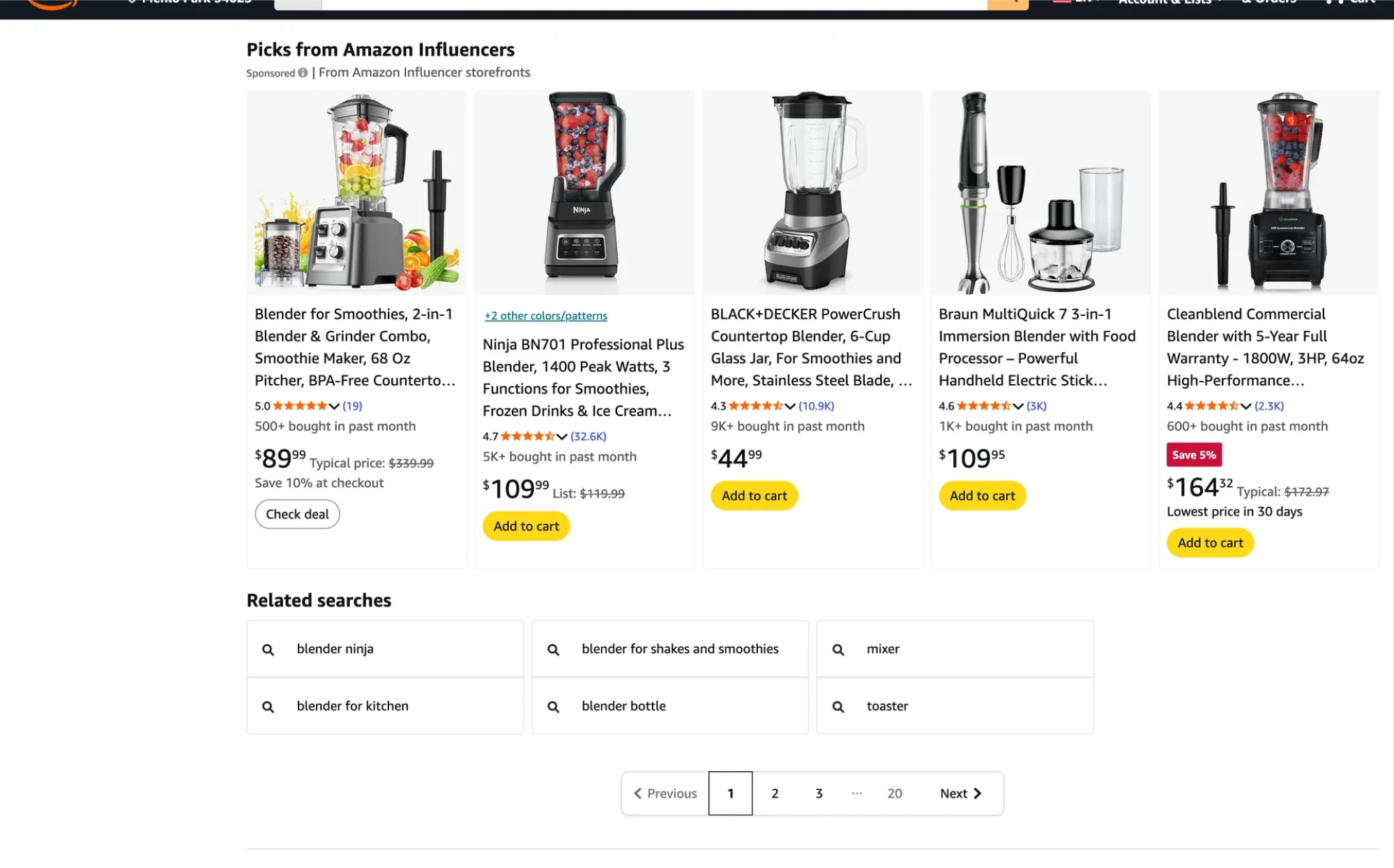
- E-commerce product listings
Online stores like Amazon, eBay, or AliExpress often deal with thousands of items. Pagination lets shoppers view products in manageable chunks, typically 20–30 items per page, and easily move to the next set.
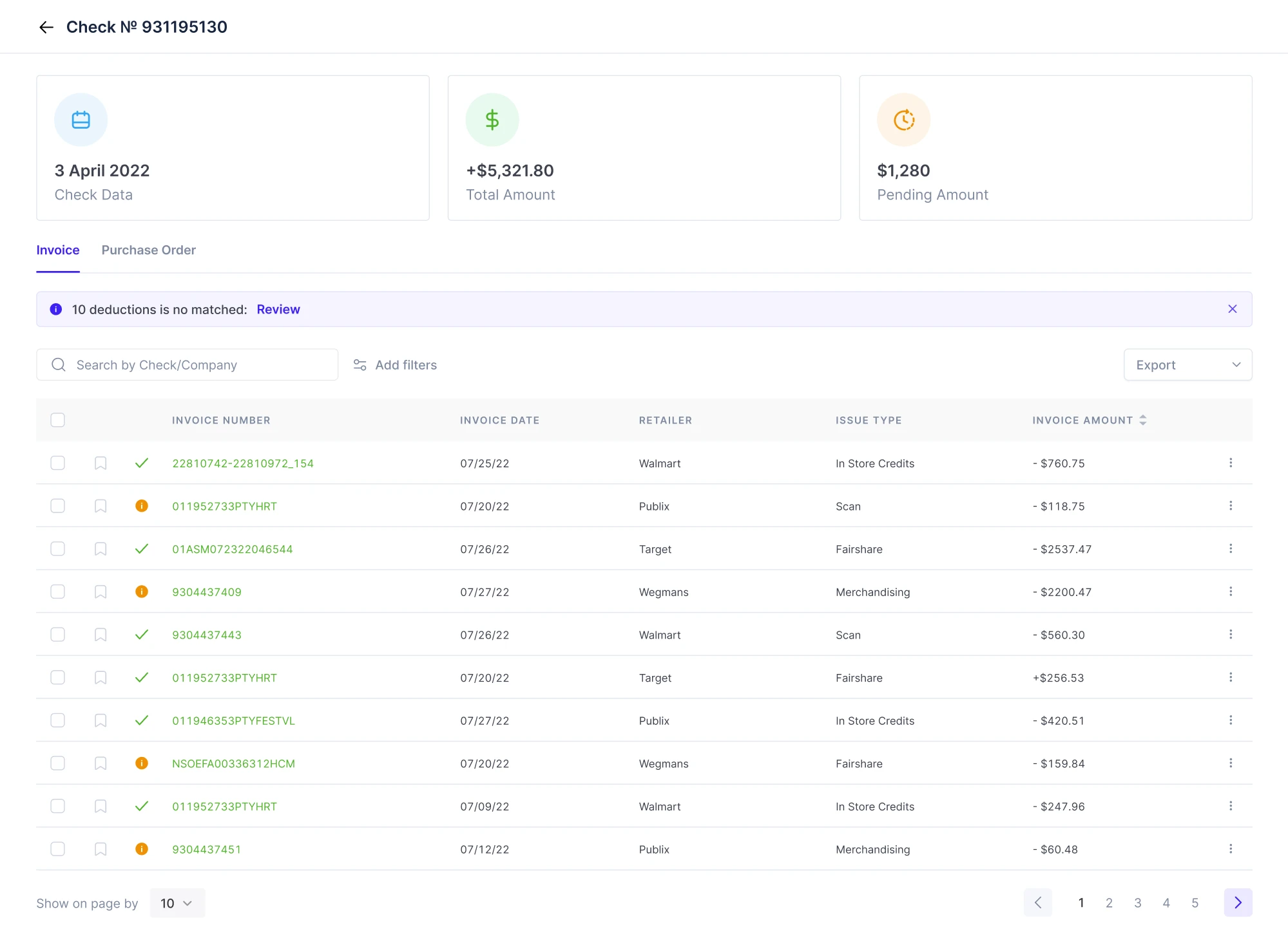
- Large data tables and SaaS dashboards
In enterprise tools or admin panels, tables can stretch across thousands of records. Paginating these improves load times and makes data easier to scan. Customers, in turn, can choose how many rows to view per page or jump to a certain page.
At Eleken, we often design SaaS dashboards like this. For instance, in our work with Floret, a management tool, we placed numbered pagination in the bottom right and allowed users to adjust items per page on the left, keeping the navigation intuitive.
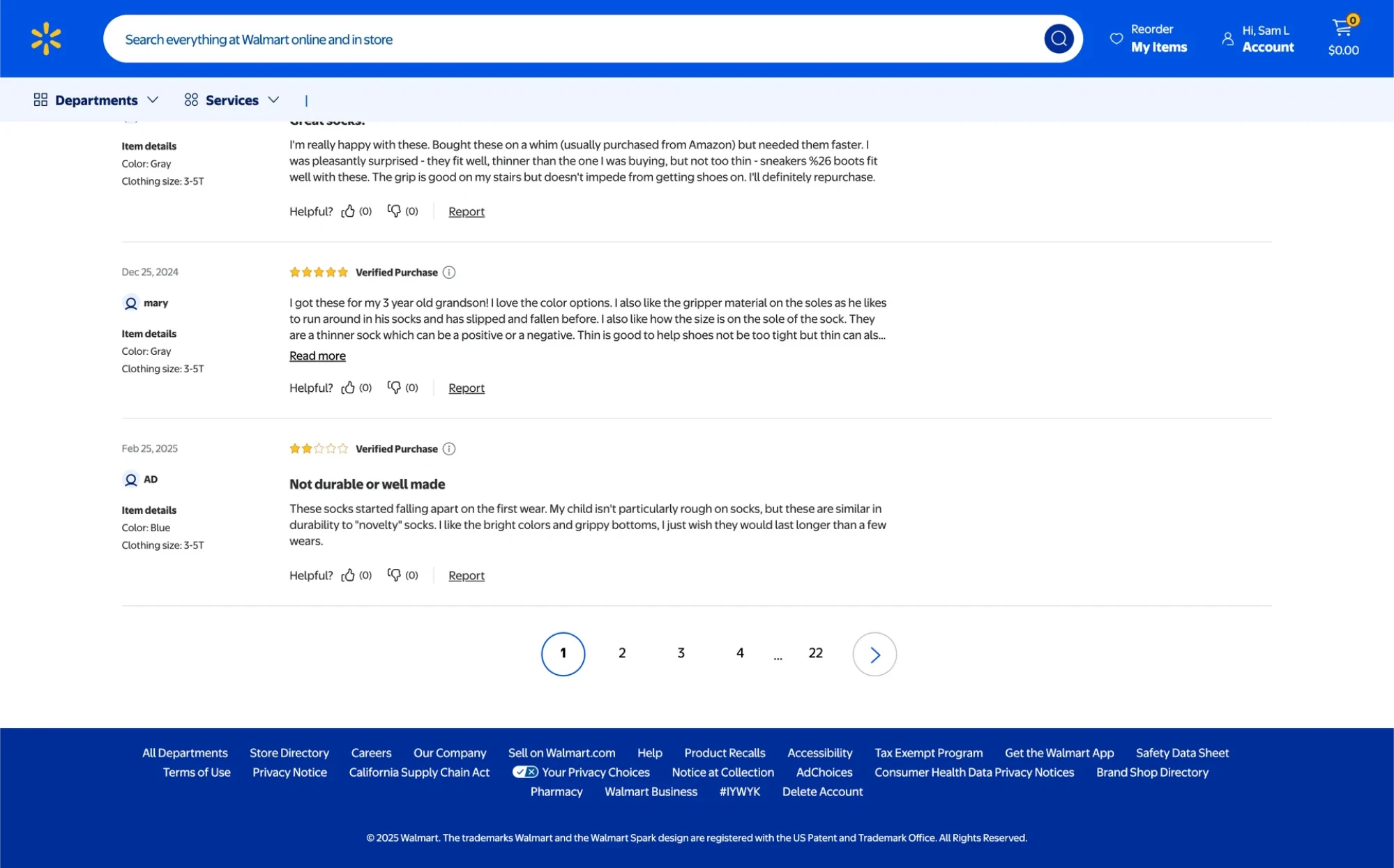
- Forums and comment sections
Discussion boards and comment sections frequently paginate content so that each page remains a reasonable length. Users can click through page numbers to read older posts without one page becoming infinitely long.
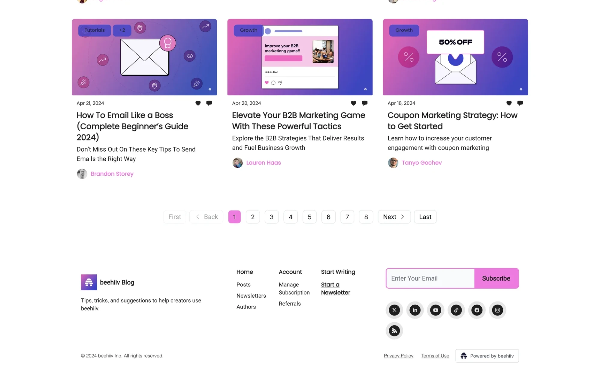
- Blogs and content libraries
Many blogs organize their posts into pages, allowing readers to explore content by date or cluster without relying on infinite scrolling. It’s also helpful for maintaining SEO-friendly URLs and improving overall site navigability.
Pagination vs infinite scroll vs “Load more”
Pagination is one way to handle large content sets, but it’s not the only pattern. Two common alternatives are infinite scrolling and “Load More” buttons. It’s important to choose the right approach, and below, we’ll look at them in detail.
Pagination
Pagination is the most familiar pattern. It gives users a sense of progress, helps them compare content across pages, and keeps the interface predictable.
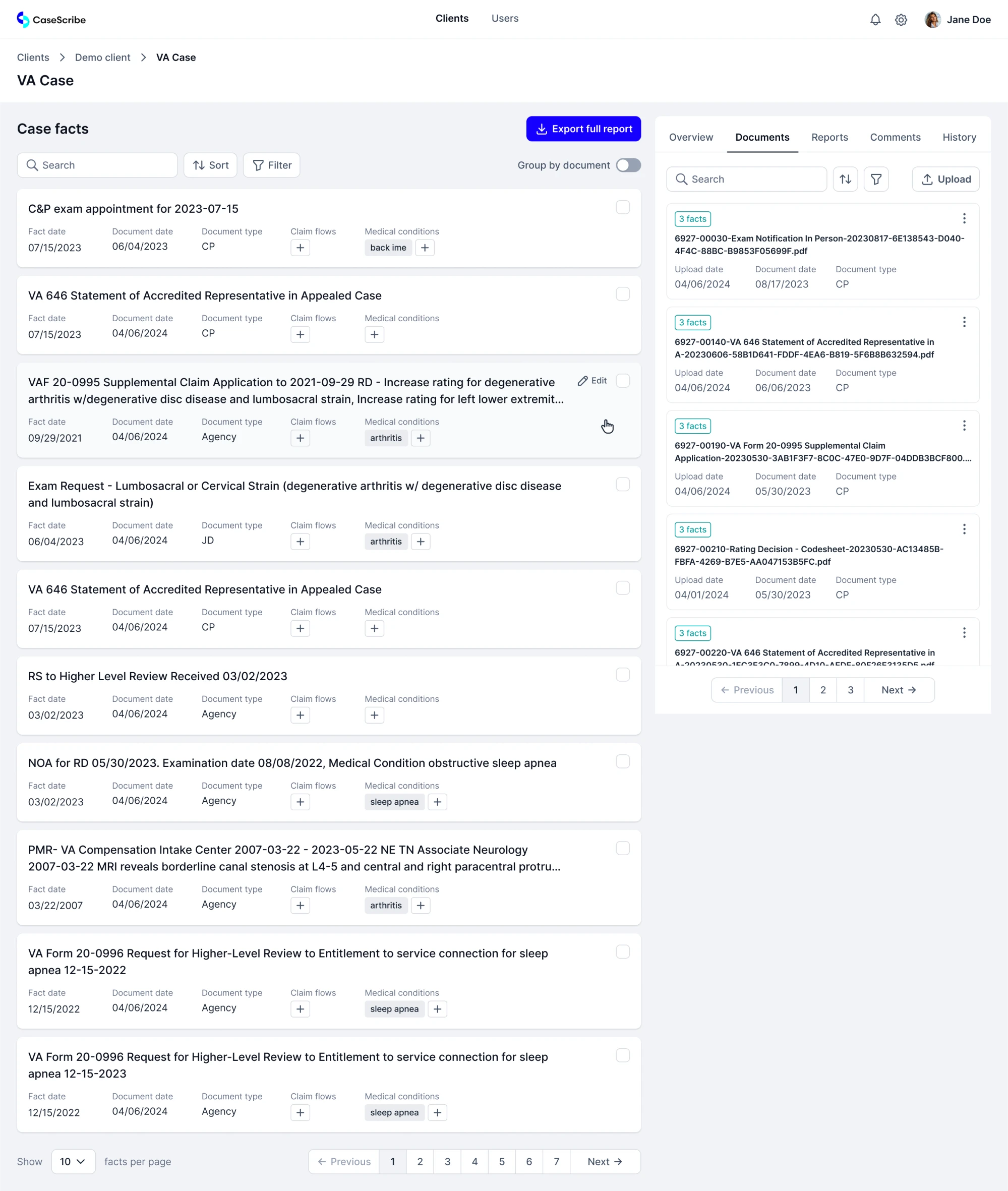
At Eleken, this is our most commonly used approach, and it worked exceptionally well in our redesign of CaseScribe, a legal AI platform.
The team had a working MVP, but real users struggled to review and manage long documents. As part of our design process, we improved the pagination UX, breaking content into manageable chunks and simplifying navigation.
Use when:
- Users are searching, comparing, or managing content.
- You need clean URLs and bookmarking.
- The experience benefits from structure and orientation.
Infinite scroll
Infinite scroll automatically loads more content as the user scrolls, making it a popular pattern in social media and content feeds.
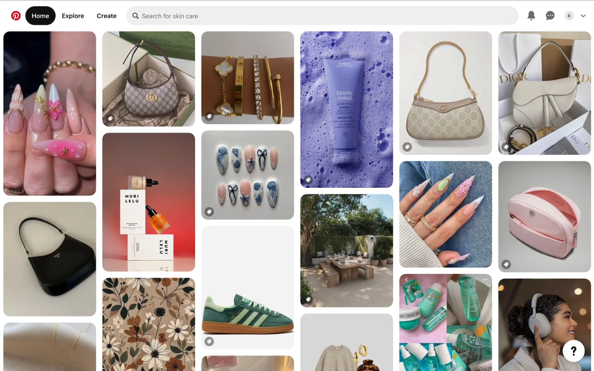
But it doesn’t suit every context. Without clear page breaks, users can struggle to return to something they saw earlier, which hurts product performance.
That’s why we rarely use infinite scroll in SaaS projects at Eleken. It lacks the structure that complex products need, and it makes tasks like scanning tables, comparing entries, or exporting data far more difficult.
Use when:
- Content is casual, visual, or endless.
- You don’t need deep linking or structured browsing.
- Engagement matters more than control.
“Load more” buttons
This pattern sits between pagination and infinite scroll. “Load more” buttons let users load content in chunks, usually without a full page reload.
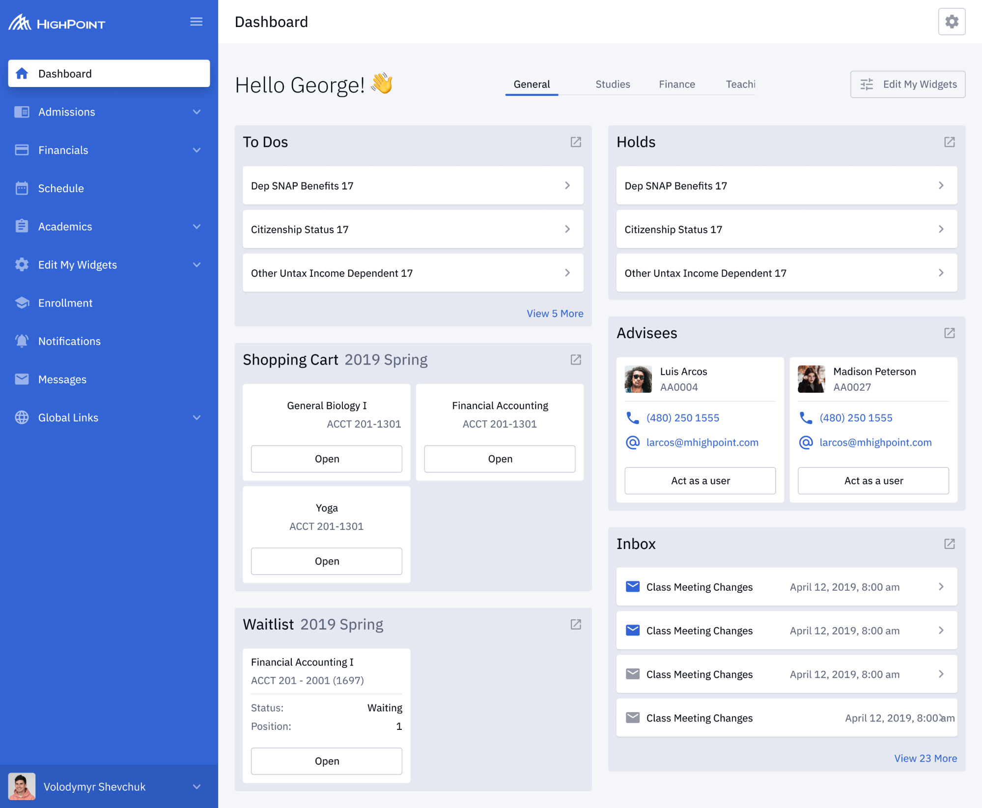
It gives users control over the flow, keeping the experience light. At Eleken, we used this approach while designing Highpoint, an education management platform.
Our designer built the dashboard around customizable cards, where standard pagination would’ve interrupted the experience. Alternatively, we added “View X more” buttons for each section, keeping the layout modular without losing clarity.
Use when:
- You want smoother performance without full-page jumps.
- Content comes in groups (like cards or tiles).
- You need a lightweight pattern that doesn’t overwhelm.
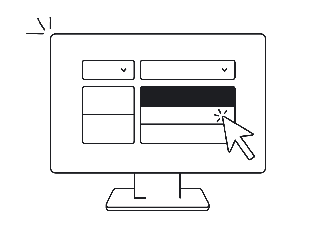
Design patterns and best practices for pagination UI
Pagination may seem like a small detail, but its design can have a big impact on usability. Below, we’ll cover pagination UX best practices to create clean, usable, and accessible components for real-world products.
Provide basic navigation controls
At the very minimum, every pagination design should include “Previous” and “Next” buttons. These controls let users move step by step through pages, which is especially helpful when they don’t care about jumping to a particular page.
Disable or hide the “Previous” button when on the first page and similarly disable the “Next” button on the last page, so users don’t try to click them in vain.
Include page numbers for direct access
Numbered page links let customers jump directly to a specific page if they know what they want. This is helpful, particularly when there are many pages of results.
Always highlight the current page in the UI, typically by styling it differently (use a different color background or bold text) and removing its link to indicate it’s the active page. This gives users a clear sense of “you are here” in the page sequence.
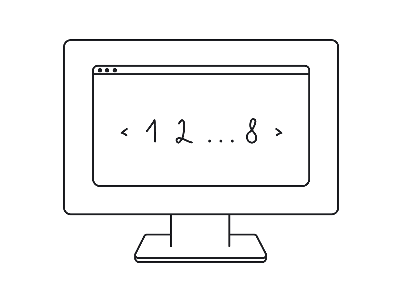
Use ellipses for long page ranges
If you have multiple pages, showing every single page number can overwhelm users and clutter the interface. In this case, use ellipsis (“…”) as a visual cue.
A well-designed UI pagination might display as “1, 2, 3, … 10, 11, 12”, giving users context without listing every page. This keeps the interface cleaner and avoids an excessively long pagination bar.
Consider First/Last links when needed
For large page sets, it can be helpful to include “First” and “Last” buttons alongside Next/Prev controls. These links let users jump to the beginning or end of the content.
If you’re already displaying the first and last page numbers in a truncated pagination (using ellipses), separate buttons may not be necessary. Still, they can improve clarity and accessibility for some users by making those actions more explicit.
Show total pages or results
Whenever possible, give users a sense of how much content they’re dealing with. A good UX pagination pattern might show the last page number or use an explicit label like “Page 2 of 12”. Similarly, you might show the total number of results.
This kind of feedback helps users gauge how far they have to go and whether they want to jump around or refine their search.
Place pagination in logical locations
The most common placement is at the bottom of the content, where users naturally reach the end of a list and are ready to move forward. It’s a good default to have pagination controls right after the list of results or items.
For longer tables or lists, consider adding pagination at the top as well, so users don’t have to scroll all the way down just to navigate.
Persist user choices and state
If your interface allows page size selection or other preferences, remember those choices. For example, if a user chooses to view 100 items per page, they’d appreciate it if the site continues to show 100 per page as they navigate.
It’s also important to preserve page position after key actions. If a user deletes an item on page 3, they shouldn’t be kicked back to page 1.
Effective pagination examples
As any curious designer knows, looking at real examples after all the theory is always a smart move. To help you gather inspiration, we’ve collected real-world pagination examples that show how different products approach this UI pattern.
1. Sessionboard
When designing Sessionboard, our team inserted numbered buttons and ellipses to simplify navigation across large datasets. We added arrows for quick switching and displayed the total number of pages for better orientation.
2. VLI Tech
For VLI Tech, we used ellipses in the pagination UI design to avoid overwhelming people with too many numbers. Users can jump to a specific page, and for added efficiency, we included a control to adjust how many items are shown per page.
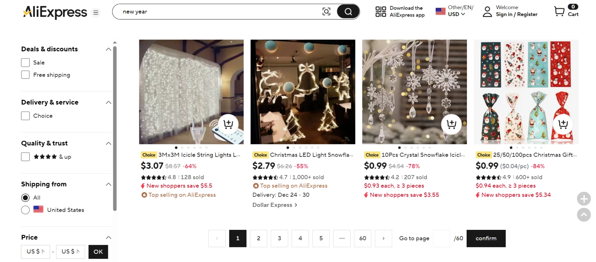
3. AliExpress
AliExpress utilizes classic web pagination with numbers and arrows, making it easy to move through thousands of products. The current page is clearly highlighted, and customers can jump several pages ahead with a single click.
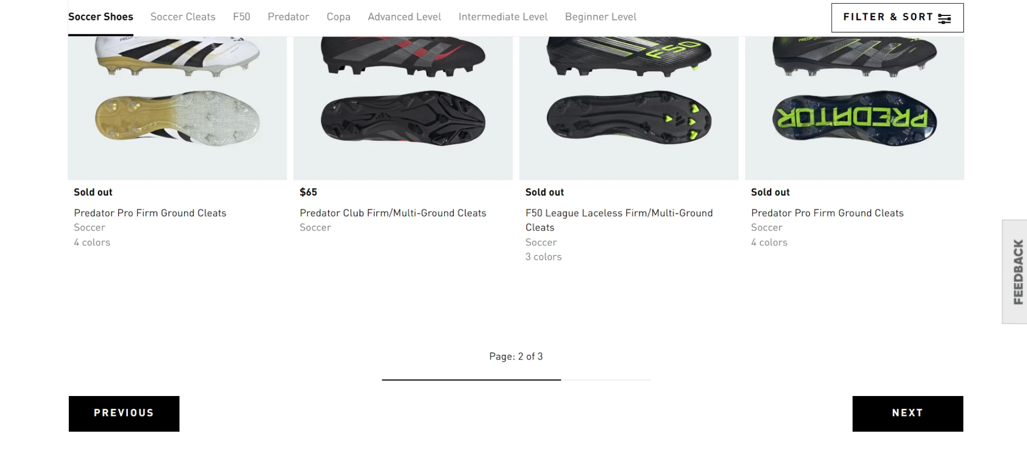
4. Adidas
Adidas employs simple pagination with next/previous buttons and a page counter. A progress bar shows how far you’ve browsed, which works well for short lists. But for larger datasets, clicking through every page could feel tedious.
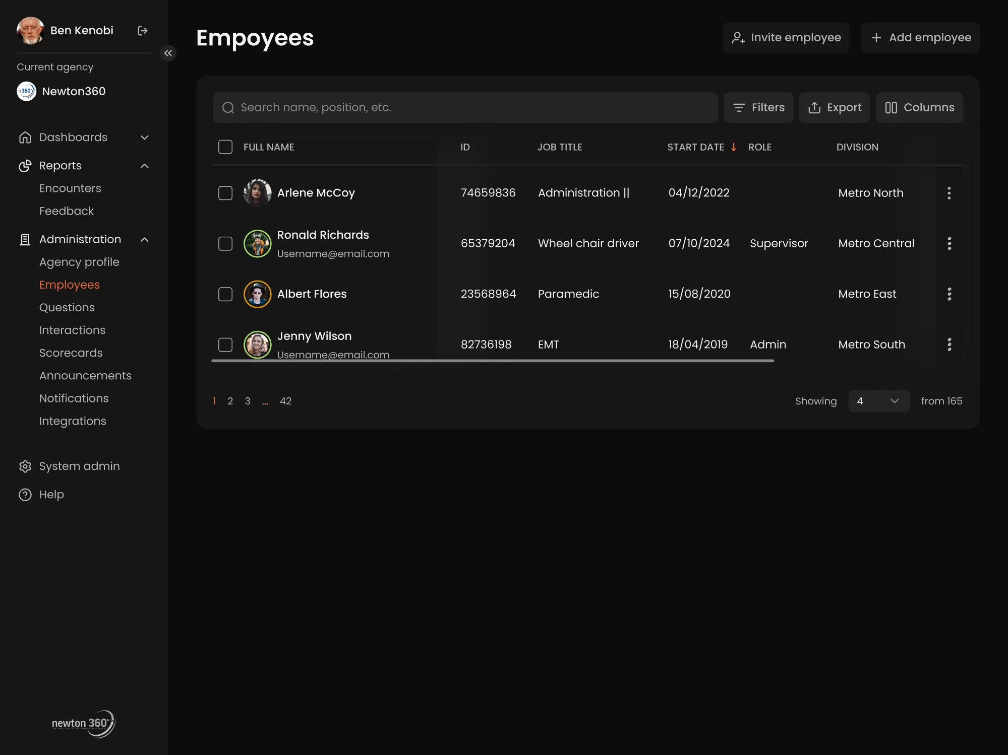
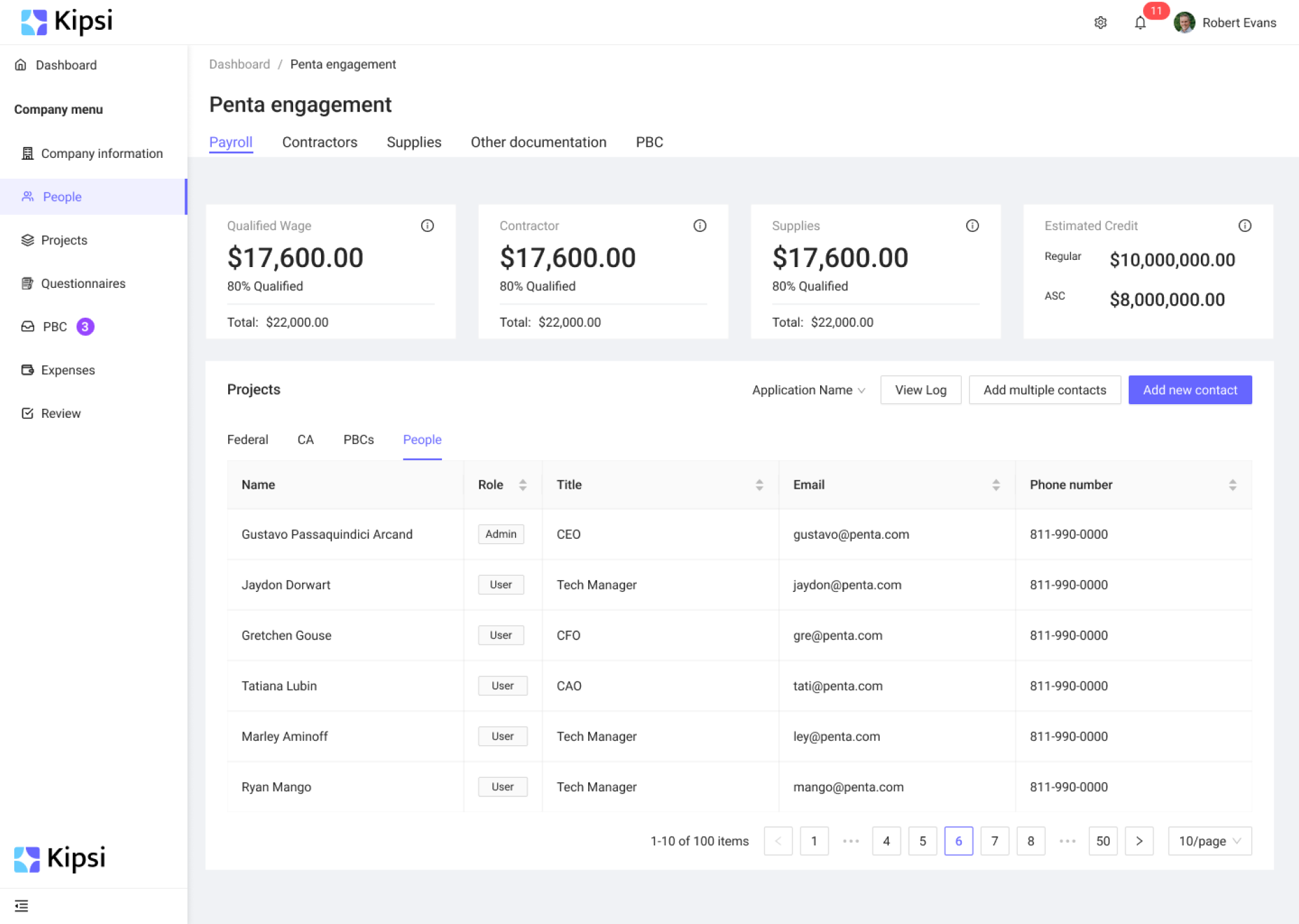
5. Kipsi
Knowing Kipsi users would work with large datasets, we relied on pagination best practices UX to design a system that keeps things manageable. It includes navigation arrows and two ellipses to avoid overwhelming users with pages.
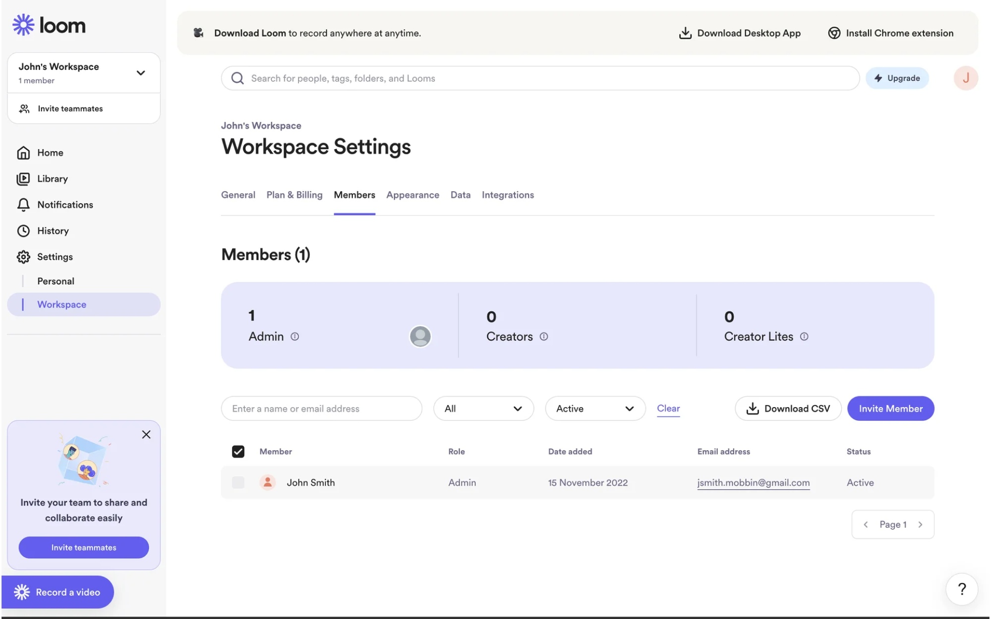
6. Loom
Among pagination UI examples, Loom offers a layout focused on highlighting the current page, with arrows for navigation. The approach fits well within Loom’s minimal design language and avoids distracting users with unnecessary elements.
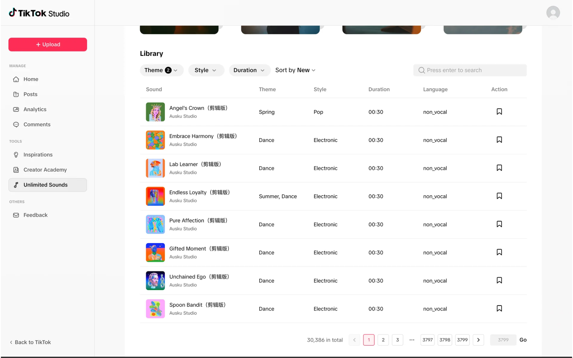
7. TikTok
TikTok mostly relies on infinite scroll, but when browsing its sound library, pagination takes over. Users can jump to an exact page, navigate with arrows, and see the total number of items. It’s a practical solution for handling long lists.
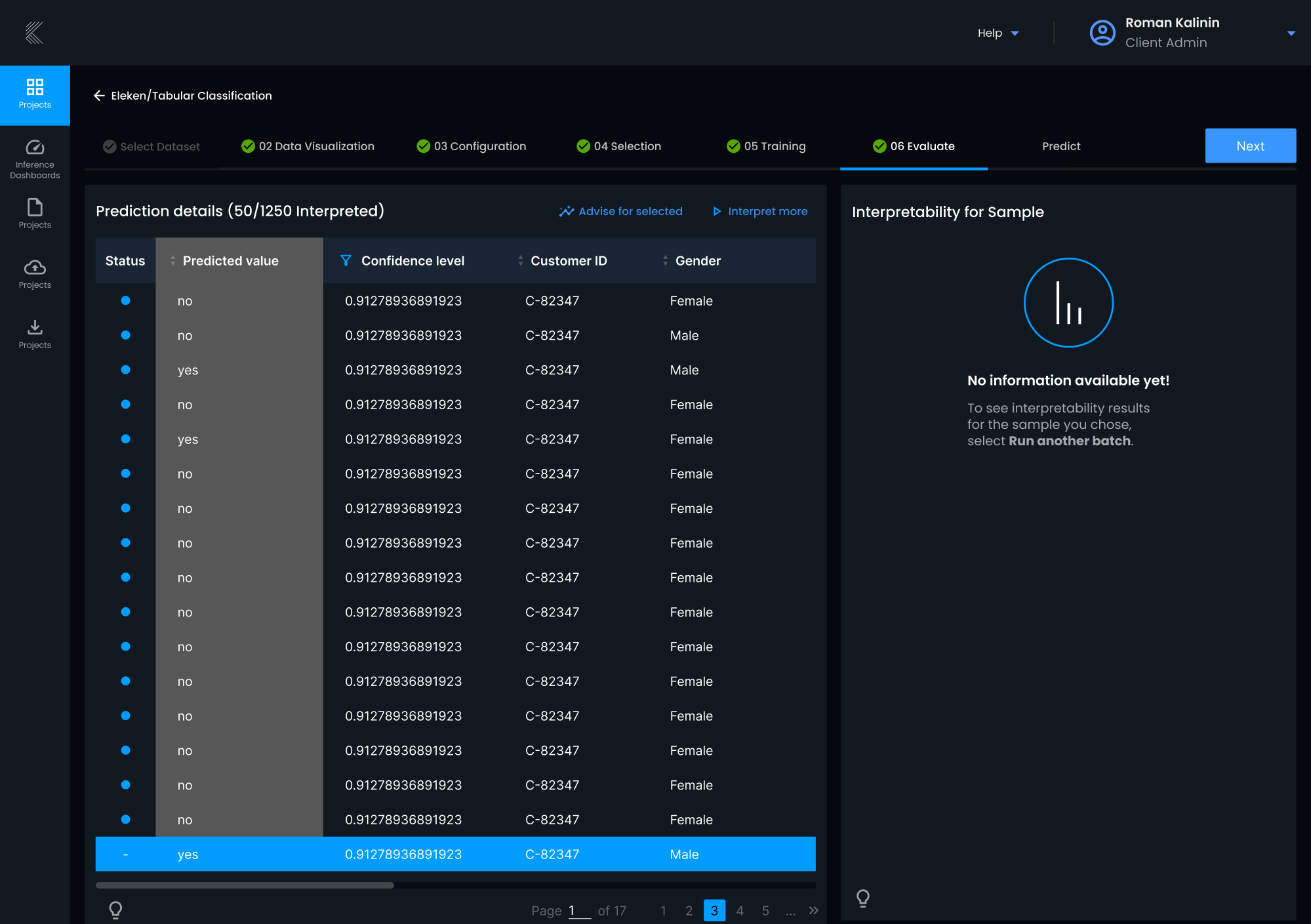
8. Stradigi AI
To simplify navigation in large datasets of Stradigi AI, we introduced a pagination UI that lets users jump directly to a specific page. Rather than using arrows or page buttons, users can type in the page number they want.
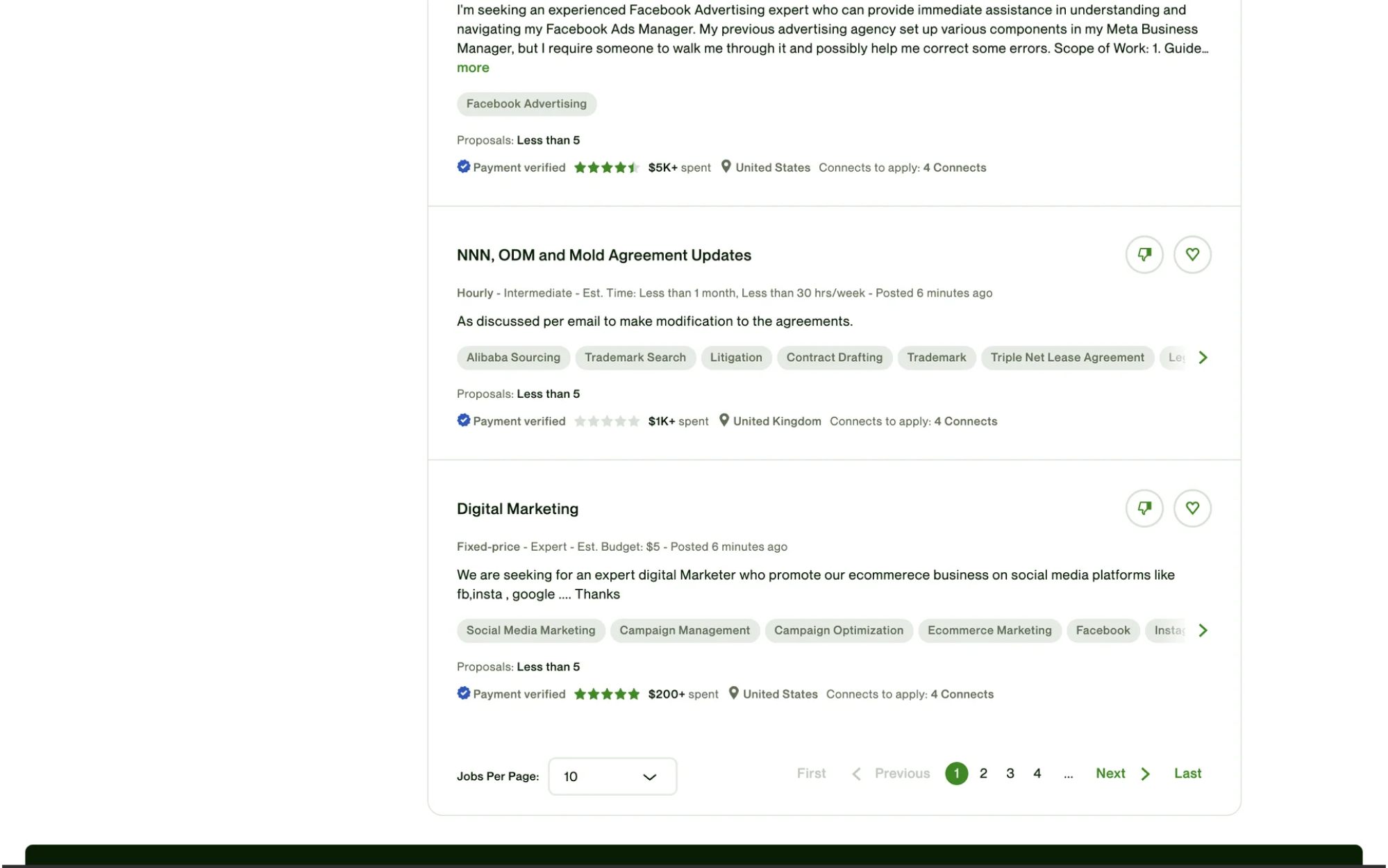
9. Upwork
On Upwork, you can navigate search results using a classic pagination UI. What’s interesting is the addition of both “Previous”/“Next” buttons and “First”/“Last” buttons, giving users more control in jumping across long result lists.
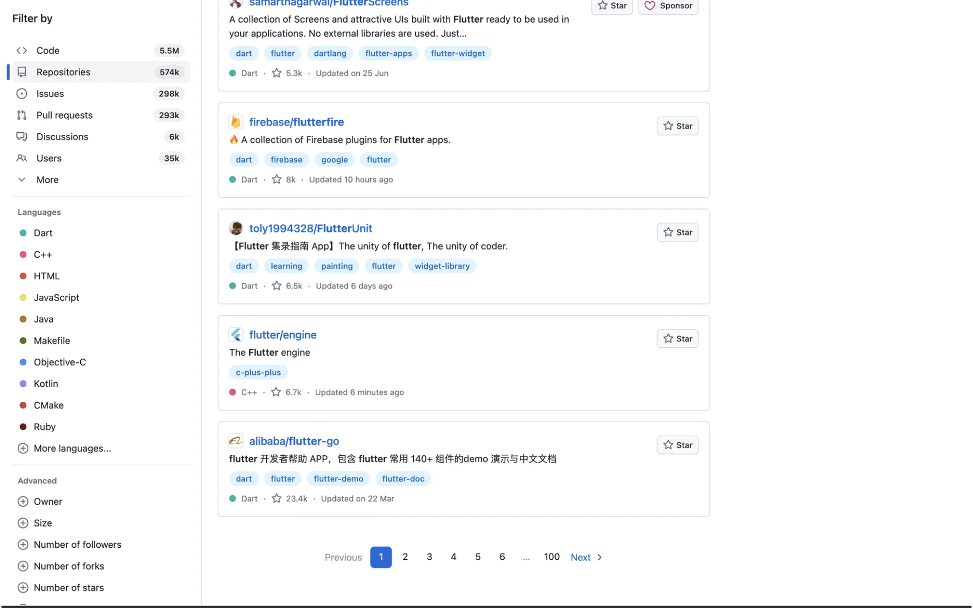
10. GitHub
In its pagination web design, GitHub uses “Previous” and “Next” buttons to let users move between pages. When you land on a specific page, it’s highlighted in GitHub’s signature color, clearly showing your current position.
Closing note
Designers often sweat over hero sections and fancy animations, but tiny things like pagination quietly decide whether a product feels usable or not. Good pagination stays out of the way. Bad pagination adds friction where there should be none.
Remember that the best design choices always start with understanding your users. Listen to them, spot patterns, and make smarter decisions from there.
At Eleken, we've designed navigation and data systems for 200+ SaaS products, and we know what gets in the way and how to clear the path.So if your app is dealing with big data, real users, and lots of content, we can help you make sure navigation isn’t what slows people down.


.webp)
.png)

.png)