


For users, file uploads are high-stakes moments. Adding a photo, a document, or a video is the part of the interface where things actually become real. If that action feels unclear, clunky, or broken, everything else you designed becomes irrelevant.
As a U/UX design agency, we worked on a variety of SaaS products and shaped this pattern over and over again. Through this journey, we learned that once you place it logically and nail the experience, users don’t struggle with it.
They know exactly what to do and just do it.
This article is a look at what makes that possible. We’ll walk through examples for inspiration and share the best practices that keep things intuitive.
Core file upload UI patterns users expect today
Designing SaaS products since 2015, we’ve noticed a set of patterns that have quietly become the standard. Users have baseline expectations, and as a designer, your job is to help them drop files and know exactly what’s supposed to happen.
Here’s what people instinctively look for when uploading a file:
- A clear dropzone;
- A click-to-upload fallback or drag-and-drop;
- Instant visual feedback;
- Previews for files;
- Validation cues (file type, size limits, etc.).
- Multi-file support;
- Friendly error handling;
- Mobile and accessibility support.
These patterns are baked into the mental model users bring to every upload experience. And when one of them is missing, you can be sure they’ll notice.
File upload UI examples for inspiration
File upload components rarely win design awards, but they definitely complete the overall product experience. In this section, we’ve collected a set of interfaces we found worth noting, including a few examples from our own client work.
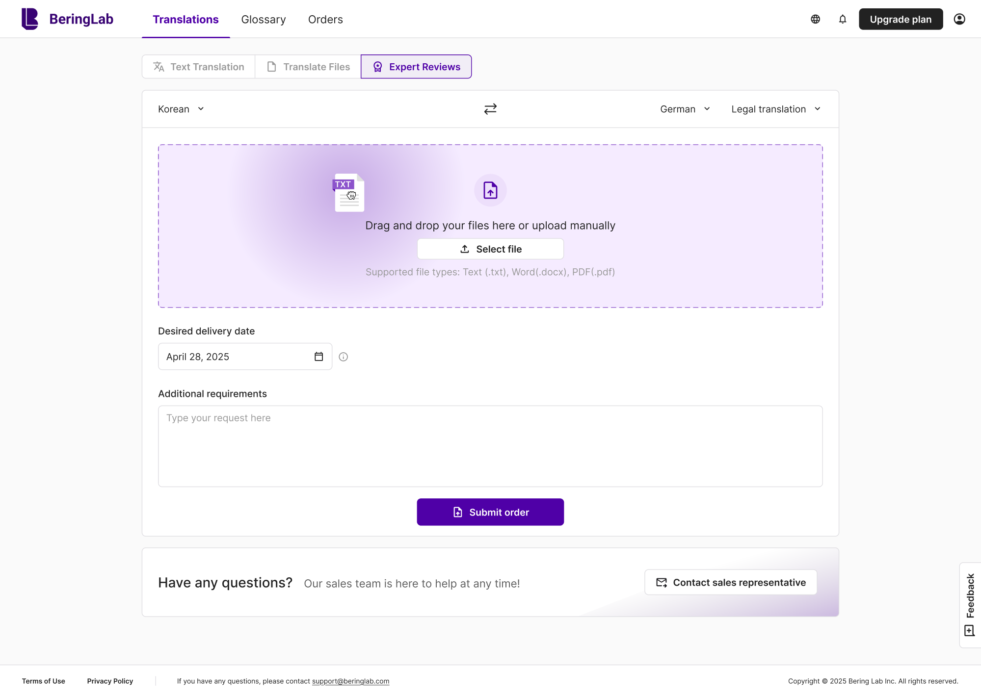
1. Bering lab
For Bering Lab, a legal translation tool, document handling is central to the workflow. We kept the file upload UI design intuitive and used brand colors to guide interaction, with supported file types shown just below as a helpful cue.
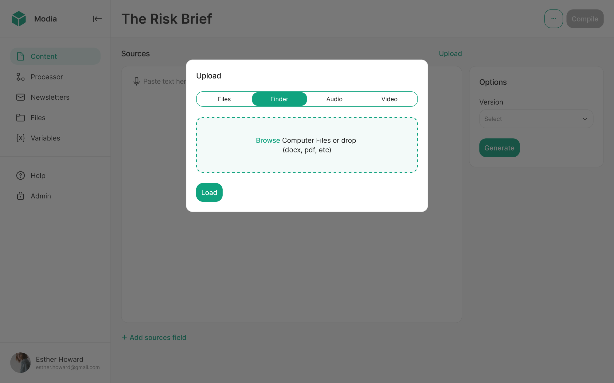
2. Modia
Working on Modia, an internal AI content creation tool, we designed the document upload UI as a modal to support multiple file types. Users can easily switch between tabs and choose what they want to import, keeping the flow focused.
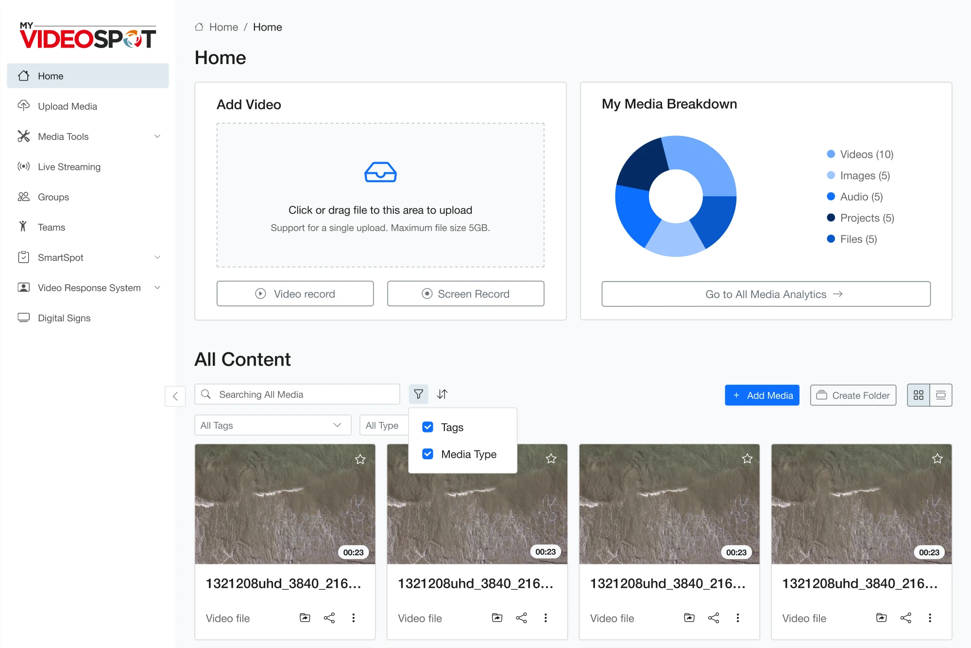
3. My Video Spot
My Video Spot, a video platform for schools, was built to support educators who manage large volumes of content. To simplify the upload document UI, we placed the file import option directly on the homepage, cutting unnecessary steps.
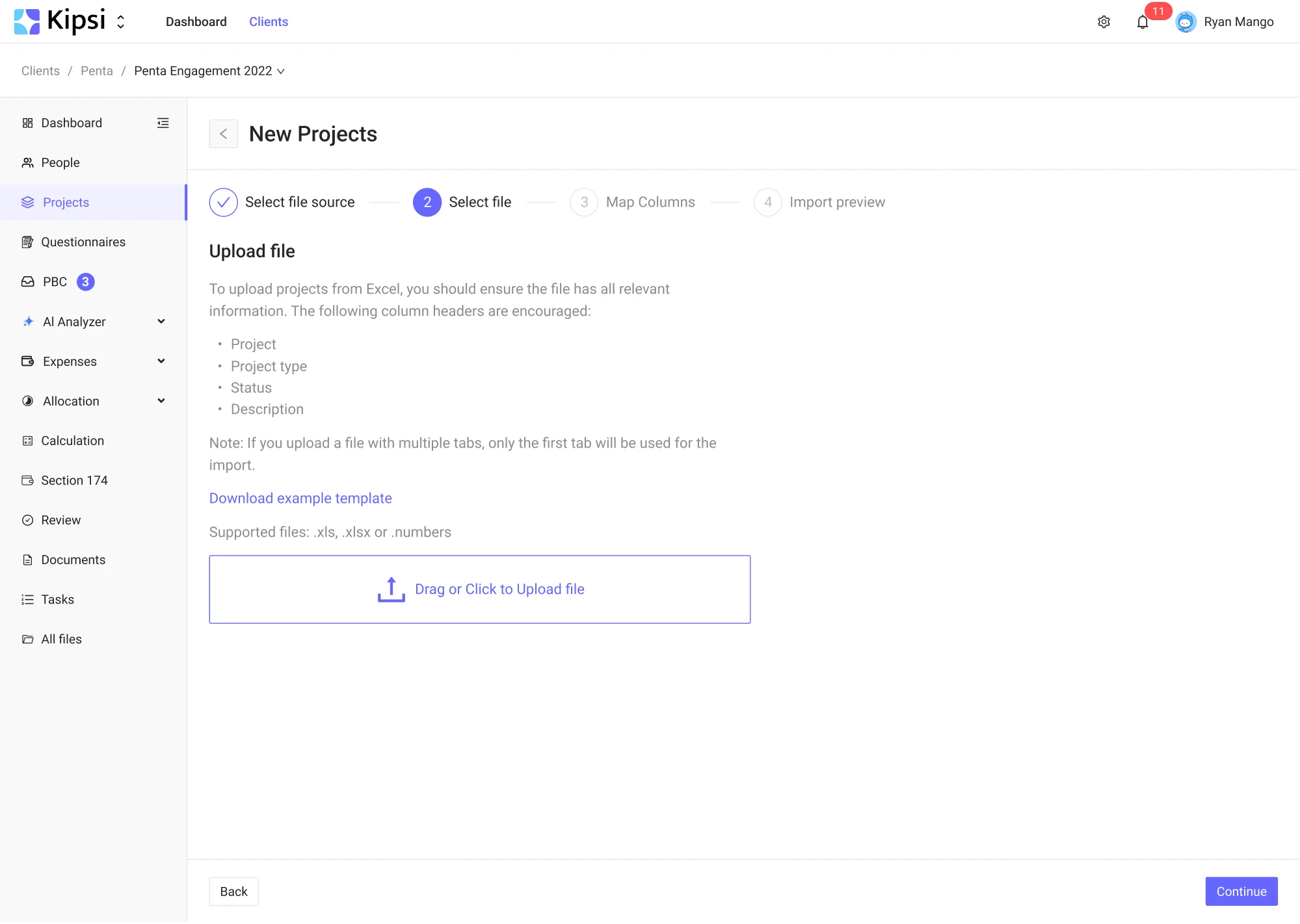
4. Kipsi
Looking for design help, Kipsi, a software platform for accounting and tax consulting firms, reached out to Eleken. For better usability, we enabled Excel file imports and included supporting text to clarify which rows can be uploaded.
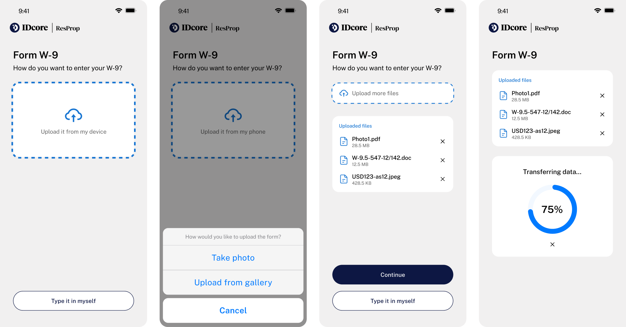
5. IDCore
IDCore software platform helps property managers and contractors manage compliance data. Instead of forcing vendors to fill out forms manually, we made it easier to add information by allowing photo or document uploads.
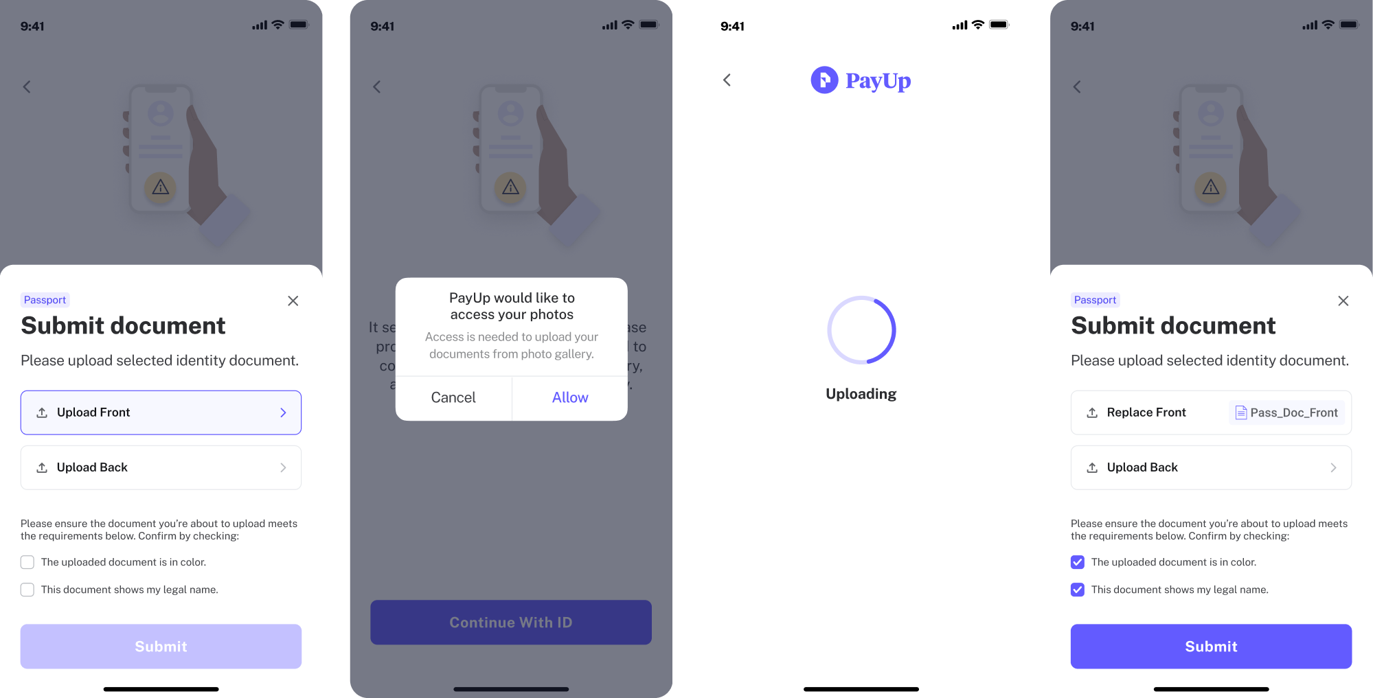
6. PayUp
PayUp is a financial platform where document verification is part of the signup flow. Here, we added a file upload component that lets mobile users add documents directly from their gallery, making the process quicker and more intuitive.
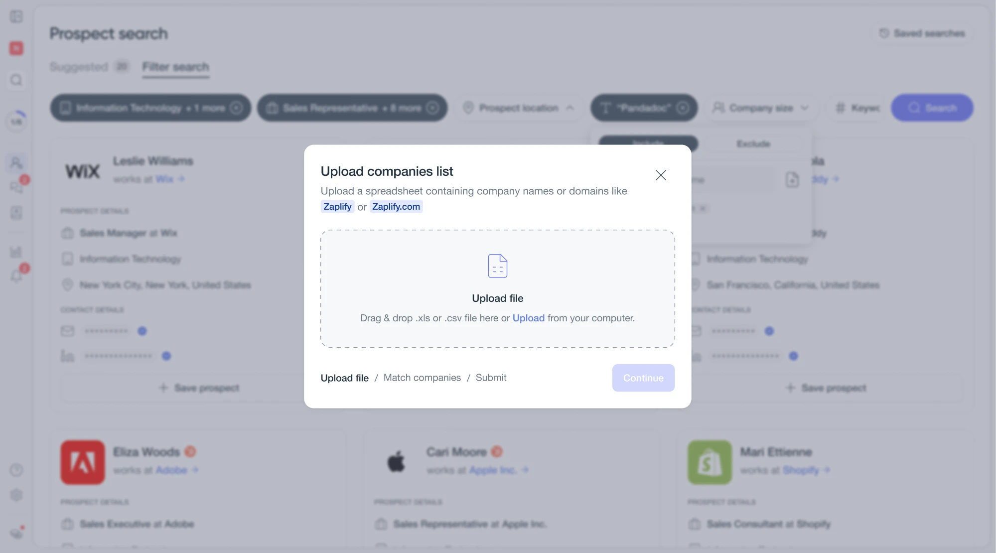
7. Zaplify
As part of a UX overhaul for Zaplify, a customer relationship platform, we refined the upload file UI without overcomplicating it. A clear dropzone, drag-and-drop support, and validation cues kept the interaction familiar and reliable.
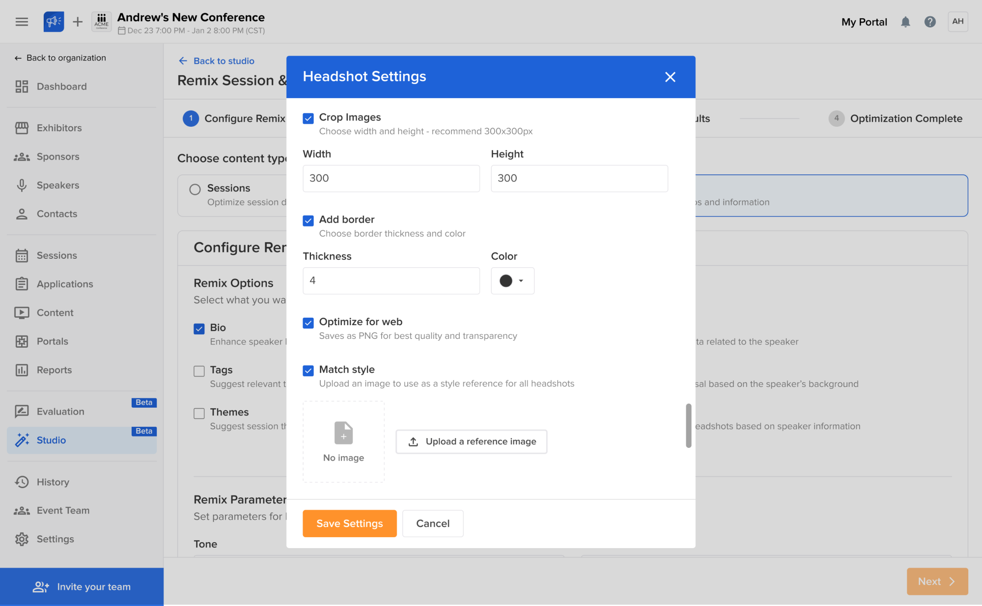
8. Sessionboard
Sessionboard is an event content management platform with interfaces for managing contacts, conferences, and more. We designed flexible upload components across different screens, giving users the ability to replace files whenever needed.
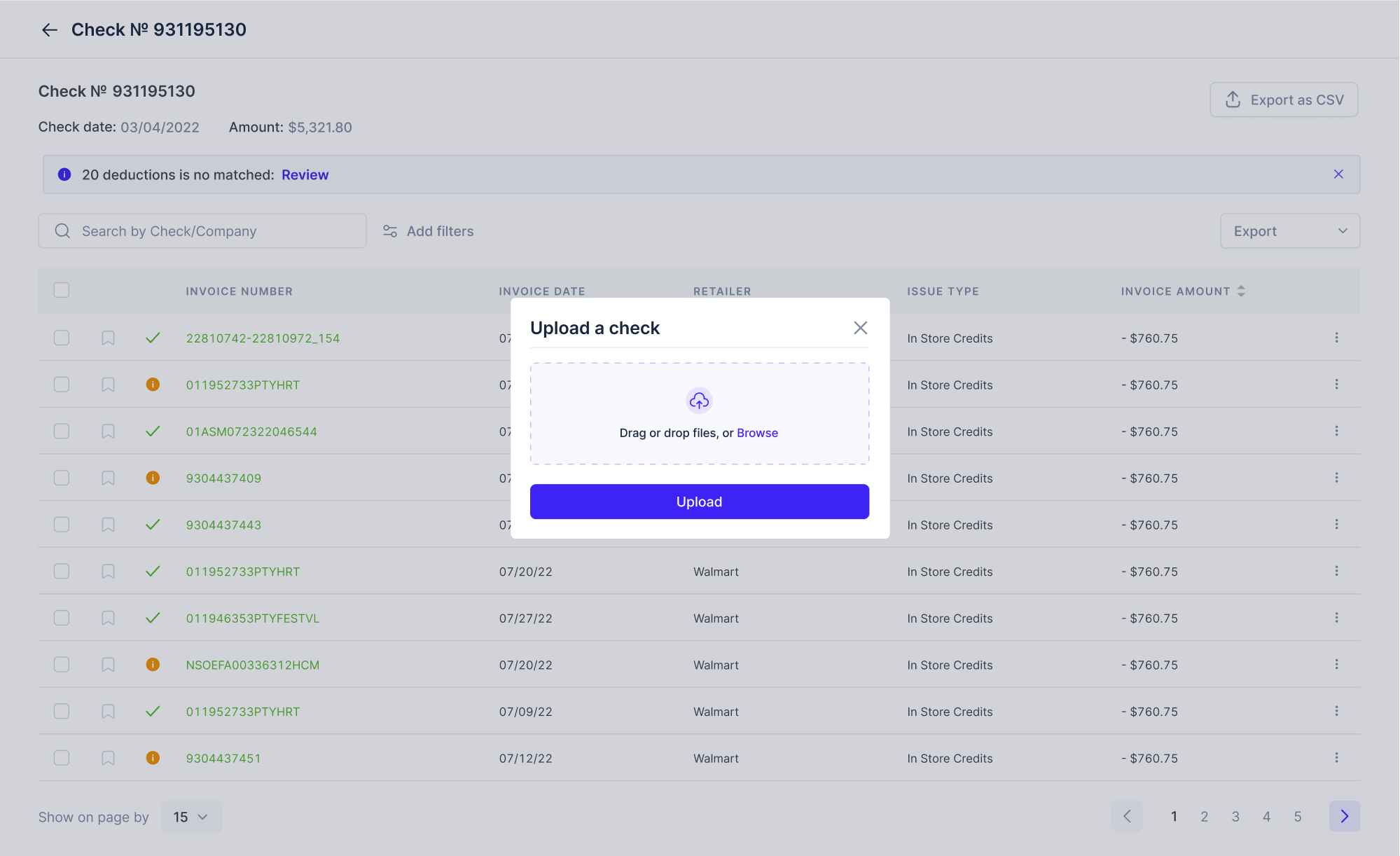
9. Floret
Built for foodtech companies, Floret brings all transaction records into one place for easier management. Uploading documents pattern our Eleken team simplified to a single click, helping users match checks without the guesswork.
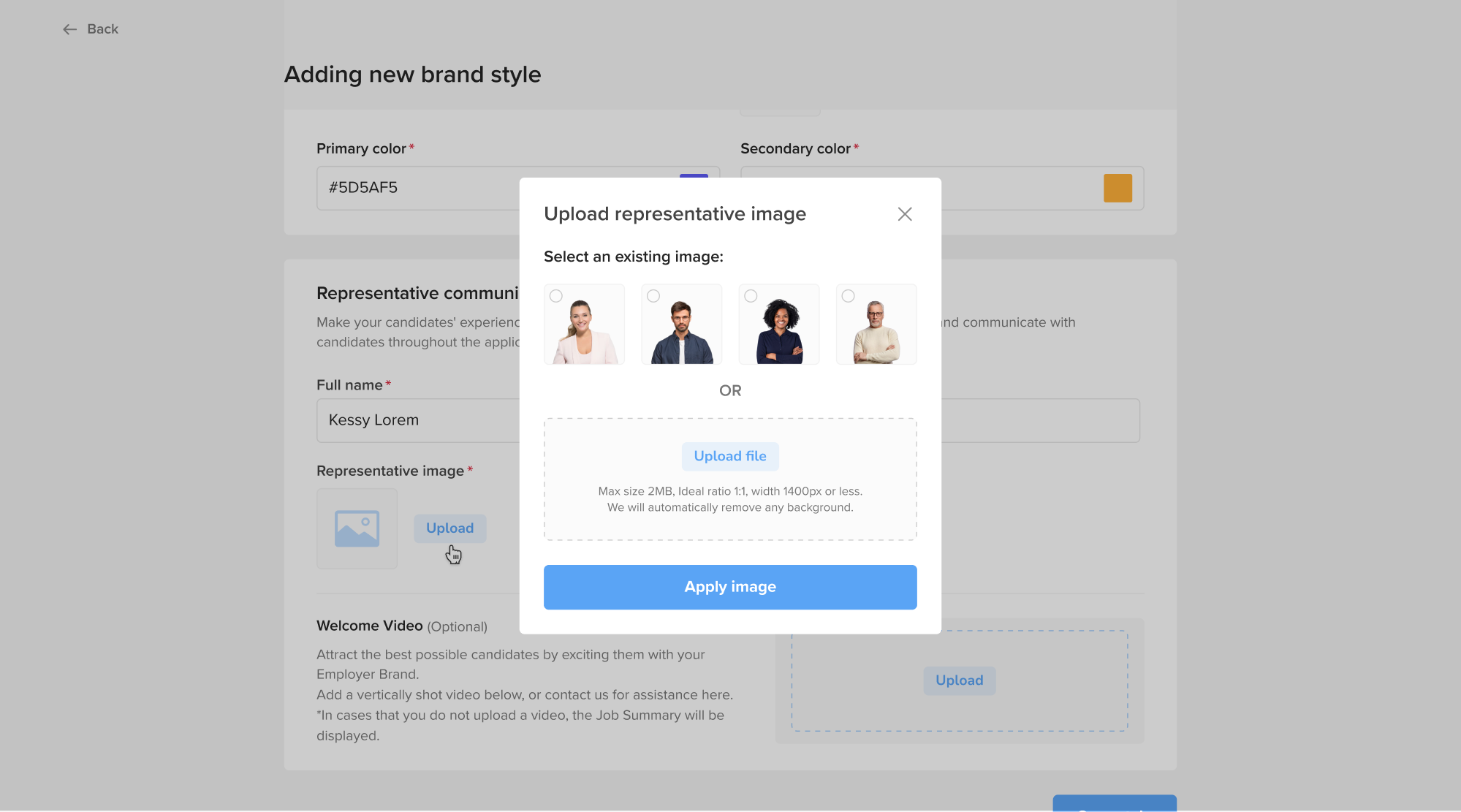
10. myInterview
As a video interviewing platform, myInterview lets recruiters create branded job postings. We focused the interface on a multiple file upload UI design, giving users the option to select existing assets or add custom ones.
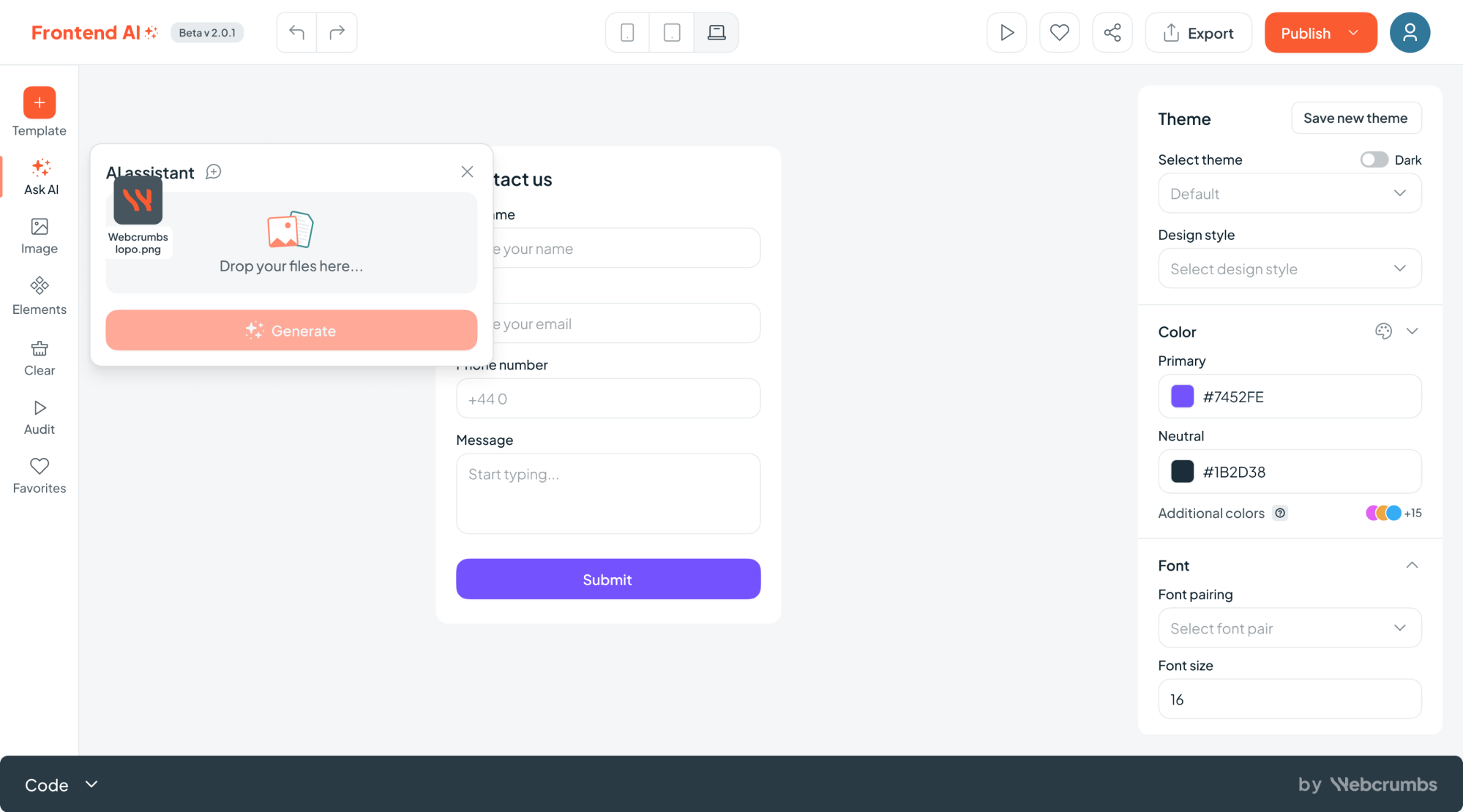
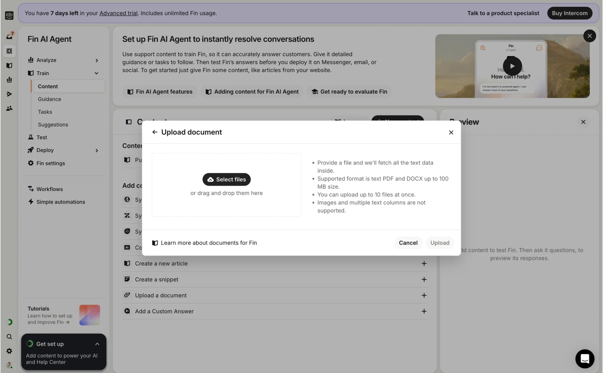
11. Frontend AI
While designing Frontend AI, a visual code editor, we made the “Ask AI” input area central to the experience. In this space, users can upload screenshots or sketches before triggering a request, keeping the flow quick and focused.
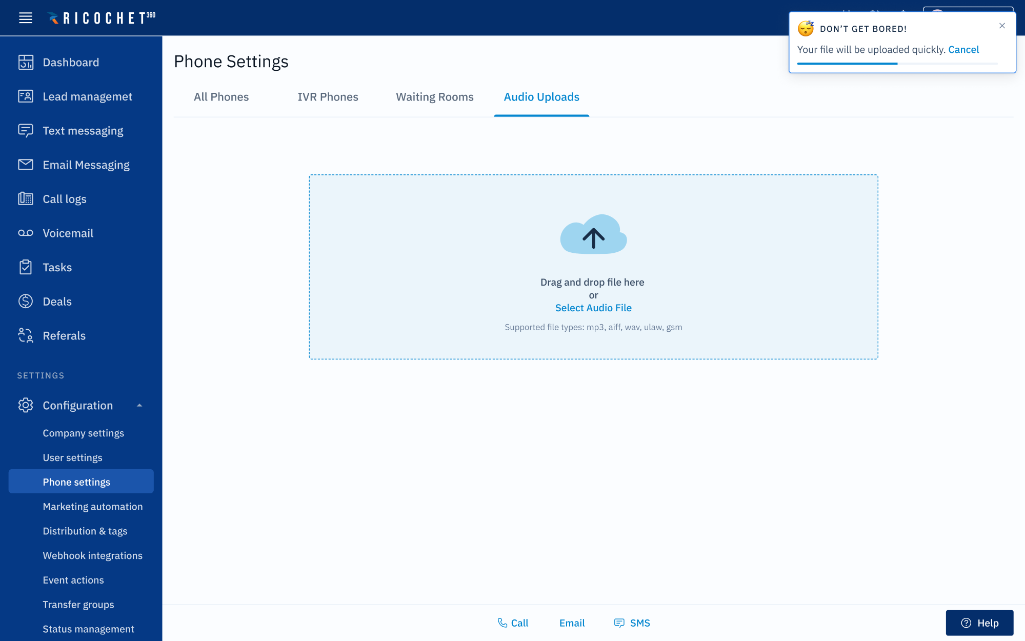
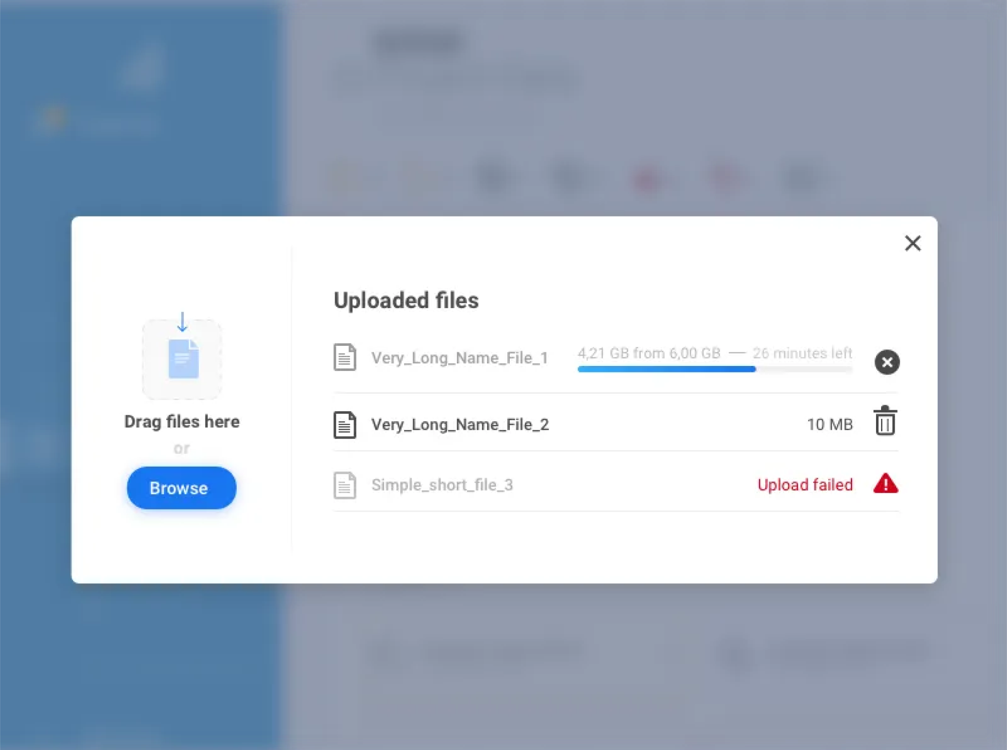
12. Ricochet360
Ricochet360 is a CRM platform where we designed a clear file upload pattern. A drag-and-drop area is paired with a short text message outlining file requirements, while a notification modal displays how much time is left to complete the import.
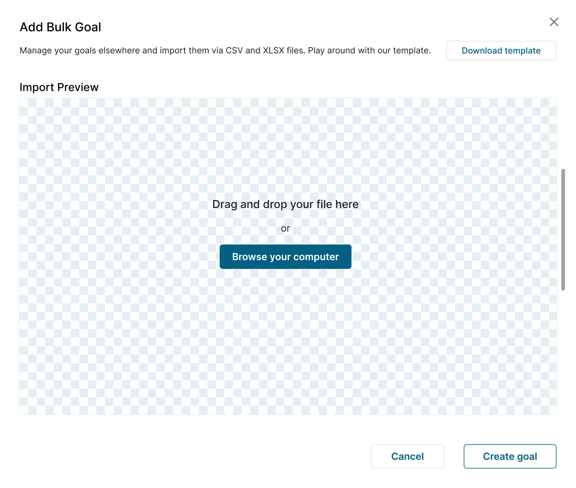
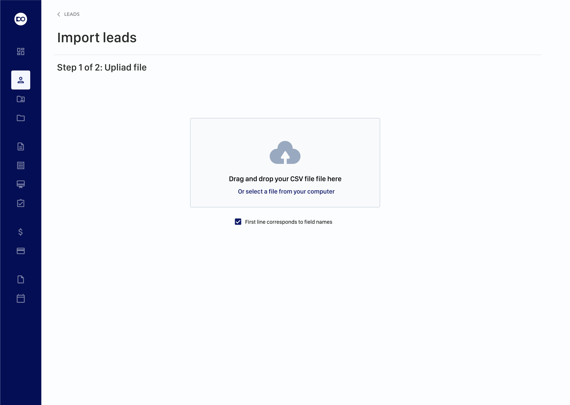
13. Nworx
For Nworx, a corporate learning management platform, we focused on simplifying the user flow. Designing the file upload field, we clearly communicated bulk capabilities, making it easier for users to manage multiple files.
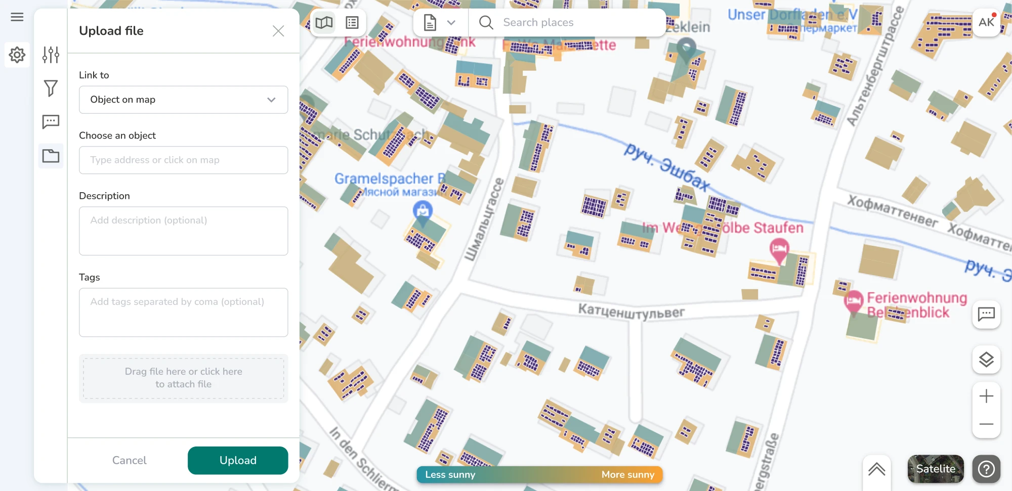
14. Greenventory
Focused on green energy planning, the Greenventory platform required deep work on data-driven maps. We designed the file upload UX to blend seamlessly into that flow, keeping it functional without pulling users out of context.
15. Gridle
When working on Gridle, a client experience platform, we recreated the entire look to make it more professional. Uploading files was a part of the experience, and we designed it with helpful visual cues and text outlining file requirements.
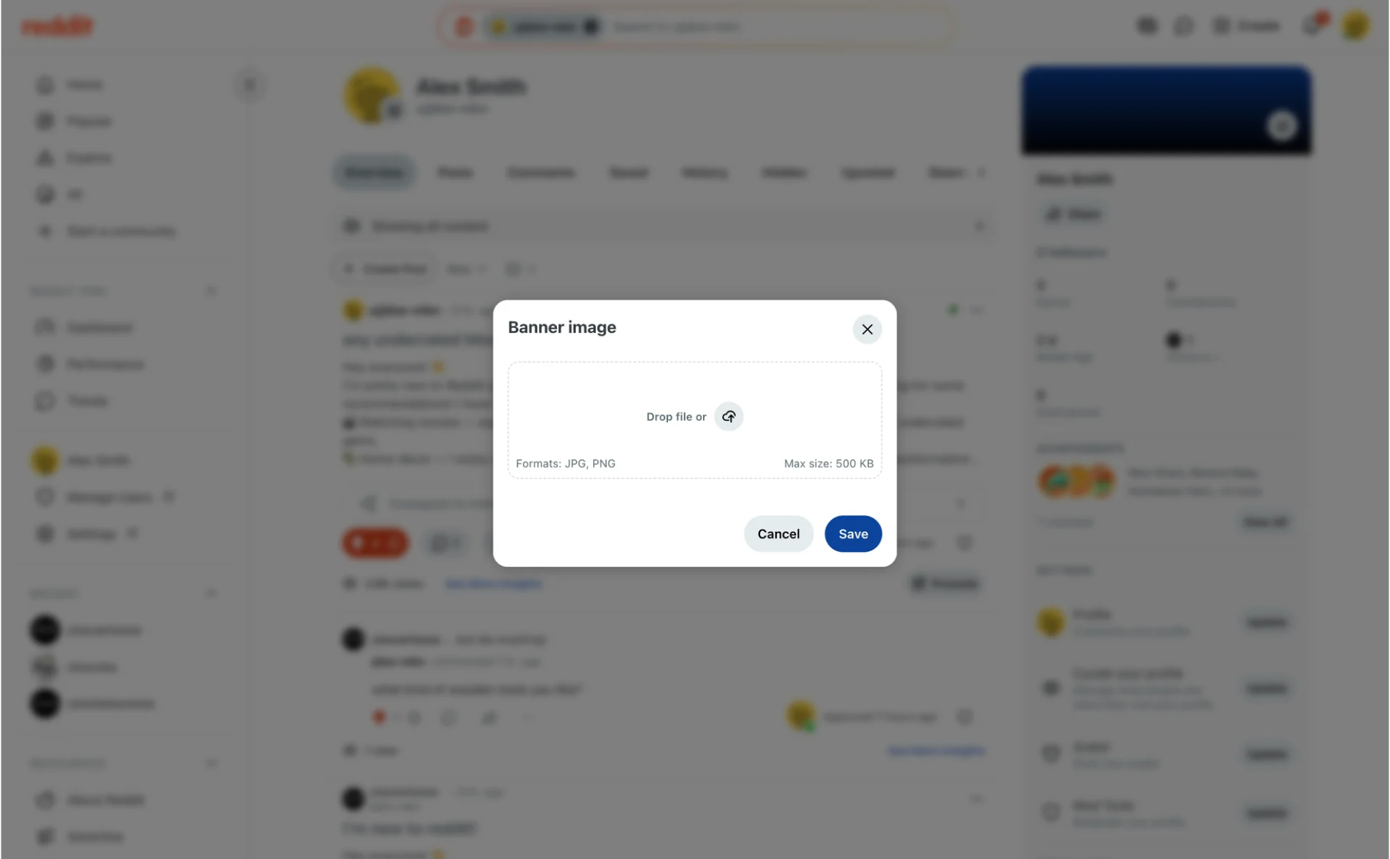
16. Reddit
Reddit keeps its file upload design minimal, tucked directly into the post creation flow. Through a simple modal window, users can drag and drop or click to add JPG or PNG files, quickly moving on to publishing.
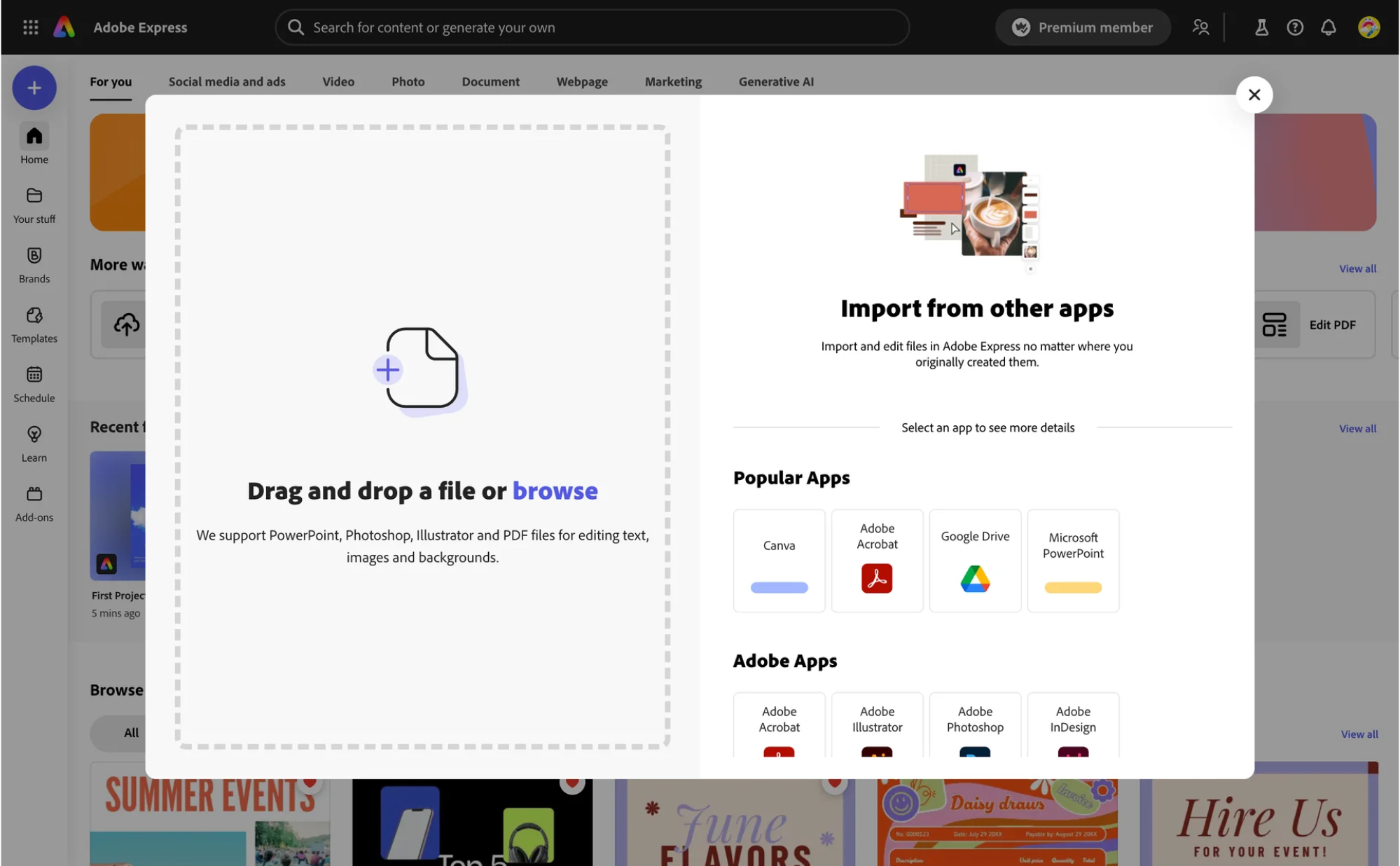
17. Adobe Express
In a tool focused on quick content creation, the upload flow has to feel seamless. Adobe Express tackles this with a split UI modal, where users can either drop custom files or import assets from connected apps.
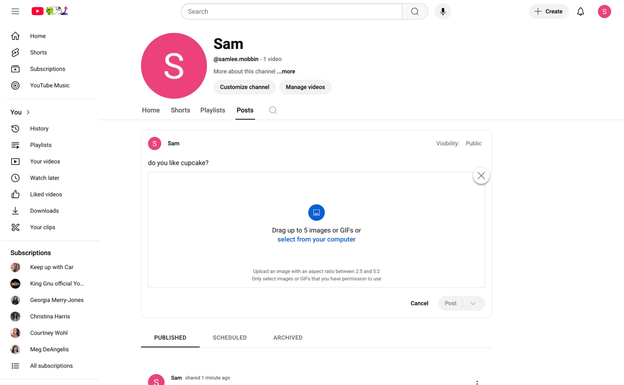
18. YouTube
YouTube places file upload at the center of its user experience. The process opens in a dedicated screen where users can drag and drop or select a file, with real-time feedback and step-by-step publishing guidance.
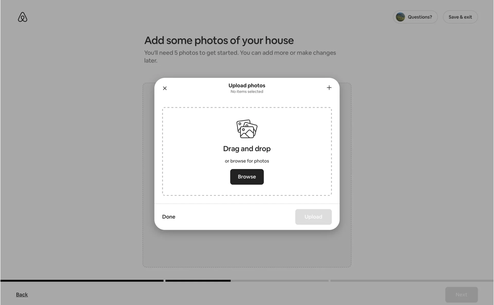
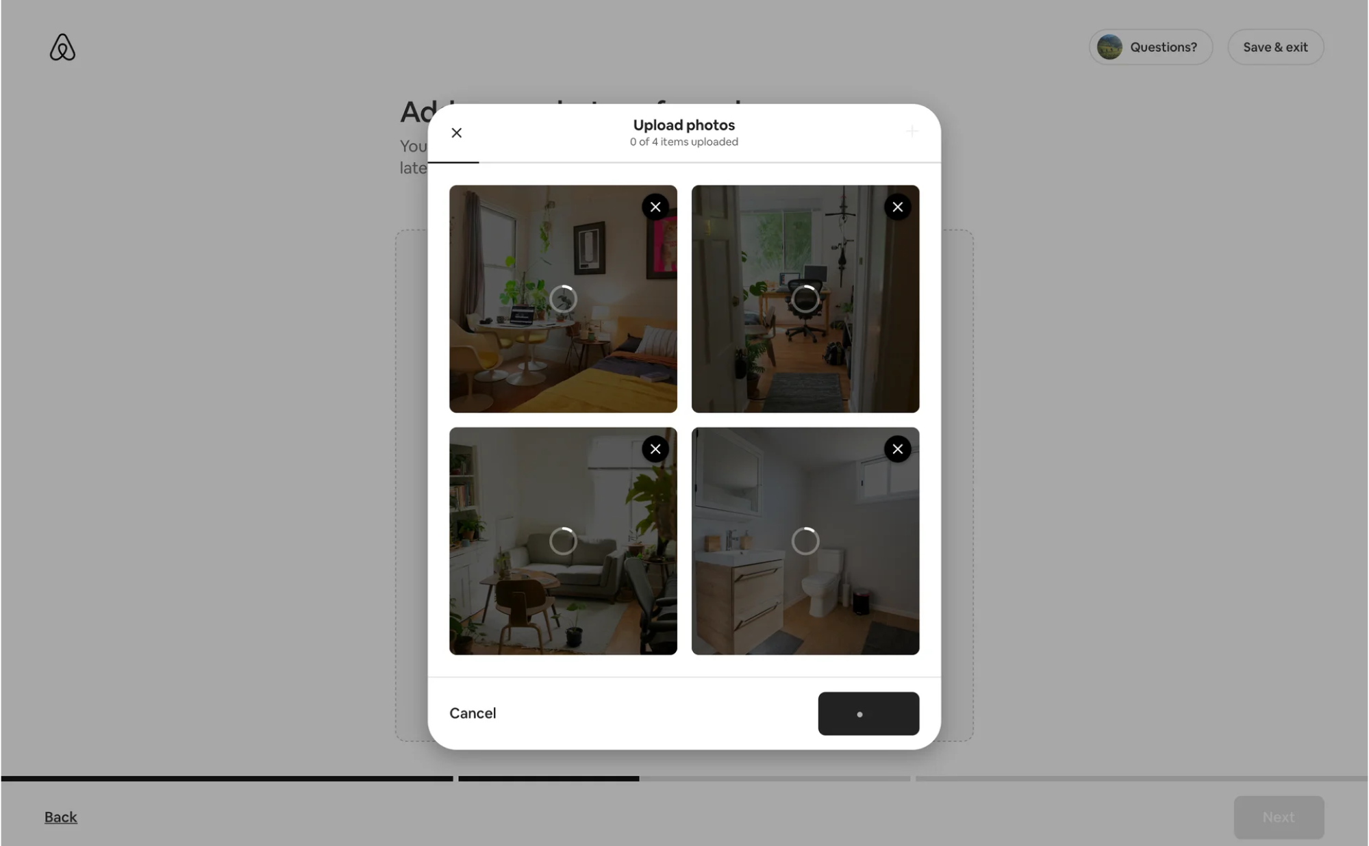
19. Airbnb
In Airbnb’s host flow, uploading photos is a key step in creating a listing. The interface allows bulk actions with auto-arranged previews, helping users present their space visually without worrying about formatting.
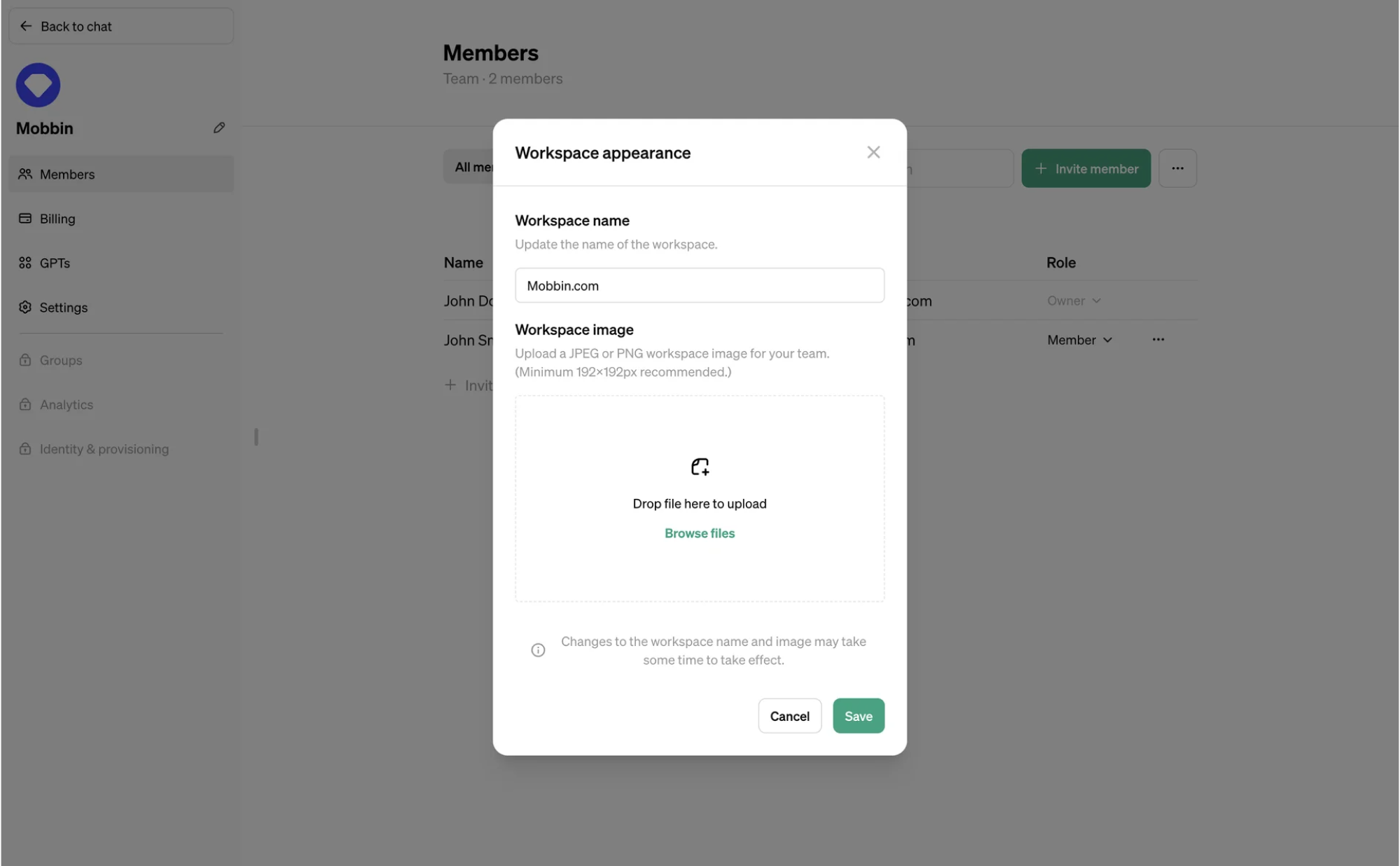
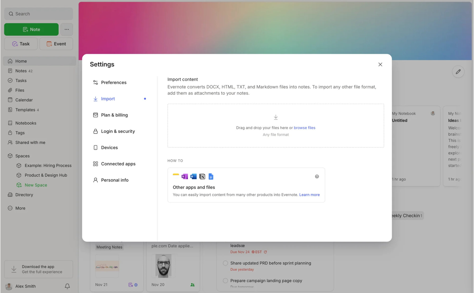
20. OpenAI
When managing workspace appearance in OpenAI, the platform lets you browse and upload files through a distraction-free interface. Subtle text prompts guide what types of documents you can add, along with helpful recommendations.
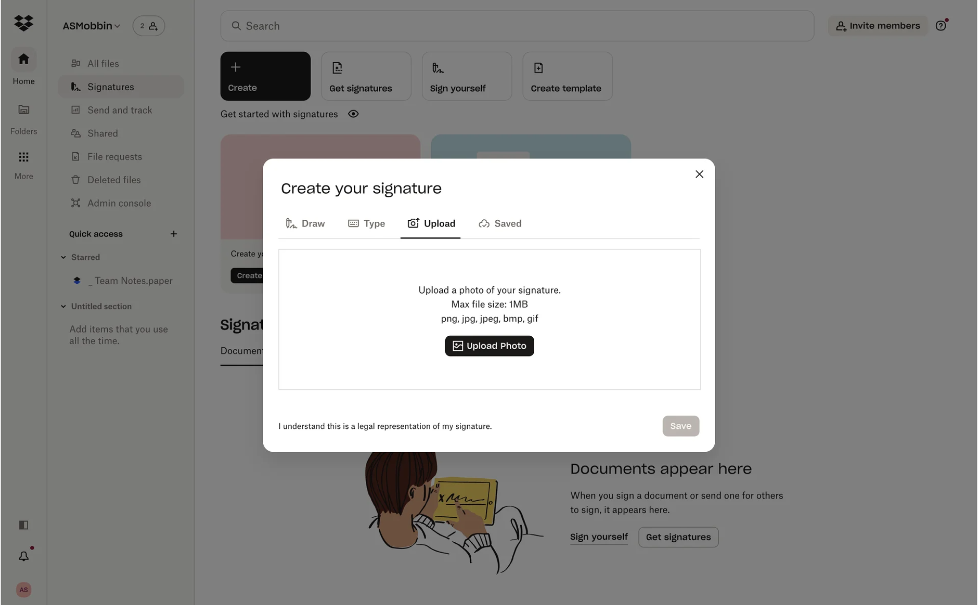
21. Dropbox
For its file upload UI design, Dropbox uses a tabbed layout similar to the one we delivered for Modia. When creating a signature, users can switch between tabs and choose the option that lets them add supporting documents.
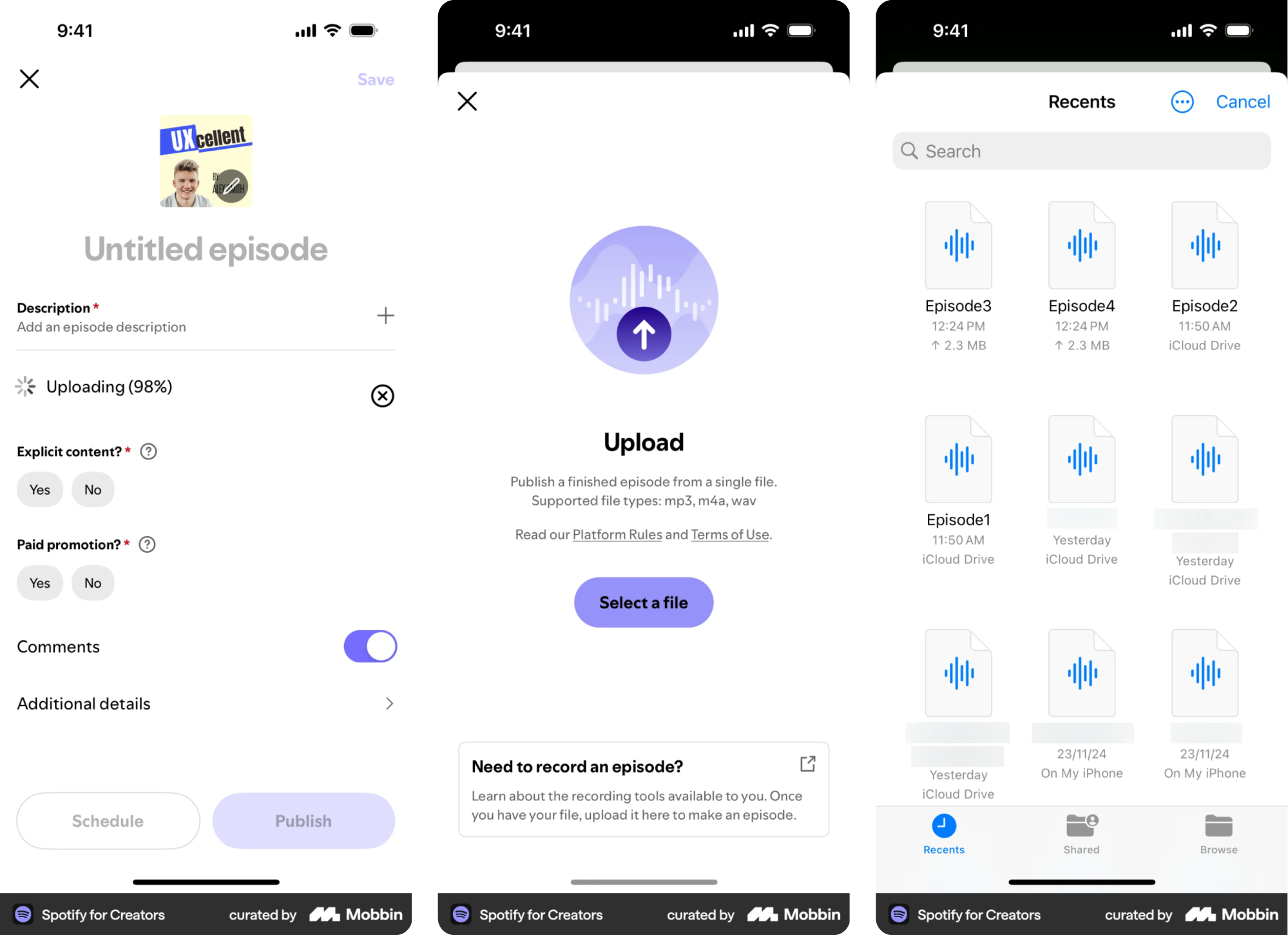
22. Spotify for Creators
In Spotify for Creators, artists can drop cover images, tracks, or promotional assets through a straightforward upload interface. The design stays minimal, with visual previews and clear file requirements to avoid last-minute surprises.
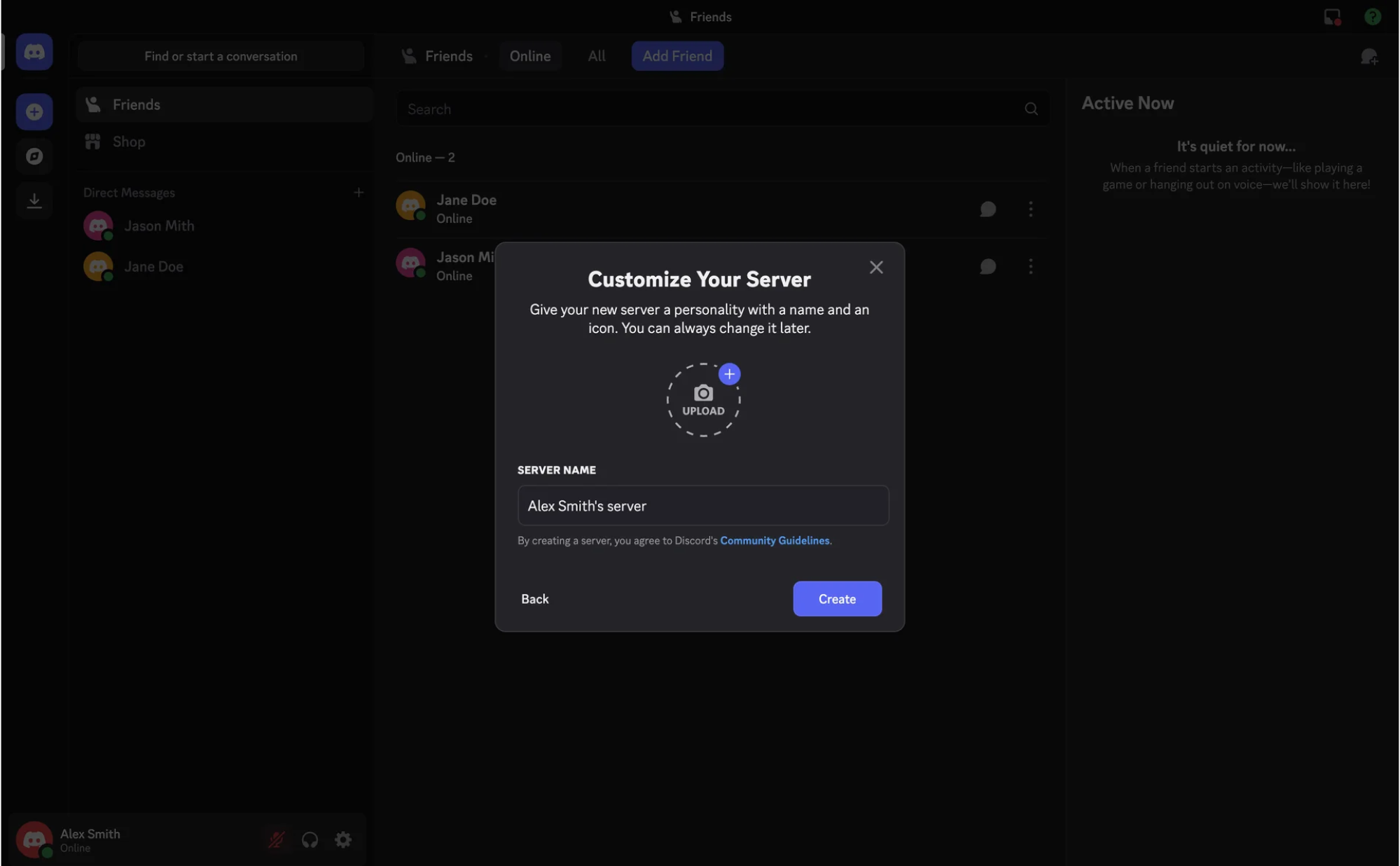
23. Discord
Discord keeps the upload file UX tightly integrated into the platform experience. Users can customize their server or profile by adding an icon, and import images through a simple modal dropzone when sharing content.
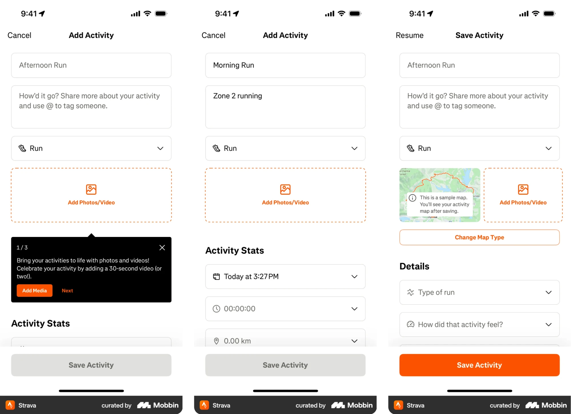
24. Strava
On mobile, Strava lets users showcase activity photos right from the post-workout screen. The upload UI is minimal and built into the flow, making it easy to add context without interrupting the routine.
UI/UX best practices for designing file upload
With the inspiration in place, it’s worth looking at what makes these interfaces actually work. Below, we’ve gathered a list of file upload UX best practices to help you design patterns that perform well in real products.
Support both drag-and-drop and manual upload
Users expect file upload interfaces to respond to how they already think about files, and offering both drag‑and‑drop and a traditional click option does exactly that.
A clearly highlighted drop zone gives people an inviting place to drag files over, and visual cues (like changes in color or border style when a file hovers over it) help signal that interaction is possible. That reduces the uncertainty users might have.
At the same time, a classic “Select files” button ensures that people who aren’t comfortable with drag‑and‑drop still have a clear way to choose files manually.
Allow multiple file selection
Many tasks naturally involve more than one file, so forcing users to upload them one at a time needlessly slows things down. Let people select or drop multiple files at once, and display their choices in a list or gallery view.
When there are limits, such as a cap on the number of files or total size, make them clear before the process begins, so people aren’t surprised by errors.
Add clear upload progress and feedback
Once users hit upload, they want to know what’s happening next. A determinate progress indicator, such as a progress bar, subtle animation, or a percentage label for each file, gives them a sense of movement and time.
For multiple files, showing both individual progress and an overall status helps users understand what’s done and what’s still in motion.
When the upload completes, reinforce success with a clear signal, like a checkmark, “Upload complete” label, or similar confirmation, and make failure states visible and actionable. Without this reassurance, people can easily assume the app froze.
Show file previews when possible
When users add images or other previewable files, a small thumbnail helps them quickly confirm they’ve chosen the right item.
Even a simple file icon paired with the filename improves recognition and reduces guesswork. This becomes especially valuable when multiple files are involved, as a swift visual scan of thumbnails can prevent unpleasant UX mistakes.
Handle errors clearly and constructively
Errors will happen. Files might be too large, in an unsupported format, or network interruptions may interrupt an upload. Your interface should handle these situations gracefully and help users recover without frustration.
Place clear, concise error messages right next to the affected file (for example, “File too large (max 10 MB)”), so people instantly understand what went wrong.
When an upload fails, offer a next step: a “Retry” button for temporary issues like network timeouts, or an option to remove the file and try a different one. Keep the tone friendly and helpful to guide users toward what to do next.
Make file uploads truly accessible
To make file upload UI work for everyone, you should take care of accessibility. For this, support keyboard navigation by ensuring the “Browse” button or drop zone can receive focus and open the file dialog when Enter or Space is pressed.
If your selected files list includes remove icons or similar controls, make those focusable and announce their purpose to screen readers.
Also, provide meaningful textual instructions and status updates that assistive technologies can relay. Beyond interaction mechanics, follow accessibility guidelines for color contrast and visible focus indicators so every element remains clear.
Design for responsive upload experiences
File upload interfaces need to feel at home on both desktop and mobile. On larger screens, a spacious area with drag-and-drop functionality signals where users can interact, and those large targets make dragging files feel effortless.
But on mobile, dragging files isn’t a common gesture. To simplify the UI, use a prominent upload button that opens the device’s file picker.
When designing, make sure your layout adjusts gracefully across screen sizes and orientations. A grid of file thumbnails might stack vertically on narrow screens, and buttons should be large enough for comfortable touch input.
Consider advanced upload options
Modern file upload experiences go beyond local files and let users tap into cloud sources or other inputs. Depending on your audience and context, it can be useful to let people import files from external services and select them from their devices.
Some upload widgets offer a menu of sources and handle the necessary authentication and import process smoothly behind the scenes. This kind of feature isn’t essential for every project, but it’s good to know what’s possible.
If you do include these options, verify they’re clearly indicated with provider icons or logos, and that the overall flow remains approachable for first‑time users.
Final drop
That’s the end of the article, and hopefully, you’ve got a few new ideas for your own file upload UI, plus some practical tips you might not have come across before.
Of course, that’s not the end of the journey. New patterns and trends appear all the time, and as UI/UX designers, it’s on us to keep an eye on what’s evolving.
By the way, if you’re working on a product and need design expertise on your side, our team is just a few lines away. With 60+ experienced designers on board, we’re always ready to jump in, especially when it comes to building SaaS apps.


.webp)


.png)

