
Talking to computers used to be a party trick. Now we casually tell our phones to set alarms, ask smart speakers to play Taylor Swift, and yell “stop!” at a vacuum cleaner like that’s a normal thing to do. Voice assistants slipped quietly into our daily routines, and suddenly, everyone is building something that listens and talks back.
However, most teams underestimate that a great voice experience doesn’t happen just because you added speech recognition to an app.
Voice UI design is its own discipline, part UX writing, part psychology, part systems thinking. Designing a good voice experience is less about fancy tech and more about understanding how people actually talk, interrupt, hesitate, change their minds, and ask for things in… well, very human ways.

This guide walks you through how to design voice interfaces that feel simple, trustworthy, and helpful, even if you’re completely new to the topic. You’ll find practical examples, best practices, and step-by-step workflows you can use right away. So, let’s dive in!
Understanding Voice User Interfaces (foundations)
Before we move into the practical stuff, let’s pause for a second and make sure we’re talking about the same thing, what a VUI really is, and why it’s becoming so important these days.
What is a Voice User Interface (VUI)?
A voice user interface (VUI) is a system that allows users to interact with a product through spoken commands, instead of relying only on taps, clicks, or visual controls. We’re talking about the technology behind Alexa, Siri, and Google Assistant, but also the voice features inside apps, cars, smart TVs, enterprise tools, and even accessibility systems.
The simplest way to think about it:
If users can talk to it, and it talks back, it’s a VUI.

And in modern products, VUIs are rarely “voice-only.” They’re usually part of multimodal experiences, where voice works together with screens, buttons, or visual feedback. For example, you might tell your car, “Navigate home”, but you still rely on the map on the dashboard. Or you ask your phone to set a timer, and a visual confirmation pops up instantly.
So, VUI is about making user interactions more natural, hands-free, and accessible when traditional UI falls short.
Components of VUI
Even though voice interfaces feel effortless when they work well, there’s a surprisingly complex chain of events behind every “Hey Siri” or “Alexa, play music”. So, let’s talk about what really happens under the hood without drowning you in technical jargon.
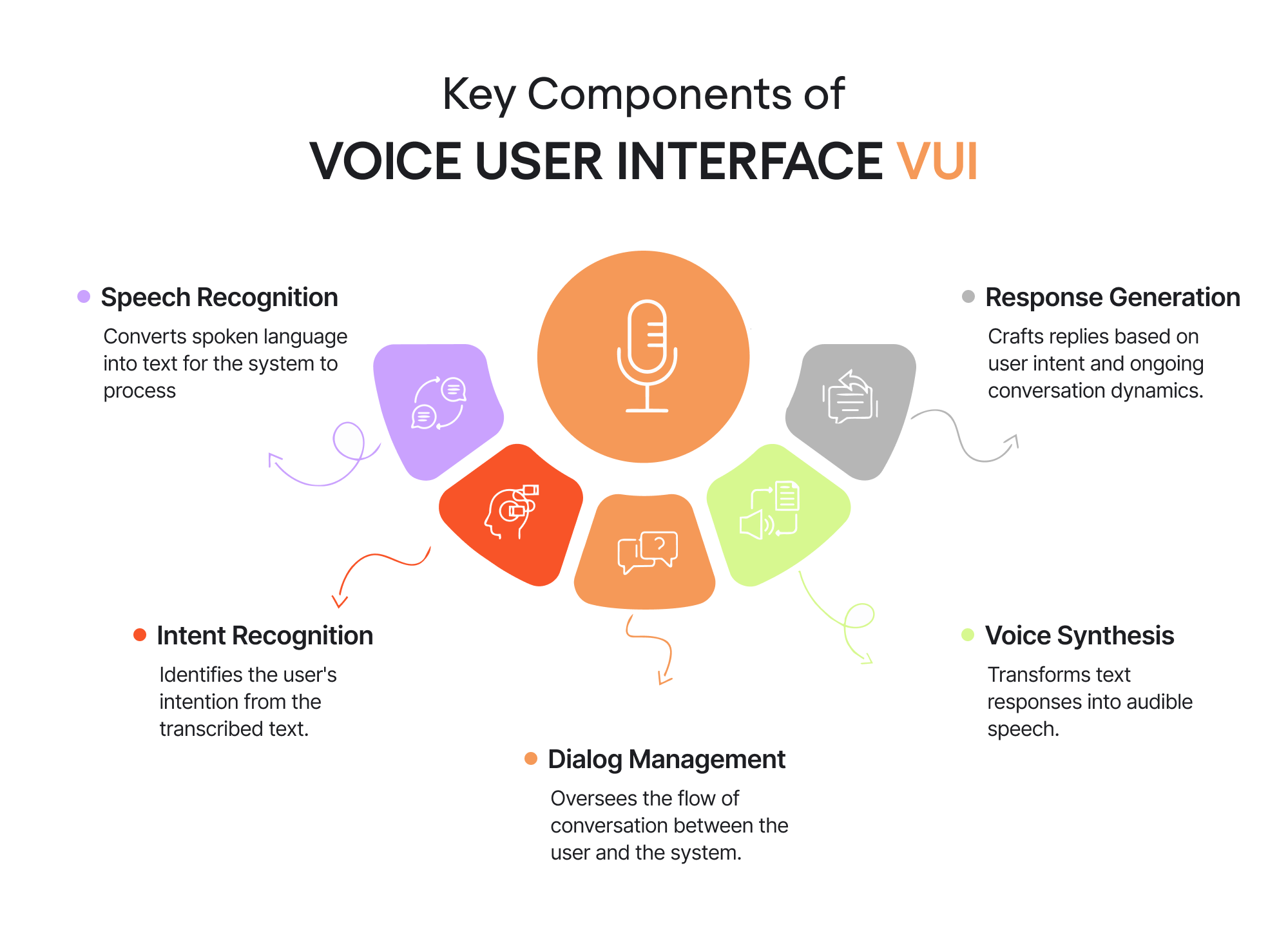
1. Speech recognition
The process starts with something basic but incredibly difficult: recognizing what you said. Voice recognition technology listens to your voice and tries to convert the audio signal into text. That means dealing with accents, background noise, mumbling, fast speech, and all the chaos of real-life conversation.
If you’ve ever told a voice assistant, “Set a timer for ten minutes,” and it heard “time limits,” you know exactly how fragile this step can be.
2. Intent recognition
Once the system has text, the next question is: what does the user want?
Intent recognition analyzes the transcribed text to figure out the user’s goal:
- Are they asking a question?
- Giving a command?
- Making a correction?
For example, “Play some jazz”, “I want to hear jazz”, and “Put on Miles Davis” all mean roughly the same thing—but they’re phrased very differently.
This is where context, phrasing, and even previous interactions start to matter.
3. Dialog management
Dialog management is the brain that keeps the conversation on track.
It decides what should happen next:
- Should the system ask a follow-up question?
- Should it confirm the request?
- Should it act immediately?
For example, if you say “Book a table,” the system might respond with “For how many people?” instead of guessing. Good dialog management prevents conversations from feeling robotic or frustrating, especially when the user’s request is incomplete.
4. Response generation
Once the system knows what to do, it needs to decide how to respond.
Response generation crafts the actual reply based on the user’s intent, available data, and the current conversation context. This includes choosing wording, tone, and level of detail.
A helpful response feels natural and relevant. A bad one feels generic, repetitive, or out of place, breaking the illusion of “intelligence” almost instantly.
5. Voice synthesis
Finally, the system has to speak back.
Voice synthesis (text-to-speech) turns the generated response into audible speech. This step affects how human or robotic the interface feels. Timing, pronunciation, pauses, and intonation all matter more than most users realize.
Even a perfectly correct answer can feel wrong if it’s delivered in a flat, unnatural voice.
How these components work together
Individually, each of these components handles a specific task. But what makes a voice user interface feel “smart” is how they work together as a single flow. From the moment speech is captured to the moment a response is spoken back, the system continuously translates human language into structured meaning and then back again. To understand that flow, we need to look a bit closer at how language itself is processed.
Natural Language Processing (NLP)
Once your speech is converted to text, the system still needs to determine what you meant. Humans are messy:
- We leave sentences unfinished.
- We change our minds halfway.
- We use slang, shortcuts, or incomplete phrases.
NLP tries to make sense of that.
For example, “Book me a table for tonight”, “Make a dinner reservation”, and “I need a place for two at 7” all express the same intention, even though the sentences look nothing alike.
Intents, utterances, and slots — the structure behind natural conversation
To respond correctly, a voice system needs structure. Designers usually break this into three parts:
- Intent: the action the user wants (“order food”, “set a timer”, “play Taylor Swift”).
- Utterances: all the different ways users might phrase that intent.
- Slots: the variables that fill in the details (“for 10 minutes”, “at 7 PM”, “pepperoni pizza”, “Paris”).
In a way, this is the VUI version of creating forms and buttons — just spoken instead of clicked.
LLM reasoning — modern AI assistants filling in the gaps
Older voice systems used strict scripts. If you didn’t phrase something exactly right, they failed. But today’s assistants use large language models (LLMs). This allows them to understand context, incomplete requests, and vague human conversation.
You can say things like:
- “Ugh, that thing I ordered last week, reorder it.”
- “Remind me about that bill, you know which one”.
- “Play that song, I can’t stop humming”.
And the system can figure it out.
This is what makes modern VUI feel less like “issuing commands” and more like having a back-and-forth conversation.
Text-to-Speech (TTS), turning responses back into natural speech
Finally, the assistant has to respond, and not with robotic beeps or flat, synthetic phrases, but with clear, natural-sounding speech that feels pleasant to listen to. And this part is more important than most teams expect. The tone of voice has to fit the product.
A banking app, for example, shouldn’t sound like UX design for children, as if it’s hosting a kids’ birthday party. A fitness coach can’t be monotone and bored. And a healthcare assistant definitely shouldn’t drift into sarcasm or overly casual jokes.
So, TTS is not just about “making the system talk”. It’s about giving your product a personality that users trust and feel comfortable interacting with.
That’s the entire loop — a conversation that feels simple on the surface but is powered by complex logic underneath.
Why voice ui design matters
Voice interfaces earned their place in modern products because they solve very specific problems. One of them is accessibility in UX: users with low vision, mobility challenges, or age-related limitations often rely on voice to do things that would otherwise require precise taps or reading small text. And a quick voice command can mean independence.
Another reason voice has become essential is timing. There are countless moments when screens are inconvenient — driving, cooking, carrying things, or simply multitasking — and a spoken request is the easiest option available.
And then there’s the larger shift in UX. Products are increasingly blending voice, visuals, and AI into one smooth experience. You ask for something out loud, the screen shows the details, and AI fills in the context. Voice isn’t meant to stand alone; it works best as part of this multimodal flow.
In short, voice matters because it steps in exactly where traditional interfaces start to feel slow, inaccessible, or attention-heavy — and because it fits naturally into how people already navigate their day.
Six core principles of great VUI design
Designing for voice means stepping into the way people actually talk — with pauses, hesitations, half-finished sentences, and the occasional “uhm”. It’s a different rhythm than tapping on a screen, and it comes with its own quirks. To make the experience feel smooth and intuitive, there are a few principles that every great voice interface leans on. So let’s go through them!
1. Voice-first, but not voice-only
Voice shines in the moments when people want to keep moving — cooking, driving, carrying bags, or just trying to get something done without poking around a screen. Those are the situations where a quick “set a timer for ten minutes” or “call Anna” comes in handy.
But even the most natural voice flow still benefits from a bit of visual support. People like to see that their command landed, catch small mistakes, or double-check information without repeating themselves. A simple on-screen confirmation or a nearby touch option gives users a safety net and makes the whole interaction feel more grounded.
Hybrid flows often work the smoothest. Imagine browsing an online store: you pick a shirt visually, because you want to see the fabric and fit. But once you’ve made your choice, refining it by voice feels natural: “Show it in black”, “Do you have it in medium?” or “Sort by lowest price”. The conversation speeds up the small decisions, while the screen reassures the user that everything landed exactly as expected.
Designing voice-first simply means creating flows that feel natural when spoken, while still giving users a comfortable way to tap, check, or adjust whenever they want.
2. Natural, human-like conversation
When people talk to a voice interface, they obviously don’t switch into “robot mode.” They speak the same way they do in everyday life — casually, with pauses, hesitations, and unfinished thoughts. A good VUI leans into that rhythm instead of forcing users to speak in perfectly structured commands.
Clear, everyday language is a huge part of this. Short sentences and friendly phrasing sound much more natural in a voice flow than stiff, formal lines. For example, “Your request has been processed” might look fine in a UI, but hearing it out loud feels awkward. “All done,” on the other hand, fits the tone of a real conversation and lands much better in a voice flow.
It also helps to design for the messy moments — interruptions, pauses, incomplete thoughts. If a user says, “Play… uh… the latest Dua Lipa song”, the assistant should handle the hesitation gracefully. People don’t speak in perfect scripts, and the interface shouldn’t expect them to.
And finally, little conversational cues matter too. Simple acknowledgments like “Sure”, “Got it”, or “Let me check” keep the interaction moving and make it feel like a real back-and-forth rather than a series of commands.
3. Conciseness and cognitive load management
Voice interfaces don’t give users the luxury of skimming or rereading. Whatever the assistant says needs to be understood in the moment, which is why concise responses feel smoother and far less tiring. Long, overly detailed answers make users mentally juggle information they never asked for — a common complaint in many VUI critiques. No one needs to hear the full “Your meeting is scheduled for 3 PM, Central European Time, Stockholm, Sweden” when “Your meeting is at 3” is perfectly clear.
A better approach is progressive disclosure. Start with the simplest, most essential answer, and let the user decide if they need more. For example, “Your package will arrive tomorrow” is usually enough, but the assistant can always offer, “Want the exact delivery window?” if the user needs the details. This keeps the conversation light and prevents the cognitive overload that comes with long, uninterrupted monologues.
In voice UX, clarity matters more than packing every detail into a single reply. Users should get the key information quickly, with the option to request more if needed.
And if you’re curious about the psychology behind why some interfaces feel light, and others are mentally exhausting, this article will come in handy.
4. Context awareness and feedback
Next up, voice interactions feel surprisingly fragile when the system gives no sign that it heard you. A simple visual cue, a short acknowledgment, or even a quick sound signal reassures users that the assistant is listening and processing the request. These tiny moments of feedback carry a lot of weight because they replace the visual certainty we’re used to in traditional interfaces.
Context matters just as much. If someone is in a noisy environment, speaking quickly, or returning to a conversation they started earlier, the system should pick up on those signals. A good VUI adjusts accordingly — asking for clarification when the audio is unclear, shortening responses when users are multitasking, or remembering small details from the previous turn so the flow doesn’t feel repetitive.
Together, context awareness and subtle feedback make the interaction feel grounded and connected. Users don’t have to wonder whether the assistant understood them, whether it’s “thinking,” or whether they need to repeat themselves. The system feels present, responsive, and in tune with what’s happening on the other side of the microphone.
5. Persona and tone of voice
Every voice interface carries a personality, whether the team designs it intentionally or not. Users pick up on tone immediately, so the way an assistant speaks shapes how trustworthy, friendly, or helpful it feels. That’s why it’s worth deciding early on who your product “sounds like” — a calm expert, a practical helper, a friendly coach, or someone completely different. Once that personality is set, the rest of the writing becomes much easier and far more consistent.
Tone also needs to adjust to context. A cheerful fitness assistant can crack a light joke during a workout, but the same tone would feel off while helping someone refill a prescription. The opposite is true, too: a formal, serious tone works well for banking or healthcare, but it might feel cold and distant inside a creative or lifestyle app. Matching the emotional temperature of the situation keeps the interaction from feeling tone-deaf.
And because the interface speaks out loud, even small phrasing choices stand out. Shorter sentences, natural intonation, and simple wording usually land better than scripted, overly polished lines. When the tone fits both the brand and the moment, users barely think about the assistant at all — the conversation just feels like it’s flowing in the right direction.
6. Trust, privacy, and inclusivity
Lastly, for many people, talking to a voice assistant still feels a bit personal. They’re speaking out loud, often in their homes or workplaces, and they want to know those moments are handled with care. That’s why transparency is the foundation of trust in voice UX. Users should always understand what the system is listening to, what it’s keeping, and how their voice data is being used. A quick reminder, like “I’ll only save this for your timer history,” or a clear option to delete voice recordings, goes a long way toward making people feel safe.
Supporting different accents, speaking styles, and abilities is just as essential. Not everyone speaks with the same rhythm or clarity, and good VUIs acknowledge that reality instead of expecting users to adapt to the system. The experience should also offer alternative ways to complete a task — especially for people who have speech impairments or who prefer typing or tapping in certain situations.
And now that we’ve covered the essentials, we can move on to the fun part: walking through the VUI design process step by step!
Step-by-step VUI design process
So let’s break theory into practice. Below is the exact workflow teams use to design human voice experiences that feel effortless, from the user research phase through to fully tested, multimodal interactions.
1. Conduct user research
Every strong voice experience starts with understanding your users — not with writing dialogues or picking a tone. The goal of this step is to figure out where voice naturally fits into your product and where it would only slow things down.
What does a UX researcher do? A good place to start is mapping the customer journey. Look for the moments when users have full hands, limited attention, or need a faster path than tapping through screens. These “micro-frictions” often reveal the real opportunities for voice. Maybe people want to add tasks while walking, update their shopping list mid-cooking, or quickly check a status without digging into a dashboard.
Competitive research helps, too. Explore how similar products approach voice interactions — whether through Alexa skills, in-car systems, or small voice features baked into mobile apps. As Toptal’s experts point out, this gives you a realistic sense of user expectations and industry standards before you design anything yourself.
And finally, don’t skip talking to real users. Simple interviews, empathy maps, or even observing how people describe tasks aloud can tell you a lot. What words do they use? Do they speak in short user requests or long explanations? Do they hesitate? These UX design patterns will later shape your intents, sample dialogs, and copywriting.
If you want a more hands-on walkthrough of this phase, check out this guide, where our founder breaks down the whole research workflow in detail.
2. Write sample dialogues
Once you know where voice actually adds value, the next step is to draft the conversations themselves. This is where the experience starts taking shape — not in Figma, but in plain human language. Sample dialogs help you understand how users naturally phrase things, how the assistant should respond, and where misunderstandings or dead ends might appear.
Start with the “happy path” — the simplest, smoothest version of a task where everything goes right. Then slowly expand into real-life scenarios: hesitations, corrections, missing details, background noise, or users changing their minds halfway through. Good dialogues reflect all these moments because that’s how people talk in real life.
It also helps to write these dialogues as if two people were talking. When you see your lines on paper, awkward phrasing or unnatural jumps become obvious immediately.
Here’s a simple example based on a banking feature — something people use often, but usually through rigid screens and menus.
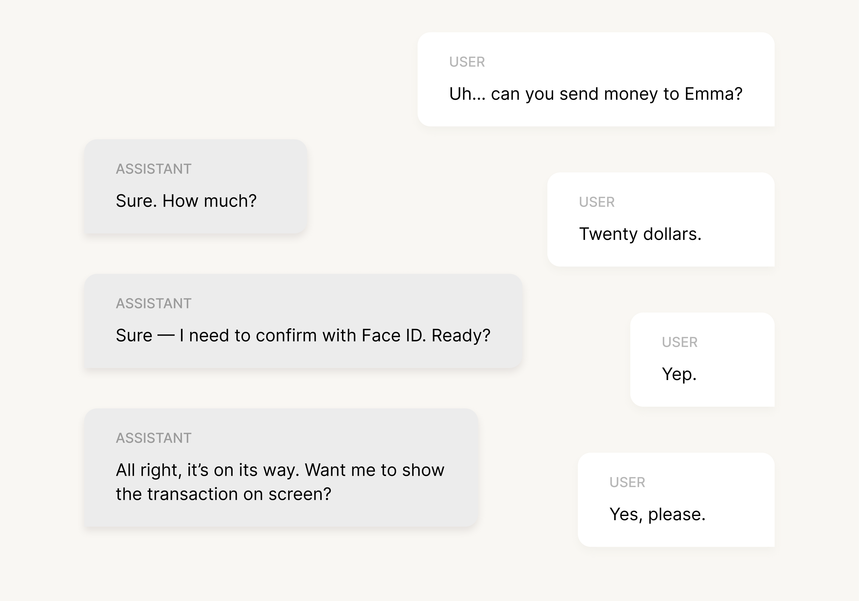
And boom, this tiny script already tells you a lot:
- The user doesn’t speak in perfect commands (“Uh… can you…”)
- The system asks for missing pieces instead of guessing
- The assistant confirms critical details
- Visual fallback appears naturally at the end
Once you write a handful of these dialogs, patterns begin to emerge — which phrases users repeat, where confusion shows up, and what parts of the flow need clearer guidance or better prompts.
3. Create conversation flows
Once you have your sample dialogs, the next step is to turn those little back-and-forth scripts into something more structured. That’s where conversation flows come in. Think of them as the roadmap of your voice experience: every path a user might take, every question the assistant needs to ask, and every moment where things can drift off track.
A good flow starts with the “happy path” you outlined earlier, then branches out into the real world — the parts where users hesitate, rephrase, or give you half of what you need. For example, in our banking scenario, the ideal flow is simple: request → amount → confirmation → done. But real usage also includes “I said Emma, not Anna”, “Wait, how much did I say?”, or “Actually, cancel that.” Designing these branches early helps the experience feel calm and predictable instead of rigid and frustrating.
It’s also worth mapping out error states right away. What happens if the user speaks too quickly? What if the assistant mishears a name, can’t find the recipient, or detects background noise? Planning these fallbacks up front saves a lot of awkwardness later and makes your UX customer support feel much more helpful when things go off script.
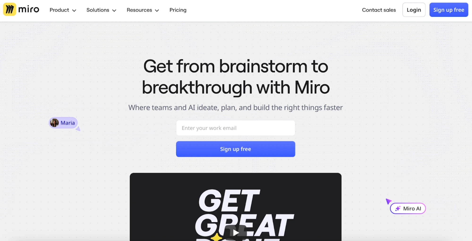
Tools like Miro or FigJam work perfectly for this step. You don’t need anything fancy — just a place to draw boxes, add arrows, and visualize how the conversation moves. The clearer your flow is, the easier it will be for your team (designers, developers, writers) to stay aligned when you move into prototyping.
At this stage, the goal is simply to make sure that every path makes sense, every dead-end has a way out, and the assistant always knows what to do next — even when the user doesn’t.
4. Prototype
Prototyping is where your voice experience finally starts to feel real. Up to this point, everything lived on paper — dialogs, flows, edge cases. Now it’s time to see how those ideas actually sound, how users react to them, and where things fall apart long before UX engineers touch a single line of code.
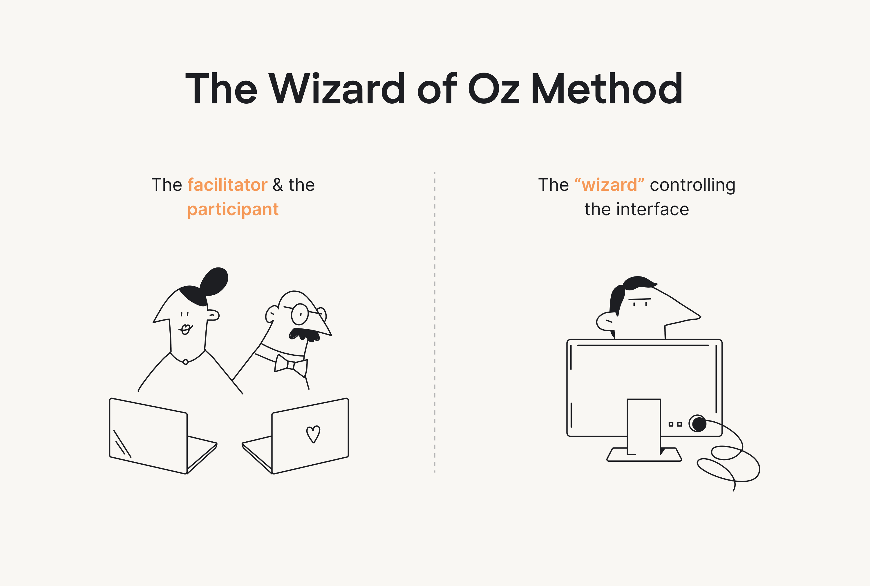
The easiest way to start is with the classic Wizard of Oz method. One person plays the “assistant” and responds to the user out loud, while the user interacts as if the system were fully built. It sounds almost too simple, but this technique uncovers issues incredibly quickly. You hear when a prompt is too long, when a question is confusing, or when users start speaking in ways you didn’t expect. It’s a low-pressure way to test the rhythm of a conversation without any technical setup.
If you want something a bit closer to the real thing, tools like Voiceflow or more advanced frameworks like Rasa let you simulate voice interactions with clearer logic behind them. Voiceflow works well for quick, drag-and-drop prototypes, while Rasa gives you more control when you need slightly more realistic, AI-driven behavior. In both cases, you’re essentially recreating the logic from your flowchart, hitting play, and speaking to the prototype as if it were a real assistant. It won’t behave perfectly, especially once AI responses get involved — but it’s enough to understand timing, intent matching, and how the assistant handles simple back-and-forth.
And for experiences that combine voice with screens, you can use tools like ProtoPie or even simple Figma hacks. A common trick is recording short clips of screen transitions and syncing them with audio responses. It’s not glamorous, but it’s great for testing things like “what should the app show while the assistant is speaking?” or “does this visual confirmation feel fast enough?”
One thing to keep in mind: AI makes prototyping a bit messy. Responses can vary, timing isn’t always consistent, and you may need to manually script tighter responses than what a real model would generate later. That’s normal. The goal at this stage is to test the flow, the prompts, and the overall feel of the conversation.
By the end of Step 4, you should have a prototype that looks and sounds believable enough for real users to try. And that brings us to the next step: testing your voice experience with actual people.
5. Test with real users
Once your prototype feels solid, it’s time to put it in front of real people. Voice interactions behave differently in someone’s living room, office, or kitchen than they do on your laptop — and you’ll learn more from watching five users speak to your assistant than from another week of polishing flows.
A simple way to run these tests is to continue with the Wizard of Oz setup you used earlier. Many teams seat the user and the “assistant” back-to-back so there are no visual cues or lip-reading that could influence the conversation. This format makes it easy to observe when users hesitate, when prompts feel too long, or when they naturally phrase something you didn’t anticipate.
During these sessions, focus on a few core metrics:
- Task completion: can users actually finish what they started?
- Error recovery: what happens when they get stuck, or the system mishears them?
- Satisfaction: how natural, fast, or frustrating does the experience feel?
At this stage, you’re simply checking whether the flow holds up in a real conversation. A couple rounds of lightweight testing often reveal the rough edges you’d never catch on paper and give you a much clearer direction for the next iteration.
6. Iterate and optimize
After you’ve tested your prototype with real users, the final step is simply making the experience better — smoothing out awkward prompts, tightening long responses, and adjusting the flow based on what people actually said and did. This is where conversation logs become incredibly useful. They reveal the phrases users naturally gravitate toward, where misunderstandings occur, and which parts of the interaction need clearer guidance or smarter follow-ups.
Iteration in voice design is never a one-and-done moment. As you refine the experience, new patterns emerge: unexpected utterances, new edge cases, or opportunities to simplify the conversation even more. The goal is to keep reducing friction until the interaction feels effortless — the kind of voice experience that simply “gets” users and adapts to how they talk, not the other way around.
Best practices, examples, and inspiration for great VUI
Alright, now that the core process is in place, it helps to look at how voice interfaces succeed (and fail) in the real world. These examples give you a clearer sense of what great VUI looks like — and what to avoid when designing your own.
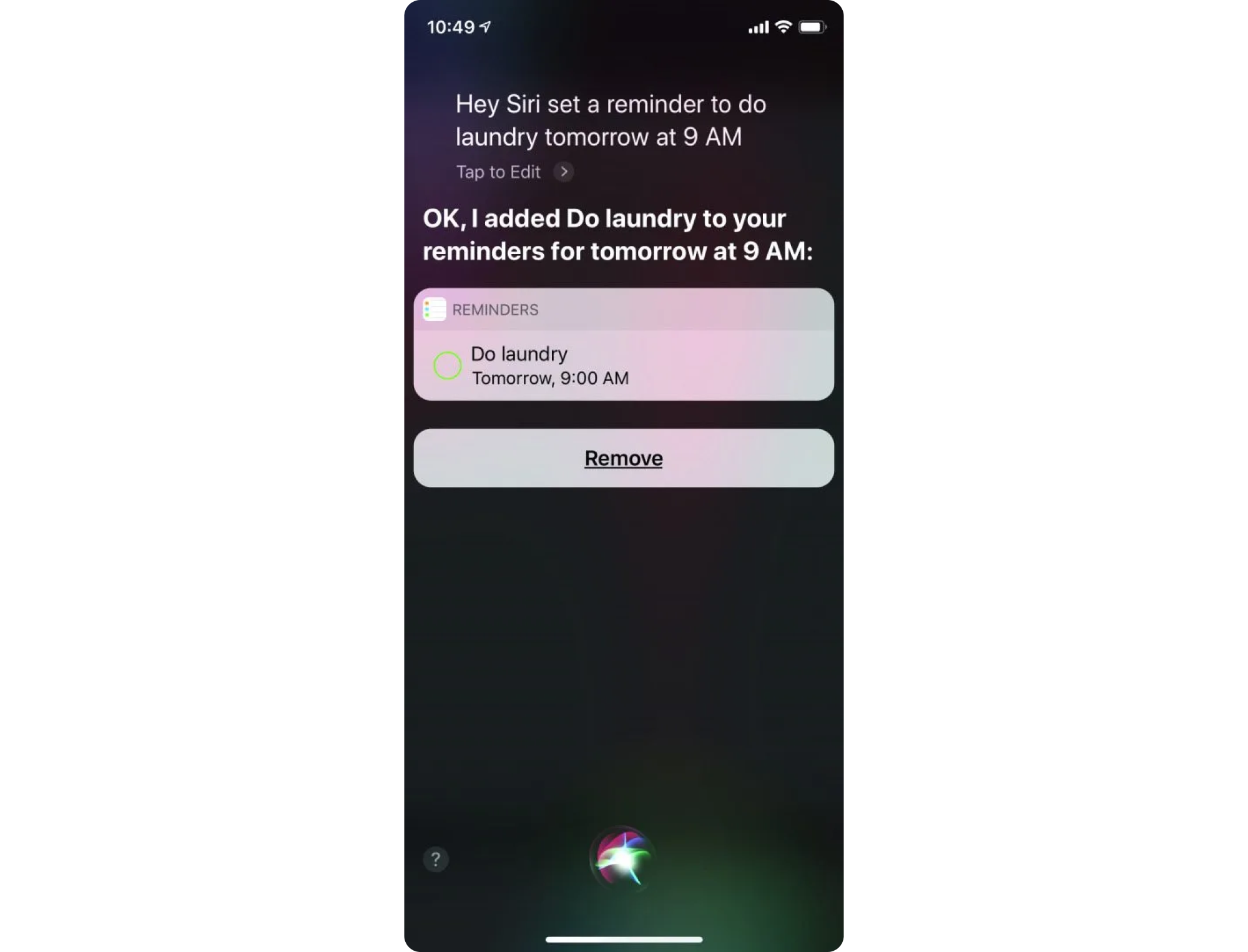
1. Apple’s Siri
Siri is probably the most familiar voice interface in the world, and for good reason: it handles quick, everyday tasks with almost no friction. Setting timers, starting navigation, sending messages, checking the weather — Siri excels at the kinds of interactions where tapping through a screen would take longer than simply speaking. It’s a great example of voice becoming the “shortcut layer” of an interface.
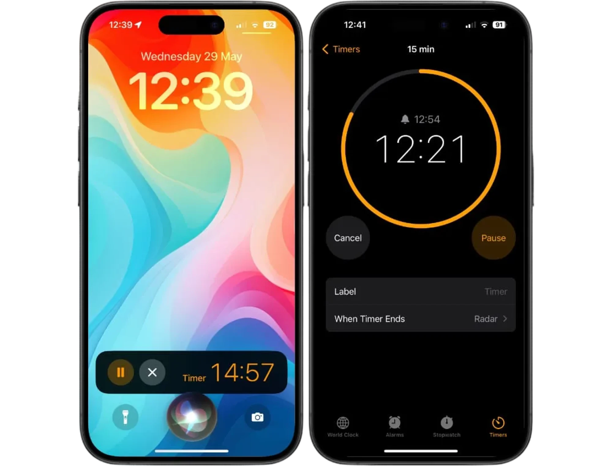
Part of what makes Siri effective is its ability to work in the background of real life. People ask it to set reminders while cooking, to call someone while driving, or to check the time while their hands are busy with anything else. The prompts are short, the confirmations are simple, and the interaction ends just as quickly as it begins. That rhythm — fast in, fast out — is exactly what well-designed VUI should feel like.
Here’s what a typical micro-interaction might look like in practice:
User: “Hey Siri, remind me to check my car insurance tomorrow.”
Siri: “Sure, what time should I remind you?”
User: “At 2.”
Siri: “Okay, I’ll remind you tomorrow at 2 PM.”
It’s a tiny flow, but it shows several good patterns at once: Siri asks for missing details instead of guessing, keeps responses short, and clearly confirms the final outcome so the user doesn’t have to wonder whether the request went through.
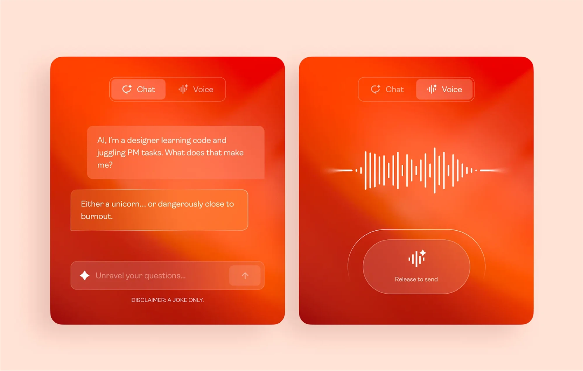
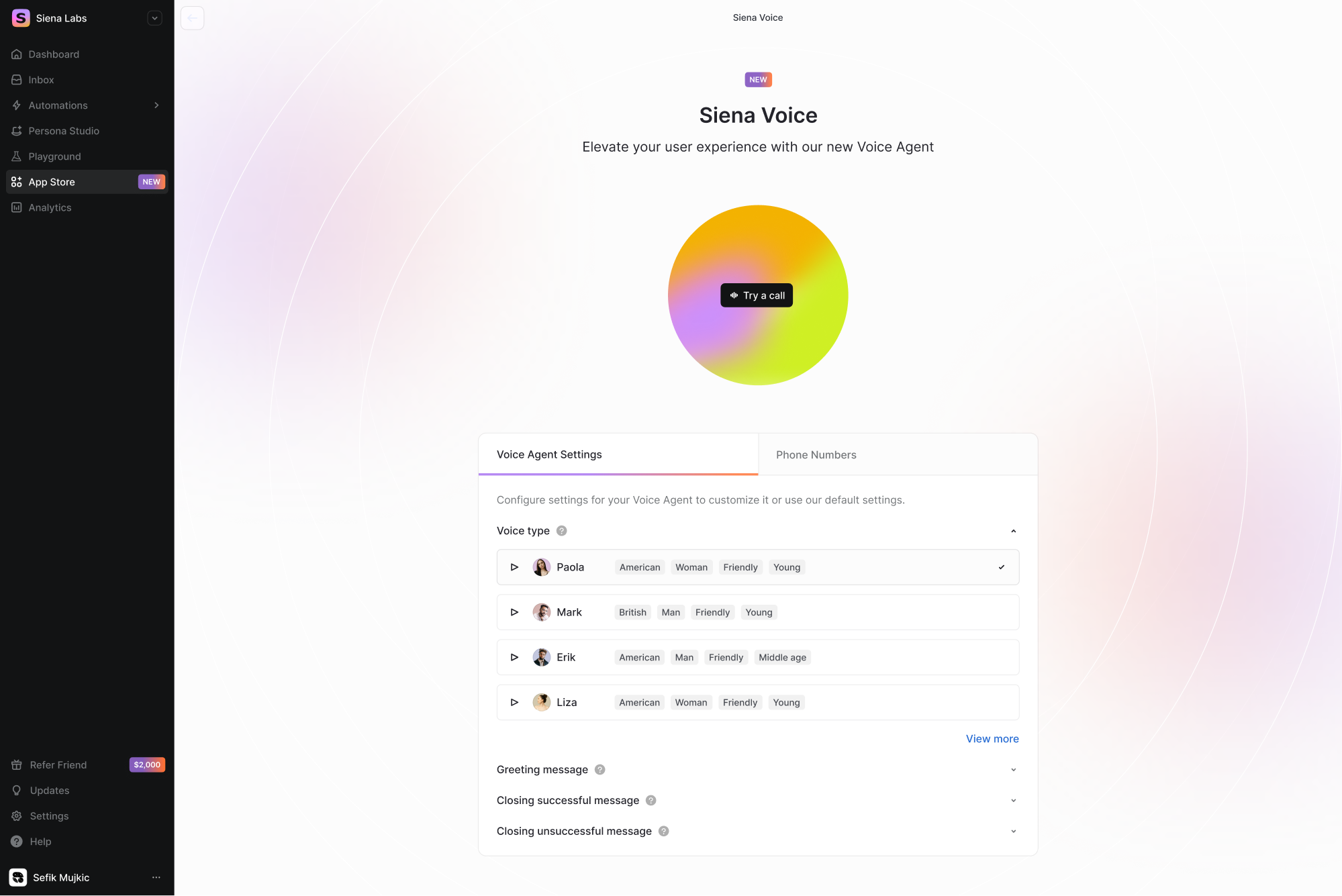
2. Siena Voice
For our client Siena, we designed Siena Voice, a new way for users to interact with the product through voice. As part of Siena’s latest upgrades, the client was eager to explore voice-enabled interactions, which led our team to create a completely new section of the platform: the Voice Channel.
To introduce this feature, Eleken designers built a dedicated landing-style screen that felt distinctive while staying consistent with Siena’s design system. We highlighted key elements with bright accents and added a subtle gradient drawn from the platform’s palette.
As a result, the interface achieved a clear visual hierarchy: primary actions stood out immediately, while secondary settings stayed accessible without adding visual noise.
3. Duolingo
At this point, it feels like everyone on the internet knows about Duolingo’s streak culture, or at least has seen the memes about the green owl emotionally blackmailing people into finishing their lessons. But underneath all the jokes, Duolingo is actually a great example of how voice interaction can blend seamlessly into a product people use every day.
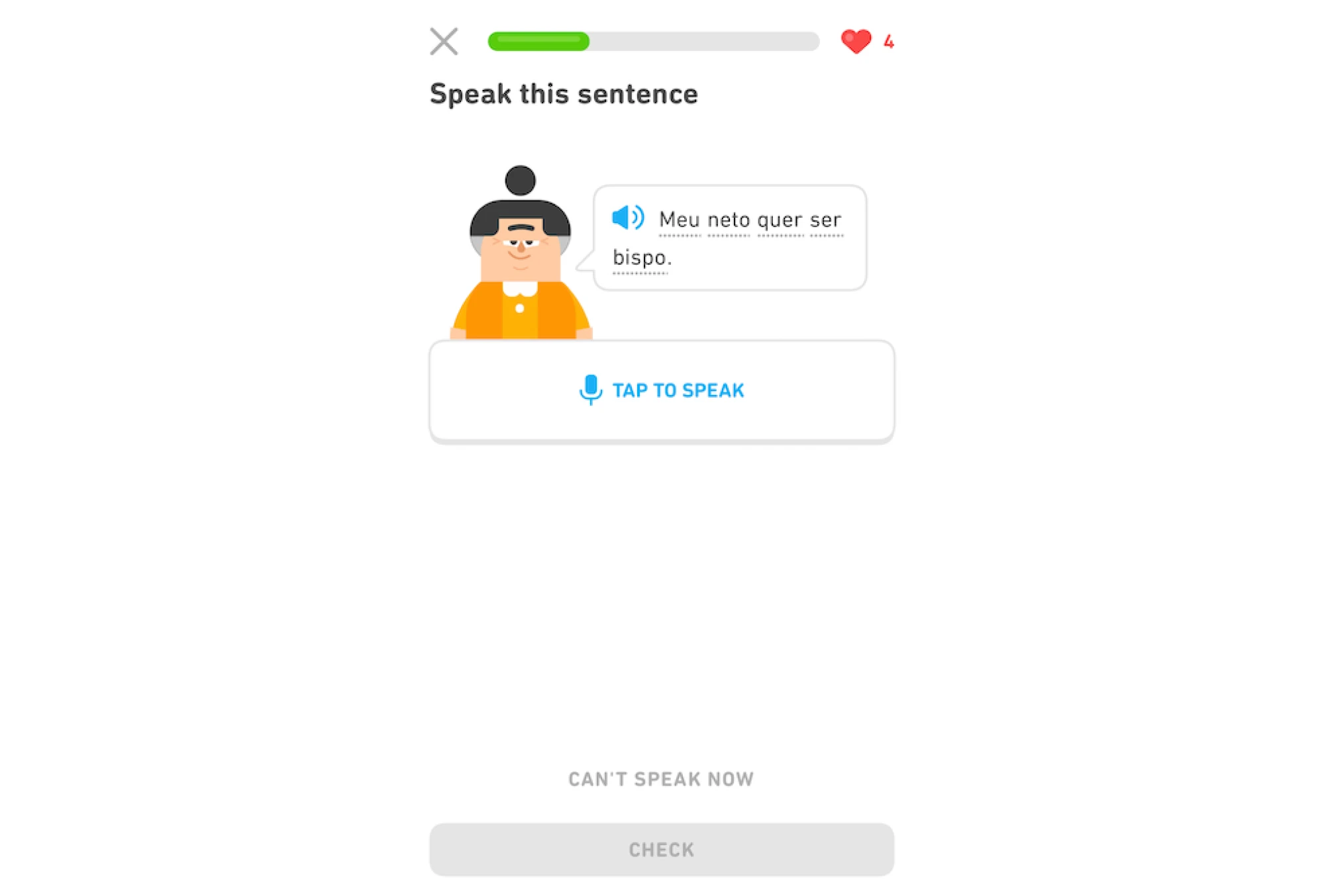
Instead of turning the voice into a big, dramatic feature, Duolingo makes it feel natural. Speaking practice is built right into the flow: you tap the microphone, say your answer out loud, and the app instantly checks how close you were. No pressure, no long instructions — just a quick moment of real language use that feels almost like talking to someone.
Here’s a quick example of how a tiny interaction might look during a speaking exercise:
User: “Dónde está la biblioteca?”
Duolingo: (transcribes your speech, checks accuracy) “Great job!”
—or—
Duolingo: “Almost! Try pronouncing biblioteca a bit more clearly.”
It’s not a full conversation like Siri's or Alexa's, but that’s exactly the point. Duolingo uses voice where it genuinely helps: getting people comfortable speaking out loud, one small step at a time. The experience is light, optional, and completely integrated into the lesson structure — a perfect example of voice UI supporting a product rather than trying to steal the spotlight.
4. In-car navigation
Now, if there’s one place where voice truly proves its worth, it’s inside a car. Nobody wants to poke through tiny menus while driving, and even glancing at the screen for a second can feel like too much. That’s why systems like CarPlay, Android Auto, and built-in assistants from BMW, Mercedes, or Volvo have become such a natural part of modern driving. They let you keep your eyes on the road while still getting things done.
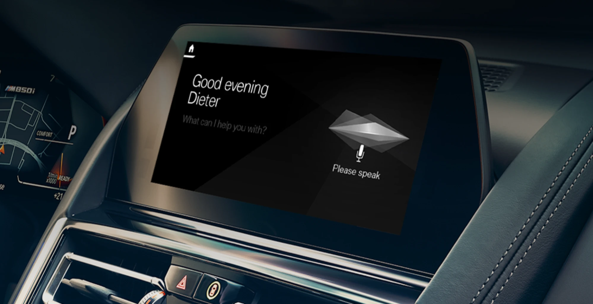
And what makes in-car voice interactions so effective is their simplicity. You don’t need perfect phrasing or long commands — just a clear request. Whether you’re asking for directions, changing a playlist, or calling someone, the assistant usually responds with short, practical confirmations instead of long explanations. It’s the kind of voice UI design that understands the moment you’re in: you’re busy, potentially stressed, and don’t have the mental space to process extra information.
Here’s a quick example of a typical navigation interaction:
User: “Take me to the Ocean Mall.”
Assistant: “Starting route to the Ocean Mall.”
User: “Avoid highways.”
Assistant: “Okay, switching to a route without highways.”
That’s it. The prompts are short, the responses are even shorter, and the whole flow is designed around keeping the driver safe and focused.
In-car systems also do a great job blending voice with visuals. The assistant speaks the essentials, while the screen quietly updates the map, the ETA, or the turn-by-turn instructions. It’s a perfect example of multimodal design: each channel doing exactly what it’s best at.
What bad VUI looks like
Unfortunately, not every voice experience feels smooth and intuitive. Some systems still make classic mistakes: talking too much, misunderstanding simple requests, or forcing users to use very specific phrasing. The result is a conversation that feels more like wrestling with a machine than talking to an assistant.
Here are a few simple examples of how bad VUI can turn a quick question into an unnecessary monologue:
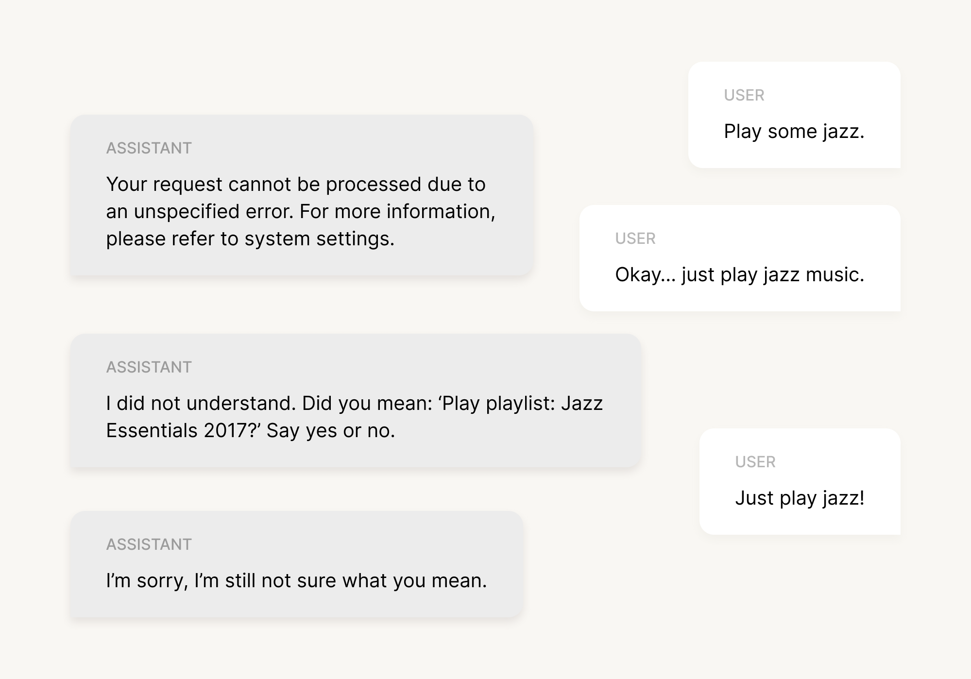
And there you are, dreaming about throwing your Alexa speaker through the window. This little exchange highlights several common issues at once: the assistant is too formal, gives unhelpful error messages, can’t handle natural phrasing, and doesn’t offer a graceful way out. There’s no recovery path, no fallback options, and certainly no sense of collaboration.
Another example of bad VUI is:
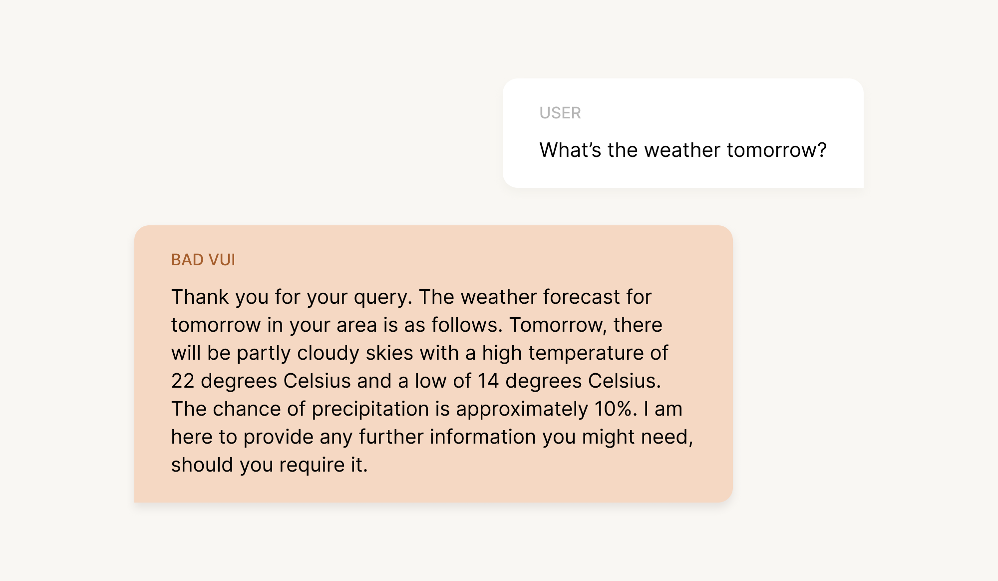
Technically accurate? Sure. Helpful in real life? Not really.
The response is overly formal, packed with details the user didn’t ask for, and ends with an awkward, unnecessary offer for more information. Most people just want a quick answer, not a weather report written like a customer-service email.
So, here’s how a clearer, more natural version could sound:
Improved VUI: “Tomorrow will be partly cloudy, with a high of 22 and a low of 14. There’s only a small chance of rain.”
Short, simple, done.
Bad voice UI design often fails not because the technology is weak, but because the system doesn’t accommodate real human behavior — messy phrasing, quick requests, changes of mind, or incomplete sentences. And when a VUI forces users to adapt to its structure rather than the other way around, frustration builds quickly. The good news? Each problem has a straightforward fix: keep responses natural, keep prompts clear, and always design around what the user is really trying to achieve.
Prototyping voice + screen interactions
By now, you might be thinking that voice design is a lot to take in — and honestly, it is. But with products becoming more multimodal every year, understanding how to design a smooth, natural voice experience is quickly becoming a core skill for modern UX teams.
Voice on its own can be powerful, but it rarely needs to carry the whole interaction. Most modern assistants — whether on phones, in cars, or inside apps — lean on a mix of voice and visuals to keep the experience clear and efficient. That’s why, when you’re prototyping, it’s important to test not just the conversation itself, but how the interface responds on screen.
A typical workflow looks something like this: the user says something out loud, the assistant replies briefly, and the screen updates instantly with more detail — a route on a map, a list of products, a confirmation message, anything that benefits from visual context. Designers often prototype this by recording short screen transitions in Figma or ProtoPie and pairing them with audio responses to simulate real timing. It doesn’t have to be perfect; the goal is simply to see how voice and visuals support one another.

Let’s go through a quick example of a workflow. So, imagine a shopping app where the user is looking for a jacket:
User: “Show me black jackets in medium.”
Assistant: “Here are some options.”
(Screen updates instantly with a filtered list.)
User: “Sort by price.”
Assistant: “Sorted from lowest to highest.”
(Screen updates again.)
This kind of flow works because each channel does its job: voice handles intent, the screen presents the details, and users stay in control without feeling overwhelmed. During prototyping, you’re mainly testing whether the timing feels natural, whether the assistant speaks too much or too little, and whether the screen updates fast enough to keep the interaction smooth.
Prototyping challenges to watch out for
Even with good tools and a clear flow, voice prototyping has its own quirks. The biggest one is timing. In a real product, voice, UI updates, and user speech overlap in subtle ways, and it’s surprisingly easy for a prototype to feel “off” by just a second or two. If the assistant starts speaking too late, the interaction feels sluggish. If it speaks too soon, it can interrupt the user. So, prototyping is where you fine-tune that rhythm.
Another challenge is simulating AI responses. Real AI won’t always give the same answer twice, especially in tasks with ambiguity or open-ended phrasing. Prototypes, however, often rely on scripted lines, which can make them feel a bit too perfect. Don’t worry about recreating true AI behavior at this stage. Your main goal is to test whether the conversation flow makes sense and whether users understand what to do next.
And finally, there’s latency. Real assistants sometimes take a moment to process what you said, especially in noisy environments or complex queries. Prototypes rarely include this “thinking time”, which can make them feel unrealistically smooth. When you’re testing, it’s worth adding a short pause here and there — just enough to mimic real delays and see how users react.
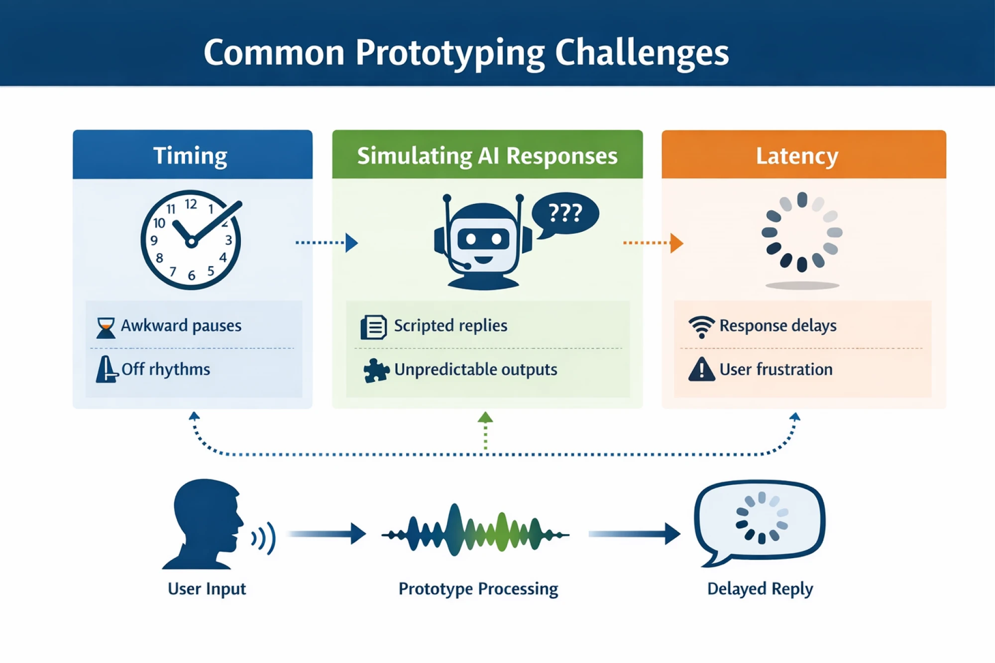
Keeping these challenges in mind helps you create prototypes that feel closer to the real thing — enough for your team to spot issues early and refine the experience before development begins.
Educational resources and further reading
If you want to keep building your skills beyond the basics, there’s no shortage of great material out there. Here’s a quick, curated list of books, guides, and communities to help you go deeper — depending on how far you want to take your voice UI practice.
And if you’d like to zoom out beyond voice and look at conversational interfaces in general, check out our article here!
Beginner-friendly reads
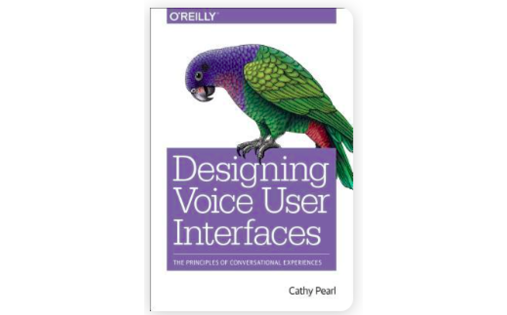
Alright, in case you’re just getting started with voice UI, two books definitely stand out. “Designing Voice User Interfaces” by Cathy Pearl is the go-to introduction. Cathy is a longtime conversation design specialist and former Head of Conversation Design Outreach at Google, and her book breaks down the fundamentals in a clear, approachable way.
Another great starting point is Erika Hall’s “Conversational Design”, a short but sharp read that focuses on how real conversation principles apply to digital products.

Intermediate resources
Once you’ve got the basics down, you can move on to more structured frameworks. “Voice User Interface Design” by Michael H. Cohen, James P. Giangola, and Jennifer Balogh dives deeper into dialog modeling and voice flow logic.

You can also read platform-specific guidelines. For example, the Amazon Alexa Design Guide and Google Conversation Design Docs both offer practical examples and best-practice patterns from the teams that build the world's largest assistants.
Advanced material
If you want to dive into more complex, AI-driven conversations, “Conversations with Things” by Diana Deibel and Rebecca Evanhoe is a great next step. The book digs into how assistants handle context, shifting user intent, and the messy, unpredictable parts of real conversation.

At this stage, some designers also look into Dialogflow or Alexa Skill development to see how advanced conversation patterns translate into working systems, but it’s completely optional.
Communities and forums
And finally, if you prefer learning by asking questions, swapping examples, or seeing how others solve similar problems, there are great communities out there. The Voiceflow community is full of conversation designers sharing templates, prototypes, and troubleshooting advice.

Reddit is another active hub where designers and developers discuss different challenges, new tools, and emerging patterns in voice UX.
Emerging trends: the future of VUI
So that's where voice UI stands today. But before we wrap up, let's zoom out and talk about where this is all heading.
Voice interfaces have moved way beyond timers and playlists. Thanks to machine learning and generative AI, assistants are getting better at following context, handling vague requests, and keeping up with how people actually talk. You don’t need to phrase things perfectly anymore or repeat yourself ten times. The interaction now feels less like barking commands and more like a quick, helpful conversation.
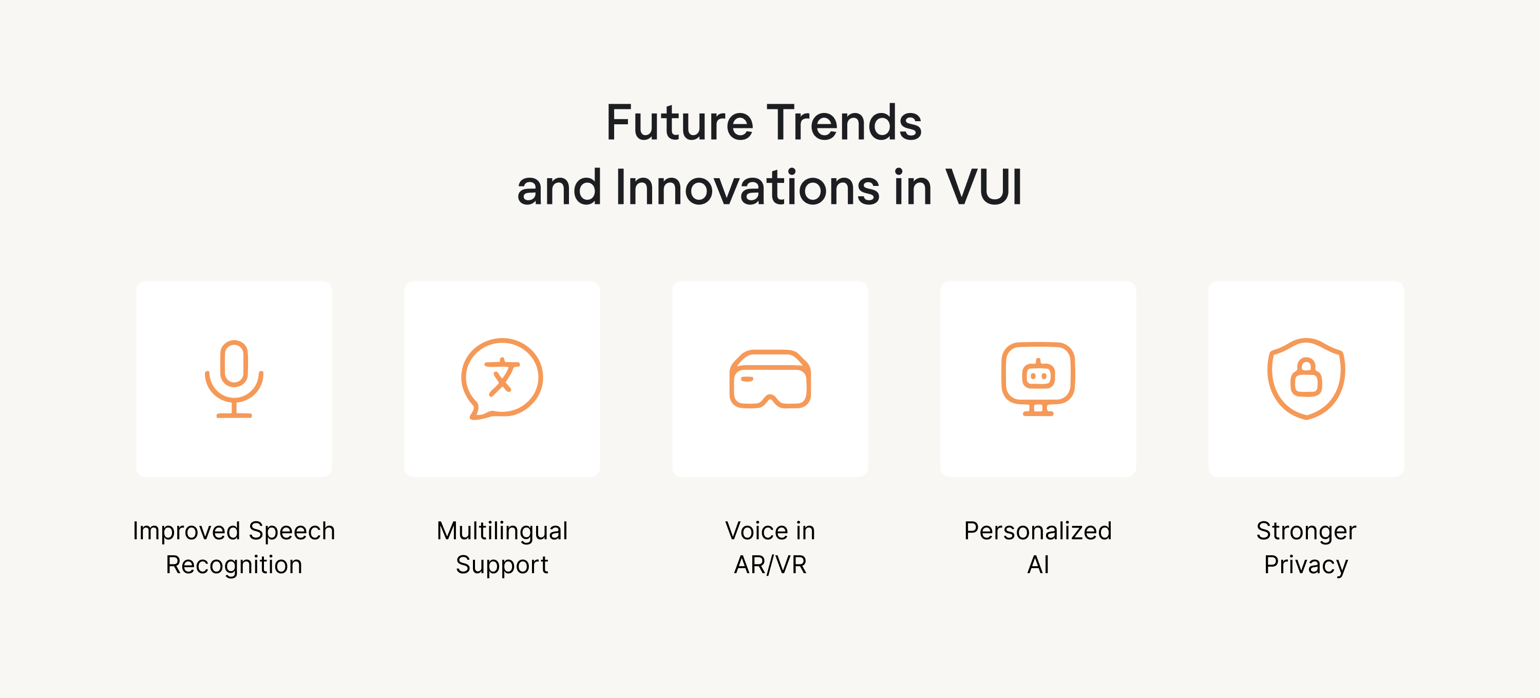
At the same time, the future of VUI isn’t voice-only. The most successful experiences are clearly multimodal: voice for speed and convenience, screens for clarity and control, and sometimes even haptics for user feedback. We’re already seeing this pattern in cars, apps, and enterprise tools, where voice acts as a natural entry point rather than a replacement for visual interfaces. And looking ahead, voice may increasingly blend with augmented reality, especially in scenarios where users need hands-free guidance layered onto the physical world.
New use cases are popping up, too, especially in B2B SaaS. Voice is starting to appear in workflow automation, internal tools, and AI copilots, and even interactive voice response flows that feel smarter than traditional phone menus, helping users solve problems quickly instead of navigating endless options.
But the core principle stays the same: voice works best when it solves a real problem, not when it’s added just because the technology exists. That’s why the challenge for designers isn’t just what voice can do; it’s where it belongs:
- Does voice save time here?
- Does it reduce friction?
- Does it match your target audience's expectations and context, or does it just add noise?
So the future of voice UI design is about answering those questions honestly and designing voice user interfaces that help users move on quickly.
Conclusion
Well, that was A LOT. In this guide, we walked through the full picture of voice UI design: what voice UIs are, the core principles behind a good experience, a step-by-step design process, real-world examples, and where voice seems to be heading next. It’s not the easiest topic, but hopefully we managed to break it down in a way that feels more concrete and easier to come back to when you’re working on your own flows.
From here, the best thing you can do is start small. Take one interaction in your product, prototype a simple voice version of it, and test it with a few real users. Once you hear how people actually speak, everything in this article will make a lot more sense.
And if you’d rather not do it alone, we’re here for that. At Eleken, we help SaaS teams turn rough voice ideas into clear, user-friendly interfaces that are ready to test and ship. Need a hand with your next voice UI project? Let’s talk.


.webp)


.png)