

If you’re designing SaaS products, chances are you’ve wrestled with selection that breaks across pagination, hidden eligibility logic, or action buttons that disappear the second users start interacting. That’s bulk actions done badly.
For something so seemingly simple, bulk actions combine UX, backend logic, and real user workflows. They’re easy to underestimate, and even easier to mess up.
At Eleken, we’ve seen these patterns in nearly every SaaS dashboard. And we can confidently say the same UX challenges resurface again and again. So in this article, we explore how to make bulk actions usable and practical for your product.
What are bulk actions in UX?
Bulk actions (or batch actions) let a user pick multiple items and apply the same change to all of them in one go. Instead of opening each item, performing the action, closing it, and repeating, you do it once, and it cascades across your selection.
Most commonly, you’ll see this pattern enabled via checkboxes or multi-select controls. Only after items are selected do the action buttons or menus become active, guiding users into the bulk flow without overwhelming them.
In practice, bulk actions are everywhere — in your Gmail inbox, e-commerce dashboards, or CRMs. They’re one of those patterns that seem invisible until you remove them, and then users suddenly feel the pain of repetitive clicks.
Design guidelines for effective bulk actions
If defining bulk actions is the easy part, designing them well is where things get tricky. What looks like a simple flow often hides the hardest UX questions. Based on our experience, we’ve prepared clear guidelines with concrete examples to demonstrate an effective bulk action UI at work.
Make selection intuitive
The first thing users need to understand is how to actually choose multiple files. Sounds obvious, but it’s where bulk actions UX often fail. We’ve seen dashboards where selection controls were hidden until you hovered over a row. Designers did it to reduce clutter, but the effect was the opposite.
Still, if you hide a bulk action by default, you need visual affordances (lines, subtle icons, row hover effects) to hint at its presence.
Checkboxes are the clearest way to signify that users can select more than one item. Radios suggest exclusivity, toggles suggest on/off states, but checkboxes carry the universal “pick as many as you need” meaning.
Once you implement this element, be mindful of usability traps. Tiny checkboxes are frustrating. That’s why design systems like Material Design recommend a minimum target size around 24×24 px for desktop and 44×44 px for touch.
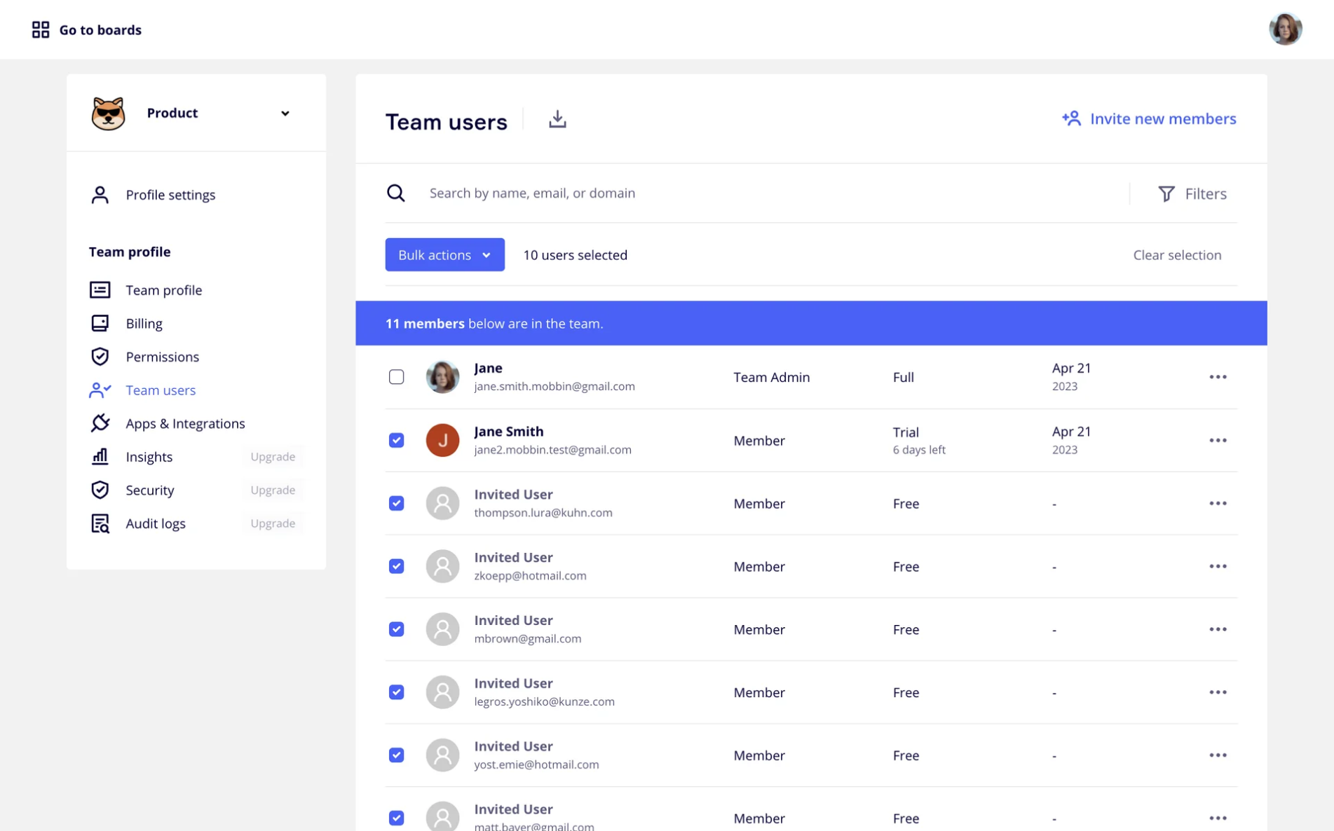
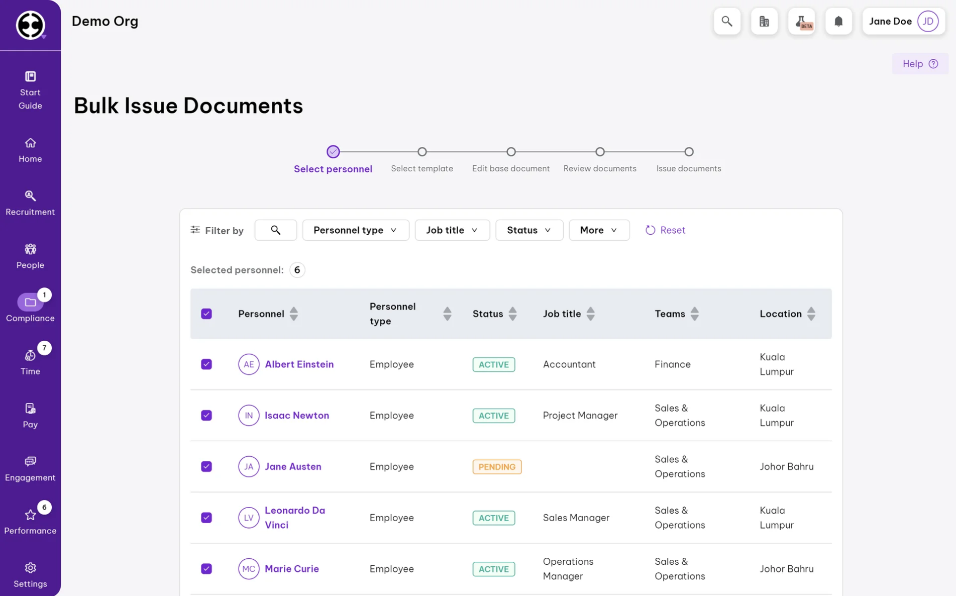
At Eleken, we applied this approach when designing a dashboard for Floret, where users had to manage large sets of transactions, checks, and deductions. We kept the checkboxes visible, presenting all information in one single chart.
Communicate eligibility clearly
One of the messiest UX design failures in bulk actions happens when users click “Apply” and nothing visibly happens for some items. Or worse, only a portion of them change, without any explanation.
If an action can’t apply to every selected item, the safest route is to disable it (or gray it out) rather than letting the user click and get ambiguous outcomes. But you have to explain why. Tooltips, inline notes, or a small “i” icon next to the disabled state can communicate the reason.
Alternatively, you can visually distinguish which items won’t respond to the chosen action. For example: grayed rows, a lock or warning icon, or a tooltip on row hover. This method gives users immediate clues before they execute anything.
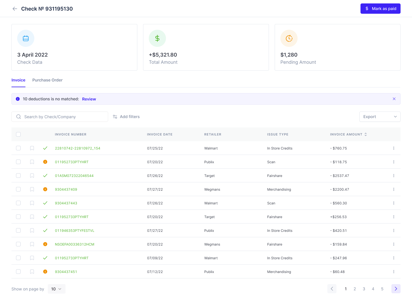
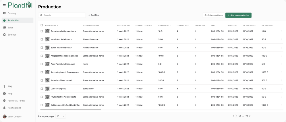
Our favorite recommendation, though, is to keep flexibility. Give users the freedom to act on a single row when needed, but also offer a bulk dropdown so they don’t repeat the same action dozens of times.
That’s exactly what we implemented in the Plantiful case, where plant-based brands needed to navigate menus, products, and pricing across multiple locations.
Keep actions contextual and visible
It doesn’t matter how smart your eligibility or selection logic is. If users can’t find the “what now?” actions, the entire UX flow falls apart. When someone selects items, the next step should feel like a natural continuation, not a hunt for buttons.
In many apps, the moment users click on a checkbox, a bulk-action bar slides into view. The pattern must tie itself visually to the items the user just interacted with. If the bar appears too far away or looks disconnected, people hesitate.
When working on the Ricochet360 project, we placed bulk actions right above the table. This worked well because it kept the workflow on one screen and added a “Show more options” button for extended functionality.
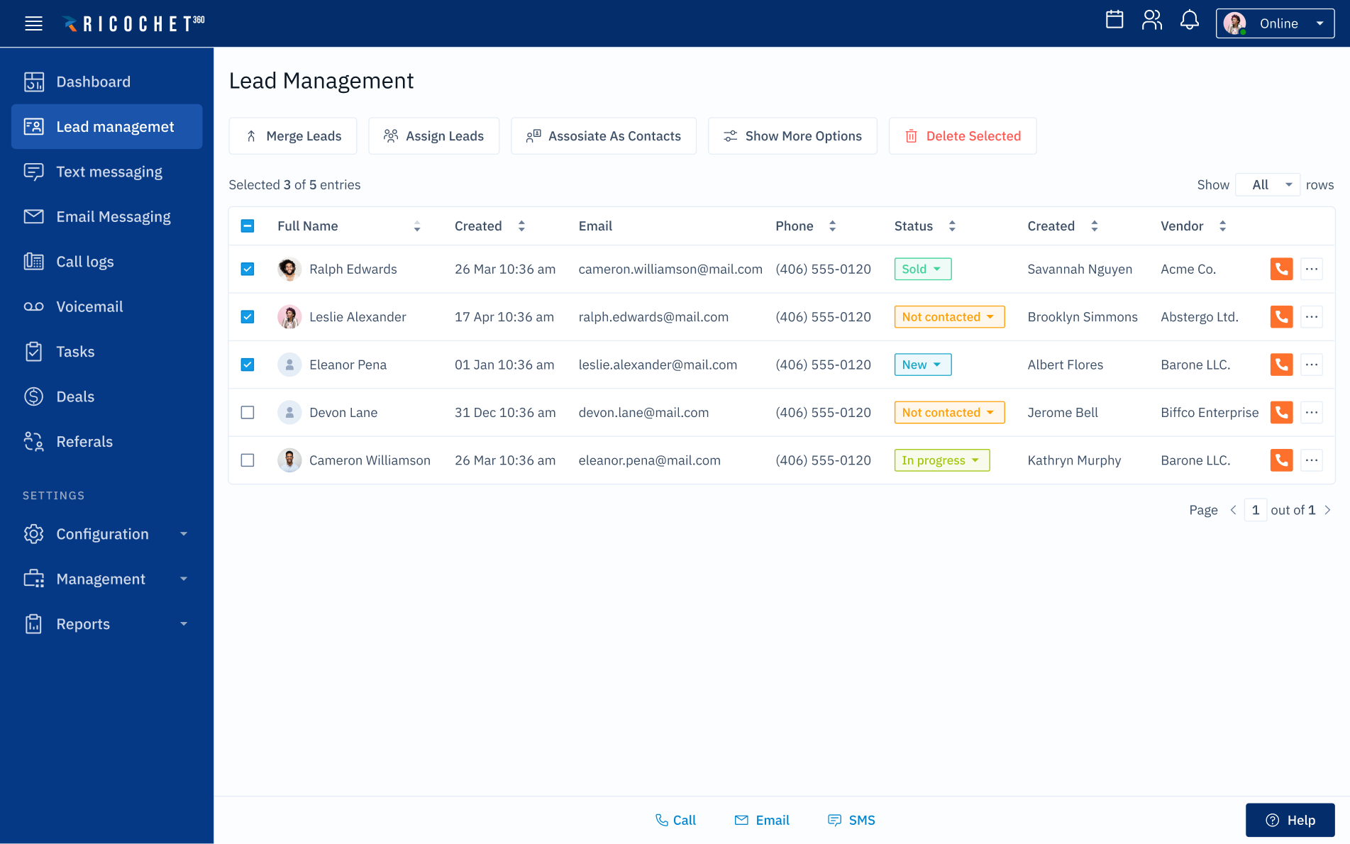
But placement alone isn’t enough. The bar has to stay persistent while users scroll and respond to changes in selection. It should expand or contract based on the number of items selected, gracefully move overflow actions into a “More” menu, and remain exactly where users expect it.
Some systems even let the bar stay open after an action is completed, giving users control to dismiss it only once they’re ready to move on.
And when there are too many actions to fit neatly, the overflow strategy becomes critical. You can’t let primary buttons disappear into a dropdown without visual clues. Users need micro-animations or subtle pulses that display where buttons migrated.
Prioritize safety and error prevention
One misplaced click or forgotten checkbox can lead to disastrous outcomes. In situations like these, the trick isn’t to eliminate risk (you never can fully), but to build thoughtful guardrails so users feel safe and in control.
That starts with being judicious about confirmations. Use them for destructive or irreversible actions when data can’t be recovered or when mistakes will cost users time or trust. The prompt should clearly state what will happen.
We applied this approach when designing a dashboard with bulk actions for the Bering Lab project. Whenever users clicked the trash icon, a warning appeared, requiring them to explicitly confirm by clicking “Delete” or “Don’t delete.”
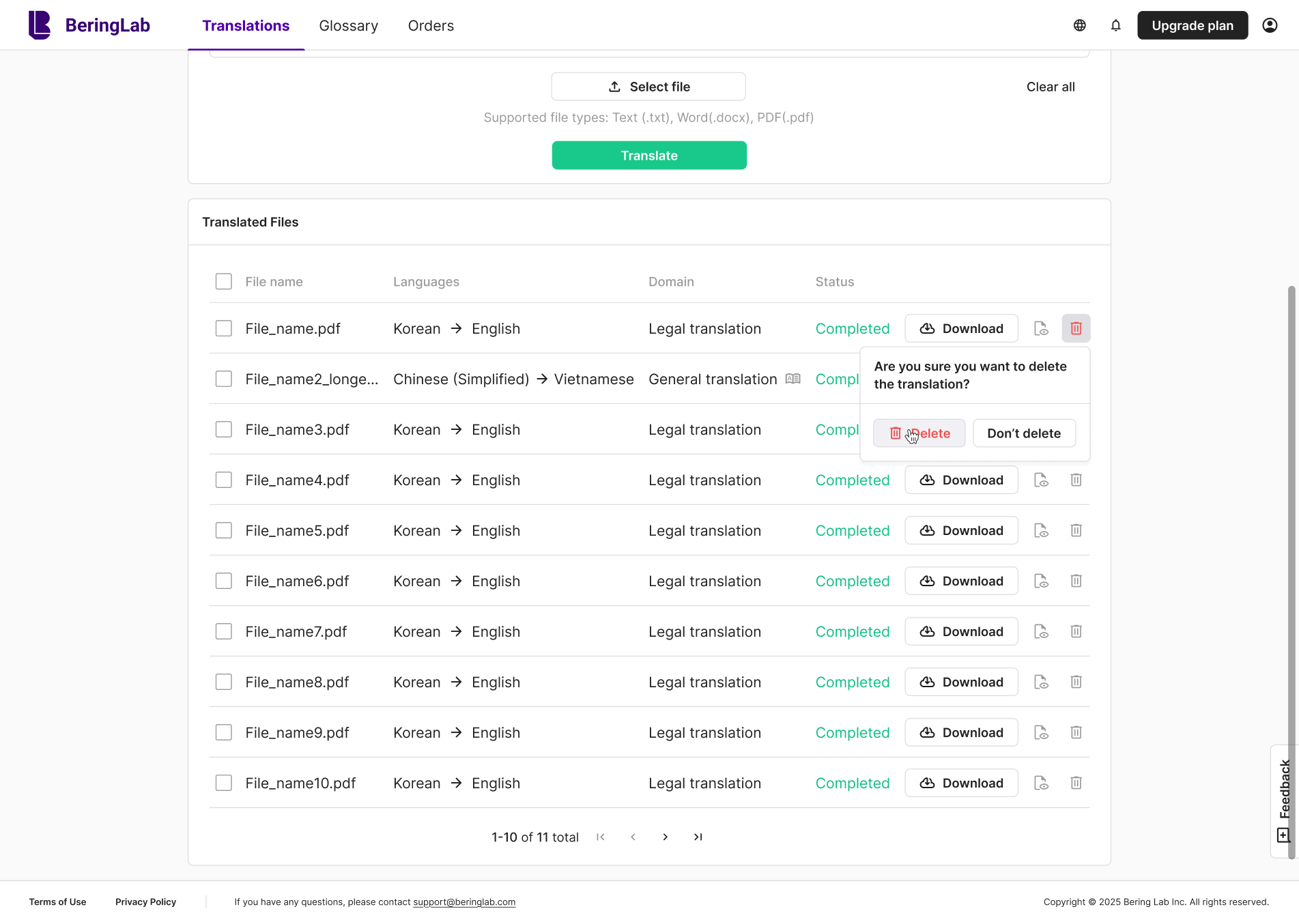
A more elegant practice is undo actions or soft recovery flows. After the user commits a bulk action, immediately offer a way to revert it, ideally with a toast notification or sliding banner that says, “X items have been deleted — Undo”. The same pattern we used in the Bering Lab, giving users more confidence in their choices.

Between confirmation and undo, good error prevention also demands foresight. You can’t rely on users to avoid mistakes, your interface should guide them away from risky interactions. For this, we advise designing for constraints:
- Use guardrails to prevent obviously invalid combinations.
- Provide inline warnings before they commit an action.
- Prompt them gently when their selection leads to edge cases.
When errors occur, you owe the user an explanation and a plan to move forward. Show exactly which items failed, why, and what (if anything) they can do to fix it.
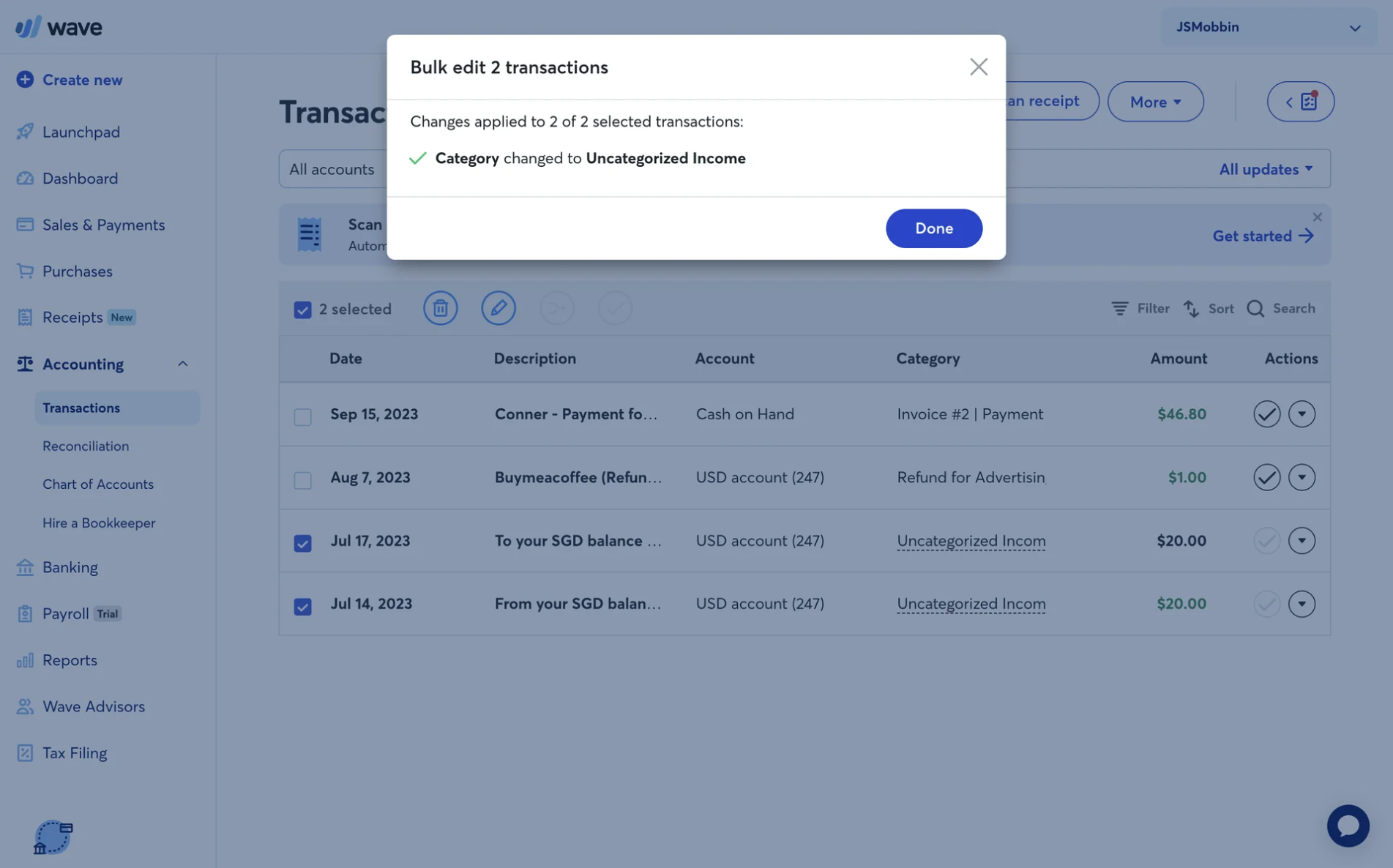
Provide clear feedback and transparency
Feedback is the conversation your interface has with users. After hitting “Apply,” they need to know immediately what’s happening, what succeeded, what failed, and why. The more ambiguous your UI becomes, the more users assume the worst.
Feedback must work on multiple levels:
- Immediate feedback: the moment the user confirms, the UI should shift into a spinner, a progress indicator, or a subtle loading state in the selected rows.
- Result summary: once processing completes, show how many items succeeded, how many failed, and ideally list which ones failed and why.
- Inline error context: allow users to click or hover on failed items to see brief explanations. Raw server errors or cryptic codes don’t cut it.
- Consistent success signals: affirm what went well. Toasts, banners, or inline confirmations help reassure users that progress was made.
Our Eleken team applied this approach in the Kipsi project. Since new customers needed guidance, we introduced a modal that presents bulk actions. To complement it, we added error fields with an “i” icon that revealed detailed information.
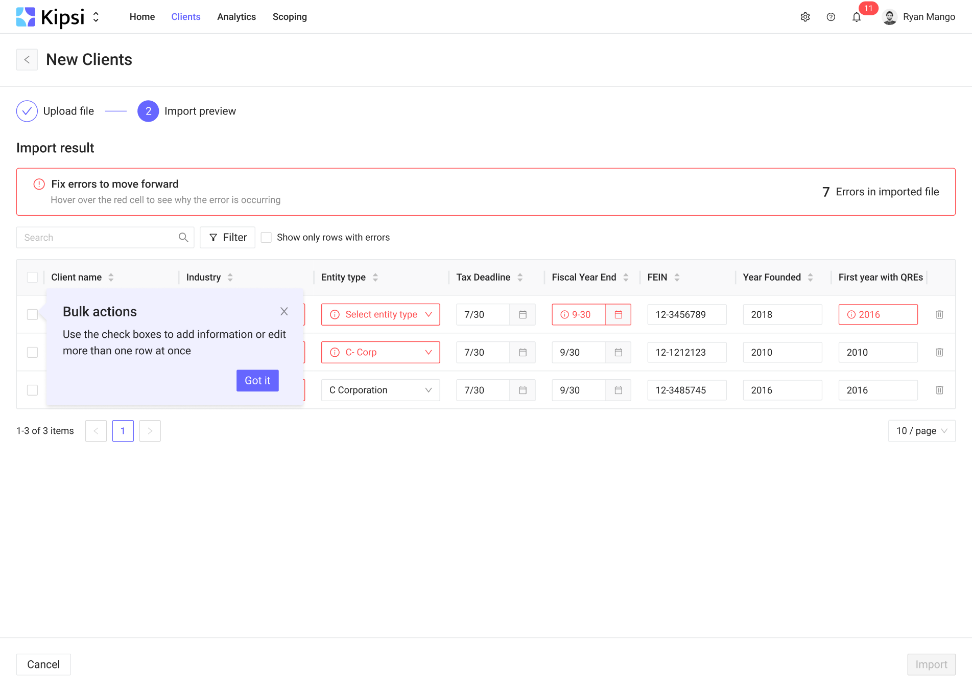
That level of transparency eliminates doubt — users always know exactly what succeeded, what failed, and why.
Design for scale
As your data grows, bulk actions need to grow with it. A flow that works well for 20 items will break under 2,000. Designing for scale means anticipating edge cases, optimizing responsiveness, and giving users confidence.
One of the first scaling challenges is selection across pages or filtered datasets. If a user picks the select all option on the current page, they may assume it covers the entire filtered result set. If you support that, make it explicit (e.g., “Select all 3,200 matching items”) and consider adding a confirmation step for very large numbers.
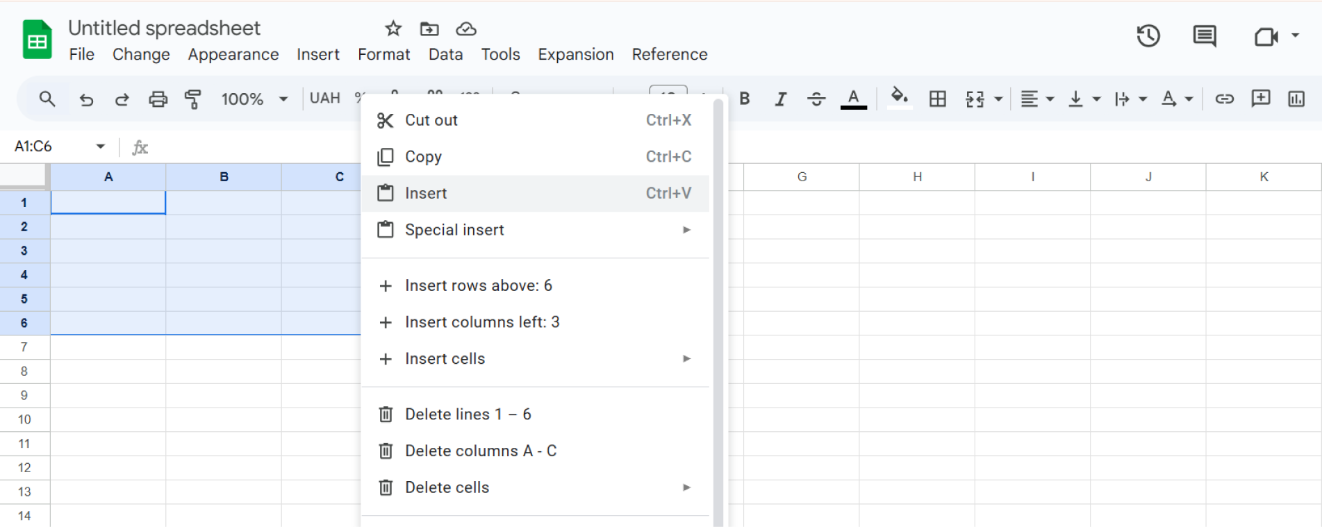
A great real-world example is Google Sheets. With a single click or keyboard shortcut, you can select entire rows or columns and apply an action across thousands of cells without losing track.
Once the system receives a bulk request for many items, performance and feedback become critical. You need to ensure the backend can handle large batches or asynchronous queueing, and the UI must remain responsive.
Visual design also matters. Fixed headers, pinned identifying columns, enough white space, and scrollable table bodies help maintain orientation when dealing with long lists (just as Google Sheets does).
Support flexible workflows
Sometimes someone just wants to tweak a few documents and move on. Other times, they’re executing multi-step, conditional operations across dozens or hundreds. Well-designed bulk action UX must support both user intentions.
When customers need to make complex changes, a wizard-style guided flow can structure decisions across stages.
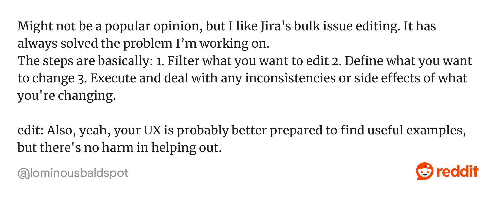
For example, Jira’s bulk change wizard walks users through selecting issues, choosing which fields to update, resolving conflicts, reviewing changes, and then applying them. This pattern helps break down complexity and reduce the risk of misconfiguration.
Compare that with simpler, day-to-day bulk tasks, such as tagging tasks, changing status, or applying labels. In this case, Notion's inline quick actions shine, letting users select rows and immediately adjust properties in the inline panel or via a floating toolbar.
.webp)
So here’s the balance to aim for:
- Use wizard flows when the action has dependencies, branching logic, or steps that must be confirmed.
- Provide inline bulk edits for routine changes where users know what they want.
- Let users move between the two modes if needed — maybe start inline and fall back into a guided flow if a condition becomes complex.
Ensure accessibility and device adaptability
Bulk edit UI must work well for everyone, regardless of ability or device. When these interactions ignore accessibility or device constraints, you risk excluding users and undermining. We kept this in mind when designing PrimePro screens.
The app’s goal was to simplify business management, and during workflow analysis, we identified where bulk actions would work well. To keep them accessible, we ensured tap targets met minimum size guidelines, used high-contrast visual indicators, and kept action labels short and self-explanatory.

Among the rules, the most basic one is about color and contrast. You cannot rely solely on color to communicate states (like “failed” or “selected”). Pair them with icons, text labels, or patterns so users with color vision deficiencies — or anyone working in difficult lighting — can still interpret the bulk actions UI correctly.
Keyboard navigation is another cornerstone. Users should be able to move through items with Tab and press Enter to confirm selections or trigger actions. Focus indicators must be visible so users know where they are. According to the W3C, this is critical under operable and perceivable principles.
Then there’s screen reader compatibility. Use ARIA roles and attributes to clearly label selections, actions, and states. For example, when a user selects several items, announce it so the screen reader provides meaningful feedback.
Also, ensure modals, focus traps, tooltips, and dynamic content are handled properly so assistive technologies can follow changes. The Accessible User Interface Guidelines (AUIG) provide solid patterns for handling these cases.
Improving bulk actions with testing and iteration
It’s tempting to think that a clean design or polished prototype is “good enough.” But bulk solutions are among those UX features where assumptions crumble under real usage. All of this underlines the importance of testing and iteration.

As Tong Wen argues, you must validate that bulk actions solve the real problem, not just the surface-level use case.
When we design bulk workflows, our process always includes multiple loops of testing: first to uncover misunderstandings, then to compare alternatives, then to quantify impact. Two approaches work especially well:
1. One-on-one usability testing.
Search for users who will complete actual bulk tasks while thinking out loud. Watch where they hesitate, misclick, or get confused about selection, eligibility, or feedback. This method surfaces both major and subtle friction points.
Once you have multiple viable designs (like “Option A” and “Option B”), release them to subsets of interested users and measure quantitative differences in performance and satisfaction. This helps you see which version scales better in real use.
By combining the qualitative depth of one-on-one tests with the quantitative breadth of A/B experiments, you get both insight and validation. But whichever approach you choose, it’s critical to know which metrics to track:
- Effectiveness / Completion rate: Did users finish the bulk task successfully?
- Efficiency / Time on task: How long did it take to complete the task?
- Error rate / number of failed items: How many items failed or were skipped?
- Satisfaction / perceived effort: How easy or satisfying did the flow feel to users?
Once you’ve run the tests and collected users' clear feedback, iteration is the real work. That means you should choose the version with better metrics and investigate why this variant outperformed the other.
Look for patterns in user behavior: Did users hesitate more at eligibility screens? Did they misinterpret error messages? Did they abandon selections mid-flow?
Each round of iteration should narrow uncertainty. Early cycles will focus on broad structure, while later ones refine small details, such as button labels, micro-animations, and error phrasing.
Checklist for designing bulk actions the right way
Designing bulk actions UI is a balancing act between speed, safety, and clarity. To keep all three in check, use this list as a quick design audit before you ship:
◯ Selection is obvious and easy to start
◯ Eligibility rules are transparent, never hidden
◯ Actions stay contextual and visible near the selection
◯ Destructive operations are protected with confirmation or undo
◯ Feedback is immediate, clear, and detailed when needed
◯ Large datasets and cross-page selections are fully supported
◯ Workflows adapt to both quick edits and complex flows
◯ Accessibility and responsiveness are built in from the start
If you can’t check every box, start with safety and feedback first. Users will forgive clunky placement or longer clicks, but they won’t forgive silent errors or lost data.
One last detail
Bulk actions rarely get the spotlight in product design. They’re not a flashy feature, and most users won’t mention them in feedback. Yet, if you can get the “boring” parts right, though, you’re probably getting the rest right too.
At Eleken, we’ve learned that designing bulk actions is more about respecting the details. So in case you’re working on a SaaS software and want your bulk workflows to inspire confidence instead of frustration, we’d be glad to help.

