
Try to search “UI kit” on Google, and you’ll get everything from downloadable button packs to Apple’s iOS framework. Some say it’s a template, others call it a design system, and a few just throw the term around to sound more professional.
No wonder beginners get confused.
If you open a UI kit and have no idea what to do next, don’t worry. Our Eleken team is made up of UI/UX pros, and we’re here to break it down. In this guide, we’ll keep things simple, so you understand how UI kits typically work and design one yourself.
Let’s start with a definition that actually helps.
What is a UI kit?
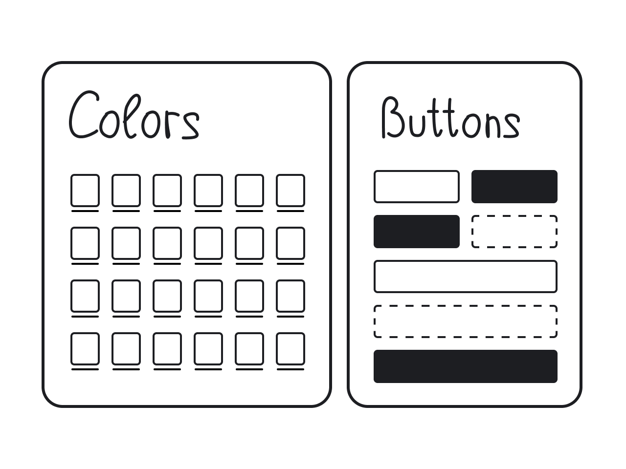
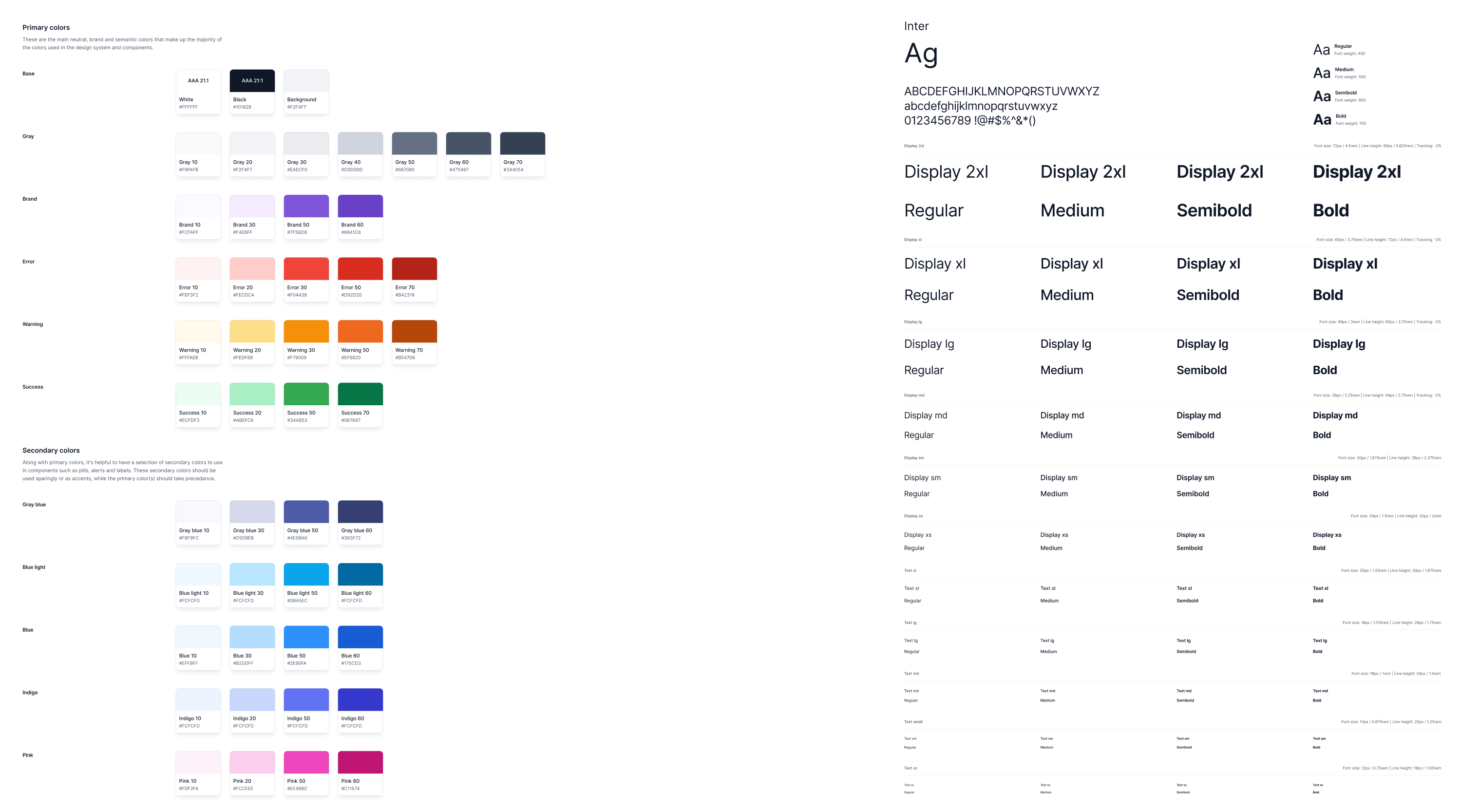
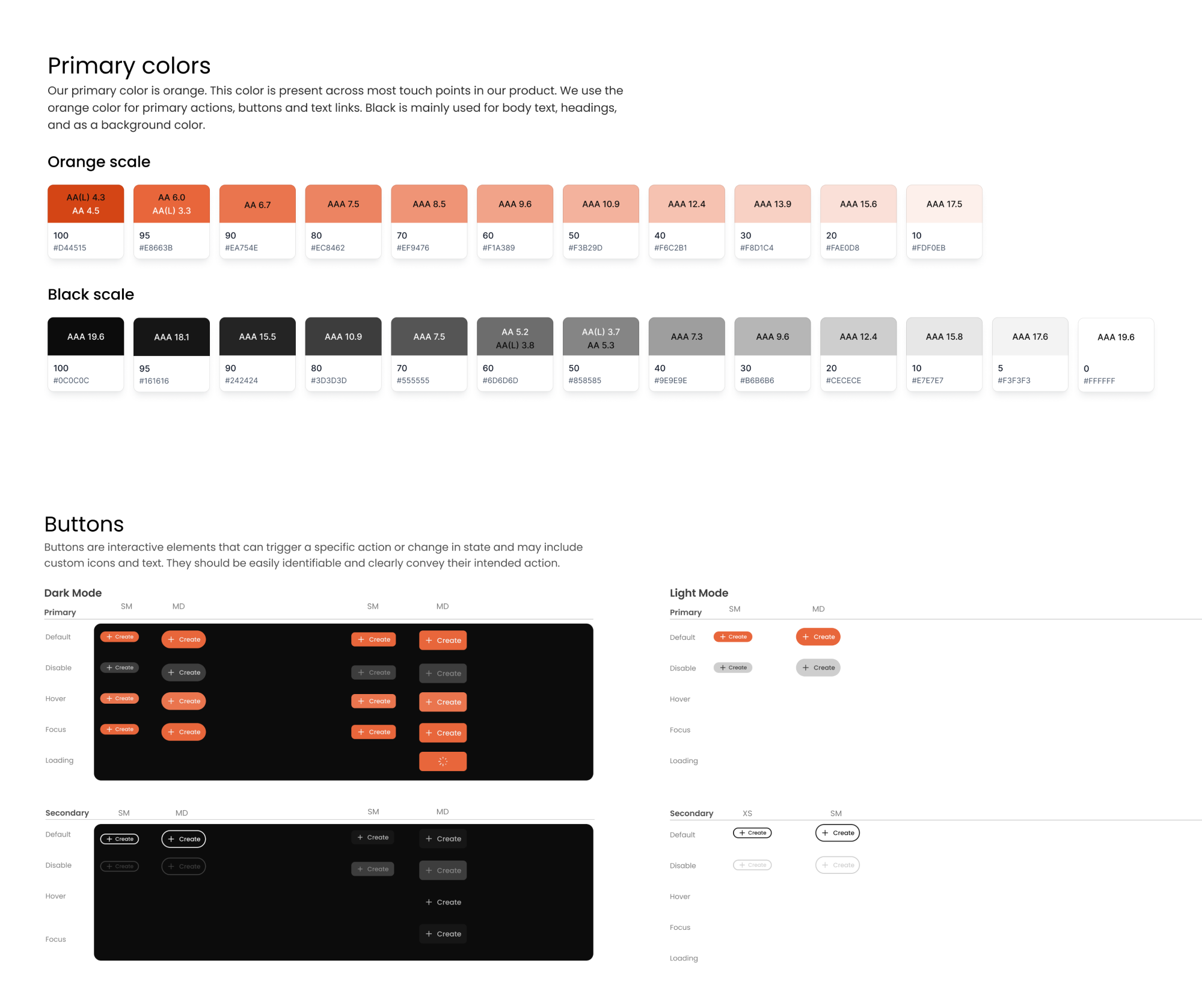
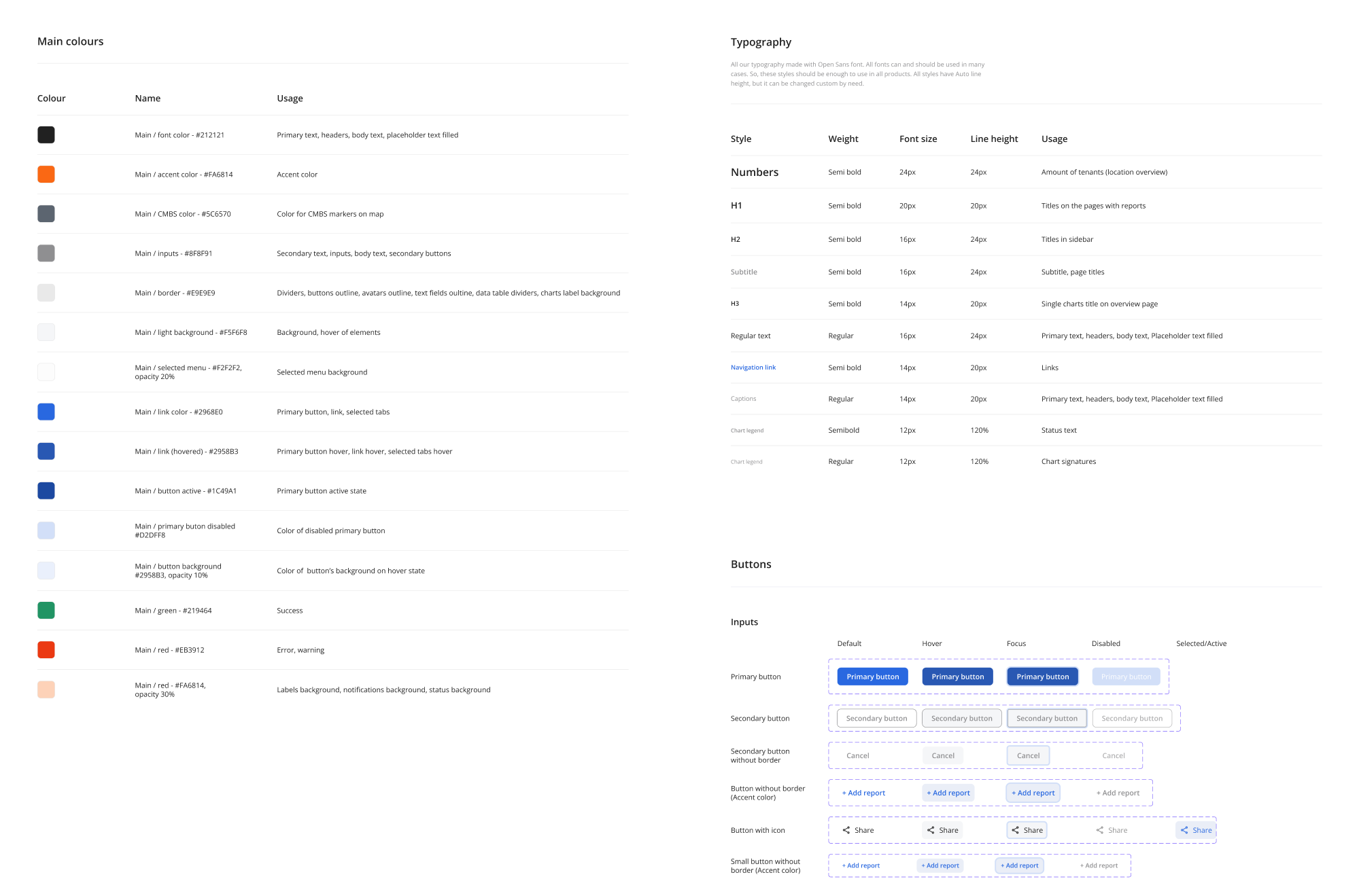
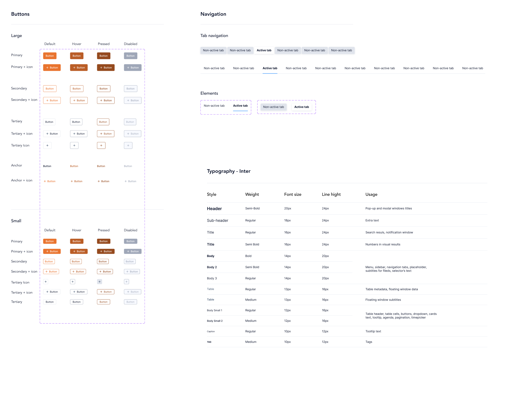
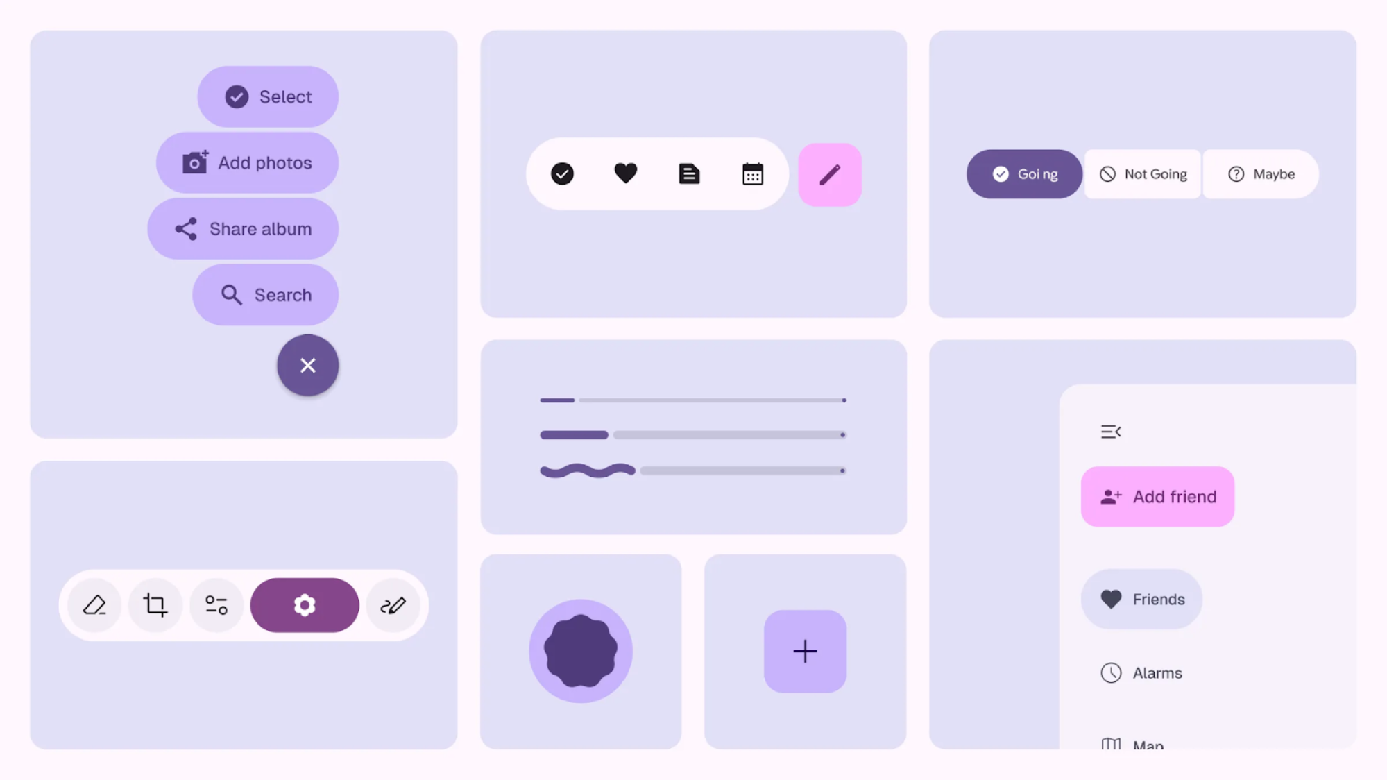
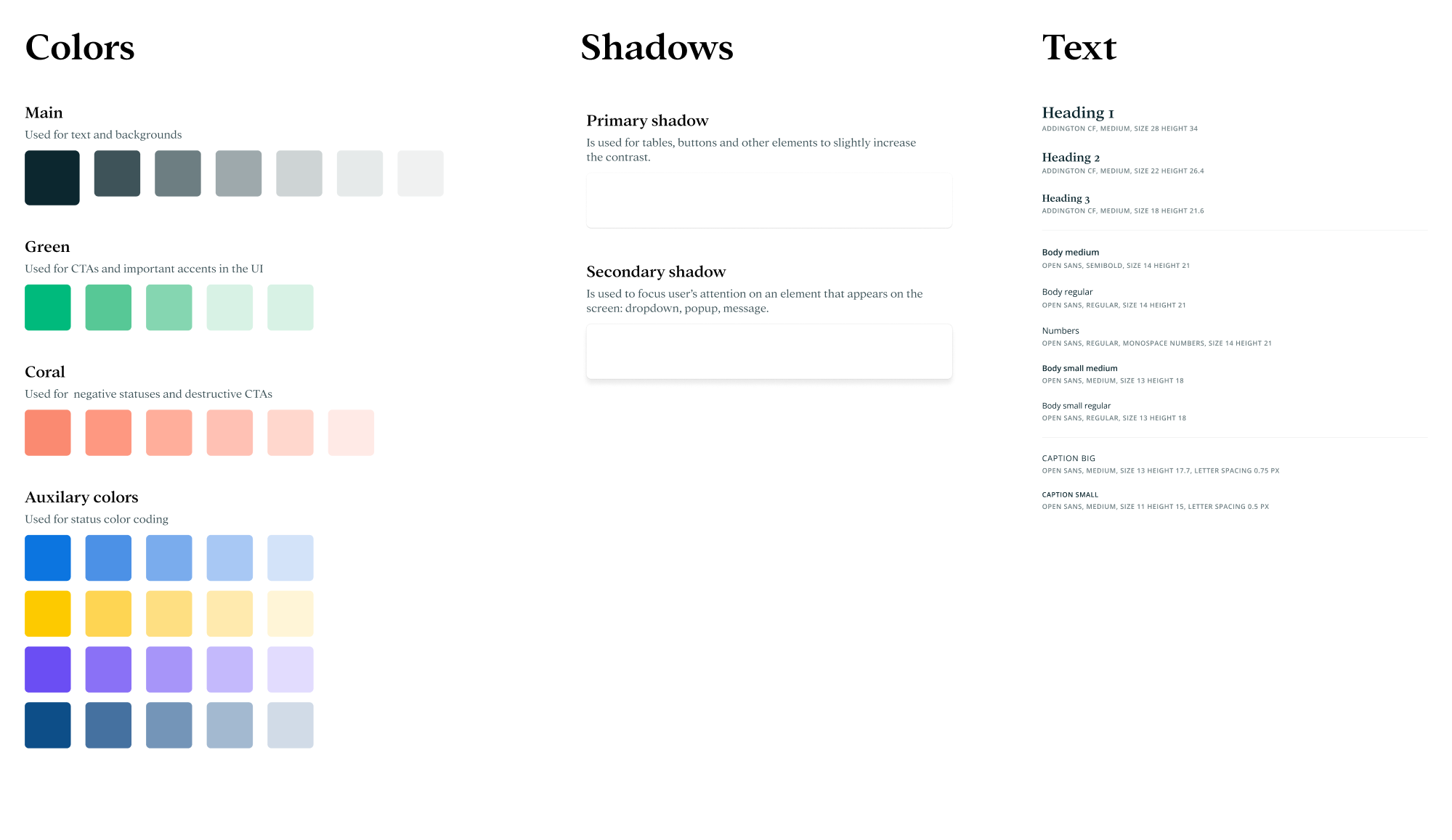
A UI Kit (User Interface Kit) is a collection of pre-designed elements, components, and templates you can reuse to build an interface faster. In simple words, it helps you create a polished UI while saving hours of repetitive work.
Because everything in the kit follows the same visual rules (spacing, colors, typography, component sizes), it’s easier for design and development teams to stay on the same page and build a product that looks consistent across every screen.
Most user interface design kits typically include ready-to-use components like:
- Buttons;
- Input fields and form elements;
- Dropdown menus and selectors;
- Checkboxes and radio buttons;
- Navigation bars and menus;
- Tabs and sidebars;
- Cards and containers;
- Tables and lists;
- Modals, popups, and tooltips;
- Icons;
- Typography styles;
- Color palettes;
- Component states.
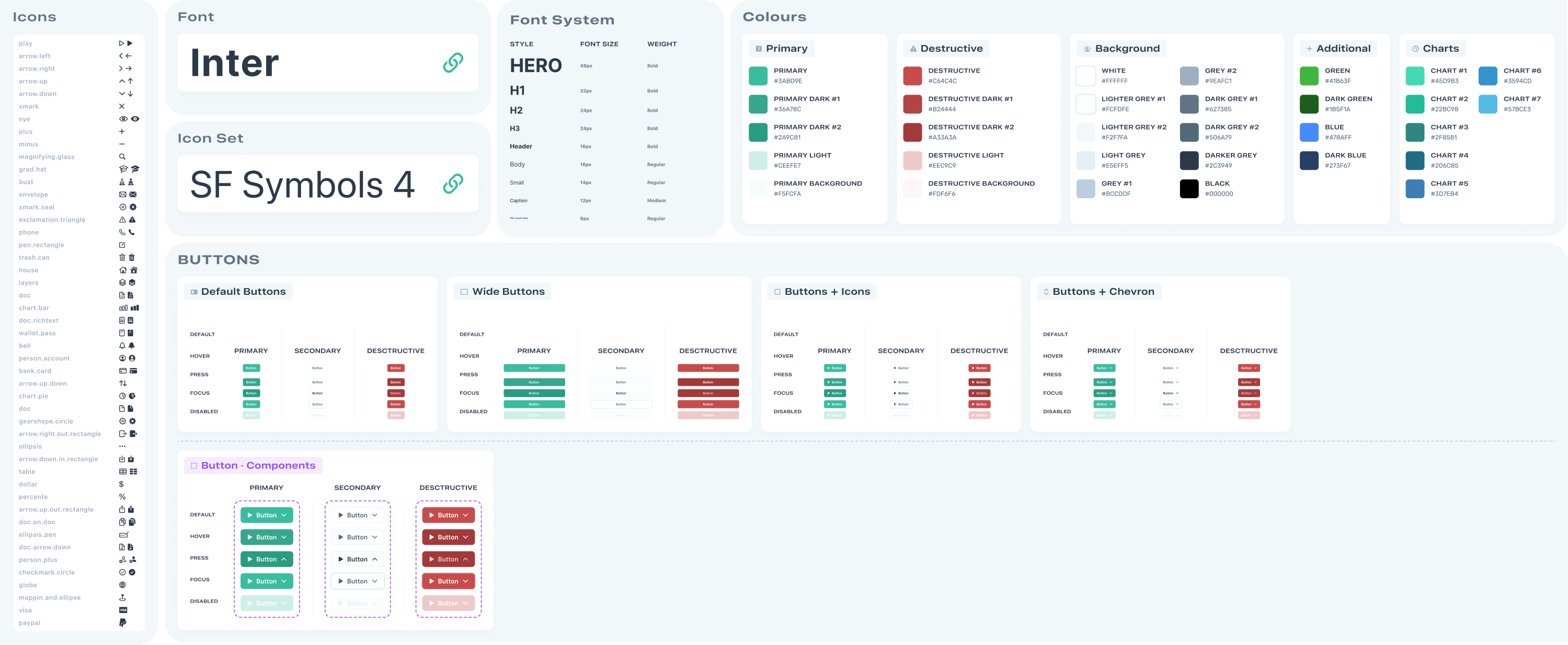
What’s the difference between UI kit and design system?
Once you get a handle on what a UI kit is, the next question usually sounds like: “Wait… is this the same thing as a design system?” Not quite.
A UI kit is a set of tools, like buttons, inputs, colors, and other reusable components that help you create an interface. It’s mostly focused on visuals and layout.
A design system, on the other hand, includes the UI kit but goes much deeper. It provides the rules for how, when, and why to use each element. So you can better understand what we are talking about, here’s what a design system includes:
- Clear guidelines;
- Design principles;
- Accessibility standards;
- Tone of voice and content style guides;
- Documentation for developers;
- Live code components (sometimes).
From our 10+ years of experience at Eleken, we’ve seen that clients building a small project or moving fast usually need a UI kit. That was exactly the case with FlourishON, a caregiving app MVP. We created a comprehensive UI kit that helped their developers move quickly after securing funding.
But when a product is expanding or going through a full redesign, a design system becomes essential. For example, with VLI Tech, an emergency services tool, we did a major product overhaul. In this regard, we delivered a complete design system with detailed documentation for every component.
Now that you understand the difference, let’s get back to UI kits and talk about the real benefits they bring to the table.
What are the benefits of using UI kits?
Using a UI kit offers benefits that are particularly helpful if you’re new to design. At Eleken, we recognize their value and create one for nearly every project we work on (depending on the goal, of course). So, it’s time to look at their key advantages.
Faster design process
UI kits dramatically reduce the time spent on repetitive work. Once you have a ready library of components, you can assemble screens much faster instead of crafting everything from scratch. For a beginner, iterating on ideas fast and seeing quick results can be a big confidence booster.
Consistent look and feel
Because all the components in a UI kit are designed to work together, it’s easier to maintain consistency. This is a valuable aspect for good user experience, as it makes your app feel professional. Even if multiple people are working on the project, using the same UI kit design keeps everyone aligned.
Fewer design errors
Since UI kit components are pre-tested for usability, you’re less likely to make design mistakes. Consistent components mean fewer inconsistencies to debug later. Also, if you need to update something, changing it in the master component can update all instances, making revisions easier.
Improved team collaboration
When everyone in a team uses a UI kit, this can reduce miscommunication. Designers create mocks with components that developers know how to code, and developers see how each element should look and behave. It essentially provides a common reference, improving the overall workflow.
Lower design costs
For businesses or projects on a budget, the time saved by using UI kits translates into cost savings. Even free UI kits can deliver a level of polish that might have otherwise required hiring a senior designer. In the long run, finishing projects faster and with fewer errors is economically beneficial.
Easier scalability
As your product grows, so do its design needs. A well-structured UI kit gives you a solid foundation to scale on. Instead of making UI elements every time, you can expand the kit with new components that follow the same visual logic. This makes it easier to onboard new team members and add features.
Popular free and paid UI kits for beginners
As UI/UX designers, we create UI kits in different ways. Depending on the project, we might build one entirely from scratch, adapt it from an existing design system, or use a Figma-ready kit as a starting point.
Each approach has its place, and to help you choose what works best, we’ve gathered a list of UI kit examples worth exploring.
Google Material Design Kit
Material Design is Google’s official design system, and its Figma kit includes everything you need to design modern user interfaces. You get components, layout templates, and color systems, all aligned with Material 3 (Google’s latest update).
Why you might like it:
- Free and officially maintained by Google.
- A strong reference for structuring your own design system.
- Great for learning industry-standard design principles.
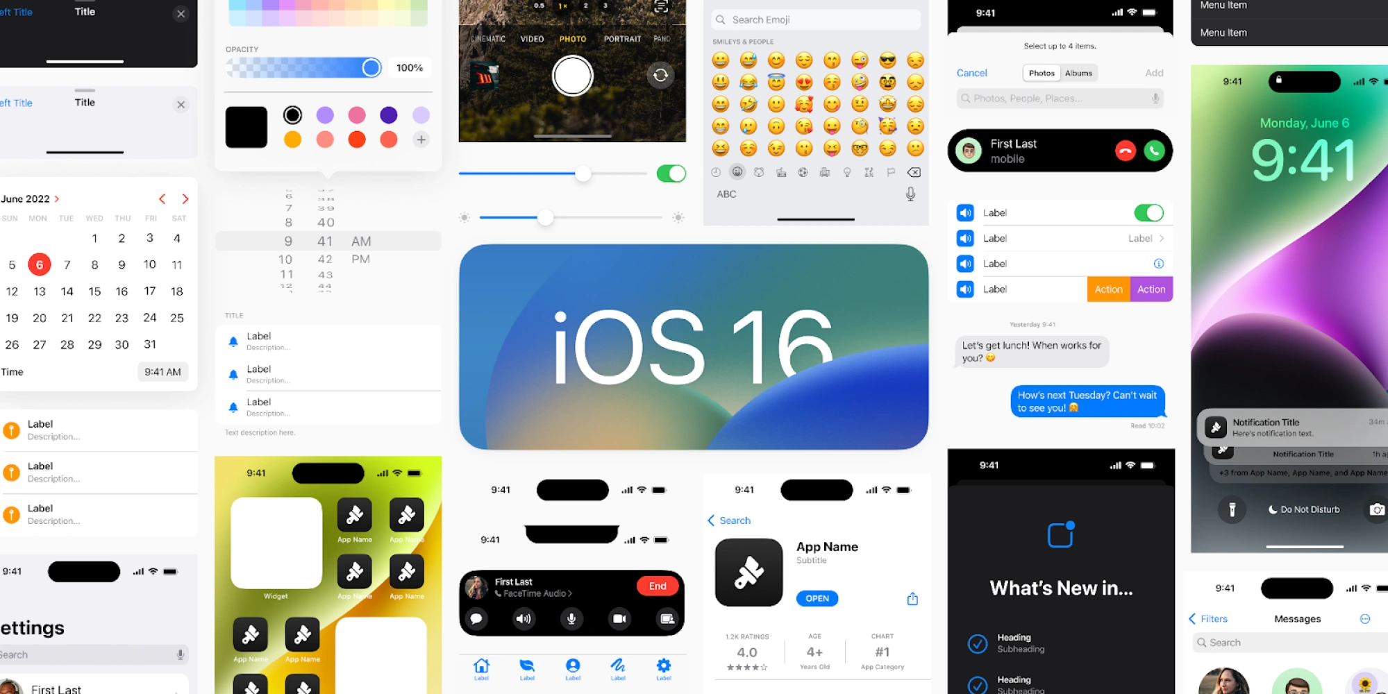
Apple iOS UI Kit
Apple’s official UI kit gives you a set of iOS design resources, including GUI components for iPhone and iPad. It’s perfect if you’re designing an iOS app and want it to feel “right,” as the kit strictly follows Apple’s Human Interface Guidelines.
Why you might like it:
- Available for free via Apple’s website.
- Aligned with Apple’s native UI design standards.
- Helps create accurate iOS and iPadOS mobile apps.
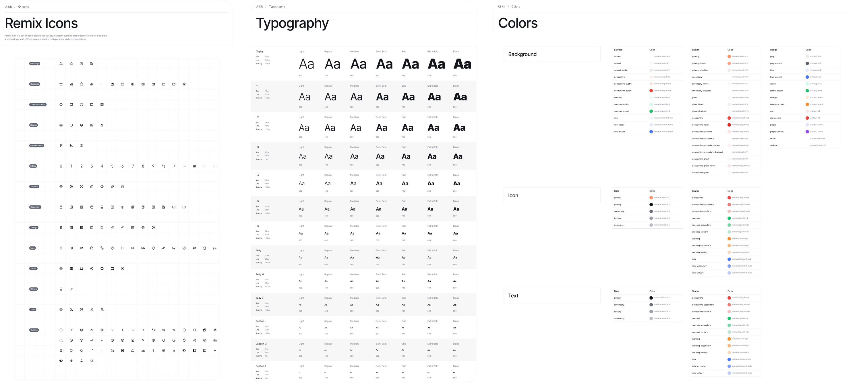
Ant Design System for Figma
Ant Design is a popular design system developed for enterprise applications. Its extensive React UI kit covers a diverse range of web application components and is useful for complex dashboards and tools with lots of user interactions.
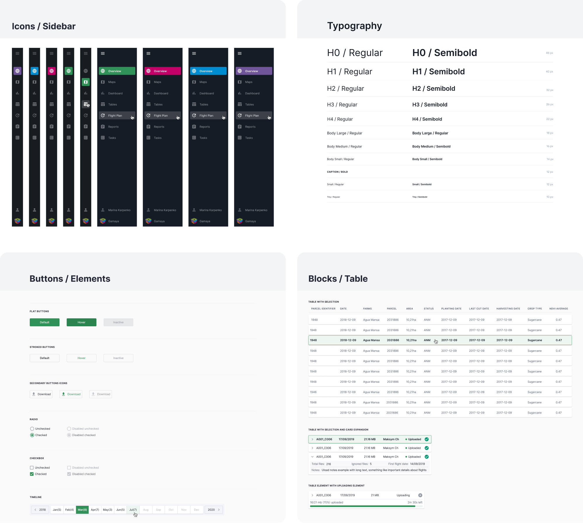
At Eleken, we used the Ant Design System when redesigning Gamaya, which helped us maintain clarity and visual consistency across data-heavy screens.
Why you might like it:
- Free kit based on a popular React UI library.
- Designed for enterprise‑grade apps.
- Covers a wide range of components.
Carbon Design System (IBM)
IBM’s Carbon Design System is an open-source design system built for enterprise products. It includes components for data tables, charts, forms, and more, along with detailed guidelines, making it a great source for learning.
Why you might like it:
- Free and open‑source design system.
- Includes enterprise‑ready UI components.
- Built with accessibility and scalability.
Untitled UI
Untitled UI is one of the most popular Figma UI kits and design systems. The Pro version is a paid kit that includes thousands of pre-built components, styles, and even page templates, crafted around the latest Figma updates.
Why you might like it:
- Large library with versatile components.
- Great for SaaS dashboards and web interfaces.
- Easy to customize to your own visual language.
Blank UI Kit
Blank UI Kit is a minimalist Figma UI kit that gives you clean components and basic styles you can build on top of. Its simplicity makes it useful when you want full control over your design language without being boxed in by heavy pre‑built systems.
When designing OptiFlow, a supply chain management tool, our UI/UX designer relied on this kind of lightweight kit and delivered a cohesive product.
Why you might like it:
- Fully optimized for Webflow projects.
- Includes 600+ variables for fast styling.
- Offers unlimited access to design assets under a paid license.
Preline UI
Preline is a Figma UI kit built to match Tailwind CSS utility classes, and notably, it’s offered 100% free to the community. It comes with a huge number of components and is perfect if you’re interested in the Tailwind CSS approach.
Why you might like it:
- Free playground for new designers.
- Designed to align with Tailwind CSS workflow.
- Developer-friendly component structure.
Cabana for Figma
Cabana is a well-known UI kit for Figma, featuring 1,000+ components and a host of templates and sections. Though this kit comes at a price per user and offers different licenses, it might be a great choice to speed up your workflow for client projects.
Why you might like it:
- Helps speed up early design phases.
- Includes an extensive set of components and templates.
- Offers multiple license tiers with extra features.
UI Prep
UI Prep is known for its smart use of Figma features like Auto Layout and Variants.
It’s premium, but for companies or advanced beginners who want to learn from its well-structured foundation, it could be useful.
Why you might like it:
- Designed to help you build your own system.
- Includes hundreds of styles and icons.
- Comes with explanatory documentation.
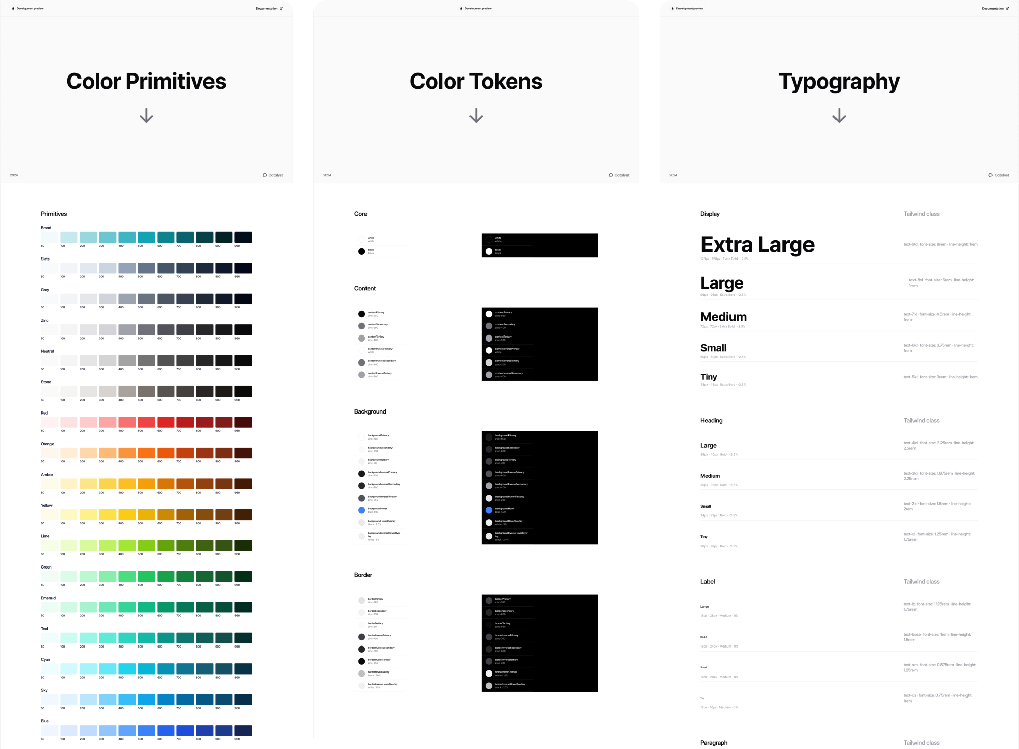
Catalyst UI Kit
Catalyst is a modern application UI kit built with Tailwind CSS, Headless UI, and React. It offers a collection of production-ready UI components you can drop into your projects and fully customize to match your product design needs.
For the HubbleNetwork SaaS platform, our Eleken team used Catalyst to move quickly and deliver a polished product that helped the client secure funding.
Why you might like it:
- Built with Tailwind CSS, Headless UI, and React.
- Production-ready and highly customizable.
- Ideal for modern SaaS platforms and web apps.
How to choose the right UI Kit for your design project
Not all UI kits are created equal, and the “best” one depends on what you’re working on. In some cases, it makes sense to create a kit from scratch. But if you decide to use an existing UI kit, keep the following considerations in mind.
Project type and industry fit
There are many types of projects and industries, and most UI kits are built for specific use cases. If you Google “UI kit,” you’ll see themed results like kits for e‑commerce apps, finance dashboards, social media platforms, and more.
And honestly, it’s pretty easy to pick the wrong one.
For example, a kit made for e‑commerce might include product cards, category filters, and cart pages. Meanwhile, a kit designed for finance dashboards will focus on data visualization components like charts, grids, and financial widgets.
Once you choose the right kit with the right components in it, you’ll spend less time customizing or adding missing interface elements later.
Multiple platforms support
Another big factor to consider is the platform you’re designing for. Some good UI kits are built for a specific device or environment, like a web app, an iOS app, an Android app, or a React Native UI kit, requiring you to choose wisely.
If you’re designing an iOS app, go with mobile UI kits that follow the Human Interface Guidelines and include components for iPhone and iPad. Likewise, for Android, a Material Design‑based kit will match users’ expectations on that platform.
Using a kit made for the wrong platform can lead to inconsistent patterns and UI elements that don’t feel quite right to your users.
Design tool compatibility
Before you pick a UI kit, make sure it’s compatible with the design tool you actually use, be it Figma, Sketch, Adobe XD, or something else.
UI kits are usually distributed in file formats tied to specific tools: .fig for Figma, .sketch for Sketch, .xd for Adobe XD. A kit that matches your tool will give you components, styles, and variants you can copy, customize, and organize.
Trying to convert a kit made for one tool into another (like opening a Sketch kit in Figma) often leads to lost editability or messy structure. In many cases, you’ll spend more time fixing things than designing, or end up rebuilding the kit entirely.
The good news is that many popular UI kits offer versions for multiple design tools, so you can pick the one that fits your workflow best.
Ease of customization
When working with an existing UI kit, you’ll almost always need to tweak things like colors, typography, spacing, or corner radii to match your brand or product needs. That’s why it’s worth checking whether a kit uses global styles or variables.
If it does, you can update a single setting (like the primary color) and see that change reflected everywhere, without manual edits on every component.
On the flip side, kits that are overly rigid, heavily themed, or hard to edit can slow you down. To avoid that, check the kit’s description, read reviews, and try a quick test in your design tool. If others mention trouble customizing it, it might not be the right fit.
Component coverage
When looking for a UI kit, it’s important to check whether it actually includes the components and patterns you’ll need for your project.
Some kits only cover the basics, including buttons, inputs, and simple layouts, while others go much deeper with things like data tables, charts, modals, notifications, onboarding patterns, and more complex components.
If your project requires advanced UI elements, a kit with limited coverage will leave you building missing pieces from scratch. So, don’t neglect to take a few minutes to skim the kit’s component list or preview screens in Figma/Sketch
License and cost
One of the simplest but most important things to check before using a UI kit is how it’s licensed and how much it costs.
In the section above, we’ve covered kits that are completely free, which are great when you’re just starting out or experimenting. At the same time, you can try paid or premium versions that offer more polished components and extended coverage.
Once you go with a free kit, make sure the license actually allows the way you plan to use it (especially for commercial products). If you’re considering a paid kit, weigh the cost against how much time it will save you and what it offers in return.
For team projects or products with serious design needs, investing in a regularly updated kit or design system can be worth the price.
Final pixels
If UI kits seemed confusing before, hopefully, they feel a bit more approachable now. And if you’re about to choose one, don’t just go for the most popular or most complex option. Find the kit that fits your project, your tools, and your pace.
At Eleken, we work across many domains, and for nearly every project, we build a UI kit. If you need help adapting a UI kit to your project’s needs, we’re here to help.


.webp)


.png)
