

Drag-and-drop design sounds deceptively simple. Just let users grab stuff and move it around, right? Easy. Until it’s not.
You add a draggable UI widget… and suddenly, users aren’t sure where to drop it. You build a Kanban board… and half your team can’t use it on mobile. You tweak the interactions… and accessibility goes out the window.
Such interfaces look clean and minimal but require a ton of thoughtful design under the hood. And when done wrong, they quietly erode trust in your product.
This is the reason why we created this guide. Drawing on our hands-on experience, we’ll walk you through drag-and-drop core elements, UX best practices, and visual inspiration from real SaaS products.
Let’s break it all down.
The core elements of drag-and-drop UI
At its heart, drag-and-drop UI is a conversation between the user and the interface. The user says, “I want to move this,” and the interface responds with cues, constraints, and feedback.
To design that well, you need to understand its basic building blocks.
Draggable elements
These are the items users can pick up, like cards, rows, files, widgets, etc. When placed inside an empty state, they need clear visual affordances (like drag handles or hover states) to signal interactivity.
Drop zones
Once an element is lifted, it should land in drop zones. They might be columns in a Kanban board, folders in a file system, or sections in a form.
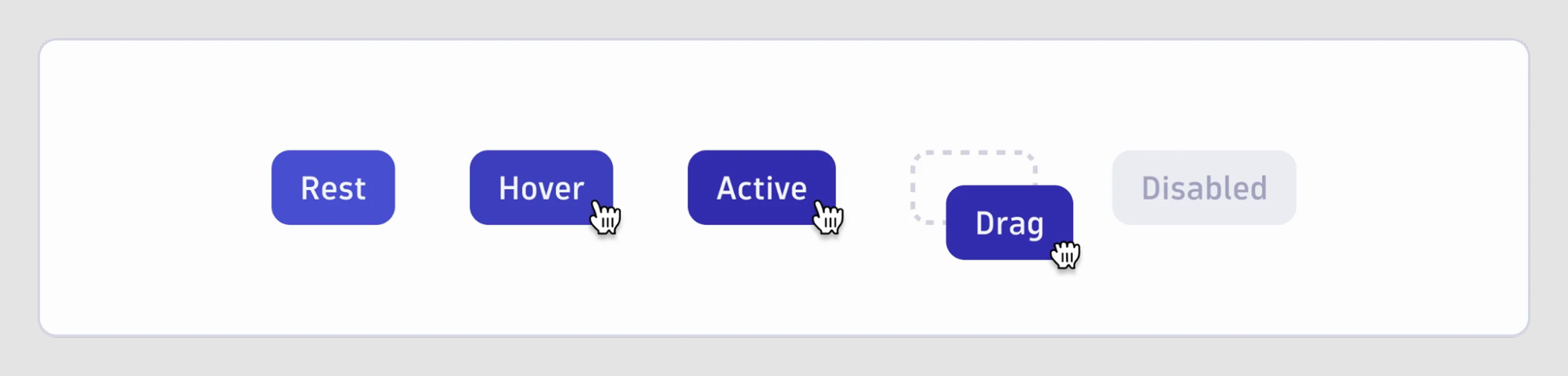
Interaction states
Every drag action flows through a series of microstates: idle → hover → grab → move → drop. And each one should communicate something.
Motion and microinteractions
Small movements, like snapping, ghosting, or subtle bounce effects, guide users intuitively. These microinteractions are what help users track their item’s journey without losing context.
UX design best practices for drag-and-drop interface
There’s something satisfying about dragging an item across the screen and watching the interface respond. However, there are times when things go wrong.
Maybe the drop zone doesn’t react. Maybe the item snaps back for no clear reason. Or worse, maybe it looks draggable but isn’t. These moments break the flow, confuse users, and turn what should feel natural into a frustrating guessing game.
We can’t guarantee every drag-and-drop design will be flawless, but we can stack the odds in our favor by following proven best practices.
Make it obvious what can be dragged
Have you ever hovered over a card and wondered if you could move it or not? That hesitation is a UX failure. Draggable elements shouldn’t be shy. They need to visually say, “Yes, you can pick me up.”
You can achieve this with subtle but consistent cues: a drag handle UI, a slight shadow or lift on hover, or a mouse cursor change to the classic “grab” hand. In interfaces with dense content, even a few pixels of breathing room around draggable elements can help differentiate them from static items.
Remember, if users have to guess, you’ve already lost them.
Show users where things can go
Dragging is only half the story. After this comes dropping. But too often, drop zones are either invisible until the last second or too subtle to notice at all.
The moment a user picks something up, your interface should shift to guide them. Drop zones should light up, highlight, or animate just enough to say, “Yes, I’ll take that.” If certain areas aren’t valid, make that clear too — fade them out, block them off, or show a “no entry” icon.
When drop zones are hidden or delayed, users second-guess the interaction. This is especially risky in conversational UIs and chatbot UIs, where clarity must happen in milliseconds.
Use visual feedback to confirm every move
Dragging something without feedback is disorienting and risky. Users need constant reassurance that their actions are working as expected.
When a drag starts, give the item a visual lift: maybe it floats above the UI with a subtle shadow or turns semi-transparent. As it moves, let the interface react — animate nearby elements, highlight drop targets, or show a preview of where it will land.
And when the drop happens, confirm it. A slight bounce, a color flash, or even a microanimation can reinforce the feeling that something just worked.
Don’t leave keyboard and screen reader users behind
Drag-and-drop UX tends to be a visually driven interaction, but that doesn’t mean it should be a mouse-only experience. If your interface can’t be used with a keyboard or a screen reader, you’re locking out a chunk of your users.

Start by making draggable elements reachable via Tab and movable with the arrow keys or dedicated buttons. Pair that with clear ARIA roles like aria-grabbed and aria-dropeffect, and use live region announcements to narrate what’s happening (e.g., “Item moved to Column B”).
Accessibility and flexibility also play a huge role in effective user onboarding, where early friction can derail engagement.
Design for fingers, not just cursors
What feels smooth on a desktop can fall apart quickly on mobile. Designing drag-and-drop UI interaction on touchscreens brings a whole new set of challenges: small targets and no hover states.
To make it work, you need to rethink precision.
Increase the size of draggable areas and drop zones, especially on crowded UIs like Kanban boards or nested lists. Use touch-friendly drag handles instead of relying on tapping and holding the entire element. And avoid gestures that conflict with native ones, like dragging vertically on a scrollable screen.
Also, consider fallback controls like swipe-to-move or up/down arrows to reorder list UI elements on smaller screens.
Visual design inspiration across SaaS patterns
When you’re stuck with UX design patterns, nothing helps more than seeing how others have solved the same problem.
We’ve categorized some of the most useful drag-and-drop UI examples from real SaaS products to show what’s possible, what works, and how you can adapt similar ideas to your own interface.
Let’s take a look.
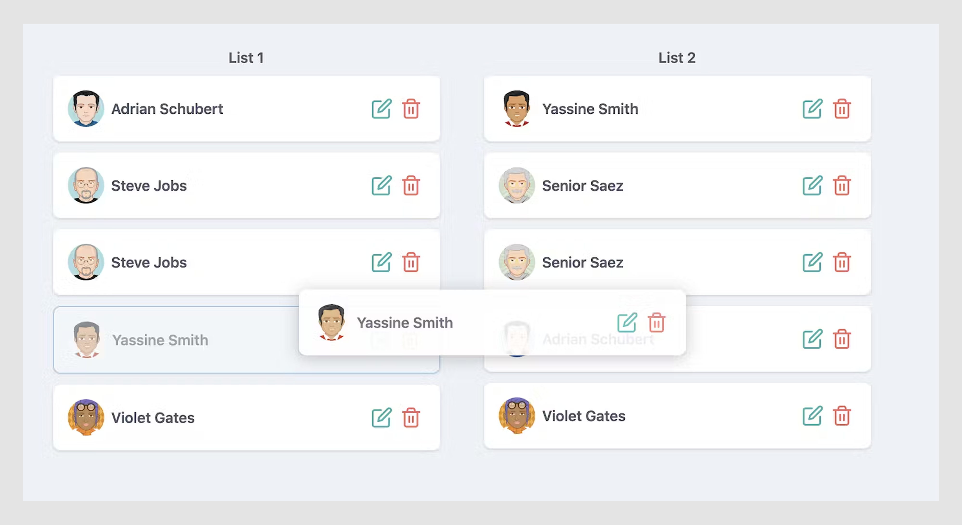
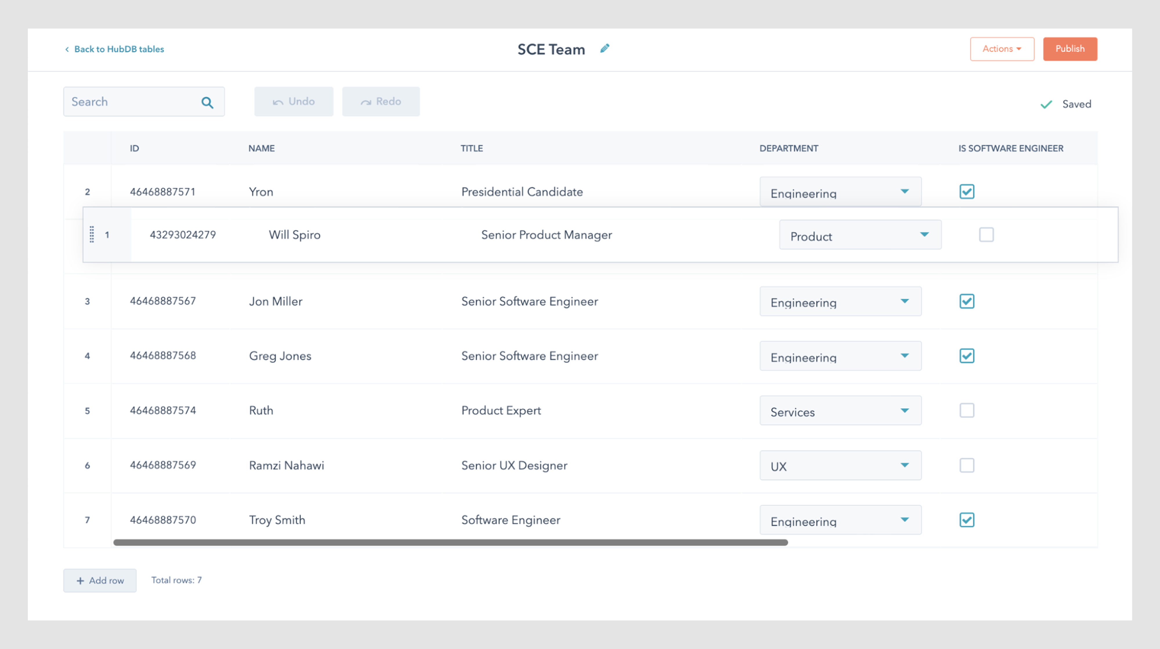
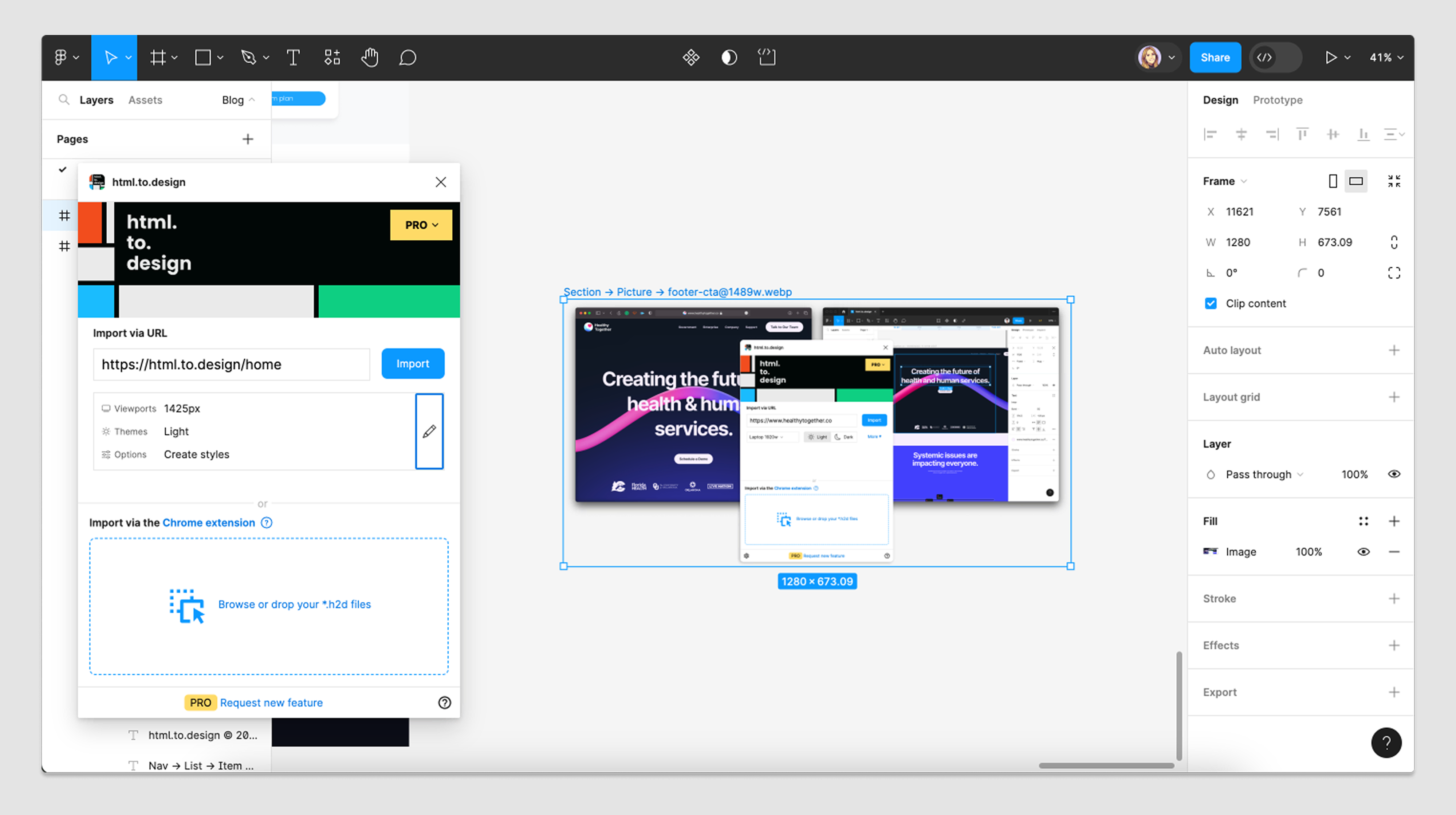
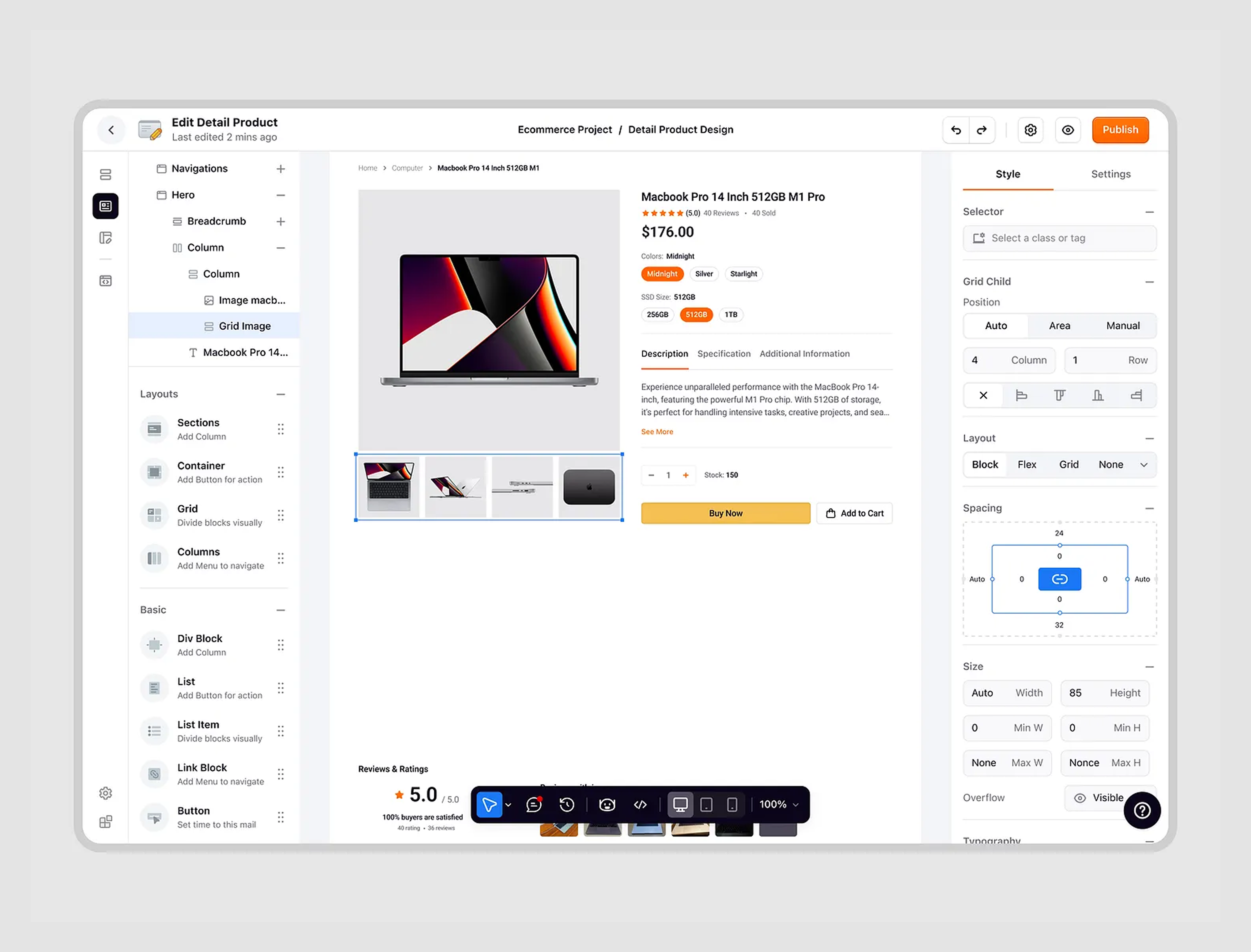
1. Data Streams
In our work with Data Streams, we designed a custom drag-and-drop experience that reimagined how users interact with dashboards and record creation.
For the dashboard, we introduced a visual constructor. Instead of sifting through dozens of pre-set parameters, users could drag preferred data visualizations directly onto a grid layout.
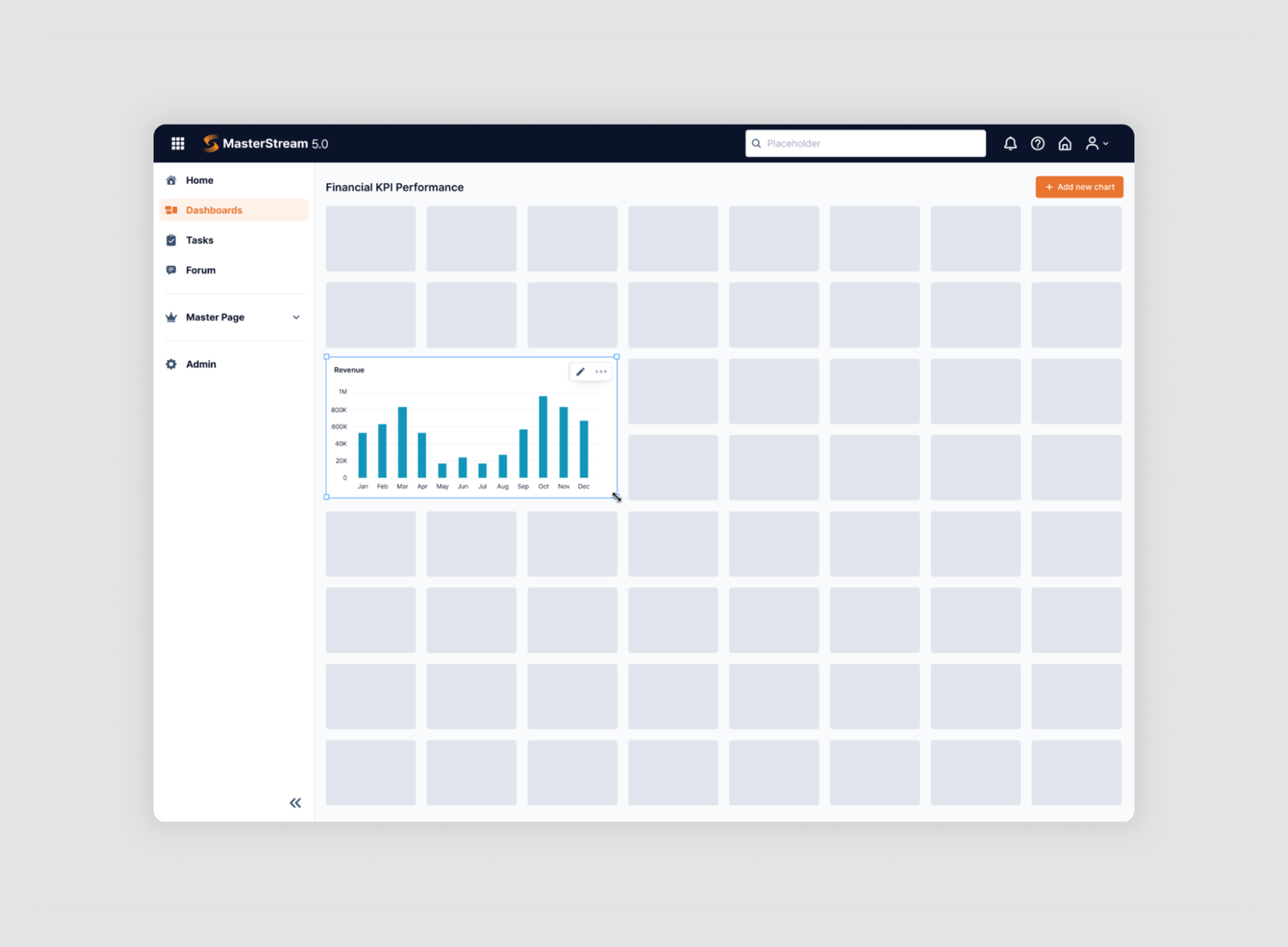
The new record page followed the same logic. A component palette on the left lets everyone drag fields into a central form canvas. As users select elements, the side panel updates with input field design controls, giving immediate feedback and customization options.
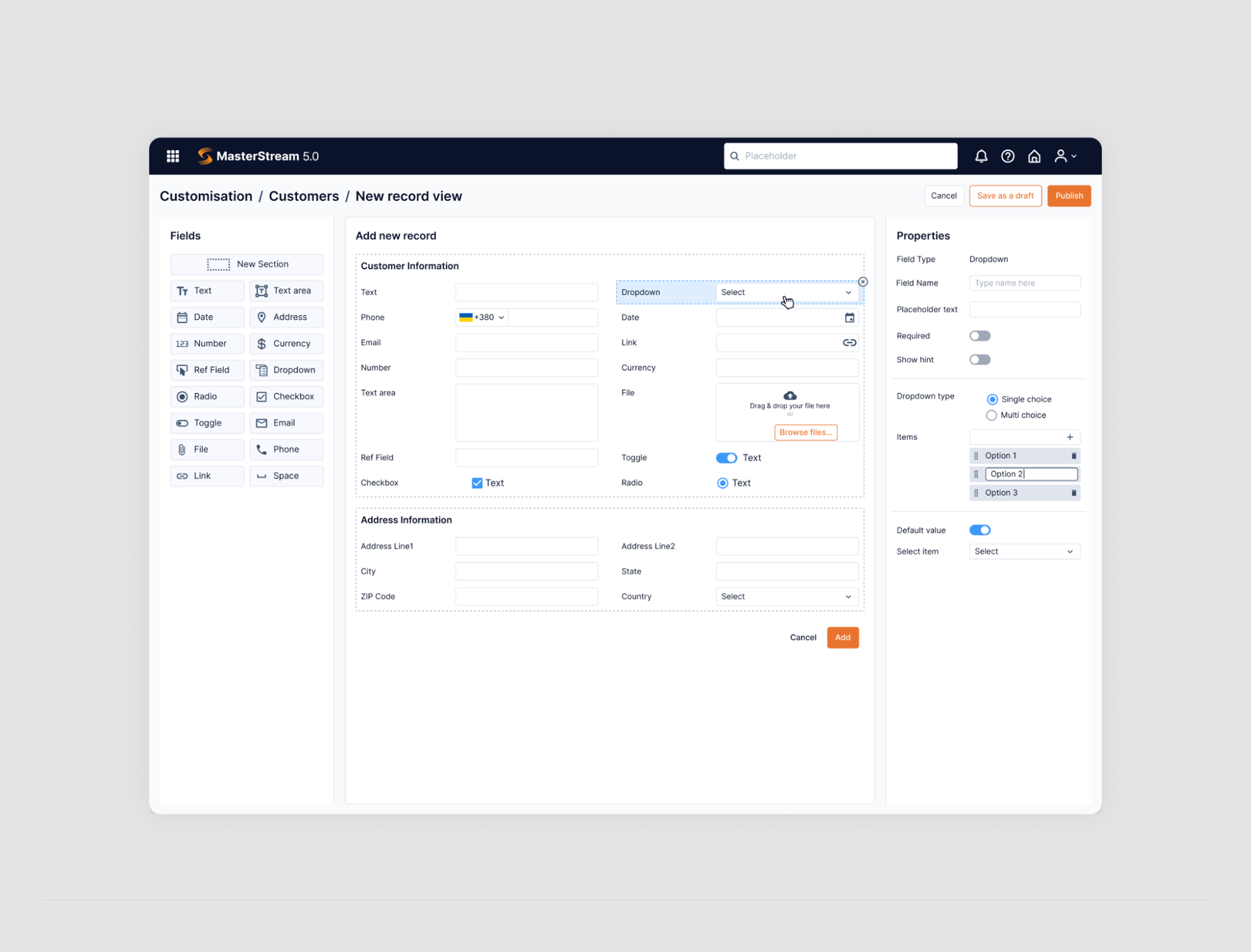
💡 If your UI includes scheduling or timed inputs, good time picker UX is just as essential as intuitive drag behavior.
2. Notion
Notion’s drag-and-drop experience is often cited as one of the most intuitive in modern SaaS, and its dashboard widget arrangement is a classic example of why.
There, every content block — whether it’s text, an image, a table, a carousel, or an embedded widget — can be dragged and repositioned.
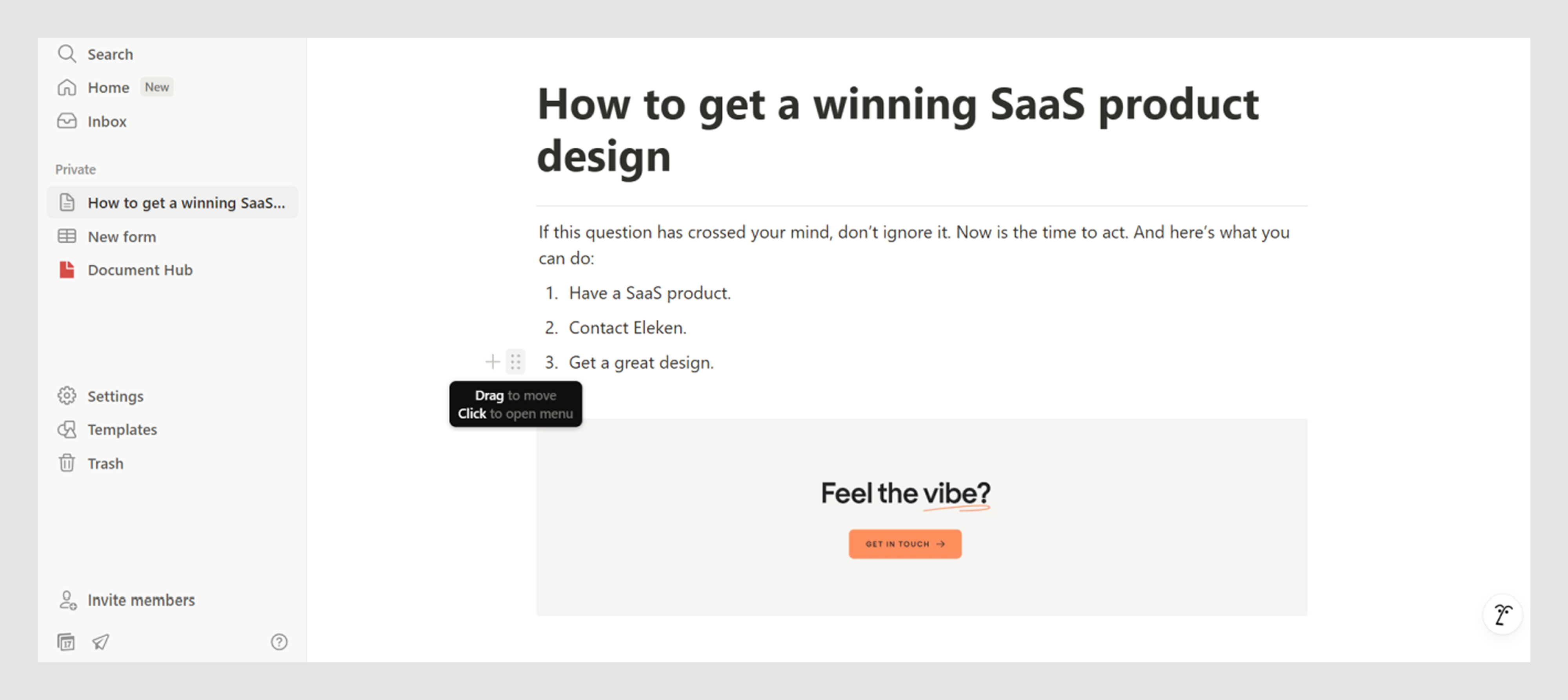
The moment you hover near the left edge of a block, a six-dot drag handle UI appears, inviting you to grab it. Once you start dragging, a slim horizontal line dynamically shows where the block will drop, updating in real time as you move.
This lightweight but clear feedback makes rearranging content feel fast and predictable.
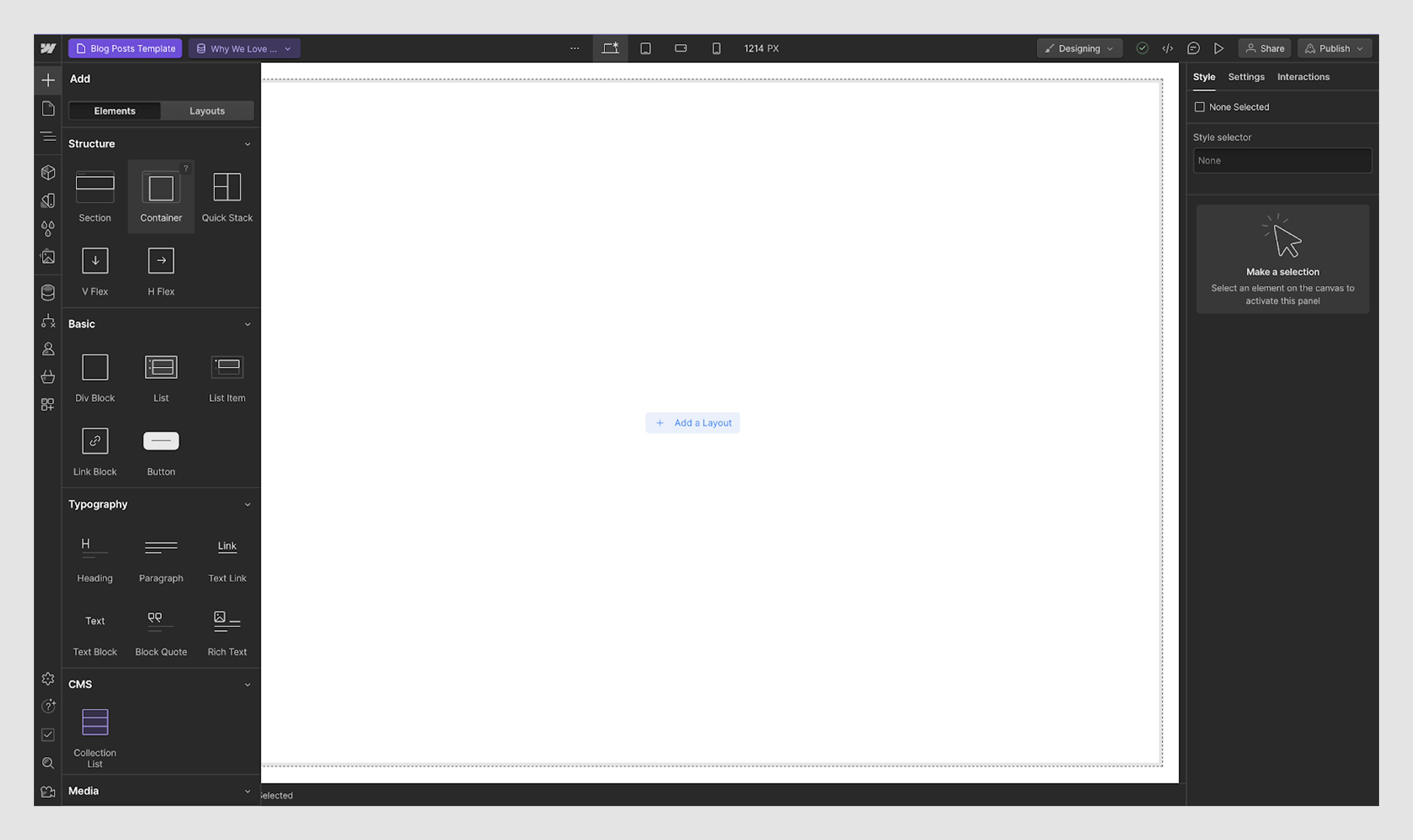
3. Webflow
In Webflow’s editor, users can drag containers, images, and text into complex layouts.
As you move an element around, blue highlight bars and section outlines clearly indicate where it can be dropped. The editor also auto-expands containers and scrolls the view as needed, a dynamic layout technique often seen in map UI design.
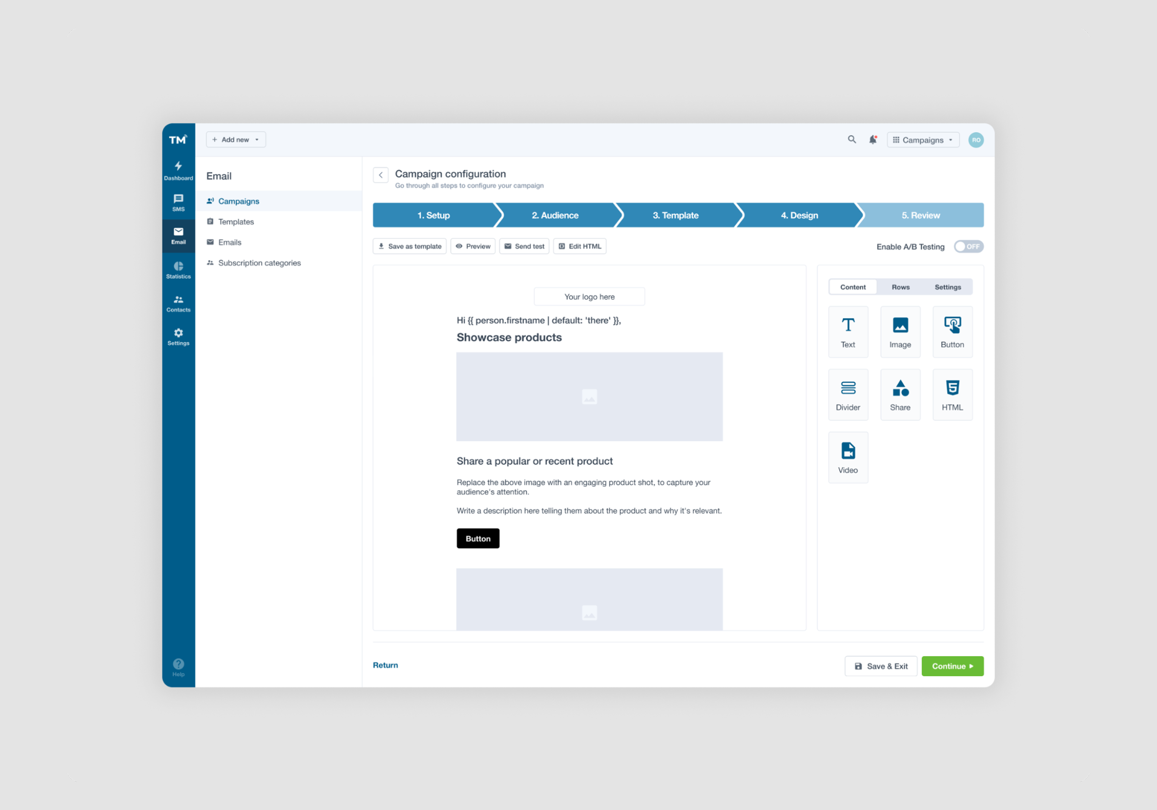
4. TextMagic
In the TextMagic platform, we enhanced the email creation flow by introducing a wizard UI pattern and a simple drag-and-drop editor. Users can build custom emails by dragging blocks, like text, images, radio button components, or dividers, directly into their message layout.
For more advanced users, we also added an HTML editing option, giving them full control over the final output. This dual approach empowers both beginners and pros to work the way they prefer.
5. Google Drive
Google Drive’s drag-and-drop is designed for speed, familiarity, and no surprises.
When you drag a file or folder within Drive’s list or grid views, the UI provides subtle but clear cues: a semi-transparent version of the item follows your cursor, while potential drop zones highlight with a light blue shade.
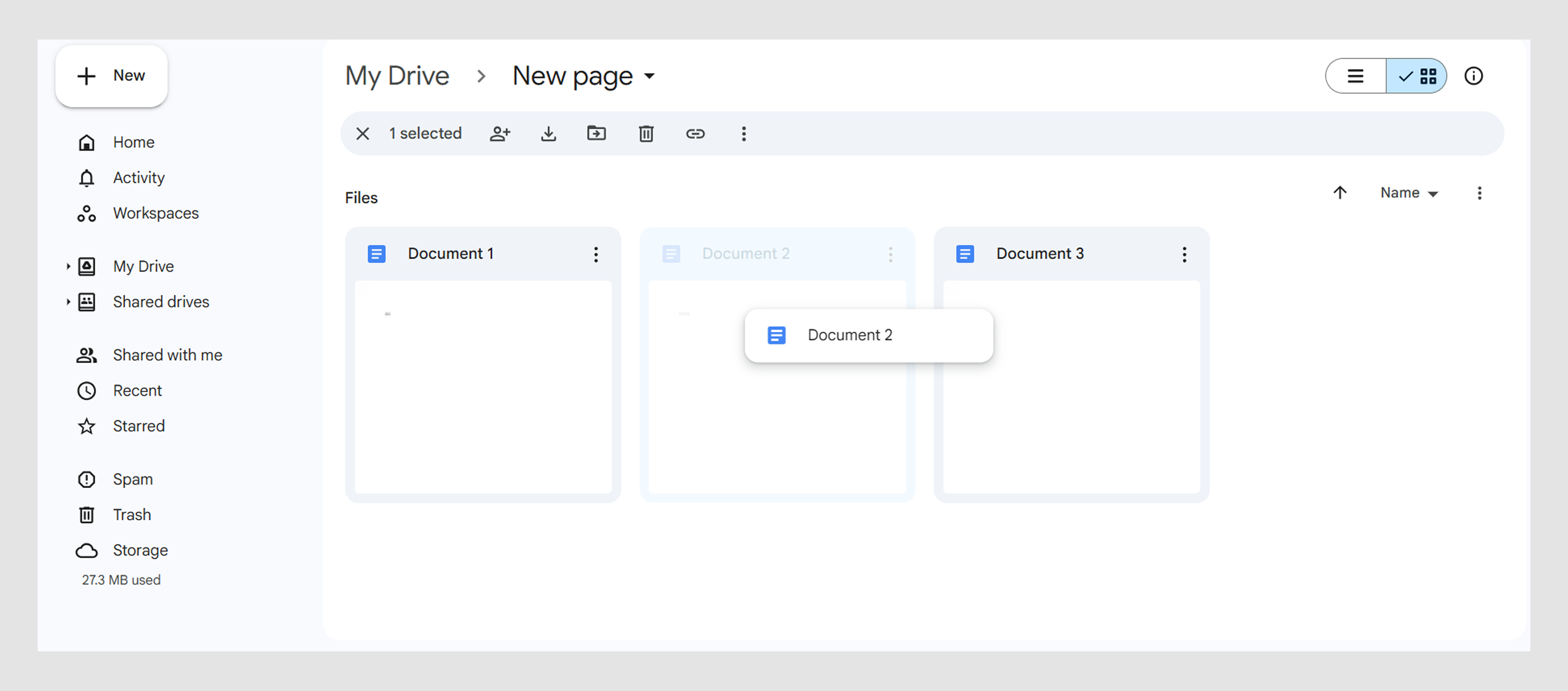
If you hover over a collapsible folder, it auto-expands, allowing you to drop deeper into the hierarchy without extra mouse clicks.
There’s nothing “wow” about this interaction. It behaves exactly how users expect, with minimal friction.
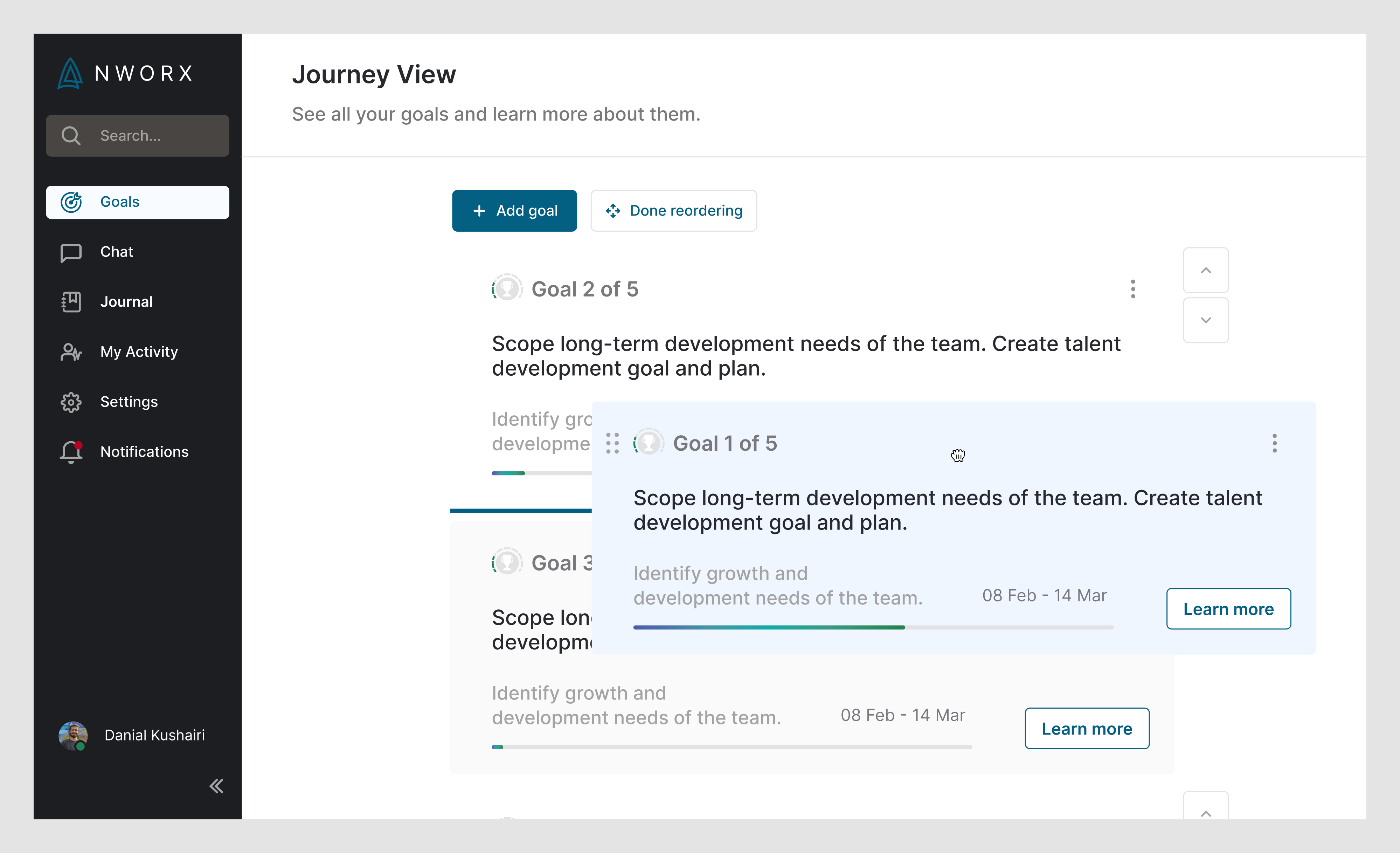
6. NWORX
In our collaboration with NWORX, we focused on improving the UX. One key enhancement was introducing drag-and-drop functionality.
Users can now reorder their goals by simply grabbing one using a six-dot drag handle (similar to Notion) or using up/down arrows positioned to the right. Once a goal is selected for dragging, it’s subtly highlighted in light blue, offering clear visual feedback that the item is active and ready to move.
This interaction makes goal management feel smoother, less technical, and more user-centered.
7. ClickUp
ClickUp combines the flexibility of spreadsheets with the structure of project management tools.
In app’s list or table views, users can easily search for tasks and reprioritize them by dragging rows up and down. Each row includes a draggable UI handle, and as you drag, a monochrome placeholder appears where the row will drop.
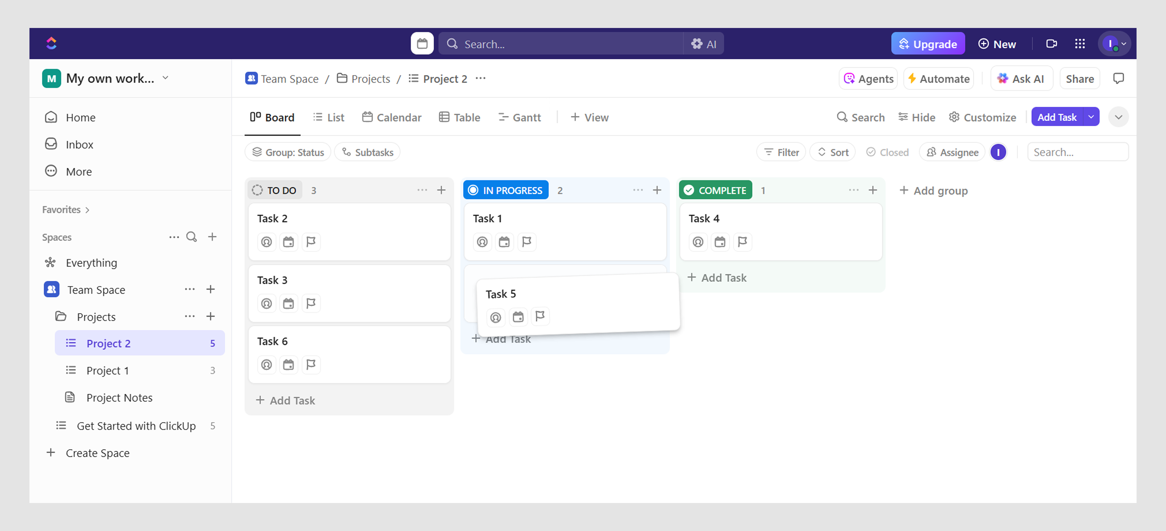
This interaction is especially powerful in prioritized backlogs or sortable views, where order matters, because the UI makes it effortless to tweak.
8. HubSpot
HubSpot’s CRM tables pack a lot of data — leads, contacts, deals — all customizable to each user’s workflow. To manage this complexity, they allow users to reorder columns via drag-and-drop.
When a user clicks and drags a column, it detaches slightly and glides horizontally. As the user moves it, other columns shift in real time to make space, and a subtle vertical highlight indicates where the dragged column will land.
This kind of reorder UI is lightweight, quick, and gives users the sense that they’re truly in control of how they view their data.
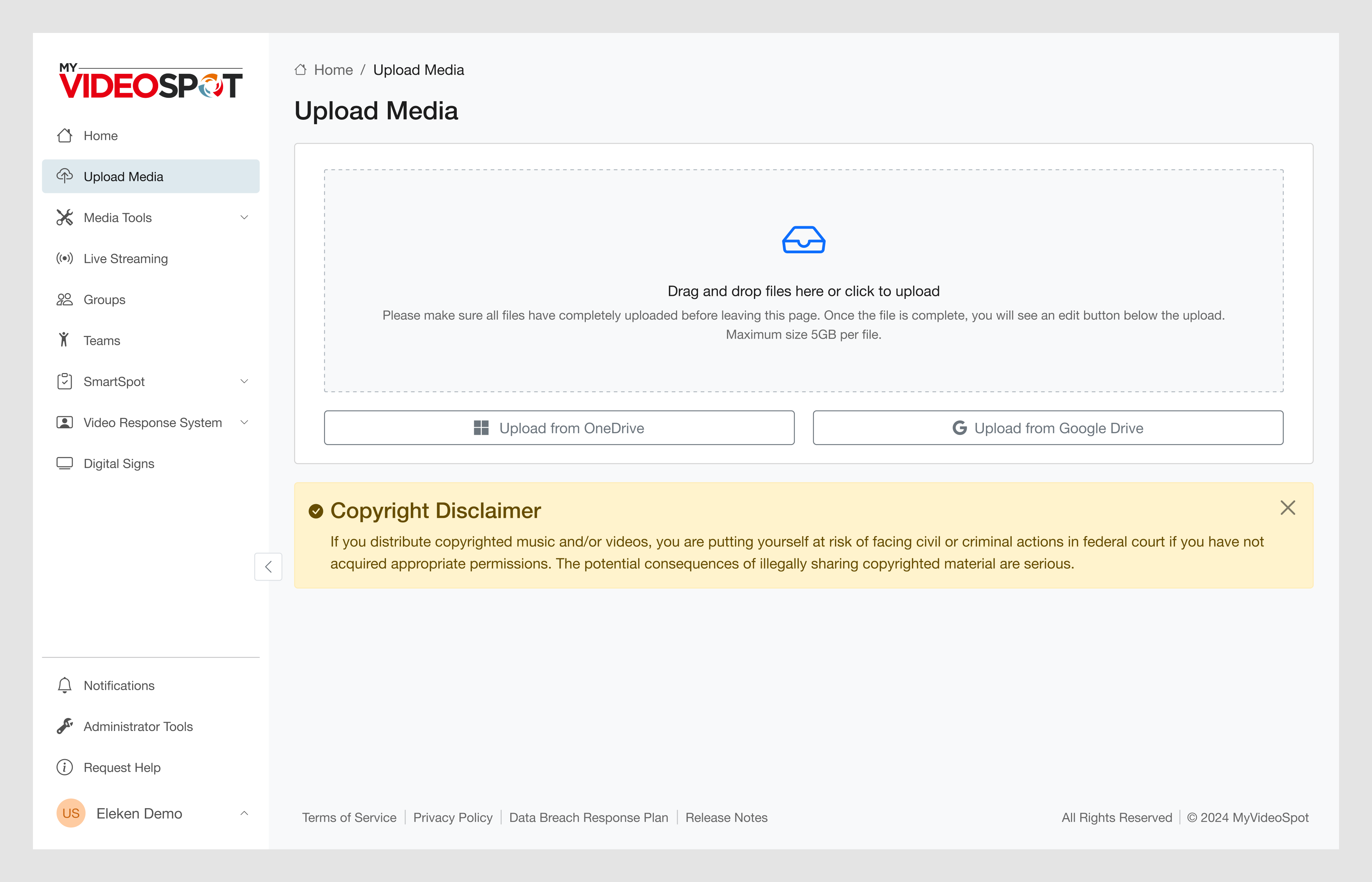
9. My Video Spot
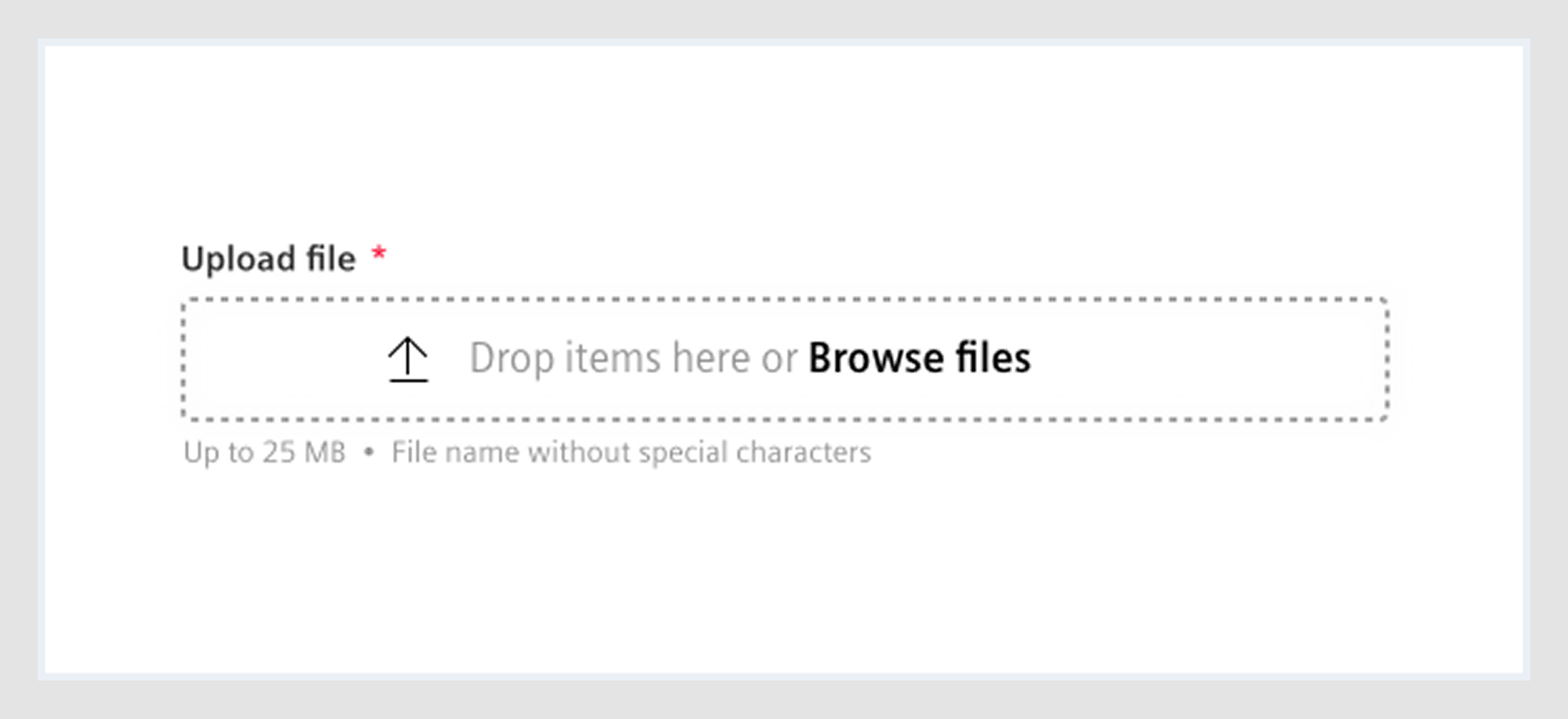
Working on My Video Spot, we introduced a flexible experience. One of the key improvements was enabling drag-and-drop file upload, allowing users to simply drop their videos into the platform without navigating file pickers.
This feature isn’t limited to just the dashboard, as we extended the same functionality to the homepage, making it easy for users to start uploading content from the very first sign-up flow interaction.
10. Zapier
Zapier’s entire value proposition is about simplifying automation, and their drag-and-drop workflow builder is central to delivering that promise.
Users create “Zaps” by dragging steps into a vertical sequence: triggers, actions, filters, and delays. As new blocks are dragged in, Zapier shows a clear drop area with a full-width shaded indicator.
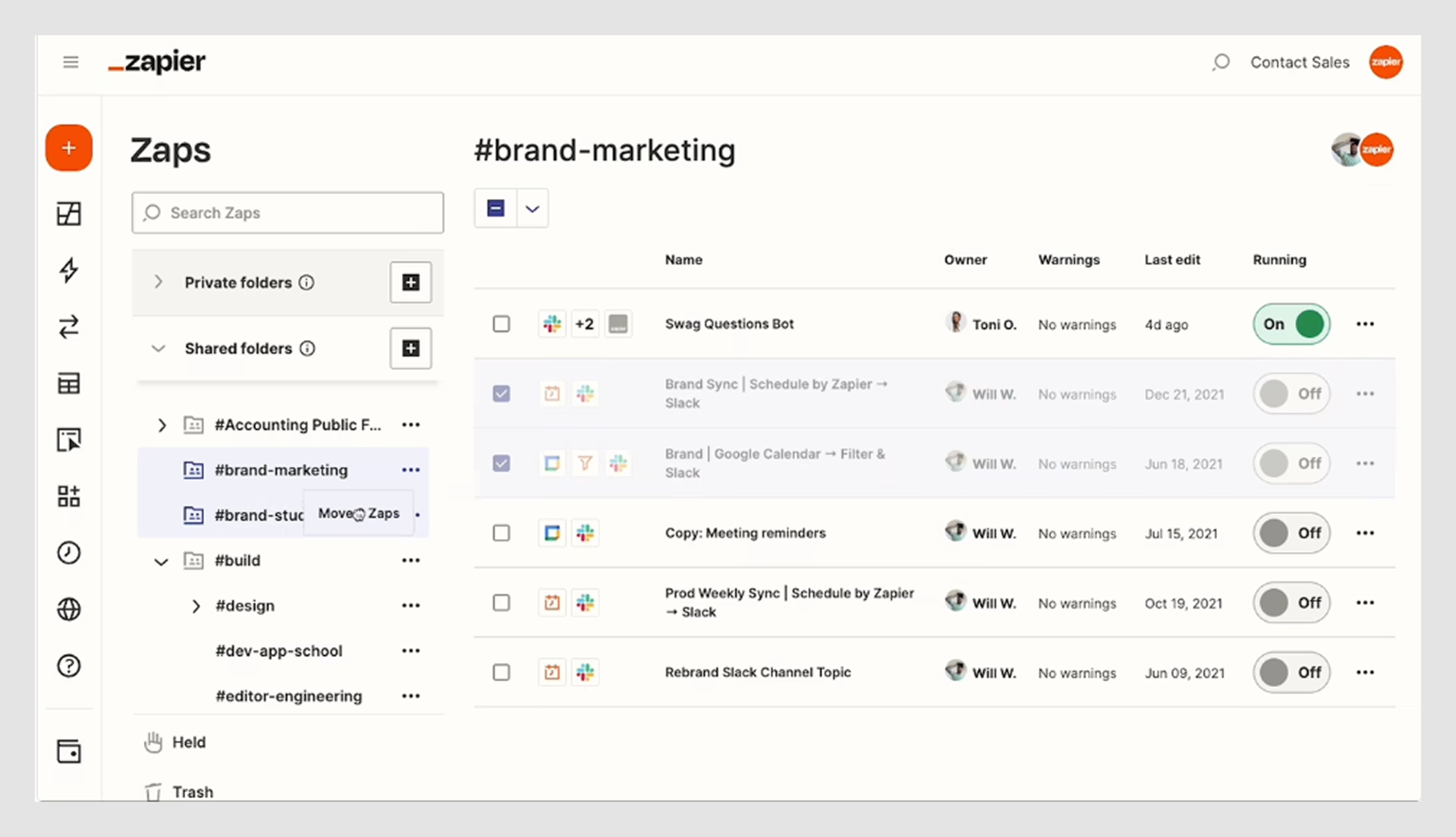
What makes Zapier’s drag-and-drop UI design great is that it balances simplicity with power. Users can manage complex workflows without ever feeling like they’re wrestling the UI.
11. Slack
Slack takes one of the most mundane interactions — uploading a file — and makes it feel clean, fast, and user-friendly through subtle design.
When users drag a file into a Slack window, the interface instantly changes. A translucent overlay appears with a drop zone prompt, showing where the file can go. Once dropped, the file is previewed inline in the message box, giving users a chance to confirm or cancel before sending.
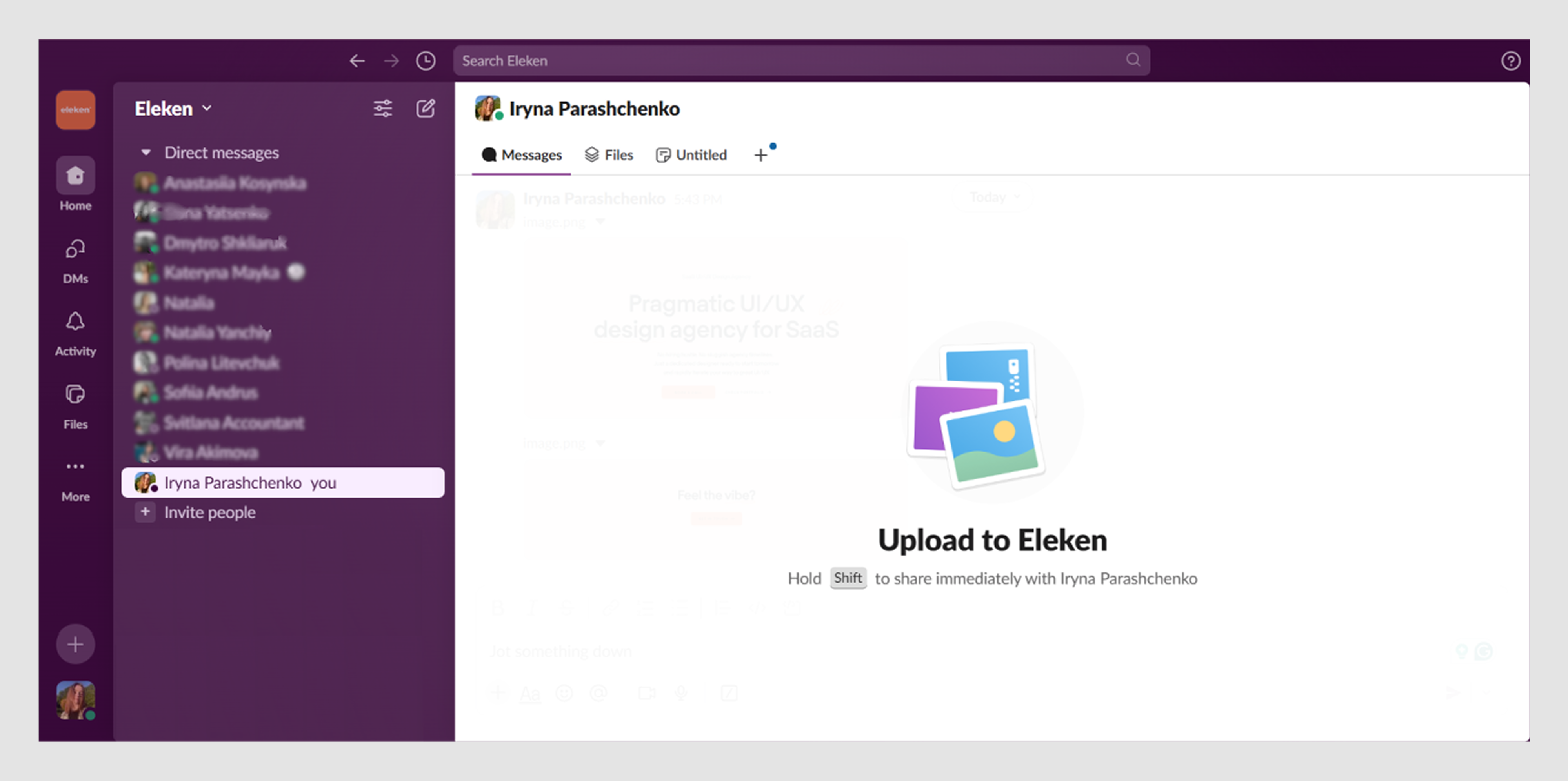
Slack keeps everything lightweight. There are no popups, no extra clicks, just immediate, clear feedback and a smooth upload experience.
12. Figma
Figma’s drag-and-drop interaction is a masterclass in making complex design systems feel approachable.
Designers can drag components from side panels or asset libraries directly onto their canvas. As they do, Figma provides subtle guides: alignment lines, snap points, and ghosted previews that show exactly how and where the element will land.
The whole interaction feels smooth and pixel-precise, even in dense design files.
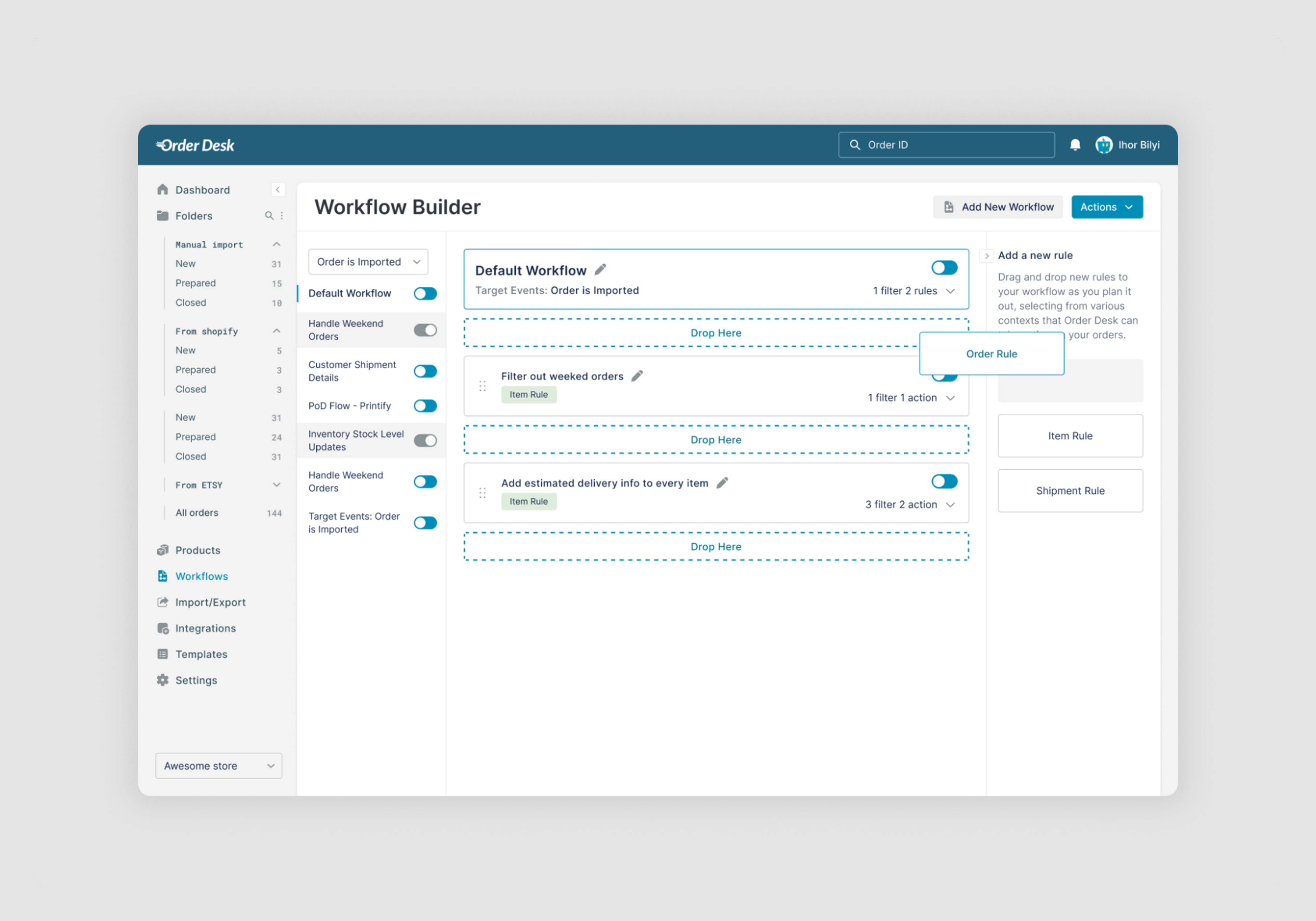
13. Order Desk
For Order Desk, our design team focused on simplifying the creation of workflows through design enhancements.
We introduced a drag-and-drop builder that allows users to organize workflow elements. Users can just drag it from the options and drop it where it belongs. To guide users visually, the active drop zone is outlined in a blue dashed border, indicating where elements can be placed.
14. Canva
Canva is a design tool built entirely around drag-and-drop interactions, and it shows.
Users can pull text, images, icons, charts, and other assets from a side panel directly onto their canvas. Every element can be moved, layered, resized, and rotated with smooth, tactile feedback. Grid snapping and alignment guides ensure precision even for non-designers.
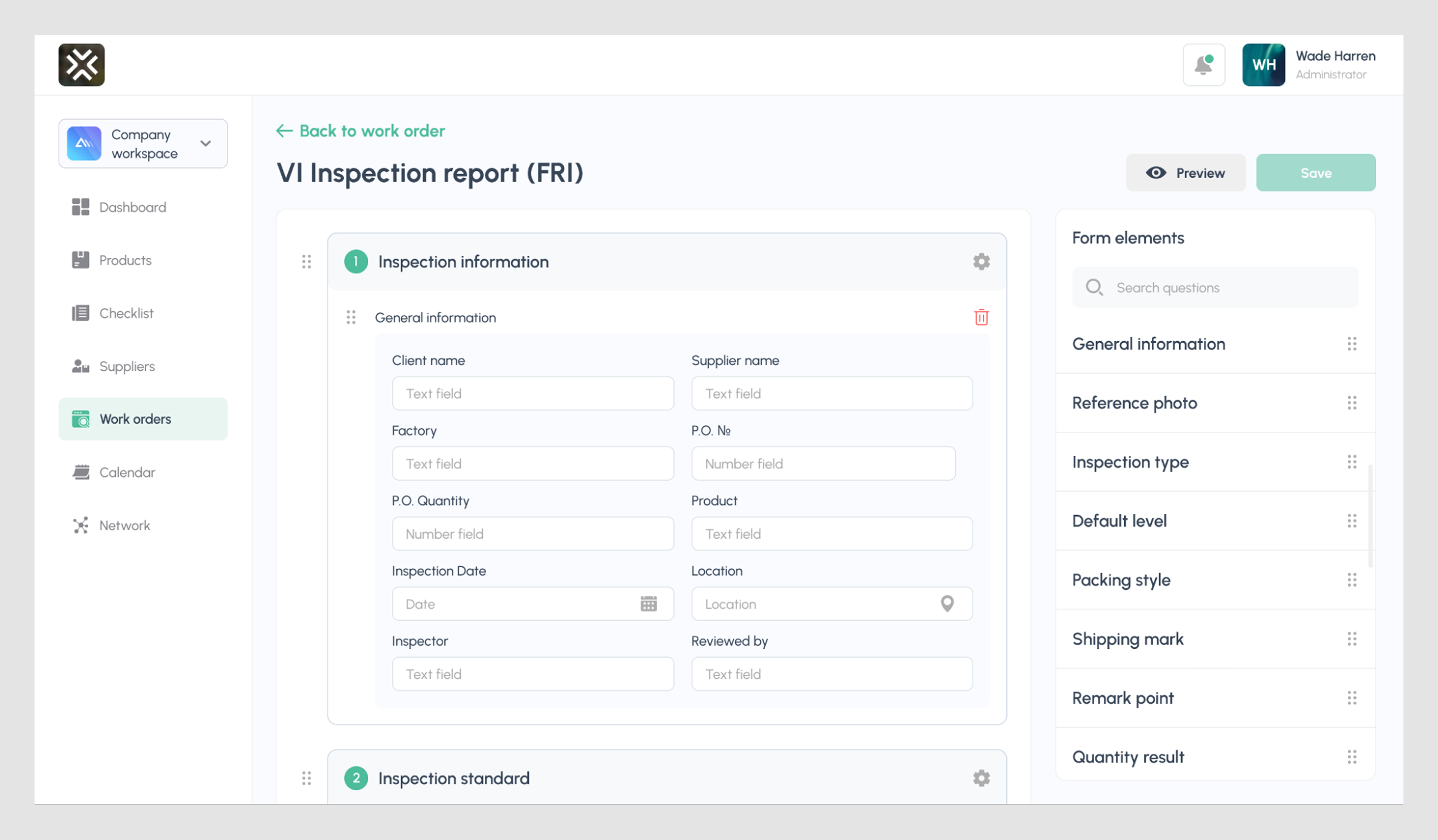
15. MegaStep
For MegaStep, we introduced a drag-and-drop interface that allows users to build fully customized reports.
On the right, a Form Elements panel houses all available components, like General Information, Reference Photo, and more. Users can drag the item they need into the central canvas to assemble their own report layout.
Once the blocks are placed, users can also rearrange the order of sections within the report using simple drag gestures. While the layout construction uses classic drag-and-drop, the internal reordering of blocks is handled through basic draggable behavior for a smoother experience.
Tools to build drag-and-drop UI
If you’d rather not spend weeks wrestling with interaction details, you can always turn to the Eleken team. Our designers have built these patterns across SaaS products (like those above) and know exactly how to make them work.
But if you’ve decided to take the solo route, we’ve got you covered, too. Below is a curated list of tools and libraries that can help you build (or prototype) drag-and-drop UIs faster, cleaner, and with a lot less frustration.
💡 Components like toggle switches or checkbox UX often work well alongside drag-and-drop when managing form-heavy dashboards.
React Beautiful DnD
A popular library from Atlassian (creators of Jira), React Beautiful DnD is one of the most elegant drag-and-drop libraries for React apps. It handles reordering, accessibility, and animation with minimal setup, being perfect for product teams building task boards, sortable lists, or dashboards.
Why we like it: Great documentation, natural movement, and built-in keyboard support
Framer Motion
While not a drag-and-drop library in itself, Framer Motion adds beautiful animation to any interactive UI elements, like sliders, and it plays nicely with libraries like DnD Kit or custom drag logic. Use it to smooth transitions between drag states, add bounce effects, or animate rearrangements.
Why we like it: Lightweight, flexible, and deeply customizable
Dnd Kit
A modern, headless drag-and-drop toolkit for React, Dnd Kit gives you full control over behavior and styling. Unlike React Beautiful DnD, it doesn’t assume much about your layout, which is great if you’re building something content-heavy like workflow editors or nested reordering systems.
Why we like it: High performance and modular design
💡 For managing hierarchies in content-heavy apps, drag-and-drop is often paired with sitemap UX to help users organize the structure visually.
SortableJS
A minimalist JavaScript library (no framework required), SortableJS makes it easy to add drag-and-drop to any list, grid, or UI container. It supports features like multi-drag, cloning, and custom animations, making it suitable for building simpler interfaces.
Why we like it: Tiny footprint and broad browser support
Figma
Though it doesn’t support real-time drag events natively, Figma is a powerful tool to prototype and fake drag-and-drop examples using smart animations, overlays, and interactive transition triggers. It’s ideal for validating UX concepts before handing them to devs.
Why we like it: Quick iteration and easy sharing with teams or stakeholders
Final note
As we’ve reached the end, there’s one last thing we need to say — every drag-and-drop interaction changes the mental model of your product. It’s one of those onboarding best practices that helps users build confidence as they explore. And it comes with responsibility.
Your drag-and-drop UI shapes how people understand hierarchy, relationships, and cause-and-effect inside your product. When that interaction is seamless, users feel like they “get it.” When it’s not, they hesitate and just leave.
So, as you design a drag UI experience, shape it around the way people think inside your product. And if you want that thinking to feel natural, intuitive, and empowering, our Eleken team can help.


.webp)


.png)
