
Healthcare apps are getting more advanced, but not always more usable. Between AI, wearables, and telehealth integrations, many products are bloated, confusing, or just plain overwhelming.
Designers in this space face a tough challenge: how do you make complex tools feel effortless for users who are stressed, sick, or simply busy?
This guide offers practical answers. You’ll learn:
- Why designing for healthcare is fundamentally different from other industries
- How to create role-specific interfaces for patients, providers, and admins
- What design choices help build trust and reduce cognitive load
- Real examples from Eleken’s healthcare user interface design projects
- Key trends for 2026, including AI diagnostics, dual-panel telehealth, and predictive dashboards
We’ll also bring in insights from working designers who know how to build clean, information-dense healthcare UIs that don’t sacrifice usability for flash.
Let’s start with why healthcare design is uniquely hard and worth doing right.
Why healthcare app UX is uniquely challenging
Designing for healthcare isn't just about good UX. It's about working inside a system that's slow, messy, and deeply regulated. You can't move fast and break things when lives are on the line.
Here's what makes healthcare user experience uniquely tough:
Multiple user roles and needs
You're not designing for a “user.” You're designing for patients, doctors, nurses, admin staff, and insurers. Each group has different goals, different stress levels, and different expectations. A doctor wants speed. A patient wants reassurance. A billing manager wants to avoid errors. One screen has to serve them all, or split into several that do.
Legacy healthcare systems
Many healthcare platforms run on legacy systems that weren't built for medical UI design at all. Updating them is expensive and slow. Designers often inherit bloated layouts, outdated interactions, and deeply nested workflows. You can't just start from scratch; you have to work with what's already there and find smart ways to improve it.
Strict regulatory requirements
HIPAA, WCAG, and FDA review. Every design decision comes with legal baggage. Even changing button text can trigger months of review in some companies. That's why a lot of healthcare app designs look like they were last updated in 2009. Because in some cases, they were.
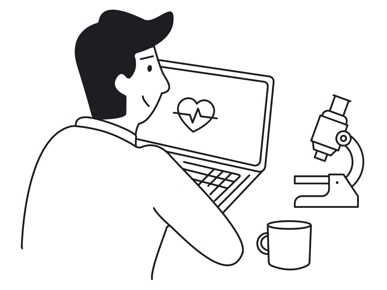
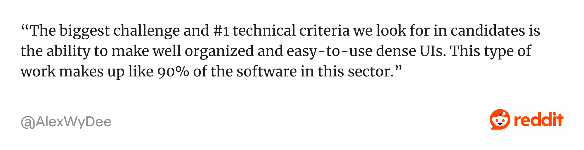
Complex workflows and high-stakes decisions
One experienced designer put it best:
.png)
In healthcare, clarity matters more than beauty. If you love simplifying tangled workflows, you're in the right place. Improving user experience in healthcare means solving for complexity, regulation, and real human emotion.
Now that we've unpacked why medical UX design is uniquely challenging, let's look at some real-world examples.
Examples of healthcare applications design
Healthcare tools are evolving fast, and user expectations are catching up. The best app interface in 2026 combines thoughtful UI/UX design for healthcare with real-world functionality. Let's explore several examples of medical UX that work in practice.
1. Populate
Eleken worked with Populate, a healthcare startup built to fight clinician burnout, by designing a lightning-fast interface powered by AI. The app generates visit note templates tailored to patient complaints and allows doctors to complete them using dropdowns or speech-to-text. Every interaction was designed to minimize clicks and save time, showcasing thoughtful medical UI/UX design.
.png)
2. Haven Diagnostics
Eleken designed Haven's dashboard to model disease spread in office environments. It visualizes risk levels, forecasts outbreaks, and gives tailored recommendations by location. Clear color cues and simplified charts turn complex data into fast, confident decisions, exactly what's needed in high-stakes situations.
.png)
3. VCDoctor
VCDoctor combines video consultations, EHR integration, and real-time messaging in a single platform. Patients can schedule appointments, attend visits, chat with providers, and manage prescriptions without switching between multiple tools. With multi-language and cross-device support, the platform makes virtual care more seamless and accessible.
.png)
4. b.well
When working with b.well, a white-label healthcare platform, our Eleken team was approached to design the Health Summary feature, which lets users generate a single downloadable document with their visit history, diagnoses, and lab results. The clear, easy-to-read format helps patients understand and share their health information while saving time for healthcare providers.
.png)
5. Reframe
Reframe, an app designed to help people reduce alcohol consumption, uses gamified CBT-based journeys to support long-term behavior change. The interface guides users through structured programs with checkpoints, progress tracking, and streak counters that encourage consistency. By visualizing progress and reinforcing daily habits, the app makes a challenging lifestyle change feel more manageable and motivating.
.png)
6. Sidekick Health
Sidekick Health helps people manage chronic diseases by turning daily care routines into structured, trackable activities. The app uses reminders, streak counters, and progress tracking to reinforce healthy behaviors over time. This approach helps users stay engaged with long-term treatment plans and makes ongoing health management feel more achievable.
.png)
7. Refera
Refera helps dentists manage referrals. When we joined the project, the UI felt outdated and too flat for a medical tool. We introduced a softer green palette, replaced generic illustrations with real photos, and improved the hierarchy. These changes made the product feel more trustworthy and helped increase adoption by lowering emotional friction.
.png)
Best practices for healthcare UI/UX design
Designing for healthcare means designing for tension. The apps are complicated, the stakes are high, and users are under pressure. Good ui/ux design pattern in healthcare doesn't just feel smooth, but it actually helps people think more clearly and act faster.
Below are the most effective strategies we've seen work in medical user interface design products.
1. Prioritize role-specific experiences
In healthcare, there's no such thing as a general “user.” You're designing for patients, doctors, nurses, and admins. Each group has different goals. A patient wants reassurance. A doctor needs quick access to clinical data. An admin needs smooth billing workflows. If your interface tries to serve them all at once, it serves none of them well.
That’s why the best healthcare UX designs personalize the experience by role. Layouts, actions, and content shift depending on who’s using the tool and why.
For example, when b.well asked Eleken to help design new features, one of our first tasks was the Health Information Network. It required three different user flows for identity verification. We also redesigned dashboards and health summaries for patients and admins. Patients saw only what mattered to them. Admins got tools for managing large datasets. This role-based structure helped keep every experience clean and focused.
.png)
2. Use calm visual language to build trust
Healthcare is stressful. People open these apps when they're worried, in pain, or overwhelmed. The last thing they need is an interface that adds more friction.
That's why visual tone matters. A clean, calm design helps users feel safe and in control. No harsh reds or cluttered layouts. No endless forms or flashing alerts. Just a clear sense that someone thoughtful is behind the screen, with an emphasis on simplicity in UI/UX design.
This is where the psychology in UX design plays a major role — using whitespace, typography, and visual hierarchy to reduce anxiety and build trust. Add structure through color and layout. Use consistent icons and soft contrasts. These small choices help users move with confidence instead of hesitation.
3. Simplify navigation for high-stress situations
People don't open healthcare apps for fun. They open them because something's wrong, something's unclear, or something needs to happen fast. In those moments, even small design hiccups can cause big frustration.
That's why navigation in healthcare apps needs to be as frictionless as possible. Users should never have to dig for key actions or guess where to click next. Use clear labels, consistent menus, and obvious next steps. Reduce depth where possible. Prioritize features that get used the most.
Avoid dropdowns within dropdowns. Avoid cute icons that hide important actions. Stick to simple paths, persistent navigation, and repeated patterns that users can rely on, especially under pressure.
When in doubt, test your flows with someone who's stressed. If they get confused or slow down, something needs fixing.
For example, in Refera, we simplified the referral process by letting dentists click directly on a visual diagram to select a tooth and specify the referral reason. No digging, no guessing — just quick, intuitive input.
.png)
When navigation works well, it fades into the background. That's exactly what users need in high-pressure moments.
4. Reduce cognitive load with smart defaults and summaries
Healthcare apps often overwhelm users with too much information at once. The best ones don't hide the complexity; they organize it. By using smart defaults and surfacing only what's most relevant, apps help users move faster and make better decisions.
Pre-filled values, suggested inputs, and clear summaries reduce the need to scan or guess. Instead of digging through multiple screens, users get quick overviews with the option to go deeper — a necessity in data-intensive applications like EHRs.
5. Build trust through transparency and guidance
Healthcare users want control, but they also want clarity. They need to know what's happening, why it's happening, and what to do next. If they can't find that information, they lose trust fast.
This is where transparency and gentle guidance come in. Explain why you're asking for sensitive data. Show where it goes — critical aspects of security UX design. Clear messaging about robust security measures can also reassure users that their personal health information is protected. Offer help exactly when it's needed, not hidden behind a support link.
Avoid dark patterns. Don't nudge people into choices they don't understand. Instead, make every interaction feel like a collaboration, not a trap.
For example, in the b.well mobile app, we designed a multi-step identity verification flow for connecting health records. We made sure each step clearly explained what the user was doing and why. That clarity reduced drop-offs and made users feel more confident sharing personal information.
.png)
6. Design for accessibility and usability
Accessibility isn't optional in healthcare. You're designing for users across all ages, backgrounds, and abilities — many of whom are managing illness, stress, or disability. This mindset is critical when approaching medical device UX, where a simple interface error can have serious clinical consequences.
Start with the essentials. Use readable font sizes. Maintain strong contrast ratios. Ensure your app works with screen readers and keyboards. WCAG compliance is just the beginning, not the end goal.
Think about real-world use. Will someone navigate your interface in a bright hospital room or on a dim phone screen? Will they understand your color choices if they're colorblind or aging? Beyond the complex data visualization layer, you must also consider HIPAA design requirements to ensure that while the interface is accessible, sensitive patient information remains strictly protected and obscured from unauthorized view.
Although Involi is not a patient-facing healthcare product, Eleken’s redesign introduced key accessibility improvements, including higher contrast, better text legibility, and non-color-reliant visual cues. These adjustments support users with visual impairments and demonstrate that accessible design strengthens usability for everyone, not just those with specific needs.
.png)
We've covered the core principles for designing better healthcare experiences, but what does that actually look like in the wild? Let's explore current trends shaping healthcare UX in 2026.
Healthcare UX design trends for 2026
Digital products are rapidly evolving as new healthcare technologies and user expectations reshape the field. Designers are focusing on smarter workflows, better accessibility, and experiences that drive patient engagement. Here are the key healthcare UX design trends for 2026.
1. AI for smart diagnostics
AI is transforming the way clinicians handle documentation and data entry. By generating note templates and auto-filling data based on patient inputs or symptoms, healthcare apps are reducing manual work and helping providers focus more on care, not clicks.
Efficiency gains like these are critical for companies aiming to satisfy the rule of 40, as automated workflows reduce operational costs and increase the scalability of the product without a linear increase in overhead.
2. Predictive dashboards
Dashboards are evolving from static data displays to proactive decision tools. They surface alerts, risk scores, and suggested next steps, helping users prioritize actions without having to dig through charts or spreadsheets.
3. Skeuomorphic icons for older adults
Older or less tech-savvy users benefit from visuals that mirror real-world objects. Skeuomorphic icons help bridge this gap and improve interface comprehension, especially important in ux for healthcare, where every second counts.
This approach aligns with best practices in UX design for seniors, who may struggle with abstract symbols or unfamiliar patterns. A clipboard with checkmarks suggests health records, while a blister pack icon clearly signals medication. These familiar, tactile references reduce the learning curve and help users navigate the app with more confidence and less guesswork.
.png)
4. Progress trackers and gamification
Chronic care apps are adopting techniques from fitness and education platforms: progress bars, badges, and daily streaks. These elements motivate users to stay consistent with their care routines and make long-term health management feel more approachable.
5. Embedded telehealth with EHR blending
As virtual care becomes standard, the focus has shifted from adoption to refinement. A key trend is embedding telehealth into existing patient portals for a seamless hybrid experience. UX upgrades include one-click appointment access, pre-call tech checks, and provider bios to humanize visits.
Designers are also improving asynchronous formats like photo uploads and messaging consults with step-by-step forms. As virtual and in-person care merge, apps help bridge the gap with smart follow-ups, directions, and caregiver access, making hybrid care feel like one connected journey.
6. Visual summaries and health passports
Patients now expect control over their health data. Visual summaries compile key records into downloadable or shareable formats that are easy to read and understand, empowering users while easing the information load for providers.
Condensed overviews of diagnoses, visit history, and lab results give users more control and save time for providers. This data empowerment reflects a broader trend in ux design for healthcare, designing interfaces that are not only usable, but patient-centered.
What designers say about healthcare UX
Designing healthcare UX is a unique experience, and many professionals highlight challenges that go beyond typical product design. From dense interfaces to deep domain knowledge, healthcare design often demands a different mindset and a strong understanding of UX requirements.
Here are several insights shared by designers working in the field.
Designing clear interfaces for dense information
Healthcare software rarely has the luxury of minimalism. Clinicians often need to see a lot of information at once, which makes information architecture and visual hierarchy critical.
Designers working in healthcare must learn how to present large amounts of clinical data in ways that remain readable, structured, and actionable.
Turning complex data into understandable stories
Another challenge designers often mention is transforming complicated medical information into something users can quickly understand.
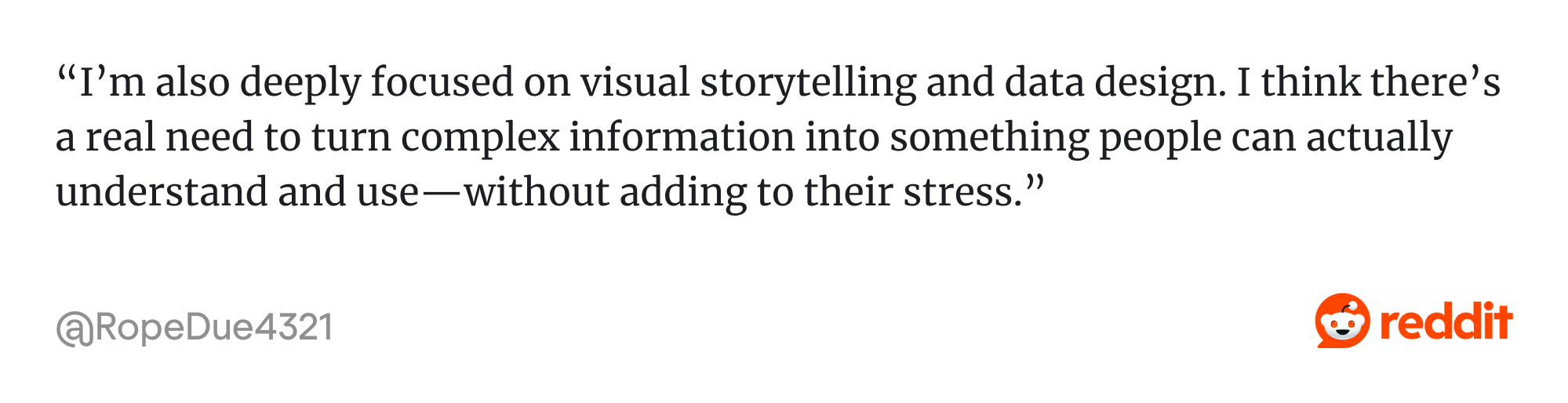
Clear visual communication becomes essential when decisions depend on quickly interpreting data.
Building domain knowledge through research
Healthcare design requires deeper domain understanding than many other industries. Designers often need to collaborate closely with doctors, nurses, and medical professionals to understand workflows and terminology.
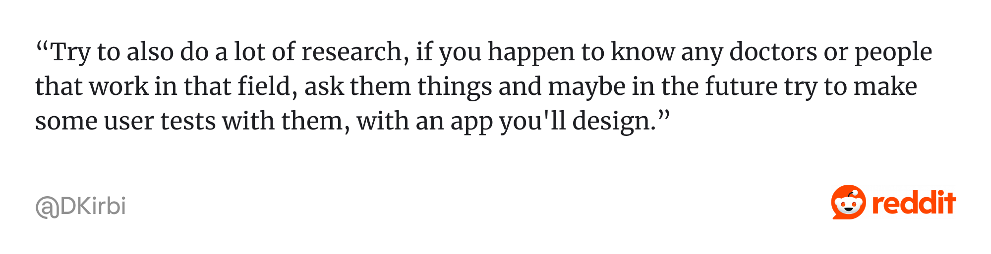
Over time, this domain knowledge becomes a major advantage when designing medical products.
Adapting to slower product development cycles
Unlike many tech sectors that prioritize rapid iteration, healthcare products often move at a slower pace due to regulation and complexity.
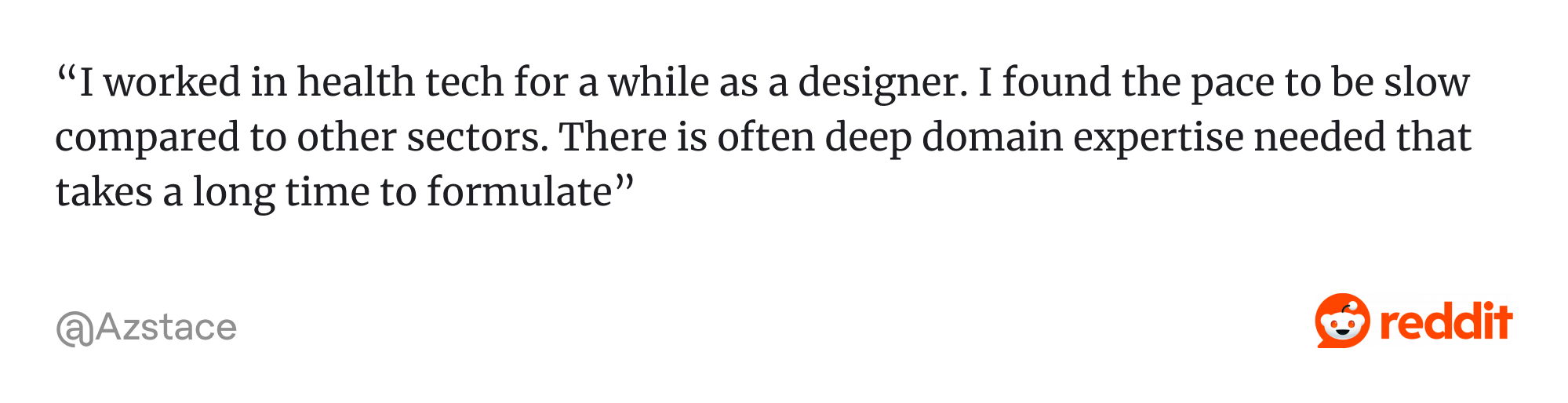
While this slower process can feel unusual for designers coming from startups or consumer products, it reflects the high stakes and strict requirements of healthcare systems.
Working within different levels of regulation
Not all healthcare products operate under the same level of regulatory oversight. The amount of freedom designers have often depends on whether a product is considered a regulated medical device or a more general health platform.
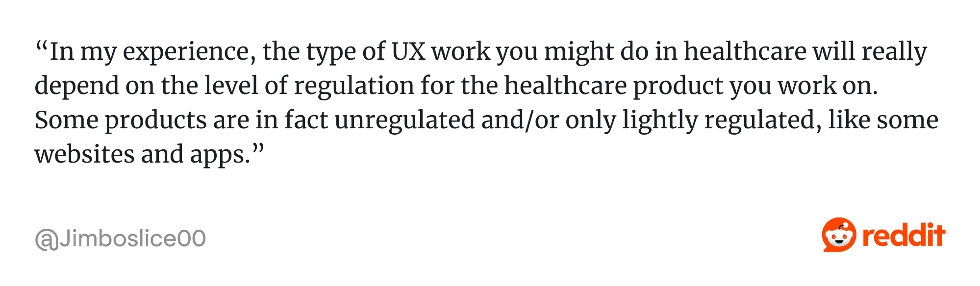
In highly regulated products, even small interface changes may require documentation, validation, and compliance reviews. In less regulated tools, designers usually have more flexibility to experiment and iterate on user experience.
What's next?
At Eleken, we design healthcare products that balance usability, compliance, and complex workflows. Whether you’re launching a new health tech product or improving an existing one, our UI/UX designers can support your team with research-driven design and scalable interfaces.
Book a free call to see how we can help.


.webp)


.png)