
With 12+ years of experience in the UX design field, we’ve seen many clients come to us for a redesign with no design system in place. What follows is always inconsistent components, the absence of a single source of truth, and a codebase full of one-off solutions nobody remembers building.
A design system keeps everything in one place. It’s a component library that holds the essentials of your visual layer, reusable UI components, and documentation that makes it easier for designers and developers to stay on the same page.
Knowing that many teams are tempted to skip this work, we put together this system design checklist to show you why that shortcut costs more than it saves. Every step is backed by real examples from Eleken case studies, so you can see what each part of the system looks like when it’s done right, and what breaks when it isn’t.
And the right place to start is alignment.
Step 1. Define the scope and coordinate the team
Ahead of the main scope of work, someone on the team needs to answer a deceptively simple question: what are we building, and for whom?
A practical approach is to list everything the system might need, then cut it down to what the product requires right now. You need to determine:
- Which platforms will the system cover?
- How many products or teams will consume it?
- What does the current tech stack allow, and what are the constraints?
- Which components are needed immediately, and which can be added later?
- What level of documentation is realistic to maintain at this stage?

Trying to make everything perfect from the start takes too much time. A more practical approach is to understand which parts are truly necessary for the client right now.

Roman Kalinin
Product designer

A design system without a clear owner drifts. Updates get skipped, contribution rules stay informal, and eventually, a designer, developer, or product manager builds a component outside the system because going through the proper process feels slower than just doing it themselves.
Defining ownership is part of this step. The team needs to know who is responsible for keeping the design system maintained to avoid any miscommunication later.
A design system needs an owner, with the authority to make decisions and the capacity to make improvements. Otherwise, how to use it becomes fuzzy and maintenance becomes neglected.

Once the scope is defined and ownership is clear, the team has a shared reference point for every decision that follows, which is exactly what the next step depends on.
Step 1 checklist
□ Scope is defined and agreed on by all key stakeholders.
□ Platforms and products the system will cover are confirmed.
□ Tech stack constraints are documented.
□ A clear owner is assigned with the authority to make decisions.
□ Roles for contributors and reviewers are established.
Step 2. Build your design foundations
Before generating any design, you need to agree on the atomic things: fonts, tokens, visual language, and basic design system decisions.
Roman Kalinin
Product designer
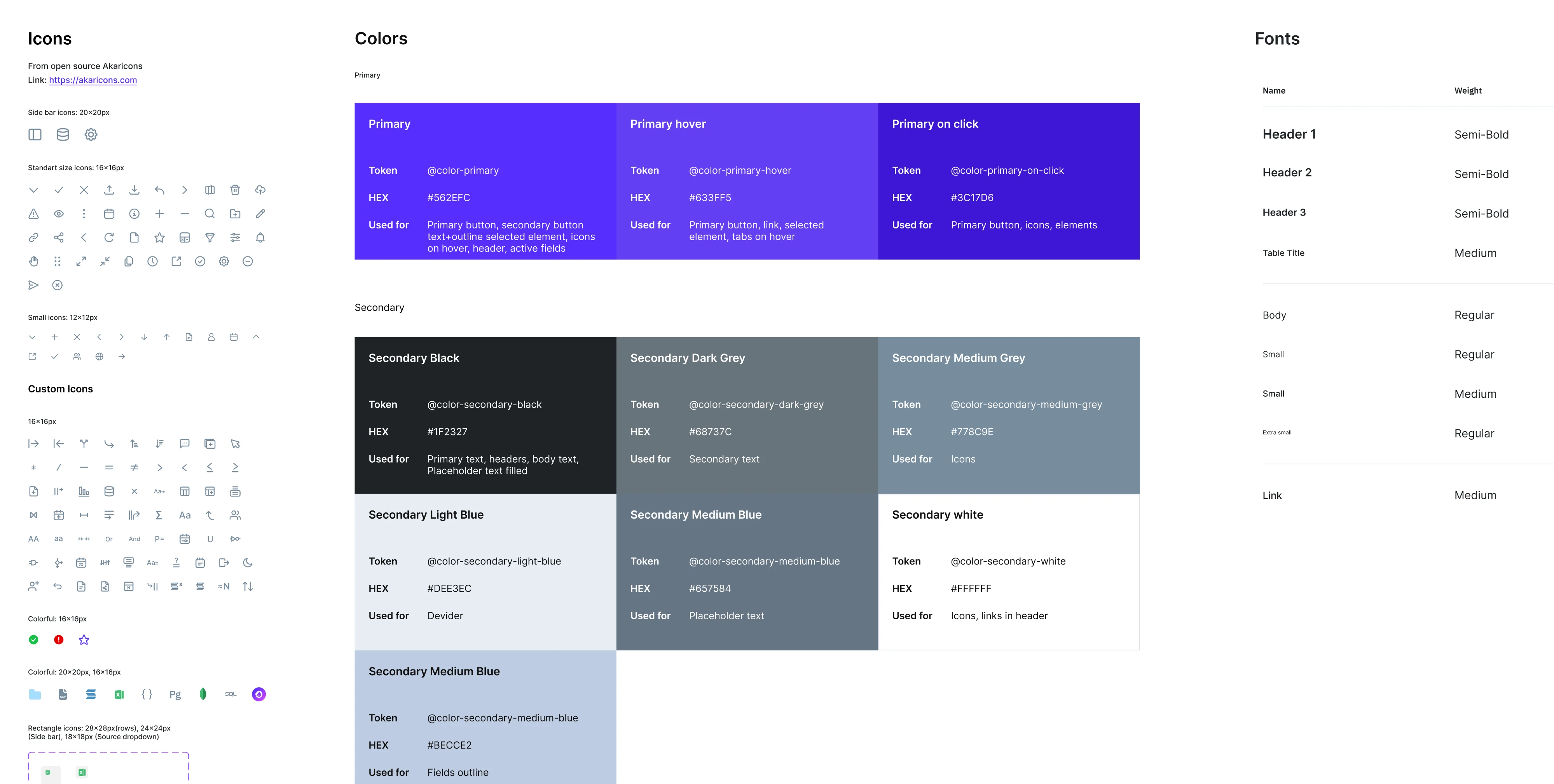
At the core of most modern design systems are design tokens, named values that store visual decisions centrally and apply them everywhere. Instead of a button having a hardcoded hex color, it references a token like color.interactive.primary. Change the token, and the change propagates across every component that uses it.
The Newton360 project is a clear example of this approach.
The product had two platforms and needed both dark and light themes. Because the Eleken designer built the entire visual layer on semantic tokens, adding the light theme later required one click to switch variable modes.
That single architectural decision saved weeks of work that would have otherwise been invisible until the moment it wasn’t.
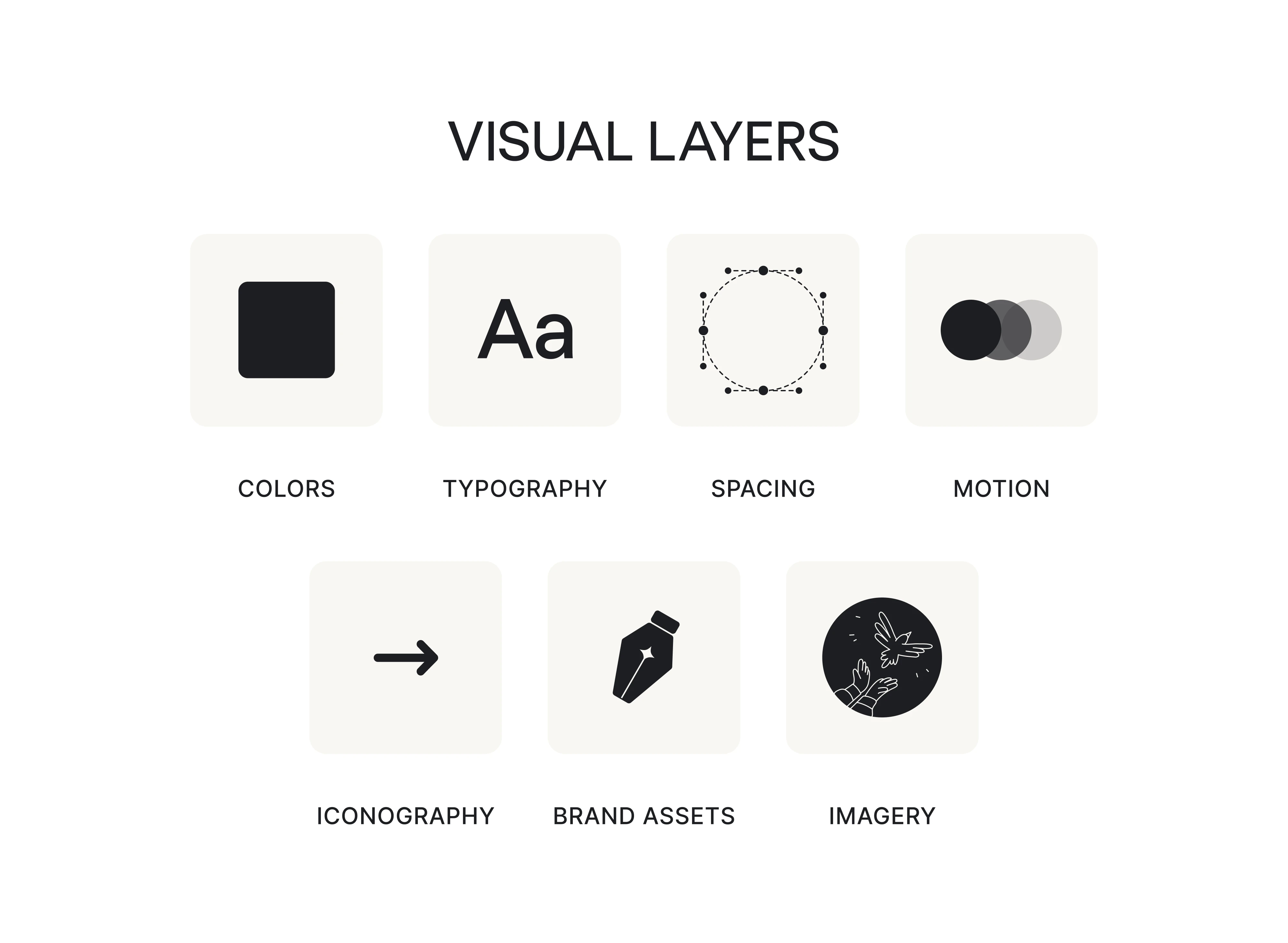
To build your design foundations right, you need to cover all the visual layers the product depends on, including color, typography, spacing, motion, iconography, and brand assets.
Tools commonly used at this stage are Figma for building and managing the token library, Tokens Studio for more complex multi-brand or multi-theme setups, and Style Dictionary for syncing tokens into code.
Step 2 checklist
□ Color tokens are named semantically and organized into theme variable modes.
□ Typography scale is defined by the font sizes the product uses.
□ Spacing system is bu□ilt on a consistent 4px or 8px grid.
□ Elevation, border radius, and shadow values are documented.
□ Motion and transition timing are defined for interactive states.
□ Iconography has sizing rules and usage guidelines.
□ Brand assets are included and referenced correctly.
Step 3. Create the component library
With foundations in place, the next step is building the components that sit on top of them. This is where things become visible, screens start taking shape, and the system begins to look like something real. It is also where scope creep quietly sets in if there is no clear plan for what gets built first.
Start by listing every component the product might need, then identifying the 20 or so that appear on almost every screen, and build those first.
Write out 100 system pieces you’re thinking you need. Pick out the top 20 that would be used 80% of the time in building something new. Build those. Repeat infinitely.
Buttons, inputs, checkboxes, modals, navigation, cards, tables, alerts, dropdowns, and form elements cover the vast majority of UI work in most SaaS products. Once those are solid, the rest of the library grows from the same foundation.
For every single component, you should cover the next states:
- Default, hover, focus, and active states.
- Disabled and read-only variants.
- Loading and skeleton states.
- Error, success, and empty states.
- Responsive behaviour across breakpoints.
- Content rules covering minimum and maximum text lengths, padding values, and truncation behaviour.
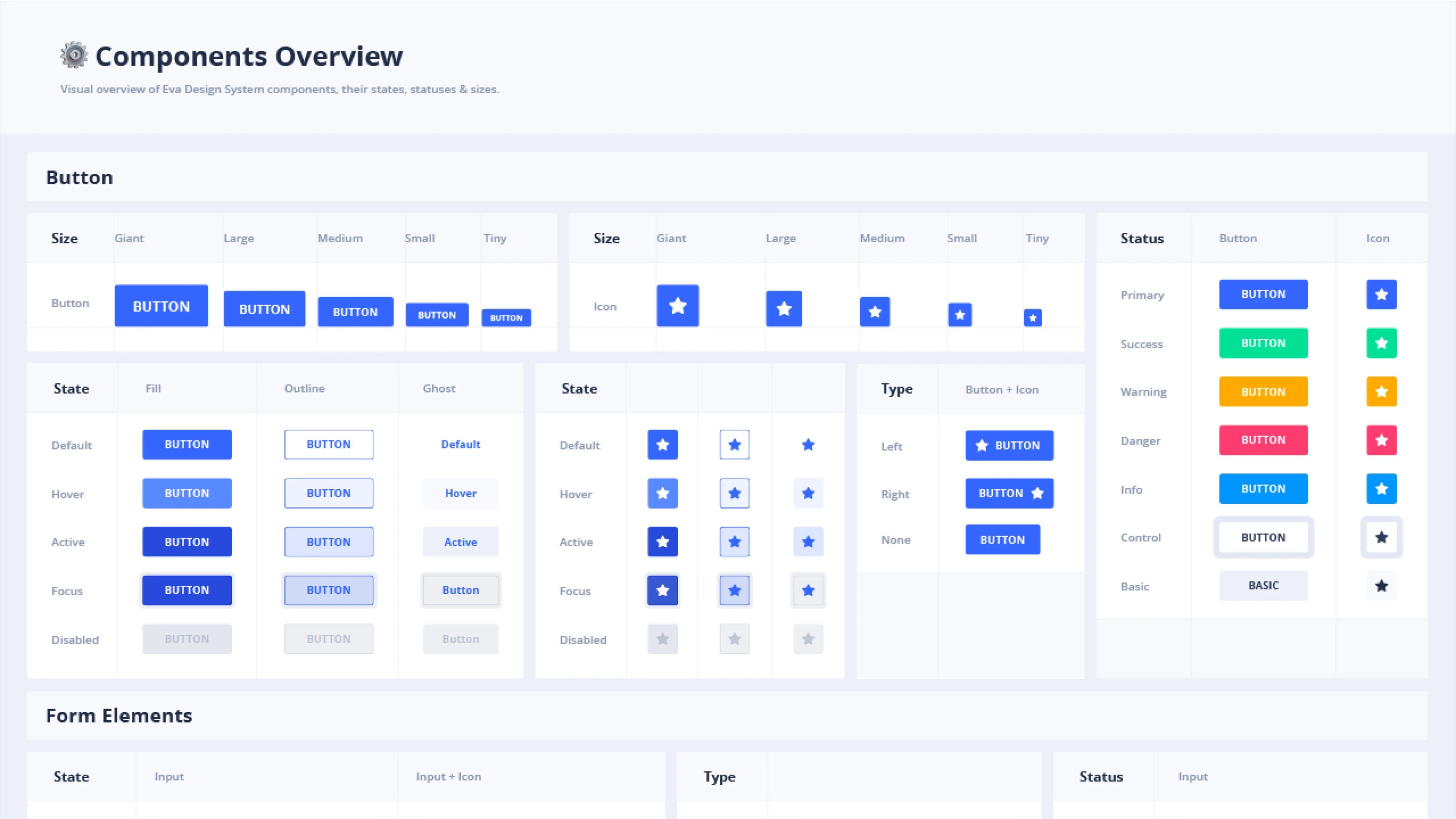
On the architecture side, components should maintain consistency in naming conventions, use a clear component properties API, and be organized in a way that makes sense to designers and developers. Storybook is the standard tool for a clean Figma developer handoff later on, and it is worth setting up early.
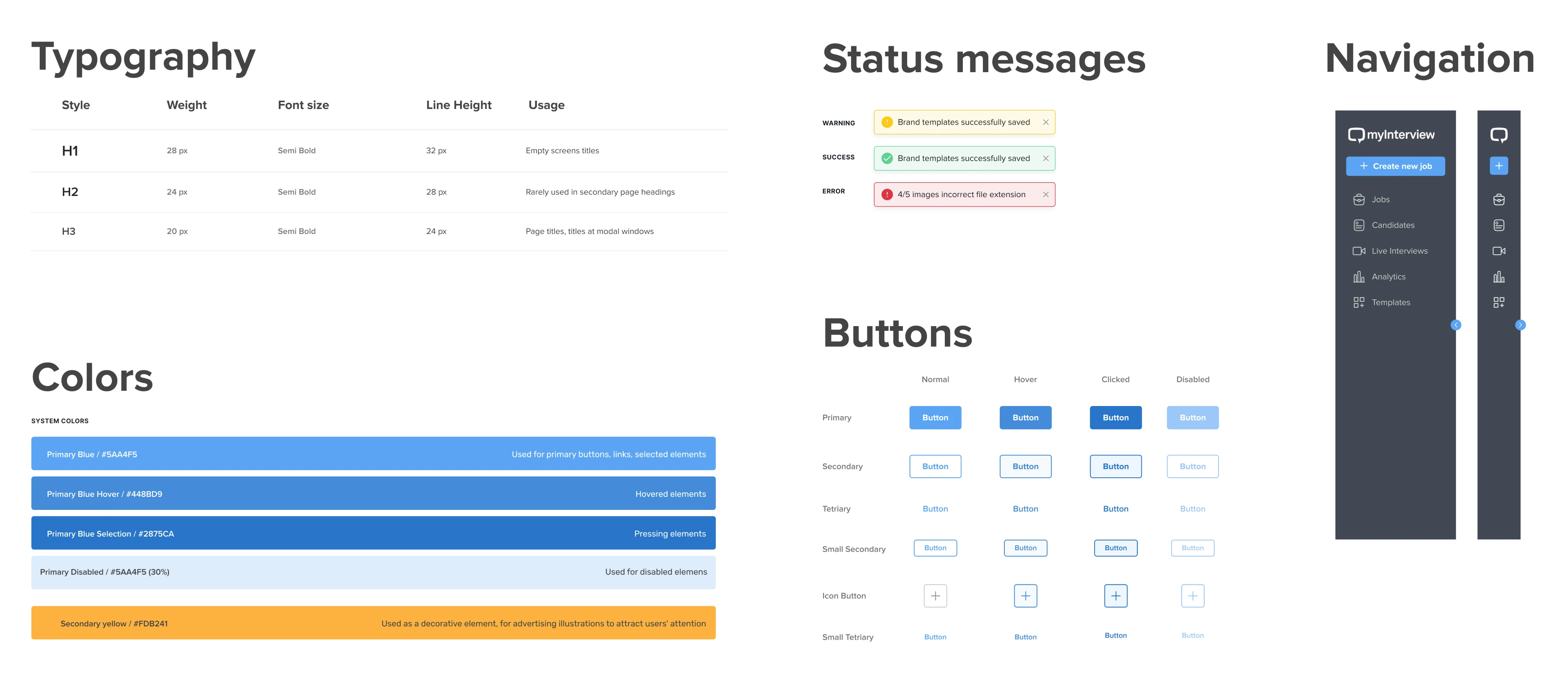
The MyInterview case illustrates what happens when component states are inconsistent. The platform had input components, but they behaved differently depending on where a user encountered them, and caused a 90% dropout rate.
We standardized those components across the platform, resolved the core issue, and gave the product a reliable UI that held up through enterprise demos.
Step 3 checklist
□ Core components covering UI patterns are identified and prioritized.
□ Every component has all the required states before it is marked done.
□ Naming conventions and component properties API are consistent.
□ Responsive behaviour is defined for each component.
□ Storybook or equivalent is set up for component previewing and handoff.
Step 4. Run an accessibility audit
Accessibility is the step most teams intend to handle properly, and most teams defer until it becomes someone else’s problem. By the time it surfaces, fixing it means reopening components that were already considered done.
Every component that gets built in Step 3 should be checked for accessibility standards before it is marked complete. That means:
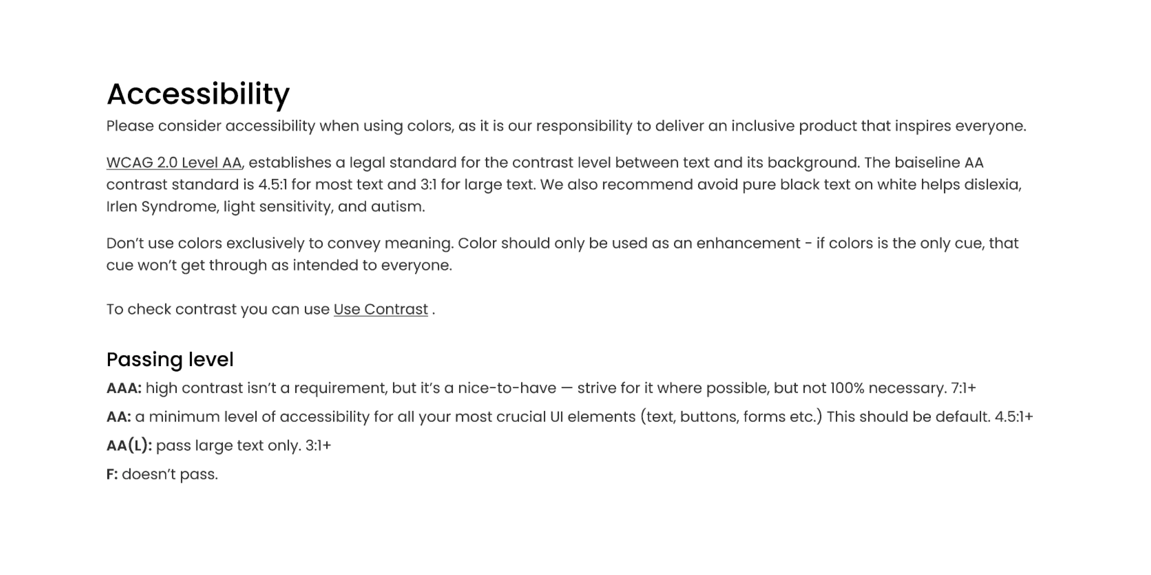
- Verifying color contrast ratios meet WCAG 2.2 AA standards, which requires 4.5:1 for body text and 3:1 for large text and UI elements.
- Confirming that every interactive element supports keyboard navigation, with visible focus states that don’t disappear or blend into the background.
- Checking that buttons are buttons, headings are headings, and form fields have labels and images have alt text for assistive technologies.
Most accessibility issues originate in design, and by the time a developer has implemented a component, the structural decisions that cause the most problems have already been made. Catching them at the component level, before implementation, is cheaper than catching them in production.
The practical way to run this audit is to build an accessibility checklist for your design system components. Four checks cover most of the ground: visual contrast, keyboard operability, screen reader compatibility, and whether the content remains understandable when visual styling is stripped away.
Tools like Axe for Designers, Stark, or the Able Figma plugin make the contrast and screen reader checks faster without requiring a specialist for every component.
One thing worth including alongside the component audit is a set of accessibility annotations for developers. These are notes that travel with the Figma file into handoff, and we’ll focus on them more in the next step.
Step 4 checklist
□ Color contrast meets WCAG 2.2 AA standards across all components.
□ Interactive elements support keyboard navigation with visible focus states.
□ HTML is semantic, and form fields have labels and alt text.
□ An accessibility scorecard exists for each component.
□ Accessibility annotations are included in handoff files for developers.
Step 5. Set up documentation
A design system without documentation is just a style guide with good intentions. Documentation is what makes a system survive beyond the people who built it. Every component should leave the design phase with a clear record of:
- What it is.
- When to use it.
- When not to.
- How it behaves across states.
- What its content constraints are.
- Accessibility requirements.
We followed this exact approach when working on Newton360. Because our designer documented each component in detail, developers never had to stop mid-sprint to ask questions during handoff. Every answer they needed was already in the file. When the client returned to the project months later, the team resumed work in minutes rather than spending days reconstructing context.
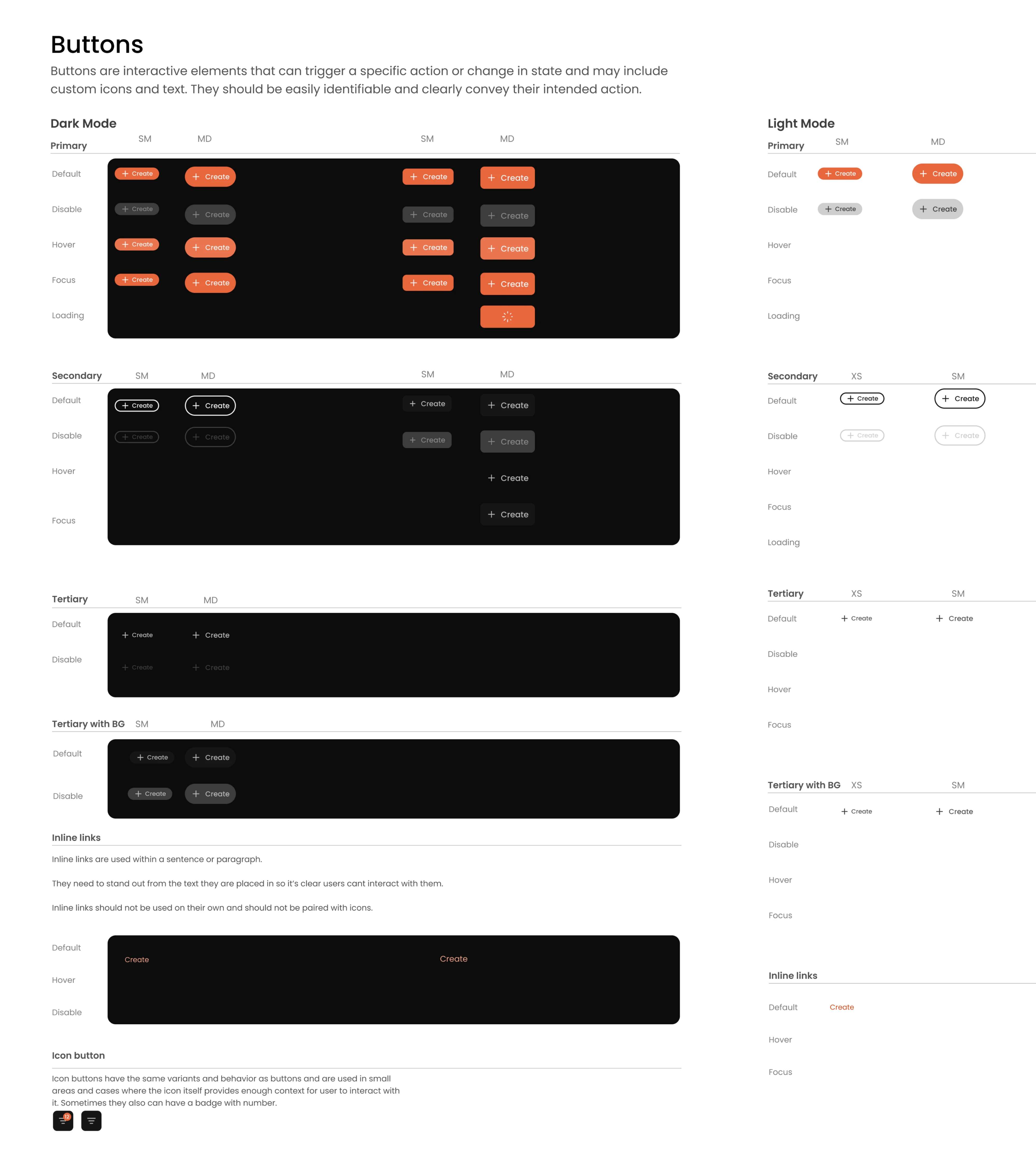
A good way to test documentation quality is to check whether someone who was not in the room can make decisions about a component they did not create, without asking anyone. If they can, the documentation is doing its job.
Documentation can get stale quickly, and if it’s not clear or easy to find, people might start going off-script.
On the tooling side, the choice of where documentation lives matters less than the choice to maintain it. At Eleken, we rely on Figma and document everything there. In design communities, Zeroheight and Storybook are commonly recommended for teams that want a dedicated documentation layer.
Step 5 checklist
□ Every component has a documented purpose, usage rules, states, content constraints, and accessibility notes.
□ A developer unfamiliar with the system can implement a component without asking questions.
□ A documentation tool is chosen, and the team has committed to maintaining it.
Step 6. Establish governance and contribution rules
At some point, more than one person will need to change something in the system. That moment is when governance either saves you or fails you.
The most common mistake teams make is centralizing every decision through one person or team, which creates a bottleneck that slows the whole product down. The better model is to make contributions accessible while keeping quality controlled.
To make that work, treat the following as your design system governance checklist:
- System team owns the library, sets contribution standards, and has final say on what gets merged.
- Component owners are responsible for specific parts of the system and review proposals in their area.
- Feature teams can submit feature requests and contribute new components following defined guidelines.
- Reviewers check that proposed changes meet documentation, accessibility, and naming standards before approval.
Zalando’s contribution model is a useful reference. They route all component requests through a structured intake form and categorize each one by effort: light changes like tweaks to existing components, medium changes like new variants, and heavy changes like major component additions or structural changes. Each tier follows a different review process.
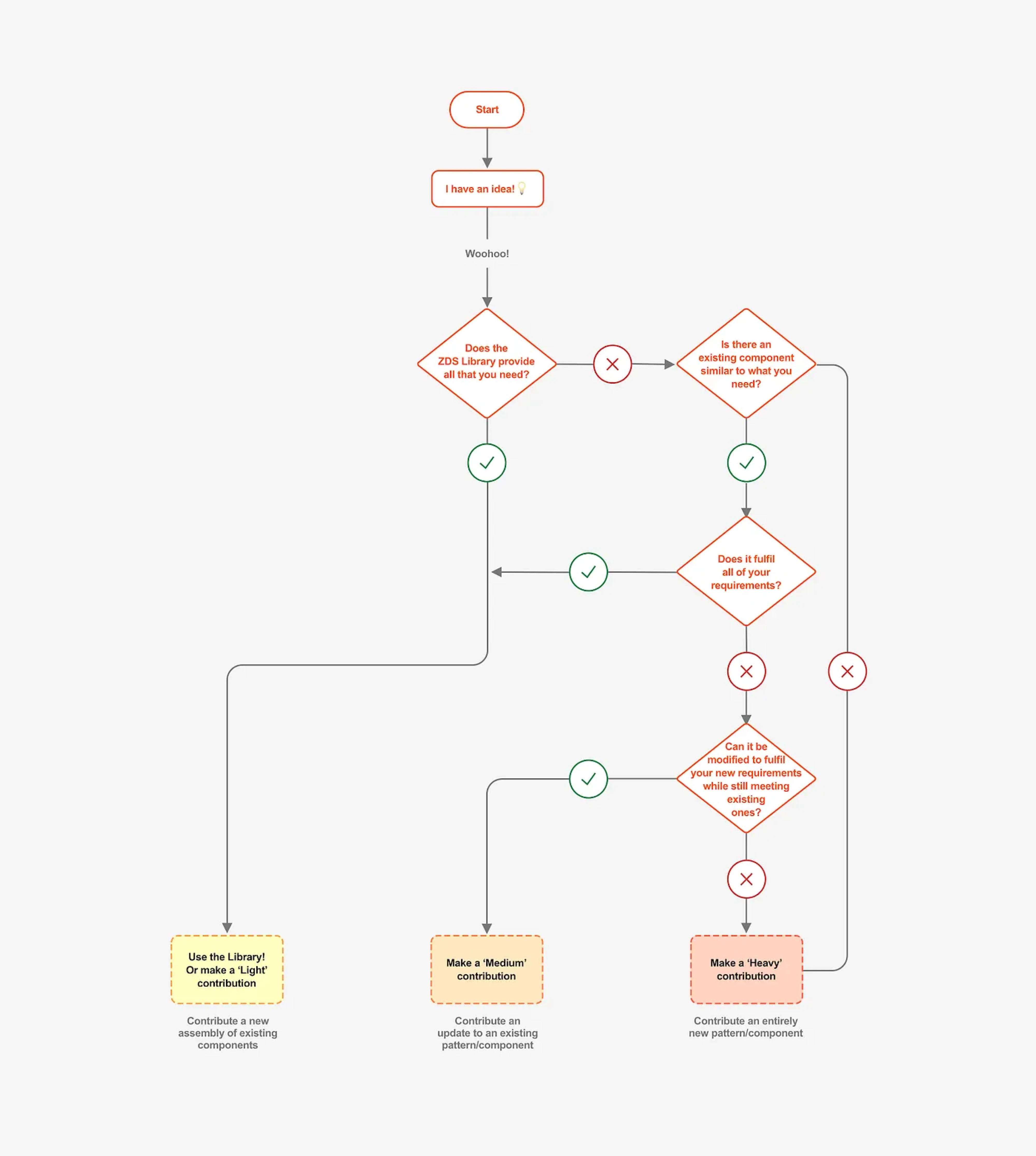
The result is that no request gets lost and no change goes unreviewed, but not every change requires the same amount of scrutiny.
Each component proposal should move through clear status states (draft, in review, approved, needs work) so contributors know where their request stands. And every release should start with publishing the updated library, updating the changelog using semantic versioning, linking it in your documentation tool, and, finally, notifying teams.
It takes ten minutes and prevents the kind of silent updates that erode trust and break the consistent experience across the product.
Step 6 checklist
□ System team, component owners, feature teams, and reviewers are defined.
□ A contribution process exists for submitting and reviewing feature requests.
□ Each component proposal moves through clear status states before merging.
□ Releases follow a consistent sequence, including changelog, semantic versioning, and team notifications.
□ A contribution tier model is in place, so not every change requires the same level of review.
Step 7. Connect your design system to AI via MCP
Once your system is structured, governed, and documented, there is one more step that most teams are not taking yet — connecting your design system to AI. It’s not a mandatory step, but it’s the one that can speed up how your team designs.
MCP, or Model Context Protocol, is an open standard that lets AI assistants like Claude connect directly to external tools and data sources. For design systems, that means Claude can read your live Figma file, including components, tokens, spacing values, documentation, and use it as a reference when generating code or UI.
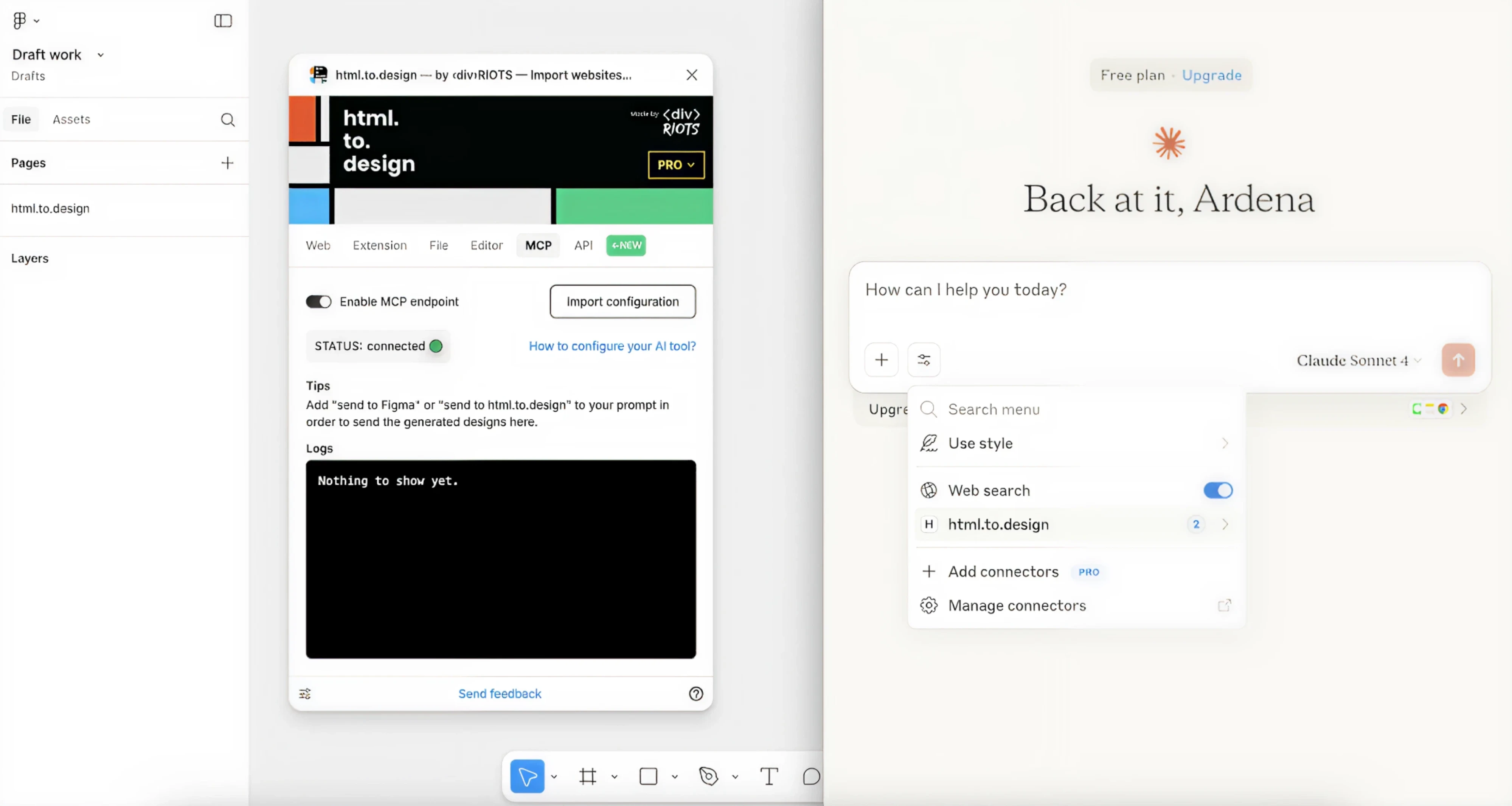
A design system is not only a visual reference. For AI, it can become the rulebook for how the product should be built.
Roman Kalinin
Product designer
In practice, the Figma MCP integration works in two directions.
Claude can read your Figma file and generate code from it, and it can send UI built in Claude Code back into Figma as editable frames. Together they form a loop: design, generate code, refine, return to canvas.
We covered how this works in detail in our guide to the Figma to Claude Code workflow, including where it adds real value and where it still falls short.
For the connection to work well, your design system needs to be structured in a way that AI can actually parse. Token naming, component states, and documentation all need to be precise enough for a machine to read. To go deeper on what that looks like, check our guide to AI design systems.
Also, it is worth being clear about what this step is not. MCP integration does not replace design judgment, and AI-generated output still needs human review. But for teams that have done the work of building a well-documented system, it is the most direct way to make that system useful beyond the design tool itself.
Step 7 checklist
□ Figma is connected to Claude via the MCP server.
□ Token and component files are structured precisely enough for AI to parse.
□ Constraints are defined for what AI can and cannot generate.
□ AI-generated output has a human review step before it goes into production.
Step 8. Measure whether it’s working
A design system that nobody measures is a design system that nobody maintains. Without signals telling you whether the system is being used, trusted, and keeping up with the product, it drifts quietly, and usually faster than anyone notices.
The metrics worth tracking fall into two categories.
- The first is adoption: how much of the product is built using system components, how often components get reused across teams, and whether the number of one-off solutions is going up or down over time.
- The second is quality: defect count, bug fixes, and support tickets related to UI inconsistencies, and how closely the shipped product matches the design.
Both tell you something different. Adoption tells you whether people trust the system enough to use it. Quality tells you whether the system is doing what it was built to do.
Use a design system audit checklist every three to six months. Look for components that have drifted from how the product uses them, documentation that has gone stale, broken links, and duplication that has crept in as the product grew.
Accessibility should be part of that audit, too. You can use Stark integrated into a CI/CD pipeline to catch contrast and focus issues before they reach production.
One practical note on what “working” looks like early on. If three components are published, documented, and used in a live product after the first year, that counts as a successful start. Measuring too late, or against an unrealistic bar, leads teams to conclude the system has failed when it is simply still finding its footing.
The Datawisp case is a useful example of what system quality looks like as a business signal. After Eleken redesigned the product and built a design system around it, user feedback shifted from “this looks complicated” to “this looks easy.” The team closed a $3.6M seed round shortly after. Behind that shift was a design system that gave the product a coherent, scalable foundation.
As a final line, we’d like to note that a design system is never finished. The teams that get the most out of theirs are the ones that treat measurement not as a final check, but as an ongoing habit that keeps the system useful.
Step 8 checklist
□ Adoption and reuse metrics are being tracked.
□ A design system audit checklist is scheduled every three to six months.
□ Accessibility is included in the audit using automated tooling.
□ The team has a realistic definition of what a successful system looks like.
□ Measurement results feed back into prioritization.
Final notes
If you’ve worked through this system design review checklist, you’re ahead of most. You have a foundation that scales, components that hold up under product pressure, and a system that developers can use without asking questions.
What comes next is keeping it that way. You should maintain the system as the product grows, the team changes, and new requirements emerge. That’s where most systems quietly stall, and where having the right people around it matters most.
At Eleken, we help SaaS products build design systems from scratch and scale the ones they already have. If you’d like a team to do that work with you, get in touch.