.webp)

Alerts are everywhere — but most are either ignored or annoying.
Some interrupt users at the worst possible moment. Others disappear before anyone can react. And when alerts are poorly designed, the consequences go beyond bad UX: missed errors, user frustration, and costly mistakes.
Part of the problem is that designers often treat alerts as components instead of decisions. But alerts aren’t just notifications — they’re decision interfaces. They shape how users notice problems, assess urgency, and decide what to do next.
In this guide, we’ll break down real alert UI examples from modern SaaS products, the patterns behind them, and the design choices that make alerts useful instead of disruptive.
Alert UI design examples (real products, real UX)
The best alert user interface patterns don’t just display information — they guide attention and help users react correctly in the moment.
Here’s how some well-known SaaS products handle alerts in practice.
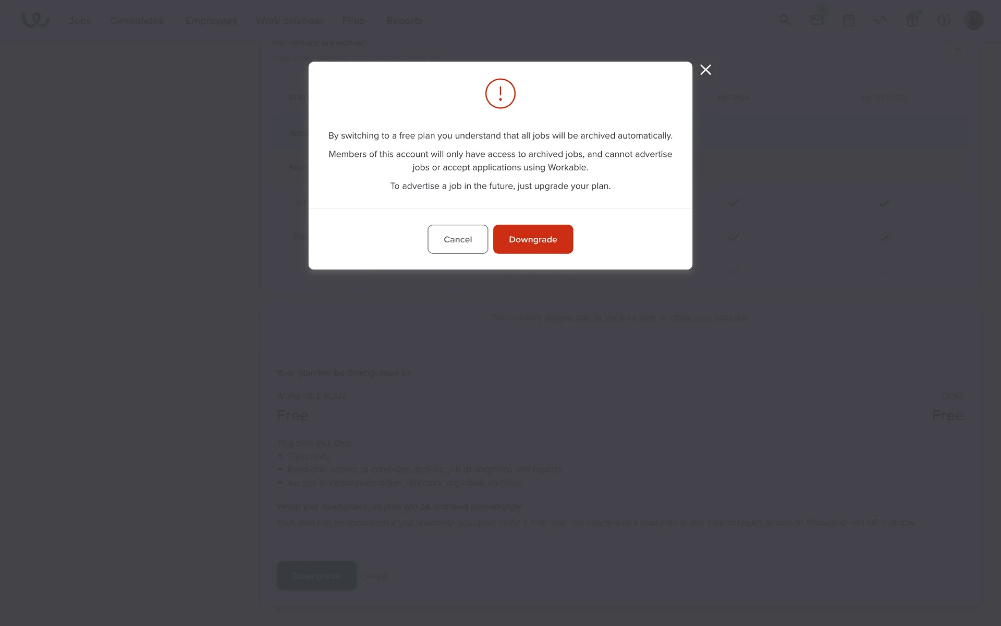
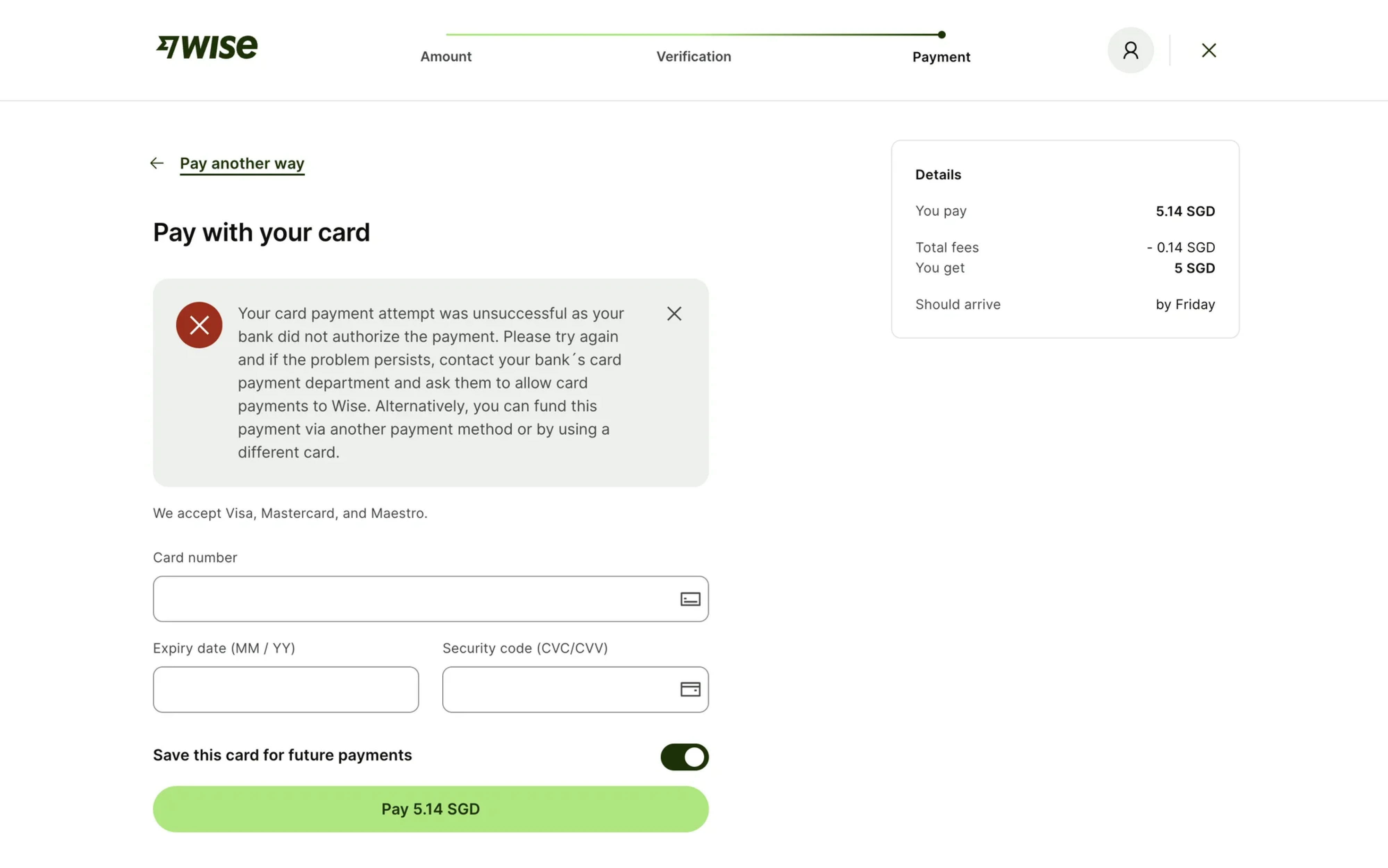
Stripe — clean, functional error alerts
Stripe is often cited for its clear and actionable error messages, which help users recover quickly:
“Your card was declined. Try another payment method.”
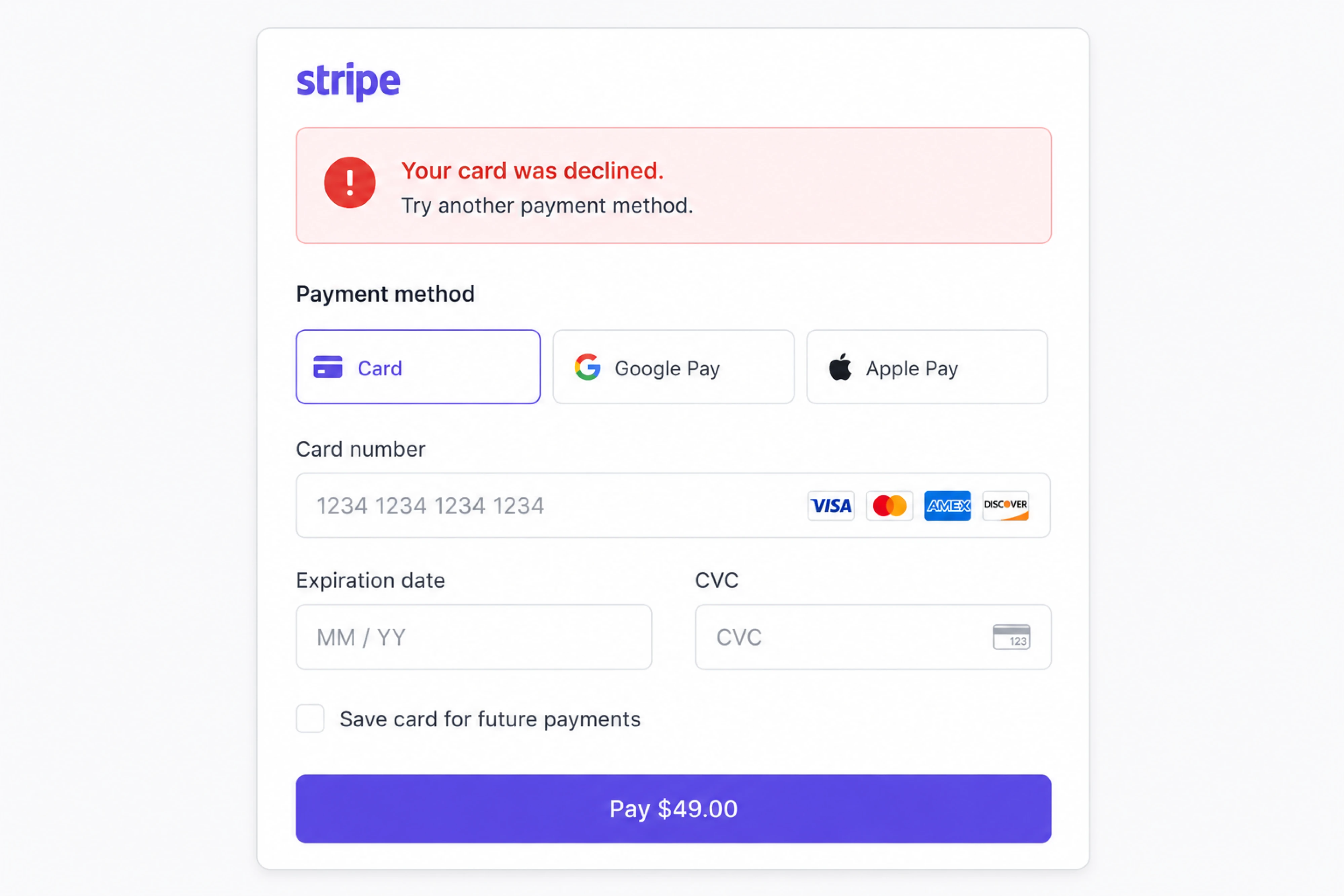
There’s no vague wording, technical jargon, or unnecessary panic, but a clear description. The alert explains:
- what happened,
- why it happened,
- and what users should do next.
The inline placement also matters. Instead of interrupting the entire flow, Stripe keeps the alert close to the affected form field, reducing cognitive load and helping users recover promptly.
Principle: clarity + immediate recovery path.
Google — subtle informational alerts
Google Drive uses lightweight success alerts like:
“All changes saved in Drive.”
These alerts have very low visual weight because they don’t require action. They quietly confirm system status, then disappear without interrupting the workflow.
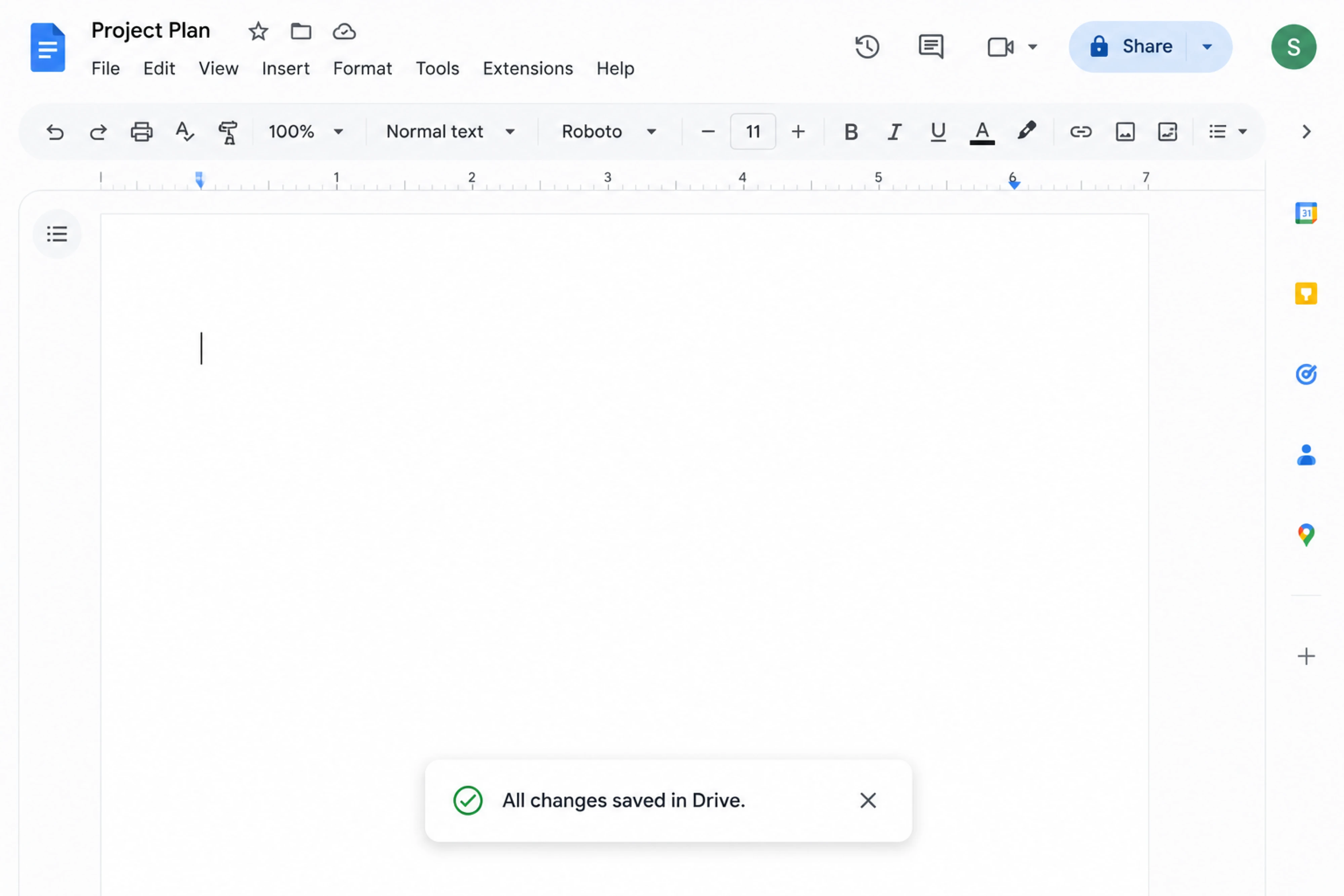
That restraint is important. Not every message deserves the same level of attention.
Principle: don’t overuse urgency.
Notion — contextual warning alerts
Notion app often warns users about unsaved changes only when behavior suggests risk:
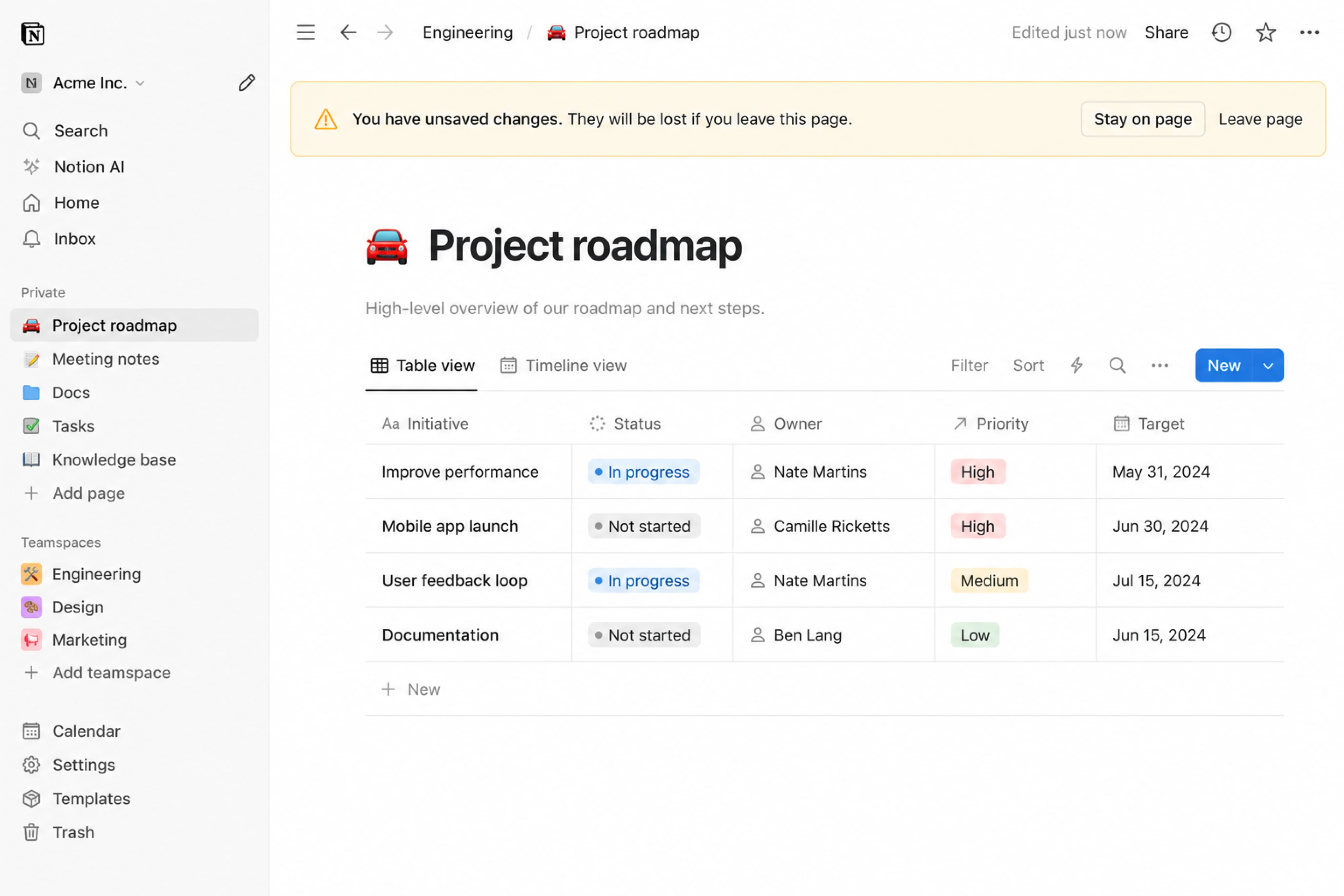
“You have unsaved changes.”
The timing is what makes this work. The alert appears contextually — not constantly — and uses warning styling without creating unnecessary anxiety.
It’s caution, not alarm.
Principle: relevance matters more than visibility.
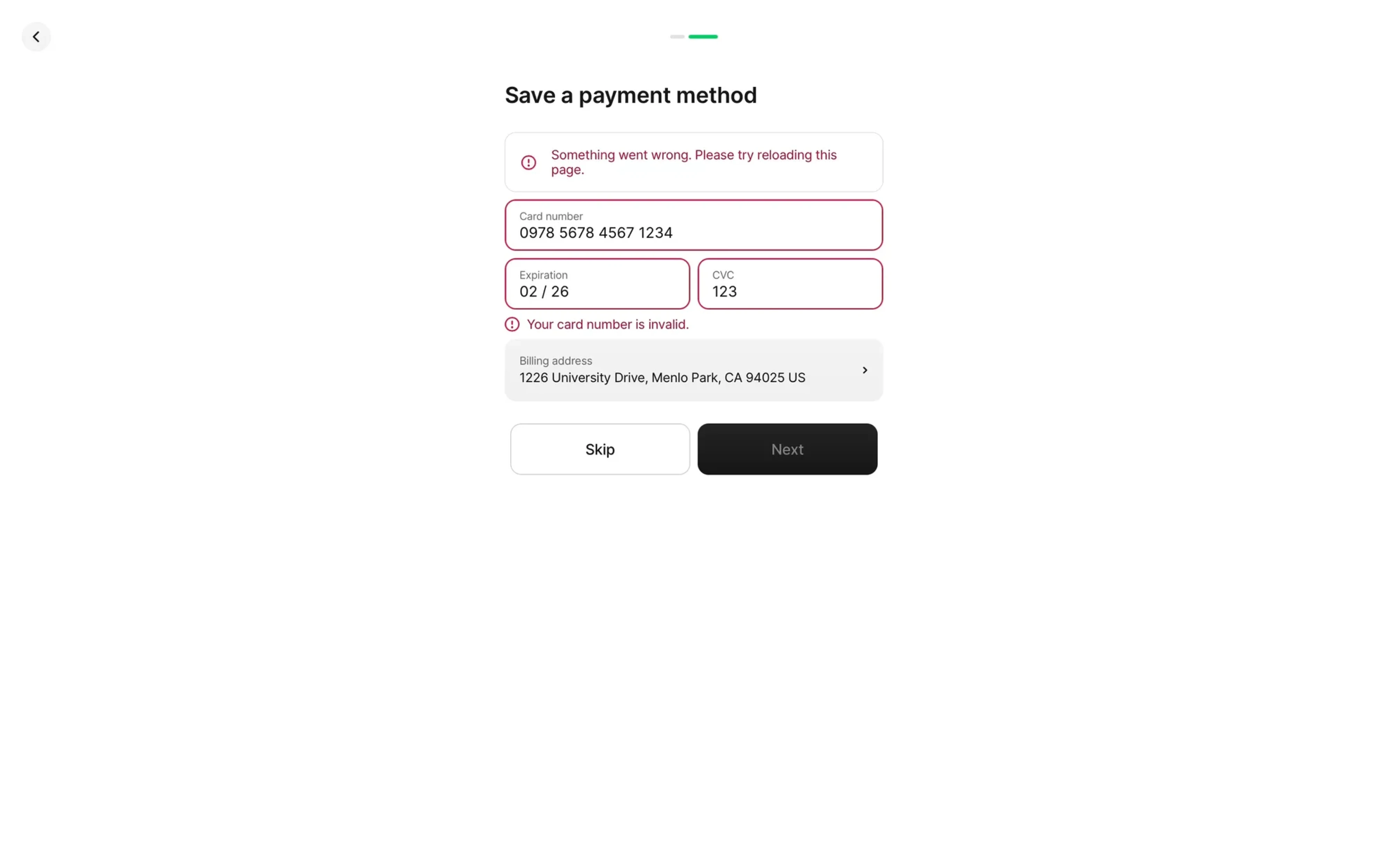
Airbnb — error alerts with recovery
When booking issues happen, Airbnb doesn’t stop at:
“Dates unavailable.”
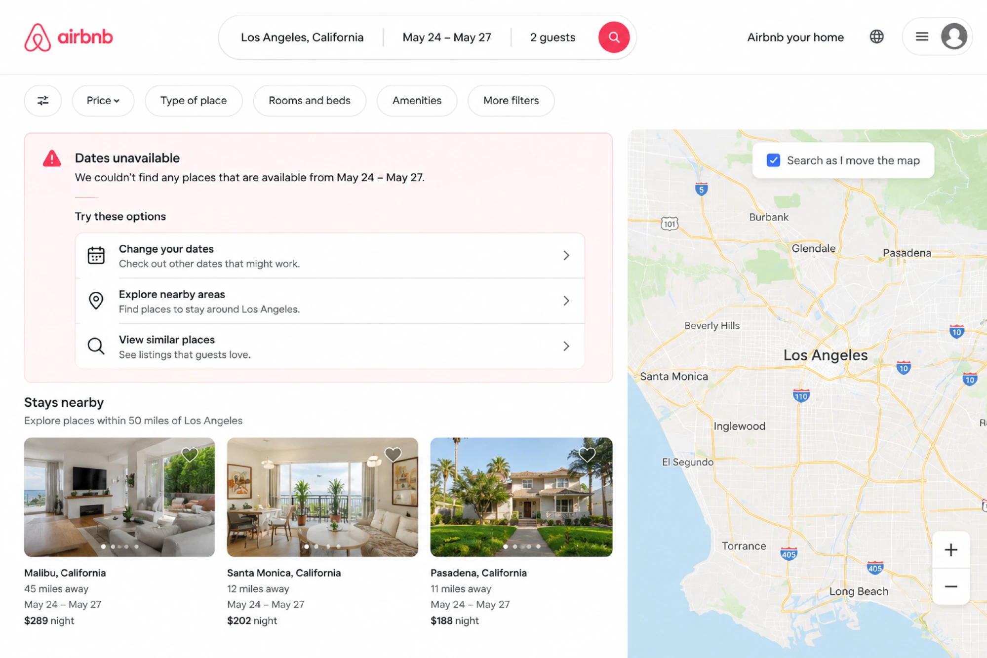
Instead, the UI usually suggests alternatives or nearby options immediately.
That recovery layer matters because good alert UI shouldn’t dead-end the user. If something fails, the interface should still help users move forward.
Principle: every error needs a recovery path.
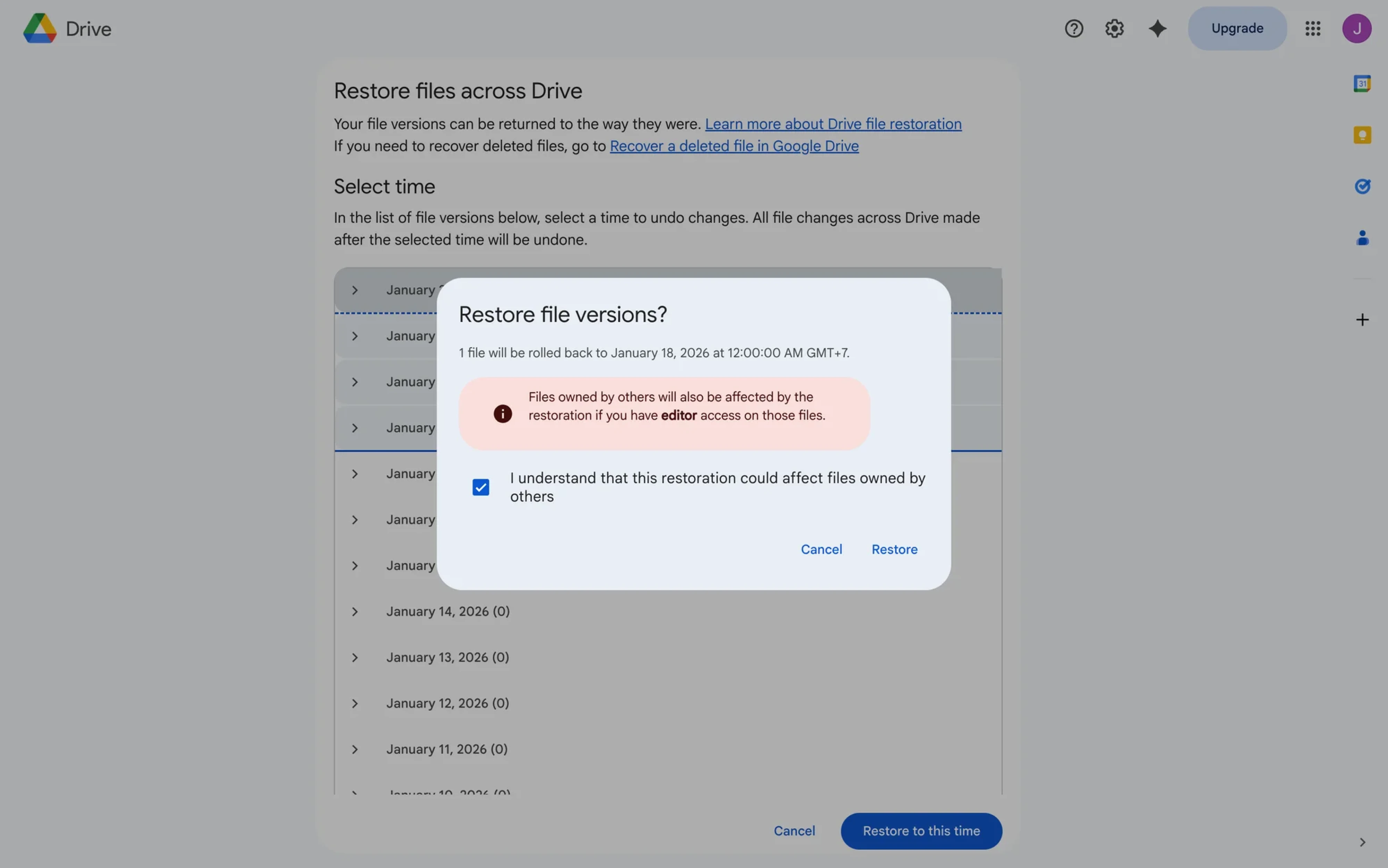
Apple — high-risk confirmation modals
Apple’s destructive-action alerts are intentionally interruptive and full-size:
“Are you sure you want to delete this photo?”
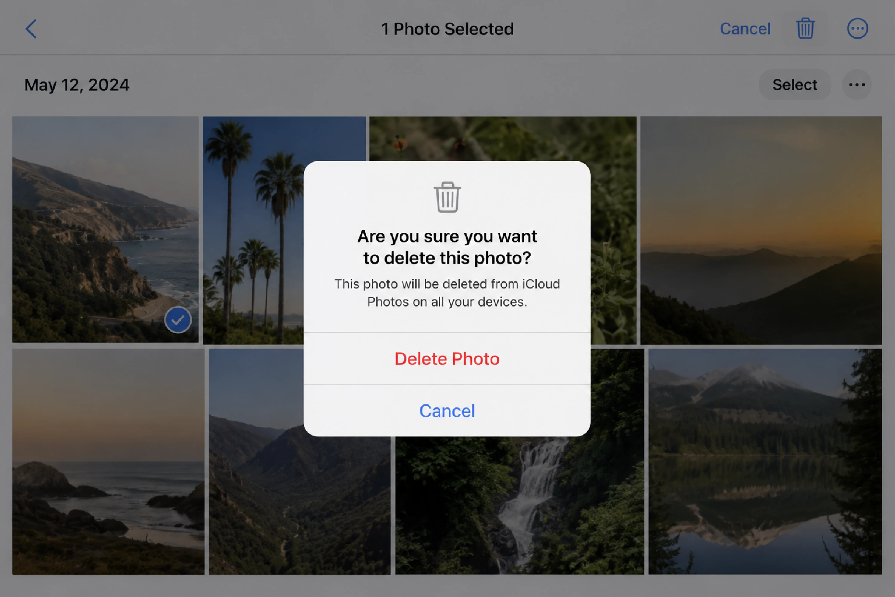
The modal forces a decision because the stakes are high. Clear button hierarchy, minimal distractions, and strong visual separation make the action feel deliberate rather optional.
This is one of the clearest examples of escalation done right.
Principle: higher risk requires higher clarity UI components.
Slack — lightweight success feedback
Slack often uses toast notifications for fast confirmation:
- message sent,
- channel updated,
- workflow completed.
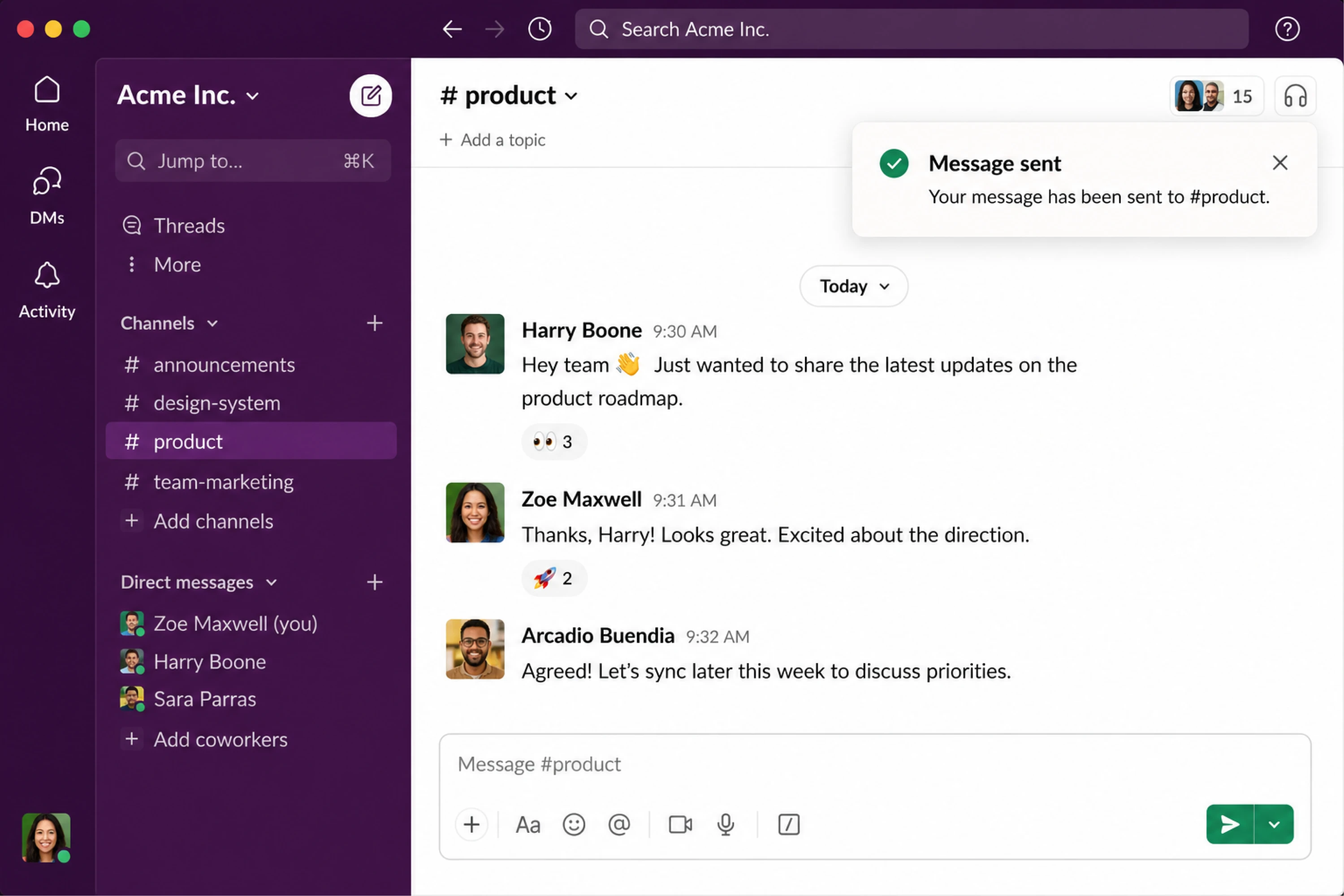
Because such notifications hold no risk, they can disappear automatically without disrupting the workflow.
The interaction feels lightweight because the feedback matches the importance of the action.
Principle: fast feedback with minimal friction.
Figma, LinkedIn, and Uber — contextual alerts at scale
Some products rely heavily on real-time alert systems:
- Figma uses collaboration alerts to show edits and comments live,
- LinkedIn uses badges and subtle notifications to surface activity gradually,
- Uber uses time-sensitive ride and location alerts where timing is critical.
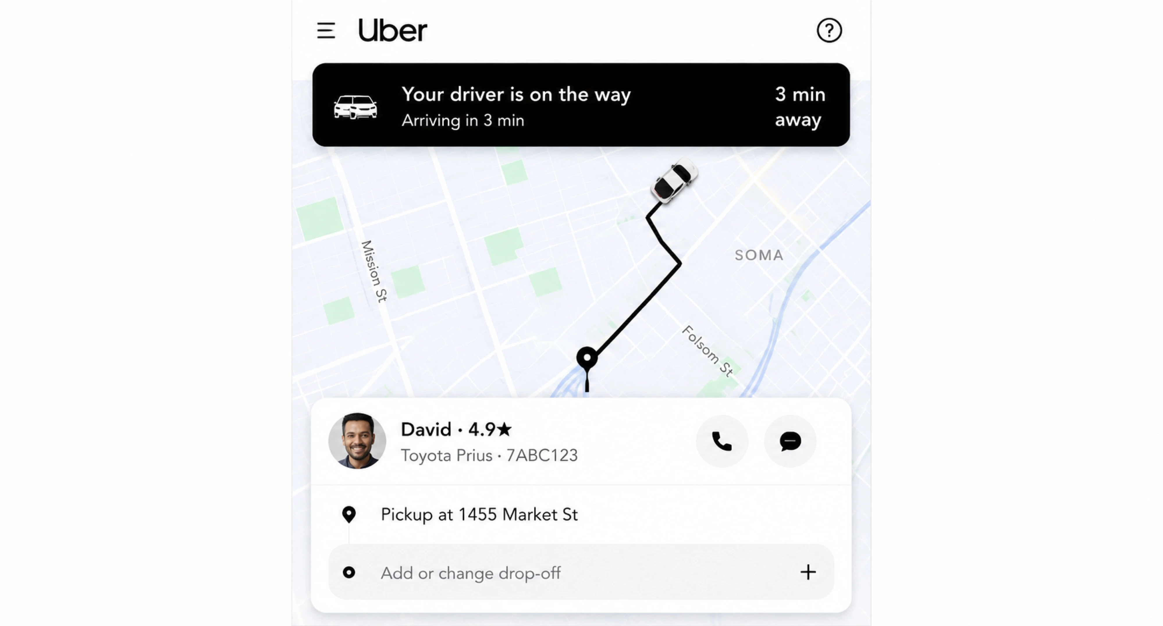
Despite their differences, they all follow the same rule: the alert adapts to the urgency of the moment instead of treating every notification equally.
What these alert UI examples have in common
At first glance, these alerts look completely different. Some are subtle. Others are interruptive. Some disappear automatically, while others force users to make a decision before continuing.
But the strongest alert UI patterns follow the same underlying principles.
They match the level of urgency
Not every alert deserves the same amount of attention.
Wise’s payment errors are highly visible because they block task completion. Google’s “All changes saved” message stays lightweight because nothing is wrong. Apple’s destructive-action modal becomes fully interruptive because the risk is much higher.
Good alert UI should match the importance of the required user action and hold attention according to consequence.
They appear in context
The best alerts don’t feel random. They appear exactly where and when users need them.
Form validation messages stay attached to the affected field. Notion warns about unsaved changes only when users try to leave. Airbnb surfaces booking problems during the reservation flow itself.
Context reduces confusion because users immediately understand:
- what triggered the alert,
- what it affects,
- and what to do next.
They guide action — or intentionally avoid it
Some alerts demand action. Others simply communicate status.
Airbnb’s booking alerts help users recover with alternatives. Stripe suggests another payment method. Meanwhile, Google Drive’s save confirmation doesn’t ask users to do anything at all — because it doesn’t need to.
Strong alert design knows the difference between:
- informing,
- warning,
- and interrupting.
They respect user attention
One of the biggest UX mistakes is treating every alert like an emergency.
Slack’s lightweight toasts work because they confirm actions without breaking flow. Apple’s confirmation modals work because they interrupt only when interruption is justified.
The best alert systems balance visibility with restraint. They know when to demand attention — and when to stay out of the way.
So how do you design alerts that strike that balance consistently? It starts with understanding the core alert patterns behind them.
Alert UI patterns explained (with real context)
Behind most alert systems are four core UI alert types. The difference between them isn’t just visual — it’s how much attention and interruption they demand from users.
Inline alerts
Inline alerts appear directly inside the interface, close to the affected element or workflow. They work well providing contextual information exactly where users need it.
You’ll commonly see them in:
- form validation,
- payment flows,
- settings pages,
- and onboarding steps.
Stripe’s payment errors and standard form validation messages are good examples. The alert stays connected to the exact place where the issue happened, making recovery faster and reducing cognitive load.
Use inline alerts when:
- users need immediate context,
- the issue affects a specific element,
- and interruption would feel excessive.
Toast notifications
Toast alerts are temporary system notifications that appear briefly and usually disappear automatically. They communicate status updates without interrupting the workflow.
Toasts work best for:
- confirmations,
- completed actions,
- background updates,
- and low-risk system feedback.
But they’re risky for important errors because users can easily miss them — especially if the toast disappears too quickly.
Banner alerts
Banner alerts appear at the top or inside a section of the interface and work best as dismissible alerts, allowing users to acknowledge the message without feeling blocked.
For example, a warning about unsaved changes behaves similarly to a banner pattern because it persists long enough for users to react without completely blocking the experience.
Banner alerts are useful when:
- the message affects a broader workflow,
- users need awareness but not interruption,
- or the issue persists over time.
They sit in the middle ground between passive notifications and hard interruptions.
Modal alerts
Modal alerts are the highest-interruption pattern. They block interaction and force users to make a decision before continuing.
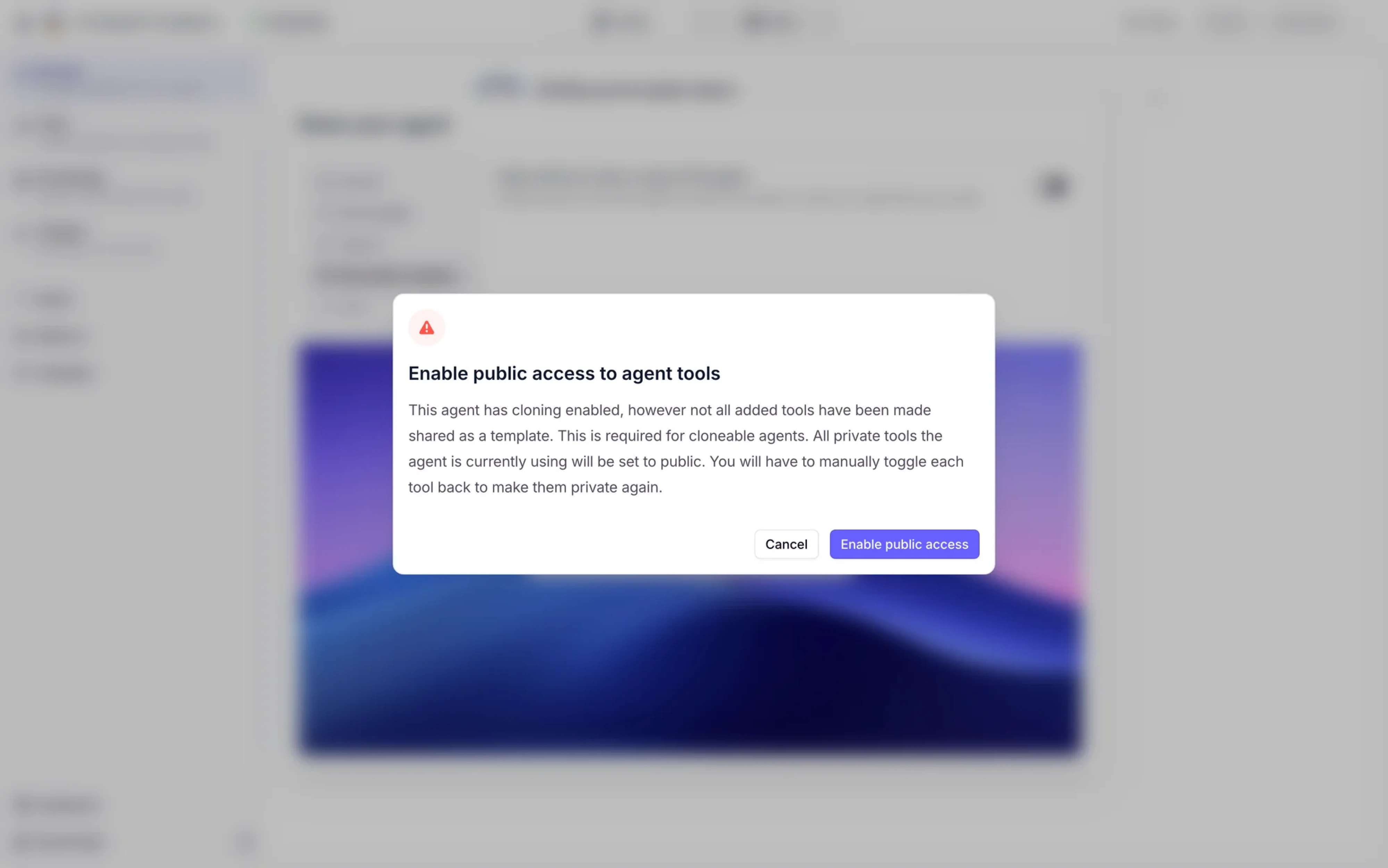
Apple’s delete confirmation dialogs are classic examples. The user must explicitly confirm or cancel the action before moving forward.
Use modal alerts only when:
- the action is destructive,
- irreversible,
- security-sensitive,
- or carries serious consequences.
If every alert becomes a modal, users quickly stop taking them seriously.
The escalation rule
One of the simplest ways to think about alert UI is through escalation:
- Inline = lowest disruption
- Toast = lightweight temporary feedback
- Banner = persistent awareness
- Modal = highest interruption
The higher the risk, the stronger the interruption should become.
That’s why Slack can use subtle toasts for “Message sent,” while Apple uses full confirmation modals before deleting photos permanently. Different actions demand different levels of attention.
The reality check: alert design isn’t always clean
Most alert UI advice sounds great in theory:
- remove unnecessary friction,
- simplify the interface,
- redesign the workflow instead of adding warnings.
But real products don’t always work that way.
Sometimes the flow can’t be redesigned yet. Sometimes technical limitations, business requirements, or legacy systems force awkward UX compromises. And in those situations, alerts often become the safety layer holding the experience together.
When UX constraints break best practices
Designers don’t always control the ideal solution.
You may know a workflow is confusing, but:
- the feature can’t be removed,
- engineering constraints block redesigns,
- or the business insists on keeping risky actions visible.
In those cases, alerts stop being simple feedback components. They become compensations for product complexity.
And that’s where alert design gets much harder.
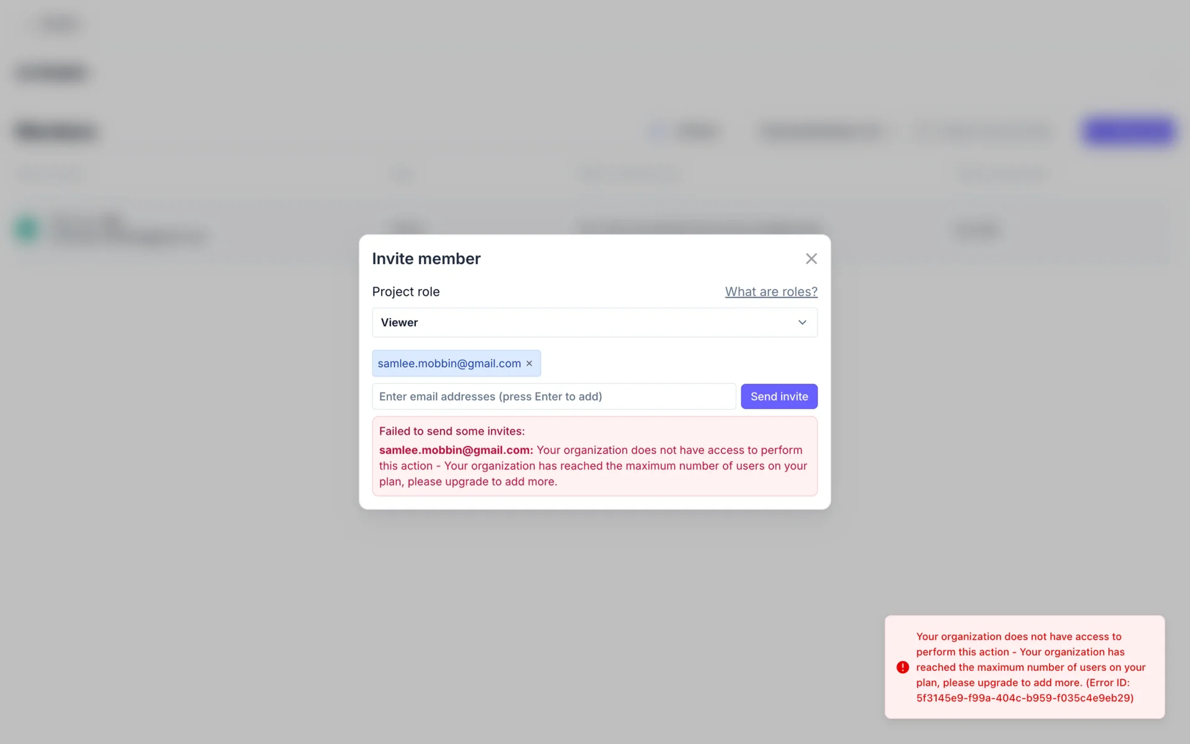
The “button that shouldn’t exist” problem
This happens constantly in SaaS products.
There’s a button users technically can click — but under certain conditions, it won’t work properly.
In a perfect world, the feature would be redesigned entirely. In reality, designers often need to prevent confusion without removing the action itself.
That’s why products use patterns like:
- disabled buttons with explanations,
- inline warning messages,
- click-triggered popovers,
- or redirects with contextual guidance.
The alert becomes part of the workflow logic itself.
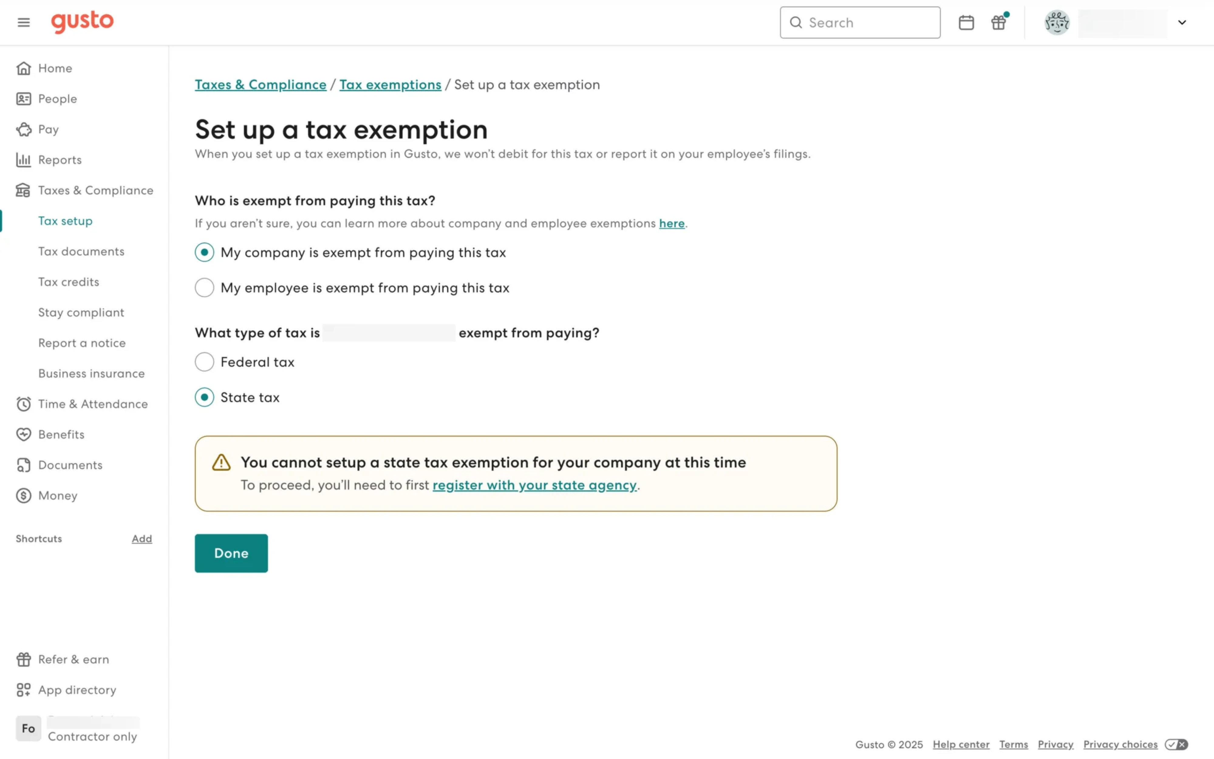
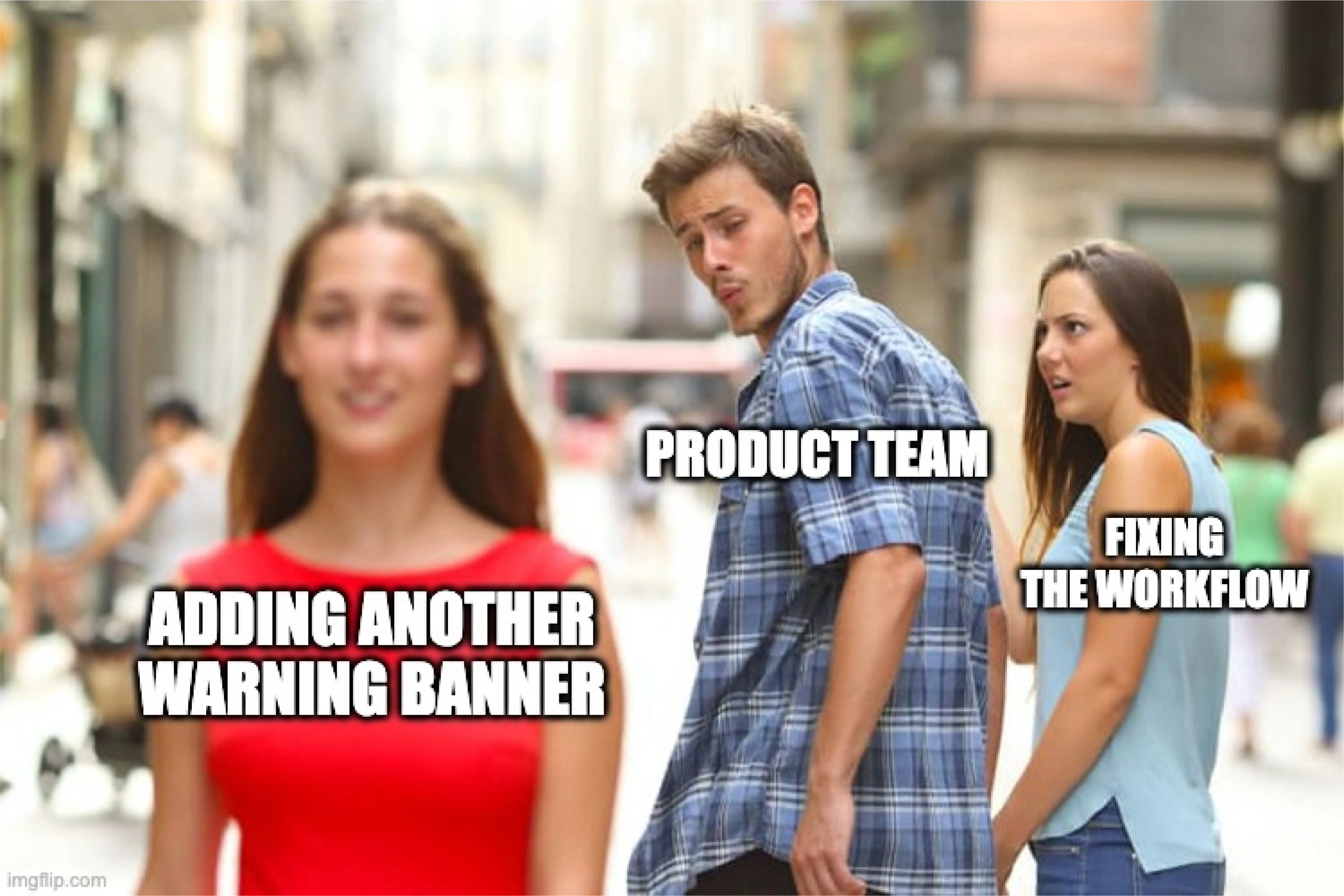
The missing middle
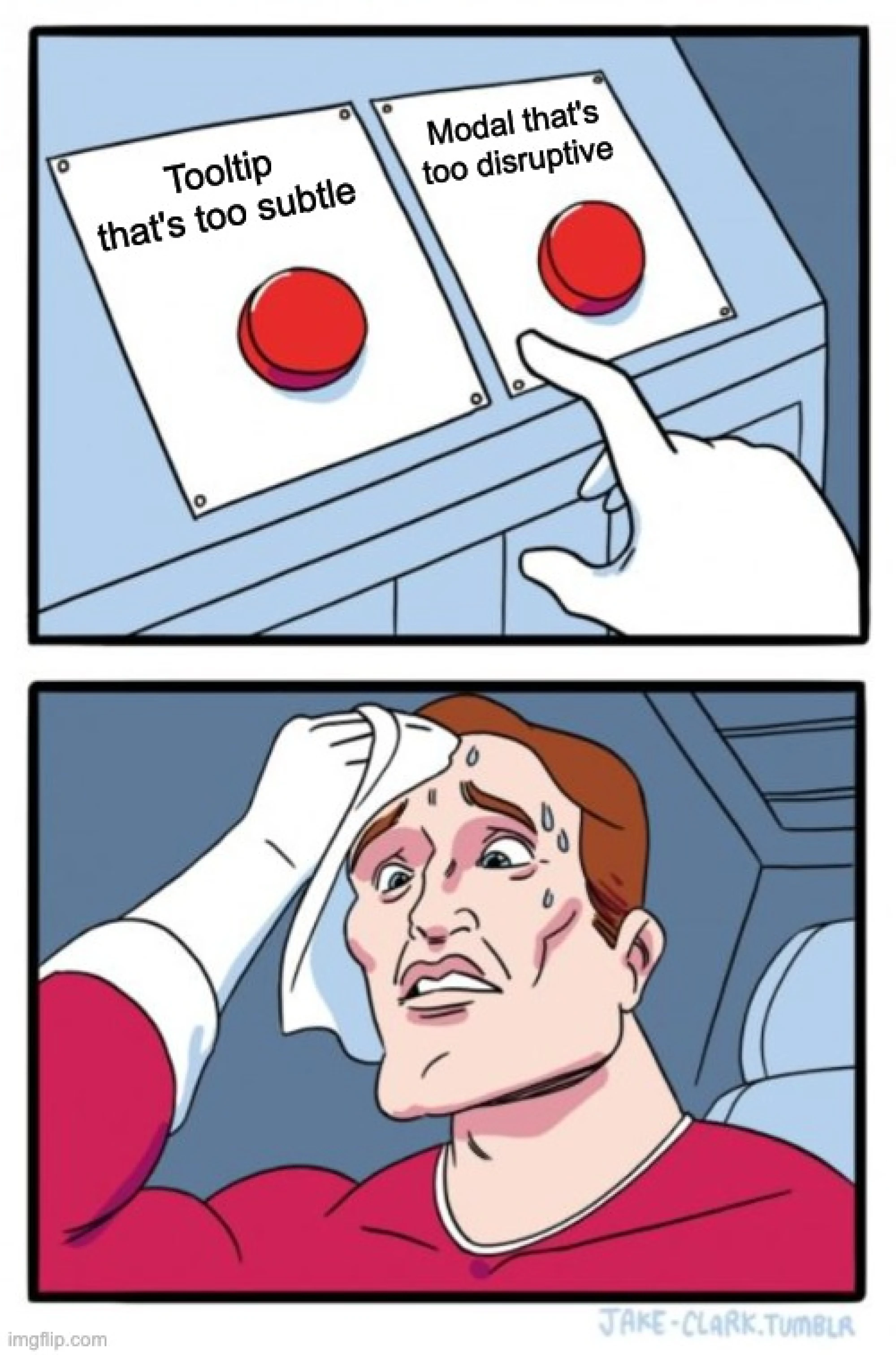
One of the biggest gaps in alert UI sits between:
- lightweight tooltips,
- and full blocking modals.
Sometimes a tooltip feels too weak, but a modal feels overly aggressive. That’s where intermediate alert patterns become valuable:
- expandable warnings,
- inline banners,
- side-panel explanations,
- or contextual popovers.
These patterns communicate friction without completely interrupting users.
And honestly, this is where many real-world SaaS products live — not in clean textbook UX patterns, but in messy middle-ground decisions that balance usability, constraints, and business realities.
Common alert UI mistakes
Even well-designed products get alerts wrong. And usually, the problem isn’t visual design — it’s poor attention management.
Using toast notifications for critical errors
Toasts work well for lightweight feedback. They’re terrible for high-risk problems.
If a payment fails, data is lost, or a destructive action requires attention, the alert shouldn’t disappear after three seconds. Critical issues need persistence and clear recovery paths.
Auto-dismissing important alerts
Not every message should vanish automatically.
Success confirmations can fade away quietly. Warnings, permission issues, or unresolved errors usually shouldn’t. If users miss the alert, they miss the problem.
Good alert UI matches visibility duration to importance.
Stacking too many notifications
Some products overwhelm users with:
- multiple toasts,
- overlapping banners,
- badges,
- modals,
- and inline warnings all at once.
At that point, alerts stop communicating priority because everything competes for attention equally.
Too many alerts create alert blindness — users learn to ignore all of them.
Relying only on color
Red for errors. Yellow for warnings. Green for success.
Helpful? Yes. Sufficient? No.
Alerts should never rely on color alone because:
- accessibility suffers,
- color perception differs between users,
- and meaning becomes unclear without supporting text or icons.
Good alerts combine color, hierarchy, labels, icons, and clear language.
Writing vague messages
Messages like: “Something went wrong”, “Error occurred” or “Action failed” create frustration because they explain nothing.
Good alerts answer three questions immediately: What happened, why did it happen, and what should the user do next.
Overusing modals
Modals interrupt flow completely, so overusing them trains users to dismiss alerts automatically without reading.
If every small warning becomes a blocking confirmation dialog, the interface starts feeling hostile instead of helpful.
The strongest alert systems reserve interruption for moments that genuinely deserve it.
Final takeaway: UI alerts are about decisions, not messages
Good alert UI isn’t just a way to provide information. It acts a faster sign, helping users notice the right thing, access the situation quickly, and respond with confidence.
That’s why the best alerts feel proportional. They interrupt only when necessary, appear in the right context, and guide users toward the next step instead of creating more friction.
At the end of the day, alerts are really about attention management. Every warning, toast, validation message, or confirmation modal competes for user focus — and products that handle that balance well simply feel easier and safer to use.
At Eleken, we help SaaS teams design different types of alert systems that work in real products and services, not just design files — from lightweight feedback patterns to high-stakes decision flows where clarity matters most.
Need alerts screen readers actually notice and understand? We’d love to help you achieve better user experience.


.png)

.png)
