/
Design process

Design Audit Example: Insights to Improve Conversion Rates

0

mins to read

The word "audit" doesn't usually ignite enthusiasm and is mostly taken as a no-fun inspection. A design audit is completely the opposite. It's about getting beneficial outcomes that will improve your website or product and the way people interact with them.

As your company grows, so does the value you want to deliver to your users. You start adding more features and capabilities. But at some point, you may notice your users don't convert. It may sound weird, but more capabilities lead to a worse customer experience.

It's not easy to get where design fails. What if the reason lies in poor or outdated design? Does it need minor improvements or major redesign? Or what way to go to find any usability issues?

Here's where design audit comes into play. Let's briefly define it and then explore some examples.

What is a design audit?

Simply put, a design audit is a usability checkup. It involves design evaluation and structuring that provides actionable business insights. It's performed to make sure your website or product remains consistent at any given touchpoint. The results of the design review (when implemented) lead to an easier user journey and thus increased customer engagement, satisfaction, and conversion.

What is a design audit?
Image source: giphy.com

A design audit is needed to keep a balance between the functionality of your digital product and the growth of your company.

The way customers access information is constantly changing. A website or product design that won over its users three years ago, may not perform that well today. So, a design audit should be perceived as a repetitive and ongoing process.

Who can benefit from the UX audit service?

  • Product teams can see how their product differs from competitors and where to streamline resources for design improvements.
  • Product managers/founders need a detached view on the possible issues, as they can have a blurry vision because of working closely with a product.
  • Product owners can identify and bridge the gaps in conversion funnels.
  • Entrepreneurs that want to make changes in prototype before passing it on to development.
  • Investors that are looking for an experienced partner to lead their teams on improving design solutions.

How long does it take to conduct an audit?

Depending on challenges and the scale of usability issues, a design audit may take from several days up to four weeks of in-depth evaluation. This timeframe is enough to identify 80% of design inconsistencies. Still, our experts approach each client’s request individually and define optimal project terms.

Here at Eleken, our team of experienced designers can help you to identify usability problems and offer actionable solutions to fix them. Read on to explore the example of a product design audit we’ve done for a SaaS company.

UX audit we did at Eleken

The majority of SaaS companies start small and expand over time. They grow by adding more features or additional products to support more capabilities. This is the case of TextMagic, a mobile marketing service, we’ve been working with.

They came up with a plan to develop additional products for marketing, customer support, and sales. At the same time, they wanted to avoid complexity and keep the customer experience simple and easy to use.

As we joined the TextMagic team, we started with a UI/UX audit of their existing application.

UX audit example

Our UX audit process comprised the following steps:

  1. Competitor analysis. We looked at Intercom and JivoChat for live chats,  Mailchimp, Autopilot, Sendgrid, and Sendinblue for email marketing and Zendesk for everything, because it was our main point of reference. We analysed their patterns and user flows to understand their strengths and weaknesses.
  2. Defining the value proposition of a product. It clearly explained how a product should fill the need of its target audience - the marketers and the sales team.
  3. Creating user stories and a user journey we depicted what tasks the user wants to accomplish and what functionality we need to add or transform.
  4. UX analysis of existing capabilities. Our designers were looking for usability inconsistencies and logical gaps using heuristic evaluation to compare it against accepted usability principles.
  5. Compiled report with explained improvements and created a new UI Kit.

In TextMagic, they already had a well-developed design system. We followed its rules when crafting user interface elements. Putting the design system in practice allowed us to speed up the process so it turned out to be very productive. 

We were always in touch with the TextMagic's team to agree on the steps, wireframes, and user flows. Such an effective cooperation allowed us to adjust the process of successful implementation of UX audit results

the results of UX audit

At Eleken, we came to the conclusion that additional products can worsen customer experience. So, we ended up designing one platform that unites sales, marketing, and customer support functionality. This way we reduced complexity and improved the productivity of the TextMagic customers’ team. Based on the insight from our UX audit, we created intuitive flows and minimalistic interfaces that do not overwhelm the user and help them to get the job done quickly.

The design audit process and the results we’ve achieved, we describe in detail in our TextMagic case study.

Website design audit. Why is it needed?

Each website has its end goal. For consultancy businesses, it can be the form filled, for SaaS businesses - the trial signup, for other companies it can be simply brand awareness. A website with an impressive design won’t bring any value for visitors if its content is far from what they could expect or you are trying to reach the wrong audience. The meaningful combination of all these will help users to achieve their goals. The web design audit is meant to reveal such pain points in a way to the desired conversion.

benefits of a website design audit
Benefits of website design audit. Image source: hubspot.net

The best way to eliminate the gap between visitors' expectations and your website capabilities is to conduct a design audit of the entire website.

Follow this checklist to audit your design

Your website is like a front door to your business. A consistent and professional look makes it welcoming and trustworthy. Moreover, a self-explanatory and smooth design leads to better conversions. That's what you need, right?

Let’s have a quick look at the basic example of the design audit checklist each designer should follow.

Information architecture and navigation

  • Navigation is consistent across the website
  • A search bar is always visible and accessible
  • Information is well-structured and credible
  • Website content is easily scannable
  • Location and contact information are easy to find

Forms and elements

  • Typography is the same throughout the website
  • All the icons are of identical style and clearly convey their meaning
  • Dropdowns and buttons are of convenient size and easily clickable
  • Text on buttons clearly describes necessary action

Usability

  • The website is mobile-friendly and responsive for other devices
  • The contrast between text and background is good
  • Text language is plain and easy-to-understand
  • Links are not broken and direct to intended pages
  • Images are relevant to the content and are of a good quality
  • The signup process is simple and trouble-free
  • Input forms ask only relevant information
  • The overall website design follows branding guidelines
  • Design is accessible for people with disabilities
how to conduct design audit?
Image source: giphy.com

Why is design audit so important?

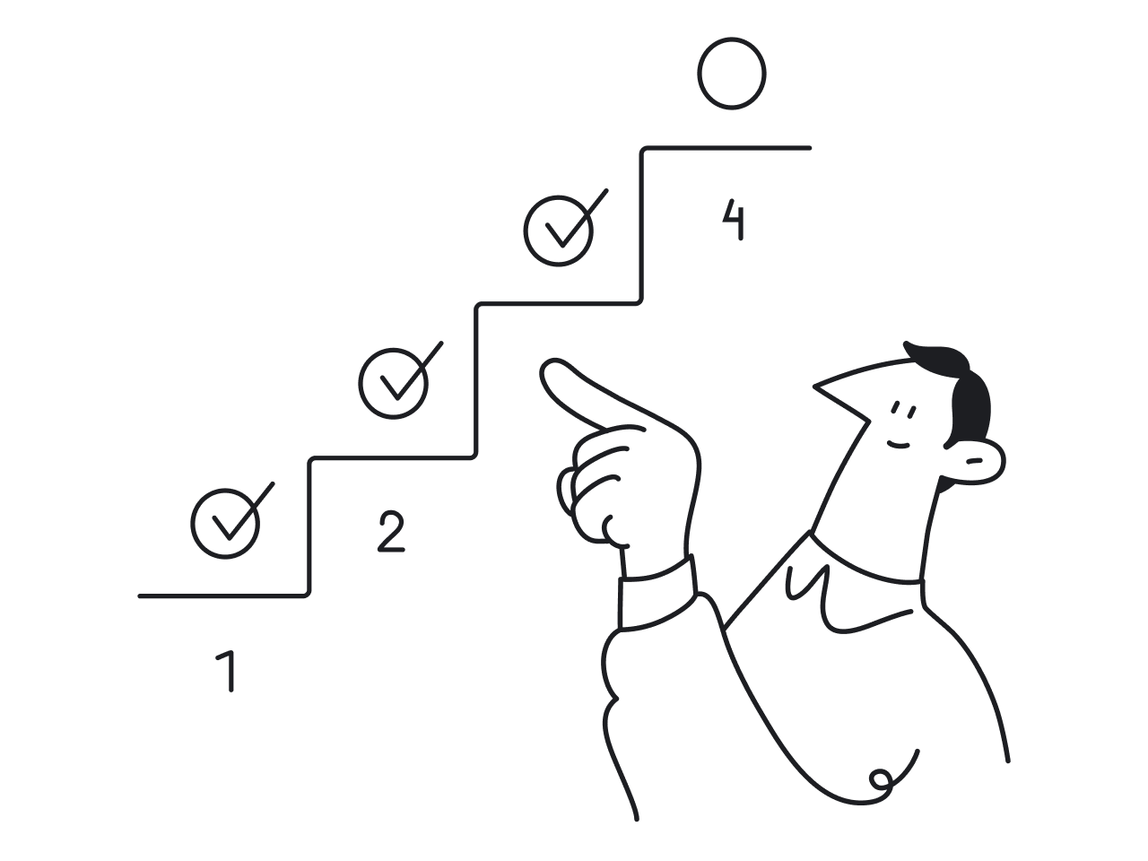
It’s normal to conduct design reviews of a website or product from time to time. In any case, the need for an audit means that your company is levelling up and you want to keep it on the right track. So, recurring audits can influence the successful growth by:

  • Identifying usability issues
  • Improving user engagement and satisfaction
  • Helping designers to understand information hierarchy better
  • Helping to set the right focus on future design enhancements
  • Improving overall perception of a brand
  • Maximizing conversions and ROI, as a result of all the above.

To sum up

As long as you are present in a digital world, you must ensure that the user experience is awesome. And, if you want to know more about your customers and grow further, you will definitely reap benefits from a website design audit or UX audit of a product no matter when it is done.

Also, get inspired by the examples of high-converting websites we’ve shared in our blog.

Lilia Gurova

Author

Table of contents

Top Stories

Design process
/
0
min read

Experience Map vs Customer Journey Map: Choose the Right Tool for Your Business Needs

Experience map and customer journey map are two interrelated concepts that can be easily confused. Nevertheless, as there are two terms for these two notions there is definitely a need to study the matter of experience map vs customer journey map deeply. 

As a design agency, we often address UX mapping in our design process to find effective user-centered solutions for projects we work on. Both experience and customer journey maps allow you to walk in your customer’s shoes and they both focus on customers’ emotions and experiences, still, they serve different purposes.

In this article, we will analyze and compare two types of maps, so that you can understand what tool serves your needs better.

To begin with, before learning the difference between a customer journey map and an experience map we should understand what their purpose is and how one can benefit from using these tools. 

What is a customer journey map?

A customer journey map (CJM) is a tool that helps to visualize certain user’s paths and customer interaction with the product. It is a story of communication between the user and the company that takes into account the customer’s thoughts, emotions, goals, and motives. The map is composed from the buyer’s perspective and looks like a graph with points and channels of customer interaction with the product.

customer journey map example
Example of a customer journey map. Image credit: mycustomer.com

A customer journey map consists of the following components:

  • Timeline graph
  • Stages of customer’s interaction with the product (for example, discovery, research, evaluation, conversion, post-sale engagement) 
  • Customer’s objectives and actions taken during each stage
  • The thoughts and emotions the customer has as they complete certain actions

CJM reflects the way a customer moves towards a certain goal, identifies problem areas at each customer journey touchpoint, and allows you to understand how to solve those issues. With the help of the CJM, you can manifest the main customers’ fears, pain points, and expectations and get the insights that will inform your further design decisions. 

To make a map, it is necessary to track customer behavior at all points of intersection with the product. For a good analysis, you need to collect enough information about the buyer and the product itself. Then, you should correctly record it on the map (with customer journey mapping tools this process seems easier). 

Main features of a CJM

A customer journey map is characterized by:

  • Linear timeline. CJMs present user’s actions in chronological order.
  • Presenting information from the customer’s perspective. The customer journey map tells little about how the product works but focuses more on the customer’s thoughts, feelings, and emotions when interacting with your brand/product.
  • One CJM depicts the journey of one buyer persona. If you look closely at the above customer journey map example, you will notice the description of a buyer persona before interacting with the product on the left side, and their feelings after completing the goal on the right side. That’s how CJMs work: one type of customer per one map.
  • A map tells a customer’s journey within one product or service. Customer journey maps are quite specific as they show the buying journey of one target customer for one product.

The purpose of a CJM

A customer journey map helps you see the entire user's path and immediately identify the gaps in the user flow - the pain points that the design team will need to resolve to create a service or product that improves users’ lives.

To better understand how helpful a CJM can be, let’s take a look at the example below. 

flight booking service customer journey map example
Example of a CJM for a flight booking service. Image credit: mycustomer.com

Let’s suppose, you understand that very few customers join the loyalty program, but can’t figure out the reason for this issue. As CJM contains real thoughts of the target audience, you look at the “book flight” stage of the customer journey, check the “thinking” block and learn that creating an account takes too much time and your customers prefer to skip it. Now it’s much easier to find an effective solution to the problem.

As well, CJM works perfectly for visually demonstrating problems to stakeholders (or any company representative) who is confident that their service is working great. The good thing about a customer journey map is that it immediately shows negative thoughts and emotions which makes all team members read those comments attentively, and start thinking about how to fix this negative experience.

At this point, it’s time to move to the explanation of the customer experience map.

What is an experience map?

An experience map shows the entire journey customers take when they interact with a product or service. 

Similar to the customer journey map, experience mapping depicts the user’s path from the product discovery stage to evaluation and purchase (until a person becomes a customer). But the experience map goes wider, it also shows what your competitors and your business are doing in the context of this journey, taking into account reviews, references, referrals, support, and so on.

experience map example
Experience map example. Image credit: pinterest.com

As you can see in the above example, the experience map also visualizes stages, timeline, emotions, and feelings but it doesn’t focus on some specific customer type. UX map shows the overall experience of all customers. As well, it presents the customer journey with various touchpoints that are not tied to one specific product or service (the customer is searching for a house with the help of an Internet, agency, by asking friends and family for advice, and so on). 

Capturing the full picture of experiences from a customer perspective helps organizations identify strategic opportunities, customer pain points, and launch innovative projects.

Main features of a UX map

Here are some main characteristics of an experience map :

  • It generalizes the experience of different types of customers. UX ma is not tied to a certain customer type.
  • A map tells the entire customer journey. Experience maps are not tied to a specific product/service.
  • It has a chronological order.
  • It depicts stages of a customer journey, actions, thoughts, and emotions

The purpose of the experience map

An experience map helps organizations see the big picture and make decisions about what to focus on based on research. When you see the whole picture, you can:

  • Inform your design decisions aimed at increasing customer satisfaction, brand loyalty, customer retention, and so on.
  • Identify opportunities for innovation.
  • Understand where the user experience is currently well supported and in which points it needs improvement.
  • Compare different customer’s paths to purchase.
  • Help all team members stay on the same page about customers’ needs.

The main objective of an experience map is to identify each possible channel a customer can use to interact with your company.

What differs customer journey map and experience map?

If you read the article up to this moment, you could already understand why people confuse the discussed map types, as well as you could identify some major differences between these tools. 

To make the picture clear for you, in this section, we will single out the main distinctions between the customer journey map and experience map.

  • Multi-channel vs single channel. Experience map depicts the complete picture of the customer experience with the brand at multiple channels, while CJM focuses on the experience the customer gets when interacting with one specific product/service.
  • Specific customer type vs overall customer experience. Experience map shows the journey every customer goes through when interacting with your brand, CJM depicts the experience of one specific buyer persona.
  • Diving into details vs understanding the broad picture. CJM works best for those who know where their problem is but need to find a suitable solution. Experience maps are great for those who don’t know where the problem lies. 

Final thoughts

I guess we won’t reveal to you some shocking truth by saying there is no one right choice for each situation. To choose between a customer journey map and a customer experience map, you should know if you need to fully understand the current state of your experience, or you need to find a solution to a specific issue to improve the overall situation. 

In general, a customer journey map can be a necessary part of experience mapping, but both approaches can be used apart. It all depends on the project's needs.

At Eleken we work with SaaS customer journeys to explore the experience of each type of customer so we don’t miss anything important when designing a product. This way we can give all types of customers a solution they're looking for. Drop us a line if you want to learn more about the way we help creating user-centered and business-oriented products.

Design process
/
0
min read

Measuring the Intangible. Usability Metrics

How do we evaluate the design? Typically, the first ones to approve it are the designers themselves. After that, other decision-makers give their opinion. Then, some users test it and give their feedback.

Having few levels of approval is great, but all those opinions are rather subjective. As a design agency, we always promote a data-driven approach. And in the case of measuring user experience, usability metrics are that essential data.

What are usability metrics?

Usability metrics are a system of measurement of the effectiveness, efficiency, and satisfaction of users working with a product. 

To put it simply, such metrics are used to measure how easy and effective the product is for users.

Most usability metrics are calculated based on the data collected during usability testing. Users are asked to complete a task while researchers observe the user behavior and take notes. A task can be something like “Find the price of delivery to Japan”, or “Register on the website”.

The minimum number of users for measuring usability is 5. Jacob Nielsen, the founder of "Nielsen Norman Group", recommends running usability testing with 20 users.

To analyze every user action, researchers might record the testing and watch it a few times. All of it is necessary to calculate the metrics. 

Let’s take a closer look at the most used usability metrics. We’ll start with the metrics for effectiveness measurement.

Success score

However long is your list of usability metrics, success score will probably be at the top of the list. Before we go into the details of usability, we have to find out if the design works. Success, or completion means that a user managed to complete a task that they were given.

The basic formula for the success score is:

Success score

Success score would be somewhere in between 0 and 1 (or 0 and 100%). 0 and 1 are not just simple numbers. In this binary system, these numbers refer to the task being completed successfully or not. All the other specific situations are overlooked. Partial task success is considered a failure.

To have a more nuanced picture, UX researchers can include tasks performed with errors in a separated group. Let’s say, the task is to purchase a pair of yellow shoes. The options of “partial success” can be buying a pair of shoes of the wrong size, not being able to pay with a credit card, or entering wrong data.

Let’s say, there were 20 users, 10 of which successfully bought the right shoes, 5 chose wrong type of delivery, 2 entered their address incorrectly, and 3 were unable to make the purchase. If we were counting just 0 or 1, we would have rather low 50% success score. By counting all kinds of “partially successful” tasks, we get a whole spectrum.

Note! Avoid counting “wrong address” as 0,5 of success and adding it to overall average, as it distorts the results.

Each of the “partially successful” groups can tell us more than a general success score: using these groups, we can understand where the problem lies. This is something that we expect more often from qualitative UX research, while quantitative just gives us a precise but narrow-focused set of data.

To consider a product having good usability, success score doesn’t have to be 100%. The average score is around 78%.

Now, let’s move to the second of the most common usability testing metrics:

Number of errors

In user testing, an error is any wrong action performed while completing a task. There are two types of errors: slips and mistakes.

Slips are those errors that are made with the right goal (for example, a typo when entering the date of birth), and mistakes are errors made with the wrong goal (for instance, entering today’s date instead of birth date).

There are two ways of measuring errors: measuring all of them (error rate) or focusing on one error (error occurrence rate).

To find the error occurrence rate, we have to calculate the total number of errors and divide it by the number of attempts. It is recommended to count every error, even the repetitive ones. For example, if a user tried to click an unclickable zone more than once, count each one.

Error rate

Error rate counts all possible errors. To calculate it, we need to define the number of error opportunities, all possible slips and mistakes. This number can be bigger or smaller depending on the complexity of the task. After that, we apply this simple formula:

Error occurrene rate

Can there be a perfect user interface that prevents people from making typos? Unlikely. That is why the error rate almost never equals zero. Making mistakes is human nature, so having errors in usability testing is totally fine.

As Jeff Sauro states in his “Practical Guide to Measuring Usability”, only about 10% of the tasks are completed without any mistakes, and the average number of errors per task is 0,7.


Success score and error rate measure the effectiveness of the product. The following metrics are used to measure efficiency.

Task time

Good usability typically means that users can perform their tasks successfully and fast. The concept of task time metric is simple, yet there are some tricks to using it with the most efficiency.

Task time

Having the average time, how do we know if the result is good or bad? For other metrics, there are some industry standards, but for task time there can’t be any.

Still, you can find an “ideal” task time — a result of an experienced user. To do this, you have to add up the average time for each little action, like “pointing with the mouse” and “clicking”, using KLM (Keystroke Level Modeling). This system allows us to calculate this time quite precisely.

Most often, the task time metric is measured to compare the results with older versions of the design or with competitors. 

Many times the difference in time will be tiny, but caring about time tasks is not just perfectionism. Remember, we are living in a world where the majority of people leave a website if it’s not loading after 3 seconds. Saving those few seconds for users can impact their user experience quite a lot.

Efficiency

There are many ways of measuring efficiency, one of the most basic is called time-based efficiency and combines both task time and success score.

Efficiency

Doesn’t look basic, right? Not all formulas are easy to catch. It would take another article to explain this one in detail.

Tracking metrics is a whole science. If you want to dive deep into it, check out our list of best books about metrics (or leave it to the professional UX designers).


Now that we have figured out how to measure both effectiveness and efficiency, we get to measuring satisfaction, the key of user experience studies. 

There are many satisfaction metrics, but we’ll bring two that we consider being the most efficient. For these metrics, the data is collected during usability testing by asking the users to fill in a questionnaire.

Single Ease Question (SEQ)

This is one of those easy and genius solutions that every UX researcher loves. Compared to all those complex formulas, this one is as simple as it gets: a single question is asked after the task.

SEQ

While most task-based usability metrics are aiming at finding objective parameters, SEQ is tapping into the essence of user experience: its subjectivity. Maybe the task took a user longer to complete, but they had no such impression. 

What if the user just reacts slower? Or were they distracted for a bit? User's subjective evaluation of difficulty is no less important than the number of errors they made.

On average, users evaluate task difficulty at 4.8. Make sure your results are no less than that.

System Usability Scale (SUS)

For those who don’t trust the single-question solution, there is a list of 10 questions, known as the System Usability Scale. Based on the answers, the product gets a score on a scale from 0 to 100 (each question is worth 10 points).

System Usability Scale

This scale comes in handy when you want to compare your product with the others: the average SUS is 68 points. Results over 80 are considered excellent.

Why care about usability metrics?

The basic rule of user research states that conducting about three user interviews gives us a big chunk of info about the product usability, as well as usability problems. But why bother measuring quantitative UX metrics?

Well, if this is the first time you run user tests, you should stick to qualitative tests, of course. The foremost is to get to know the users well. However, when a company gets serious about user research, quantitative data comes to play.

What is the difference between qualitative and quantitative tests then? The first one gives us valuable insights like “users find the navigation of the website confusing”, and the second gives data in precise numbers, like “our redesign makes users do their tasks 61,5% faster than the old design”.

The latter insight does not tell you what exactly makes a new design work faster than the old one and doesn’t tell you how it can be further improved. However, when you have to justify redesign to the CEO, solid data would look more convincing than excerpts from user interviews.

The same metrics can be a good basis for the assessment of a design team’s success and defining design KPIs. It helps with an old problem of UI/UX designers: when a good interface is barely noticeable. Few people understand how much work lies behind these seemingly “simple and obvious” solutions.

With the urge to make the changes slightly more visible, designers sometimes are tempted to make small but noticeable adjustments like switching colors, replacing buttons, and so on. These are the things that annoy users so much every time their favorite app changes. This is what happened to Twitter, by the way. We wrote about the scandal around Twitter redesign recently.

How do metrics help with it? When designers know that their objective is to improve the metrics, they won’t be just changing visuals and reshaping logos to make the results of their work more “noticeable”. Their management knows the KPIs and can easily see the impact.

All in all, tracking usability metrics is a sign of a company with a certain level of UX maturity. Once you decide to invest in that, you’ll find out that usability metrics can be as valuable as CAC, MRR, AARRR, and others.

To sum up

Usability metrics are not the easiest part of a UX researcher’s work. There is a lot more to do than just counting the numbers. You have to recruit many users, create tasks, organize the testing, observe and collect the data, and after that, you can finally apply the formulas and get the results.

For those who dare to go all this long way, we have to say that they will be rewarded with a clear data-driven system of UX evaluation.

Curious to find out what is there beyond usability testing? Read our article about other crucial UX research methods.

Don't want to miss anything?

Get weekly updates on the newest design stories, case studies and tips right in your mailbox.

Success!

Your email has been submitted successfully. Check your email for first article we’ve sent you.

Oops! Something went wrong while submitting the form.
Don't want to miss anything?

Get weekly updates on the newest design stories, case studies and tips right in your mailbox.

Success!

Your email has been submitted successfully. Check your email for first article we’ve sent you.

Oops! Something went wrong while submitting the form.