.webp)


As digital products grow, maintaining consistency across interfaces becomes harder.
Components multiply, teams expand, and small design decisions start to drift. The same button looks slightly different across pages. Similar patterns get rebuilt instead of reused. Over time, this slows down both design and development.
This is exactly the problem a design system is meant to solve.
At its core, a design system helps teams create consistent, scalable digital products by turning design decisions into reusable building blocks. Instead of designing every screen from scratch, teams rely on shared components, patterns, and rules.
At Eleken, we often work with SaaS companies that reach this stage – when growth introduces complexity and the lack of structure starts to slow teams down. Based on that experience, this guide breaks down what a design system actually is, what it includes, and how teams approach creating one in practice.
What is a design system in UX?
The term design system gets used a lot—but not always consistently.
Some teams use it to describe a UI kit. Others mean a set of components. In reality, a design system is broader than both.
At its simplest, a design system is a shared framework used to build consistent digital products. It combines reusable components, design principles, and clear guidelines into a single source that both designers and developers rely on.
But what makes something a design system—and not just a collection of files—is how it connects decisions across the product.
A good UI/UX design system typically includes:
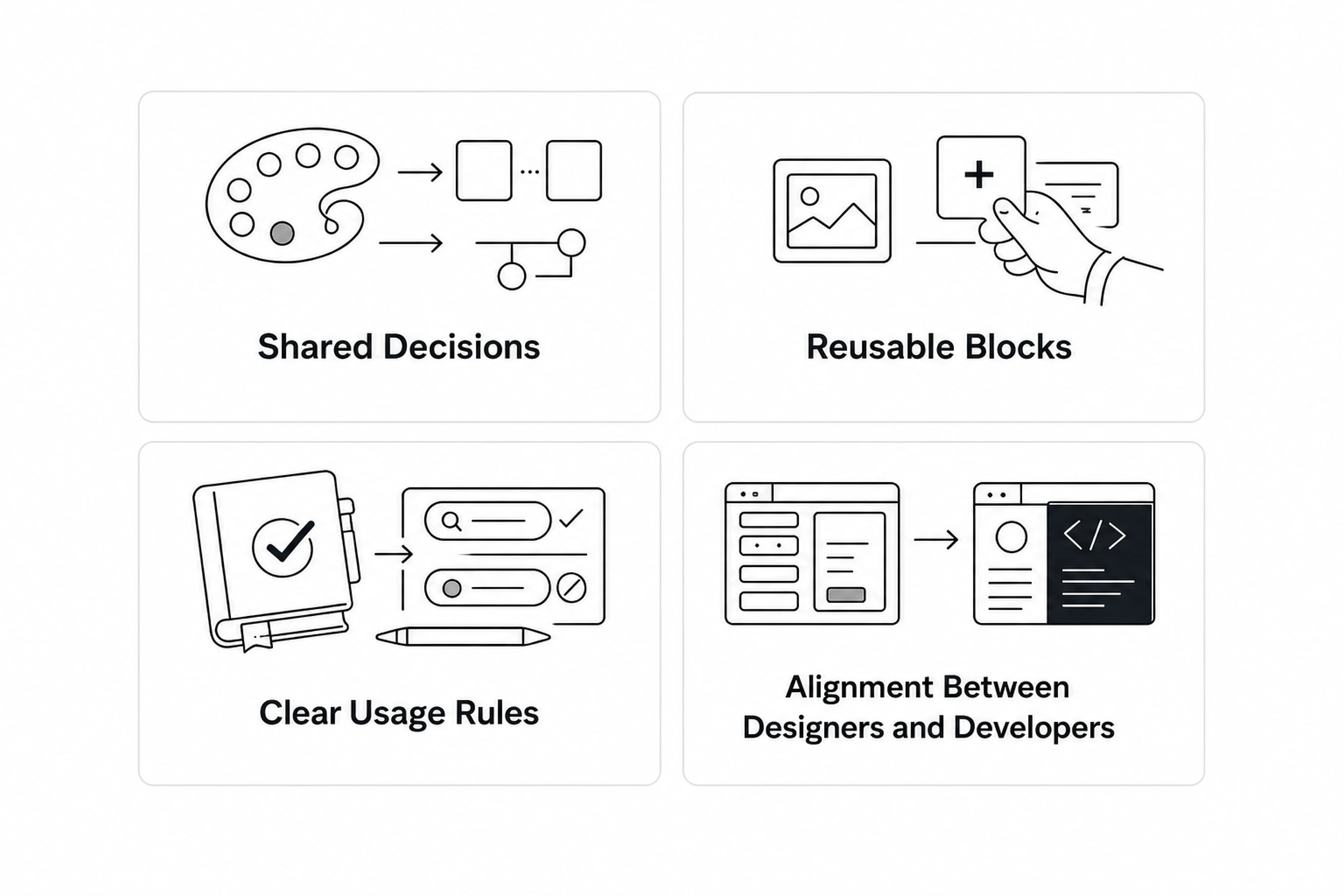
- Shared decisions — colors, spacing, and behaviors are defined once
- Reusable building blocks — components that can be used across screens
- Clear usage rules — guidance on when and how to use each element
- Alignment between designers and developers — a system that exists in both design and code
This creates a shared design language that helps teams move faster and stay consistent as the product grows.
Why the definition varies
One reason there’s confusion around what is a design system definition is that teams build them at different levels of maturity.
Some start with simple style guides or a basic user interface library. Others develop full systems with tokens, components, and documentation tied directly to code.
That’s why you’ll often see terms like ui design system, ux design system, or design system ui used interchangeably—even though they don’t always mean the same thing.
In practice, a UX design system isn’t a fixed format. It’s something that evolves with your product, your team, and your design process.
Design system vs UI kit vs style guide vs component library
These terms are often used interchangeably, but they refer to different things. Understanding the distinction helps clarify what a design system actually includes.
Style guide
A style guide defines the visual foundation of a product. It typically includes:
- colors
- typography
- spacing rules
- brand guidelines
It answers the question: What should things look like?
UI kit
A UI kit is a broader collection of visual ui elements. As we explain in our guide on what a UI kit is and how to use it, this can include:
- buttons
- inputs
- icons
- cards
It helps designers quickly assemble screens and maintain visual consistency, but documentation and usage rules are often limited.
Component library
A component library is the developer-side version of a UI kit or design system. It contains reusable components implemented in code, including:
- coded UI components
- states and variants
- implementation logic
- technical documentation
Unlike UI kits, component libraries exist inside the product codebase and are used by developers to build interfaces consistently and efficiently.
Design system
A design system brings everything together. UI design system components include:
- style guides
- UI kits
- component libraries
- design tokens
- documentation and guidelines
More importantly, it creates a shared language across designers and developers.
It doesn’t just define how things look—it defines how design decisions are made, documented, and maintained across the product.
Many teams think they have a design system when they actually only have a UI kit or a component library. Understanding the difference helps set realistic expectations about how structured and scalable the product workflow really is.
Why сompanies use visual design systems
Most teams don’t decide to build a design system upfront.
It usually starts with friction.
Designers notice repeated inconsistencies. Developers rebuild the same ui components multiple times. Product teams spend more time fixing UI issues than moving forward.
At that point, a design system becomes less of a “nice to have” and more of a way to bring structure back into the design process.
Consistency across products
As products grow, maintaining a consistent user interface becomes harder.
Without a system:
- similar screens look slightly different
- interactions behave inconsistently
- user experiences start to feel fragmented
UX design systems introduce a shared language that keeps everything aligned and visually cohesive.
Case in point, in our work with myInterview, inconsistencies across products created a fragmented user experience, with sudden shifts in colors, layouts, and UI patterns reducing user trust. As the platform scaled, these inconsistencies became even harder to manage.
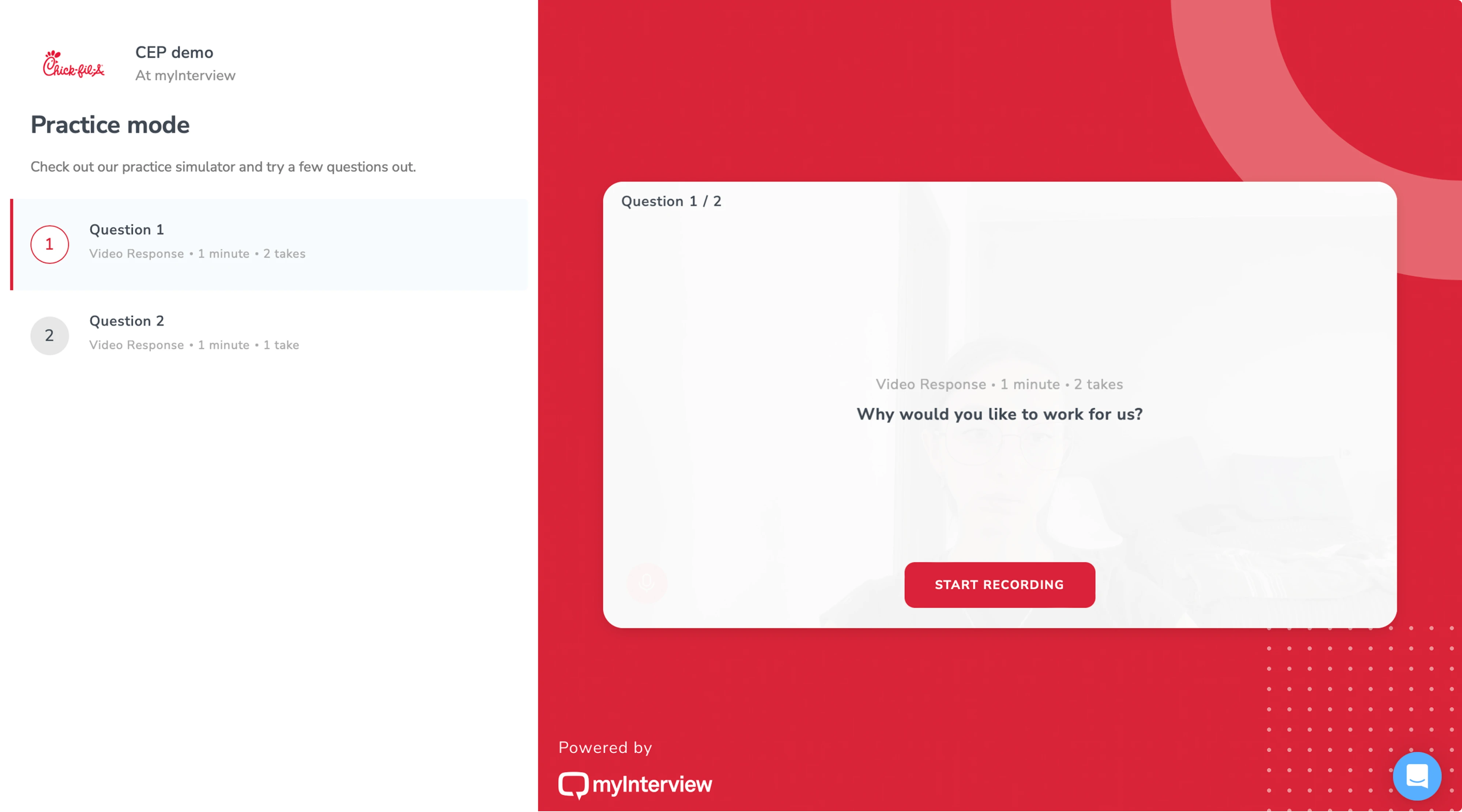
To solve this, Eleken developed a scalable design system with reusable components and a shared source of truth for designers and engineers. The result was a more cohesive product experience and a stronger foundation for scaling the platform consistently.
Faster development and design
Instead of designing and coding everything from scratch, teams rely on reusable components and established patterns.
This reduces duplication and helps:
- speed up design work
- accelerate development
- reduce repetitive decisions
Over time, this leads to real improvements in efficiency.
Better collaboration
One of the biggest benefits of a design system is how it improves collaboration between designers and developers.
Instead of translating designs from scratch every time, both sides work from the same structure:
- shared tokens
- shared components
- shared naming
This creates a unified language across cross-functional teams.
Easier scaling
As teams grow and products expand, complexity increases. A design system helps manage that complexity by introducing:
- standardized components
- consistent patterns
- clear structure
This makes it easier to scale across:
- multiple features
- multiple teams
- multiple platforms (including mobile apps and websites)
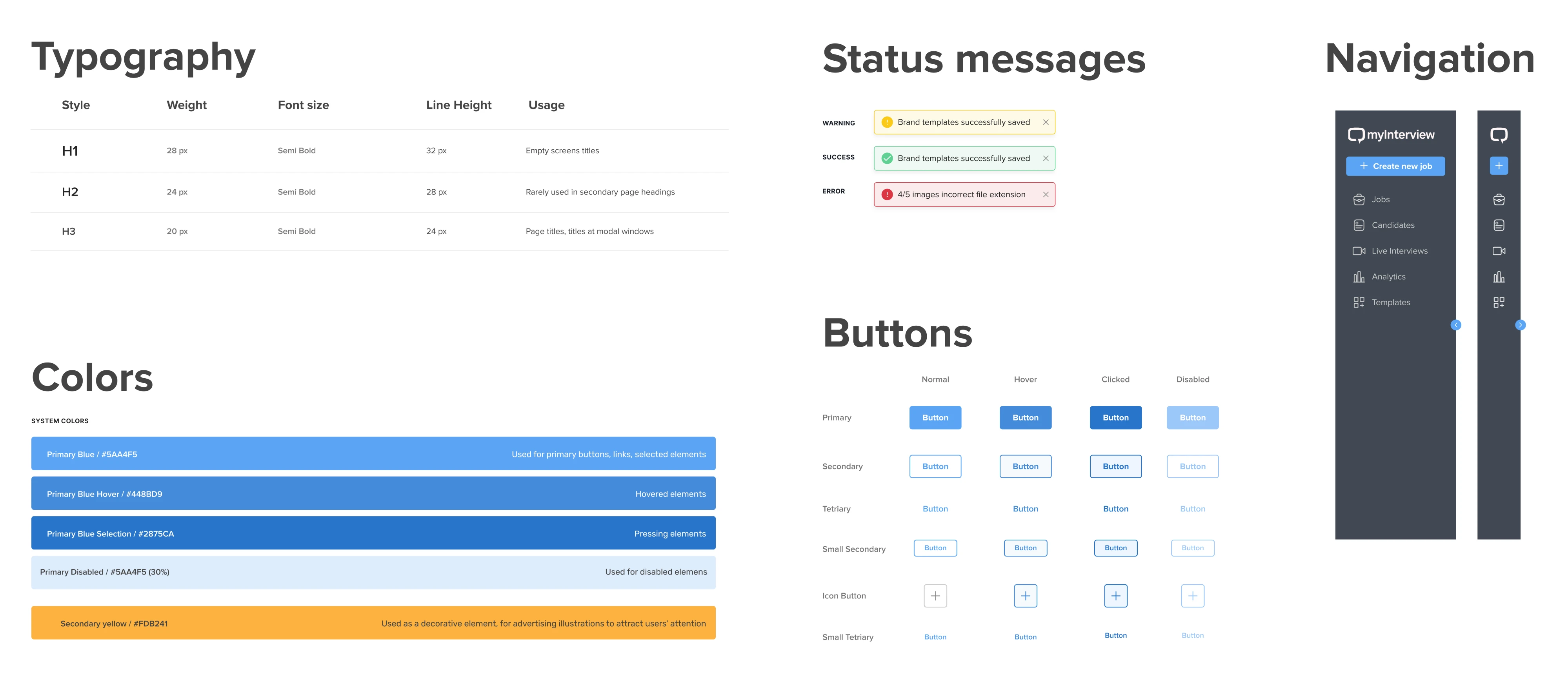
For example, during our work with PayUp, one of the key priorities was building a product that could scale quickly without creating inconsistencies in the interface. To support that growth, Eleken developed a consistent design system and continuously expanded the UI kit with reusable components throughout the project.
This allowed the team to ship updates faster, iterate more efficiently, and scale the product with far greater consistency and reliability.
Faster onboarding
New team members don’t need to learn everything from scratch.
With clear guidelines, structured component Figma libraries, and documented patterns, they can quickly understand how the product is built and start contributing sooner.
Real impact
Over time, these improvements add up:
- fewer inconsistencies
- faster delivery
- better alignment
For growing product teams, this often translates into measurable cost savings and more predictable workflows.
A strong example of this comes from Sessionboard, where Eleken unified a fragmented interface by standardizing components, rebuilding inconsistent UI patterns, and aligning the design system with the actual product experience.
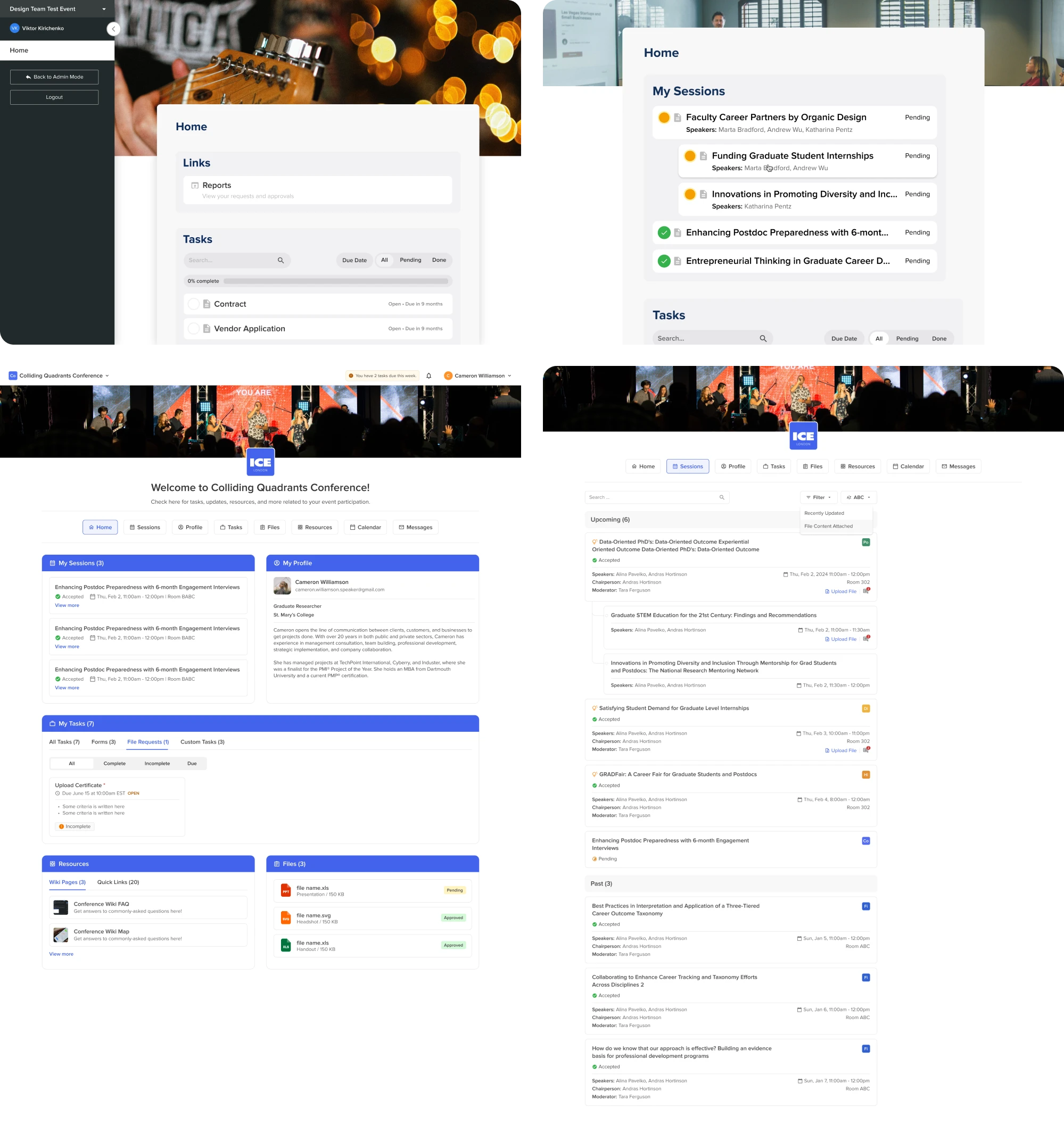
This not only improved usability and developer handoff, but also created a scalable foundation for future features and faster product expansion.
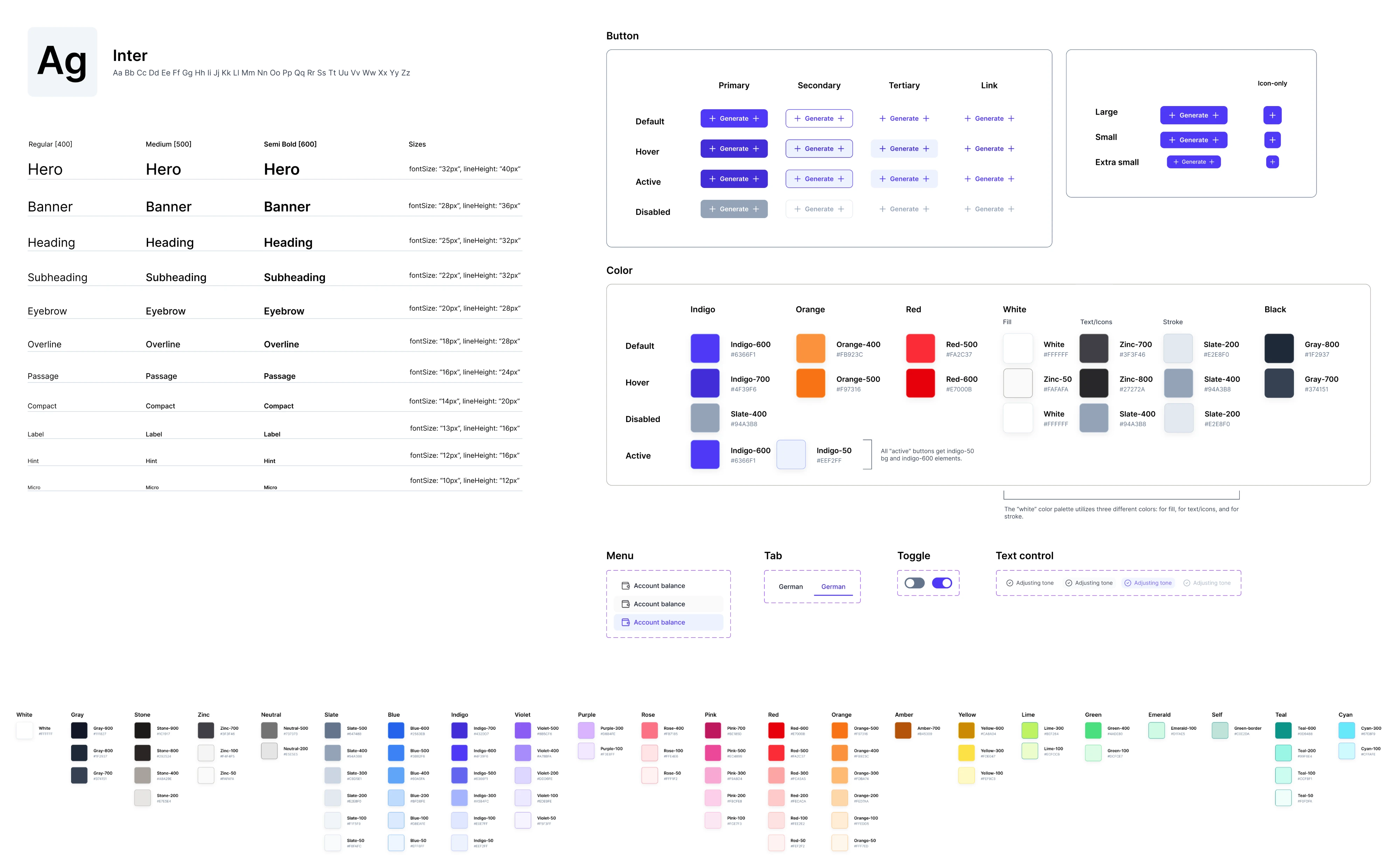
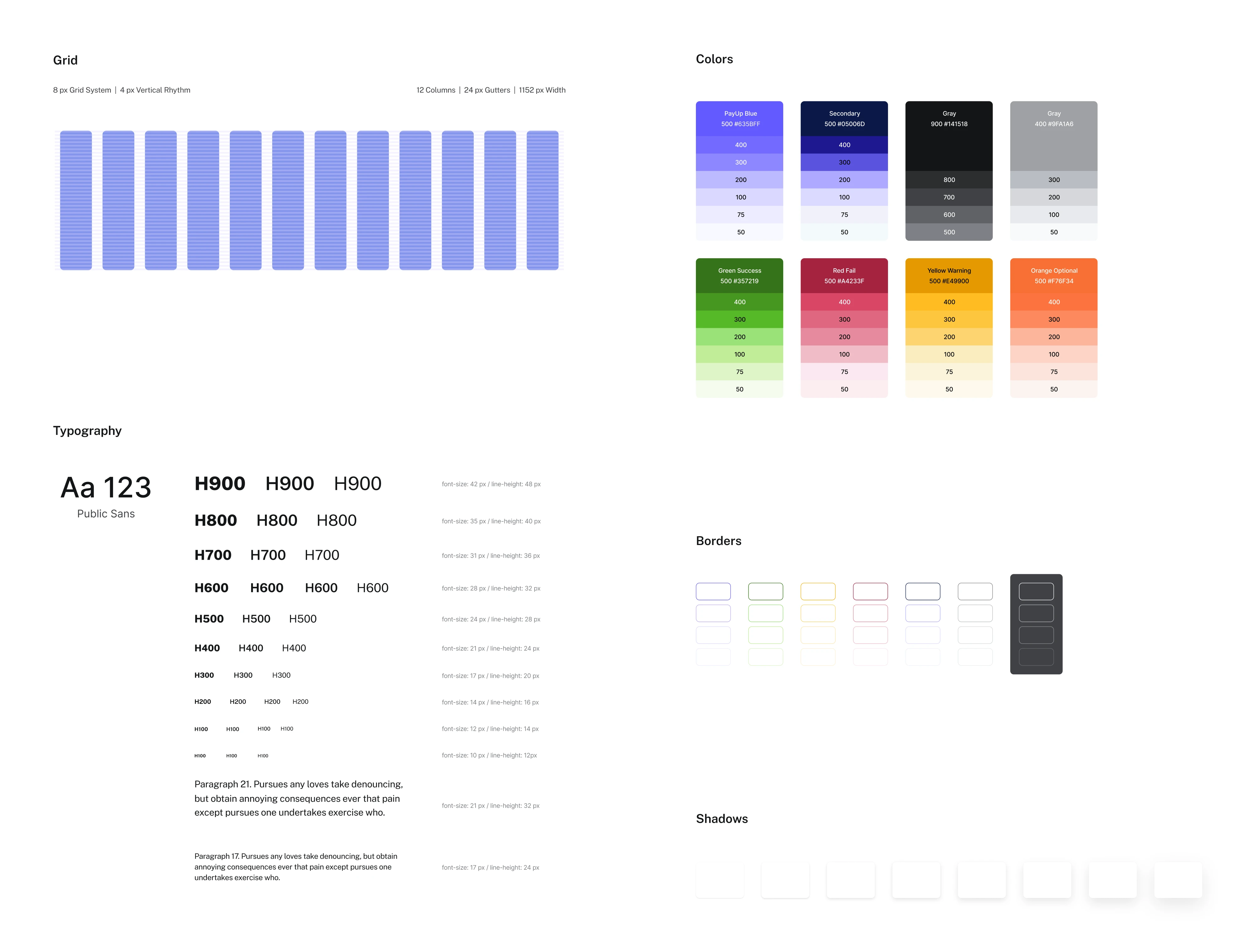
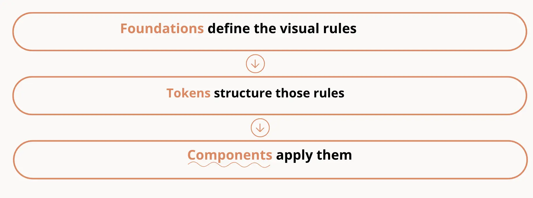
The core elements of a design system UX
A design system isn’t just a set of components or a UI kit. It’s a structured system made up of several interconnected parts that help teams build consistent, scalable digital products.
Each element plays a specific role—and the real value comes from how they work together.
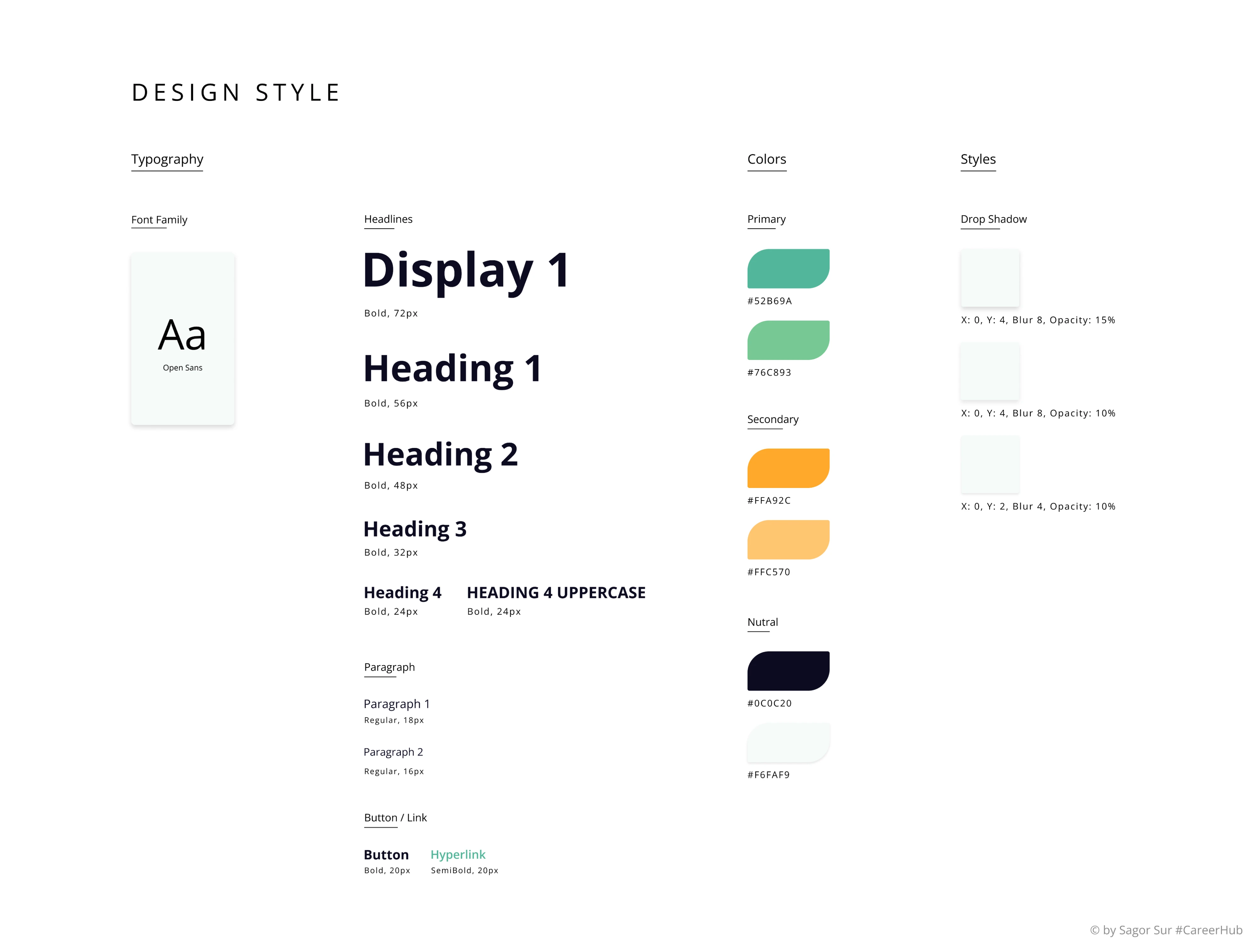
Foundations
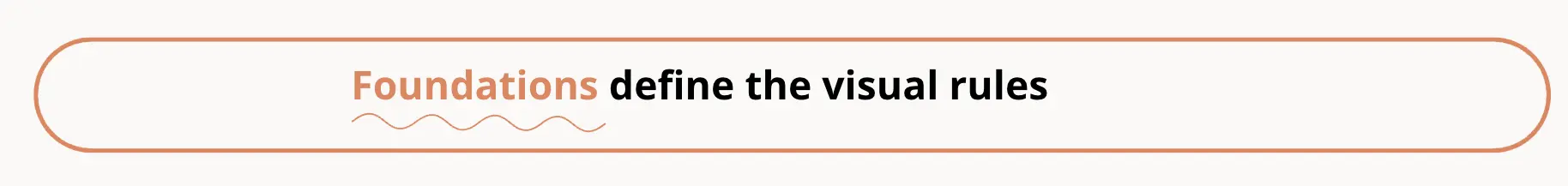
Foundations define the visual base of your product. They include:
- colors
- radius
- icons
- typography
- spacing
- layout rules (like grid layout design)
- motion and interaction principles
These are the rules that shape how your product looks and feels. For example:
- spacing defines rhythm and hierarchy
- typography affects readability and tone
- motion defines how interactions feel
Together, these elements form the product’s design language and ensure all visual elements feel cohesive across different screens and features.
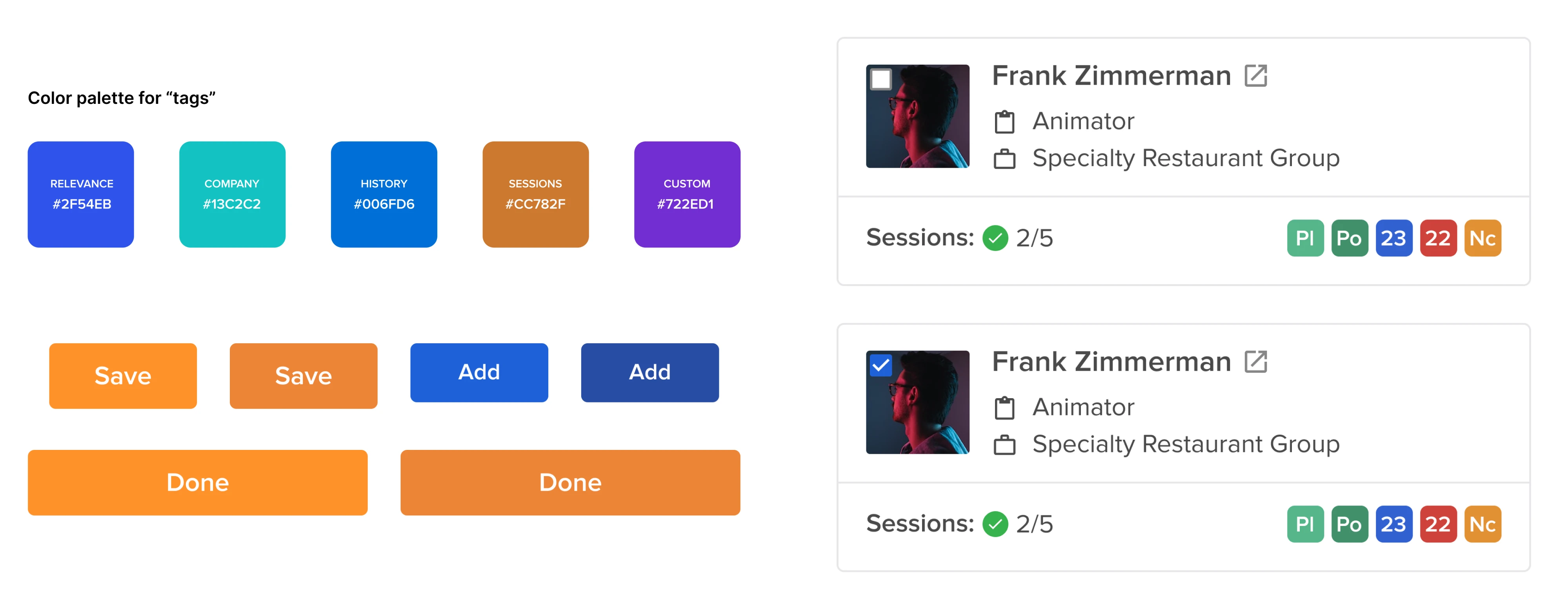
Design tokens
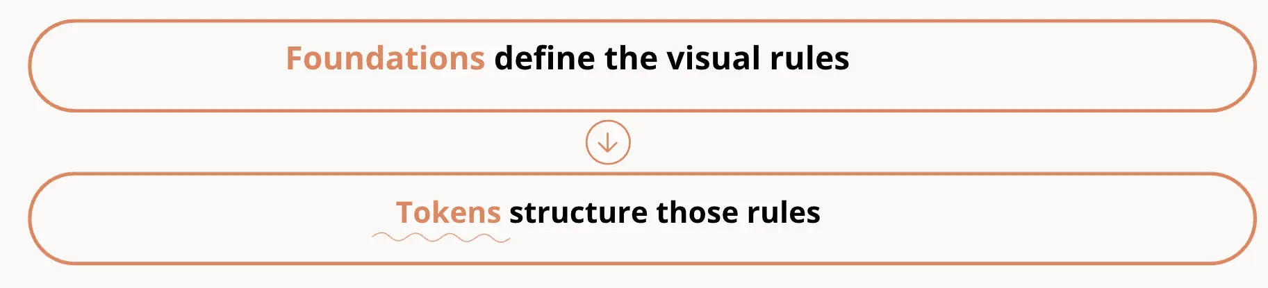
Design tokens translate visual decisions into structured, reusable values.
Instead of manually applying styles, teams define tokens like:
- primary color
- spacing scale
- border radius
These tokens act as a single source of truth across design and development. This makes it easier to:
- update styles globally
- maintain consistency across features
- scale the design system across platforms
For example, changing a color token updates every component that uses it—without redesigning each element manually.
This is what allows a system to scale efficiently.
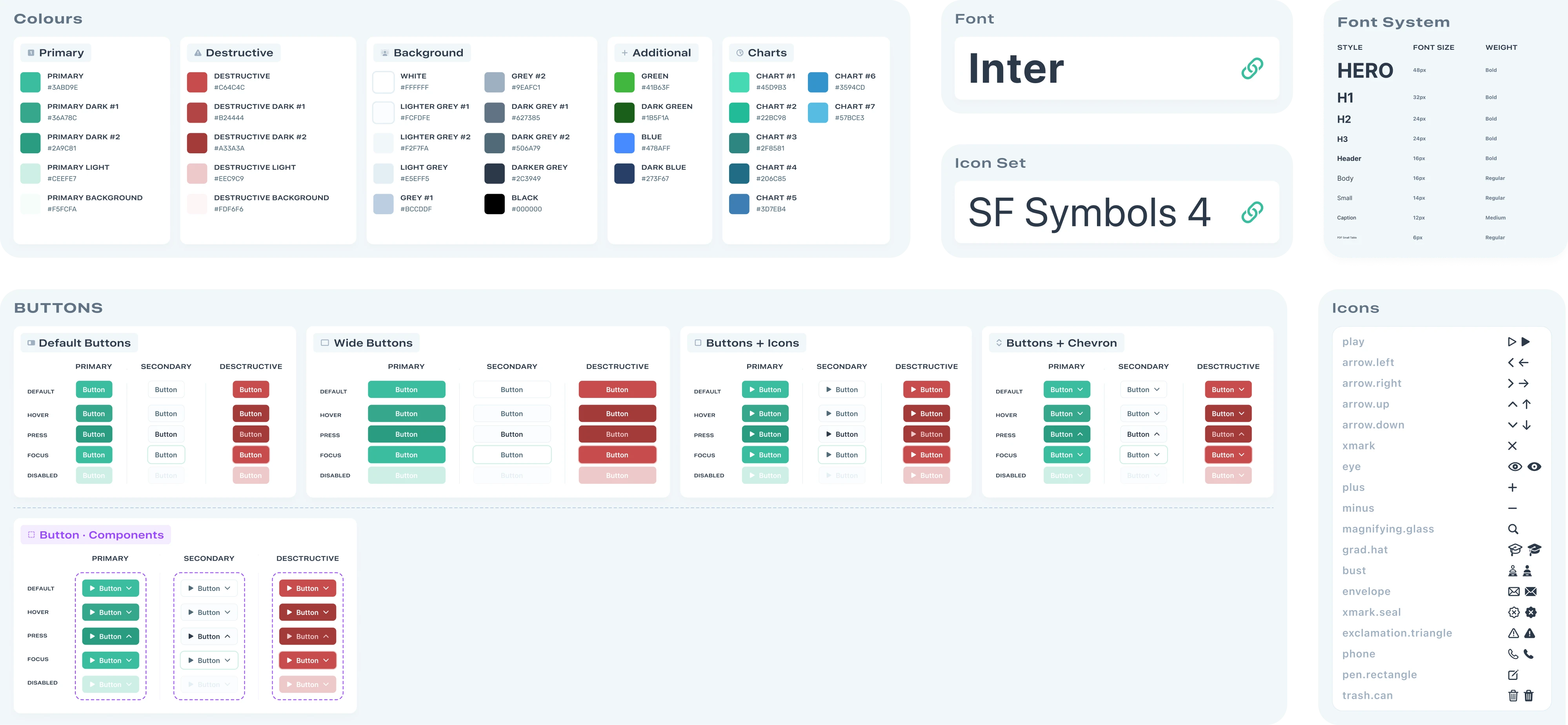
Component Figma library
A component library contains reusable components that teams use to build interfaces. Common examples include:
- buttons
- inputs
- dropdowns
- tables
- navigation elements
Each component is defined once and reused across the product. Good component libraries include:
- multiple states (hover, disabled, error)
- variants (size, type, behavior)
- consistent structure
This reduces duplicated work and ensures that ui components behave consistently in both design and code.
Pattern library
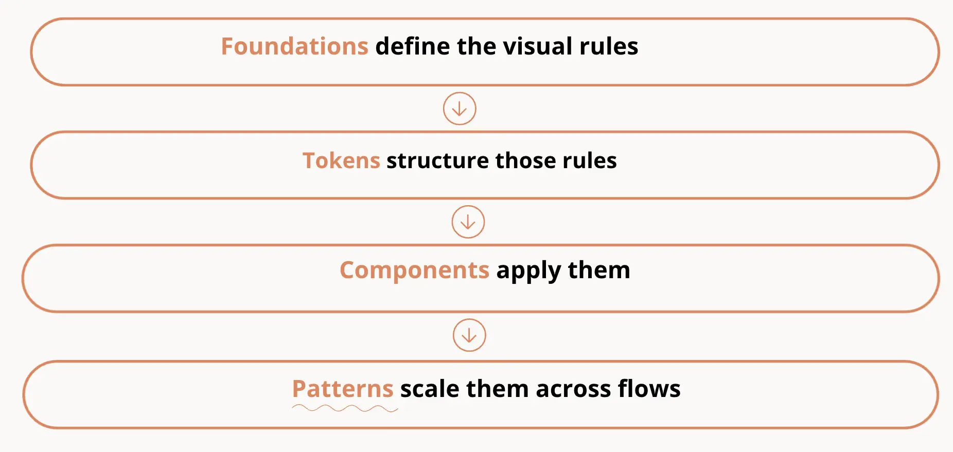
While components solve individual UI problems, pattern libraries address recurring UX challenges.
They define reusable solutions for:
- navigation structures
- onboarding flows
- form interactions
- page layouts
These UX design patterns help teams solve problems consistently instead of reinventing solutions each time.
They’re especially useful for maintaining consistency in user experiences across complex products.
Documentation
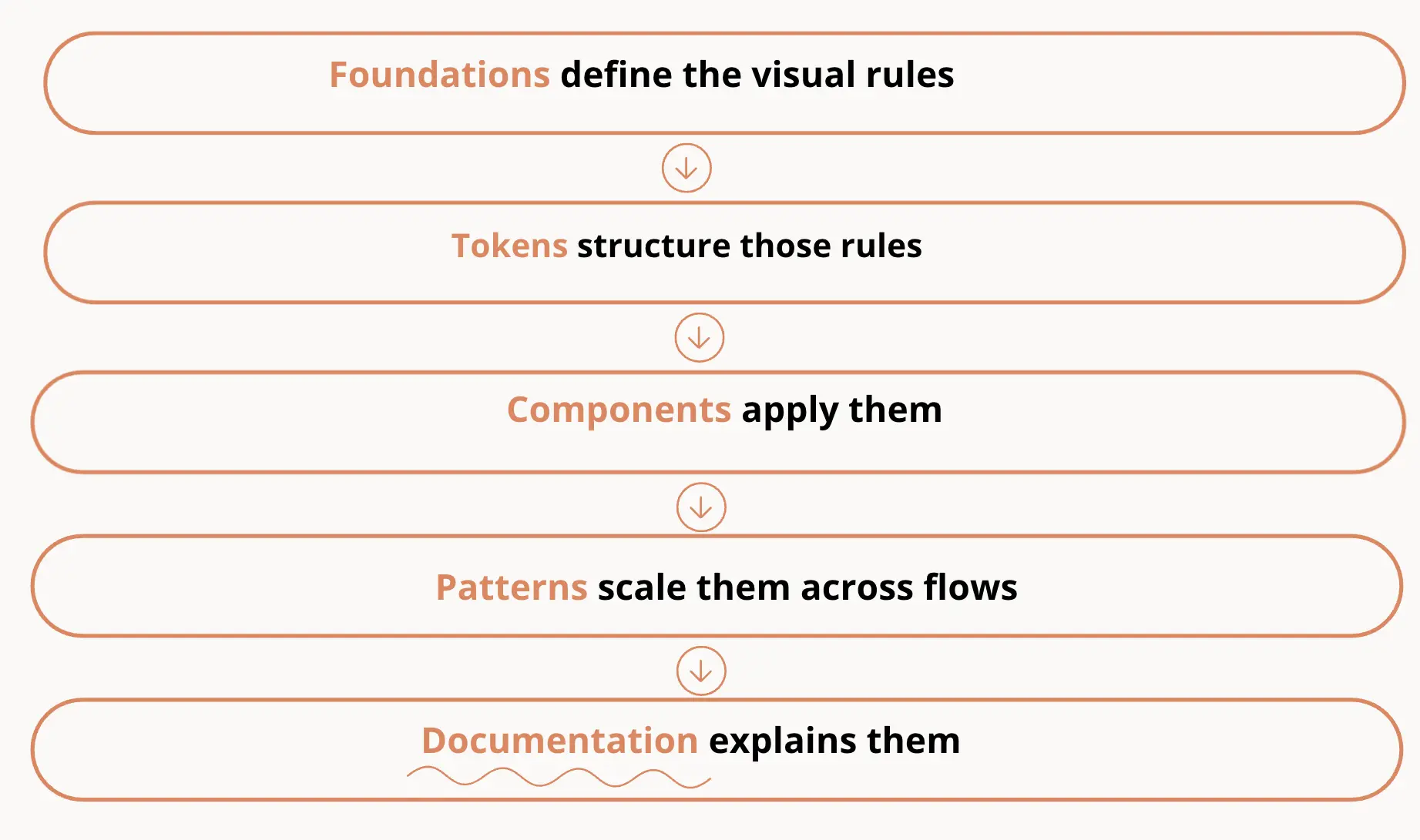
Documentation explains how the system should be used in practice. It typically includes:
- usage instructions
- do’s and don’ts
- design guidelines
- accessibility requirements
Good documentation answers:
- When and how should I use this component?
- When should I not?
- How should it behave?
Without documentation, even well-built components become difficult to use consistently.
This is what turns a system into something the entire design team and developers can rely on.
Governance
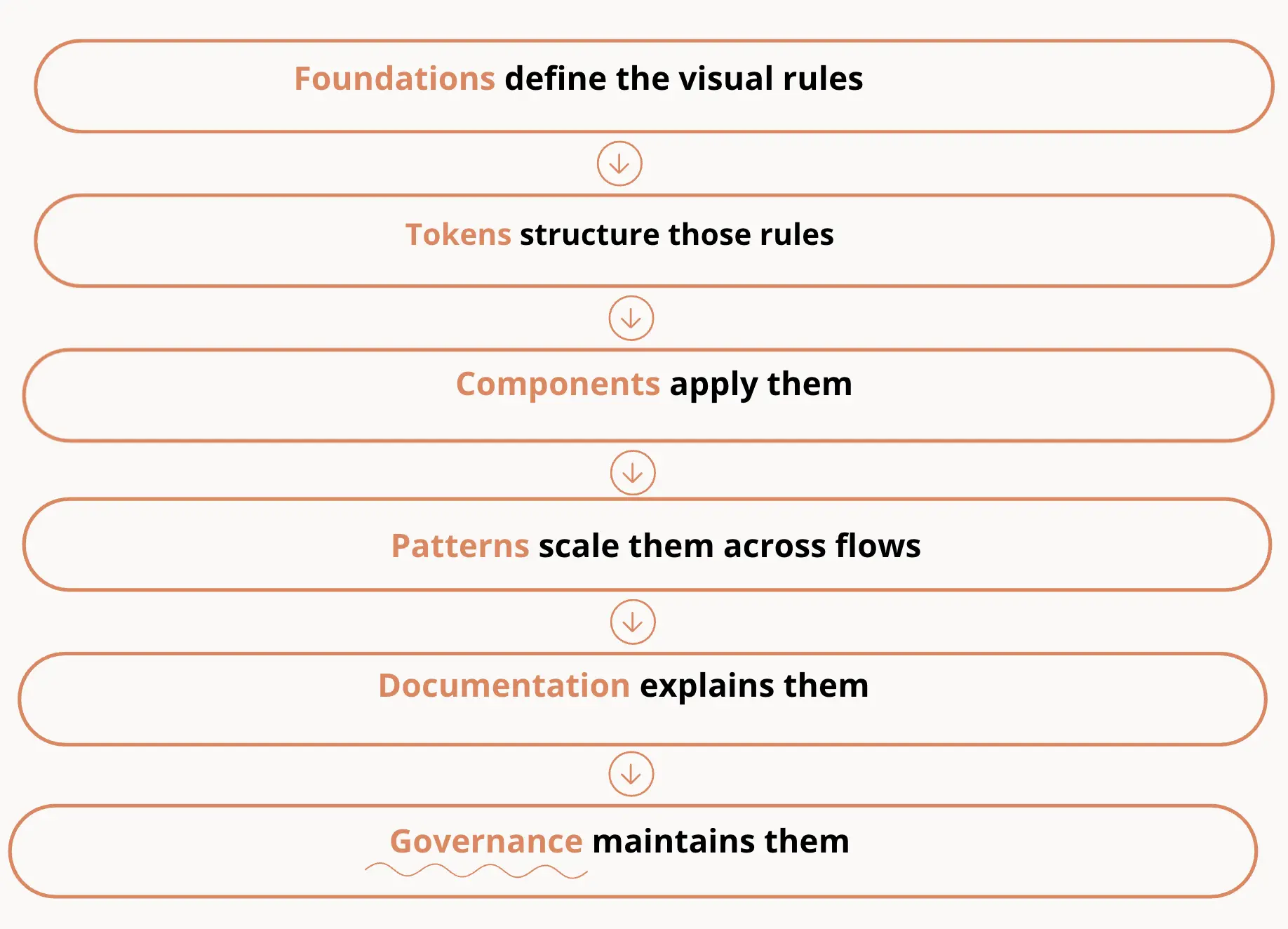
Governance defines how the design system evolves over time. It includes:
- contribution rules
- review processes
- versioning and updates
As products grow, new requirements appear. Governance ensures that changes:
- are consistent
- don’t break existing patterns
- align with the system’s structure
Without governance, systems tend to drift and lose their value.
Each part of a design system supports the others and this creates a connected system where design decisions are not isolated—but shared, reusable, and scalable.
How design systems actually start
Most design systems don’t start as full systems, and looking at real-world design system examples shows that many began as simple style guides or small sets of reusable components
They begin as a response to growing complexity—when designers and developers start noticing repeated work, inconsistencies, and slower development.
At that point, the goal isn’t to build a perfect system.
It’s to bring structure to what already exists.
Step 1: Audit your product
The first step in creating a design system is understanding what you already have.
Start by reviewing your product and identifying:
- repeated ui elements
- inconsistent styles
- duplicated components
- common patterns across flows
This helps you see where standardization will have the biggest impact.
In many real projects, this step reveals multiple versions of the same component—slightly different buttons, inputs, or layouts that evolved over time.
The audit becomes your starting point for building a more consistent system.
Step 2: Define foundations
Once you understand the current state, the next step is defining your visual rules.
This includes:
- color system
- radius
- icons
- typography
- spacing scale
- layout structure
At this stage, teams often introduce design tokens to structure these decisions.
Instead of applying styles manually, you define reusable values that can be applied consistently across the product.
This is what creates a scalable foundation for your design system.
Step 3: Create reusable components
With foundations in place, you can start building reusable components.
Focus on elements that appear most often:
- buttons
- inputs
- navigation
- cards
Each component should:
- follow your defined tokens
- include states and variants
- be reusable across multiple screens
This is where your component libraries begin to take shape.
Instead of designing screens, you’re building a system of building blocks.
Step 4: Document usage guidelines
As components grow, documentation becomes essential.
Teams need to understand:
- when and how to use each component
- how components behave
- what patterns to follow
Clear guidelines help ensure consistency across teams and reduce guesswork.
Without documentation, systems often fall apart—even if the components themselves are well designed.
Step 5: Align design with development
A design system only works if it exists in both design and code.
This means:
- components in design match implementation
- tokens are reflected in code
- naming and structure are shared
Alignment between designers and developers is what turns a visual system into a working one.
Ongoing maintenance
Once the system is in use, the work doesn’t stop. A design system needs continuous updates:
- new components are added
- existing ones are refined
- outdated patterns are removed
Most teams assign ownership to a small group responsible for maintaining the system and supporting its evolution.
Over time, this ensures the system stays aligned with real product needs instead of becoming outdated.
Best practices for building and maintaining a design system UI
There’s no single way to build a design system, but in practice, certain approaches tend to work better than others.
Across different teams and projects, the most effective systems share a few common traits: they start small, evolve with real product needs, and stay closely aligned with both design and development.
The following practices reflect what helps design systems stay useful over time—not just in theory, but in day-to-day work.
Start small and expand gradually

Most teams overestimate how much they need at the beginning.
A better approach is to start with:
- a few core components (button, input, dropdown)
- essential design tokens (colors, spacing, typography)
- minimal guidelines
For example, instead of building a full design system, you might standardize just one area—like onboarding or forms. As those components get reused, the system grows naturally.
This reduces complexity and helps teams adopt the system faster.
Build on existing component libraries when possible

You don’t always need to start from zero.
Many teams use existing component libraries or pattern libraries as a base—then adapt them to fit their product.
For example:
- extending a library inspired by Google’s Material Design
- reusing internal UI patterns already used across multiple features
The goal isn’t originality—it’s consistency and speed.
Collaborate closely with developers

A design system only works if it exists in both design and code.
In practice, this means aligning:
- naming conventions for design tokens
- structure of ui components
- behavior and states
For example, if a button has defined states in design but is implemented differently in code, inconsistencies appear quickly.
Close collaboration between designers and developers ensures the system stays consistent across both sides.
Focus on real product needs rather than theoretical completeness
A common trap is designing for edge cases that don’t exist yet.
Instead, focus on:
- repeated patterns in your product
- frequently used ui elements
- real user flows
For example, if your product relies heavily on forms, prioritize:
- inputs
- validation states
- error handling patterns
This makes the design system immediately useful, rather than something teams ignore.
Treat the system as a living product

A design system isn’t something you “finish.”
It evolves as your product grows:
- new features introduce new components
- existing patterns need refinement
- outdated solutions get removed
For example, a system built for simple flows may later need:
- data-heavy tables
- dashboards
- complex interactions
Regular updates keep the system aligned with real product needs and prevent it from becoming outdated.
Consider partnering with experts

For many teams, building and maintaining a design system internally isn’t always realistic—especially when resources are limited, or priorities shift.
In those cases, working with a design partner like Eleken can help structure the system faster and align it with real development workflows.
For example:
- defining design tokens and foundations
- building scalable component libraries
- supporting teams during system rollout
This approach allows teams to move forward without pausing product development, while still creating a system that scales.
Bringing it all together
A design system is more than a collection of components. It’s a shared framework that helps teams build consistent, scalable digital products without reinventing solutions every time.
At its core, a strong system connects:
- foundations and design tokens
- components and patterns
- documentation and real workflows
Together, these elements create a shared language that improves collaboration between designers and developers and helps teams move faster with fewer inconsistencies.
At the same time, not every product needs a full system from day one. The most effective approach is to start small, focus on real needs, and expand gradually as complexity grows.
If you’re looking to create a design system or bring more structure into your product, having the right support can make a big difference. A partner like Eleken can help you define foundations, build scalable component libraries, and align design with development—so your system works in practice, not just in theory.


.png)

