
Most teams look for design system services only after something breaks. The UI becomes inconsistent, designers rebuild the same components, engineers aren’t sure which version to use, and releases start slowing down.
That’s usually the moment when a growing product finally feels messy enough to hurt.
At Eleken, a UI/UX design agency focused on SaaS products, we see this pattern all the time. As products scale, the chaos grows with them. The number of features increases, designers circle back to the same problems, and the user experience slowly becomes inconsistent.
A design system helps restore order. It allows teams to design faster, ship with confidence, and maintain a consistent product experience as the product grows.
In this guide, we’ll explain what design system services include, when they make sense, how to decide whether you need a full system or something leaner, and what to look for when evaluating a partner.
What are design system services?
Design system services help companies create, improve, or scale a reusable UI foundation across their products and teams. But that description undersells the scope. A real engagement usually goes well beyond "making things look consistent."
Depending on where you're starting from, it might include:
- design audit examples;
- token structure;
- component library development;
- interaction patterns;
- documentation;
- accessibility work;
- design-to-code alignment;
- and a governance model for keeping the system alive after launch.
That's a wide range. Which is exactly why it helps to get clear on what you're talking about before scoping anything.
And if you want to learn more about how a design system can help eliminate design inconsistencies, watch this video. We’ll share practical steps and a free Figma template you can use right away.
Design system vs. UI kit vs. component library vs. style guide
These terms are often used interchangeably, but they represent different levels of design maturity. Here’s a quick way to understand how they compare:
A style guide is the visual rulebook, including colors, typography, spacing, and brand rules. Useful, but mostly static.

A UI kit is a set of design assets, usually in Figma, that helps designers move faster. It looks like a system but often has no connection to production code.
A component library goes further. It's reusable, coded UI components that developers can actually implement. This is where design and engineering start to converge.
A UX design system is all of the above, plus documentation, usage guidelines, governance, and an adoption model. It's a shared language and a living piece of infrastructure.
The table below summarizes the key difference: each level builds on the previous one. A style guide defines how things look, a UI kit provides reusable design elements, a component library turns those elements into reusable code, and a design system connects everything with rules, documentation, and processes.
A lot of teams say "design system" when what they need is a well-organized component library. That's not a failure of ambition. It's just useful information before you invest in something more complex than your situation calls for.
But when consistency, speed, and scalability become critical, teams often need more than internal fixes. That’s when they start looking for experienced partners to help build and scale their systems.
Top 7 design system service providers for scalable UX
Many agencies claim to build design systems, but the real value lies in aligning design, engineering, and product teams around a shared structure that can scale with the product. Here are several providers known for helping companies create and maintain effective design systems.
1. Eleken: best for SaaS design systems
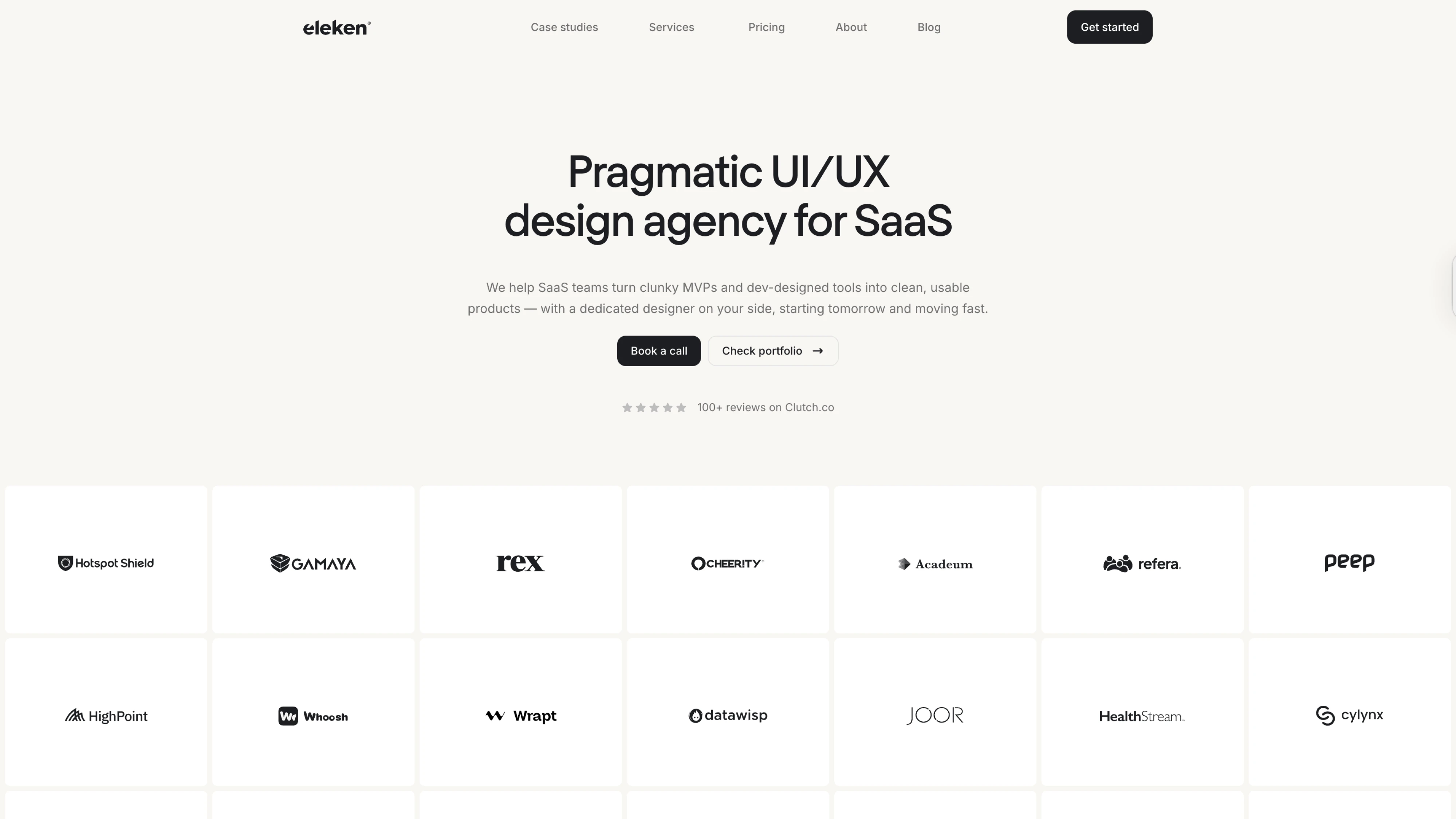
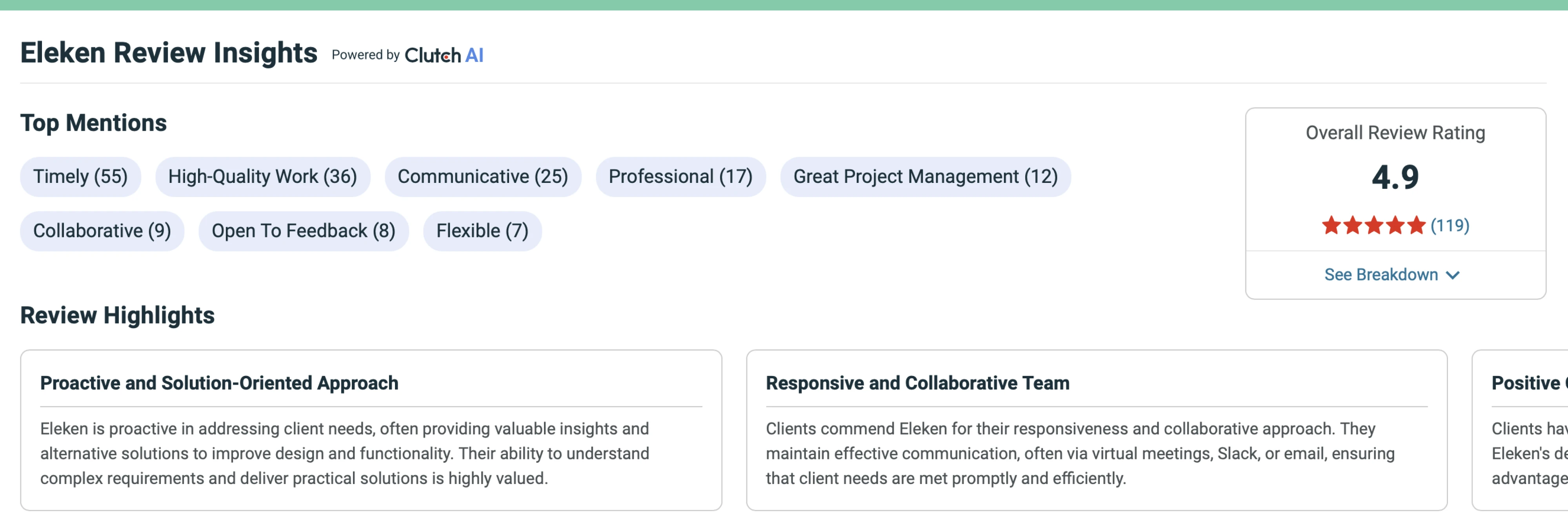
Eleken is a design system agency focused on SaaS UX and scalable product interfaces. Founded in 2015 and operating as a distributed team originating from Kyiv, the company has worked on 200+ projects and maintains a 4.9 Clutch rating from 111+ reviews.
What sets Eleken apart from general design agencies is its focus on the specific complexity of B2B SaaS products, such as data-heavy dashboards, multi-module platforms, and workflows, where inconsistent UI quickly creates downstream costs for product teams.
Rather than delivering static design assets, Eleken focuses on systems that teams can use.
Typical design system services include:
- Design system audits
- UI component libraries
- Token and foundation setup
- Design-to-development alignment
- Figma libraries and documentation
- Governance recommendations
- Design system expansion for growing products
Their subscription-based model gives SaaS companies access to vetted designers trained in Eleken’s internal UX process. Designers work independently but receive senior design oversight, ensuring consistent quality and faster delivery.
Eleken is particularly strong in complex SaaS interfaces such as analytics dashboards, AI tools, geospatial platforms, and developer products, helping teams move faster while maintaining consistency as their product grows.
2. Zeroheight: design system documentation and governance
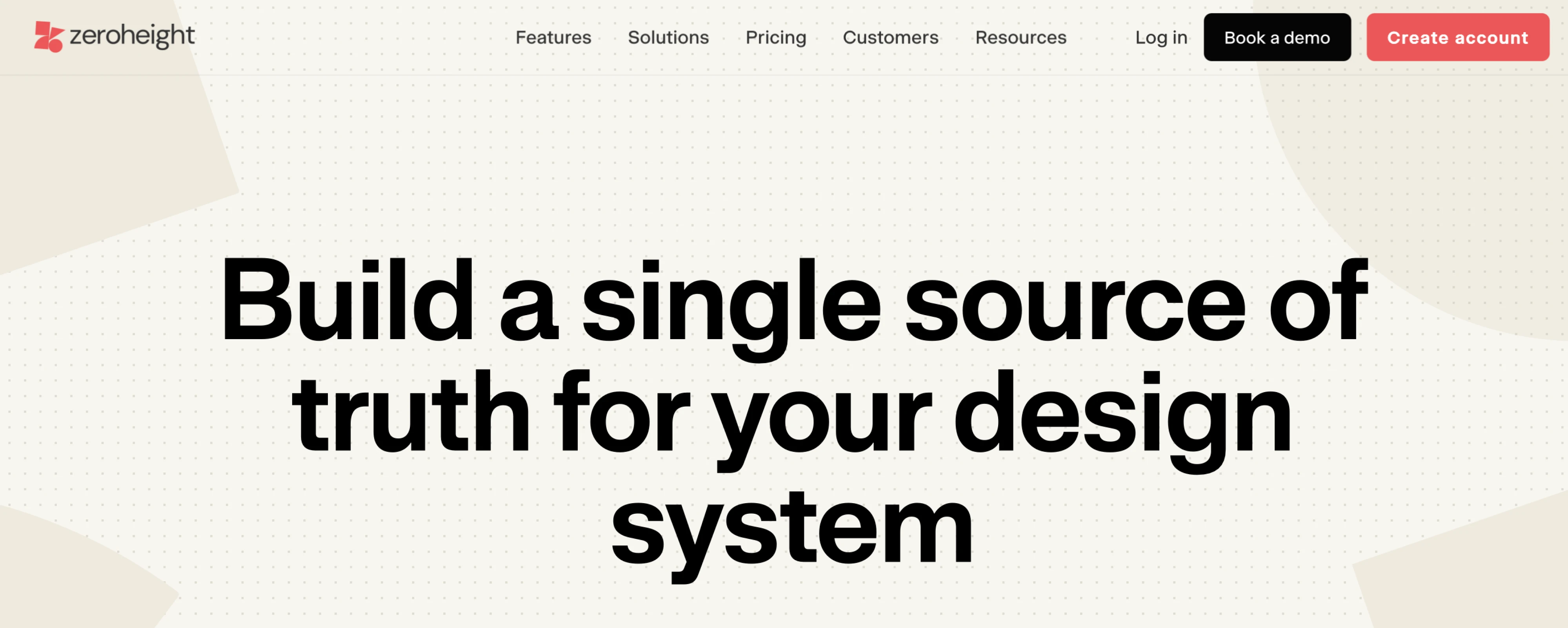
Zeroheight is a platform and design system consulting focused on design system documentation, adoption, and governance. Rather than building design systems from scratch, the company helps teams structure, document, and scale existing systems so they remain usable across large organizations.
What makes Zeroheight distinctive is its focus on design system adoption and maintainability. Their platform integrates with tools like Figma, Storybook, and code repositories to create a single source of truth where designers, developers, and product teams can access components, guidelines, and UX design patterns.
Here are typical design system services:
- Design system documentation platforms
- Design-to-code documentation integration
- Component usage guidelines and governance frameworks
- Design system adoption strategies
- Cross-team collaboration workflows
- System maintenance and scaling support
Zeroheight is particularly valuable for large teams that already have a component library but struggle with documentation, onboarding, and long-term system governance.
3. Ramotion: best for brand-driven design systems
Ramotion is a design studio focused on scalable digital product experiences and structured design systems for technology companies. Founded in 2009, the agency works with startups and enterprise tech brands to build cohesive product ecosystems that combine strong UX foundations with distinctive visual identity.
What sets Ramotion apart is its emphasis on connecting product design systems with brand systems. Rather than treating UI components and brand guidelines separately, they design systems where interface components, motion, typography, and visual language are tightly aligned with the company’s brand identity.
Typical design system services are as follows:
- Design system architecture and UI component libraries
- Brand-driven UI frameworks
- Figma libraries and documentation
- Interaction and motion guidelines
- Scalable design patterns for digital products
- System implementation guidance for product teams
Ramotion is often a good fit for technology companies that want their design system to reinforce a strong brand identity, especially for products where visual differentiation and brand consistency are as important as functional UX structure.
4. ProCreator: best for multi-brand and white-label design systems
ProCreator is a product design studio and design systems consultancy that focuses on enterprise platforms and complex multi-product ecosystems. The agency works with organizations that manage multiple brands, products, or client-specific platform variations, helping them structure scalable design systems that remain consistent across environments.
What distinguishes ProCreator is its emphasis on modular and adaptable component architecture. Their systems are designed to support scenarios like white-label platforms, multi-brand products, and configurable enterprise software where the same core product must serve different clients or business units.
Typical design system services include:
- Modular UI component libraries
- Multi-brand and white-label design systems
- Scalable design tokens and foundations
- Pattern libraries for complex enterprise workflows
- Documentation and governance guidelines
- System maintenance and expansion support
ProCreator is particularly well-suited for organizations managing multiple product variants or brands, where a flexible design system is needed to maintain consistency while allowing customization for different markets or clients.
5. Superside: best for enterprise design operations
Superside is a creative services platform that provides design support through a subscription-based model, working primarily with enterprise and high-growth companies. Their global team delivers a wide range of design services, including product design, branding, marketing assets, and design systems.
What differentiates Superside is its ability to support design consistency across multiple business functions at once. Instead of focusing only on product interfaces, Superside often helps companies align product design systems with brand and marketing design, ensuring a cohesive experience across apps, websites, campaigns, and other customer touchpoints.
Typical design system work includes:
- Cross-platform design system development
- UI component and pattern libraries
- Brand and product design alignment
- Figma libraries and shared design assets
- Documentation and system governance
- Ongoing system maintenance and expansion
Because of its scale and multidisciplinary teams, Superside is typically a strong fit for large organizations that need to maintain design consistency across product, brand, and marketing channels simultaneously.
6. Clay: design systems for product-led companies
Clay is a global product design agency that works with both consumer and enterprise software companies, helping them build cohesive digital products supported by scalable design systems. The studio combines product UX, brand design, and system architecture to create experiences that are both functional and visually refined.
What sets Clay apart is its emphasis on high-end visual design integrated with structured product systems. Rather than treating a design system as purely technical infrastructure, Clay focuses on making it a natural extension of the product’s visual identity and overall user experience.
Here are typical design system services:
- Design system architecture and component libraries
- Scalable UI frameworks and pattern libraries
- Design tokens and visual foundations
- Figma libraries and detailed documentation
- Brand-to-product design alignment
- System governance and scaling guidance
Clay is particularly well-suited for companies that want a design system tightly integrated with a polished product experience, especially teams where visual quality, brand expression, and product consistency need to evolve together.
7. Netguru: design systems for scalable digital products
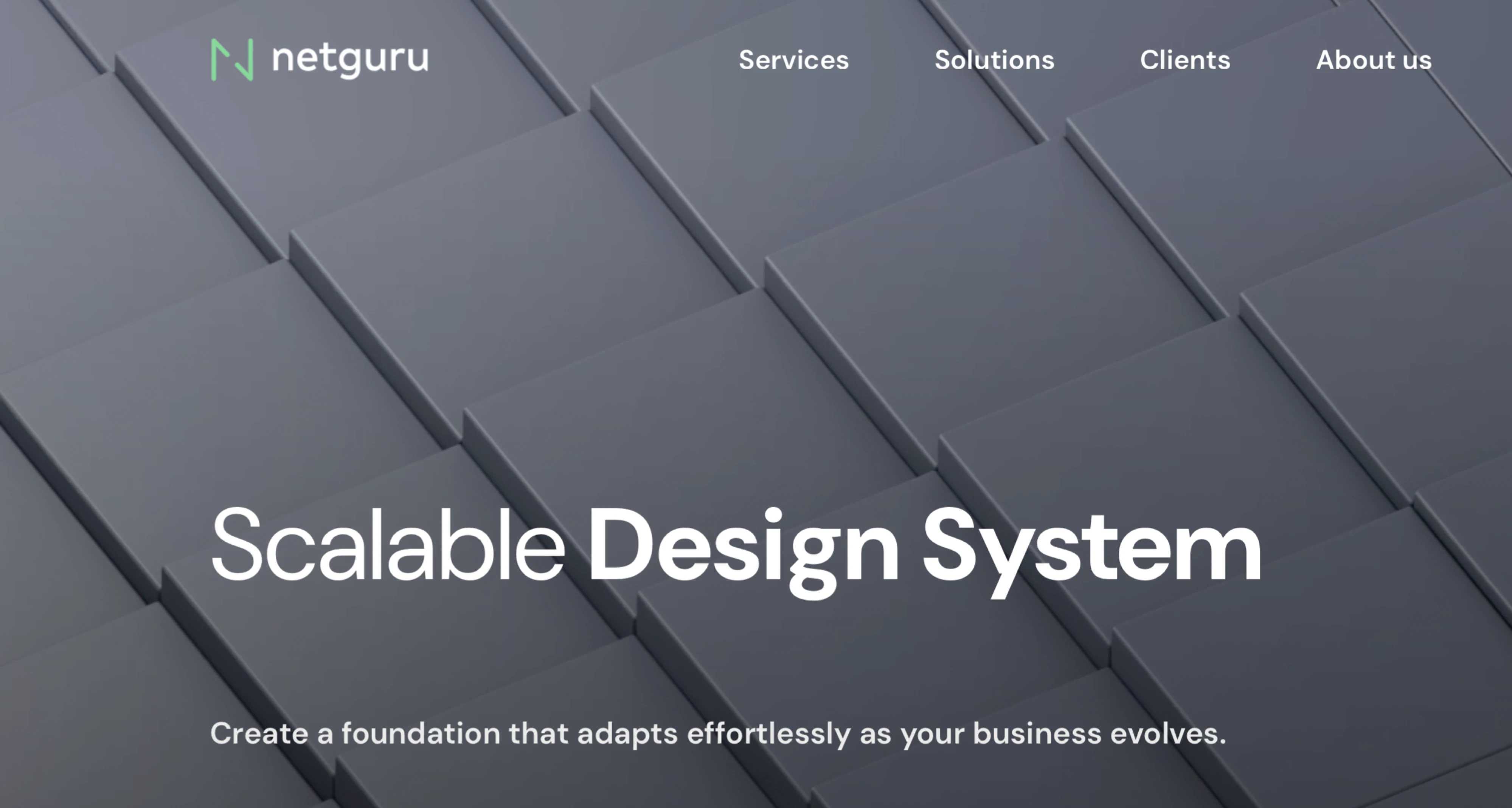
Netguru is a global digital product and design system consultant that helps companies build scalable design systems alongside product design and engineering workflows. Working with startups, scale-ups, and enterprise clients, the agency focuses on creating systems that support long-term product growth and cross-team collaboration.
What distinguishes Netguru is its focus on connecting design systems with development workflows. Their teams often work across both design and engineering environments, ensuring that component libraries, design tokens, and documentation translate cleanly into production code.
Typical design system services include:
- Design system strategy and architecture
- UI component and pattern libraries
- Design tokens and foundations
- Figma libraries and documentation
- Design-to-development integration
- System governance and scaling support
Netguru is a strong fit for product-led companies building complex digital platforms, particularly organizations that want their design systems tightly aligned with development processes and long-term product scalability.
Different agencies approach design systems in different ways. But the reason companies look for these services usually comes down to a similar set of challenges. Let’s look at them in more detail.
Why companies invest in design system services
There’s usually a tipping point. It rarely happens overnight. Instead, friction slowly accumulates until someone finally says, “We need to fix this properly.”
Here are the most common signals that teams have reached that point:
- Inconsistent UI starts slowing teams down.
When designers and squads build similar components in isolation, you end up with duplicated work and a product that feels slightly off depending on where you are in it. Users notice, even if they can't articulate why.
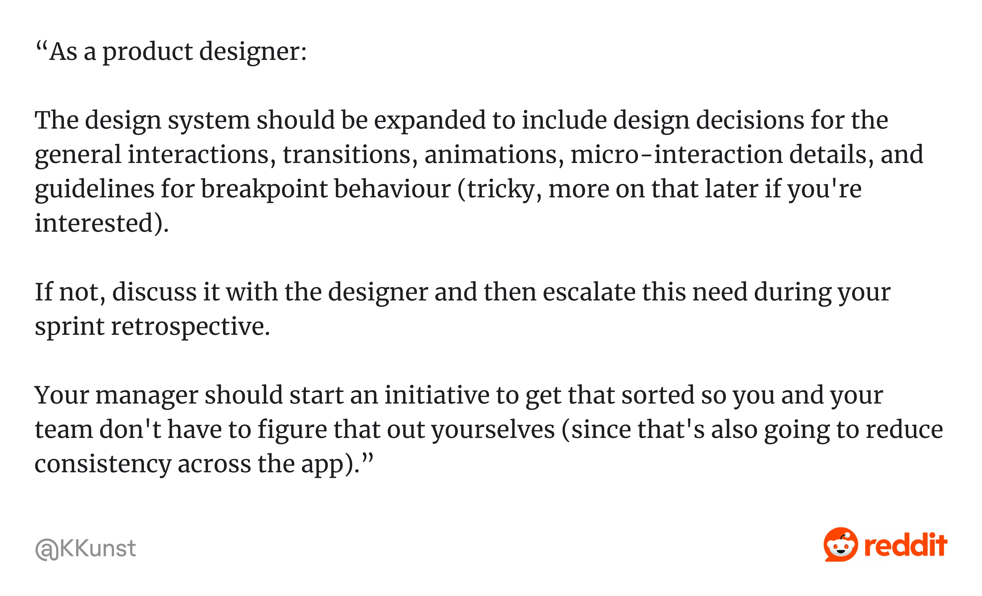
As one product designer on Reddit explained: “...The design system should be expanded to include design decisions for the general interactions, transitions, animations, micro-interaction details, and guidelines for breakpoint behaviour… Your manager should start an initiative to get that sorted so you and your team don't have to figure that out yourselves (since that's also going to reduce consistency across the app).”
Without that shared system, teams often end up inventing solutions on the fly, which is exactly how inconsistency spreads across a product.
- Design and engineering stop speaking the same language.
The Figma library drifts from production. Component names diverge. Handoffs get messy because no one's working from the same source of truth. This is one of the most common and most quietly damaging things that happens to growing product teams.
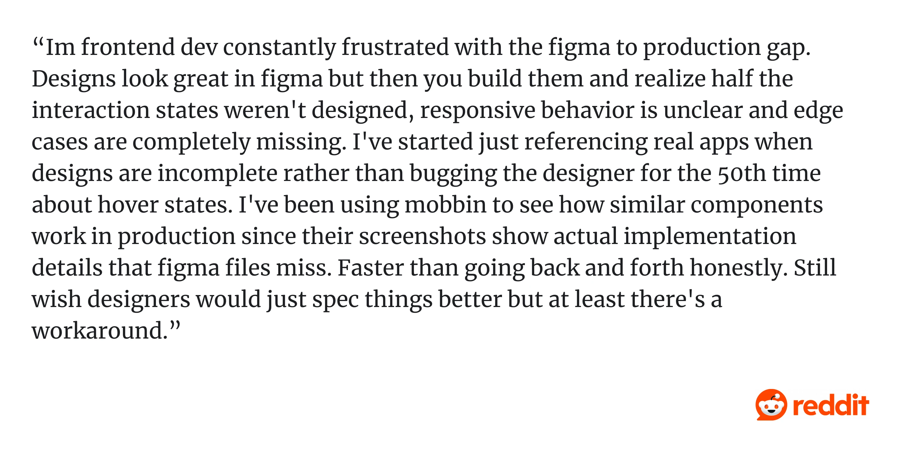
As one Reddit user shared: “...Designs look great in figma but then you build them and realize half the interaction states weren't designed, responsive behavior is unclear and edge cases are completely missing…”
- Product scope outgrows the system underneath it.
What worked fine with two designers and a small dev team starts showing cracks when you add more contributors, new modules, or multi-brand requirements. The structure that felt fine at one scale becomes a liability at the next.
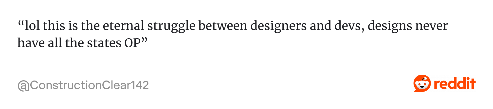
As one Redditor put it: “lol this is the eternal struggle between designers and devs, designs never have all the states OP”.
When products grow without a structured system behind them, teams end up improvising solutions. Over time, those small gaps accumulate into inconsistent patterns and harder-to-maintain interfaces.
- Design debt becomes genuinely expensive.
Every feature takes a little longer. Quality gets inconsistent. Accessibility depends on whoever happens to care that sprint. And the longer you wait, the worse the cleanup.
As one Redditor just asked: “Have you tried asking for a design system or component library? That usually covers the basic states”.
It’s a simple suggestion, but it points to the real issue. Without shared components and documented states, teams keep solving the same UI problems over and over again.
When these problems accumulate, it’s usually a sign that the product has outgrown its current design structure.
Signs you may need design system services
Here's a practical list. The more of these that apply, the stronger the case for outside help.
- Multiple designers or squads are building similar components in different ways.
- Engineers are rebuilding the same interface patterns from scratch, repeatedly.
- Your Figma files and production UI no longer match.
- Every new screen starts from a partial reinvention rather than existing patterns.
- You're preparing for a rebrand, a platform expansion, or product consolidation.
- You're supporting multiple products, tenants, or brands under one roof.
- Accessibility and consistency depend on individual contributors rather than the system.
- Designers are spending more time policing consistency than actually designing.
That last one is worth pausing on. When designers become the consistency enforcement layer, manually checking that everyone used the right spacing, the right color, the right component, that's a structural problem. The system should be doing that work, not the people.
For example, when we at Eleken worked with the graph intelligence platform Cylynx, the product had already grown complex, but the interface patterns were still evolving ad hoc. By introducing a structured design system foundation and reusable UI components, we helped the team standardize how features were built, while supporting a human-centered design approach that made the platform easier for analysts to use.
How to evaluate a design system service provider
A design systems agency list gets you started. What matters more is whether a specific partner fits your situation. Here's a practical framework.
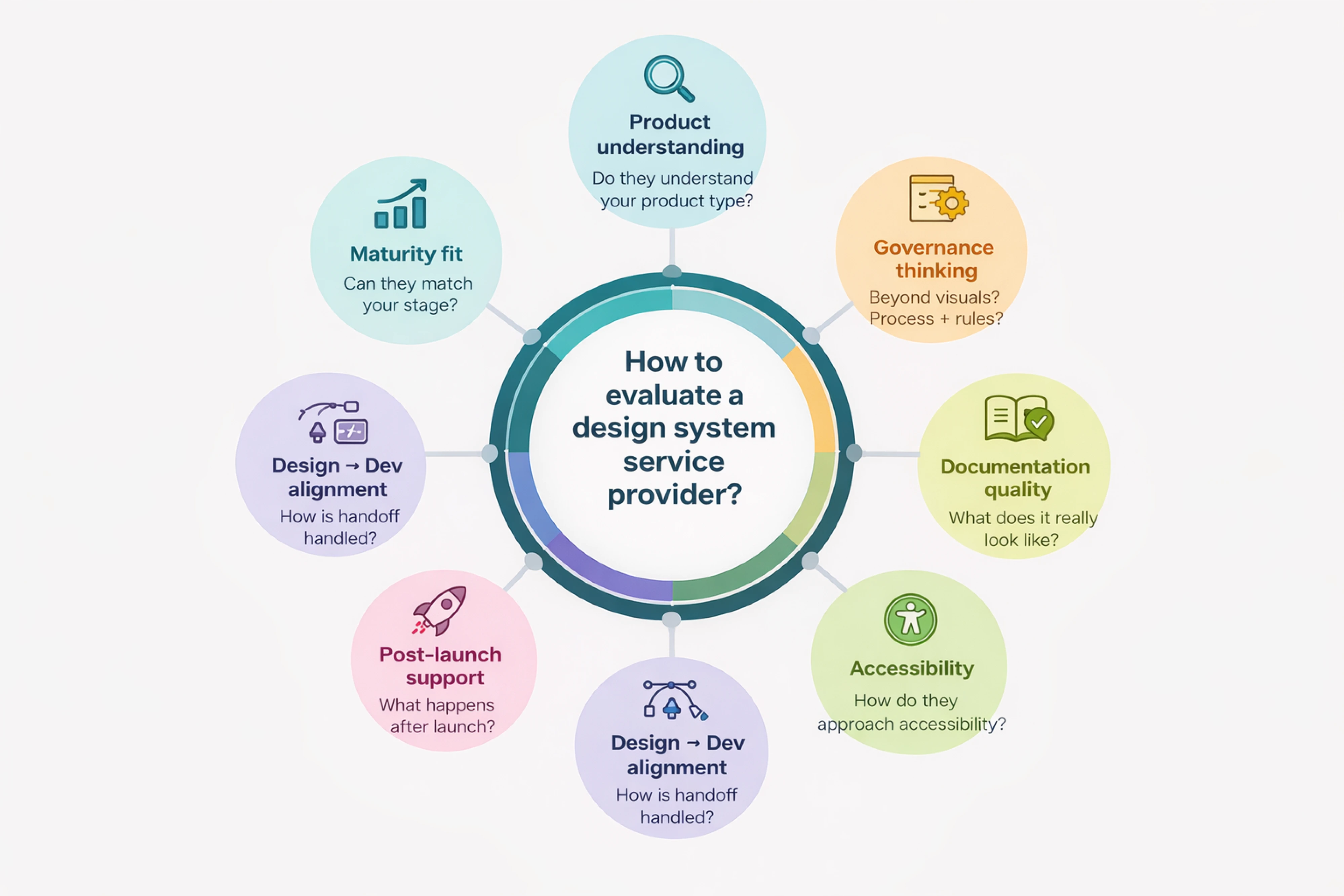
- Can they match the service to your maturity level?
You don't want an enterprise-heavy process if you're a startup that needs a lean system. Ask how they've worked with companies at different stages and what those engagements actually looked like.
- Do they understand your product type?
SaaS, enterprise software, multi-brand platforms, and consumer apps have genuinely different needs. Past experience in your category matters more than a general portfolio of nice-looking work.
- How do they handle design-to-development alignment?
This is where a lot of systems quietly fall apart. Ask specifically about component naming conventions, token structure, Storybook integration, and how they keep Figma and production in sync over time.
- Do they think about governance, not just visuals?
A beautiful component library without a governance model is a system that will drift. Ask who owns updates, how new components get added, and what the product design process looks like when the team grows or changes.
- What does their documentation actually look like?
Ask to see real design systems examples. Usage guidance, when to use something, when not to, edge cases, interaction states, and design principles examples that explain why components exist and how they should be used look very different from a component showcase with labels attached.
- How do they approach accessibility?
It should be built into components from the start. Ask about the process, not just whether they mention it on their website.
- What happens after launch?
Maintenance, versioning, adoption, support. A system handed off without a plan for how it evolves will stagnate or get abandoned. The best partners think beyond delivery.
Build the system your team can use
Do you need a full design system or simply the right level of systemization? This is the question you should ask first. Not every team needs an enterprise-grade system.
In fact, over-engineering too early is one of the most common mistakes. The right approach depends on your product complexity, team size, and how closely design and engineering already work together.
For smaller teams or early-stage products, a lean component library with core styles, reusable components, and light documentation is often enough. It’s faster to build, easier to maintain, and far more likely to be adopted.
As products and teams grow, a full design system with components, tokens, documentation, and governance becomes more valuable for maintaining consistency and scaling design-driven development.
The key is starting at the right level for your stage and expanding intentionally over time.
If you’re unsure where your product stands, the best first step is often a design system audit. Eleken helps SaaS teams evaluate what they have, identify gaps, and build systems that scale without unnecessary complexity. Talk to our design experts.


