Newton360
How we built a design system that scaled design and development together
Newton360 is a workforce management app for EMS teams. We had already worked with this product, and you can read how we redesigned it in our full case study. But there’s a part of that story we haven’t talked about yet — the unified design system we built from scratch alongside it.
Newton360 is a product with complexity: two platforms, multiple user roles, dark and light themes, and a growing set of components that needed to reflect the brand.
When we started, there was no design system in place, literally nothing. And without that foundation, some very familiar problems were already taking shape:
- Lack of a shared visual language led to inconsistent UI across the product.
- Changing something small meant hunting it down manually.
- Without component documentation, developers had to guess or stop and ask.
- Every handoff or new team member required starting from scratch.

Creating a design system wasn’t a direct request from the client. Our designer saw that emerging gaps and knew a design system would solve them. We proposed the approach, the client approved, and we got to work.
This was our first time outsourcing this kind of work, so we weren’t sure what to expect, but Eleken thoroughly impressed us throughout the engagement.
Integrator & EVP at VLI Tech
We turned early screens into a scalable system
For Newton360, we started with screens. During the trial phase, we created several distinct visual directions for the client to react to. Once we aligned on what fit the product, we began building a scalable design system.
It was an ongoing process. As we designed new screens, we identified new components and added them to the system.
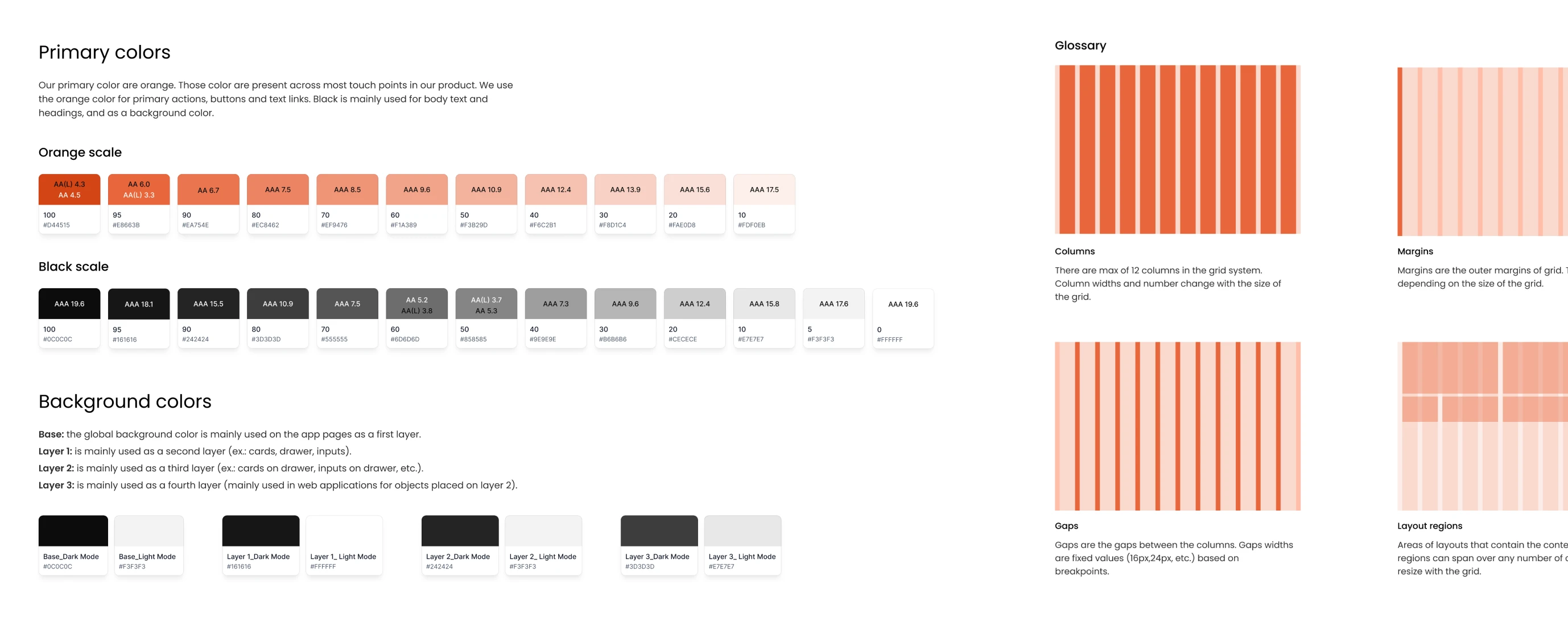
And it all started with the foundation layer:
- Colors — the full palette, including primary, background, and status colors.
- Typography — font sizes, weights, and line heights across all text styles.
- Border and radius — stroke widths and corner rounding across components.
- Grids and spacing — a consistent scale for margins, paddings, and gaps.
One-click design updates with reusable tokens
Our designer built the system around foundation elements, namely tokens. Every component (buttons, inputs, cards, dropdowns) references them, so a single change at this level updates the entire product and keeps it visually consistent.
In practice, if we agreed with the client to shift the primary color or change the border radius, one update can be carried through every screen automatically.
For developers, it worked the same way. Our designer gave each token a clear, logical name, like “Orange 100” or “Primary Color”, so there was never any guessing about what something was or where it was used.
They could export the full token set as a JSON file and plug it straight into code. If a value changed, they only had to update it once, speeding up development.
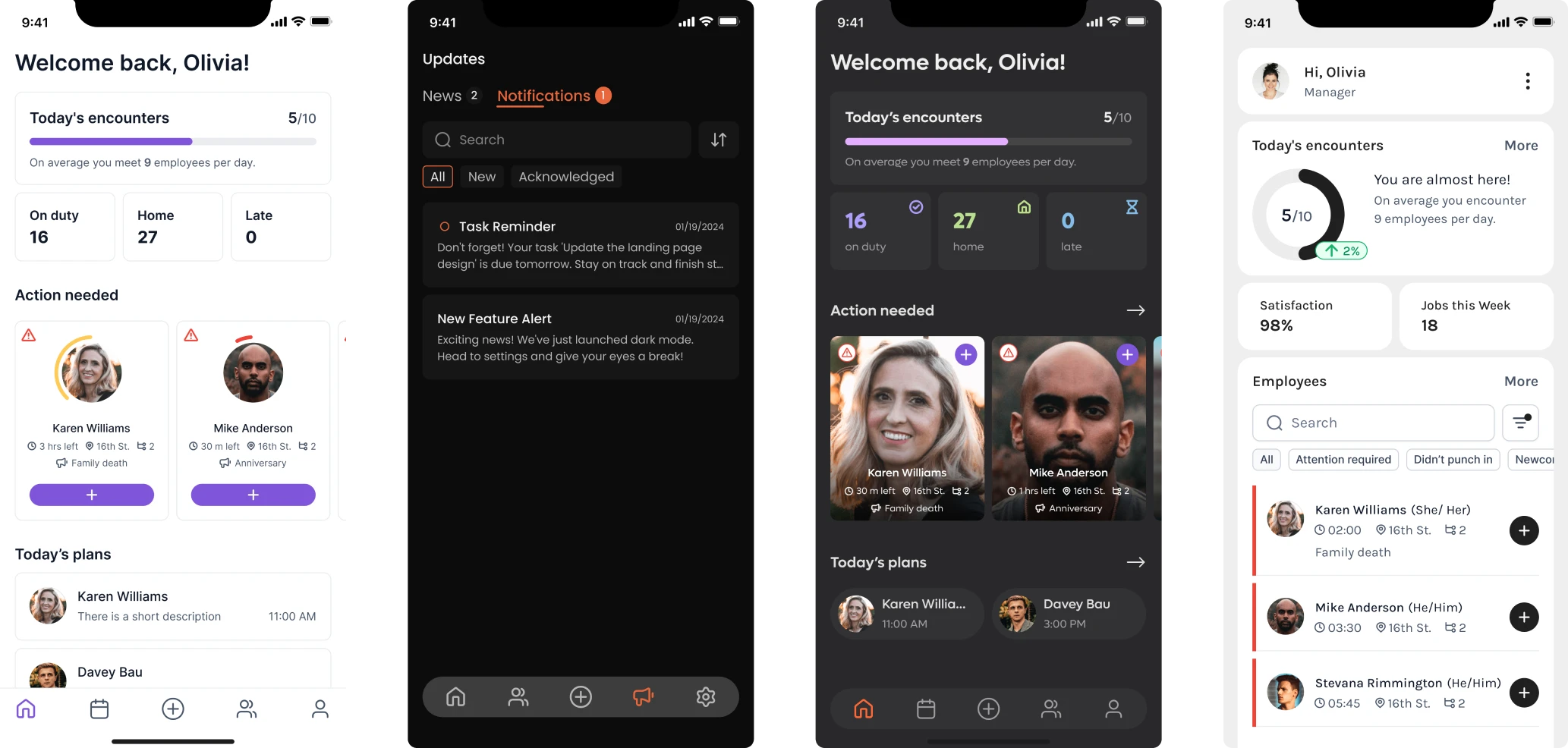
Automatic light and dark theme switching
The default theme for Newton360 was dark, and our designer built all the screens around it. At some point, the client asked for a light theme as well, which could have meant revisiting every screen from scratch.
Instead, our designer set up variable modes in the design system, assigning a separate set of color values to the light theme. Once that was done, switching the entire product from dark to light was a single click. Dragging a component from a dark-mode frame into a light-mode frame changed its colors automatically.
This saved us a significant amount of time. We could focus on what actually mattered — solving real UX problems for the product.
Detailed breakdown of each component
Beyond the design system, our designer wrote detailed documentation for every component. As a result, throughout the project, developers never came to her with questions about how something worked.
Each component breakdown covered:
- Anatomy — the structure of each component and what every element inside it does.
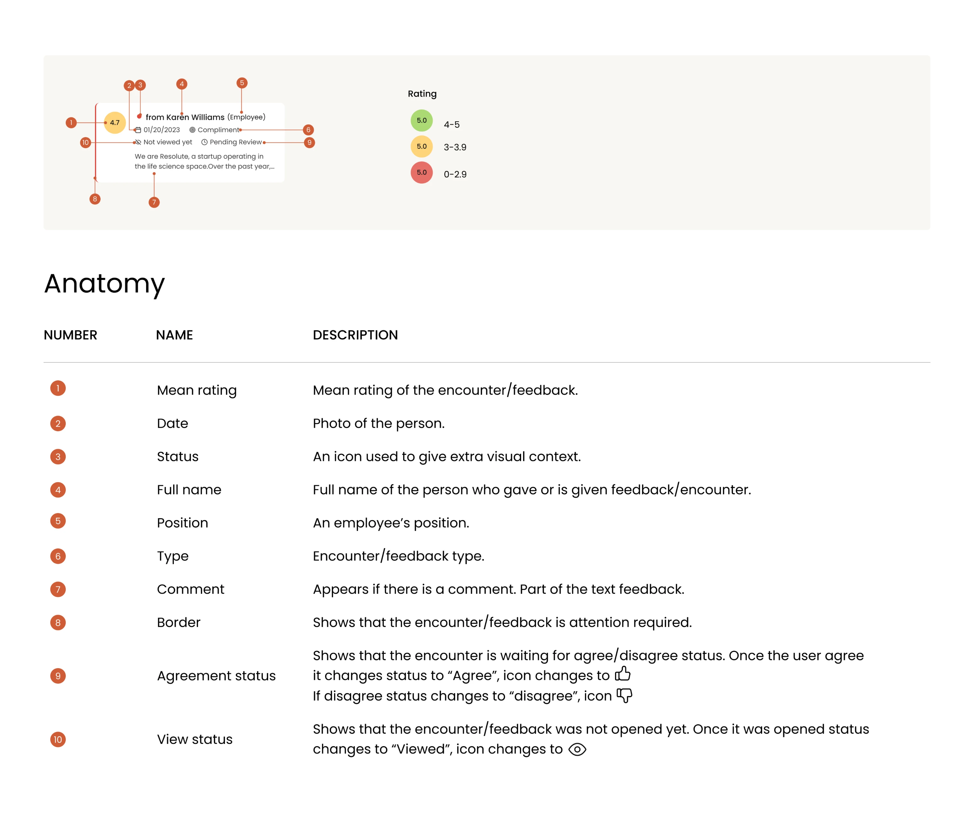
- Use cases — where and how the component should be used in the product.
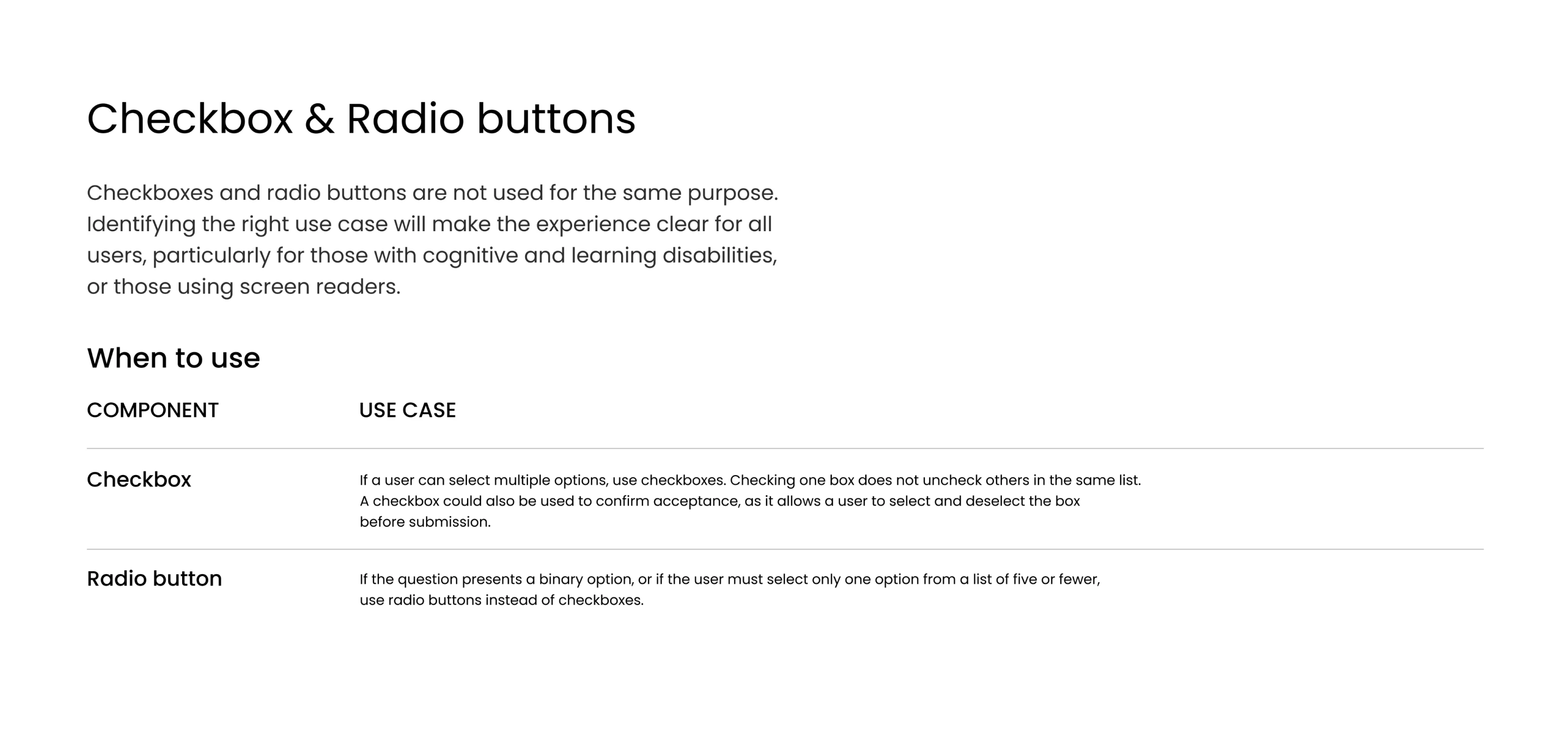
- Do’s and don’ts — clear examples of correct and incorrect usage, with explanations.
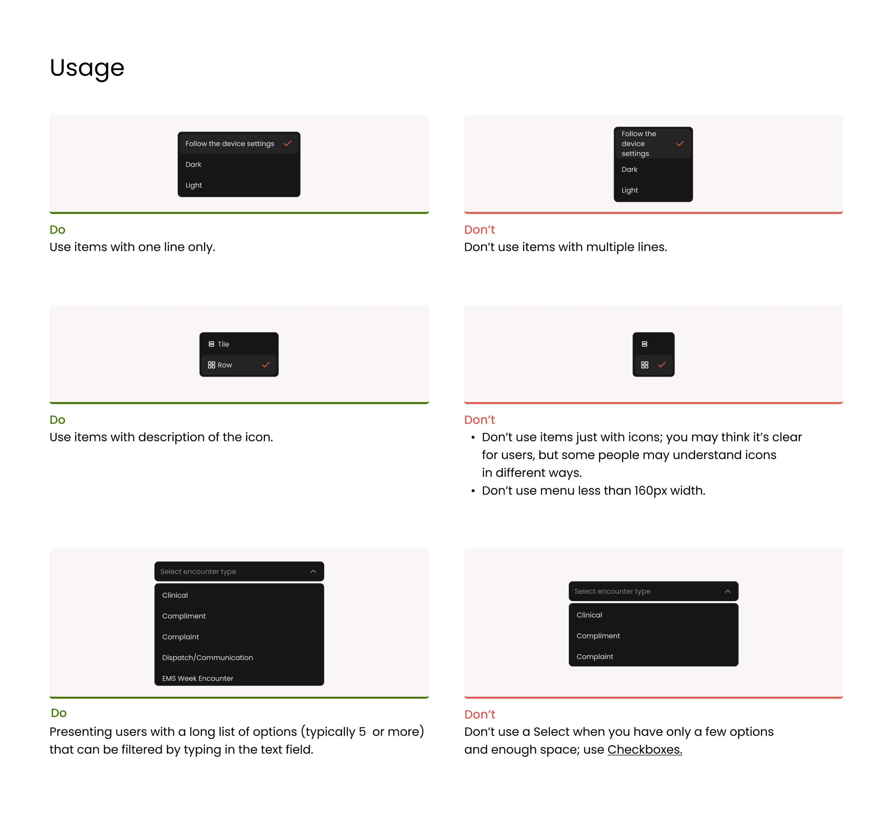
- Naming conventions — consistent labeling so designers and developers speak the same language.
- Behavior — how the component responds to different states, content lengths, or interactions.
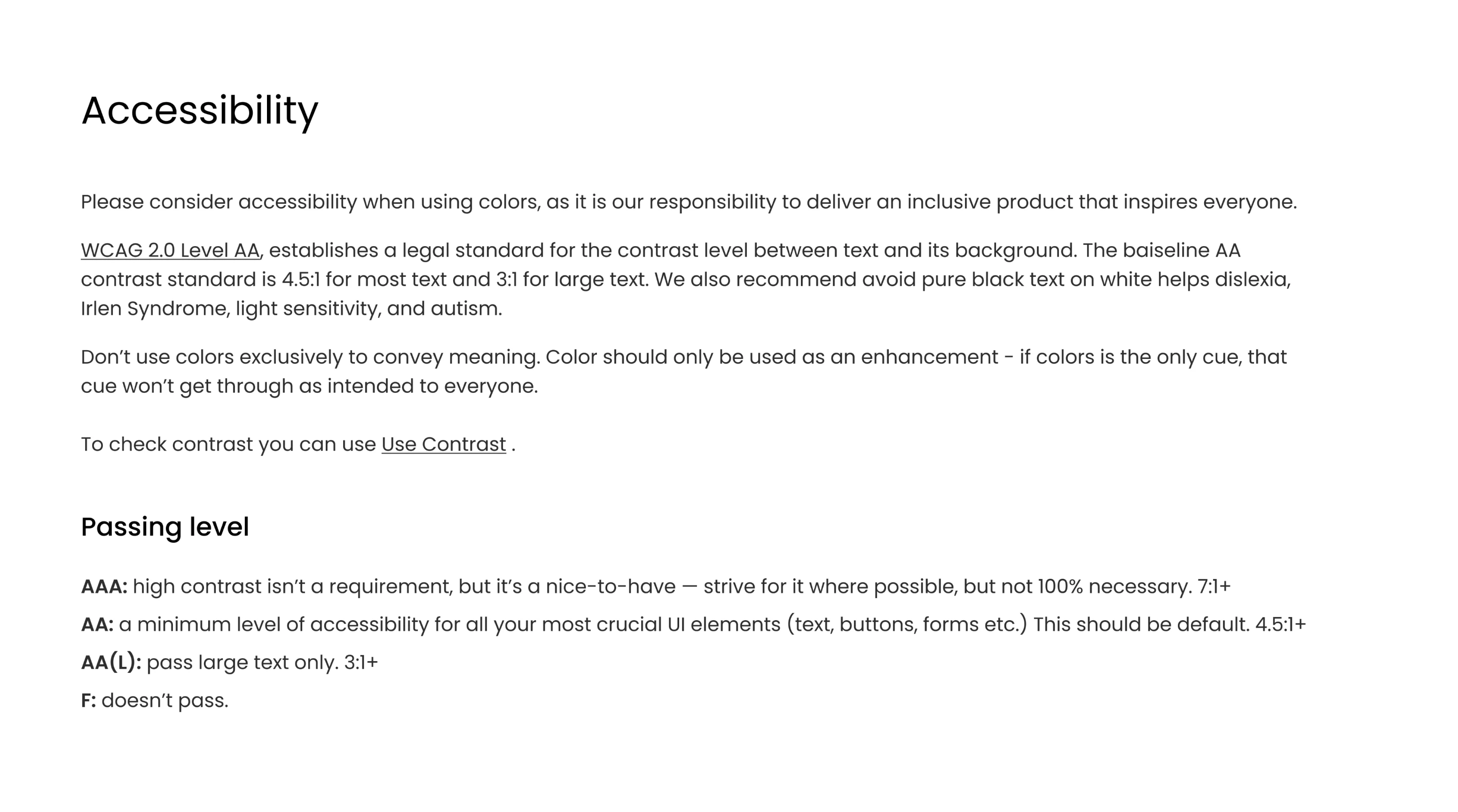
- WCAG compliance — contrast ratios and accessibility notes for every color combination.
Our designer wrote everything in plain language, intentionally avoiding technical jargon. Whether a developer was implementing a component or a stakeholder was reviewing a design decision, all they needed was already there.
Our designer actually went above and beyond and provided lots of recommendations and guidance on some of the specifics of the design.
Integrator & EVP at VLI Tech
When the client came back, we resumed work in minutes
During full-time engagement, our designer worked on the design system in parallel with the mobile app and web redesign. The client was happy with the results, and some time later came back for a part-time collaboration.
Picking up where we left off took no time at all, as our designer had the design system at hand. She could jump straight into delivering new designs from day one.
As the product grows, so does the system. Every new component that appears gets added to the design system, keeping it current and ready for whatever comes next.