


In the early days of online mapping, MapQuest ruled the space — until Google Maps came along and made it obsolete almost overnight. The difference wasn't just technology. It was design. A cleaner, more intuitive interface was enough to shift millions of users and never look back.
That's the power of UI/UX in SaaS. Being first isn't enough — you have to be better to use.
At Eleken, we live and breathe SaaS design, and over 10 years designing for a variety of cloud industries, we've built up a library of products that genuinely inspire us. In this post, we're sharing our favorite SaaS application interface design examples (desktop and mobile) — each one worth studying for a specific reason — so you can take something useful back to your own product.
#1. Intercom's complex menu
When asked about her favorite SaaS UI design examples, the first thing our senior designer mentioned was Intercom.
"In this case," she says, "It's hard to point out just one specific feature. It's the general feel. However, if I have to choose, it's how they work with complex data and organize it, and the menu is the best illustration. The tables and schemes of the menu look great. It can be used as a template for literally any SaaS app or page. In fact, at Eleken, we used it as a reference quite a lot (well, I used it for a project, and then junior designers started doing it as well). There's nothing unnecessary there, the design is not new but still looks modern. They were among the first to use blue for the contrast, and it still works as well. So, if you need web design inspiration for a SaaS product, Intercom is your go-to choice regardless of the niche."
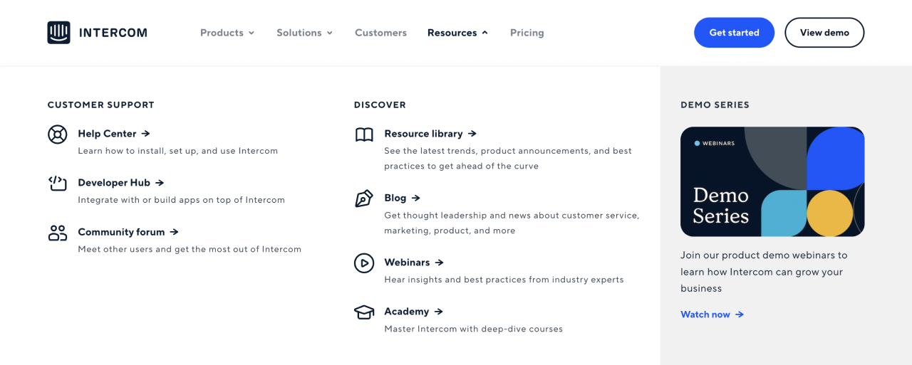
What we can learn from this SaaS design
- a clean look-and-feel is the most important aspect of a successful UI for SaaS;
- take a note of how Intercom organizes their complex, many-layered menu;
- using one color for contrast (for example, in buttons) will never get old;
- don't be afraid to look for design references outside of your niche and industry, including strong web design examples that solve similar complexity in different contexts.
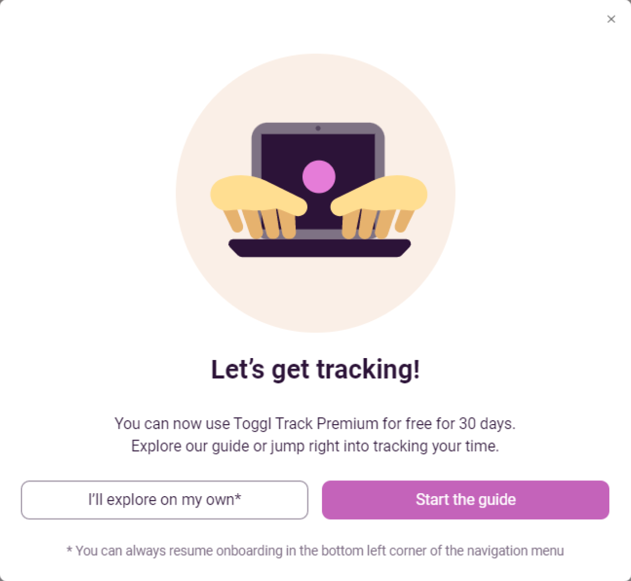
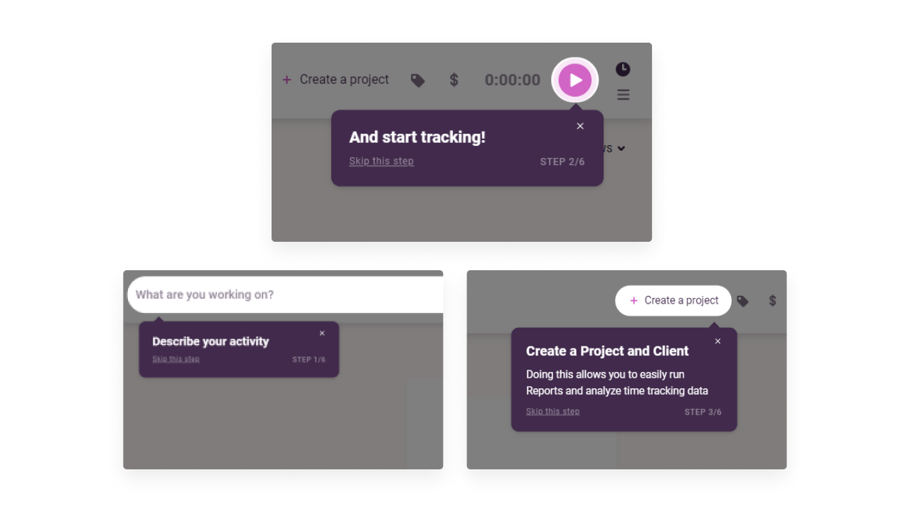
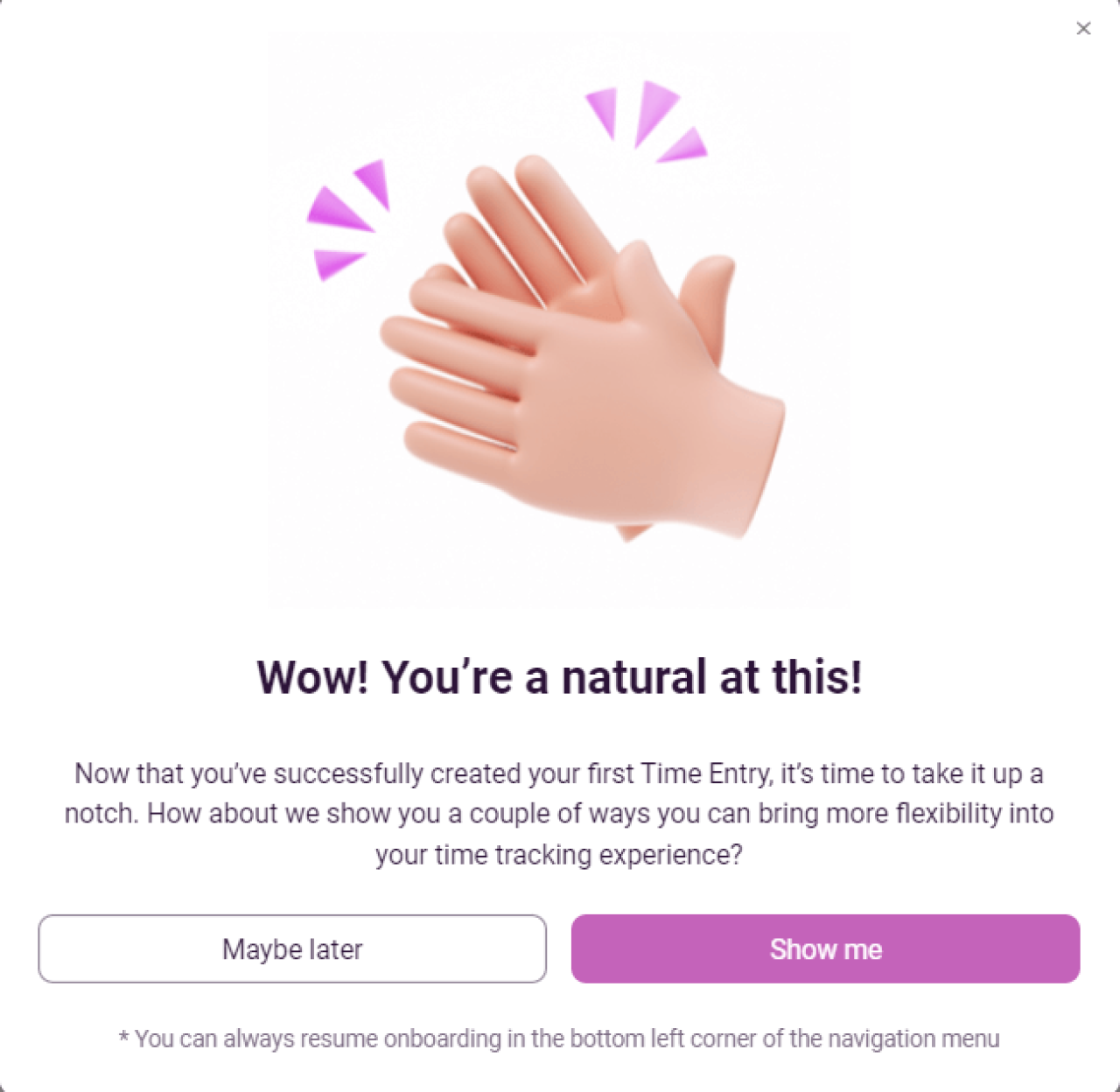
#2. Toggl’s product onboarding
Toggl is an easy-to-use time-tracking software that helps individuals and teams see where their work time goes, set billable rates, view reports, and so on. The main benefit of this app is that it takes minimum effort to use.
Their onboarding flow is not an exception. Toggl even mentioned simple onboarding as one of their main advantages on the “Our mission” page.

- The onboarding itself starts with a modal window that offers new users two options: start the guide or explore the product on their own. As well, there is a note that in case users want to skip the tutorial, they can always get back to onboarding with the help of a button in the navigation menu.
- The guide consists of 6 steps in a form of tooltips that teach the user how to deal with the platform’s key features.
- Finally, the user sees a modal window with congratulations on going through all onboarding steps. And again Toggl gives newbies the same choice as at the beginning: to continue the product tour and learn how to use some more features or start tracking projects on their own.
What we can learn from this SaaS design
We think Toggl’s design is a good SaaS onboarding example, which can teach us the following:
- Shorten time to value. Don't overload users with too much information at once. Divide the onboarding process into short tours that teach to use key features. Onboarding flows with a few easy steps help novice users understand how they can benefit from this product faster, therefore they retain.
- Add reminders. Modal windows that contain reminders about how to get back to onboarding let users learn when it’s convenient for them.
- Allow users to skip onboarding. Each tooltip and modal window allows users to skip onboarding which reduces the friction and makes the educational tour less annoying. Users should always feel that they control each function in an application, a principle that’s already reinforced on the homepage design, where clarity and first impressions set expectations for the entire product experience.
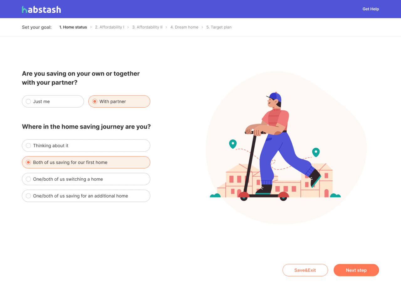
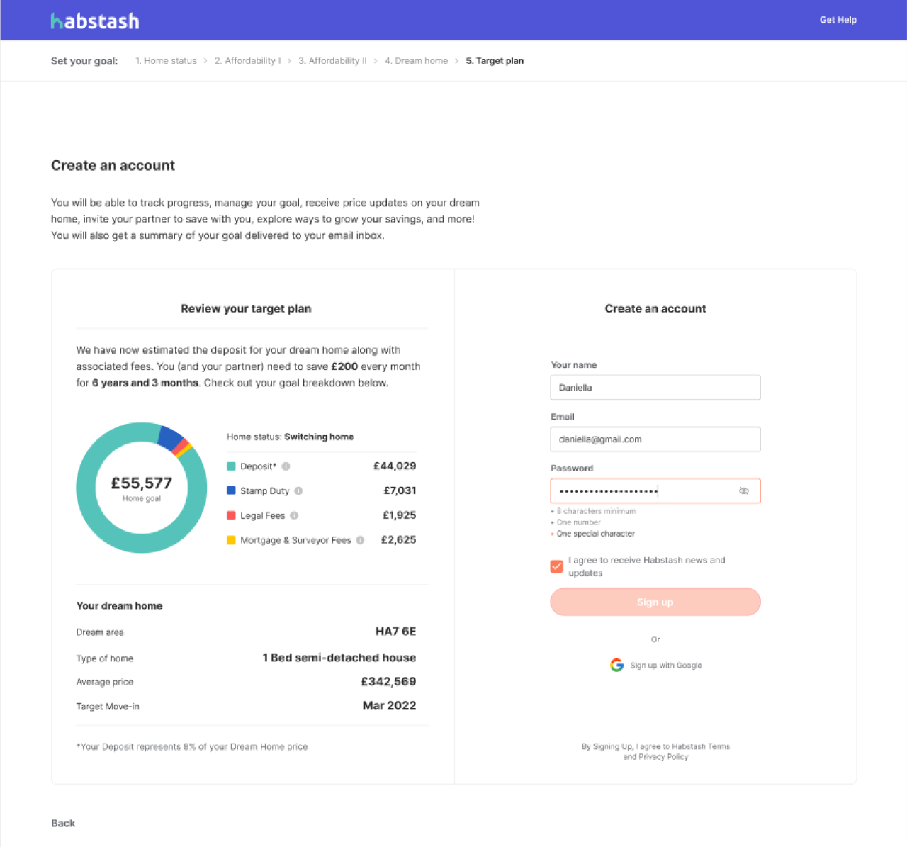
At Eleken, we often help users feel the benefits of a product quicker by using Wizard, a design pattern that simplifies complex processes. For example, for Habstash we divided the sign-up flow into several separate screens so as not to place too much info on one screen and make it easier to perceive the content.
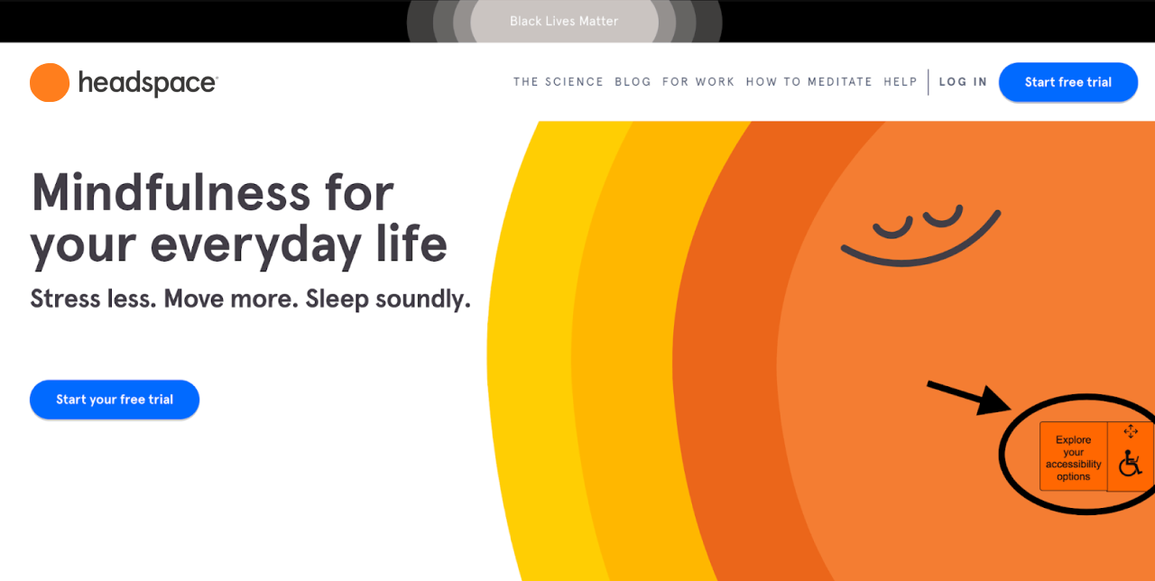
#3. Headspace’s accessibility options
Headspace is a cloud-based app for meditation that helps people manage stress, relax, find concentration, and stay healthy overall. Its colors, illustrations and typography often come up when our designers are asked about good web app user interface design examples. But one of its distinguishing characteristics is the design for accessibility, and we want to focus on it a bit here.
To ensure all the visitors can equally use the web application, Headspace launched an accessibility menu, a widget that helps people with disabilities easily perceive the content.
The menu is launched with one click on the “Explore your accessibility options” button.
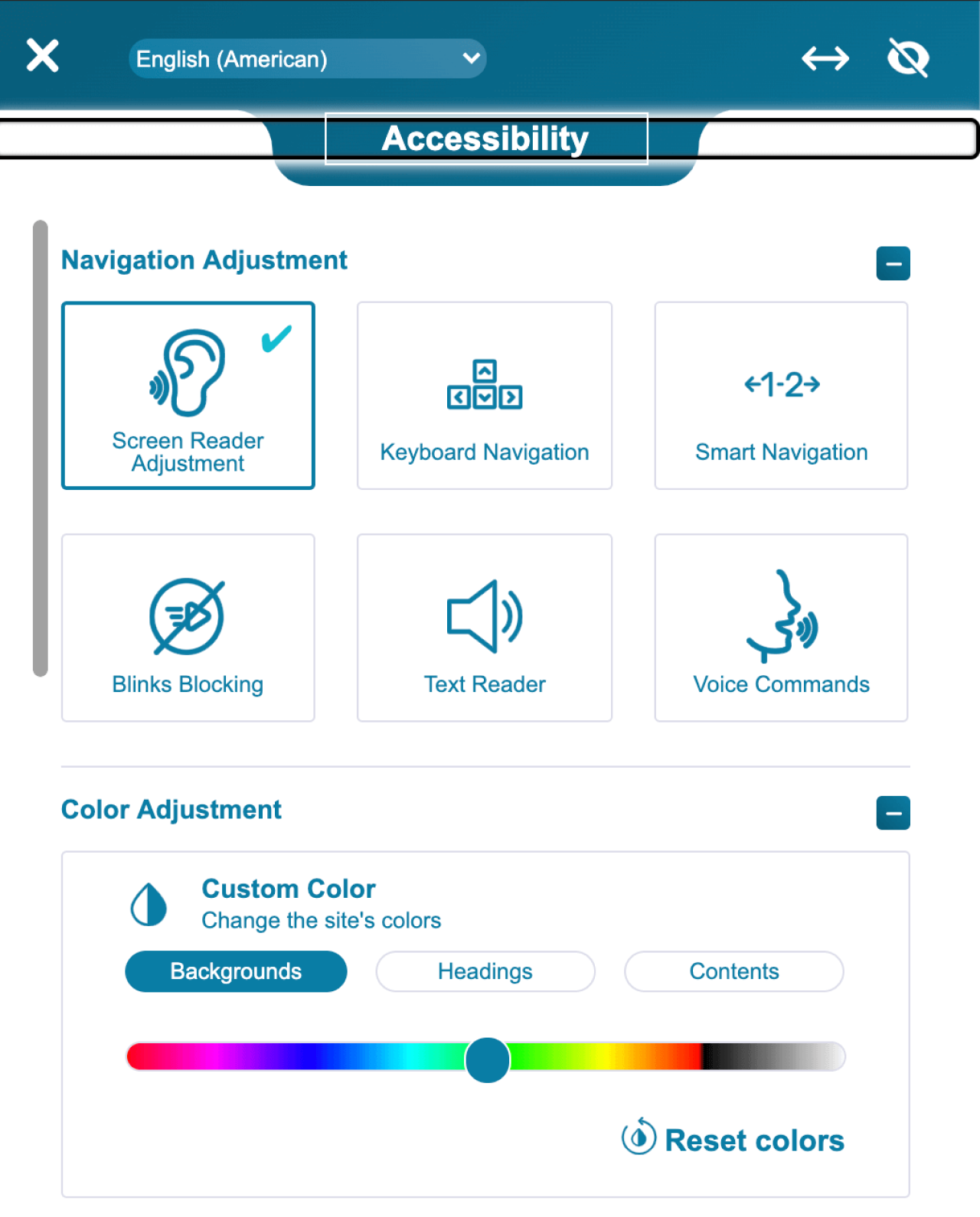
The widget offers people to adjust the color, contrast, font, spacing, and more for those who have issues with their eyesight.
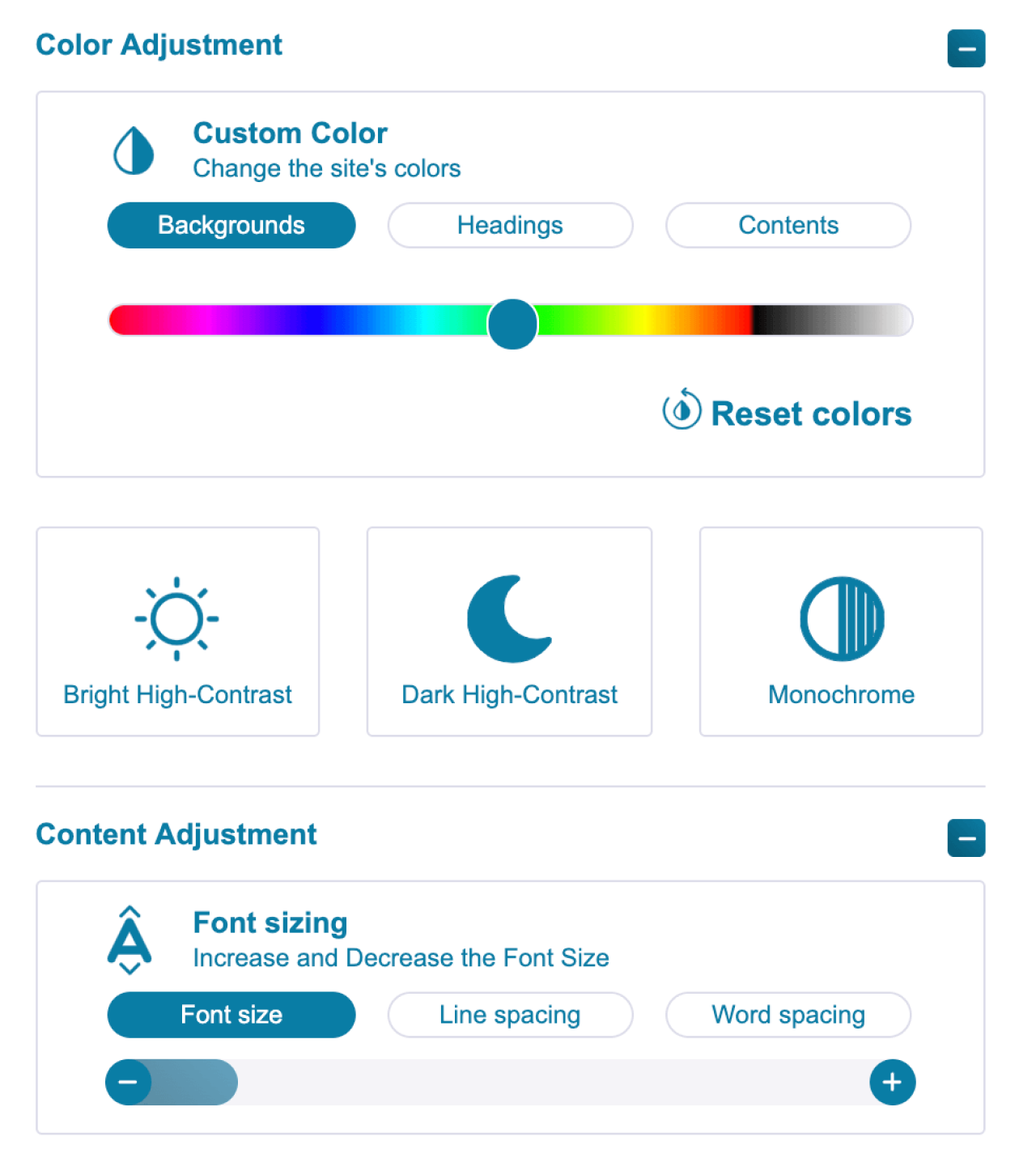
As well, there is a possibility to adjust the navigation. For example, users can search for the needed content with voice commands and listen to it with a text reader.
What we can learn from this SaaS design
- Taking care of accessibility is a must for any modern business as it allows a wider audience to obtain the information on your website/app and stay inclusive.
- The least you can do is to provide sufficient contrast, clear navigation, and well-labeled buttons so that users interact with the app easily. However, consider creating a separate menu for disabled people — especially in mobile UX design, where limited screen space, touch gestures, and one-handed use make accessibility decisions even more critical.
From our personal experience, our designers are always super attentive to accessibility in design. When we were conducting a UX audit for TextMagic, for example, we analyzed each interface element to make sure the app is easy-to-perceive, and the content is legible.
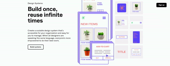
#4. Figma’s landing page
Figma is a digital UI/UX design tool for individuals and distributed teams’ online collaboration. Our team admires this platform a lot and we think their SaaS landing page is worth your attention.
The first thing that catches the eye on Figma’s landing page is the headline that communicates the product's main value proposition and an interesting font that is used for this heading.

As well, Figma acquaints its prospects with the app interface by presenting the use cases right on their landing. And in general, the page is full of interactive elements that encourage visitors to explore the website.
What we can learn from this SaaS design
- Use eye-catching typeface. Appropriate size and a unique type of fonts help to highlight the information on a website and make visitors’ feel that this design was made specifically for them.
- Present how the app works. Placing real use cases on the page allows visitors to understand different ways of how Figma works without the need to read long copies.
- Create consistent brand identity. Figma’s target audience is people who prefer perceiving visual information. That’s why the Figma’s team incorporated animation, colors, and shapes into the website’s interface, allowing them to create a non-boring user experience and consistent visual language for website visitors.
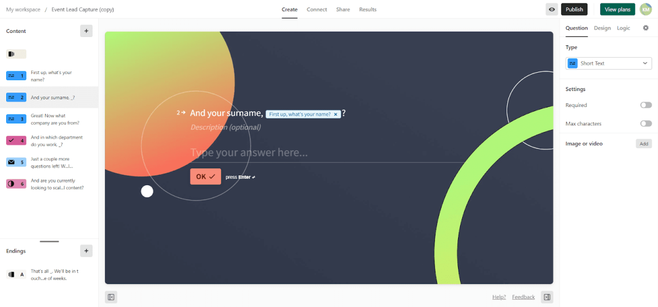
#5. Typeform's template gallery
Typeform is a SaaS platform that helps users create engaging and interactive online forms and surveys to get more responses. To make this process fast and simple, Typeform provides a vast gallery of survey & questionnaire templates, from which people can choose the one that suits their ideas best.
Once the user gets to a template gallery, they can search for the needed questionnaire within the list of categories, by typing the keyword in a search bar, or by scrolling through all templates manually.
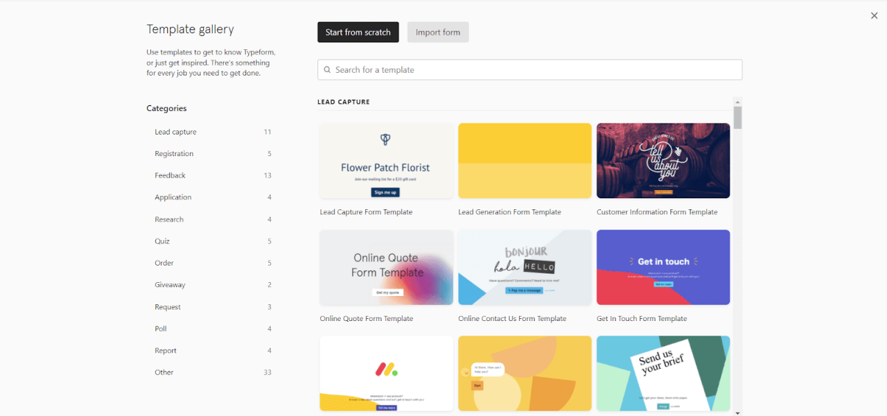
When users choose to preview some specific template, there will be short info about the purpose of this form, the number of questions, and the approximate time needed to fill all the information in.
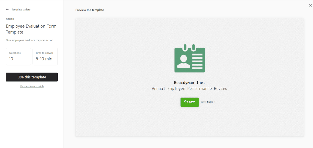
As well, all templates are customizable. Customers can adjust them to their needs with ease.
What we can learn from this SaaS design
The use of templates decreases the mental effort people need to take to create something new, and therefore users can reach their goals quicker. Application design as a whole works for it.
Typeform’s templates have all characteristics needed to shorten users’ time to value.
- Make sure your templates are easy to browse and well-structured. Typeform has a clear list of categories and a search bar, so it’s a no-brainer for a person to find the needed template as fast as possible.
- Go for minimalist design. There are no useless elements in Typeform’s templates that exist only for the aesthetics. Each interface element and piece of content has its purpose. The right use of white space and sufficient contrast focus doesn’t create distractions for the user and make templates light, and easy to perceive, much like thoughtfully crafted adobe xd design systems.
- Make sure the templates are easy to edit. The template editor’s design is intuitive, as each button has a clear copy so that even new users can quickly understand how to make changes and customize forms according to their needs.
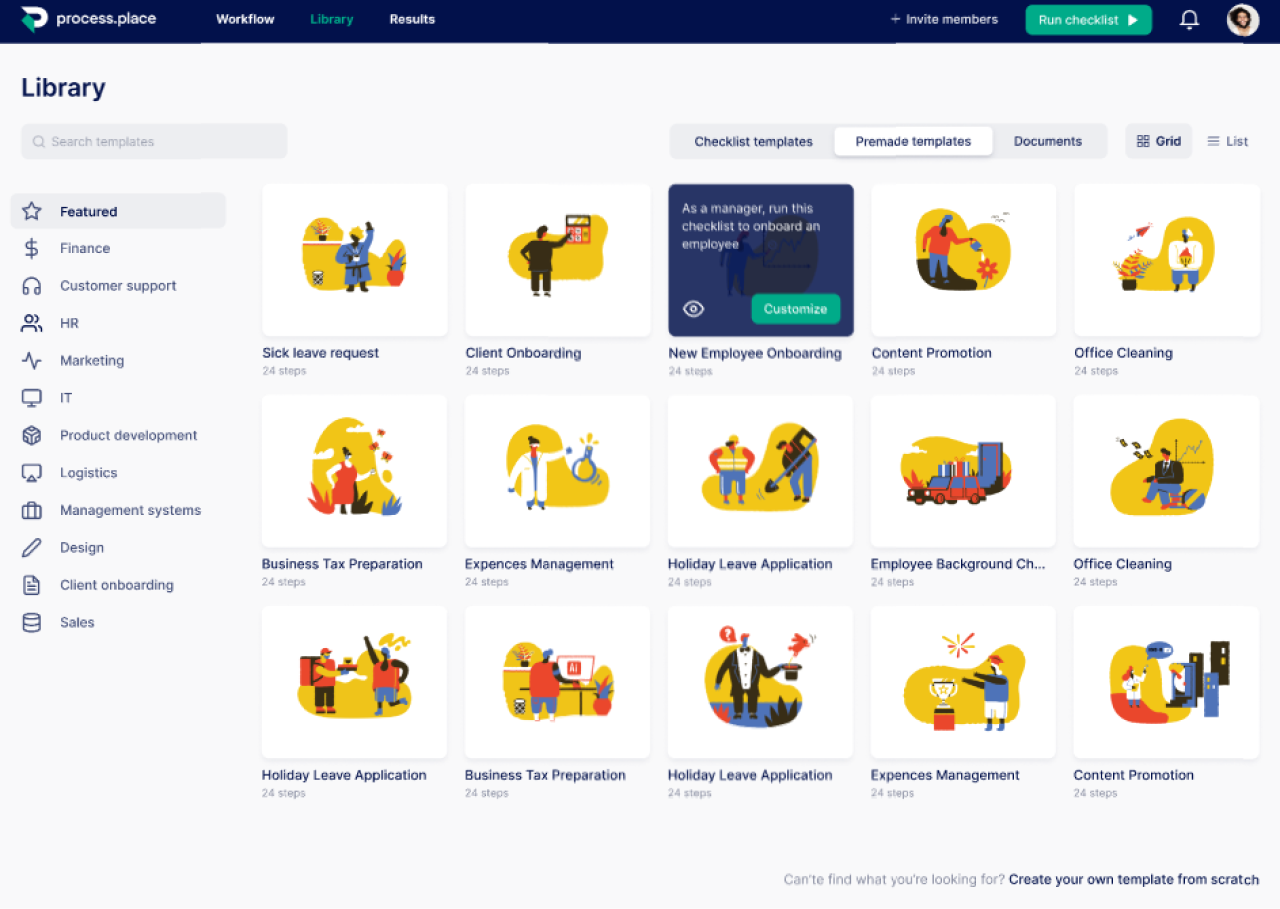
At Eleken we also had the experience of creating a template gallery with a minimalist design for Process Place, a workflow management application. A gallery of process templates, organized as illustrated cards, is available for the users. They can also create and save their own.
#6. Asana’s celebrating user’s success
Managing regular work tasks isn’t that fun, so to somehow make this routine process more engaging and cheer up users as they succeed with another task, Asana came up with celebration creatures. After enabling the celebration feature in the Profile Settings, users will see a unicorn, yeti, narwhal, or phoenix congratulating them on completing a task.
The creatures appear randomly, not each time, but the more tasks are completed the higher is the chance to meet them.
What we can learn from this SaaS design
- Of course, it’s not a typical feature and not a compulsory one. Still, we believe that adding such fun and engaging design elements is a great way to improve UX and cheer people up through their busy workday. Besides, we think that such small but interesting design ideas help the app stand out on the market.
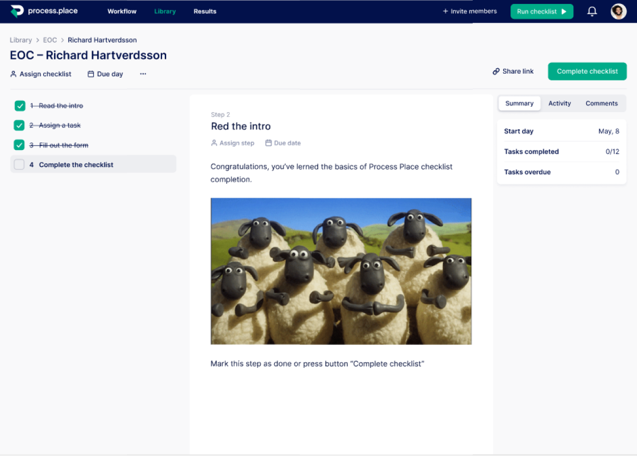
For example, for Process Place, we decided to add a funny image with applauding sheep that users see once they completed an onboarding sequence.
#7. Buffer’s upgrade prompt
Buffer works on a freemium pricing model, that is, provides its users with a free trial period. The goal of the trial is to show users the value of the product and then convince them to upgrade.
UI/UX design plays an essential role in prompting users to buy a premium subscription. Buffer starts encouraging free users to upgrade from their first interactions. Once the user signs up for a free trial, they’ll be sent to the “My Organization” page to connect their social media accounts. Right there, they’ll see a bright blue “Upgrade Now” CTA and the number of days left in trial. As well, Buffer shows features available for premium users only (connecting Pinterest account) to give more reasons to upgrade.
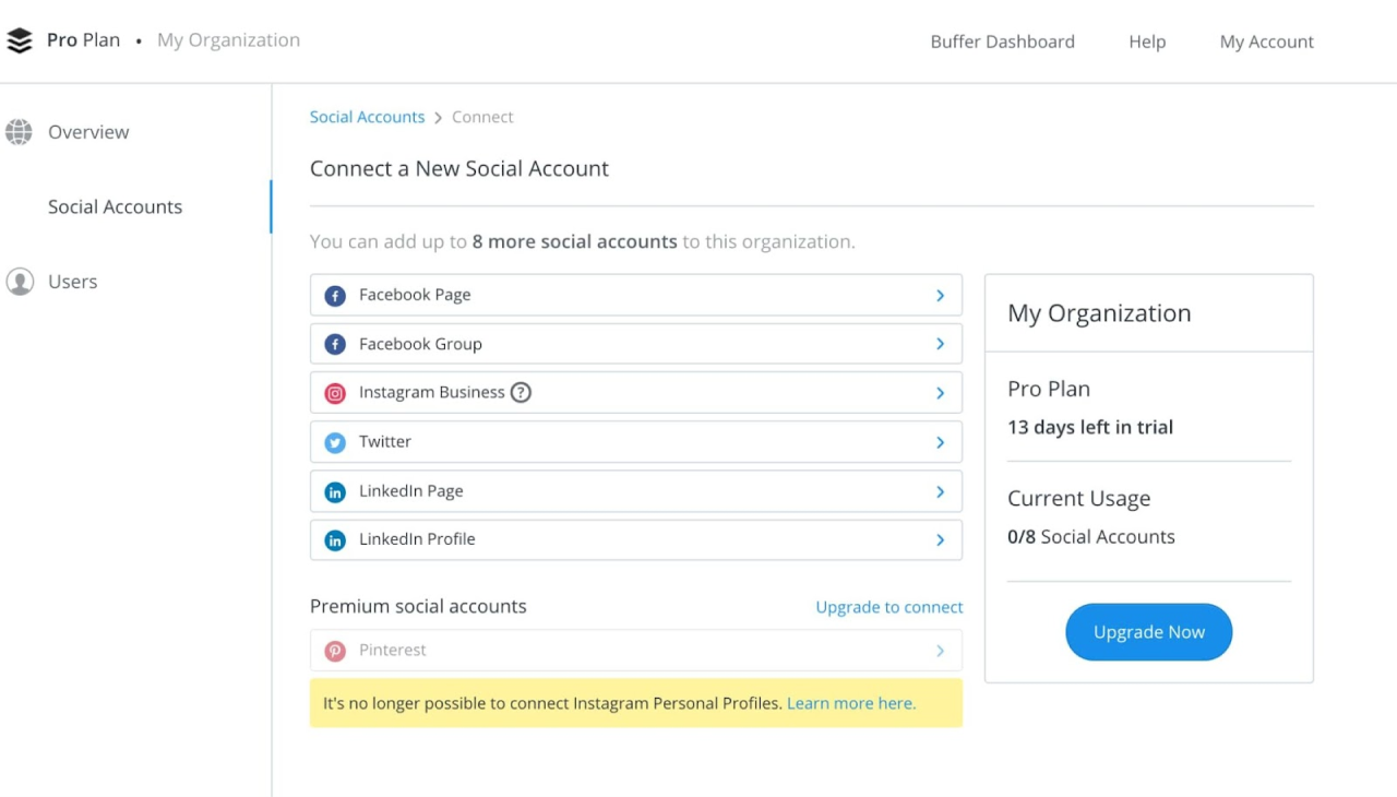
An upgrade reminder stays available at the top of the Dashboard screen so that users keep this option in mind during their free trial.
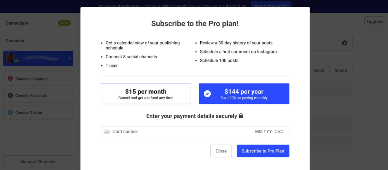
The pricing tier of the Pro Plan itself also has a great design. It presents the plan’s advantages in a bulleted list that is easy to read. As well, it highlights the annual plan to attract users’ attention to it.
What we can learn from this SaaS design
- Mind the place of your CTA button. Having an upgrade button on the top of the screen is a great idea as it is easy to notice, but at the same time doesn’t distract users from completing their tasks.
- Make it easy to upgrade the plan. Users don’t have to spend their valuable time searching for the CTA, it’s easy to notice and quick to access. Once they choose to upgrade, there is a modal window with key information only and one field to fill in.
- Highlight the plan that would bring the most value to the majority of your customers. Buffer does this with its annual subscription. You can choose whatever works for your business.
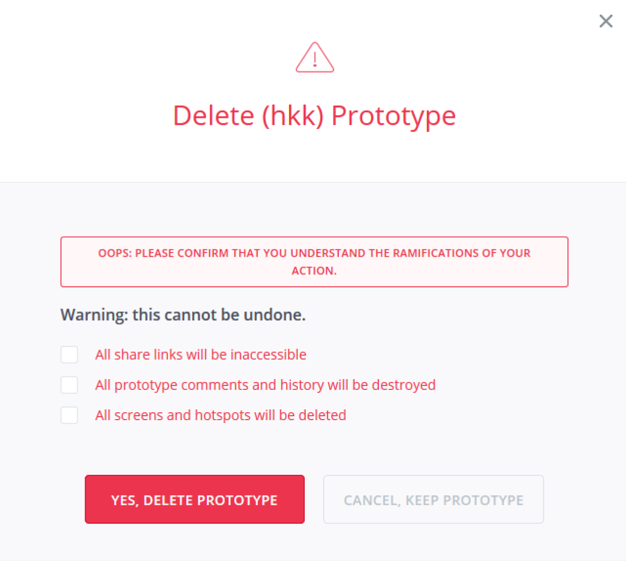
#8. Invision’s error prevention modal window
Invision is a no-code cloud-based design platform used by designers and developers to create and manage prototypes. Though it’s quite easy to create a prototype with the help of this platform, it still takes precious time and effort, especially when one deletes their prototype by mistake. To avoid that from happening, Invision’s design team decided to create additional friction in this process.
To completely delete a prototype, users have to manually put checks in three boxes. This way, the business makes sure their customers think twice before getting rid of their creation.
What we can learn from this SaaS design
To make the user experience better and customers more satisfied, it’s important to help users avoid making mistakes. Invision’s error prevention window copes with the above issue very well. So, when designing your product, try to:
- Eliminate user frustration. Intuitive design helps people quickly complete their tasks, but sometimes relying on automated thinking can lead to making irreversible mistakes and unhappy users. Asking people to confirm the action ensures they read the information next to the checkboxes and gives them a chance to stop making wrong decisions.
- Use clear visual communication. Here, the modal window has the warning icon, sufficient contrast, clear and straightforward copy. A CTA stands out from the rest of the content, and a greyish background that helps attract users’ attention.
- Use the checkboxes to ensure that users clearly understand what decision they make.
Error prevention methods in design can be different. For example, for the Habstash project, in the “Create an account” screen we added a list of password rules, points that fade away once the password matches with the requirements to prevent users from making mistakes and explain what we expect them to do.
#9. Blinkist’s card design
Blinkist is a SaaS book summaries platform that quickly explains key insights from non-fiction books. The app focuses on the mobile format and has a great mobile app card UI design.
Cards tend to bring better scrolling rates in comparison to lists. Therefore, Blinkist uses card design to present a brief book overview. They feature the book’s title, image, author name, a short description, and CTA buttons.
What we can learn from this SaaS design
- Use cards to make a design more responsive. Cards suit the mobile design well because of their rectangular shape which is highly transformative.
- You can also use cards to help you to attract and keep users’ attention. They have bright coloring that grabs attention and contains small pieces of information which makes them easy to read and understand.
- Cards create consistency. All cards are unified by the same concept and similar visual design which makes the app look neat and consistent.
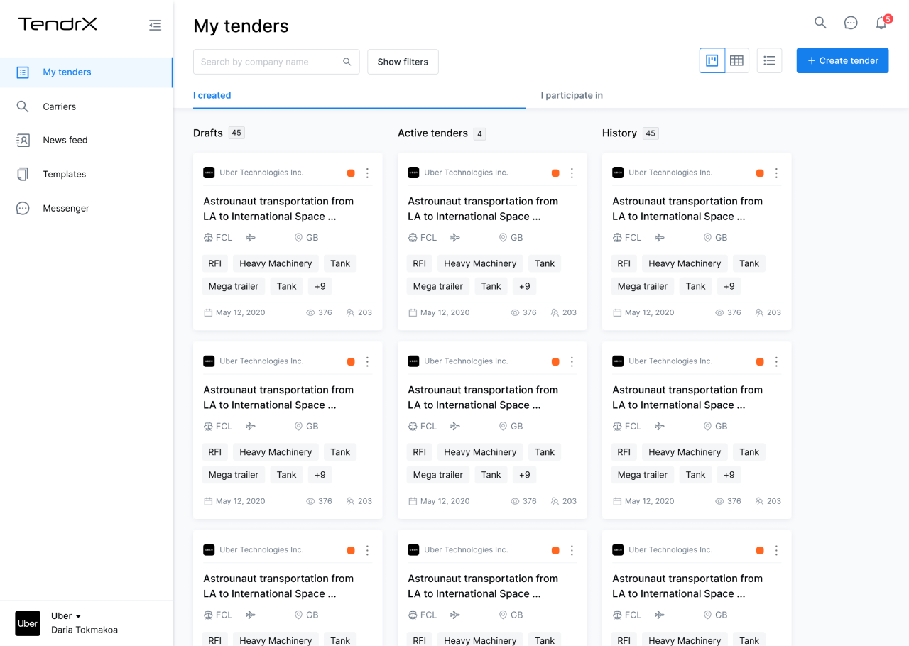
We also use card design at Eleken for the same purpose. For instance, when working on Tendrx, a freight tendering platform, our designers chose cards to represent tenders which are central elements of this cloud service.
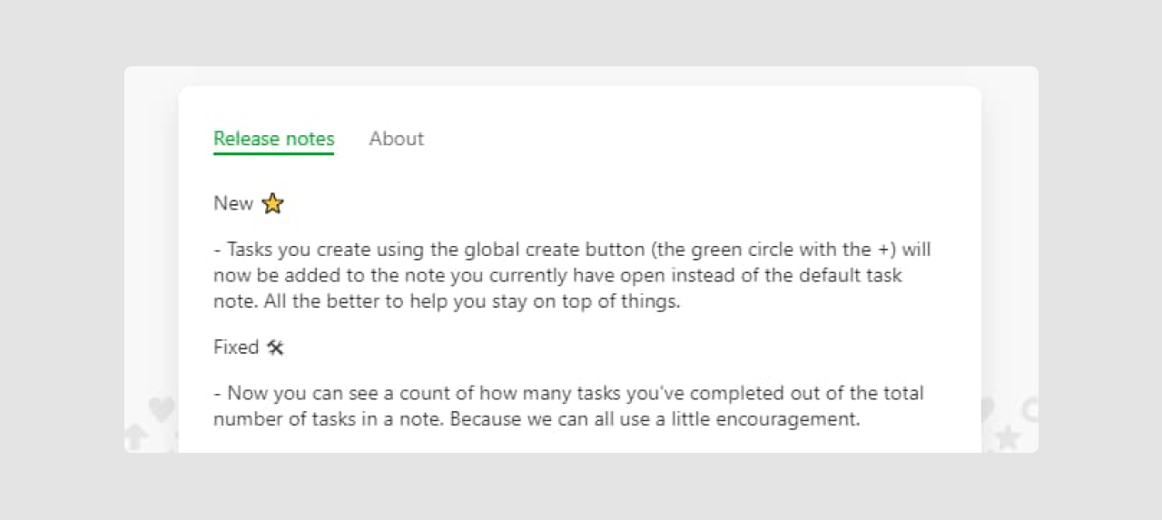
#10. Evernote’s new feature presentation
The feature we want to discuss here is the way Evernote presents updates to its users. Once the user wants to learn what updates the app has prepared they can click the “What’s new” button and see a popup with the list of new features.
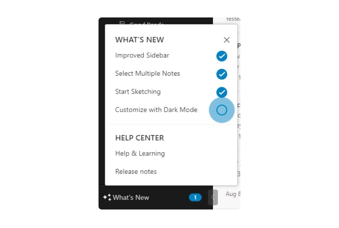
When the user chooses the specific feature they want to discover, they are shown a tooltip with a short description.
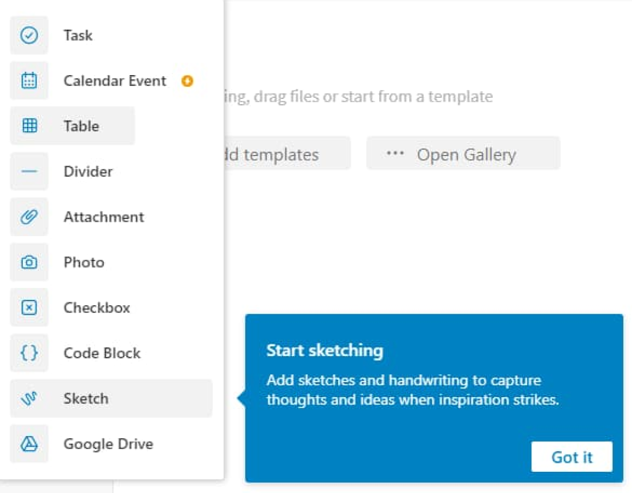
In case this short explanation is not enough, there’s a “Release notes” button at the bottom of the “What’s new” modal window that provides a detailed description of each update.
What we can learn from this SaaS design
- Use checklists smartly. Presenting updates in the form of a checklist allows Evernote’s team to clearly inform users about the number of new features released and explore them in portions at a convenient time. As well, by checking the boxes, it’s easy to track what news is left to discover.
- The division of the “Release notes” section into “new” and “fixed” features. Creating these two categories lets users quickly and easily perceive the information.
- Use patterns. Evernote uses such UX design patterns as tooltips, checklists, and hotspots to drag users’ attention to the needed info. UX patterns are reusable solutions to common problems and implementing them in your design helps users quicker adopt the product.
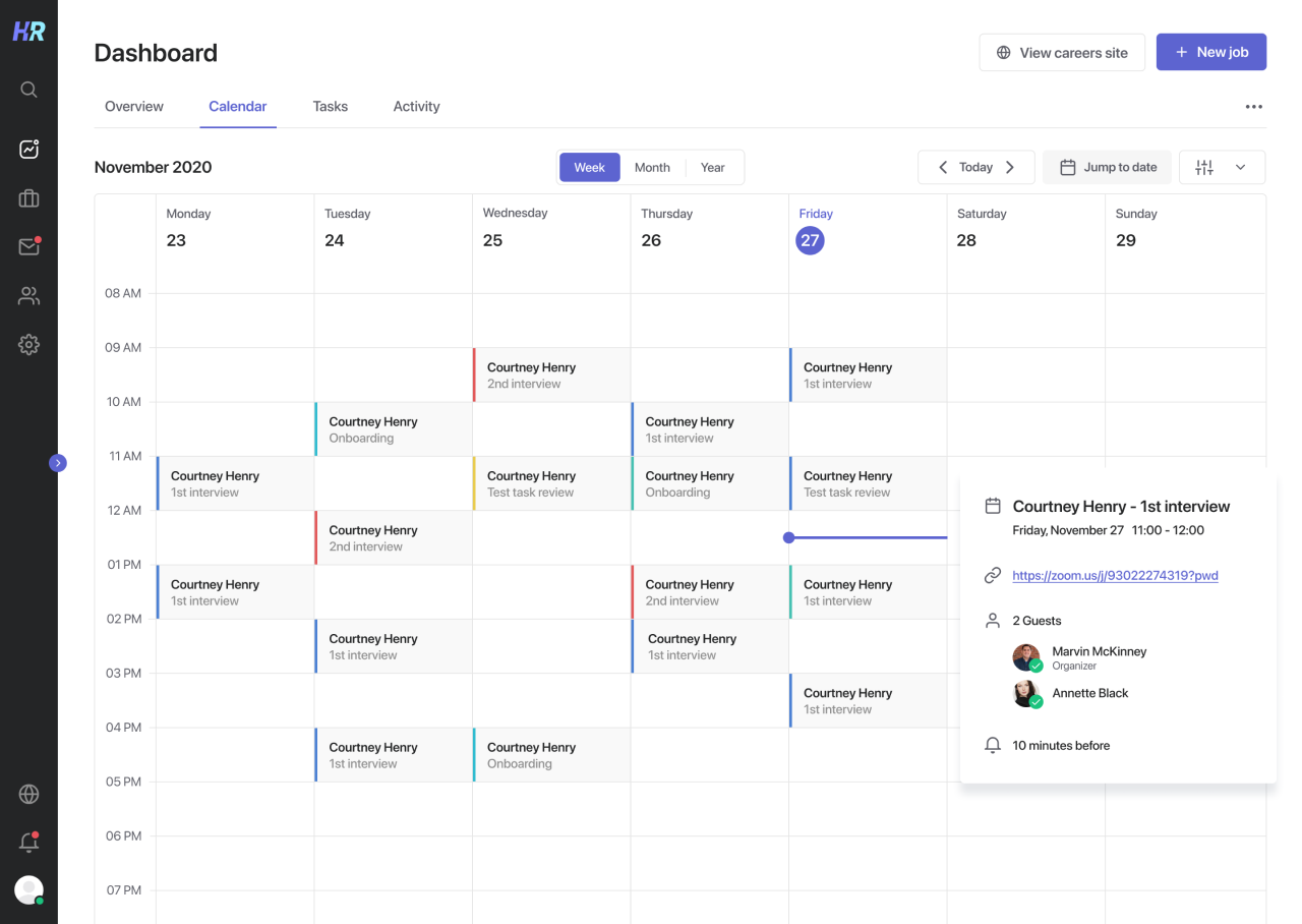
We also use calendar patterns widely in our projects. For example, for Hirerise, an applicant tracking system, our designers used a calendar pattern similar to the one used by Google. That’s how people can immediately understand how to interact with it.
#11. Hootsuite’s net promoter score survey
When Hootsuite launched a redesign of Bulk Message Uploader, this SaaS company decided to learn their users’ opinions with an NPS survey. Users were shown the survey in case they chose to get back to an old version. Here’s how it looked:

What we can learn from this SaaS design
- Use surveys at the right time. Hootsuite chooses to ask users for feedback when they want to return to the Bulk Message Uploader's old version and catches them at the right moment, which increases the chances users will explain the true reason for their decision.
- Ensure good copy. The text inside the survey is brief and on point. Hootsuite states that the survey lets them become better and encourages readers to help them by filling in the survey.
#12. Miro's and Figma's clean workspace
Both Miro and Figma are household names in tech and creative industries. When asked about his favorite application interface examples, our chief product designer praised Miro and Figma for their uncluttered, to-the-point workspace. In both apps, the focus is on the content, not on the design tools. In Miro, this is achieved with the floating buttons, which leaves the workspace fully visible. Figma's workplace also displays only the necessary tools and features and doesn't seem overwhelming.
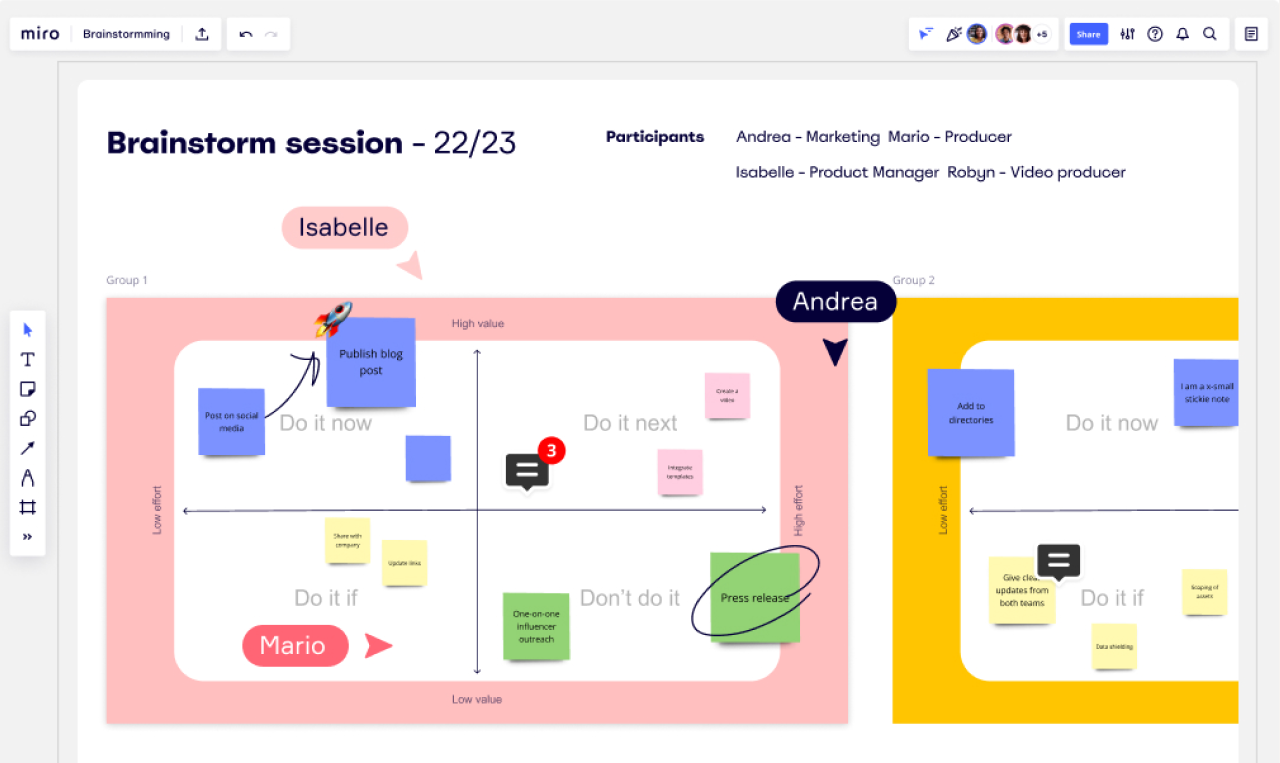
What we can learn from this SaaS design
- Your design should not distract users from their tasks.
- If you're building a product where workspace and/or visualization are important, the less tools and settings catch the eye, the better.
#13. Slack's side-by-side view
Another of our chief designer’s favorite app interface examples is Slack. He praised it for being straightforward and versatile, but one feature liked particularly was the possibility to have two tabs open: for example, one with dialogues, and the other with threads. Of course, split or side-by–side screen views are not necessary in every app (although they might get extremely useful in something like Procreate or other painting or visual editing apps – anything, really, where you have to keep the references in front of you). But, if they are beneficial, it's up to a UI designer to make sure all parts of the workspace are clearly distinguished and legible.

What we can learn from this SaaS design
- If split-view is something your app can benefit from, be sure to think through the visual hierarchy and the ways to distinguish visually different tabs or sections.
#14. Adobe Express' icons
Icons are a vital part of visual communication, and no one has it pinned down better than Adobe. Here, simple minimalist icons manage to communicate quite complex commands and operations without making the menu look too cluttered.
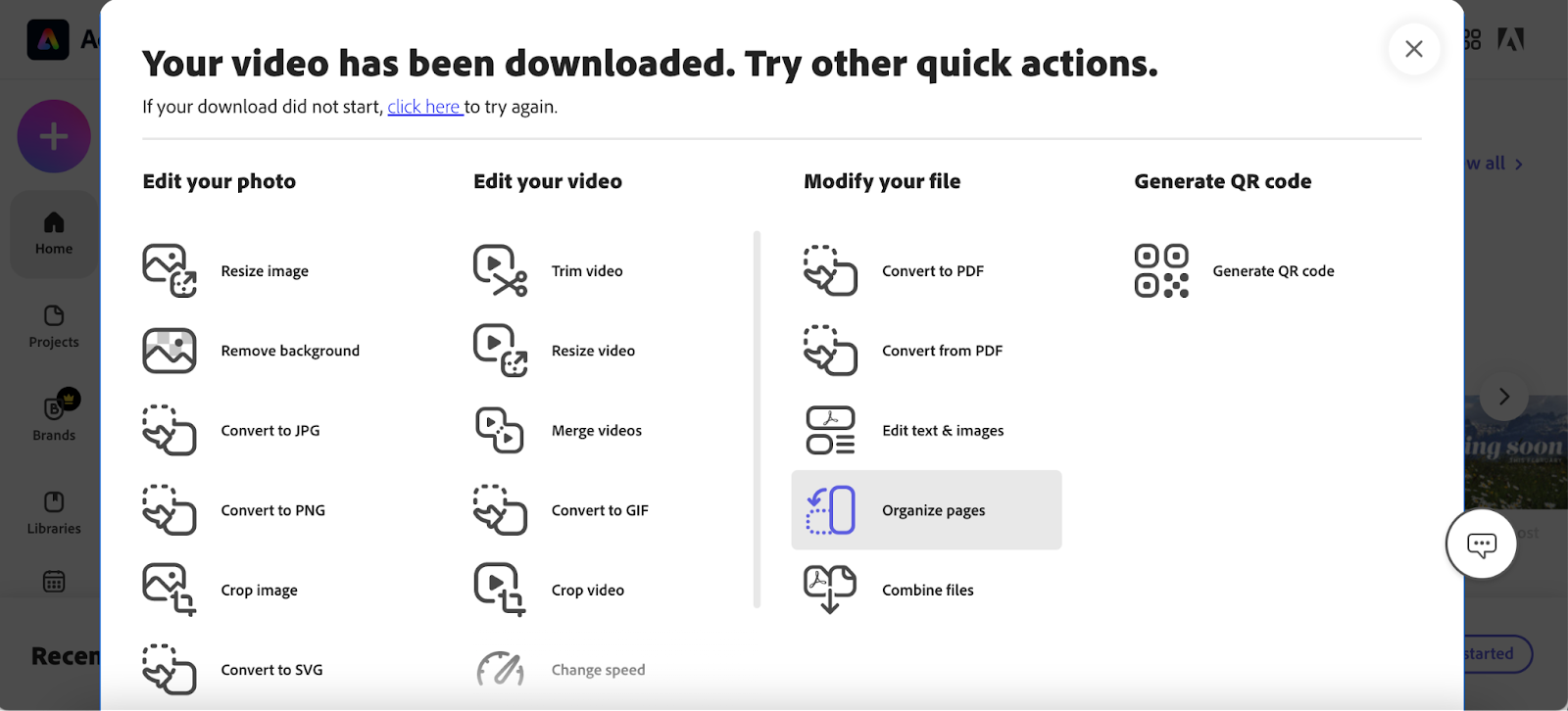
What we can learn from this SaaS design
- Icons should be well-designed and thought-through part of your brand identity and visual communication.
- If you have multiple connected products (see: Adobe Creative Cloud apps), make sure your icons are consistent, or at least similar enough, across all of them.
- You don't need complex colorful icons for them to be readable. Often minimalist works just as well.
- Don't forget to add textual cues where the icon might be misunderstood.
#15. Spendee's dashboard charts
Next on our list of noteworthy app user interface examples is Spendee, a personal finances app. Designing a dashboard, especially for B2C apps, might be a tricky task. Spendee manages it quite well. It allows the user to switch between different types of data visualization, while making sure its graphs and charts are easy to read and informative.
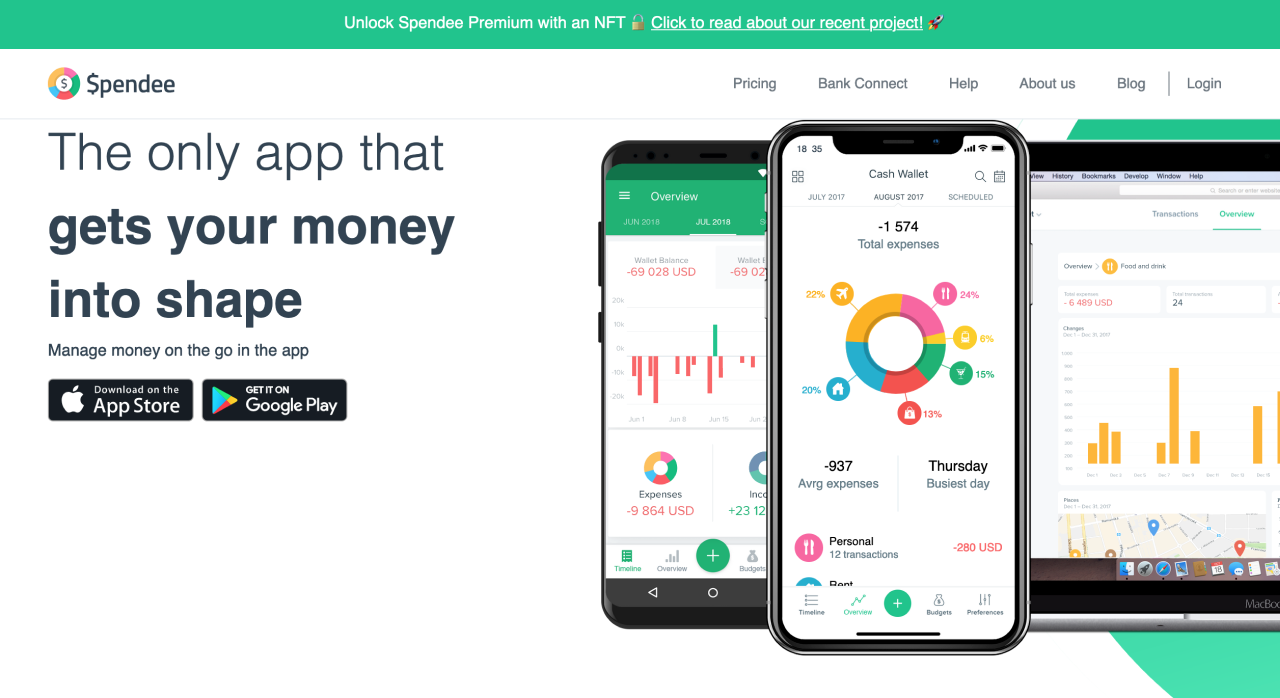
At Eleken, we've worked quite a lot with different types of dashboards, and know how much of a challenge it can be. Check our article on dashboard design examples if you want more information on how to design an efficient dashboard.
What we can learn from this SaaS design
- Colors, icons and typography – you can use whatever it takes to make dashboards and your application interface design in general both informative and visually appealing.
- When possible, use different tabs for different types of data/graphs.
#16. Prequel's sign-up page

Prequel is one of the more fun and creative mobile app user interface design examples on our list. It is a photo editing app, targeted at photographers, SMM professionals, designers and bloggers. Creative audience demands creative decisions, and Prequel delivers. During the sign-up process, the user not only sees the high-quality, appealing photos, but also gets a chance to see Prequel's capabilities in motion.
What we can learn from this SaaS design
- Demonstrating your product's capabilities and selling points during the sign-up/onboarding process right away is a great chance to entice the user and make sure they do actually sign up.
- If it suits your industry or niche, try to make sign-up process an entertaining part of the user's journey instead of a chore.
#17. Portfoliobox's interactions

Interactive elements and animations are a great way to grab and direct the user's attention. For Portfoliobox, targeted predominantly at creative professionals, it is especially vital as it emphasizes their expertise and serves as an example of the service's capabilities.
Of course, you don't have to go to such lengths if your audience doesn't demand it. Still, keep in mind that animation or catchy interactions can bring your design to the next level.
What we can learn from this SaaS design
- Animations and interactions are a great way to grab the users' attention.
- Playing around with scrolling animation can boost your landing or home page visuals.
#18. Squarespace's hover highlights
Using different colors to highlight the hover state is nothing new. Using low-opacity colored layers to make images work better with the text on them is also a known technique. Here, however, they work in tandem to create a card-based, creative and colorful design.

What we can learn from this SaaS design
- If you think that using photos or illustrations as navigation items is something you might want to do for your product, take notice of how you might visualize different states of hover and activation.
- While some might argue that throwing a 50%-opacity fill or gradient on a photo is overdone at this point, there are still ways to use it smartly and make it look fresh.
#19. Notion's hover buttons
Notion is one of those products in which a clean and intuitive UI is vital to avoid overwhelming the users. With loads of data and options available, however, avoiding the interface looking too cluttered was a challenge. One of the ways Notion addressed it is by relegating most action buttons to appearing visually only on hover. Editing or moving the item or adding a new one only becomes available when it might be relevant to the user.
What we can learn from this SaaS design
- If you have to squeeze a lot of data into your design, consider hiding the buttons or other actionable items. They should be easy to access, but they do not necessarily need to be visible all the time.
#20. Mojo's template navigation
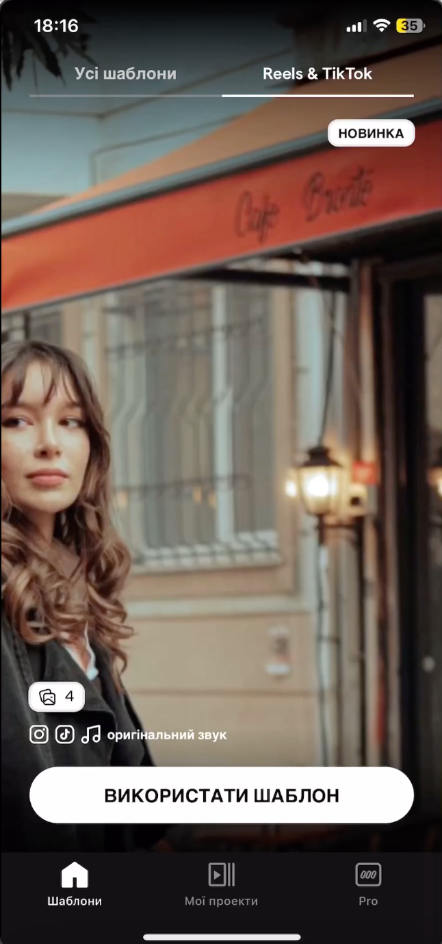
Mojo is another app which has to entice and retain the creative ones. While many similar platforms demonstrate its functionality, Mojo went a step further. The tab of templates geared towards creating Reels and TikTok videos looks and has to be navigated just like these platforms. This way, the app takes it a step further and showcases how the user's project might look like in its natural environment.
What we can learn from this SaaS design
- If that's applicable to your product, demonstrating during the onboarding process the results the users might achieve with your app is a great way to emphasize your value.
#21. Later's colors and gradients
Times when gradients were the number one tool might have passed, but you shouldn't underestimate the power of well-placed and thought-out gradients still. In their web application interface design, Later does it both with the background and the button, without making any of them look over-the-top.
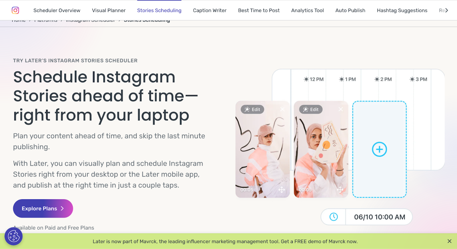
At Eleken, we often use gradients to emphasize the buttons or important info. Here you can see how it works in LittleDate design.
What we can learn from this SaaS design
- Don't overuse the gradients, but don't be afraid of them either. When done right, they are a great way to draw attention to the important navigation elements or information.
#22. Todoist and Mailchimp's illustrations
Illustrations are an integral part of any UI design. Even if you're going for the minimalist and straightforward app interface design, illustrations can bear both decorative and communicative functions. In recent years, after Facebook, the trend for vector, colorful flat illustrations became a staple of the corporate styles (to the point that some illustrators build good careers out of them while the others started to loath the style). While there’s nothing wrong with this style, if you want your product to stand out, and/or it is targeted at the creative industry, you might want to experiment a bit with different styles of illustrations.
At Eleken, we use different types of illustrations for various projects. One of the most fun is the one we designed for the HabitSpace app. If you're designing a B2C product, original illustrations are almost a must.
What we can learn from this SaaS design
- Illustration can be a distinctive part of your visual communication and style.
- If you wondered whether you should have illustrations, you probably should.
- If you automatically wanted to go for the flat vector illustrations, consider other options, especially if your product leans toward a more playful or creative vibe.
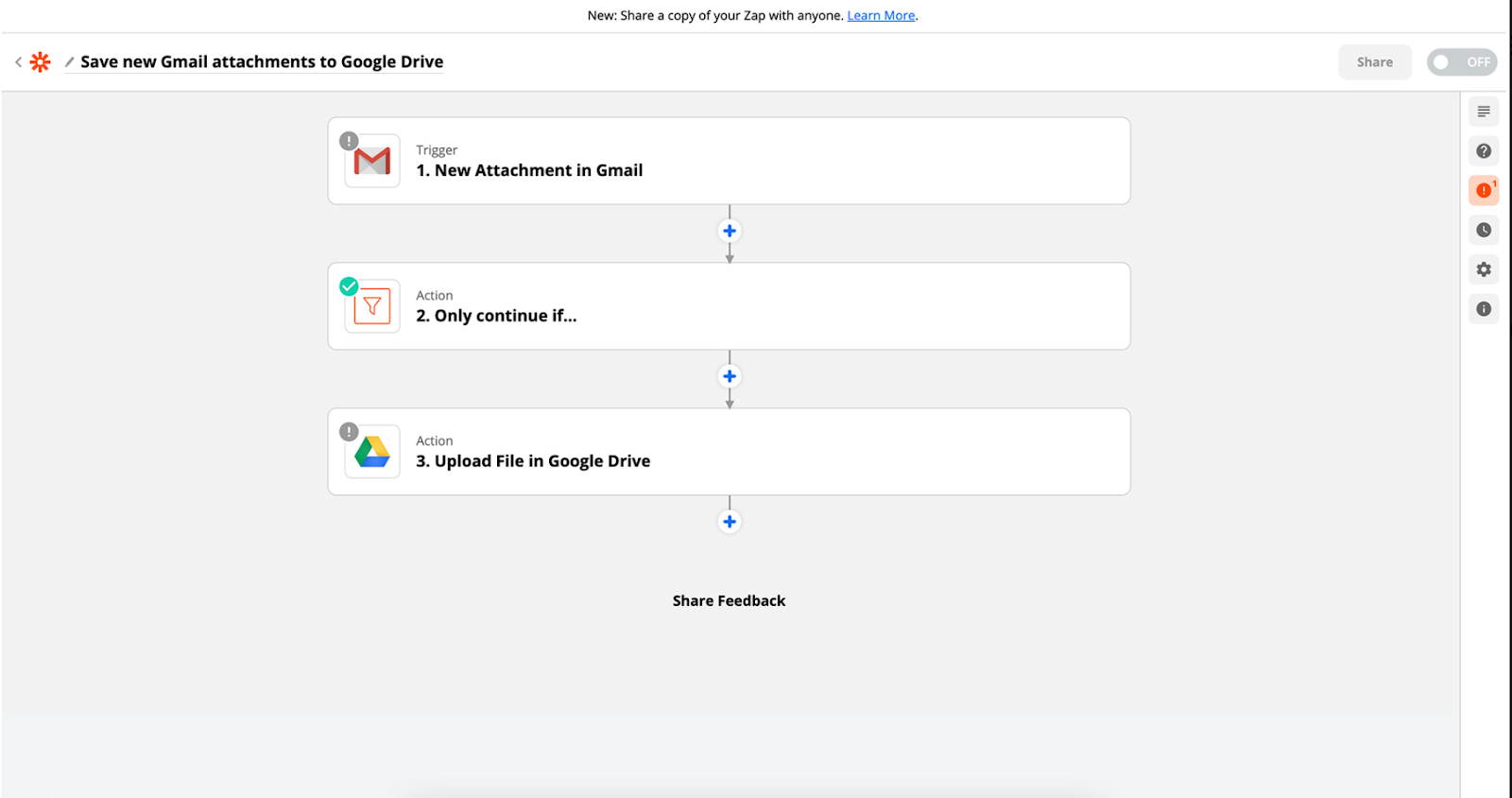
#23. Zapier's sequence builder
Zapier helps to automate one's processes, allowing users to do custom action sequences for that. This is presented in an intuitive form of the blocks adding to each other.
What we can learn from this SaaS design
- More often than not, chronological or logical sequences can be visualized in an easy-to-digest format, and it is your responsibility to learn how. For example, if using your product requires building complicated custom user scenarios, use cards and visualize the actionable items so that it cues the user and not confuses them.
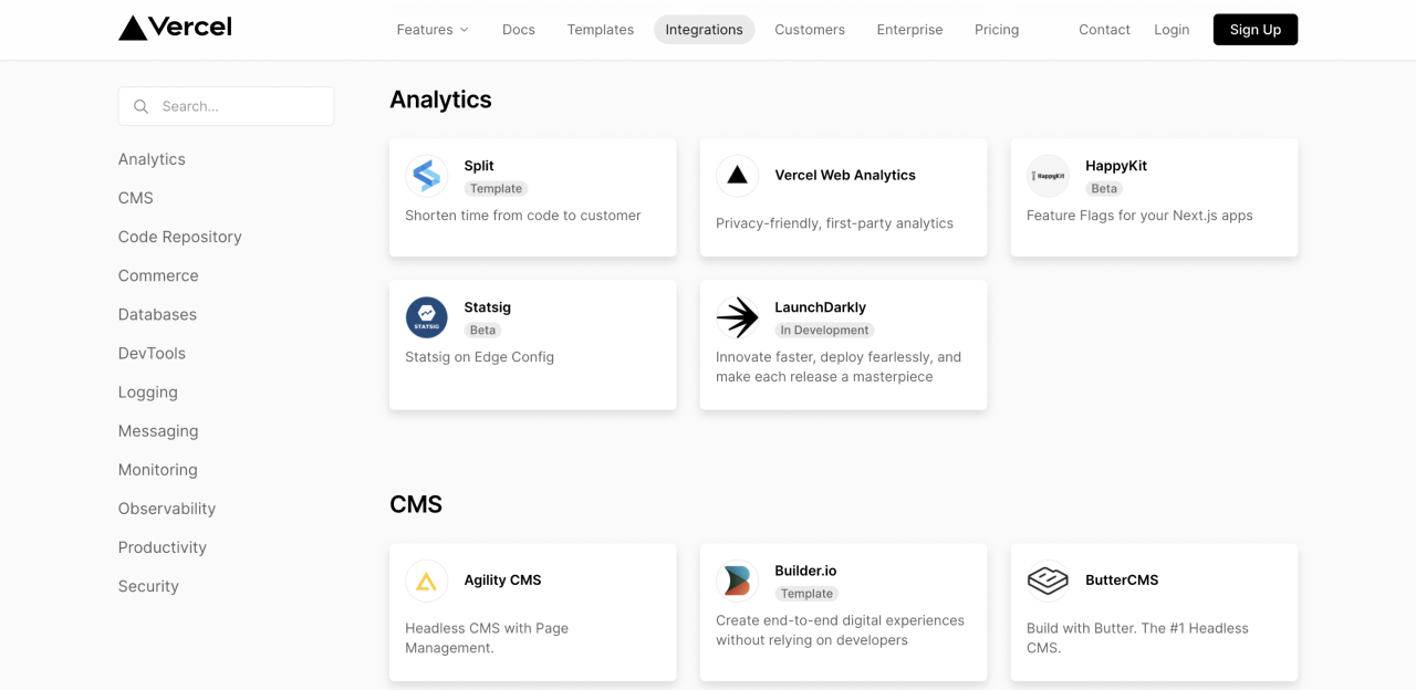
#24. Vercel's integrations
Vercel uses quite large and eye-catching cards to visualize its integration possibilities, and splits them into categories according to their niche. The simple app interface here is legible and helps the user to navigate their integrations without fear of missing or forgetting anything.
What we can learn from this SaaS design
- If integrations and partnerships are an important part of your product, visualizing them through cards is a good way to lay them out for the user without cluttering the screen.
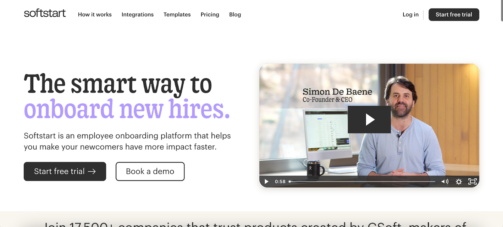
#25. SoftStart's typographics
Typography is one of the elephants that bear good UI design on their spines. The only reason we haven't mentioned it earlier is that often good typography simply goes unnoticed. It's only when the headlines become hard to read, the paragraphs get too long, and the blocks of text squished together, we start noticing something's wrong.
Softstart managed to use a somewhat original font without making it unreadable or unsuitable for the context, so it's a good moment to remind you of the typographics' importance.
P.S. Our senior UI designer also adds that pastel color palette with black as an accent color is trendy now. Don't miss your chance to jump on the wagon.
Eleken's work on redesigning Photobooth included adding a secondary font (Avenir Next) to the company's brand Sofia Pro to make visual hierarchy between the fonts more clear. This might look like a small thing, but it goes a long way in ensuring smooth and flawless user experience.
What we can learn from this SaaS design
- Typographics are vital for good UI design.
- Make sure everything is readable.
- Use a different font to emphasize the headlines or the company name, but don't use more than 2 to 3 fonts.
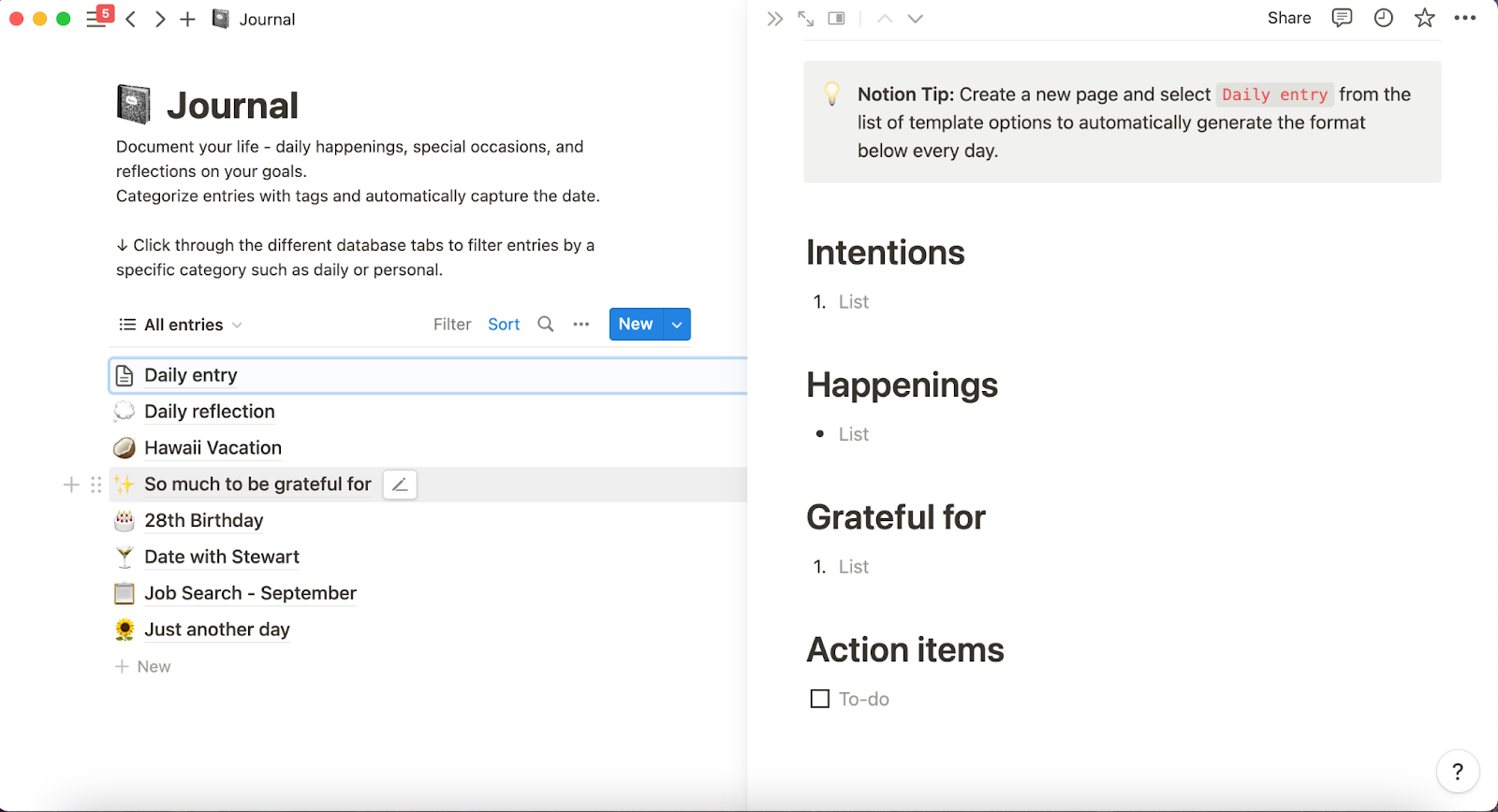
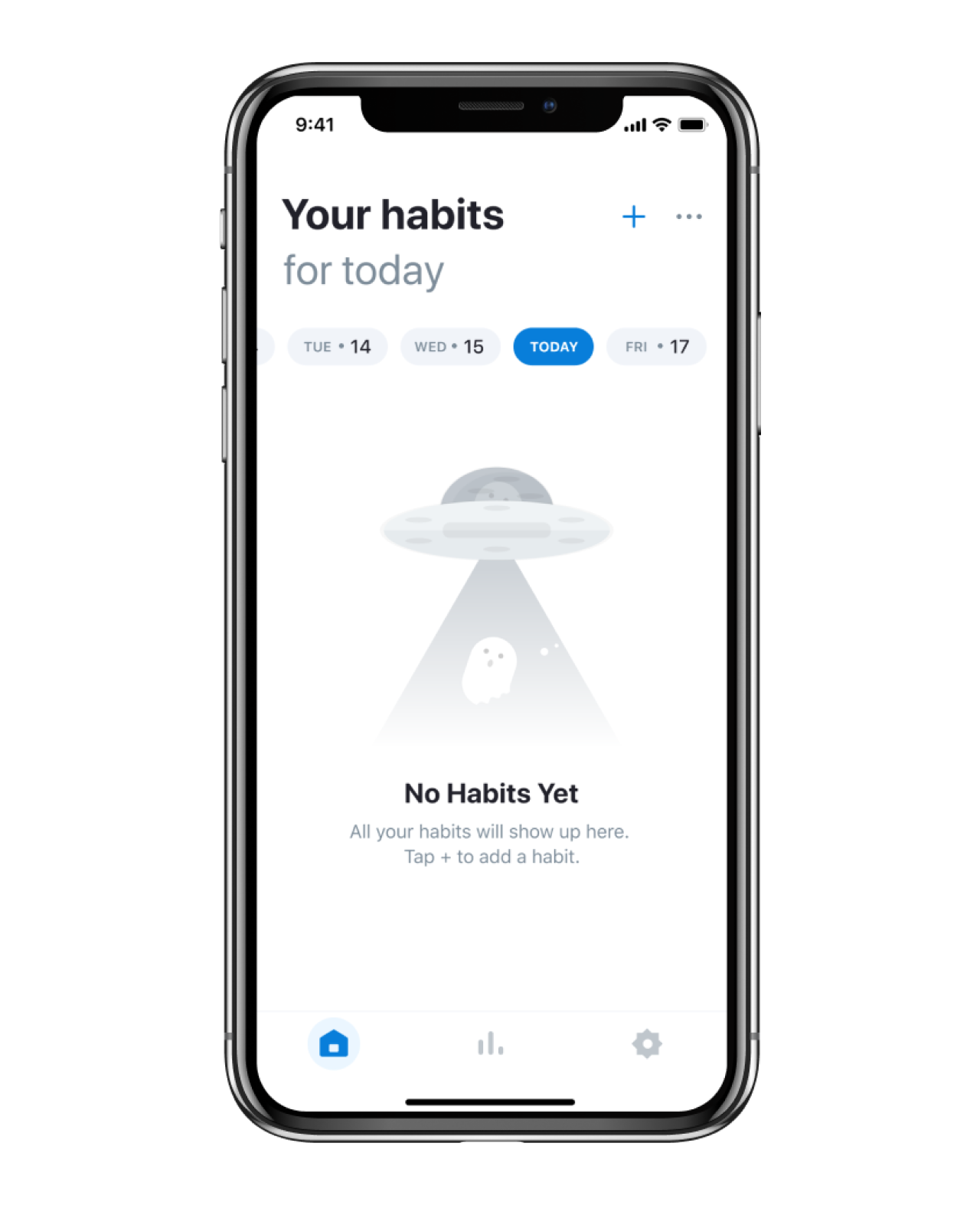
#26. Notion's mobile menu
Notion packs a lot into one workspace — notes, databases, wikis, projects — and as a mobile app UI design, that could easily become a mess. But their sidebar navigation handles the complexity surprisingly well.
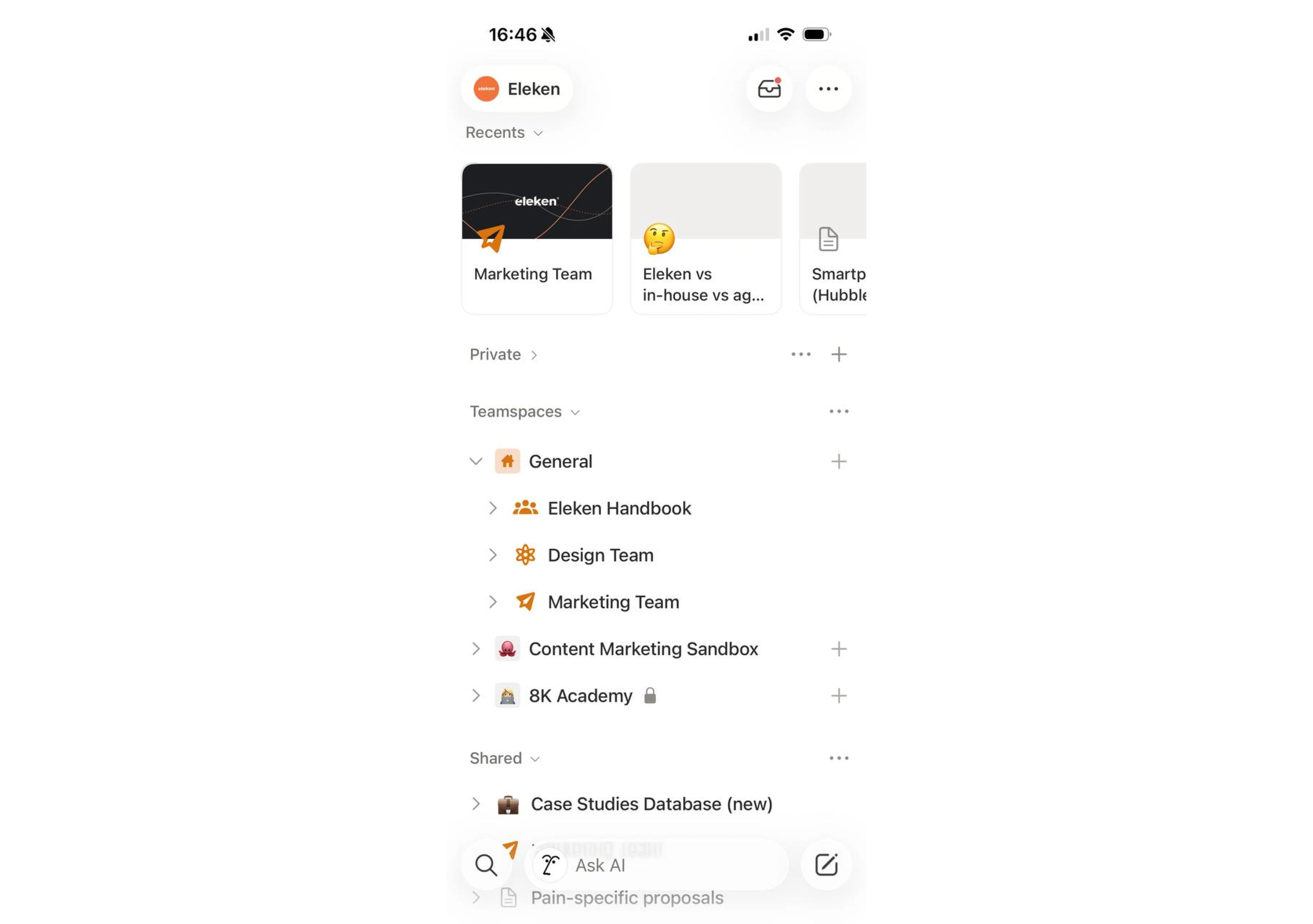
The menu is organized into clear sections (Private, Teamspaces, Shared) with collapsible items so mobile users only see what's relevant to them. There's no visual clutter — just hierarchy done right. And the persistent search and "Ask AI" bar pinned to the bottom means you're never more than a tap away from finding anything, no matter how deep your workspace goes.
What we can learn from this SaaS design
- Collapsible sections are a simple but effective way to manage complexity without hiding important content — users stay in control of what they see.
- On mobile, a persistent search bar is almost always worth the screen real estate. Navigation shouldn't require memory.
- Clear visual grouping (icons, indentation, labels) does a lot of heavy lifting when you have many items to display — structure replaces scrolling.
The key principles that make SaaS design great
Researching SaaS competitors is an important part of the product design process and its main purpose is to single out the best design decisions and adopt them in your product. Therefore, here are 4 main lessons we can define from all the above examples.
- Mind simplicity in your design, do not overwhelm the interface with unnecessary elements.
- Never forget about people with disabilities.
- Use common design patterns to help users quickly adopt the product.
- Offer users ready-made templates to shorten their time to value.
A well-thought-out user experience and user interface design is a powerful tool for any application to deliver the necessary message to the end-users. With effective and eye-catching UI/UX design, your customers are sure that the product you are offering is practical and provides efficient ways to complete their tasks.
Contact Eleken to help you with building a unique SaaS application with effective and meaningful UI/UX design so that the customers can make the most of your service.


.webp)

.png)


.png)