.png)

Open any app, and there’s a decent chance you’ll bump into a calendar UI. Booking flights? Calendar. Tracking workouts? Calendar. Scheduling a dentist appointment? Yep — another calendar component built into the experience.
.png)
The funny thing is, for something so common, calendar systems are often treated like an afterthought. I’ve seen plenty of apps spend months perfecting a logo… then slap in a generic calendar grid or outdated date picker like it’s 2009.
A good calendar UI is more than a grid of cells and dates. It’s a workflow enabler. It’s how people organize work, plan life, and visualize time — the one resource we can’t make more of. And yet, designing a calendar that’s both intuitive and pleasant to use isn’t as simple as dropping in a default component from a UI kit.
In this guide, we’ll look at:
- 30+ real calendar app design examples (including ones we’ve designed at Eleken)
- Practical UX tips to make them functional and accessible
- Ready-to-use kits and components if you don’t want to start from scratch
- Common mistakes that ruin user experience, and how to avoid them
If you’ve ever rolled your eyes at a clunky date picker or struggled to make your own calendar UI feel just right, this is for you.
30+ inspiring calendar UI design examples
We’ve collected over thirty calendar examples and calendar design ideas that show just how versatile and creative this humble component can be. Each example comes with a quick description of what makes it stand out, and common design patterns you can steal for your own projects. To make browsing easier, we’ve grouped them by use case.
Productivity & task management
Calendars don’t just show when things happen — they help users get things done. These calendar UI examples show how teams and individuals use calendar grids to manage tasks, deadlines, and daily focus.
1. Things 3 minimal daily planner
Things 3 keeps its daily view beautifully minimal. Events and tasks are laid out in a clean vertical list, with a soft gradient running through the timeline to mark the current date. This subtle design choice helps users orient themselves instantly without extra labels across the calendar grid.
By removing visual clutter from the calendar cells, the app ensures there’s nothing competing for your attention. You’re left with only what matters — the data selected for today.
.png)
UX takeaway: Guide attention with gentle, almost invisible cues. You want users to feel in control, not distracted by visual noise.
2. Apple Calendar natural language scheduling
Apple Calendar’s “natural language” event creation is a deceptively simple function. Type “Lunch with Alex tomorrow at 1 PM,” and it automatically slots into the right date and time. No dropdowns, no clicking through calendar cells in a component.
For busy users, this turns scheduling into a quick, almost conversational action. It’s a small detail, but it can make everyday interactions smoother and more intuitive.
.png)
UX takeaway: Remove cognitive load wherever possible. The less thinking a user has to do to log an event, the more likely they’ll stick with your calendar.
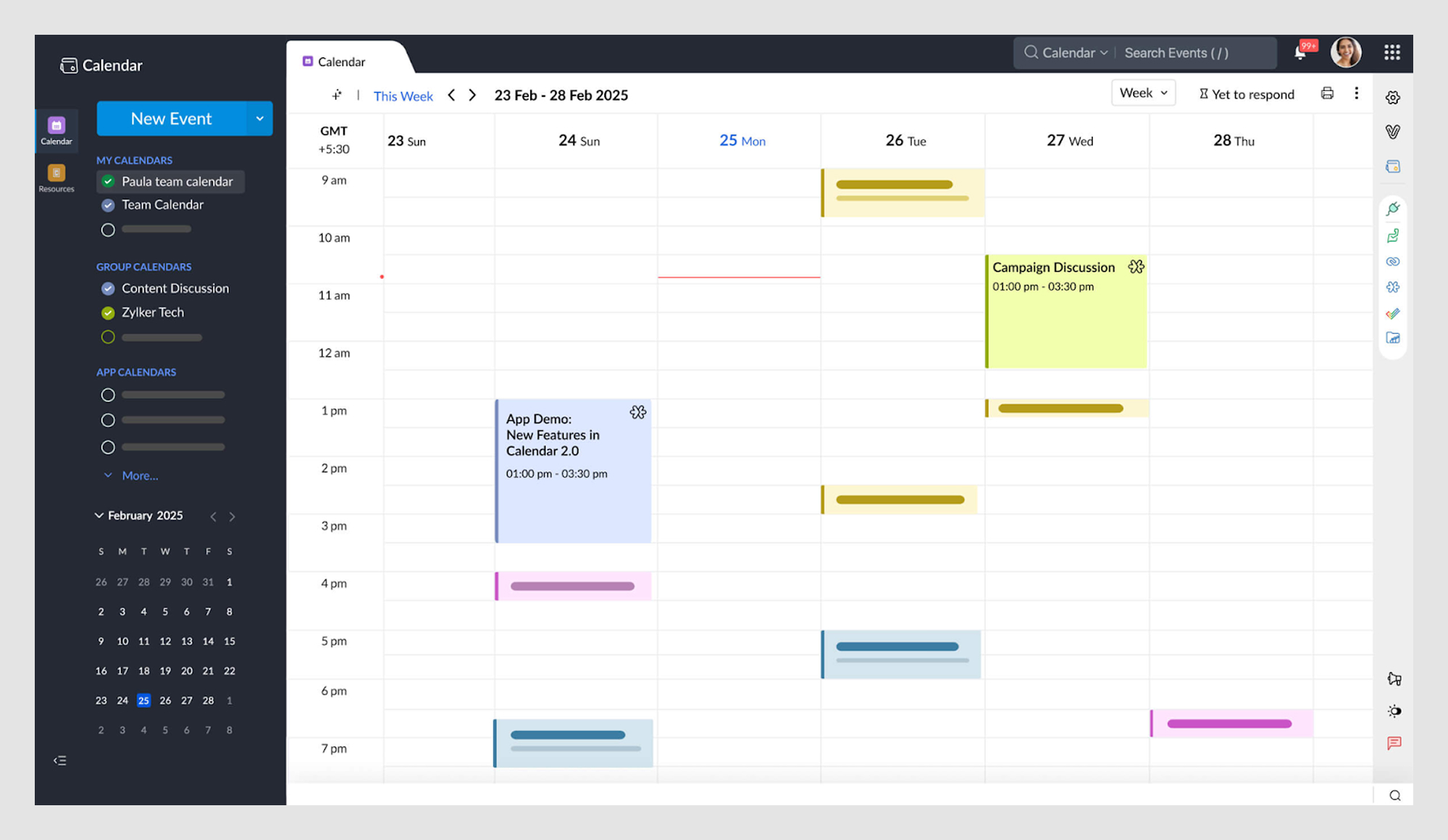
3. PrimePro job-tracking view (Our work at Eleken)
For PrimePro, we designed a weekly and monthly calendar UI that shows contractors and on-demand workers all their assigned jobs at a glance. Each job appears as a clearly defined component on the calendar grid, so workers can check free slots or tap into the data selected with one interaction.
Because the audience isn’t tech-savvy, we prioritized clarity: plenty of white space, consistent layouts, and only the most relevant value on each screen. This way, scheduling feels intuitive, not stressful.
.png)
UX takeaway: In productivity tools, clarity is king. A calendar UI should be the quickest way to see what’s next, what’s in progress, and where there’s room for more work — all at a glance.
4. Google Tasks events + to-dos in one place
Google Tasks integrates directly into Google Calendar, letting users see tasks alongside events in the same calendar grid. Deadlines, reminders, and meetings all live in one visible space, eliminating the need to bounce between apps.
This integration makes the calendar a true personal hub. By blending to-dos with data selected events, users get a complete view of their commitments in seconds.
.png)
UX takeaway: Combine related functions into one interface. If users already connect events and tasks in their mind, your design should do the same.
5. Asana timeline for project tracking
Asana’s timeline takes a different approach. Instead of a strict calendar grid, it presents tasks as movable blocks on a project-level timeline. Dragging a block updates its date instantly, and dependencies shift automatically.
This bird’s-eye view helps teams spot overlaps, manage workloads, and adjust plans quickly. It’s less about individual events and more about keeping projects on track across the full calendar system.
.png)
UX takeaway: Sometimes a Gantt-like view works better than a calendar grid for teams, especially when tracking projects with shifting deadlines.
6. Microsoft Outlook integrated work calendar
Outlook Calendar has been around for decades, but its strength today lies in integration. Events flow directly from email into the calendar, meeting invites sync across devices, and smart scheduling assistants suggest meeting times based on everyone’s availability.
For personal use, the clean calendar grid can display multiple current month or team calendars side by side (work, family, holidays) without turning into a cluttered mess. The design balances detail with clarity, making it easy to zoom between daily calendar cells and long-term planning.
.png)
UX takeaway: Seamless integration across tools reduces friction. A calendar that connects with email, contacts, and tasks saves users from context-switching and keeps everything in one visible place.
7. Slack huddle scheduling integration
Slack integrates with Google Calendar to show meeting availability directly inside chat. Instead of switching apps, users can see who’s free and pick a time based on data selected — all without leaving the conversation.
This small touch makes scheduling feel seamless. By embedding calendar components into communication tools, teams avoid the usual back-and-forth of juggling previous and current availability.
.png)
UX takeaway: Bring the calendar to where the team is already communicating. Reducing app-switching makes coordination smoother.
Booking & reservations
Whether it’s dinner, an appointment, or a hotel stay, calendars are often at the heart of booking flows. The examples below show how smart design reduces friction and boosts conversion.
8. Airbnb date picker for bookings
Airbnb’s calendar UI is one of the most polished booking interfaces around. When users select a start date, the calendar cell highlights it with a circle. Picking an end date connects the two points, and the calendar grid shades the range in between. This subtle behavior reassures users they’ve selected the right period.
The component also supports micro-interactions — buttons let you quickly add a night or extend your stay without reselecting data. On mobile, the calendar grid is responsive and intuitive, with layout logic that mirrors the desktop experience. No steep learning curve as users switch devices.
.png)
UX takeaway: Make data selected and visual feedback obvious. Users should never wonder, “Did I actually pick the right date?”
9. Calendly slot picker
Calendly flips the typical calendar UI by hiding unavailable calendar cells and displaying only selectable time blocks. Instead of picking from a calendar grid, users choose from a list of available slots — a more intuitive function that reduces scheduling friction.
It’s a mobile-first design with responsive components, large tappable cells, and automatic timezone detection. The system prevents double-booking and handles data invalid or unavailable slots in the background.
.png)
UX takeaway: Put focus on availability, not options. Simplify the calendar component so users can lock in times with confidence.
10. OpenTable real-time reservation calendar
OpenTable connects its calendar system directly to real-time restaurant capacity. Change the party size or time preference, and calendar cells update instantly. If a time slot becomes fully booked, it simply disappears from the grid, eliminating confusion.
This behavior prevents users from submitting invalid data or chasing unavailable options. The visible feedback loop is fast and responsive, which builds trust during high-pressure decisions like Friday night reservations.
.png)
UX takeaway: Sync your calendar grid with real-time systems. When unavailable options vanish, users get clarity and confidence in their selections.
Task-first calendar tools
Sometimes users don’t start with a calendar — they start with tasks. These tools add calendar UI views to task-focused apps, helping users visualize deadlines, see what’s passed, and manage time more effectively.
11. Notion toggle between views
Notion offers users flexibility: they can toggle between kanban boards, lists, and calendar grids — all tied to the same data. No matter the first day they start planning, switching views won’t affect the value or content.
Tasks display in the calendar component instantly, and the data selected remains consistent across formats. This ensures continuity and minimizes friction when switching between planning and execution modes.
.png)
UX takeaway: Support multiple ways of seeing the same data. Let users shift focus between formats without breaking their workflow.
12. Trello calendar power-ups
Trello’s calendar component is an optional “power-up” that transforms task boards into calendar UI views. Cards appear as data selected items in a monthly or weekly calendar grid, and dragging a card to a new date updates the task instantly.
This simple function turns Trello into a planning tool by embracing simplicity in UI UX without requiring a full redesign. Even better — the current month and active cards stay visually clean with drag-and-drop rescheduling.
.png)
UX takeaway: Overlay calendar systems onto task tools. Give users time context while maintaining board familiarity.
13. Todoist synced task deadlines
Todoist integrates with external calendar components like Google or Outlook, syncing task deadlines directly into the user's calendar UI. Tasks appear alongside meetings, eliminating the need to juggle multiple apps or schedules.
Users can drag tasks across the calendar grid to shift deadlines, and those updates sync across platforms. The design avoids data invalid errors by using only validated calendar cells and values.
.png)
UX takeaway: Build bridges between tools. A good calendar component integrates rather than isolates.
14. Fantastical grid + timeline view
Fantastical blends two calendar UI paradigms: a clean calendar grid and a scrollable timeline. Users can quickly toggle from a broad view of the current month to a detailed hour-by-hour agenda.
Natural language input like “Call next Thursday at 11” automatically fills the data selected — no hunting through cells. Subtle animations and color-coded components make dense schedules visible but never overwhelming.
.png)
UX takeaway: Combine overview and detail in one place. Timeline + calendar grid offers the best of both worlds.
Business & enterprise
Enterprise users rely on calendar components not just for scheduling, but for operational insight. These examples show how a calendar UI becomes a decision-making tool, not just a display of dates.
15. Privado Dining event calendar (Our work at Eleken)
For Privado Dining, we designed dual calendar views. The default calendar grid shows upcoming events, while a heatmap view overlays financial performance, combining calendar systems with the ability to design a dashboard.
By turning the calendar UI into a visual reporting tool, managers get both scheduling and strategic overviews at a glance. It’s a great example of turning calendar cells into data-rich components.
.png)
UX takeaway: Add context to calendar UI. Don’t just show the date — show what it means for the business.
16. Floret promotion tracker (Our work at Eleken)
For Floret, a foodtech platform, we created a promo calendar UI where each cell displays active discounts. Instead of flooding users with information, we highlighted only the value that matters: promo duration, days left, and filters.
Quick actions like “create new promo” or using a wizard UI pattern for input steps make the component fast to use. And with filters for date, retailer, and type, it reduces overload without sacrificing flexibility.
.png)
UX takeaway: Focus on duration and filters. Show what’s active, what’s passed, and what’s next — all in one visible interface.
17. Highpoint schedule builder (Our work at Eleken)
Highpoint, a white-label higher ed platform, needed a flexible calendar system to support student planning. We designed a schedule builder where students can arrange classes, create backup plans, and see everything in one structured calendar grid. Course details, exams, and enrollment steps live in a single component, reducing friction.
For admins, the same calendar UI doubles as an analytics tool. With Schedule Builder Analytics, they can track demand and adjust curricula. Each cell reflects real data, making the calendar both strategic and fully visible across devices.
.png)
UX takeaway: In education, calendar components must serve multiple audiences. Design flexible calendar grids that deliver clarity to students and insight to admins alike.
18. Hirerise recruitment calendar (Our work at Eleken)
For Hirerise, an applicant tracking platform, we developed a recruitment-focused calendar UI where each calendar cell reflects a real hiring action from interviews and decision points to offer stages. These aren’t just events floating in time; they’re tied to job posts and candidate pipelines, turning the component into a dynamic workflow dashboard.
Switching between calendar views, tasks, and activities is seamless. Recruiters stay focused on decisions, not tools. The calendar grid is intentionally minimal, ensuring the data selected remains the focus. The result: no lost context, no scheduling confusion.
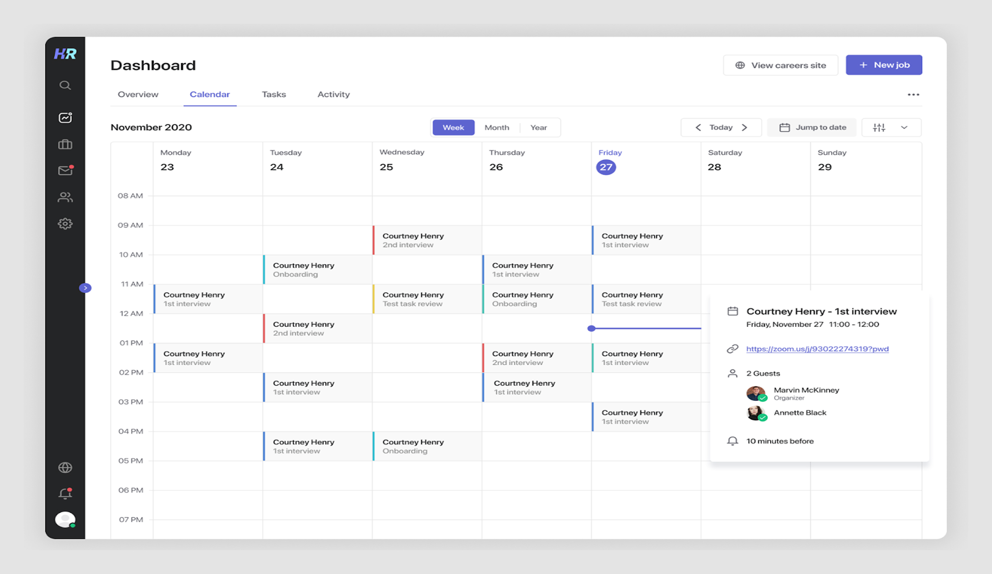
UX takeaway: Tie calendar components directly to core workflows. When calendar systems reflect actual hiring data, recruiters stay productive and informed.
Health & habit tracking calendars
When tracking cycles, routines, or goals, the calendar UI shifts from a scheduling tool to a personal reflection system. These components rely on clarity, soft visuals, and behavioral cues to keep users engaged over time.
19. Fitbit cycle tracker
Fitbit’s cycle tracker uses a traditional calendar grid, color-coded markers, and intuitive calendar cells to highlight fertile windows, predicted periods, and logged symptoms. Whether you’re viewing today or the current date in a specific month like October, the component makes recurring patterns easy to spot.
Each cell becomes a selected entry storing health data, not just visual but functional. Clear value indicators and tap behavior make the system ideal for both quick daily check-ins and long-term tracking. While weekends like Sunday (sun) appear alongside other weekdays, subtle color contrasts support ease of read even in low-light modes.
.png)
UX takeaway: When designing health calendar components, emphasize visual patterns and minimize the effort needed to interpret them.
20. Flo predictive health tracker
Flo enhances the typical cycle-tracking component by layering in predictive insights, tips, and wellness content. The calendar grid highlights key dates, like ovulation or period start, using soft visuals that shift dynamically with the month, from August to September and beyond.
It adapts the UI based on the current date, open state, and user preferences. Each selected cell shows detailed logs and offers button access to switch between standard tracking and pregnancy mode. If any data is invalid, the system flags it clearly without halting the function.
.png)
UX takeaway: Use your calendar system to offer more than records — provide foresight and reassurance through gentle, predictive cues.
21. Bloom cycle tracker
Bloom blends aesthetics and function in a soothing tracker. The UI uses subtle animations, even floral motifs, to turn cycle tracking into an uplifting habit. Each cell is both decorative and useful, tracking selected periods, fertile windows, and symptoms.
The design makes sure no value is unavailable: even disabled cells are styled clearly to prevent misinterpretation. It adapts smoothly across month transitions like November to December, with past data passed forward for easy journaling. Logs remain visible through gentle hover states and allow easy edit access.
.png)
UX takeaway: For sensitive topics like health cycles, use visuals that comfort and encourage. A calendar can be both functional and emotionally supportive.
22. Duolingo streak calendar
Duolingo turns time tracking app design into a game-like calendar experience. Instead of the usual month grid, it emphasizes the number of selected days in a streak — visually represented by glowing cells and colorful badges.
The component updates dynamically with each start of a new session. When a day is missed, it shows a data invalid cell to signal the break in routine. Each value is tied to a button action or reward trigger, making the function emotionally reinforcing. You won’t find unavailable options — all entries are touch-ready and responsive.
.png)
UX takeaway: Milestone calendars don’t need complexity. Focus on positive reinforcement and simple visuals that encourage repeat behavior.
Lifestyle & personal planning calendars
Beyond work, calendars can help users plan travel, express themselves, or reflect on their lives. These examples highlight how personal use cases reshape what a calendar can be.
23. Whering outfit planner
Whering turns the calendar into a personal style assistant. Users can assign outfits to specific days, making it easy to plan looks for events, trips, or just the week ahead. The app even pulls in weather data, so you’re not planning sandals on a rainy October day.
The screen design is simple and playful — instead of numbers and text, the daily view is filled with visual outfit cards. It makes the planning process more engaging and less like a chore.
.png)
UX takeaway: Calendars can go beyond time management. By pairing them with lifestyle data, like weather, they help users plan smarter and avoid unavailable combinations.
24. Co–Star astrology calendar
Co–Star transforms the calendar into a personal guide, linking astrological data with daily recommendations. Each date comes with symbols that hint at moods, themes, or events, and tapping into a day reveals suggestions like “Great day for haircuts” or “Best day for new music.”
By reframing the calendar as a tool for self-reflection rather than just scheduling, it resonates with users who want more than logistics. The minimalist component design keeps it from feeling overwhelming, even while offering symbolic meaning.
.png)
UX takeaway: Calendars don’t have to be purely functional. Layering interpretation or context can start emotional engagement and encourage daily use.
25. Instagram Stories Archive calendar
Instagram takes the calendar concept beyond productivity, using it as a way to resurface memories. The Stories Archive lays out past posts in a monthly grid, letting users revisit what they shared on specific dates. Tapping a cell brings back ephemeral content that would otherwise be lost.
There’s also a map view that pins stories to their locations, turning memories into both a timeline and a travel log. This design reframes the calendar as a storytelling tool rather than a planner.
.png)
UX takeaway: Calendars can be about the past, not just the future. Use them to help users reflect, relive, and re-contextualize their own history.
26. Habitica gamified habit calendar
Habitica gamifies habits by turning them into calendar entries. Daily habits appear on a streak view, and missing them creates visible gaps. Completing tasks earns rewards, reinforcing consistency.
The behavior-driven design makes even mundane tasks feel like part of a game. The calendar isn’t just for planning — it’s for accountability and motivation.
.png)
UX takeaway: Gamification adds stickiness. A calendar that rewards consistency keeps users engaged longer.
27. Mindtrip travel itinerary calendar
Mindtrip organizes trips as a time-based plan where flights, check-ins, transfers, and activities slot into a clear timeline. Instead of a generic booking grid, the layout is tailored for travelers, showing the sequence of the day at a glance.
Color-coded blocks differentiate activities, accommodations, and transport, making hour‑by‑hour plans easy to scan. The result is confidence that no step is unavailable and plenty of space to adjust on the fly.
.png)
UX takeaway: For itinerary-style calendars, prioritize clarity and context. Use color and categorization to make complex plans instantly understandable.
28. Tubik event calendar concept
Tubik’s concept treats the calendar as part of the event experience, with bold gradients, dark backgrounds, and playful motion that make current date views feel alive. It’s a mood-forward component design that fits parties, concerts, and festivals.
A single, prominent “Add to calendar” button reduces friction for joining events, while the expressive visuals double as lightweight marketing. The calendar becomes both planner and promo surface.
.png)
UX takeaway: A calendar doesn’t always need to be neutral. For event-driven contexts, bold visuals can create excitement and make selected dates feel special.
Team & collaboration calendars
In team settings, the calendar becomes a shared source of truth. These tools prioritize transparency, coordination, and fast access to avoid confusion and misalignment.
29. TimeTree shared calendar
TimeTree is designed around collaboration. Instead of each person keeping a private schedule, families, friends, or teams create a shared calendar where everyone can add events, reminders, and notes. Each component supports comments, so people can coordinate details right inside the page.
The UI emphasizes transparency: color-coded entries, clear monthly and weekly views, and notifications that keep everyone updated in real time. It turns the calendar into a lightweight communication hub.
.png)
UX takeaway: Shared calendars work best when they double as conversation spaces. Add comments, reminders, and notifications so coordination happens in one component, not scattered across pages.
30. Zoho Calendar for teams
Zoho Calendar is part of Zoho’s broader productivity suite, but it stands out on its own as a full-featured scheduling component for teams. Users can create group calendars, subscribe to external calendars, and layer them together for a complete overview. Sharing is flexible — you can keep calendars public, restrict them to an organization, or set default permissions.
The interface focuses on visibility and control. Color-coded categories, recurring month-level events, and integrated resource booking (like meeting rooms) make it practical for businesses of any size. Sync with Google, Outlook, or other platforms ensures no one misses an event, even across timezones or after using search bar examples to find them quickly.
UX takeaway: Team calendars should balance openness and control. Permissions, categories, and integrations help teams submit updates faster and avoid unavailable time slots.
31. Teamup calendar for easy sharing
Teamup focuses on simplicity for groups that need to coordinate quickly. It lets teams create shareable calendars without requiring user accounts. Each sub-calendar can be color-coded for clarity, and links can be shared with different permission props.
This makes it especially handy for community groups, clubs, or temporary teams that don’t want the friction of sign-ups. The emphasis is on easy access and fast setup using just a button, even if the previous month has passed.
.png)
UX takeaway: Don’t overcomplicate access. Sometimes the best coordination tool is just a shareable link with a clear button to get started.
32. ClickUp drag-and-drop planning
ClickUp offers a powerful calendar view where tasks, subtasks, and milestones can be dragged and dropped across month views. It’s designed for flexibility — users can switch between tabs UX like day, week, or month layouts, filter by assignee, and sync everything with Google or Outlook.
The drag-and-drop behavior supports dynamic component updates, while every date adjustment keeps the current month visible and responsive. If a deadline value is changing, it reflects immediately in all connected tools.
.png)
UX takeaway: In task-heavy calendars, flexibility is critical. Drag-and-drop scheduling with real-time sync helps teams adapt quickly without breaking workflows.
33. Monday.com calendar integration
Monday.com turns project boards into calendars. Each task becomes a calendar entry, and custom fields like “priority” or “status” appear directly on the cell or card.
This gives teams both timeline visibility and context in one place. Instead of bouncing between views, they can start and finish all scheduling in one Stepper UI–style component. Even unavailable slots are clearly marked, and selected dates are highlighted for better orientation.
.png)
UX takeaway: Enrich calendar entries with context. Extra data on each cell saves users from unnecessary clicks and clarifies team coordination at a glance.
That’s a lot of calendars — from minimal daily planners to gamified streak trackers, and even astrology-inspired schedules. The point is, there’s no single “right” way to design a calendar. The best approach depends on your users, their context, and what they’re trying to achieve.
Now that we’ve seen 30+ examples in action, let’s zoom out. What makes a calendar good? Which UX principles turn a basic date grid into a tool people actually enjoy using?
Calendar UI&UX Design: Smart Tips for Better Interfaces
Designing a calendar isn’t about drawing boxes for days. It’s about making time feel navigable. When done right, calendars help users plan, act, and reflect with minimal friction. When done wrong, they overwhelm with clutter or make basic actions confusing.
To avoid the traps, we’ll break down calendar design into four key principles: layout & navigation, visual hierarchy, interactions, and accessibility.
1. Layout & navigation
Calendars succeed when users can easily shift between the “micro” (what’s happening today) and the “macro” (what’s happening this month). Outlook Calendar does this well by letting you toggle between day, work week, full week, and month with one click.
On mobile, natural gestures like swiping between days or weeks make navigation feel fluid. Google Calendar’s mobile app is a strong example: swipe to move through days, but always see your events aligned in a consistent vertical flow.
.png)
Key takeaways:
- Give users control over switching between agenda, week, and month views.
- Support natural gestures (swipe/scroll) on mobile, quick toggles on desktop.
- Keep layouts consistent across devices to reduce relearning.
2. Visual hierarchy
Calendars get messy fast. That’s why color, contrast, and typography, rooted in gestalt principles, matter so much. Notion’s calendar view uses clean typography and subtle color labels to make tasks scannable without overwhelming.
When data is dense, clarity comes from prioritizing what’s most important. Apple Calendar highlights the current day and time with subtle shading, guiding the eye instantly without extra labels.
.png)
Key takeaways:
- Use color sparingly to highlight categories or urgency.
- Establish a typographic hierarchy (large for dates, smaller for events).
- Use visual cues (shading, highlights) to orient users instantly.
3. Interactions
The best calendars are interactive, not static. ClickUp’s calendar view lets users drag tasks between days, instantly updating deadlines. That tactile interaction makes planning feel natural.
Recurring events are another UX minefield. Fantastical’s natural language input field design (“dinner every Thursday at 7”) solves it elegantly, removing the need for endless dropdown menus.
.png)
Key takeaways:
- Enable drag-and-drop rescheduling.
- Make recurring events simple with natural language or smart defaults.
- Show event details in side panels instead of disruptive modal windows.
4. Accessibility & edge cases
Calendars are everyday tools, so they have to hold up in edge cases. Google Calendar’s keyboard shortcuts make it usable for power users and those with accessibility needs.
Timezones are another classic source of frustration. Calendly solves this by auto-detecting zones for both host and invitee, ensuring meetings align without manual math.
Finally, many people check calendars at night. iOS Calendar’s dark mode keeps readability high without glare, proving small details like theme options matter.
.png)
Key takeaways:
- Add keyboard navigation for speed and inclusivity.
- Handle timezones automatically in scheduling.
- Ensure offline edits or syncs for reliability.
- Provide dark mode for low-light use.
Good principles are the foundation of a great calendar, but sometimes you don’t have the luxury of starting from scratch. Maybe you’re on a tight deadline, or you just want proven components instead of reinventing a date picker for the hundredth time. That’s where UI kits and ready-made components come in handy.
Whether you’re a designer looking for polished Figma templates, a developer in need of production-ready React libraries, or a team that wants a bridge between the two, there are plenty of resources to jumpstart your calendar.
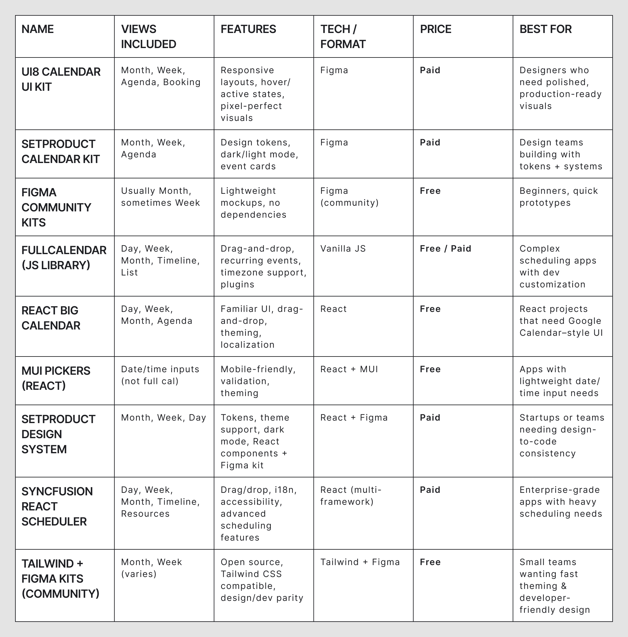
Best Calendar UI Kits & Calendar Components for Web and Mobile
If you don’t want to build a calendar from scratch, you’re not alone. Luckily, there are plenty of UI kits and components that give you a head start, whether you’re working in Figma, writing React code, or trying to bridge both worlds with design tokens and theme support.
We’ll break these down into three buckets: Figma UI kits, code components, and hybrid design+dev kits.
1. Figma UI kits
Figma kits are best for designers who want polished layouts they can drop into prototypes or adapt into final products. Many include multiple views (month, week, agenda) and come with auto-layout, variants, and dark/light modes built in.
UI8 Calendar UI Kit
UI8 Calendar UI Kit offers a high fidelity wireframe — perfect for scheduling, booking, and task planning.
Best for: product designers who need pixel-perfect visuals fast.
- Views: Month, Week, Agenda, Booking
- Includes: Responsive layouts, hover/active states
- Modes: Light & dark
- Price: Paid
SetProduct Calendar Figma Kit
A minimalist, system-ready kit with tokens and variants. Ideal for teams building design systems.
Best for: design teams who want scalable, themeable components.
- Views: Month, Week, Agenda
- Includes: Event cards, design tokens, auto-layout
- Modes: Light & dark
- Price: Paid
Figma Community Freebies
Community-contributed kits — great for mockups, early-stage designs, or learning.
Best for: beginners or projects on a budget.
- Views: Typically Month (some with Week/Agenda)
- Includes: Varies (basic grids, light components)
- Modes: Usually light only
- Price: Free
.png)
2. Code components
Code components are ideal for developers who want production-ready scheduling tools — complete with API hooks, drag-and-drop, and timezone handling.
FullCalendar (JS library)
One of the most widely used JS calendar libraries. Highly customizable with plugins.
Best for: dev teams building complex scheduling apps.
- Views: Day, Week, Month, Timeline, List
- Features: Recurring events, drag-and-drop, timezone support
- Tech: Vanilla JS with plugins for frameworks
- Price: Free / Paid (advanced plugins)
.png)
React Big Calendar
A React-based calendar that mimics Google Calendar’s UI.
Best for: React projects that need familiar scheduling UIs fast.
- Views: Day, Week, Month, Agenda
- Features: Drag-and-drop, localization, theming
- Tech: Built on date-fns or moment.js
- Price: Free (MIT)
MUI Pickers (React)
Not a full calendar, but great for lightweight date/time input components.
Best for: apps that don’t need full scheduling, just picking dates or times.
- Views: Inline date/time pickers (not full calendar)
- Features: Mobile-friendly, theming, validation
- Tech: Part of the MUI ecosystem
- Price: Free (MIT)
3. Design + dev kits
These kits provide both Figma files and code components, often using shared tokens or theming systems — ideal for teams looking to bridge design and dev.
SetProduct Design System with Calendar Module
Ships with both Figma components and a React-based implementation.
Best for: startups or design-system-driven teams.
- Views: Month, Week, Day
- Includes: Tokens, dark/light modes, theme support
- Tech: Figma + React
- Price: Paid
Syncfusion React Scheduler
An enterprise-grade scheduler with advanced features and accessibility support.
Best for: complex SaaS platforms or enterprise dashboards.
- Views: Day, Week, Month, Timeline, Resource view
- Features: Drag/drop, i18n, A11y, recurring events
- Tech: React (also available in Angular, Vue, Blazor)
- Price: Paid
Tailwind + Figma Calendar Kits (community projects)
Lightweight and open-source kits combining visual assets and utility-first CSS.
Best for: small teams who want quick theming and flexibility.
- Views: Month/Week (varies)
- Includes: Tailwind-compatible components, Figma mockups
- Tech: Tailwind CSS + Figma
- Price: Free (MIT or open licenses)
Together, these Figma kits, code libraries, and hybrid systems cover most use cases from quick prototypes to enterprise-grade scheduling apps. To make the differences easier to compare at a glance, here’s a table that breaks them down by included views, pricing, and ideal use cases.
Using UI kits and components can save a ton of time, but remember: no kit can protect you from bad design choices — use a design QA checklist to validate your interface before launch. A polished template still falls apart if you overload it with colors, ignore timezones, or hide the most basic actions. Before we wrap up, let’s look at the most common calendar design mistakes and how to avoid them.
Common Calendar UI&UX Mistakes (and How to Avoid Them)
For something as universal as a calendar, it’s surprisingly easy to get the design wrong. A single bad decision, like hiding the “add event” button or forcing everyone into a rigid monthly view, can turn a calendar from a helpful tool into a constant source of frustration.
Here are the most common mistakes we see in real-world products (and how to avoid them).
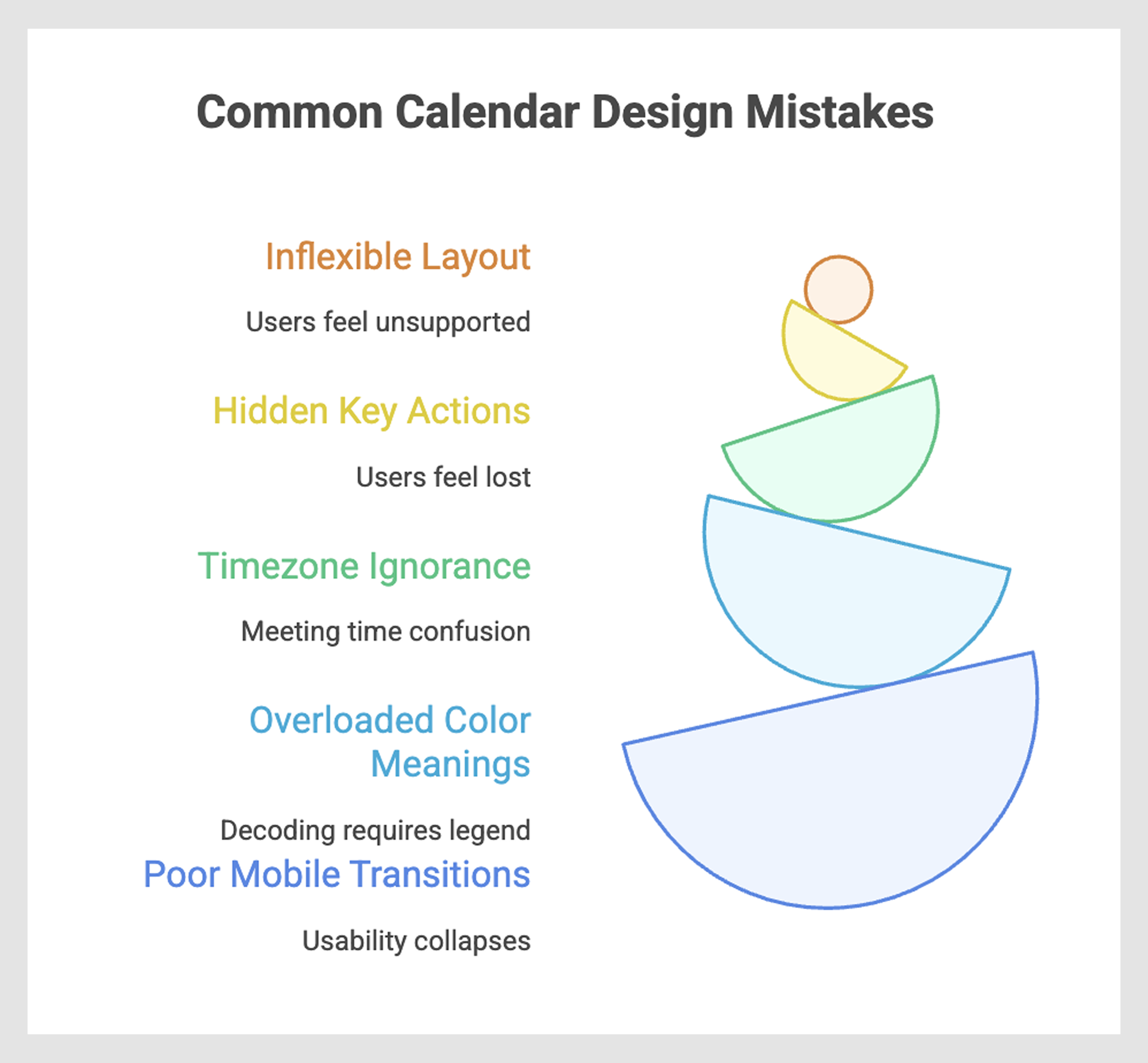
Forcing all users into one layout
Some people live in their agenda view, others swear by weekly grids, and project managers often need Gantt-like timelines. Forcing everyone into the same layout guarantees that part of your audience will feel unsupported.
Better approach: Offer flexible views (day, week, month, agenda, timeline) and let users toggle between them. Google Calendar and Notion do this well, while many older tools still lock you into a single grid.
Hiding key actions (like add/edit)
Calendars exist to be used, not just looked at. If users can’t instantly see how to add, edit, or delete an event, they’ll feel lost. Some mobile apps hide these actions behind tiny “+” buttons or deep menus, which slows everything down.
Better approach: Make “add event” or “new task” obvious and one-tap accessible. Apple Calendar and Todoist both keep this action visible at all times.
No timezone awareness for selected date
Timezone confusion can quickly lead to missed meetings and frustration, which may negatively affect user trust and communication. Remote teams, freelancers, and global companies deal with this daily, yet many calendars still fail to display or auto-adjust zones.
Better approach: Handle timezone conversions automatically. Tools like Calendly and Slack integrations adjust availability seamlessly, preventing the “Is that 2 pm my time or yours?” problem.
Overloading color meanings
Color coding is helpful until it isn’t. If red means “urgent,” blue means “work,” and green means “personal,” what happens when a red-green event overlaps with a blue recurring one? Users shouldn’t need a legend to decode their calendar.
Better approach: Limit color usage to a single meaning (categories, urgency, or status). Combine with icons, labels, or text to avoid over-reliance on color alone.
Poor mobile transitions
Calendars are among the most frequently checked mobile tools. If your layout shrinks a desktop grid onto a tiny screen, usability collapses. Tiny tap targets, hidden labels, and clunky scrolling all kill adoption.
Better approach: Optimize for mobile with swipe gestures, vertical event lists, and adaptive layouts. Fantastical and Google Calendar both feel “native” on small screens, while older apps still feel like desktop ports.
Avoiding these mistakes can mean the difference between a calendar that frustrates users and one that quietly makes their lives easier. But good calendar design isn’t just about avoiding pitfalls — it’s about rethinking how people interact with time itself. Which brings us to a bigger idea: calendars as more than utilities, but as trusted time assistants.
Conclusion: Designing time, not just UIs
A great calendar app design goes far beyond utility. It’s how people plan their lives, track their progress, and make sense of the one resource they can’t make more of — time. A well-designed calendar is more than a grid of dates; it’s a quiet assistant that reduces friction, removes uncertainty, and helps users feel in control of their day.
Whether you’re pulling inspiration from 30+ UI examples, applying UX principles, borrowing from ready-made kits, or avoiding common mistakes, the real goal is the same: designing for time, not just designing a UI.
And if you’re building a product where scheduling or planning plays a key role, that’s exactly where we can help. At Eleken, we specialize in designing SaaS products that don’t just look good but also work seamlessly for real users.
Let’s design a calendar, or an entire product, that feels like a time assistant, not just another app. Talk to us about your project.


.webp)