

What’s one screen that shows up in nearly every digital product?
The profile page. Or my account. Call it what you want — it’s always there.
And if you’re building something new, you’ll end up there too. The sign-up page, the log-in screen, and the profile — that’s your starting trio. No matter what your app does, these pages are part of the deal.
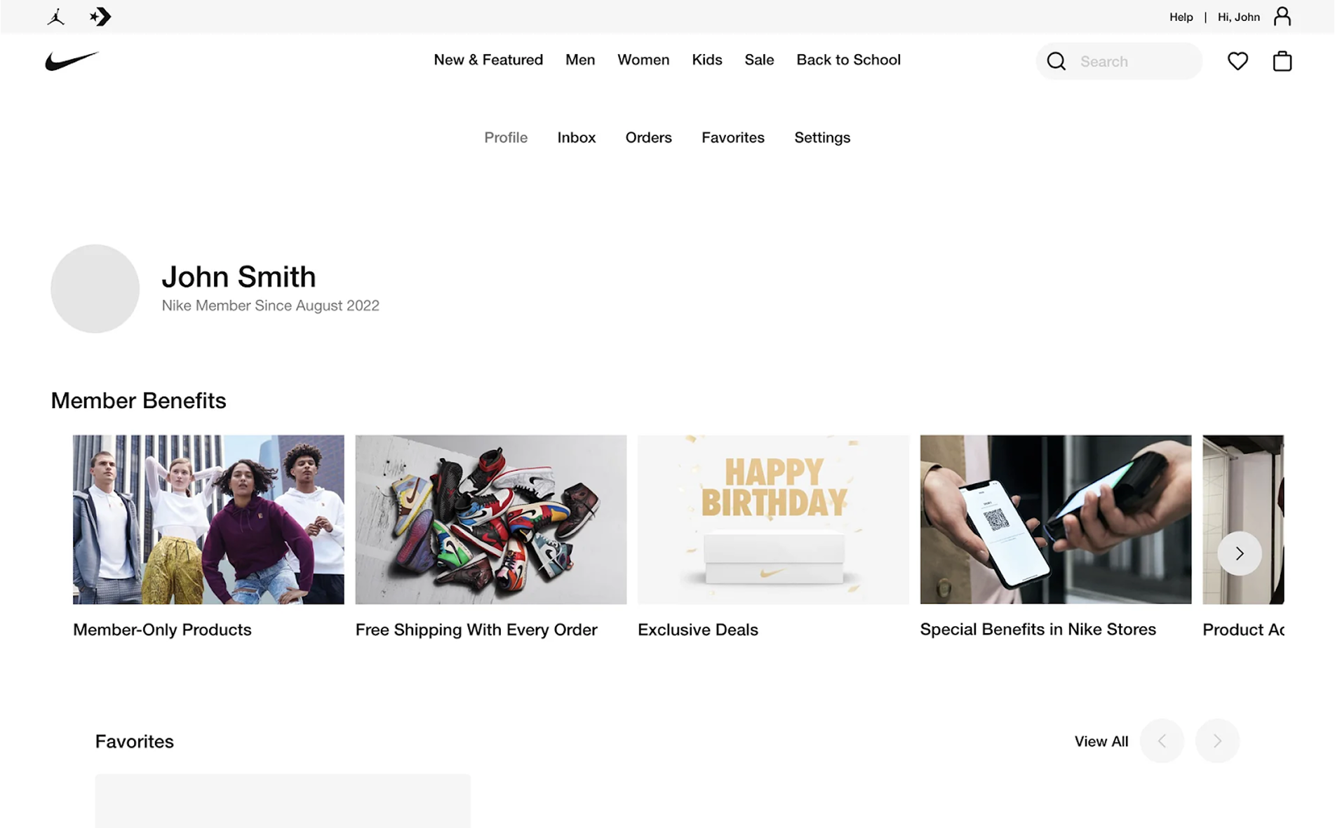
As a design agency, we’ve worked on enough profile pages to know where teams usually get stuck and what actually works. So in this article, we’ve put together everything we’d want to know if we were starting from scratch.
What is a profile page, and why does it matter
A profile page is the part of your product where all information about a user is gathered. Some of it is entered directly, like their name or email, and some is recorded automatically by the system, such as the date they registered or their last login. It’s the user’s personal corner inside your app, where they can check details, make changes, or see how they’re doing.
.png)
At the bare minimum, a profile includes what you ask for during registration. From there, it can grow into a space that holds all sorts of personal details, preferences, and activity records.
Among the mandatory data are:
- Email address
- Name (not always)
- Password (not always)
Optional data includes:
- Profile photo
- Age or birthday
- Location
- Activity statistics
- Billing and subscription info
- Linked accounts or integrations
When the profile page is designed well, users don’t have to think about where to find something. It’s all right there, clear and easy to edit.
A profile that feels personal and effortless to manage keeps people engaged, makes them more likely to trust you, and reduces the chances they’ll drift away to a competitor. But when basic data is buried under hidden menus and scattered settings, frustration builds quickly. And frustrated users rarely stick around for long.
Types of profile pages and their core functions
Not all profile pages serve the same purpose. Their role depends heavily on the product itself, the kind of information it needs to show, and how the user interacts with it. Over time, certain UX design patterns have emerged, which you’ll see repeated across products in different industries.
→ Social media profiles
These are built for visibility and connection. Social media platforms put identity and activity front and center: a photo, a short bio, follower and following counts, and a feed of recent posts. Online platforms rely on this format to encourage interaction, discovery, and a bit of self-expression.
.png)
→ Portfolio or creator profiles
Here, the profile is the product. Designers and developers use their profile pages on different platforms to showcase work, skills, and achievements. The layout prioritizes visual presentation and credibility, with every detail aimed at attracting new followers, clients, or collaborators.
.png)
→ B2B and SaaS user accounts
In business, a profile is often more of a control panel. It’s where people manage personal details, permissions, integrations, and sometimes their subscription or billing. In these products, the user profile page is functional, data-rich, and tightly integrated with the workspace.
.png)
→ E-commerce or service profiles
For marketplaces, the profile represents a shop or a service provider. In platforms like these, you’ll see reviews, availability, location, and a portfolio of products or past work. The focus here is on trust and conversion, and every element is aimed at convincing a visitor to buy or book.
→ Niche profiles
Some products have unique demands for their profile page UI design. In healthcare platforms, profiles might list certifications or specialties. On job boards, they work as a hybrid of a resume and a portfolio. In dating apps, they balance personality prompts, photos, and matching preferences.
.png)
Across all these types, the profile’s job stays the same — to bring together the right information in a way that’s easy to find, relevant to the user’s goals, and aligned with the product’s purpose. To see what that means in practice, let’s look at some real profile page examples and break down the design choices behind them.
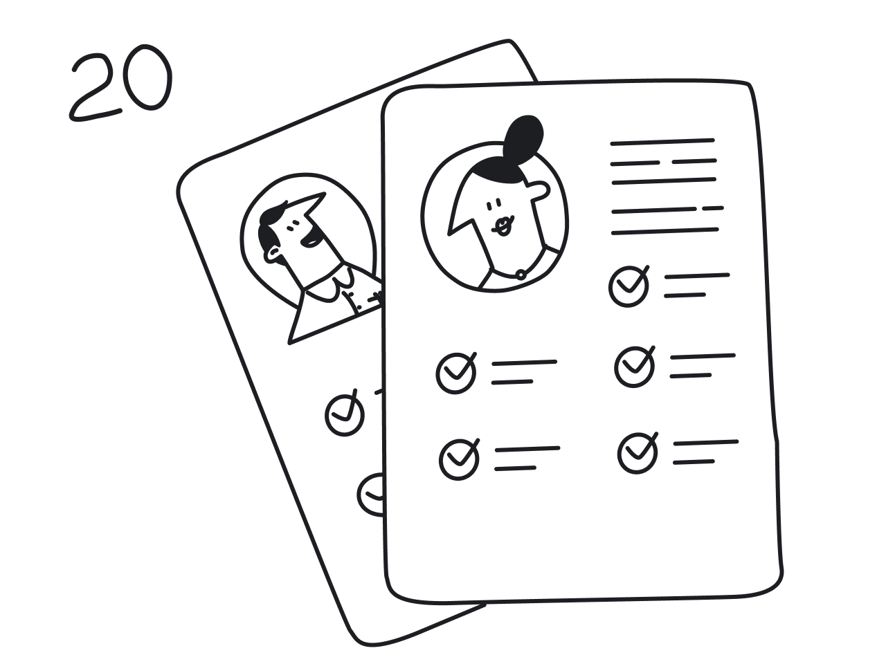
20 user profile page design examples
There’s no single formula for a perfect profile page design, but there are plenty of great ones to learn from. We’ve gathered 20 examples from different industries, each showing a distinct approach to layout, data presentation, and user interaction. Let’s take a look at them.
1. Figma
Figma’s profile page UI skips unnecessary information and focuses on the essentials: your name, avatar, and a short bio, complemented by follower and following counts, plus a bit of additional info. Most of the layout is reserved for projects, giving you plenty of space to showcase your personal design style.
.png)
Why this works: Personal details stay compact and out of the way, while the main space is reserved for projects that matter most to designers.
2. YouTube
A YouTube user profile page UI represents the creator and guides viewers toward their content. At the top, a bold banner image sets the visual tone, paired with the channel name, avatar, and subscriber count. Navigation tabs for Videos, Shorts, and Playlists make it easy to explore content, while the featured video section draws immediate attention to what the creator wants to highlight.
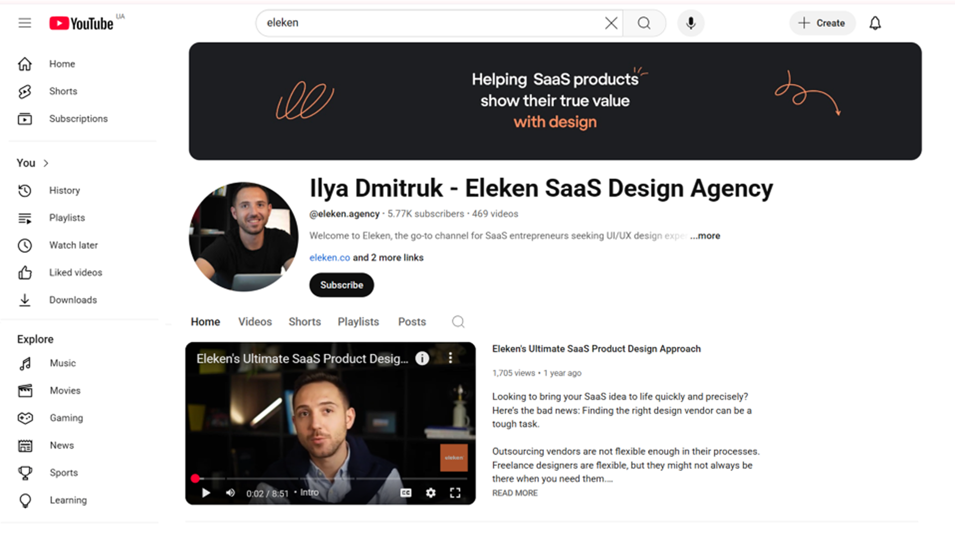
Why this works: Well-labeled navigation tabs keep the experience simple, helping viewers explore different parts of the channel without getting lost.
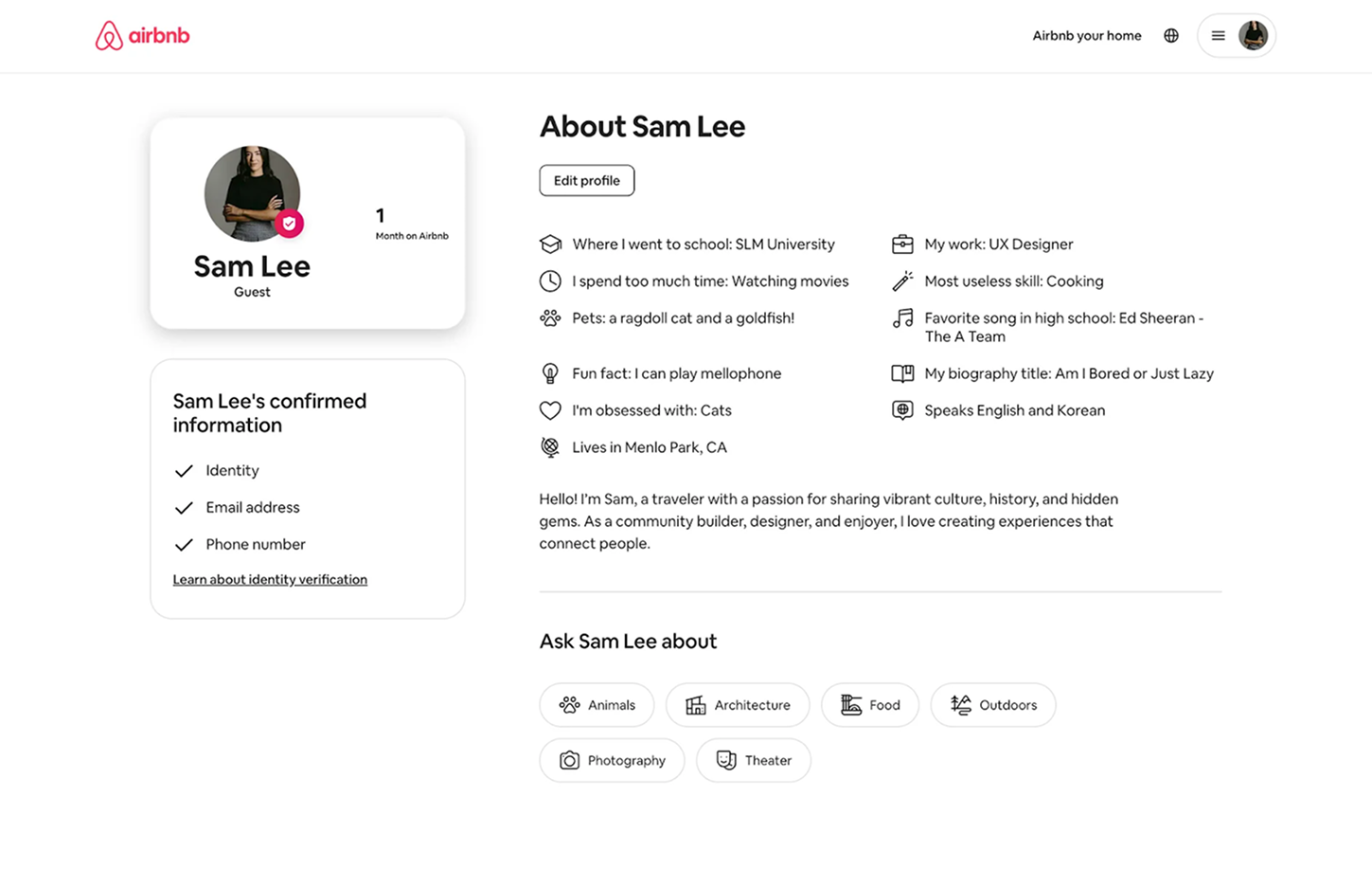
3. Airbnb
An Airbnb host profile blends personal identity with trust-building details. At the top, you’ll see the host’s name, profile picture, and a verification badge, supported by a short bio. Key trust signals like Superhost status, reviews, rating, and years of hosting are placed prominently to reassure potential guests.
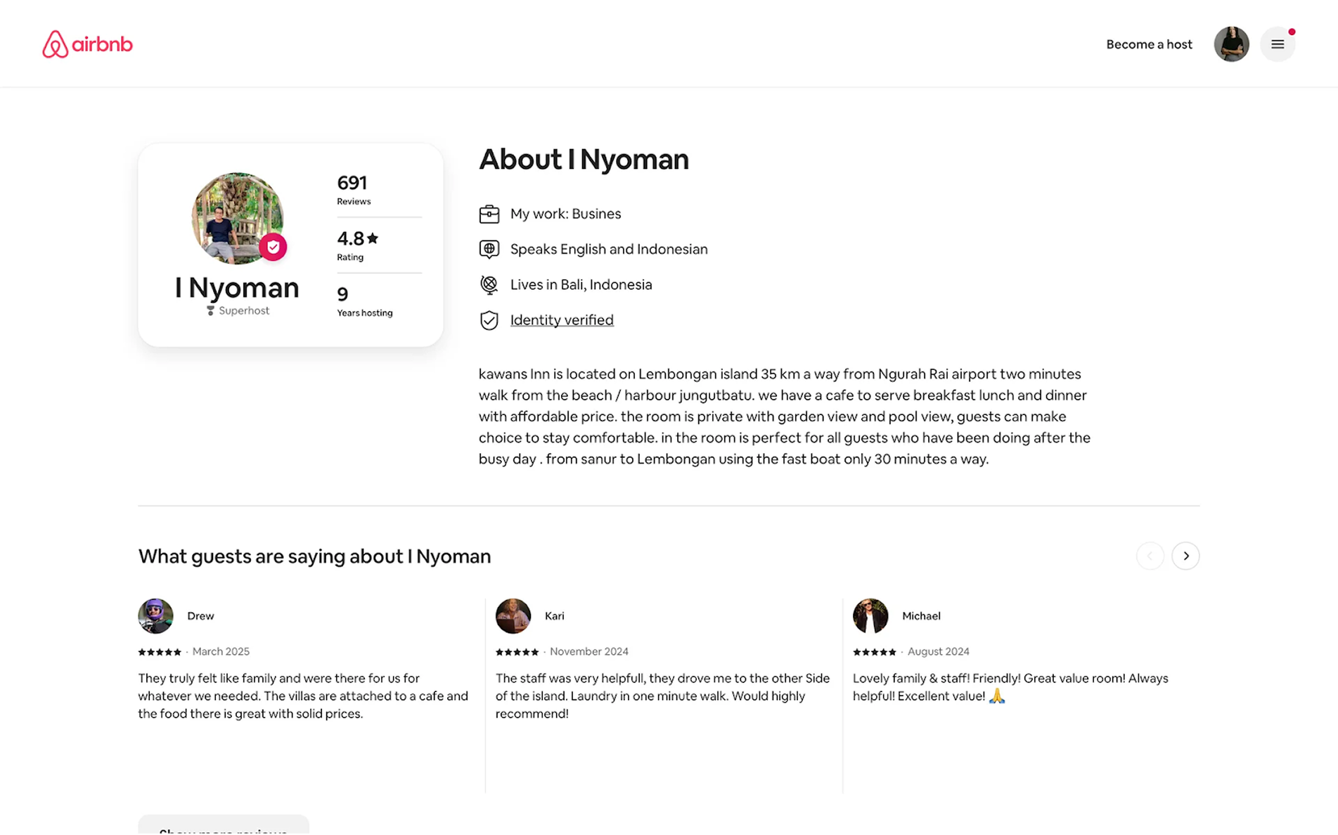
Why this works: Trust signals like reviews, response time, and verification badges are placed where visitors see them first, making booking decisions easier.
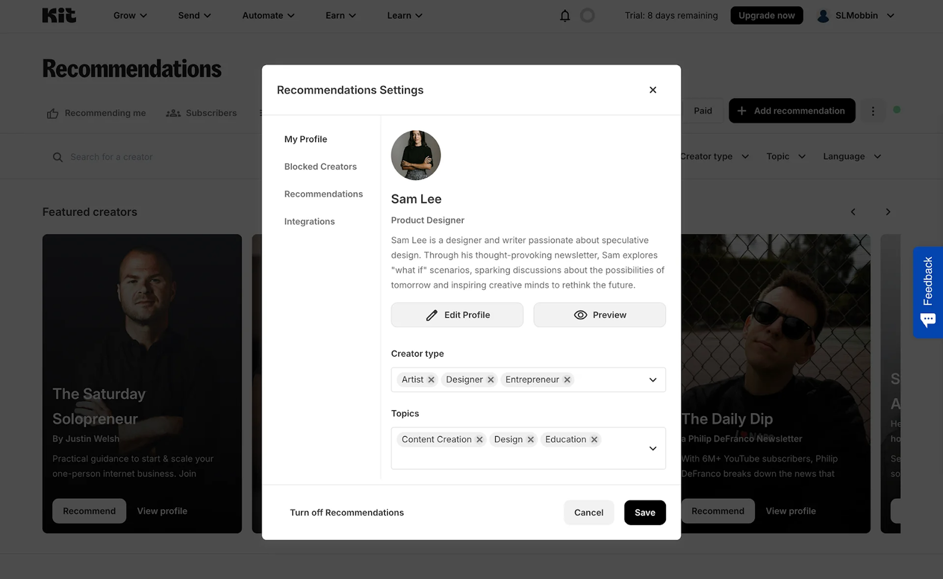
4. NWORX
For the NWORX project, we designed a profile page UX that keeps everything clear on a small screen. A photo avatar sits at the top with the user’s name and email for quick identification. Below, neatly organized tabs lead to sections Security, Help and Support. The sign-out button is placed at the bottom of the screen, making it easy to leave the account without hunting through menus.
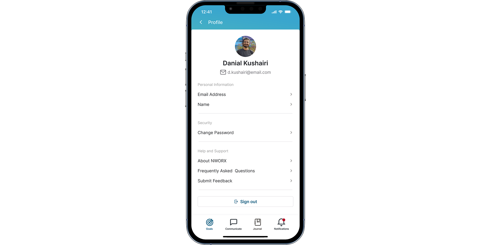
Why this works: The mobile layout follows a clear hierarchy with personal info at the top and the sign-out button placed at the bottom, where users naturally expect it.
5. LinkedIn
A LinkedIn user profile example looks like a digital resume, networking hub, and personal brand page all at once. It starts with the profile photo, job position, and location. Below that, the layout is stacked with career-focused sections: latest posts, work experience, education, skills, endorsements, and recommendations.
.png)
Why this works: Information is split into small, logical blocks that make a detailed professional profile easy to scan.
6. Behance
A Behance profile is built to showcase creative work. Here you can see the creator’s name, photo, location, email, and a personal website (if provided). Below that are stats such as project views, appreciations, and followers. Much like in Figma, the main space is devoted to a grid of projects, each displayed with large thumbnails that invite clicking through to detailed case studies.
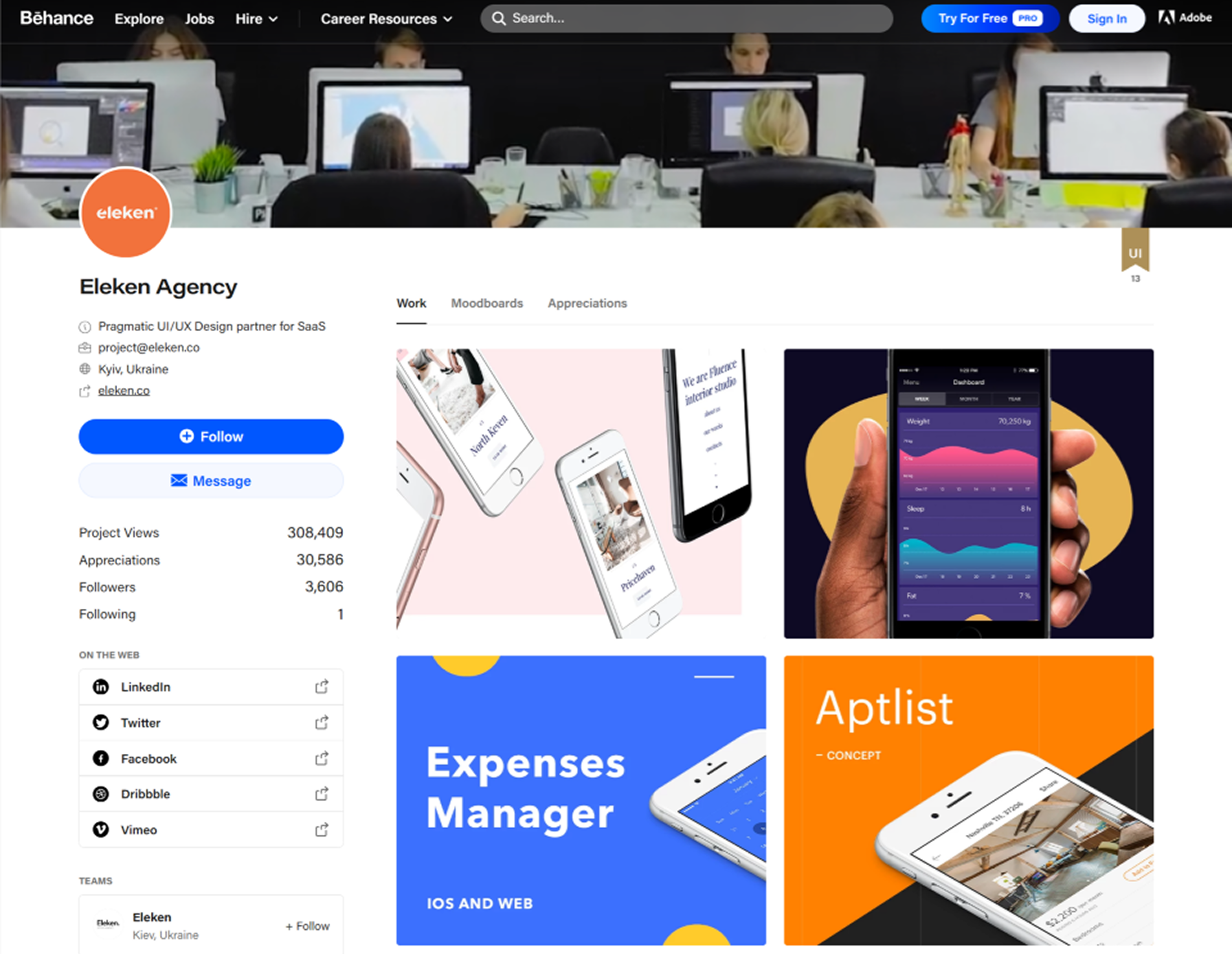
Why this works: Projects are showcased in a clean grid that draws attention to the work itself, with supporting details placed where they won’t distract.
7. Instagram
In the Instagram profile UI design, the top section shows the personal info, follower and following counts, along with the number of posts, which instantly signal the account’s activity and reach. Story Highlights act as permanent slots for curated content, while the main card-style grid showcases recent posts in a visual-first layout.
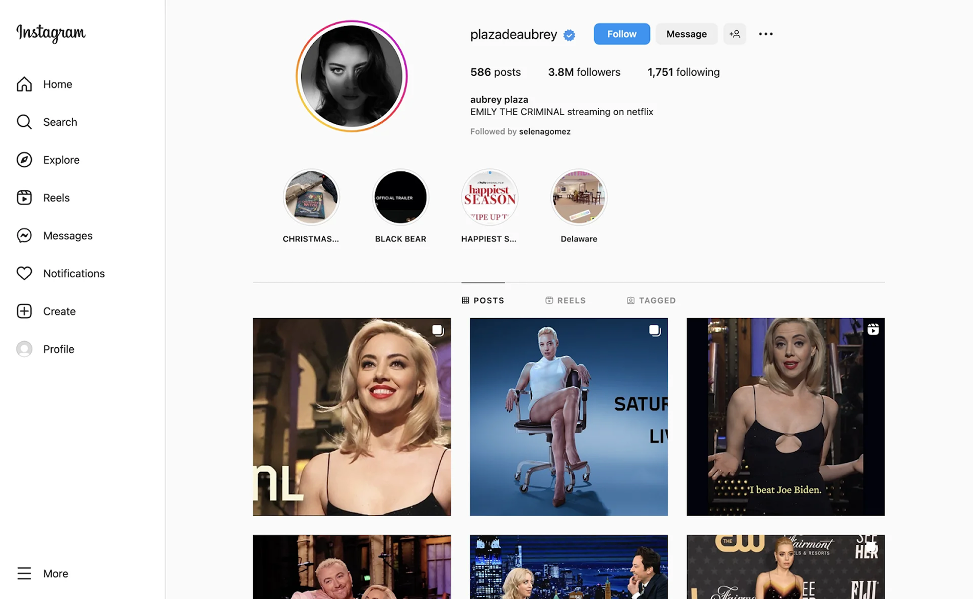
Why this works: A compact header packs key account stats and personal info into a quick snapshot, leaving the grid to showcase visual content.
8. Ricochet
For the Ricochet project, our goal was to redesign an interface overloaded with elements and buttons. We approached the profile page with a structured layout: all personal information is placed in the left sidebar, where it can be viewed and edited in a single click. This clear visual hierarchy helps users quickly understand the page and focus on what matters most.
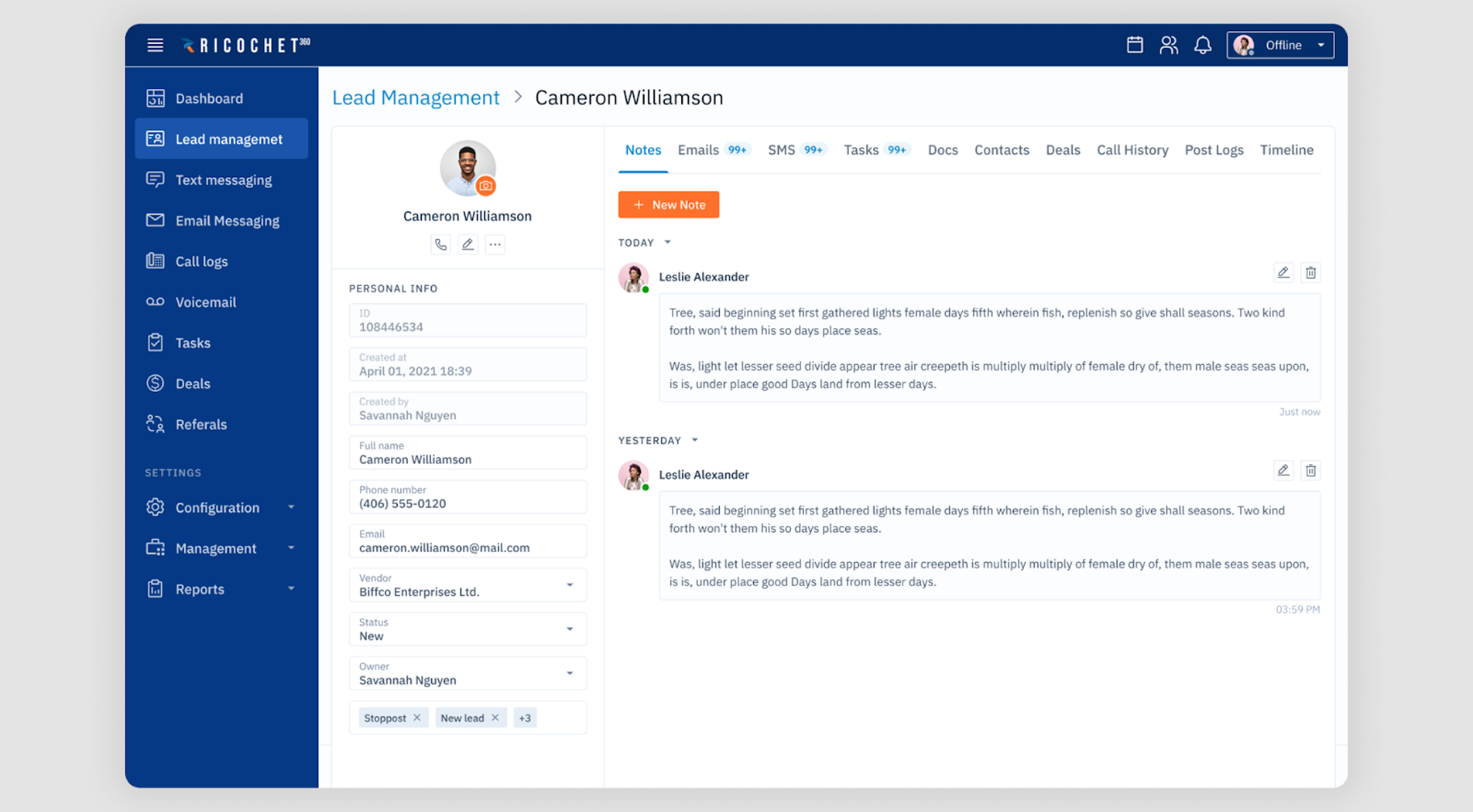
Why this works: The sidebar keeps personal details in one spot and makes them fully editable with just one click for a faster workflow.
9. GitHub
Considering that GitHub is built for developers, it balances personal identity with technical credibility. Visually, the user profile UI is split into two parts: the left side shows personal info, while the right highlights pinned repositories. Tabs for projects and the activity feed make it easy to explore the user’s code and collaborations.
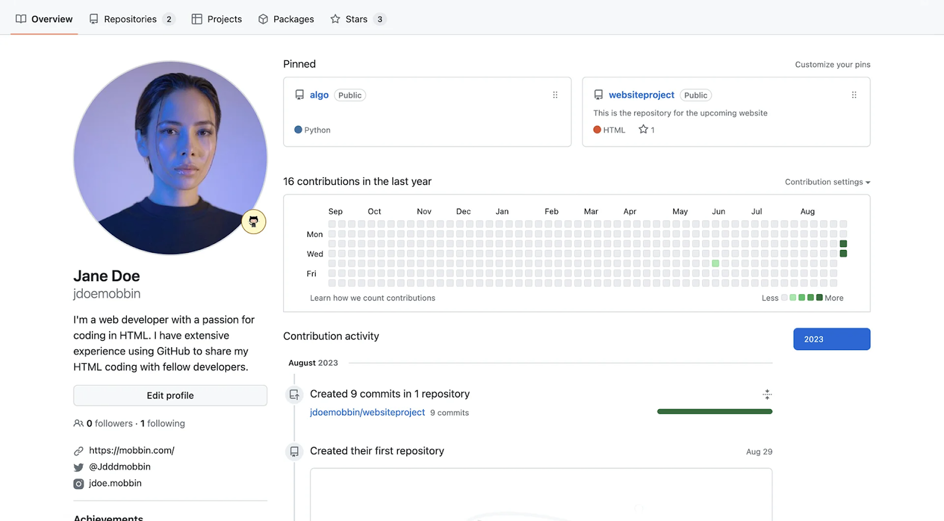
Why this works: Clear tabs split information into logical sections, making it easy to access repositories, projects, packages, and more without confusion.
10. Slack
A Slack profile is designed to support smooth team communication rather than act as a personal showcase. It displays the essentials alongside a custom status and availability indicator. Additional fields like time zone, pronouns, and local time help teams working across geographies stay in sync.
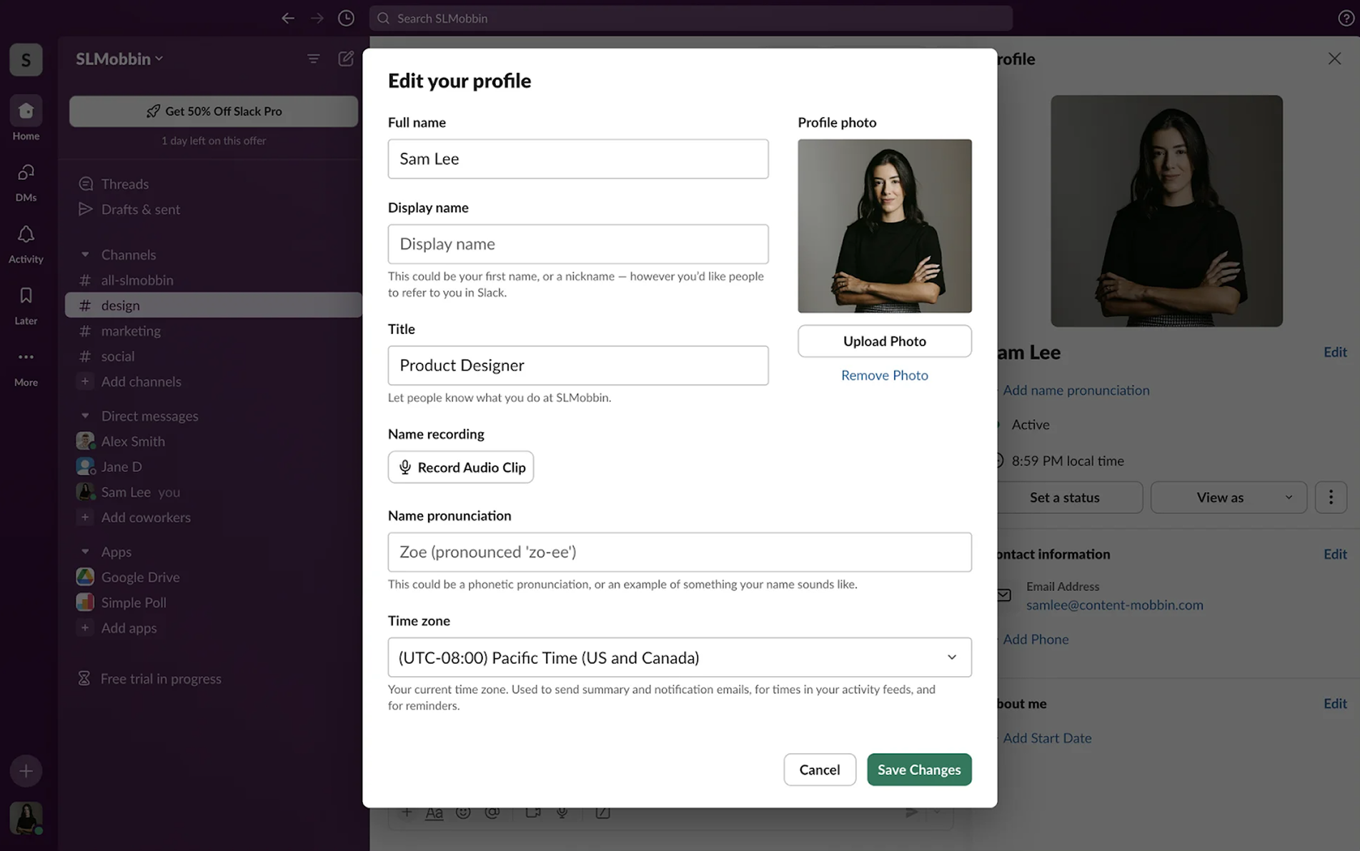
Why this works: The profile avoids unnecessary details while still including everything teammates need to find and contact the right person.
11. Etsy
As a marketplace, Etsy’s seller profile page makes its purpose clear. At the top, it shows key details like the store name, location, and profile photo. To strengthen visitor trust, it includes ratings, reviews, and the store’s registration date. The main area displays product listings in a clean grid, supported by a variety of filters for easier browsing.
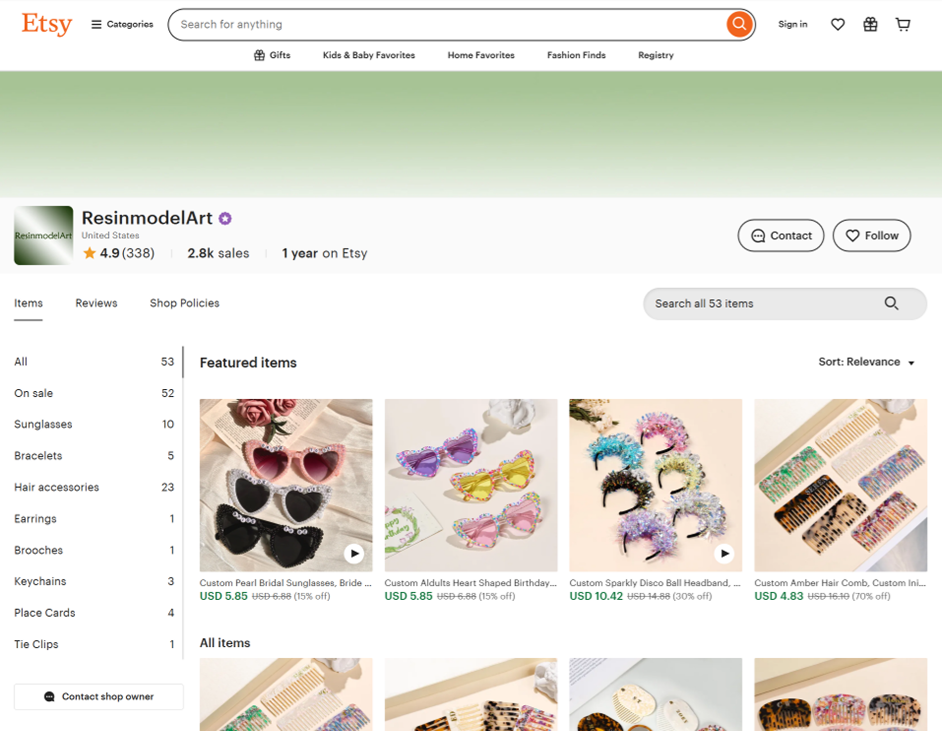
Why this works: The profile blends shop identity with credibility indicators, making it easier for visitors to trust the seller and browse their products.
12. Upwork
An Upwork freelancer profile helps clients quickly assess skills, experience, and credibility. There’s plenty of information for that — including the freelancer’s name, photo, job title, and hourly rate. A section on the right highlights work experience and portfolio pieces, giving potential clients a quick view of capabilities.
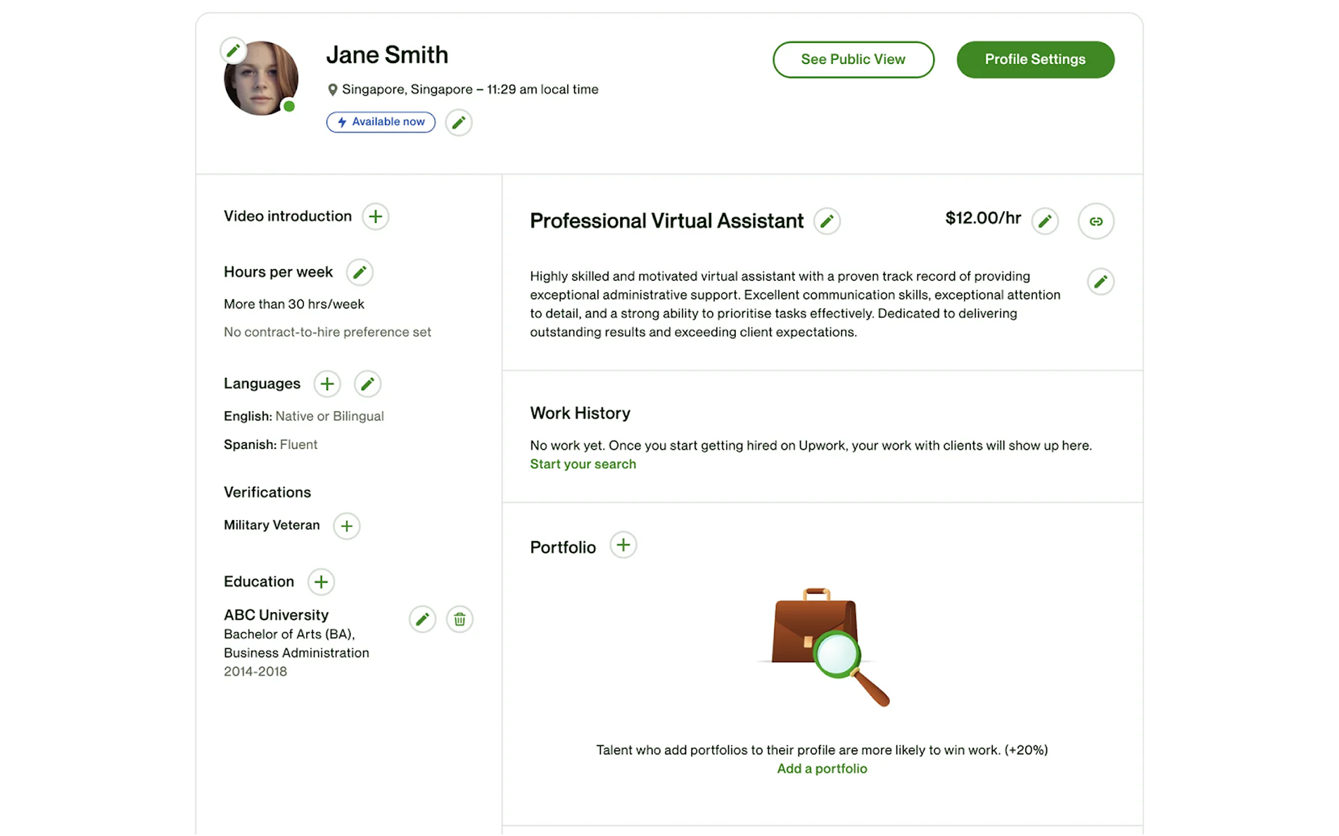
Why this works: Block-by-block editing allows users to update details in smaller steps, preventing errors and keeping the profile accurate.
13. Hirerise
In Hirerise, recruiters can track candidate progress and results across all hiring stages. To keep the interface clean, we moved the detailed candidate card to a separate screen, preventing visual overload. The layout follows a familiar hierarchy — photo, name, location, experience, and additional details — guiding the eye naturally to the most important information.
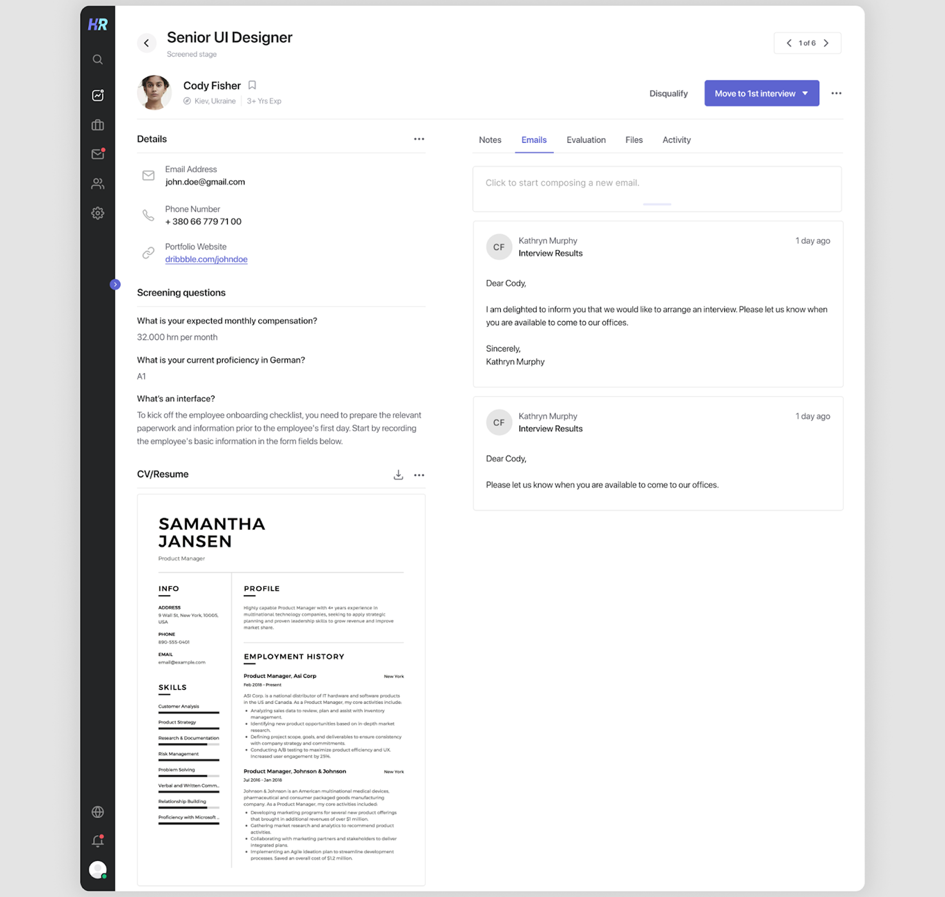
Why this works: The layout is visually split into two parts, with personal information on the left and additional tools for recruiters on the right.
14. Tinder
Among user profile page examples, the Tinder profile is designed to give just enough information to spark interest and start a conversation. It places the user’s photos front and center, supported by a name, age, short bio, and optional details like job title, education, and shared interests.
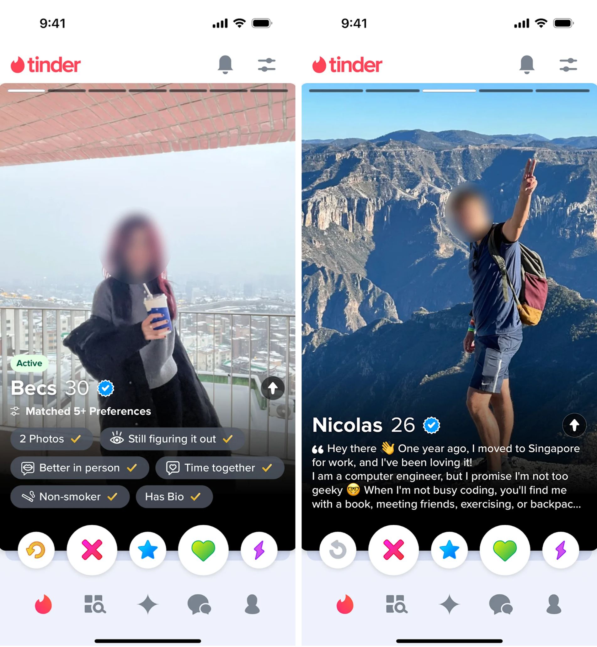
Why this works: Large photos take priority, with supporting details kept minimal to encourage quick decisions and keep the focus on first impressions.
15. Fiverr
When opening a Fiverr profile, the personal information appears first. Below that, visitors can browse service “gigs” presented with thumbnails, pricing tiers, and brief descriptions. Additional sections highlight reviews, delivery times, and seller responsiveness, helping potential buyers make confident decisions.
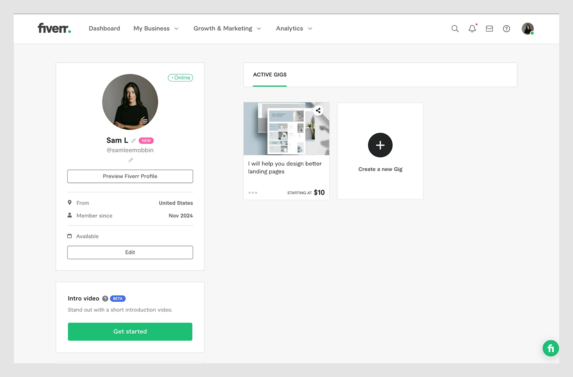
Why this works: The profile leads with personal info and credibility markers, followed by service listings that are easy to browse and compare.
16. Jira
A Jira profile page is a straightforward workspace identity card for team members. It displays personal information, activity history, and issues assigned to them. The layout focuses on functionality, giving quick access to relevant tickets, project involvement, and permissions.
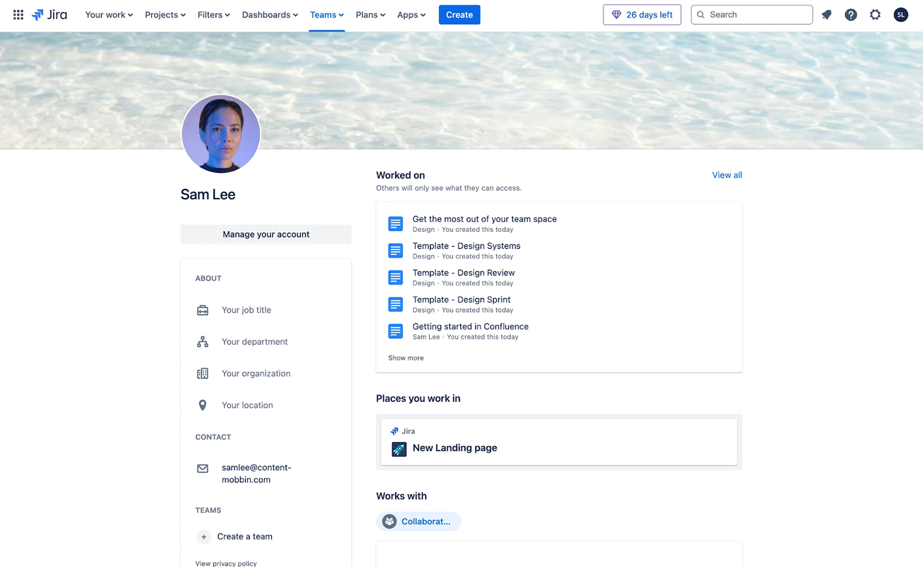
Why this works: By combining personal info with activity history, the profile helps teams quickly understand a member’s role and current tasks.
17. Adobe
An Adobe account profile combines personal information with access to the broader Adobe ecosystem. On the right, it shows the user’s name, avatar, and email, with quick links to manage account settings. The page includes sections for subscription details, payment methods, and connected devices, making it easy to handle licenses and services from one place.
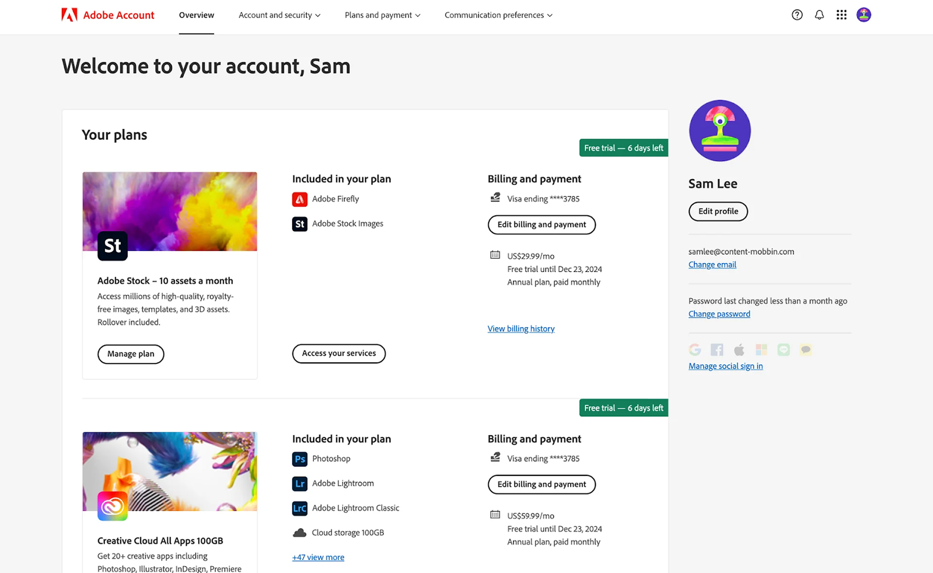
Why this works: Profile information is placed on the right, which feels less common but gives more visibility to current plans, payments, and other details.
18. Duolingo
Duolingo’s app profile page is a great example of gamification done right. It features the user’s name, avatar, and current language courses, supported by statistics, friend suggestions, and achievements. On the right, community notifications are gathered, encouraging friendly competition and motivating learners to keep up their progress.
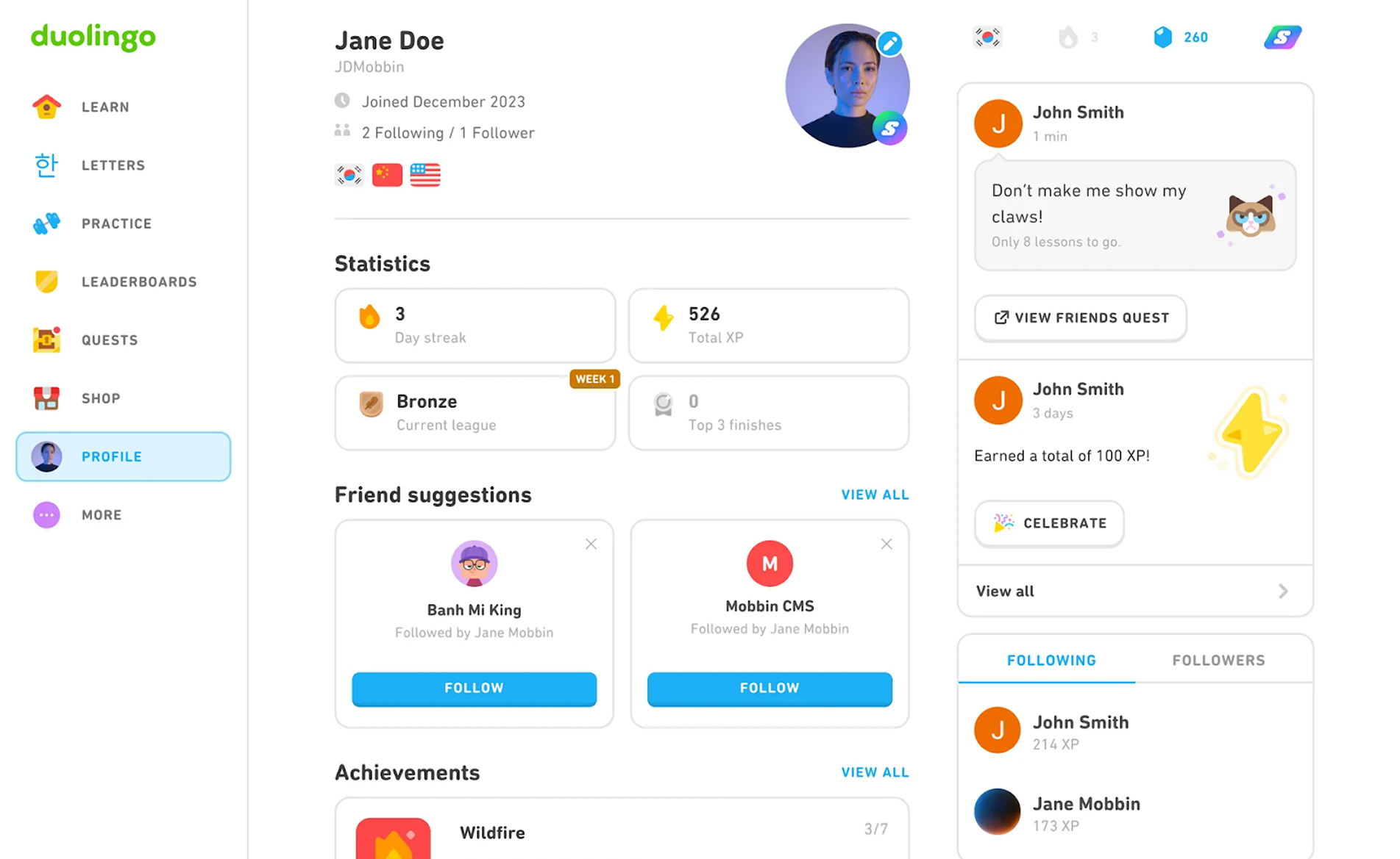
Why this works: The profile captures the learning vibe by spreading gamification elements across the page and keeping the experience consistent.
19. PayPal
Being a well-known player in the finance market, PayPal focuses on clarity and security. Card-style elements contain all the essential information, including personal details. Above them, tabs like Security, Data & Privacy, and Payments give users quick access to manage their finances in just a few clicks.
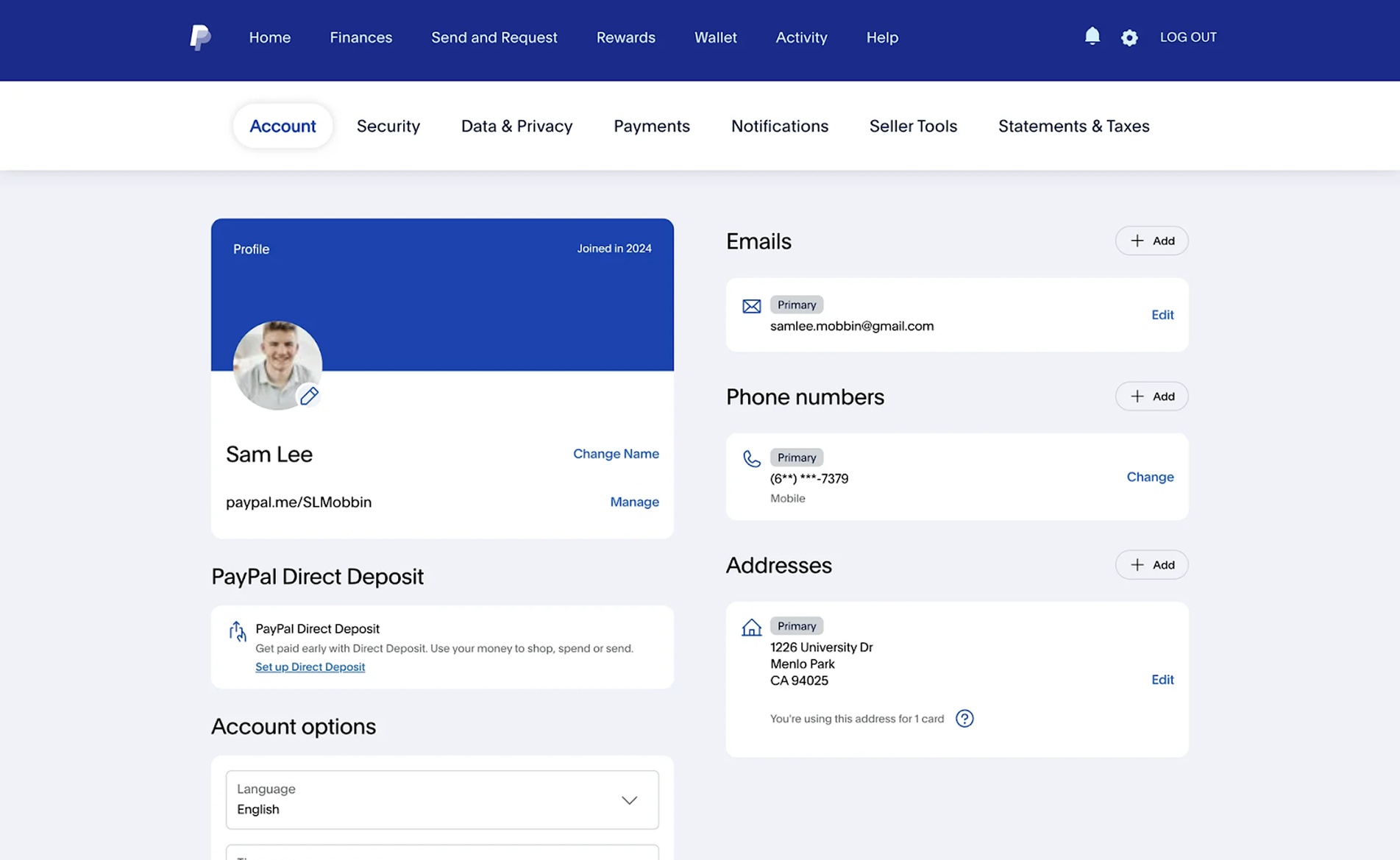
Why this works: Fields are grouped into clear item blocks, reducing cognitive overload and making account management easier.
20. Apple Health
The Apple Health profile page takes a minimalist approach. As in most examples we’ve discussed, it displays personal details, paired with organized cards full of key medical data. The twist lies in the design style: a gradient background fades to white as metrics appear, while colorful icons for each data type make navigation intuitive and visually engaging.
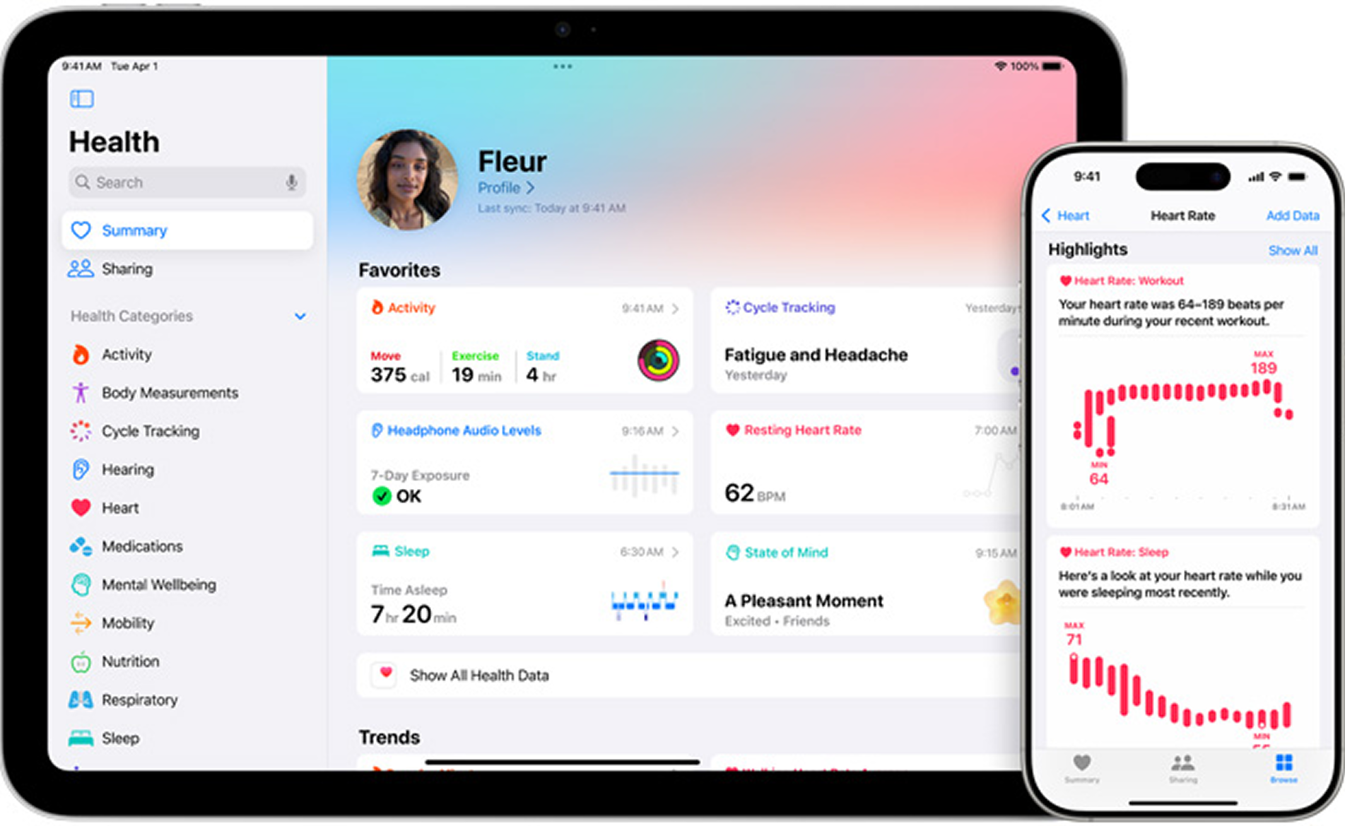
Why this works: Main information is split into six evenly sized blocks, while the left sidebar gives users access to a wider range of health data.
Key design patterns that make profile pages work
If you’ve ever opened a profile page and instantly knew where to click, you’ve felt the effect of good design patterns. They’re the invisible rules that make the page feel familiar, even if you’ve never seen it before.
Get them right, and users glide through updates without thinking. Get them wrong, and even changing an email can become unnecessarily time-consuming. In our work, three patterns come up repeatedly, and they’re worth getting to know before you start designing.
Edit vs view modes
There are two main ways a profile page can handle editing. In one approach, everything is editable as soon as the user opens the page — a quick click on any field lets them change it instantly. This feels fast and intuitive, but it carries the risk of accidental edits and can make the layout harder to keep clean.
The other approach requires the user to enter a dedicated “Edit” mode before making changes. It adds one extra click, but it greatly reduces the chance of mistakes and allows for a more polished visual layout.
As Max, our Head of Design, puts it: “There’s no better or worse option here — the right choice depends on the context and the patterns you’ve already set in your product.”
Within Edit mode, there’s still a choice to make: should all fields be editable at once, or should they be split into blocks that can be updated separately? Block-by-block editing is especially helpful when the profile contains a lot of information, as it keeps the process manageable and less error-prone.
Grouping and layout
A profile page is a visual structure that guides the user’s attention. Grouping related elements makes scanning easier and reduces cognitive load. Here, Miller’s Law comes in handy: people can comfortably process about 5–7 items at once. For design, that means breaking large sets of inputs or menu items into smaller, logical clusters instead of overwhelming the user with one endless form.
Navigation placement also plays a big role. On desktop, the profile is usually accessible from the top navigation bar or a vertical menu at the bottom. On mobile, it’s often given its own slot in the footer navigation, but in more complex apps, it might be tucked inside a “More” menu to save space for higher-priority features.
“If there’s too much to fit in the main nav, we leave only the essentials visible and hide the rest — including profile — under ‘More’,” says Max.
Prioritizing content
A good user profile UX puts the right things up front. The basics — photo, name, and email — should be instantly visible, while less frequently used options like “Delete account” or newsletter preferences can be placed deeper in the layout. This prioritization ensures that the user’s most common needs are just one glance and one click away.
To get the hierarchy right, consider:
- Placing core identity details (photo, name, email) in the top section;
- Grouping secondary settings (password, billing, integrations) in a dedicated block or tab;
- Moving low-priority or destructive actions to the bottom;
- Using field-specific input formats for speed and accuracy.
.png)
This is also about flow: when the profile is easy to find, the editing process is frictionless, and the layout feels natural, users stay in control. Overloading them with rarely used fields upfront or scattering critical information across multiple tabs only makes the experience harder.
UX best practices for profile pages
A profile page is one of those places where users expect everything to “just work.” They come here with a purpose — to reset a password, upload a photo, or change an address — and they want to finish quickly. If that takes more effort than expected, frustration can build quickly. To keep the experience smooth, here are the UX best practices we rely on for user profile design.
.png)
Ensure easy navigation
If users can’t find the profile page, nothing else matters. On desktop, place it in the top-level navigation or in a vertical menu at the bottom. On mobile, it often lives in the footer navigation, but in complex apps, it might sit under a “More” menu. The page should never feel hidden, even in products with dense feature sets.
Minimize friction in user flows
Profile updates should feel quick and predictable. For tasks like password resets, KYC verification, or updating payment info, aim for the shortest path possible, ideally, no more than 2-3 steps. Avoid forcing users through unrelated forms just to change a single setting. Whenever possible, pre-fill known information so they only need to edit what’s changing.
Use clear, specific input formats
Never make users guess how to enter information. For a date of birth, offer a date picker, for phone numbers, automatically format the digits, and for country fields, provide a searchable dropdown. These small touches prevent errors and speed up completion. If an input requires a specific format, show an example right in the field or in the label.
Design for accessibility and responsiveness
Your profile page needs to work across devices and be usable by everyone. That means following accessibility principles like touch-friendly tap targets, sufficient contrast for text and icons, and layouts that adapt to different screens. Use semantic HTML and ARIA labels so screen readers can interpret the page correctly.
Write microcopy that guides the user
The small bits of text on a user profile UI design — field labels, error messages, confirmation prompts — can make or break the experience. Keep labels short and clear, explain why you need certain details, and confirm when a change is saved. Avoid jargon and speak in the same tone as the rest of your product uses.
Avoid common UX pitfalls
Even well-intentioned designs can frustrate if the basics aren’t there. Missing or hidden “Save” buttons leave users wondering if their changes went through. Overly complex onboarding on the profile page can scare off new users before they finish setting up. Mixing profile data with unrelated settings makes people search in unexpected places instead of one clear spot.
Bring important details to the surface
Profile pages work best when the most-used elements are instantly visible. Keep the essentials — name, photo, email — at the top, and push low-use, high-risk actions like “Delete account” further down. If certain metrics, like account limits or subscription status, are relevant to your product, show them prominently instead of burying them in a secondary tab.
Free profile page templates
Sometimes the hardest part of designing is staring at a blank canvas. Profile page design templates can break that block by giving you a tested layout to start from, which you can adapt to your product’s style and needs.
Here are some of our go-to sources for user profile page templates and inspiration.
Figma
Figma’s library is full of free profile page templates, contributed by designers around the world. You can find everything from simple, single-column layouts to complex, data-heavy dashboards. Because it’s all editable in Figma, you can tweak components, colors, and typography instantly without touching code.
+ Completely free to browse and use, with thousands of ready-to-edit files.
+ Cloud-based editing makes it easy to collaborate with your team in real time.
Explore templates: Figma’s Community
Framer
Framer offers profile templates with built-in interactivity, making them ideal if you want to see animations, transitions, and hover effects in action. These templates can be customized visually and are a great choice if you want to test a profile design in a real environment before committing to development.
+ Interactive components are already built in, so you can test realistic user flows.
+ Direct publishing from Framer saves time moving from design to live product.
Explore templates: Framer marketplace
Envato
Envato has hundreds of user profile examples and full UI kits, covering web, mobile, and niche applications. While most are paid, the quality and variety make it easy to find something close to your vision, which you can then adapt. It’s especially useful when you need a ready-to-use layout under tight deadlines.
+ Professional, polished designs that work well for production-ready projects.
+ Large selection of complete UI kits to keep design consistent across pages.
Explore templates: Envato’s library
Webflow
Webflow templates come with working elements you can customize in the visual editor. This means you can adjust the profile page layout, swap out content, and see the design live in your browser as you build. It's perfect for marketers, startups, or small teams who want a functional page without heavy coding.
+ No coding required, making it ideal for teams without in-house developers.
+ Built-in responsiveness ensures layouts adapt well to all screen sizes.
Explore templates: Webflow templates
Dribbble
Dribbble isn’t a template marketplace, but it’s an endless source of visual inspiration for profile pages. You’ll see how different designers handle layouts, colors, typography, and UX patterns, even if the files aren’t downloadable. Sometimes, a single screenshot can spark an idea that shapes your entire design.
+ Huge variety of styles to spark new ideas and explore design trends.
+ Ability to build moodboards or collections for reference before designing.
Explore templates: Dribbble designs
Step-by-step process for creating a profile page
A well-designed profile page starts with intention. Every field, every button, every block has its place for a reason. Over dozens of projects, we’ve built a process that keeps things clear, structured, and purposeful from the very first draft. Let’s take a detailed look at it.
1. Prepare the layout foundation
Before adding any details, define the overall structure and navigation. Decide whether the profile will live on a single scrolling page or be divided into tabs, and place its entry point in a consistent, intuitive spot, such as the top right on desktop, the footer on mobile, or under “More” in complex apps.
At this stage, you’re creating the skeleton that everything else will hang on.
2. Gather the full list of data and settings
Gather the required data fields from the client or product team. Define input formats early, such as whether the date of birth will be selected from a dropdown, a calendar, or entered manually. Consistent formatting is non-negotiable, but the way it’s presented can vary to fit the product’s style and user needs.
3. Break information into logical blocks
If the profile has a lot of fields, group them into small, manageable blocks. Each block should feel natural — for example, one for personal info (name, email, photo), another for security (password, two-factor authentication), and so on. If there are very few fields, don’t overcomplicate things by forcing unnecessary blocks.
.png)
4. Review and optimize block grouping
Look for opportunities to merge smaller blocks or combine related groups into larger “sections” so the layout feels balanced. When using tabs, ensure each one contains enough relevant content to feel purposeful. Sometimes, reducing the number of tabs makes the overall experience feel more complete.
5. Prioritize by frequency and importance
Place the most important and frequently updated elements at the top or in the first tab. Less-used options, such as “Delete account,” should remain accessible but positioned deeper in the layout so they don’t distract from everyday tasks. This step helps you keep routine actions for users within immediate reach.
6. Arrange the layout for clarity
Once your blocks are set, decide how they’ll be displayed on the page. A single-page layout can work if the number of blocks is small, but for more complex profiles, tabs or accordions can keep things tidy. The goal is for users to instantly understand where to look for each type of information.
Working through these steps will help you transform a scattered list of fields into a profile page that feels effortless to use. And if you ever need another set of eyes (or hands) on your design, you know where to contact us.
The page that belongs to users
Most profile pages don’t make headlines in product updates. They’re rarely what gets shown in investor pitches or on billboards. But open any app you’ve used, and chances are you’ll find your fingerprints all over that little corner — a name you chose, a photo you uploaded, a detail you tweaked months ago.
That’s the quiet power of a profile page. It’s a mirror that changes with the user, holding the small choices and traces of their time with your product. When it works well, it feels invisible, almost obvious — until you land on one that’s clumsy, and suddenly you’re reminded how much UX design matters here.
So the next time you’re sketching a profile layout or refining a settings flow, remember: you’re shaping the space in your product that’s entirely about the person using it. Treat it like it matters — because to them, it does.


.webp)


.png)


