

When you first bump into human machine interface design, you’d probably jump into industrial equipment interaction: control panels, factory systems, or car dashboards. And that’s totally fair. The term is mostly used in engineering-heavy industries.
But here’s the catch beyond industrial HMI design: every app, website, and digital tool is also a human-machine interface.

While the HMI was coined in industrial process design, we’ll look at it through a UI/UX lens, using our featured UX examples and best practices we apply at Eleken product design agency.
Get inspired with action-driven HMI design guidelines to enhance safety, efficiency, and user experience.
What is human-machine interface (HMI) design?
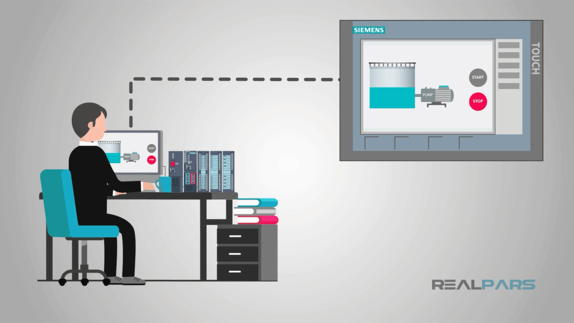
Human-machine interface (HMI) design creates systems and screens for users to interact with machines, development software, or devices. If a person uses a visual or digital interface to give a command or receive feedback from a machine, that’s HMI in action.
Think of a touchscreen on a vending machine, the navigation system in a car, or the dashboard in a SaaS app. All these are the examples of how HMIs translate actions, inputs, and data between humans and machines.

Why good HMI design matters
A well-designed HMI isn’t just a nice-to-have, it marks the difference between clarity and confusion.
Here’s why good HMI design matters:
- Accuracy: clear data presentation prevents mistakes.
- Cost savings: fewer human error and training save on operational costs.
- Efficiency: users manage tasks faster with an intuitive interface.
- User experience: smooth interface leads to deeper engagement and higher satisfaction.
For digital product teams, underlying design HMI principles: clarity, responsiveness, safety, and usability improve onboarding, retention, and long-term product success.
Who uses HMIs
HMI interface design is relevant across a wide range of roles and industries:
- Operators and technicians use HMIs to monitor equipment and respond to alerts in industrial settings.
- Engineers and developers design and maintain the systems behind the interface.
- Product designers use HMI principles to shape dashboards, web apps, and mobile devices.
- End users: anyone using a software tool, app, or smart device is interacting with an HMI.
The more complex the system behind the screen, the more important the interface.
HMI types: exploring the ways humans interact with machines
Human-machine interfaces (HMIs) come in many evolved forms from simple physical buttons to sophisticated digital dashboards. Each type serves a different purpose depending on the environment, user needs, and system complexity.

Let’s break down the main types of HMIs and how they’re used:
Designers often combine these types to create a more complete user experience depending on the complexity of the system.
HMI design fundamentals
Now that we’ve explored why HMI design matters, let’s dive into the core principles that make it effective in practice.
We’ll break down how these fundamentals apply to the most common types of screens and how they shape the way users interact with key functions in digital products. Whether it's a dashboard, control panel, or onboarding flow, good HMI design turns complexity into clarity and actions into intuitive experiences.
Core HMI functions
Every human-machine interface is ultimately designed to help people see what’s happening, take action when needed, and stay in control.
Whether you’re designing an industrial dashboard or a sleek SaaS product, these functions are at the core of effective HMI design:
1. Monitoring: Keeping an eye on key processes, metrics, or centralizing data, whether that’s machine status or user behavior in an app.
2. Control: Allowing users to start, stop, or adjust parts of the system like toggling settings or adjusting automation parameters.
3. Alarm and alert management: Notifying users when something goes wrong, from minor warnings to critical system failures. A well-designed alert system prioritizes severity and guides quick action.
4. Performance dashboards: Surfacing KPIs and real-time metrics to help users make informed decisions fast.
These HMI fundamentals ensure that your interface is intuitive, responsive, and aligned with user intent.
Stages of human-machine communication
Designing for human-machine interface (HMI) means understanding how users interact with machines and how they respond. Think of HMI like a conversation between the user and the machine.
At its core, every HMI experience follows a four-step loop to ensure clear communication flow between human and machine.
Here's how it works:
1. Input: The user sends a command to the machine, like tapping a touchscreen, pressing a button, or turning a knob. It’s the user's way of saying, “Hey, I want you to do something.”
2. Processing: The machine receives the input and processes it based on its built-in logic. For instance, if the user hits “Start,” the system figures out what needs to happen next: launching a machine or activating a setting.
3. Output: Once processed, the system delivers an output. This could be a visual message, a beep, a flashing light, or even a motor starting to move. This is how the machine “talks back,” showing that it received the command and is acting on it.
4. Feedback: Finally, the machine gives the user some kind of feedback: a success message, an error notification, or a visual cue. This helps the user know what happened.

Each of these stages makes user experience smoother, faster, and deeply intuitive. As a designer, your job is to ensure the user always knows where they are in the process and never feels lost or uncertain about what to do next.
HMI screen design
Screens serve multiple purposes in HMI design. Here are the four main types commonly found in digital context:
1. High performance screens: Prioritize usability and minimalism by highlighting only the most critical data, usually with color coding or simplified layouts. For example: modern SaaS dashboards that surface KPIs with minimal distraction.
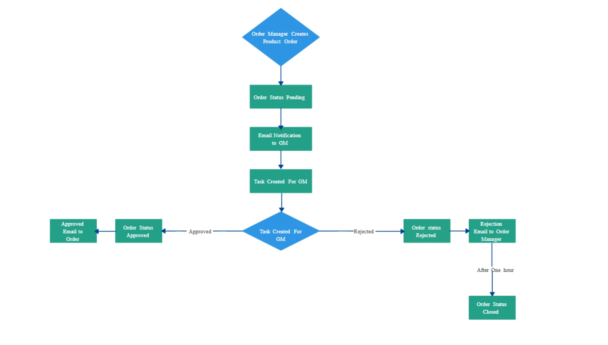
2. Schematic (or mimic) screens: Visual layouts showing how components are connected. For example: a network status map or a process flow diagram in a cloud platform.
3. Tabular/text-based screens: Display information (raw data) in lists, tables, or logs. For example: system event logs or inventory tables.
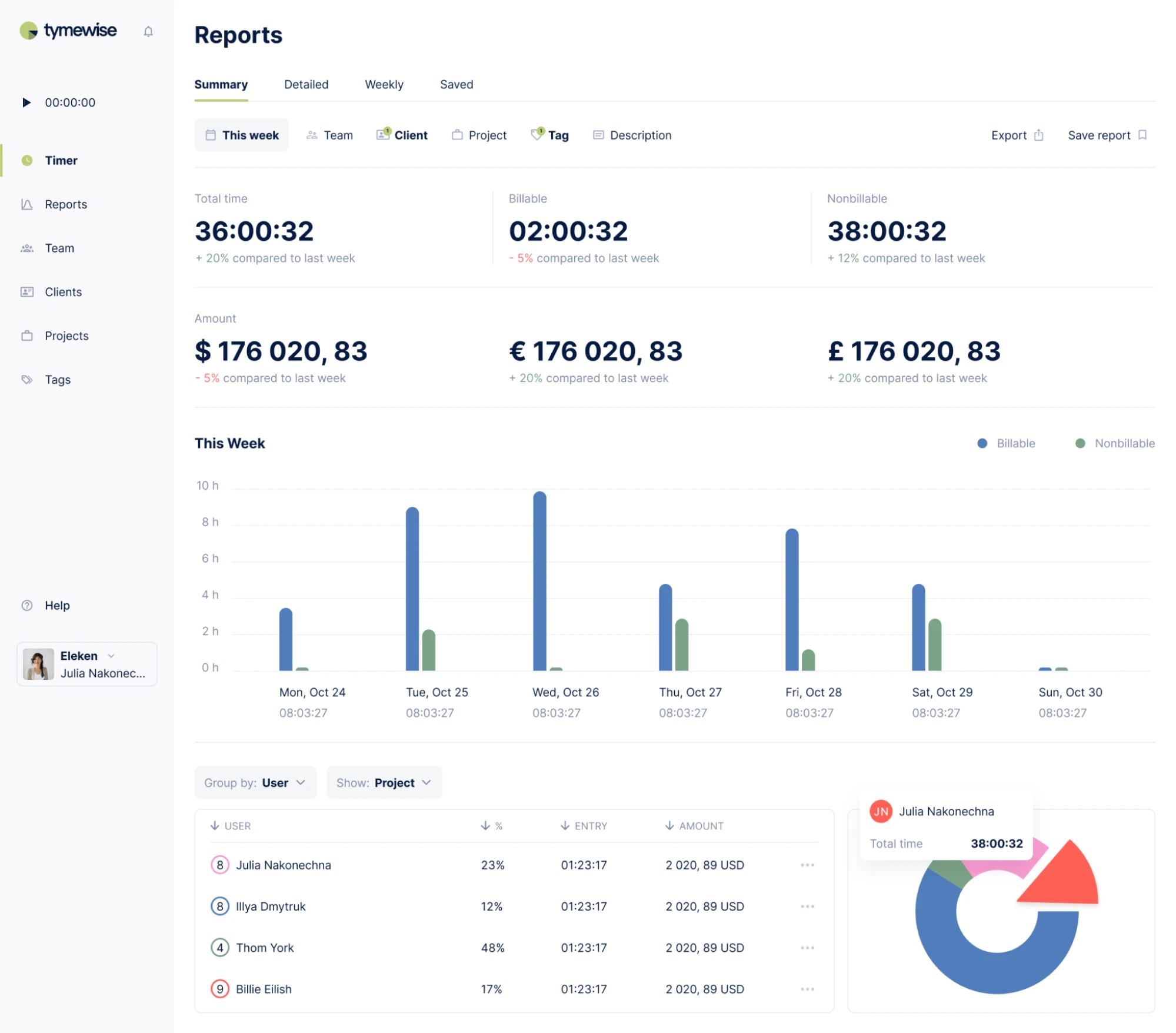
Here’s an exemplary dashboard designed by Eleken for Tymewise
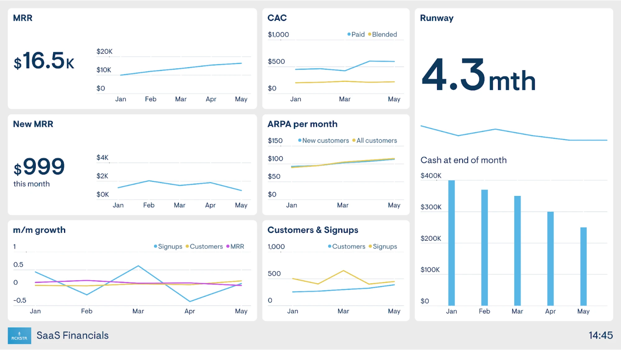
4. Trend screens: Show historical data over time using charts or graphs. For example: analytics dashboards showing user behavior or performance trends.
Haven Diagnostics case designed by Eleken includes historical data and future predictions shown in graphs.

Designers often combine these types to create a more complete user experience depending on the system complexity.
HMI design principles: creating interfaces that feel natural, clear, and safe
While specific use cases may vary, strong HMI design always centers around three core principles:
1. Situational awareness: The interface should help users instantly understand what’s happening: what the system is doing, what’s normal, and what requires attention.
2. Clarity: Visuals, labels, and layouts should make complex data simple to understand. The goal is to reduce cognitive load.
3. Responsiveness: The system should give immediate and meaningful feedback after every action, so users know their input was received and what the result was.
Let’s now explore how psychology in UX design meets pixels to create interfaces that feel effortless.
Cognitive psychology applications in interface design
Cognitive psychology empowers UI designers with invaluable insights into how users perceive, remember, and make decisions, all of which directly influence how they interact with digital interfaces:
- Fitts’s Law takeaway: To reduce user effort and boost interaction speed, make interactive elements (buttons, icons, and links) large enough to easily click or tap, and place them near the user's focus area. Fitts’s Law tells us that the time it takes to reach a target depends on both its size and distance from the starting point. In HMI design, this means placing critical controls where users naturally look or interact to improve usability and reduce errors.

In the poor design example, the Buy button is tucked away in the upper-right corner of the screen: the area hard to reach when using a phone single-handedly.
The improved version places the Purchase button at the bottom, right within thumb’s reach. Paired with a horizontal layout for the key info, this setup streamlines interaction and makes completing the purchase effortless.
- Hick’s Law takeaway: Design for simplicity. The more choices a user sees, the longer it takes to make a decision. Hick’s Law explains that increasing the number of visible options increases cognitive load, slowing down interaction. In HMI design, this means interfaces should present only the most relevant choices at any given moment. By simplifying menus, decluttering screens, and grouping related actions, you help users make faster, more confident decisions:

This employee app streamlines equipment tracking for construction workers. What used to be a time-consuming task is now handled on a single screen: just a few quick taps, and the job is done.
- Jakob’s Law takeaway: People prefer familiar patterns (menus, icons, gestures) because they already understand how they work. In HMI design, this means you should stick to conventions for common tasks, like navigation or data input. Reinventing basic UI behaviors might feel innovative, but it can confuse users and slow them down.
Placing CTAs in familiar spots, like the lower right corner of a form, helps reduce friction and encourages action. But placement alone isn’t enough; clear, direct labeling is just as important.
When both elements work together, buttons serve as intuitive guides that lead users toward completing key tasks:

Applying cognitive psychology principles in interface design at Eleken, we:
- Shape user behavior
- Mitigate friction
- Guide users through intuitive journeys.
One of the most impactful outcomes was applying Fitts’s Law in practice for Gamaya, a Swiss precision agriculture platform.
Open-source data and drone images provide farmers with a fantastic bird's-eye view, but sometimes you need boots on the ground.
That's where scouts come in! By using our custom-designed, super-convenient interface, they snap photos, add detailed comments about the existing problem: pest type or disease severity, and upload it all directly to the system:

This blends human expertise with instant digital reporting to ensure that farmers get the most precise, timely field intelligence possible.
This is how effective HMI design makes powerful systems feel simple and human-friendly:
How UX principles shape HMI success
Designing for HMI is about understanding the user's context. To achieve simplicity in UX, designers use tools like user journey mapping, personas, and prototyping to ensure that interfaces are intuitive under pressure.
User journey mapping is a visual representation of the steps a user takes to complete a task within a product. It helps designers understand the user’s mindset, pain points, and goals at each stage. In HMI design user journey mapping reveals where users might hesitate, get confused, or require extra guidance.
Personas are data-driven profiles representing typical users. Personas keep the design process user-centered by focusing on real needs and behaviors. This essential tool benefits HMI design to tailor interfaces to specific user types.
Prototyping is creating low- to high-fidelity interactive mockups of the interface before development. This tool allows testing and iteration early, saving time and resources. In HMI design, prototyping lets you simulate system behaviors and gather real-life feedback.
HMI design best practices
Designing a human-machine interface is about making that data clear, actionable, and easy to comprehend.
Whether you're building a dashboard for a SaaS product, a mobile app for smart devices, or an internal tool for operations teams, help users make informed decisions, faster:
1. Clarity is king: Use simple, familiar icons and group related elements logically. Every piece of important information displayed should serve a purpose.
Here’s a clean, focused dashboard designed for our client where every element serves a purpose. Logical grouping, color hierarchy, and minimal distractions help users understand key metrics and actions quickly:

2. Consistency builds confidence: UX design patterns should be uniform across screens. If a “Start” button is green in one place, don’t make it blue somewhere else.
This is how we built a consistent design system for Glow Labs where everything, from sign-up screens to illustrations and graphs, follows the same visual logic:

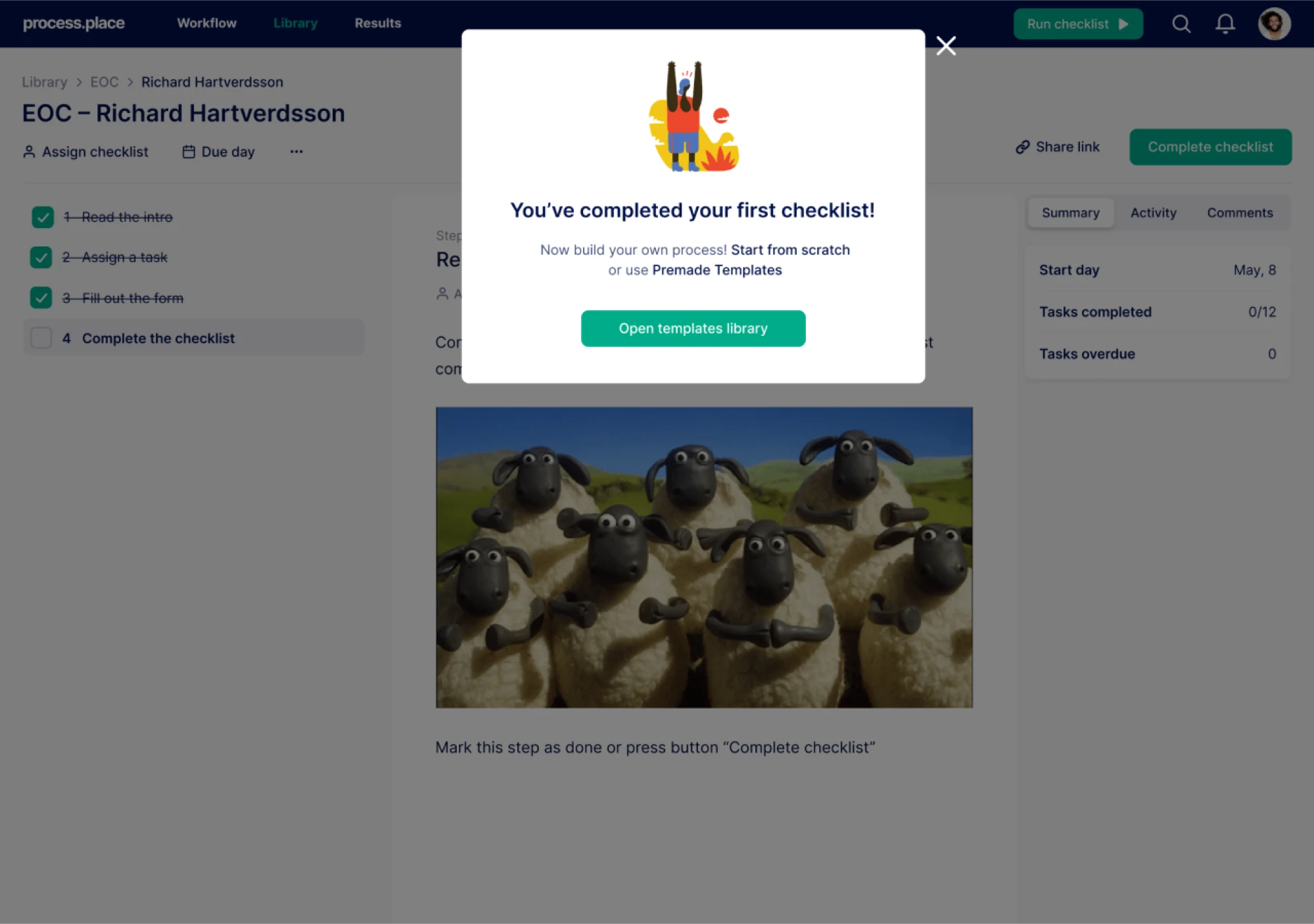
3. Feedback closes the loop: Always show users what’s happening. If they press a button, the system should respond with an animation, sound, or status change.
This is another design solution by Eleken for a workflow management app that showcases how the user completes the checklist. The system responds immediately with a clear visual message: “You’ve completed your first checklist!” followed by further steps and options:
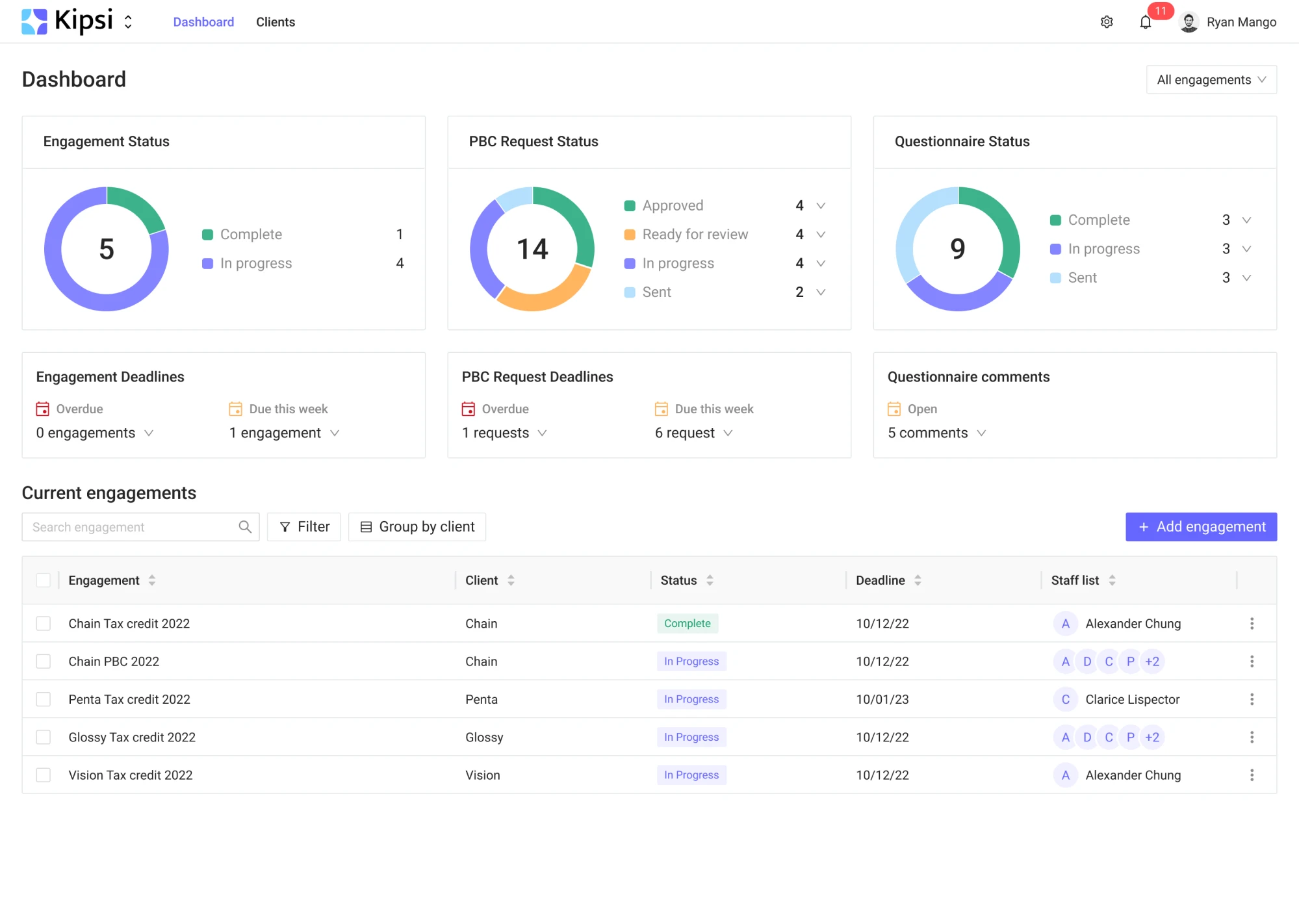
4. Hierarchy and prioritization: Important data must stand out visually. Use typography, color, and spacing to highlight what matters most in real time.
Kipsi dashboard designed by Eleken highlights key metrics through color and layout to make vital information easy to grasp:
Here are more design tips shared by Eleken’s founder Illya Dmitruk to help you create HMIs that feel smooth, intuitive, and user-friendly:
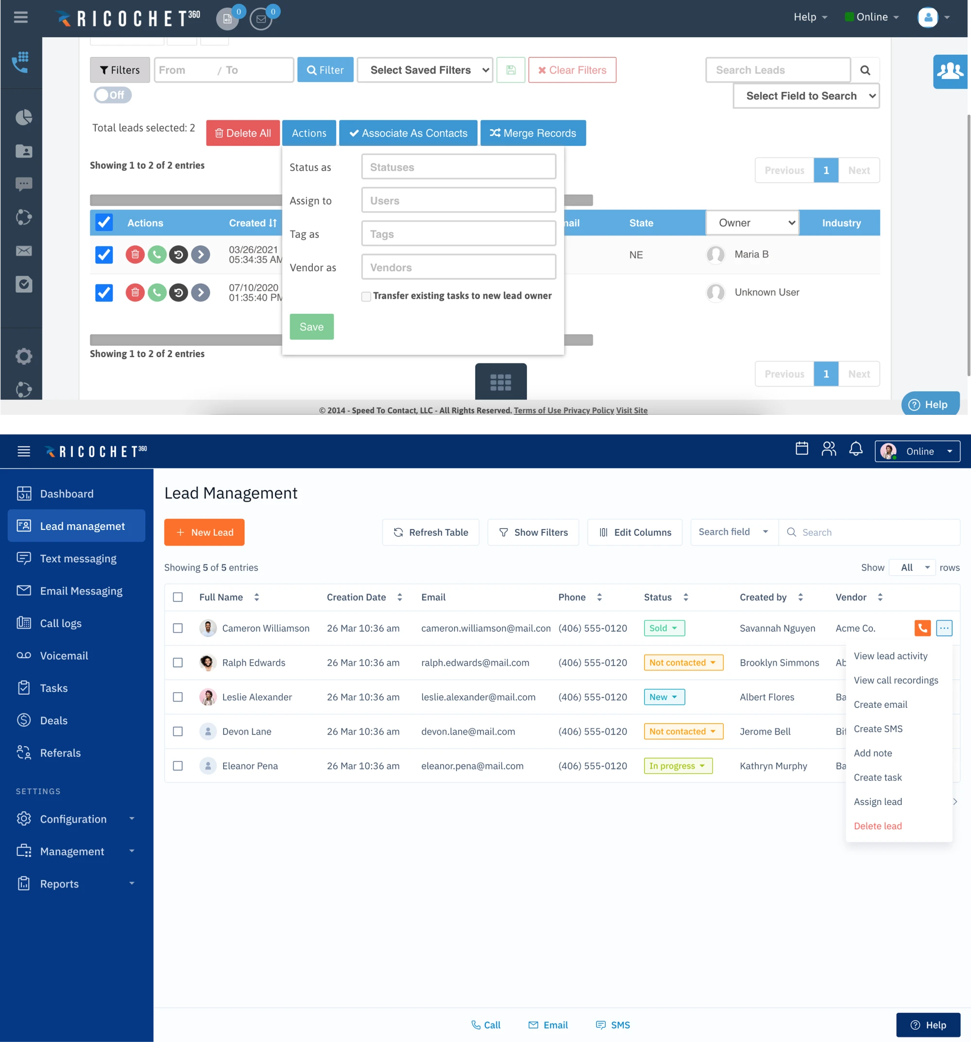
Turning complexity into clarity with Ricochet360
When Ricochet360, a cloud-based sales dialer platform, came to us at Eleken, their product had a solid engine under the hood, but the interface was holding it back.
Packed with features but burdened by clutter, the UI felt more like a puzzle than a tool. For new users, onboarding was rough. For businesses, that meant lower adoption and retention.
That’s where Eleken’s human-machine interface design solution came in:
We approached Ricochet360 with our guiding principle: make the system work the way humans do. Our designers stepped into the shoes of real sales teams and restructured the entire interface around how these users actually work.
We simplified repetitive actions, cut the noise, and streamlined workflows. But perhaps the most dramatic change was the ‘Call Queue.’ Once a frustrating corner of the app, it turned into the central control hub refined with clear visual hierarchy, contextual actions, and strategic focus on a fewer cognitive overload.
The transformation wasn’t merely cosmetic, it was behavioral:
- Salespeople no longer had to fight the interface to get their work done
- Post-redesign, Ricochet360 saw a measurable rise in user satisfaction and engagement
- The platform felt more intuitive, more responsive, more human.
A sound piece of design isn't just about making things look better: it’s about making technology feel natural. When interfaces align with user expectations, even the most complex tools become easy to adopt, quick to learn, and satisfying to use.
UX strategies to improve HMI usability
Simple UX strategies, like placing frequent tasks front and center or reducing steps in a workflow enhance HMI usability:

- Prioritize frequent tasks. Place the most commonly used actions (e.g., Start, Stop, Reset) in prominent, easy-to-reach locations.
- Minimize steps in critical workflows. Streamline multi-step processes into fewer screens or actions to reduce cognitive load and operational delays.
- Use a clear visual hierarchy. Apply contrast, size, and spacing to guide the user’s attention; critical data should stand out instantly.
- Eliminate unnecessary elements. Remove rarely-used controls or information that can clutter the interface and distract users.
- Offer contextual guidance. Use inline tips, labels, or icons to explain features only when and where they’re needed, avoiding overwhelm.
- Design for error recovery. Provide clear undo options, confirmation prompts, or safe defaults to prevent costly mistakes in complex systems.
Diving deeper into the time-proven UX strategies that stemline HMI usability, we’ve selected the following approaches:
- Color usage and visual hierarchy
- Layout and screen hierarchy
- Typography and readability
- Navigation and consistency
- Graphic style and performance
1. Color usage and visual hierarchy
When it comes to color, less is more. Your HMI should use color intentionally to guide attention:
- Use gray or muted tones as your baseline: Following ISA-101 guidelines, neutral backgrounds and low-saturation “normal state” elements keep the focus on what matters.
- Reserve bright, saturated colors for alarms and abnormal conditions: Color should signal urgency; if everything is bright, nothing stands out.
- Avoid using red and green as the only visual indicators: This is a common accessibility pitfall: use icons, shapes, or labels alongside color to support color-blind users.
- Support light and dark modes if possible: This is beyond a user interface (UI) trend: different lighting environments call for different screen modes. Dark mode can reduce eye strain in control rooms or night settings.
2. Layout and screen hierarchy
A clean layout is key to reducing cognitive load and making users stay aware:
- Follow a top-down information model: Start with an overview screen → drill down into subsystems → then detailed screens. Each level should be uncluttered and purpose-built.
- Label values directly on the equipment or visual elements: Avoid forcing users to trace lines or guess which label belongs to what.
- Surface only the most critical data at the top level: Avoid overload by pushing lower-priority info into secondary views, popovers, or nested pages.
3. Typography and readability
Typography can make or break an HMI’s usability, especially once users are under pressure or have visual impairments:
- Use large, legible fonts that are easy to read from a distance: Test your designs with users who wear glasses or work in low-light environments.
- Ensure strong contrast between text and background: WCAG recommends a minimum 4.5:1 ratio for body text, but higher is better in HMI scenarios.
- Eliminate decimal noise: Only display precision that is relevant to the task. Three digits after the decimal point can be more confusing than helpful.
4. Navigation and consistency
Users rely on consistency to build confidence and speed. The more predictable your interface, the faster users will act:
- Keep navigation elements consistent across screens: Use fixed positions for menus, breadcrumbs, and action buttons.
- Reduce the number of clicks to reach mission-critical views: Alarm summaries, system overviews, and controls should never be buried in menus.
5. Graphic style and performance
While visual polish matters, clarity and performance always come first:
- Avoid skeuomorphic 3D graphics and unnecessary animations: They may look cool, but they often add clutter and slow down performance.
- Optimize your design for low-end or legacy hardware: Many users still operate HMIs on aging equipment. Compress image assets, limit transitions, and test for lag.
- Use scalable vector graphics (SVGs) wherever possible: SVGs are lightweight, resolution-independent, and easier to maintain across screen sizes and zoom levels.
What is HMI in web design?
HMI design is about crafting user interfaces that allow people to interact with digital systems efficiently, intuitively, and with minimal friction. In web and UI design, this means:
- Creating interfaces that guide user behavior
- Prioritizing usability, clarity, and feedback
- Respecting user expectations
- Designing for varied contexts: desktop, mobile, on-the-go
- Ensuring accessibility in UX and performance.
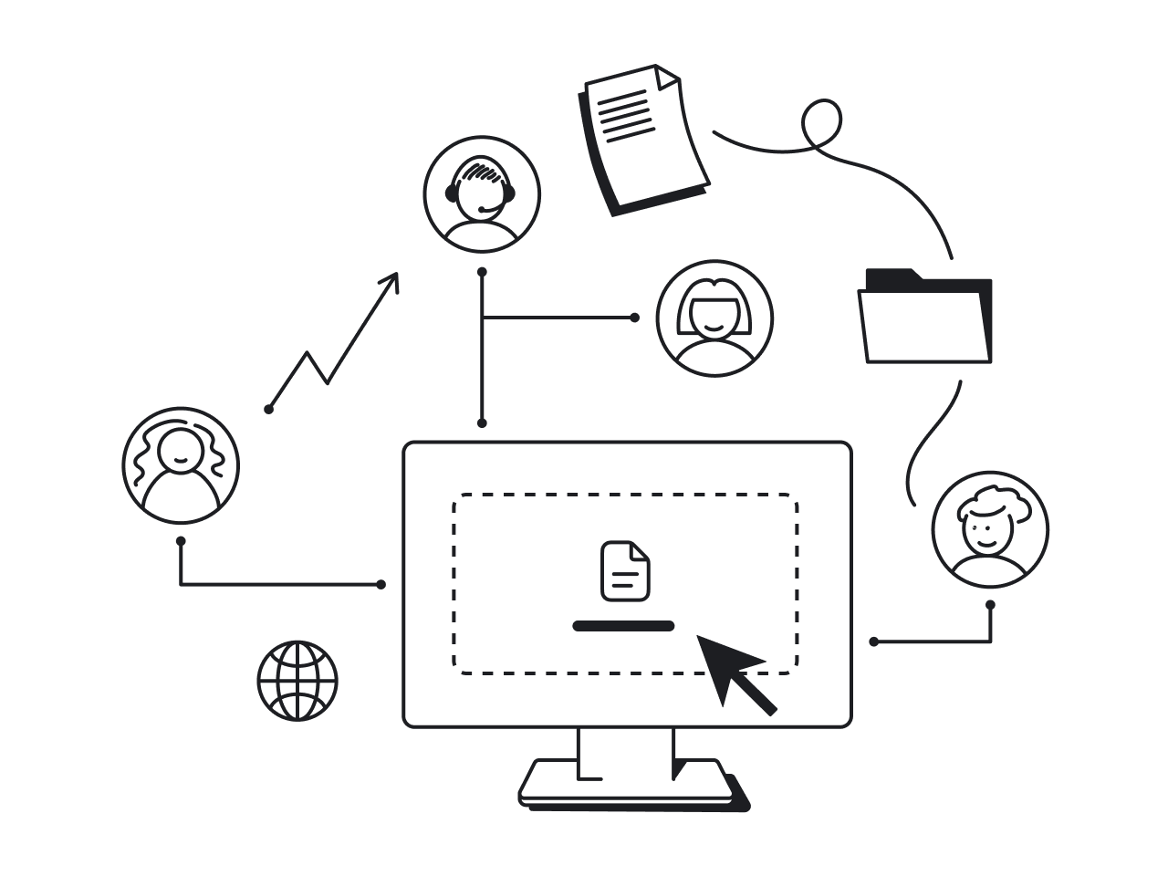
HMI applications in web design
HMI mistakes to avoid
If your HMI is hard to read, overloaded with visuals, or built without real user input, it’s not doing its job. To understand what bad design is, check out four common HMI design flaws:
1. Overusing color → alarm fatigue: When every element is bright red or flashing yellow, users stop noticing what actually matters
Fix: Stick to gray or muted tones for normal conditions. Use bright color only for critical alerts. If everything screams for attention, nothing gets heard.
2. Cluttered screens → cognitive overload: Cramming too much info onto one screen slows users down and causes mistakes.
Fix: Use clean layouts, clear groupings, and a top-down hierarchy (overview → subsystem → detail). Only show what’s essential at each level.
3. Tiny fonts & low contrast → unreadable under real-world conditions: Small, low-contrast text looks sleek on your laptop, but is useless on the shop floor.
Fix: Use larger fonts (16px+), ensure high contrast, and test screens in realistic environments. Legibility should never be an afterthought.
4. Ignoring operators → looks good, doesn’t work: Pretty interfaces that weren’t tested with real users usually fall apart under pressure.
Fix:Talk to operators. Watch how they work. Catch design and friction points before launch.
HMI design aims to make things immediately usable. A well-designed HMI should feel intuitive from the first click. To avoid bad UX examples, keep things simple, test with real users, and always design with clarity and context in mind.
The future of HMI design
As technology evolves, so does the role of human-machine interfaces. What used to be fixed control panels and desktop dashboards is quickly becoming mobile, cloud-connected, intelligent, and immersive.
Modern HMI design is about empowering humans to make better decisions, from anywhere, in real time.
Here’s where things are headed.
Cloud and edge computing
Cloud platforms and edge devices are redefining how HMIs handle data. This hybrid model enables smarter, faster HMIs ideal for systems demanding global oversight and local control:
Cloud computing allows centralized access to real-time data across teams and locations.
Edge computing brings processing power closer to the machines, reducing latency and enabling faster responses on the ground.
Design your HMI architecture to support real-time data streaming, failover capabilities, and scalable performance across the network.
Mobile and remote monitoring for product, SaaS, and UX/UI designers
As systems move to the cloud, human-machine interfaces are shifting from fixed desktop setups to responsive web dashboards and mobile apps that support real-time monitoring and control across devices.
Mobile and remote-friendly HMI design is becoming the standard for SaaS tools and digital platforms to ensure enhanced user experience.
For designers building SaaS platforms, internal tools, or connected device interfaces, the trend opens up more opportunities:
Product designers need to consider how information hierarchy shifts across screen sizes. A top-level overview on desktop might need to collapse into a simplified, actionable summary on mobile. Prioritize alerts, critical metrics, and quick interactions that matter most in mobile workflows.
SaaS designers plan for role-based access and cross-device continuity. With design thinking beyond static screens, they build modular, flexible UI components that scale across form factors while maintaining clarity and usability for every user type.
UX/UI designers lean into mobile-first principles for performance, tap target sizing, and gesture-based navigation. Tap targets follow accessibility best practices, at least 44x44 pixels, to accommodate touch input and mitigate user frustration. Mobile interfaces leverage native gestures, like swipe, pinch, or long-press, to streamline navigation and soothe user experience .
Build mobile views around real-world uses:
- What would a user want to see at 2 a.m. when an alert hits their phone?
- What’s the one tap that lets them take action without logging into a full desktop?
Make your interfaces responsive, cloud-connected, and optimized for touch and mobile-first workflows.
AR/VR interfaces
Augmented reality (AR) and virtual reality (VR) are becoming powerful tools for training, maintenance, and remote support.
- AR overlays live system data onto physical machines through smart glasses or tablets.
- VR environments allow technicians to practice procedures in a risk-free, simulated space.
While still emerging, these immersive interfaces offer the next level of contextual awareness and hands-free interaction.
Think beyond screens. Future HMIs may live inside headsets, holograms, or even voice-controlled environments.
AI-powered HMIs
Artificial intelligence is adding a layer of intelligence to traditional interfaces. Instead of passively displaying data, AI-enhanced HMIs:
- Predict system failures before they happen (predictive maintenance).
- Adapt layouts or content based on user roles or behaviors.
- Summarize complex system states or recommend actions.
These adaptive, self-learning interfaces improve efficiency and reduce cognitive load, especially in data-heavy systems where operators can’t catch every change manually.
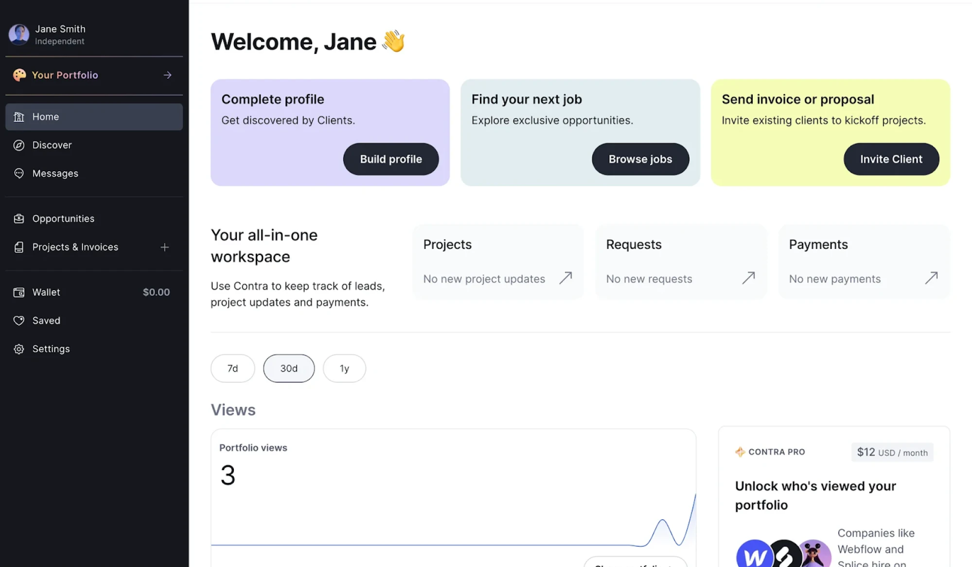
Contra dashboard is a clean example of an AI-powered HMI designed for independent professionals. It surfaces personalized actions like job suggestions or client outreach based on user activity, while tracking key metrics like portfolio views over time. With its minimal, card-based layout and clear call-to-actions, the interface helps users manage projects, payments, and opportunities efficiently. In its background, AI prioritizes tasks, simplifies navigation, and turns a complex workflow into a guided, human-friendly experience.
As HMIs continue to evolve, one thing remains certain: human-centered design comes first. While advanced technology knows no limits, the core of great HMI design will always be about creating clear, intuitive experiences that help people do their jobs better, faster, and smarter. Humans will further integrate AI tools to support smarter decision making and more personalized user experiences.
Let’s close the loop: what you’ve learned and where to go next
Human-Machine Interface (HMI) design bridges the gap between human needs and machine complexity in a way that feels intuitive, safe, and efficient.
HMI design has turned into a critical skill for SaaS designers, app developers, and anyone building digital tools connecting humans to systems.
To grasp what is HMI design, start with the fundamentals:
- Understand what HMI really means in a digital context
- Grasp the basics: clarity, responsiveness, and situational awareness
- Avoid common design traps: clutter, color overuse, and ignoring real-world users
- Start thinking toward mobile, cloud, AI, and beyond.
Whether you're improving an internal dashboard, designing a connected device interface, or building a new SaaS product, your target users rely on you to make complex systems feel simple.
Eleken specializes in clean, human-centered interface design for HMI systems. We have in-depth experience in designing data-heavy, mission-critical interfaces.
Simplicity in UI/UX for cybersecurity, analytics, and enterprise SaaS is our unique edge in creating interfaces that balance complex data visualization with intuitive, error-proof user flows.


.webp)


.png)