In my childhood, impressed by Star Wars, I dreamt about having robot friends like R2-D2 and C-3PO. Could I ever have thought that we would become a bit of Luke Skywalker chatting with machines in less than two decades?
Yet not so smart and empathetic, chatbots help businesses boost customer engagement and increase work efficiency through close-to-natural communication with users. On the other hand, it turns into quite a frustrating experience when a conversation with a chatbot hits a dead-end.
To create an effective conversational interface for customers, Eleken designers meticulously searched answers to critical questions. How can we make bots act more humanlike? What differentiates a quality chatbot from those that spur customers to abandon a dialogue? What challenges do chatbot developers face and how to create a conversational user interface that will benefit your brand?
If you feel like this is what you need to know, keep reading this post.
And may the Force be with you ©
What is conversational UI?
Simply put, it's an interface connecting a user and a digital product by text or voice. Conversational UI translates human language to a computer and other way round. This became possible due to the rise of artificial intelligence and natural language processing (NLP) technology in particular, making AI integration a practical design challenge rather than a purely technical one.
Conversational interfaces are extremely important in the customer service realm, where agents should always be ready to accept and process clients’ inquiries. During peak or non-working hours, when customer support isn’t up and running, chatbots can address some customers’ questions and route the communication further to a human “colleague”. In this context, much of the product’s success depends on how to design integrations that allow AI to smoothly hand work off between automated and human support.
In all fairness, it has to be added, a customer experience depends much on chatbot communication abilities. Contextual AI-driven and rule-based bots are more flexible in understanding and interpreting users’ queries than chatbots with preestablished answers that narrow communication to limited algorithms. These real-world use cases also reframe the ongoing debate around will AI replace SaaS, showing instead how AI often enhances existing systems rather than replacing them entirely.
And here you might be furrowing your brows in bewilderment: “Wait, what are you talking about? Too many cryptic words in one sentence.”
I anticipate this, so here the explanation goes.
Types of conversational user interface
If we divide conversational interfaces into two groups, there would be chatbots and voice assistants. Even though we concentrate on chatbots in this article, voice assistants shouldn’t go unmentioned.
Apple's Siri, Microsoft's Cortana, and Google Assistant use voice recognition and natural language processing to understand a human's commands and give a relevant answer. The AI technologies that voice assistants are based on are complex and costly. Thus, for the time being, only tech giants can afford to invest in voice bot development.
Unlike their voice counterparts, chatbots became quite a widespread solution online businesses adopt to enhance their interaction with customers.
Depending on core technology, chatbots fall into two categories:
- AI-driven
- Rule-based
AI-driven chatbots
Chatbots powered by artificial intelligence, namely natural language processing and machine learning, can literally read between the lines. They not only understand users' queries but also give appropriate responses based on the context analysis.
What is thrilling about AI-driven chatbots that they:
- Absorb immense amount of data and continuously learn
- Understand different languages (at least those with Latin alphabet should be no problem)
- Comprehend users behavioral patterns
- And (that's mind-blowing!) they can make decisions
Rule-based chatbots
Rule-based chatbots yield to their AI relatives. A set of rules predetermines their interaction with customers and gives no space for improvisation. However, this type of bots is less expensive and easier to integrate into the various systems. The more detailed algorithm a chatbot has on the backend, the better the communication experience a user ultimately receives.

Regardless of the chatbots’ usefulness for business, there’s a catch. People don’t like chatbots...yet.
Core components of conversational interfaces
When users interact with a chatbot or voice assistant, they rarely think about the mechanics behind it. They just expect it to “get” them. But what feels like a smooth conversation is actually the result of carefully chosen interface elements working together. By paying attention to these details, designers can create an experience tailored specifically to users.
- Input field – The place where users type or speak. Input field design should be simple, visible, and support text, voice, or even media, depending on the use case.
- Bot messages – The responses that make up the conversation. These can be plain text, images, or even interactive voice response, but they should always be clear and concise.
- Quick replies and buttons – Predefined options that guide users and reduce typing effort. They’re especially useful for onboarding, payments, or repetitive tasks.
- Rich cards and carousels – Visual elements that display products, suggestions, or key information in an interactive way, helping users explore without leaving the chat.
- Error handling & fallbacks – Friendly messages that appear when the bot doesn’t understand. Instead of dead ends, they redirect users or offer alternative actions.
- Notifications and alerts – Timely reminders, updates, or confirmations that keep users engaged and informed without overwhelming them.
As a designer, simply memorizing a list of these UI elements isn't enough. Of course, they’re a starting point, but a finished product. The tricky part begins when you need to apply them in context — when to use them as they are, when to adapt them, and when to rethink them completely. And beyond these building blocks, there are broader design challenges to consider, which we’ll explore in the next section.
Conversational UI challenge
Before coming to this conclusion, I decided to conduct my personal tiny UX research. I surveyed only one but reliable participant whose opinion I deeply respect - my husband (he’s a software engineer and a tech geek).
My questions were whether he had ever used a chatbot and what his experience was. It turned out that my respondent tries avoiding communication with chatbots because of two reasons (have you noticed this “2” number is chasing me throughout the article? Let it be the “number of the day” then.)
So, the reasons are:
- It costs extra effort explaining the issue in the way a chatbot could understand
- The bot failed to comprehend the issue, so it could neither help nor connect to a human agent
Waste of time and nerves.
Well, not inspiring results. But what do other people think? So I googled and found the research carried out by Userlike guys that proved my concerns.
More than 50% of the surveyed audience was disappointed with the chatbot’s incapability to solve the issue. Around 40% of respondents claimed the bot couldn’t understand the problem.

However, 70% admitted that the chatbot answered them quickly, and 40% mentioned the chatbot could assist them outside of regular working hours.

According to the following graph, people would like to use chatbots rather as a link between them and a human agent than a full-fledged assistant.

The conversational user interface design needs to generate a seamless experience to show users the huge chatbot's potential. From the perspective of an AI product manager, every detail in conversational UI/UX should be considered to mitigate the skepticism of those customers whose initial experience was corrupted by a low-quality chatbot. This is where UI/UX design for AI based products becomes critical, focusing not on novelty but on clarity, consistency, and trust.
On the other hand, a well-designed bot will help you:
- Strengthen brand image
- Assist with handling specific tasks
- Reduce service costs
The biggest challenge is making chatbots more human-like without pretending to be real humans (as this deceit can provoke even more negative emotions). Strong AI in UX practices help strike this balance by designing interactions that feel natural and supportive, while remaining transparent about the system’s non-human nature.
9 principles to humanize chatbots UI
Here are some principles to help you create customer service chatbots that everyone would love to talk to.
- Make a chatbot more specific
To avoid customers’ judgment that your chatbot is incapable of helping them, be more specific in what your chatbot can offer to customers. If a bot can accomplish simple, unambiguous tasks like help customers place an order, check order status, or choose food from a menu, that would be helpful. In case you aren’t sure your chatbot is trained enough to handle complex requests, think of limiting the options it can help with.
The chatbot on the image below asks customers what they’re craving without options’ limitation, therefore can’t eventually understand the responses.

- Use multiple-choice buttons
AI-driven bots learn to recognize and understand the common patterns of multiple languages, thanks to NLP technology. However, the problems happen when people alter their natural language in the heat of aspiration to help bots better understand them. And this is a total fiasco.
The conversational interface designed to facilitate the interaction with customers leads to a conversation dead-end. Persuasive design techniques can help rectify this problem. For example, several options of answers, realized in the interface by multi-choice buttons, limit a user to a range of offered selections.

- “Give me more emotions!”
Emotions are an invisible glue that sticks us to screens when watching a heartbreaking drama. In messaging, we use emoticons, images, and gifs to convey our emotions and make a text less dry and soulless. The same approach will work for conversational interface design as well.

- Give feedback, react, reward
It’s crucial for the chatbot to identify peak moments in dialogue and adequately react - encourage, congratulate, or cheer the client up. I loved this natural dialog between the Freshchat bot by Freshdesk and a user. It sounds like a small chat between two schoolmates.

- Nudge customers in a right direction
Sometimes it’s necessary to give users a gentle push to perform a particular action. At the same time, a chatbot can reassure a customer that it’s okay to skip some action or come back later if they change their mind. In a well-crafted chatbot UI, it’s crucial for the user to have a feeling of a friend’s helping hand rather than a mentor’s instructions. This balance is especially important in generative AI UX, where the system actively suggests next steps instead of waiting for explicit commands.
- Utilize selected words for commands
It’s great if you try enriching your chatbot’s vocabulary. However, using various words to mark the same functionality may lead customers to confusion. They simply won’t comprehend what actions they need to take if every time these actions are named differently. Insights from AI in UX research consistently show that clarity and repetition build confidence, so it’s better to be consistent and use some selected words throughout the conversation.
- Choose a chatbot’s voice and tone
The main thing here to remember is that a conversational interface should correlate with your brand values and act as a brand ambassador. Clear boundaries around tone and behavior also support AI transparency, helping users understand what the chatbot can and cannot do. The rest is up to you and your business to decide what voice your chatbot will have, especially as AI in SaaS products increasingly becomes a core part of everyday customer interactions. It can even be like this one.

- Create a character
Remember R2-D2? He wasn’t just a piece of metal and microchips. He had a personality. Your chatbot should also have.
The most stunning example of a chatbot’s personality I’ve ever seen is an AI-driven bot Kuki (formerly known as Mitsuku). She’s extremely smart and ready to chat with you 24/7.
Make sure your bot is a vivid character people can remember.

However, it still should be a bot. Don’t try to delude customers that they’re talking to a real human. It may evoke a negative attitude to your brand when they reveal the deceit. And again, set your chatbot’s purpose first and think of a character afterward.
- Avoid a dead-end situation
Well, perhaps it’s not that easy task, but at least a chatbot must have a pre-established setting for the cases when it doesn’t know the answer. However, it shouldn’t be one phrase perpetually repeated. Also, it’s essential to offer a walkaround if the conversation hits a dead-end. The ultimate goal is to provide a customer with a great conversational user experience, so go from there.
Top 5 conversational interface examples
Seeing how leading companies design their conversational UIs makes it easier to understand what works in practice. These examples highlight different approaches and show how conversations can be turned into meaningful user experiences.
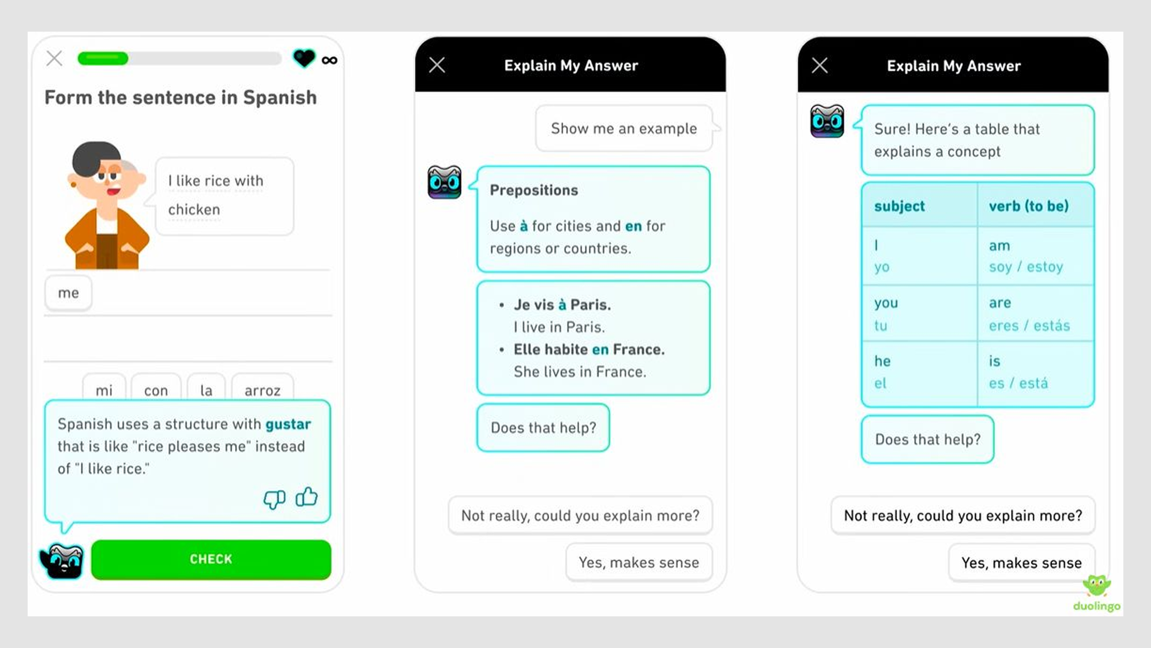
1. Duolingo
Duolingo uses conversational practice to make learning a new language feel approachable. Instead of overwhelming learners with grammar charts, its chatbot prompts users with short dialogues that mimic real-life scenarios. The mix of encouragement and progress tracking keeps people coming back daily.
2. Google Assistant
Google Assistant helps people get things done with natural voice commands. Whether it’s setting reminders, controlling smart devices, or answering quick questions, the virtual assistant removes friction from everyday tasks. Its ability to understand context makes it feel like a helpful companion.

3. ChatGPT
ChatGPT has become one of the most recognizable conversational UIs, offering free-flowing text-based dialogue that adapts to different contexts. Users can brainstorm ideas, ask questions, or get personalized recommendations in a way that feels intuitive. Its strength lies in generating responses that sound natural and human-like, setting a high bar for conversational experiences.

4. Sephora Virtual Artist
Sephora’s Virtual Artist lets shoppers test products through conversation-driven interactions. Customers can explore different makeup shades, try them on using augmented reality, and instantly get suggestions that fit their style. This approach blends utility with personalization, making online shopping feel more like an in-store consultation.

5. Domino’s Pizza Bot
Domino’s makes food ordering as effortless as chatting with a friend. The bot asks what you’d like to eat, helps customize toppings, and provides live delivery updates directly in the conversation. It transforms a multi-step process into a quick, conversational flow that feels convenient and engaging.

A final word
Will chatbots reach the real human conversational level? I would vote for “yes”.
With AI development, chatbots will become smarter and more capable of driving the conversation without embarrassing flubs. Our designers always keep a curious eye on the latest tech trends and are ready to apply the freshest knowledge in designing your chatbot. And here we have more about UI/UX trends and SaaS trends for 2021; read them on.


