
Radio buttons may seem like a small, straightforward element. But when designed poorly, they can quickly confuse, frustrate, and drive users away. FinancesOnline statistics showed that 81% of users abandon a form after starting to fill it out, often due to frustrating UX choices.
At Eleken, we understand that radio buttons, a key element in many forms, can either make or break the user experience. We’ve seen firsthand how thoughtful, intuitive design leads to smoother interactions and higher completion rates.
In this guide, we’ll explain why radio button UX matters, share design best practices, and show you how to avoid common pitfalls.
What is a radio button in the UI?
A radio button is one of those humble little UI elements that quietly do their job. You’ve probably seen them a thousand times: small, circular selectors that let users choose one option from a list. That’s the radio UI whole deal. One list, one choice. No going back for seconds.
So, why do radio buttons matter? Because they may seem basic, many designers treat them as an afterthought. However, radio buttons can shape the entire user experience, particularly in form design and user onboarding UX patterns. When done right, they’re virtually invisible, exactly what you want. But when they’re not, users notice everything.
Whether you're working on form design or crafting input field design, don’t underestimate these little circles. The radio button UX principles below will make them work better.
Radio button UX principles: best practices for design
A few simple principles can make a huge difference in ensuring a smooth and intuitive user experience. Let’s walk through some best practices to keep in mind when implementing radio buttons in your UI.
- Use radio buttons for mutually exclusive choices
Radio buttons are perfect for situations where users need to select only one option from a list UI design. If your form requires users to select multiple options, however, you might want to explore other UI patterns, such as card UI examples or grid layout design, which offer more flexibility for multi-selection.
When the user is limited to a single choice, like picking a payment method, selecting gender, or choosing a subscription plan, radio buttons are the way to go. They keep the process simple, clear, and easy to navigate.

- Keep choices visually clear and scan-friendly
A common mistake is spacing radio buttons too far apart or too close together, which makes it harder for users to select quickly. Stacking radio buttons vertically is the best approach, especially on mobile, as it improves scanability and readability.
A clean, well-organized design reduces user mistakes and improves the overall experience. Google’s payment methods form, for example, shows how well-spaced, easy-to-read options create a seamless user flow.
- Prioritize logical option order
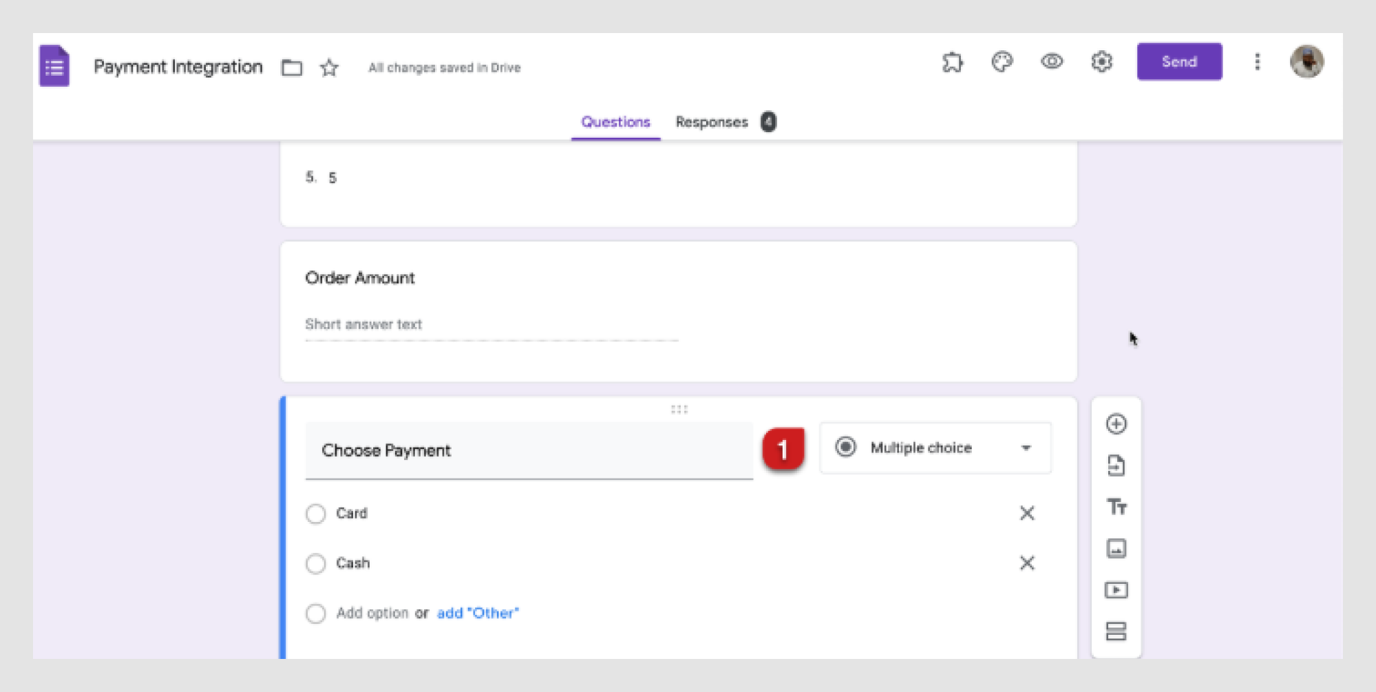
The order of options is essential; alphabetizing them when it doesn’t make sense can confuse users. For instance, ordering age groups as "0-18, 50+, 19-35, 36-49" is counterintuitive. Always prioritize the most common or relevant choices first.
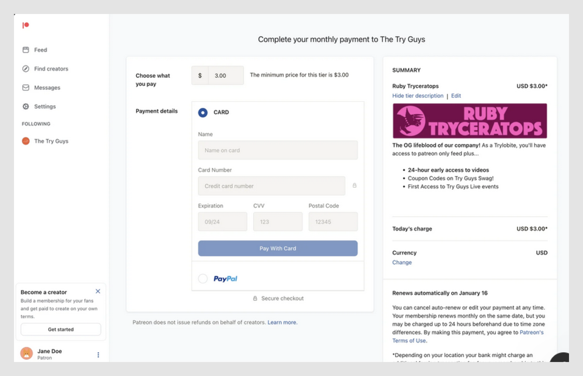
For example, when offering payment options, list Saved Mastercard first, followed by credit or debit card payment, before PayPal and other payment options. This approach is more intuitive and aligns with user expectations.

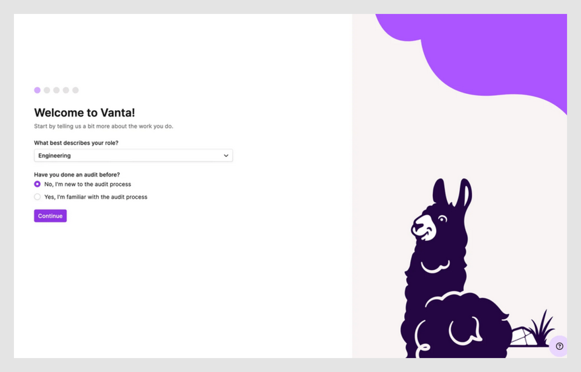
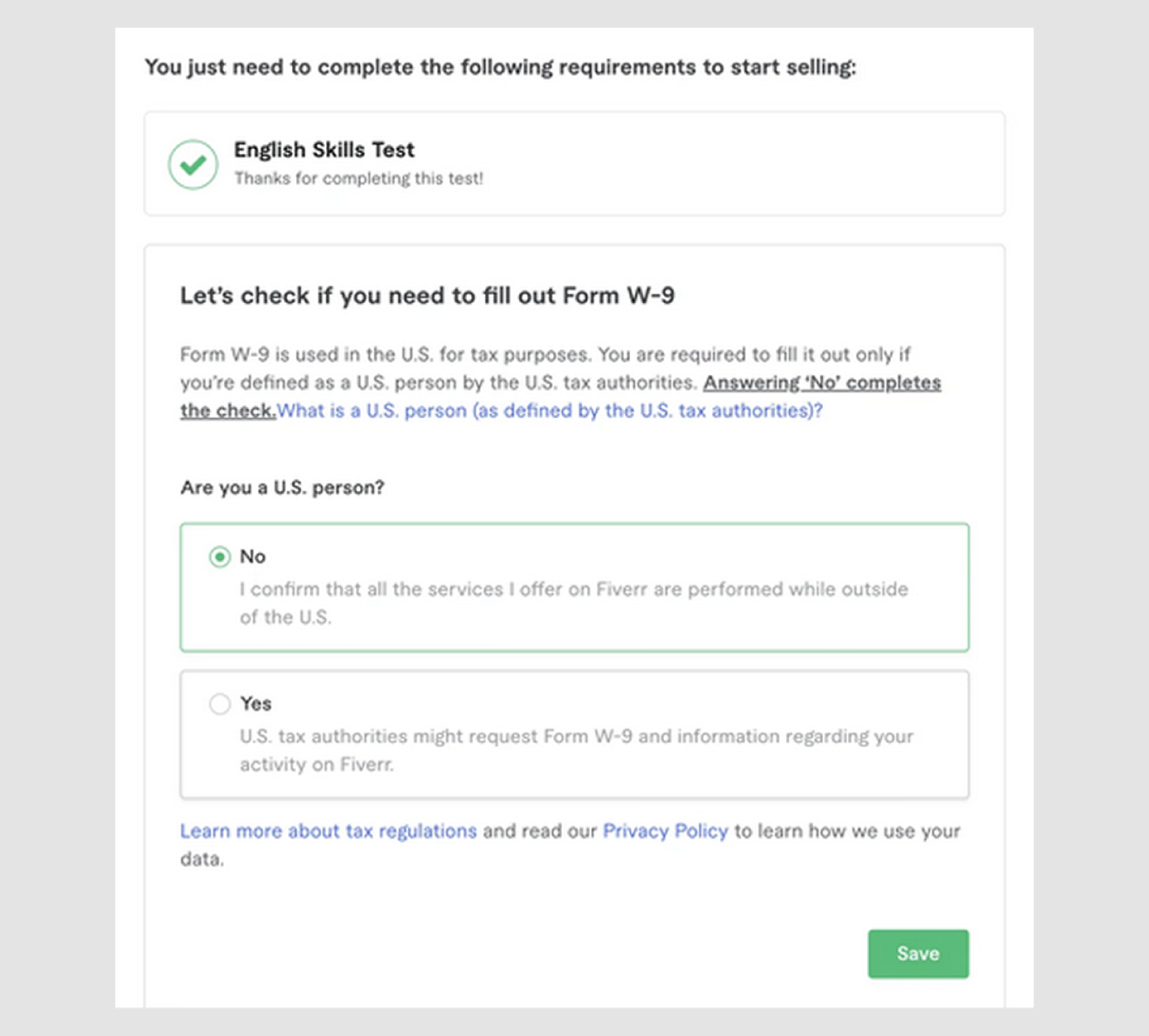
- Provide descriptive labels (not just one-word choices)
Ambiguous labels can confuse users, so provide clear, descriptive options. While keeping labels short is tempting, vague choices like "Yes" and "No" don’t give enough context, especially in interfaces that rely on tabs UX, where labels must clearly signal what content or step comes next. Instead, be specific about what users are agreeing to. This becomes even more important when choices are part of a sequence, such as in stepper UI examples, where each decision affects the following step.
For example, instead of just "Yes" or "No," try something like: "What best describes your role? Have you done an audit before?” “Yes, I’m familiar with the audit process" vs. "No, I’m new to the audit process."
Clear wording like this works well not only for radio buttons, but also when similar decisions appear in slider UI ranges, carousel UI selections, or map UI design contexts, where users rely on labels to understand the meaning behind each interaction.
- Ensure sufficient spacing and tap areas for mobile UX
Making radio buttons too small or placing them too close together, especially on mobile, can make tapping them accurately difficult, leading to user frustration and potential abandonment.
Mobile users should be able to tap on radio buttons easily, giving them enough space. Apple's Human Interface Guidelines suggest a minimum tap area of 44x44px to ensure smooth, frustration-free interaction on different screen design examples.
In short, keep radio buttons large enough for easy tapping and avoid overcrowding or shrinking them on mobile.
And if you want to learn more about how to design an app using 9 key steps, consider watching this video:
Radio button UI examples: real-world design inspirations
Design inspiration is all around, but to master radio button UX, you need examples that balance creativity with usability. Let’s explore some real-world designs that elevate radio buttons and make them effective.
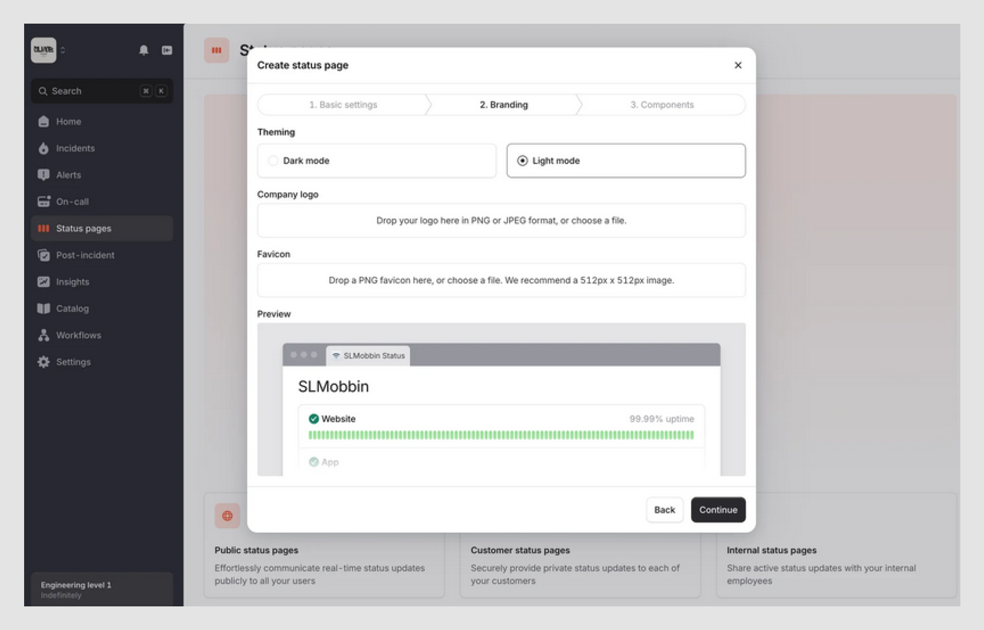
Modern minimalist style to avoid distractions
Sometimes, less really is more. A clean, minimalist approach is ideal for radio buttons UX, especially when focusing on functionality without unnecessary distractions.
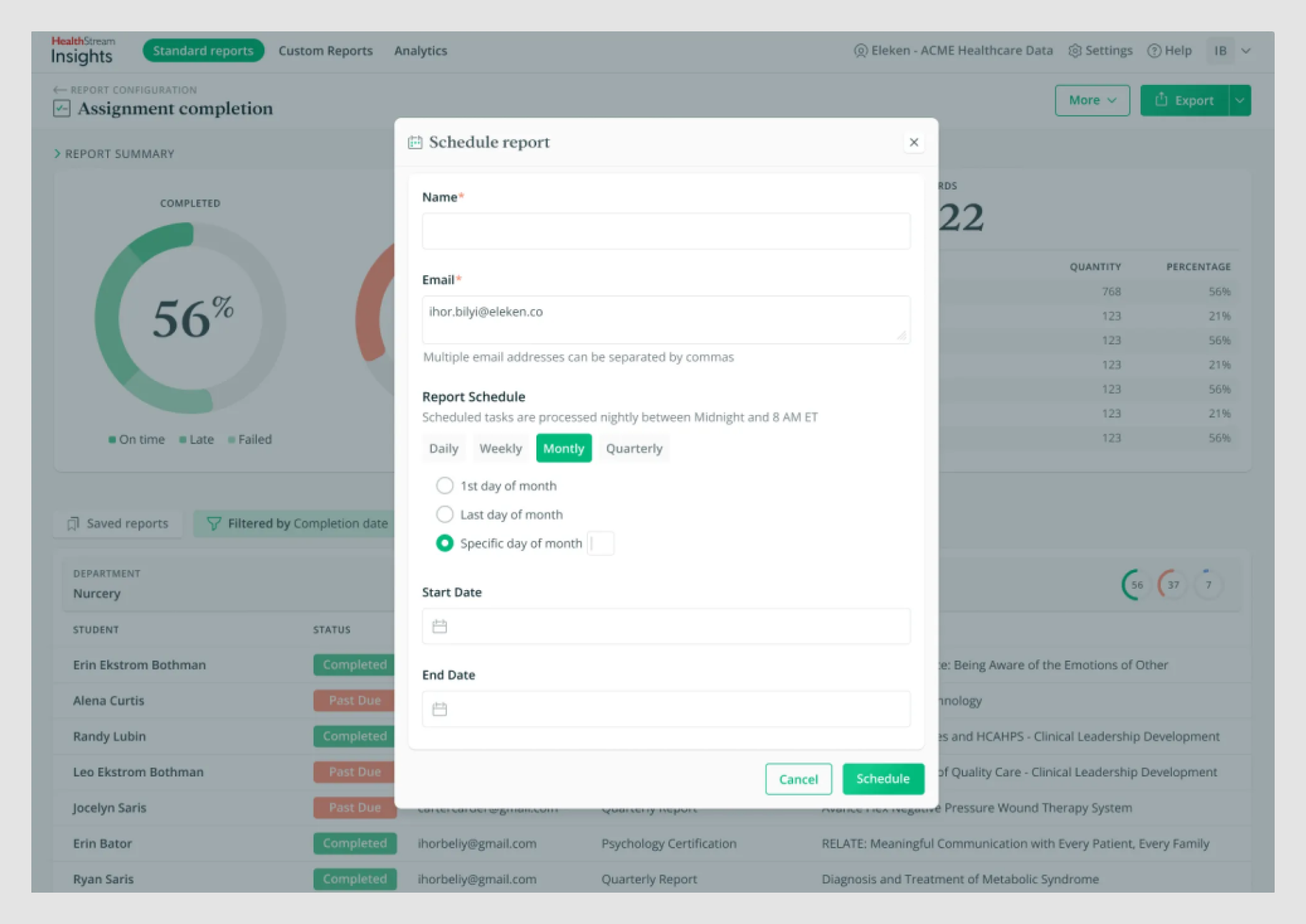
For example, our client, HealthStream Insights, uses simple, high-contrast radio buttons in its Schedule report feature. They’re not flashy, but they’re easy to spot and select. For users who prefer minimal interaction with report customization, the feature allows them to set everything once and have the report delivered straight to their inbox. There is no need to log into the program again.
The key takeaway? Prioritize simple designs that emphasize usability over unnecessary decoration.
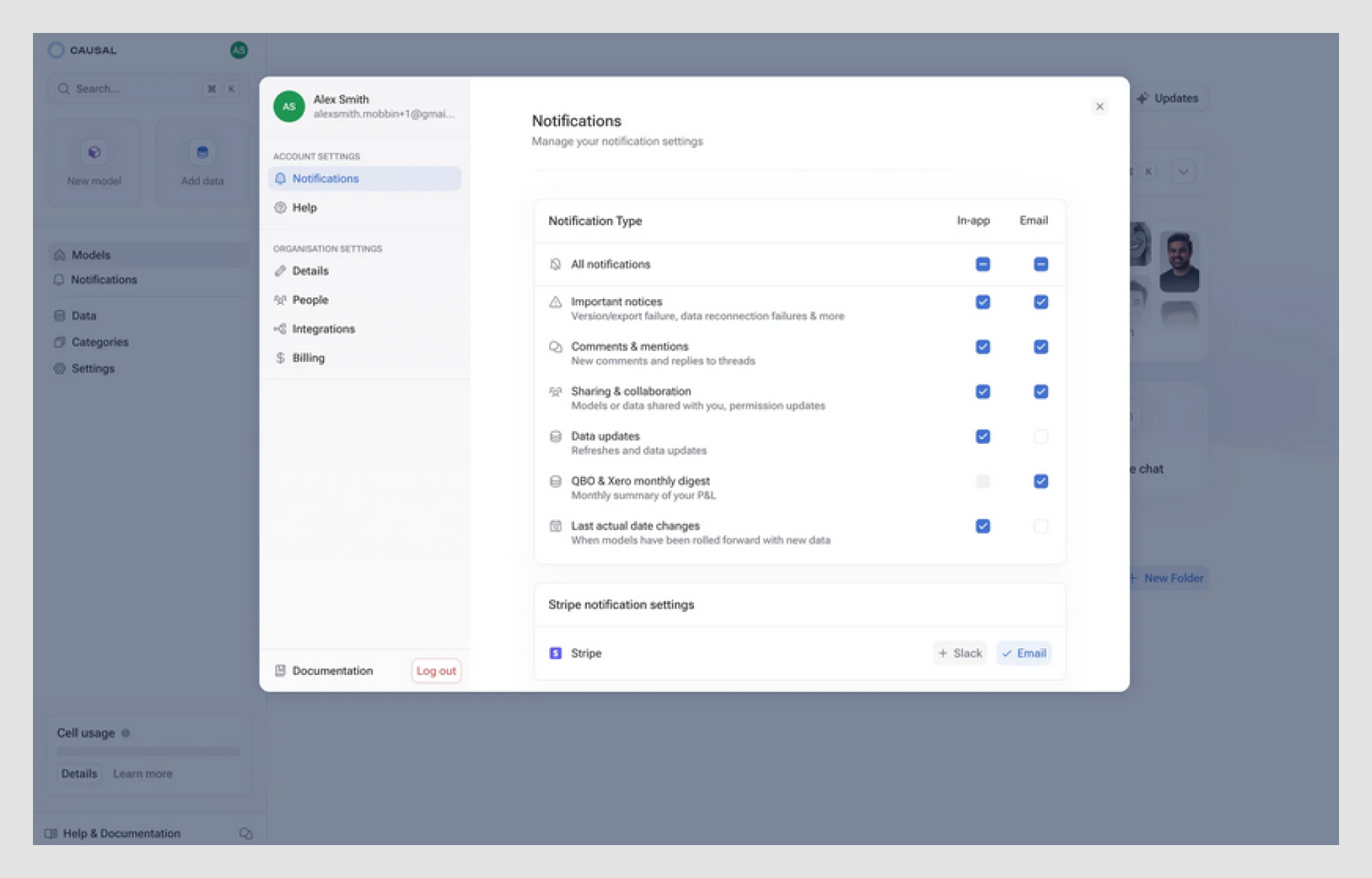
Radio buttons with icons for better recognition
Sometimes, users need a little extra guidance to make quick decisions. Adding icons to radio buttons can enhance recognition, improve a material design radio button, and reduce cognitive load — an approach that works well across interfaces like profile page design, where users scan options quickly.
For example, incorporating icons alongside radio buttons helps users identify options at a glance. This is especially useful for non-native speakers or when users need to scan options quickly, such as in contact form design, where hesitation can lead to drop-off. Pairing icons with a brief description further clarifies each choice, making the process even more intuitive. This pattern translates well to other interactions too, including drop down menu UI and calendar UI, where visual cues help users interpret options faster.
In more advanced flows, icon-enhanced radio buttons can coexist with drag and drop UI for reordering preferences or priorities without increasing complexity.
Accessibility-focused design
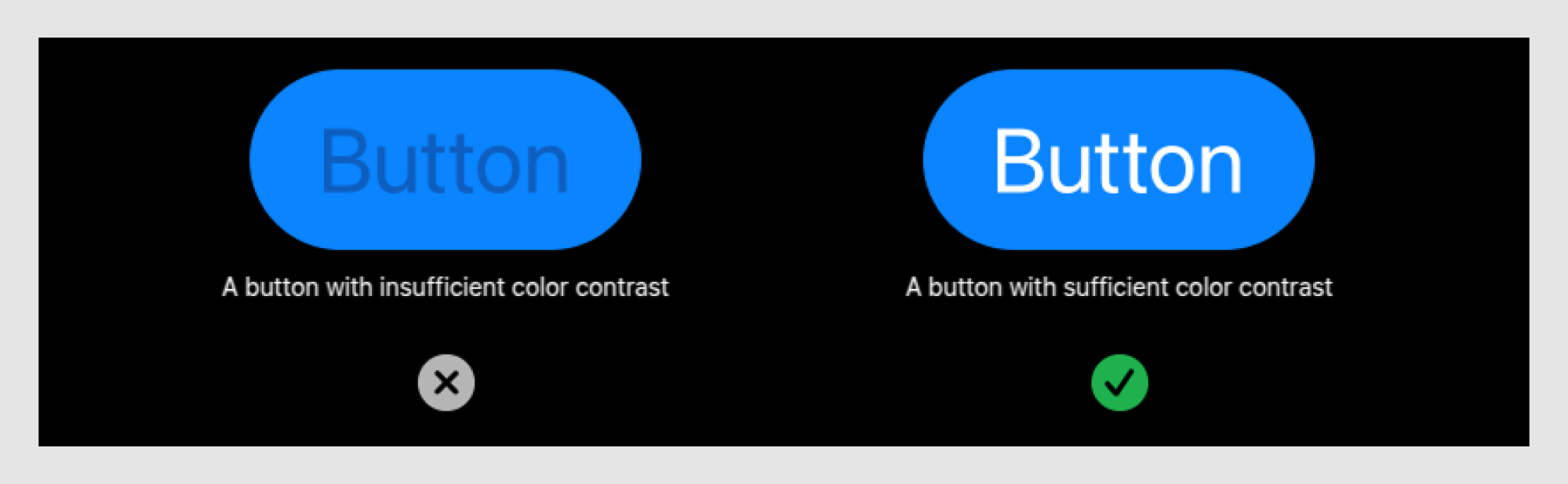
When designing radio buttons, accessibility should always be a top priority. Incorporating features like clear labels, high contrast, and keyboard navigation ensures everyone, including users with disabilities, can interact with your form without barriers.
For example, Apple’s radio buttons are designed with high contrast and ample spacing to improve visibility for users with visual impairments.
To meet accessibility standards, they follow guidelines like the Web Content Accessibility Guidelines (WCAG) and the Accessible Perceptual Contrast Algorithm (APCA) for color contrast. Additionally, Apple ensures that all elements are easily navigable using keyboard shortcuts, providing a seamless experience for all users.
Contextual design for improved decision-making
Sometimes, radio buttons can include contextual help or tooltips to guide users through their choices, especially in complex forms or decision-making scenarios. This approach is often seen in dashboard design examples, where dense interfaces require lightweight guidance without overwhelming the screen.
So, what are radio buttons on a form? They’re interactive elements that allow users to select only one option from a list. In contrast to filter UX, which supports multi-selection and exploration, radio buttons are designed for clear, mutually exclusive decisions. Providing additional information on hover or click can reduce confusion and help users make informed decisions more quickly. This information can be revealed through patterns like accordion UI, which keeps explanations accessible without cluttering the layout, or modal UX when a decision carries higher importance and requires focused attention.
For instance, radio buttons with a preview or description explain the choice in detail, ensuring users fully understand their options before selecting. Similar principles apply in chatbot UI, where constrained choices paired with clear explanations help users move forward confidently without second-guessing their input.
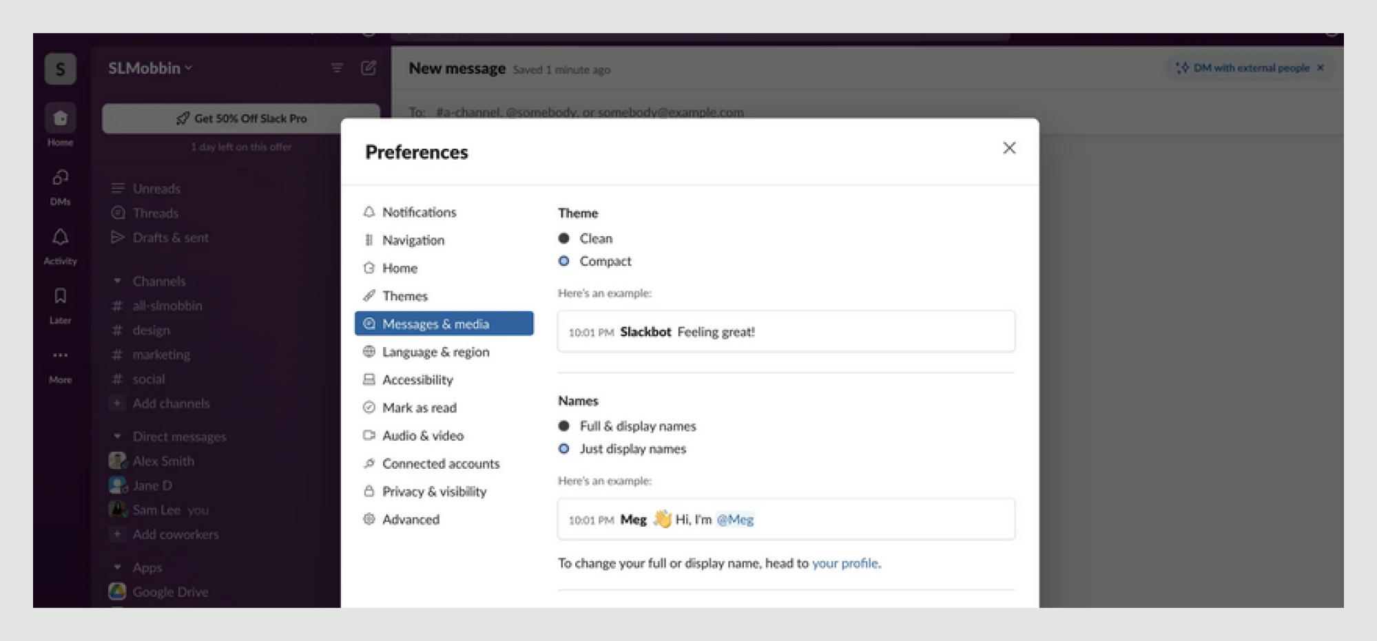
Microinteractions for feedback
Adding subtle animations or microinteractions to radio button UI design can provide instant feedback to users, improving their experience without overwhelming them.
A simple color change, animation, or even an emoji after selection can add a touch of conversational UI, making the interface feel more responsive and engaging, while giving users a sense of satisfaction.
For example, Slack uses smooth animations and color transitions in its radio buttons to indicate selection visually, making the process dynamic and interactive. This attention to detail improves user engagement and creates a more polished experience.
Creative and playful radio button UX
If you want to inject some personality into your design, why not have a little fun with it? A touch of creativity can turn routine interactions into enjoyable experiences.
Take Duolingo, for example. They gamify their radio buttons with vibrant colors, animations, and interactive checkmarks. Creative designs can make your interface stand out, but always ensure they enhance, not overwhelm, the user experience.
When not to use radio buttons: avoid these UX mistakes
While radio buttons are a great choice for certain scenarios, there are times when they can cause more harm than good. Let’s dive into common mistakes and learn when to use something else.
- Using radio buttons for non-mutually exclusive choices
If your users need the option to select more than one choice, don’t restrict them to a single option with radio buttons. For multi-stage tasks, you can opt for a wizard UI.
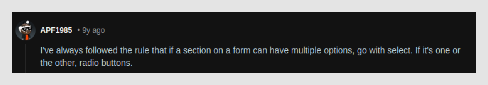
As one Reddit user wisely stated, “I've always followed the rule that if a section on a form can have multiple options, go with select. If it's one or the other, radio buttons.”
For instance, checkboxes or toggle UX can be better when selecting notification preferences like email, SMS, or push notifications, giving users the flexibility to choose multiple options.
- Radio buttons hidden in dropdowns
Hiding radio buttons inside a dropdown unnecessarily complicates the user experience. The UI radio button is meant to be visible and easily scannable, and placing it in a dropdown defeats that purpose.
As one Reddit user pointed out, " If there's less than 5-6 items, it's arguably easier to 'scan' all of the options at a glance using radio buttons than to be forced to open the select drop down. It takes up more space and depending on that you may be forced to go the select route. But I think ideally it's best to make a form as scannable as possible, and this means showing as much as you can without additional clicks.”
For example, instead of putting payment options inside a dropdown, display them as visible radio buttons for quick selection.
- Poorly designed disabled states
It’s easy to gray out unselectable radio buttons and leave them at that, but this small detail can confuse users. Without context, users may wonder why an option is unavailable. To improve the experience, always provide an explanation or a helpful tooltip.
One Reddit user shared this scenario, “I’m working on a global app where global restrictions mean it has to be equally weighted options, not just the usual tick box, so here we are, binary choices without a default.”
For example, if a payment option is unavailable due to the user's location, or if specific form fields are not needed, a tooltip like “This option is unavailable in your region” or a simple note explaining the situation can save users a lot of frustration and make the process clearer.
Advanced UX patterns for radio buttons
When you’re ready to take your radio button design to the next level, it’s time to explore some advanced UX design patterns. These patterns help you handle more complex user interactions while maintaining clarity and ease of use, especially when radio buttons are combined with elements like checkbox UX, where users may need to make secondary or optional selections.
- Radio buttons with progressive disclosure
Progressive disclosure occurs when selecting an option, revealing additional fields or options, and reducing clutter while keeping things clear. This approach is commonly implemented through popup UI, which surfaces extra inputs only when they become relevant. For example, selecting a payment method such as “Credit Card” could reveal a field to enter card details in payment forms. In more advanced scenarios, this might include time picker UX for scheduling payments or recurring charges, or structured layouts inspired by table design UX when multiple related fields need to be reviewed together.
When no option is selected, empty state UX plays an important role by guiding users on what to do next and explaining why additional information isn’t visible yet.
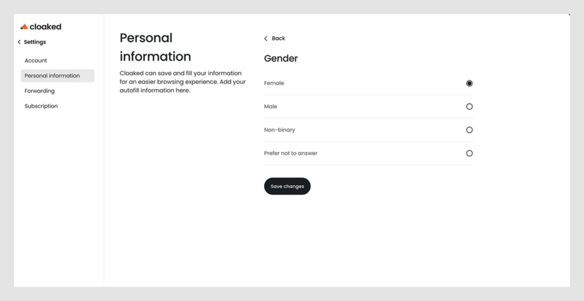
- "None of the above" option for clearer selection
Sometimes, users don’t want to pick anything. And that’s okay! Offering a “None of the Above” option can save users from frustration.
In a survey, providing “Prefer not to answer” can give users a clear way out if they’re uncomfortable selecting an option.
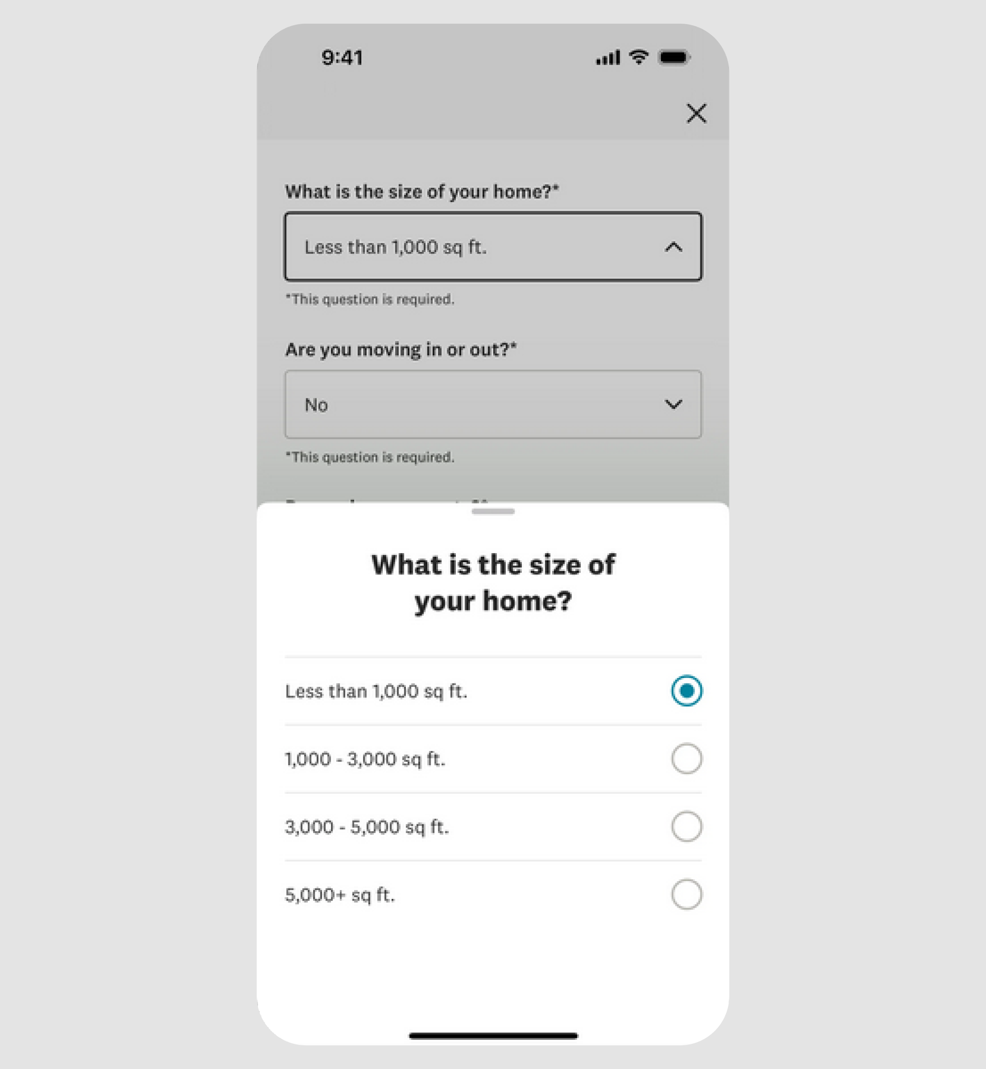
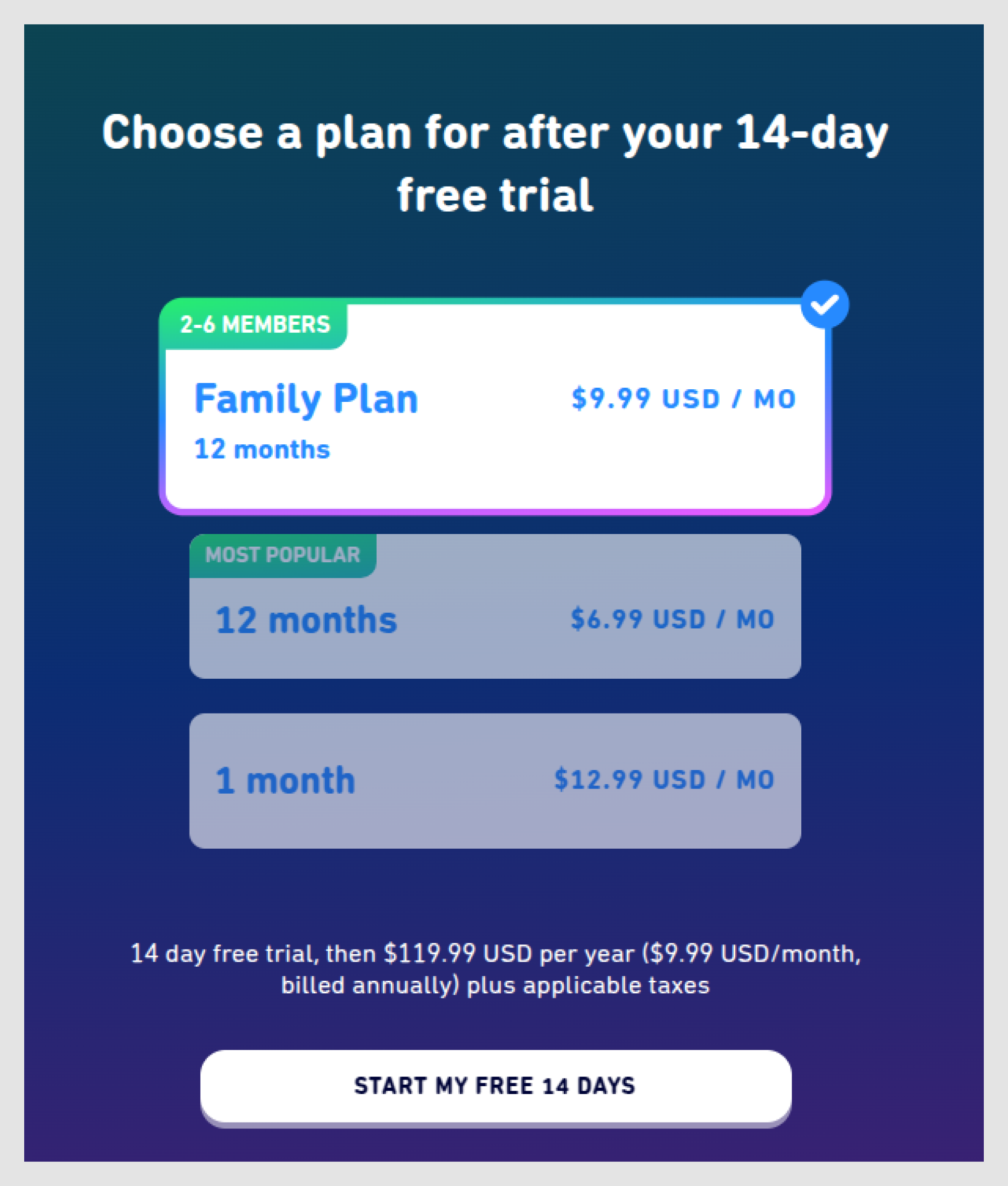
- Multi-step forms: when to show only one option at a time
For more complex forms, showing one radio button choice at a time can reduce cognitive load. Breaking it down step-by-step helps users focus on the task at hand.
In the example below, the sign-up flow shows each choice in sequence, guiding the user through the process without overwhelming them.
Final thoughts
Radio buttons may seem like a small detail in your UI, but they greatly impact the user experience. Following best practices, avoiding common mistakes, and leveraging advanced UX patterns can help you design radio buttons that are intuitive, clear, and engaging.
The trick? Keep it simple! Make the choices clear, the design easy to scan, and always order them logically. And if you’re feeling adventurous, go ahead and add a little personality through minimalist designs, playful animations, or helpful icons. Just don’t go overboard, your radio buttons still need to work.
If you need expert guidance on designing intuitive, effective radio buttons and enhancing your UI, reach out to Eleken. We’re here to help turn your vision into an exceptional user experience.


.png)
.png)


